A Daily History of Holes, Dots, Lines, Science, History, Math, Physics, Art, the Unintentional Absurd, Architecture, Maps, Data Visualization, Blank and Missing Things, and so on. |1.6 million words, 7500 images, 4.9 million hits| Press & appearances in The Times, Le Figaro, Mensa, The Economist, The Guardian, Discovery News, Slate, Le Monde, Sci American Blogs, Le Pont, and many other places… 5000+ total posts since 2008.

Category: Information, Quantitative Display of

  • Another London Underground: Water, 1929

    JF Ptak Science Books  Quick Post

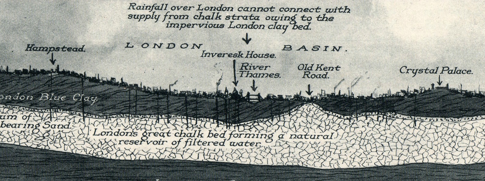
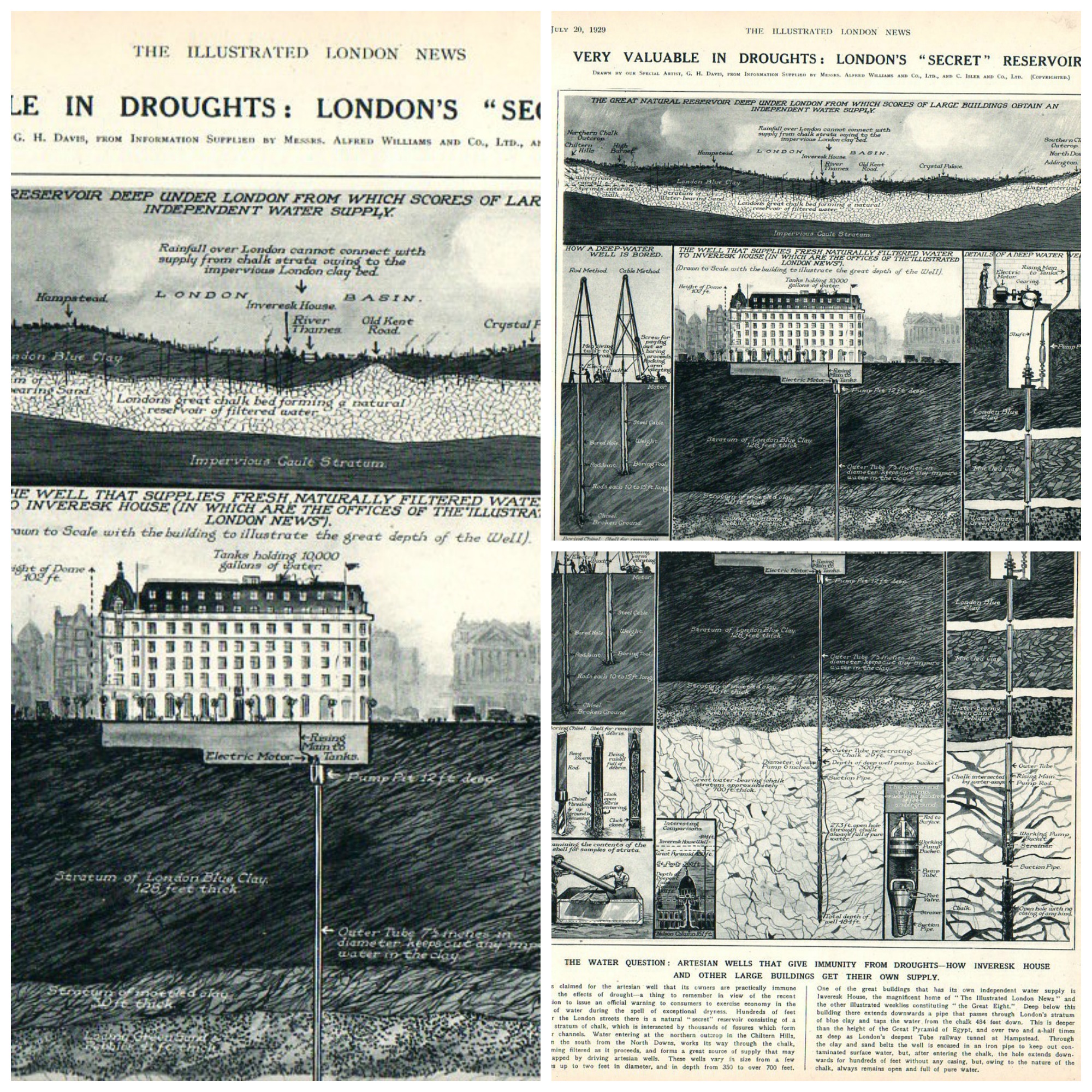
    On the heals of two water-related posts in the last two days (one of the waterless Jornada del Muerto in New Mexico and the other on the well at the Turin citadel as a reverse-tower) comes this fine image of a geological/hydrological cross section of London, from the Illustrated London News for July 20, 1929. 

    London underground water143

    All elements of this collage are very (screen-filling) clickable, and sharp:

    London underground collage


  • History of Squares-within-Squares

    JF Ptak Science Books   Quick Post

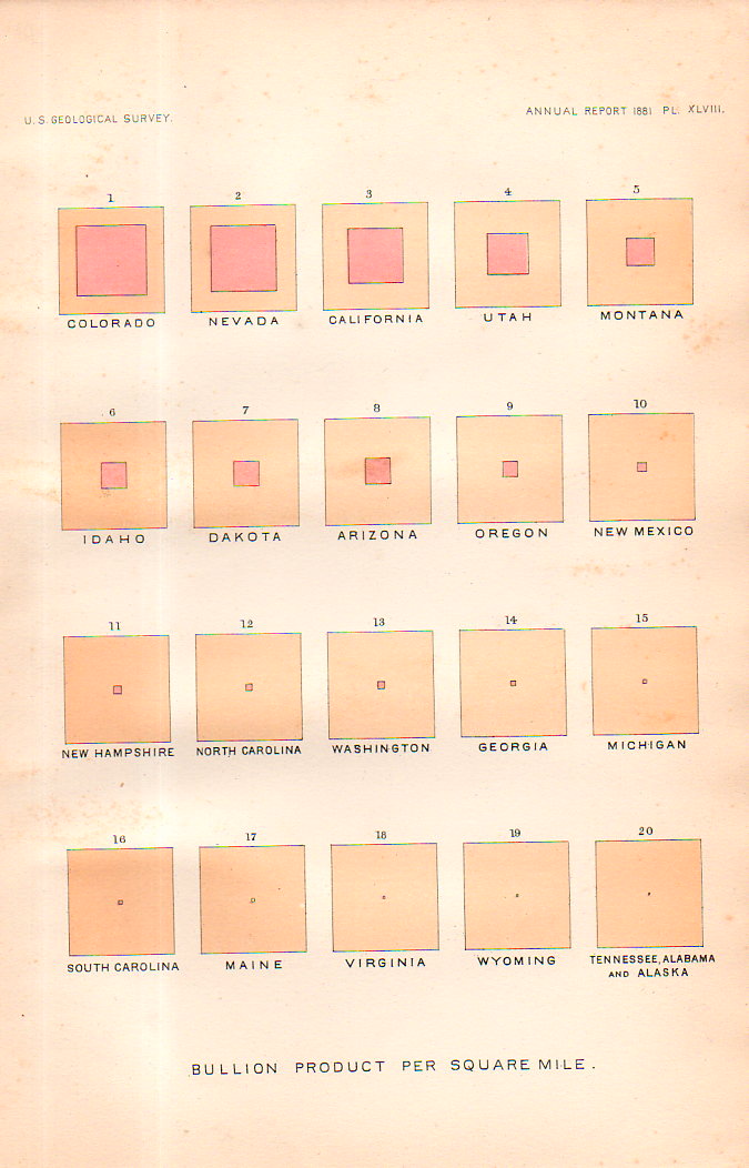
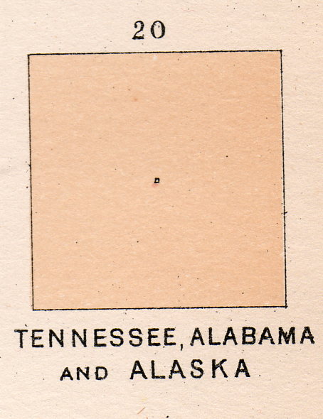
    This square-within-a-square appears in a table of squares in several pages of square collections. They represent “Bullion product per capita” for U.S states and territories, and published in the U.S. Geological Survey Annual Report for 1881 (plate XLIX).  The “bullion” is silver bullion, and as we can there twelve leading states for silver production worth discussing before the rest become melded into one solid whole in square 13.  It is a beautiful display, in its pre-non-representational-art sort of way.  Kandinsky was still more than 30 years away from calling this sort of thing “art”, and the representation itself was 95 years after the first graphic displays to convey info (in Playfair’s Commercial and Political Atlas of 1786)and still, it is very captivating in a simple, squarey sort of way. 


    Squares, history of141


    Squares, history of140


  • Pride in a 3mm House on the Dead Man’s Walk, 1855

    JF Ptak Science Books   Post 2483
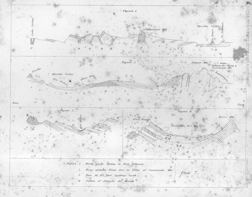
    Jornada136

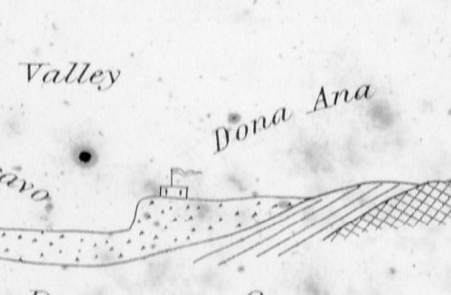
    Sometimes maps have an unusual ability they can Maps can record human achievement and anti-achievement and show human impact on the environment and vice versa, which is standard,  especially if you can see a little deeply into it.  Sometimes though there are the little bits–extras–that find their way onto the paper that opens a window to the emotional involvement of people and space, added by the artist or engraver or whoever it might be that last touches the plate before prints are made from it.  

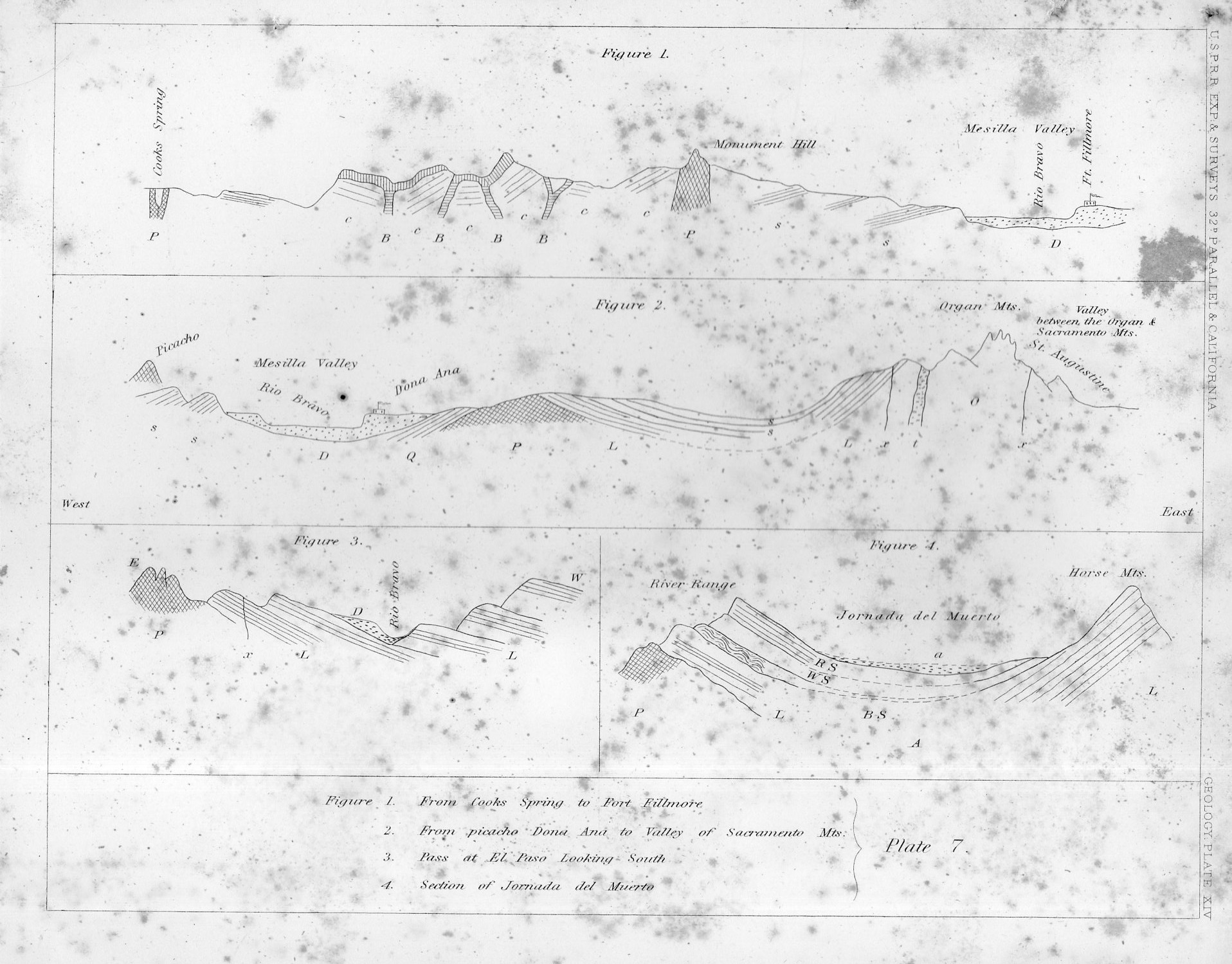
    This certainly seems to be the case in this cross-section of tough New Mexico earth.

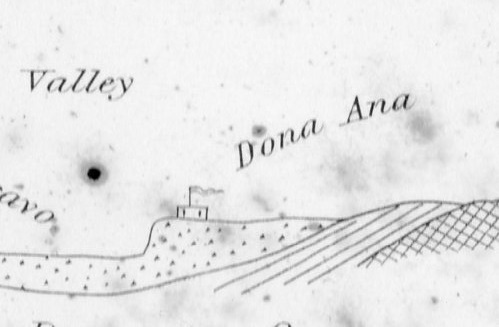
    That little adobe building represents the Dona Ana Land Grant back in 1855, when those pioneers had a few decades of roots in the very hot ground there in New Mexico, across from the Rio Bravo, commanding the Mesilla Valley.  In the original print, published in the great U.S. Pacific Railroad Survey1 in 1855, the structure is only about 3mm long–very easy to miss until you start looking closely at the sheet, which itself is only 2×2.5 cigarettes high and wide.

    I thought the structure had a personality, and looked stolid, strong, and maybe even proud with its long fluttering banner, sitting there in the heights above the river, a strong place perched at the edge of the Jornada del Muerto (“The Dead Man’s Journey” or more prosaically and according to Mr. McMurtry, “The Dead Man’s Walk”)
    Jornada135
    Notes:

    1. The full title of the eight-volume publication, which was an exhaustive treatment of the U.S. west from the mud below to the birds above, Reports of Explorations and Surveys to Ascertain the Most Practicable and Economical Route for a Railroad from the Mississippi River to the Pacific Ocean Made Under the Direction of the Secretary of War, which was published by the U.S. government from 1853-6.
  • Details in Terrestrial/Celestial Globes, 1723

    JF Ptak Science Books   Quick Post

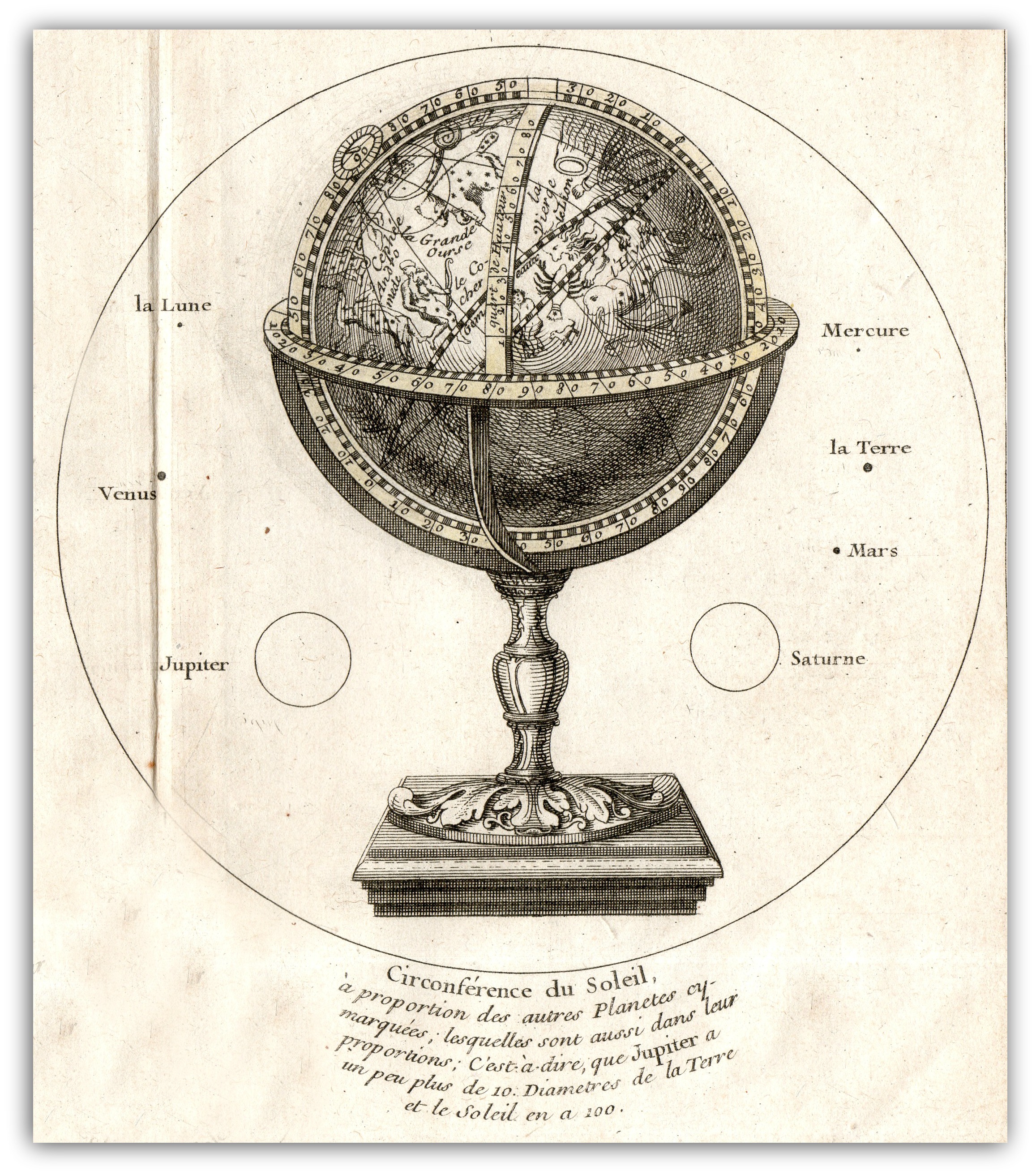
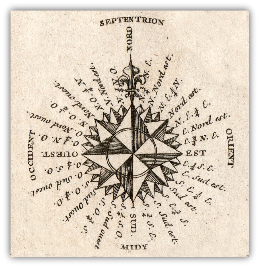
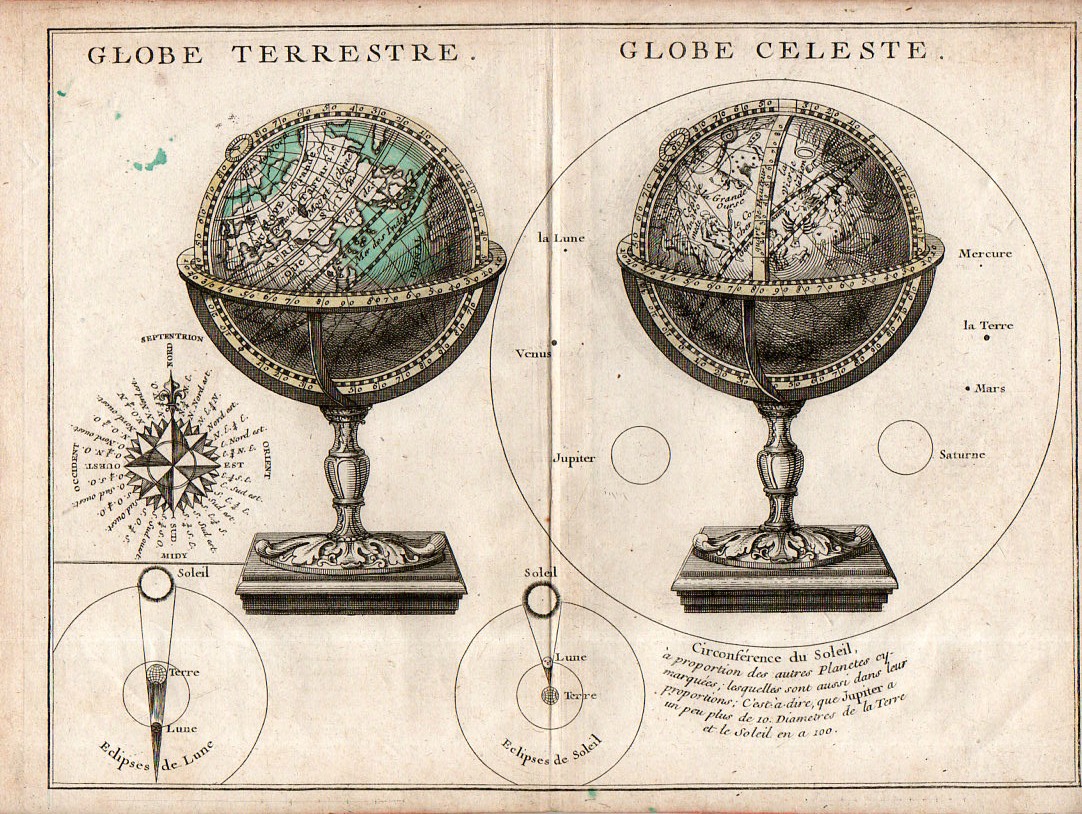
    The main object in this engraving–the presentation of two globes, one terrestrial and one celestial–is perhaps less interesting than secondary figures accompanying it.  The two small insets of solar and lunar eclipses are instructive and pretty, while the compass rose is full and surprisingly stubby, making that example fairly uncommon–and much more attractive when isolated and cleaned up a bit.  So too for the rudimentary but elegant comparison of the sizes of the planets compared to the Sun that surrounds the celestial globe–again, isolated and defined, the image is striking. 

    Map Globe Terrestre Globe Celeste detail

    • The original map is available here at the blog’s bookstore.

    Map Globe Terrestre Globe Celeste117This from the full image:

    Map Globe Terrestre Globe Celeste115


  • The Beauty of Dirt

    JF Ptak Science Books  Quick Post

    “All the roots hang down
    Swing from town to town
    They are marching around
    Down under your boots
    Below the gopher holes
    Where they all unfold
    There’s a world going on underground
    Underground”–Tom Waits (“Underground”, with audio)

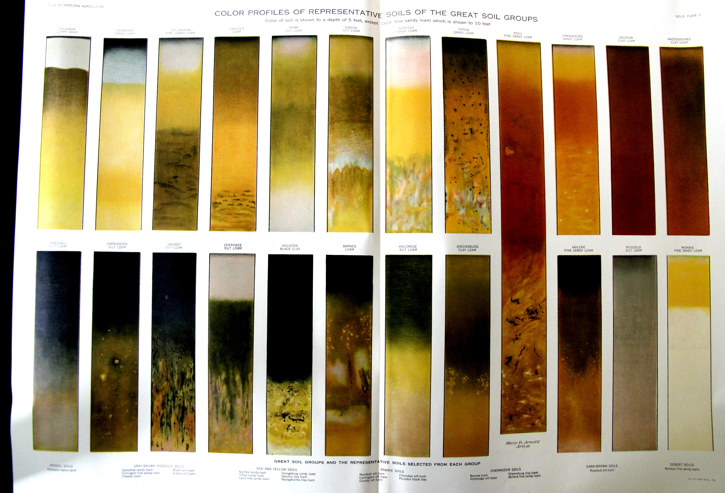
    Dirt isn’t just the stuff that one gets rid of, of course–it is the basis of all that we are. Varieties of dirt are the stuff of the connoisseur and the expert, and when laid out properly, and particularly in a scientific manner, dirt is exceptionally beautiful. For example, this exceptional and large illustration appears in the Atlas of American Agriculture, which was printed in a very unpretty/dustbowly year for soil, 1936.  (The image is clearer once you click in and expand.)

    SOil samples

    The lithograph is also available for sale at the blog’s bookstore, here. 


  • “Our Puny Earth!”

    JF Ptak Science Books  Quick Post

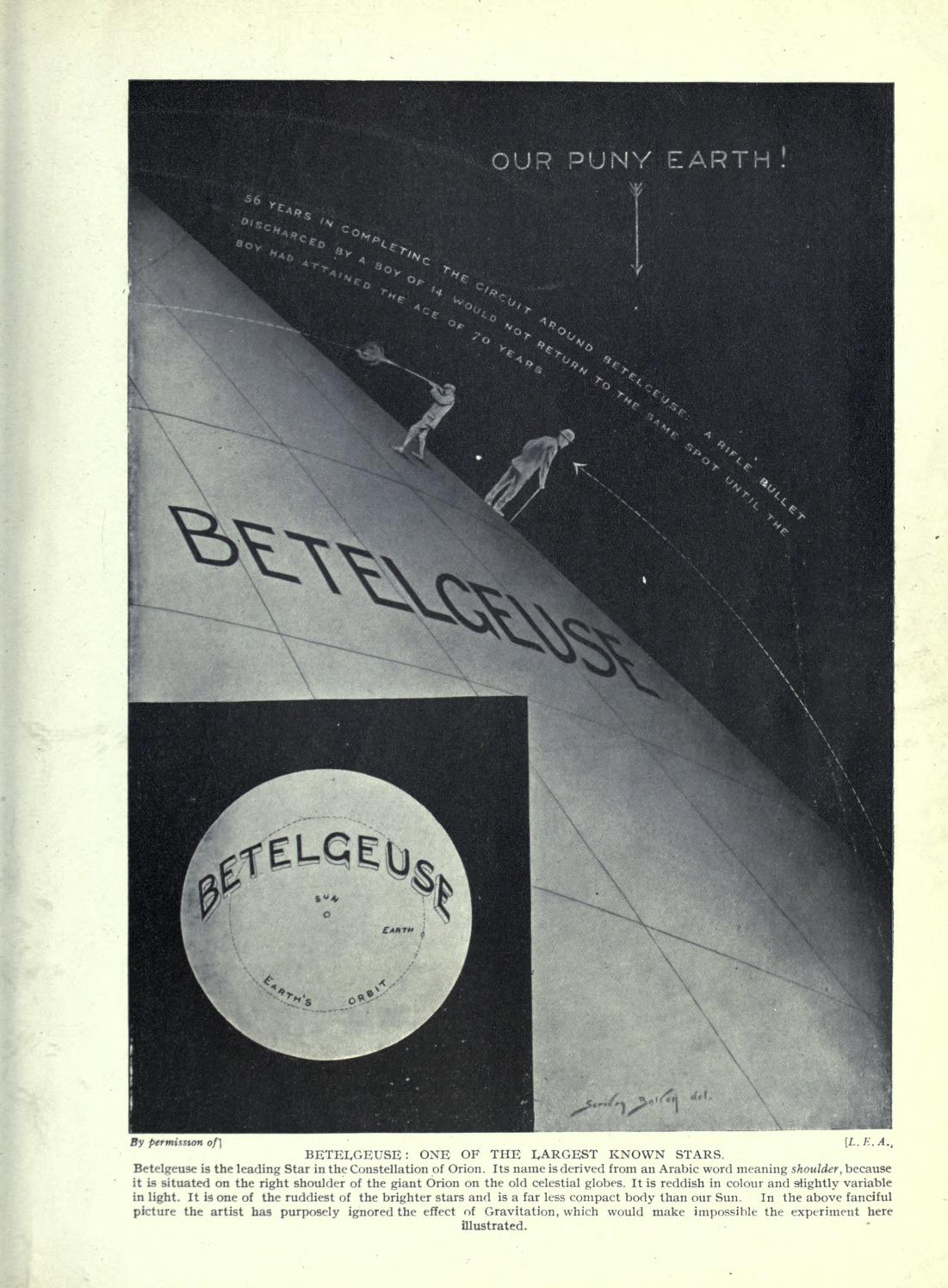
    Hutchinson’s Splendour of the heavens; a popular authoritative astronomy, by Theodore Philips and William Steavenson, was a splendid popular work filled with fine images, some of which were rather unusual.  One that I thought I had to share was the f=one below, which contains the first time that I have seen the phrase “Our Puny Earth!” in a non-comic book.  It is also a nice graphical display of data underneath the “puny Earth” bit–enjoy. 


    Astronomy  Betelgeuse[Source: Internet Archive,  https://archive.org/stream/hutchinsonssplen01philuoft#page/418/mode/thumb]


  • Paper Love–Moveable Paper Prints: the Protos Automobile, 1925

    JF Ptak Science Books  Quick Post

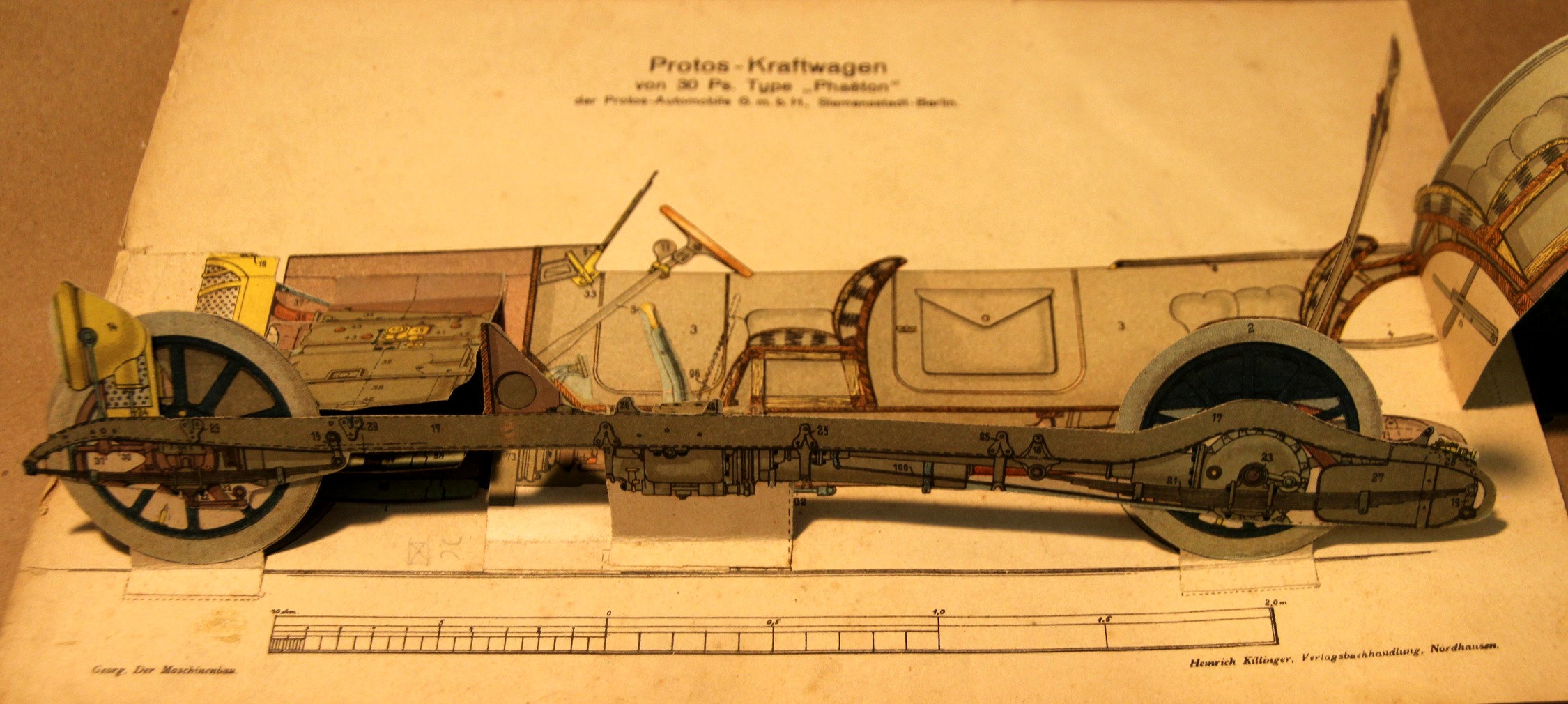
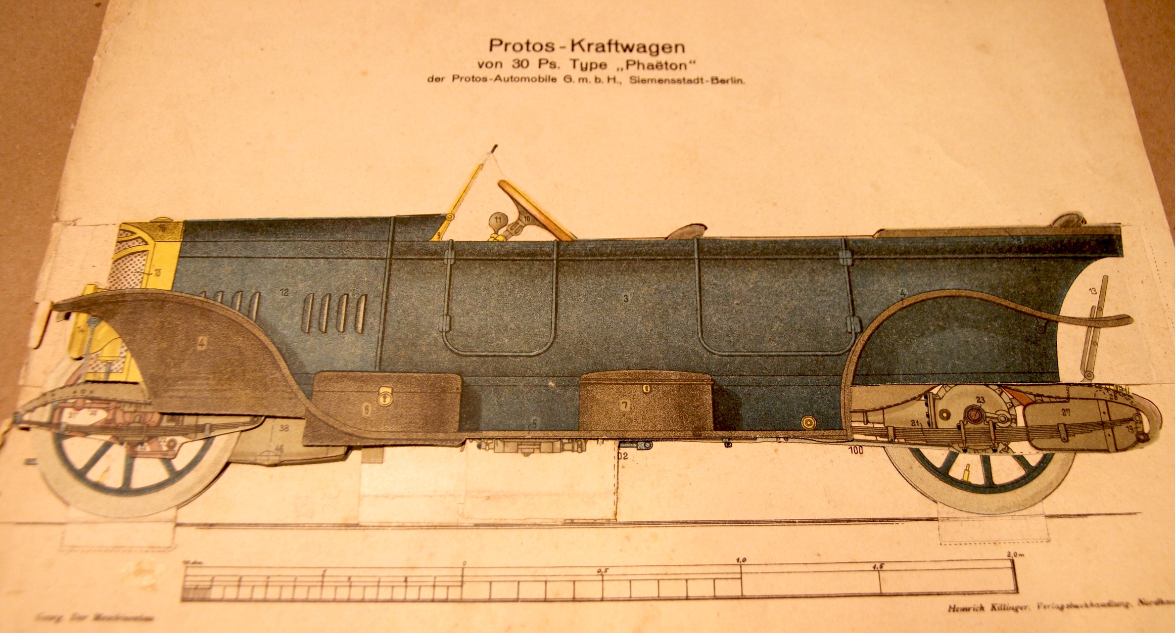
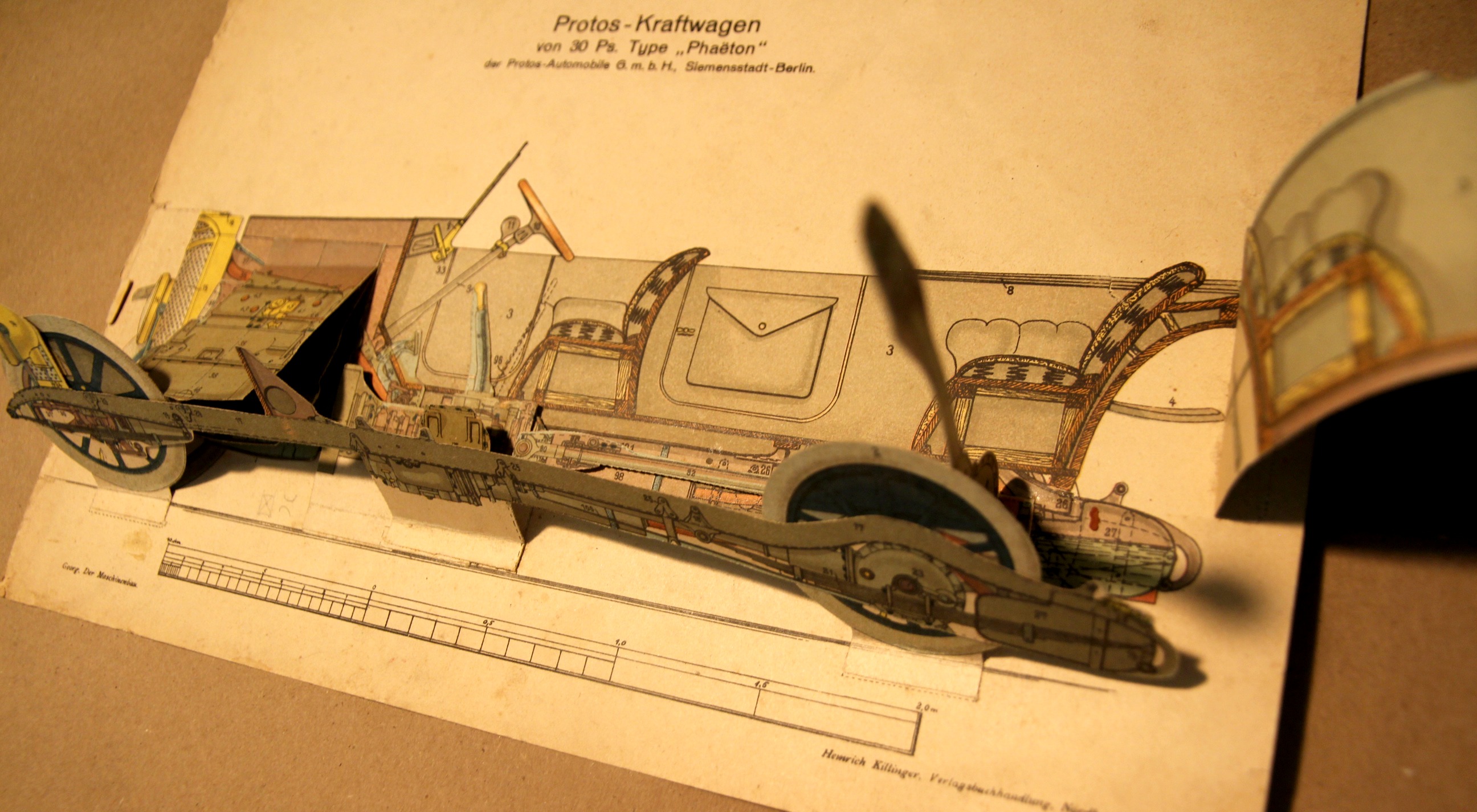
    The moveable book (flapbook) has long been interesting to me–unfortunate though that in my own fields they weren’t used very often. There are some very notable exceptions–early geometries would occasionally be published with many of the geometric illustrations made to pull out a little with the tug of a string to show you the construction in 3-D. Then of course there are the paper dissection manikins, where you can find nearly-life-sized paper anatomies with hundreds of movable/liftable flaps, and smaller examples of the body and specific organs that can be simple or not simple whatsoever.  These were time-intensive efforts, and in their own way they provided a sort of pre-MRI MRI by revealing the various layers of 3-D objects with 2-D tools–and they’re beautiful and captivating objects.

    (And this example is for sale at the blog bookstore, here.)

    Moveable_car_3

    This plate appears in Der Maschinenbau. Modelle.Zeichenerklärungen zu den Modellen des Werkes, by R. Georg, printed by Heinrich Killinger in Nordhausen in 1925.  The major detraction here is an old 5-inch tear that has been repaired verso with aacid-free tape, otherwise in nice condition. 

    The full image, “unmoved”:

    Moveable_car

    Moveable_car_2_


  • Small, Compact, Unusual Comparative Heights of Mountains Map

    JF Ptak Science Books   Quick Post–revisited and expanded

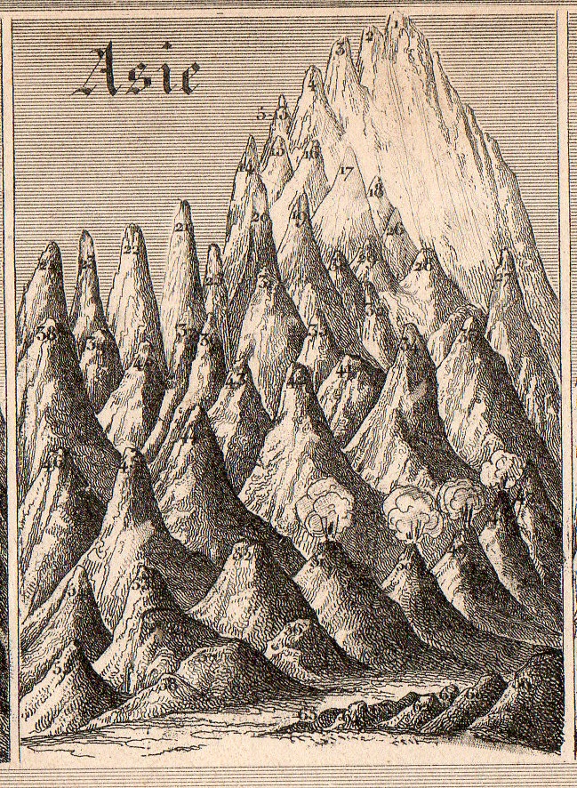
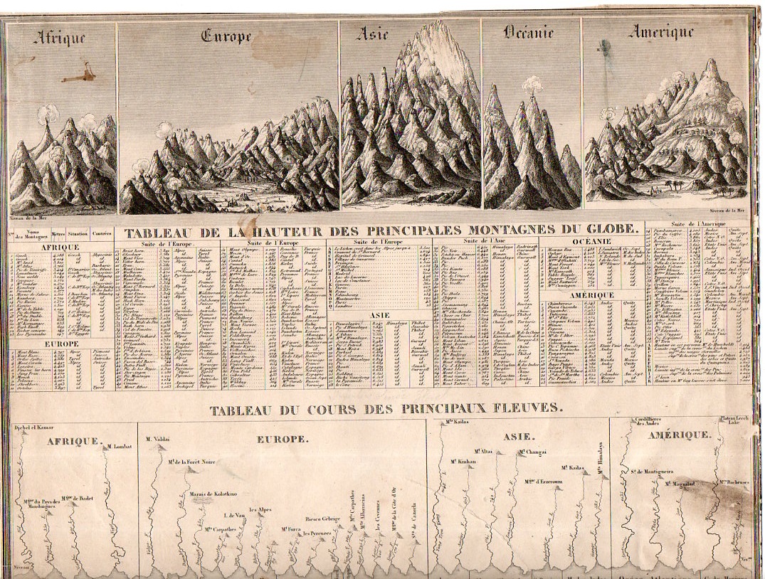
    Mountains small compact114[Small detail from the quantitative display, below; measures 2×2 3/4″.]

    • I wrote about this earlier on this blog but went back to it today to expand it a little and add to the illustrations–and to also place it in the for sale section of the blog. 

    Generally the dozens of maps/charts showing the comparative heights of mountains and lengths of rivers maps that have come through the store part of this blog have been somewhat large–or at least larger than the present example, which may be about the smallest (at about 11×8″) detailed representative of this genre that I have seen. 

    Mountains small compact113

    “Tableu de la Hauteur des Pricnipales Montagenes du Globe” was published in Guillemin’s Atlas universel de Geographie Ancienne et Moderne, and published by Langlume in 1845.  It is also at the beginning of the more-modern heyday for publishing maps and charts such as these.  (The practice began modestly at the end of the 18th century, came into a high tide in the 1850’s/1860’s or so, and then pretty much disappeared by the 1880’s.) 

     There’s a lot of comparatively-displayed information presented on 88 square inches, including the lengths of 30 rivers and the heights of about 500 mountain peaks distributed over Africa, Europe, Asia, Oceania, and the Americas.  And for as much imagery and data there is on this sheet, the whole is very nicely designed, a real success in the display of quantitative data.  


  • Big Paper History: 1806 Chronology of the Years 14-1800

    JF Ptak Science Books Post 2478

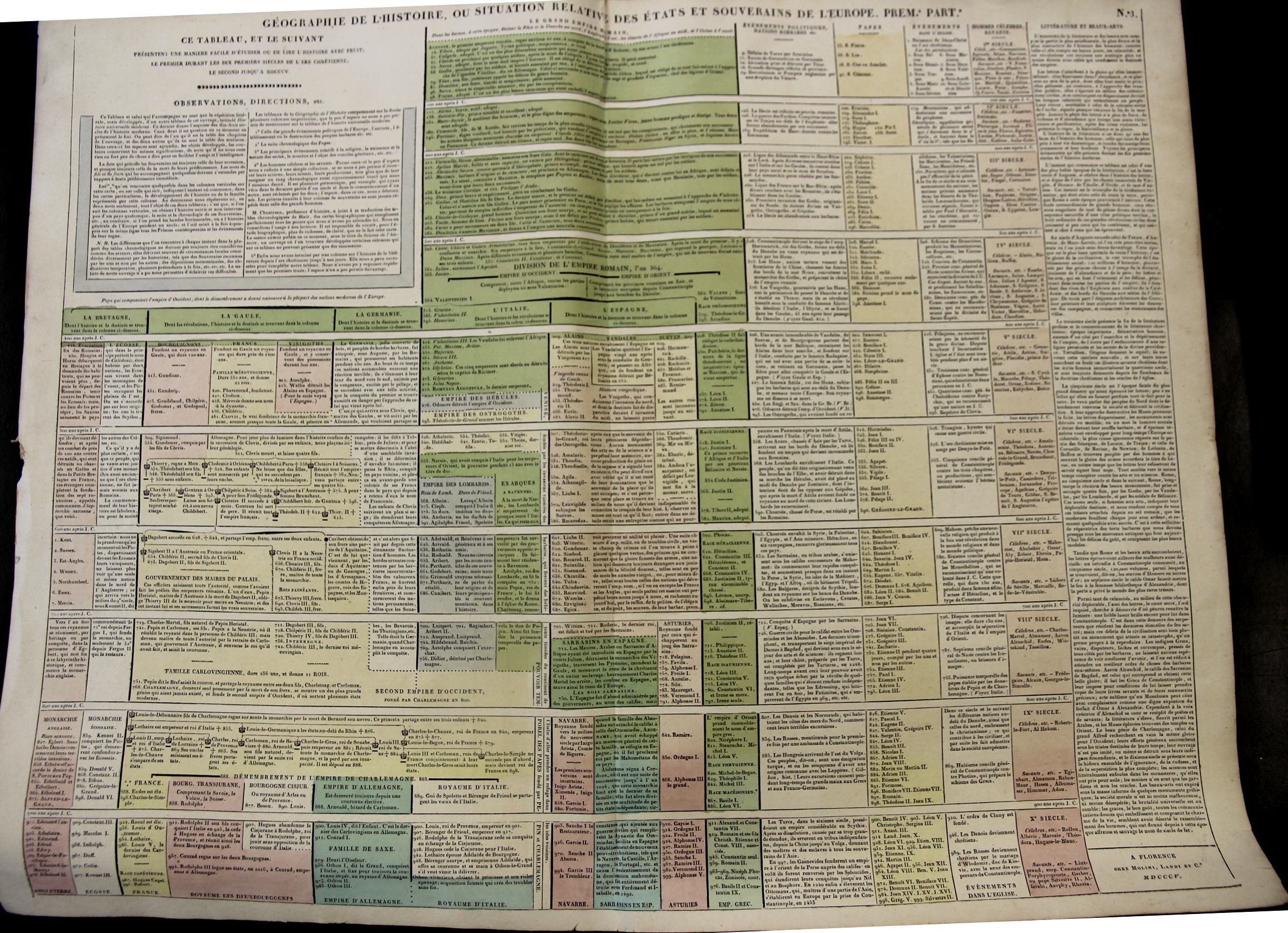
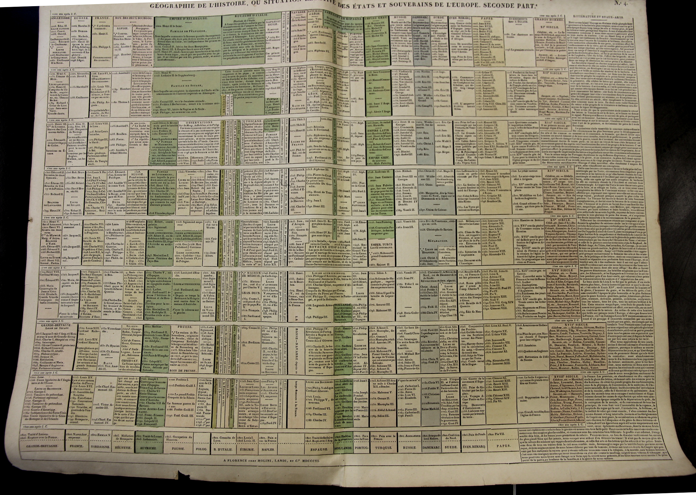
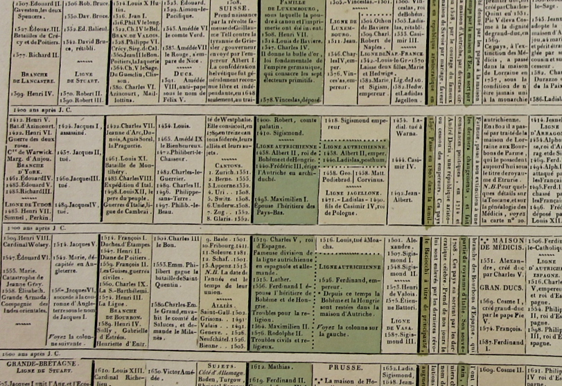
    Starting at the year 14 (ACE) with the reign of Augustus Caesar this large two-sheet chronology organizes the rulers of the Western world so far as it was known into the early 19th century. (“Geographie de l’Histoire. ou Situation Relative des Etats et Souverains de l’Europe (in two parts), published by Molini and Landi, in Florence, in 1806.) There are 15 major divisions from the year 400-1800, with a short bit at the top of the first chart covering the previous 386 years or so.  The columns show the rulers of reach century for Britain, France, Germany, Italy, Spain  (then subdividing as necessary). There is one column for the “nations barbares” that covers everyone else in about 2″ per century; there is another column for the chronology of Popes; one column for a general history of the Christian church, one column for celebrated and famous people, and then a final column for literature and the arts. 

    Maps_Chronology_LeSage_1_

    • You can own these!  Check them out on the blog’s bookstore, here. 

    At the very least the chart helps you keep your rulers straight, so to speak–it is also the sort of engaging display of data that if it was hanging up and accessible that people would read it all the time in passing. 

    The sheets are large (27×21″ or 68x53cm, and combined (as I have done in the past) they make a very imposing display 42×27″ (106x68cm).  The coloring (except for the odd darkish green) is fairly subtle but evident and useful in distinguishing the blocks of data at an easy glance. 

    Maps_Chronology_LeSage_2

    I’ a big fan of this sort of arrangement and display of data, trying as I used to in graduate school (and still do now) to fit the appropriate memory triggers on any given subject onto one sheet of 8.5×11″ paper.  It is a highly useful memory exercise, creating your own memory palace. 

    Maps_Chronology_LeSage_3

    These charts appear in A. Le Sage (Comte de La-Casas) Atlas historique chronologique et géographique ou Tableau général de l histoire universelle présentant un moyen sûr et facile de classer avec fruit tout ce qui s est passé depuis la création jusqu à Jésus Christ espace de 4004 ans….


  • The Long and Short and Low and High of Rivers and Mountains, 1862

    JF Ptak Science Books   Quick Post

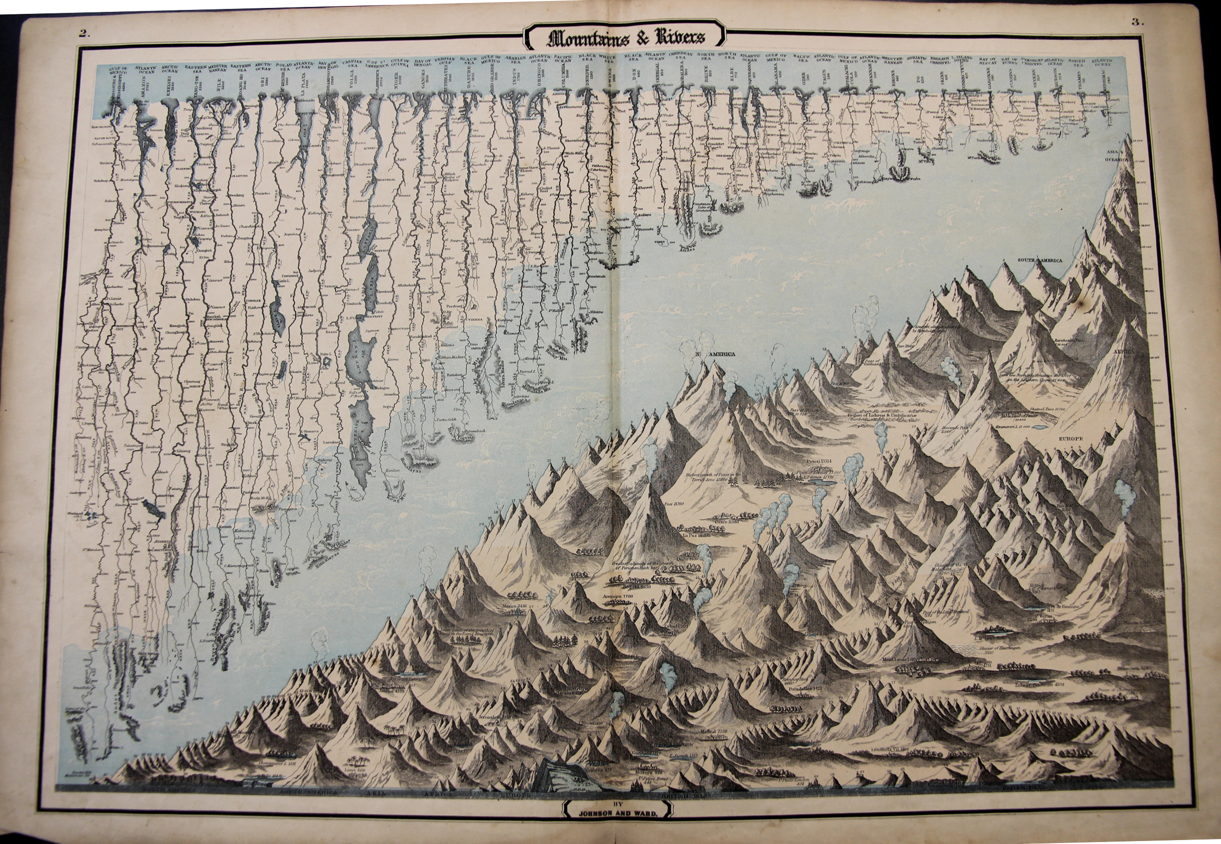
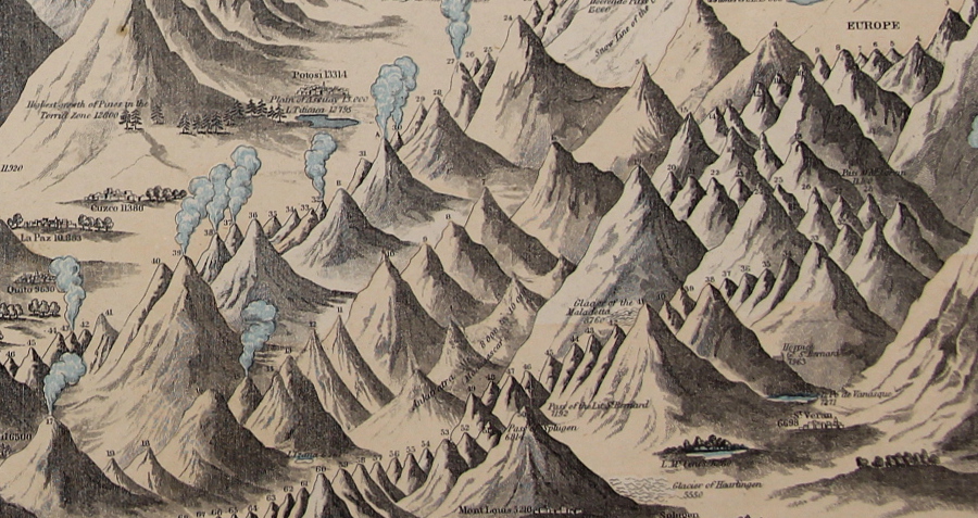
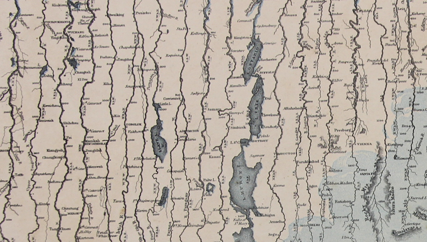
    This map may be simply named (“Mountains & Rivers”) but the information it displays is hardly so. As a matter of fact there are probably a thousand data points in this flowing, pleasingly-design comparative display of information–and the closer you look, the more there is. 

    Mountains and Rivers 1862

    In the mountains section there are hundreds of pieces of data locating the elevations at which cities and towns are found, and the altitudes of the extent of different types of trees, and of course the comparative heights of enumerated mountains set off by the continents.  Above the mountains floats the fantastic display of the lengths of rivers, listing 43 in all, showing cities at the various stages of each river’s progress. 

    It really is a glorious thing.

    Mountains and Rivers 1862 detail

    “Maps & Rivers” was printed and published by Johnson & Ward in 1862 and appeared in Johnson’s New Illustrated Family Atlas; there is at least one earlier version that appeared in 1856 with a different background and with ornate Celtic-inspired borders, though I prefer this version with the simple border and the full blue-sky-and-clouds background.  For my experience this is one of the richest of the genre published in the mid/late 19th century.

    • The original map is available for sale at the blog’s bookstore, here. 
    • Mountains and Rivers 1862 detail rivers