A Daily History of Holes, Dots, Lines, Science, History, Math, Physics, Art, the Unintentional Absurd, Architecture, Maps, Data Visualization, Blank and Missing Things, and so on. |1.6 million words, 7500 images, 4.9 million hits| Press & appearances in The Times, Le Figaro, Mensa, The Economist, The Guardian, Discovery News, Slate, Le Monde, Sci American Blogs, Le Pont, and many other places… 5000+ total posts since 2008.

Category: Information, Quantitative Display of

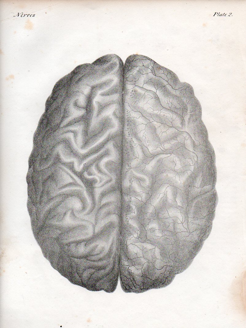
  • Paper Dissections of the Brain I, ca. 1876

    JF Ptak Science Books  

    These images are brought to us by the Irish-born Quain brothers:  Jones Quain (1796-1865) who was  an anatomist and professor of Anatomy and Physiology at the University of London; and Richard Quain (1800-1887), a professor of anatomy from 1832-on at the University of London, then surgeon at North London Hospital, and president of the Royal College of Surgeons. The illustrations are from a later (ca. 1850’s) and smaller printing of their beautiful 1844 work The Anatomy of the Arteries of the Human Body, with its Applications to Pathology and Operative Surgery, in Lithographic Drawings with Practical Commentaries.

    • The original lithographs of these images can be purchased at the blog’s bookstore. 

    Brain521


  • Phases of Saturn, Big and Small (1851)

    JF Ptak Science Books   Quick Post   Part of the Zoomology series

    Saturn BIG multiples_sun saturn

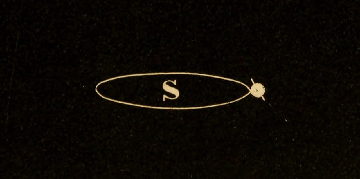
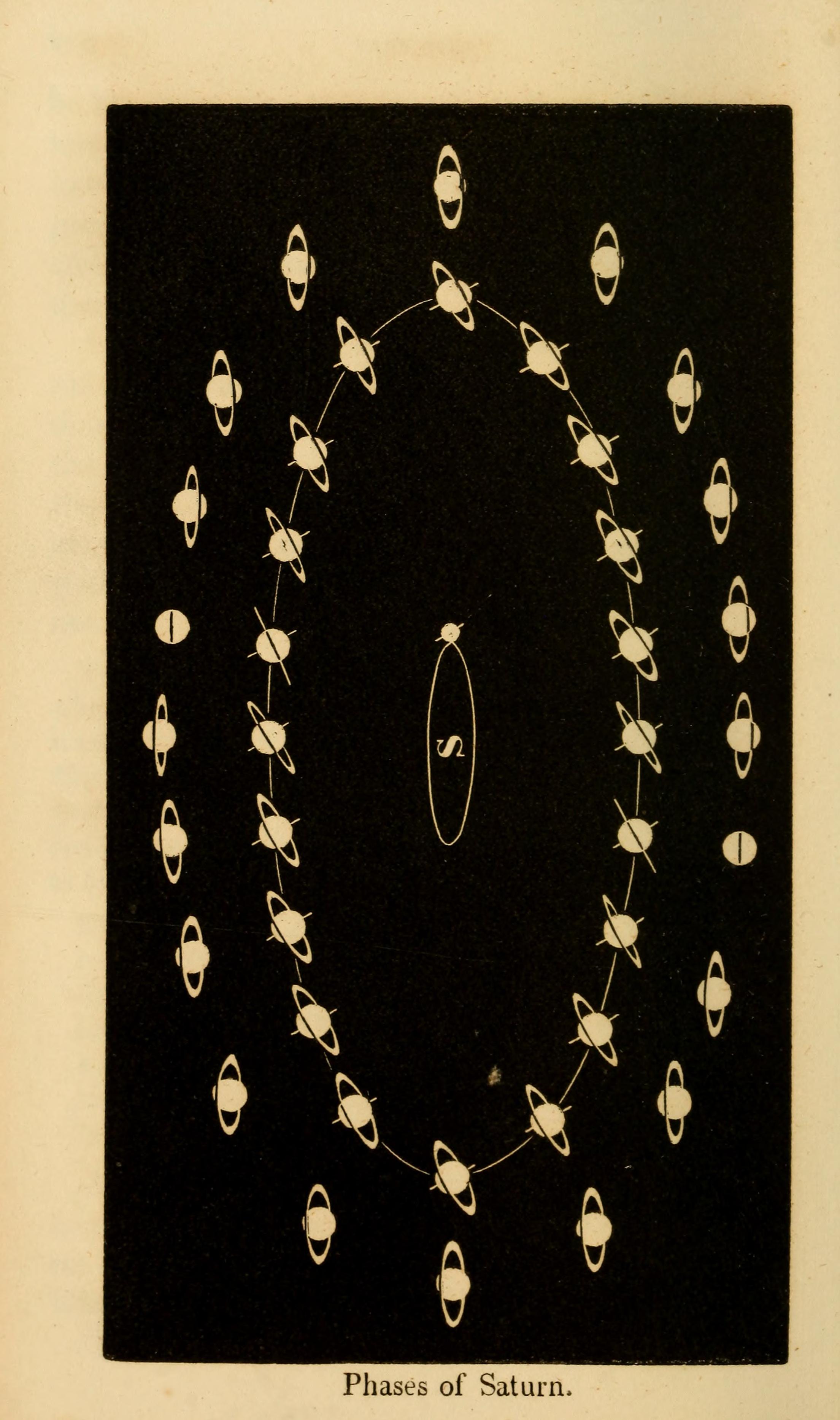
    I’ve had a bit of fun with my “paper microscope” on this beautiful engraving of the phases of Saturn.  It is enormously captivating in it full glory, but there’s so much more in it, a huge variety of single and multiple images of captivating energy–almost everywhere within the image is another image, and so on, turtles all the way down.  

    The full image:

    Saturn BIG multiples

    The engraving is from E.O. Kendall Uranography, published in 1850, and an excellent high-def deeply zoomable copy is located at the Internet Archive, here. 

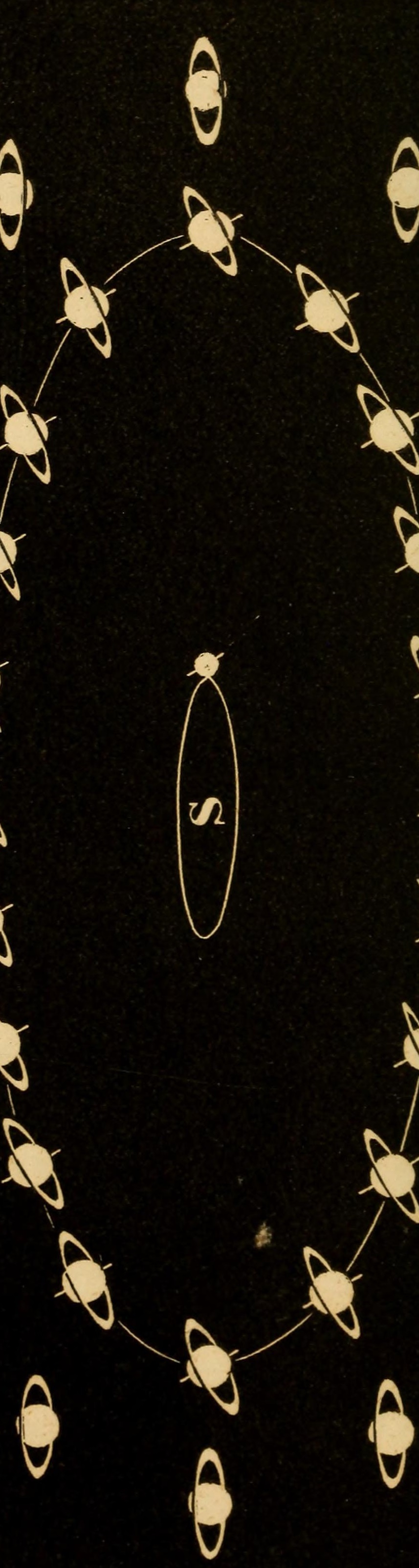
    And another selection:

    Saturn BIG multiples_long vert

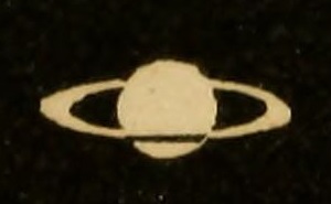
    There’s much that can be done with this piece of art–in this example we just have a close-up of the original image which is only a few millimeters wide…

    Saturn BIG multiples_tiny Saturn


  • The U.S. and Not Wanting to Go to War, 1939 & 1940

    JF Ptak Science Books   Post 2450

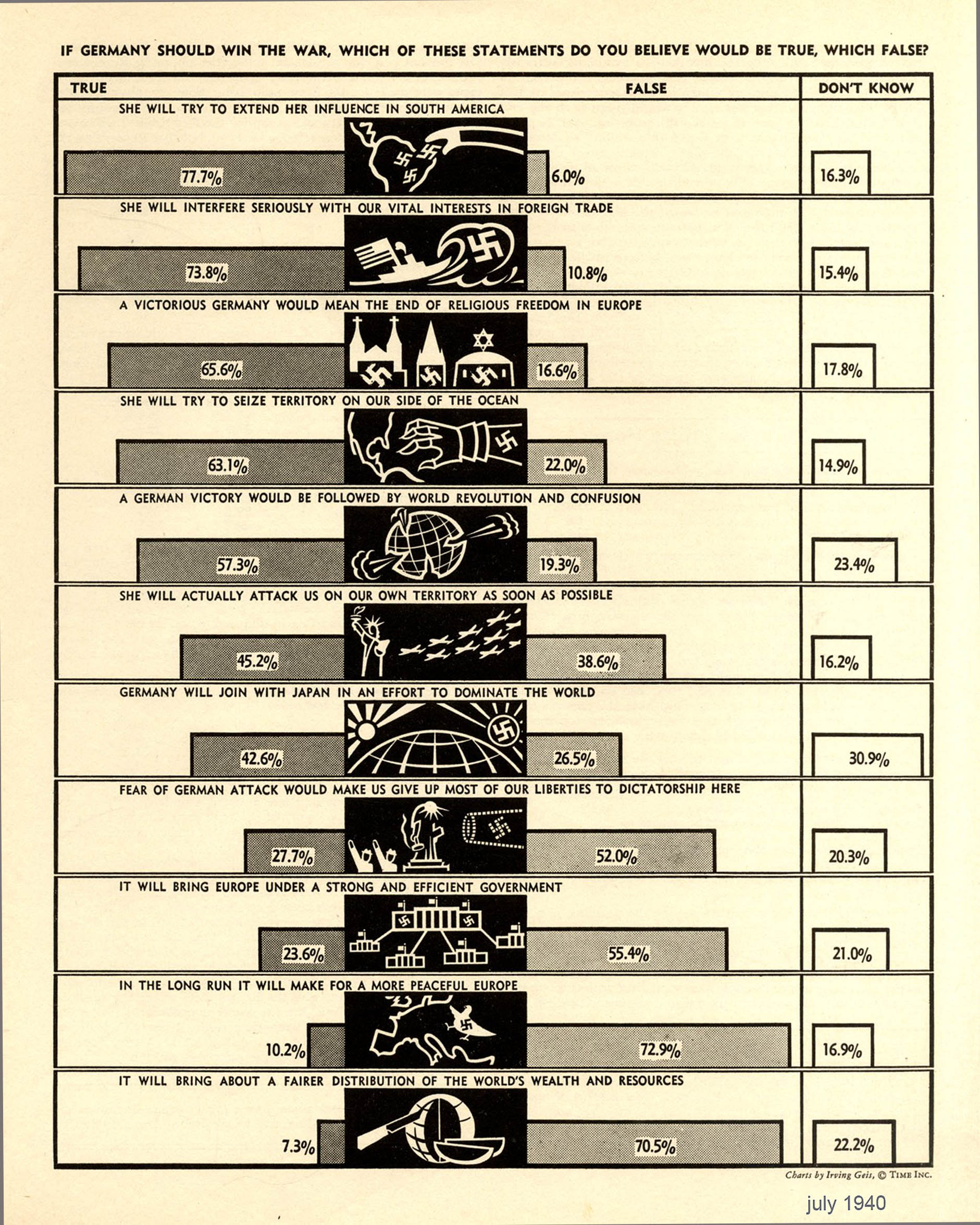
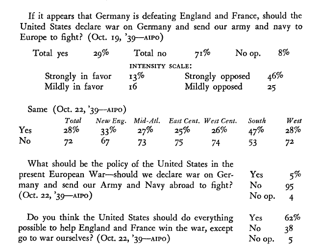
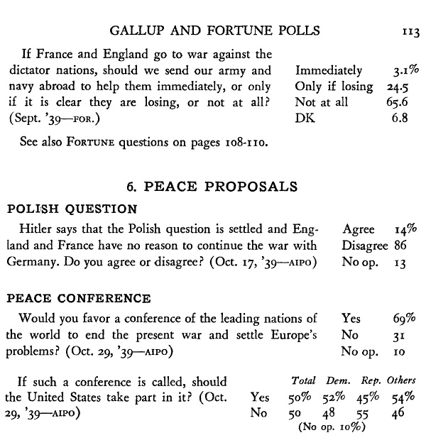
    I found this interesting display of data on opinions of people in the United States regarding the war in Europe in 1939.  The information is fascinating–and combined with further samples from opinion polls included below, contribute to showing the deep opinion that the United States stay out of the war, even to extremes. Everyone probably knows that the U.S. wanted to avoid the war, and to have the European War stay in Europe, and that there were many odd right-wing groups with famous/infamous leaders leading the way to isolation and self-interest, and that the general implications for the U.S.of an overseas war was more economic concern than anything else, but looking at the numbers in representations like those below it is still surprising to see how wide and deep those feelings were.  It can certainly give a greater insight into the problems that Roosevelt faced even with trying to supply war goods to Great Britain.  

    First, the original chart:
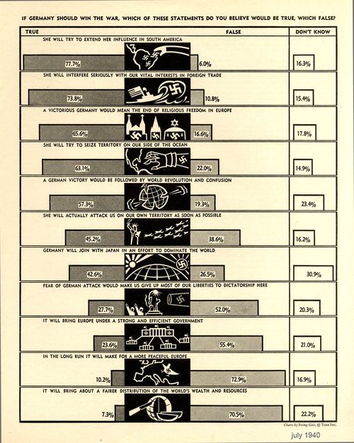
    Poll if germany shoul dwin war

    The source for this graphic is the excellent site,Visual Loop (http://visualoop.com/blog/17696/vintage-infodesign-56), who has provided an extended reference for more of  Irving Geis’ (1908-1997) highly stylized and interesting work (via Visual Loop at http://www.fulltable.com/VTS/f/fortune/diag/b.htm). Geis might be recognizable to some as a long-time illustrator for Scientific American among many other journals, and also for the semi-famous How to Lie with Statistics, which was published in 1954.

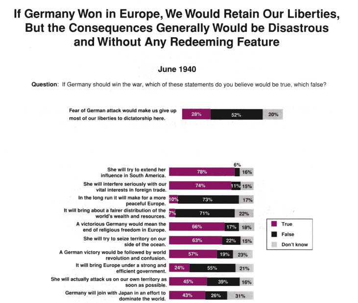
    A similar source of data is found at the Roper Center UConn, with a ton of interesting bits in it, though it does not describe the source of the data. (This article was published in Public Perspective, Dec/January 1998.) One lead led me to this article (below) on the Gallup Fortune Public Opinion Poll in the Public Opinion Quarterly for December 1940, and it may have provided some of the data for the infographic, but I haven’t yet read in closely.

    Here is an interesting sample from Roper:
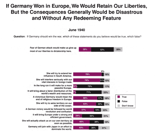
    Poll if germany won 1940
     In any event the Public Opinion Quarterly (“Gallup and Fortune Polls” Vol. 4, No. 1, March 1940 pp. 83-115) piece is interesting on its own, and I’ll no doubt return to it, though tonight I’m just interested in a few bits.
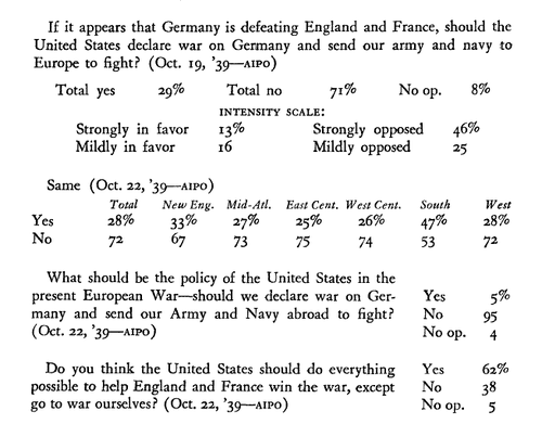
    Data should u.s. fight

    [Gallup and Fortune Polls The Public Opinion Quarterly Vol. 4, No. 1 (Mar., 1940), pp. 83-115]
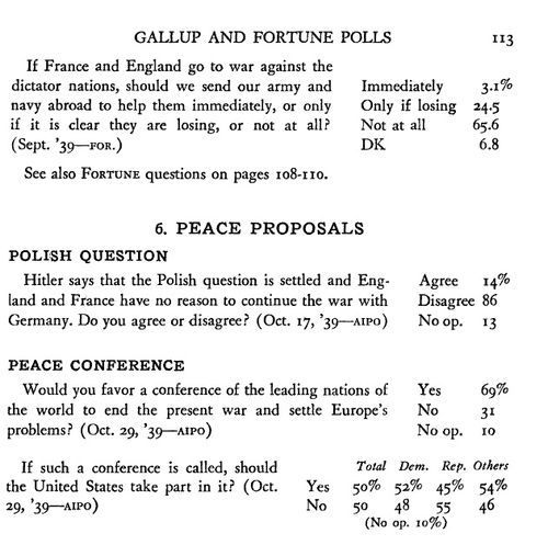
    Data war and peace

    I’ll come back to this in a bit–for now I would just like to post the links.  

  • A Not-Beautiful Confusion (1912)

    JF Ptak Science Books   Quick Post

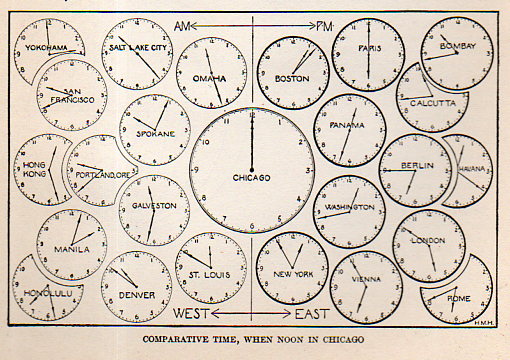
    In an earlier post on this blog (A Beautiful Confusion) I wrote about some lovely engravings that attempted to sort out time difference and distance before the adoption of Standard Time. The idea was a little awkward and must have been vexing for folks running the railroads, but the notion of time difference was generally prettily and elegantly portrayed.  

    I’m including an example of these images that doesn’t work and seems intellectually jiggly to me–it is fairly obscure and meant to clue in schoolkids to the practice of time difference from palce-to-place, and found in The New Practical Reference Library (1912).  

    This isn’t a terrible thing–it just isn’t that well done, especially in comparison to the lovely images found in that earlier post.  

    Time013


  • Comparative Lengths of Rivers, in Black & White (1875)

    JF Ptak Science Books Quick Post

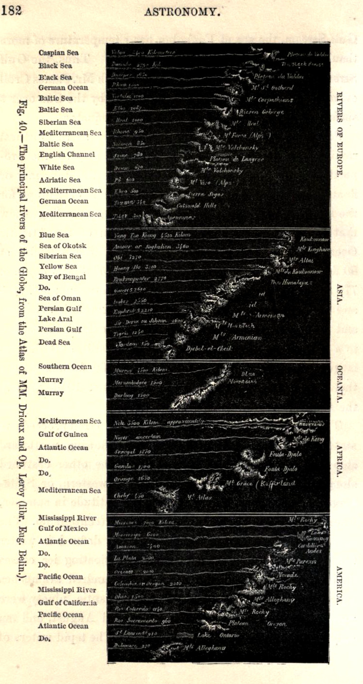
    There have been a number of posts on this blog concerning 19th century comparative tables of river lengths, mountain heights, lake sizes, and so on.  The example below is an odd one, found deep in Jean Pierre Ranbosson’s Astronomy, published in London in 1875,–a funny little chart on the comparative lengths of rivers, very unusual in that it is printed white-on-black. 

    River length


  • Visualizing Physics for the 6th Grade, 1912

    JF Ptak Science Books   Quick Post 

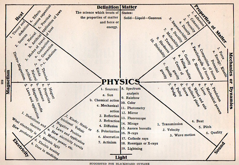
    This outline appeared n The New Practical Reference Library, Educator Volume, an Invaluable Aid to the Student...volume VI, and printed in Chicago in 1912.  What is interesting is not so much the outline itself, but the expectation that this was being used in 6th grade classrooms.  So, while the diagrammatic representation of physics is not so impressive, the intended age of its audience is.  

    PHYSICS CHART012


  • The Four Seasons in Beautiful Astronomical Detail, 1851

    JF Ptak Science Books  Post 2449  

    • The original print is available from the blog’s bookstore, here.

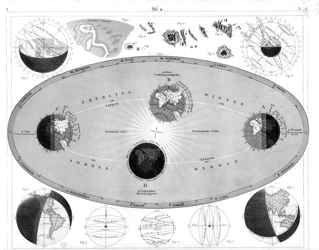
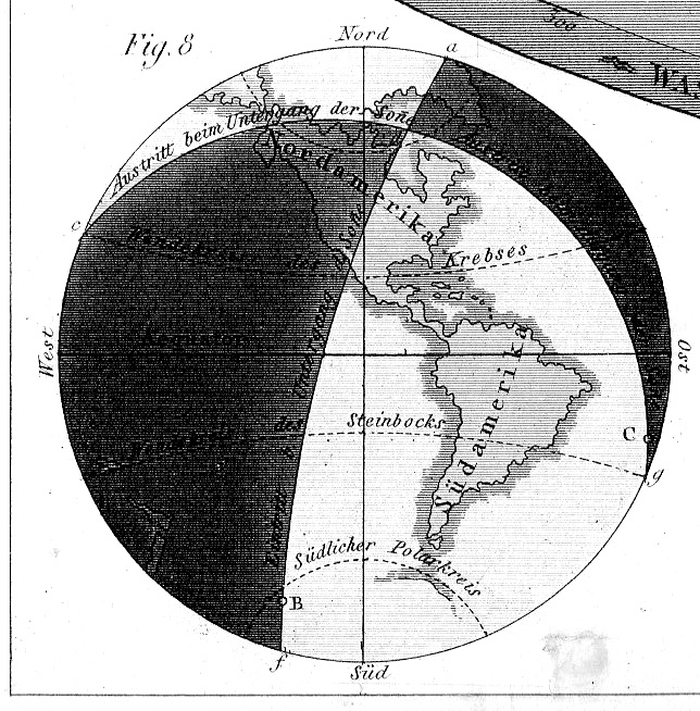
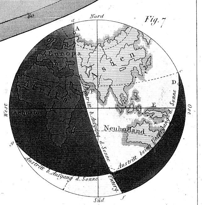
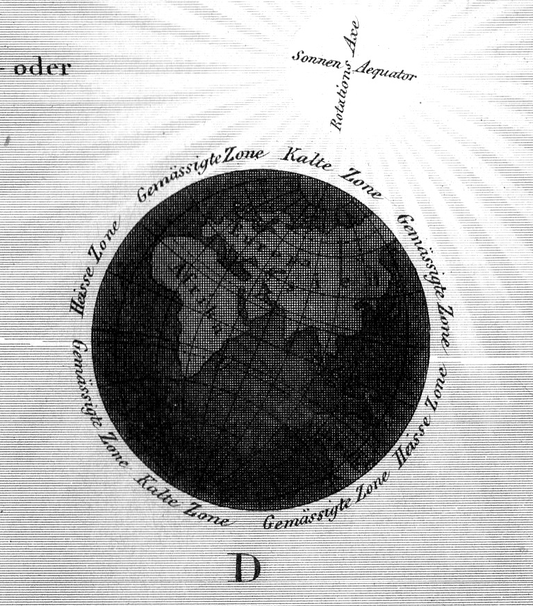
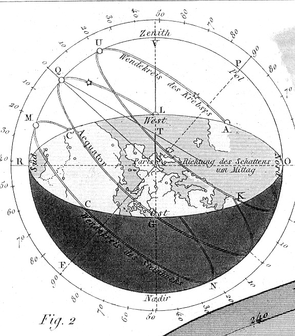
    J.G. Heck wrote and compiled a fascinating and complex work entitled The Iconographic Encyclopedia of Science, Literature and Art, which was published in the United States for the first time in 1851 following Spencer Baird’s translation from its original German. The artwork is detailed, and deep, fantastically controlled, and very instructive

    Eclipses heck941

    The key to his work is the amount of data displayed on each of the 500 engraved plates illustrating this work and the way in which it is arranged.  The design and layout of the 30,000 items on these 500 plates was a work of genius, and for my money it is easily the best-presented complex means of the display of data and objects that was published in the 19th century.  

    For example, in the plate above is displayed the progression of the seasons. It is a beautiful work–the original measuring about 12×9″–with great detail in the inset globes, which measure in the original only about 1.5:” in diameter.  It is an excellent work of exactness and shading.  

    The details:


    Eclipses heck942

    Eclipses heck943

    Eclipses heck944

    Eclipses heck945


  • What They Wore: the U.S. Soldier, May 1941

    JF Ptak Science Books  Quick Post

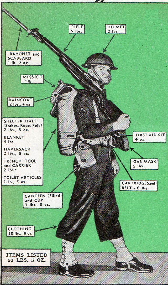
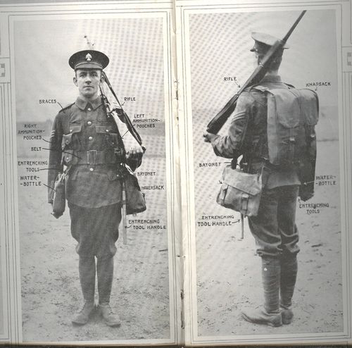
    Earlier in blog I wrote a post (“Things They Took to War, 1915“) about what the soldiers of the U.K. carried into battle.  In many ways it was inspirational and heartbreaking to see what there soldiers marched off with to meet their fate.  I’ve stumbled into another visual record like this, though this time for the U.S. just before our involvement in WWII, appearing in the July 1941 issue of Popular Mechanics.  

    WWII SOLDIER GEAR993

    I reckon that this soldier weighs 148 pounds. which means that his gear amounted to about a third of his body weight.  I suspect that one of the first things these soldiers learned was what they actually needed to carry, and how to make whatever that was to be quiet and non-reflective. Of course this gear would change in about six months, and change again shortly after that.  

    • For example this private was using the M1917 helmet, which would within months be replaced by the steel M-1 helmet–over 22 million of these helmets would be made by September 1945.
    • That’s a lot of helmets. End-to-end in a line they’d stretch from NYC to L.A. and halfway back. On the other hand that number represents about 1/3 of the total war dead in WWII.  

    The outfitted solider of the British Army, 1915:

    Blog jan 30 infantry center btm

     (“Things They Took to War, 1915“) 


  • Superior, Tiny, Mountain Height Profile Insets, 1856

    JF Ptak Science Books  Post 2446

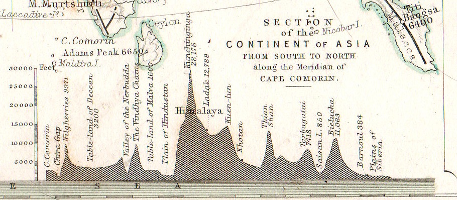
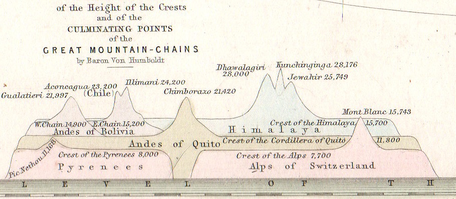
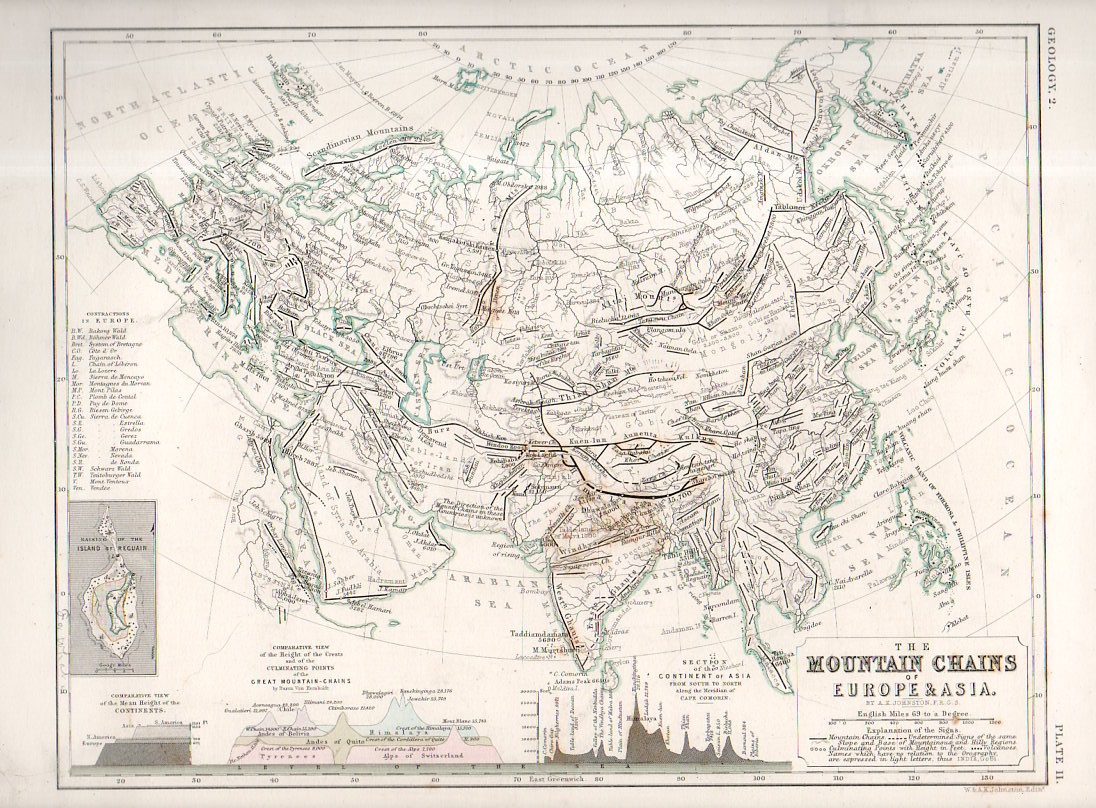
    One of the favorite parts of map reading–especially for 19th century maps–is finding the small, add-on gems of represented data clinging to the sides of the main map, along the margins and in the corners.  Although this map by W. and A.K. Johnstons in itself a fine work of art  and displays some knotty and previously hard-to-com-by data, the two bits at teh bottom of the map just give the overall project a deep lustre.    Alexander Keith Johnston (1804 – 1871) came to this task via the suggestion of Alexander von Humboldt, the results of his own phenomenal research and exploration finding their way into Johnston’s atlas.   

    • The original map may be purchased via our blog bookstore, here.

    Geological mountain ranges934

    This version of “The Mountain Chains of Europe and Asia” is found in the second edition of the Johnston’s The Physical Atlas – A series of maps & illustrations of the Geographical Distribution of Natural Phenomena embracing I. Geology II. Hydrography III. Meteorology IV. Natural History, published in 1856 (following the first edition of 1850).  

    Geological mountain ranges935

    Each of the small inset measures about 1″x1.5″ in the detail of the following:

    Geological mountain ranges933

    Notes:

    Some contemporary notices on the Johnston Atlas: 

    “For the first time, in this country, the principles of graphic representation are here applied to the delineation of the most important facts of external phenomena. Simple but significant symbolical signs have been introduced to an extent, and with an effect, hitherto never contemplated. The contents of the many volumes, formerly the sole depositories of information regarding the different kingdoms of nature, have been condensed and reproduced with a conciseness, precision, completeness, and promptitude of application altogether unattainable by any other agency.”–from a longer description for the atlas found at Chest of Books, here.  

    “This splendid volume will fill a void long felt in this country, where no work has been attainable presenting the results of the important science of Physical Geography in a distinct and tangible form. “–Forgotten Books (here)


  • Bumping into the Invisible: the Coolidge Tube, 1911

    JF Ptak Science Books   Post 2463

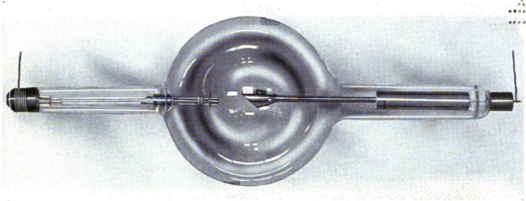
    I’ve bumped into another issue of the Physical Review (December 1911, pp 409-430, volume II (second series), #6) with the important William D. Coolidge  paper, “A Powerful Roentgen Ray Tube With a Pure Electron Discharge”.

    A decade-and-a-half after Wilhelm Roentgen’s discovery of x-rays (an epochal paper published at the tail end of 1895) this is the first appearance of what we think of as the modern X-Ray tube–a design that would be used for decades to come, and which provided clear and more accurate that had been seen, in a way opening this world up, well, exponentially. It is a very significant contribution to the history of science, and it was cool to find it again by chance.

    Coolidge_xray_tube[Source: Wikipedia, showing the Coolidge tube ca. 1917.]