A Daily History of Holes, Dots, Lines, Science, History, Math, Physics, Art, the Unintentional Absurd, Architecture, Maps, Data Visualization, Blank and Missing Things, and so on. |1.6 million words, 7500 images, 4.9 million hits| Press & appearances in The Times, Le Figaro, Mensa, The Economist, The Guardian, Discovery News, Slate, Le Monde, Sci American Blogs, Le Pont, and many other places… 5000+ total posts since 2008.

Category: History of the Future

  • A Note on the History of Not-Straight Pre-Telephone Poles

    JF Ptak Science Books    Post 1914

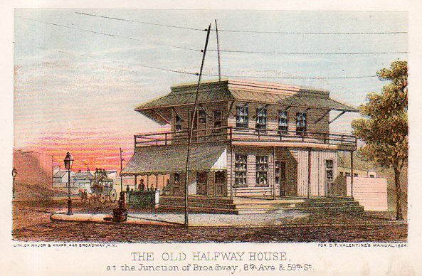
    This is one of those images in search of a story, and as it turns out the story is actually pretty long and involved. The image is this fantastic lithograph from Valentine’s Manual of the City of New York (a sort of annual review/directory of the city that ran on-and-on from the 1850’s to the 1920’s), this one being from the 1868 edition.
    Telephone poles865

    It also is a very stark reminder about how we still deliver power and communication in the United States, still via insulated wires strung along cross beams on what are mostly dead trees–pretty much the way the business has been done for he last 160 year.s  That the backbone of the American energy and communication grid is still transferred on wire/cable strung over the street and exposed to everything on cultivated and treated sticks from the forest is an irony that we live under every day, and that beginning with telegraph poles.

    That said, I like this image because the pole n the picture is so curved.  Perhaps it was the way the tree was; perhaps it was rendered that way when it was treated with creosote. I don’t know.  But the folks at Valentines liked it, otherwise they could have ignored its crookedness or used another angle on depicting the Old Halfway House.

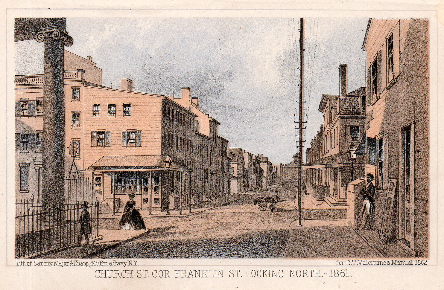
    Judging from many other examples, it seems that the artists at Valentines had a taste for the subtle and obscure.  There are plenty of cases of the depiction of the quietly uncommon, as with another unusual image, showing Church street looking north and showing a long line of telegraph poles, all of which are squarely behind the other so that only the initial pole is visible, though you can see the cross-beams and insulators of the others, the brace getting “lower” and “smaller” behind the first pole.  It is just extremely uncommon (in my experience) to see a long line of anything depicted in this way.
    Telephone poles866

    The artists/lithographers at The Manual seemed to enjoy their work.  For example, in the above image in addition to teh lined-up telegraph poles we have some other very uncommon small elements. No doubt the view was true–which was the intent of the book, to accurately portray the city–but the small elements were creative, quiet and incisive.  Perhaps it is also just exactly what the artist saw when the view was made.  For example, the woman
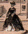
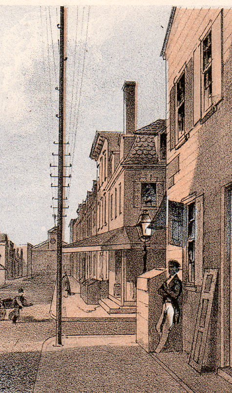
    Telephone poles skirtcrossing the street us stepping up on the curb and raising her skirts slightly–it would’ve been easier to just have her standing there, as with the gentleman immediately in front of her, but for some (creative) reason she is shown in an unusual pose.  Ditto the guy leaning against the building at right–he’s out of proportion with the other two figures, unless he was a giant, but he’s just, well, leaning there.  He’s also standing next to a shutter, which is down and also leaning against the building.  A peddler makes his/her way across the street in the background with a large cart. And the windows in the buildings are unequally decorated, with interior window dressings at different stages of being drawn and not, and with different treatment, and in different states of repair. In short, the image is really a snapshot.
    Telephone poles867
    I imagine that somewhere here in this country there could still original telegraph poles standing–the originals started out generally as chestnut, and then force treated with creosote, and were intended to stand for 50 to 100 years. Under favorable conditions in which they were just simply not replaced, it is conceivable that some could have lasted for 150 years. 


  • Sequential Illustration and the Seven Stage Rule of Human Decay

     JF Ptak Science Books       Post 1910

    Among graduated indicators the semi-physical allocations of measurable units time must be the most significant–or at least in modern times, over the last few hundreds years, when the popular class was able to afford time-keeping devices so that they could have a greater appreciation and control over time past and future.  Simplified articulations of long periods of time is generally not a topic of illustration, however–art and illustration showing the development of a story is generally not a common occurrence in published form. 

    It is not terribly uncommon in ancient and early modern times, though.  Trajan’s Column is an excellent example of a sequential story, this told in stone; legends and myths and other stories are told in vases and friezes in Greece, and in various codices and altars in Mayan and Mixtec cultures. 

    But in more modern times the telling of the sequential stories in published form, again, is not a common thing.  Even the telling of the story of the development of, say, a tree or the  life cycle of a bird is just not a common occurrence, in spite of the more-popular appearance of graphical and expressive modes of displaying quantitative data in the mid-19th century. 

    http://www.internetmonk.com/wp-content/uploads/AdamAndEve_Garden_Lucas_Cranach.jpg

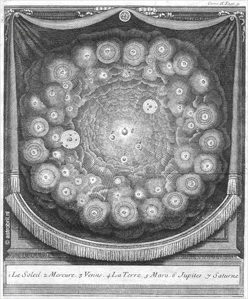
    Perhaps the most common of the early transitions in displaying these stories since the Renaissance have been in the telling of the lives of the Saints, or in the Passion of the Christ, or in the depiction of the legend of Adam and Eve (as in the work of Lucius Cranach, above).  There are interesting cycles showing the Christian mythic formulation of the creation of the world, as in the case of Thomas Burnet’s (illustrated title page to his)  Sacred History of the Earth  where there is a glorious seven-sphere display of the beginning and ending of our planet. 

    [Source, with full text, here.]

    I wonder though if one of the most popular and common sequential depictions of an important and shared story is that of the ages of man/people:  generally they show a pyramidal showcase of silhouettes or full-body portraits of one person as that body develops and decays over the major decades of a life.

    They would normally appear in a configuration like the following:

    File:The Stages of Life BM 1992 0125 31.jpg

    And earlier on, very famously, like so:

    File:Stages of Life by Bartholomeus Anglicus 1486.jpg

    (I’ve written about and identified these and other related depictions of the ages of man here.)

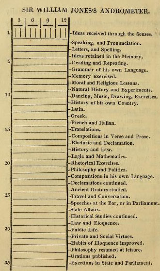
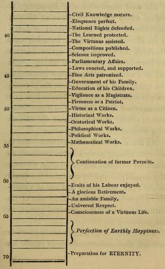
     I came to think about all of this again after reading an interesting post in the excellent Public Domain Review blog where I found this absolutely delightful “barometric” rendition of the stages of life, a sequential, top-to-bottom graphical display of the stages, but without illustration.  I cannot remember seeing such a “list” before, and was not familiar with the book from which it came (The art of invigorating and prolonging life, by food, clothes, air, exercise, wine, sleep, &c
    and peptic precepts, pointing out agreeable and
    effectual methods to prevent and relieve indigestion, and to regulate
    and strengthen the action of the stomach and bowels … : to which is
    added, the pleasure of making a will …

    which was printed in 1822 by Constable for Hurst/Robinson in London, the full text of which can be found at the Internet Archive). 

    Stages of life (a)

    Stages of life (b)

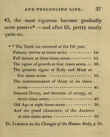
    And the “Rule of Seven” which precedes the longer list above:

    Stages of living rule of 7
    It is interesting to note that this was the fourth edition of this work, and that the end of the book, the very synopsis for ideas of full life and longevity, the whole is topped off by a chapter on happy-making and your personal will. 

    There were many admonishments that made and still make perfect sense found in these pages:  early to bed and early to rise sort of material.  Plain, but sensible.  Eating early. Dressing sensibly.  Eating (for the time) modestly. Interesting recipes. Pure air making for “a diverted mind”.  Good advice for the mature bookbuyers there in first quarter 19th-century England.  I imagine that most of those readers were no doubt born in the second-to-last decade of the 18th century, which means that their instructions on Daily Life business was from their parents who got their information from their parents, which means by 1822 much of the handed-down wisdom relating to diet and exercise was from the early 18th century.   Perhaps this work was the breath of fresh air that people needed, making it popular enough to find its was into at least four editions. (Also worth noting is that the average resting pulse rate for the readers of this book was said to be 60, which I think is lower than the American national average today.)

    There is of course a suffocating number of ill-advised recommendations, like for athletes, where the consumed foods should not include veal, lamb, pork, fish or cheese puddings, “or vegetables”, which leaves little room for anything besides red beef, which was to be had in quantities, including beef pudding, jellied beef, and “beef tea”. There was also a lot of beer and malt liquor drinking, with suggestions for “three pints of home-brewed” to be had with dinner, followed by three glasses of wine (‘the less, the better”)–then again, clean/drinkable water was a tough go at times, so beer was a common-enough stand-in.  All things being equal, the advice utilized whatever was the good data for the time. 

    The long list from birth to death of supposed and impending accomplishments is interesting particularly for the “decaying” part (which is outlined in the second chart) of life, where we find that at age 54 a person should be conducting their mathematical works, after which (from 55 to 60) one is relegated to pursuing “former works”.  (After all, the period of general decay according to the Rules of Seven chart begins at age 6×7.) And it is here that the creative life ends, because from this point to the preparation for eternity the life is spent enjoying one’s earthly works.

    In any event, I just wanted to point out the unusual nature of the “William Jones’ Andrometer”, which is a display of information that is outside my usual experience. 

    Note:

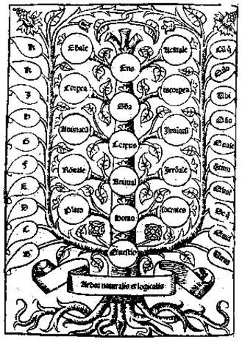
    I briefly considered including “logic trees” in this description, as they do tell a story, in a way.  ParticPorphyrysularly
    Porphyry’s Tree came to mind (which was a classification in diagrammatic form on different kinds of being) and then Pacioloi’s summary of ratios from his Summa de arithmetica (1494). They do certainly represent a structured depiction of thought, but they are not a narrative, though they would provide the structure for one. Anyway, I’m convinced tonight at least that these diagrams don’t belong in the sequential illustration discussion.  (And in a weird way these diagrams enter the modern conversation so far as their overuse is concerned. Even in the Middle Ages the idea of the logic tree was being so over- and mis-employed that they would remind the modern reader of the “Top 15 (or whatever number) Photographs of Butterflies (and again, whatever he counted thing might be).)


  • Robot Roundup: Edenless Eve (1927) & the Great Texas Robot (1936)

    JF Ptak Science Books  Post 1909

    Robot tx820

    [Image source: Popular Mechanics, September 1936, page 400.]

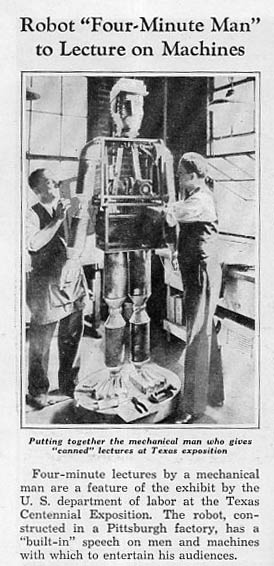
    Robots, or mechanical beings, or mechanized forms of humanity or from the animal kingdom have been around in popular literature for many decades by the time this giant robot appeared in Texas in 19361. (The idea is old though the name “robot” didn’t appear until Karel Capek invented it for his book on the future called R.U.R in 1920.  Actually the human-like forms created by Capek in this early scifi work were biotech, and not fully mechanized.) The form of the robot stretches back hundreds of years, in a way–if not the exactly the idea of a robot, but at least with the appearance of one.

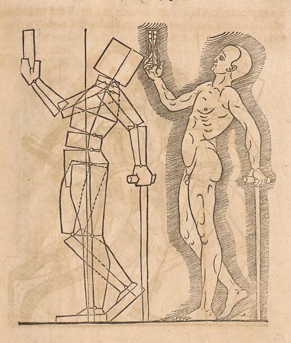
    Such is the case with Albrecht Durer’s (1471-1528) revolutionary drawing of a geometrical man, compartmentalizing the bodyd into distinct chunks–these and other woodcuts appeared in his Symmetria partium…humanorum corporum and must have been an amazing, startling site for the new reader to such things in 1537.To me this looks like visionary thinking in trying to understand the motions of living beings with no actual way of capturing the image in motion. 

    Perspectiva (Lautensack) 1564 e

    [This and many other images from the fabulous Bibliodyssey website, here.]

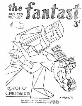
    All of which are retro-reminiscent of early robots, like this from The Fantast in 1939:

    Robot durer[Image source: the wonderful Cybernetic Zoo website, with loads of images and timelines, here.]

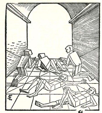
    Seven years late in Nuremberg Erhard Schoen published Unnderweissung der proportzion unnd stellung der possen, liegent und stehent…, which  followed Durer showing that the human form was reducible to connected but discrete Euclidean solids:

    Blogmissing_peopl_2e077_2


  • Out-of-Place Department: the Moon as Debris Ring Around the Earth

    JF Ptak Science Books   Quick Post

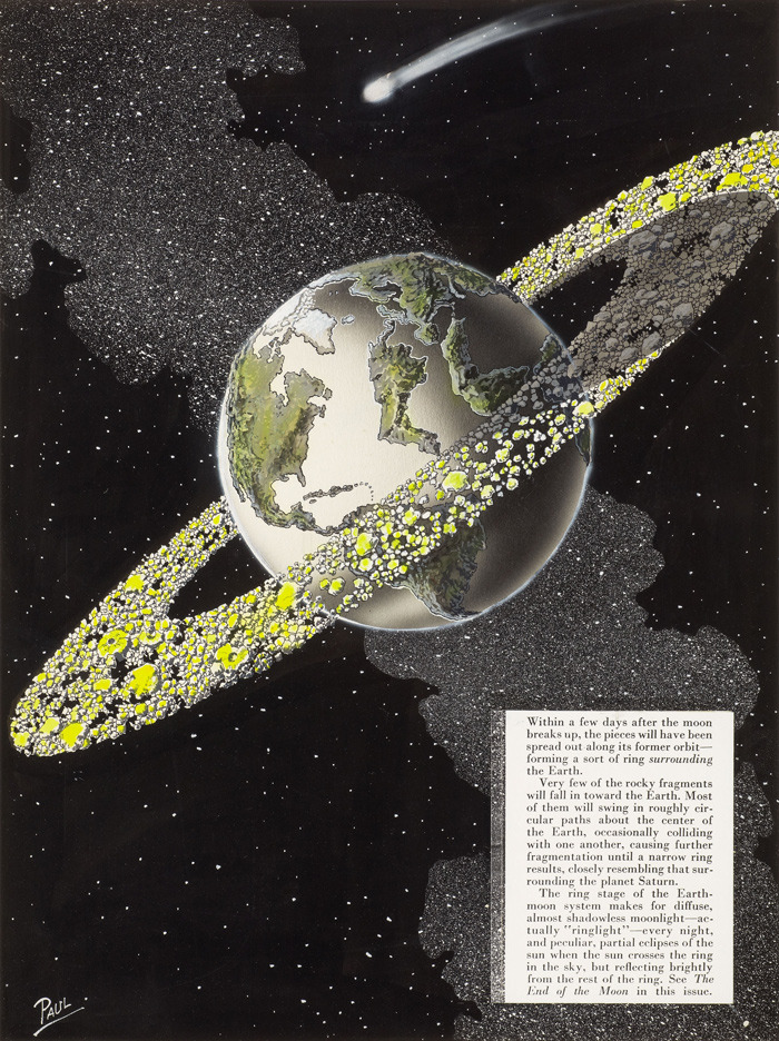
    Moon gone earth belt
    [Source: 50watts.com, “Tetrahedra in Space”, Frank R. Paul series, here.]

    See also an earlier post, “Things out of Place Department: the Moon”, here.

    This is certainly the work of a delightful and bouncing imagination, more so with the illustration by the great Frank R. Paul.  The image is found on the back cover of  the August 1953 issue of Science Fiction Plus for the short story “The End of the Moon”.   And what we see–at least from the artwork as I cannot find an online version of the text–is a not-convincing result of the Moon going away.  I’m not an historian of the idea of the vanishing Moon and how early writers have imagined it ailing/disappearing/exploding/imploding, though I’m fairly well sure that the scifi wasn’t keeping up with the 1953 science of it all, at least with what I can see and understand.

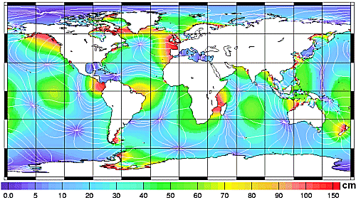
    If there was no Moon.  What if the Moon never existed? What if the Moon existed but vanished?  I guess it would all depend on what exactly happened to the Moon to figure out the disposition of its remaining assets.  The Moon removed certainly would effect changes in the tides, though I think not in the way depicted above. There would substantial changes  though I think not enough to cause a new continent to rise out of the middle of the Atlantic, or to flood all of northeastern Africa.  “If  We Had No Moon”, an essay by Bernard Foing in Astrobiology Magazine, here, provides an interesting tidal change map (below) which shows a projection of the main hotbeds of tidal change. 

    Since I have no access to the text of the scifi article I don’t know if the story addressed changes to the weather and migratory patterns of animals in response to tidal changes, or what happens to large coastal cities, or the influence of a more volatile seasonal change, or changes to the Earth’s orbital parameters, and so on.

    Its the “and so on” part that is the most interesting left-out bit.

    Bottom line here is that I just like the great cover art for the story

    
    Moon gone map of tidal changes

    Another interesting article from ScienceNordic, here.


  • New York City Under Attack–Additional Images

    JF Ptak Science Books   Quick Post

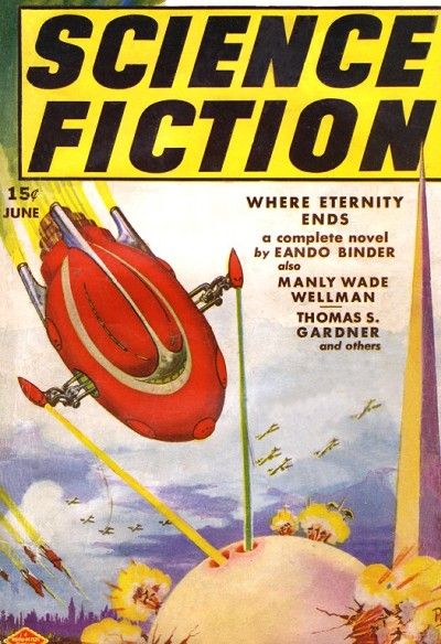
    New york city attacked
    The Binder brothers (Earl Andrew [1904-1965] and Otto Oscar [1911-1975] under the pseudonym Eando Binder (E and O Binder) wrote “Where Eternity Ends”, a story which appeared in the June 1939 issue of Science Fiction magazine. The cover illustration was by the great Frank R. Paul, and it depicted a savage attack upon the iconic New York City World’s Fair building, the perisphere (the trylon is in the background), and what looks like the rest of NYC as well. 

    It is also part of a continuing subseries on this blog relating
    images of antique images showing NYC destroyed, and include the
    following posts:


  • Mark Rothko, 1870: Unidentified Pre-Modern Found-Modernist Art

    JF Ptak Science Books   Post 1895

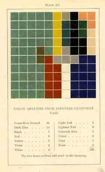
    This blog has long hosted a series of posts on “accidental” or “unintended” works of pre-modern modernist art found in displays of information and statistics in the sciences and mathematics, and even occasionally in art and design.  One such work–a 1904 triumph of accidental art issuing from an usunal work on color theory–belongs to an aesthetician named Emily Vanderpoel.  It is extraordinary in a narrower sense, and that extraordinary might not actually be positive for its original intent–the extra-intent of the book, what has come out of it for me, was something that was unintentionally accomplished by the author.  The images that she used to illustrate her color theory ideas–the basis of which are not really omprehensible to me–turn out to be artwork in themselves, a found art, the artistry of the images taking over the original intention for the arrangement of their color. She had introduced (though to no one, not really) a concept of beautifully arranged spatial color, artwork without a subject that could be recognized as any sort of natural object–non-representational art, finding publication several years before what is seen as the first inentional attempt at that genre, by Vassily Kandinsky in 1911. (Images below.) And when one strolls through the history of scientific illustration it becomes easier and easier to find such things, fabulous precursors to non-represnetational art, and Dadism, and Cubism and Surrealism. 

    Blogcolorvander_2poel_063These elements seem to be most populous in the illustrated sections of early encyclopediae, and dictionaries, and even encyclopedic dictionaries, where a number of different elements are displayed on the same page, different and generally unrelated images on the same engraved sheet, references for articles found in different parts of the book. 
    Here is a good example of that, with unintentional Surrealist images found in the image refernce pages of Horace Benedict de Saussure’s Voyages dans les Alpes….(published in Neuchatel in 1803):
    Unintentional surreal766
    [There are a number of other examples that I’ve written about on this blog:  here, for example, in “On the Paper Sculpting of Nothing”.]

    And then there are examples like Vanderpoel, where the entire image from one sheet is the pre-modernist image in question–to my experience this is the more uncommon occurrence. 

    Which brings us to today’s installment:  the infographic displays found in  Francis Walker’s  Statistical atlas of the United States based on the results of the ninth census 1870 with contributions from many eminent men of science and several departments of the government, which is the atlas of data to accompany the 9th Census of the United States, published in 1874.  This is a beautiful work, and a pioneering challenge.  Walker was one of the earliest to produce a statistical atlas, and was perhaps the earliest to display this huge and broad amount of data in so many different ways–it must have seemed a semi-miracle to see the information displayed so, like going froma  black & white television to color, or color to infared, and so on.  It may well have represented anentirely new way of looking at data.

     The first image (above) in this post is from the illustration showing proportions of the white/non-white population, and the following image shows a detail of that, offset against Mark Rothko’s 1959 Black on Maroon.

    Francis Walker’s statistical mapping, above, 1873; Mark Rotko,

    1959, below:  


     mark-rothko-black-on-maroon-1959

    [Black on Maroon (1959) by Mark Rothko, part of the Seagram mural series, via Tate Modern.]

    The first and third images are details from this full-page illustration:

    It is easy to see the similarities between the data display and the Rothko, though it would really not be within anyone’s power to identify the Walker diagrams as “art” in the modern sense for another five decades.  But it certainly seemed there, ready to be of influence and service, though I’m not aware offhand of artists being influence by these images as they were with, say etienne Marey’s photographs. I’m not sure that these statistics images ever came into the service of art in the beginning of the modern era.  And maybe that’s the biggest question here. 

    Sources:

    1. Guide to National Atlases: here.
    2. The Walker atlas for the 1870 census from the LC site: here.
    3. And an improvement on the Library of Congress presentation, by HandsomeAtlas (Brooklyn Brainery): here.


  • “This Enquiry Not Overcurious”: Huygens on the Laws of Extraterrestrials, 1698

    JF Ptak Science Books   Post 1894

    “…stars…Numerous, and every star perhaps a world Of destined habitations”–Milton, Paradise Lost (1668)

    In spite of a fairly long (if not light) and ancient history, it seems as though Christian Huygens might have thought more to the shaping of extraterrestrial life than any writer to his time.  [The idea of extraterrestrial life is very old, stretching far back into Hindu cosmology, and even deep into the (eighteen worlds) of the Talmud.  Thales, Anaximander, Democritus, Aristole, Ptolemy all thought about and agreed on the possibilities of life being lived on places other than the Earth–infintely more life, in the case of Epicurus. Bruno, Copernicus, Fontenelle, Henry More, and Cyrano de Bergerac.] In a way, in a Asimovian way of rules, Huygens may have laid out the first real template for describing what life-not-on-Earth might look like.  And in the long run, he finds that the possibilities for life Elsewhere are enormously high (and not in doubt in any way), and that it should in no way be any lesser life-formed than what we know here on Earth–and that includes “life” in all of its great complexities.

    [One of the few images made during this time or earlier on the possibilities of world systems outside our own appeared in Bernard le Bovier de Fontenelle–who almost but not quite gets there in his 1682 book Entretriens sur la pluralite des mondes, as follows, though it really has not much at all to do directly with Huygens:]

    Blog--plurality of world fontenelle

    Huygens (1629-1695) worked across many fields, including astronomy, biology, math and physics, and was extraordinarily productive, making numerous contributions in the physical and theoretical areas, as well as being a prolific author and correspondant.  But towards the end of his relatively short life (he died at age 56) Huygens embarked down the science fiction road in pre-science fiction days, writing a wonderful and provocative book entitled Cosmotheoros, The Celestial World Discover’d: or, Conjectures Concerning the Inhabitants, Plants and Productions of the Worlds in the Planets (available online in English here) where he establishes the groundwork of this extraterretrial life. (The book was nearly published during Huygens’ lifetime, but it didn’t quit ework out; left to his brother to published, he, too died before the book was finally in print in 1698. Shortly after the Latin edition of the Cosmotheoro was published by the The Hague publisher Adriaan Moetjens, translations appeared in English (1698) and in Dutch (1699). In the following years, translations also appeared in French (1702), German (1703), Russian (1717) and in Swedish (1774).)

    Hugens set out his description by arguing that extraterrestrial existence of life is perfectly in keeping with the Bible, and that his”conjectures are not useless” or “overcurious”, and that are justified in and of themselves as a useful pursuit because of the display of logic in his arguments.  He states that the inherent sinfulness and “villany” of man on Earth does not perclude life elsewhere, and these lifeforms coul dbe everywhere else, and no different from our own, with no differences in ability to reason and explore.  Lifeforms exist much like us, with at least five senses (and here Huygens makes an interesting play for more-than-give senses, though he doesn’t understand what they might be), and are capable of all of the supporting capacities for enjoying astronomy, and logic, mathematics, physik, arithmatic, and all of the rest, including all possible skills that could be called upon in the production of instruments of science necessary to pursue any endeavor, and all enjoyed in a society as expectently rich as any on Earth, enjoying all of their plants and animal lifeforms, all of their own creations and the rest of the creations of Nature, all while listening to a universe-wide application of music (“everywhere immutably the same”, which Huygens states beautifully here:)

    “It’s the same with Musick as with Geometry, it’s every where immutably the same, and always will be so. For all Harmony consists in Concord, and Concord is all the World over fixt according to the same invariable measure and proportion. So that in all Nations the difference and distance of Notes is the same, whether they be in a continued gradual progression, or the voice makes skips over one to the next. Nay very credible Authors report, that there’s a sort of Bird in America, that can plainly sing in order six musical Notes: whence it follows that the Laws of Musick are unchangeably fix’d by Nature, and therefore the same Reason holds valid for their Musick, as we even now proposed for their Geometry”–(page 86)

    Cosmotheoros’ pages are filled with such reasoned arguments–remarkably so for the end of the 17th century, barely 90 years after the great publication of Galileo and 40 aftre the work of Hooke (in exploring infinities at the other end of the optic scale).

    I’ve included some interesting parts from Book One of the Cosmotheoros; the subject/section headings are in red, and the page number (which usually appears mid-sentence) is related as [23]. Huygens occasionally referes to the other non-Earth life forms as “Planetarians”.  Here’s a sample:


  • Einstein at 10: School Photograph

    JF Ptak Science Books   Quick Post
    Follow Me on Pinterest


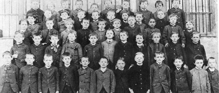
    There is a reminder on our refrigerator for class pictures being made for our younger daughter’s elementary school this Friday.  It never fails to remind me of simpler times for not-so-simple people, time that would soon be overtaken by the complex time of the rest-of-their-lives.  One of my favorite images of this impending wave of life is this:

    Instein class photo763
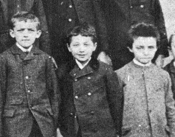
    This shows Albert Einstein in Munich at the Luitpold Gymnasium in 1889, when he was 10. (The source for his image, Ronald Clark’s illustrated biography of Einstein, says that it is from the 1890’s, which is just wrong. Einstein is third from right, front row. In many reproductions of this photographs the boy on the far right of the front row is usually lopped off–I’ve imagiend a rich life for him from time to time, excised as he was from one of the most famous schoolboy photographs of the last 125 years.)

    It was a fiction or fairy tale that Einstein was an average student when he was young–he was in fact a prodigy, and tested out so long as he was somewhat interested, tested out in all areas save one:  French.  Latin and Greek were good.  French, not so.  It was a main stumbling block for him throughout his young academic career.  And that’s a pity.  More so, really, when you consider the amount of interest French scientific publications gave to Einstein in the early years, 1905-1908; and conversely, how much time and effort Einstein gave to the French, which was very little, and almost no attention at all when the greatest mathematician of the day, Henri Poincare, especially whe the great man died (in 1911). It has little to do with the actual language part–but that’s another story.)

    Instein class photo764

     It was a time of big discovery for the little man, though not so much of that discovery took place in school, and the school itself was a trial. But at least right at this point, when this photo was made, he looked happy.

    ·Posted by :

    ·in:

    —

  • Letters of Warning: Einstein and Szilard on the Atomic Bomb, 1939-1945

    Einstein’s Letters of 1939 and 1945 and Szilard’s Petition of 1945

    There were certainly a number of cautionary flags waved at the Executive Branch in the period just before the atomic bomb was first used against a Japanese target.  As I wrote in an earlier post here, Dwight Eisenhower was adamantly opposed to the use of the bomb on a city, preferring an example to be made of the thing on an unpopulated area; in his memoirs, General Spaatz (who had received the only written communication authorizing the use of the bomb) was privately against using the weapon on a city. As early as 1939 Albert Einstein famously communicated with Franklin Roosevelt his concerns on the possibility of the terrifying nature of a bomb produced by his early efforts and those of Fermi and Szilard and many others.  In all Einstein wrote four letters to the President, the first part of the first letter is shown below:


  • Daily Dose of Doctor Odd: Disappeared NYC, 1946

    JF Ptak Science Books   Quick Post

    This is part of a series on destroyed New York City that includes New York City: Attacked by Tentacled Flying Saucers, Giant Flying Snakes, Glaciers, and Mining Missile Space Aliens, 1929-1941 and H-Bomb Wipes out Brooklyn, among others.

    http://static.flickr.com/66/199900324_b6a6863a76_o.jpg


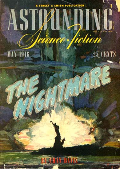
     ”This is a story of the immediate tomorrow – and of civilization headed down the  inescapable road to destruction – down the road that we have, already, selected – and its nightmare end.”

    Chandler Davis wrote this nightmare for Astounding Stories in 1946, and the artwork of the deteriorating-before-your-eyes Statue of Liberty fits this blog’s series of Disappearing New York series. Davis is a very interesting man–Ph.D. mathematics from Havard and professor of math at Toronto, a New York-born man who started his sci fi career early (age 20, with the story above) and who iimmigrated to Canada after his relsease from his HUAC-inspired prison term.  Davis was probably a born Leftie, a radical, and it evidently never left him. 

    The cover art is by William Timmins.