A Daily History of Holes, Dots, Lines, Science, History, Math, Physics, Art, the Unintentional Absurd, Architecture, Maps, Data Visualization, Blank and Missing Things, and so on. |1.6 million words, 7500 images, 4.9 million hits| Press & appearances in The Times, Le Figaro, Mensa, The Economist, The Guardian, Discovery News, Slate, Le Monde, Sci American Blogs, Le Pont, and many other places… 5000+ total posts since 2008.

Category: Absurdist, Unintentional

  • Isolating ElectroPunk pre-Dadist Illuminated Signs, 1876-1914

    JF Ptak Science Books   Post 1919

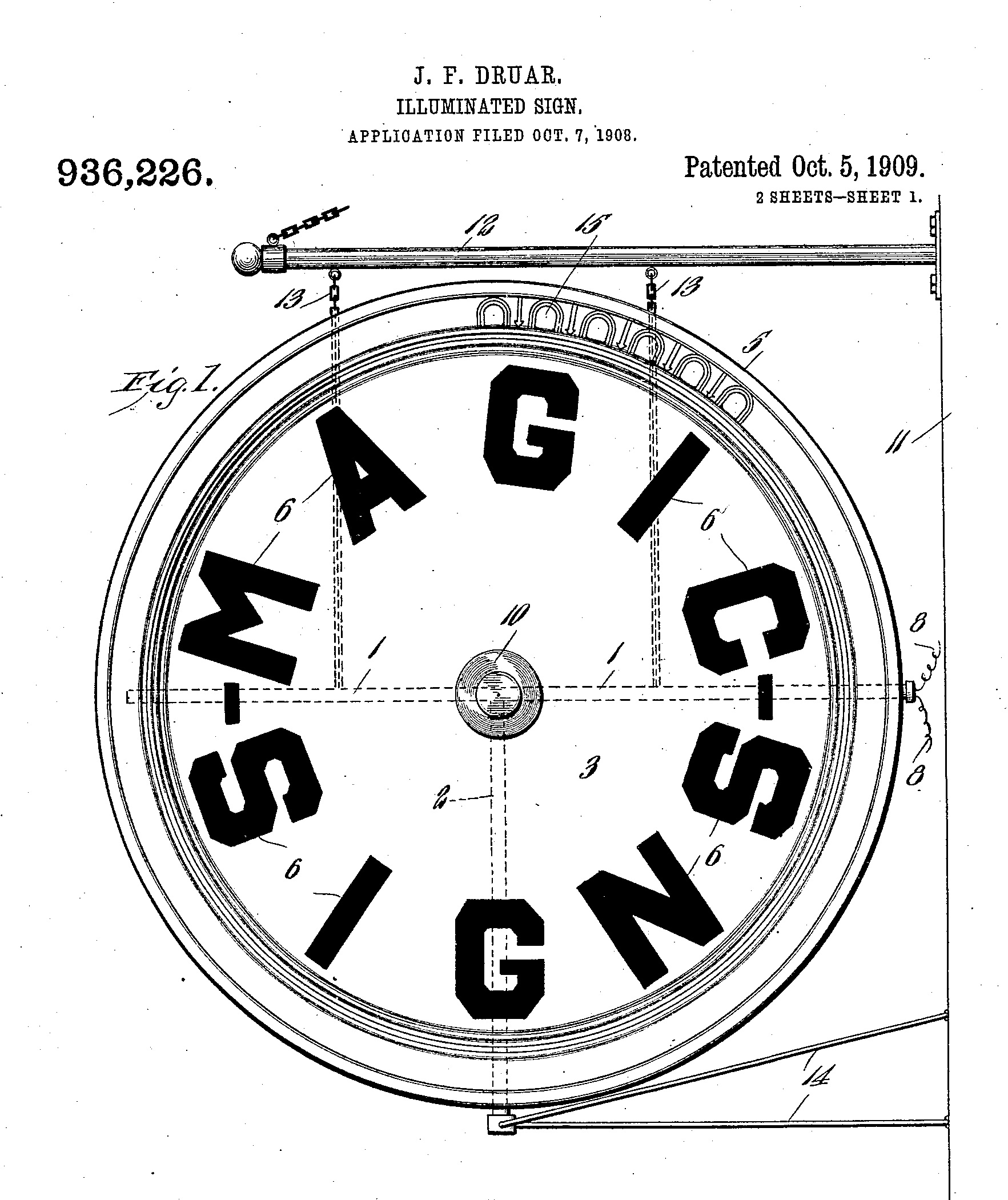
    I am quite certain that entering into a category of ElectoPunk Found Art was the furthest/furtherest thing from the minds of these inventors, mainly because these words didn’t yet exist, and also because these inventors worked on practicable application of the relatively new employment of electricity for advertising. Still, they were serious efforts in pursuing the sale of soap and cigars and “pure food” and other sundries large and small.  But removing them fro their intentions clearly makes these designs into art, some of which is just drop-down gorgeous. 

    DADA FOUND PATENT SIGNSSource:  Google patents:

    http://www.google.com/patents/US936226?dq=illuminated+signs


  • “Damaged Glob” and ElectroLux Found Word Art, 1883-1920

    JF Ptak Science Books  Quick Post

    Not much to say on these images–they’re just terribly neat. There seems to be a sensible amount of proto-Dadist material here, extolling distant observation, attracting and repelling the reader with its distracting possibilities, all ending with an upside-down “Earl”.  At the very least, these images are “pretty”. 

    Walker Evans. Salon, West Virginia, 1935


  • On Being Obvious, (Again)

    JF Ptak Science Books   Quick Post
    Follow Me on Pinterest

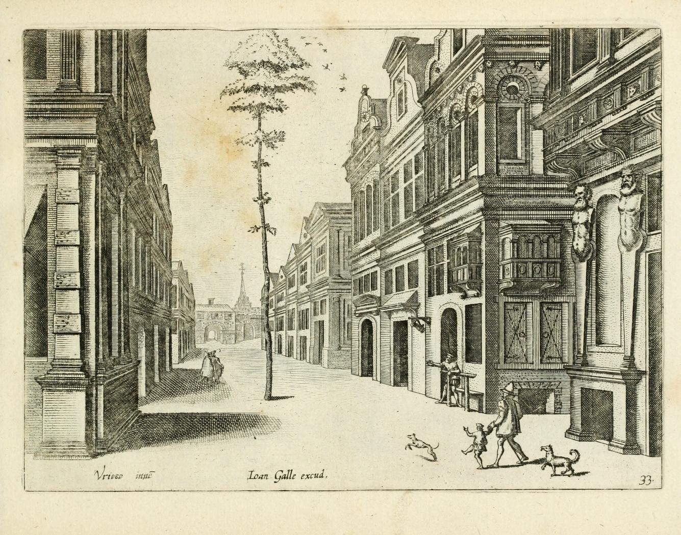
    The following example of Great Obviousness comes from one of the great masters of perspective on the Continent, Jan Vredeman de Vries,  (architect, engineer and man with a vision), and appear in his work Variae Architecturae Formae, and published in 1601. (The whole of the book is available at the Internet Archive, here.)

    It would be interesting to know the history of this tree and its obvious salvation–it doesn’t seem to be older than the street or the buildings, yet, there it is, a tree the diameter of an adult waist in the middle of a very populated street 

    Obviousness

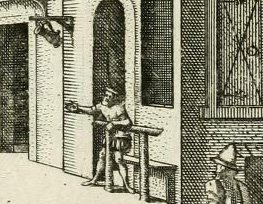
    Below you can see the detail of the man at the middle right–he is absolutely pointing to teh tree, perhaps sharing his amazement with the man and child coming down the street. The pointer had been seated, probably, on the bench behind the bar that was in front of the bar/saloon/draughthouse that he was probably inside of, perhaps enjoying a pint of five, perhaps making the tree even more amusing than it was. (The tilted stein is clearly visible advertising a place for thirsts to stop.) The child is reacting to something, and even so the dogs–the second of which seems to be stopped mid-stride in amazement.

    Obviousness detail

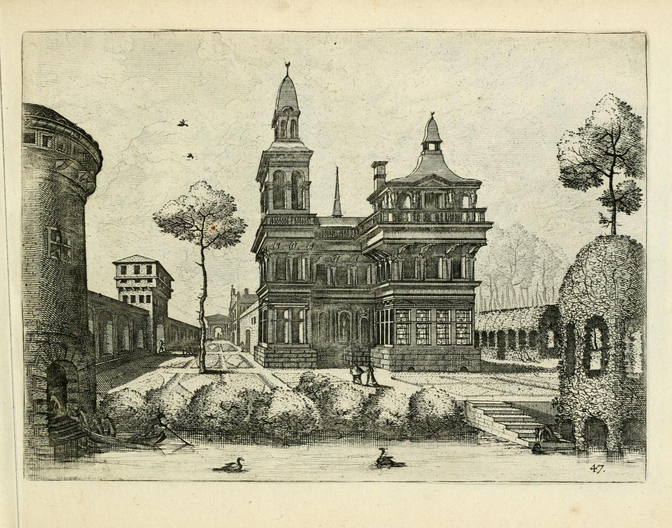
    Another exzmple of the unexpected tree comes later in the same book, when we see one tree in th emiddle of a plan garden and the other growing on top of what might be an herbarium. (On closer inspection the figure at lower right is a woman collectig some water in a jug; without magnification the seen looks a little more sinister than it is.)Obviousness 2


  • Ships in the Skyline: Graphic Displays of Information

    JF Ptak Science Books   Quick Post (Overall post #2515)

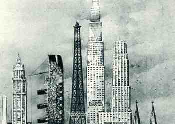
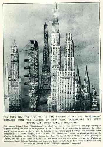
    This wonderful display (appearing in The Illustrated London News for 26 March 1927, page 518) of quantitative data isn’t quite as whimsical as it appears in detail, though I can think of onlyBlog1sept_16_ship_skyline_detail5_2
    a few (antiquarian) times that I have seen a ship made part of a cosmopolitan vertical cityscape.  It is a great way of comparing two disparate, out-of-place equals, and certainly can get the idea of the size of something as stand-alone and solitary as a great ship to children (and adults, too) by comparing it to something as obvious as a tall building.,  This time its really just comparing the length of the SS Mauretania with the heights of some famous and notable buildings. (The Mauretania, 1906-1935, was a fabled, luxurious and fast ocean liner of the Cunard line; it was refitted for a resurgent oceanic service at about this time.)   In the larger, expanded second image we see the Mauretania stacked up against (from left to right) the Washington Monument (555′), the Woolworth Building (792′), the Mauretania  (790′), the Eiffel Tower (984′), the Larkin Building (proposed at 1208′), the Book Building (873′), the Koln Cathedral (512′) and the Statue of Liberty (305′).  The Larkin Building (not the F.L. Wright structure of the same name) was a proposed super-tall of 110 floors for 330 W. 42nd Street that was proposed in 1926 and not canceled until 1930, and which would’ve been the tallest building in the world.   In any event, this was a big ship–the largest in the world when it was launched as a matter of fact–and the drawing is wonderful.   (Upon closer inspection, there is a terrific amount of detail in the cross section of the ship.)                                                   

    Blog1sept_16_ship_skyline564


  • The Battle of the Extra Earths: Mini-Extra-Earth Vs. Full-Sized-Standrard-Earth (?)

    JF Ptak Science Books  Quick Post     Part of a series on Strange Things in the Sky

    Follow Me on Pinterest

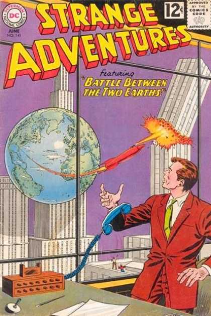
    This is a quick addition to the Extra-Earth category of this blog–and an amazing one. In the other examples the extra-Earths appear simply appear , with little or no interaction between the two. In this instance we have one Earth attacking the other. 

    Extra earth

    There is no necessity for this to make much or any sense, what with the purple sky and, of course, the extra-Earth–but the attacking rocket taking off from the extra-Earth extra-Florida (or thereabouts) seems to grow in size as it gets closer to its target.  After all, the attacking extra-Earth is less than 300′ away from what has become an enormous and marauding space vehicle (judging from the distances in relation to the buildings) which is now longer than the extra-Earth-America is wide.  But in the world where a miniature extra-Earth can attack a standard-sized-Earth, this would be a minor quibble. 

    Honestly, I think I like to write about such things for the joy in having to think of a title for the post. 


  • Accidental Cubism, 1914

    JF Ptak Science Books   Quick Post    Part of the Accidental Absurdist series

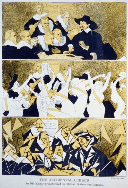
    Marisu de Zayas  had a little fun with the origins of Cubism, producing this satire in 1914 during the first decade of the new movement’s existence. He has a group of Suffragists (still five years away from the vote at this point) transform Rembrandt’s Anatomy Lesson of Dr. Tulp with the tools of the trade of the folks in the painting:

    Cubism

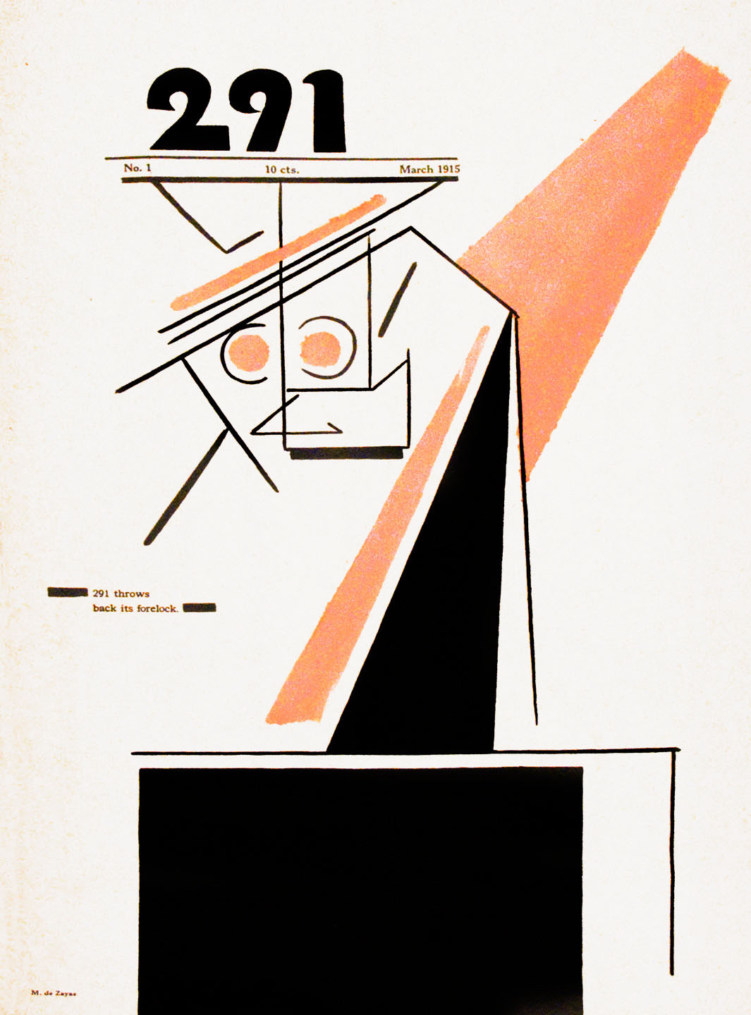
    Its not as though de Zayas was anti-Cubist or a traditionalist or a morality figure or a cow-in-the-field artist–hardly.  He was a modernist with a sense of humor, though I am sure that there were millions of people who agreed with a literal interpretation of his satire. Perhaps his name is a little misty at this point, but his artistic contributions are not–here’s his cover for the very first issue of Alfred Stieglitz’s 291:

    De zayas
    This was the Little Magazine born of Stieglitz’s pioneering art gallery of the same name, which held the first exhibition in the U.S. for the works of Matisse (1908) and the first American one-person shows of Cezanne and Picasso (both in 1911) and championed the work of modernists like Duchamp, John Marin, Marsden Hartley, Arthur Dove, Max Weber, Clarence White,  Auguste Rodin, Constantin Brancusi, Francis Picabia, Henri Rousseau, and, well, the list goes on and on. (And de Zayas.)

    ·Posted by :

    ·in:


  • Out-of-Place Department: the Moon as Debris Ring Around the Earth

    JF Ptak Science Books   Quick Post

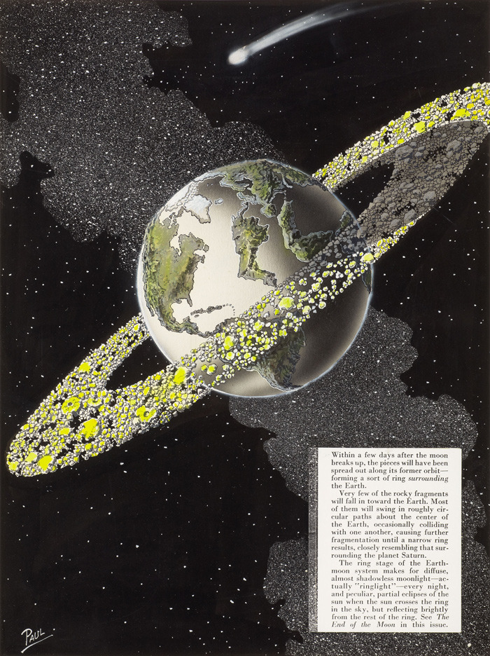
    Moon gone earth belt
    [Source: 50watts.com, “Tetrahedra in Space”, Frank R. Paul series, here.]

    See also an earlier post, “Things out of Place Department: the Moon”, here.

    This is certainly the work of a delightful and bouncing imagination, more so with the illustration by the great Frank R. Paul.  The image is found on the back cover of  the August 1953 issue of Science Fiction Plus for the short story “The End of the Moon”.   And what we see–at least from the artwork as I cannot find an online version of the text–is a not-convincing result of the Moon going away.  I’m not an historian of the idea of the vanishing Moon and how early writers have imagined it ailing/disappearing/exploding/imploding, though I’m fairly well sure that the scifi wasn’t keeping up with the 1953 science of it all, at least with what I can see and understand.

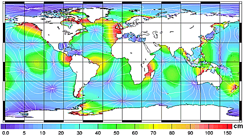
    If there was no Moon.  What if the Moon never existed? What if the Moon existed but vanished?  I guess it would all depend on what exactly happened to the Moon to figure out the disposition of its remaining assets.  The Moon removed certainly would effect changes in the tides, though I think not in the way depicted above. There would substantial changes  though I think not enough to cause a new continent to rise out of the middle of the Atlantic, or to flood all of northeastern Africa.  “If  We Had No Moon”, an essay by Bernard Foing in Astrobiology Magazine, here, provides an interesting tidal change map (below) which shows a projection of the main hotbeds of tidal change. 

    Since I have no access to the text of the scifi article I don’t know if the story addressed changes to the weather and migratory patterns of animals in response to tidal changes, or what happens to large coastal cities, or the influence of a more volatile seasonal change, or changes to the Earth’s orbital parameters, and so on.

    Its the “and so on” part that is the most interesting left-out bit.

    Bottom line here is that I just like the great cover art for the story

    
    Moon gone map of tidal changes

    Another interesting article from ScienceNordic, here.


  • A Note on the History of Not-Straight Pre-Telephone Poles

    JF Ptak Science Books    Post 1914

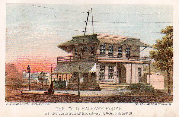
    This is one of those images in search of a story, and as it turns out the story is actually pretty long and involved. The image is this fantastic lithograph from Valentine’s Manual of the City of New York (a sort of annual review/directory of the city that ran on-and-on from the 1850’s to the 1920’s), this one being from the 1868 edition.

    Telephone poles865

    It also is a very stark reminder about how we still deliver power and communication in the United States, still via insulated wires strung along cross beams on what are mostly dead trees–pretty much the way the business has been done for he last 160 year.s  That the backbone of the American energy and communication grid is still transferred on wire/cable strung over the street and exposed to everything on cultivated and treated sticks from the forest is an irony that we live under every day, and that beginning with telegraph poles.

    That said, I like this image because the pole n the picture is so curved.  Perhaps it was the way the tree was; perhaps it was rendered that way when it was treated with creosote. I don’t know.  But the folks at Valentines liked it, otherwise they could have ignored its crookedness or used another angle on depicting the Old Halfway House.

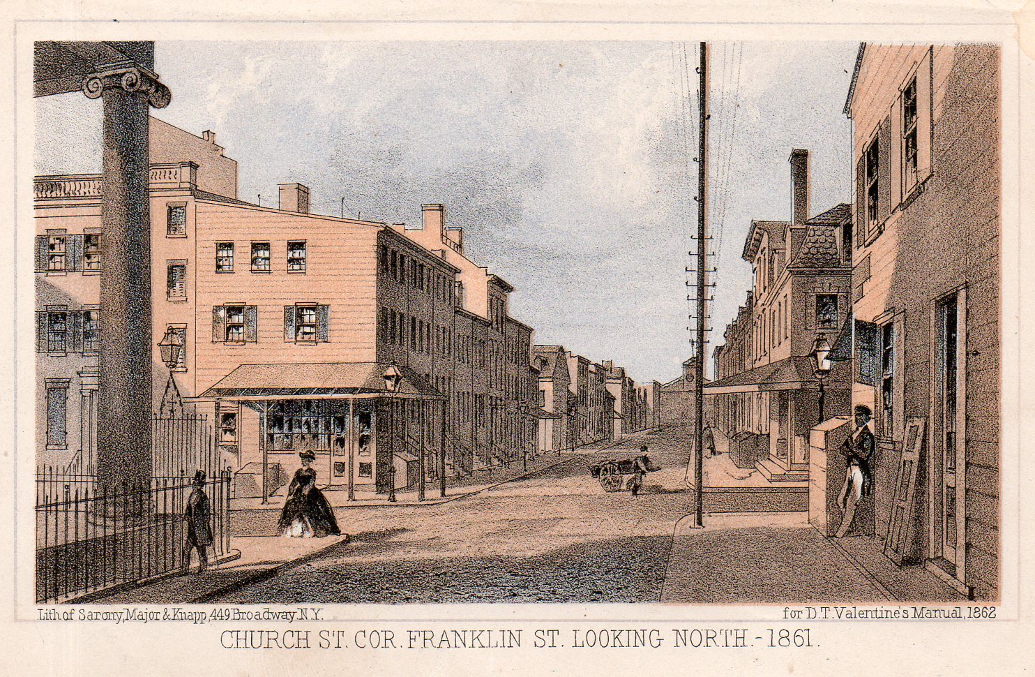
    Judging from many other examples, it seems that the artists at Valentines had a taste for the subtle and obscure.  There are plenty of cases of the depiction of the quietly uncommon, as with another unusual image, showing Church street looking north and showing a long line of telegraph poles, all of which are squarely behind the other so that only the initial pole is visible, though you can see the cross-beams and insulators of the others, the brace getting “lower” and “smaller” behind the first pole.  It is just extremely uncommon (in my experience) to see a long line of anything depicted in this way.

    Telephone poles866

    The artists/lithographers at The Manual seemed to enjoy their work.  For example, in the above image in addition to teh lined-up telegraph poles we have some other very uncommon small elements. No doubt the view was true–which was the intent of the book, to accurately portray the city–but the small elements were creative, quiet and incisive.  Perhaps it is also just exactly what the artist saw when the view was made.  For example, the woman
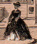
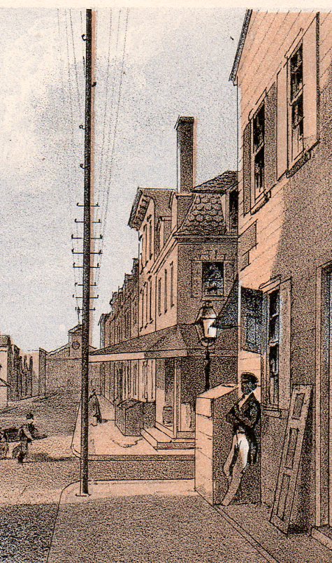
    Telephone poles skirtcrossing the street us stepping up on the curb and raising her skirts slightly–it would’ve been easier to just have her standing there, as with the gentleman immediately in front of her, but for some (creative) reason she is shown in an unusual pose.  Ditto the guy leaning against the building at right–he’s out of proportion with the other two figures, unless he was a giant, but he’s just, well, leaning there.  He’s also standing next to a shutter, which is down and also leaning against the building.  A peddler makes his/her way across the street in the background with a large cart. And the windows in the buildings are unequally decorated, with interior window dressings at different stages of being drawn and not, and with different treatment, and in different states of repair. In short, the image is really a snapshot.

    Telephone poles867
    I imagine that somewhere here in this country there could still original telegraph poles standing–the originals started out generally as chestnut, and then force treated with creosote, and were intended to stand for 50 to 100 years. Under favorable conditions in which they were just simply not replaced, it is conceivable that some could have lasted for 150 years. 


  • Imago Frammeni: Boulle, the Dogon, Jouffret, the Simple and the Complex

    JF Ptak Science Books  Post 1914

    Changing the Mind’s View of Simple and Complex Ideas via Different Image Perspectives

    I’m always very interested in curious things, or standard, “average” things pictured in non-standard ways, as theDsc04588
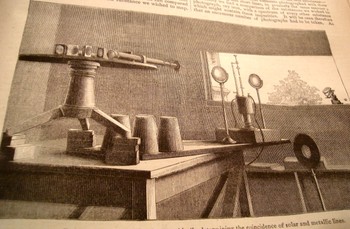
    change in perspective can lead to entirely new observations and discovery.  Seeing this illustration in an article by J. Norman Lockyer (Nature 1881) I was shocked by its clarity and usefulness—Lockyer was simply showing the arrangement of his apparatus for his solar spectrum experiments but the angle of observation (being at such an oblique angle as is normally found) was just, so, well, “correct”.  The image I thought was perfect for the reader—not only that, it was designed artistically and with grace, and one can see exactly what Lockyer was up to.  Diagrams would’ve worked almost as well, but there is just something so extraordinary here that you could just about work from the image if there was no description. 
    Dsc04579_2

    Looking at things differently is hard work—that’s why I think it is always good to refresh the neuronal sap and look at great examples of unusual , insightful imagery.

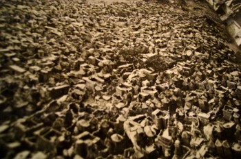
    Sometimes it works to read the description of what the image is before actually viewing it to see the differences of the image that you form in your brain before seeing the thing itself.  For example, when reading about the Dogon, a cliff-dwelling people of the plateau of Bandiagara, south of Tombouctou, and how they would make houses and then towns out of the rocks fallen from cliffs, you get what is probably a pretty benign image.  When you see photographs of these structures it seems as though the brain just simply isn’t ready for their impossible nature, though you quickly, instantly, recover (once you convince yourself the photo is real) and—voila—your mind has been expanded.  (This photo is from an expansive work by Bernard Rudofsky, Architectures without Architects, Doubleday, 1964.) 

    The (internally) spectacular Etienne Boullee can greet us in the same way with some of his eye-popping architecturalBoulle1
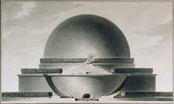
    creations (unbuilt architecture by an architect, in this case, compared to the built architecture of the non-architects above).  Boullee’s “Plan du Cenotaphe de Newton”, a gigantic memorial to Newton  that was dancing with necessary privacy in Boullee’s brain during the French Revolution (and also during a particularly un-Newtonesque time in on-your-knees-to-Cartesian-principles France)  is another superior example.  Reading the description of the structure just doesn’t quite do, and it seems whatever grand comes of that is tarnished and stripped away  by the obesely florid sentiment of none other than Ledoux’s poetic sentiments “…O Newton!  Sublime Mind!  Vast and profound genius!  I conceived the idea of surrounding thee withBoulle2
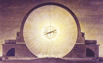
    thy discovery…”.  Oy.   Boulle adds to this inspirational atrocity by saying of the sphere:  “…we must speak of a grace that owes its being to an outline that is as soft and flowing as it is  possible to imagine…”   And once the demand of “oh  dear god just please show me the picture” is met, we are left with a turned-around brain and another heavenly exaltation, or profanity.  The Cenotaph is just Grand-Canyon-Spectacular. 

    Complex can turn on the simple in this way, where we can have those “a-ha” moments from, say, early efforts at picturing the fourth dimension or non-Euclidean geometry to a new perspective of looking at Roman ruins.  The arrival on the non-Euclidean geometries  in the 19th century posed new issues, not the least of which was representing the ideas.  Our saintly Hermann von Helmholtz believed –contrary to most elevated opinions—that the human mind could indeed intuit complex space and figures of these geometries.  (The difficulty not only from the obvious intellectual hardships in picturing the concepts but also because the geometry of Lobachevsky http://www-groups.dcs.st-and.ac.uk/~history/Mathematicians/Lobachevsky.html was called somewhat into doubt when some of its results were cast in doubt by contemporary astronomical observations.—and this even though so far as the great Gauss was concerned there was no deviation in Euclidean values.)   Helmholtz did this by employing the three-dimensional pseudosphere model of Beltrami.  (Reluctance to these ideas would end soon enough, for, as Linda Dalrymple Henderson points out with such sotto voce, “the convenience of Euclidean geometry would prove inadequate once Einstein” hit in 1905.)
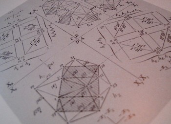
    Dsc04585
    The work of Beltrami  and H.P. Manning  (Geometry of Four Dimensions, 1914), and Jouffret  (Traite elementaire de geometrie a quarte dimensions, Paris 1903) in illustrating these complex ideas (the titles of which were in themselves daungting as with Jouffret’s “plane projections of the sixteen fundamental octahedrons of an ikosatettrhroid”) would in themselves prove to be entirely irresistible to the world of the arts.  Charles Howard and Maurice Princet I think had as much to do with  the creation of cubism and abstract art and the imaging of time than anyone, including the painter (I shudder to say his name) of Les Demoiselles (1907) or the lovely Georges Braque (Houses at Estaque, 1908) or Jean Metzinger or even the sublime comedian Duchamp’s Nude DescendingDsc04584
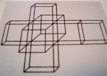
    (1914).  The hypercube starts to show up a lot in some Bauhaus genres and even into the palette of Frank Lloyd (“Stinky”) Wright (with his St. Mark’s Tower plan, NYC, 1929).Dsc04589 I can only imagine the shock to the brains of these creative geniuses in seeing the display of such a novel idea.  (For the ultimate treatise on this see Linda Dalrymple Henderson’s The Fourth Dimension and Non Euclidean Geometry in Modern Art, Princeton  1983).  And no the art didn’t come first. 
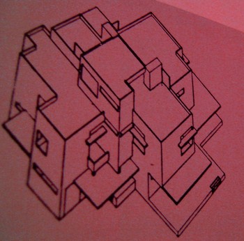
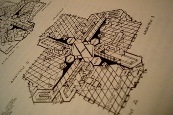
    Dsc04578

    But coming back to the simple, and in the same frame as the first example that we mentioned in Lockyer, we have the unlikely find of Giovanni Piranesi.  In my opinion his most spectacular work is found in his frammeni (the diverse bits and pieces of architectural and sculptural bric-a-brac found objects that are collected together on one stage) and in his archaeological detail.   His attention to new perspective in showing the crucial aspects of structure and building in Rome is tremendous andDsc04590
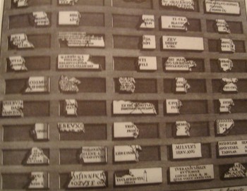
    unexpected—as an example we see here the child’s-eye-height view of three steps of the reconstruction of the theatre of Pompey.  I must say that I’ve seen a lot of architectural images in my time but nothing quite comes to me so surprisingly as this step-level view of the reconstruction of a Roman theatre,  This happens throughout the lesser-known Piranesi, with great details of tools, and cross sections of the very deep Dsc04591
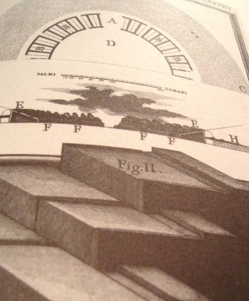
    footings of bridges, and so on.  It is really refreshing, lovely, unexpected work. 

    We’ll return to this subject from time to time as I have hundreds of interesting examples to draw from—for example, the remarkable Emily Vanderpoel’s Colour Problems (which has surfaced in this blog from time to time) which is ostensibly an undecipherable attempt to quantify color arrangement in art but through the lovely examples displaying this attempt pre-date the modern re-invention of non-representational art by at least a dozen years.  Stay tuned! Dsc04592

  • Inside Looking Out: Ernst Mach vs. the Hudson River

    JF Ptak Science Books  Post 1913

    Machbook

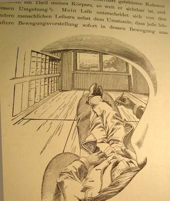
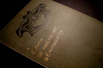
    I cannot think of another illustration by a scientist or philosopher who attempts to explain their own, literal, view of the world and then offer what this looks like to the reader from inside his own head, looking out through his own eye.  That’s exactly what Ernst Mach is doing right here on page 15 of his influential book Die Analyse der Empfindungen,  the fourth German edition (“The Analysis of Sensations and the Relation of the Physical to the Pyschical”, published in Jena in 1903).

    There is nothing in this world for Mach that is not admissible to the human brain that is not empirically verifiable–that is, the world is nothing but awash in sensation and that sensation itself forms part of the experience of, well, experience. I’ve actually never been interested in the philosophy of science, and this is one of the reasons why.  Nevertheless I boldly break through my own prejudices to enjoy this phenomenally original image, drawn from the inside of Mach’s working mind, looking out through his eye socket, over his mustache, under his eyebrow, around his nose, out across his body and then leaping into the rest of the world.  I think he does make his point about the essentialSteinberg_352
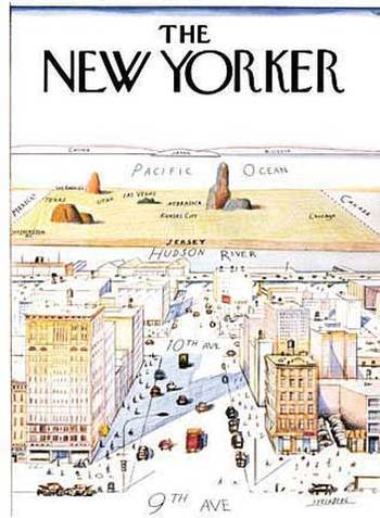
    nature of the observer. And much like the classic Steinberg New Yorker cartoon of the world view of the New Yorker (of course this includes only Manhattan), I know some number of people who have transposed their bodies much like Herr Mach into the Steinberg map–except that their worldview ends basically at the Hudson River (Mach’s feet) with the rest of the world being the sliver out there beyond the river (Mach’s window) until you go 359 degrees around the world to get back to the East River (and back inside Mach’s noggin).  It is an unusual world view to have, but someone has to have it so that we can at least identify it so. 

    I just like the picture.   

    (Section 10, describing this image,  with translation by C M Williams and Sydney Waterlow from the blessed Dover people in 1959):

    “The considerations just advanced, expressed as they have been in an abstract form, will gain in strength and vividness if we consider the concrete facts from which they flow. Thus, I lie upon my sofa. If I close my right eye, the picture represented in the accompanying cut is presented to my left eye In a frame formed by the ridge of my eyebrow, by my nose, and by my moustache, appears a part of my body, so far as visible, with Mach2_3
    its environment. My body differs from other human bodies – beyond the fact that every intense motor idea is immediately expressed by a movement of it, and that, if it is touched, more striking changes are determined than if other bodies are touched – by the circumstance, that it is only seen piecemeal, and, especially, is seen without a head. If I observe an element A within my field of vision, and investigate its connexion with another element B within the same field, I step out of the domain of physics into that of physiology or psychology, provided B, to use the apposite expression of a friend of mine made upon seeing this drawing, passes through my skin. Reflexions like that for the field of vision may be made with regard to the province of touch and the perceptual domains of the other senses.”