A Daily History of Holes, Dots, Lines, Science, History, Math, Physics, Art, the Unintentional Absurd, Architecture, Maps, Data Visualization, Blank and Missing Things, and so on. |1.6 million words, 7500 images, 4.9 million hits| Press & appearances in The Times, Le Figaro, Mensa, The Economist, The Guardian, Discovery News, Slate, Le Monde, Sci American Blogs, Le Pont, and many other places… 5000+ total posts since 2008.

Author: JF Ptak

  • War After the Peace: American, Philippine and Japanese Guerrillas, September 1945

    JF Ptak Science Books     Post 566

    Several years ago I purchased part of an archive of David Katcher*, who was the founding editor of the journal Physics Today. Before that, several years before that, in 1945, David Katcher was Lt. Katcher, serving as a correspondent/writer in the public relations office of the U.S. Army Headquarters of the Western Pacific (GHQ USAFPAC). There’s a 6-inch stack of paper here with what seems to be his (and associated) mimeographed offprints of the daily grind of running the PR department of the Army in the Philippines, which, taken as a whole, is pretty interesting, showing the concerns and trials of the Army in reestablishing the government and infrastructure of the country.  Some of the individual reports/publications are stand-alone, straight-up fabulously interesting things, and so far as I can determine, have not been published anywhere else.  These two examples are both related to the subduing of the last remnants of the Japanese Army still fighting in the dense nether lands of northern Luzon, the Philippines, fighting after the surrender had been made (14 August 1945) and  signed (formally, on the USS Missouri, 2 September) , fighting after the war had ended. 

    There’s much more than can be written about fighting after  peace treaties ending wars–I know that the Germans were running around in Africa following WWI–but that’s a very big story, and not for here.


    DOCUMENT 1      (Issued 28 September 1945)

    The first document relates the extraordinary story of Col. Russell W. Volckmann who from 1942 led a force of thousands of guerrillas against the Japanese and who, by September 1945, led a force of 20,000 in routing the last elements of the Japanese army.    (The entire text of his memoir written in 1954 as We Remained Behind: Three Years Behind the Enemy Lines in the Philippines  can be found here.)                                                                                                 
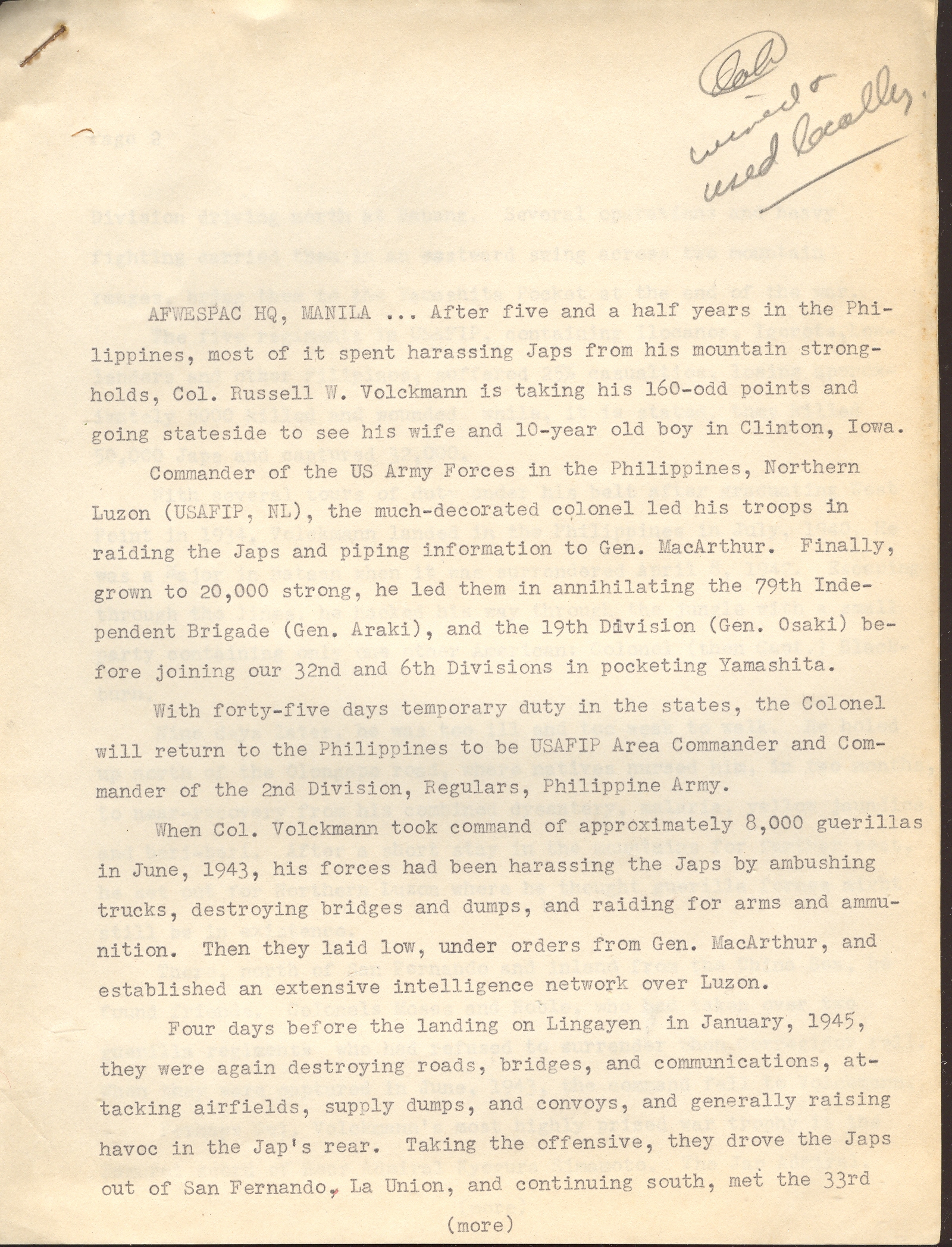
    Volckmann1

    (see Continued Reading section, below, for the rest of this document)

    DOCUMENT 2  (Issued 25 September 1945)

    This short document relates the story of the capture of the last of the Japanese forces in Luzon, including the capture of some 40,000 troops, including General Yamashita (“The Tiger of Malaya”) and soon-to-be-executed war criminal and beast of Manila.

    I’ll let the documents speak for themselves.
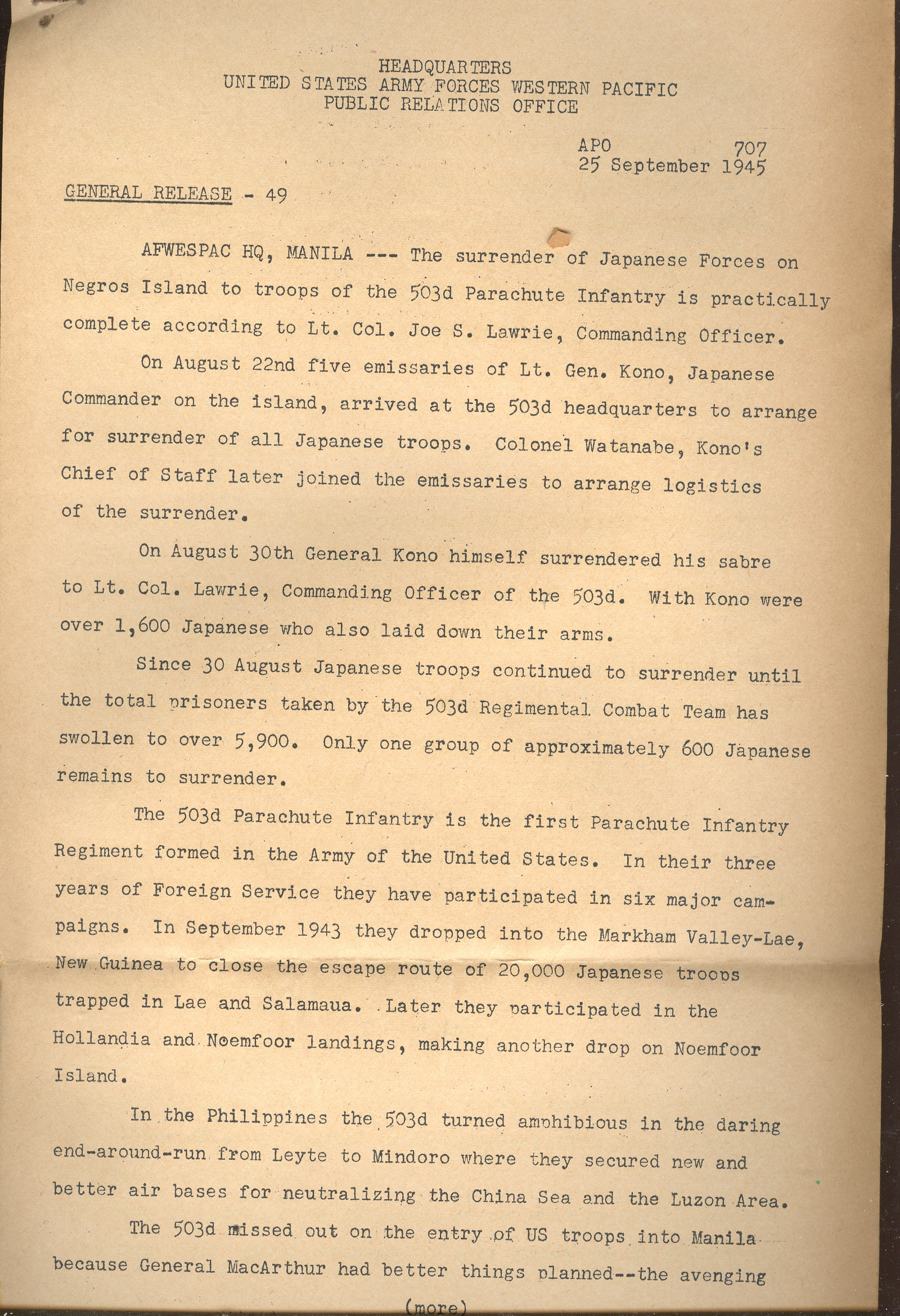
    Volckmann4

    (Read more, below)

    *from the Washington Post, 2 June 2002, the following obituary of David Katcher:

    “David Katcher, 87, who retired in 1979 as special assistant in science and technology to the undersecretary of state for security assistance, science and technology, died of cancer May 31 at his Chevy Chase home.

    Mr. Katcher was also senior policy analyst in the White House Office of Science and Technology policy during the Carter administration. He was the 1947 founding editor of Physics Today monthly magazine, published by the American Physics Association, and he edited the journal for four years.

    He had been an editor at the Naval Ordnance Laboratory before World War II and later executive secretary of a theoretical physics division of the Institute for Defense Analysis.”
    ·Posted by :

    ·in:


  • (Un-?) Necessary Emotion: Medical and Anatomical Illustration and the Human Spirit

    JF Ptak Science Books LLC  Post 565

    Standard illustrations that give a little more than they need to have always been very interesting to me–sometimes this takes the form of completely unnecessary detail in almost-invisible expendable space fillers (as I’ve looked at in this series)

    Gersdorff_-_Schädelwunde

    and sometimes it is in the most obvious places. 

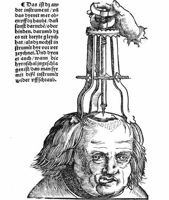
    Now, in this remarkable image from Hans von Gersdorff ‘s (who we met earlier in this blog) Feldbuch der Wunderartzney (Fieldbook of Wound Surgery, and printed in 1517) comes an unexpected bit of detail.  The machine, the surgical device, operates something like a cork-puller: it is meant to attach to and extract a piece of skull that had become embedded in the brain following a skull fracture.  The procedure looks as though it is just beginning–the man’s head has been shaved, the fracture revealed, and the penetration about to begin.  The patient looks, well, I’m not so sure exactly what this look means–perhaps nothing, perhaps the man has brain damage.His right eye has drifted, his jaw set off to the the side and is jutting considerably.  I suspect that a simple view of the top of the patient’s head would’ve been enough to illustrate the image, but–as seems to be more often than not in the 16th century–the illustrator has included not only the entire head, but has given the head character, history, emotion and dignity.  Everything necessary to imbue the surgeon-reader with with the sense of humanity associated with his trade and task. 


    Zzzzzzbartisch

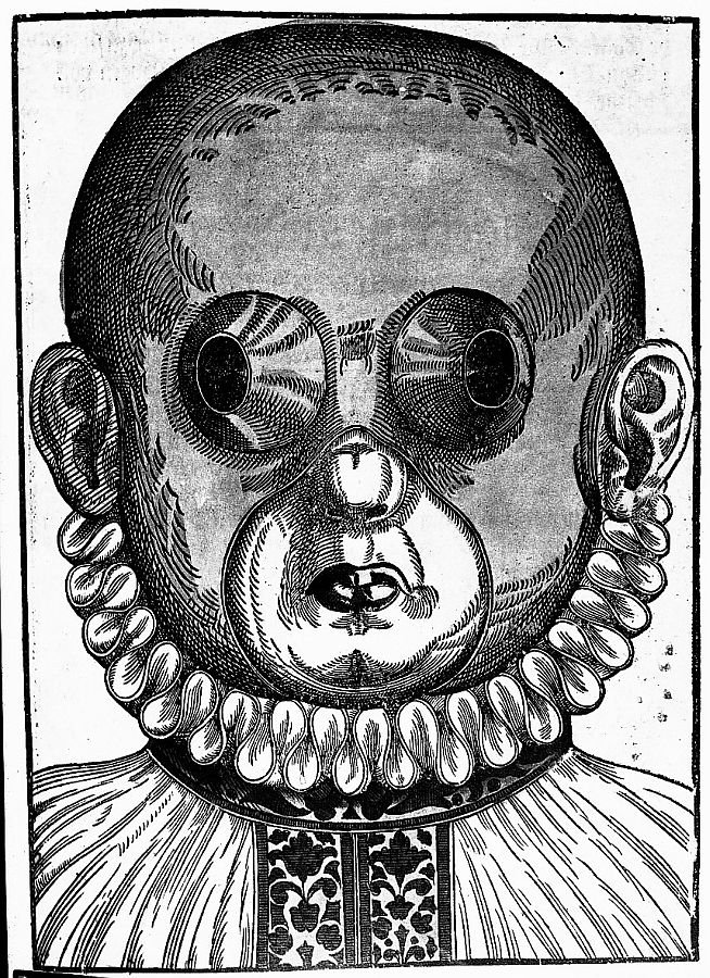
    I should think that the same may be said for many of the illustrations from Georg Bartisch’s Augendienst (The Treatment of the Eye, printed in 1583).  The woodcut at right is an example of Bartisch’s suggestion for crossed eyes–the mask would be worn for different periods of time, the openings supposedly working to make the eye muscles assume their normal positions.  The remedy looks bizarre (and very symmetrical) from our point of view here in its future, but what seems very modern is the careful treatment of the illustration of the patient, who is erect, calm, well dressed and terribly decent. 

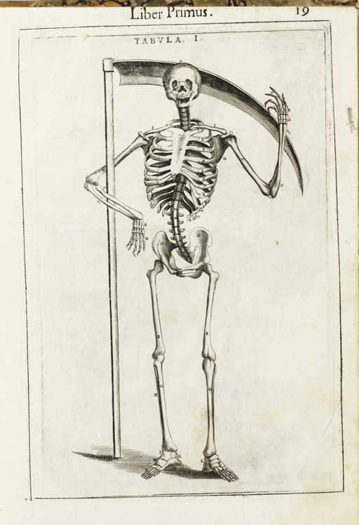
    The thread of deeply humanized anatomy runs deep in the 16th and 17th centuries,where human bodies are dissected to show the different levels of our delicate existence.  The bodies are not simple cadavers, but seem to have some sort of “liveliness” in their post-living being.  This image (below) by Guido Guidi (1508-1569).in his De anatome corporis humani libri
    VII.

     (printed in Venice in 1611)  gives the beckoning skeleton a smile  to go along with its timeless  gesture for the remembrance  of mortality.

    Blog--emotion--guidi 

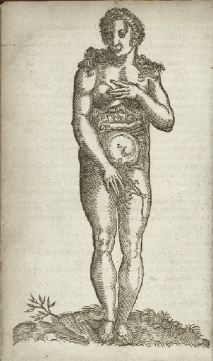
    Certainly there can be no escaping the modesty of the model
    in Alexander Read’s (1580-1641). Somatographia Anthropine, or a Description
    of the Body of Man. . .By Artificiall Figures representing the members…
    (printed
    in London by Jaggard
    in 1616).  Even though she is displaying most of her abdomen, this person is still caring for her moral appearance.

    Blog--emotion--woman

    Another example of this modesty can be found in the work of Adriaan
    van de Spiegel’s(1578-1625). Opera quae extant omnia (edited by Johannes
    vander Linder) printed by the famous Blaeu’s in Amsterdam
    in 1645:  here we see the nearly full-term foetus ably
    displayed, the mother’s skin pulled back as if to form petals to the flower of
    the child (helped along by a strategically-placed plant in the foreground).


    These images can go on and on–these are just a few scant examples.

    Another quick example: 
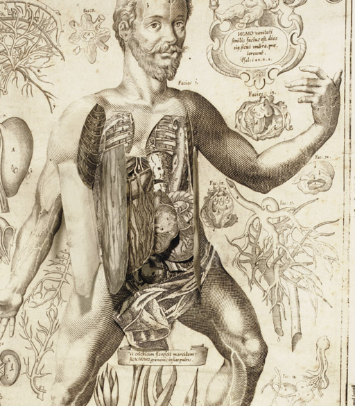
    Johannes Remmelin’s (1583-1632) Kleiner Welt Spiegel, das ist,
    Abbildung goettlicher Schoepffung an des Menschen Leib….
    (printed in Ulm
    in 1661) has many illustrations in which the anatomical model seems quite
    serene; ambiguous, sometimes, to what is going on, but at the same time looking
    inviting, welcoming even.

    Blog--emotion man beard 
    All I’m saying is t hat there seems to be something special going on in these images–certainly a “something” that was lacking in most other (non-artistic) anatomies of the 19th and 20th centuries.  Emotion was certainly extracted from the examples of modern and recent-past anatomical studies. I feel a little happier with the artists and physicians who were interested in connecting humanity to these studies than the slabs of Netter and Grey, to say nothing of the Adam and Eve project or deeply modern technologies.  A little reminder now and then that there was something else connected to the viscera and bones and muscles and veins might not be too bad. 


  • A Map of The Office, 1942 -&- On the Cusp of Color: Bringing Color to Packaging

    JF Ptak Science Books LLC  Post 564

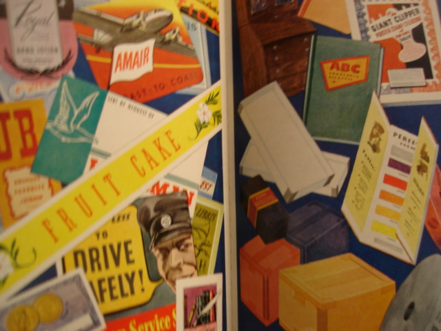
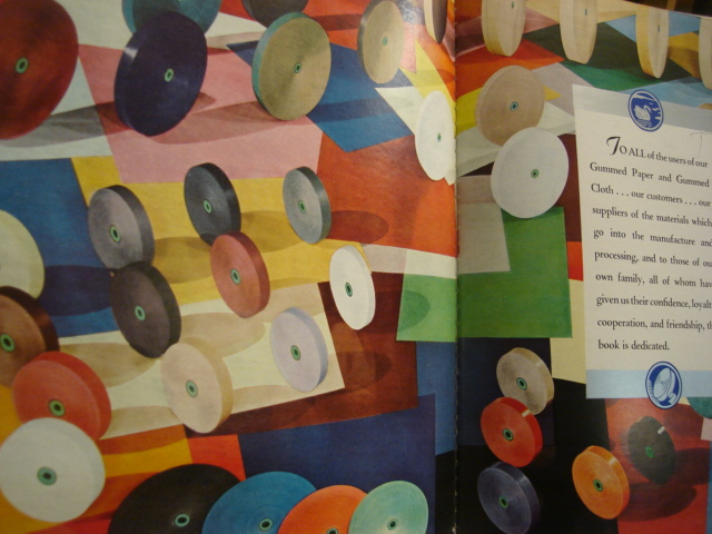
    Color 001


    An Occasion An Appreciation,
    a badly-titled but butterly-produced and broadly-illustrated work is a shiny, slippery and slick celebration of gummed paper.  It may well be the Gutenberg Bible of gummed paper celebration books. 

    The book is a silver anniversary (1917-1942) of the Mid-States Gummed Paper Company of Chicago, makers of gummed,.flat, non-curling special gum gummed papers.  It was a company started by box makers, the logical extension of that business. (“Gummed cloth tapes completed the manufactured joint of corrugated boxes, and gummed kraft sealing tape close the box,” Indeed. Also its a nicely-written Color 003
    sentence, and a well-written book.)  There is a continuous reference throughout the book to “flat, really flat” gummed tape, something that is lost on me if I don’t think about it–the use of splashy color throughout the work, though, isn’t. 

    The company’s color tapes washed over a wide spectrum, adding an artistic touch to a packaging world which was largely black and white. It also produced color gummed labels for  packaging and advertising, which made all the difference. (To appreciate this all you have to do is wind your way through a year or two of LIFE magazine from 1939/1940 and see the vanilla- and blandly-colored boxes of cereals and cans of  such and so spread across the issues.  People Color 004are much more convinced to buy something that has a colorful, pictorial image on the box than one that is a white box with black lettering. )*

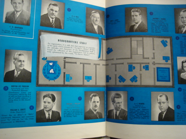
    Another very interesting bit about this book is that it published an indexed map of the offices of the headquarters staff–which is a very unusual map to my experience, very.  I’ve got a small collection of office layouts/maps from the 1900-1940 period, mainly because it belongs to a period long ago and far away, even though the tail end of office design like this creeps its way into my own life, showing up at places like “computer headquarters” in tv shows like the Rockford Files in 1980. It is a wonderful insight into the way business was done, and I can just about see the polished red linoleum floors, open Color 002transoms and abundant oak everything, all swirling in cigarette smoke, populated with people wearing real clothing.

    Yet another oddity is the map of the locations of the company–it definitely belongs to the Blank and Empty Things category of this blog–showing the five cities where it  had offices.  The resulting map though is quite unusual, as it shows just the five point and leaves the rest of the country jet black in a deep blue background, everything else missing. 

    I know I’ve had some fun with this book, but I’ve got to say that it was very well done, very well written, and about as interesting as its topic could allow. 

    * I believe that the first mass-produced book illustrated with color photos was by Leica for its labs, published in Berlin in 1938 (?).  color printing in photography had been around by a laborious process since at least the 1890’s, but that’s a different story


  • Humanist Secular Prints in the Renaissance: Bedroom vs Boredom Eyes

    JF Ptak Science Books LLC   Post 563

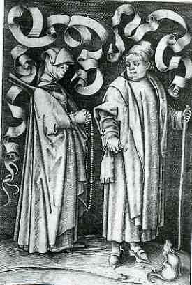
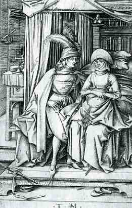
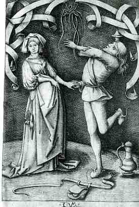
     blog 26 mar humanist 1733At about the same time as the development of a tonal system in the art/print world–which appeared later of course than that in the painting world, given the means of production for the printed medium–came the introduction of the deeply and occasionally troubled vernacular.  The examples below are works done in a cycle by the semi-problematic Israhel van Meckenem (ca. 1450-ca.1510), whose productive and highly-skilled period of productivity swirled around that of Mantegna*, Schongauer, Durer, de Barberi, and Raimondi.  He  is not well remembered in the histories of early printmaking, even though  he had magnificent skills, though not as prodigious as those of his contemporaries.  It is interesting to note that in addition to his artistic and technical prowess, van Meckenem also had a hard touch for business.  For example, answering a particular and immodest call, he produced images exploiting fears of death and eternal death.  Some prints  were, upon purchase and display, supposed to ward off the Plague.  Others presented images of Christ, purchased by hopefuls as indulgences to free them of the burden of thousands of years in Purgatory**.
     blog 26 mar humanist 1735


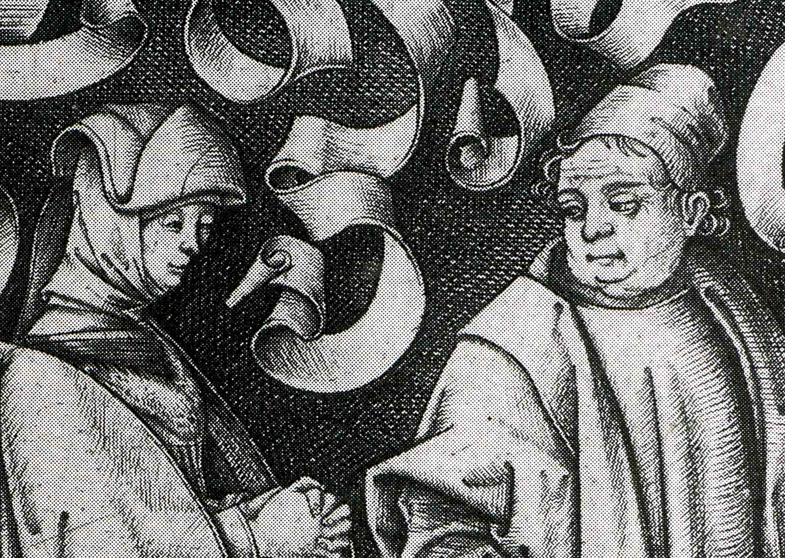
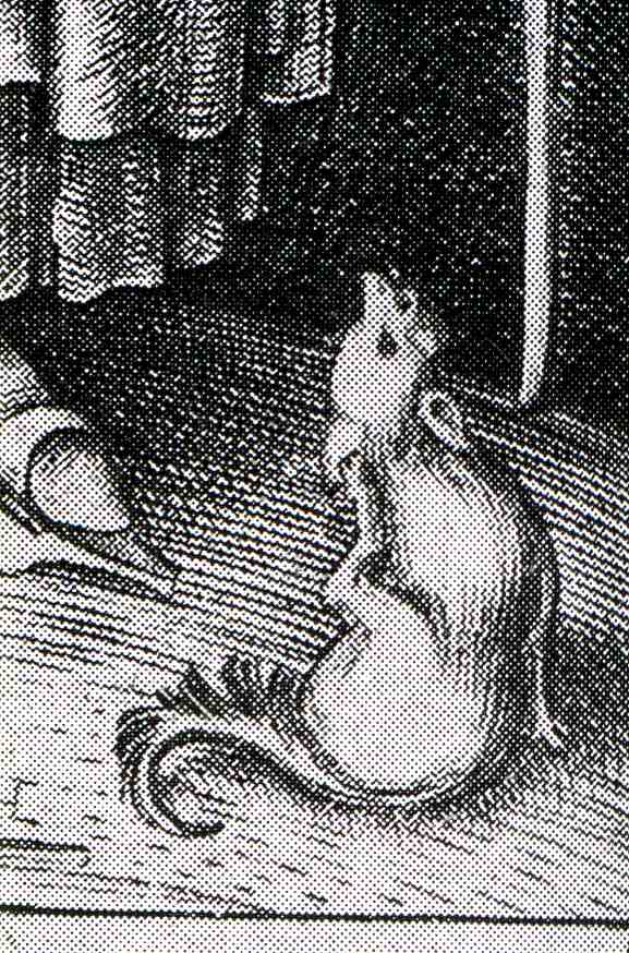
    This series captured my eye because of the eyes it captured.  It is a lusty series of profane images, or at least they were one-way lusts and desires.  In general, the women in this series seem pretty resistant, if not militant and disgusted, by the fumbling and obvious (or oblivious) suggestions of the men.  The women are distant, arms crossed, leaning away, eyes averted.  In the example above, a church-going couple are, well , going to church, but the man/husband seems to be thinking of a different sort of worship–for her part, the woman/wife keeps her hands very prayerfully clasped, knuckle-busting tight; the scrolls in the back seem to be ready for the thought-balloon legend “oh dear sweet god leave me alone!”.  The busty-jowled, pigdog man’s emotion is clearly displayed in his fat-lidded eyes..  (As a humorous aside, if you look closely in the right bottom corner of the print you’ll see a small doggie scratching itself, which I take to be the artist’s statement on the whole scene.  I’ve included a detail at the bottom of this post.)

     blog 26 mar humanis knife737
     blog 26 mar humanis knife738

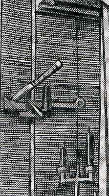
    Next is this slightly ambiguous scene of a puffy-plumed man staring hard at his “date”, sitting at the edge of a bed.  Her look is non-committal; his isn’t.  (Perhaps she is pregnant? )  The wonderful bit about this scene though is the knife in the door above the latch, sunk deep into the wood by the man to keep whatever was going to happen private. 

    The final image shows a dancing man–his purse loosened and on the floor to free him up, I guess–trying his best to impress his lady.  The woman, obviously, wants no part of the foolishness.  Her body language is slight but VERY clear.  He tries to hold her hand; she only lets him touch her, her fingers straight and her thumb relaxed, not gripping anything at all.  She just wants to get the hell out of there. 

    And so we have a modest introduction to foolish sexual dalliance, ca. 1500.

     blog 26 mar humanist 1732
      blog 26 mar humanist 1736


    * Andreas Mantegna has been credited with beginning printmaking in Italy, as has the Master of the Playing Cards in Germany. 

    ** Some of the prints were sold with indulgences for 45,000 years out of Purgatory.  The problem with these things is that no one knew if 45,000 years meant anything at all in terms of time-in-eternity.  My guess is that you’d need a whole lot of those things to make any difference at all. 


  • Imaging Mass Casualties: the Big Crowd series, continued.

    JF Ptak Science Books LLC  Post 562

    Crowds 001

    Few
    things capture the attention of the general reader quicker than a comparative
    display of what mass casualties looks like. 
    Putting an organized, recognizable face to concepts that are vastly
    removed from the common experience is very compelling, and demands
    thought.  (I’ve made a small number of
    posts on the display of quantitative data via the use of crowds and masses of
    people “The Department of What Things Look Like: the
    Casualties of the Somme, Visualized
    “,
    as well as the general confusion in images of enormous crowds “Crowds and the
    Press of Humanity: WWI German Prisoners, November, 1918″
      ,
    and also as the history of crowds in art  “Clarity and Confusion in Displays of Human
    Masses 
    “
    .)

    Today’s post (from the Illustrated London News for September 1932)  follows the line of the Somme Casualties  post, showing in two very striking images what
    large-scale death looks like
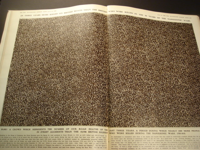
    .  The first, montaged,  photographic  image depicts the number of people killed (20,169)  in Britain over a three year period in automobile and other traffic/roadway accidents.  This does not include the number of people injured, which would be ten times greater than this image.  (I’ve included a magnified view of a small section just to show that this was not a picture of dots, but actually a lot of people, men mainly, wearing hats.)  In contrast, the caption-writer points out that this three-years period produced more deaths among the British than all years of the Napoleonic Wars (1793-1815) combined.  This comparison was made in a plea for safety on the roads. Crowds 002

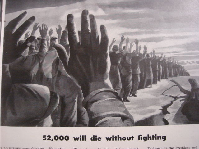
    And as a matter of fact, deaths on the roads in the U.K. significantly decreased over the years:  from about 7,000 a year in 1932 to 2,900 or so in 2007.  In 2006 in the United  States, on the other hand, more than 13,000 people were killed  in alcohol-impaired traffic accidents alone; that represents about 30% of all traffic fatalities, which  numbered about 52,000.  A year.  This is also nearly the same number of all American service people killed in the Vietnam War.  For the same period of time,  driving deaths in the U.K numbered 2,900 people in a population of 61 million and for 230,000 miles of roadway;  there were 52,000  deaths in the U.S. in a  total population of about 300,000  driving on 4 million miles of roads.  When you look at the deaths per miles of roadways, the two country’s statistics are very similar

    Crowds 003 The second image comes from an ad for American Locomotive in LIFE magazine for 11 January 1943.I t was a plea for industrial safety during a period of war, stating that in 1940 there were 52,000 people killed on the job (!) in the United States, with more than 2 million injured.  American Locomotive pointed out that this was equal to the loss of some 500 million man-hours (sic), which was not affordable to the country while fighting a two-front war.  It is a striking image, and must’ve commanded a fair amount of thought to anyone seeing it. The 52k figure sounds very big and too-strong to me, given that the American population was  132 million, meaning the work force was around half of that.  

    A “Safety First” motto was developed from this effort.  (Say it and it’s so (?))


  • Sublime Mundane: a History of High School Lunches and the Commercialization of Children’s Needs

    JF Ptak Science Books  LLC  Post 561

     blog 23 mar lunch724

    This is another in a series of posts on the Sublime Mundane–books and pamphlets whose titles are nothing if not introductions to spectacular nothingness.  Sometimes these publications are indeed about disappearing wisps of lost lint, and sometimes not; sometimes the mundane and seemingly stupifyingly “normality” of their subject matter leads to something of deep depth.  Today’s pamphlet, left, fits the second category. 
    Part of the interest in this work–outside of its momentarily arresting title that has a potential for being a cascade of boredom– is that it so quickly rights itself into an important topic.  That’s not to say that it isn’t a boring topic, as my quick and semi-feeble research reveals.  It does get interesting though when you consider that it took so long for the recognition that, since all of these children in school have been brought together, that there wasn’t some sort of federally organized effort to make sure that the weakest members of this group had at least one decent meal a day.  That said, the earliest program were for students who could afford to pay for their lunches.  Perhaps it was assumed that, around the turn of the century, there were no lunch rooms per se and that children would eat wherever they could find the space, that many children were also going home for lunch, and that they were all being fed.  (I do remember that some classmates of mine in P.S. 29 would go home for lunch, and I remember wondering exactly what that was all about.  I can recall taking my brother for special every-so-often-Friday treats at Joe & Pat’s Pizzeria for three slices and two cokes for a dollar back there in 1968.  But I digress.)  It actually took a little time before children’s lunches at school were made to be free to those who needed it. 

    Which brings us to Marion Nestle’s Food Politics (Berkeley, University
    of California Press, 2002), who discusses the early commodification of children’s food: “School meal programs
    began during the Great Depression of the 1930’s. From
    the outset, they had two purposes: to help dispose of
    surplus agricultural commodities owned by the government
    as a result of price-support agreement with farmers ,
    and to help prevent nutritional deficiencies among low-income
    schoolchildren. Because chronic disease risk factors were
    not an issue at that time, the rules specified meals that
    used surplus commodities and were higher in fat, saturated
    fat, sugar, and salt—and lower in fiber—than recommended
    in later years.”  All of which is detestable and unwholesome and immediately transparent.

    Perhaps the really interesting stuff on feeding children at school starts here, in the 1930’s, and that with the commercialization of children’s biological needs, breaking the back of an agricultural finance Vintage-space-lunch-boxproblem in the school lunch rooms.  The lunch as commodity expands from massive leftover projects into something a little more insidious in the television age, when children not only get to dress their foods in the sorts of containers that they wanted (lunch boxes), but also were being deluged with displays of foods that they could select for themselves via television.  This commercialization process gets ramped up decade by decade, until in the 1990’s and 2000’s the lunchroom has in some cases become an extension of the t.v. commercial, and that local and state governments are counting the value of sugary waters, salt, and catchup packets while plying the rest of the arrested nutritional package with prepackaged conglomerate goodness.

    And such is the value of the sublime mundane, at least for me–these items are filled with possibilities invisible to their titles. 

    Even after all of this, I must confess that I would dearly like to have a Fireball XL5 lunch box to take with me into eternity.  All systems go!

    Some interesting links with more than you need to know about school lunch history:

    The Food Museum Online Exhibit:  School Lunch History
    School Lunch Programs in the USA (according to city)
    School Lunch Programs in Europe

    ·Posted by :

    ·in:

    — —

  • The History of Dots and the Isotropic Universe: the Iconic Image of the Irregular, Dot-Filled Milky Way Galaxy of William Herschel

    JF Ptak Science Books LLC  Post 560

    Lucretius (95-55 BCE), in his Nature of the Universe, stated that  since there is nothing outside the universe, it must be infinite: “the universe stretches away…just the same in all directions without limit”;  it stretches far and wide into immeasurable depths.  All that is in it, he reasons, is distributed equally and in the same way.  But this is not the case, even in light of Edward Milne’s cosmological principle (1933),  stating that all  places in the universe is alike—which is true, except that there are vast disturbances in very large local areas that distinguish themselves from other places.  The work of Gamow/Alpher/Herman  (1939) and Penzias/Wilson in establishing the cosmic microwave radiation  (CMB)  shows that the observable universe to be very close to homogeneous and isotropic, and of course accelerating. (Suffice to say for this short post that there are models– Friedmann-Lemaître-Robertson-Walker (FLRW) model for example– which show the observable universe to be  “weakly” inhomogeneous and anisotropic; but generally and on average the isotropic models stand.) 

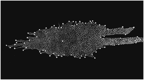
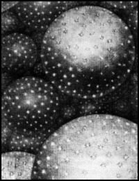
    Blog--herschel Perhaps the earliest published “bump” in the calm waters of the equal-distribution universe occurs with William Herschel (1738-1822), who in 1785 published a revolutionary image of the “Stellar System” (the Milky Way), showing its irregular pattern and the off-center placement of our sun amidst a panoply of other stars.(His image was remarkably and substantially correct, with the most grievous error being the placement of the sun too close to the center of the galaxy.) It was an image which bought the idea of a not-so-humano-centric idea into popular philosophy. This galacto-centric view remained until the work of Harlow Shapley’s globular clusters in 1918.

    Blog--wright, thomas

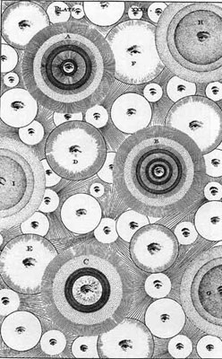
    This varied quite widely from the images of other astronomical observers and theorists such as Thomas Wright (1711-1786), who in his book An Original Theory of the Universe (1750) gives the Milky Way a friendlier, homogenous manner, overruling his earlier theory that the stars were “promiscuously distributed through mundane space” and delivering a theory of the stars organized in a regular pattern based upon a hierarchical center of some sort around which everything else was positioned.  He also provided this fabulous image of the centers of galaxies as an immutable, transcendent force, the eye of the creator, rather than the simple, positive dot.

    This idea was picked up by Immanuel  Kant (1724-1804) who in his own work, The Theory of the Heavens (1755), expanded on the multiple centers of creation(s) (an “endless immensity in an unlimited plenum of creations”) of cascading and separate galaxies, and detailed a vast system of disk-shaped galaxies which revolved around centers which in turn revolved around other centers, becoming far vaster, though all were centered on a dominant, universal center.

    Blog--kant But it was Herschel’s images of the dots that came closest, longest, to the most accurate and appealing depiction of the universe, especially with the location of our solar system’s principal dot seen as a dot among dots in a universe of dots. 


    ·Posted by :

    ·in:

    —

  • A Battleship in Union Square: the “USS” Recruit, 1917, & the Invention of the Word “Landship”

    JF Ptak Science Books LLC  Post 559

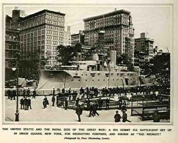
               blog 23 recruiot shiop727
    Well, perhaps this isn’t the origin of the word “landship”,
    but it does make for a snappy title.  The
    fact of the matter is that the Mayor of NYC, John Purroy Mitchel,  had this model of a ship (designed by Donn
    Barber and Jules Guerin, and sort of based on the USS Maine) built to attract greater numbers to the city’s recruiting station,
    as it lagged behind the established quota of 2000 enlistments for the Navy with
    only 900 men.  The 200 x 40 foot landship
    did the job, gaining 25,000 recruits (until it was disassembled in 1920),
    though it didn’t work very much magic for the mayor, who lost his election
    later in the year.  Actually, the gung-ho
    Mitchel lost his entire life in 1918, after volunteering for the Army Air Corps and
    dying in a training accident. 

    ZZZZZZZ]


  • History of Dots 7: Dots versus Lines, Engravings versus Half-tones

    JF Ptak Science Books LLC  Post 558

    Engraving_example
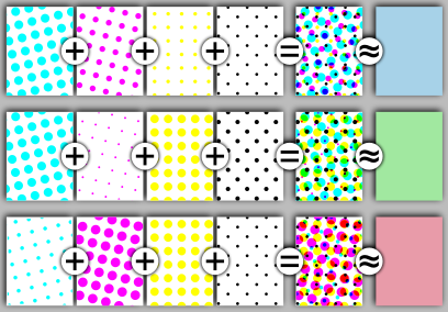
    The history of illustration has some distinct phases:  from woodcut to wood engraving to engravings on metal to lithography to printing in colors to chromolithography…and then on to a process that would begin to do away with all of those processes, the half-tone.  This was a process whose foundation was laid in the 1850’s by William Fox Talbot and brought to life in 1873 by Stephen Henry Horgan, though  it really wasn’t commercially viable until  Frederick Ives  further deepened the process in 1881, finally becoming a staple in the printing industry in the mid 1890’s.  The half-tone process would basically due away with the line-centric engraving process, as it was much quicker and easier to use, making images much more readily available to daily-printed media like newspapers.  Images that were drawn could be rendered without being engraved; also, one of its greatest advantages was being able to reproduce photographs, which was an enormous breakthrough, as a photograph automatically increased the veracity of the image. (During the U.S. Civil War, reader’s of the illustrated

    Stieglitz-gossip-1905

    weekly journal Harper’s Weekly trusted battlefield images more if the wood engraving appearing in the magazine was copied from a photograph rather than being from the sketchbook of the

    correspondent on the scene.  The photograph would capture a particular point in time (nearly) instantaneously, whereas the war correspondent artist captured bits and pieces of an instant flavored with memory and subsequent action.  The phrase in the credit line. “Drawn from a photograph”, had real value.)

    MorseCodeForever
    And so it came to pass that the happy lives of dots and lines–so important and intertwined in such things as the Morse Code–made a particular and dramatic break with the triumph of the half-tone over the engraving in illustrating popular publications (from the 1890’s to the 1980’s). 

    The image above at left is a magnification of an engraving from 1760;above right is a half-tone image of a 1905 Alfred Stieglitz photo; below left is a magnified sample of what the Stieglitz was composed of; and bottom right finds an illustration of the different combinations in size and color that would effect the composed final image in the final column. 

    Halftoning_introduction

    408px-Halftoningcolor.svg


  • Getting the Future Wrong: Missing Beethoven and the Grosse Fugue

    JF Ptak Science Books LLC  Post 557

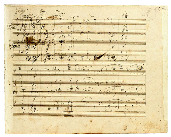
    Beethoven
    Dark is the present that denies change, or misunderstands it,
    or ignores it. I was thinking
    about this last night watching Ed Harris in an odd movie about Ludwig van
    Beethoven (“Copying Beethoven”, made I think in 2006)—more precisely it was
    about Beethoven’s time from 1824 to his death in 1827.   The movie introduced a woman who was sent as
    his score copyist as the Maestro worked the final days of the 9th
    symphony. (There were copyists of course but not women; I couldn’t imagine a
    woman filling that role for Beethoven, and I’m not sure what was added to the
    general knowledge of the man by supplying a fictional character in a general
    grand biopic.  Seems to me that we would
    have all been better served if the movie was told from B’s point of view and
    that the copyist was a creation in his own mind, a fragmentary muse.)  It was an offhandedly annoying film, except
    when it touched on the Grosse Fugue, which I don’t think I’ve ever seen
    mentioned in any movie that I’ve ever seen. 

    The Grosse Fugue was supposed to be the last movement in his
    String Quartet No. 13 (opus 130), but it was so difficult to perform, and it
    was so incredibly unlike anything else and so completely insistent in its
    originality that he was persuaded to replace the movement with another work,
    allowing the Grosse Fugue to survive in its own (opus 133) as a titanic single
    movement composition. The music was very
    hard and demanding—in the movie, the completely-deaf Beethoven sat facing the
    musicians at the front of the audience, and slowly but steadily as the piece
    was played the audience left, until at the end almost no one remained.  Ed Harris’ Beethoven was overjoyed that the
    musicians played the piece successfully, and then was shocked to see that there
    was almost no one left who had been listening—no one “got it.”  It was seen as a beastly piece of music from
    a beautiful beast who had lost touch—it remained so for a long time, too.  (The great Louis Spohr, along with almost
    everyone else in the 19th century, found it “an uncorrected
    horror.”)  Anyway I liked the idea of
    tossing the Fugue into this mix—surprised, really, to see someone deal with the
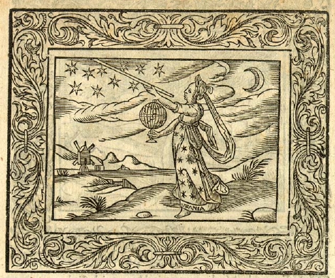
    thing.Urania

    But as with many visionaries, their insight into the future
    can be largely solitary—Beethoven’s visions lasted longer than most.

    Johannes Kepler, in the midst of finally overthrowing the Aristotilean
    concept of the universe in his Harmonies
    of the World
    , writes to Urania, one of the nine Muses, the Muse of
    Astronomy (and also the favorite of John Milton in Paradise Lost):

    “But now, Urania, there is need for a louder sound while I
    climb along the harmonic scale of the celestial movements to higher things
    where the true archetype of the fabric of the world is kept hidden. Follow after, ye modern musicians, and judge
    the thing according to your arts, which were unknown to antiquity. Nature, which is never not lavish of herself,
    after a lying-in of two thousand years, has finally brought you forth in these
    last generations, the finest true images of the universe. By means of your
    concord of various voices, and through your ears, she has whispered to the
    human mind, the favorite daughter of God the Creator, how she exists in her
    immortal bosom.”  It seems as though he
    could’ve been writing about a lot of things, not the least of which could’ve
    been our immortal Ludwig van. 

    Beethoven’s Fugue, like some of the other late quartets would
    have to wait, unappreciated, not understood, for a hundred years, a little
    piece of the future swathed in black. A
    Dickensian-black, a Victorian mourning-black, when black in mourning (for
    women, anyway) was deeply black. Bombazine black (a lusterless, lightless black material that ensured
    nothing but black). Arnold Sommerfeld’s
    B-1 bomber black. 

    And then somewhere in the earlyish 20th century
    it wasn’t a figment of bad imagination anymore; the Fugue was recognized as a
    piece of modern music written hundred years too early. To top it all of Igor
    Stravinsky said that the Fugue was a piece of contemporary music that would always
    be contemporary.  Except of course when
    it was written as a piece of the future in a dim past.

    ·Posted by :

    ·in:

    —