A Daily History of Holes, Dots, Lines, Science, History, Math, Physics, Art, the Unintentional Absurd, Architecture, Maps, Data Visualization, Blank and Missing Things, and so on. |1.6 million words, 7500 images, 4.9 million hits| Press & appearances in The Times, Le Figaro, Mensa, The Economist, The Guardian, Discovery News, Slate, Le Monde, Sci American Blogs, Le Pont, and many other places… 5000+ total posts since 2008.

Author: JF Ptak

  • A Long, Low, Massive Circle: Circular Building, 1938

    JF Ptak Science Books LLC  Post 639  Blog Bookstore

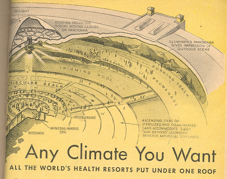
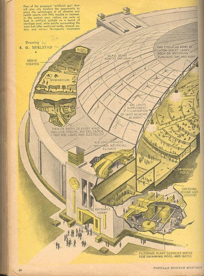
    This re-surfaced idea for a
    mega-spa was very wide, very long and very low. 
    Karl Stoldeck and J. Goldmerstein—architects and planners in Berlin—published
    a broad idea in 1928 called Thermenpalast (Thermal Palace, Spa Space, something
    like that), and although it seemed to satisfy almost everyone, the idea was
    consumed in the general economic malaise of the depression of 1929.  It looks as though the idea had a little life
    again in 1934, but there was a problem with fund raising.  The idea came back again, broader, bigger,
    and more defined, finding some idea-space in the Popular Science Monthly for
    March, 1938.

    Blog--jun 6 1

    The structure for health and
    exercise was massive—as a matter of fact, it would’ve been the most massive
    circular project in history.  The
    building had 6.5 acres under glass, which makes it 280k or so feet, giving the
    building a diameter of 1,800 feet and a circumference of something just over a
    mile.  IT looks as though the ceiling
    reached a maximum of 250’ or so; seeing that the dome would also be about 1200,
    that presents a little engineering problem. 
    But no matter:  it would never be
    built, anyway, even with Nazi dollars from home.

    The building was quite a feast
    of the body—there was a mountainside panorama around the exterior wall,
    illuminated from a  series of light sources
    from the ceiling.  In diminishing concentric
    circles: there was a mile-long running track, a promenade just inside that,
    followed by a spectacular pool which looks to be 4000’ long and 100’ wide!  Interior to the pool was a wide “beach”, a
    restaurant, park and lounging area.

    Blog--jun 6 2

    This was also a multi-floor
    building, with gyms and restaurants and a long series of health baths.  The entire spectacle would offer many
    different climates depending on the needs of the clientele. 

    The cost:  6 million, U.S. A few years earlier the Empire State 
    building was built for $24,718,000. The
    architectural firm Foster + Partners

    released designs for a the largest building (“Crystal Island”)  ever built: 
    2.5 million square meters (8.2 million feet, or 35 times bigger than
    this 1938 idea), with a tower 1476 feet tall, all sort of circular, and to be
    built in Moscow.

    Had the thing been built in Berlin and started in
    1938, it would’ve been about ready to bombed on the day of its completion. 

    Here’s an interesting read on water parks:  Water, leisure and culture: European historical perspectives, Susan C. Anderson, Bruce H. Tabb, 2002.


  • Michelangelo v. Leonardo, Blake v. Newton: Famous Contraries Chess Set

    JF Ptak Science Books LLC  Post 638  Blog Bookstore

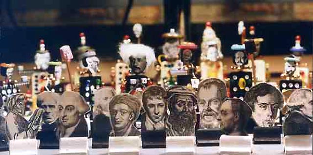
    Some years ago I made a chess set whose pieces forced a
    battle between mathematicians and physicists. The pieces were constructed with
    a mélange of bric-a-brChess ac and junk, all with the same bases of dominoes.  Each piece was an identifiable person from
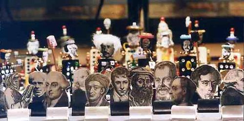
    the history of their respective fields.  And
    while the two divisions of science have become necessarily more porous over the
    years, there remains no difference that there still is a difference between
    math and physics. I brought this set with me when exhibiting my rare bookstore
    stock at national meetings for the American Mathematical Society  and the American Physical Society, and it
    attracted a lot of attention—more so for the choice of who was what piece than
    any game that was ever played on it. (The mathematicians were much more
    ambitious in offering their opinions on the choices of mathematicians per
    position.)   There are chess
    sets of “contraries” on the mass production market, though it is usually
    limited to Star Wars and Civil War figures—and there it is generally generic
    figures for anything outside the King and Queen. 

    I was intending on doing a post today on the unpleasant
    contrariness of Michelangelo and Leonardo. (These guys are two of a small
    number of people who are instantly identifiable by one name only, though a very
    popular and vastly oversold modern author chooses to use Leonardo’s second name
    as the identifier, a distinctly minority position….like referring to Michelangelo
    as Buonarotti of Florence.)   And then it struck me how interesting a
    chess set would be made up of such opposed figures, happily or not squaring off
    against one another on the 64s. 

    Finding the
    contraries is not so simple.  Skipping
    past Leonardo/Michelangelo (I’ll get to them in a minute) I went to the most
    famous of all contrarians in the world of science—Isaac Newton.  (Is the “Isaac” really necessary?) During his
    famously grumpy and combative lifetime
    Newton battled a night sky of most shining stars of
    his day:  Hooke and Leibniz being two of
    the greatest of these figures.  But I
    think for this chess set I’d have
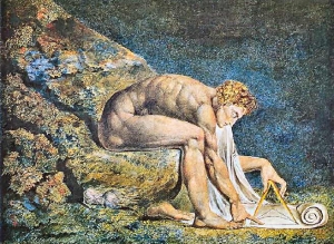
    Newton squared up against a man who wasn’t even
    born during his lifetime—William Blake. 
    Blake was an impossible anti-Newtonian, making a career of being a
    spectacular (and perhaps insane/manipulative) anti-rationalist,  a weaver of smoke, playing with and
    distorting images like a theramin player, using language to produce dichotomies
    in even the most standard of sensate ideas. 
    Blake was the poster child for thing anti-tech, an anti-scientist out to
    save the world from its scientific self, 
    the rationalist world set to destroy imagination, the “Antichrist
    science” hell bent on destroying the soul of art and religion. 

    “Art is the tree of
    life; Science is the tree of death” wrote Blake, and so he chose the
    “Athesistic”  Sir Isaac to stand for the
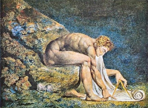
    beast, depicting him in art as a naked geometer intent on subjugating the world
    with a compass and a keen brain, reducing glory to quantification, the work of
    Satan..  For most of my life I thought
    that this image by Blake was celebrating
    Newton—I knew little of the poet/artist/poet, and
    thought the painting a reverence.  When I
    understood Blake a little,  I saw that
    the image was intended as a mockery of
    Newton and the idea of science—this was an unusual
    sensation, because absent the unspopken intention of the artist,  you could still take the subject matter of
    the artwork two ways. 

    Blake’s writing
    leaves no doubt about where he stood on the issue, even though much of it (to
    me) seems not terribly understandable due to its repeated and visceral
    self-reference and private language (“Reason is the bound or outward
    circumference of energy”, the “ratio of the things of Memory”:

    The Spectre is the Reasoning Power in Man,
    and when Separated from Imagination and enclosing in steel a Ratio Of the
    Things Of Memory, It thence frames Laws & Moralities To Destroy
    Imagination.   

    Science—embodied
    here in Newtonian mechanics, there in Renaissance rediscovery of classical
    perspective—was killing the “eternity of the imagination”.

    I could well imagine
    a “conversation” between the two men: 
    Blake saying Things, and
    Newton not able to find any space in his head for
    them, answering in silence.  OR perhaps
    he would be vicious.  God knows.  Newton died in 1727 when Blake was still in
    ueber-dimensional pre-pregnancy, waiting his turn to descend from the heavens,
    which was not bound to happen for another thirty years.
    Newton_blake

    In his otherwise
    brilliant book, Art & Physics,
    Leonard Shlain refers to Blake as a Cassandra, having the ability to see the
    future but not being able to say or do anything about it.  To think that Blake was “correct” in  foreseeing the problems that technology would
    bring to people’s lives leaves me baffled: 
    it is certain that people became more cog-nified with the advance of
    technology, but it also allowed for the birth of “free time” for the masses,
    giving them some soul and imagination that they would’ve have had if they were
    in a flat field in Poland pulling potatoes out of the ground for 18 hours a
    day.  Perhaps Blake was just referring to
    those lucky enough to wear clean white shirts and have a benefactor; perhaps
    all of those Others didn’t exist in his many scheduled god/heaven visions he
    had every day.   (
    I should point out that Blake published Songs of Innocence and of Experience:
    Shewing the Two Contrary States of
    the Human Soul
    in 1794, which was actually a varied republication of his
    1789 Songs of Innocence with the
    addition of the Songs of Experience.  Blake exposes the duality of experience and
    innocence, of their opposing nature in human existence, neither negating the
    other, both trying to survive simultaneously. 
    His engraved poems really are striking and gigantically, unreservedly, ars-religico-veritas
    of the highest Romantic order. And then some.)

    Back to chess and
    picking out the first pieces: :  Blake
    and
    Newton.  I’d
    have to give
    Newton the nod for Queen for the sheer enormity of his abilities.  Blake gets a pawn’s position, the first piece
    sacrificed. 

    Chess Contraries,
    Piece Two:  Michelangelo and Leonardo.

    It is odd that even
    though Michelangelo (1475-1564) and Leonardo (1452-1513) lived in the same city
    (Florence) for several years that the only thing that developed between them in
    the smallish societal/artist communities was a brew of mutual disdain.   Diplomatically speaking, the men did not
    care for one another, though it seems that the junior of the two,
    Michelangelo–who was a well-established rising star of 35 or so to the more
    famous Leonardo, who was 55—possessed the young man’s temper and was more
    outspoken in his dislike of Leonardo.  It
    does seem spectacular that the two greatest talents of the Renaissance could
    live so close together for several years and have no working or collegiale
    relationship, no exchange of ideas, nothing. 

    They did, however,
    almost work together in the same (big) room, though that too never came to
    fruition.  Both men received a commission
    from Piero Soderini to decorate the walls of the Council Hall of the Palazzo
    Vecchio with massive  (20×50’ !) paintings
    of great Florentine military victories:  Leonardo would paint the
    Battle
    of Anghiari
    and Michelangelo the Battle of Cascina.  Like much else in the careers of both of these men, the projects were unfinished–Michelangelo not even getting beyond the cartoon stage in preparation; Leonardo actually got paint on the wall,s but made an error in trying to quicken the slow drying time, and heated the wax undercoating enough to make the paint run down the wall and puddle on the floor.   It is interesting that  it would be Guiseppe Vasari–the man who wrote one of the earliest biographies of renaissance painters, and the creator of the Ufizzi Gallery, and a large talent in his own right–who would be brought in to produce one of the large paintings.  It seems to some that Vasari, ironically, painted his own work over that of the started  and probable masterpiece of  Leonardo.  (As a matter of fact, there is an art historian who thinks that some of the Leonardo might have survived under Vasari’s work; that story can be seen here.)

    I don’t mean to set out for pure contraries (like Ovid’s question
    of water and fire–cunctarum contraria semina rerum, Fasti, IV, 783, f–the
    yin and yang, and other entities combative at all points. The question here is
    for entertaining contraries at some interesting points—that’s good enough.  All aspects needn’t be the mutually exclusive
    of the other such that if one is true the other must be false.  There’s room enough for neither-true-nor-false,
    at least for this game, a wide-open Wittgensteinian arbitrary contrary.


    It might be interesting to have a look at Vasari’s estimation of Leonardo and Michelangelo; I’ve reprinted the first tow paragraphs for each from Vasari below.
  • Blank and Missing Things: a Map of Missing People of Central Europe and Russia, 1881

    JF Ptak Science Books LLC   Post 636  Blog Bookstore

    The History of Blank, Missing and Empty Things (Thread, #45)

    “Heaven and earth were one form…. (then they were separated
    from one another…)”

     In ancient times the representation of the gods and beliefs
    was handed from one writer or storyteller to the next, on and on, changes here
    and deletions there, for many generations. 
    This practice was possible (necessary?) because there really wasn’t a
    solitary scripture to follow (as in the Koran or the Bible) and no priestly
    class to guard and cherish a particular strong story line in all of its barbed
    details.

    Juden_1881  

    There are of course bits that have survived intact for
    millennia.  One of these is this fragment
    from one of Euripides’ lost plays (only 20% or so are complete), The Wise Melanippe, and begins a
    statement of cosmogony that states the creation of all things.  The separation of heaven and earth has always
    stuck with me, because this separation begins with Euripides with the creation
    of the world seems to continue on its way with mini-separations of all things
    over the course of time—like the cosmological world-bearing turtles—all the way
    down.  I’m not sure how or who exactly
    did this heaven-rending, or to what force it owed its being:  evidently the Presocratics tended to
    depersonalize the actions of the gods and grant their actions to natural
    forces, so the issue with the heaven-separation business may well have been a
    motive force rather than a god.  Anyway
    it’s the tearing apart, the removal, the separation phenomena that got my
    attention to begin with, and one which has stayed with me, though I’m sure that
    Euripides didn’t have that sort of violent rending in mind while describing the
    birth of the earth.

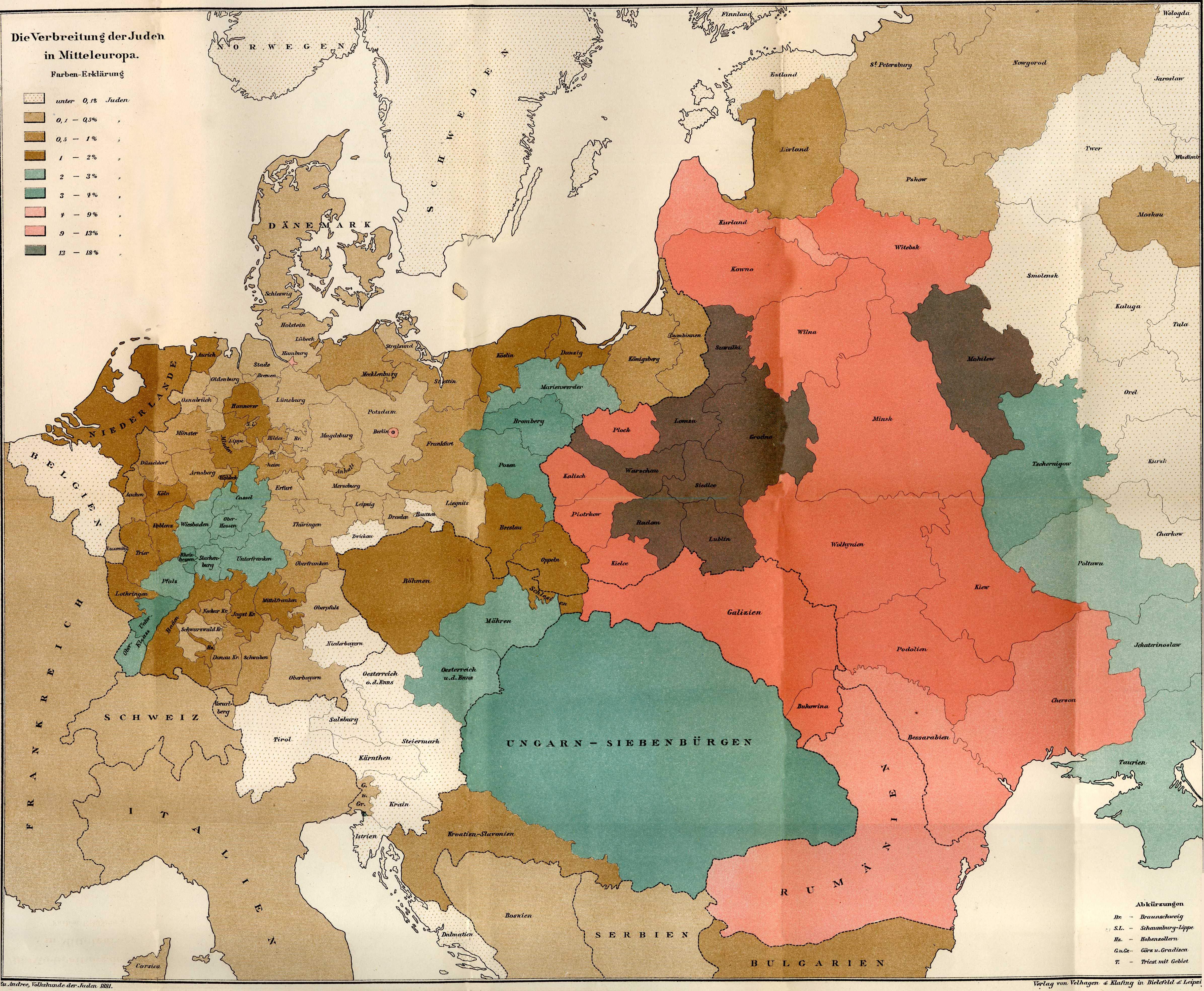
    And so it is with this map* showing the concentrations of the
    Jewish people in Europe  in the late 19th
    century. Between the time of the publication of this map—1881—and the beginning
    of the Nazi regime in  Germany
    in 1933, there were many persecutions and Pogroms and deportations of the
    Jewish people.  Nothing prepared anyone
    for the concentration camps and the systematic extermination of that people
    between 1935 and 1945.  What this map
    shows is the distribution of the Jewish people (by percentage of the total
    population) before they were eviscerated: 
    the difference between this map in 1881 and the map of 1945 would be completely
    different.  The Jews were gone:  killed. 
    Some deported.  Others
    escaped.  But they were basically torn
    from Europe  in the cruelest manner so that in
    almost every case the only indicators of their existence were shadows. 

    There are large-scale maps of this sort of evidence for
    other groups of people in their pre-Euripidean tearing from
    their home:  maps showing the locations of Indian tribes
    in North America (pre-Columbian, 17th
    century, 19th century, they’re all telling pretty much the same
    devastating story) is one good example of a slender category.  There aren’t maps for the mass extermination
    by starvation created by Joe Stalin, or the millions murdered by Pol Pot or Mao.  There are of course more small-scale,
    localized maps depicting the results of forced relocations or devastating war
    or drought or hunger or floods.  But few,
    I think, take such a compelling x-ray of a people’s past on a continental scales
    such as this. 

     *”Die Verbreitung der Juden in Mitteleurope”  found in  Richard Andree’s , Volkskunde der Juden…,  Verlag von Velhagen & Klefirg in Bielfeld und Leipzig:  1881. 


  • A Note on Forgetfulness: London, the City of the Lost (Things)

    JF Ptak Science Books LLC  Post 636  Blog Bookstore

    Blog--June 1--overiew In the panoply of play upon the
    title of this post are many variations. For example, book and movie titles which could  fill  the space in the
    category of “City of
    Lost _____” are Children, Dragon Lace, Souls, Soles, Angels,
    Heaven, Books, Dream and Men.   Filling in
    “The Lost City of _______” are Atlantis, Chernobyl, 
    El
    Dorado
    , Nan Madol,
    Abad,
    Bethsaida, Geraptiku, Trellech, Dvaraka and Uganit.  For “Lost Cities of ____” that were never
    really ever found, and which existed in the imagination and on the printed page
    would include Metropolis, Wonderland, Utopia, Narnia, Fredonia, Eden,
    Yuknapatawpha (County), Oz, Lilliput, Middle Earth (etc.), Slobbovia, Dune and
    Hell. 

    Blog--June 1--corset Then of course there are the
    cities that were and weren’t any longer (though some did come back but without
    its original inhabitants:  the annihilated Jewish ghettos of Europe, Nagasaki, Hiroshima and Nanging
    are just a few that come to mind.  New Orleans seems to be in a different category, partially destroyed
    by benign neglect and arrogant stupidity at the very highest reaches of the federal
    government (and resting in the one man, now thankfully lost). Blog--June 1--toys

    It would be fun to write a history
    of forgetfulness with its companion volume on The Lost., but that has been
    accomplished a number of times, already (see below*).  

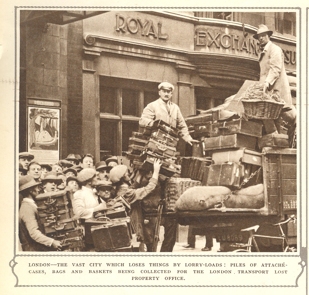
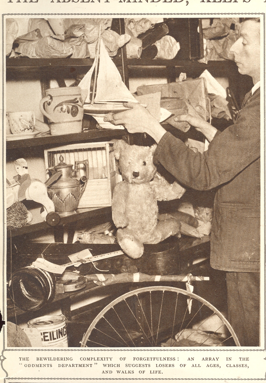
    Blog--June 1--chick My post is not an attack upon London or its imaginary lost souls–it really is about lost
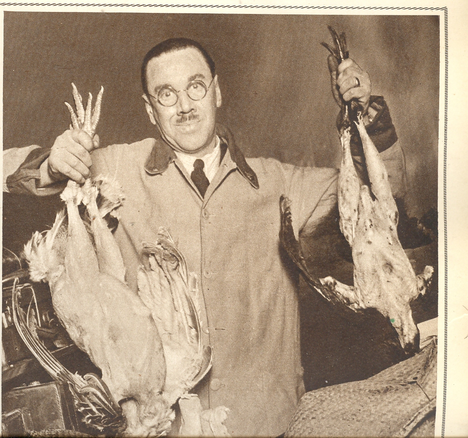
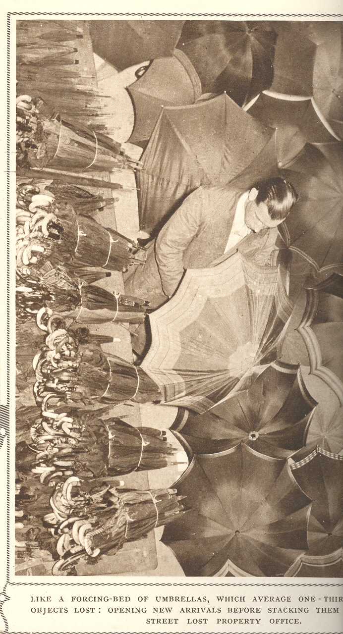
    things.  The images come from a fabulous article from the Illustrated London News of 5 March 1938 called “Forgetfulness by Tons and Thousands; How London, the Absent Minded Keeps Lost Property Offices Busy”. Evidently, in the old days when London Transport were superb, there was a very well orchestrated and
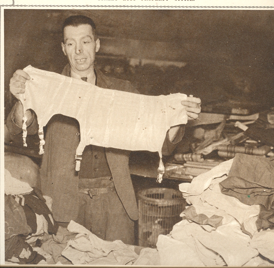
    Blog--June 1--umbrellas detail-orientated staff that collected the lost things of the day found in the Tube, tram depots, buses and lorries; they were gathered and brought to the London Passenger Transport Board at Baker Street, where all of the items were meticulously cataloged and stored, kept for a half year (?!), all registered with the Lost Property Office. Add so aside from the pinch-faced Aubrey Beardsley-fingered man handling the sailboat, and the Floyd the Barber lookalike celebrating the fowl, and the low-belted quizicum inspecting the nether garments, and the slick-haired man inexplicably opening all o the thousands of closed umbrellas, are the following statistical bits on Lost Things Identified for the Year 1937:  49,9999 pairs of gloves; 19,978 single gloves; 33, 361 pieces of clothing; 25,489 attache cases; 24,600 books; 24, 158 pieces of “undefined property in parcels”; 5,805 spectacles; 5,278 keys; 4,005 pipes; and 2307 different pieces of foodstuffs.  All this was just part of a grand total of 348,477 lost things for one year.

    I think it would be fabulous if there was some lost room there at the old Lost Property Office, a place waiting to be rediscovered after the room itself had been lost for the last 71 years. If I had to chose I’d certainly would shout for Mr. Beardsley-fingers–he is,after all, pictured in the beautifully named “Oddments Department”, admiring the “beautiful complexity of forgetfulness” stored there.  Perhaps that room would be filled antique story lines, lost-items-found that were of such an unusual origin that the professionals used to dealing with such things found these to be unclassifiable, tossing them all into a I’ll-Deal-With-it-Later locale.  The material seems like a lock looking for a treasure.

    *Philip Grove’s The Imaginary
    Voyage in Prose Fiction
    (1941); Pierre Versins’ Encyclopèdie de
    l’Utopie, des Voyages extraordinaires et de la Science-Fiction
    (1972);  Alberto Manguel
    and Gianni Guadalupi. The Dictionary of Imaginary Places
    (1980, 1987, 1999)

    ·Posted by :

    ·in:


  • History of Lines: Human Queues, Fascist Italy

    JF Ptak Science Books LLC  Post 635  Blog Bookstore

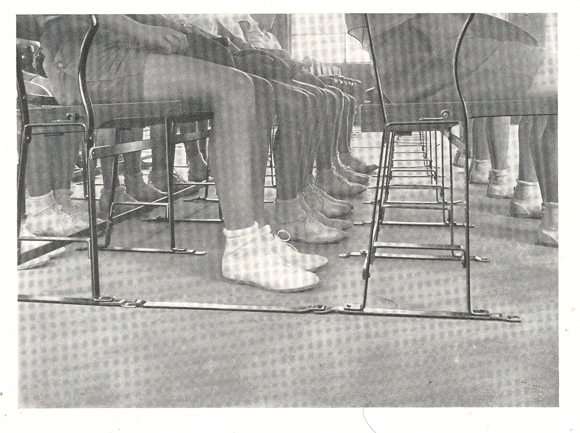
     Blog--june 1 feet In my imaginary History of Lines there is a subsection for
    humans-in-line(s).  In the history of the
    world, the fourth and fifth decades of the twentieth century—the 1930’s and ‘40’s—were
    big ones for human lines.   Big does not imply
    good, because as we all know lots of humans lined up for all manner of
    unspeakable nastiness during this time and well more than 100 million didn’t
    make it out alive (considering all of the wars, purges, revolutions and
    stupidity).

    The lines here are a little more benign, though with
    shriveled overtones of corrected respect.

     Oppressive obedience in a well-designed environment is still
    like dressing your ear-infected 14-year-old St. Bernard/Jack Russell (?!) mixed
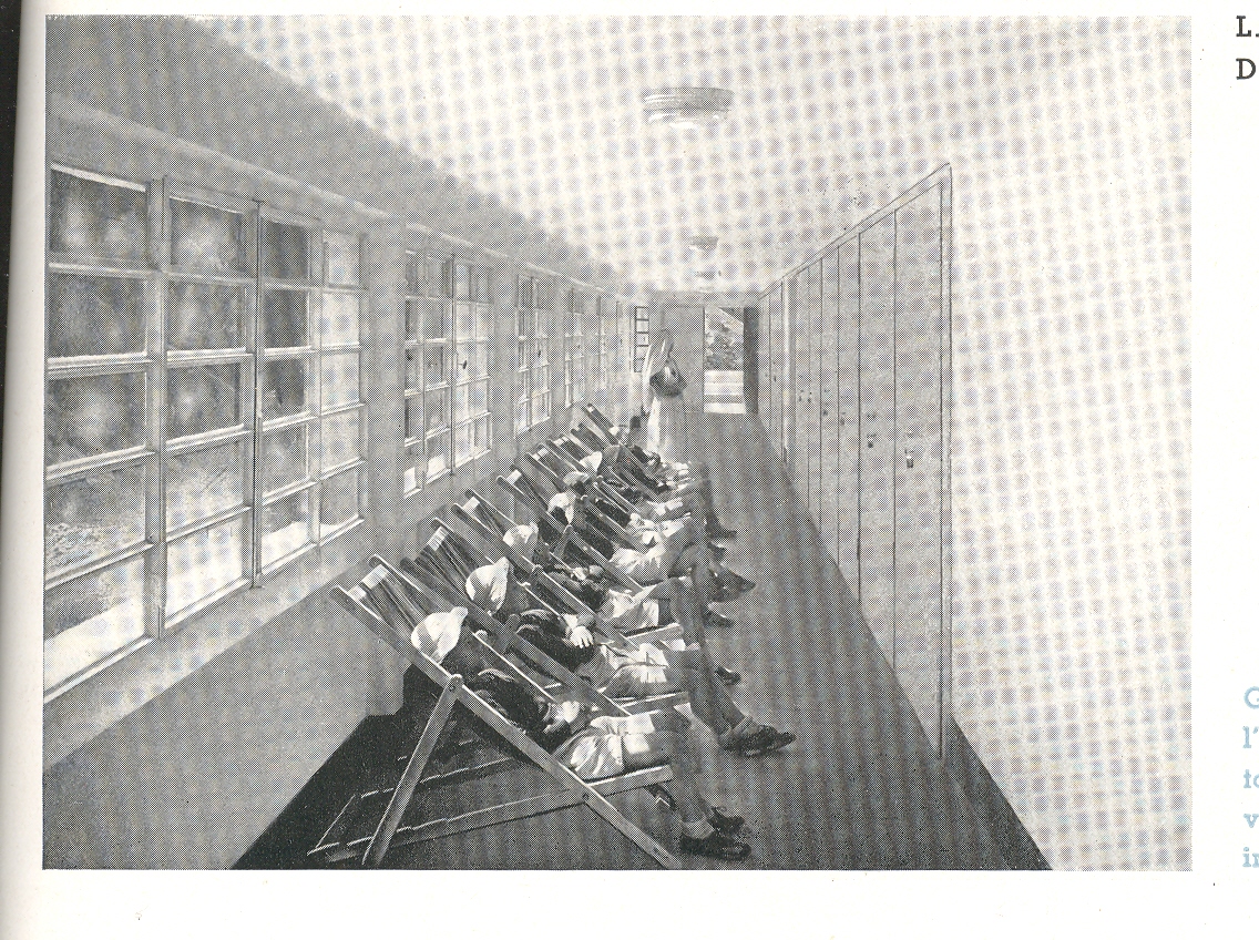
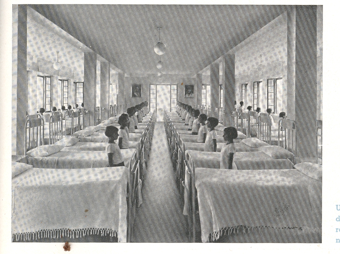
    breed in baby booties—its just not right, and these images attest to this simpy comparison. All of these photographs
    come from a delightful manufacturer’s catalog for linoleum products (Il
    Linoleim nelle Costruzioni Scolastiche
    ), which was printed in Umbria in 1935. 

    Blog--june 1sick I’ll undoubtedly write a post on this stylistic
    beauty later on, but suffice to say for right now that it really is a lovely
    thing.  If only we could forget the
    Mussolini part.  Now I’m no fan,
    necessarily, of linoleum, but if I had
    to live on a linoleum island far removed from civilization and I had to choose
    a design for my world, I would choose the designs from this catalog, without
    hesitation. They’re spare, well-proportioned, beautifully design utilitarian designs;
    they are also very shiney and cold with a dispirited order, but so it
    goes.  The catalog seems to speak for its
    times, the inspired design bowing to the weighty needs of the flatulent state.

     Even though the people (mainly child people) are in very
    structured environments, they still look as though they really don’t believe in
    whatever it was was happening.  

    Blog--june 1sick 001

    ·Posted by :

    ·in:


  • A History of Dots: Images of the Unbelievable, 1944

    JF Ptak Science Books LLC  Post 634  Blog Bookstore

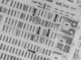
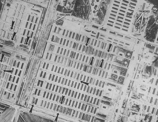
    Auschwitz dots 1The History of Dots, Part 12

    This is a detail from an unintentionally
    astonishing photograph made in 1944—the last line of its caption forming the
    basis of the title of this post. (“Click on the dots below for photos from the
    Album depicting events which took place at those points.”)

    It is the ultimate insult to consider these dots to be dots–though to some analytical eyes this is all they were; in extreme and unutterable cases, this is what they remain. 

     Auschwitz dots 2As you scroll down through
    these four images their origin becomes clear.

    This photograph was one of a series made on 31 May
    1944 by the 60 Photo-reconnaissance Squadron of the
    South African Air Force under the direction of the U.S. 
    Army
    Air Force–the purpose being to identify Nazi bombing targets, the principle object in this case being the
    IG Farben complex near the border town of Auschwitz.

     The base data reveals that sorties were flown and
    photographs made and presented from missions of 4 April, 31 May , 26 June, 25
    August, 14 September, 21 December (1944) and 14 January and 15 February 1945. (See
    HERE for the rest of the photographs.)
     The
    images were evidently captured as a result of the standard method of filming:
    taking pictures several minutes before and after reaching the target area to
    ensure that the primary objective is actually photographed; some of the sorties
    were executed to find the target, and others enabled to survey the damage done
    to the target (and to also see how quickly the targets were reconstructed). The
    “side” result is a record of the Auschwitz and Birkenau concentration camps, the
    significance of which seems to have escaped notice at the time, although the
    camp of Auschwitz III was indeed labeled as a “Concentration Camp” in the original. 

    Auschwitz dots 3

    IG
    (“Interessengemeinschaft”, 
    standing  for “Association of Common Interests”) Farben
    was a massive business concern composed of BASF, Bayer, Hoechst and other
    German pharmaceutical and chemical companies, 
    whose main political benefactor was the NSDAP and whose roots go back to
    the very formation of real Nazi power in 1932. 
    The basis for this mutual interest was principally the production of
    synthetic fuel and chemicals, but as the time pressed on that capacity expanded
    to many other roles essential for the functioning of the German military and
    the basis of Nazi power.  It is not
    possible to understate the importance of Farben to the production of the Nazi
    state and the waging of the war.

    After 20 years of back and forth historians have come to the
    conclusion that major industries/industrialist such as Farben didn’t actually
    “back” Hitler in the early days (1932/3/4) per se—that is to say that large
    amounts of capital didn’t flow into the NSDAP bank accounts from Big Money
    sources, though they (the every large majority) certainly did acquiesce to the
    social programs of Hitler.  Business in
    general certainly did well under the Nazi regime before 1938.  The giant bonuses for both the government and
    business/industry came after the attacks and conquests beginning gin 1938—it
    was at that time that these businesses rolled into the cities of the conquered
    land and took the tools of industry, the raw material and any else of value to
    expand themselves and to also help support the war effort.  The utilizeable means of production did not
    limit itself to goods:  the captured
    population was also put to work as slave laborers and worse.  And this is where Farben really makes its
    pact with the devil, as it was far and away the worst offender of putting
    humanity into its industrial oil can, making expendable people all together more
    so, using them as another piece of machinery; the prisoners were worked and
    starved to death, and once they no longer provided some sort of value to Farben
    (and etc.), they were sent to be eliminated at the extermination centers.

    Auschwitz


    These workers were generally “sold” by  the SS to private companies, though
    officially it was known as a “fee”. This practice broadened as the war grew on and
    the labor supply o these companies was drawn off by the army; by 1944 there
    were in fact millions of foreign workers doing labor in Germany itself, with
    companies like Volkswagen, Daimler-Benz, Krupp and Siemens taking solemn and
    completely lecherous advantage of the captured slave labor pool. 

    Back to the photograph: 
    these “dots” were the humans who were the expendable slave worker units
    who were burned up like an old rag once their utility had been maximized.  The official reason for this mission was to
    locate the Farben synthetic rubber works and petroleum plants, some 2k from the
    Auschwitz compound. 
    One of the last images shows the destruction to the camps by the Nazis who
    were trying to hide what had been going on there as they prepared for the inevitable arrival
    of the Soviets (who would arrive two weeks later).

    The arrows and annotations in these versions are the result of a reinterpretation of the images in 1978 by two photographic image analysts/interpreters at the DIA and did not appear of course n the originals of 1944. The arrows pointing at the “dots” were actually long lines of prisoners; there were arrows pointing to a rather long train heading off from a complex of tracks; there was the enormous barracks evidently housing a very large population within a town center; and there was the production of a fair amount of smoke from a not-small building.  It is a mystery why these images–one of which actually had Birkenau labeled as a concentration camp–didn’t produce a military reaction by the Allies, the question producing its own considerable amount of interpretation and study. remember now these annotations were made in 1978.)   The photo does show how nestled the camps were in the town and in the
    busy countryside; the main entrance to the camp was (and is today)
    located on a busy street.  The walls around the compounds remind me of
    the walls around the Warsaw Ghetto–if you needed not to see the obvious, you wouldn’t.  Except at the Auschwitz and Birkenau concentration camps there was also the smell….   Revisionist Holocaust deniers have actually employed these images to their own evil ends, using a feeble analysis to support the notion that the Allies didn’t act on the camps because the extermination and liquidation end of it didn’t exist.   This would be the extreme (gamma ray) end of the spectrum of interpretation, and an ultra-violent, criminal and instantly disposable way of reading history.  In Part II of this post I’ll have a look at some of the positions.

    [Reading list in the continued reading section, below]

    ·Posted by :

    ·in:


  • The Finnegan’s Wake of the 15th Century

    JF Ptak Science Books  Post 632  Blog Bookstore

    Blog may 30 philo


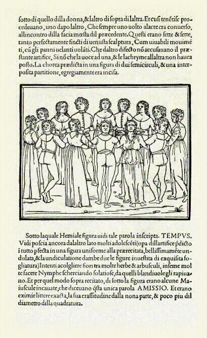
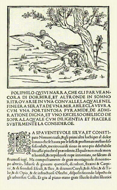
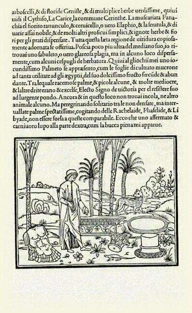
    Since I had a go at early illustration earlier today in this blog I thought to write something about a book that is probably one of the most beautifully printed books not only of the Renaissance but of all time.  The Hypnerotomachia Poliphili (The Strife of Love in a Dream)
    by Francesco Colonna was the greatest achievement by the greatest printer of the Renaissance (Aldus Manutius in Venice), a spectacular combination of story and type and design and illustration; an imaginative, secular Humanist self-romance like no other printed to that time.  ) See the entire text HERE.)


    Blog may 30 polyphilo dreams

    Hypnerotomachia means “the strife of love in a dream”, and the reference to Poliphili refers to the narrator of the story, Poliphilo, telling of the love affair between Polia and Poliphilo—the master text of the whole story though is a description of ancient art and architecture,  all told in a wonderful ”macaronic mélange” of Italian and Latin, and which were the “exact accounts” seen in Poliphilo’s dreams about Polia.. It is a  modernist book for being printed in the last year of the 15th century (1499), and stands for vitality and grace and superb design, and according to George Painter was the Finnegan’s Wake of the fifteenth century.  Painter continues, and writing that “Gutenberg’s forty-two line Bible of 1455 and the Hypnerotomachia of 1499 confront one another from opposite ends of the incunable period with equal and contrasting pre-eminence.  The Gutenberg Bible is somberly and sternly German, Gothic, Christian and mediaeval; the Hypnerotomachia is radiantly and graciously Italian, classic, pagan and renascent. These are two supreme masterpieces of the art of printing, and stand at the two poles of human endeavor and desire! “(Cited by Alan Thomas, Fine Books, 1967, pp 71-4).


    Martin Lowry in his The World of Aldus Manututus  (Ithaca, New York, 1979) makes another interesting statement on this masterpiece: “(Hypnerotomachia) was a linguistic and literary debauch, choked with recondite imagery, erudite periphrases, and exotic verbiage: a work so bizarre that many critics have felt a certain uneasiness at Aldus’ agreeing to print it.” 

    Blog may 30 poliphilo dreams

    It is truly an astonishing accomplishment, and its significance in the design of type and of the book really cannot be underestimated.  As E.P. Goldsmidt stated (in The Printed Book of the Renaissance, 1950, p. 52): “In the North an astonishing proportion of all Renaissance ornament and accessory design can clearly be proved to derive from Colonna…”

    The book is summarized here and below:


    ·Posted by :

    ·in:


  • Blank, Empty and Missing Things #44: Missing Detail in Illustrations

    JF Ptak Science Books LLC  Post 631   Blog Bookstore

    The History of Blank, Empty & Missing Things #44

    Blog--may 29--alexander In America
    and Europe for much of the 19th century
    books with illustrations received their color by the labor of small-handed
    women and older children.  For popular,
    inexpensive and widely distributed books engravings and woodcuts were often
    given their color by an assembly line process: 
    one person applying the red, another the blue, the third the green, and
    so on, until image was completed.  This
    was a fairly quick process—more than five colors was rare—and once done the
    sheets were left to dry before being sent off to be cut, folded, sewn, trimmed
    and bound.  The colorists wouldn’t really
    survive past the 1880’s or so, being replaced by machines and different sorts
    of coloring processes—the last book to be published for the mass market being
    the 1896 edition of Johnson’s Cyclopedia. 

    This sort of distribution of artistic labor was not new to
    the 19th century by any means. 
    Guilds dictating the strict observance of a painting’s preparation—making
    the canvas or preparing the wood, gathering the ingredients for making colors, making
    the colors, and so on—stretches back at least 600 years. Blog--may 29--alexander 001

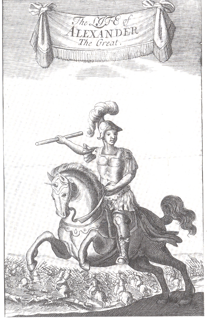
    I’m wondering about this because of an illustration that I
    found of extremely uneven accomplishment. 
    It occurs in Quintus Curtius Rufus
    The Life of Alexander the Great
    (“translated by several Gentlemen in the University of Cambridge”) and printed for Gilbert
    Cownly in 1687. (I can never let it pass that this is the year that modern
    science really began, with the publication of Newton’s Principia…
    .)  The engraving is the book’s
    frontispiece, and shows Alexander on horseback.

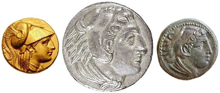
    Of course there’s no real portrait of Alexander, though his “likeness”
    appears on coins from that period.  But
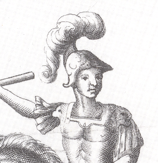
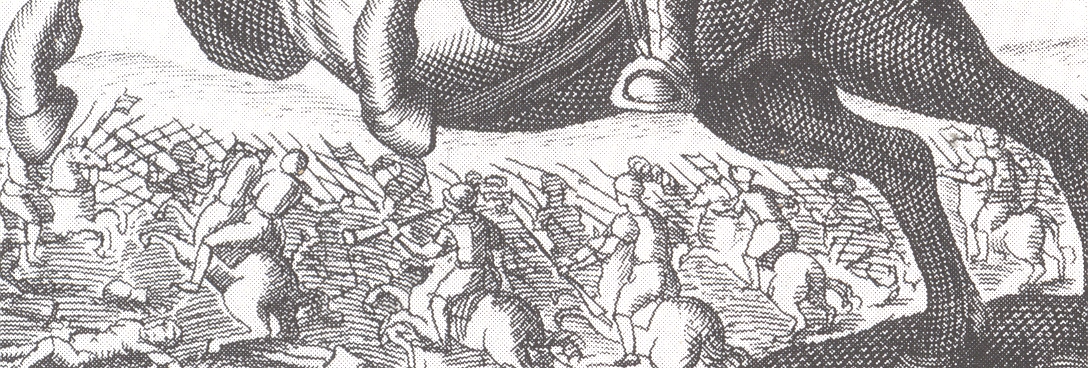
    the face in the engraving just doesn’t match up to the quality of the rest of
    the image.  The horse is a little nicer
    than standard for the period, and there’s a fair amount of detail in the
    background. 

    Alex_trio

    The face of the great
    Alexander though is pretty bad, drawn in almost as an afterthought even though
    he is the subject of the book.  Maybe the
    engraving’s elements were divided and distributed in the workshop to, say
    someone good at horses doing the horse, another good at executing armor doing
    that, and so on, until someone realized that no one was there to engrave the
    face. And so perhaps it came to pass that Alex received this cheeky/jowly face with a single-muscled skinny neck.  (I notice that none of the riders in the background have faces.)  Maybe there was only one artist, and they just got tired or figured this face was good enough, and moved on to the next project; perhaps there was just one engraver who was late for dinner and did a too-fast job on the face.  And maybe the face was just good enough, no matter who did or or how many people worked on it.  I’ve seen this sort of uneven effort, this missing detail in a detailed work, many times over the years, and I’ve always wondered what the story was.  And I guess I always will. 

    Blog--may 29--alexander 002


  • A Note on the History of Smiling

    JF Ptak Science Books Post 630  Blog Bookstore


    Where do exhausted 1951 smiles go?

    Blog--may 29--smile 7up det

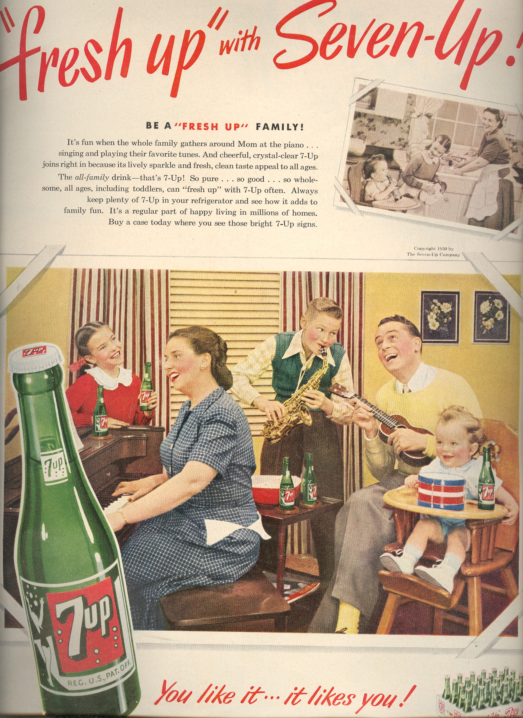
    I don’t know when the first illustrated advertisement appeared, and I don’t know when the first picture of a smiling human face was used in that in order to sell a product displayed in a mass market printed publication.  My sense though is that the smiling, happy (and too-happy) face was first used in the first or second decade of the 20th century, but that the general, templated use of the eagerly over-sized mega-toothed smile topped by wide-spirited painted eyeballs came into play in America right after the end of WWII.  The enthusiastic smiled-upon objects seem to become more slight and mundane as time passes, coming to a point fairly early on of the mysterious basis for this happiness over such modest products.  The smiles and happiness brought by these items was surely short-lived, the smile becoming a fossil, a relic, to simpler times and simpler consuming needs. 

    Blog--may 29--smile 7up

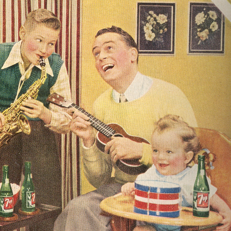
    Breezing through a hand volume of LIFE magazine for 1951 finds many examples, and quickly too:    how exciting can a bottle of 7Up possibly be?  This entire family seems to be serenading the object of their collected desires, the father certainly being the most moved of the bunch.  Baby has its own bottle and, of course, drum.


    Blog--may 29--smile water bott;e

    Is that Jerry Mathers smiling so contentedly at Mother brining in his hot water bottle?  (The doggie is staring at something to Mother’s left, probably focused on some trainer threatening/rewarding  it to make it seem  interested in the hot water bottle, too. )  It is hard to image this item bringing a smile to anyone’s face, at least from this standpoint in the future.  Its a simple rubber bag, brought to  a simple room.  In a weird and unexpected King of the Hill neighborhood sort of way,  the whole scene seems  very comforting. Maybe its the cowboy holster at the foot of the bed and the perfectly folded blanket that seals the deal.)


    Blog--may 29--smile pumps

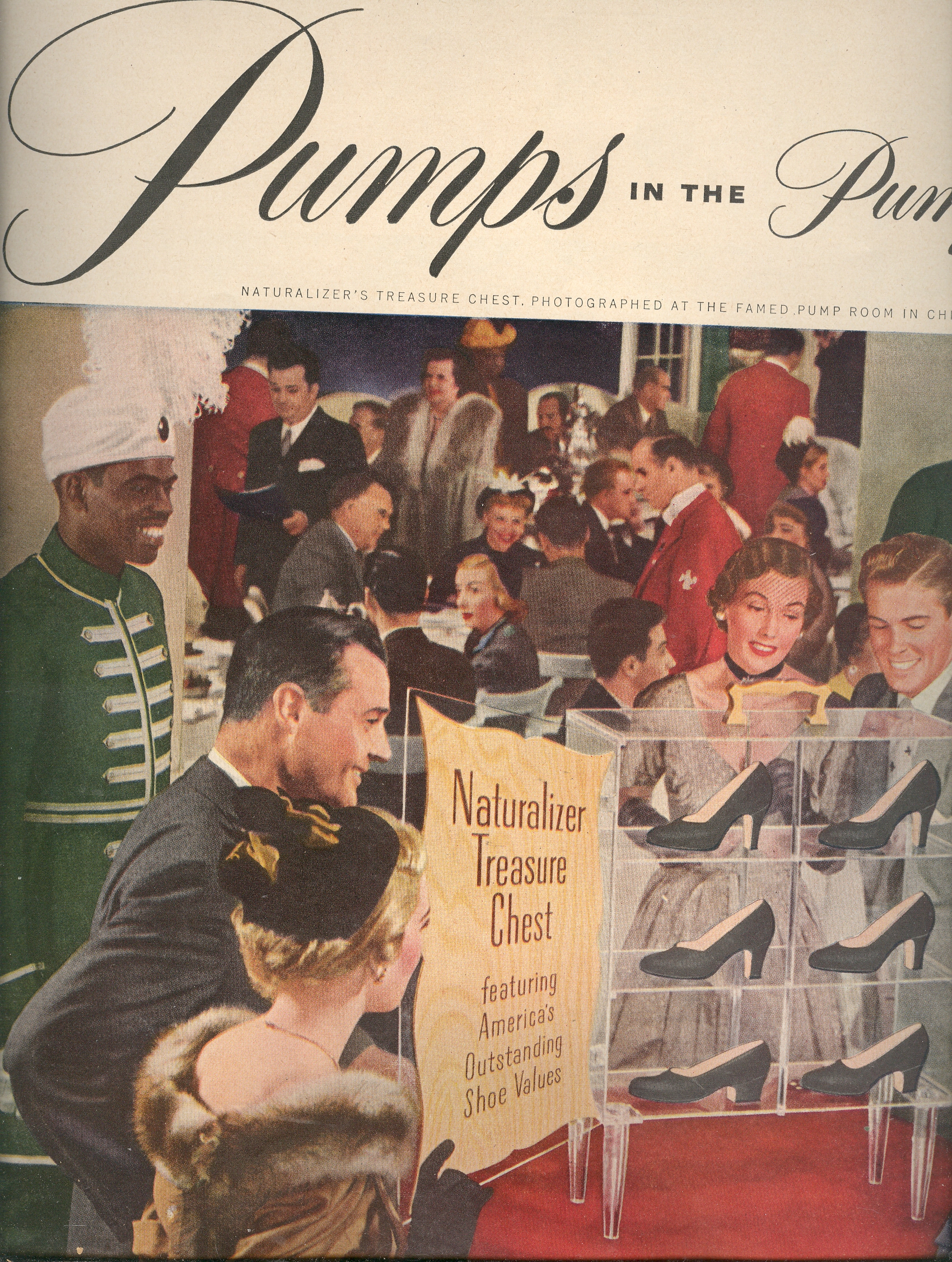
    Pumps?  This is actually half of an ad featuring a number of very accommodating couples allowing themselves to be happy while looking at women’s shoes.  I can’t tell what is going on in the background, but in the foreground there are several of men infected with broad-beam smiles brought on by looking at a glass case filled with pumps.  The glass “treasure chest” seems to be guarded by garishly-festooned black men, a sign of the un-lliberated LIFE magazine times.  


    Blog--may 29--smile underwear

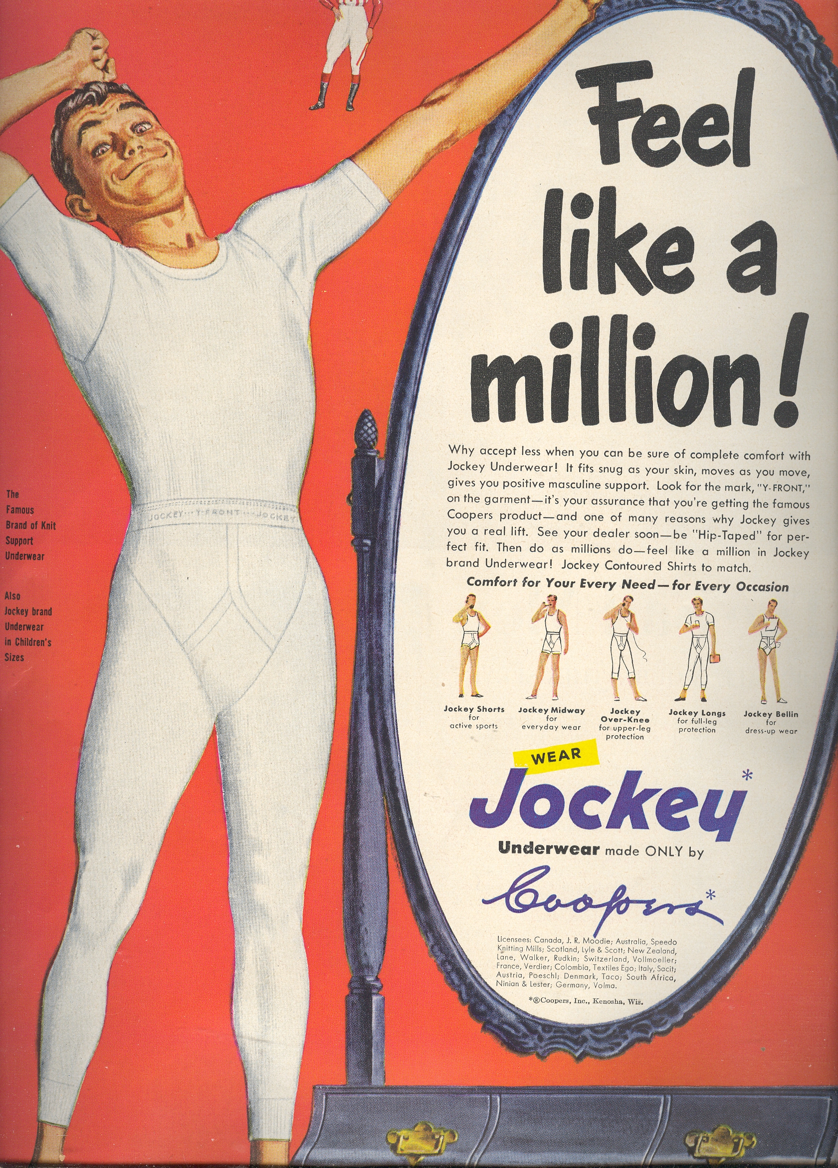
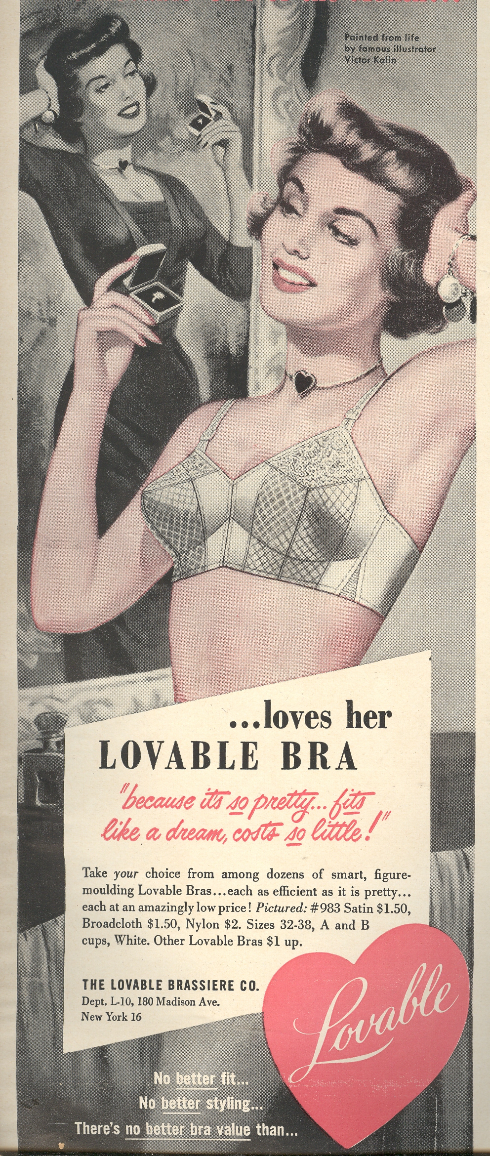
    This man seems overly exuberant with the pleasure brought him by his underwear, though he is at least alone while experiencing this private Underwear Emotion. (In many other ads by Jockey there’s a man & boy setting, each usually with big smiles, straddling things to show the comforts of their underthings, caught in what seems today to be pre-porny trash poses of extremely dubious ease…no one today would ever come close to publishing such a thing in today’s (legitimate) advert community.) So too for the woman who seems to match appreciation for her new engagement band with the fortitude of her bra–it isn’t exactly clear that the ad is celebrating  uplifted pointy breasts with  marriage proposals, but  it  doesn’t take too much  of  a  leap to get there.

    Blog--may 29--smile bra

    There was a time that the *something* that made us smile didn’t make us smile any longer.  The smile is gone, gone to where smiles go once they’re no longer needed, replaced by thin-lipped satisfied need.There was a time in 1951 when advertisers thought their products to be so appealing that they used monumentally misplaced smiles to convince the buying population of the United States to purchase their product, expecting I guess to produce that photographed smile onto the face of every purchaser, or at least to image the smile in the consumers’ noggins. That smile didn’t last long—after all, we’re just talking about 7Up and underwear. 

    I wonder about the issue of the  impossible smile of promised  pleasures like these, and how it changed over the years. As a casual observer of  millions (?)  of these  sorts of things over the years,  my own general impression is that the smiles are  era-dependent and semi-generational.  Or not.

    ·Posted by :

    ·in:


  • 1932 as an Annus Mirabilis

    JF Ptak Science Books LLC  Post 629   Blog Bookstore

    My daughter Emma started a collection for my wife
    Patti last year–for Mother’s Day—of books with dates as the main part of their
    title. For example:  Roger Crowley’s
    1453, James Chace 1912, Andrew Brieford 1066, Charles Mann’s 1491, David
    McCullogh’s 1776, and that elusive 1968 that I can never find.  It is a wonderful idea, and probably
    something that could be expanded as a real collection. 

    I mention this because I was thinking about Big
    Years, enormous years, the annus mirabilis. 1905 is the first date that springs
    to mind in this category, but it is almost entirely dedicated to one
    person—Einstein—and not that much miraculously else, though it can probably be
    argued that those four papers in the Annalen were enough for enormous
    contributions spread across four very big people.  Einstein really did have that good a year.

    I like the year (for the sciences, anyway) 1932.

    It
    isn’t thought of in the same way, say, as 1543, which was a great year for
    things big and little. Nicolas Copernicus saw (finally, basically from
    his deathbed) his  “De revolutionibus orbium coelestium”
    (On the Revolutions of the Heavenly Spheres) published in Nuremberg,
    while the Brussels-born, brilliant and troubled Andreas Vesalius had Johannes Oporinus
      print his
    revolutionary treatment of the human body
    “De humani corporis fabrica“ (On the Fabric of the Human Body).
    Copernicus said the things that any thinking person was thinking about the
    structure of the solar system and universe at large, while Vesalius conducted
    his brave overthrow of the deeply ancient Galenic system of anatomy.

    1932
    isn’t 1666, either, though 1-sign-of-the-devil’s stupendous nature was related
    in a way to that of 1543.  1666 saw a
    great heavenly event—the naming of the comet known as Halley’s—and a horrendous
    biological one, with the great plague of London, 
    which killed upwards of 100,000 people. 
    (It was a bad year overall for the city—the winter of 1665 was terrifically
    cold and was followed by the plague.  At
    the tail end of the plague came the Great Fire of London [the diarist Samuel
    Pepys referring to it as ‘a most horrid malicious bloody flame’]).  It seems more like an annus horriblius more than
    anything else. Except of course for Issac Newton, who had a very fine year this
    year.

    And
    1932 wasn’t 1453 or 1066 or 1968 or 1776 or 1918 or 1945.  Perhaps it is close to 1859, which saw the  publication of what may be the most revolutionary work of the 19th century
    in  Darwin’  On
    the Origin of Species.
      Bunsen and Kirchhoff
    added spectacular content when they figured out (with the aid of earlier work
    by Fraunhoeffer and others) the internal constitution of the stars with a
    telescope equipped with A spectroscope—truly an unthinkable breakthrough to
    even a well-rounded mid-19th century mind. 

    What happened in1932 was another sweeping array of
    discoveries in the large and small.  Carl
    Anderson identified the positron while James Chadwick discovered the neutron
    and the Joliot-Curies’ made their monumental discoveries in radiation (called “one of the most important
    discoveries of the century… the consequences of the discovery of artificial
    radioactivity are immense” from Segrè, From X-rays to Quarks, 198-199).  Iwanenko described the neutron as a constituent
    f the nucleus, while Heisenberg described the nucleus as composed of protons
    and neutrons.  Knoll and Ruska built the
    electron microscope, allowing a vision of the interior parts of the interiors
    of the smallest things, offering images almost as spectacularly new as Hooke’s
    two centuries earlier.  Looking up and
    out, in the same year, Lev Landau postulated the existence of neutron stars
    while Karl Jansky invented radio astronomy. 
    (Franklin Roosevelt and Adolf Hitler also had a big year this year.)*

    It is tempting to include 16 months or so of 1925/6/7
    in this list, if for no other reason than the people making the great innovations
    were so very young–the term for these German physicists is Knabenphysik (boy
    physics, boy physicists), and what they did was invent the new quantum
    mechanics and change the face of physics.  It all came about at the end of the era of the
    old quantum theory (which comprised the years 1900-1925), and pretty much all
    at the 
    University of Goettingen.  The 1925 players were Werner Heisenberg (age
    23, with his PhD. under Sommerfeld), Paul Jordan (age 22 with his Ph.D. under
    Born), Wolfgang Pauli (25, with his doctorate under Sommerfeld) and P. (aul)A.M.
    Dirac (22, and who wrote the world’s first dissertation on quantum mechanics).  The odd person out in this group though was
    perhaps the strongest: Erwin Schroedinger was 37 in 1925, definitely the “Old
    Man” of this set.  On the other hand
    there were three men of mountainous importance in physics who also made vast
    contributions to the new physics, even though  they were, um, more mature:  Max Born (in his mid-forties), Niels Bohr
    (about the same age) and Arnold Sommerfeld (who was 60 when he founded the
    quantum mechanics of metals).

    In any event, I like 1932.  Next time we’ll look at another Big Year:  1948.

    *Some of the books released in this year was also a bumper crop:  Death in the Afternoon, Ernest
    Hemingway
    ; Light in August, William Faulkner;
    1919, John Dos Passos; The
    Thin Man
    , Dashiell Hammett
    ; Tobacco Road,
    Erskine Caldwell; Young Lonigan, James Farrell
    ; Little House in the Big Woods, Laura Ingalls Wilder;
    and Brave New World, by Aldous Huxley


    ·Posted by :

    ·in: