A Daily History of Holes, Dots, Lines, Science, History, Math, Physics, Art, the Unintentional Absurd, Architecture, Maps, Data Visualization, Blank and Missing Things, and so on. |1.6 million words, 7500 images, 4.9 million hits| Press & appearances in The Times, Le Figaro, Mensa, The Economist, The Guardian, Discovery News, Slate, Le Monde, Sci American Blogs, Le Pont, and many other places… 5000+ total posts since 2008.

Author: JF Ptak

  • Road Map of Mud and Dust (1936)

    JF Ptak Science Books  Quick Post

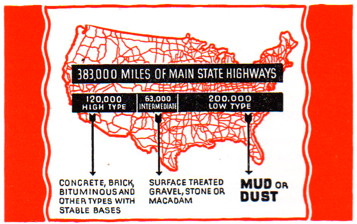
    What a simple and semi-magnificent map is this! A spaghetti map of the U.S. featuring road types, more than half of which were allocated as a “low type” of “MUD or DUST”. 

    Map of dusty roads040

    The map is in a disheartening and potentially numbing pamphlet on road improvement, which– had there been a simple cover for the work I would have quickly skipped by–however, the maps, data, and the lurking insomnia of boredom is perfectly hidden by this:

    Map of dusty roads041

    Holy cow!  This is marvelously striking–and just look at that “T”! 

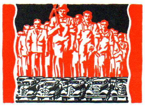
    In any event, the pamphlet is loaded with small woodcuts and graphics illustrating its point, which was to take Depression-available workforces and put them to work on repair of old and construction of new roads. 

    Map of dusty roads042The anonymous illustrator and/or designer certainly made a commendable and superior effort in making this fairly dry pamphlet, um, interesting. 


  • A Leonardoesque Pre-Surrealist Anatomy Book for Artists, 1884

    JF Ptak Science Books (Expanding Post 667 from June 2009)
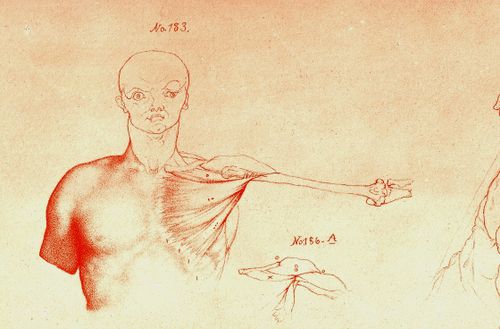
    Blog==June 29--rimmer pecs det

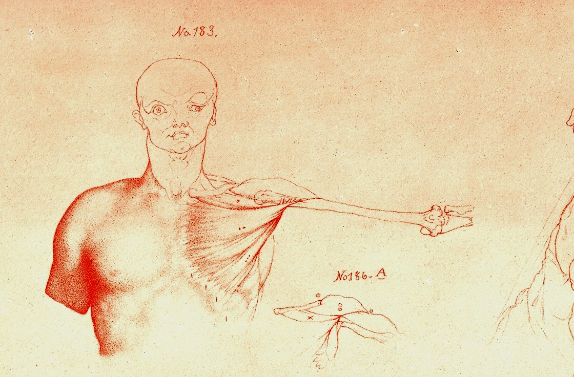
     Looking at old prints sometimes reveals more than just their own history, simple or not:  there are, from time to time, subtle bits of otherness that creeps into the image, if you allow yourself the time to see it. 

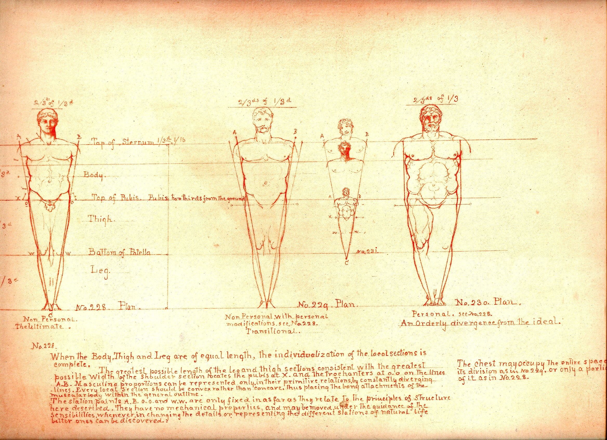
    And sometimes looking at images of the past reveal a little of the future, or the possibility of the future, as we can see here in these examples in the book by the art-anatomist William Rimmer (1816-1879).  His work is superior, and spot-on, and has Leonardo-flourishes all throughout his work–he reaches deeply into the past to the great anatomical standards, and also employs newly established work too (as with Charles Darwin1). There is also–to me anyway–a certain quality of his work that predates modern art movements, like the Surrealists, and Dadaists, that melt into his work, giving it a very post-modern sympathy.  The drawings sometimes have a great “unexpected” sense to them, which I think is not often found in anatomical artwork, given the nature of the exercise and all, giving Rimmer a sense of surprise and somewhat-removed fantasy.

    (In another example of this idea of pre-dating a modern movement, I wrote a little about the odd art/color textbooks of the pre-Kandinskian Emily Vanderpoel , about whose color theory I still understand not at all, though the images that she produced as illustrations to these bizarre theories are stunning, pre-modernist, and unintentional creations.)

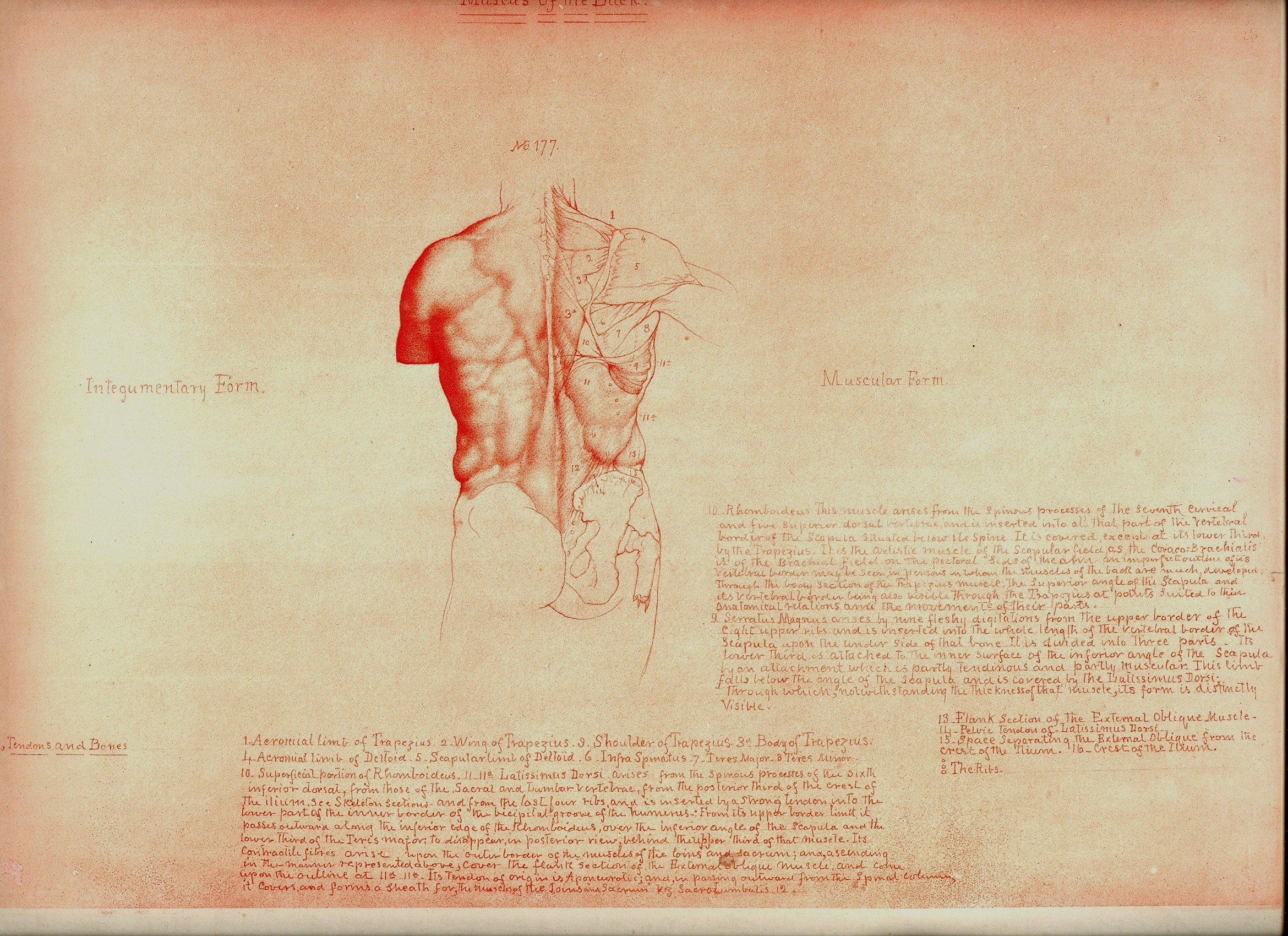
    The images being discussed here are found in Rimmer’s  Art Anatomy (1877 is the first edition and very rare for its process and for being destroyed in a printing house fire, and subsequent printings, this one being the subsequent 1884 printing).  He was a very accomplished artist, and was also a physician and a fine anatomist, with a long career of having varied careers in the arts.  He was very concerned and interested in what happens to the skin, forced into action by all of the stuff underneath it.  He pursued the movement of muscle, and bone, and the interplay of the two, and produced a wonderful exponent of artistic anatomy. 
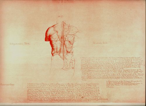
    Blog==June 29--rimmer back

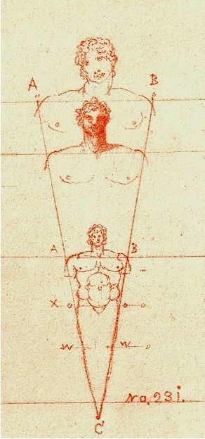
    Even the design of the book and the placement of drawings and text on the page–page after page–is both antique and pre-modernist, the images surrounded by the author’s notes and explanations, sometimes the very spacing and placement on the page is an evocative mystery.  

    Perhaps some of this “mystery” may be easily solved given the way in which the book came into being.  According to Amy Beth Werbel in her Thomas Eakins: Art, Medicine, and Sexuality in Nineteenth-century Philadelphia (Yale University Press, page 61, here) Rimmer constructed most of the work while on vacation, using no models, and seemingly working without reference. That would be an extraordinary accomplishment, and might explain some of the “surprising” parts that I just spoke of, but it really doesn’t necessarily address that dreamy quality of looking not-so-quietly into the future of art. (There are other odd and, well, bizarre, bits that Rimmer writes about that seem unrelated to this anatomy task, but I’ll just have to chalk that up to “personality” at the present time.)

    (I’ll expand this quite a bit as I’ve got 50 or so of these lithographs that I’ll be selling.)
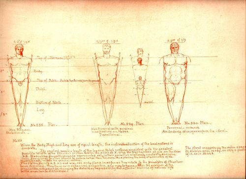
    Blog==June 29--rimmer little man


    Notes:

    1. Elliott Davis writes a very interesting article on Darwin and Rimmer and about the influence of the former on our artist.  For example, Davis writes that Rimmer’s work “represents the most comprehensive anatomy book issued in the United States at the time and provides new insight into the influence of Darwin’s evolutionary theory on artistic practice.“ See:  ”Life Drawing from Ape to Human: Charles Darwin’s Theories of Evolution and William Rimmer’s Art Anatomy” by Elliott Bostwick Davis, on the Nineteenth Century Art Worldwide blog http://www.19thc-artworldwide.org, here. Also from Davis’ article is this good footnote on two further sources of information for Rimmer:  “Marzio, 1976, p. 1. For information on Rimmer, see Truman H. Bartlett, The Art Life of William Rimmer: Sculptor, Painter, Physician. Boston and New York: Houghton Mifflin, 1890. [And] Jeffrey Weidman, Neil Harris, and Philip Cash, William Rimmer. A Yankee Michelangelo, Exh. Cat. Brockton, Brockton Art Museum/Fuller Memorial (Hanover and London: University Press of New England, 1985).
  • Non-Observatory Telescope Houses and Rolling Homes

    JF Ptak Science Books   Quick Post   [Part of a series on the History of the Future]

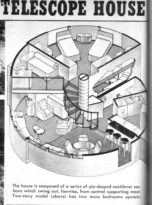
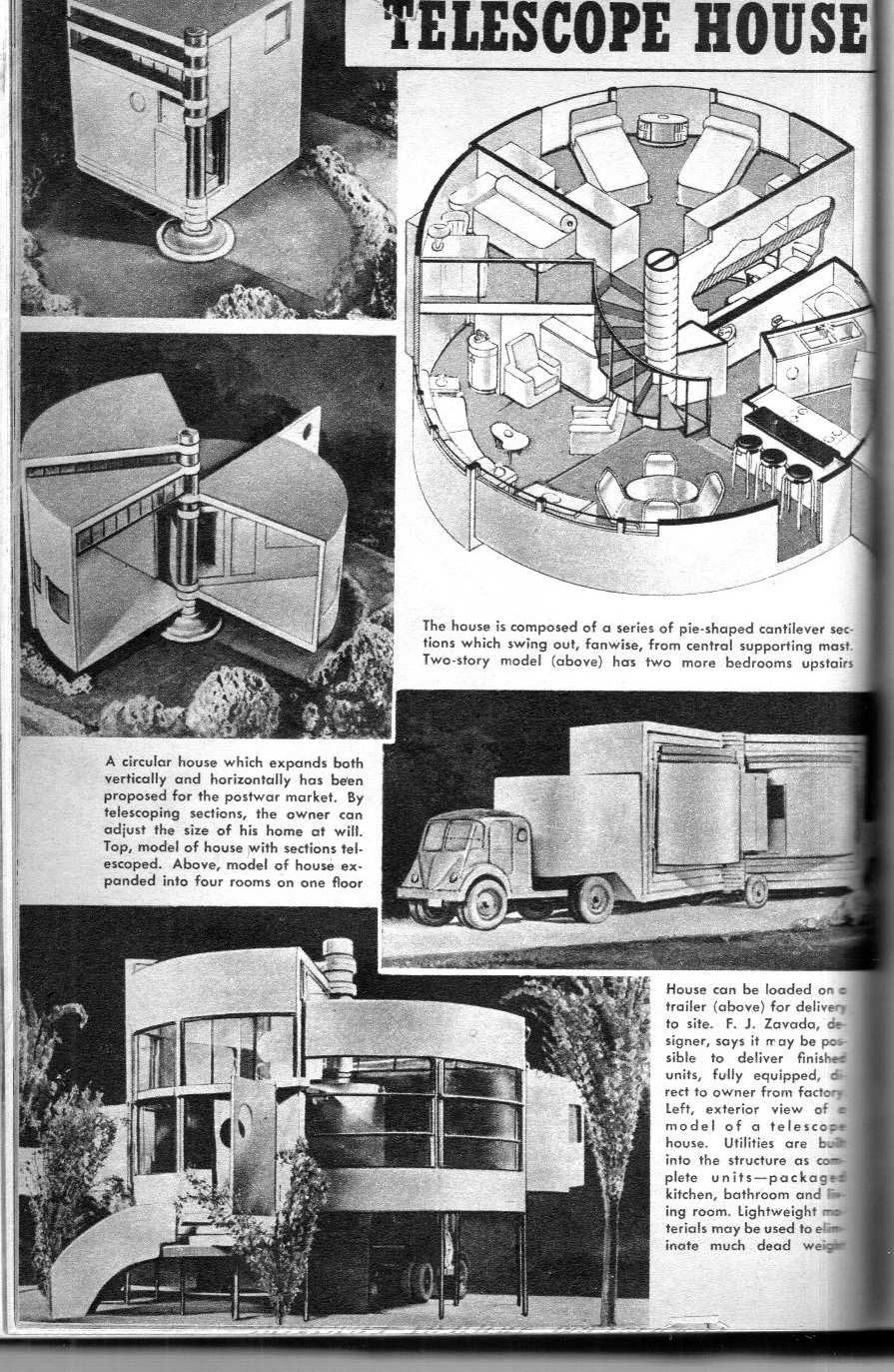
    Say “hello” to the “telescope house”, an unusual idea in small house design, found in Popular Mechanics for the March, 1945 issue, just before the end of WWII in Europe.  It was designed by F(rank) J. Zavada (1916-1998?), and it is a tidy little place:  four rooms on the first floor and two bedrooms on the second, the house is made to collapse and expand vertically and horizontally.  I don’t see area  mentioned, but it looks to be on the order of 400 sq ft or so. 

    Telescope house detail[Detail]

    Telescope house039

    This design put me in mind of a much-inferior idea: the rolling house of the future (offered in the September, 1934 issue of Everyday Science and Mechanics). Etienne Boullee it is not. The house does, however, roll, for whatever that is worth, and if that is a positive thing then that would be one advantage it would have over a non-rolling house. (I don’ get to write that phrase very often.) And it rolls exclusive of  some rolling platform, which somehow seemed like  a better idea than just having a more-traditional house with wheels.  Presumably the rolling house would be filled with E. Lloyd Wright nothingness, so there will be no displacement issues. 

    Rolling_house_large

    [Read more about the Rolling Houses and Glass Homes of Futurlandia here.]


  • The Flat Earth Dumpster Fire of 1891

    JF Ptak Science Books   Quick Post     Part of the History of Nothing series

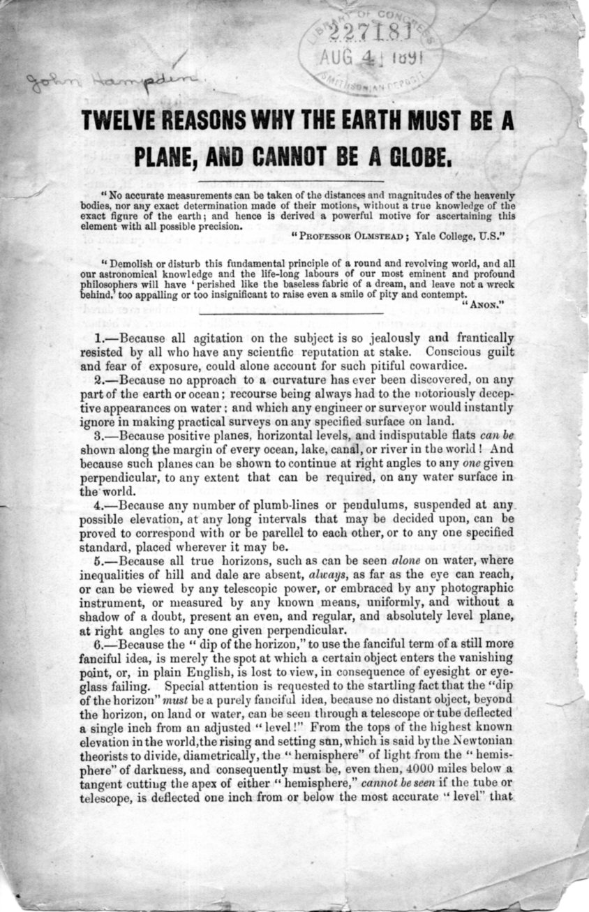
    The most disappointing thing about this tiny pamphlet is that it is not illustrated–I would have loved to see the representation of the flat Earth and its relation to the rest of the solar system.  Unfortunately, there’s nothing, only word-pictures that are not altogether descriptive in spite of liberal sprinklings of exclamation points in the midst and end of some irregular and turgid prose.  So, I’m not reporting on it, the thing being too demanding for not feasible return, but I will reproduce the thing in toto so that the curious reader may take the adventure themselves.

    The pamphlet (actually just a folded sheet of paper) was the work of John Hampden, whose name is probably recognizable to those who have read in the swollen knuckle  religious/scientific strife literature. He was a long opponent of the Earth as a sphere, basing much of his deep assertions on scripture. Hampden was that terrible mix of unctious and litigious, and fought with folks for decades, most famously with Alfred Russell Wallace, to whom he lost several libel suits costing him money and freedom over the long course of that inextinguishable dumpster fire.

    In any event, here is the text (printed I think around 1890, some 20 years after his troubles with Wallace began); this copy is the Smithsonian Institution Deposit copy via the Library of Congress, and now lives here in the studio:

    Flat Earth004


  • A Call for Relief from Britons Overseas, 1916

    JF Ptak Science Books  Post 2501

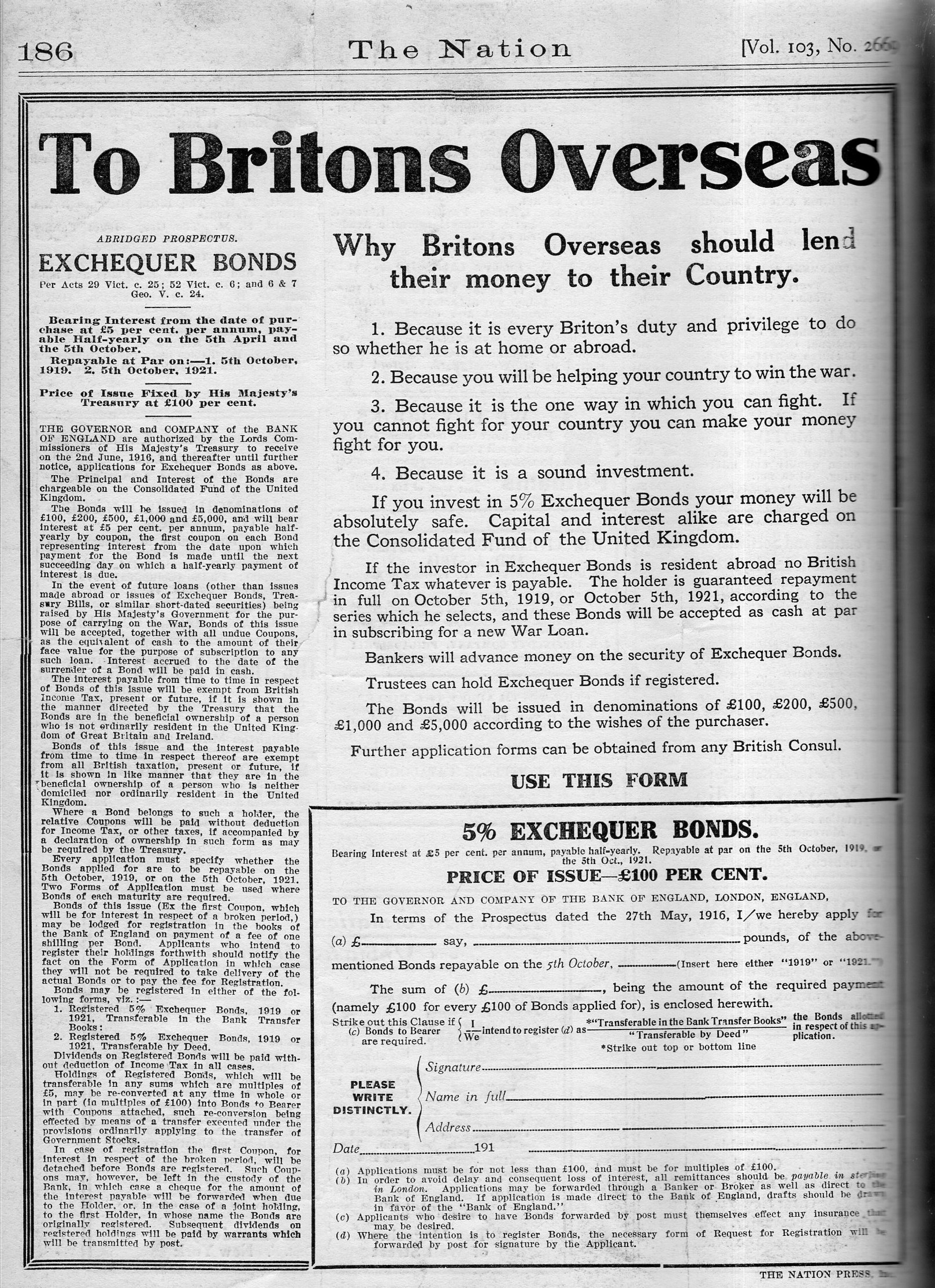
    In nearly the very middle of WWI, on August 24, 1916, there appeared this remarkable ad in the pages of the decidedly this-is-what-left-wing-magazines-look-like NYC-published magazine, The Nation:

    Britons overseas236

    It is interesting to think of the “middle” of this war with the “middle” of other wars, because, well, this doesn’t look like the middle of anything except for the post facto chronometer of fighting. In the U.S. Civil War, the almost-perfect middle turns out to be Gettsyburg, and that looked considerably past the middle so far as the Confederacy was concerned.  (And as a matter of fact, the section on Gettysburg in Shelby Foote’s great classic (The Civil War, a Narrative) comes in the near-exact middle of the middle volume of the three-volume work…the “capstone” of the book, as he referred to the battle.)  With WWII, the chronological middle, which is right around New Year’s 1943, doesn’t look like anywhere in the middle if you were there, though with the involvement of the U.S. and its enormous industrial/production capacity spelled the eventual end of the Axis; in January 1943, it still looked like a very hard road ahead. 

    It is highly probable that teh nature of being in the middle of anything is apparent only in hindsight.

    Anyway, the ad shown above was an appeal for financial support, to help fight a war that was enormously expensive, and soliciting from overseas sources one one approach. 

    The U.K. had been consumed by the war since August, 1914, and would wind up with enormous losses totaling more than 10% of the entire soldiers-in-unfirom for the war, with more than 800,000 soldiers killed (and more than 1.6 million wounded)–the fatalities being roughly twice the number of people buried in Arlington Cemetery. 

    As a matter of fact, the U.K lost more soldiers in WWI than the U.S. lost in the Revolutionary War (25,000), War of 1812 (15,000), Mexican American War  (13,000), Spanish American/Philippine American Wars (6,000), WWI (116,000), World War II (405,000), Korea (36,000), Vietnam (58,000), Iraq (3,600) and Afghanistan (1,800) combined, and then some. The U.S. Civil War, though, is another thing entirely, so far as these numbers go. (That said, and speaking of “another thing entirely, there was the Taipei Rebellion of 1850-1864, ending just before the U.S. war, claimed the lives of an unbelievable 20 million.)

    Other nations fared even worse: Austria-Hungary suffered 1.2 million soldiers dead, France 1.4 million, and Russia and Germany each with about 2 million dead. 

    I’m not sure how I got here in this short post–all of the above generated by this advertisement for financial help to fight the war and to keep a country solvent.  Now that I’ve had a quick look through the full years for 1916 and 1917 this seems to be the only appearance of the ad, and it is also I think the only full-page ad in The Nation for that time.  I have no idea what happened to the U.S. appeal–perhaps they were reaching out to the wrong audience, because in spite of the time and the spirit of the magazine, prior to U.S. involvement in the war for 1916 and 1917 there wasn’t much war coverage beyond the first page or two of general war news.  Interesting.

    ·Posted by :

    ·in:


  • The Man with a Camera, Soviet Union, 1929

    JF Ptak Science Books   Post 2500

    So. Welcome to Post #2,500. As it turns out this was in line as a continuation of an earlier post and is not entirely fresh for today, but so it goes.  Post 2,500 is also overall the 3,751st post to this blog, which began in January 2008. The numbered posts all usually have at least 400 words, or a bunch of time-consuming pics; there are also 1,351 “Quick Posts”, which are the little guys, 100-400 words long.  (There are also another 1,500 posts in the books-for-sale section, but that’s a separate issue.) 

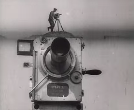
    Man with camera235

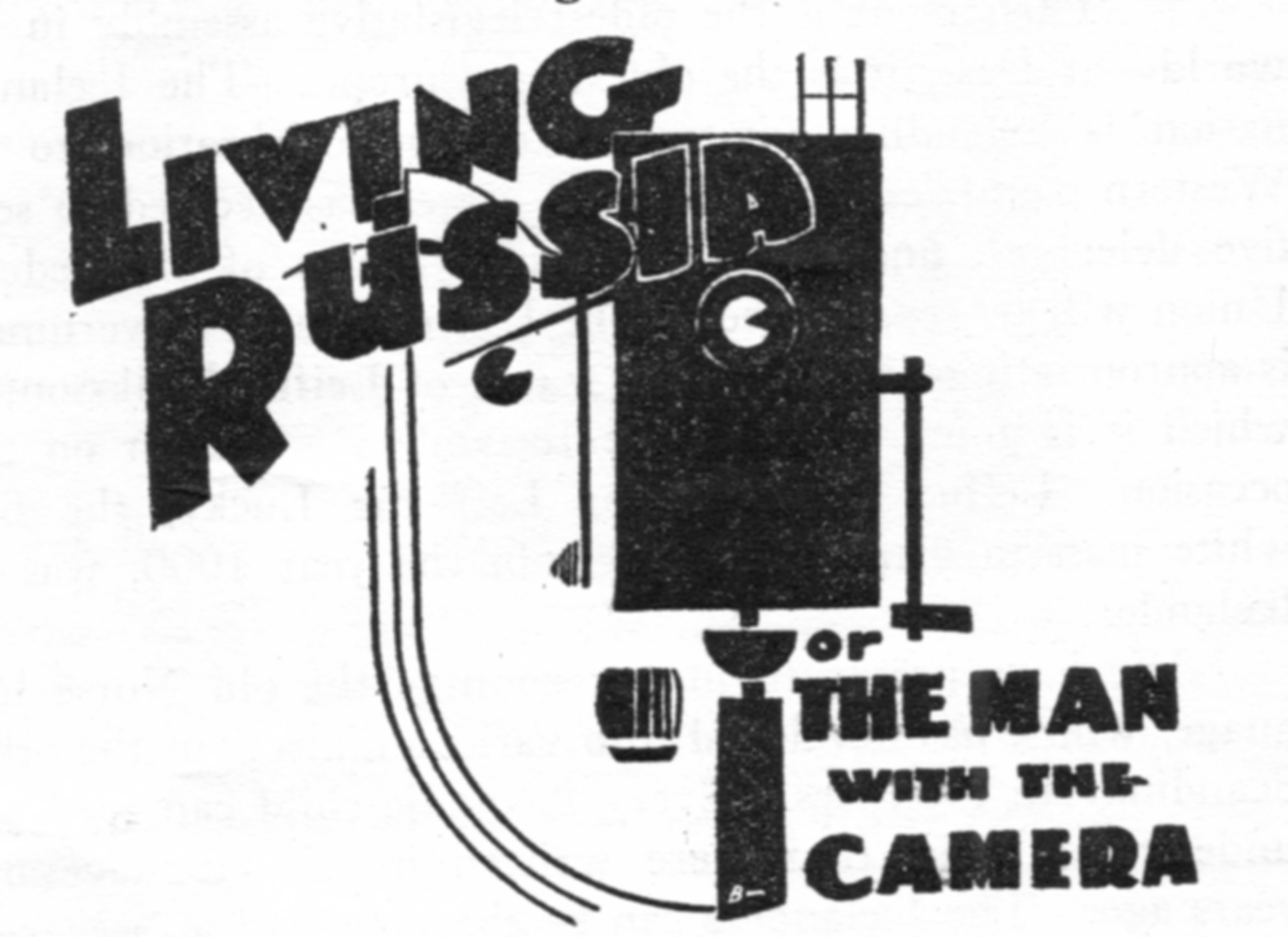
    The man with the camera was David Abelevich Kaufman (Vertov) (1896-1954), who made it along with his editor-wife Elizaveta Svilova (who worked on a number of films, mainly propaganda from the looks of it, though I would really like to see The Fall of Berlin, 1945, and also her film about Auschwitz).

    Poster man with a camera

    The film was evidently a ground-breaker1–Roger Ebert points out one facet of the work, the average shot length, which is by far shorter here than anywhere previous works, meaning that there was more editing and selection done than normally:  “In 1929, the year it [Man…] was released, films had an average shot length (ASL) of 11.2 seconds. “Man With a Movie Camera” had an ASL of 2.3 seconds. The ASL of Michael Bay’s “Armageddon” was — also 2.3 seconds…”)  

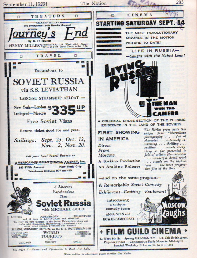
    Here’s an interesting ad for a U.S. release of the movie, appearing here in the same year that it was made, and appearing in the pages of the old-time old-school leftie magazine, The Nation, which was already 64 years old at that time.  It appeared alongside other ads featuring excursions to the Soviet Union for those interested in Russia culture and for the others who were still admirers of what was supposed to be The Union. 

    Man with camera234

    I’ve included a link to the film (below) but honestly what attracted me to it was its poster, created by the indomitable and prolific Stenberg Brothers. Not only does the poster seem to me to be a masterpiece and iconic, it also uses an unusual perspective–straight up.  I’ve done several posts here on the perspective of looking straight down and straight across, but there have been very few opportunities to write something about looking straight up (in the antiquarian image world).  But here it is, in all of its glory.   

    The full movie, here:

    Man with a Movie Camera

    [Source: http://en.wikipedia.org/wiki/Man_with_a_Movie_Camera]

    Notes:

    1. Studio Daily lists Man with a Movie Camera as the 8th best movie ever made.  http://www.studiodaily.com/2012/08/sight-sound-revises-best-films-ever-lists/

    ·Posted by :

    ·in:


  • Recovery to Normal Existence: Found-Surreal Images in Nuclear Survival Handbook

    JF Ptak Science Books    Post 2499

    Nuclear Attack LIVE230
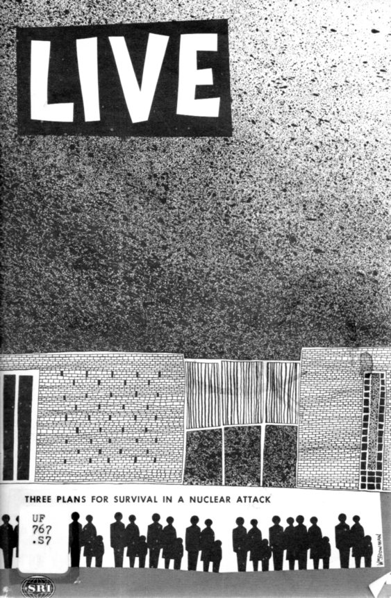
    In the not-modest stream of thin paperback  nuclear holocaust survival literature in the 1950’s and 1960’s appears this effort: LIVE, Three Plans for Survival in a Nuclear Attack. It was published by the Stanford Research Institute in 1960, and was part of nuclear health physics pioneer Lauriston Taylor’s donation to the National Council on Radiation Protection and Measurement, where I bought it some time ago when they were thinning out their stuff.  It is an unusual publication to me for its illustrations, some of which are odd, and a few of which are positively semi-surreal when view out of context.

    The pamphlet overall is fairly helpful, assuming that you had as much time to get yourself together in an impending attack, and that is a major assumption.  But I’m sharing this tonight for some of those images–and the cover, which is an unusual design in itself, not the least of which is the heavily-borrowed part from LIFE Magazine.

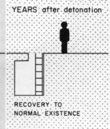
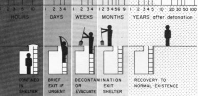
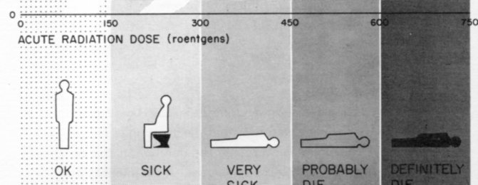
    So the first of the few that I’ll post here (above) is a detail from this illustrated graph, a march of teh intellect and survival from being in a dark hole to a rather stiff return to normal existence:

    Nuclear Attack LIVE229

    Here’s another sobering bit, showing a progression of NOT-recovering to normal existence:

    Nuclear Attack LIVE231

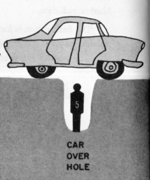
    And of course the hole:

    Nuclear Attack LIVE233

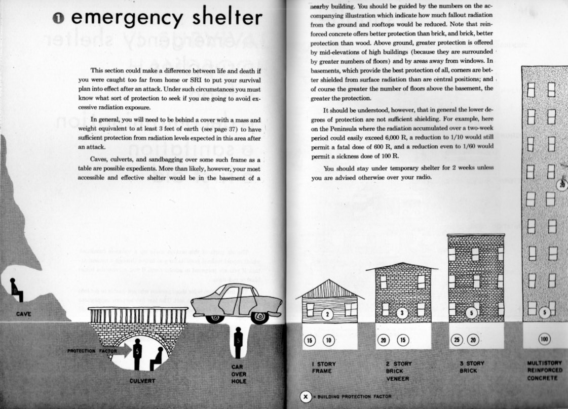
    Which is a detail from:

    Nuclear Attack LIVE232

    And the cover, which has some blotchy Ralph Steadman-y elements:


    Nuclear Attack LIVE228

    And so, there are some of the major themes.  I found the work unsettling in general for using mostly dark silhouettes for the people, that profile having been sort of established to represent dead folks.  Ah, well.


  • A Slightly Surreal Image from Mimbres Culture

    JF Ptak Science Books  Post 2497

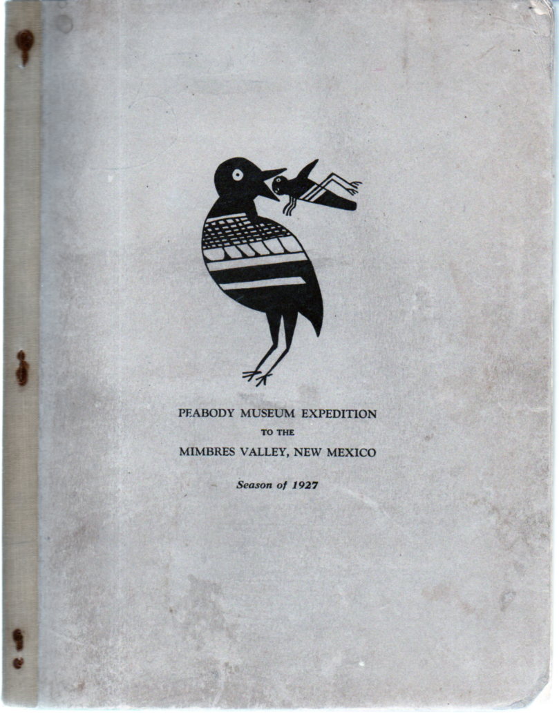
    Alfred V. Kidder’s  Peabody Museum expedition to the Mimbres Valley, New Mexico : Season of 1927 is a beautiful little production. Given that it is illustrated with 19 original pasted-in photographs and the offset text seems just to be type pages, I’d ay that it received a fairly tight distribution.  Kidder (1885-1963) was perhaps the leading U.S. expert on the Southwest and Mesoamerica, and led the Harvard-based Peabody Museum of Archaeology and Ethnology expeditions into the heart of the ancient lands in Arizona and New Mexico from 1915 to 1929 and published extensively on his excavations and observations.

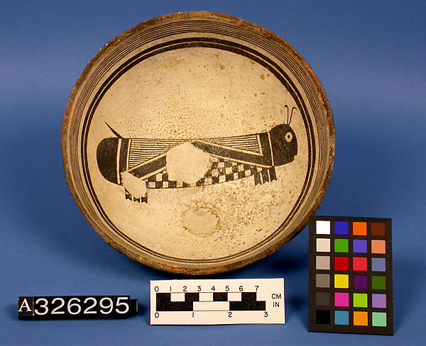
    The present volume addresses the somewhat mysterious Mimbres peoples, a branch of the Mogolion culture who lived in the  southwestern New Mexico and northeastern Arizona area during the period of about 1000-1150 CE. Perhaps they are mostly mysterious to me, and that based on the hyper-ethereal nature of the pottery designs produced by those people–the pottery is enormously beautiful. 

    Mimbres pottery

    [Source: National Museum of Natural History, Smithsonian Institution http://anthropology.si.edu/cm/images/mimbres-11-a326295.jpg]

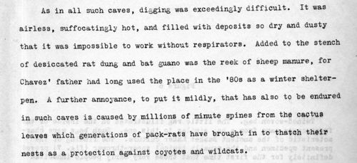
    Kidder has a very clear expository style, especially in describing the environment of the excavations.  His description of the caves in this area are very compelling and spot-on, and remind me somewhat of George Orwell’s observations on coals mines and mining conditions.

    Here he is:

    • Mimbres223[The original document is for sale at teh blog’s bookstore, here.]

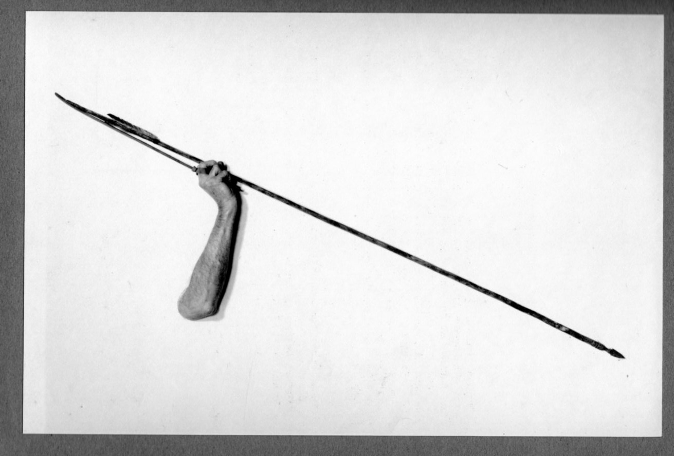
    I apologize for concentrating off-topic here, but the illustration showing how a leather strap was used in aid of throwing a spear is really quite spectacular in its way, a bit of the unintentional surreal (even though the finding of the strap was very exciting, archaeologically-speaking):

    Mimbres225

    Actually this sort of found articulation has something in common with the designs in the pots, which seem sometimes to have a definite modern 1920’s-30’s flavor rather than something from 12 centuries before. 

    And the cover:

    Mimbres226

    ·Posted by :

    ·in:


  • A “What Is THIS?” Map of Manhattan (1938)

    JF Ptak Science Books   Quick Post

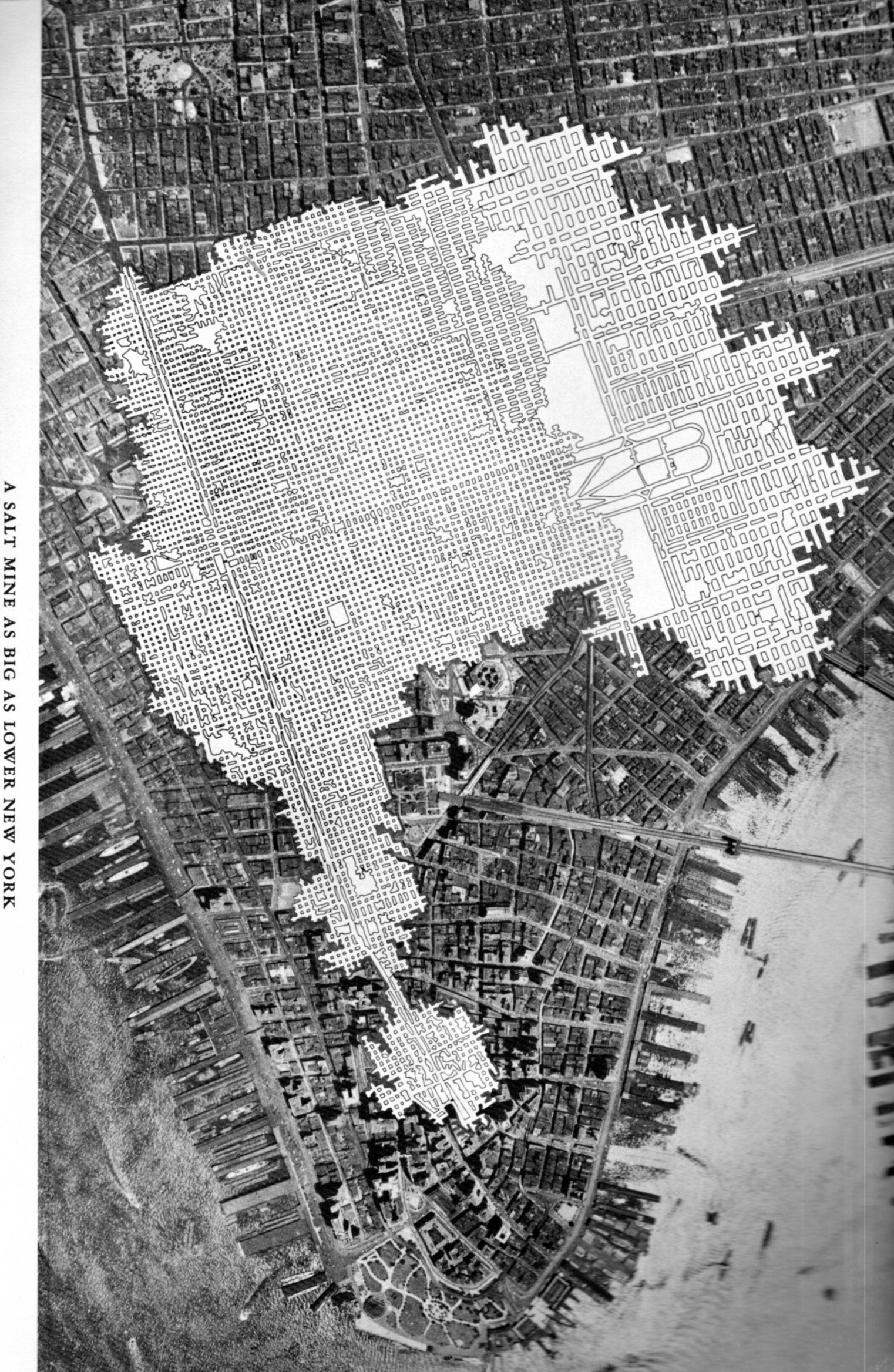
    The Chaco-like overlay in this map of midtown/lower Manhattan has a lot of creative opportunities in it–like showing a map of an enormous and  mysteriously removed Manhattan, or just-discovered earthworks that were somehow dug into bedrock, and so on.

    SALT map218

    But it isn’t. It is a salt mine comparative overlap using Manhattan as a unit if measurement.

    Talk about the “Great White Way”– this elaborate footprint of salt works, with its wide and short-ceilinged rectangular tunnels that are all illuminated white surfaces would challenge anything that Broadway (ca. 1948) offered. “A Salt Mine as Big as Lower New York” is an unusual map to my experience–of course there must be many of these maps available through the years by the companies that mined salt (and coal, and so on) but to my experience they are not often published for public consumption.  The map below is an exception, and simply depicts the rock salt mine at Retsof, NY, (“the largest in the world”).It appears in the unevenly-titled  Salt Empire of the Largest Producer of Salt in the World, and was published by the International Salt Company in 1935.


  • A Cuirous Display of What-is-It?

    JF Ptak Science Books   Quick Post

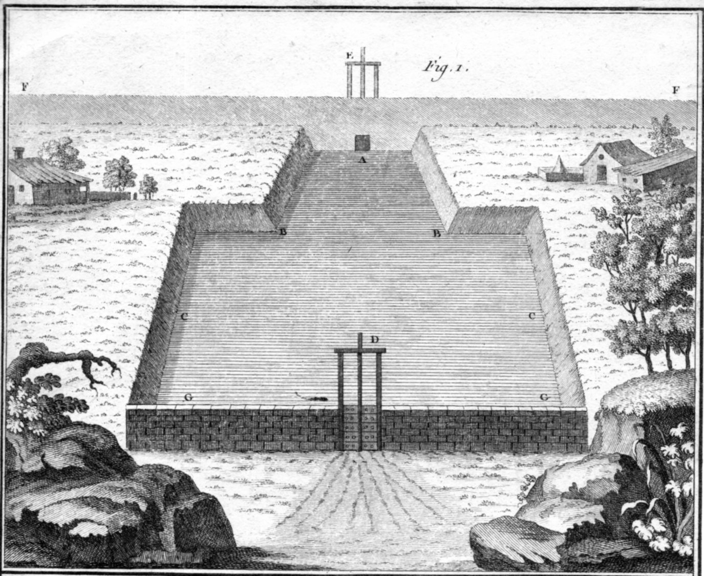
    Curious print219

    There haven’t been many entries in the “Tech Quiz” category for this bl, and today’s addition really isn’t all that techy, though it may be–it is definitely a what-is-going-on-here image, though.

    I saved this a long time, and it has been mostly lost in archives more so than found, but here it is–except that I do not have a good hold on the “is” part of that statement. I suspect it is French and late 18th c, which puts it at about the time of the Diderot encyclopedia.  It seems as though this may be a design for some sort of fishing operation–the wall in the background may be a dyke with a sluice (?), or it may be a part of another irrigation system. Most of the structure seems anti-structural per se, the thing being mostly a dug-out, though it does look like there is a wall in the foreground. 

    I am not sure.

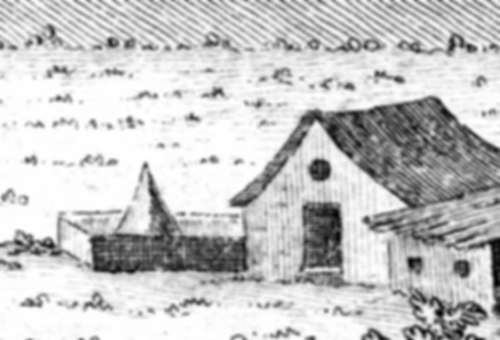
    Also, what is the pyramidal thing in the yard of the building at the upper right?  Everything beyond the drawing of the structure is filler material, and a house would have been as much filler as a house with a pyramid, so why is that pyramid there? 

    Curious print220

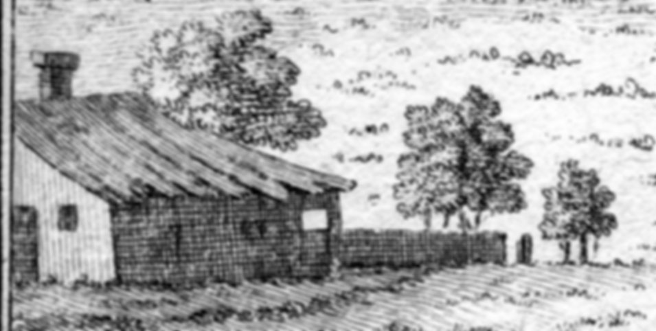
    And what about the other house?  What’s going on with that roof? And what about that post at the end of the fence? It is an open gate, or a solitary post?  What?  These are tiny (1-3mm) details that could easily have been excluded, but they were included for a reason beyond what I can probably know–perhaps it was as simple as the engraver indulging himself with some late night doodles to make the work a little more interesting and to invest it with some personality.

    Curious print221

    Anyway, if the ghost of the anonymous engraver is listening, I would like it to know that we see your “stuff”. 

    ·Posted by :

    ·in: