A Daily History of Holes, Dots, Lines, Science, History, Math, Physics, Art, the Unintentional Absurd, Architecture, Maps, Data Visualization, Blank and Missing Things, and so on. |1.6 million words, 7500 images, 4.9 million hits| Press & appearances in The Times, Le Figaro, Mensa, The Economist, The Guardian, Discovery News, Slate, Le Monde, Sci American Blogs, Le Pont, and many other places… 5000+ total posts since 2008.

Category: Maps/Diagrams of Imagination & Ideas

  • Extending Manhattan: Filling in the East River & Part of NYC Harbor

    JF Ptak Science Books   Extending Post 1470 
    Follow Me on Pinterest 

    A while ago I wrote a post on  Herman Soergel’s  plan for extending the landmass of the countries around the Mediterranean Sea by damming the straits of Gibraltar, lowering the sea and irrigating the Sahara–an original, interesting but not very good idea, filled with briney cultivation and racial politics. In the past on this blog I’ve written about other city plans–and in particular, for New York City–that have involved floating Manhattan into the harbor, or filling up large chunks of the Narrows, or floating the city on an enormous anti-gravity platform, and so on. Some of those plans were real, some science fiction, and some were plainly beyond both.  The plan presented above is another monster, but at least this one could work, if not for the doing of it, and the expense. And the will.
    NYC Really Big
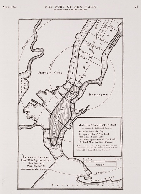
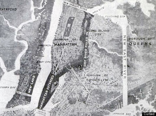
    But the bottom line, according to the engineer doing the thinking on this project, Kennard Thomson, would supposedly net the city a cool billion dollars after everything was said and done, and that would be 1916 dollars–that was equal to about 5% of the American GDP (!) in 1916, which would be about $400 billion in terms of 2010 GDP.  I’m not sure how Thomson came up with this very big/very round number, though it must have been done for effect–I can just imagine him standing before a smokey room filled with civil engineers talking about his massive plan for enlarging NYC and throwing out the billion-dollar figure, watching the cigars glow red in exhaled disbelief.
    NYC really big
    [Source: Popular Science, 1916.]

    Thomson did know what he was talking about–he was a busy (and “leading” according to the NYT) Manhattan civil engineer of stature, working on the Canal Barge and being the principal engineer for the Municipal and Singer buildings, for example–and his project seems to be well within the scope of possibility.  Their sensical aspects however are, well, questionable. 

    Here’s the story–around 1911, while examining proposals to repair and extend New York’s wharves, Thomson came upon the idea–a magnificent, fabulous idea–of adding new wharves by adding new lands to the city.  In short, the overall plan was to fill in the East River (!!) and reclaim the new land for city living,  dam Hell Gate,  construct a New East River (from Flushing to Jamaica Bay),  extend the tip of Manhattan Island from the Battery to within a quarter-mile of Staten Island (!), create a new 40-square-mile island between Sandy Hook and Staten Island, extend the Jersey shoreline, add two new Manhattan-sized appendages to the east shore of Staten Island, and more.  All of this would be connected by various new bridges and roads and tunnels, as well as a 6-track elevated railway that would circumnavigate the city.  The purpose of all of this would be to add 100 miles of new docks, an enormous amount (“50 square miles of reclaimed land”) of new land and the capacity for NYC to house 20+ million people, all of which would be worth a billion dollars. 

    Thomson really meant “really” in the title for the proposal. There have been reclamation projects undertaken in New York Bay since then of course, and I think that virtually all of what Thomson talked about could be done.  I think it would be a very interesting project for a class of some sort to undertake an estimation of what such a thing would cost today (and I would guess to duplicate the idea in real terms now would take up a sizable chunk of the GDP).  Maybe all of this will make sense at some more future point. 

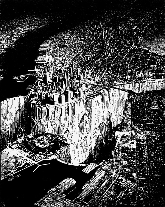
    And along this line of thinking I include a very interesting drawing made by architect Lebbeus Woods, showing the bedrock part of Manhattan. He empties the East River and damns (?) the Hudson, and also builds some new port extending from Staten Island or out from Jersey…but the effect of the dry river bed between Manhattan and Brooklyn.  Andthen some–he empties the river, and then deepens/excavates, heightening the depths (?!) of Manhattan Canyon. The depth of the river where we can see it in the drawing is maybe 100 feet, and certainly (judging the depth against the heights of the structures in the lower island) the canyon is deeper than that–maybe an order of magnitude deeper.
    NYC woods
    [Source: Lebbeus Woods, here.]

    Notes:

    –A good read on Thomson and Woods can be found here, at Telemachus Untitled. 

    –A contemporary NY Times article on the Plan can be seen here and another (with illustrations) from 1913 here (“Plan to Fill in East River to Solve Port Problems”).

    –Another treatment of the whole idea can be seen at Frank Jacob’s great Strange Maps blog, here.


  • Daily Dose from Dr. Odd: Apple Maps of Eating, from the Little to the BIG Eat

    JF Ptak Science Books    Daily Dose from Dr. Odd

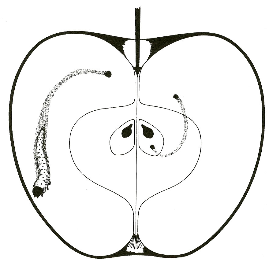
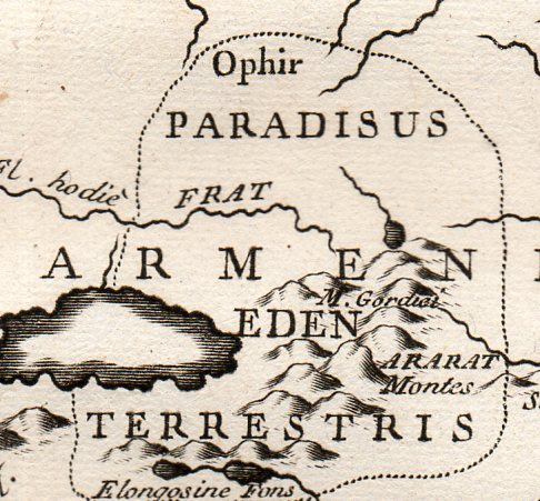
    I’ve made a post here before on the location of the Garden of Eating, um, “Eden”, here, which I guess might be the ultimate of all Apple Maps, The Big Eat; but I’ve found these two (below) that are entertaining and probably not interetsing though they are without the overwhelming consequences of the first map. They’re just about apples, and not what apples might represent (which I think was an unwieldy way for a Creator of the Universe to test the future of humankind with).

    Apple map897 detail[Source:  “Choice Variety of Apples”, in American Agriculturist, New York, 1848, vol VII/no. III, page 79.]

    And of course the route of Small Things Internally Eating Apples:

    Apple map[Source: Maps Incohate, here.]

    Eden 2359
    [Source:private collection, Tabula Paradisi Terrestris justa Systema Auctoris incisa a P. Stark-Man was
    printed late in the 18th century, probably around 1775, and locates the
    GOE far in the north country, near the Dead Sea, deep in old Armenia,
    near Mount Ararat (where Noe and his family were supposed to have landed
    after the creator flooded the world killing everything, where
    everything else, young and old, infant younger, men women children,
    beasts and ants, were killed by a wrathful OT maker.).]


  • The Earth Skeleton, Primal Pansperma & the Gigantic California

    JF Ptak Science Books   Post 1933

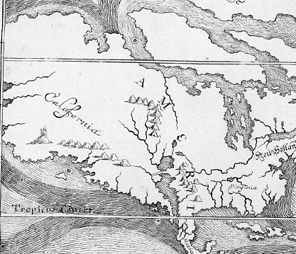
    Happel map895 detail;
    [Detail of  E.W. Happel’s map in his Relationes Curiosae (1675), plates 23 in the Peabody Library’s The World Encompassed, 1952.]]

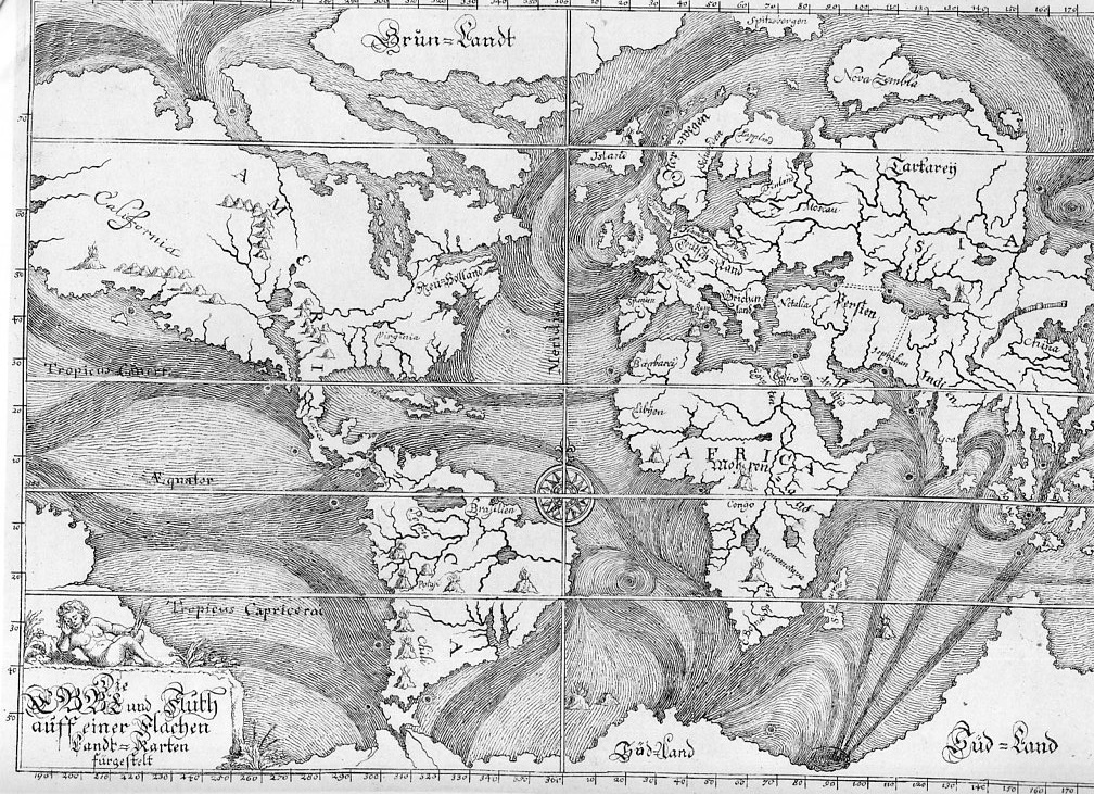
    I’m not sure how my thinking went from Athanasius Kircher’s Earth skeleton to the magnificent Eberhard Werner Happel 1675 world map of ocean currents featuring what might be the largest California ever seen in the history of cartography, but, well, the thinking wound up there, (and this leaving out Bishop Burnett’s perfect primordial world egg in the process). This was intended as a simply post following up yesterday’s bit in the Blank and Missing Things series relating to California as an island and the missing land mass connecting the non-island to the rest of North America.  Nominally California usually appears as a stubby/plump infected-appendix-sized bit either attached/not to the continent, but the California in the Happel (1647-1730, a man of math and medicine) map is larger than the rest of North America from the California gulf to the Atlantic.  Of course that also includes all of Alaska and then some imagined lands as well, but, still the mass of it is labelled “California” stands by itself larger than South America, Africa (which looks surprisingly good for the age of the rendering), China (which is very very small) and Russia (which lacks virtually all of Russia east if the Urals).  The only land mass that comes close to California’s size is the Antarctic regions, which is drawn here as a solid land mass including the scant points of data for New Zealand and Australia and whatever other island was found in southerly South Sea travels, all drawn together and fitted into an enormous continent.

    Happel map895[The full image of the Happel map]

    Although there weren’t many explorers yet to go up the west coast of North America in 1675, other maps of the period render the coastline in a more accurate way than this.  The point of the map, really, is to display what was known of the ocean currents, some of which was correct but a lot of which is not–though it is a very good attempt given the state of the data collection.  The source of this map,the Peabody Library’s The World Encompassed (1952)  calls it the “first chart of ocean currents”, which I think is incorrect–and it is here where our favorite 17th century science-Jesuit comes into play, for it is in Athanasius Kircher’s Mundus Subterreaneus (1642) that the first map of ocean currents occurs.

    Tramerzinus map896_edited-1 detailed

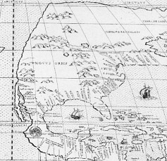
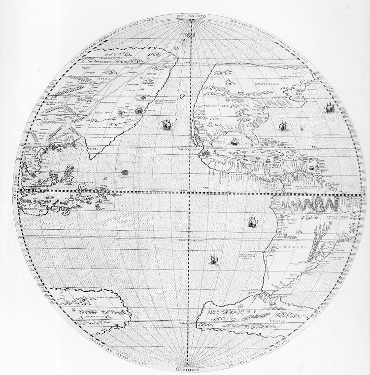
    [Michael Tramezinus’s map of the Western Hemisphere (1534) showing a mostly non-existent western coastline of North America along with a stringy California–but given the time and the available information, it is an excellent map that is not afraid to define unknown lands with a squiggly line. Source, plate 35 from The World Encompassed.]

    Kircher is a highly problematic character in the history of science.  He is at times wonderful and insightful and creative; at other times he is boring, pedantic, grueling, wrong, fanciful, and stingy with attribution.  I’m no Kircher scholar, but it seems to me after al this time that sometimes he writes stuff that he couldn’t’ve meant, that he absolutely knew better than to assert–but there it is, anyway, written as gospel truth (and the Gospels and related religious mythio-stories evidently demanded obedience to their own truths, in which Kircher complies) . This is one of the problems with the Fra Athanasius.

    Tramerzinus map896
    [The full detail of the Tramezinus map.]

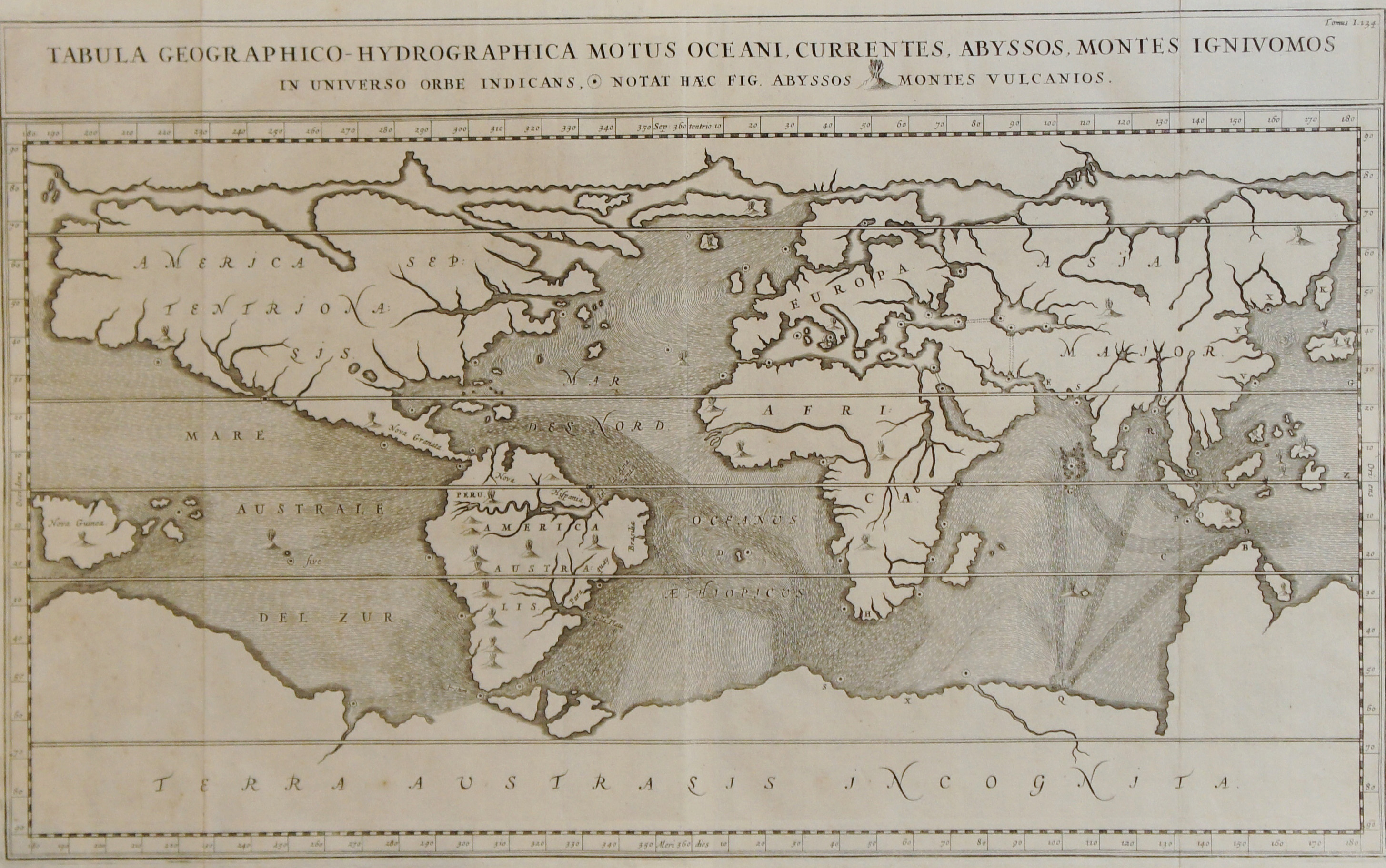
    In his Mundus Subterraneus Kircher presents the true first map of ocean currents (Tabula Geographico-Hydrographica motus Oceani, currents, abyssos, montes igniuomos in universe orbe indican), some bits being correct and others not so. He rejects the Aristotelian concept of condensation, and figures that the accumulation of snow/rain/dew is simply not enough water to feed the rivers and lakes and oceans, so he devised subterranean oceans and rivers with vast stores of water to feed the waters topside.  His hydrophyllaciae is one of four components of an underground Earth that closely coincides with the four elements and with the human condition, much in the tradition of the Medieval body/spirit approach to the understanding of the world system. 

    Kircher current maop
    [Source: image from the mapseller site of Sebastian Hidalgo Sola, Buenos Aires, here.]

    John Edward Fletcher, in his A Study of the Life and Works of Athanasius Kircher, ‘Germanus Incredibilis …” describes Kircher creating an “Earth Skeleton”which he dresses according to science and ecclesiastical needs, finding a vis spermatica, the launching of all matter from the primeval chaos of primordial Earth.  The Mundus addresses this and many other things–it is, in all of this and all of its faults (as Fletcher states), a great repository of all geological knowledge of the time.  There is the good with the bad in the Mundus, “a conglomeration of exotic facts and fiction, along with odd scraps of truth and the occasional flash of brilliance” (Fletcher, p. 172), and the ocean currents map is one of those bits.

    Kircher undertakes an enormous and probably impossible job in this book, but may actually be kept from getting to the big point by depending upon himself too much. As Fletcher points out (page 171), the Mundus‘ third edition of 1671 failed to take into account the major advances in fields touching on the book’s contents, in particular, the work of Mariotte and Varenius, which was much superior to that of Kircher on the ocean currents, neither of which are discussed or even mentioned in the new edition.

    This was a very round-about way of getting to the California-part of the Happel map, but the attribution of the World Encompassed as “the first” of its kind needed to be addressed.

    Notes:

    Here’s an interesting read on the Kircher/Happel maps:  from http://www.coastalguide.com/helmsman/gulf-stream-history-noaa2.shtml


  • Blank and Missing Things: Land (California as an Island)

    JF Ptak Sciene Books    Part of the series on The History of Blank, Empty and Missing Things.

    The influence of economic strategy seems to be the Old Red Sandstone of the geology of life on this planet, and sometimes it reaches right into cartography, expressing itself in unusual ways.  Such may be the case with the creation of the idea of California beign an island.

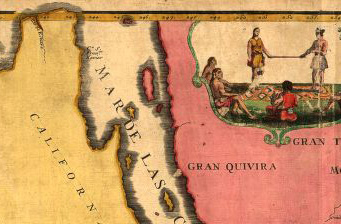
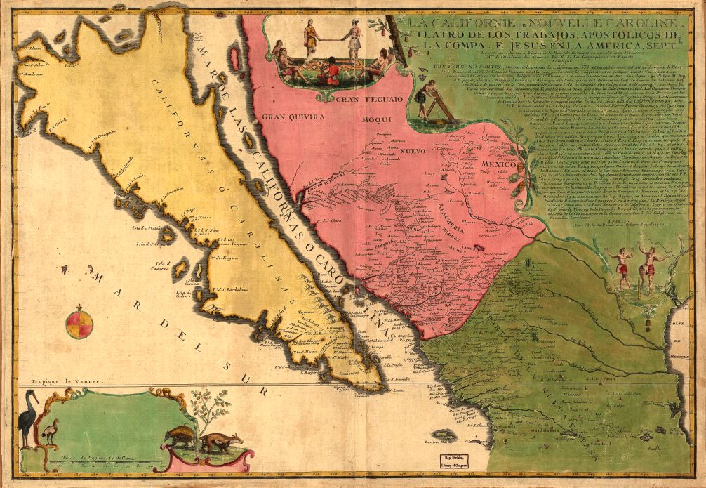
    California as an island det[A detail of a sample map showing California as an island, by Nicolas de Fer, 1720, and depicting the famous missing land at the north end of the Gulf of California.]

    In general, much of the vast expanse of blankness of the continent in the 16th and 17th century was hidden under ornate Baroque cartouches and their encumbrances, which was a tried-and-true method of taking up space on  a map where you didn’t (a) really know what was their and (b) didn’t want to make stuff up to fill in the white space. By necessity most of North America was unknown to cartographers at this time because, well, there was no reliable information to work with.  The far reaches of the middle North American western coastline enjoyed a history of
    connectivity with the large land mass that exists east of the Gulf of
    California, the region known today as “california” being connected to the rest of the continent from the early 16th century.

    About 116 years later, though, cartographic thinking on part of the coast changed.  Antonio de la Ascensíon is credited with first giving flight to the idea that the California Peninsula was in fact an island–and so, beginning in 1620, California would frequently make guest appearances on maps as an island. (Fray Antonio was born in Salamanca in 1573/4 and studied there and at the College of Pilots in Seville; he was ordained in the Order of Discalced Carmelites, and sent off to Mexico. As a cosmographer he accompanied Sebastian Vizcaino (1548-1624) on his expedition to California to find a good port for Spanish galleons coming from Manila, which is when Antonio produced his diaries with the famous island maps1.)  This map was created during a period where there was heavy competition for trade routes and geographical knowledge was actual currency, so there was some amount of cartographic information that was proprietary. When the abbot’s map was lost to/and recovered by the Dutch, the changes that were made to California were codified and published–the Spanish thought it not necessary to correct the misinformation. Perhaps.  In any event, it seems plausible that the Spanish crown had no interest in involving itself with what may or may not have been the loss of proprietary information, and so let the island business slide.  Until1751, when the King of Spain issued a proclamation saying that California was indeed not an island.

    This practice continued to about 1747, when there was more than ample evidence to suggest that the island status of California was erroneous–still, it took several decades for the last of the island-maps to make its appearance. 

     
    California as an island


  • Anatomy of Maps–Dissections in Geography

    JF Ptak Science Books   Quick Post

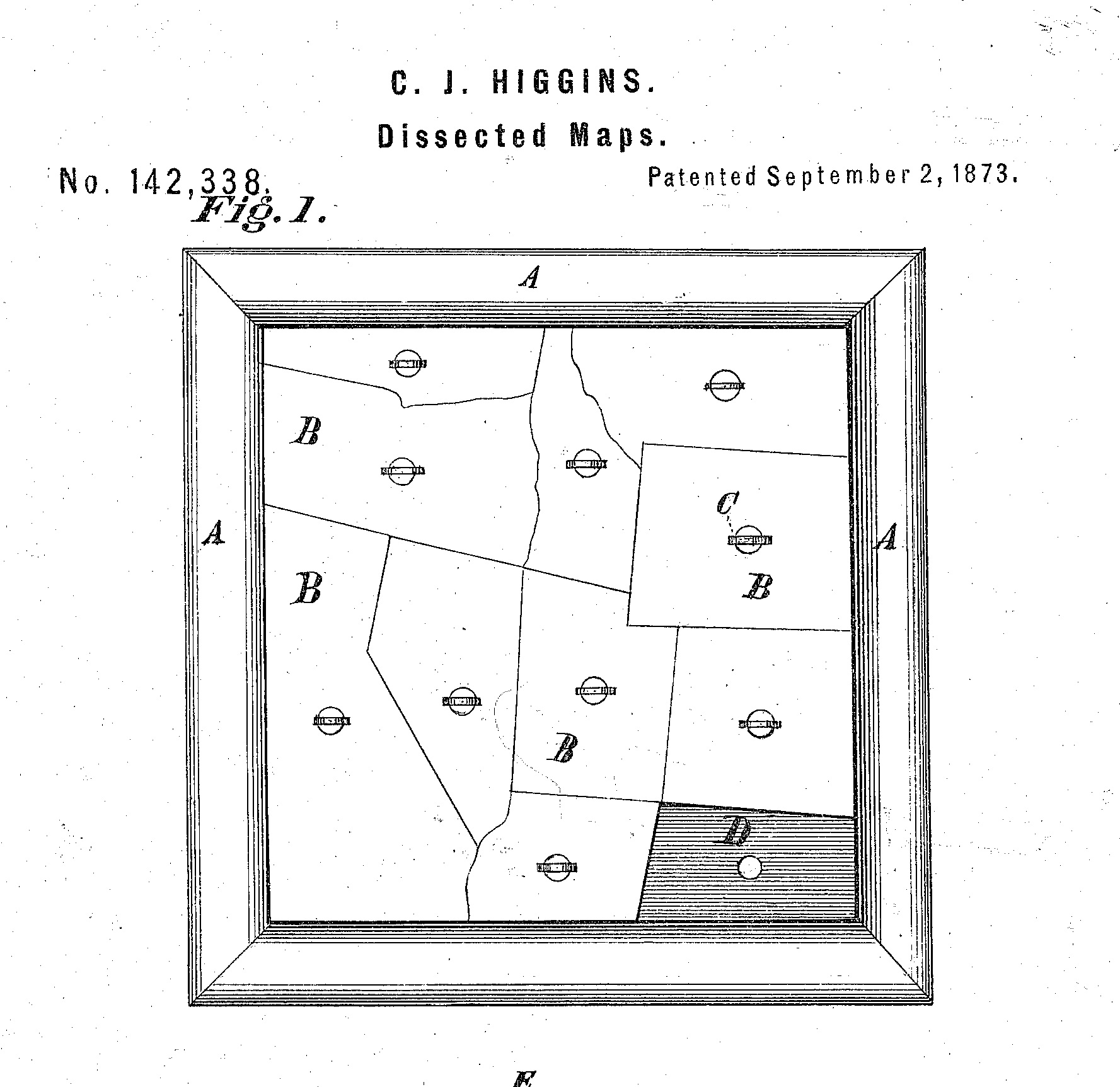
    This is an odd entry for the History of Blank, Empty and Missing Things category as it relates both to making things missing and finding them again.  In this instance the topic is maps and puzzles, where both actions of making things blank and restoring them are intentional. The first item on display–a sample from a “dissected” map patent from 1873, shows both an unusual “blank map” (a template simply waiting for a face) and the ability to remove part of the whole or the entire thing itself–and then of course replace/return the pieces.  But I must admit the original image (below) had that appeal of being mostly an unintentionally absurd item, a blank jigsaw in a frame. 

    Maps dissectedSource:  Google Patents  http://www.google.com/patents/US142338?dq=puzzle


  • Looking Straight Down Department: the Topography of Hell

    JF Ptak Science Books    Post 1920

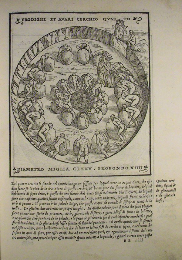
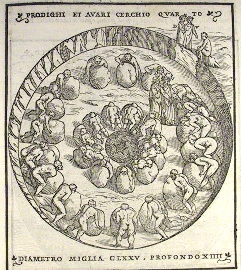
    The interesting thing about Hell–Dante’s Hell–is that it has been shown and reconstructed and imagined for a long time–eight centuries–and, outside of painting, most of the representations seem to be in cross-section. That is why this image from the famous exposition by Alessandro Vellutello’s 1544 struck me so strongly–it is a mostly straight-down look at the miserly and the prodigal in the fourth circle of Hell. 

      InfernoVIIfullpage

    InfernoVIIfullpage

    “… I saw multitudes
    to every side of me; their howls were loud
    while, wheeling weights, they used their chests to push.
    They struck against each other; at that point,
    each turned around and, wheeling back those weights,
    cried out: Why do you hoard? Why do you squander?’ –Canto VII, lines 25-30

    This image depicts the great, tiring but tire-less, endless, despicable joust of the miserly and the prodigals, going at each other with large, difficult-to-move stones.  Pluto is supposed to be in the middle, but I don’t see him here.  The artist though has made the men basically unrecognizable, giving them little character to their faces and virtually no differences in their bodies–Virgil tells Dante that they have lost themselves to something else, that there is no “there” there, that Dante–who would normally speak with the people he was coming into contact with–would not be able to interview them as they were too absorbed in their vicious need. 

    As has been seen in the many maps constructed for the Divine Comedy over the years–but especially during the Renaissance–Hell for Dante was a real place, a nine-layered inverted cone of measured depth and width commensurate with the sin, and established under the city of Jerusalem.  Dante visited the place

    “… but who art thou
     That hast inquir’d of us?” To whom my guide:
     “One that descend with this man, who yet lives,
     From rock to rock, and show him hell’s abyss.”      (Inferno XXIX, 89–92, trans. Cary)

    entering Hell on Good Friday and emerging from Purgatory on Easter morning, taking three days to travel through the two places and straight through the center of the Earth. 

    Here are a few examples of the cross sections that are the great standard bearers of Dante’s visions:

    The  Hell of Dante by Pietro da Fino, 1568:
    Frontispiece of Hell

    The circles of Hell from Commedia di Dante insieme con uno dialogo circa el sito, forma et misure dello Inferno by Filippo Giunta, Florence, 1506.

    The circles of Hell

    Again, just a few examples of the cross sections of Hell to contrast with the scarce looking-straight-down-at-Hell image above. 


  • The Unspoken Bits in Antique Historical Charts: Africa, 1826

    JF Ptak Science Books     Quick Post

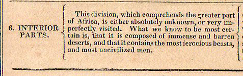
    John L. Blake’s Geographical Atlas is interesting for what it says and doesn’t say–granted, you can’t much take someone to task for things that they do not say, unless of course the unspoken bit makes a louder noise in its absence than in its presence. 

    Africa chrono816


  • Letters Inscribed in the Sky: Gaffarel, Kircher and Curious Ideas

    JF Ptak Science Books    Post 1905

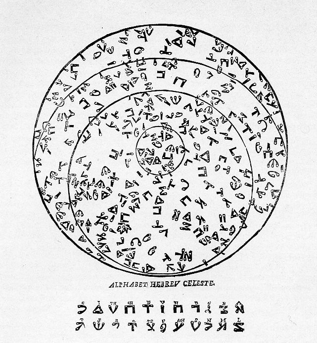
    Alphabet Hebrew sky806

    Could we satisfy our selves in the position of the lights above, or
    discover the wisdom of that order so invariably maintained in the fixed
    stars of heaven……we might abate…..the strange Cryptography of
    Gaffarell in his Starrie Booke of Heaven. 
    Thomas Browne1 (1605-1682) in his major Hermetic effort, The Garden of Cyrus, or The Quincunciall Lozenge, or Network Plantations of the Ancients, naturally, artificially, mystically considered (published in 1658).

    The Garden of Cyrus is a neo-Pythagorean insight weaving together all manner of visions in nature and art, and the art of nature and vice versa and so on, all tied up in universal thinking about these intersections in terms of the great quincunx patterns and the number five and it various variants in terms of latticework and the figure X. 

    Quincunx


    “What is more beautiful than the
    quincunx, that, from whatever direction you regard it, presents straight
    lines?–
    Quintillian’s Institutio Oratoria VIII.3.ix

    The Browne quote relate to the work of J. Gaffarel, who saw connections in art and nature quite literally in the structure of the heavens, among other places–but it is his “star-writing”  that I’d like to address a bit here.  His provocatively-titled Curiositez inouyes sur la sculpture talismanique des Persans, horoscope des Patriarches et lecture des estoiles  (“Unheard-of Curiosities concerning Talismanical Sculpture of the Persians, the horoscope of the Patriarchs and the reading of the Stars”) was published first in 1629 and then many times thereafter well into the 18th century.  Garrafel (1601-1682) presented to the world a wide class of interesting subjects which had previously been thought of as being outside the normal realm of academic discussion, the subjects being mainly seen as dogmatic occultism.  What Garrafel did was very interesting, writing about these areas as discussion-builders, as “curious” topics that could or should be considered to widen general inquiry. (In an interesting article, “The Use of Curiosity in Early Medieval France and Germany” the author  Neil Kenny writes of Gaffarel, “Making occult knowledge into conversation rather than a dogmatic system made [his work] less likely to be universally censured”)

    His work definitely interesting and curious, though the use of that word didn’t save him, as some of the topics  were verbotten–certainly Gaffarel
    was aware of this, and he tried his best to write about them in a way
    that the ruling intellectual powers would not find offensive, but it
    didn’t work, and his book was found to be abusive and was banned by the
    Sorbonne. This was such an integral action that Gaffarel succumbed to
    not one but two retractions.

    What is of primary interest right now with Gaffarel is his interpretation of writing systems, and how frequently they seem to exist exclusive of human manufacture.  It seems that a fair percentage of the time that these appearances came in the form of agate. and that these durable micro- explorations in agate go back thousands of years,
    expounded by Pliny and some of the other ancients, who followed the origins of
    humanity back into the 1blog_oc_t_9_not_here_kircher_793rocks. This was a
    popular idea for the origin of animate beings, propounding itself for centuries,
    even winding up in the bony lap of Leibniz of all people, who wrote that “men
    derive from animals, animals from plants, plants from fossils, which in turn
    derive from bodies that the senses and imagination represent to us as being
    totally dead and formless”. Stones
    therefore held the seeds of the formation of the world; all things living,
    breathing, and not.

    Our own Athanasius Kircher, the definition of polymathic ability and
    superior imagination was responsible for many such observations and
    discoveries. It seems to me that as much
    as Kircher gave, he took away, keeping ahead of his critics and the rest of the
    scientific community with tremendous output…people I think just couldn’t keep
    up with him. He found all sorts of
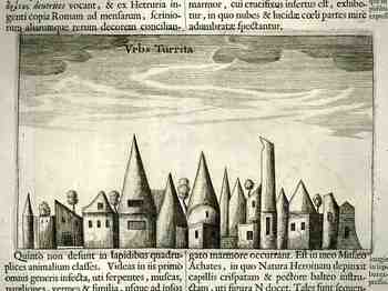
    things in stone: as early as 1619  he exhibited an image of   St. Jerome (in no less a place than the cave of the Nativity
    in Bethlehem!) that he found in
    agate. His Mundus Subterraneus (1661)
    is a home to a wide range of these
    objects: quadrupeds of all shapes and descriptions, human full-length
    portraits, hands with jewels, and even the Virgin Mary and child. AS spectacular as these are there is always
    more: the magnificent cityscape
    (reproduced here) and the sublime discoveries of a full set of the alphabet and
    a series of 15 geometrical drawings, all naturally impressed in stone.

    Gaffarel’s principle and perhaps first-on-the-scene notion (though some of it may have appeared in Agrippa’s Three Books of Occult Philosophy (first published in 1533))  was the elements of an alphabet–the Hebrew alphabet–was found not in stone, but actually written in the night sky. In the stars.

    It was another sort of artificial language, an entire alphabet, though this was written in the sky; Hebrew letters transcribed in the stars, lines connecting them here and there.  Replaceable letters from one point to another.  The possibilities of the formation of actual words was present.  This seems to have been the first time this idea appeared in print. 

    Notes:

    1. Browne’s writing is both beautiful and difficult, or complex and impenetrable, as can be seen from the very opening paragraph of his work here.

    That Vulcan gave arrows unto Apollo and Diana the fourth day after their Nativities, according to Gentile Theology, may passe for no blinde apprehension of the Creation of the Sunne and
    Moon, in the work of the fourth day; When the diffused light contracted
    into Orbes, and shooting rayes, of those Luminaries.
    Plainer Descriptions there are from Pagan pens, of the creatures of the
    fourth day; While the divine Philosopher unhappily omitteth the noblest part of the third; And Ovid (whom many conceive to have borrowed his description from Moses) coldly deserting the remarkable account of the text, in three words,
    describeth this work of the third day; the vegetable creation, and
    first ornamentall Scene of nature; the primitive food of animals, and
    first story of Physick, in Dietetical conservation.

    2.  An interesting article in the blog 8vo appears here on Gaffarel’s celestial writing.


  • Thematic Maps: Finding Russia in the U.S. Midwest


    JF Ptak Science Books  Post 1899

    Putting objects of different classifications into the same scale for the sake of comparison is a relatively recent idea in the history of printing.  It really wasn’t until Etienne Durand’s architectural textbooks of the 1850’s that buildings by different architects were displayed on the same scale on the same page. Likewise, too, the cartographic depiction of mountain heights and islands and lakes and rivers side-by-side and on the same scale didn’t take place in earnest until mid-19th century. 

    My favorites relating to geographical items are those that take, say, all of the major islands in the world and remove them to a single sheet of paper, all in scale, so that it would be easier to compare their sizes without the distraction of the rest of the map.

    Here’s another, just recently found in the warehouse:

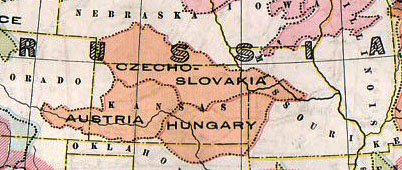
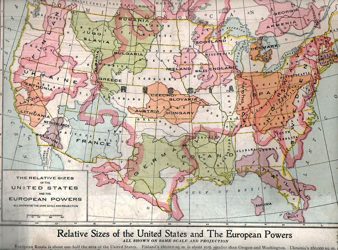
    Thematic europe in Russia 782_edited-3

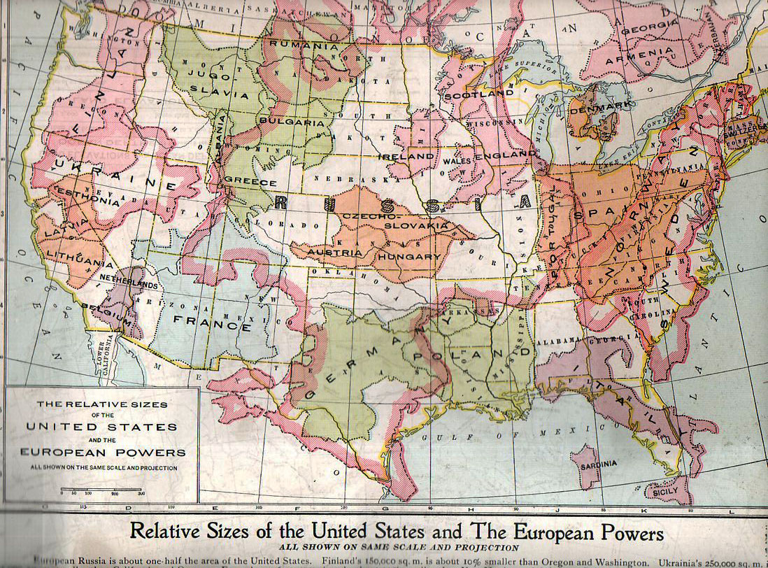
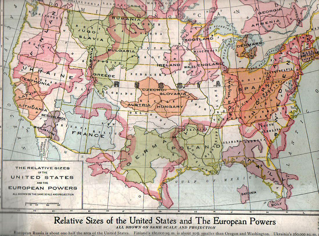
    This map, “Relative Sizes of the United States and the European Powers” was published by the People’s Handy Atlas of the World in ca. 1920,  appearing in print just a couple of  years after the map of Europe was changed by WWI.  (As a matter of fact this map very liberally used and without credit an earlier version published by the Geo. F. Cram company in their war atlas of 1914; it again appeared in the European War Book (by Canfield, published in 1917), calling on the information in this version and adding color. The People’s History also published a 1913 version of this map though I cannot find an example of it.)  Here’s the map in full:

    Thematic europe in  us782

    It really does put things into perspective, giving the reader a good, strong look at just how small some of these countries were in comparison with the United States. Many of the combatants of WWI are here–and its quite sobbering to think of the enormous casualties incurred in some countries and the very small area that those millions of dead and wounded would have taken if placed in a similar locale in the U.S.  An excellent example of this is Belgium, fitting very nicely into less than a tenth of the state California, where so much killing and suffering occurred.  Thinking of France as battlefield that was limited to about 60% of the size of the combined four states of New Mexico, Arizon, Utah and Colorado, and then thinking of most of the largest battles of WWI taking place in an area about a quarter of that is, well, incredible.  Using this as a guide, less han half the state of Colorado would’ve been the seat of the battles of Verdun (976,000 casualties), Marne (750,000), Somme (1.2 million), Cambrai (700,000) Arras (278,000), the Spring Offensive (1.5 million) and the Hundred Days Offensive (1.8 million),plus all of the rest of the action, and you get a little bit of a better idea of the bloodiness of that acreage. 

    Placing things in comparison in the same scale, side-by-side, is an excellent means of insight. 

    Casualties in World War One (taken with thanks from the site First World War

    Country Dead Wounded Missing Total
    Africa 10,000 – – 10,000
    Australia 58,150 152,170 – 210,320
    Austria-Hungary 922,000 3,600,000 855,283 5,377,283
    Belgium 44,000 450,000 – 494,000
    Britain 658,700 2,032,150 359,150 3,050,000
    Bulgaria 87,500 152,390 27,029 266,919
    Canada 56,500 149,700 – 206,200
    Caribbean 1,000 3,000 – 4,000
    France 1,359,000 4,200,000 361,650 5,920,650
    Germany 1,600,000 4,065,000 103,000 5,768,000
    Greece 5,000 21,000 1,000 27,000
    India 43,200 65,175 5,875 114,250
    Italy 689,000 959,100 – 1,424,660
    Japan 300 907 3 1,210
    Montenegro 3,000 10,000 7,000 20,000
    New Zealand 16,130 40,750 – 56,880
    Portugal 7,222 13,751 12,318 33,291
    Romania 335,706 120,000 80,000 535,706
    Russia 1,700,000 5,000,000 – 6,700,000
    Serbia 45,000 133,148 152,958 331,106
    South Africa 7,000 12,000 – 19,000
    Turkey 250,000 400,000 – 650,000
    USA 58,480 189,955 14,290 262,725


  • A Masterwork of Graphic Display of Data: a History of U.S. State Populations, 1870

    JF Ptak Science Books  Post 1864

    Rank_states_1900 Though the U.S census has been completed decennially ever since 1790, the first census atlas wasn’t published until 1870. The issue wasn’t desire, of course—it was the time that it took for calculation, analysis and design that prevented them from having been published before this date. It was still a monumental task of producing an entire atlas of visual displays of quantitative data.
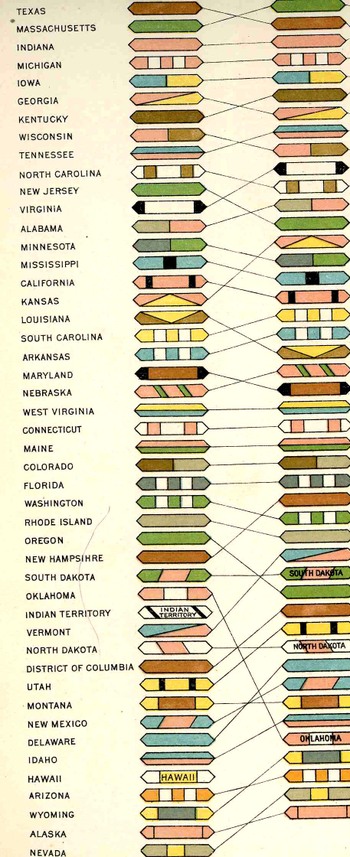
     The first atlas (produced under the direction of Francis Walker, who was the chief of the 1870 census) was printed in 1872, and was smaller, shorter and less graphically involved the later atlases, but it was the first, and it did present information in a way seldom seen before in the United States.  The first truly spectacular census atlas was produced twenty years later in 1890—it is elephant folio in size, and just a physically huge undertaking, and beautifully printed via chromolithography. It set the foundation for the two subsequent atlses of 1900 and 1920

    Blogaugust_24_statesd_detail442_2

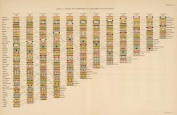
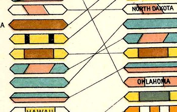
     The folding plate Rank of states and territories in population at each census (prepared under the supervision of Henry Gannett, Geographer of the Twelfth Census, printed at the Census Office in 1903 by Julius Bien & Co., N.Y.) from the 1900 census is nearly identical to the 1890 version, only it is about 1/4 of the size.  This graphic representation is remarkable because it displays and tracks a total of 348 data points (over time and ranking) using only eight colors.  (This atlas has been in my house a long time, and I’ve known about this plates forever, but I honestly never counted the colors–it is a surprise, really, to see that it was just eight colors being used in what seems like a dazzlingly different assembly of color.) The key was employing different shapes within the 6-sided polygon, making for the whole mass of objects and lines to be much more simply followed. Using more color rather than distinctive shapes-within-shapes would’ve made for a wall of color that would’ve been far less intuitively trackable.  This is just simply a fantastic achievement of data display–even if it takes a little while to train your eyes to become familiar with the geomertic shapes and sizes, it becomes quite easy to use.

    (Just for the record, the states in the United States at the beginning of each census over the first twelve censuses are:  1790, 14 states; 1800, 16; 1810, 17; 1820, 23; 1830, 24; 1840, 26; 1850, 31; 1860, 33; 1870, 37; 1880, 38; 1890, 44; 1900, 45.)

    For a complete display of the  1900 atlas, see HERE. 


    Blogaugust_24_statesd_detail_fine_d