A Daily History of Holes, Dots, Lines, Science, History, Math, Physics, Art, the Unintentional Absurd, Architecture, Maps, Data Visualization, Blank and Missing Things, and so on. |1.6 million words, 7500 images, 4.9 million hits| Press & appearances in The Times, Le Figaro, Mensa, The Economist, The Guardian, Discovery News, Slate, Le Monde, Sci American Blogs, Le Pont, and many other places… 5000+ total posts since 2008.

Category: Maps/Diagrams of Imagination & Ideas

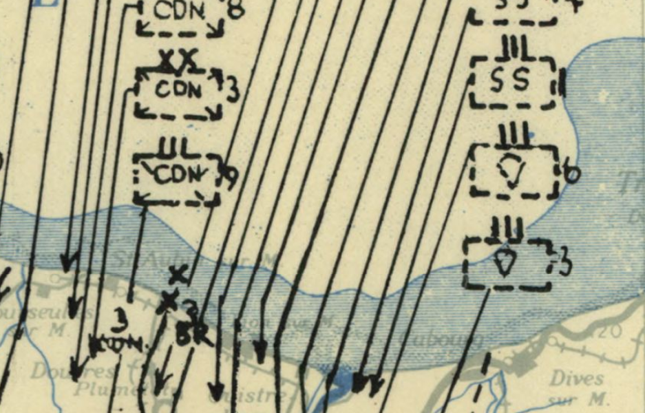
  • History of Lines–Big Lines, June 1944

    JF Ptak Science Books   Quick Post 

    DDAy lines

    [Source:  the Library of Congress, here.]

    The idea of being on the receiving end of these lines on 6 June 1944 is terrifying.  General Rommel pretty much figured out what was going to happen, and sort of when it was going to happen, but he was kept out of the strategy loop even though he was in charge of the German defences here, unable to convince Hitler to move men and machines southward to meet the invasion where he thought it was going to come rather than strengthen the position of defence in a place where he knew the invasion wasn’t coming, which was Pas de Calais. The pull of war by this time had destroyed the Luftwaffe, and German high command had been destroyed by Hitler–or at least communications and straegy within the command system of the German army was very highly compromised.  In any event, once the invasion had begun, there was not much hope for the Germans–it had been a complete surprise, with the huge efforts of misdirection playing themselves out beautifully. So beautifully, as a matter of fact, that once the invasion was well underway it was still a matter of no small debate as to where the “real” invasion would take place.  Even after the airborne divisions began landing some hours before the assault began, it was only the elderly and problematic General von Rundstedt who reacted appropriately, believing that the airborne assault was far too large to be a feint, and ordered two reserve panzer divisions to Normandy.  the amount of men and materiel moving onto Normandy was gigantic, impossible, overwelming, as some part of this map makes clear. 


  • A Beautiful Timeline: the U.S. Civil War

    JF Ptak Science Books   Quick Post 
     
    Follow Me on Pinterest


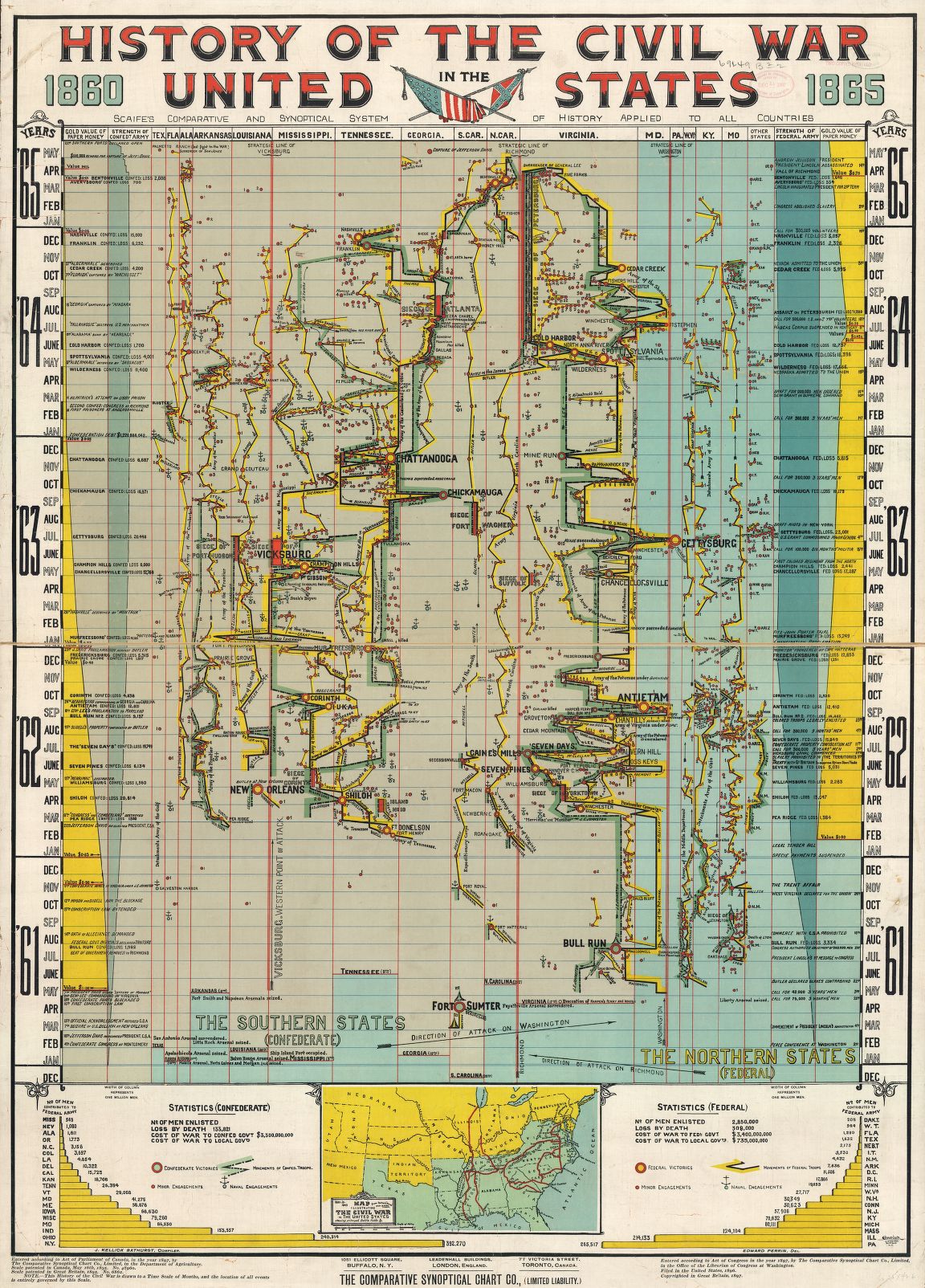
    This fantastic timeline of the U.S. Civil War  (History of the Civil War in the United States, 1860-1865) was compiled by J. Kellick Bathurst, drawn by Edward Perrin, and printed by the  Courier Lithographic  Co. of Buffalo, N.Y. in 1897. It is a beautiful thing, and is actually pretty useful:

    Maps--Civil War Infographic

    Source: the Library of Congress, here.

     
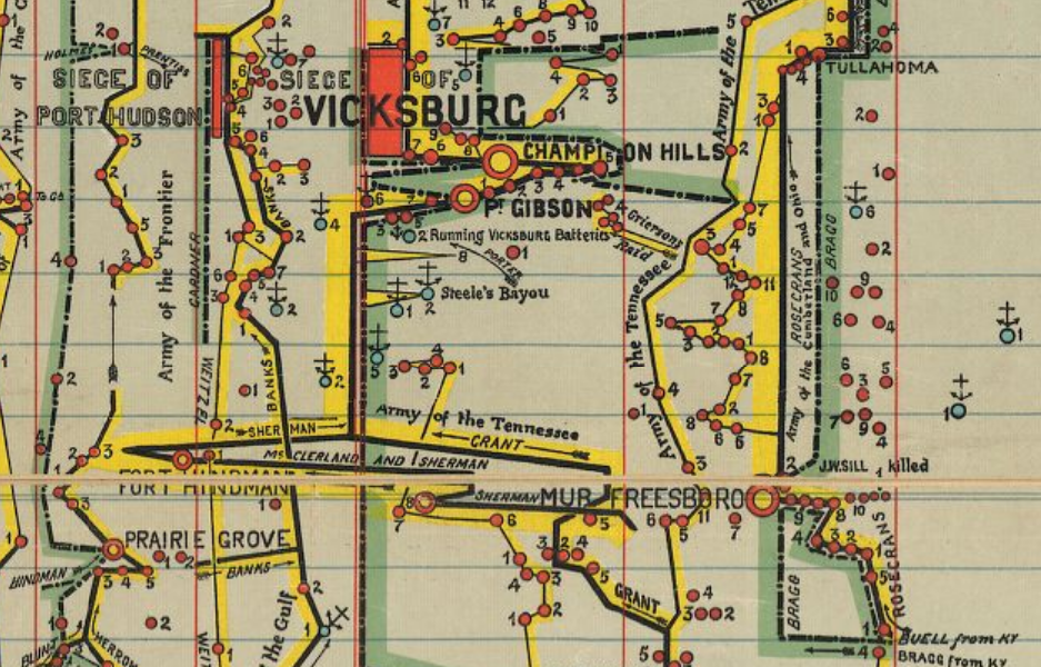
    A detailed view reveals that the timeline includes major (and minor) battles weighted for their importance and distinction:

    CW synoptical vicksburg


  • A Found View of Brooklyn and Map of Green-Wood Cemetery, 1846

    JF Ptak Science Books   Quick Post 

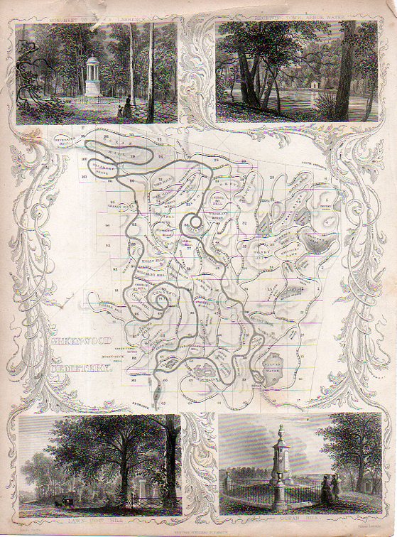
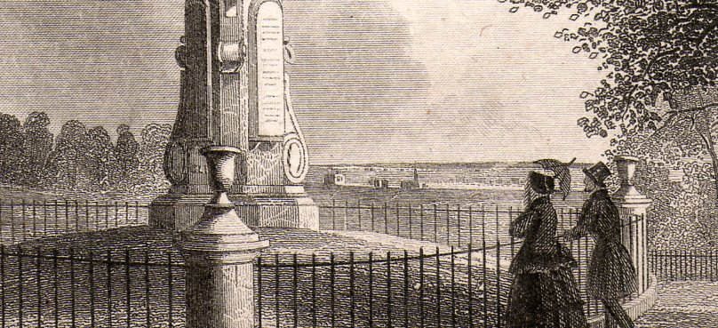
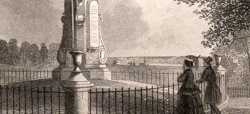
    Green-Wood223This interesting engraving shows a map of the relatively new Green-Wood Cemetery in Brooklyn, U.S.A. It was engraved by James Smillie (1807-1885) and published in 1846, 16 years after opening and addressing a need of the quick-growing burrough whose population grew from 47k in 1840 to 139k in 1850 to 279k in 1860. (Brooklyn would overtake Manhattan in population by 1930, with 2.5 million vs. 1.8 million for Manhattan. More population stats here.)  What interests me most is that small vignette at the bottom right, which shows a quiet scene at the rise in the cemetery called Ocean Hill–what it reveals in the background, though, is an uninterrupted view across Brooklyn and the Hudson River, and on into New Jersey.  Pastoral, Farmlands.  Its a found bit of history, a quiet, privileged view. 

    (The church in the engraving is about 2mm wide in the original.)

    Green-Wood224

    Green-Wood224


  • A Map of the Human Ability to Replace Itself, 1610-1723

    JF Ptak Science Books   Post 2009

    Follow Me on Pinterest


    Blogmissing_man041_3

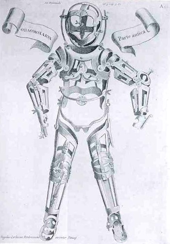
    This woodcut of applications and applicators to injured humans, lacking the human, waiting for the human, the missing human, was made by Hieronymous Fabrizzi (or Jerome Fabricius, 1537-1619), and found in his Opera Chirurgica, printed in 1723.  Even though this is a pretty straight-forward image, it strikes me as a little odd, a little off,  looking a bit like inhuman trappings, the entrapments of a human waiting to be built, an artificial skin with artificial bones.  It was much less than that, and in its way, much more—it was a statement of the advances of medicine in the 16th century, a map of the ability of man to replace himself; a map of the artificial man. Perhaps the image of our own artificial man, showing our ability to replace organs, bone, skin, limbs, etc.may come to look to the people of the near future the same way that we here in the present look back on Fabricius’ mage. 

    A Map of Getting Wounded

    Gersdorff_p21v_3

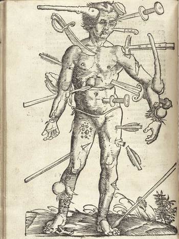
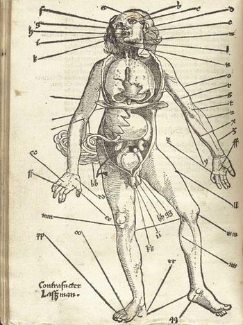
    This map of the wounded man was a very popular, much reproduced image, seeing publication in many works since it first appeared in Johannes de Ketham’s Fasciculus Medicinae,  printed in the year Columbus set sail for India.  It was a battle map, really—a battle for the human body, showing the effects of what happened to that body when someone tried to erase its existence.  The image is graphic, realistic and fairly gruesome, and highly useful.  It was accompanied by instructions on how to deal with all of the trauma, and to save the man thus that he could fight again.  In its way, this might be the earliest issue of M.A.S.H.  This woodcut, as the next, appeared in Hans von Gersdorff. Feldtbüch der Wundartzney (printed in Strassburg, by  H. Schotten, in 1528).

    A Map of Letting the Blood out of the Human Body.

    Gersdorffx400jpg_other_2

    Well, it really wasn’t like that, not how I mean by by snippy modernist viewpoint looking back on medical history with no contextual appreciation.  Bloodletting was an approach to healthfulness, as blood was seen as one of the four major elements (or “humours”) of the human body that needed to be kept in balance.  This was accomplished via the application of leeches or by the more common (and quicker) practice of venesection, or opening a vein to allow the blood to come out. (Let’s reference Steve Reich’s magnificent “Bruise Blood” creation of 1966 at this point—I don’t think that I’ll ever have a better chance to drop a reference to this piece of revolutionary music in regards to venesection again.)  Thus this map was map for the practiconers of bloodletting—the physicians, and more probably the barbers and other assistants who would inherit this lesser procedure from the more-busy doctors.  In the history of maps of anatomy and the general practice of mapping the human condition, this woodcut x-ray of the best places to drain human blood would not survive close to the age of modernity, disappearing almost entirely by the 18th century, and becoming much more scarce well before that.


  • Found Art in Oil Well Prospect Mapping, 1935

    JF Ptak Science Books  Quick Post 

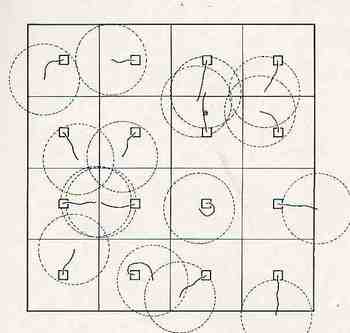
    These diagrams of oil well surveys (printed ca. 1935) have a very fine found-art appeal to me–frankly, if hey existed apart from the printed text, I would not have known what they were or represented.  They do remind me quite a bit of labanotation.

    Ebay_sept_23_found_art661


  • Mapping a Timid Whispered Revolution, 1938

    JF Ptak Science Books  Quick Post 


    Socialist New Party180


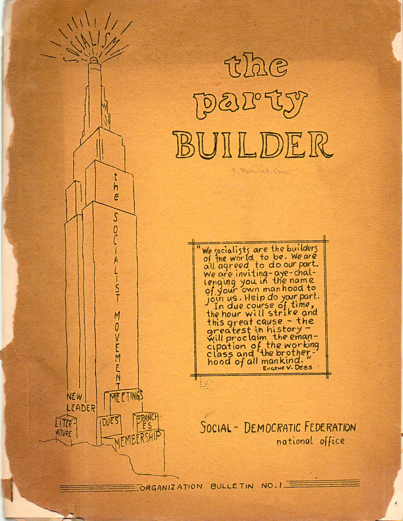
    Socialist New Party179The Part Builder, Organization Bulletin No.1  
    published inn 1938 by the Social-Democratic Federation’s “national office”, is an odd, semi-Outsider kind of publication, a skinny ingenuous cluster of littleness and naivete and homemade hope.  “Socialism” is a beacon of something (light or radio/television waves?) at the top of the Empire State Builind-like structure of the formation of the movement, as we can see in the quick-crude drawing on the left side of the pamphlet’s cover.  

    Maybe it an odd thing to use the new Empire State Building as a symbol for the movement, maybe not–the SDF was a splinter group that cleaved itself away from the Socialist Party in 1936 because it seems that the SP was too revolutionary/pro-Communist for the old line folks who formed the SDP. So maybe the building stood for something that the Communists and parties didn’t–I don’t know, and I’ve never been very good in following the histories of smallish political parties down their rabbit holes of formulations and re-constitutions and inter-tribal micro-warfare, so I really have no great insight into the symbolism. And perhaps given the rudimentary nature of the publication, maybe the symbolism went only so far as it was a thing that the artist/illustrator could actually sort-of draw.

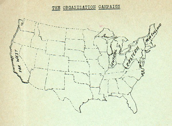
    The main object of interest in this sad little pamphlet though was the U.S. map that appears on page two–it is striking in its way, a silent stab at making claim to potential SDF members in a very quietly outlined American map.  The regional labels are so small and tentative, and the vast inner ocean of undefined America is so, well, vast, that the map seems more one of timidity than anything else, a whispered revolution. 


  • How High is the Sky? A Cross Section of Black and Red Earths

    JF Ptak Science Books    Post 2000

    [This is numbered post 2,000–a number that does not include another 500 or so “Quick Posts”–written for this blog since beginning in February 2008.]

    Preyssinger Earth plan

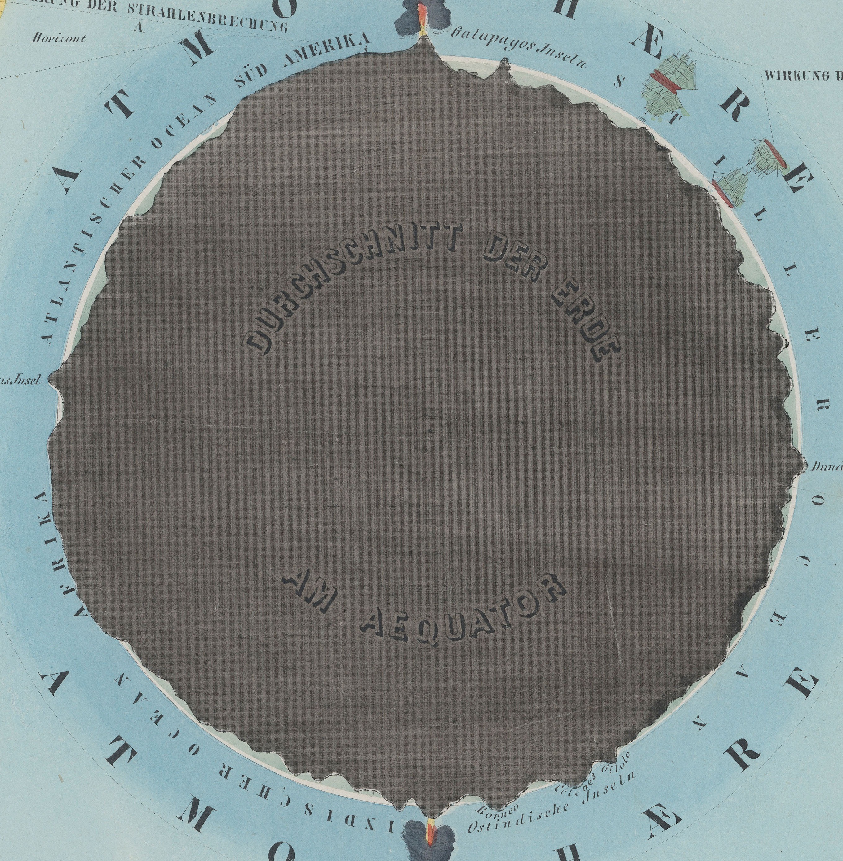
    • “Der Erde und Ihre Atmosphare” from Astronomischer Bilderatlas, by Ludwig
      Preyssinger, published in 1853 (with 12 engraved plates1, following the
      first edition of 1840, which had 10 plates). Source: found at Michael Stoll’s flickr set, a superior and large image, here.]

    Our older daughter Emma asked that question years ago, when she was six or seven.  It was a great question, and one of those questions, really, that only kids can come up with. It is also reminiscent of Ruth Krauss and Maurice Sendak’s A Hole is to Dig, a classic work published in 1952 with these sorts of question/responses, a kid-cratic method of inquiry and answer, that is possible generally only with a younger and fluid mind.  (“What is a hole? A hole is when you step in it you go down” and “a hole is to dig” and so on.)

    People from long ago certainly knew that clouds were not nearly as high as the Sun and Moon and stars, but how high could they be? How high was the sky?  How thick was the envelope of air around the Earth?  Exploratory balloon ascents could help that question along, but only somewhat: heights attained in the first 80 years or so of ballooning reached 43,000 feet. (The question of ballooning and the limits of the atmosphere comes up early, as we can see with Jane C. Webb Loudon, the author of the anonymously-published The Mummy!: Or a Tale of the Twenty-Second Century  in 1827, interestingly published nine years after Mary Shelley’s Frankenstein:  “… and the  hampers are filled with elastic plugs for our ears and noses, and tubes  and barrels of common air, for us to breathe when we get beyond the  atmosphere of the earth.”)  In 1803, the record stood at 24,000; in 1835, 26,000; in 1862, 39,000; the record of 43,000 feet was reached in 1927, and at a great cost. On the other hand, more than half of the atmosphere exists at 3 miles above the Earth, and 70% of it is at 5 miles and under; at 22 miles exists about 99% of the atmosphere, and at 62 miles the atmosphere is so thin that it is a virtual vacuum, and is basically negligible. (The exosphere reaches out though to about to about 6,200 miles, but that’s where free moving particles are able to escape the Earth’s gravity and get swept away by the solar wind.)

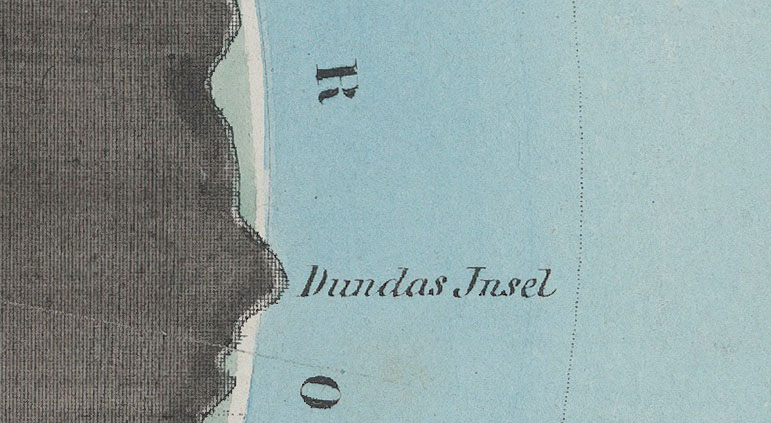
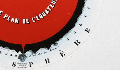
    Herr Preyssinger was trying to exhibit this atmospheric density in his illustration #10 to his beautiful astronomical atlas. (I should add here that Preyssinger’s work is a very uncommon production, made so that several of the engraved plates coul dbe held up to a solitary light source in a dark room and be illuminated cut-outs in the paper which also had transparent material on the verso to difuse the light…very smart.)  His illustration for the atmosphere was very effective, and was set against a plan of the earth made at the equator.  I’ve also included the same plate #10 from a French edition of the same work made slightly later, though the interior of this Earth is colored in a brilliant red.

    Preyssinger Earth plan detaik_edited-1
    So when the engraving above was printed in 1862, the balloon ascension record stood at about 5 miles, getting humans to above 70% of the ocean of air.

    Relative to humans getting high above the ground, the atmosphere is high; relative to just about everything else–like the 99% at 22 miles compared to the 7,900 or so miles of the Earth’s diameter, the atmosphere is but a thin slip. IF we reached that distance down into the Earth, we would just be touching the outer mantle.

    Preyssinger red larger

    •  Fromt the French edition, printed in 1862, here.  French explanation (Astronomie Populaire ou Description des Corps
      Celestes, Astronomie Populaire en Tableux Transparents..
      .., published in
      1862) of plate X, here. 

    Preyssinger Earth plan det

    Notes:

    1. Twelve plates, as follows:  Die Central-Sonne und die Ansicht von der Fixsternwelt; Himmelskarte; Darstellung des Sonnensystems; Vergleichende Darstellung der Grösse der Planeten; Die Sonne und verschiedene Erscheinungen derselben; Der Mond durch das Fernrohr gesehen; Transparente Darstellung der Mondsphasen; Finsternisse; Ansicht von den Jahreszeiten; Die Erde und ihre Atomsphäre; Kometen und Aerolithen.


  • On Looking at Things Straight Down

    JF Ptak Science Books    Daily Dose from Dr. Odd

    Follow Me on Pinterest


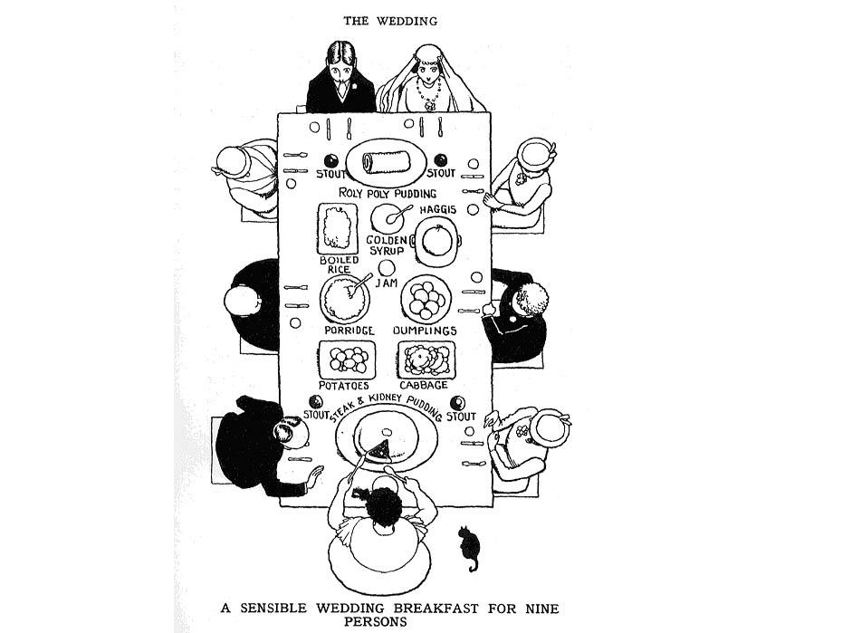
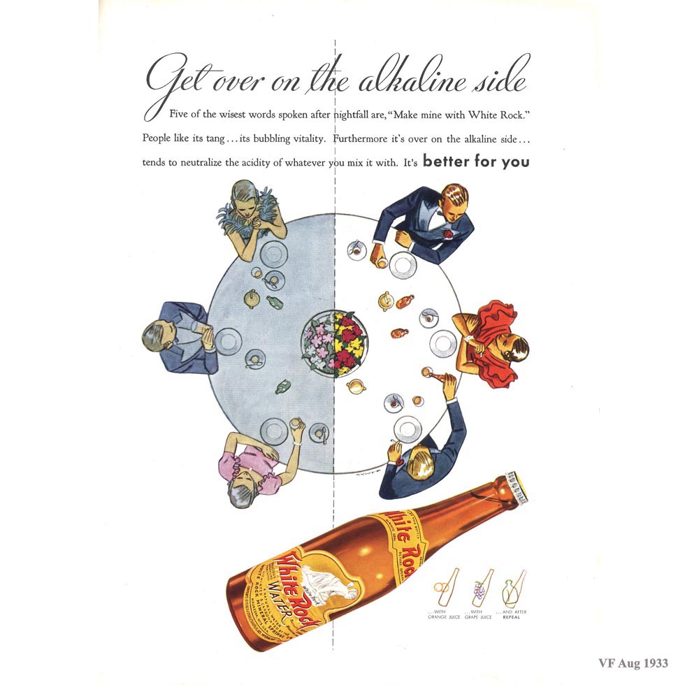
    This Daily Dose from Dr. Odd combines two interesting categories today, “Looking Straight Down” and “Display of Information”, and they involve food. Rather, its the placement of food, and maps of dinner tables, seen from above–directly above–and looking straight down.

    The idea of representing a view straight down, of looking straight down from some height, is a relatively recent occurrence, this view being somewhat rare in the antiquarian world pre-balloon or pre-heavier-than-air flight.  The pre-human-flight reason for its scarcity is understandable, but even after the first Montgolfier ascension in 1787, there’s another 120+ years of scarcity yet to come before these views would start to pop up in common (and uncommon) literature..  Now I’m not talking about cartography, which is basically a straight-down view of the world—what I’m referring to is that same view but not as a map per se, but what you would see if you were dangling out of a plane or balloon. It is an unusual and scarce perspective.

    Maps--Imaginary--Map of a Wedding Table


  • Cartographic Evidence of Hell in Texas, 1888

    JF Ptak Science Books    Post 1941  
    Follow Me on Pinterest 

    Slave map 1888 texas
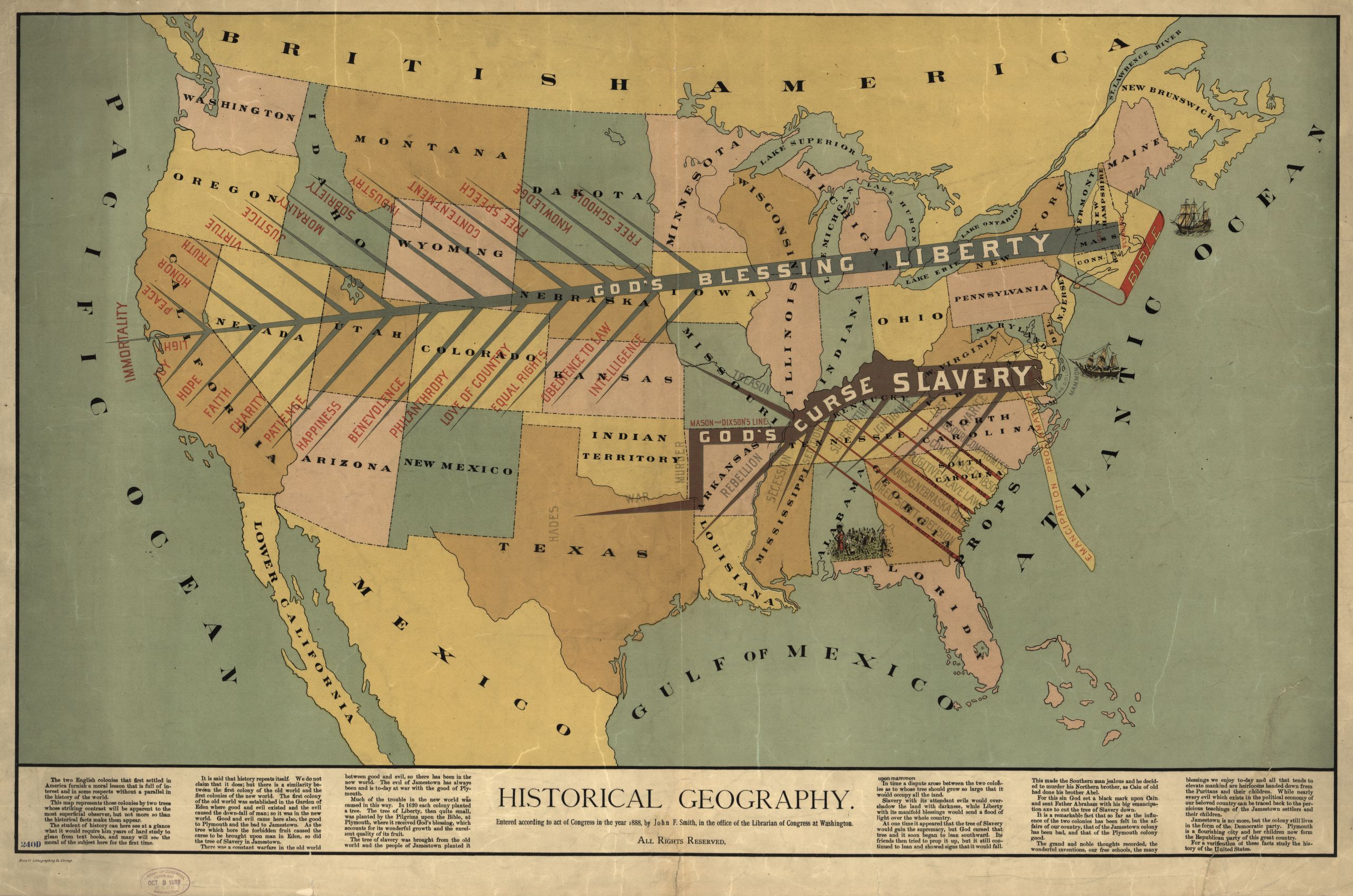
    Just yesterday in this blog I made an entry on a very striking, viciously anti-slavery Moral Map of the U.S. It is very red and was printed in 1854, just barely before the great troubles really started to begin in 1856, and it stands on its own as a fine representation of a map-with-a-message.  The map below by John F. Smith (Historical Geography) was printed in 1888, and although it was made after slavery it still carried a very strong message–perhaps not as graphic as the 1854 map, but certainly as vehement, and perhaps more-so, with a very heavy dosage of Reconstructionist retribution laced in its text. There is a sense of channels of warm blood flowing through canali of stone altars, a mass on the chest to Huitzliopochtli.  It has its own sense of deep danger.

    Slave map 1888
    [Source:  the Library of Congress.  The map is very expandable.]

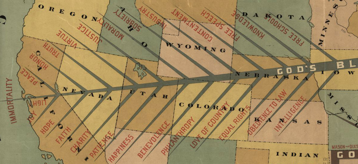
    The map is divided North and South by two lightning-like trees, “God’s Blessing, Liberty” and “God’s Curse, Slavery.”  The limbs of the tree of Liberty read “Light, Joy, Hope, Faith, Charity, Patience, Benevolence, Philanthropy, Love of Country, Equal Rights, Obedience to Law, Peace, Honor, Truth, Virtue, Sobriety, Industry, Contentment, Free Speech, Knowledge, Free School.”

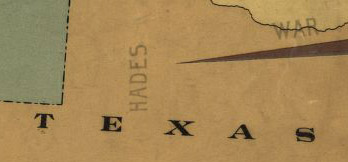
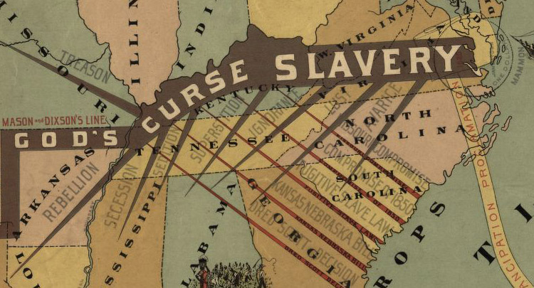
    The limbs of the dark, crooked tree of slavery read: “Murder, War, Rebellion, Treason, Secession, Sedition, Superstition, Ignorance, Avarice, Lust” and of course “Hades”. these are hosted on the spikes of the Missouri Compromise, the Compromise of 1850, Fugitive Slave Laws, Kansas-Nebraska Act, Dred Scott.”

    “Hades” might not be that far off, at least for the heat/difficulty index, as this one seems to be located right about at the eastern boundary of the Llano Estacado, which in centuries past was a very highly difficult place to navigate. 

    Slave map 1888--detail 2

    Slave map 1888 det 3


  • The Moral Map of the United States, 1854 (and other Maps of Slavery)

    JF Ptak Science Books  Post 1940
    Blogslavery_detail

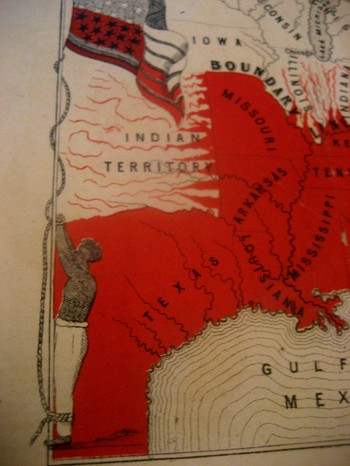
    This incredible, indelible image is another from our collection of graphical representations of data and ideas.  This map, is entitled Moral Map of North America, 1854; (the Slave States are coloued Red, the blighted influence of Slavery is also deeply felt in those parts more slightly streaked with Red)€.  I can find no record of this map, printed obviously by our Brethren across the ocean–€”that and the fact that it was printed in 1854 is all the publishing data that I can find thus far.

    The poem at bottom reads:

    United States! Your banner wears
    Two Emblem €”one of Fame;
    Alas! The other it bars
    Reminds us of your shame.
    The white man’s liberty in types
    Stands blazoned by your stars;
    But what’s the meaning of your stripes;
    They mean your Negro-scars.

    Reciting this poem by Thomas Campbell before an abolitionist convention in 6 March 1851, William Wells Brown continued (as was reported in the National Anti-Slavery Standard):

    “The name of the United States is becoming a hissing and bye-word in the mouths of the inhabitants of every clime.  My country is indeed the land of oppression. There is not a rood of territory over which the Stars and Stripes€ fly, on which William and Ellen Craft or myself could be protected by law. Wherever the American flag is seen flying on the continent of the New World it points us out as slaves; and we enjoy to-night a degree of freedom in your town that we could not if we were in the land of our birth. I often speak of America as my country, but in point of fact I have no country. In the language of one of the noblest of the Negro’s champions in the United States.  €œMy country is the wide, wide world; My countrymen are all mankind.”€

    Brown should know:  his mother was a slave and his father the plantation owner who later granted him his freedom.  Brown then worked the underground railroad and much, much more, working with William Lloyd Garrison and Wendell Phillips.  Among his published works included the incredible  Clotel, (1853), which was one of the first novels published by an African-American in the U.S.,  and which discusses in great detail the relationship between Thomas Jefferson and his slave/lover/mistress Sally Hemings.

    The map is definitely a tale of morality, showing a definite margin of slavery but also depicting slavery leeching its way through the border states. It is interesting to note that Washington D.C. is represented in red as it was indeed a slave-holding district, with a slave pen right on the Mall in the 1830’s. 

    The most striking feature to me of course is the slave who is lashed hand-and-foot to the flagpole on which the American flag is flying, as €”this is the only time that I have seen the slave and the flag portrayed as a unit, together, the slave being tortured by the standard of our country. 

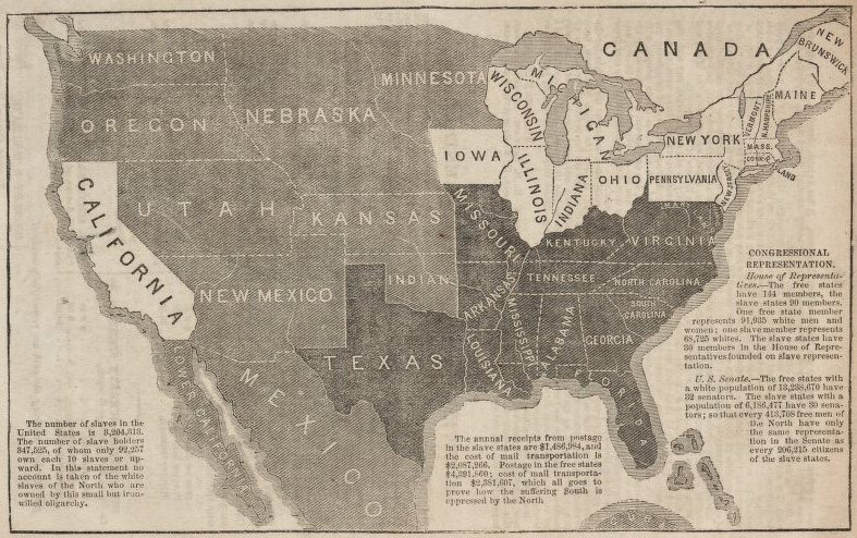
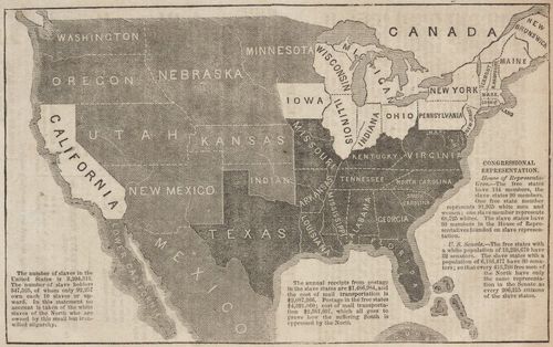
    (Here’s another contemporary map depicting the expansion/limitation of slavery from a blog post on the Kansas-Nebraska act on the excellent antiqueprintsblog site, described here):
    1856 John Jay Freedon and Slavery
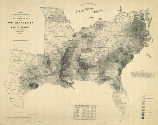
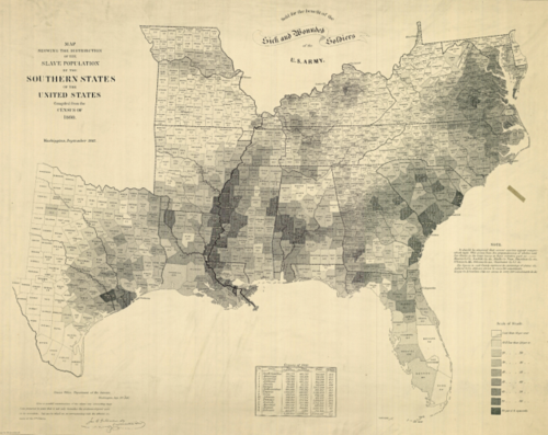
    And this famous map of the United States slave holding region depicting slave ownership by density and by county, which is described in detail (along with pull-outs and expansions at the New York Times website: 

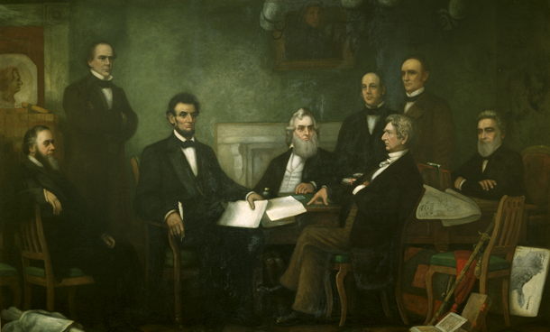
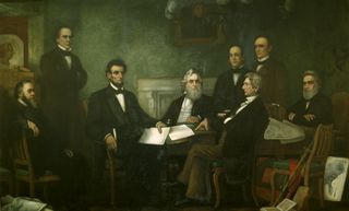
    “(Francis Bicknell) Carpenter spent the first six months of 1864 in the White House preparing the portrait (of Lincoln reading the Emancipation Proclamation to his Cabinet), and on more than one occasion found Lincoln poring over the map. Though the president had abundant maps at his disposal, only this one allowed him to focus on the Confederacy’s greatest asset: its labor system. After January 1, 1863—when the Emancipation Proclamation became law—the president could use the map to follow Union troops as they liberated slaves and destabilized the rebellion.” Quote pull from the NYT via Flowing Data.
    Map slavery US 1864
    The Carpenter painting (described in another New York Times piece here, with the map clearly visible at the lower right):
    Lincoln emancipation proc
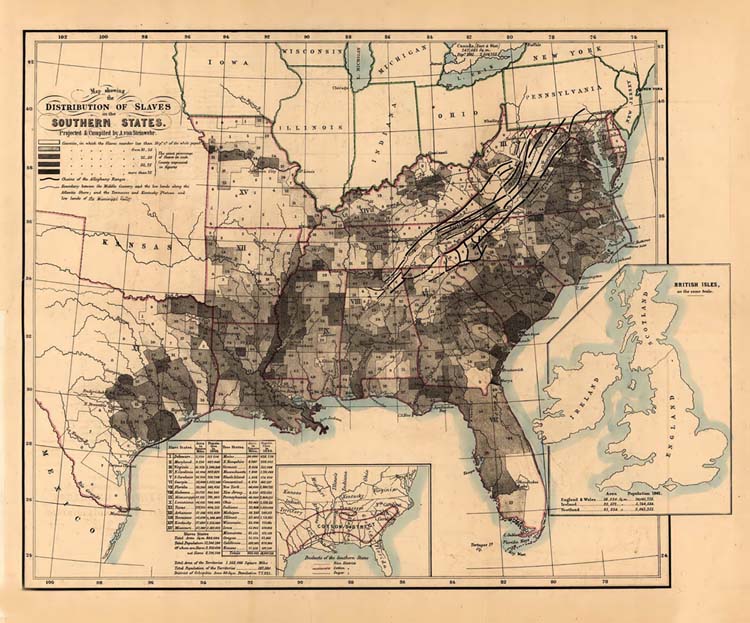
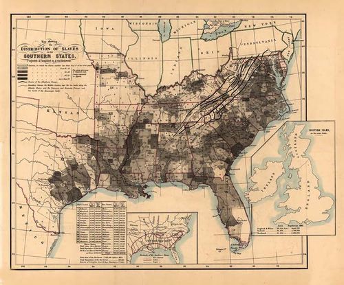
    Another fine example of a slavery map showing the details of the institution was made by Adolph von Steinwehr (a cartographer and geographer who would serve as a brigadier general in the Union Army) in 1861:
    Map slave 1861 Steinwehr
    The data given in the  three maps above is great and indispensable, but the first map still perhaps makes the most indelible impression.