A Daily History of Holes, Dots, Lines, Science, History, Math, Physics, Art, the Unintentional Absurd, Architecture, Maps, Data Visualization, Blank and Missing Things, and so on. |1.6 million words, 7500 images, 4.9 million hits| Press & appearances in The Times, Le Figaro, Mensa, The Economist, The Guardian, Discovery News, Slate, Le Monde, Sci American Blogs, Le Pont, and many other places… 5000+ total posts since 2008.

Category: Maps/Diagrams of Imagination & Ideas

  • CartographArtia of the Flight of Homing Pigeons

    JF Ptak Science Books  Quick Post 

      Homing pigeon151

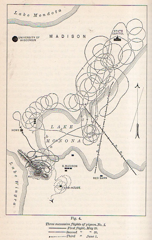
    Non-representational art was still nearly twenty years in the future when this lovely cartographic artwork was published in 1894.  And what we are seeing here in the collection of circles and spirals is a representation of three trials of a homing pigeon finding its way home in the Lake Monona region of Madison, Wisconsin.  C.F. Hodge Ph.D. (of Clark University, psychology) wrote “The Method of Homing Pigeons” for Popular Science Monthly (volume 24, 1894), showing at least in this found instance that behavioralists (yet named at this point) enjoyed working with pigeons well before C.B. Ferster recommended them over rats to B.F. Skinner (mainly because, as Ferster said, he didn’t like rats).

    Actually Hodge was more of a neuro/pathology person, but for now I’m just interested in the artwork generated by his experiments.  


  • The Newspaper Frontier, 1880: Cutting Texas (Almost) in Half

    JF Ptak Science Books   Post 2240

    The idea of the frontier in American history has been around for quite some time, made famous and mostly-invented (and closed) by Frederick Jackson Turner in 1893, and expanded, imagined, enticed, magnified, micro-analyzed, and  generally messed with ever since.  There have been all sorts of frontiers introduced into the study of the birth, expansion and filling-up of this country, from the very earliest colonial periods of Indian frontiers, “far-western” river frontiers of the Connecticut, Delaware, Hudson (!) and Susquehanna, to the Appalachian frontier of the early western reaches of the colonies, to the transportation frontier, the slavery frontier, the gold and mining frontier, the gun frontier and so on.  

    TExas newspaper

    I’ve got another bit to add:  the newspaper frontier.  

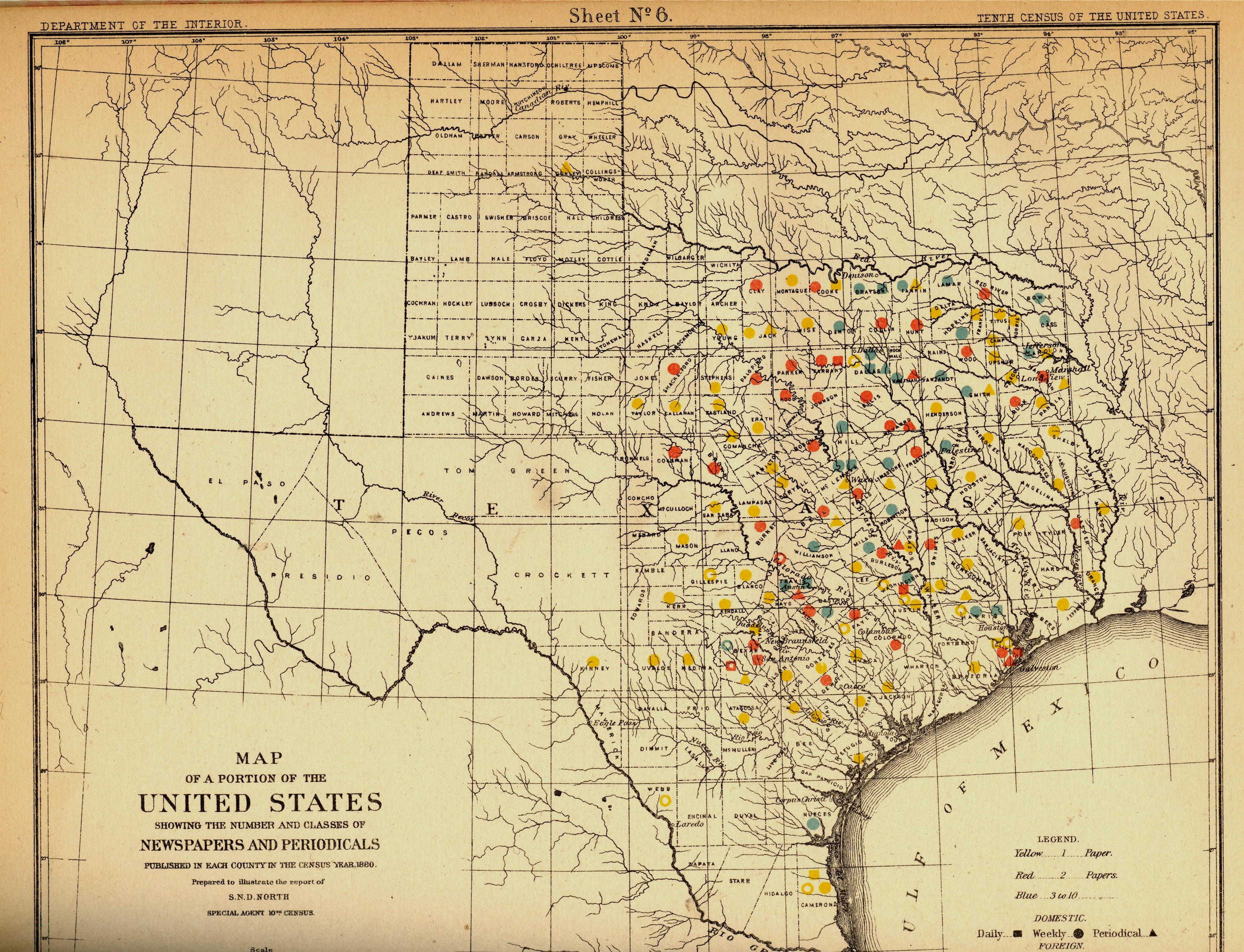
    I just happened upon a volume of the US Census of 1880, with a special report by S.N.D. North entitled History and Present Condition of the Newspaper and Periodical Press of the United States…and published in 1882.  What provoked me was the map of Texas newspapers for 1880.  It very clearly, and like no other map of its kind, delineates a fantastic line/frontier between the Texas with newspapers and the Texas without newspapers. We see very clearly that the frontier of the newspaper stops fairly abruptly (and wonderfully) at the 100th meridian, with only two newspapers in all of the rest of Texas found beyond that point (and those just barely beyond the 100th.  And it’s the 100th meridian that mostly marks the vertical middle of the country, running through North and South Dakota, Kansas, Nebraska, the Texas/Oklahoma borders, and so into Texas—if you folded this map vertically in half it folds virtually on the 100th meridian.  An odd bit, it is, half of the country and then approaching half of Texas. 

    I should report that the newspapers west of the 100th meridian were in Kinney County (population 4,440) with the Fort Clark News (established in 1880, at exactly the year of census) and Donley County (population 160, with the monthly Clarendon News and a 50-cent annual subscription rate).  The newspaper development also sort of followed the frontier fort development, almos tall of which (but four) were east of the 100th. 

    Of course the population and easier-natural-resources are located east of this point, I know, but it is still quite a jolt to see the line of newspapers get drawn in the sand so vividly.  There isn’t anything else quite like this so far as the newspapers go, except, a little, for Florida, where the line gets drawn north and south, splitting the peninsula roughly in half, the southern part holding only five counties at this point..  But it is a much more robust image for Texas given the number of newspapers that were being published—280 periodicals and newspapers for Texas versus 45 for Florida, with 11,374 in the entire country*—so that the difference between the have-newspapers and haven’t-newspapers in Texas is that much more vivid. 

    Texas needed more papers:  there were 1.5 million people living in the massive state in 1880, almost twice as many as there were in 1870, and almost half of what there would be there in 1900. That was another story, entirely—even in 1880, which is only 130 years ago, there were only 270,000 people living in the entire state, not even close to half of the county population of Pinelas today.I’m just enjoying the surprise of the straight-edge frontier in Texas. 

    The deal too was that Texas wasn’t at the top of the lisst for average area for each publication per square mile, with each periodical providing coverage for 936 miles. But that again is for Texas east of the 100th meridian–throw in the rest of the state, and that number skyrockets. (There were 13 states with a higher mileage distribution than Texas, topped by Indian Territory,m with basically nothing, with each paper servicing an area of 21,000 square miles.  

    Also, Texas’ 225 counties had 119 counties publishing newspapers and/or peridoicals, compared to the national figures, which were 2,605 counties and 2,073 publishing papers.  

     *Just for the sake of comparison, the number of newspapers and periodicals per state for 1880 was as follows: Illinois, 1017; New York, 1411; Pennsylvania, 973; Ohio,  774; New Jersey 215.  Also, oddly, the average circulation of the Florida and Texaspapers was roughly the same: 1,282 for Texas and 1306 for Florida (with an average for the country at 4137). 


  • Iconography–the World on a Globe on a Title Page (1537)

    JF Ptak Science Books   Post 2235

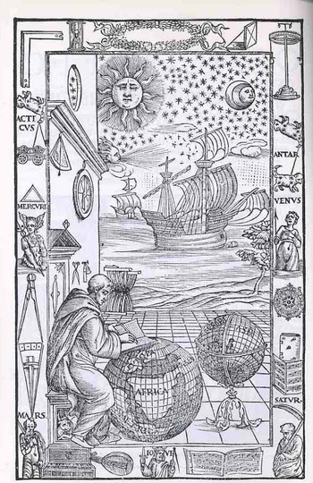
    This magnificent piece of tidy work (below) was executed for a new edition of Johannes de Sacrobosco’s (latinized for John Halifax or Holywood, a teacher of mathematics and astronomy at the University of Paris, a monk/scholar/astronomer ca. 1195-1256) Tractatus de Sphaera Mundi  by Fra Mauro Fiorentino (1492-1556), and gives us all a chance to have a bit of fun reading late Renaissance iconography. The work is entitled Sphaera volgare novamente tradotta con molte notande additoni di geometria, cosmographia, arte navicatoria et stereometria (and so on), published in Venice in 1537, and as stated in the title this is an augmented edition of Sacrobosco with Mauro adding segments on geometry, cosmography, navigation and perspective. (Full text of this classic here.)
    Blogtpamerica105

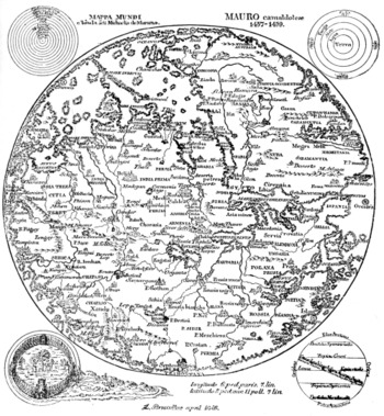
    The wood engraving is of particular interest because of the globe upon which Fra Mauro is writing—as you can more clearly see in the detail; shot (below) we can see a large continent labeled “America” just hundreds of miles off the coast of Africa.  The Americas still make only guest appearances on globes at this point, and seeing it here, as a bit of an afterthought, is a treat (considering how easy it is to overlook it).  There is another Fra Mauro, much more famous than our’s above, whose cartographic workshop produced a seminal, magnificent  map of the world in 1453, thus bringing the two Mauro’s together, if only slightly, via their maps (one great, the other incidental).

    From the Sphaera, chapter one:  

    THE FOUR ELEMENTS. — The machine of the universe is divided into two, the ethereal and the elementary region. The elementary region, existing subject to continual alteration, is divided into four For there is earth, placed, as it were, as the center in the middle of all, about which is water, about water air, about air fire, which is pure and not turbid there and reaches to the sphere of the moon, as Aristotle says in his book ofMeteorology. For so God, the glorious and sublime, disposed. And these are called the “four elements” which are in turn by themselves altered, corrupted and regenerated. The elements are also simple bodies which cannot be subdivided into parts of diverse forms and from whose commixture are produced various species of generated things. Three of them, in turn, surround the earth on all sides spherically, except in so far as the dry land stays the sea’s tide to protect the life of animate beings. All, too, are mobile except earth, which, as the center of the world, by its weight in every direction equally avoiding the great motion of the extremes, as a round body occupies the middle of the sphere.

    Looking a little more closely at the elements of this image we find a number of interesting bits.  Working from the upper right hand corner across and down we find a right angle (for the architectural and building parts of the book), then a sand clock, a decorative laurel wreath with a pocket sundial (!) right next to it, ending with an object that looks as though it might be a physical sciences demonstration tool (I’m guessing).  Working down from the “what is it” we see the first cut of a three-times-repeated constellation that I think has nothing to do with the word “Antar” beneath it. 
    Mauro_map

    “Antar” probably refers to the famous Arab warrior-poet, subject of lots of attention over the centuries including two works by Bach and Rimsky-Korsikov (and also the name of Apollo as worshiped at Actium) Below Antar is an armed and clothed (?!) Venus, major domo goddess of love and beauty and for whom existed innumerable cults (witnessed by just some of the famous Venuses as Venus de Milo ,Venus de’ Medici, Capitoline Venus, Esquiline Venus, Venus Felix, Venus of Arles, Venus Anadyomene (also here), Venus, Pan and Eros, Venus Genetrix, Venus of Capua, Venus Kallipygos, Venus Pudica, and so on into the sweaty  night.)


    Following Venus is, I think a complex compass rose, though it may also be a calendar—I can’t quite tell from the detail of the cut.  This is turn is followed by a heavily fortified book (actually this sort of bonding, meant for heavy use, was relatively common at this time)and a score of (5-line staff) music. 

    Returning to the right angle and moving down we se the same constellation under which hangs a very stable-appearing wagon, with a triangle beneath it , followed by a representation of Mercury, the messenger of the gods, who in turn is positioned over a large set of dividers.  On the wall over the head of Fra Mauro we see two precision instruments—a surveying tool and an astrolabe.  The two small tools near Mauro’s head seem to be a scale and a pair of scissors. 
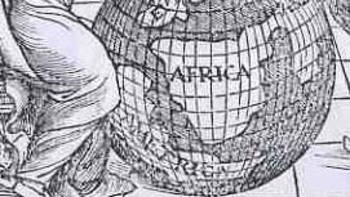
    Blogtpamerica_detail

    The central panel shows two caravans (approximately 100-footers?), being driven by a favorable wind to hospitable shores beneath a starry and benign firmament. 

    The bottom tier is the most emblematic of the set of images, as we see the related Saturn-Jove-Mars all together.  Saturn is also Kronos, which is why we see the old horned man caring the scythe of time’s reckoning; he is also the father of Zeus, also known as Jupiter (Juppiter Optimus Maximus Soter (Jupiter Best, Greatest, Savior)), also known as Jove, who stands here crowned and warning us with a sword and dividers.  Jove in turn was the father of Mars, who here doesn’t look terribly war-like at all.  Punctuating the spaces between these three are a keyboard instrument, a lute and a score of music.  I’m not sure that these lyrical/musical devices had anything to do with the three generations of super gods, but there you have it. 

    The ending of the Sphaera: 

    ECLIPSE DURING THE PASSION MIRACULOUS. — From the aforesaid it is also evident that, when the sun was eclipsed during the Passion and the same Passion occurred at full moon, that eclipse was not natural — nay, it was miraculous and contrary to nature, since a solar eclipse ought to occur at new moon or thereabouts.

    On which account Dionysius the Areopagite is reported to have said during the same Passion, “Either the God of nature suffers, or the mechanism of the universe is dissolved.”

  • Maps of Human Hair Streams (1902)

    JF Ptak Science Books     Daily Dose from Dr. Odd

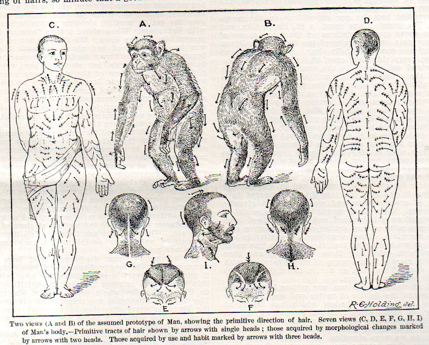
    There is something exceptional about the exceptional.  In this case, the category is maps, and in this instance the map that takes us away, far away, from the expected or standard is one showing the flow of human hair streams.  (It fits very nicely with other exceptional maps found on this site, like Maps of the Cosmos of Moles–just browse the “maps” section in the archives.)  

    Hair map contract087

     This unlikely title is the creation of Dr. Walter Kidd (Fellow of the Zoological Society, London) and his attempt to reconcile the the influences of gravity, inheritance, genetics, Weismannianism, and other assorted biological bits via his study of hair growth patterns.  The article appears in the (many) pages of the Scientific American Supplement for 13 September 1902, on page 22, 328. (Yes, the Supplement was paginated consecutively over dozens of years of publications, a cumbersome manner of ordering an 8-foot stack of paper over dozens of volumes.)  In any event, this was an article to simply explain some of Kidd’s ideas and the chart that would appear in a more lengthy treatise of 153pp published in the next year by Adam Black.  Contemporary views of Kidd’s book were not very supportive of his work.  I should add that I was attracted to this article solely for the possibility that this may well be the first map of directional hair growth. (I think the idea is pretty interesting, but I’m just not in the mood for it presently.)

    Hair map contract086

     Some of the other posts on this blog dealing with unusual hairiana include the following:


  • The Unexpected Unintentional Unusual: Maps of America

    JF Ptak Science Books  Post 2162   An offshoot of the Unintentional Absurdist series

    After all of this time on this blog–six years now and 3,000 posts–I think that I would have paid more attention to Unintentional and Unexpectedly Odd Maps of America that bobble up here and about in the home collection. The are odd and strange maps though none really relegated to America–there are strange maps of NYC (as in NYC being disappeared, or lifted by strange anti-gravity implements to float serenely above its hollowed ground below)–but none of the entire country.  And so a few have come up, unexpected and unusual things, though not so much in and of themselves, but separately.  What I mean to say is that the maps (for the large part) make sense with regards to their texts–not terribly much though without.  And so, here are the first few (and brief) examples:

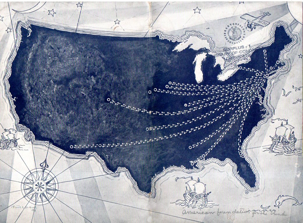
    Maps of US GIMP

    This rather strange example was printed as the covers of a pamphlet in 1928 and comes from the American Foundation for the Blind, simply showing the progression of the agency’s representatives extending out beyond the originating point of New York City, though on  first sight the map is very unusual, and naively odd.

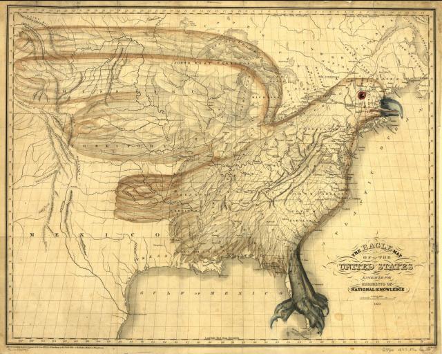
    This sort of map in the “Unexpected” category differs from the intentional oddness of maps like (the very recent) map of the U.S. showing distances to McDoanld’s, or I.W. Moore’s 1833 map incorporating an eagle into the design of the early RepublicMaps Eagle America

     or even the Porcineographic map of the U.S. of 1876:

    This porcineograph

    Again, they are very unusual images–particularly the latter–and they were trying to be so.  The Unexpected Unusual map is unusual but not by choice. 

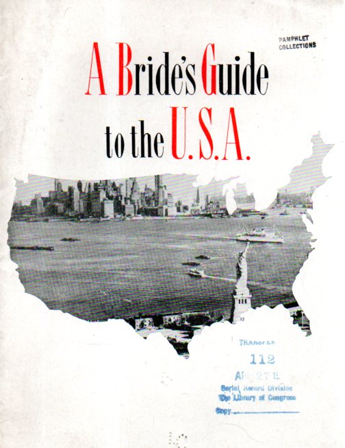
     Another example is the cover illustration for A Brides Guide to the U.S.A., which was intended for the (British) brides of American servicemen returning to the U.S. following the end of WWII.  More than anything, the whole arrangement of the pamphlet is just a little off.Maps of US 2 odd043

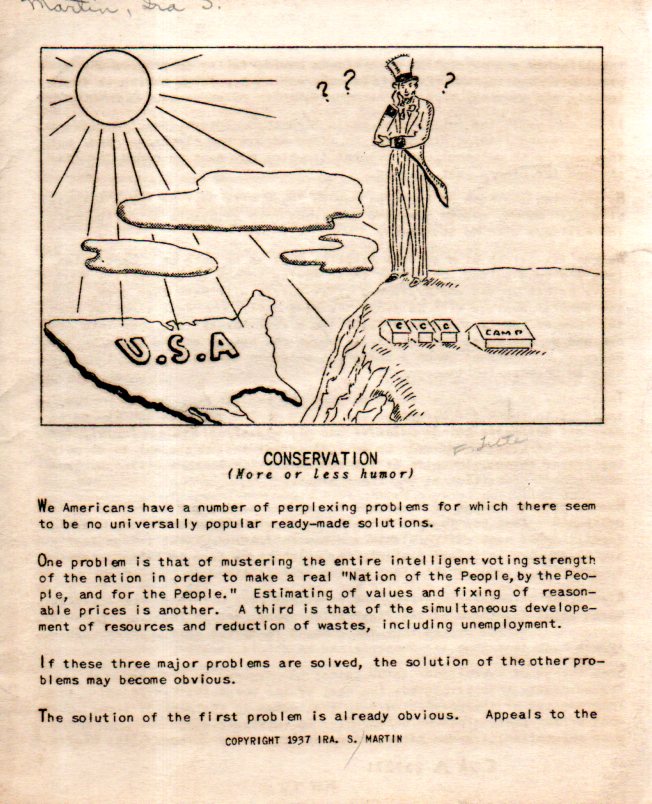
    And lastly, for now, comes a puzzling map from an oddly-named pamphlet called Conservation (More or Less Humor) which was an appreciation of some of C.C.C. camps (Civilian Conservation Corps) and shows little sign of authorship (“S. Martin”) and none of place of publication.

    Maps of US 3 odd044

     The whole production is pretty happenstance, somewhat crude, and probably quickly undertaken and completed, giving it an air of slim and slippery mystery.  The end result for the pamphlet cover, though is unusual, and a little creepy, somehow, and in a way it is a great representative of the Unexpected/Unusual/Unintentional in maps.  


  • Europa Agonistes: Maps of States of Agitation

    JF PtakScience Books  Quick Post 


    Follow Me on Pinterest


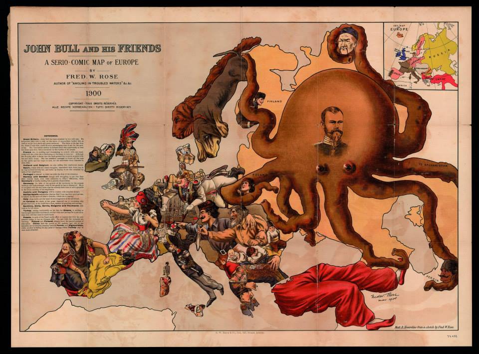
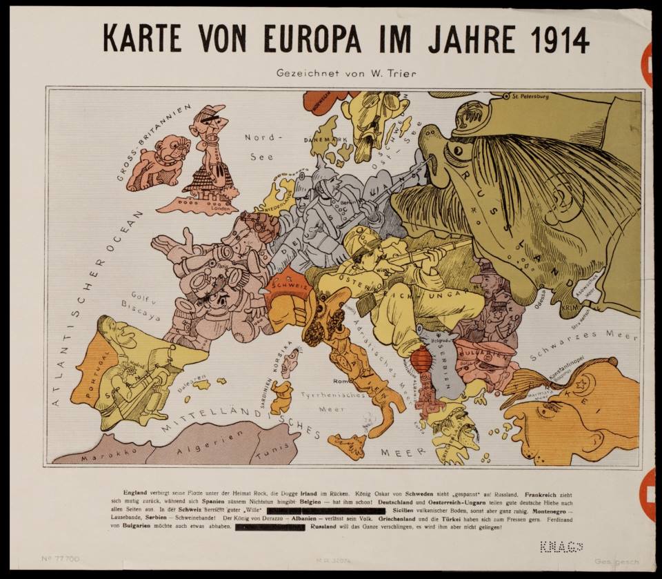
    I’ve collected a dozen maps here showing an animorphization of battlefield Europa over a period of about 40 years, from the Franco-Prussian War to the beginning of WWI.  They are biting and vicious, and no one seem to receive this bitter sword more savagely than the Russians.  The maps basically need no commentary, so I won’t contribute any.  (Thanks to Mark Dylan Sieber‘s Les Curiosites de Cartes, whose Twitter feed started this interest.)

    Europa c

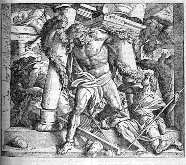
    Thou art become (O worst imprisonment!)
    The Dungeon of thy self; thy soul
    (Which men enjoying sight oft without cause complain)
    Imprisoned now indeed,
    In real darkness of the body dwells,
    Shut up from outward light
    To incorporate with gloomy night
    For inward light alas
    Puts forth no visual beam
    (–John Milton, lines 155–163, Samson Agoniste, published with Paradise Regain’d, 1671)
    Samson


    Europa e


  • Statistical Atlases and the Artful Display of Massive Data

    JF Ptak Science Books   Quick Post   

    Follow Me on Pinterest


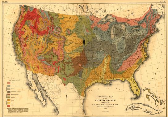
    Statistical Atlas 1870 geo map[Geological map of the U.S. from the 1870 U.S. Statistical Atlas, here.]

    Even though I have used (and owned) these atlases over a long time I’ve never collected them together in any of the 2600+ entries (2036 longer posts and 500+ Quick Posts)  that I have made to this blog.  So today I include links for the atlases in their entirety, as found on the sumptuous site of the Library of Congress. The books are interesting, fascinating, captivating, and beautiful.


  • Big Cities Missing from the Western Landscape, 1920

    JF Ptak Science Books  Quick Post


    Map census city pop318
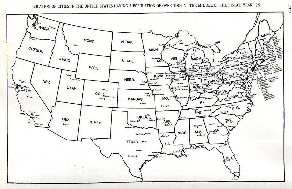
    It is interesting to see in this found map that the U.S. was still a vastly under-citied place in 1920.  This map (from the Statistical Atlas of the United States, compiled by Charles S. Sloane in 1924) created for the census of 1920 shows the locations of cities with populations of 30,000 and above.  It is strikingly clear that once you move west of the Minnesota/Iowa/Missouri/Arkansas/Louisiana line, there are very few big cities.  38 in fact– and half of those in the two states of California and Texas.  The rest are distributed fairly widely: six states had no cities >30k, three had one, two had two, and four had three. Other than that, there was a 1000+mile swath of land hundreds of miles wide spreading from central Texas to Oregon in which there were none of these cities. 


  • Propaganda Maps: the Big Lie and the Surrounding Threat to Germany, 1927

    JF Ptak Science Books  

    Bloggermany_surrounded328

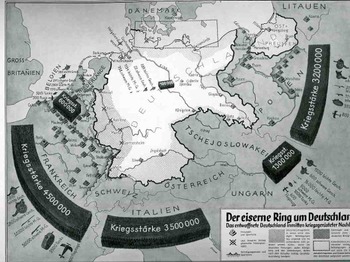
    These two displays come at different ends of the beginning of WWII and, in a way, couldn’t be further away from themselves in the stories they were trying to tell(some truth, some fiction), and were separated in time by  11 years or so.   The first “Der eiserne Ring um Deutschland” (“The Iron Ring and Germany”) shows Germany surrounded by imaginarily aggressive (and aggressively-portrayed) neighbors nine years after the end of WWI.  They both display subsets of the Big Lie superset described by Hitler in 1925 in Mein Kampf (actually, sort of better described by the German term Lügenfabrik, or “lie factory”, used by Goebbels in his descriptions of the British.  The “Big Lie” was basically a lie so big and so preposterous, so outrageous, so impossible, that no one would possibly utter something so insane and dubious, and so therefore the massive untruth is taken as true.) 

    This representation depicts the threat posed to Germany-making an iron ring-by the potentially hostile French, Italians, Belgians, Czechs and  Poles.  It shows the ring composed of a combined army of 13.1 million men versus the standing army of Germany, which in 1928 was given as 100,000, and listing virtually no heavy weapons and no air force whatsoever.. (The interesting bit here is that neither the Soviet Union nor Great Britain is included in these aggressive forces, the Soviets less-so than the English.)   The designer goes so far as to shade in areas of Germany that were under immediate threat, extending from the Donau to the Rhine, to a 50-mile-wide area all around the country, with East Prussia almost entirely consumed.  (Certainly the Treaty of Versailles was a very troubling document closing the end of the war and, it cam be argued, opening the door for the next one.  It took six months to sign the peace treaty following the cessation of hostilities in November 1918, and the troubled negotiations produced a troubled treaty, ripping Germany up and saddling it with unrealistic retributions that began to wither in only four years, with the treaty virtually dissolved by 1935.)

    Blognazi_brit_aircraft325

    It is no wonder when looking at propaganda such as this that Germany was immured with fear of national collapse at the hands of land-hungry neighbors, and that there was a huge need to re-instate the army and a system of “self protection”.    (By 1936, only 8 years later, it was beyond question about what Germany was up to-I can say that after having at least breezed through every page of the Illustrirte Zeitung (Leipzig)  from 1930-1940, that even a very casual reader could’ve tracked, graphically, the interest in military reporting and militarism in the page’s of what would’ve been the German equivalent of LIFE magazine.  By 1935 there was so much glorification of weapons and the Nazi manifesto that it should’ve been a surprise to no one when the Germans moved into their neighboring countries.)  This was by no means the earliest depiction of this rampant sale of fear or fear mongering (a design which has existed for thousands of years and not at all a creation of the present republican administration), but it is a very big and bald one, a somewhat staggering one, a bright shining lie.  (A Bright Shining Lie by John Paul Vann is by the way a great book on American involvement in Vietnam.) 

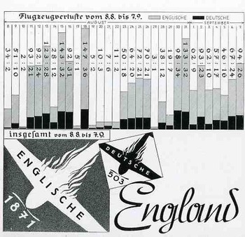
    The second image, a graph showing the successes of and very limited damage to the German Luftwaffe at the beginning stages of WWII, in August 1940.  This was a bad time for the Allies, this part of the war coined by Winston Churchill in 18 June 1940 in the House of Commons:  “The Battle of France is over. I expect the Battle of Britain is about to begin”. 

    Hitler’s Luftschlacht um England would start by air, where the Brits were far less the equal in military capacity, rather than by a land/sea assault, which would’ve tested the British at their strengths.  This second part of the assault on England was Unternehmen Seelöwe, or “Operation Sea Lion”, which would’ve begun the land assault following the victorious air campaign. 
    The graph shows aircraft losses from 9 July to 8 August, 1940, the German losses in black, and the British in gray.  As you can see, it was a pretty lopsided affair, made even more dramatic by the fictitious number of English planes being destroyed.

    This would all change, of course, with the Germans losing this battle, in a big way, with a resulting decisive victory for the Brits. (Who would of course muscle their way through the war another seven months before the U.S. was attacked and entered the war.) . It would coming to a screeching and collapsing reverse for the Germans by May 1941.  The results of the battle, in terms of aircraft and humans, were,  for England: 1,023 fighters: 376 bombers, 148 coastal command aircraft  for a total of 1,547 aircraft and  544 pilots and aircrew killed.  There were also 27,450 civilians killed and 32,138 wounded.  The Germans lost 873 fighters and 1,014
    bombers for a total of 1,887 aircraft and  2,500 pilots

    I could find no graph of course showing the results of the endgame in the Zeitung.


  • A History of Antiquarian Water: Line Segments

    JF Ptak Science Books   Follow Me on PinterestPost 2022

    Images of rivers and oceans in 16th century maps can be beautifully-rendered objects.  Water can appear as lines thick and languid, curling and wavy, sparse, tentative, adventurous, willing, dashed, timid.  Cold. Mostly cold, and full of loneliness and foreboding.  And sometimes the sea is just a blank–it is more common to see blank skies in engravings and woodcuts before, say, the 1540’s, but the blankness is usually covered by rhumb lines and compass roses and lines of longitude and latitude, compared to the blankness of blank skies, where there is usually nothing to spare us from the blank.

    Today I’d like to have a look at the strong and long lines delineating activity in water as the first part of a short series of posts looking at the design of the representation of water by lines.  Then, when the lines are done, we’ll take a look at dots. 

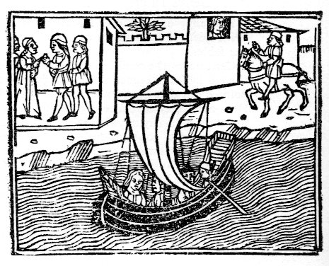
    This example occurs in Masuccio Salernitano’s (Tommaso Guadati, fl. c. 1476) Novellino, published in Venice by Bartholomeo Zanni in 1510, a tall book of a Decameron-ish flavor, with 50 stories told in five sections, mostly of a waning erotic nature.  The lines here are long and very languid. I also like the face in the window. 

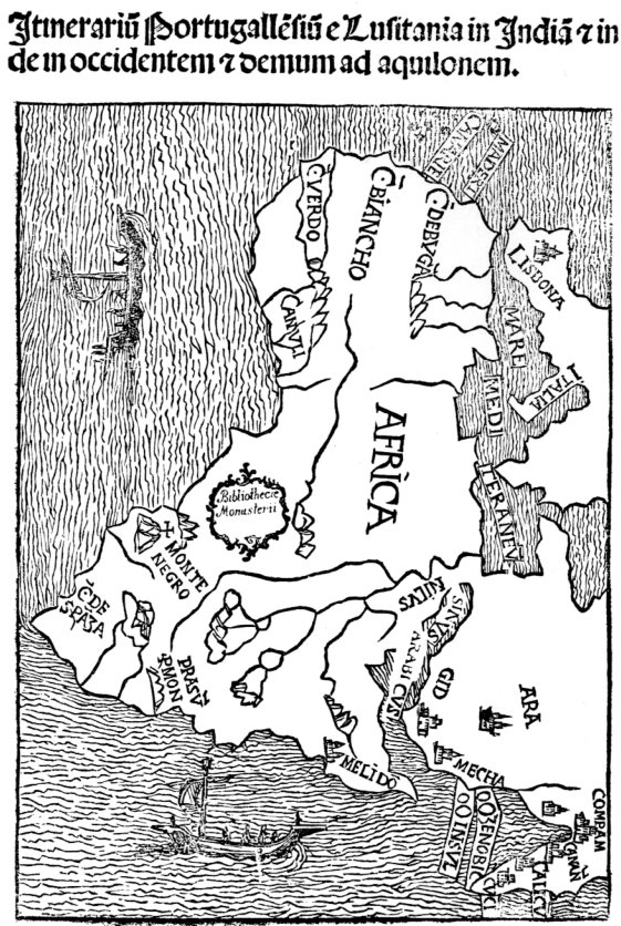
    Water masuccio267This complex of lines illustrates the map of Africa found in Montalboddo Fracan’s Itinerarium Portugallensium, which was about the earliest published collection of Spanish and Portugese travel and exploration relating to the New World.  The work was exceptional and very significant–and very popular, going through fifteen editions in 22 years to 1528. 
    Water africa266

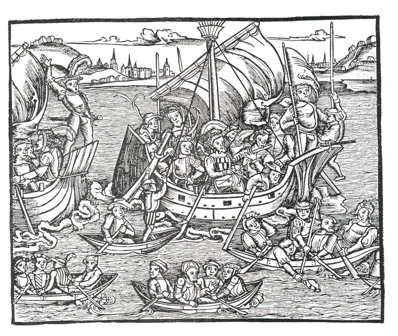
    Titus Livius (59 BCE-17 ACE), better known to the English-speaking world as Livy, was a superior among superiors of Roman historians, writing on the history of his city and country.  His work, Romische Historie…,published in Mainz by Johann Schoeffler 1450 years later in 1514, was one of the most beautifully illustrated books ever produced in that city. This is a considerable statement, as Mainz was the birthplace/hotbed of moveable type printing, being home to Johann Gutenberg and a number of other early presses. 

    Water Livy Punic

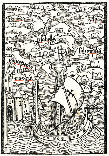
    One of the most famous printed water scenes is from the (numerous) editions of Christopher Columbus’ letter describing his voyage to the New World. It was written (or at least finished)  soon after his arrival in Lisbon 4 May 1493, almost exactly 520 years ago, and quickly found its way into print. This image (depicting Hispaniola and Isabella) was printed in Basel in 1494, and served to illustrate the somewhat hopeful and inflated description of what he found on his new voyage.

    Water Collbus Basel

    [Source: Wiki, here.]

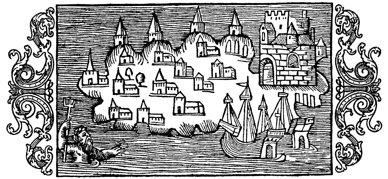
    This image from the mid-16th century is found in the fantastic work on the history of Scandanavia (and etc.) in Olaus Magnus’ Histotria di gentibus septentrionale (“History of the Northern Peoples”, 1555).

    Water Magnus[Image source: http://www.avrosys.nu/prints/index.htm]

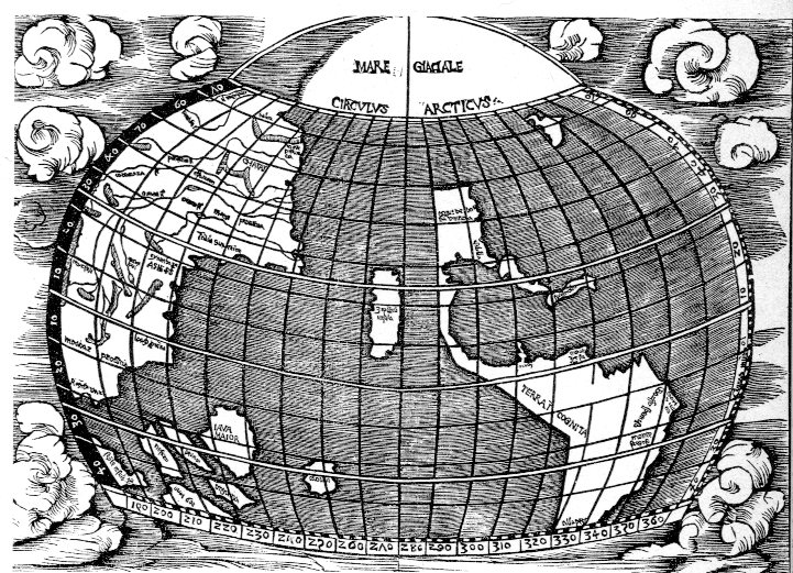
    The seas in the map of the Western Hemisphere in Joannes de Stobnicza’s Introductio in Ptholemei Cosmographium (Cracow, 1512, and widely believed to be copied or at least very heavily inspired by the Martin Waldseemueller’s 1507 map of the world) are very tightly drawn, neatly unifrom, and lovely, as wesee below).  This recitation could go on for quite some time, but this gets the point across on heavy lines.  Next stop: dots. 

    Water strob268