A Daily History of Holes, Dots, Lines, Science, History, Math, Physics, Art, the Unintentional Absurd, Architecture, Maps, Data Visualization, Blank and Missing Things, and so on. |1.6 million words, 7500 images, 4.9 million hits| Press & appearances in The Times, Le Figaro, Mensa, The Economist, The Guardian, Discovery News, Slate, Le Monde, Sci American Blogs, Le Pont, and many other places… 5000+ total posts since 2008.

Category: Maps/Diagrams of Imagination & Ideas

  • Nazi Propaganda Map for a European Hearts and Minds Campaign

    JF Ptak Science Books  (Post 193 from 2008) Expanded and with better images. 
    Nazi Maps D Propaganda1

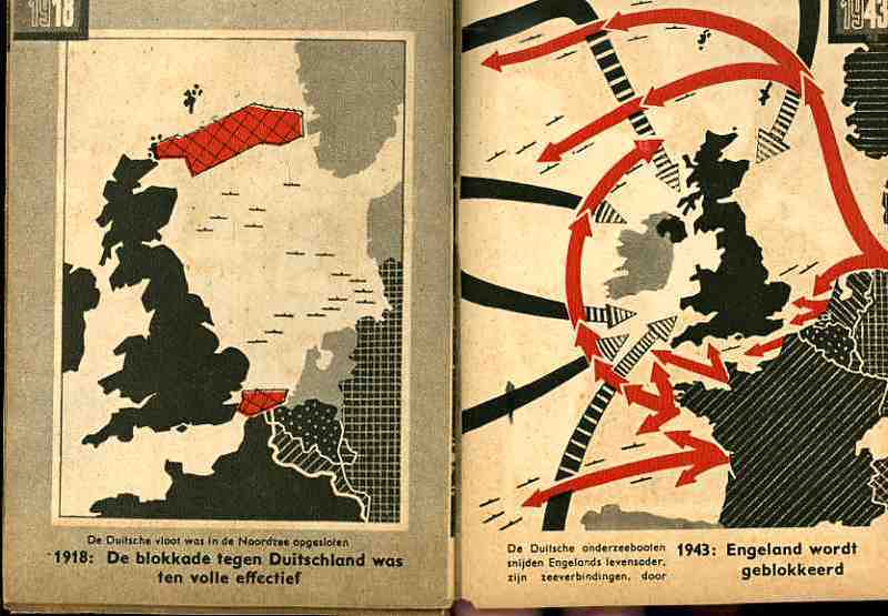
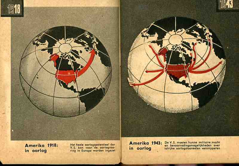
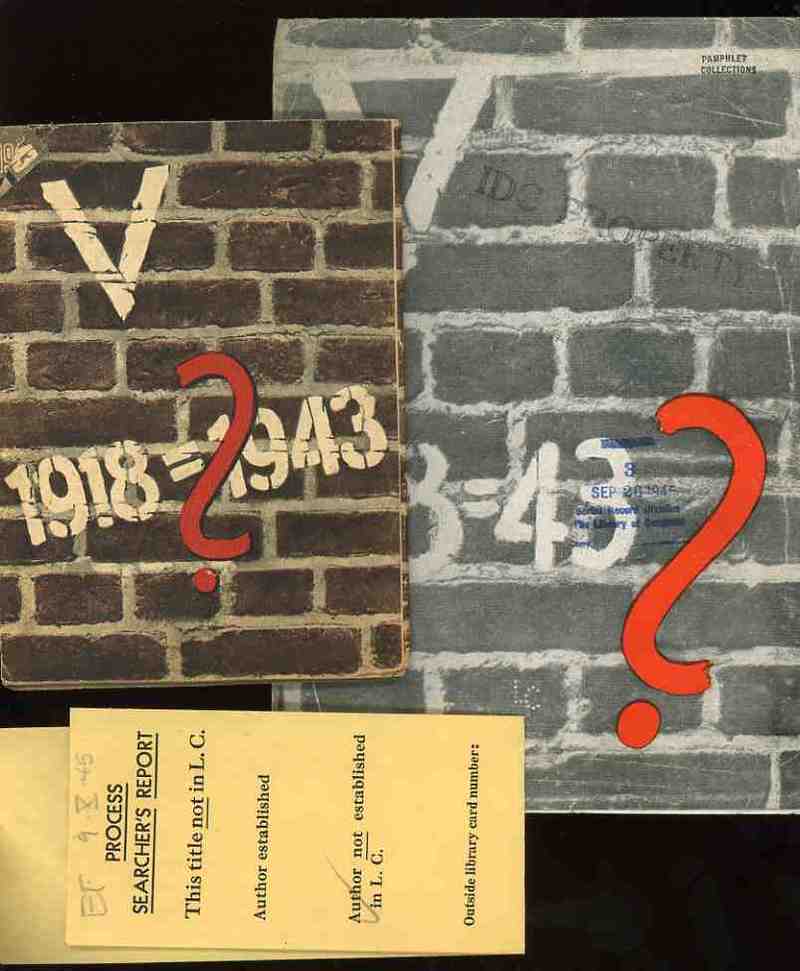
    These two, related, pamphlets were the products of the Nazi Propaganda engine and sought to affect the moral and intellectual stamina of the people in the occupied countries of the Netherlands and France in 1943.   Each stressed the enormous differences in the German state that took place in the 25 years between the end of World War I and the third year of the Nazi European part of World War II.  I’ve no idea whatsoever about the grander symbology  (if any) of these numbers associated with these two pamphlets (the Roman numeral for “5” and the 25 years of the difference and the “13” points (of the French propaganda) aside from the obvious mathematical implications.
    Nazi Maps D Propaganda2

    (The only interesting bit that I can find in the “18=43” from the French pamphlet is Luke 18:43 “Immediately the man could see again and began to follow Jesus, glorifying God. All the people saw this and gave praise to God.”. )   I find it curious that identical symbolism (?) was used for the two countries, and that the French version was simple comparative text (summarizing the differences in the two periods of time) while the Dutch version was mainly a picture book. 
    Nazi Maps D Propaganda3

    I would reprint the French version if it wasn’t so bloodily hateful.  (Suffice to say that this is so by looking at one example: in the last of the second issue of 13 points  Goebbels et alia wrapped themselves in the insulating fabric of the German “people” in the “resistance” against “Jewish saboteurs”—not the German political machine, and not the German military, but the German people, insinuating that the Nazi annihilation of the Jewish people was de facto sanctioned by the will of the German nation.  This is of course part and parcel of the fictitious and loathsome Protocols of the Elders of Zion (of which Henry Ford was a happy reader), a French work that was completely stolen and plagiarized by Imperial Russia in the early 1880’s and which, later,  Hitler used to both build his hate against the Jewish people and use (and acknowledge ) as the template for his early actions in the Nazi Party.)
    Nazi Maps D Propaganda4

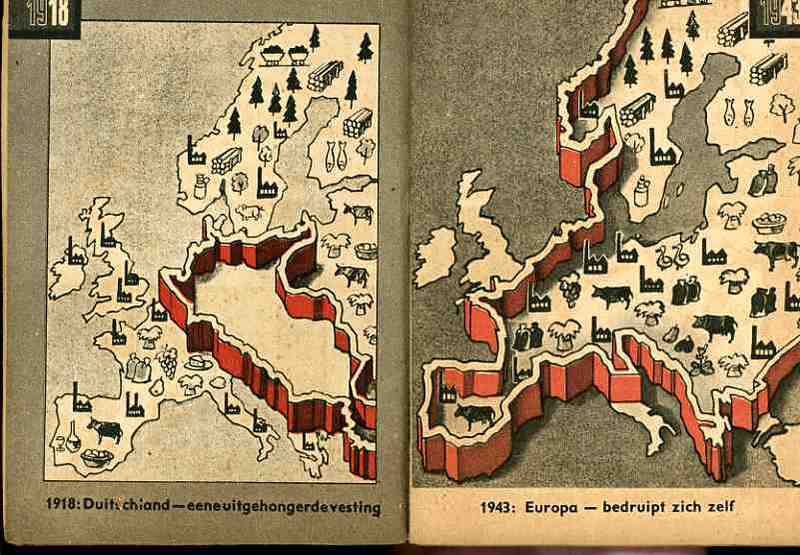
    The maps used in the Dutch publication are fairly general and issue a stark warning about the growth of Germany–and how Germany continues to grow through war.  The first that we reprint, above, tries to get the point across to the occupied people that England has more problems to deal with than would concern their attention with the Netherlands.  The second part of the first map crazily shows the attack upon England and the effectively exhausting attention it has to pay to many points of invasion.  Ditto for the second map, showing the spread of American concerns–the U.S. in 1943 would have far more to deal with in many points in a two-ocean war than to concern itself with or have the ability to think about the liberation of Europe and the Netherlands.  The last map shows the supposedly extraordinary growth in Germany’s  industrial and agricultural capacity. 

    In short, the maps tell its readers to just keep quiet, the German nation is mighty, and just wait for the end of the victorious German war.  The maps also addressed non-readers–of course the Dutch literacy rate was extremely high, but you didn’t have to be able to read the description of the map to understand its blunt message. (This makes me wonder if the maps really weren’t intended for scare tactics against children.)  As Boss Tweed once infamously reported–that he had no fear of editorials because his constituency couldn’t read–he hadn’t counted on the political cartoons of Thomas Nast–which could be understood by a non-reader–and which wound up being one of the direct causes of his exposure and downfall. 


  • A Simple Map of Possible Intention (1943/3)

    JF Ptak Science Books   Quick Post

    Yugoslavia map841


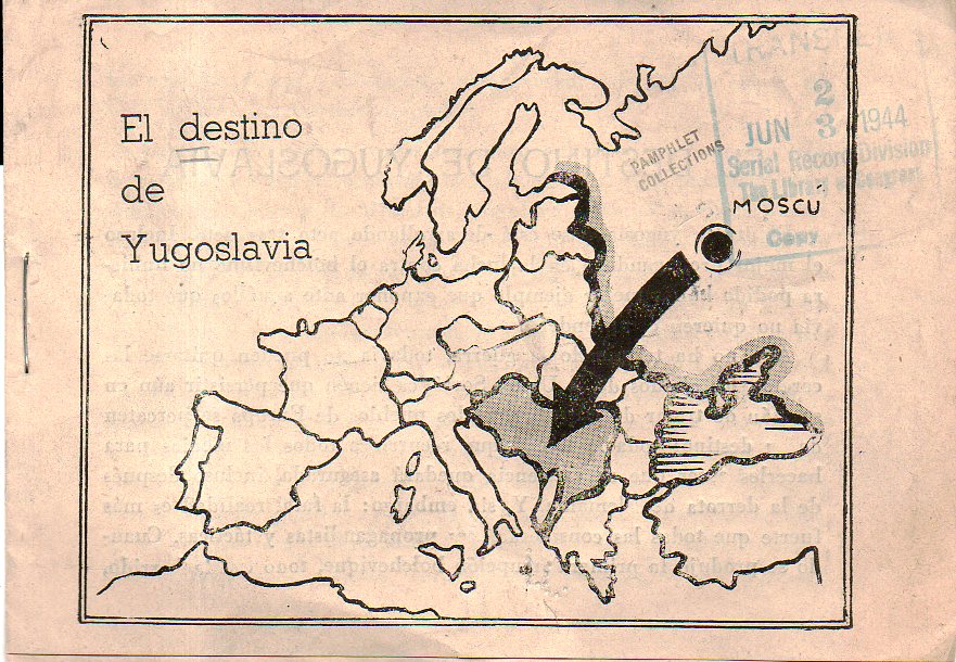
    Given my non-existent Spanish skills, the closest I can come to interpreting this tiny pamphlet (published in 1943 and received by the Library of Congress three days before D-Day in 1944 and me in 1998)  is that it was a word of caution.  The warning is obvious–that Yugoslavia was of interest to the Soviet Union–but in 1943 given the state of the war and Yugoslavia being occupied by several Axis forces the concerns of being overtaken by Moscow seem to be way down the to-do list.  The Soviets did provide limited assistance, and they did leave Yugoslavia at teh end of the war, and there was a Communist government established there in 1946–but by 1948 there was a break in relations between it and the USSR, and Yugoslavia attempted to remain non-aligned.  

    The map is simplified and very direct, which makes it pretty effective.  Why it was printed in Spanish, I don’t know.  


  • Nazi Propaganda Map of Communist Threat and Expansion, 1933

    JF Ptak Science Books   Quick Post

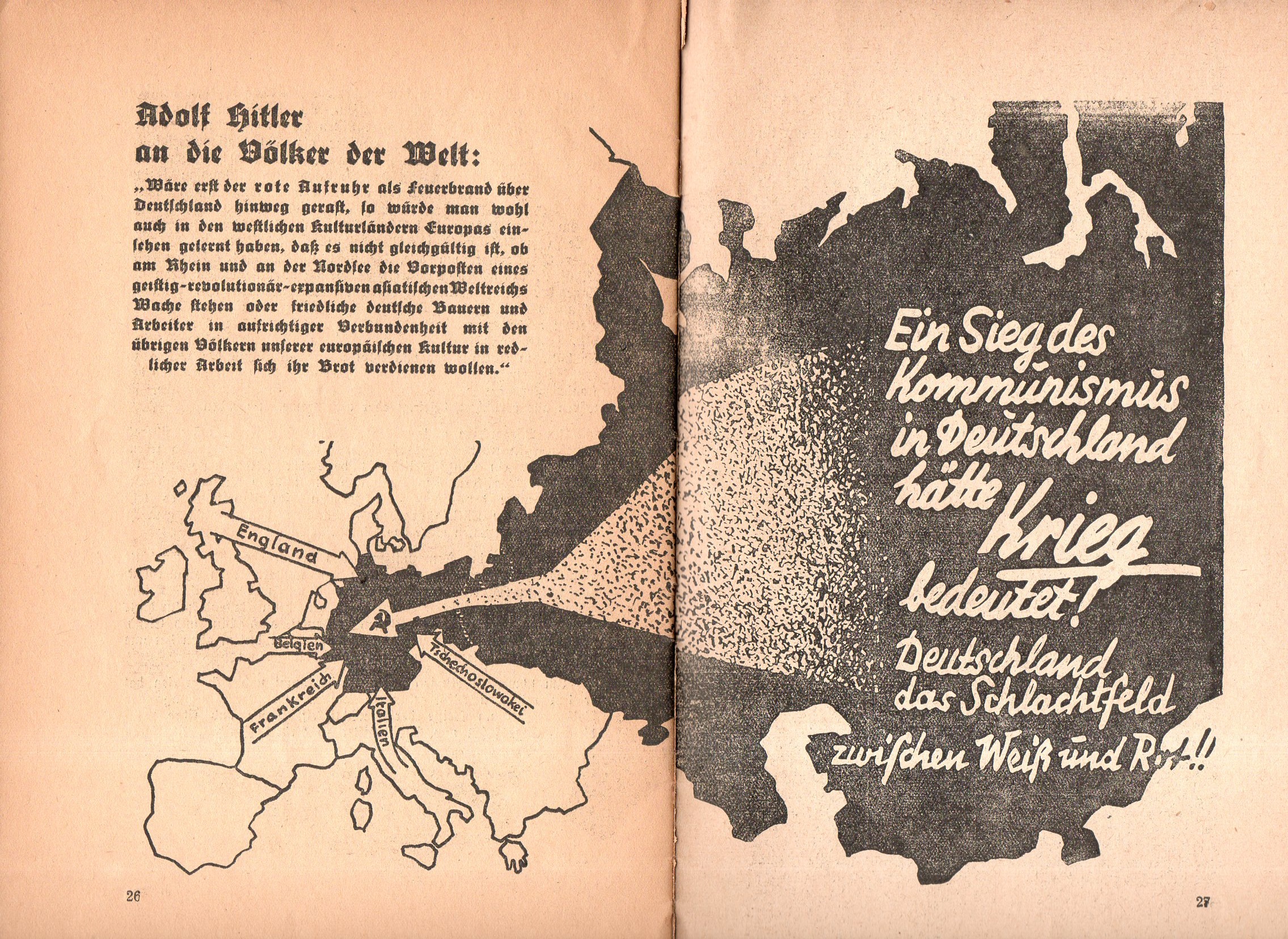
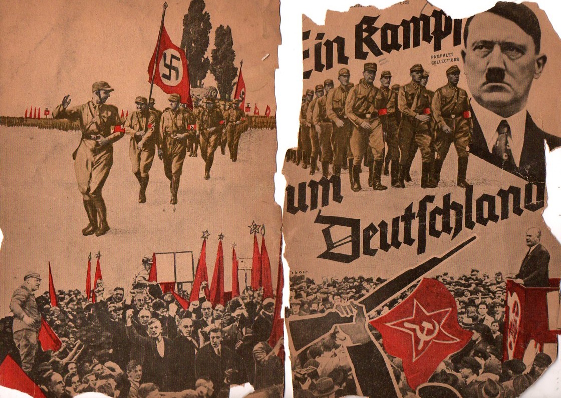
    Not long after Hitler’s election in 1933 this curious pamphlet appeared: Ein Kampf um Deutschland (1933), short and thin, is a  work filled with anti-Communist photos and images portraying them in as harsh a bad light as you could muster in 32 pages.One of the images is this map showing in no uncertain terms threats to Germany from the west, but most importantly a gigantic threat coming from the Communist east, the arrow striking right through the heart of Germany, with the hammer and sickle (the symbol only about 16 years old at the time) coming to rest just about on top of Berlin.  

    Nazi map communiast762

    For all of this Hitler would sign a Non-Aggression Pact with the Soviet Union six years later (22 August 1939) with the plan of dividing some Eastern conquests with the Russians.  Less than two years later came Operation Barbarossa, with Hitler launching a massive surprise invasion of the Soviet Union on 22 June 1941. Dozens of millions of lives later, it would all be over in four years.  

    And the opened cover for the pamphlet, or what is left of it:

    Nazi map communiast763


  • U.S. Air Service Map: is Part of the Country Raised, or the Rest Lowered?

    JF Ptak Science Books   Post 2422

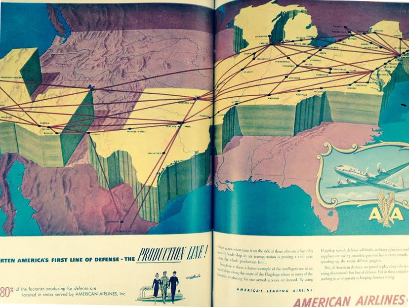
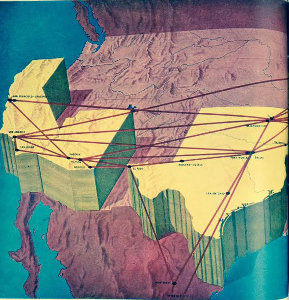
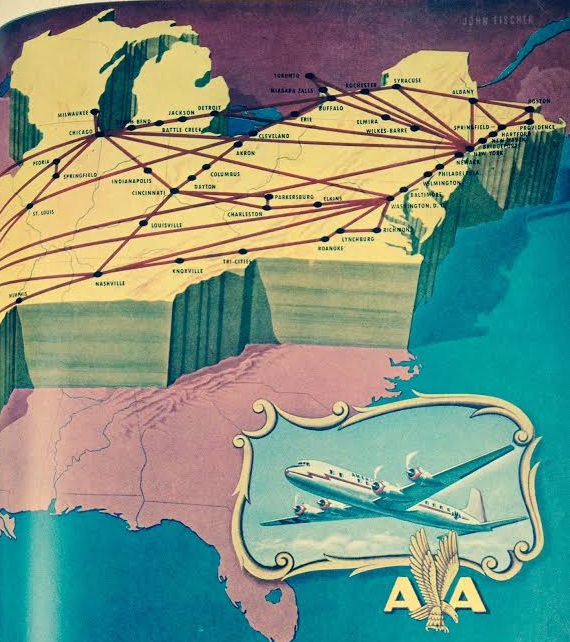
    Yesterday I posted a lovely octahedron map showing intercontiental air routes in 1956 (here). Today, looking in LIFE magazine for some images and a story about U.S. GI’s being exposed to nuclear blast tests I bumped into this unusual two-and-a-half dimension map showing domestic air routes of American Airlines (November, 1951).  The national service areas are chunked-up, given some enormous height, not making things very comfortable-looking for the Pacific W and northern Mid-West, and almost the entire South.  I guess the question would be, were the service areas heightened, or the rest of the world lowered?  

    Map--air route, LIFE mag


    The first transcontinental flight competition called for crossing the country in 30 days (for a $50k prize) and was accomplished in 1911. By 1933 the fist transcontinental through-flight (a one-day, not-overnight flight) occurred just 22 years later in 1933; only 5 years before this map was made was the first 1-stop service (1946), which is one reason why there are so many intermittent stops; it would be another two years (1953) for there to be non-stop service.  The of course the not-slow explosion of competing airlines and flights. 

    It is interesting to recall that the first transcontinental railroad for the U.S. was in 1869, and the first European transcontinental railroad was 14 years before that (in 1855), thus getting people across the country and continent 80 and then nearly 100 years ago.  On the other hand ,the first trans-Australian RR was completed in 1917–that was east-west. North-south is a different issue for Australia, which has been an historically very highly difficult crossing., In any event that line was not completed until 2004.  All things considered, I think, this transcontinental air business was extremely successful and fast, coming less than 50 years after the first Wright powered flight.  

    Map--air route, LIFE2 mag

    Map--air route, LIFE4mag


  • A Fine and Interesting Map of Air Routes, 1956

    JF Ptak Science Books  Quick Post

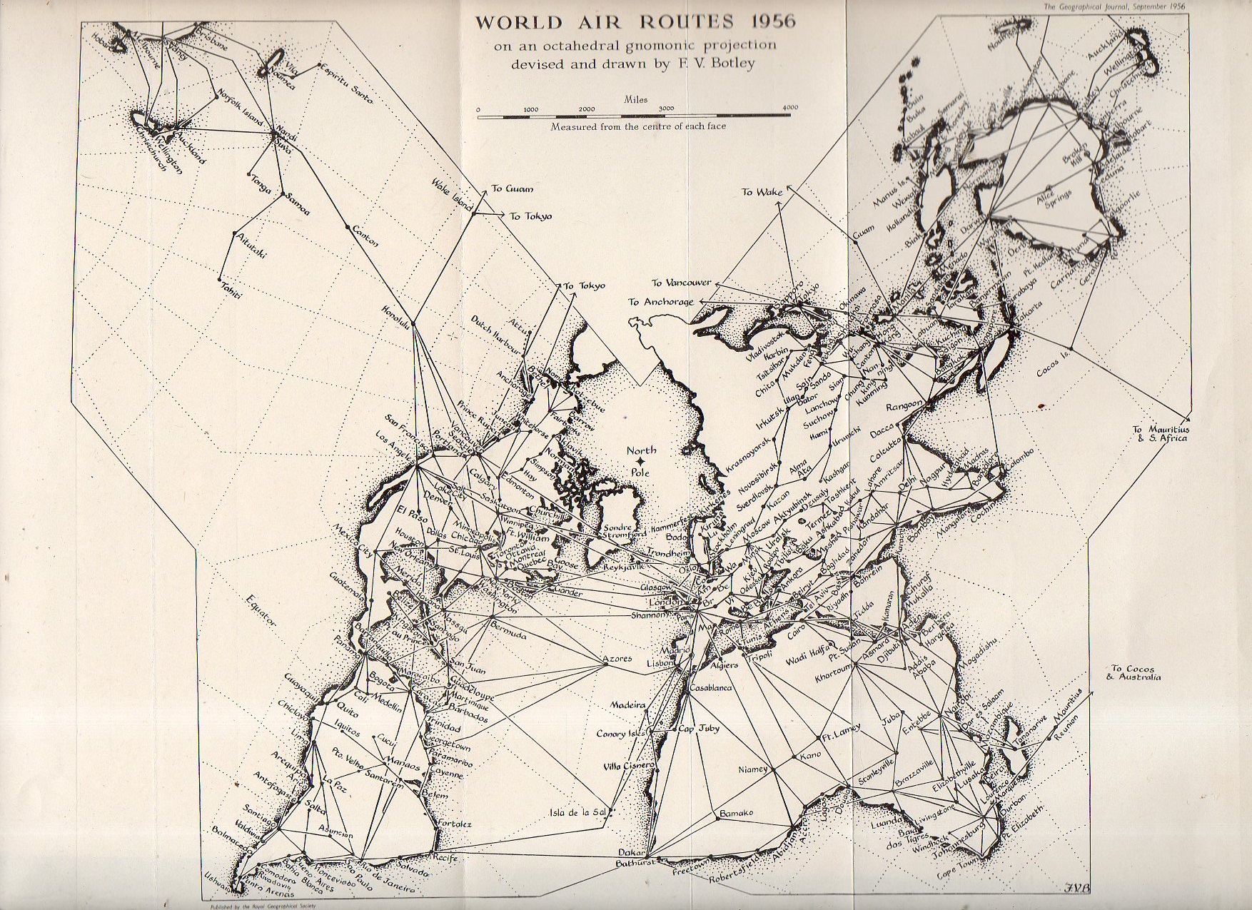
    Map, air routes806

    F.V. Botley’s map of international airline routes–interesting the author points out that the routes have stayed “substantially unchanged for the last two decades”. The (above) is based on a regular octahedron, which opens to a star-shaped design (in figure 2, below) and which is not truly related in the larger map–it is “an oblique gnomonic projection designed on this principle”, making it an easier read.  [Source: Journal of Geography, 1956, pg 397.]


  • A Great Map Showing a Complex Distribution of Nationalities, NYC 1895

    JF Ptak Science Books    (Post 1343–expanded)

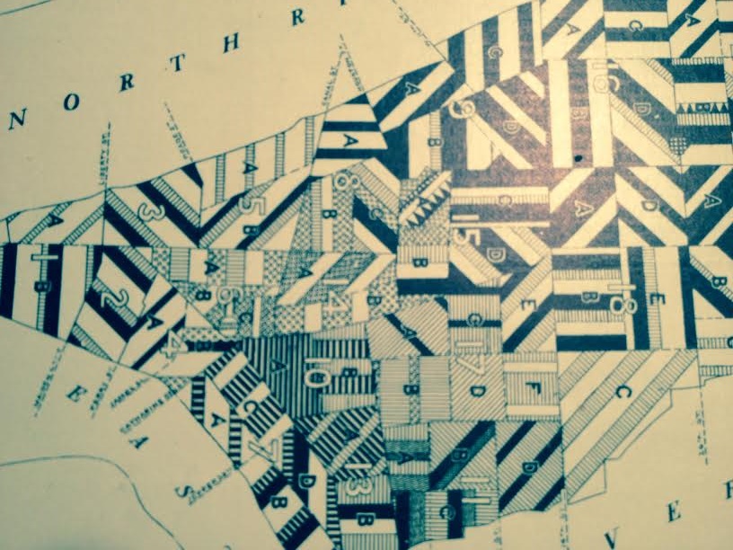
    Frederick Erastus Pierce (1878-1935) is the creator of the extraordinary The Tenement-House Committee Maps: printed on one sheet of paper for Harper’s Weekly in 1895, Pierce presents his data on the distribution of the population of Manhattan with two maps,  one showing the densities of Manhattan populations (on top) and the other the distribution of nationalities (at bottom). 

    [I should point out that the original of this map is for sale at our blog bookstore, here.]

    Nationalities Map 4

    Here’s an overall view of the maps–this example from the Library of Congress, as I could not make an accurate image of the one I have here–I do include some details of the maps from my own copy, however, which are found just above, with several below.


  • In Really, Really, “Dark” Africa (1879)

    JF Ptak Science Books    Quick Post

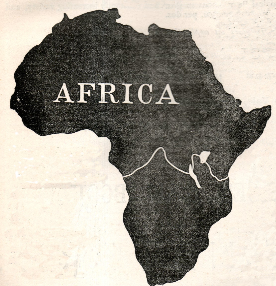
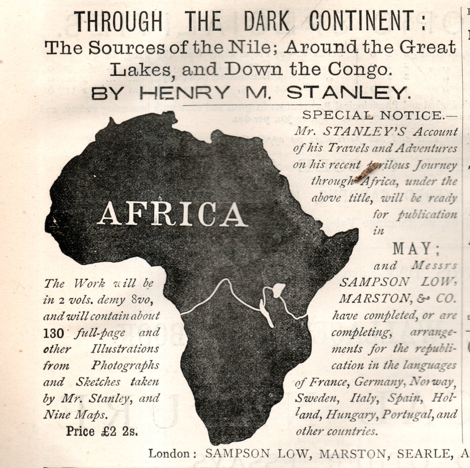
    Advertisers for Henry M. Stanley’s Through the Dark Continent could not paint Africa any darker than they did in this ad which appeared in the journal Nature on May 3, 1878.  Stanley plowed his way through Africa from 1874 to 1877, and was quickly into print on his return, which may have been more armed Imperial Pushing than it was a geographical expedition.  

    Africa, dark715detail

    Stanley published another book, In Darkest Africa. twelve years later in 1890, no doubt alluding to the unimaginably dark places of a dark place.  

    And just for the sport of it I had a quick tour around the massive 75,000,000-item database of library holdings in WorldCat and found that there may be only one other book earlier than Stanley’s published with dark/darkest Africa/Continent in the title (Christian Liberia, the Hope of the Dark Continent, with Special Reference to the Work and Mission of Edward S. Morris, 1838). After Stanley’s book was published there are easily dozens of other books using that phrase published between 1878-1900. So there’s that. In my long career of looking at maps I cannot recall the continent appearing on world maps as simply an entirely blacked out/filled-in geographical region–certainly in earlier maps of Africa (or at least before 1900) the unknown spots were simply left blank; the older the map the more likely it was to be that the blank spots were filled in with unusual representation of flora and fauna.  But never, it seems to me, was it just entirely black.  

    The full add looks like this:

    Africa, dark715


  • Display of Data: WWII Resource Material Maps

    JF Ptak Science Books   Quick Post

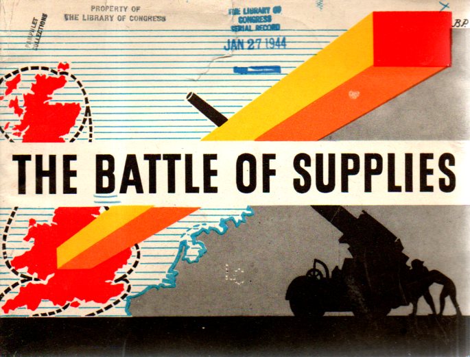
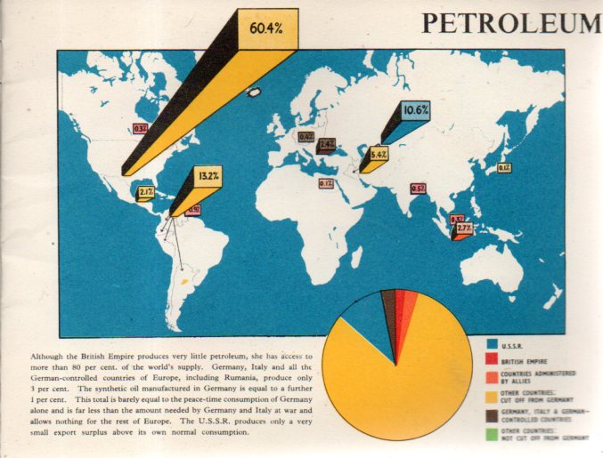
    The Battle of Supplies (1944) is an interesting propaganda publication, simultaneously celebrating achievements and promoting the new for greater production.  The method of displaying the relatively simple data is pretty striking.

    Maps--battle supplies693

    Maps--battle supplies694


  • Beautiful Lines: Depicting Voyages of Discovery, 850-1850

    JF Ptak Science Books   Quick Post

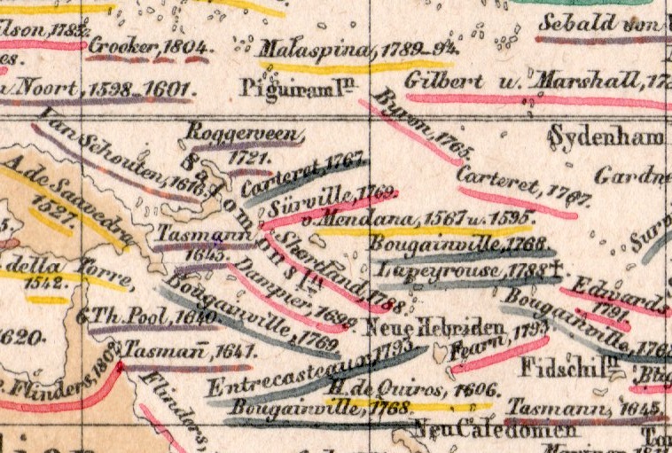
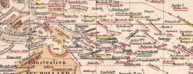
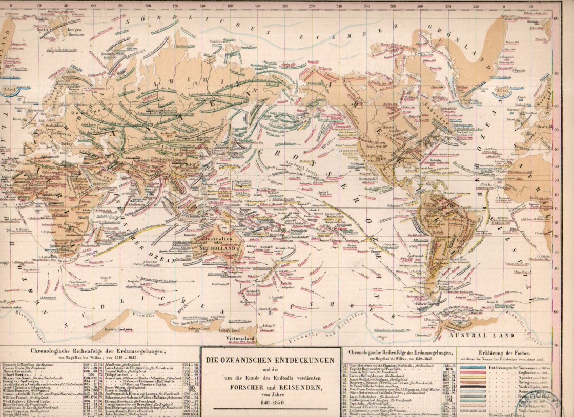
     This small detail (measuring about 1/3″ square) is from a fine, detailed, and oddly beautiful map (itself only about 12×9″) which was published in the atlas volume1 to accompany the best-selling encyclopedic presentation of the natural history knowledge of the world to that time, Baron Alexander von Humboldt’s Kosmos, which was published over a period of several from 1845-1862.  

    Map visualization ocean currents657

    The map is titled Die Ozeanischen Entdeckungen und die  um die Kunde des erdballs verdienten  Forscher  und Reisenden vom Jahre 840-1850, and depicts voyages of discovery for a milennium, 850-1850. It is a terrifically-detailed map, even among highly-detailed maps. (This detail is taken froma 1×2″ section seen here:)

    Map visualization ocean currents656


    And the full map:

    Map visualization ocean currents655

    Notes:

    1.  The atlas was by T. Bromme, Atlas zu Alex. V. Humboldt’s Kosmos in zweiundvierzig Tafeln mit erlauterndem Texte. Herausgegeben von Traugott Bromme. Stuttgart. Verlag von Krais & Hoffman. (with second title page) Atlas zur Physik der Welt in … Bromme, 1851. 


  • Beautiful Lines: Depicting the Climate, 1851

    JF Ptak Science Books  Quick Post

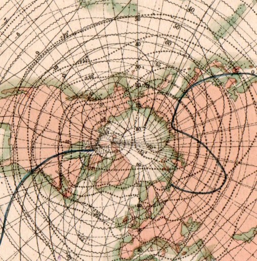
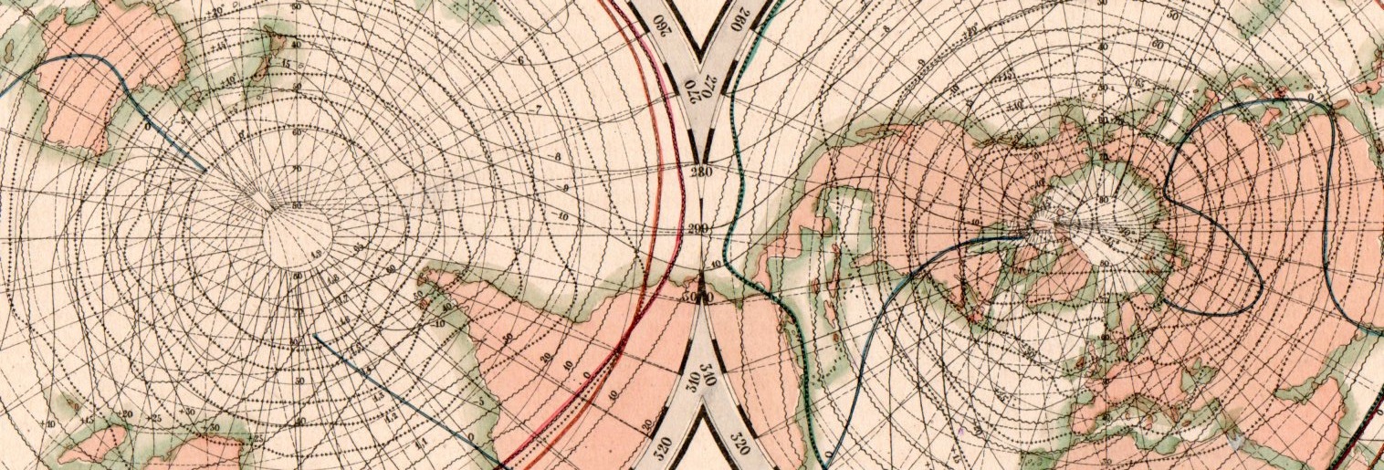
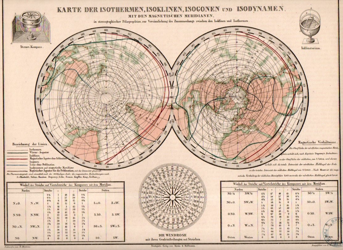
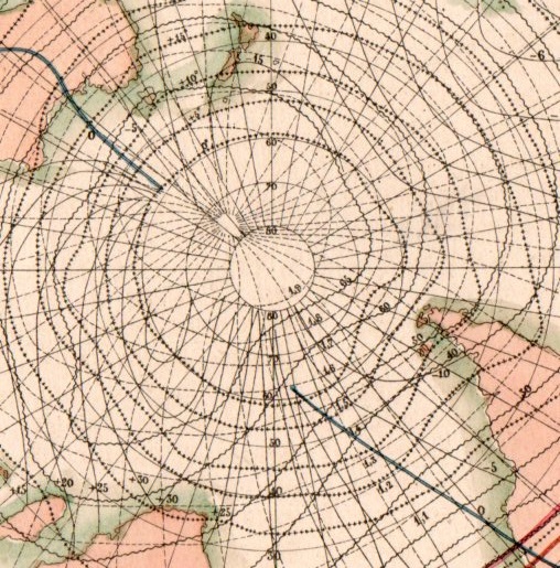
    This beautiful network of lines tells the early story of weather in cartographic form. They appear on Karte der Isothermen, Isoklinen, Isogonen und Isodynamen mit der Magnetischen Meridianen, and was published in the atlas volume1 to accompany the best-selling encyclopedic presentation of the natural history knowledge of the world to that time, Baron Alexander von Humboldt’s Kosmos, which was published over a period of several from 1845-1862. The map demonstrates and visualizes climatic information showing isothermes, isoclines, isogones and isodynamics, with the magnetic meridian.

    Map visualization isotherm653

    [This is a detail of the Northern Hemisphere section of the double-hemisphere map, which is reproduced below.]

    Map visualization isotherm654

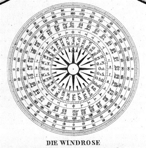
    At bottom there is also a beautiful 32-point wind rose:

    Map visualization isotherm651

    And this, the full version of the map:

    Map visualization isotherm650

    And the detail of the Southern Hemisphere:

    Map visualization isotherm652

    Notes:

    1.  The atlas was by T. Bromme, Atlas zu Alex. V. Humboldt’s Kosmos in zweiundvierzig Tafeln mit erlauterndem Texte. Herausgegeben von Traugott Bromme. Stuttgart. Verlag von Krais & Hoffman. (with second title page) Atlas zur Physik der Welt in … Bromme, 1851.