A Daily History of Holes, Dots, Lines, Science, History, Math, Physics, Art, the Unintentional Absurd, Architecture, Maps, Data Visualization, Blank and Missing Things, and so on. |1.6 million words, 7500 images, 4.9 million hits| Press & appearances in The Times, Le Figaro, Mensa, The Economist, The Guardian, Discovery News, Slate, Le Monde, Sci American Blogs, Le Pont, and many other places… 5000+ total posts since 2008.

Category: Maps/Diagrams of Imagination & Ideas

  • Early Map of Elevations of Plants and Tress, 1873

    JF Ptak Science Books   Quick Post

    Maps elevation maury161

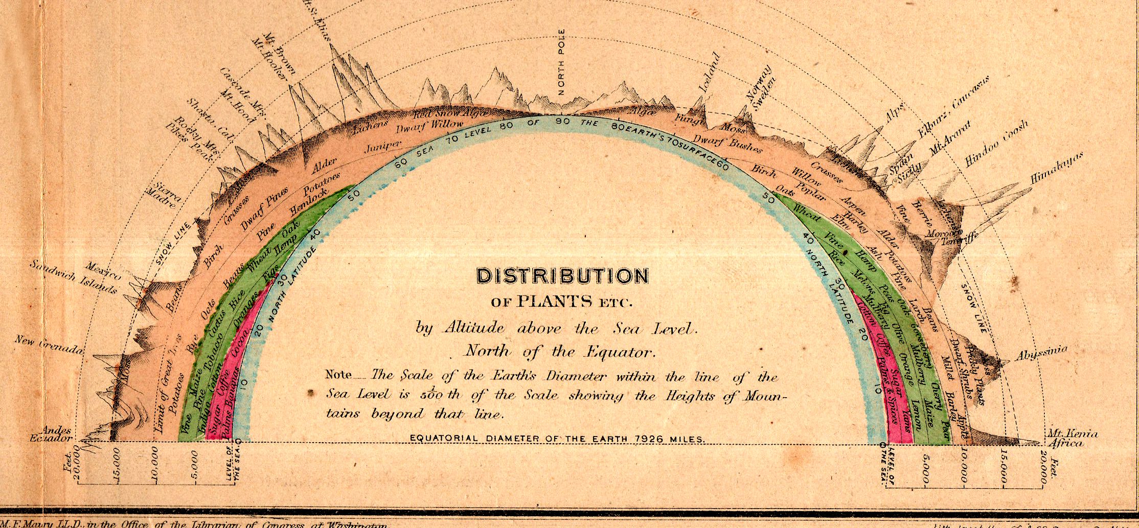
    This fine little inset appears in “Chart of Principal Vegetable Growths and Chief Staples” from Matthew Fontaine Maury’s Physical Geography, a classic work for schools, which was printed in 1873. Maury is considered to be the father of U.S. oceanography (The Physical Geography of the Sea (1855), was the groundbreaking work)  and was a real pioneer in several areas. This did not exclude his adventures on behalf of the Commonwealth of Virginia and the Confederate States of America, where he served as Chief of Sea Coast, River and Harbor Defenses, among other things. Maury had a complicated relationship with the idea of slavery, attempting to eradicate slavery (and slaves) by removing the institution and perhaps the owners and their plantations to the Amazon basin.

    This small inset (above) measures 6×2.5″ in the original on a 13×10″ map, and shows the elevations at which certain trees and plants are found. It is an ingenious display, and depicts about 60 different samples. (The print in the map is about 1mm tall, by the way.)


  • Road Map of Mud and Dust (1936)

    JF Ptak Science Books  Quick Post

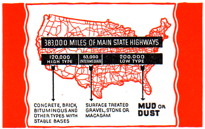
    What a simple and semi-magnificent map is this! A spaghetti map of the U.S. featuring road types, more than half of which were allocated as a “low type” of “MUD or DUST”. 

    Map of dusty roads040

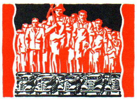
    The map is in a disheartening and potentially numbing pamphlet on road improvement, which– had there been a simple cover for the work I would have quickly skipped by–however, the maps, data, and the lurking insomnia of boredom is perfectly hidden by this:

    Map of dusty roads041

    Holy cow!  This is marvelously striking–and just look at that “T”! 

    In any event, the pamphlet is loaded with small woodcuts and graphics illustrating its point, which was to take Depression-available workforces and put them to work on repair of old and construction of new roads. 

    Map of dusty roads042The anonymous illustrator and/or designer certainly made a commendable and superior effort in making this fairly dry pamphlet, um, interesting. 


  • A “What Is THIS?” Map of Manhattan (1938)

    JF Ptak Science Books   Quick Post

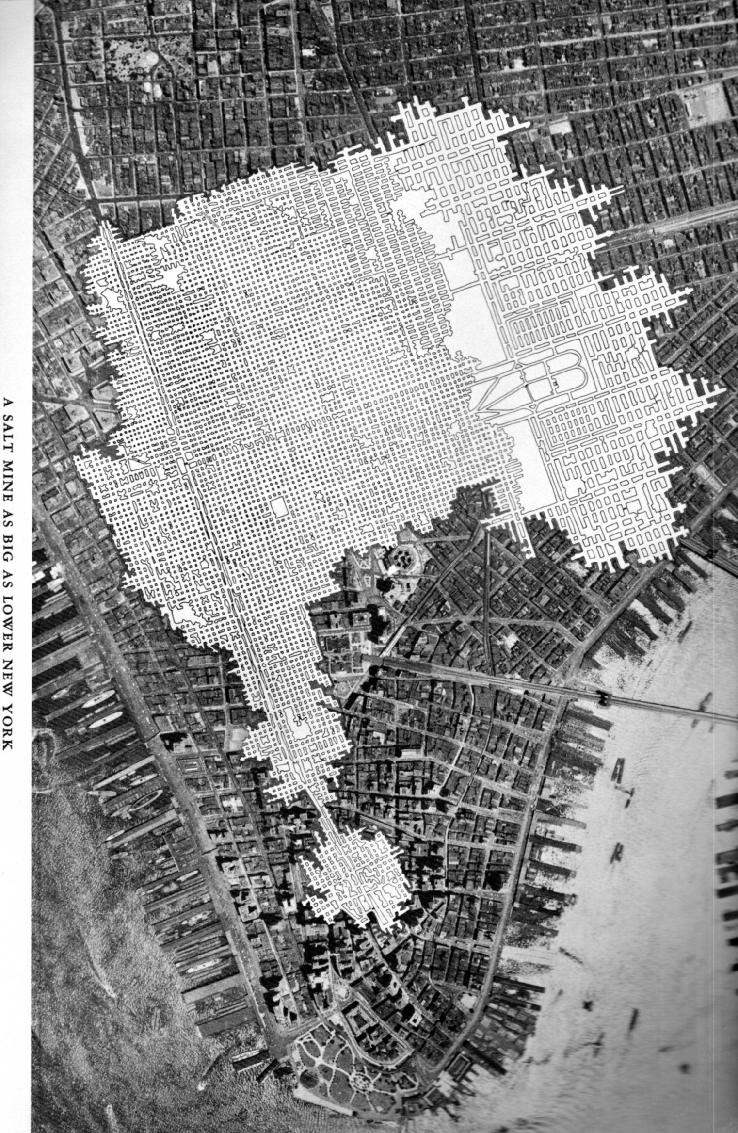
    The Chaco-like overlay in this map of midtown/lower Manhattan has a lot of creative opportunities in it–like showing a map of an enormous and  mysteriously removed Manhattan, or just-discovered earthworks that were somehow dug into bedrock, and so on.

    SALT map218

    But it isn’t. It is a salt mine comparative overlap using Manhattan as a unit if measurement.

    Talk about the “Great White Way”– this elaborate footprint of salt works, with its wide and short-ceilinged rectangular tunnels that are all illuminated white surfaces would challenge anything that Broadway (ca. 1948) offered. “A Salt Mine as Big as Lower New York” is an unusual map to my experience–of course there must be many of these maps available through the years by the companies that mined salt (and coal, and so on) but to my experience they are not often published for public consumption.  The map below is an exception, and simply depicts the rock salt mine at Retsof, NY, (“the largest in the world”).It appears in the unevenly-titled  Salt Empire of the Largest Producer of Salt in the World, and was published by the International Salt Company in 1935.


  • Pride in a 3mm House on the Dead Man’s Walk, 1855

    JF Ptak Science Books   Post 2483

    Jornada136

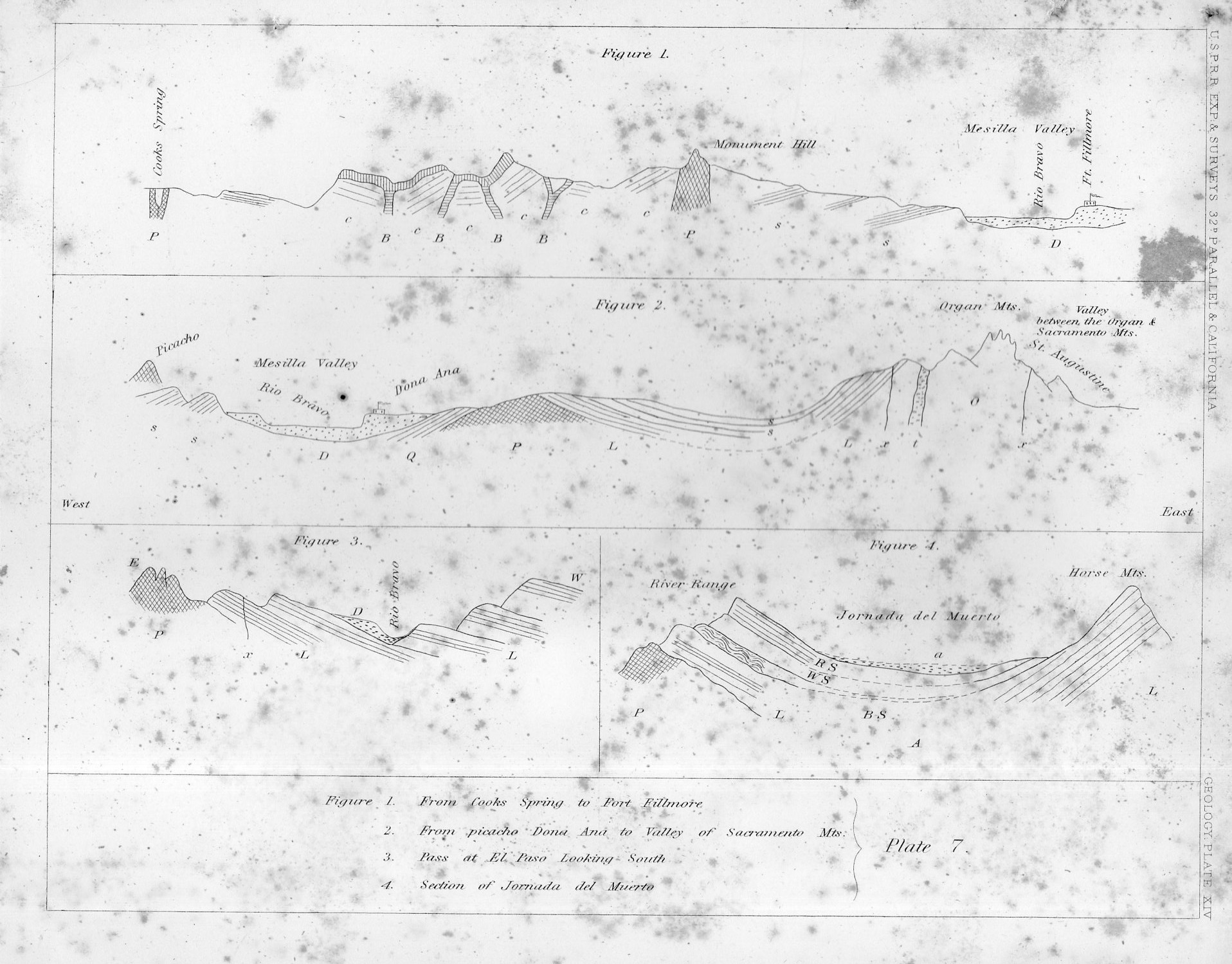
    Sometimes maps have an unusual ability they can Maps can record human achievement and anti-achievement and show human impact on the environment and vice versa, which is standard,  especially if you can see a little deeply into it.  Sometimes though there are the little bits–extras–that find their way onto the paper that opens a window to the emotional involvement of people and space, added by the artist or engraver or whoever it might be that last touches the plate before prints are made from it.  

    This certainly seems to be the case in this cross-section of tough New Mexico earth.

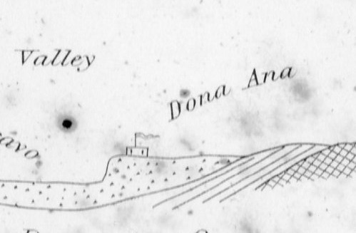
    That little adobe building represents the Dona Ana Land Grant back in 1855, when those pioneers had a few decades of roots in the very hot ground there in New Mexico, across from the Rio Bravo, commanding the Mesilla Valley.  In the original print, published in the great U.S. Pacific Railroad Survey1 in 1855, the structure is only about 3mm long–very easy to miss until you start looking closely at the sheet, which itself is only 2×2.5 cigarettes high and wide.

    I thought the structure had a personality, and looked stolid, strong, and maybe even proud with its long fluttering banner, sitting there in the heights above the river, a strong place perched at the edge of the Jornada del Muerto (“The Dead Man’s Journey” or more prosaically and according to Mr. McMurtry, “The Dead Man’s Walk”)

    Jornada135
    Notes:

    1. The full title of the eight-volume publication, which was an exhaustive treatment of the U.S. west from the mud below to the birds above, Reports of Explorations and Surveys to Ascertain the Most Practicable and Economical Route for a Railroad from the Mississippi River to the Pacific Ocean Made Under the Direction of the Secretary of War, which was published by the U.S. government from 1853-6.


  • Big Paper History: 1806 Chronology of the Years 14-1800

    JF Ptak Science Books Post 2478

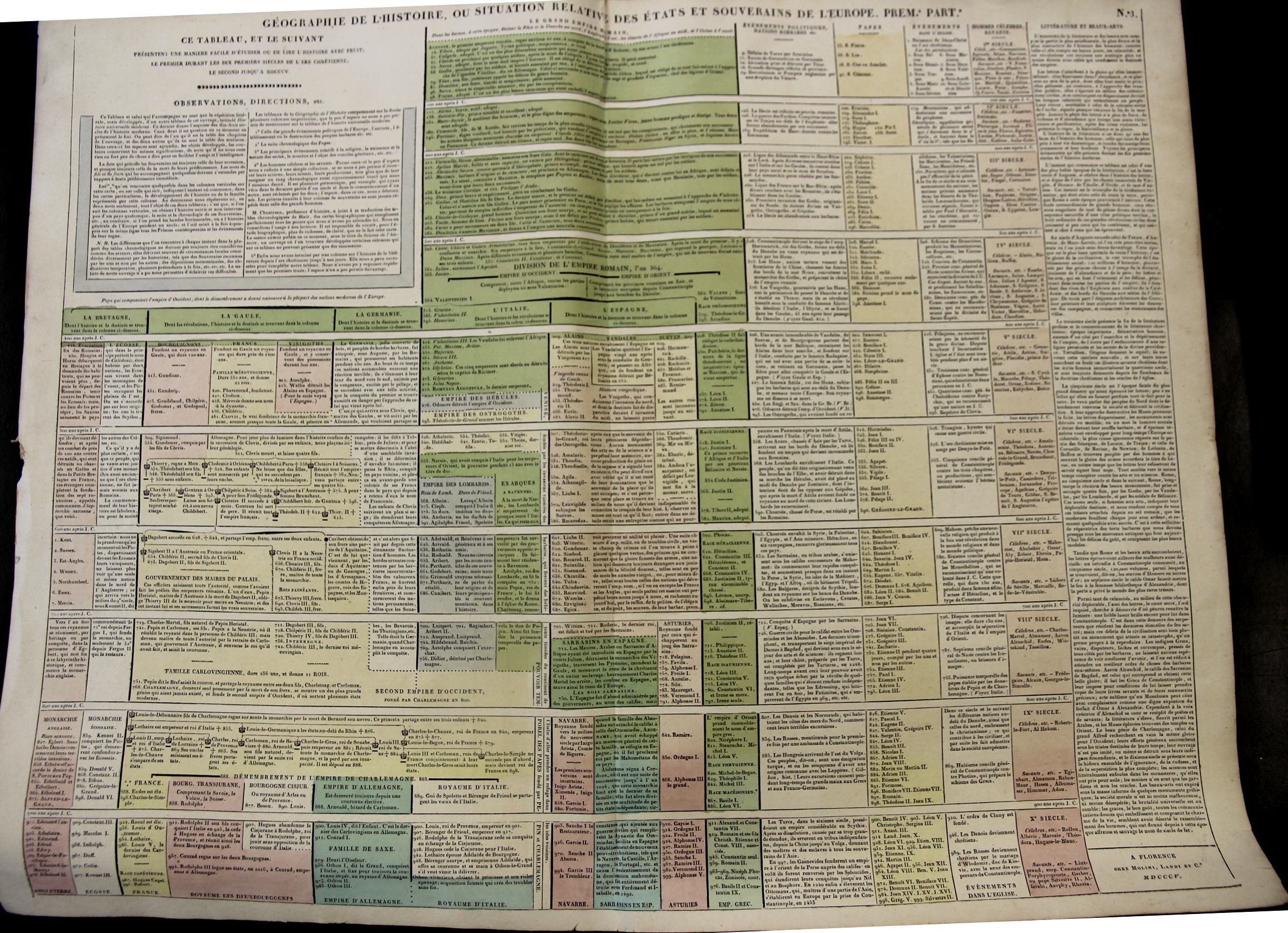
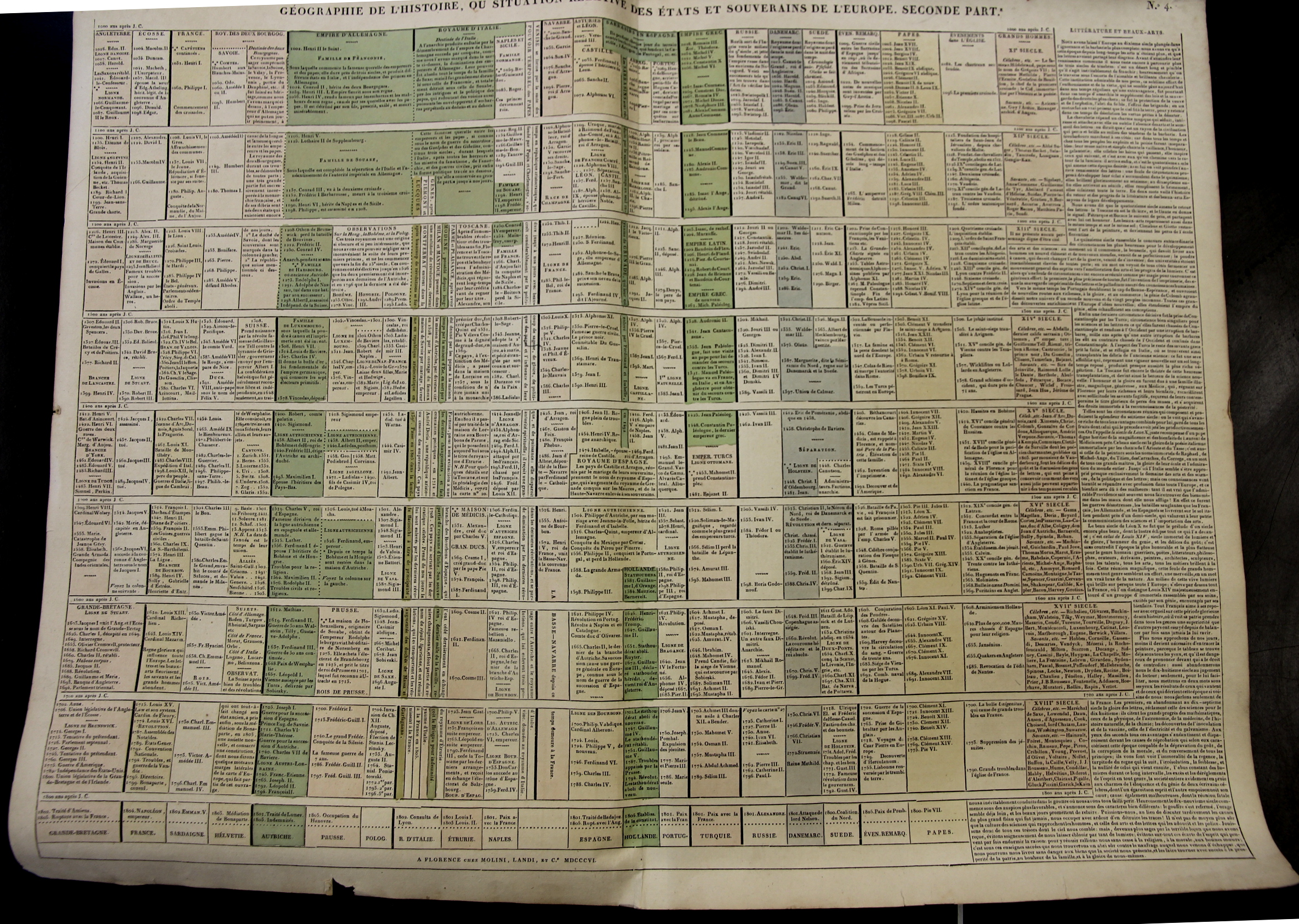
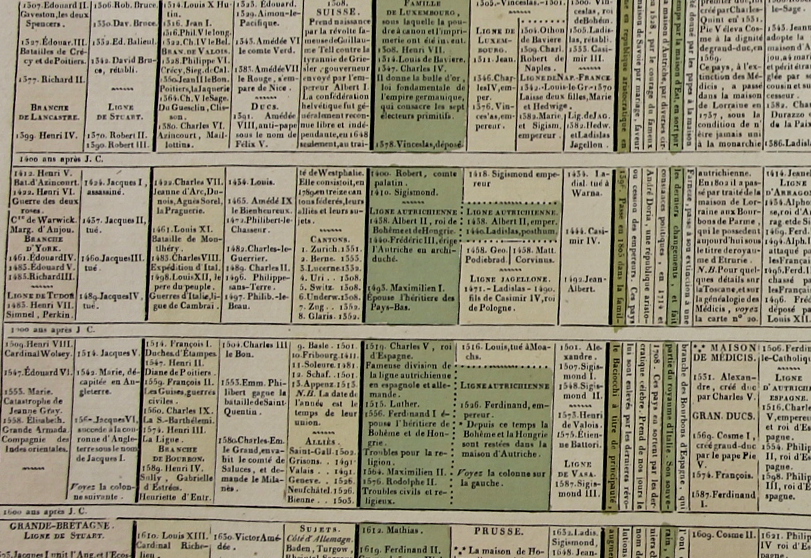
    Starting at the year 14 (ACE) with the reign of Augustus Caesar this large two-sheet chronology organizes the rulers of the Western world so far as it was known into the early 19th century. (“Geographie de l’Histoire. ou Situation Relative des Etats et Souverains de l’Europe (in two parts), published by Molini and Landi, in Florence, in 1806.) There are 15 major divisions from the year 400-1800, with a short bit at the top of the first chart covering the previous 386 years or so.  The columns show the rulers of reach century for Britain, France, Germany, Italy, Spain  (then subdividing as necessary). There is one column for the “nations barbares” that covers everyone else in about 2″ per century; there is another column for the chronology of Popes; one column for a general history of the Christian church, one column for celebrated and famous people, and then a final column for literature and the arts. 

    Maps_Chronology_LeSage_1_

    • You can own these!  Check them out on the blog’s bookstore, here. 

    At the very least the chart helps you keep your rulers straight, so to speak–it is also the sort of engaging display of data that if it was hanging up and accessible that people would read it all the time in passing. 

    The sheets are large (27×21″ or 68x53cm, and combined (as I have done in the past) they make a very imposing display 42×27″ (106x68cm).  The coloring (except for the odd darkish green) is fairly subtle but evident and useful in distinguishing the blocks of data at an easy glance. 

    Maps_Chronology_LeSage_2

    I’ a big fan of this sort of arrangement and display of data, trying as I used to in graduate school (and still do now) to fit the appropriate memory triggers on any given subject onto one sheet of 8.5×11″ paper.  It is a highly useful memory exercise, creating your own memory palace. 

    Maps_Chronology_LeSage_3

    These charts appear in A. Le Sage (Comte de La-Casas) Atlas historique chronologique et géographique ou Tableau général de l histoire universelle présentant un moyen sûr et facile de classer avec fruit tout ce qui s est passé depuis la création jusqu à Jésus Christ espace de 4004 ans….


  • A Great Map of the “Other” London Underground: the Sewer System, 1990

    JF Ptak Science Books   Quick Post

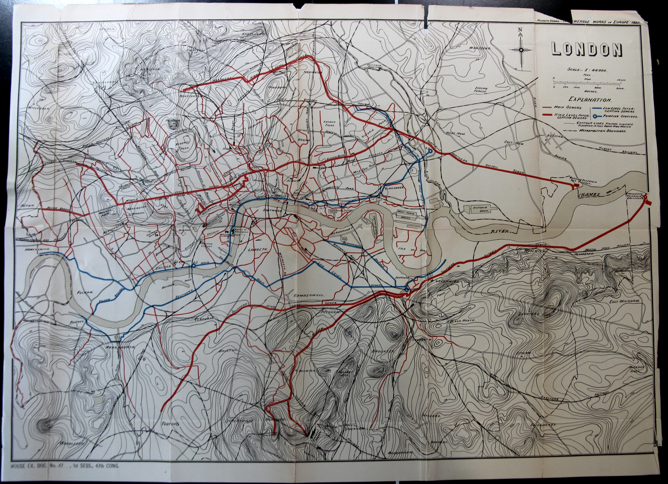
    In order ot have an Industrial Revolution, you need people, and the people (given the times) needed to live close to where they would work. Large number of people all living in close proximity to work means that they need to live close together; close together means that there needs to be essential services, like water. And of course with water you need a place for it all to “go”–and perhaps the “goingest” of water in the city would be for waste. So, if you can’t get rid of waste, then you have no Industrial Revolution. Or something along those lines.

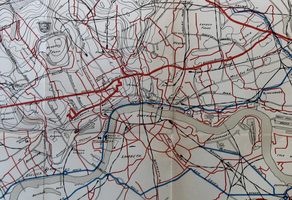
    In any event that leads me into this fantastic map of the “other” London underground, the sewer system, the alternative outflowing lifeblood of the great city.

    London Map Sewer

    The map appears in the Report of the Results of an Examination Made in 1880 of Several Sewerage Works in Europe, by Rudolph Hering, in the Annual Report of the National Board of Health 1881 (Washington: Government Printing Office, 1882), pp. 99-223.

    • The original version of this map is offered for sale at the blog bookstore, here. 

    And a detail:

    London Map Sewer detail


  • Maps of Commonality and Hope in Transport Through a 1939 Kitchen

    JF Ptak Science Books    Quick Post   

    Follow Me on Pinterest

    There have been many unusual maps registered on this blog over seven years (see Maps/Presentation of Imagination and Ideas here as well as Maps/History of Cartography, here) not the least of which are several long posts on maps of imaginary places.  (I should also say that perhaps my selection for the most beautiful map of all time is the Bellman’s Map [of nothing] from Lewis Carroll’s Hunting of the Snark.)  

    • See also: A Map of the Kingdom of Corsets, here.

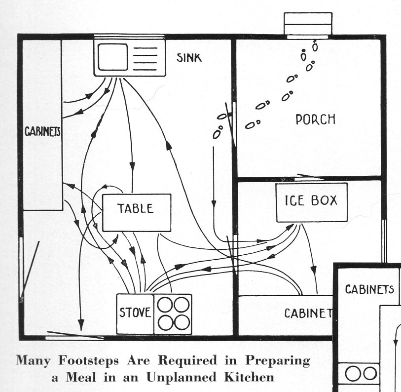
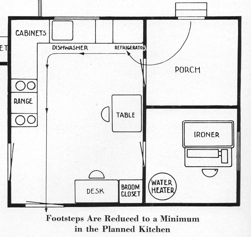
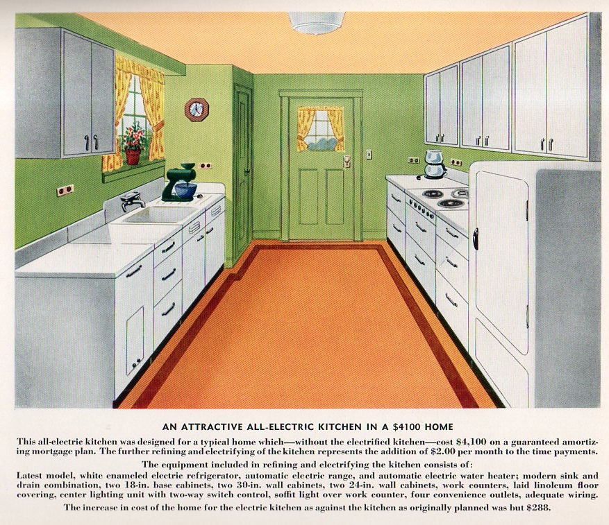
    The maps below are a presentation of Commonality and Hope in Transport Through a 1939 Kitchen, and appear in Electric Kitchens, and How to Plan Them, published by the Modern Kitchen Bureau (of course), of 420 Lex, NYC.  It is much more difficult to find/stumble upon unusual maps such as these compared with displaying the first map to depict California as an island or some such notion, so I think it is slightly significant that when these unexpected pearls present themselves that they should be shared, or at least indexed.  

    Electric Kitchens and the Kitchen Bureau were no doubt funded by Con Edison or a manufacturer of electric kitchen appliances, because what we see in this pamphlet is the promise of saved time and efficiency and cleanliness by using electric stoves and dishwashers and refrigerators and mixers and blenders and ovens and ventilating fans and toasters and even clocks.  

    And so, movement in a pre-mostly-electric kitchen looks complex:

    Kitchen 1939894

    Whereas the promise of the new ultra-electric kitchen looks incredibly streamlined, with a message to the reader that you won’t spend any time in the kitchen at all:

    Kitchen 1939895

    When these folks say “minimum” they really mean it–really, it is more like minimum being the maximum.  

    And since we’re on the min/max bit right now I would be remiss if I didn’t include a view of the modern kitchen, offered in modern color:

    Kitchen 1939896


  • Maps: Climate Change, Population, Drought

    JF Ptak Science Books  Quick Post

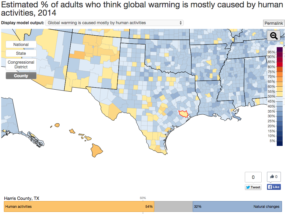
    Interactive Map on Global Warming Opinions

    Click a state and more detailed parts of the questionnaire are revealed, including whether the climate change is largely a result of human action and thirteen other questions arranged in the three areas of policy  support, risk perception, and beliefs.  

    One odd thing is the percentage of people opposed to renewable energy R+D–I’m not sure why 21% would say so, why someone would be against becoming more-or-less self-sufficient. Another 25% are opposed to regulating CO2 emisisons, which combined with the renewable opposition is frustrating to comprehend.  

    Data map global warming

    SOURCE:  http://environment.yale.edu/poe/v2014

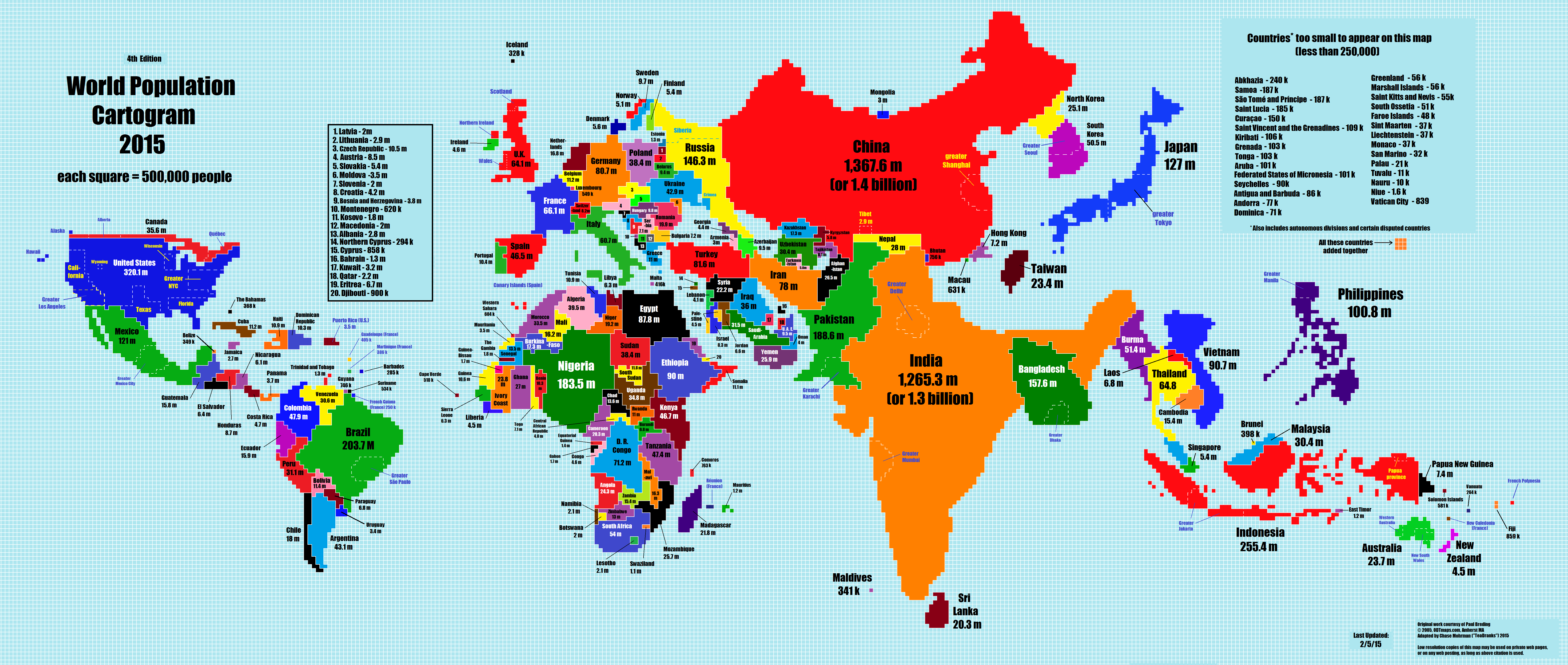
    Population

    The 2015 World Population Cartogram, showing country population in discrete blocks equal to one million people each.  Not a projection but looks like one, and interesting:

    Data maps pop growth

    SOURCE:  NPR blog, here  http://i.imgur.com/I81xSNt.png


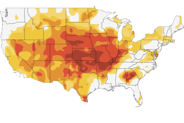
    Drought Map, 2011-2015.
    Data map interactive drough mapThere’s a fine and scary interactive map if you follow the link to the NPR site showing the development of the drought situation in 1200 counties in the U.S.

    SOURCE:  http://www.npr.org/2012/07/18/156989764/interactive-mapping-the-u-s-drought


  • History of Lines–Straightening out the Thames

    JF Ptak Science Books   Quick Post

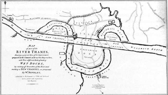
    The architect Willey Reveley straightened out curves and curved out straight lines. 

    Thames River straightening

    Source: Wikimedia. 

    As we can see here he had the idea of constructing a straightaway through the three famous bends of the River Thames in East London.  The straight part would be used for commerce while the bends would become docks and yards.  

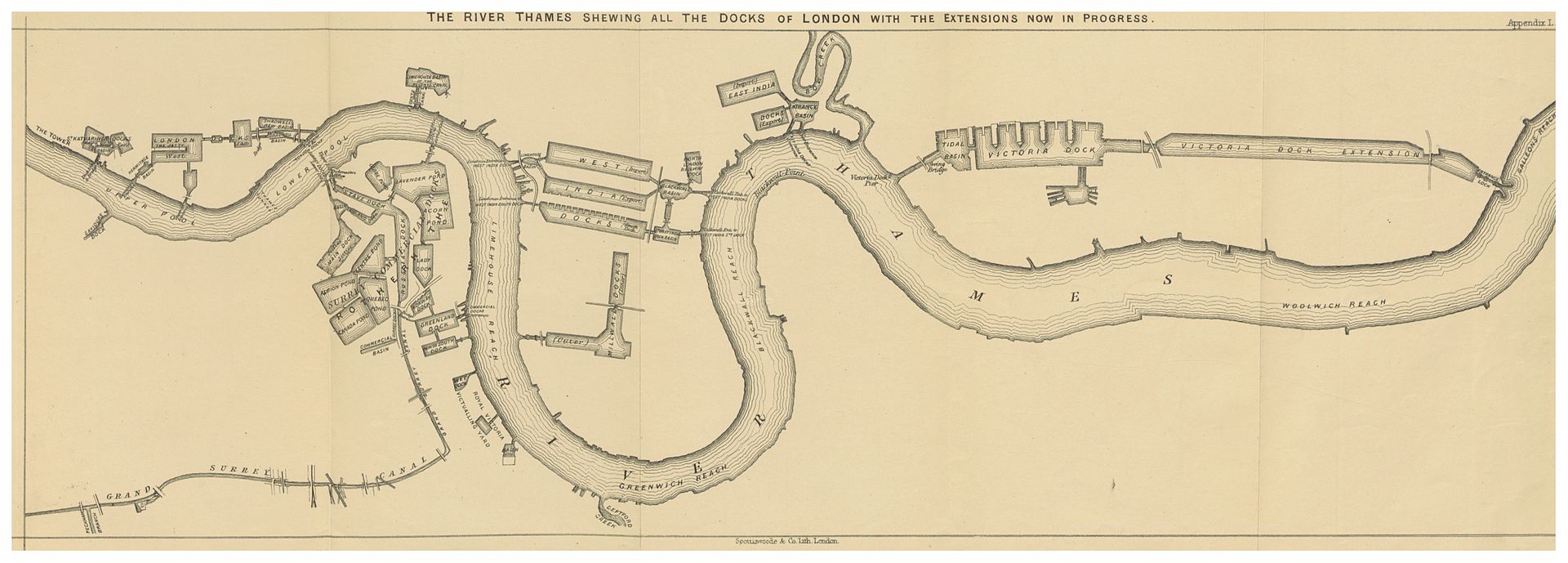
    Another vision by Reveley is seen below, from page 113 of Alexander Forrow’s The Thames and its Docks, a Lecture (London), 1877 (the full text available at the Internet Archive):

    River thames 2Source:  Wikicommons 

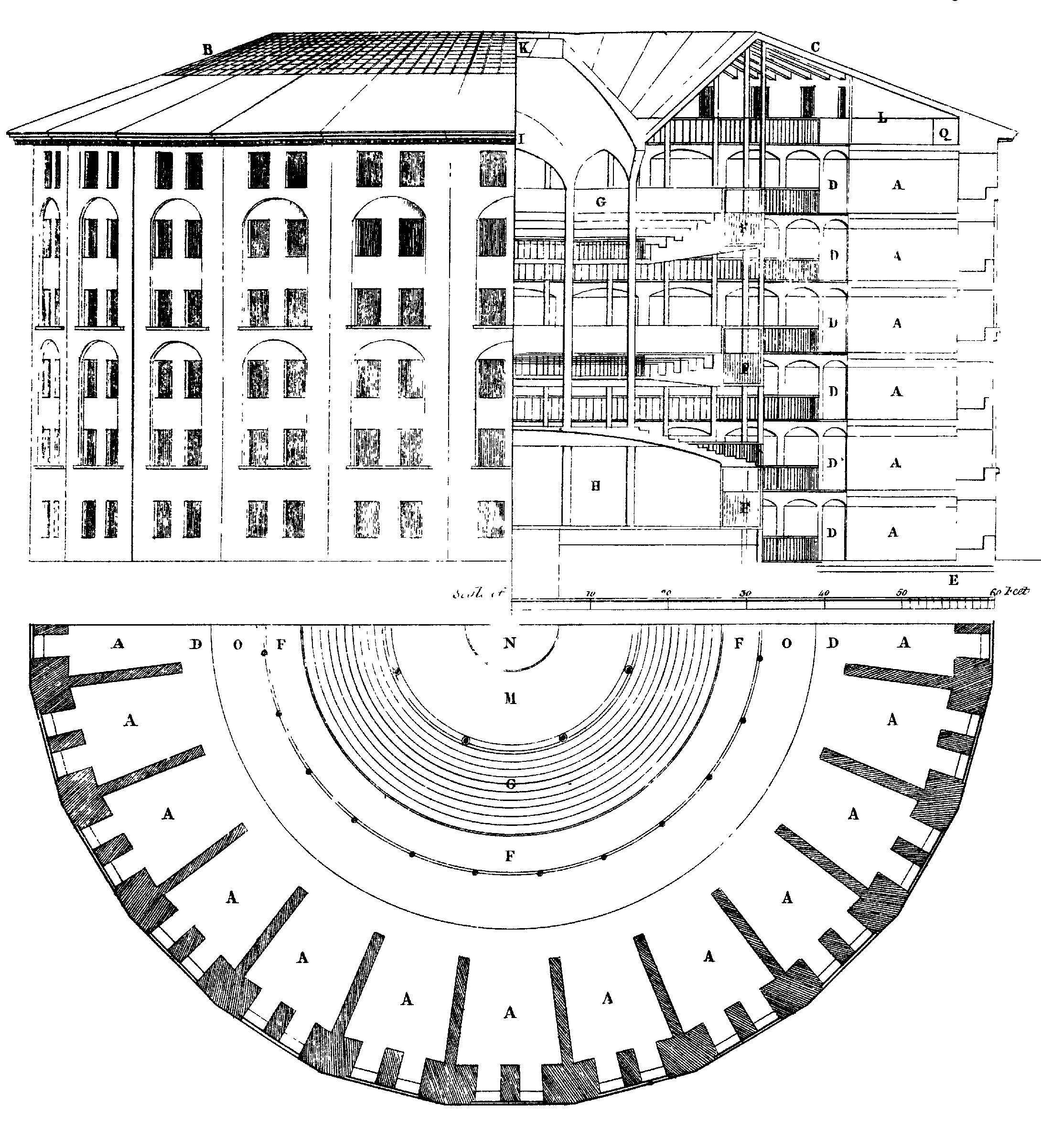
    With all of this straightening-out of the river thinking going on in Reveley it is interesting to see that when he applied his brain to the the world of very straight lines as they exist in prisons that he went the other way–following the idea and commission by Jeremy Bentham, Reveley created plans for a circular prison. Bentham’s Panopticon was an idea that wouldn’t leave Bentham and occupied at least one small part of his brain throughout the 1790’s–I’m not sure where in Reveley’s head the idea lived, but it didn’t live there for long, as the architect died at a very young 39 in 1799. Bentham (born in 1748) lived until 1832, and never did see his Panopticon constructed. (Then again, he may come to see it if someone showed it to him, as his head has been preserved as an on- and off-again display at University College…)


    File:Panopticon.jpg

    Source:  http://upload.wikimedia.org/wikipedia/commons/1/11/Panopticon.jpg


  • Nazi Propaganda Map for a European Hearts and Minds Campaign

    JF Ptak Science Books  (Post 193 from 2008) Expanded and with better images. 
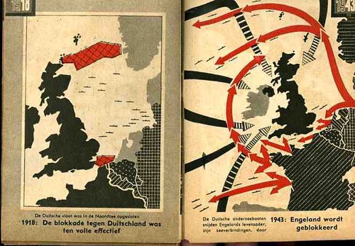
    Nazi Maps D Propaganda1

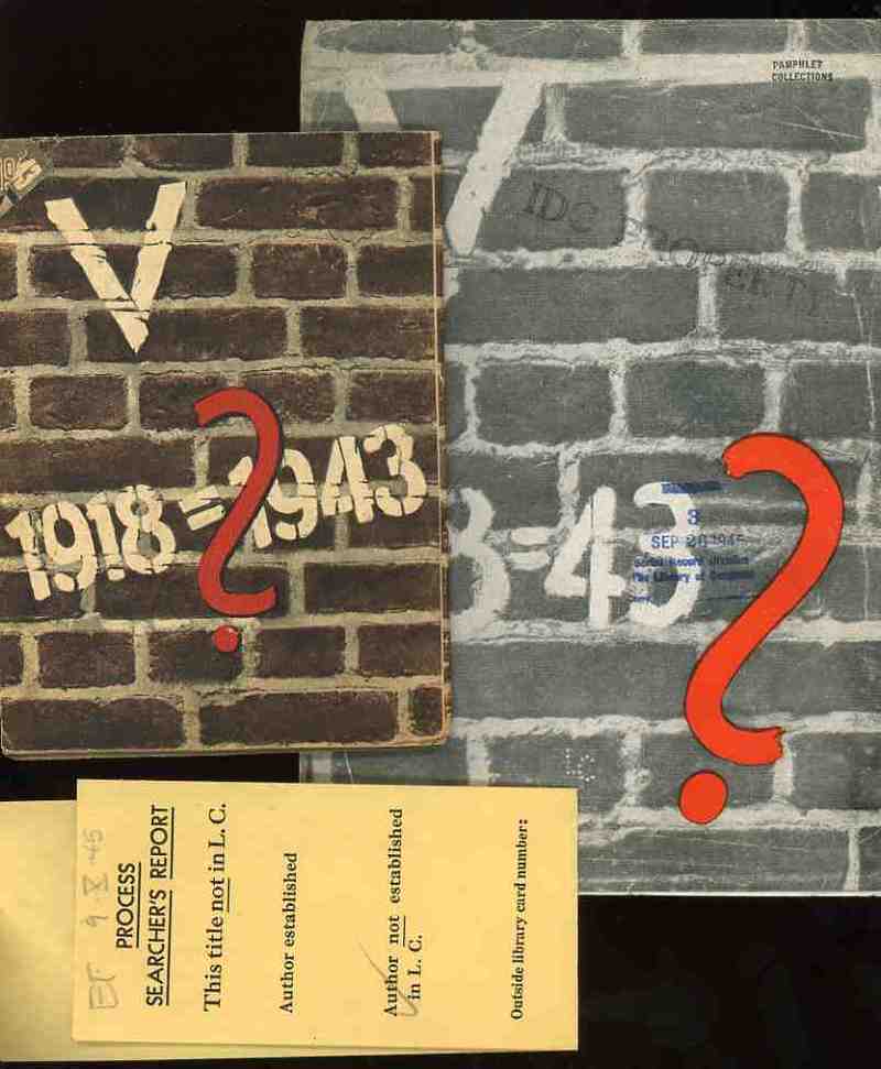
    These two, related, pamphlets were the products of the Nazi Propaganda engine and sought to affect the moral and intellectual stamina of the people in the occupied countries of the Netherlands and France in 1943.   Each stressed the enormous differences in the German state that took place in the 25 years between the end of World War I and the third year of the Nazi European part of World War II.  I’ve no idea whatsoever about the grander symbology  (if any) of these numbers associated with these two pamphlets (the Roman numeral for “5” and the 25 years of the difference and the “13” points (of the French propaganda) aside from the obvious mathematical implications.
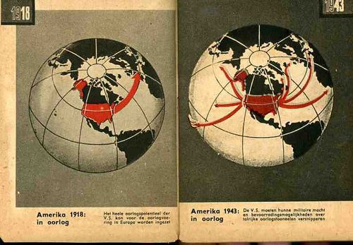
    Nazi Maps D Propaganda2

    (The only interesting bit that I can find in the “18=43” from the French pamphlet is Luke 18:43 “Immediately the man could see again and began to follow Jesus, glorifying God. All the people saw this and gave praise to God.”. )   I find it curious that identical symbolism (?) was used for the two countries, and that the French version was simple comparative text (summarizing the differences in the two periods of time) while the Dutch version was mainly a picture book. 
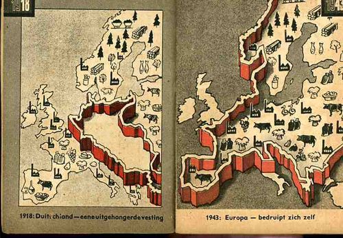
    Nazi Maps D Propaganda3

    I would reprint the French version if it wasn’t so bloodily hateful.  (Suffice to say that this is so by looking at one example: in the last of the second issue of 13 points  Goebbels et alia wrapped themselves in the insulating fabric of the German “people” in the “resistance” against “Jewish saboteurs”—not the German political machine, and not the German military, but the German people, insinuating that the Nazi annihilation of the Jewish people was de facto sanctioned by the will of the German nation.  This is of course part and parcel of the fictitious and loathsome Protocols of the Elders of Zion (of which Henry Ford was a happy reader), a French work that was completely stolen and plagiarized by Imperial Russia in the early 1880’s and which, later,  Hitler used to both build his hate against the Jewish people and use (and acknowledge ) as the template for his early actions in the Nazi Party.)
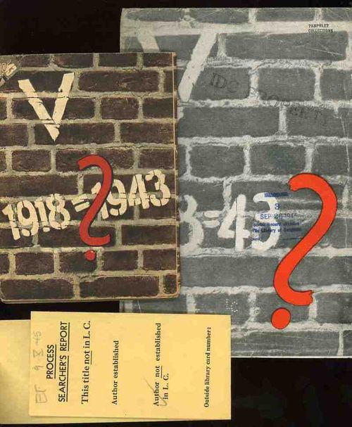
    Nazi Maps D Propaganda4

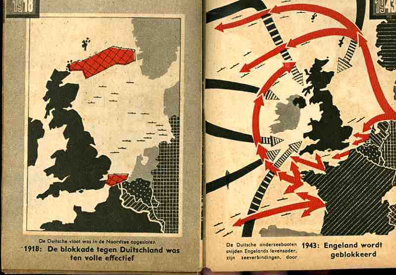
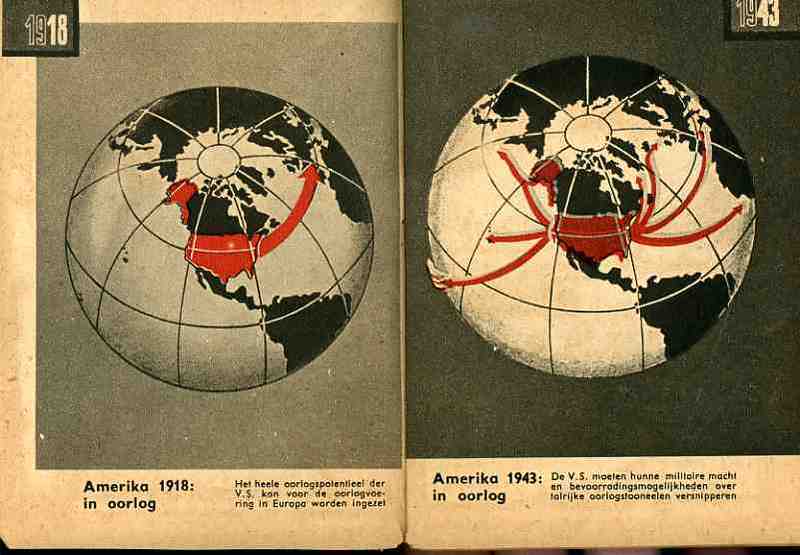
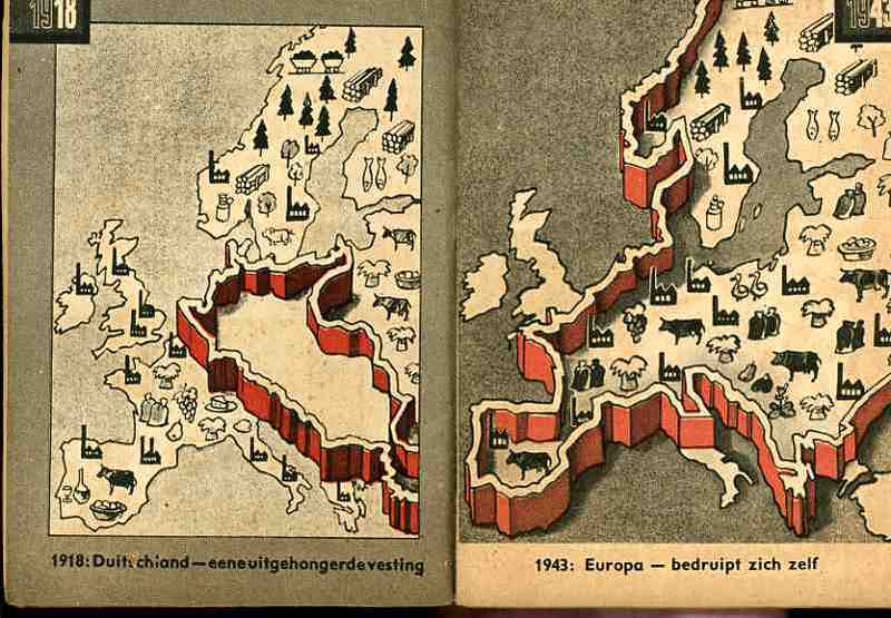
    The maps used in the Dutch publication are fairly general and issue a stark warning about the growth of Germany–and how Germany continues to grow through war.  The first that we reprint, above, tries to get the point across to the occupied people that England has more problems to deal with than would concern their attention with the Netherlands.  The second part of the first map crazily shows the attack upon England and the effectively exhausting attention it has to pay to many points of invasion.  Ditto for the second map, showing the spread of American concerns–the U.S. in 1943 would have far more to deal with in many points in a two-ocean war than to concern itself with or have the ability to think about the liberation of Europe and the Netherlands.  The last map shows the supposedly extraordinary growth in Germany’s  industrial and agricultural capacity. 

    In short, the maps tell its readers to just keep quiet, the German nation is mighty, and just wait for the end of the victorious German war.  The maps also addressed non-readers–of course the Dutch literacy rate was extremely high, but you didn’t have to be able to read the description of the map to understand its blunt message. (This makes me wonder if the maps really weren’t intended for scare tactics against children.)  As Boss Tweed once infamously reported–that he had no fear of editorials because his constituency couldn’t read–he hadn’t counted on the political cartoons of Thomas Nast–which could be understood by a non-reader–and which wound up being one of the direct causes of his exposure and downfall.