A Daily History of Holes, Dots, Lines, Science, History, Math, Physics, Art, the Unintentional Absurd, Architecture, Maps, Data Visualization, Blank and Missing Things, and so on. |1.6 million words, 7500 images, 4.9 million hits| Press & appearances in The Times, Le Figaro, Mensa, The Economist, The Guardian, Discovery News, Slate, Le Monde, Sci American Blogs, Le Pont, and many other places… 5000+ total posts since 2008.

Category: Maps, Cartography, History of Mapmaking

  • Measuring Things with Mt. Everest (and the Empire State Building), 1933

    JF Ptak Science Books  Post 2465

    I was just looking for a good link for the full text of Donald Knuth’s 1965 paper on “Very Magic Squares” when instead I found mention of his earliest publication, a playful paper that was published in MAD magazine in issue #33 for June 1957.  The work by the 19-year-old Knuth, “The potrzebie system of weights and measures”, suggested that, among other things, the “potrzebie” as a standard unit of measure–and that was equal to the width of the issue #33 or  2.263348517438173216473. There were more fanciful measures for Knuth, which suggests that these “standard” units are infinite, one measure of infinite being the length of the finite over its negative.  
    Dataviz Measuring with Mt  Everest787

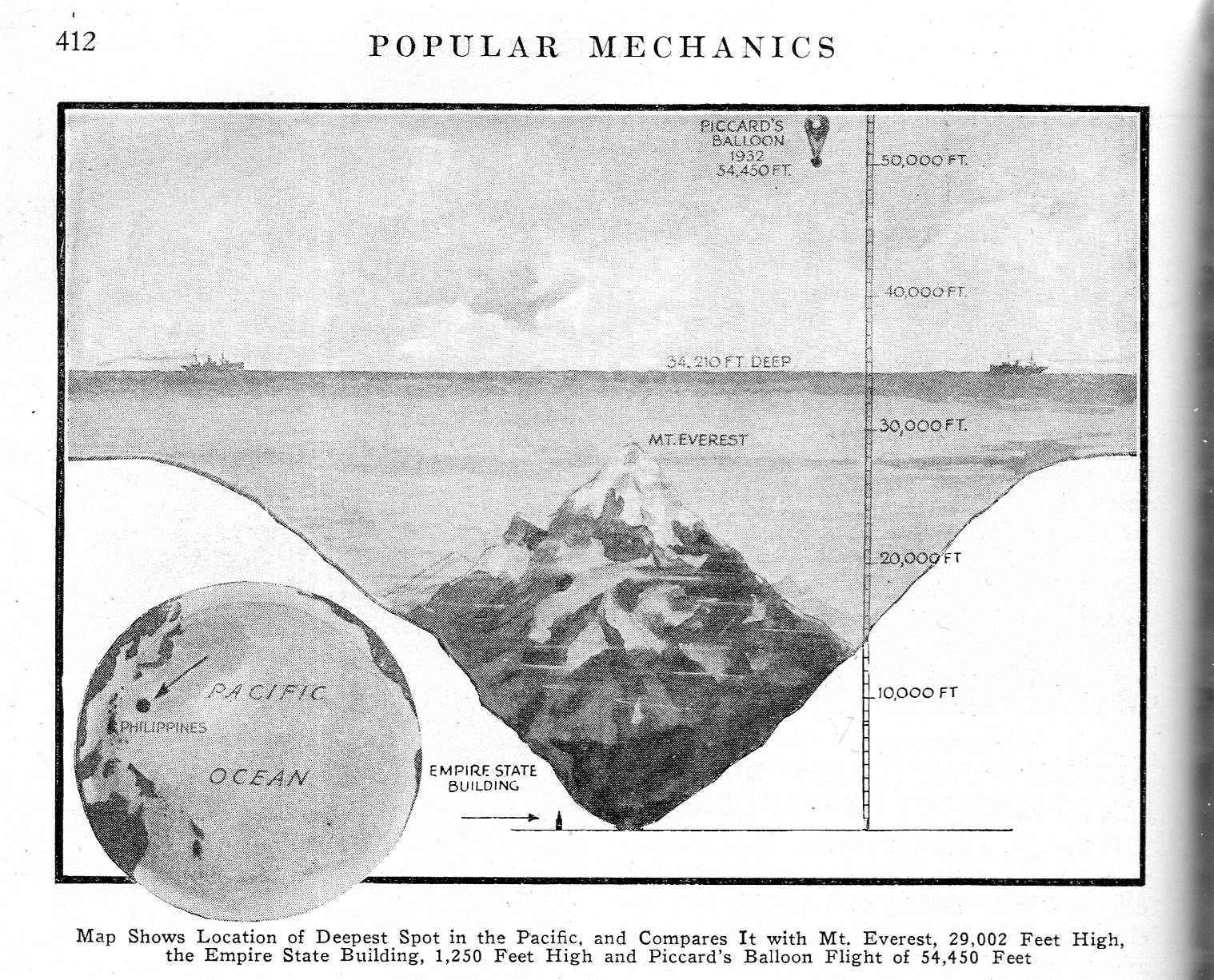
    This brings us to measuring things in terms of units of Mt. Everests found in this short notice in Popular Mechancis for September 1933. Truthfully this is a simple dataviz tool, comparing the depth of one unknown and not visualized entity–in this case, the “deepest spot in the Pacific”–with another that is known and highly visible (after a fashion), and so we get to appreicate the great depth  by comparing it to Mt. Everest.  There are no stackings of Everests in this image though I can see a future use for the visual–I have after all posted many unusual pieces to this blog where heights/depths are measured in terms of stacks of Eiffel Towers, or mammoth bread, or gigantic piles of wood, or nails, and uprighted ships, and of course numerous Great Pyramids filled with excavated dirt from the digging of the Panama Canal and stretched over the island of Manhattan.  Those are more involved, while the present unit of measure is just suggesting itself for future use.

    On the other hand it might be more beneficial to use stacks of the Empire State Building to convey the sense of deep depth.  In 1933 it was just two years old and a world-wide sensation as an icon art deco building and the tallest building in the world, so if you said that the deepest depth could absorb 32 Empire State Buildings one on top of the other, there may have been a greater understanding of the consequences of that much depth.  In any event, I like that more as a unit of measure.  

    Notes:

    Knuth. Selected Papers on Fun and Games, http://www-cs-faculty.stanford.edu/~uno/fg.html  (From the website: “I’ve never been able to see any boundary between scientific research and game-playing. … The topics treated here were often inspired by patterns that are visually compelling, or by paradoxical truths that are logically compelling, or by combinations of numbers and/or symbols that fit together just right. These were papers that I couldn’t not write.)

    Knith’s c.v. http://www-cs-faculty.stanford.edu/~uno/vita.html
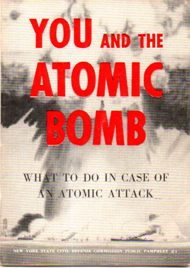

  • YOU and the Atomic Bomb (Again)

    JF Ptak Science Books  Quick Post

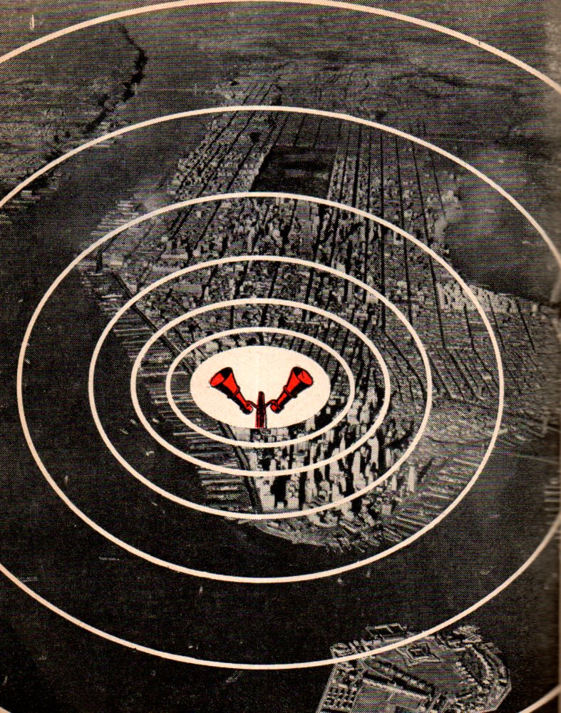
    No doubt there is some serious and useful information in this little undated (ca. 1945/6) pamphlet–mostly I guess its purpose was fulfilled in its attempt at softening the dread of nuclear holocaust in that there was actually something that could be “done” in the event of an attack.  It addresses the standard fears, and perhaps the standard fears of hope, though the pamphlet does paint a profile of possibility for a post-attack scenario that is, shall we say, a little optimistic.  In any event, I share this now for the graphics, and the Manhattan Destroyed map.  

    Atom bomb you and the737


    Of course there must be a map, but instead of the usual map of rings of destruction, this bird’s eye view was meant only to depict the effective range of an air raid siren–and it is not lost on me that the central red graphic is placed very near to the WTC site. (The first published map of the rings of destruction of an atomic bomb on any city of so far as I can tell appeared in the great PM newspaper the day after Hiroshima, showing what sort of effects the bomb would have on a profile not of Hiroshima, but of Manhattan.  As a matter of fact the entire issue of the ad-free newspaper was devoted to the bombing, Hiroshima receiving more (and better) coverage than in any newspaper reporting I have seen in the first week after the bomb was dropped.  I really have no idea how the paper was able to put together dozens of bright and informed pages of coverage in 24/36 hours after the event–except of course that those were some very smart people.)  

    Atom bomb you and the NYC map738


  • Maps: “Through the Meander of the Rockish Creek”, 1842

    JF Ptak Science Books   Post 2634

    Back when I had an open shop I would occasionally have surveyor customers who would come in after hauling themselves back to our civilization, telling stories of doing some re-survey of some piece of land in the out-yonder and finding old heart of pine stakes from a 19th c survey still in place and just very slightly off from where the modern surveying tools would place them. These guys held these earlier surveyors in high regard, as they did hard work and did it very well, using relatively rudimentary tools (optics, chains, measures) in sometimes very difficult conditions and doing a splendid job of it.  

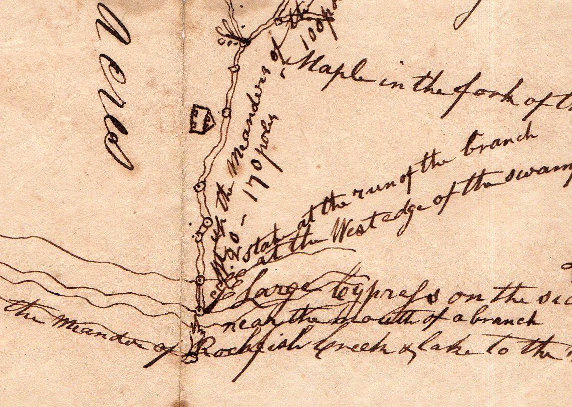
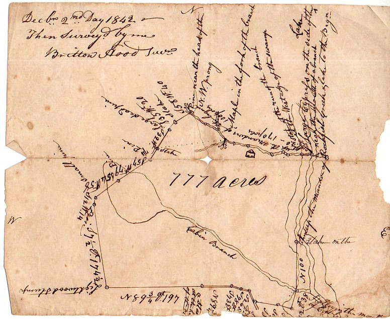
    These stories came to mind just this afternoon again while cataloging an 1842 manuscript map made by Britton Hood, Jr., who was the son of a surveyor Hood Sr. who worked through the late 18th c and into the middle 19th. The family was in Wayne County, and it looks as though the son stayed their, at least according to a hint or two on this map. Although the location is not identified the major feature is, and the “Cabin Branch” of the map may be the “Cabin Branch” creek that is south-central Wayne County, south of Goldsboro. 

    The very attractive part of this map of course are the landmarks used by the surveyor, and as is very often in these cases, the “landmarks” tend to be simple trees and stumps and such.  Of course is you identify a starting place and base all of the landmarks upon that, then virtually anything can be used, so long as it is referenced to something. 

    This leads to the found-poetry of the Hood map:

    Britton Hood725

    Some of the then-essential and now-delightful boundary markers for Hood’s 770-acre survey include:

    • Maple at the fork of the branch
    • stake at the turn of the branch
    • pine at the west edge of the swamp
    • large cypress at the edge of the swamp
    • through the meander of the Rockish (?) Creek
    • Lightwood stump
    • small pine
    • pine
    • large dead pine
    • stake
    • pine at the prong of the NW branch
    • and of course a pine, pine, and small pine, among other things.

    The map in full (the original measuring 6×7″):

    Britton Hood724


  • Infographic on the Invasions of Great Britain and Ireland (1914)

    JF Ptak Science Books  Quick Post

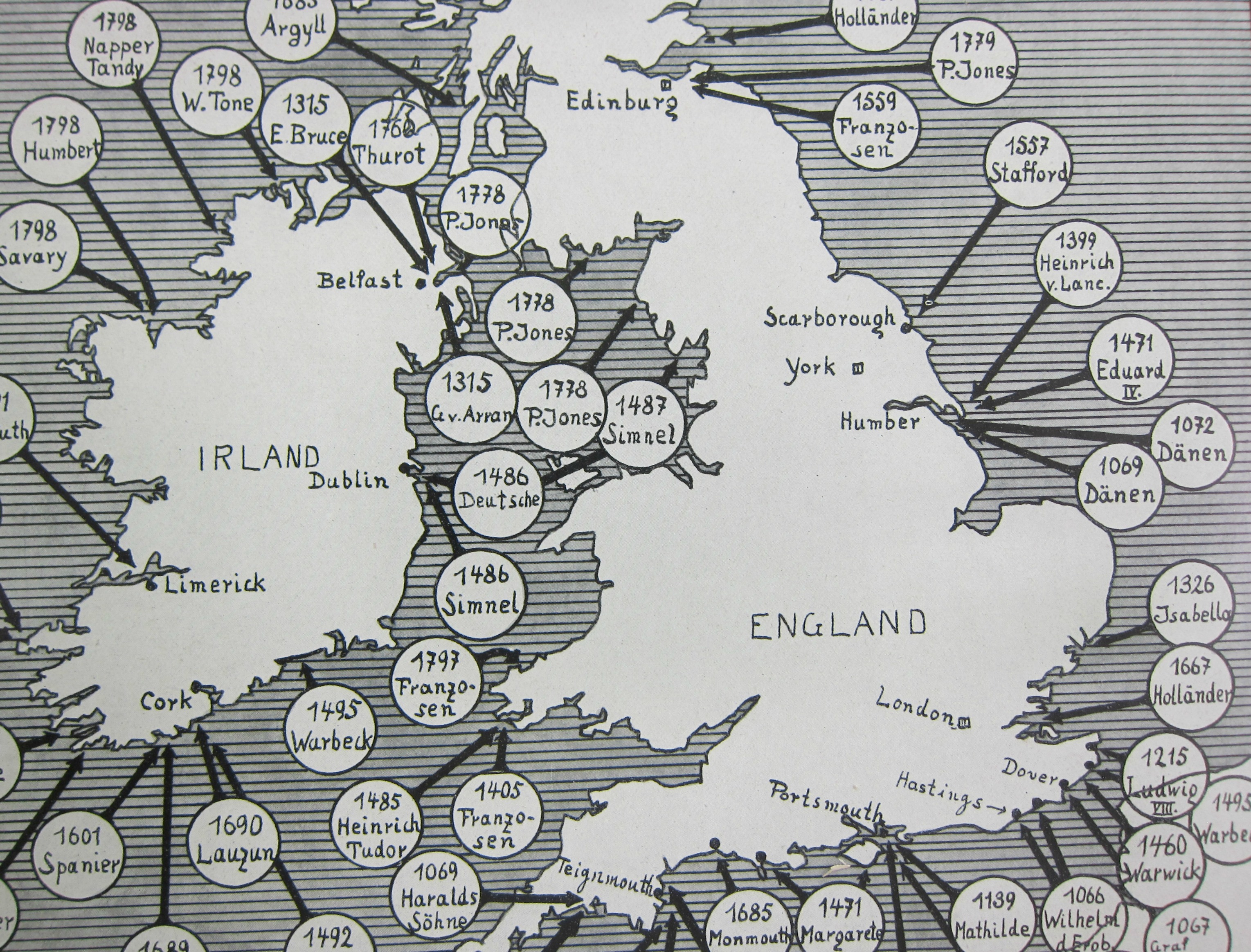
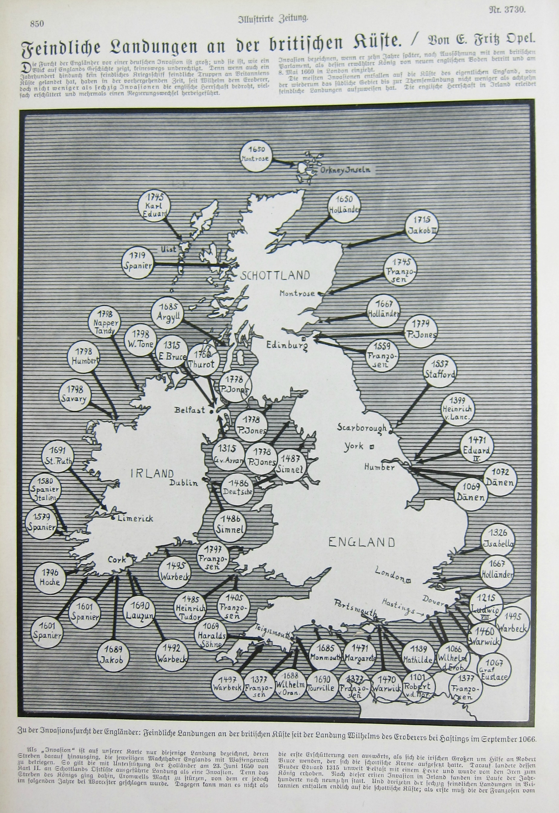
    This piece of cartographic propaganda appeared in the fifth month of the war in the Illustrirte Zeitung (Leipzig) on Christmas Eve, 1914–it was in its way a vision of hope for the popular audience that this German equivalent of Life magazine reached. Perhaps it was a comfort to read that Great Britain and Ireland had been invaded before–many times–and that it might happen yet again; perhaps it was a comfort at a time when  the realization dawning on tens of millions of people that This War would be over by Christmas, but it had really just only begun.  Not much comfort though can be had in a piece of paper. 

    A detail:

    Map Invasions England detail

     And the full image:

    Map Invasions England


  • “Two Disastrous Failures” for the German Army, January 1945

    JF Ptak Science Books   Quick Post

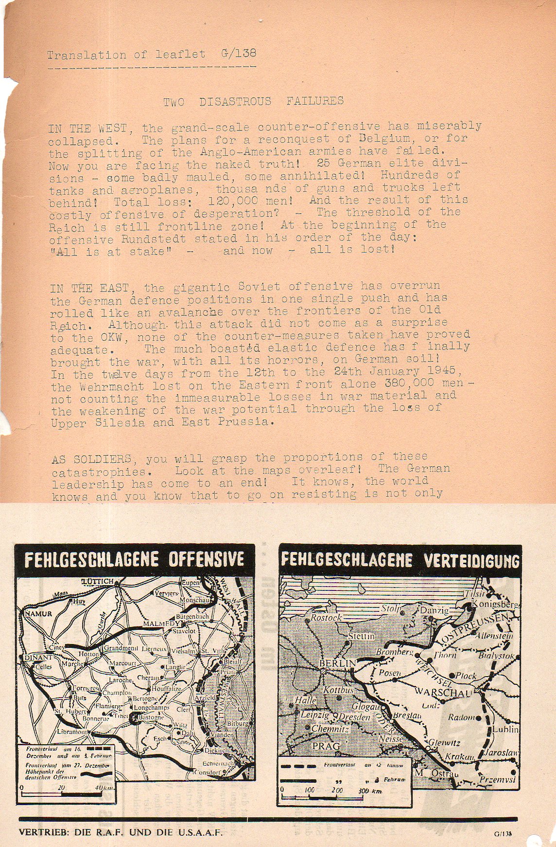
    This leaflet was dropped on German forces by the R.A.F. and the U.S.A.A.F. soon after the breakout of the Battle of the Bulge/Ardennes in the end of January 1945, which is one of the two failures that this propaganda sheet screamed about. It is a little odd though that in the map it would show the German offensive at its worst for the U.S. troops, with the bulge extending far west and Bastogne being surrounded. Yet the leaflet told of the German losses of its failed offensive (“Operation Watch on the Rhine”) though it did not show the progress of the month-long battle on the map, which should have shown the battle line back to its more-or-less original position by 25 January.  In describing the catastrophe of the German position in the east (leading with the loss of “380,000 soldiers”) the date of 24 January is mentioned, which supports the late January estimate for a printing date. This was of course the Vistula-Oder Offensive. which saw the Soviet Army advance more than 300 miles in a month, right to the Oder, only 40-odd miles from Berlin.  In that campaign the German Army Group A was just about killed–of the 450,000 soldiers in retreat along this long and disastrous front during the month of January, the overwhelming majority were casualties, including nearly 300,000 killed. The wounded and other survivors became POWs.  The bottom line of course was that the winter of 1945 for the German soldier was bitter and deadly, and was leading nowhere except defeat–there was no doubt what lay ahead after seeing that map of the Eastern Front. 

    Leaflet two disasterous failures468


  • Visualizing Data: the Texas Newspaper Frontier in 1880

    JF Ptak Science Books 

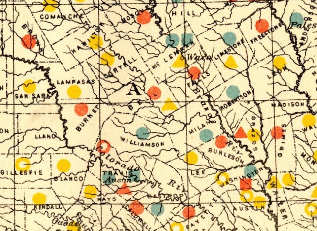
    Dataviz texas newspaper  detail


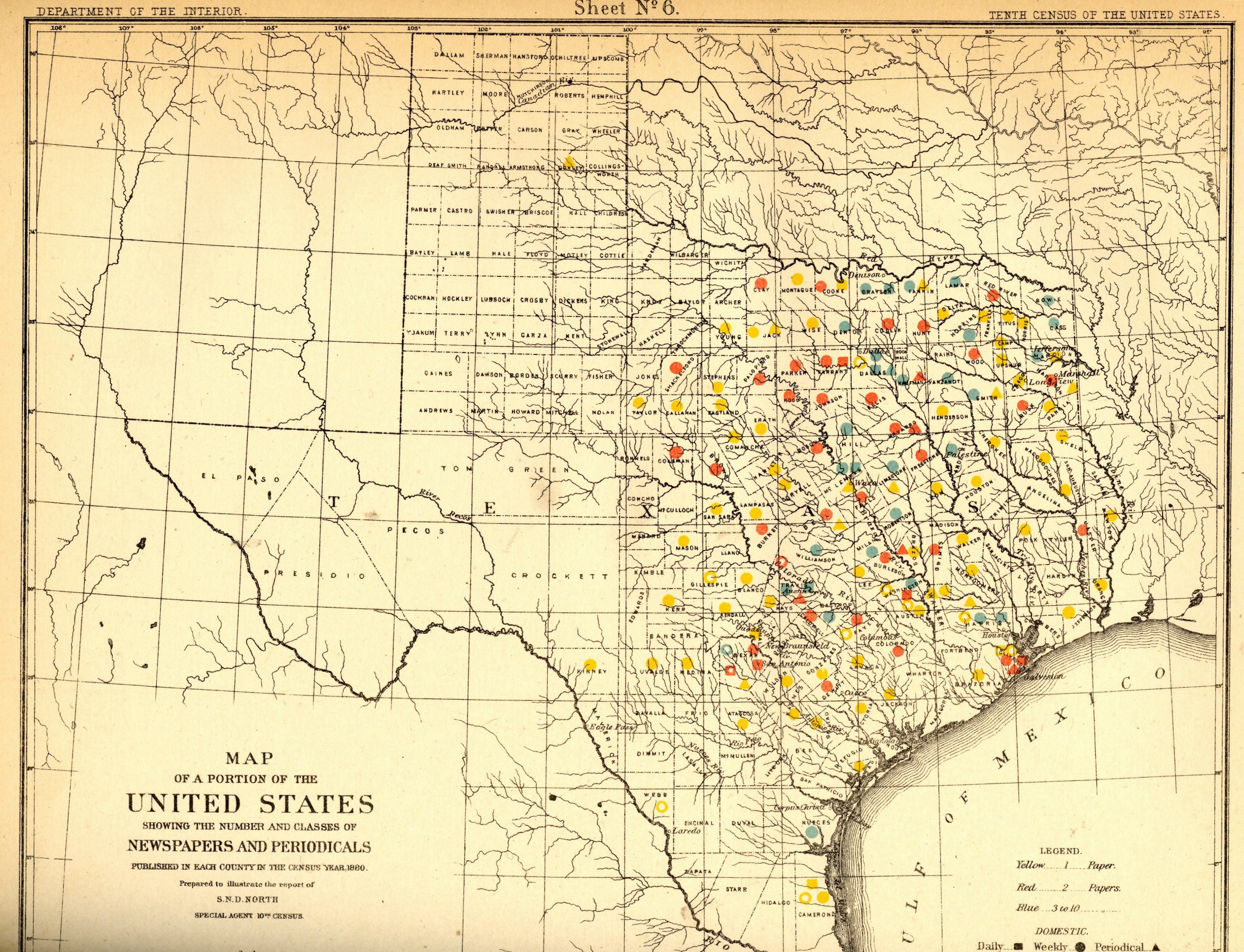
    Dataviz texas newspaper  tail

    [This expandable image is from the blog’s copy of the publication–full text can be found at the Internet Archive, here: https://archive.org/details/cu31924083814453]

    The idea of the frontier in American history has been around for quite some time, made famous and mostly-invented (and closed) by Frederick Jackson Turner in 1893, and expanded, imagined, enticed, magnified, micro-analyzed, and  generally messed with ever since.  There have been all sorts of frontiers introduced into the study of the birth, expansion and filling-up of this country, from the very earliest colonial periods of Indian frontiers, “far-western” river frontiers of the Connecticut, Delaware, Hudson (!) and Susquehanna, to the Appalachian frontier of the early western reaches of the colonies, to the transportation frontier, the slavery frontier, the gold and mining frontier, the gun frontier, and so on.  

    Here’s another bit to add:  the newspaper frontier.  

    I just happened upon a volume of the US Census of 1880, with a special report by S.N.D. North entitled History and Present Condition of the Newspaper and Periodical Press of the United States…and published in 1882.  What provoked me was the map of Texas newspapers for 1880.  It very clearly, and like no other map of its kind, delineates a fantastic line/frontier between the Texas with newspapers and the Texas without newspapers. We see very clearly that the frontier of the newspaper stops fairly abruptly (and wonderfully) at the 100th meridian, with only two newspapers in all of the rest of Texas found beyond that point (and those just barely beyond the 100th.  And it’s the 100th meridian that mostly marks the vertical middle of the country, running through North and South Dakota, Kansas, Nebraska, the Texas/Oklahoma borders, and so into Texas—if you folded this map vertically in half it folds virtually on the 100th meridian.  An odd bit, it is, half of the country and then approaching half of Texas. 

    I should report that the newspapers west of the 100th meridian were in Kinney County (population 4,440) with the Fort Clark News (established in 1880, at exactly the year of census) and Donley County (population 160, with the monthlyClarendon News and a 50-cent annual subscription rate).  The newspaper development also sort of followed the frontier fort development, almos tall of which (but four) were east of the 100th. 

    Of course the population and easier-natural-resources are located east of this point, I know, but it is still quite a jolt to see the line of newspapers get drawn in the sand so vividly.  There isn’t anything else quite like this so far as the newspapers go, except, a little, for Florida, where the line gets drawn north and south, splitting the peninsula roughly in half, the southern part holding only five counties at this point..  But it is a much more robust image for Texas given the number of newspapers that were being published—280 periodicals and newspapers for Texas versus 45 for Florida, with 11,374 in the entire country*—so that the difference between the have-newspapers and haven’t-newspapers in Texas is that much more vivid. 

    Texas needed more papers:  there were 1.5 million people living in the massive state in 1880, almost twice as many as there were in 1870, and almost half of what there would be there in 1900. That was another story, entirely—even in 1880, which is only 130 years ago, there were only 270,000 people living in the entire state, not even close to half of the county population of Pinelas today.I’m just enjoying the surprise of the straight-edge frontier in Texas. 

    The deal too was that Texas wasn’t at the top of the lisst for average area for each publication per square mile, with each periodical providing coverage for 936 miles. But that again is for Texas east of the 100th meridian–throw in the rest of the state, and that number skyrockets. (There were 13 states with a higher mileage distribution than Texas, topped by Indian Territory,m with basically nothing, with each paper servicing an area of 21,000 square miles.  

    Also, Texas’ 225 counties had 119 counties publishing newspapers and/or peridoicals, compared to the national figures, which were 2,605 counties and 2,073 publishing papers.  

     *Just for the sake of comparison, the number of newspapers and periodicals per state for 1880 was as follows: Illinois, 1017; New York, 1411; Pennsylvania, 973; Ohio,  774; New Jersey 215.  Also, oddly, the average circulation of the Florida and Texaspapers was roughly the same: 1,282 for Texas and 1306 for Florida (with an average for the country at 4137). 


  • Hitler as Leviathan of the German People; a Map of the Threat to Germany (1936)

    JF Ptak Science Books   Post 2613

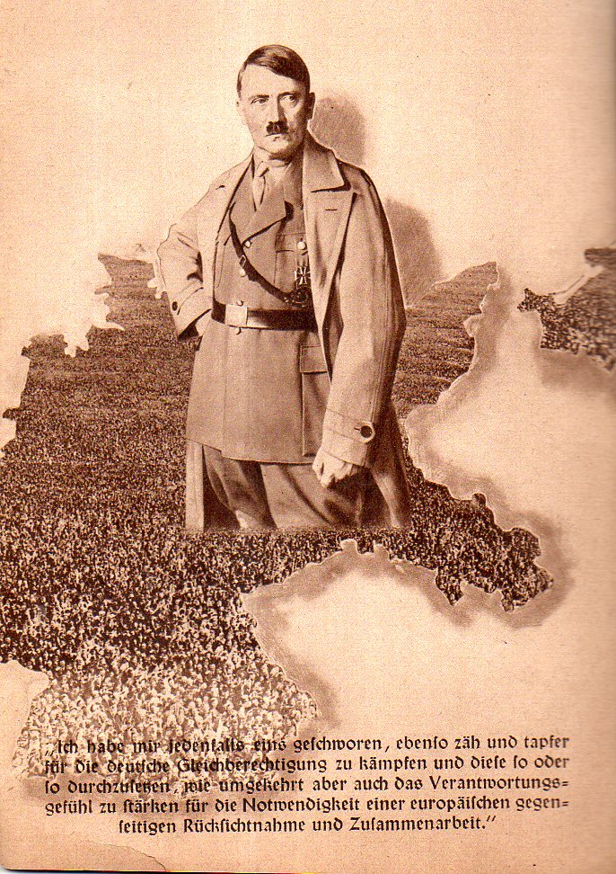
    the following two images are found in a small pamphlet on the general election and single-question referendum held in Germany on March 29, 1936 (Des Deutschen Volkes Schicksalswende am 29. Marx). as it turns out the small pamphlet accordion-folded oput to about 2.5 feet, which was printed on both sides.  Anyway the single question was whether the voter wanted a single-party representation by the NSDAP in the Reichstag–not surprisingly whatsoever the German population voted/”voted” 99% in favor of the proposal.  The pamphlet was a gross propaganda instrument, as was the “election/referendum”, and it contained a number of striking images, though perhaps none so as near-unforgettable as that showing Hitler arising from a living-person map of Germany:

    Hitler map of people303


    Hitler came to power via a number of elections–he didn’t just take it, or at least not until 1933; 44 million people voted in March 1933 (an 88% turnout), and 17 million voted for the NSDAP and Hitler giving him the popular vote and the most seats in the Reichstag. In the November 1933 (“Ein Volk, Ein Fuhrer, Ein Ja”) elections, 39 million/92% voted for Hitler, which was another story.  And here he is, rising from a sea of Germans, three years later, a leader restrictive of enemies and opposition, the whole thing looking horrible. 

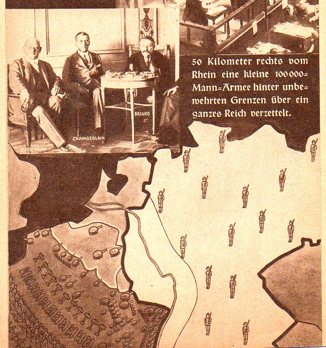
    Here’s another bit from the same 12-panel accordion-fold pamphlet, a propaganda map showing the possibly-invasive weaknesses of the Versailles-dictated German army.  AS in the case of several other maps posted to this blog on this 1934-1939 geographic creation of risk and threat, this one depicts a heavily-armed and populated French army looking at Germany, while the relatively-meagre 100,000-man German army quietly protects itself on the borders 50km away from the Rhine.  I guess it might have been effective if people were actually voting in this election, for scared people to vote their scared conscience for the man who scared them. The writing however was on the proverbial wall, and the only thing left to do with the Versailles treaty at that point would be to scrap it.  About four years later the Nazis would come sweeping down on France and by June 22 the French would be signing a humiliating surrender instrument.

    Hitler map of people304


  • Maps of the Progress of the Nazi Occupation, 1936-1943

    JF Ptak Science Books  Quick Post

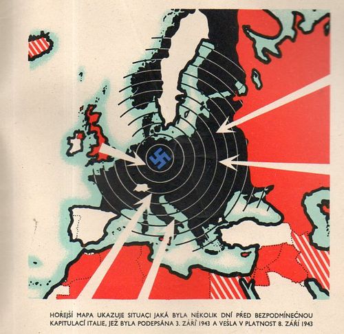
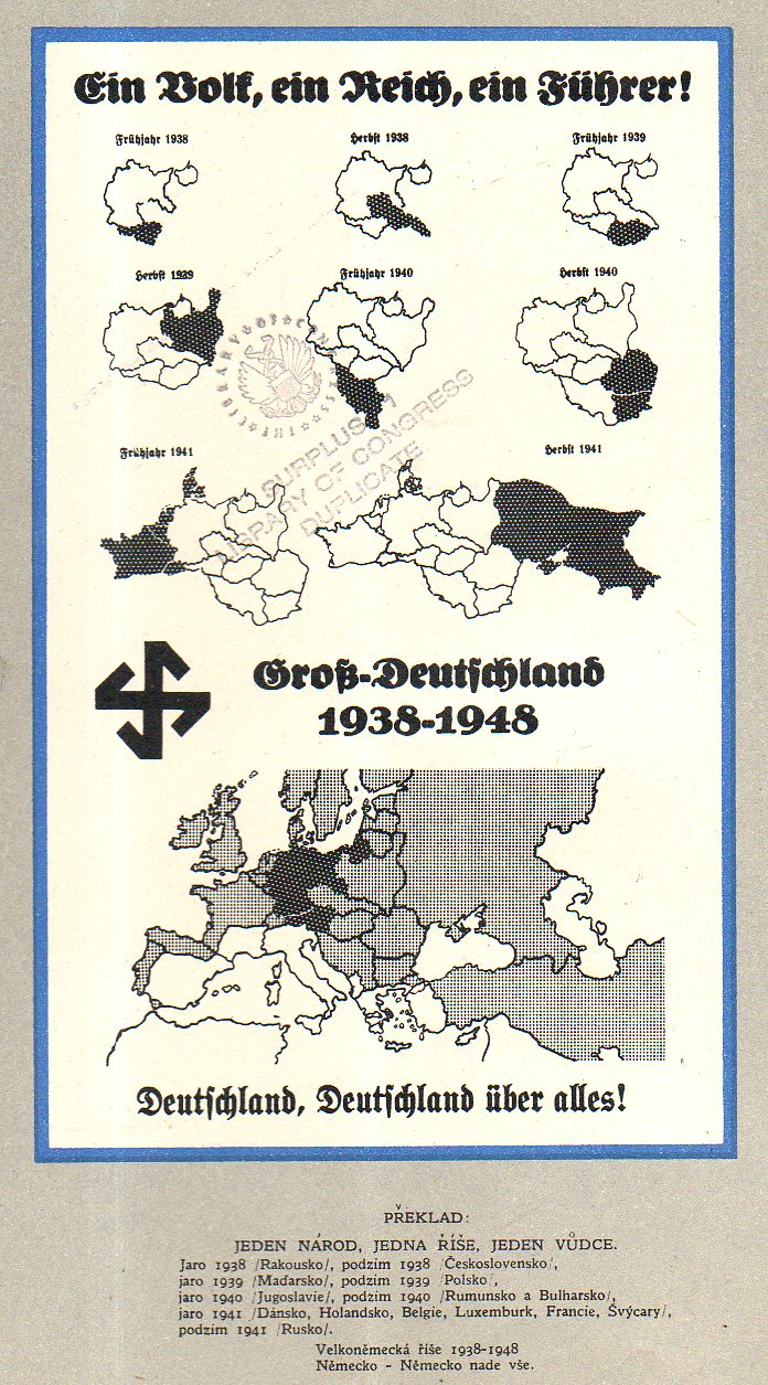
    Čtyři léta války v mapách (“Four Years of War…in Maps”), published in London, ca. 1943, is a Czech-exile publication showing the development of the war in a number of very striking maps. The maps end at the publication of the pamphlet–except of course, for the 1948 map. The culminating interest though shows the Nazis surrounded, and put to the final test–it is the first map I list, below, even though it was about the last map in the pamphlet.  It is a rare thing, this pamphlet, and it does not show up in the usual places. There are only seven copies located in the WorldCat/OCLC, all in top-notch libraries: NYPL, Yale, Harvard, Harvard Law, UC Berkeley, Oxford, and Nanterre. 

    Maps Germany 1942183


    An overall view of the progress of German war conquests:

    Maps Germany 1938-1948175


  • An Unusual Bird’s-Eye View of Manhattan, 1877

    JF Ptak Science Books    Quick Post

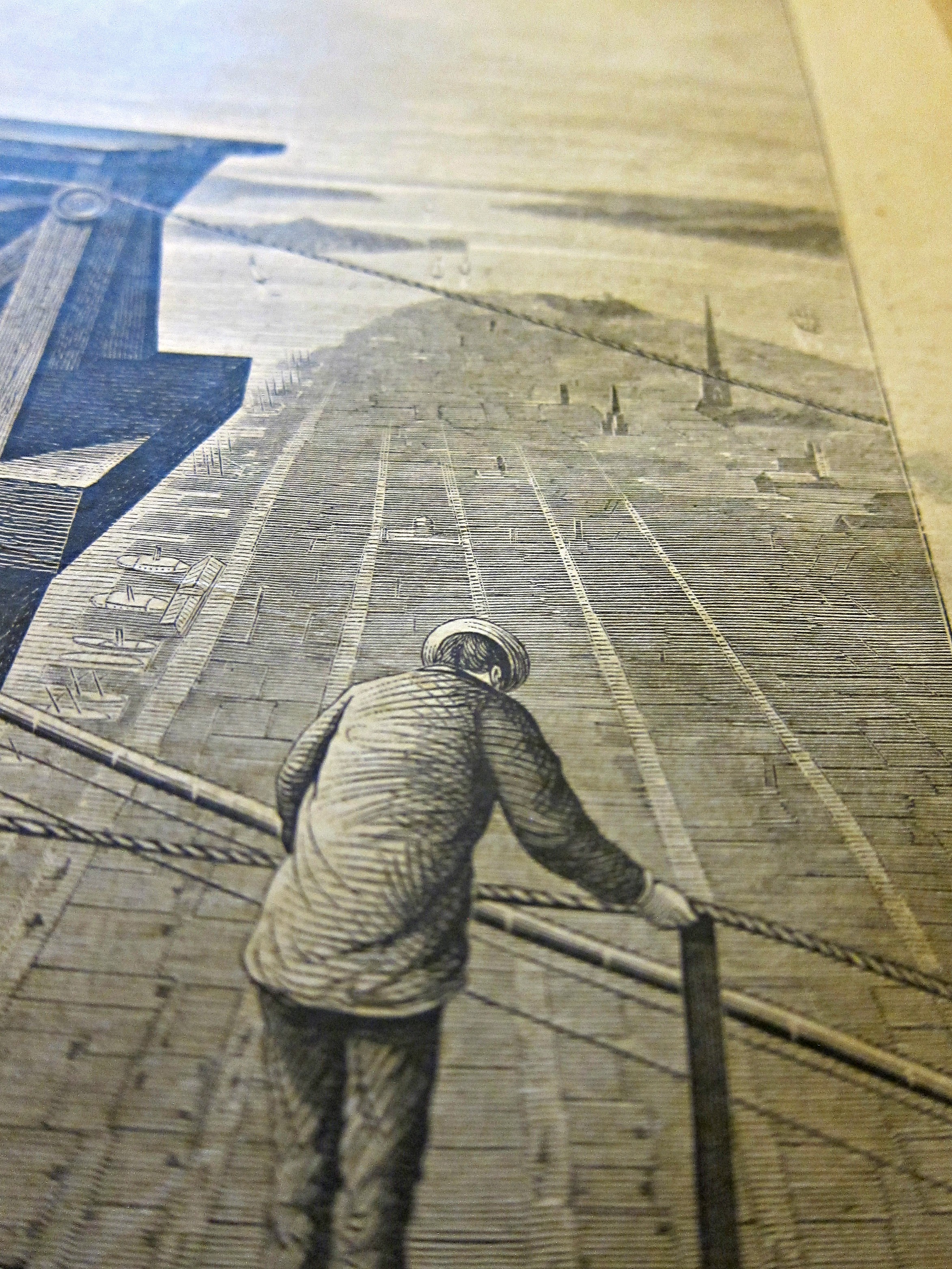
    This was about as high as one could be in a ground-based structure in Manhattan–at the top of one of the granite towers of the Brooklyn Bridge, 277′ (plus whatever wooden structure has been built on the top of the bridge, plus the height of a person). The image is found in Scientific American for August 16, 1877, and shows a bit of the bridge which was still six years away from completion, with workers looking out and down at the rest of the city. It is an unusual perspective, looking south, and seemingly far higher than what  must be Trinity Church (the present version completed in 1846)–Trinity’s sp[ire was actually seven feet taller than the finished bridge (at 284′), though from this angle it is dwarfed by the new structure. There wouldn’t be a building higher than 400′ until the very early 20th century.  In any event, I thought to share this view for its unexpected nature. 

    Sci Am brooklyn bridge view from 1877


  • Cruises in Skyland! Uncle Sam, the Canal, and the Zeppelin (1912)

    JF Ptak Science Books  Quick Post


    Scientific American Zeppelin Uncle Sam single

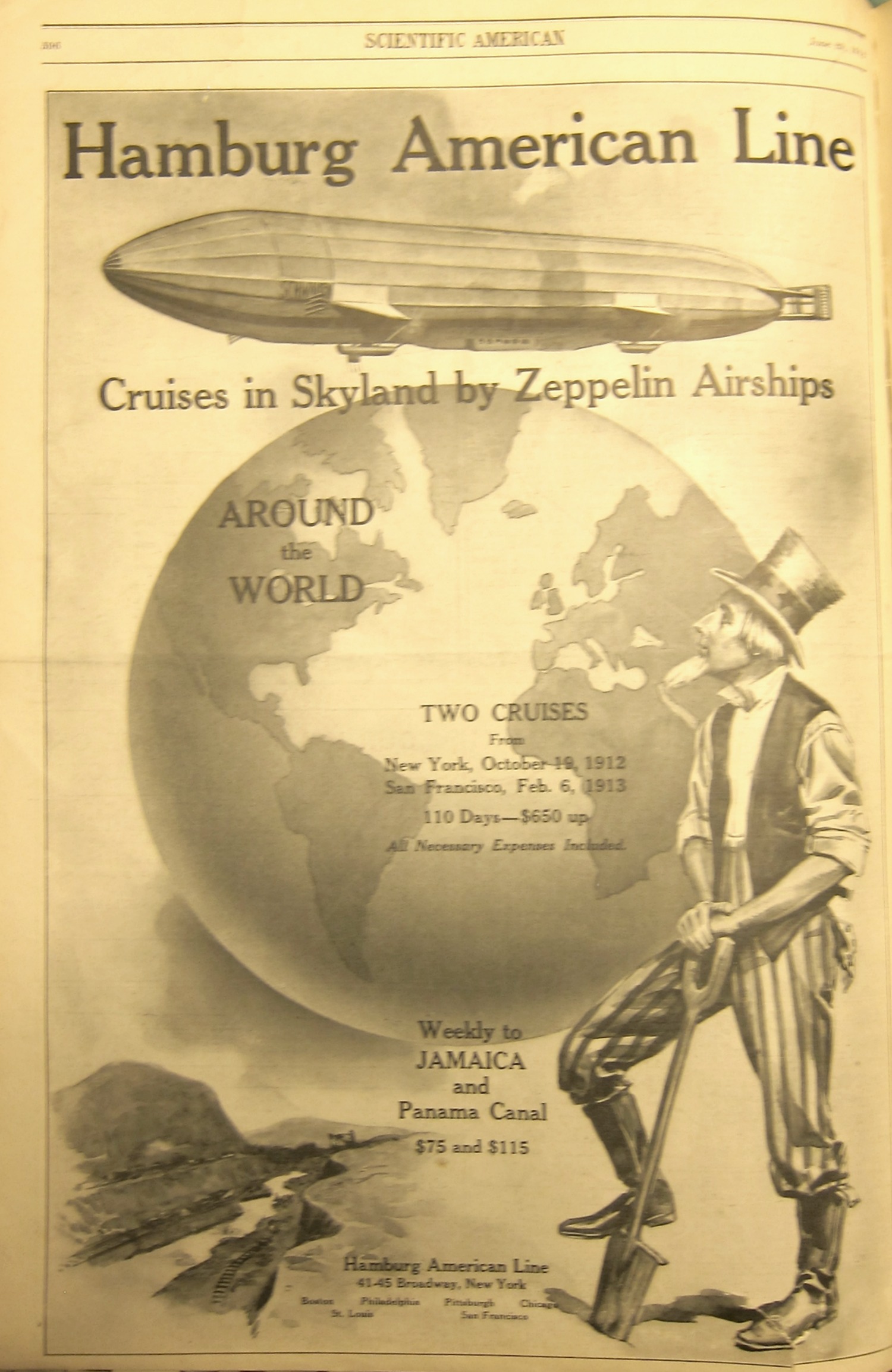
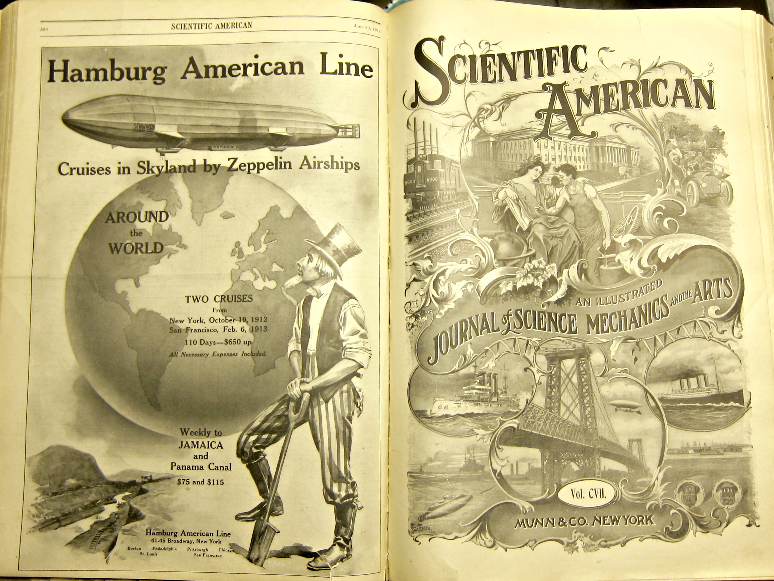
    $650 doesn’t sound like much in today’s dollars, but in 1912 that 650 would be about equal to the average salary of a factory worker1; so, if you calculated the trip of 1/3 year at the average salary today of, say, $45,000, it feels more expensive.  It doesn’t translate all that well, really, but it does give a good idea of what that 650 meant in 1912.  

    Uncle Sam is taking a breather from his work on the Panama Canal, which is clearly under construction in the vignette at bottom left and something that wouldn’t open for business for another two years.  The Hamburg American Line was definitely associating the grand undertaking in Panama with its around-the-world cruise offering–the Panama engineering feat was certainly considered one of the wonders of the world.  The zeppelin flights were extraordinary in themselves, what with making transatlantic flights with 400-800 people (depending on the airship) who received three square meals a day, could rent their own rugs, go to the barber and to the ship’s library, and listen to the airship’s band.

    The bottom line here is that this is a great design, and as advertisements go it seems to be very effective.  

    (See http://www.gjenvick.com/PassengerLists/Hamburg-AmericanLine/Westbound/1912-11-01-PassengerList-PresidentLincoln.html#axzz43r2FHFKT for various passenger lists, activities, menus, and the like.) 


    Scientific American Zeppelin Uncle Sam


    Notes:

    1.  See an earlier posst, https://historyofideasblog.com/thesciencebookstore/2009/09/the-overworked-working-poor-of-1914-women-and-children-and-what-they-didnt-get-paid.html