A Daily History of Holes, Dots, Lines, Science, History, Math, Physics, Art, the Unintentional Absurd, Architecture, Maps, Data Visualization, Blank and Missing Things, and so on. |1.6 million words, 7500 images, 4.9 million hits| Press & appearances in The Times, Le Figaro, Mensa, The Economist, The Guardian, Discovery News, Slate, Le Monde, Sci American Blogs, Le Pont, and many other places… 5000+ total posts since 2008.

Category: Maps, Cartography, History of Mapmaking

  • A Map of Drunken England (1908)

    JF Ptak Science Books  Quick Post

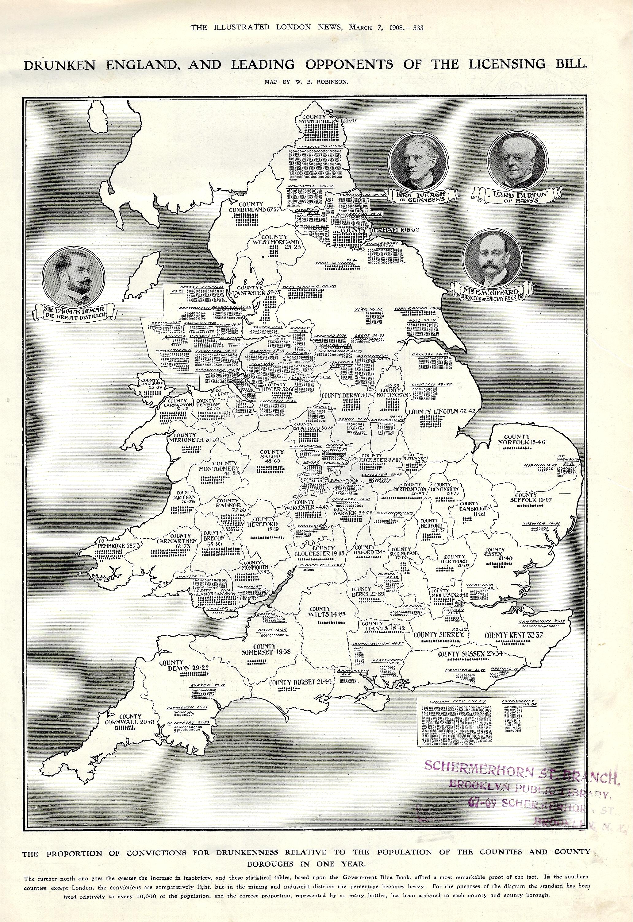
    And so, here we are, my first ever encounter with a map of drunken England, printed in the Illustrated London News om March 7, 1908.  As a data visualization element in a pretty buttoned-up periodical printed during a pretty buttoned-up period, it carries a provocative title using “Drunken” and “England”.  

    The subtitle reads: “the proportion of convictions for drunkenness relative to the population of the counties and county boroughs in one year”. It continues: “the further north one goes the greater the increase in insobriety, and these statistical tables, based upon the Government Blue Book, afford a most remarkable proof of the fact. In the southern counties, except London, the convictions are comparatively light, but in the mining and industrial districts the percentage becomes heavy. For the purposes of the diagram the standard has been fixed relatively to every 10,000 of the population, and the correct proportion, represented by so many bottles…”  

    Maps Drunken England and Wales


  • Maps of Nazi-Controlled Lands, Including Nazi Germany 1948 (Published in 1942)

    JF Ptak Science Books  Post 2718

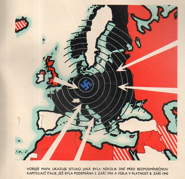
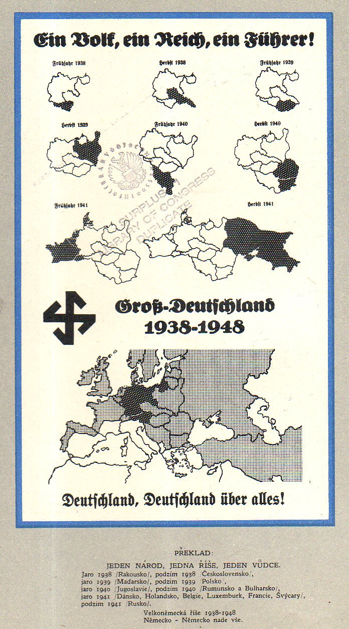
    Čtyři léta války v mapách (“Four Years of War…in Maps”), published in London, ca. 1942, is a curious, Czech-exile publication telling the story of the rise and fall of Nazi Germany in maps.  The culminating interest though shows the Nazis surrounded, and put to the final test–it is the first map I list, below, even though it was about the last map in the pamphlet. The “Ein Volk, Ein Reich…” map (the last map shown below), is a Nazi propaganda piece, reproduced here no doubt to show the audacity and hubris of the Nazi state, shows them with a vast territory, including Great Britain and the Soviet Union. I can’t recall having seen such a map depicting Great Britain as a captured entity.)

    [The pamphlet is 9″x 6″ and 35pp, with printed wrappers. It is a rare thing, this pamphlet, and it does not show up in the usual places. There are only seven copies located in the WorldCat/OCLC, all in top-notch libraries: NYPL, Yale, Harvard, Harvard Law, UC Berkeley, Oxford, and Nanterre.]

    1943:

    Maps Germany 1942183

    And the vision of the future, taken from a German design (poster? illustration?) showing the advance of the making of Greater Germany, showing countries conquered through 1940 and then countries that would be conquered, including the Soviet Union (which was to be taken in 1941) and also an occupied Great Britain, though no date is given for that.  

    1938-1948:

    Maps Germany 1938-1948175


  • Unusual Maps Department: (1) Map of Brunetness and (2) Heights of the British Isles (1897)

    JF Ptak Science Books   Quick Post

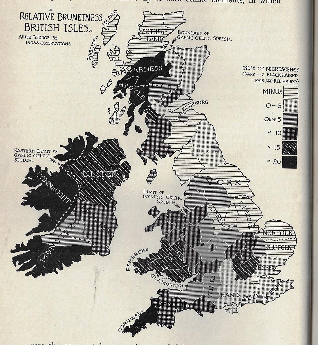
    I must say that I’ve never seen a map of “Relative Brunetness” before finding this one, today. It occurs in a little bit of a wincing article by William Ripley (Ph.D., and assistant prof of sociology at (surprisingly) M.I.T) called “The Racial Geography of Europe”, and appearing in Appleton’s Popular Science Monthly for December 1897.  Here we see the “Index of Nigrescence”, which I take is a measure of blackness of the hair (in this case), with light to dark meaning, well, light-to-dark measures of hair, this taken from 13,000 observations.  A few pages away comes a map of the stature of adult males in the British Isles, locating the averages between the gross average of 5’6.5″ to 5’10” and over. 

    I don’t have anything to say about the maps, but I thought that it was worth reproducing them.  

    Maps of Brunetness of British Isles


  • Fine Map from the Excellent and Seldom Seen “PM” Newspaper, May 8, 1945

    JF Ptak Science Books   Quick Post

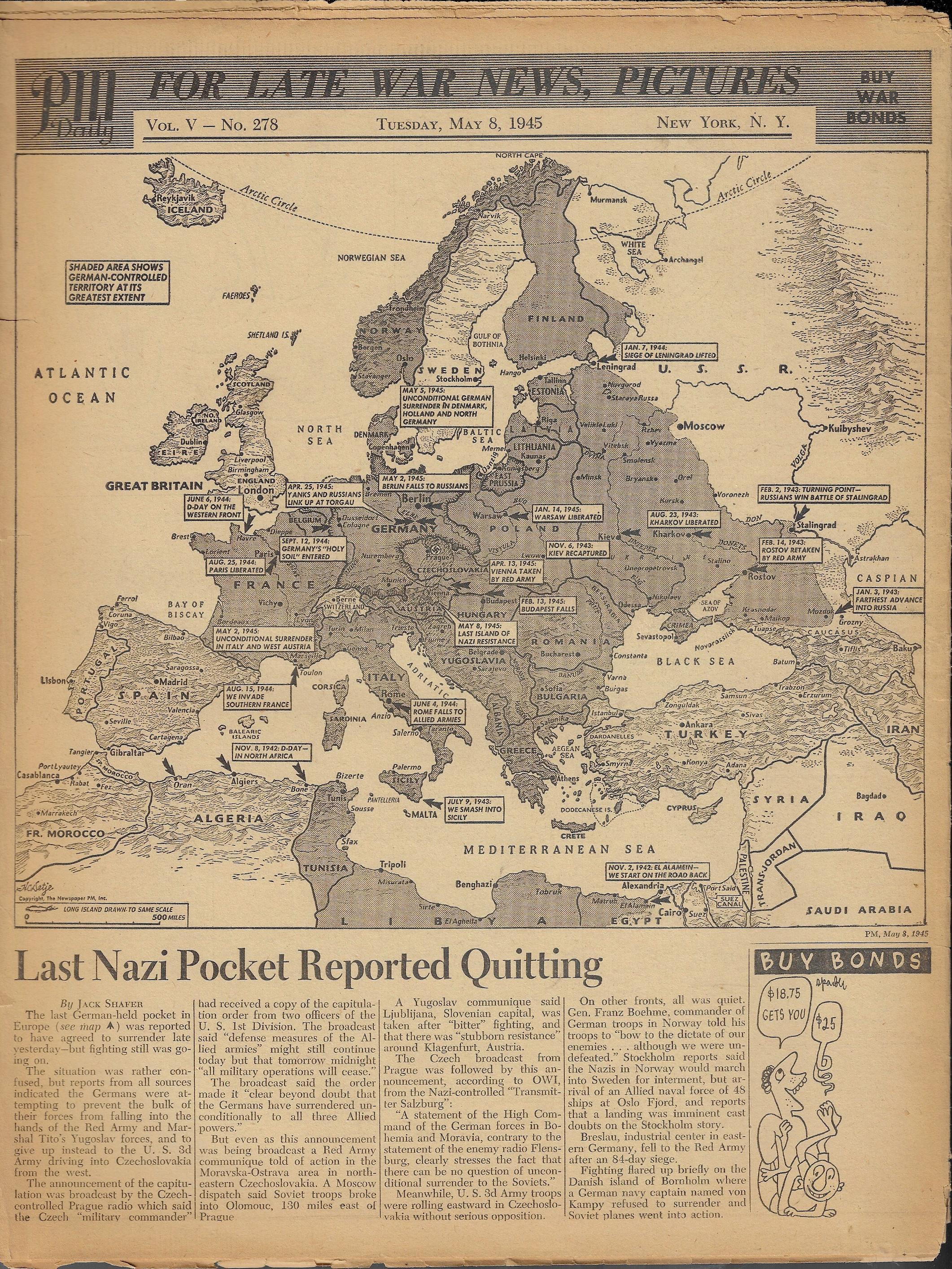
    PM  newspaper (active 1940-1948) was a left-leaning newspaper funded by Marshall Field III, and was home to excellent reporting. Among the staff writers was I.F.Stone and staff photographers Margaret Bourke-White.  Other contributors included Heywood Hale Broun, James Thurber,  (the great) Dorothy Parker, Ernest Hemingway, Eugene Lyons, Ben Stolberg, Malcolm Cowley, Tip O’Neill, and Ben Hecht, among many other illuminati.  (PM’s stated mission: “PM is against people who push other people around.   PM accepts no advertising. PM belongs to no political party. PM is absolutely free and uncensored. PM’s sole source of income is its readers–to whom it alone is responsible. PM us one newspaper that can and dares to tell the truth.)  It so happens though that PM is a difficult newspaper to find, nowadays, and so far as I can tell very little of it lives online, which is why I’ve decided to post some of the bits of interest from the copies of the paper that I have. Today’s installment: a fine and illuminating map of the seat of war in Europe, published at the end of the on May 8, 1945, showing the advance of victory. Whoever their cartographer was did a superior job.  (Note: double clicking into the map will open a very large and bright version of the map.)

    PM Newspaper May 8 MAP


  • On Not-Missing the Not-Unhidden Darwin and his “Masterpiece” Map (1845)

    JF Ptak Science Books   Post 2680

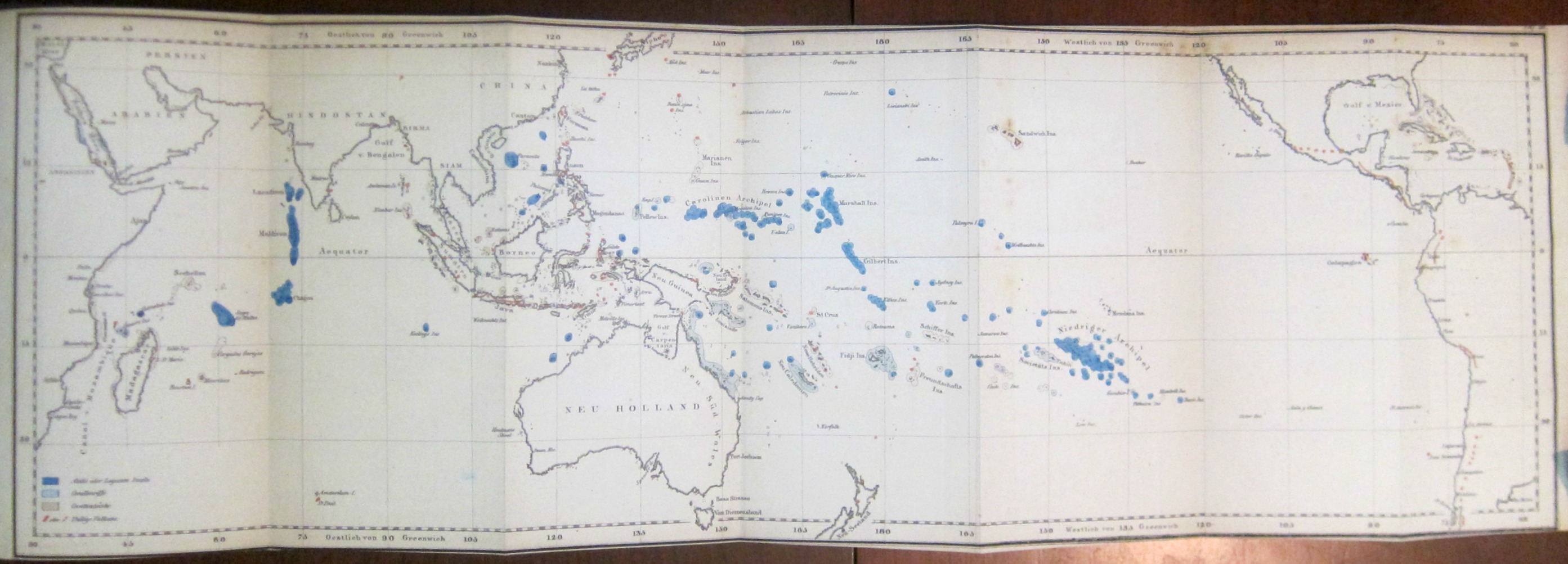
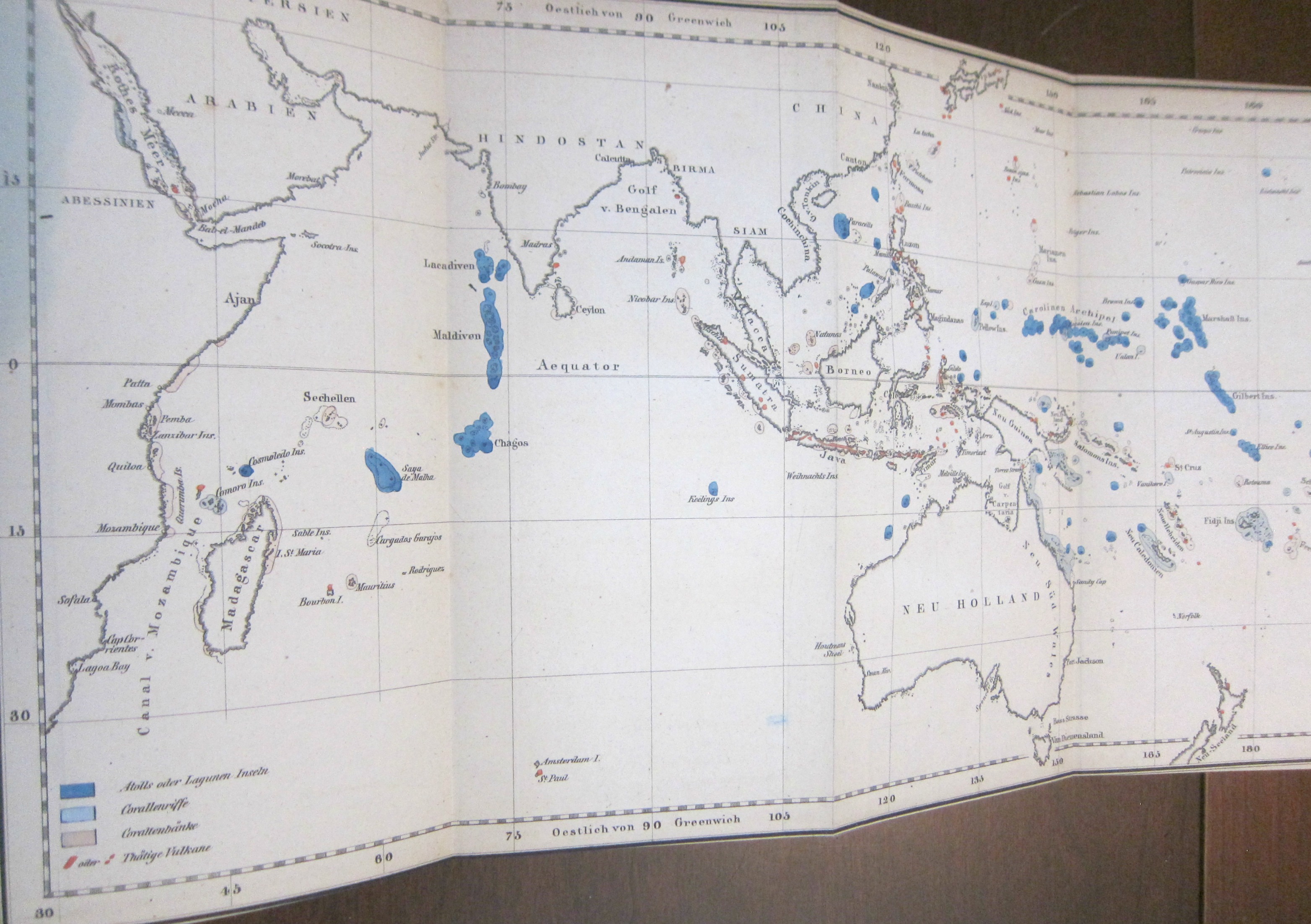
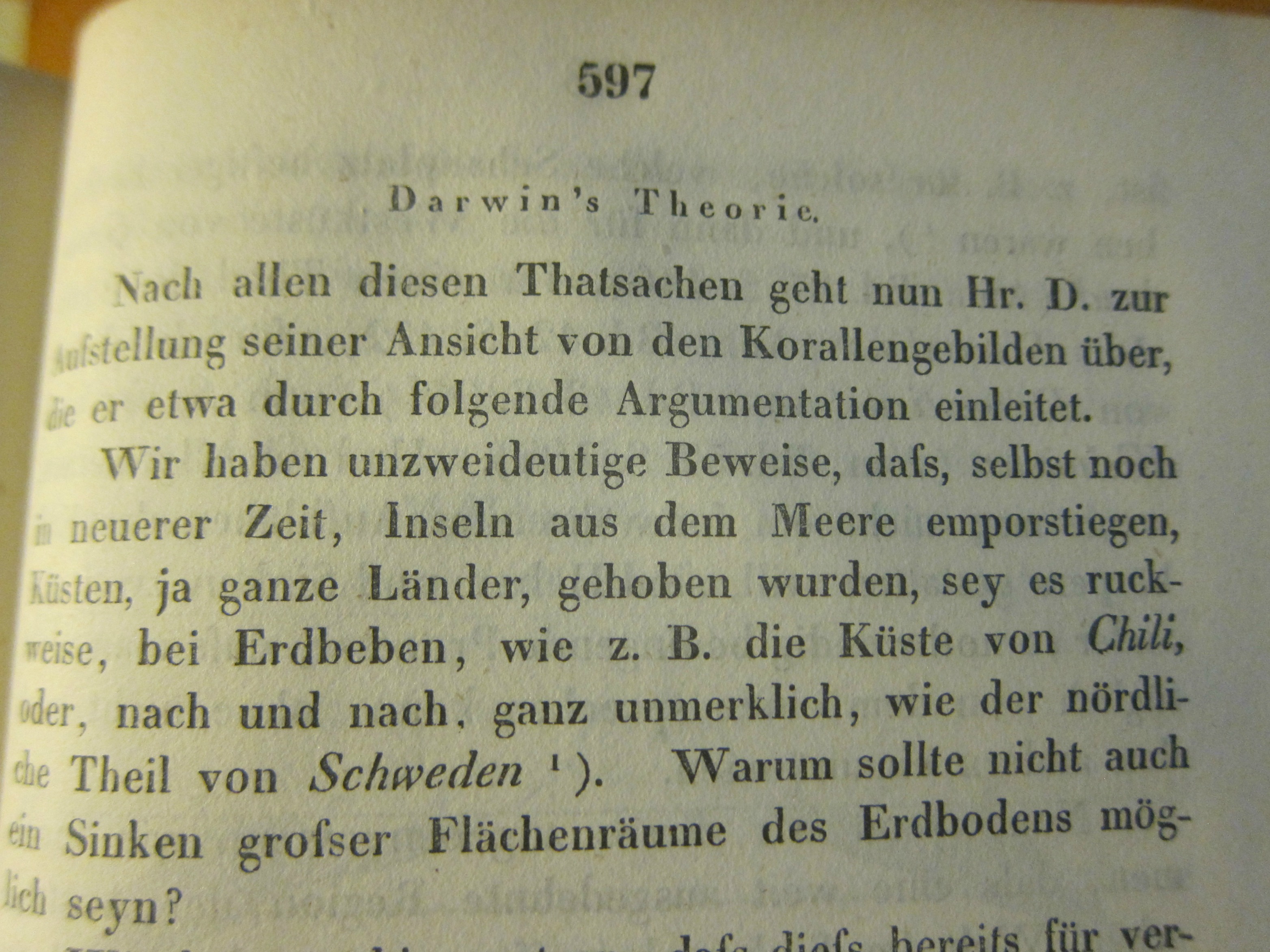
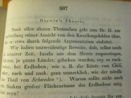
    I was surprised to find this long and early (1845) contribution1 on Darwin and his ambitious work on coral reefs in the generally physical-sciences-heavy Annalen der Physik2. The surprise was ever more so because of the illustration for the article–a German version of the coral islands/reefs map that appears as the frontispiece to Darwin’s The Structure and Distribution of Coral Reefs3…  that appeared three years earlier in 1842.  (Darwin’s Journal of Researches...,  today more commonly known as the Voyage of the Beagle, which was the third volume of Narrative of the Surveying Voyage of His Majesty’s Ships Adventure and Beagle…… was published in 1839, and his first publication of any kind appeared ten years earlier in 1829; the first German translation of the Narrative appeared in 1845 as  Naturwissenschaftliche Reise. As John van Wyhe–the founder and curator of the fantastic resource Darwin Online–points out the German translations were significant because “It was in German…that Darwin influenced the founder of genetics Gregor Mendel, and the pioneering evolutionists August Weismann and Ernst Haeckel”4.)

    When I was thumbing through the volume I noticed the folding map tucked away at the back of the book, nestled with a number of other folding engravings–and I very nearly missed it (that being easy to do in this case).
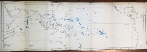
    Darwin annalen _4_

    • [For a full description of the map consult Darwin Online, Structure and Distribution of Coral Reefs, chapter VI, pp 119-126 http://darwin-online.org.uk/content/frameset?viewtype=side&itemID=F271&pageseq=8]

    Having worked with the Annalen for many years (principally the Annalen from 1799 to the early 1930’s which numbered in the low hundreds of volumes) it was my overall impression that the appearance of contributions in the natural sciences were not at all common in the early years and had become less so by the time of the Darwin-related article. In any event, there it was–I felt a little groggy for not recognizing the map straight away–I slowly pieced it together from the clues, and then pinned the thing down in the test (the Annalen is not generally very user-friendly in placing images with text, though if I had bothered to look for the usually missing image index it would have made life easier). And then, there it was–right where it should be.
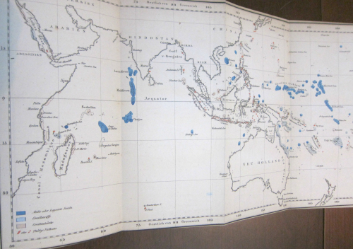
    Darwin annalen _2_

    So tonight I’m just sharing a few images of the map from this happy little adventure of not-missing the not-attributed-in-the-table-of-contents Darwin.  I guess I should’ve recognized the map right at the outset, but didn’t. Ah, well. 

    Here’s an appreciation of the map from the University of Maryland’s Integration and Application Network, “Ten Classic Maps” (http://ian.umces.edu/blog/2013/12/27/ten-classic-scientific-maps/): 

    “Coral reefs: The map of coral reefs throughout the Pacific Ocean created by Charles Darwin in 1842 as part of his first science book, The Structure and Distribution of Coral Reefs is a masterpiece. Although Darwin’s subsequent books about natural selection eclipsed his insights into coral reefs, this coral reef map is part of the theory that Darwin had about the formation of coral reefs. Darwin correctly hypothesized that coral reefs were formed by the limestone accumulation by corals and that extinct volcanos were buried beneath modern coral atolls. It was over one hundred years before drilling associated with the nuclear testing on Bikini atoll that Darwin’s theory was confirmed. Darwin did a couple of important things with this map: he color coded the reefs that were subsiding (blue) and uplifting (red) and he produced a large foldout to cover the entire tropical Pacific Ocean in a single contiguous map. In this manner, viewing the map instantly reveals the “magnificent and harmonious picture” of the broad patterns that Darwin observed. I am convinced that this is the first important piece of evidence supporting plate tectonics and the Pacific ‘Ring of Fire‘, and that if Darwin had a bit more information available at the time, that he would have actually come up with the theory of plate tectonics.”
     

    Darwin annalen


    Notes

    1. (Darwin, Charles.) “Ueber Verbreitung, Beschaffenheit und Entstehung der Korllen-Inseln” [nach Darwin], in Annalen der Physik und Chemie, 1845, series II volume 64, pp 563-614 (about 15,000 words).  (“The distribution, character, and origin of the coral islands.”, “after Darwin”.)

    2.  The Annalen would become one of the most important scientific journals in physics beginning in the 1830’s. 

    3. The Structure and Distribution of Coral Reefs. Being the First Part of the Geology of the Voyage of the Beagle, under the Command of Capt. Fitzroy, R.N. during the Years 1832 to 1836. The work included three folding maps in total (two of which were hand colored). 

    4. John van Wyhe, “Darwin in Translation”,https://www.amphilsoc.org/library/valentinedarwin/vanwyhe
  • The Beauty of Contour Lines and on Missing Importance (1893)

    JF Ptak Science Books   Quick Post

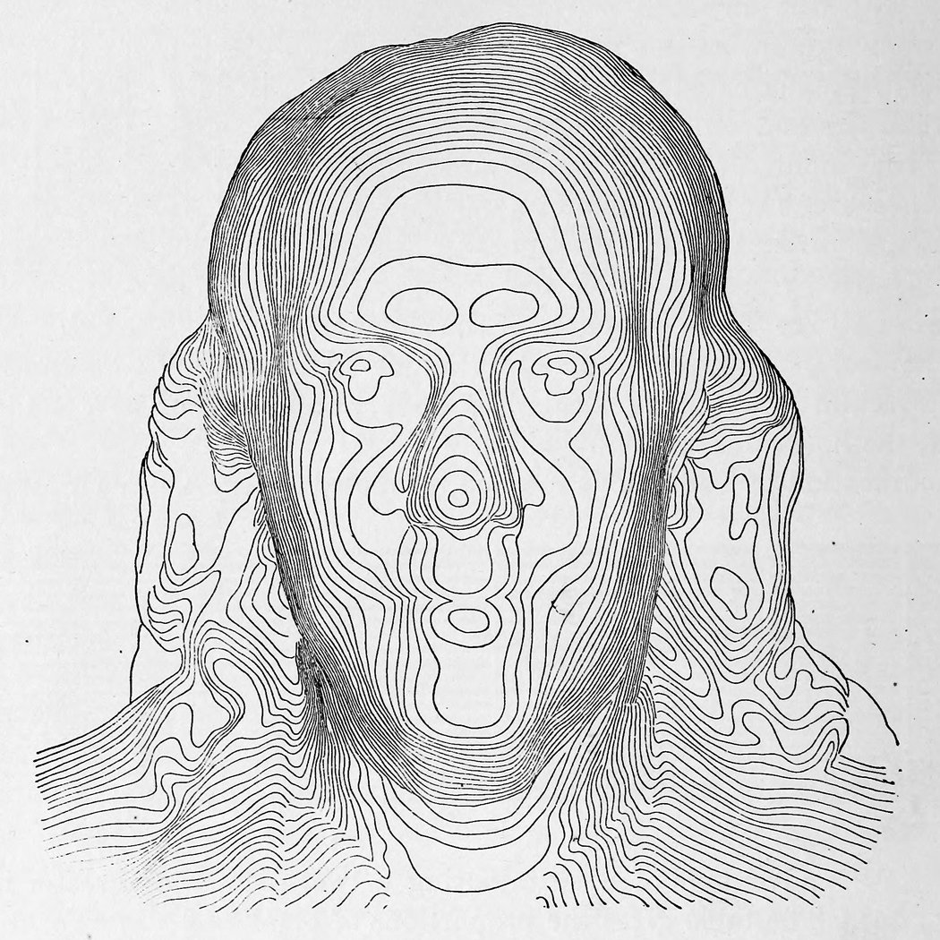
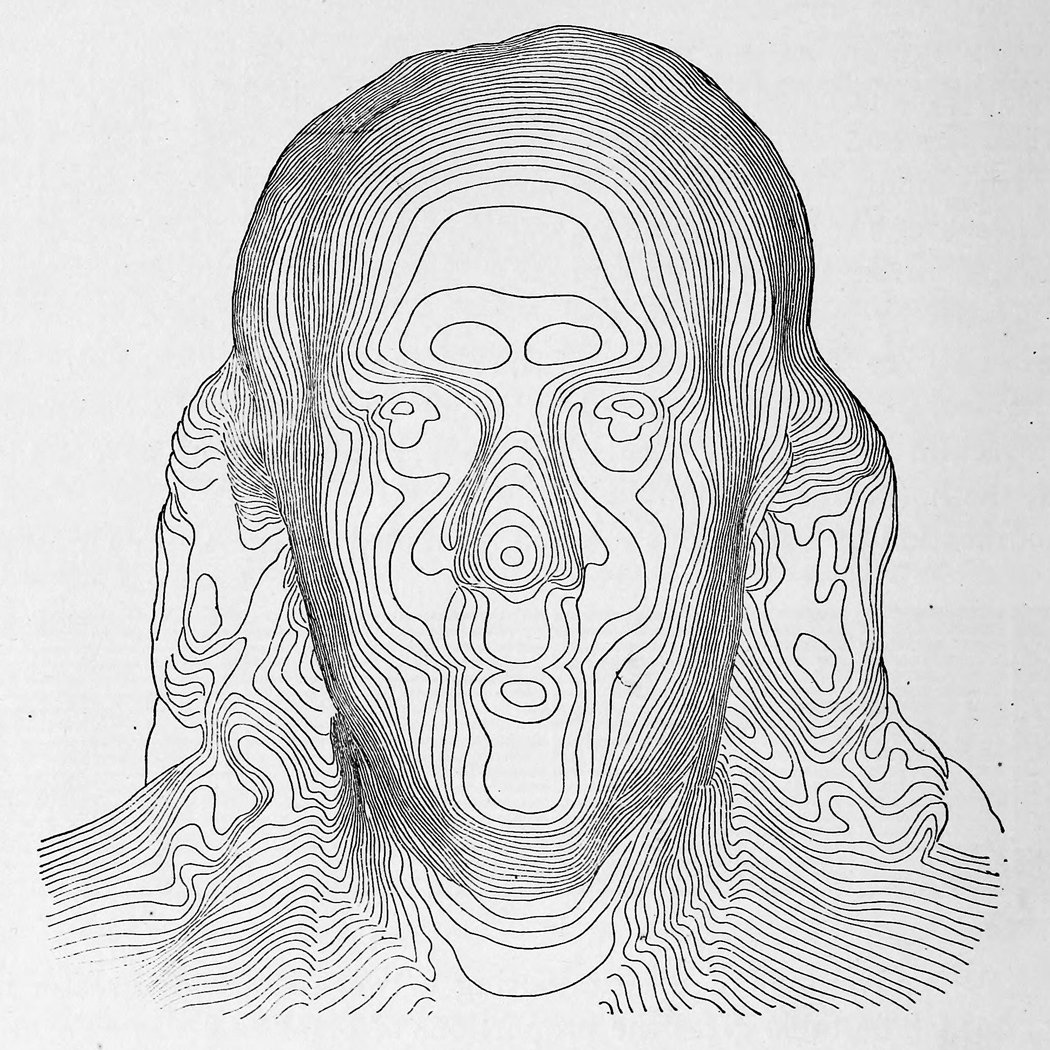
    Contour franklinI found magnificent and early contour image of Ben Franklin in a tweet from Tim Wallace (@wallaectim) who found it in Appleton’s Cyclopedia of Technical Drawing (1893). (The full text of Appleton’s is here: https://archive.org/stream/appletonscyclopd01wort#page/100/mode/2up/search/franklin and a larger image of Franklin is located below.)

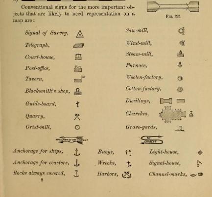
    While checking out the fascinating Franklin in the text, I found an interesting graphic that locates a certain History of Importance in one tidy display. The graphic is in the section on topological drawing, and contains “conventional signs for the more important objects that are likely to be represented on a map”, at least for 1893:


    Contour important objects

    All of this makes sense, of course, except perhaps for the surprise of locating taverns, which I think I’ve not noticed before in 19th map legends–it does make sense though, especially for more regional maps, as the tavern would be a central force for a small town, as well as operating as a possible hotel.  Many of the rest of the important things for a late 19th century map have slipped into obstructed memory, if not further. 

    Contour franklin


  • Grand Central Terminal, NYC,1939

    JF Ptak Science Books  Quick Post

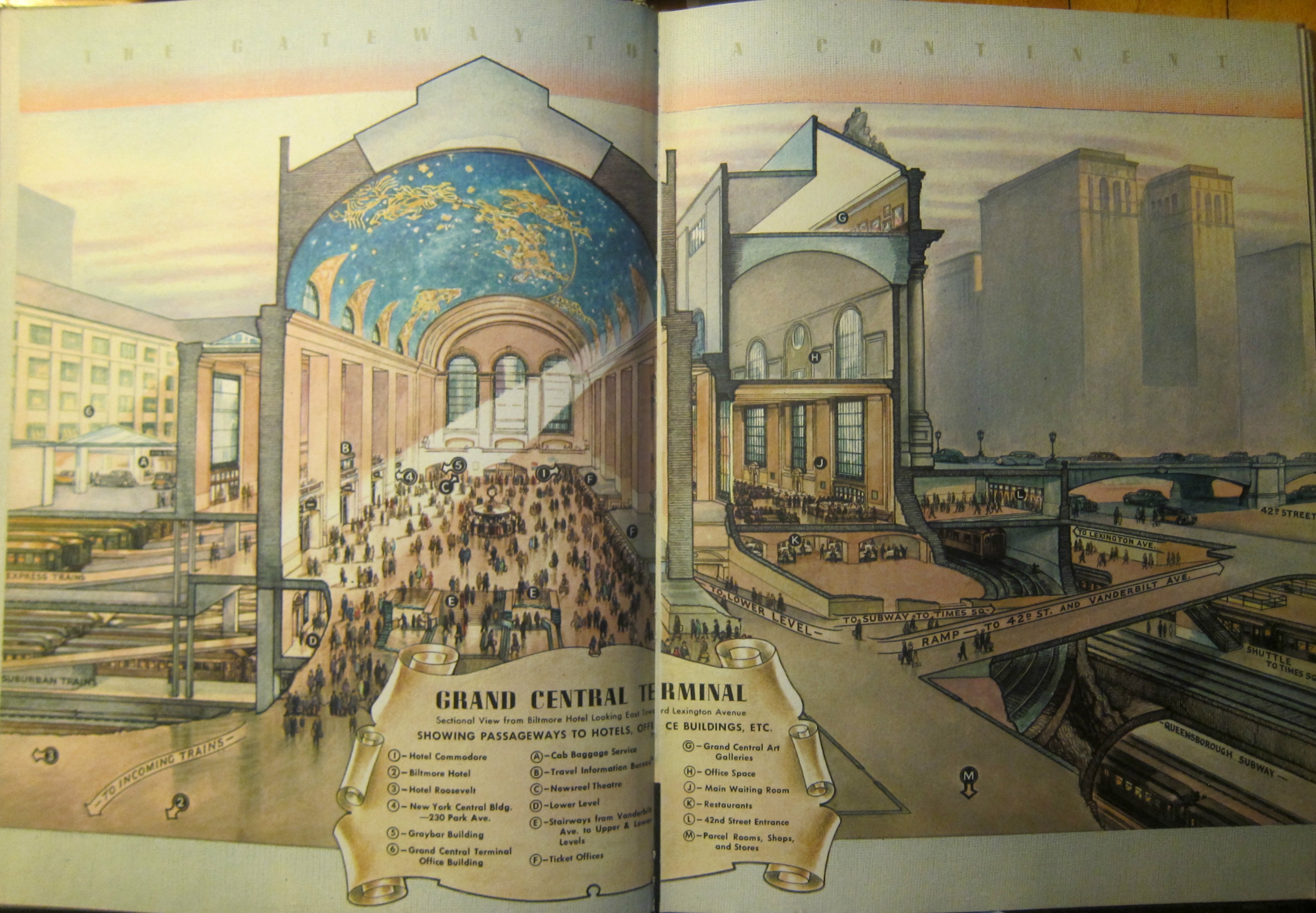
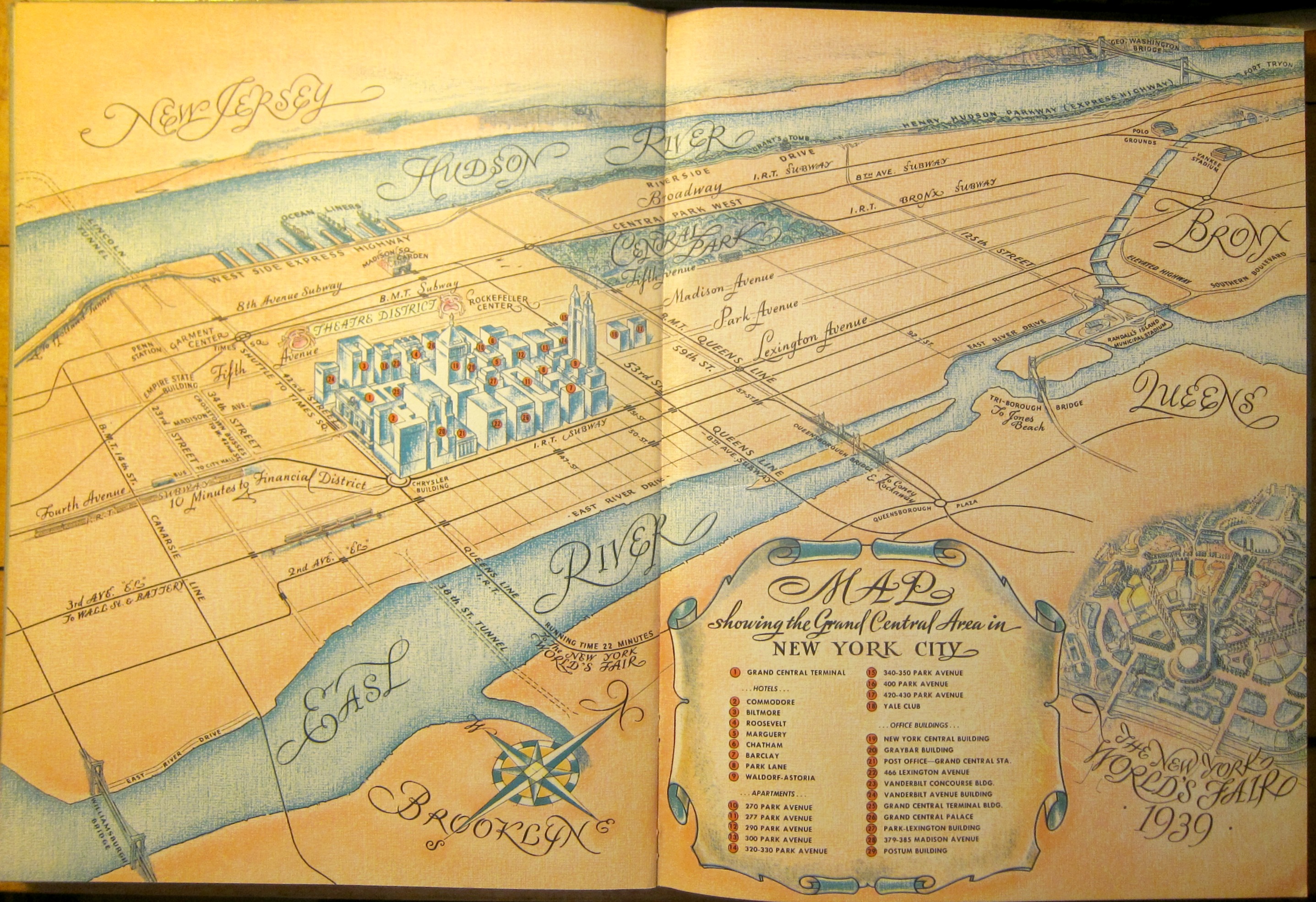
    This is a very Grand-Central_terminal-centric image of NYC–and rightfully so, being one of the great buildings of Manhattan. These images come from a promotional The Gateway to a Continent, published in 1939, which is a fairly luxurious publication which I think was intended for the appreciation of possible luxury accommodations for visitors to the 1939 New York World’s Fair. The result is an overview of the venues on Lexington/Park/Madison from 42nd-51st streets. There’s a great two-page map that shows this section in detail and which leaves out virtually everything else save the text mentions of some like “the Chrysler Building”, “the Empire State”, and “Penn Station” without images of them.

    NYC Grand Central Cutaway _1_


    NYC Grand Central Map of Manhattan _1_


  • The Greatest Traffic Machine Ever Built (to 1936)

    JF Ptak Science Books  Quick Post

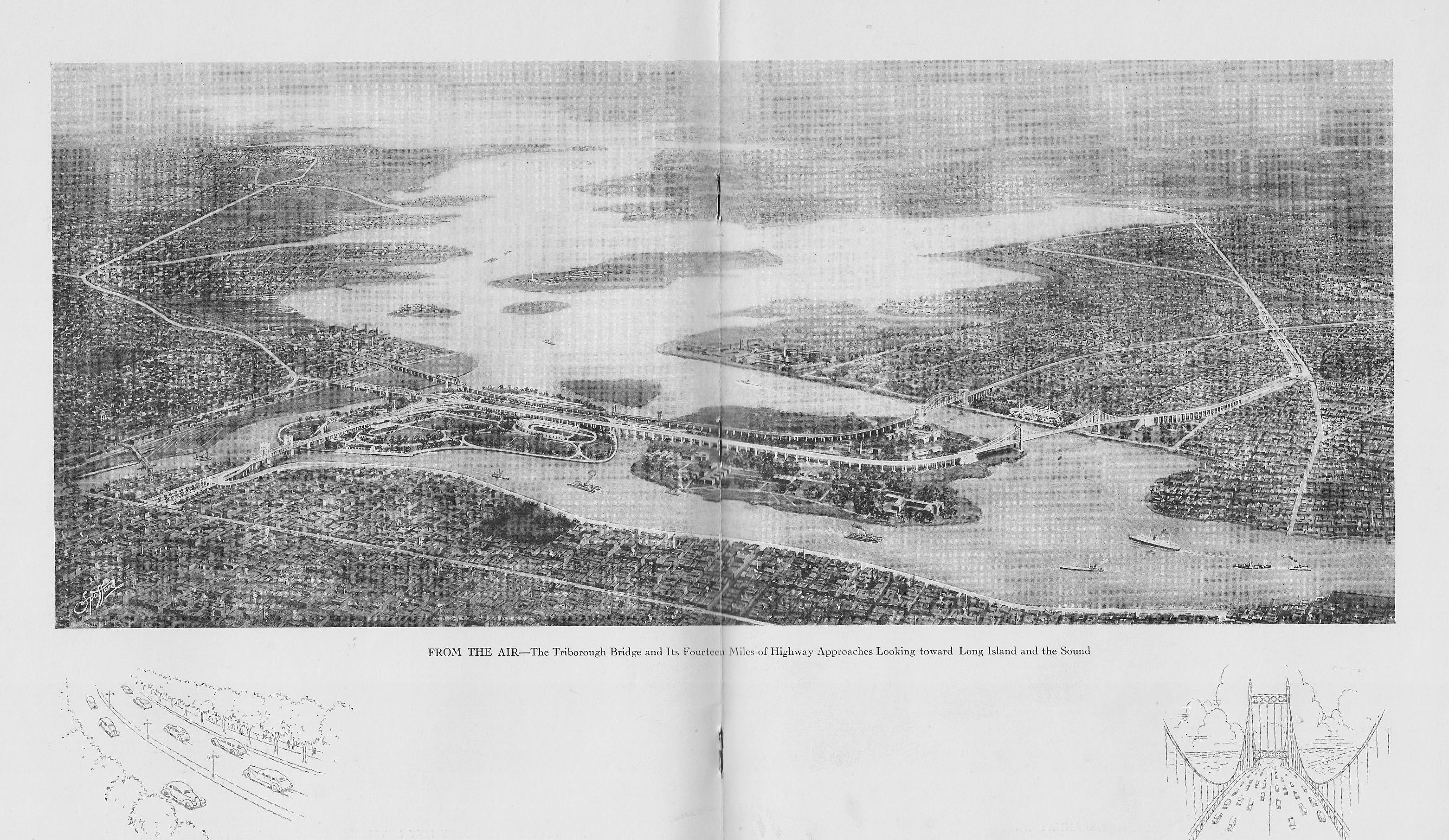
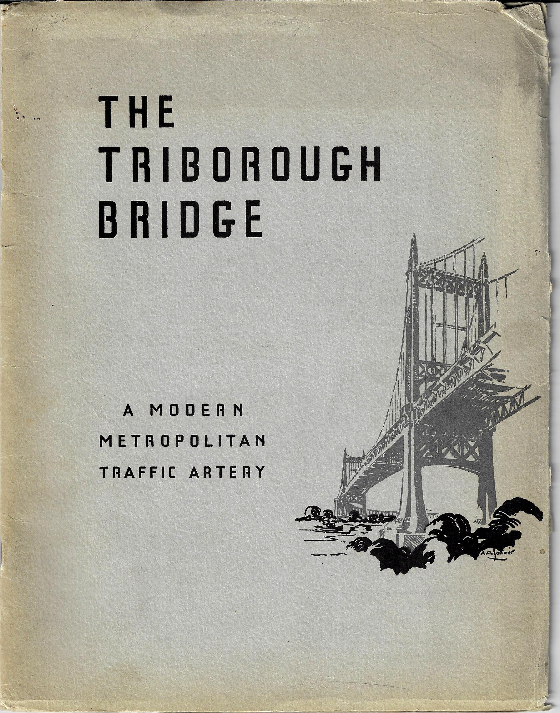
    This is a bird’s-eye view of part of NYC illustrating a pamphlet on the construction of the Triborough Bridge1, and published in the month of its opening in 1936. The view shows its 14 miles of approaches plus the bridges themselves, all stretching out to the southeast. The perspective here shows the Queens approach at the bottom right, the East River spreading out before us, with Flushing Bay at right; the middle island is Riker’s, and the two smaller island with the bridge and connections in the foreground are Randall’s and Ward’s, and the land receding into the distance is part of the Bronx and then on to Long Island. Overall, it is a pretty interesting map. 


    Triborough bridge

    .The Virginia Commonwealth University Social Library site quotes two paragraphs from Robert A. Caro’s The Power Broker which provides a good insight into the breadth and depth of the bridge project: 

    “Here was a project to kindle the imagination. In size, its proportions were heroic. For all Moses’ previous construction feats, it dwarfed any other single enterprise he had undertaken. Its approach ramps would be so huge that houses – not only single-family homes but also sizable apartment buildings – would have to be demolished by the hundreds to give them footing. Its approaches, the masses of concrete in which its cables would be embedded, would be as big as any pyramid built by an Egyptian Pharaoh, its roadways wider than the widest roadways built by the Caesars of Rome. To construct those anchorages and to pave those roadways (just the roadways of the bridge proper itself, not the approach roads) would require enough concrete to pave a four-lane highway from New York to Philadelphia, enough to reopen Depression-shuttered cement factories from Maine to the Mississippi. To make the girders on which that concrete would be laid, Depression-banked furnaces would have to be fired up at no fewer than fifty separate Pennsylvania steel mills. To provide enough lumber for the forms into which that concrete would be poured, an entire forest would have to crash on the Pacific Coast on the opposite side of the American continent.  Triborough was not really a bridge at all, but four bridges which, together with 13,500 feet of broad viaducts, would link together three boroughs and two islands.”

    “Triborough was not a bridge so much as a traffic machine, the largest ever built. The amount of human energy that would be expended in its construction gives some idea of its immensity: more than five thousand men would be working at the site, and these men would be putting into place the materials furnished by the labor of many times five thousand men; before the Triborough Bridge was completed, its construction would have generated more than 31,000,000 man-hours of work in 134 cities in twenty states. And the size of the bridge is also shown by the amount of money involved. With $5,400,000 already contributed by the city and $44,200,000 promised by the PWA (Public Works Administration), the amount promised for its construction was almost equal to the combined cost of all the projects Robert Moses had built on Long Island during the previous ten years.”  Quote source:  http://socialwelfare.library.vcu.edu/eras/great-depression/triborough-bridge-dedication-1936/

    Triborough bridge pamphlet

    Notes:

    1. “The Triborough Bridge, known officially as the Robert F. Kennedy Bridge since 2008…is a complex of three separate bridges in New York City. The bridges connect the boroughs of Manhattan, Queens, and the Bronx via Randalls and Wards Islands… The bridge complex … connects with the FDR Drive and the Harlem River Drive in Manhattan, the Bruckner Expressway and the Major Deegan Expressway in the Bronx, and the Grand Central Parkway and Astoria Boulevard in Queens…”–Wiki https://en.wikipedia.org/wiki/Triborough_Bridge


  • Propaganda Maps–a Play for Greater Germany, 1938

    JF Ptak Science Books   Quick Post

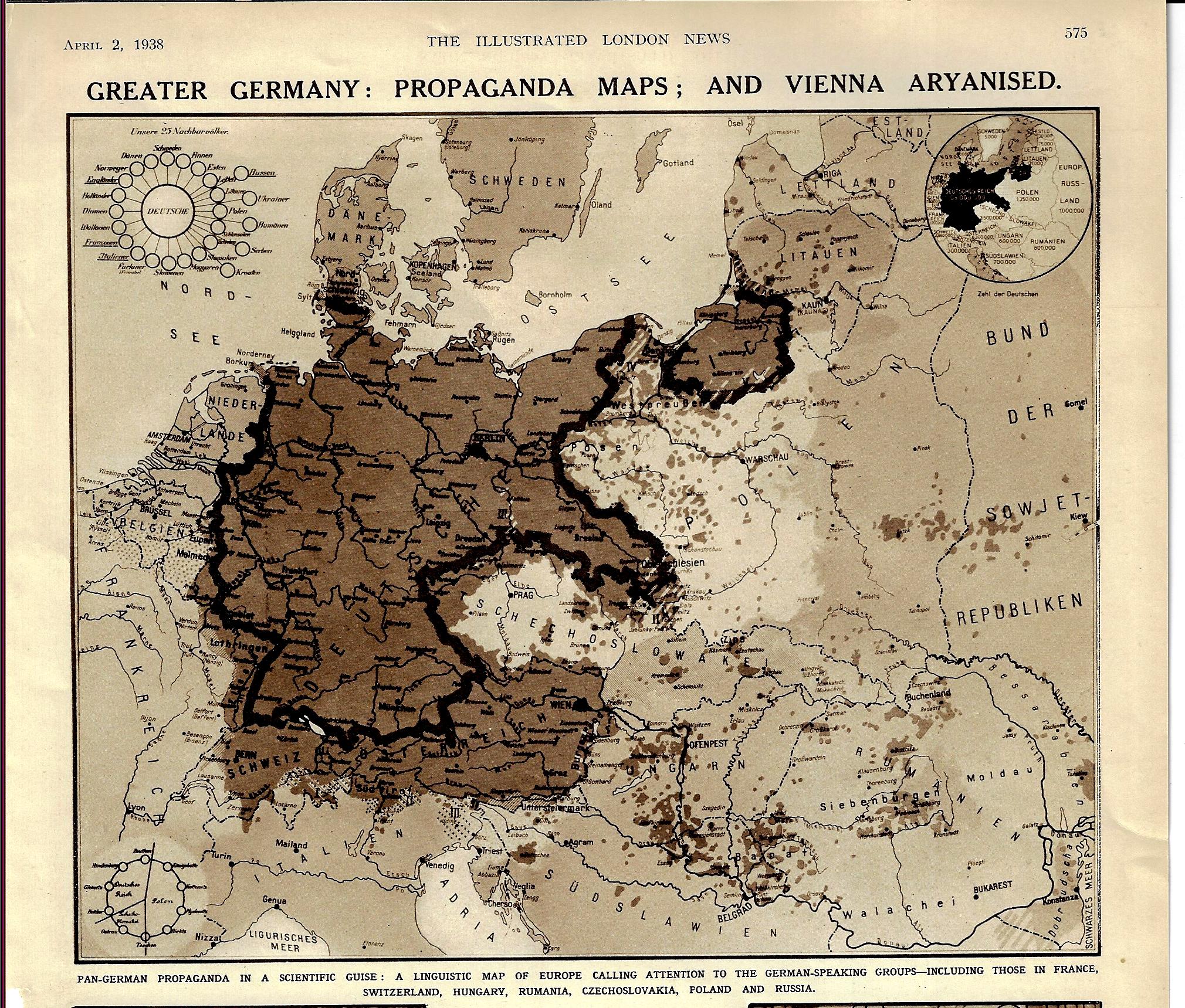
    Maps Propaganda German speaking 1938

    [Image: The Illustrated London News, p 575, April 2, 1938.]

    The title and the date of this map pretty much tells at least the partial story of the beginning of WWII. The “Aryanized” Vienna (Wien) shows up with the rest of Austria as German-speaking but also outside the boundaries of Germany, even though the Anschluss Österreichs occurred about three weeks earlier. “Pan Germany” was still figuratively so, in spite of the absorption of Austria.  Prague sits nearly surrounded by Germania irredentia, and of course Czechoslovakia was next, with Germany beginning the theft of the country that October, and then only about a year after the appearance of this article, Hitler was giving a speech at Prague Castle, also declaring Bohemia and Moravia to be the Protectorate of Bohemia and Moravia. This linguistic map certainly portrayed the gaping maw of the Nazi Kraken, Germany declaring that these actions was a natural right in the protection of Germans-outside-Germany. 


  • Lubricating the Machine–a Map of Domestic Sewage (1892)

    JF Ptak Science Books   Quick Post

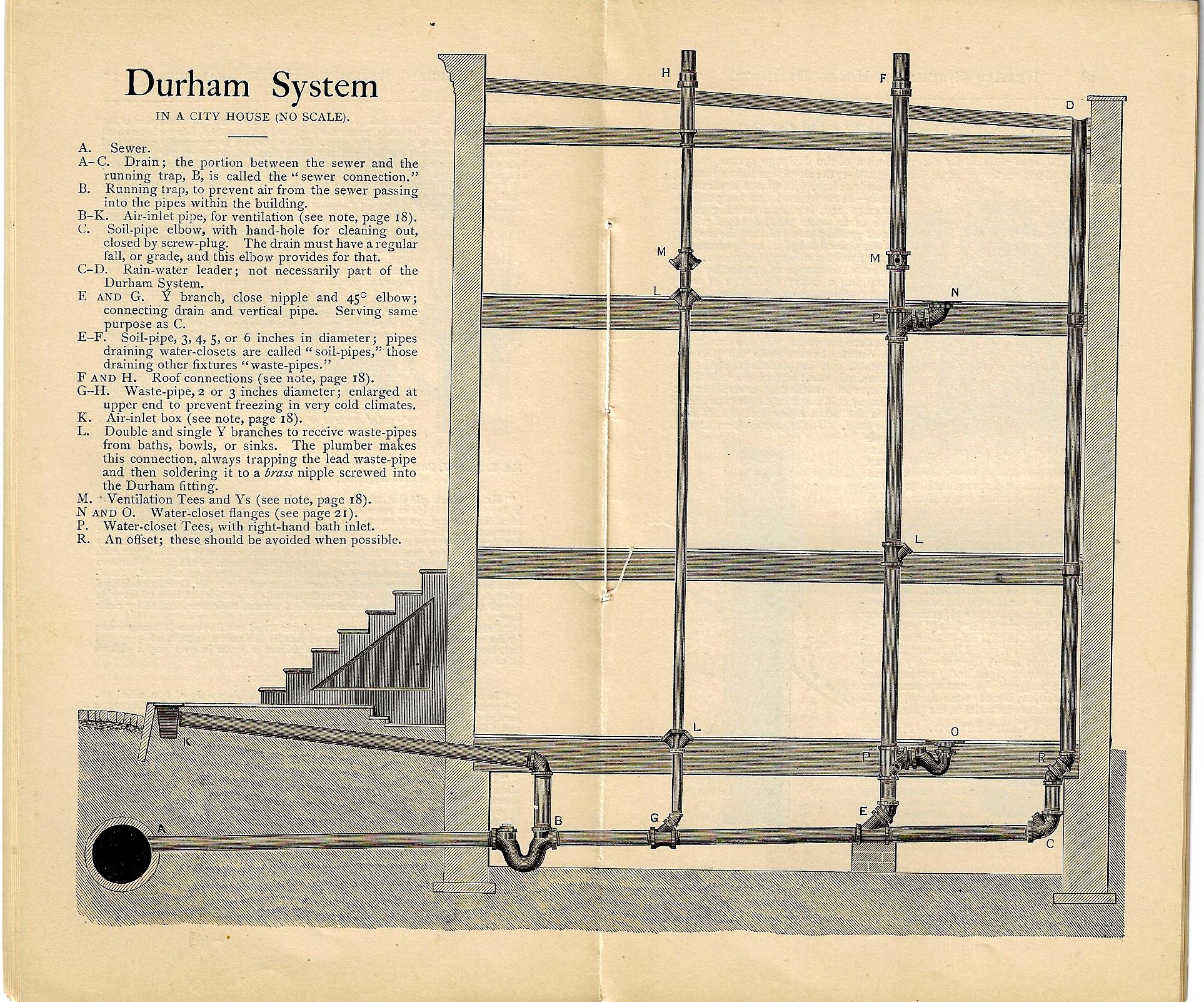
    You can’t have a Second Industrial Revolution without people living closely together, and you can’t have that without cities, and you have cities without water, and you can’t have any of that without a way of getting rid of the water and what all of those people were evacuating. And so the issue of “drainage” takes on a lot of powerful meaning–in getting rid of sewage, and rainwater, and a host of other things.  

    Now 1892 is already decades past the Second Industrial Revolution (as was indoor plumbing) and of course cities continued to grow, and so did the needs for plumbing in delivering the byproducts of consumption and maintenance of the city. The Durham system–manufactured in NYC–was one of these responses, and the image below shows a cross section of a multi-story structure with a several toilets, basically a map showing the flow of the exuded lubricant of the great machinery of the city.  That prose was a little purpley, but it is sorta true. 

    The Durham Patent System of Screw-Joint Iron House Drainage addressed this issue, manufacturing the pipe and all of the other necessaries, ready for you to install:

    Durham drainage _1_