A Daily History of Holes, Dots, Lines, Science, History, Math, Physics, Art, the Unintentional Absurd, Architecture, Maps, Data Visualization, Blank and Missing Things, and so on. |1.6 million words, 7500 images, 4.9 million hits| Press & appearances in The Times, Le Figaro, Mensa, The Economist, The Guardian, Discovery News, Slate, Le Monde, Sci American Blogs, Le Pont, and many other places… 5000+ total posts since 2008.

Category: Maps, Cartography, History of Mapmaking

  • The Battlefields of WWI in U.S. Land Based Context

    JF Ptak Science Books  Quick Post

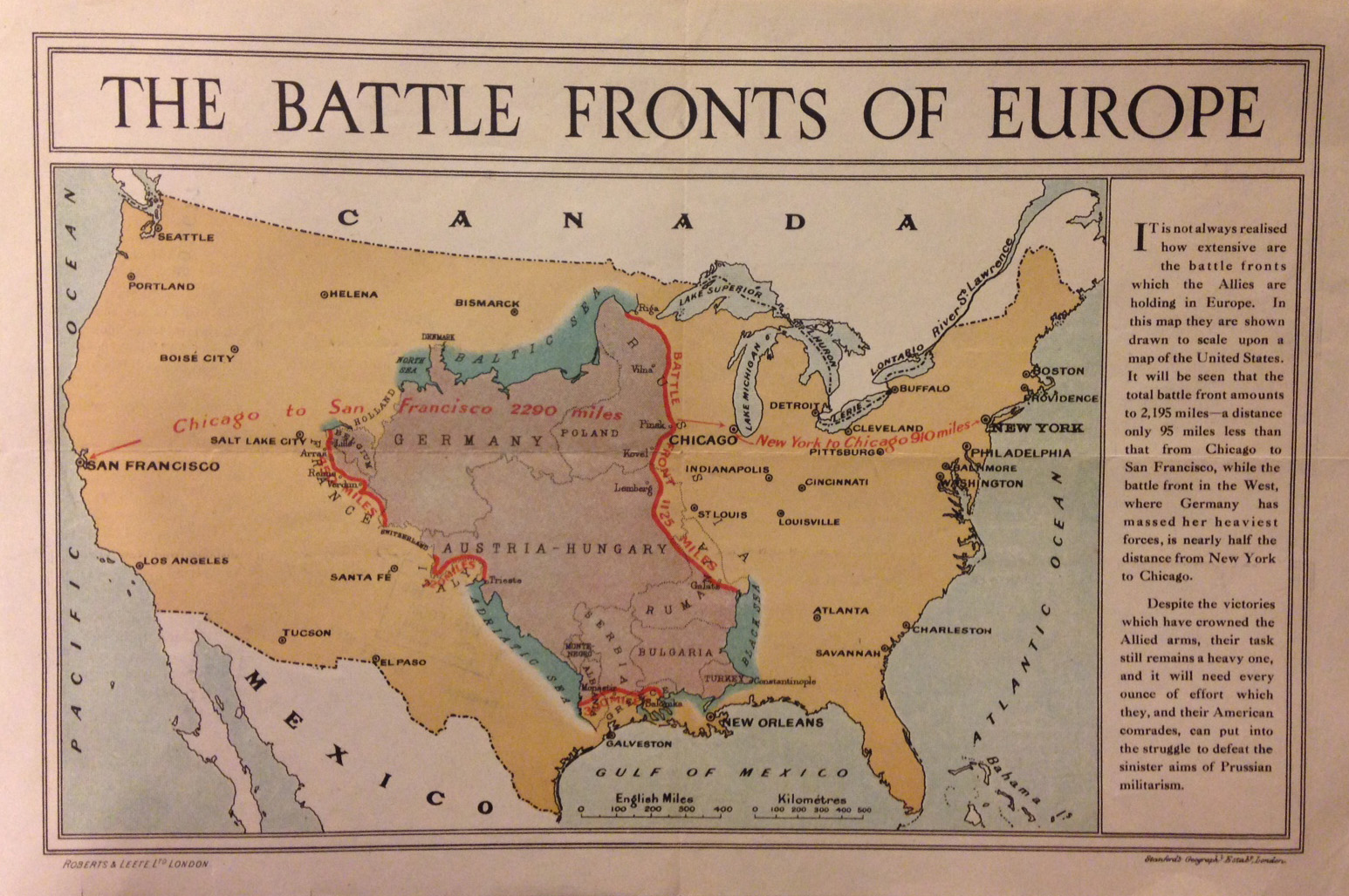
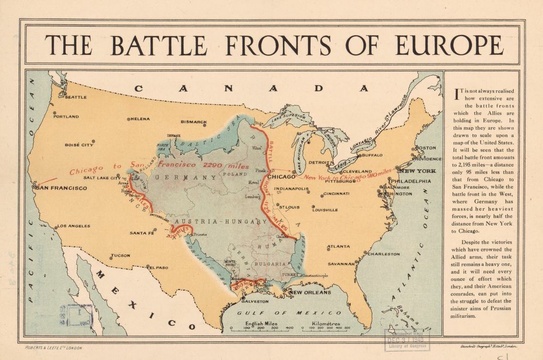
    The battle fronts of Europe (by Stanford’s Geographical Establishment, printed ca. 1917) is a useful contextualization of the major battlefields of Europe placed within a map of the U.S., showing the relative distances and differences in relation to a geography that Western Hemisphere folks might better understand. Much of the fighting was taking place in an area about the size of the middle third of the United States, which I am certain gave many readers back then (and probably now) some pause and insight. As you can see, the areas of action work their way from the Baltic across the upper Eastern Front, crossing Austria-Hungary, Romania, Bulgaria and a bit of Turkey, then west to the Adriatic and north along the Austria-Hungarian border to the Western Front of France and Germany and Belgium, all fit correct and proper into the land from the Mississippi into the Great Plains. There were about 95 million people alive in the U.S. at that point, and I’ll guess that maybe 20% lived in this Battle Front swath–that means that the dead and wounded from the war would be at least equal to the entire population of the U.S. covered by the battleground map. 

    WWI Map battlefronts LC _2_[Click to enlarge and clarify.]

    “London : Stanford’s Geographl. Estabt., [1917 or 1918]. London : Roberts & Leete Ltd, [1917 or 1918].”

    Source: Library of Congress,  https://tile.loc.gov/image-services/iiif/service:gmd:gmd5:g5701:g5701s:ct007679/full/pct:25/0/default.jpg


  • Lines and Trenches (1916)

    JF Ptak Science Books   Quick Post in the History of Lines series

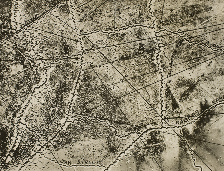
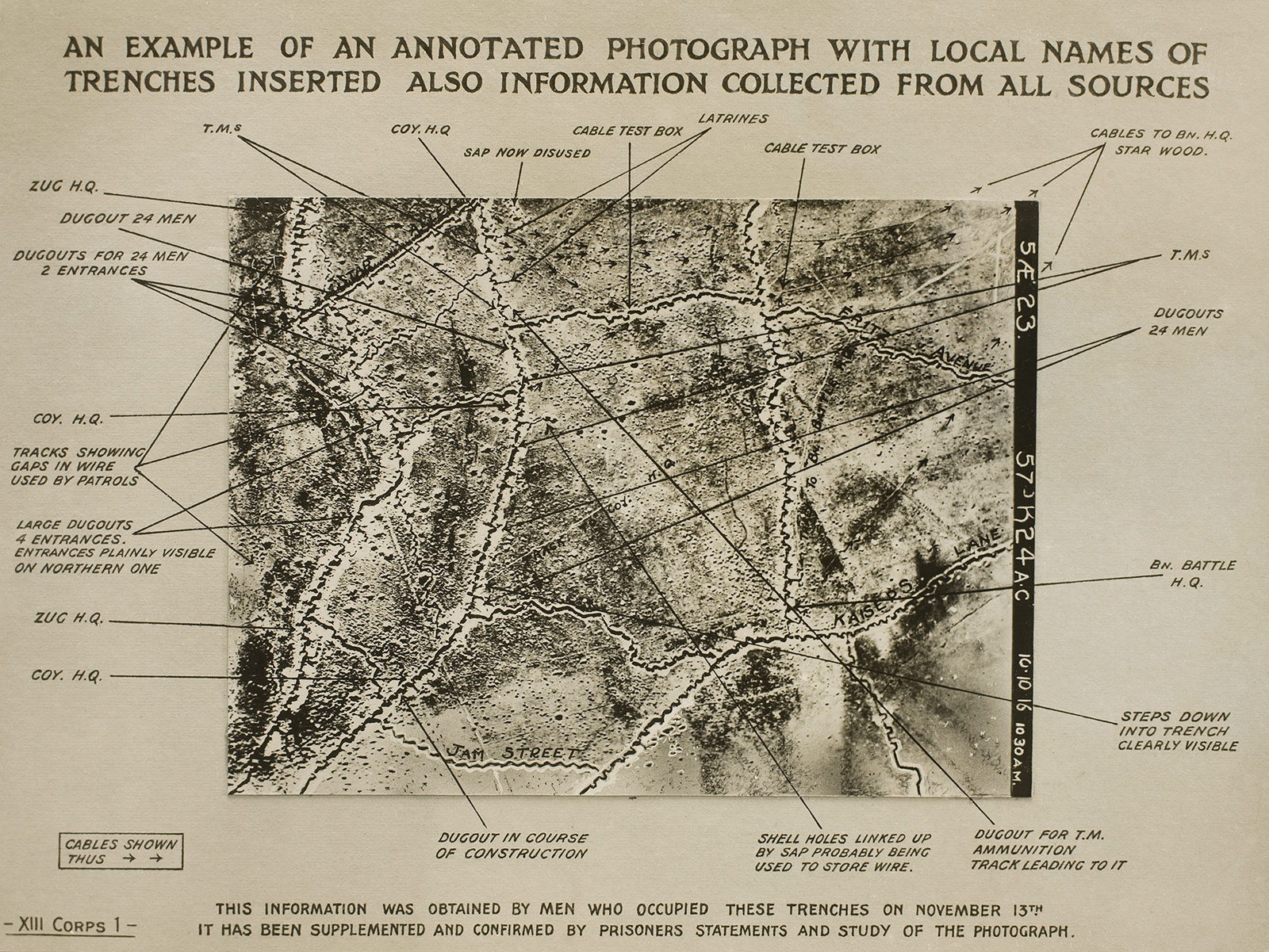
    I’ve just found an interesting example of a photo reconnaissance display of trenches with an interpretation of installations and trench names. It is interesting in and of itself, of course, but I was drawn to it because of the zig-zagged lines of the trenches explained with criss-crossed straight lines. The trenches went off at hard angles rather than long straight lines for several reasons, all for defensive purposes: first, they could offer places to use for fire cover if the trench was overrun by enemy forces, and secondly as a dispersal agent for the effects of bomb blasts within a trench.

    The photo “An Example of an Annotated Photograph with Local Names of Trenches Inserted. An example of an annotated photograph with local names of trenches inserted also information collected from all sources” is a silver gelatin print from the George Eastman Museum. The first image below is a detail from the overall image, used here just to show the accumulation of lines. The full image follows, showing dugouts, latrines, cables, ammo dumps, linked bomb craters, and gaps in the barbed wire enabling patrols to come and go without becoming hopelessly tangled in the sharp steel. 

    WWI trench names _3_

    Source of image: Art Blart https://artblart.com/tag/photographs-and-transition/  

    And the full image:

    WWI trench names _2_

    Notes: 

    Two good reference tools on names and naming practices of trenches:

    Peter Chasseaud, Topography of Armageddon: A British Trench Map Atlas of the Western Front 1914-1918

    _____. Rats Alley: Trench Names of the Western Front, 1914-1918.  Gazetteer of British trench names, as well as an appreciation of the naming practices and names of German and French trenches.


  • Extreme Bird’s-Eye Views of NYC

    JF Ptak Science Books  Quick Post

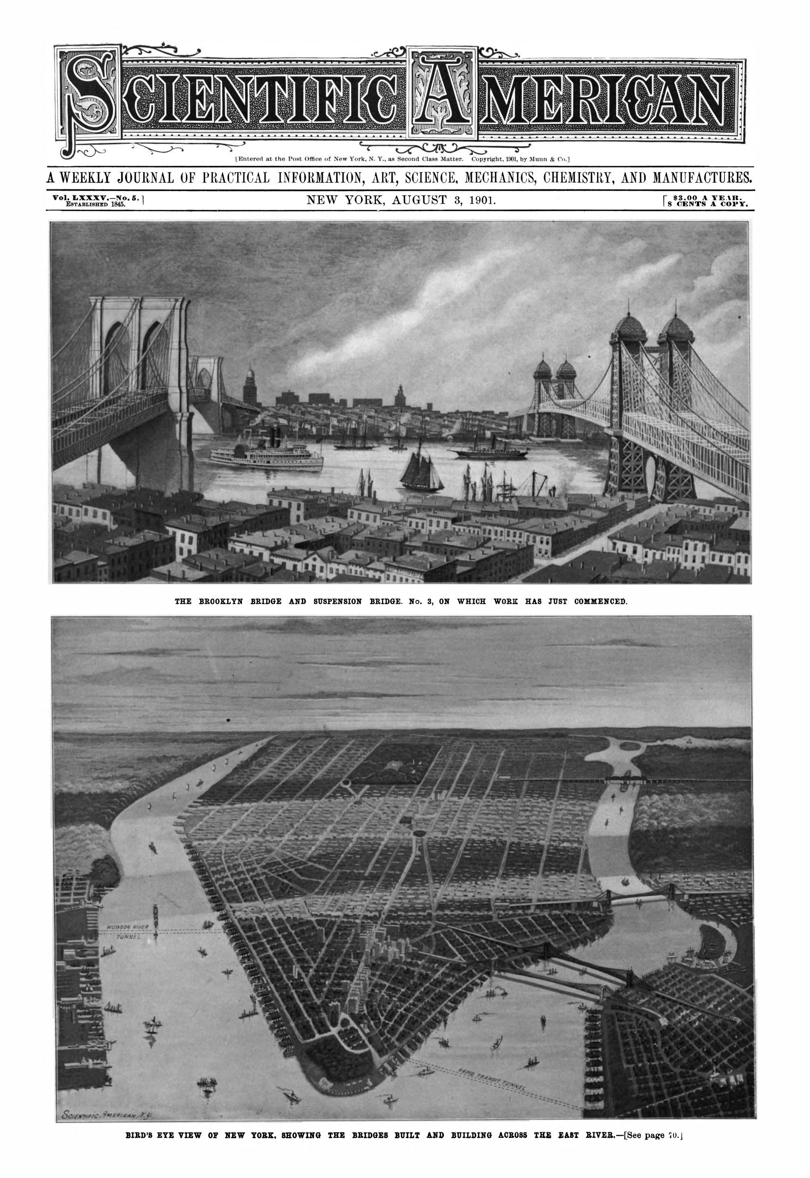
    I found this fine bird’s-eye view in the 8 August 1901 issue of Scientific American (the lower image is what I’m referring to).  It is a low-level oblique that shows about the entirety of Manhattan, from South Ferry to what is probably Harlem, and it seems to be an image that is not often reproduced.  While looking around online for something similar I found a great selection (19 maps, documented and linked) at the terrific (and now on hiatus) Bibliodyssey website. There’s no sense to reproducing all of the hard work that PK (Mr. Bibliodyssey) did in assembling his view selection, so just follow the link to his site and enjoy.

    Well, now that I think of it, I do want to share just one of them here and make a few comments on the thing here because it is just a terrific image:

    Sci Am 1901 Agust Birds Eye View Manhattan

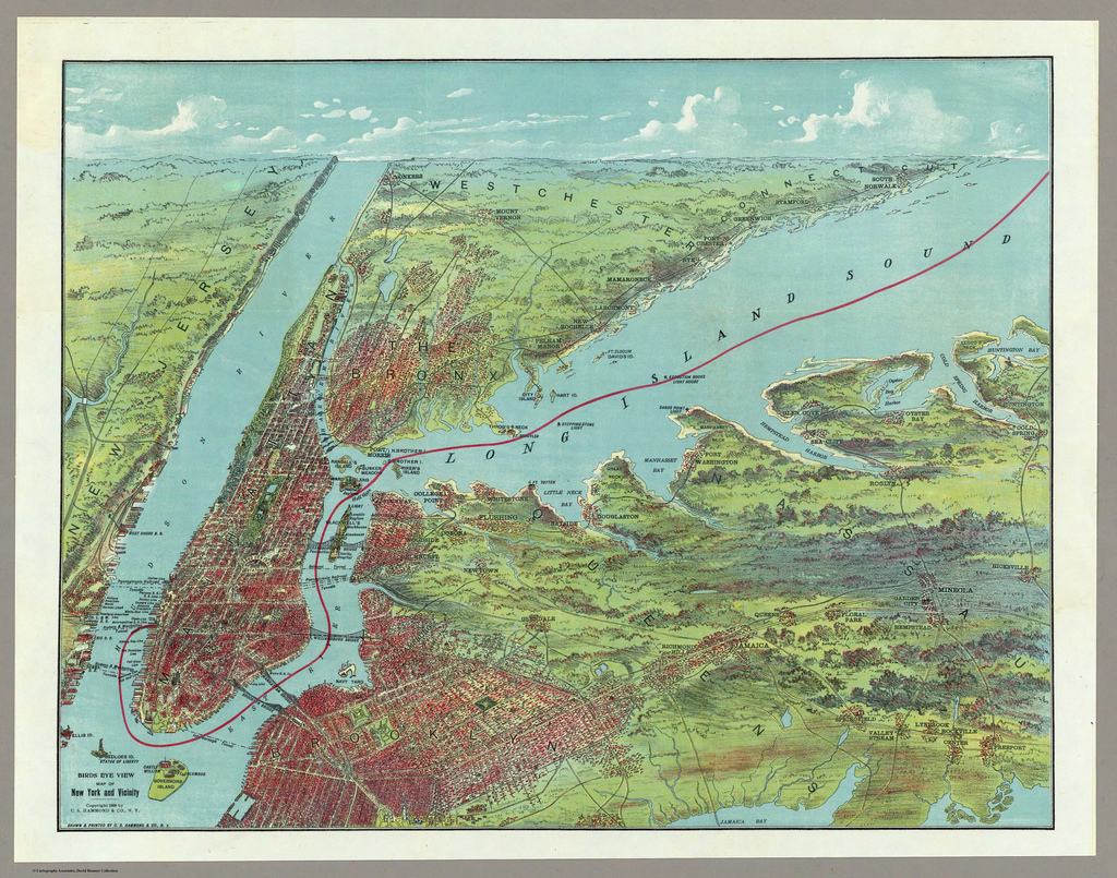
    The Bibliodyssey image:

    Brooklyn Birds Eye 1909

    [Bird’s Eye View Map Of East And North Rivers And Long Island Sound Price 10 Cents – New York C.S. Hammond & Co. Publishers. Scale 1:80,033.]

    [Source: http://bibliodyssey.blogspot.com/2011/09/birds-eye-new-york.html]

    This view reaches from Grand Army Plaza all the way to Yonkers, and it shows that even in 1909 there were some green areas left in Brooklyn in the south towards Jamaica Bay and out east (my mother’s mother was from Brooklyn who as a girl didn’t have to go far from Boro Park to go sledding on an open hill). Also it looks as though the Sci Am image also reaches almost to the Grand Army Plaza, but not much else in Brooklyn.  Anyway, its a beauty. 

    Okay! One other that I’d like to draw attention to:

    Brooklyn birds eye 1873[Source: http://bibliodyssey.blogspot.com/2011/09/birds-eye-new-york.html]

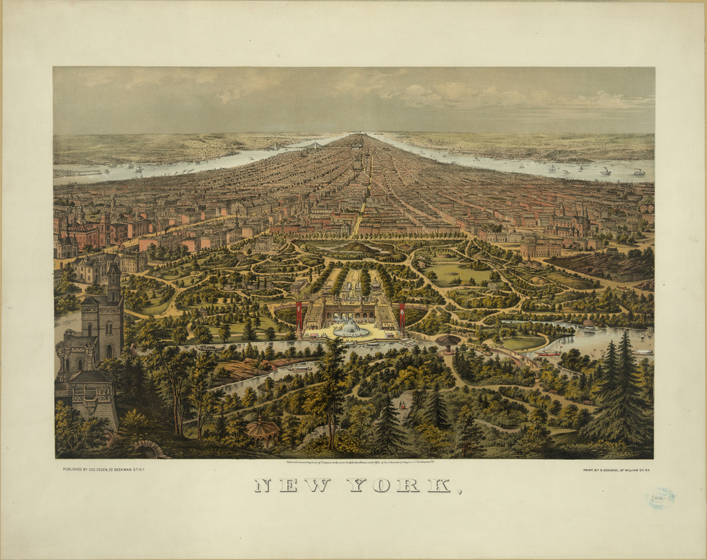
    This is a “Bird’s-eye view of New York with Central Park in the foreground”, by George Schegel, published by George Degen in 1873.  This is sort of the opposite of the Sci Am image, though the perspective is not quite right and the point of view is much closer to the ground–still, we see all of Manhattan from Central Park south to the Battery and beyond. This view has an odd feel to it, as though you’re looking through the wrong end of a binoculars–still a fantastic piece of work. 


  • Finding the Center, continued: the Center Sun and the Center of the Universe. 11th Anniversary Post

    JF Ptak Science Books   Post 2787

    In the long history of finding the Center of Things is the subset (or overset) of finding the center of the galaxy (which until the 1920’s was the universe) or of creation. The center changes over the dozens of centuries, not the least of which was the flower of creation blossoming outward from Jerusalem.  
    Astronomy--central sun

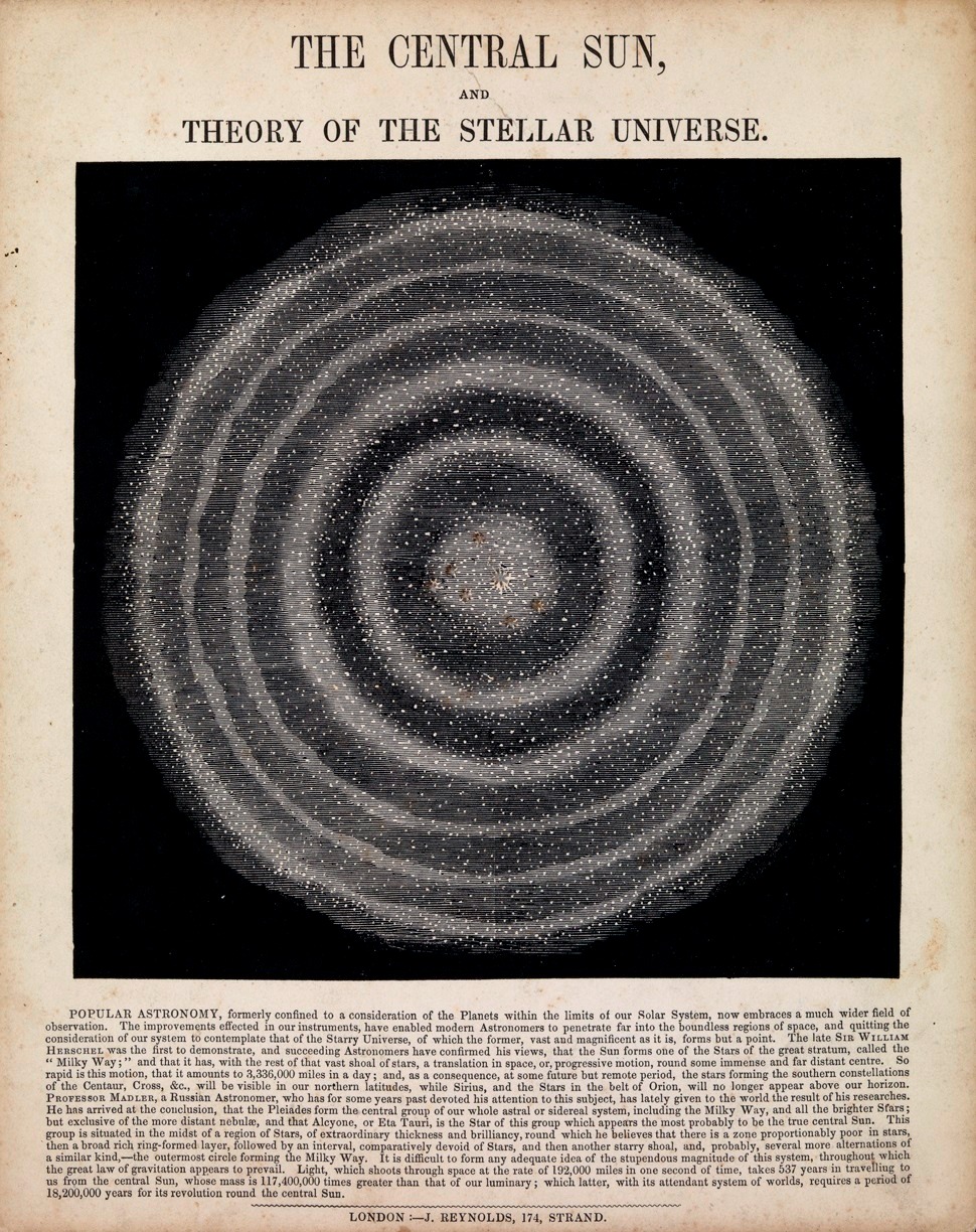
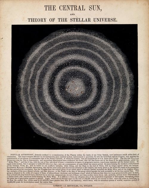
    • Image source:  Greenwich Observatory29x23cm http://collections.rmg.co.uk/collections/objects/263846.html (This is a depiction of the center of the universe, the Central Sun, as hypothesized by William Herschel and  later by Johann Henirich von Maedler (1794-1874), who published his observational results in Die Central Sonne, Doprat, 1846.)  This legend to this image is very legible once expanded. 

    Where is the center?
    Where is the center of the Earth, of religion, of the United States, of the universe, of art, of consciousness, of seriousness, of complexity?
    The center of stuff throughout history has been an almost entirely shifting matrix, a collection of vortices coming from Jupiter’s strongbox–a three dimensional representation of the location of their shifting centers over time would make an interesting Fibonacci-like display, I think.\The question may seem meaningless at first, but people have long asked it of nearly everything within their experience, trying to find the center of their world and universe, of their selves, of their religion, of their country, of politics, of art and music, and on through the Encyclopedia of Things that Could Have a Center.

    Take for example the questions of where the center of the Earth, or solar system, or galaxy, or universe might be?  There have been answers to these question more often than not over time, though the answers have been shifting.  The center of the Earth has certainly stayed more-or-less constant over thousands of years, though the stuff in the center has been swarming with change, from being hollow, to being filled with magma, to being a solid magnetic core, to being occupied by Mole Men, to housing the seat of the Inferno, or to be simply located on the surface of the sphere at Jerusalem (as the old T-maps have shown for hundreds of years), and on and on.  Working backwards, the center of the universe has drastically changed over time–for thousands of years, it was assumed that the Earth was the center of all things, until it wasn’t (that beginning mostly with Copernicus, and then challenged with Galileo’s use of the telescope and his discovery of an order of magnitude more stars, etc.).  And then William Herschel beautifully represented the shape of the galaxy in 1782, placing our solar system in a far from central location.  The center of the universe’s fate changed along with that of the Earth, incredibly so beginning with the Big Bang and then with the possibilities of their being a universe without boundaries.  And then of course there’s multiple universe theories, and worm holes, and the space time continuum, which complicates things even further, making the discussion of a “center” pretty much nonsensical.

    Simpler things can be as complicated–where is the center of the United States?  If we measure the center for the lower 48 states, it will be different than if we included the two far-flung states, or protectorates like Puerto Rico. The geographical center is one thing; another might be where the population center might be–that has made a beautiful map published over time by the U.S. Census Bureau (Department of Commerce), showing the star of the center moving not-so-slowly westward into Ohio over the last 20 censuses or so.  And where is the heart of the country?  Where is the heart of the West?  Better yet, where is the center of the West (or North, or South, or Mid-West)?  To answer where the center of these places might be you’ve got to first locate where those geographical ideas begin and end, which for many is a tricky subject, making it a matter of opinion as to where the center of these places might be.  
                                        
    The center in art had been a findable thing for some time, though more recently people like the Impressionists and Kandinsky have shown that the center might not exist, and it might not exist along with anything that is recognizable as a form of nature, representation and the center falling away completely.  Perhaps this is like finding the center of a decade or year or month, or week or day or second.  The parameters keep getting both smaller and larger, the ability to measure halves of things or the center of a second growing almost incalculably small, small enough to reveal that in this Zeno-paradoxical way, that there is no center because there are no boundaries; getting half-way to something into infinity doesn’t actually get you there.  

    Now, getting back to today’s image: this lovely illustration shows what is supposed to be the center of the galaxy, which at the time also meant the center of the universe.  The model was based on the observations and hypothesis of William Herschel, and then later more firmly put forward by Johann Henirich von Maedler (1794-1874), who published his results in Die Central Sonne, Doprat, 1846. The Central Sun was supposed to be the star Alcyone in the constellation of the Pleiades. Alcyone (or Eta Tauri, “the Central One”), who in legend threw herself into the sea in deep grief after an encounter with the disguised Morpheus; the gods though took pity or exhibited compassion and changed her into a bird, the Kingfisher. The Kingfisher is a bird which lays its eggs around the time of the equinox in December, the gods showing more mercy by introducing a period of non-stormy weather for seven days, and so introducing the (H)alcyone Days of winter. (I just missed being able to post this during that period by about a week.)  The Pleiades, (“the Seven Sisters”), were the seven daughters of Atlas, who (long story fractured) were turned into stars to ease the worry of the father who was busy doing others things, saving them from their instant pursuers once their protector was otherwise engaged. Orion, however, still pursues them across the sky.

    Here’s the concept of the Central Sun, explained for the kids of 1872:

  • Human Maps of Cyborg Parts, Wounds, and Blood

    JF Ptak Science Books

    A Map of Man’s Ability to Replace Himself, 1610-1723

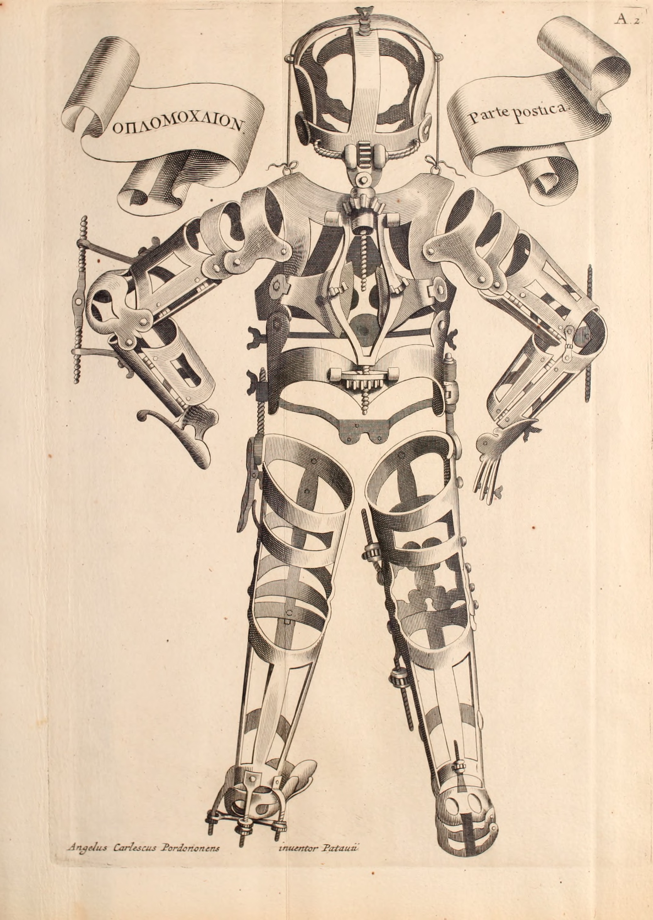
    FabriciThis woodcut of applications and applicators to injured humans, lacking the human, waiting for the human, the missing human, was made by Hieronymous Fabrizzi (or Jerome Fabricius, 1537-1619), and found in his Opera Chirurgica… printed in 1723.  Even though this is a pretty straight-forward image, it strikes me as a little odd, a little off,  looking a bit like inhuman trappings, the entrapments of a human waiting to be built, an artificial skin with artificial bones.  It was much less than that, and in its way, much more—it was a statement of the advances of medicine in the 16th century, a map of the ability of man to replace himself; a map of the artificial man. Perhaps the image of our own artificial man, showing our ability to replace organs, bone, skin, limbs, etc.may come to look to the people of the near future the same way that we here in the present look back on Fabricius’ image. 

    [Image source: Wikimedia Commons]


    A Map of Getting Wounded

    This map of the wounded man was a very popular, much reproduced

    Gersdorff_p21v_3image, seeing publication in many works since it first appeared in
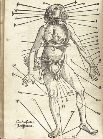
    Johannes de Ketham’s Fasciculus Medicinae,  printed in the year Columbus set sail for India.  It was a battle map, really—a battle for the human body, showing the effects of what happened to that body when someone tried to erase its existence.  The image is graphic, realistic and fairly gruesome, and highly useful.  It was accompanied by instructions on how to deal with all of the trauma, and to save the man thus that he could fight again. 

    This woodcut, as the next, appeared in Hans von Gersdorff. Feldtbüch  der Wundartzney (printed in Strassburg, by  H. Schotten, in 1528).


    A Map of Letting the Blood out of the Human Body

    Gersdorffx400jpg_other_2Well, it really wasn’t like that, not how I mean by a snippy modernist viewpoint looking back on medical history with no contextual appreciation.  Bloodletting was an approach to healthfulness, as blood was seen as one of the four major elements (or “humours”) of the human body that needed to be kept in balance.  This was accomplished via the application of leeches or by the more common (and quicker) practice of venesection, or opening a vein to allow the blood to come out. (Let’s reference Steve Reich’s magnificent “Bruise Blood” creation of 1966 at this point—I don’t think that I’ll ever have a better chance to drop a reference to this piece of revolutionary music in regards to venesection again.)  Thus this map was map for the practitioner of bloodletting—the physicians, and more probably the barbers and other assistants who would inherit this lesser procedure from the more-busy doctors.  In the history of maps of anatomy and the general practice of mapping the human condition, this woodcut x-ray of the best places to drain human blood would not survive close to the age of modernity, disappearing almost entirely by the 18th century, and becoming much more scarce well before that.
  • An Uncommon “First” in the History of Data Visualization and Cartography (1874)

    JF Ptak Science Books   Post 2765

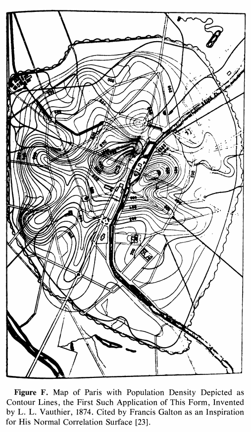
    So this is a loose-and-pulled-thread post–I bumped into something that led me somewhere coming face-to-face with an interesting reference to an unusual “first” in the history of cartography. I found the map and (correct) reference and tracked it down to the great Comptes Rendus. The map is the first one to use contours to convey statistical information. It was a short article and I was very curious to see the illustration of the map–I discovered that the paper written on an significant innovation on the display of information did not display the information. No image! This is one of those scarce article describing a breakthrough in the visual representation of data that doesn’t use an illustration of the pioneering work. After I figured it out that the description of the map was for the breakthrough map in question and satisfied with my read and translation of it, I went ahead and wrote a description for its sale on my blog bookstore.  I was about to upload it but stopped to check out the mass database for booksellers called Addall dot com and found somebody had a loose issue of the document offered for sale at eight bucks! That was a disappointing end to an hour+ of research. The person selling the paper for $8 did not know what the article was all about, I reckon, since I thought it was slightly valuable…still, it was a damp blanket to shoulder on a wet and stormy night. Lastly, I should note that I haven’t yet found the original source for the map’s image that I was able to display here–I’ll hopefully do that in due course. 
    Map Vauthier

    The paper was by the lyrically-named Louis Leger Vauthier (1815-1901) and titled “Note sur une carte statistique figurant la rapartition de la population de Paris” (found in the Comptes Rendus des Seaances de L’Academie des Sciences, 1874, vol 78, pp 264-267). It is evidently the “first statistical use of a contour map” according to  https://infovis.info/ In a more expanded and restrictive description from Wikipedia, we see that Vauthier “…is credited with one of the earliest (if not the first) thematic map to use contour lines to display a non-geographic variable on map— a contour map of the population of Paris in 1874”. This is probably the more accurate and definitely more qualified description. 

    In any event the map as I said is described, but not pictured, which is pretty unusual to my experience. I did find a picture of the map here: James R. Beniger and Dorothy L. Robyn, “Quantitative Graphics in Statistics: A Brief History”, in The American Statistician, vol. 32, no. 1, pp. 1–11, 1978

    And: https://www.sci.utah.edu/~kpotter/Library/Papers/beniger:1978:QGSH/index.html

    The Vauthier article starts out with a simple statement about the map adopting the use of the terrain relief  and using it to show the distribution of the population of Paris, using terms and descriptions that were already established and “quite familiar”:

    • “Cette carte a pour objet de figurer, au moyen du procédé graphique  généralement adopté aujourd’hui pour représenter le relief du terrain, la manière dont la population de Paris est répartie.  En topographie, le relief s’acccuse par des courbes de niveau, s’échelonnant à diverses hauteurs au-dessus ou au-dessous du plan de comparaison adopté. Les plans, ou, plus généralement, les surfaces de niveau contenant ces courbes sont, d’habitude, pour la facilité de l’interprétation, conçus équidistanis, et l’on complète la description en inscrivant sur chaque combe la distance au plan de comparaison.”
    • “La carte de la popidation procède de notions tout à fait analogues. Les courbes sinueuses qui y sont tracées passent chacune par des points ou la population est la même: ce sont, quant à la population, de véritables courbes de niveau. Elles sont équidistantes, en ce sens qu’elles s’échelonnent par degrés égaux de variations de la population ; quant  aux nombres inscrits sur chaque courbe, ils représentent le nombre d’habitants à l’hectare. Ces brèves indications nous paraissent suffisantes pour que toute personne habituée à la lecture des cartes topographiques lise la nôtre sans difficulté. 11 nous reste à expliquer ce qu’est la surlace que nous avons représentée, quelle est sa génération et comment, en dehors des courbes de niveau qui y sont tracées, elle doit être conçue dans l’espace.”

    The article continues in depth in the description of the data and how it was collected.


  • A Glorious Issue of Scientific American featuring NYC (1908)

    JF Ptak Science Books   Quick Post  

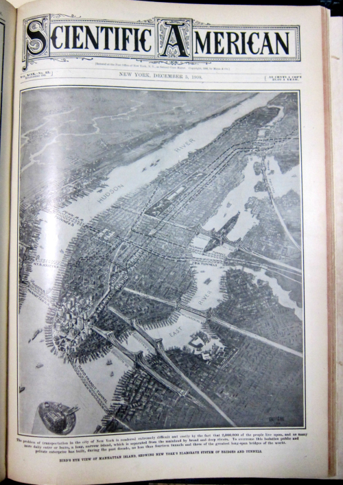
    I don’t have that much to say about the series of images that I found in the 5 December 1908 issue of Scientific American–except for “Wow!” Sometimes that is about all I can manage, and that’s fine. (Richard Feynman, on witnessing the Alamogordo test shot in the desert in 1945, simply said “hot dog!”, which was quite a distance away from Oppenheimer’s reaction, and one which I like more.) Anyway, opening up the volume and by chance opening to this full-pager was very pleasantly surprising, and this from a journal which was very successful in achieving their constant goal of being “surprising”. 

    And as you can well see, “wow” can be shared:


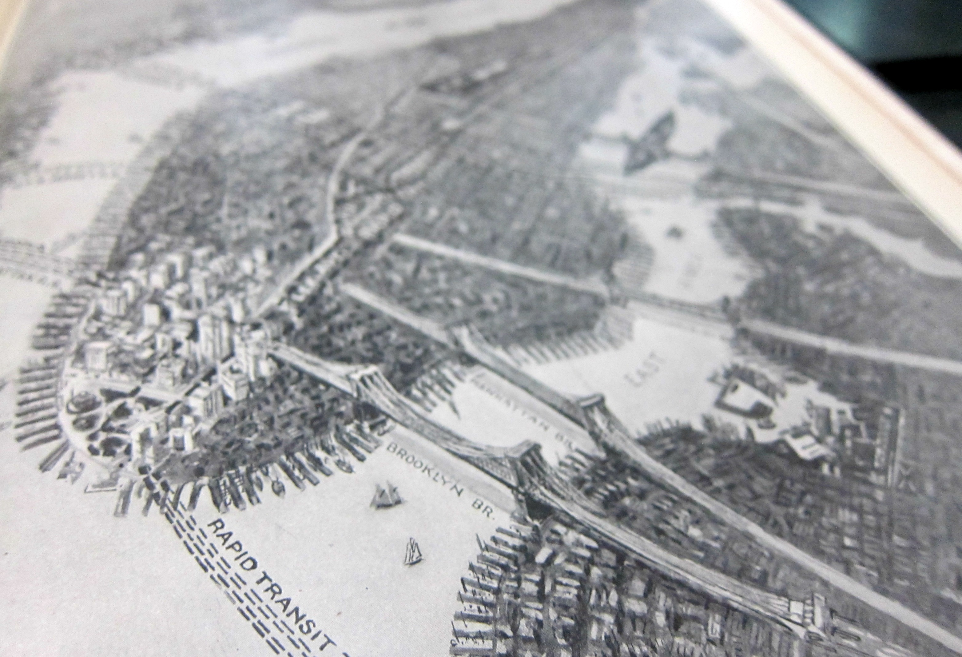
    NYC Sci Am map 3d detail

    The bird’s-eye view has a peculiar 3D sense to it–you could make any of the bridges pop to life by changing your angle of perspective, like so:


    NYC Sci Am map 3d detail


  • A View of the “Zones of Animal Life” (1889)

    JF Ptak Science Books  Quick Post

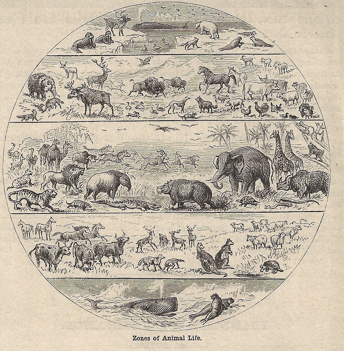
    Here’s is an interesting bit of data display, showing the distribution of animal life in torrid, temperate, and frigid zones. It is relatively small, 4×4″ or so, and is found in James Orton’s  Comparative zoology, structural and systematic, published in New York by Harper and Brothers in 1889, (pg 389). 

    Maps zones of animal life


  • Looking for Bastogne (1939)

    JF Ptak Science Books   Quick Post

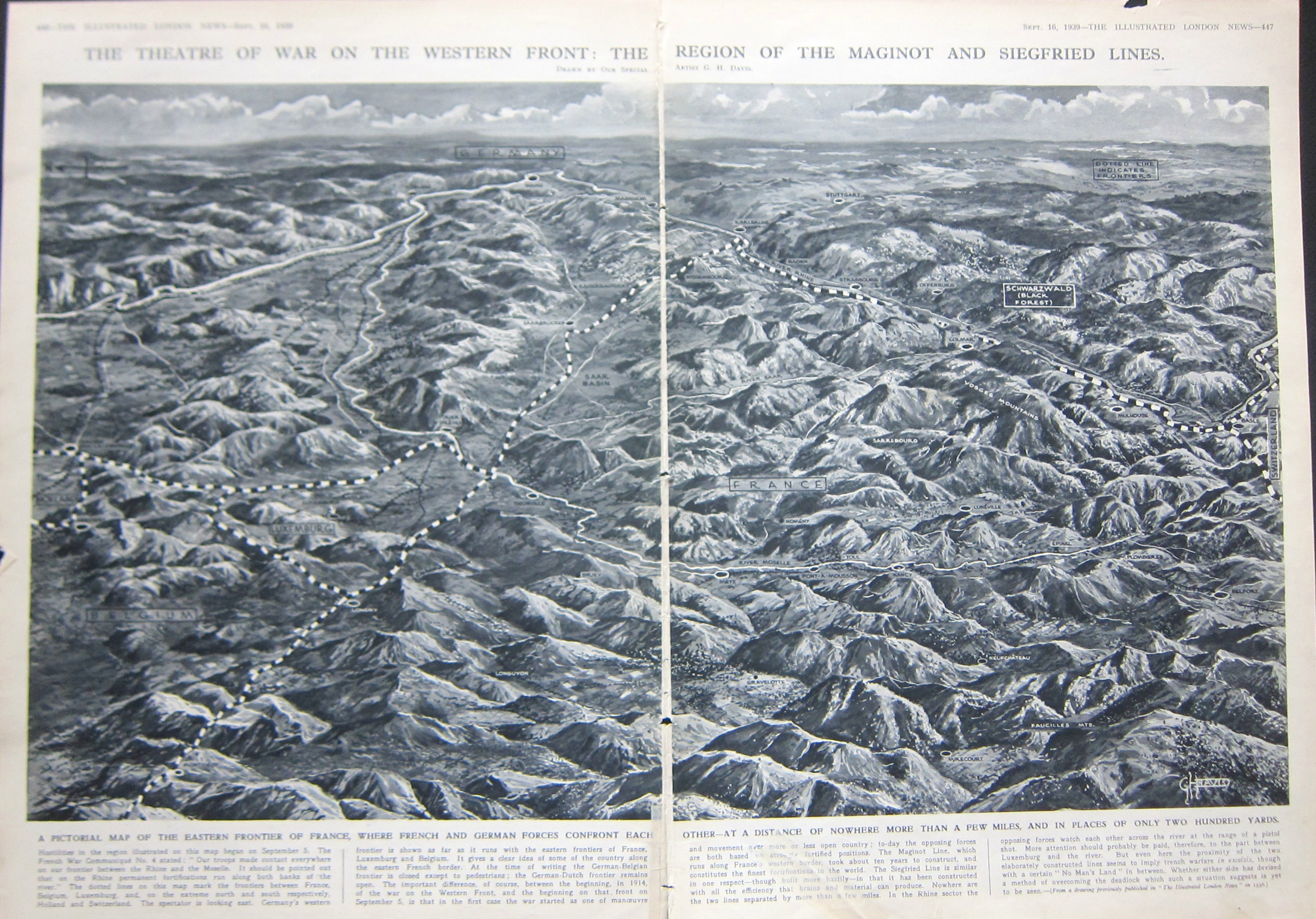
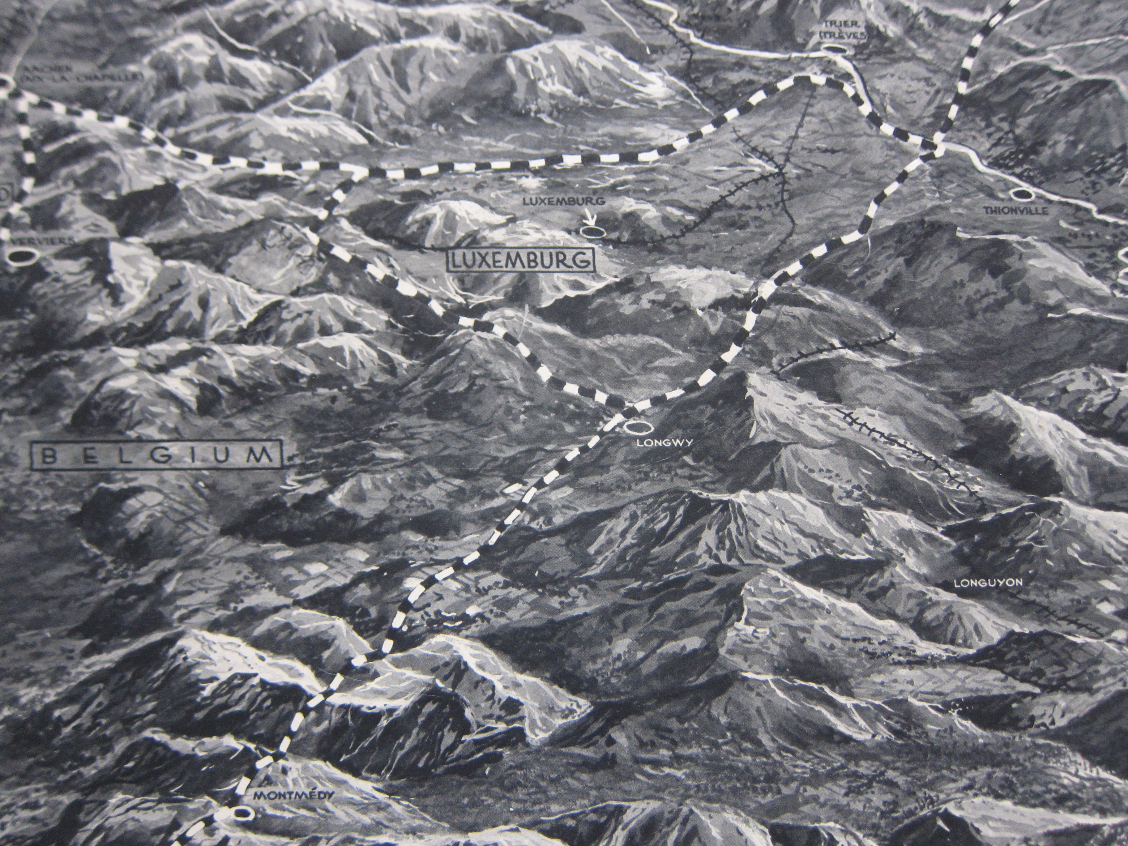
    This double-page map from Illustrated London News caught my eye–it shows “the theatre of war on the Western Front” at the end of the second week of the European war, 16 September, 1939, just five days after the war had been freshly defined for the first time as “World War II”. (From the OED: “1939   Time 11 Sept. 38/1   ‘Some of the diplomatic juggling which last week ended in World War II was old-fashioned international jockeying for power.’”) It is an interesting oblique view (north to the left) created by the great ILN illustrator, George H. Davis, showing the borderlands of Belgium, Luxenbourg, France, and Germany, the first three soon to be overrun. The map does seem to present a good bird’s eye for the region, and what I set out to find was the Ardennes–soon to come to life again as an unlikely entry point of attack to France, and then again to the Germans come Christmastime 1944.  Part of the Ardennes is seen at the lower left, though not identified. Triangulating the towens of Longwy, Longyuon, and Luxembourg City, I’d place the town of Bastogne at about the “G” in the title for “Belgium”.  The town isn’t on th emap now, but in five years, everyone will know where it is, named or not.  

    Maps WWII ILN 1939 Ardennes

    IMG_9195


  • A Reverse D-Day, 1803

    JF Ptak Science Books  Post 2746  

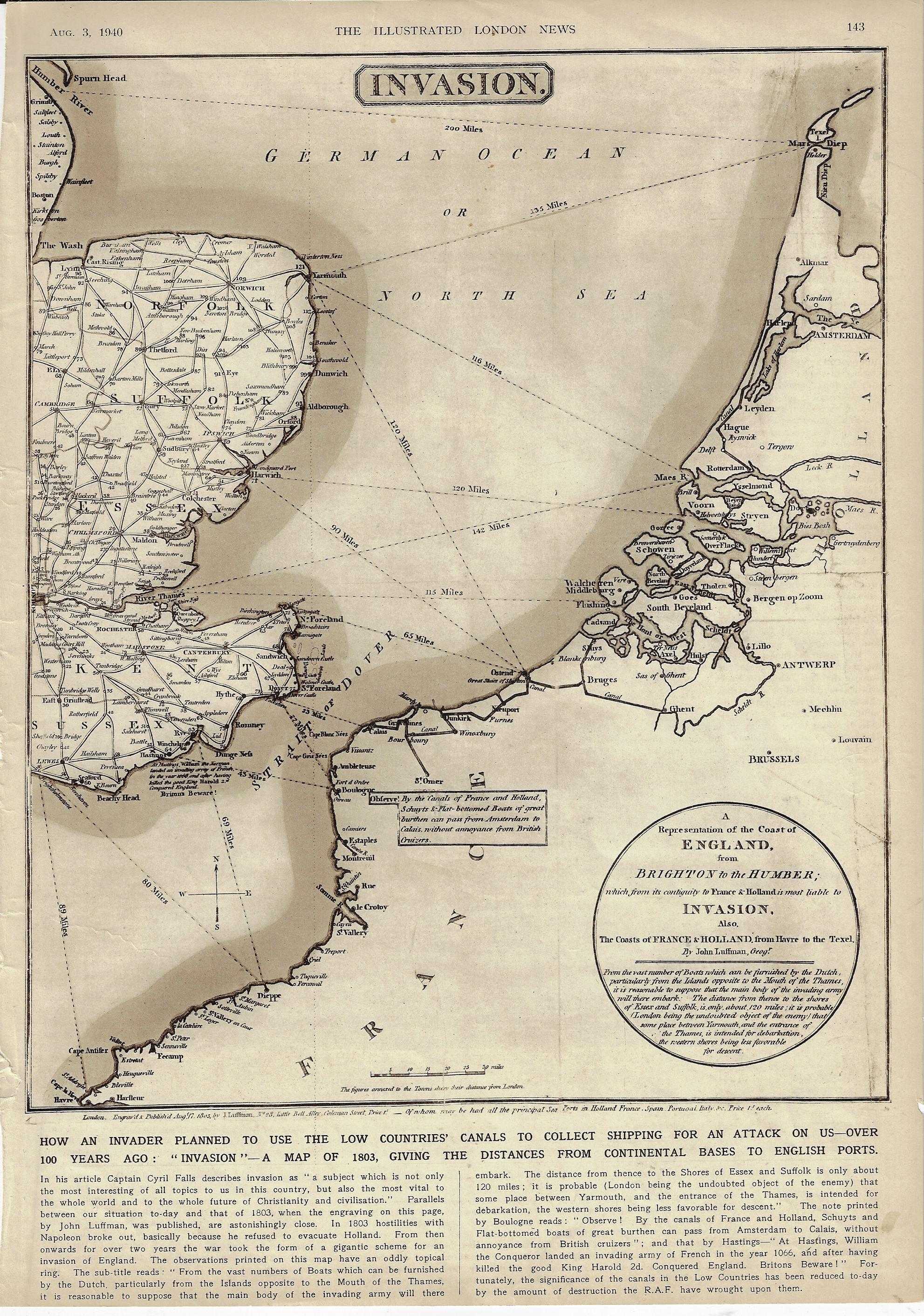
    There have been many D-Days in the history military terminology, but for almost everyone it refers to the Allied invasion of Normandy on 6 June 1944. In 1803 when Napoleon was in high form and making his way through Europe there was a wide concern in England that he would attempt a cross-channel attack and invade the country.  Which leads us to this map1 that I just found (again) in the Illustrated London News for 3 August 1940–the map entitled “Invasion”, showing the possible routes that the enemy might take in crossing the channel. 

    This was published at the time where the very real threat of invasion loomed like an angry low-ceiling mammatus cumulus, ready to break. Belgium, Luxembourg, and the Netherlands were defeated three months earlier, Dunkirk had just been sustained and the evacuation completed two months earlier; one month later, in July, the Battle of Britain had begun. It was not the French this time, but Germany–though the French had just weeks earlier surrendered without much fight and signed a disgraceful armistice with Germany, further weakening the very bad position of Great Britain. France was invaded in May and surrendered in June, an incredible collapse of what had just a few years earlier been Europe’s leading army, encamped behind the instantly obsolete Maginot Line.  It would be another 16 months before the U.S. entered the war, and another 46 months before the Normandy Invasion would cement the endgame for the war in Europe.  There was one gigantic good thing that happened in May–Winston Churchill became the Prime Minister. 

    Perhaps the editors at ILN sought to show the stoic Brits that they had been “there” (but now “here”) before, and nothing came of the Napoleonic threat. Of course there is almost no discussion of earlier attempts at invasion–though there is some fine print on the map quietly shouting “Beware Britons” about 1066 and all that.

    The odd thing about this map–made by J. Luffman and published 17 August 1803–is that I haven’t been able to find it online. The mapforum group has a very interesting entry on Luffman as well as images of a different map showing a much greater area.2 And so here it is–perhaps I’ve missed the thing, somewhere, but I just haven’t been able to find it. 

    The Luffman map comes very close to concentrating on the WWII D-Day theater of operations, the map extending as far to the SW as Le Havre, which misses by just 10 miles the Eastern Task Force beachhead at Sword.  

    Map invasion 1940

    Notes: