A Daily History of Holes, Dots, Lines, Science, History, Math, Physics, Art, the Unintentional Absurd, Architecture, Maps, Data Visualization, Blank and Missing Things, and so on. |1.6 million words, 7500 images, 4.9 million hits| Press & appearances in The Times, Le Figaro, Mensa, The Economist, The Guardian, Discovery News, Slate, Le Monde, Sci American Blogs, Le Pont, and many other places… 5000+ total posts since 2008.

Category: Maps, Cartography, History of Mapmaking

  • In the Fool’s Cap, a Map

    JF Ptak Science Books  Quick Post

    Jester020

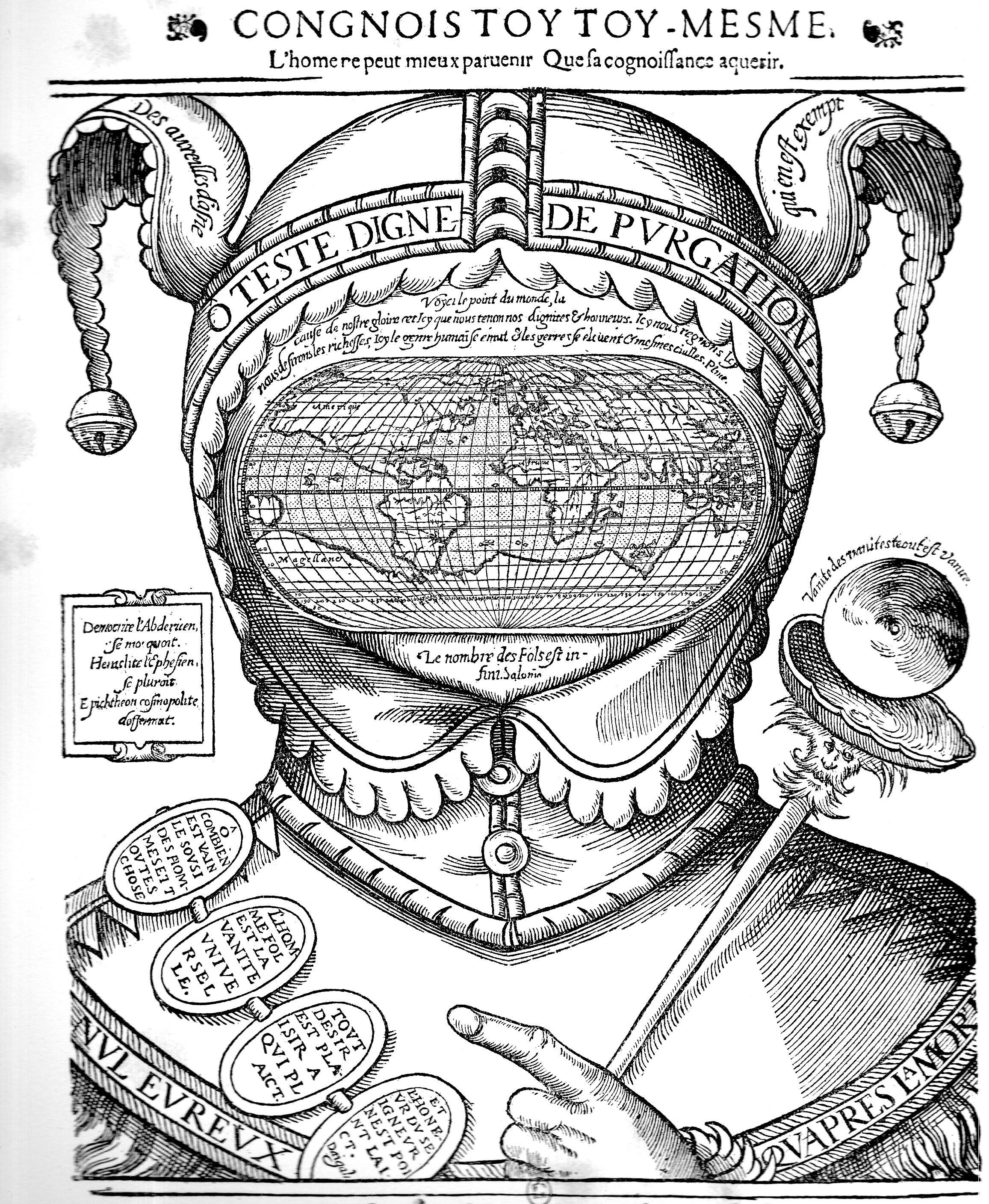
    I’ve known about this famous map/curiosity by Jean de Gourmont (ca. 1570) for some time, though I never seem to meet it out there in the world very often. Yesterday though I discovered that there was a fine 19th century reproduction of it in the studio, and so I thought I had a closer look now that I had a good copy in my hands.  

    And then when I looked the map up I found a number of good descriptions of it that pretty much took care of its description and interpretation. The baseline description is that it is mostly an allegory on the pursuit of knowledge, and of knowing, and thinking about the nature of knowledge–my read is that in the end, only a fool would think that the more they knew the less there was to know.  The famous Ortelius map (“Typus Orbis Terrarum”) in the face of the jester could represent a gridwork of what we think we know, though across the top of the image is the dictum from Socrates, “Know Thyself” (“Congnois toy [‘toi’] toy-meme”), which prepares us for what might be the dry hole in our soul if we spend too much time in the pursuit of knowledge of the world.

    One of the most interesting reads on this image can be found in  Literature, Mapping, and the Politics of Space in Early Modern Britain, by Andrew Gordon, Bernhard Klein, where the authors discus the mind-as-a-map, and bring into play a great passage from the immortal great-book-that-is-semi-unreadable Anatomy of Melancholy, by Robert Burton. They refer to the great map set in the motley, order set against “the spirit of disorder” and “the enemy of boundaries”, with Burton declaring on the essence of folly.


  • The Coming Threat from the Air: Austria, 1935

    JF Ptak Science Books  Post 2582

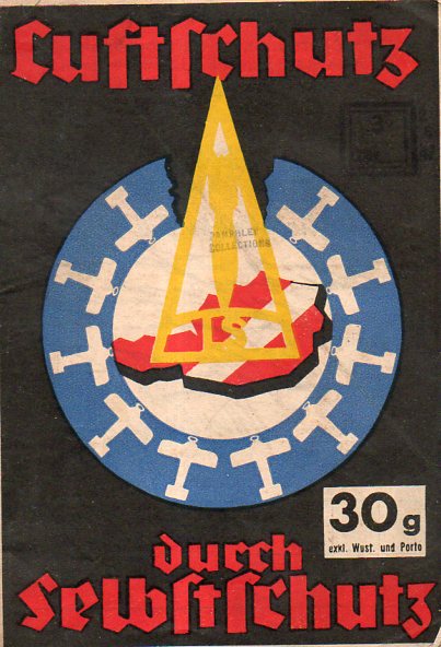
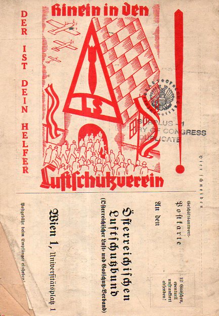
    1935 was not a particularly good year for Austria.  The country was fighting off the threat of Anschluss–the occupation of Austria by Nazi Germany–for several years, the cause hurt by the infamous assassination of the federal chancellor Englebert Dollfus in July 1934.  When this pamphlet was printed in 1935, the threat to Austria from Germany was real and advanced.  This publication, Luftschutz durch Selbstschutz (“Self Protection by Anti-Aircraft Defense” or so) addressed part of this issue. It sounds more militarily-based than it is; the story though is that the pamphlet was intended as a sort of civilian defense piece, for example, asking people to join an air defense club (“hinein in dem Luftschutverein”) for the protection of all (“Schutz fuer jedermann”) and to be general aware and prepared for the possibility of air raids.

    Austria air defenses cvr map001

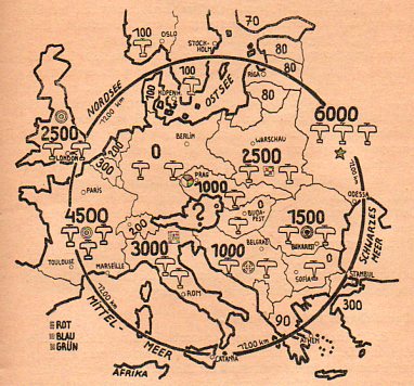
    What attracted me from the outset was the cover design which at first doesn’t actually appear to be a map, though it is–and an effective one at that.  In the middle of the circle is a red Austria with a white bar; on top of that, in yellow, is a bomb in a triangle; and surrounding Austria in a blue circle are the possible approaching/attacking/threatening air forces of its neighbors. Inside the pamphlet is another, more detailed map (below) showing the disposition of opposing air forces. It is interesting to note here that Germany is shown as having zero aircraft as dictated by the Treaty of Versailles, though it was in February of this year (1935) that the Luftwaffe was organized thus disbanding part of the treaty–at this point in 1935 the threat from Germany was not presently from the air.

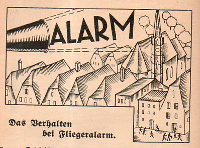
    The pamphlet runs 64 pages and contains information for Austrians in preparing for aerial assault, in general: what to do when the bombs fall, how to prepare, what sort of supplies are needed to survive a sustained attack, and the like–plus ads for gas masks, survival goods, and such.  

    In the end, Germany did not bomb Austria–it disappeared as part of the Reich in March 1938 as a result of intimidation, embargo, political subterfuge, and finally the threat of war.  

    Austria air defenses cvr map003


    Austria air defenses cvr map004


    Austria air defenses cvr map002


  • A Beautiful Infographic With Little Info to “Graph” (1835)

    JF Ptak Science Books  Quick Post

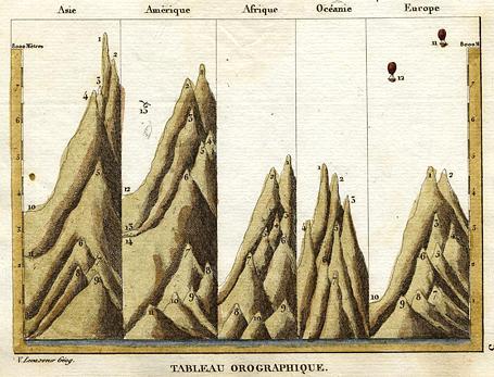
    Victor Levasseur (1800–1870) was a French cartographer who crippled and broke the modern line about not spending ink on a informational design that did not carry some sort of specific and necessary data. It seems that most of Levasseur’s ink was decorative–but that’s okay, I guess, because the effects today look quite handsome–and also it should be remembered that at the time the man was not exactly awash in detailed data. That said, he produced this beautiful little miniature map showing the comparative heights of mountains, though the detail is more-or-less generally lacking, and frankly I’m comfortable with that.  

    Maps Mountains Levasseur

    [Source: “Tableau Orographique” a miniature map by Victor Levasseur (1795-1862), published in his Atlas Classique Universel de Geographie …, about 1835]


  • Unusual Maps: a Weighted Radio Map of the U.S. 1937

    JF Ptak Science Books  Quick Post

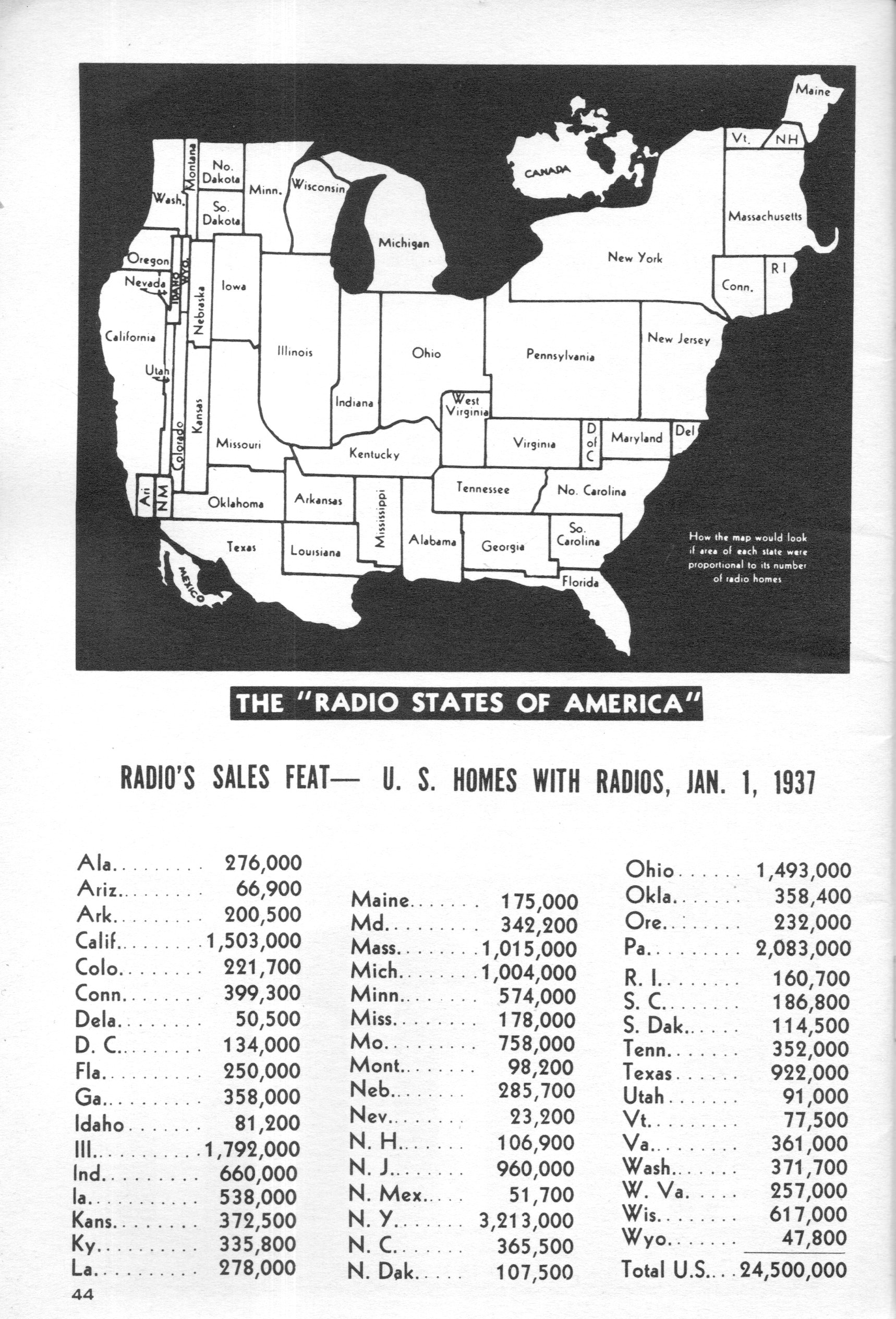
    To read the title of the pamphlet The Radio Dealer’s Handbook (1937) in a sales catalog would do little to excite any particular zeal, though to see its cover probably would spark an interest enough to at least browse the pamphlet.  And browsing was a happy thing, as I found several infographics,including a terrific map of the U.S. showing the states in proportionate sizes according to radio ownership.  Well, it shows the U.S. and Canada, which evidently sported as many radios as Massachusetts and exists on this map looking very much like  a mini-U.S. It also seems as though radio ownership in the Dust Bowl regions was very restricted, the land area north of Oklahoma to the border is about as thin as a swizzle stick.  

    Map Radio252

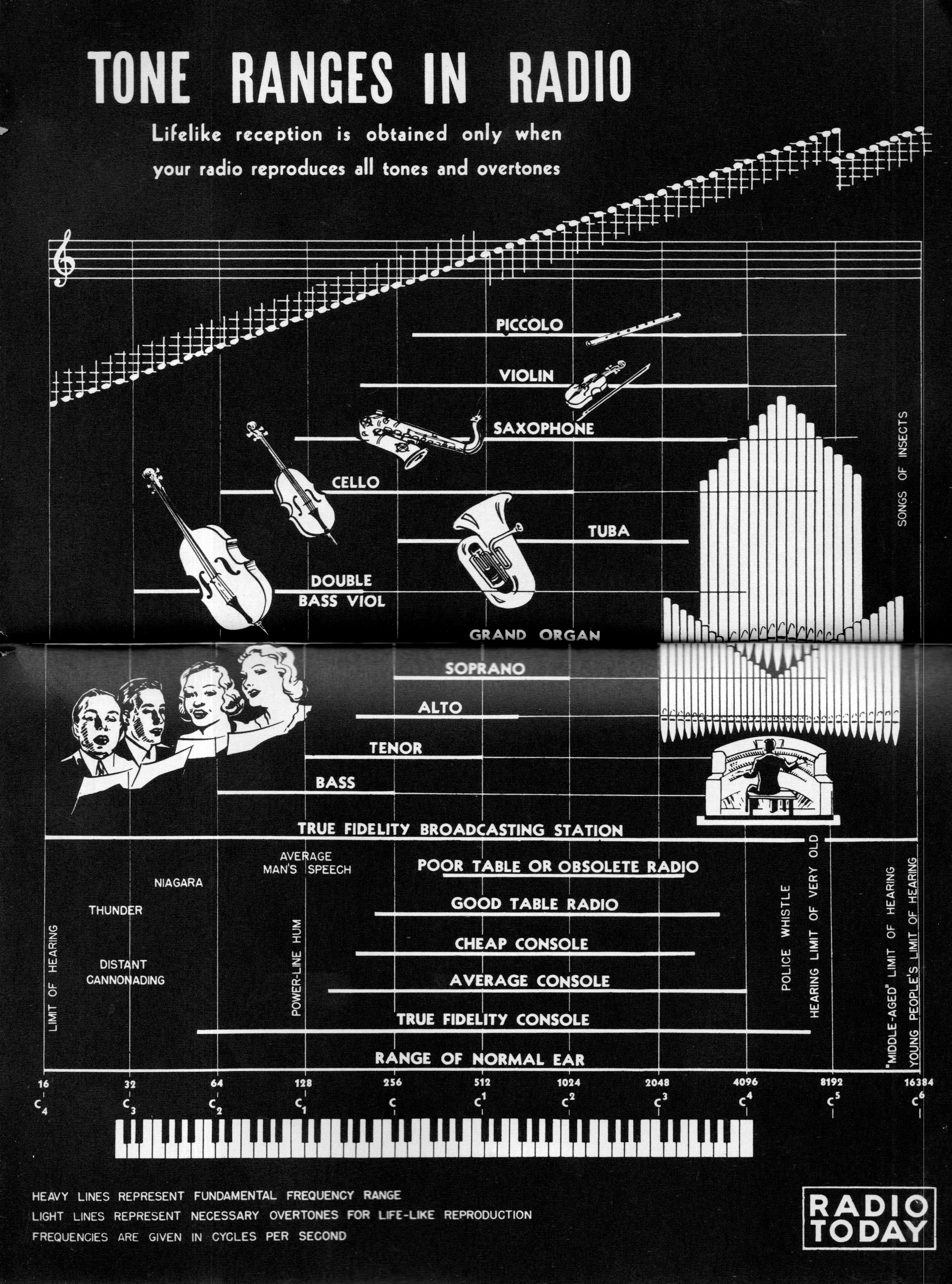
    And a graphic representation of how well radios reproduce various sounds (that was to be used by radio salesmen in influencing their customers’ selections):

    Map Radio254

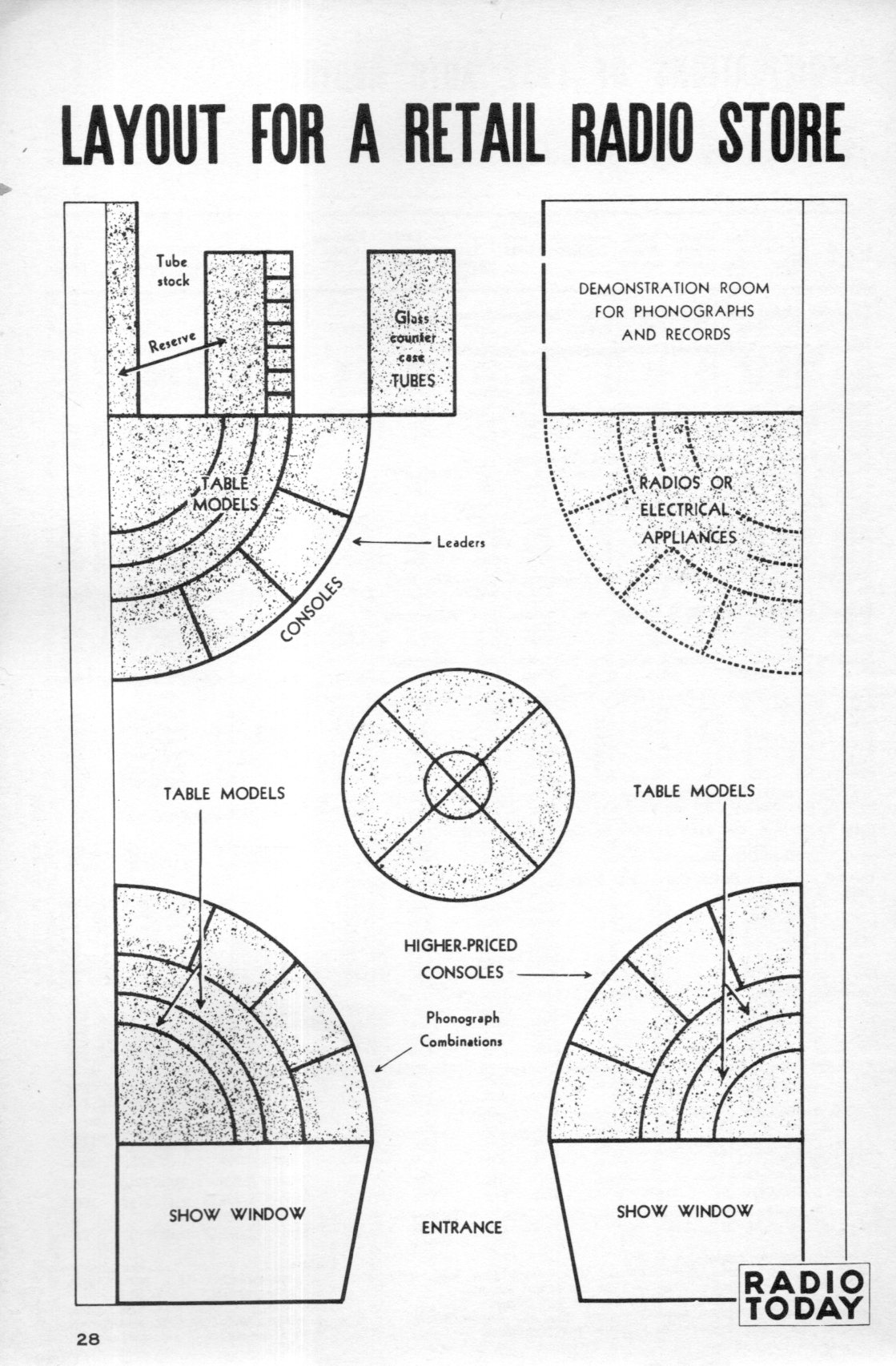
    And the very seldom seen layout of a radio shop:

    Map Radio255

    And the cover of the pamphlet and source of these images:

    Map Radio253


  • History of Lines–the Use of Thick and Bold Lines in Information, 1862

    JF Ptak Science Books   Quick Post

    I have posted many times to this blog over the last eight years on interesting examples of the graphical display of information (mostly in the category of “Information, Quantitative Display of”) that included subjects like the comparative heights of mountains and lengths of rivers, ocean depths, divorce rates, fatalities from various diseases, literacy, the location of the population centers of the U.S., what 50,000 B-17s looked like if they were to fly at the same time, and so on.  Most of these are 19th century vintage, though there are a fair number now from before WWII, though the more recent varieties show unusual bits like the amount of food consumed by an average family over the course of a year, the history of hemlines in dresses, the changes in the vital measurements of the White Rock girl, and the like. 

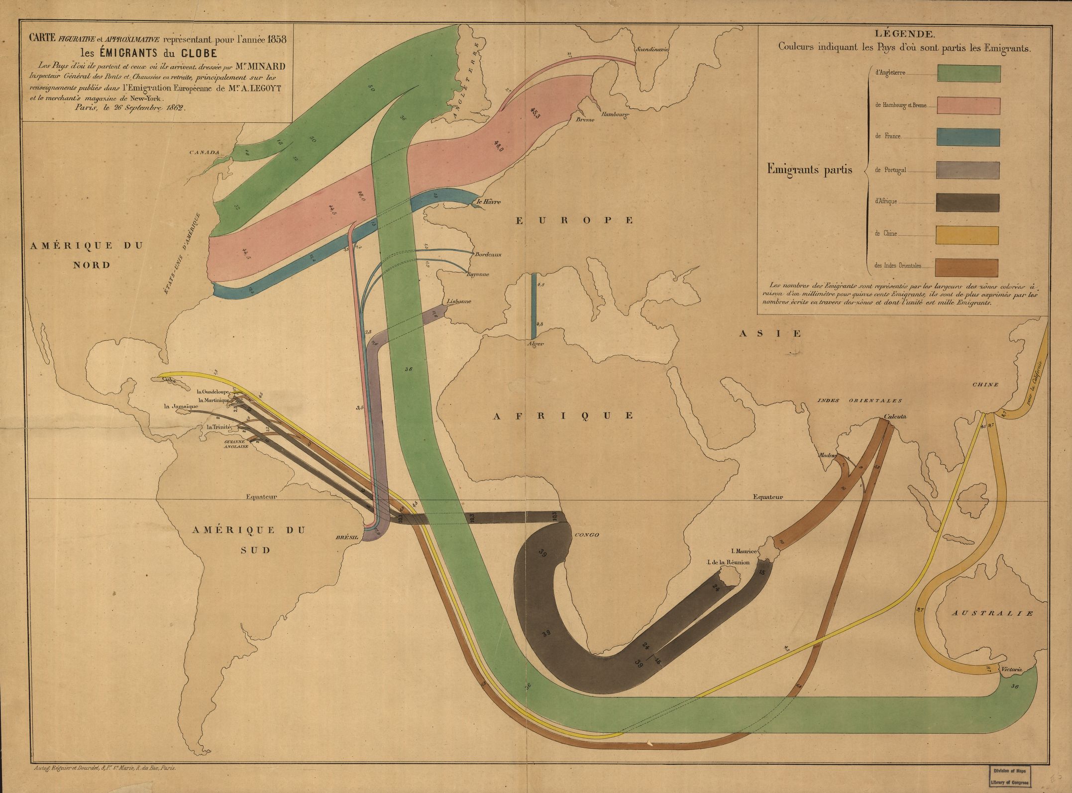
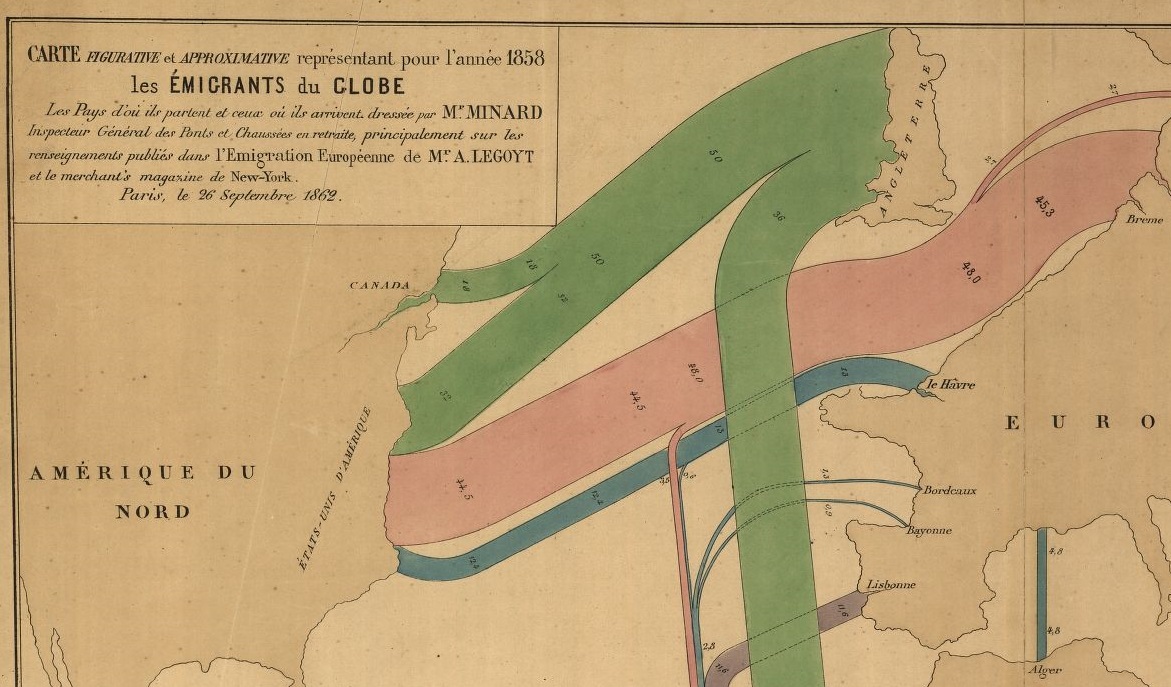
    The following map–depicting immigration origins and relative amounts and destinations–is somewhat unusual not only for the early date and manner in which the info is displayed, but also in the design–the data is not crowded out from the field of vision by anything but the broadest outlines of geography, almost all details are left off the map, which also uses two pale colors to set off the land and the sea, allowing the graphed colors to stand brilliantly apart. 

    Map immigration

    [Map source–the Library of Congress, http://tile.loc.gov/image-services/iiif/service:gmd:gmd3:g3201:g3201e:ct000242/full/pct:25/0/default.jpg]

    The map is the work of the early innovator and information-explorer Charles Minard, who is most known for his famously ubiquitous depiction of the death of Napoleon’s army in its advance upon and retreat from Moscow (see https://robots.thoughtbot.com/analyzing-minards-visualization-of-napoleons-1812-march).

    Map immigration b


  • Unusual WWII Maps by a Significant Soviet Intelligence Agent

    JF Ptak Science Books  

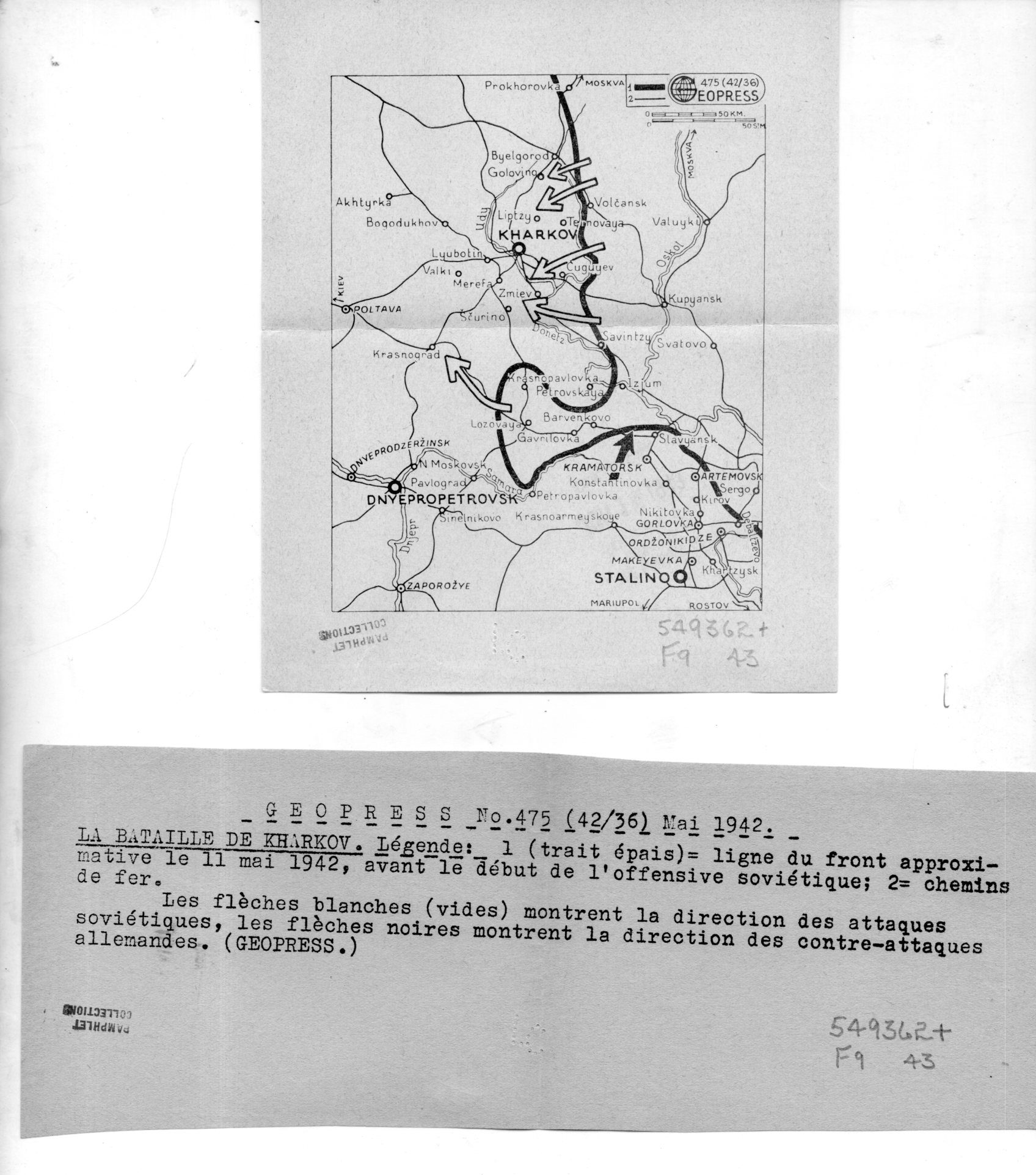
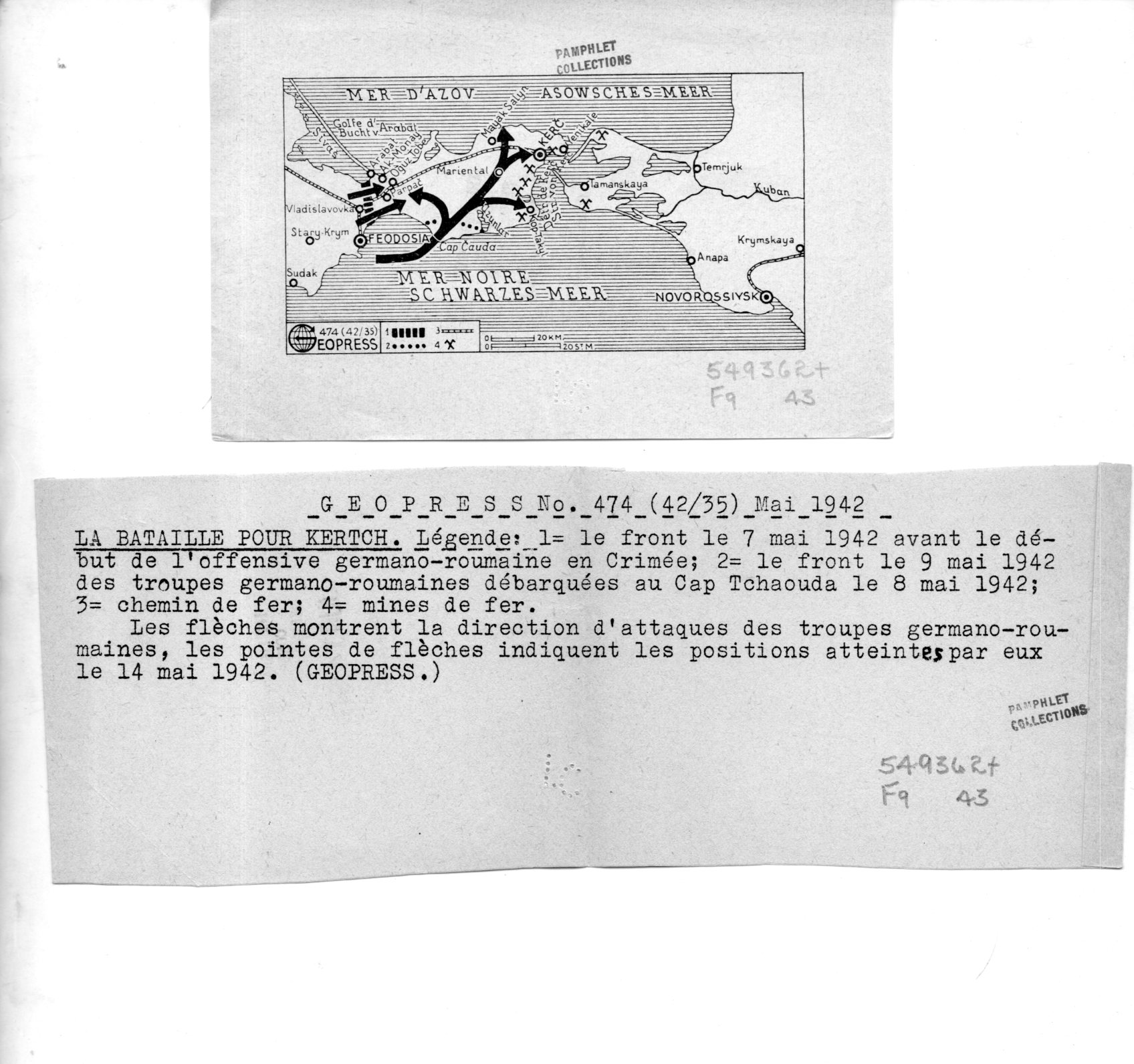
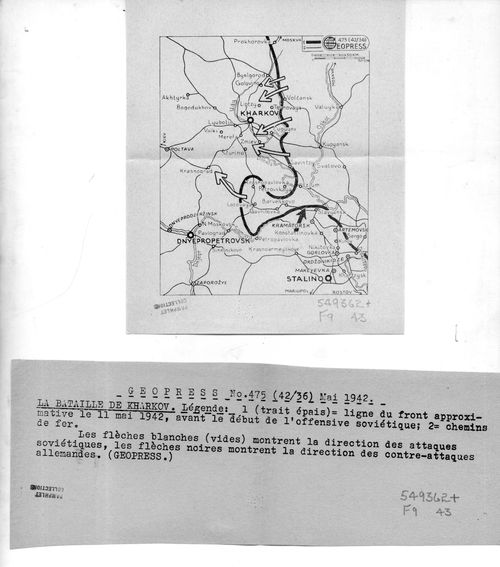
    I’ve found a number of interesting maps in the pamphlet collection here–these are highly unusual to my experience in that they were the work of a firm called “Geopress”, which was an active business and cover for a significant intelligence agent for the Soviet Union, operating in Switzerland, collecting data relating to German activities during WWII. There’s nothing I can add beyond the information that I quote extensively below from the CIA website on Rado–except that I cannot find images/examples of his Geopress work. So it seems the most efficient thing to do here is to simply quote the known sources and reproduce the images of the 18 maps and their accompanying texts.  
    Geopress _4_080

    As I said Rado operated Geopress as a news/cartographic service, and Rado was an accomplished cartographer, so the mans in and off themselves as maps are perhaps not a singular issue.  Their evident scarcity, however, does seem to be an issue. Also I do not understand why these maps are so small, some of which are just 1″x 3″; also the uneven;y cut/torn text sheets that are made to accompany the maps are also puzzling in their own way.  I do not understand the format–someone out there in Weblandia no doubt will.  

    All of the maps shown below are from 1942. They were received by the Library of Congress in June 1943 and stamped so on the backs of the maps.  (They lived for some time in the “Pamphlet Collection” at the LC before being purchased by me in 1998.)  

    The following quotes come from the CIA website, the Center for the Study of Intelligence, here:  https://www.cia.gov/library/center-for-the-study-of-intelligence/kent-csi/vol12i3/html/v12i3a05p_0001.htm]

     “Alexander (Sandor) Rado, Alexander Foote’s chief in the Swiss-based “Rote Drei” net that in 1941-43 supplied Moscow with detailed information on German order of battle… His activity in intelligence, mapping, and related fields has lasted nearly 50 years and may earn him a place in the pantheon of major intelligence figures of the times.”

    And this:

    “In 1936 or 1937, with Soviet funds and having a Swiss citizen as silent partner, Rado organized Geopress, a news agency specializing as Inpress had in maps and geographic background data. Geopress was more successful than Inpress because of better organization and the increased demand for news maps in the advancing shadows of World War II. As cover for an intelligence operation it proved ideal. Its normal activity—news collection and dissemination—provided justification for contacts with businessmen, officials, diplomats, journalists, and military leaders, some of whom became intelligence sources. It also justified a large volume of telephone and telegraph traffic, extensive postal business, and the maintenance of a courier system.”

    And so:

    “While building up his Geopress cover Rado also developed his sources, organized communications, and summarized for transmission the reports collected by his growing network. And he even found time to maintain through publications his image as an internationally known geographer.”

    And:

    “24 Feb. 1945.  During the German occupation of Hungary, (Rado) lived in Geneva where (he) published geographical maps for the Allied Governments until 1943; discovered by the GESTAPO and consequently his relatives in Hungary were murdered/ went with family to Paris in September 1944 and continued his work/summoned to Russia to report on his activities with the Free French Organization and left on 8 Jan. 1945 by special plane for Moscow/suspecting a trap, he got off the plane in Cairo where he remained/received no news from his wife in Paris and suspects that she might have been deported/he was formerly a Fellow of the Geographical Society in London, New York, Paris, Geneva, Rome and Washington, D.C.  OFFICE OF CENSORSHIP, Egypt, 11 April 1945.”

    [Again, the source for this and the above quotes:  https://www.cia.gov/library/center-for-the-study-of-intelligence/kent-csi/vol12i3/html/v12i3a05p_0001.htm]

    The maps:

    Geopress _3_079


  • Maps of Torment: the U-Boat Menace, 1917/1918

    JF Ptak Science Books  

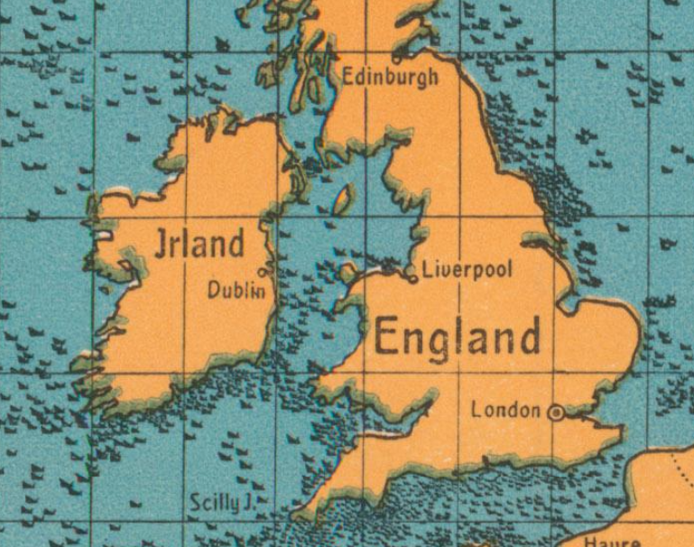
    This is a pretty stark reminder of just what was going on in the waters around Great Britain in 1917–it is a postcard propaganda map showing the gross tonnage of ships sunk by U-Boats for 1917:

    Maps U-boat WWI sinking

     [Image source: P.J. Mode’s wonderful collection of what he refers to as “Persuasive Maps”, now housed at Cornell University.]


  • An Unusual Chronological-Timeline-World Map (1887)

    JF Ptak Science Books   Quick Post

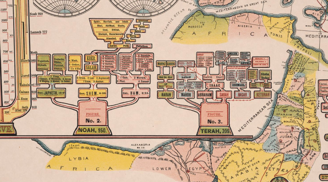
    The details of this chronological chart/map caught my eye–the genealogy trees look to me very out-of-place or -time, speaking in terms of design, and seem to have a definite mid-20th century feel to them:

    Maps dataviz chronology

    They are found in the left section of Jakob Skeen’ s 1887 Genealogical Chronological And Geographical Chart. Embracing Biblical And Profane History Of Ancient Times From Adam To Christ, which is part of my friend P.J. Mode’s wonderful collection of what he refers to as “Persuasive Maps”, now housed at Cornell University. I don’t often see chronologies of this detail with embedded maps, which is another odd bit about this display of information; overall, it is unusual to my experience:  


  • Map of the Confederacy-Crushing Anaconda Plan, 1861

    JF Ptak Science Books   Quick Post

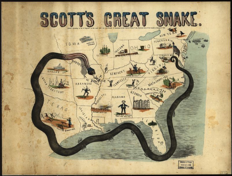
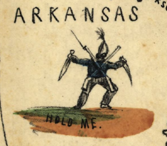
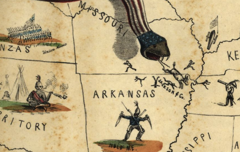
    This very graphic allegorical map was published at the beginning of the Civil War in 1861 and was intended to depict General Winfield Scott’s not-bad plan for the eventual destruction of the Confederacy. He called for isolating the Southern states by a naval blockade and by a push from the West and also an advance up the Mississippi River. The problem with the plan for most people was that Scott saw correctly that the new war was going to be long and costly–this at a time when most saw the conflict as a months-long affair. Part of the correctness of Scott’s recognition of a long war was that the Northern states had fewer than 20,000 troops, and that many more would be needed and that the army would need to be gathered, trained, and built, none of which would happen quickly. But the general faults with the plan do not diminish his important contribution that the Civil War would a total war, and that the conflict would not be over any time soon.

    • [For a good and concise article to get you started in understanding Scott’s’ plan, see B. Wolfe, “Anaconda Plan”, (2011, May 9), in Encyclopedia Virginia: http://www.EncyclopediaVirginia.org/Anaconda_Plan.]
    • (I bumped into the Anaconda Plan map on cnn.com or something like that, in a piece on 15 great maps or some such, but there was almost no backstory…)

    Maps Scotts great snake large

    [Source: the Library of Congress, http://www.loc.gov/item/99447020/]

    Maps Scotts great snake arkansas

    And:

    Maps Scotts great snake detail


  • The Coming Storm: a Map of the French “Drole de Guerre”, September, 1939

    JF Ptak Science Books   Post 2582

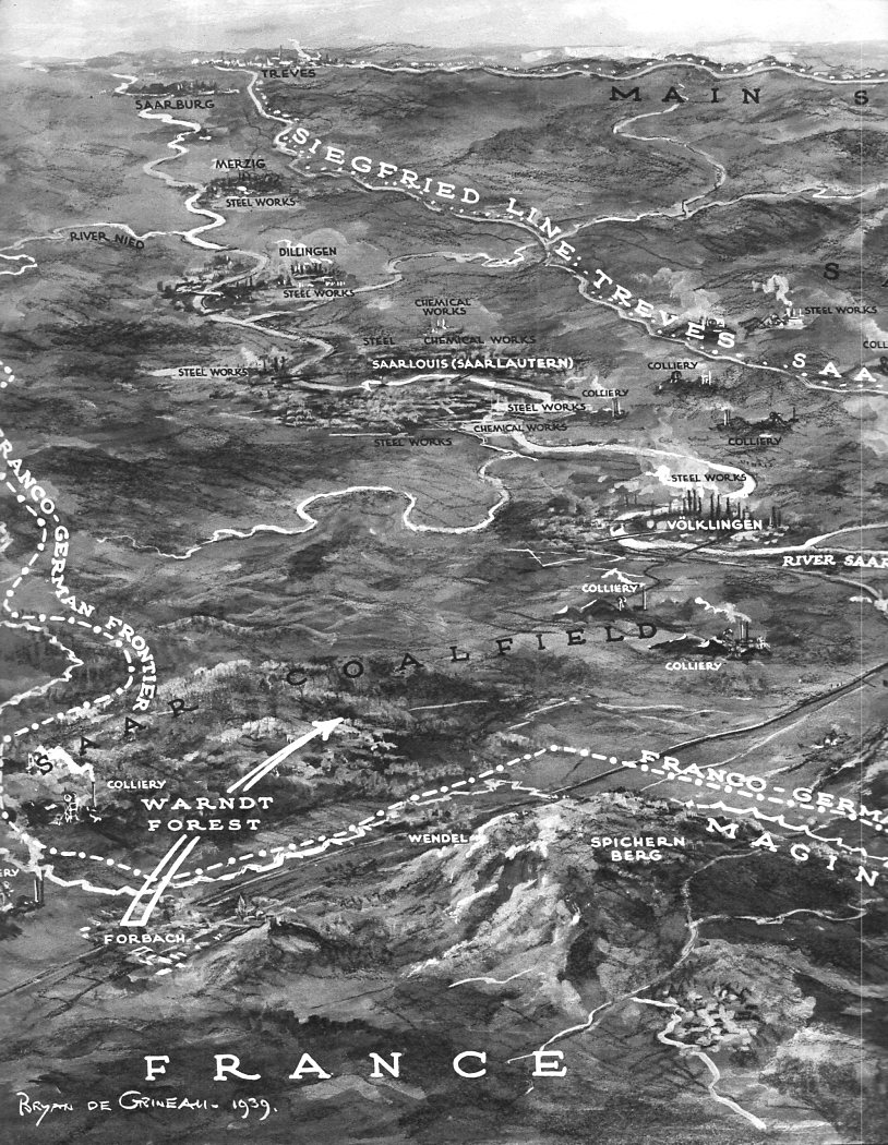
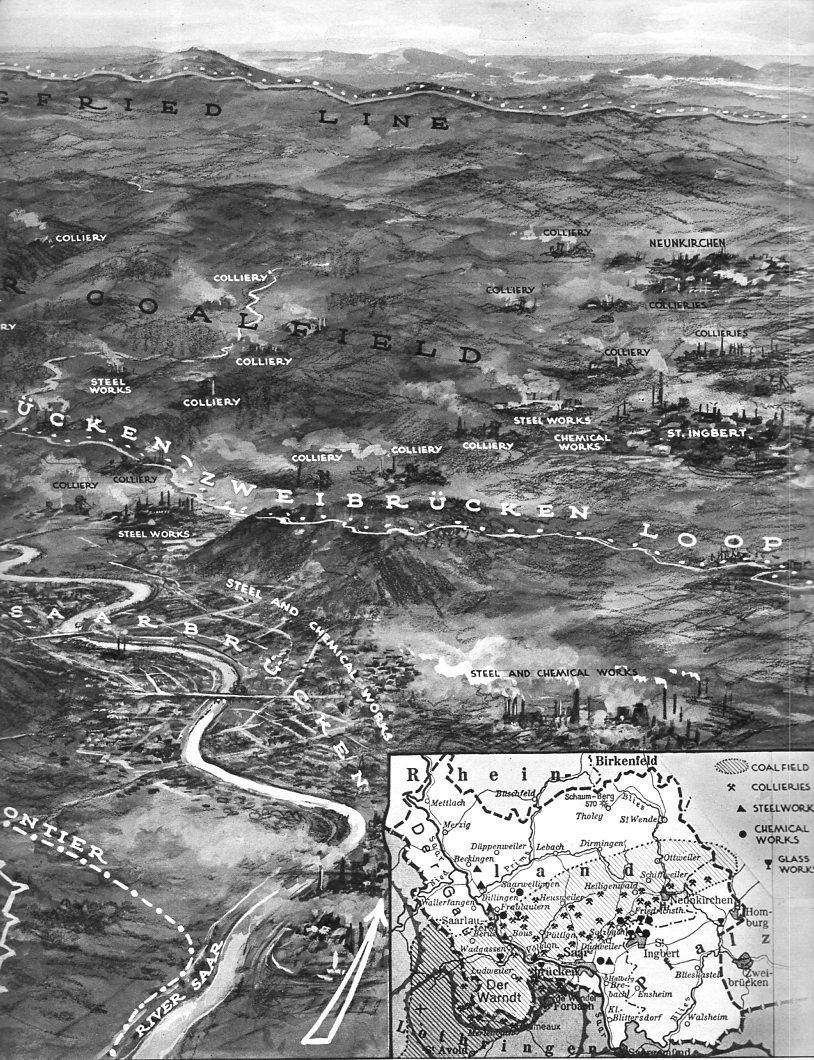
    This orderly and  semi-pastoral bird’s-eye view of the earliest part of the war in the west of WWII appeared in The Illustrated London News on September 30, 1939, three weeks or so after the Nazi attack on Poland.  The foreground shows about 40 km of the front from the river Nied to the Saar and south to Saarburgken, with the Siegfried Line in the distance.  The map shows the region into which 40 French divisions advanced from September 7-16, meeting little resistance from the outnumbered German troops who by and large fell back to more defensible positions. 

    Not much happened.

    This period of the war has often been referred to as the “Phony War” due to the lack of action, though it wouldn’t seem so “phony” if you were killed in the process, as thousands were.  Winston Churchill referred to it more as the “Twilight War”, which is far more appropriate–and this no doubt more meaningful to Churchill int he light of the HMS  aircraft carrier “Courageous” being sent to the bottom by Nazi torpedoes with the loss of more than 500 sailors…there was certainly not a bloody thing “phony” in that. 

    The French referred to this period as the “Drole de Guerre”, which they really shouldn’t’ve done–their Saar offensive of mid-September being stunted and odd, came to a halt, and the troops called back to the doomed Maginot in October. 

    The Twilight War continued until late April, and then in May, it was certainly all over, as the Nazis attacked Belgium, Luxembourg, and the Netherlands. And then of course came France.  In just about the same amount of time that the Saar Offensive occupied, the Germany advanced and forced France to surrender, the curtain coming down on June 22.   Calm before the storm, and all that–the rest of the war was more storm before the storm, until there was storm no more.


    Siegfried line _1_375 Siegfried line _2 _380


    And the text accompanying the maps:

    Siegfried line _1 text_376

    Siegfried line _2  text b_379