A Daily History of Holes, Dots, Lines, Science, History, Math, Physics, Art, the Unintentional Absurd, Architecture, Maps, Data Visualization, Blank and Missing Things, and so on. |1.6 million words, 7500 images, 4.9 million hits| Press & appearances in The Times, Le Figaro, Mensa, The Economist, The Guardian, Discovery News, Slate, Le Monde, Sci American Blogs, Le Pont, and many other places… 5000+ total posts since 2008.

Category: Art History

  • Art Made of Fat: Boneless Sculpture in a Boney World

    JF Ptak Science Books   Post 100    [See also my latest post on fat:  Fat Redux, 1920’s Fat  Quack Cures].

    Luminousfatcvr111

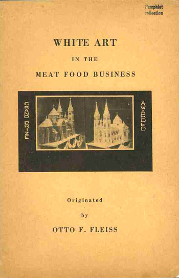
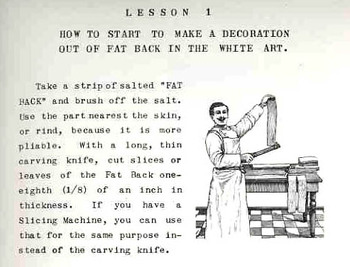
    In the world of found-book-objects, few I think are as deeply removed and as deeply obscure as the work by Otto F. Fleiss, a butcher and sculptor in fat. And lard.  The pamphlet’s title is a throw-back to an earlier day of titling, when the title page was pretty much fully overtaken by the title, though as a common practice it say its heyday 300+ years ago. Fleiss’ 50-word title: White Art in the Meat Food Business.  A Practical Handbook for Butcher, Pork Stores, Restaurants, Hotels and Delicatessens on How to Make Lasting and Transferable White Art Decorations out of Bacon Fat Back for Window Displays, Ornaments on Meat Food Cold Buffets and for Exhibits and Advertising Purposes.  Enrich yourself with Personal Knowledge. 
    Luminousfatman_top

    If the title of this book could itself be described in terms of food, I think that I’d have to call it a (warm) Slim Jim Egg Frosty with a crust of French fries, baked.  Or something like that.  If the exhaustive, exhausting title didn’t stop you in your tracks, though, the slim pamphlet holds some indelible, indigestible, eyebrow-burning, flat-out remarkable images. Working your way through this pamphlet is as much fun as stringing together dirty diapers:  you can enjoy instructions on how to make a vase of roses out of strips of fat, or produce the reverse (?!) portrait of Santa Claus in slabs of fat, or marvel at the photos of Mr. Fleiss’ “first prize” (?) 200-pound fat sculpture of a cathedral done entirely in slips and chunks and strips of fat.
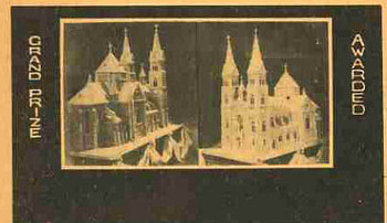
    Luminousfatcvr_detail This simply must be the most sublime work ever produced on Fat Art.

    And, in the annals of art, I should think that Black Velvet Sparkly Liberace paintings may have moved up a level from the most secret depths of the inferno to make way for Fat Art–or, dare I say it, “FART”.


    A Note on the Origin of this Pamphlet:

    The Fleiss work comes from a singular collection that we purchased of the Library of Congress some years ago.  It was called, simply, “The Pamphlet Collection”, and included 90,000 or so pamphlets stored in 2,355 blue document boxes.  They were all categorized and alphabetized, but not according to any truly discernible methodology.  Their greatest common denominator was that the great majority of them simply did not exist.

    By “they did not exist” I mean that they were not catalogued in the massive (70 million item)  database and librarian’s tool WorldCat/FirstSearch which lists books in libraries world wide.   And they continually do not show up in the mass bookseller databases, or in Google/Yahoo searches, and so on.

    The pamphlets in the collection also weren’t added, in large part, to the Library of Congress collection, nor were they ever circulated.  They were just kept in their blue boxes, waiting to a-moulder away.  But they didn’t, and here they are, and will be, making appearances over the next number of years.

    There will also be many other images from much more public and published sources that have simply slipped away from us here in our present—unexpected bits of revelatory history wrapped in a simple image that speak volumes from the dim, deep forgotten.

    Additional Images:

    Perhaps the most incredible of the photographs in this unleafy work by Fleiss is of that below, of the Welfare Meat Pork Store.  The legend describes “lamb roast ornamented into a duck”, meaning that all of the duck-like things hanging there in the window were actually made of lamb roast covered in pork fat.  (One doesn’t get to write that ever day.) Then we see a “roast with a rose” (and as we saw in the text the roses in the ornamentation were made out of fat), as well as a “rose on a smoked ham and a bouquet of roses”.  Again, virtually everything in the wind of this store was constructed of fat.Luminousfatlamb115

     

    Mr. Fleiss also did Christmas ornamentation.
    In fat.

  • Different Forms of Writing 2: Recording Movement. Dance Notation

    JF Ptak Science Books LLC Post #98
    Blogwritingdanceorch_tp

    It’s intriguing to think of writing systems standing for things other than words—for example, one has the whole of the mathematical sciences, chemical notation, Feynman diagrams, weather patterns, and on and on.  Lines and dots and squiggles and the like, not forming words, but something entirely else, an amanuensis for words. 
    Blogwritingdance

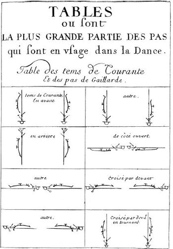
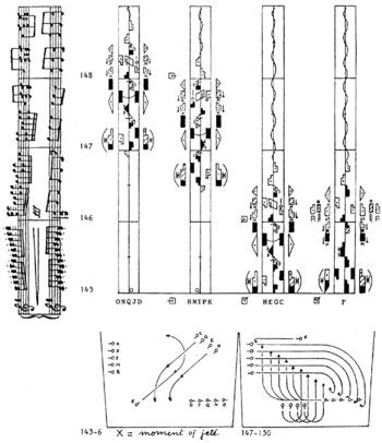
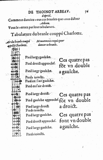
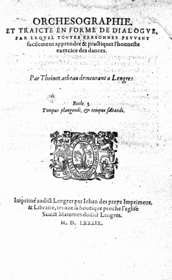
    The idea of adopting a written dance iconography—replacing drawings and written descriptions of dances—is nearly as old as the dance instructional itself.  The notation used by Lana in the 1920’s was the first image that came into my mind for this alternative wiring scheme, but in fact there were several systems for recording the simple movement and placement of the feet that reach back into the 16th century.  The first of these books to attempt to codify the movement of dance via non-descriptive writing is the letter codes employed by Thoinot Arbeau in his 1588 book Orchesographie.   In this Socratic introduction to dance Arbeau showed foot and movement patterns and linked them (visually) with the music.  What Arbeau was describing was solely the movements of the feet—everything else beyond that—position of the legs,
    Blogwritingdanceitlaian_1604

    arms, head, etc.—was left unaddressed in the iconographie though he did connect them with engravings showing how the rest of the body should look at some point during the dance.   

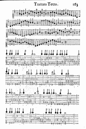
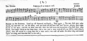
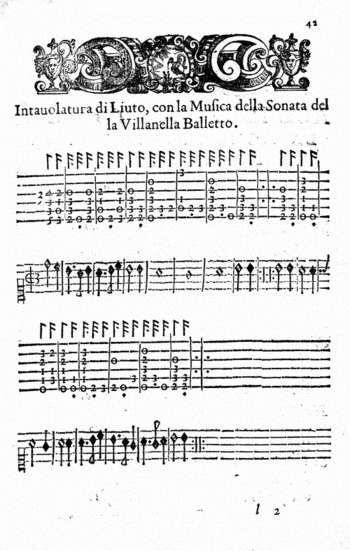
    A similar system was employed in the 1680 Nvove inventioni di balli; opera…(left) , and then again in The dancing master; or, Directions for dancing country dances, with the tunes to each dance, for the treble-violin, “10th ed. corrected; with addition of several new dances and tunes never before printed”, by Henry Playford (in London) in 1698 (below). 
    Blogwritingdancuingplayford

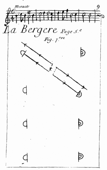
    A major development occurs in the Choregraphie of Pierre Beauchamps (and published by Raoul Feuillet, and known perhaps unfairly as the”Feuillet System”), which instituted a floor plan of sorts, showing the movement of the feet by symbol and viewed from . As better described by the Library of Congress site:   “Feuillet’s procedure was analytical; he broke up the steps into their mechanical parts, invented symbols for each of those parts, and organized them temporally by bars on the progression line. These bars reflect the temporal sequence of the steps according to the musical score.” (The Feuillet illustration is below.)
    Blogwritingdancefeuillet

    The view from above, or bird’s-eye view, was replaced in one 19th century system of annotation with stick figures, which were viewed from the front.  Again, from the Library of Congress: . “In his Stenochorégraphie, published in Paris and St Petersburg in 1852, Arthur Saint-Léon used a scheme consisting of five horizontal lines for the movements of the legs and one additional line for the actions of the upper body. The figurative notation signs appear directly above the musical score, relating them approximately to the musical values.”
    Movement was also recorded on whatr appears to be a musical template, using bars an staffs and musical-note-like notation to record movement, which seems to hjave possessed a more lyrical quality, with the potential for capturing more of the movemente than foot arrangements and speed of motion.  The Library of Congress writes about this in reference to the system of Vladimir Stpeanov’s 1892 Alphabet du Corps Humain, “…Procedures of sound notation are transferred to movement notation: addition (a movement is, just like a musical sound, the sum of several elements) and duration (the temporal value of a movement is indicated by the time value of the note). described the human body within a scheme consisting of nine lines, divided into three parts. The top two lines are used for the movements of the head and torso, the three middle lines indicate the actions of the arms, and the bottom four lines the movements of the legs. The position of the tail of a note indicates whether the movement concerns the left or the right body part: for the left parts, the tail is directed upwards, for the right parts, it is directed downwards. “

    In 1910 Vaclav Nijinsky published a very similar system of notation to Stepanov, using the basic template and then adding five more lines to the figure to denote movements throughout the core of the body.
    Laban

    It seems to me that the greatest pre-WWII advancements in all of this is Kinetography Laban  (and afterwards known as Labanotation), which belongs to Rudolf von Laban, who seems to have incorporated movement of the feet, the body, the head, arms, as well as expression and speed, as well as relating it all to music in his own (famous) writing system.  I call again on the authorless Library of Congress work on dance notation to for a superior and extended description of the notation:

    “Kinetography, and Labanotation use geometrical shapes as symbols that indicate not only directions, but also specific levels and duration. Direction symbols modify the basic rectangular shape and show the directions forwards/backwards and left/right as well as the diagonal directions in between; the shading of the shape indicates the direction upwards/downwards, and its length shows duration. The body is represented within a vertical system from behind that is to be read from the bottom of the paper towards the top: following the central line, the right side of the dancer is also the right side of notation. The central line represents the vertical centre line of the body, and also the progression of the movement. Next to this line, on both sides, there are the columns for all movements transferring weight. The body parts themselves are identified by particular symbols. Their various movements are observed and notated separately and then synchronized in the notation score.”

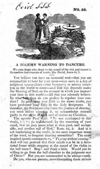
    This post would somehow seem incomplete without at least mentioning the contrary to this notation–the warnings by some religions that The Dance itself would lead humans directly to Hell.  So, not only should people not have recorded dance, but they shouldn’t be dancing in the first place.  OR thinking about dancing, for that matter.
    Blogwritingdancegoing_to_hell

    The article that I have quoted from here is found HERE.

    Some other interesting, and beautiful alternative means of writing in regard to recording dance include:

    Blogwritingdancearbot_notes

    Wilson, Thomas dancing master; An analysis of country dancing: wherein are displayed all the figures ever used in country dances, in a way so easy and familiar, that persons of the meanest capacity may in a short time acquire (without the aid of a master) a complete knowledge of that rational and polite amusement. To which are added, instructions for dancing some entire new reels; together with the rules, regulations, and complete etiquette of the ball room. By T. Wilson … Embellished and illustrated with engravings on wood, by J. Berryman; London, Printed by W. Calvert, to be had to Mr. Dutton [etc.] 1808

    Nvove inventioni di balli; opera vaghissima nella quale si danno i giusti modi del ben portar la vita, et di accommodarsi con ogni leggiadria di movimento alle creanze et gratie d’amore. Convenevoli a tutti i cavalieri, & dame, per ogni sorte di ballo, balletto, & brando d’Italia, di Spagna & di Francia. Con figure … in rame et regole della musica et intavolatura quali si richieggono al suono et al canto. Divisa in tre trattati …Blogwritingdanceitalian_note

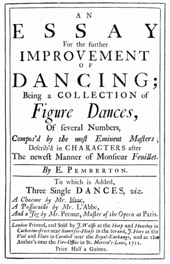
    Blogwritingdance_tp_pember

    ·Posted by :

    ·in:

    — —

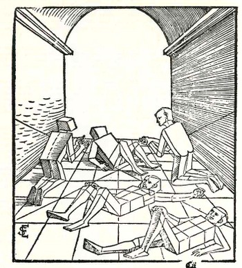
  • Missing People–[Addition]. Joachim van Ringelberg, 1541.

    JF Ptak Science Books LLC  Addition to Post #88

    I’ve
    found another extraordinary image that would fit just perfectly in an an
    earlier post, Missing People—Pelerin, Schoen and Marey and Picturing Absent and
    Empty People for the Study of Perspective
    .

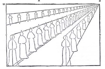
    Blogmissing_add107
    This
    wood engraving comes from the Flemish Joachim Sterck van Ringelberg’s (1499-1536
    or so) book Lucubrations, printed in Basel in 1541 Ringelberg was one of those famous wandering
    scholars from the first half of the 15th century, and the book was no doubt constructed for the use of his pupils. This is one of about 30 books that Ringelberg
    wrote–he intended to wrtie a thousand, but times being what they were, and
    living to only 37 or so, he fell short of the mark. He did produce quite a lot
    though given his youth, the hardship of travel, access to published works, and
    tools, and general annoyances of the 16th century traveler who was not a
    royal. It is really quite
    remarkable. Ringelberg taught a wide
    range of subjects belying his quest for M books–he was competent in astronomy,
    mathematics, literature, classics (of course) , and languages.

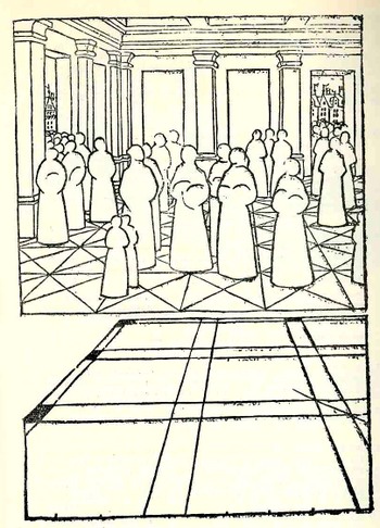
    This “missing people” image comes from a section of this book dealing
    with perspective. I’m just endlessly
    entertained trying to get inside the head of a 16th century student seeing
    these empty, missing, place-holder human forms for the very first time. As I’ve said earlier, these figures just
    don’t occur in Western art.   


    ·Posted by :

    ·in:

    —

  • Color Music–Found Images and the Second Perfect Number.

    JF Ptak Science Books LLC  Post #93

    (Notes for a Future Post)
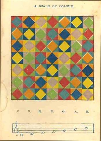
    Blogcolor_scales097
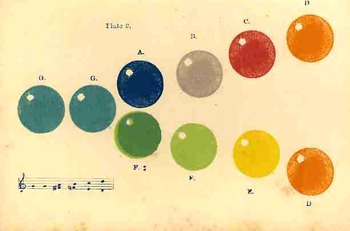
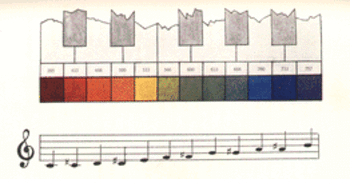
    I found these two beautiful lithographs a while ago—they are really quite gorgeous, and I don’t have a clue to their source.  They probably were printed in the 1860s or so, perhaps 1870s, which I thought—given their subject matter—would make their identification easier.  The subject matter is old, appearing hundreds of years before these images were published. For example, in 1690 the philosopher and constitutional muckrack John Locke reported on a blind synesthesiastic man “who…bragged one day that he now understood what scarlet signified … It was like the sound of a trumpet.” 

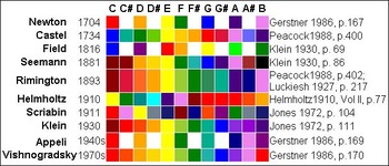
    Equating the frequency of sound waves with the corresponding wavelengths of light was a quest by Sir Isaac in 1704 (In the Opticks), while in 1742 the French mathematician Louis Bertrand Castel strengthened Newton’s proposal of a solid relationship between the seven colors and the seven units of the scale. Slightly later he  undertook the  construction of a clavecin oculaire–a light-organ–as a new musical instrument,. which would simultaneously produce both sound and the “correct” associated color for each note.  A century and a half later Bainbridge Bishop had constructed at least three color organs, while in 1893 Rimington had patented the name “color organ,” and had already toured with his own device, performing color tone presentations of the works of Chopin,
    Blogcolor_scales_bubbles098

    Bach, Wagner and Dvorak.  Experimentation of a new order took place in the early 20th century in the hands of Scriabin (who thought colors were associated with tonality, not with singular notes), Kandinsky, Schoenberg and Marc. 

    Now, getting back to the “scale of colour” illustration, we find our anonymous author equating the following scales thus, beginning with the first column, reading top to bottom, and looking first at the underlying color:
    C:  red, blue, orange, blue, yellow, violet and green.
    D:  orange, blue, yellow, violet, green, red indigo
    Blogcolo_rmusic_rimington
    E:  yellow, violet, green, red, indigo, orange, blue.
    F:  green, red, indigo, orange, blue, yellow, violet.

    And so on through the scales of G, A and B. 

    When you assign numerical values to each one of these colors (green=1, red 2, indigo=3, violet=4, red=5, green=6, yellow=7), the sum is 28. 
    28 is an interesting number in itself, being the
    Blogcolor_organ_bishop
    second perfect number (following the first perfect number which is 6)—a perfect number being the sum of its divisors, including unity but excluding itself (so 28= 1+2+4+7+14).

    The color systems proposed by Castel and Bainbrisge are as follows:

    Castel

    B (dark) violet Bb agate A violet Ab crimson G red F# orange
    F golden yellow E yellow Eb olive green D green C# pale green C blue

    Bainbridge
    B violet-red Bb violet A violet-blue G# blue G green-blue
    F# green F yellow-green E green-gold / yellow
    D# yellow-orange D orange C# orange-red C red

    Blogcolor_schemes

    The following chart is from the wonderful color/music siteVISUAL MUSIC.

    ·Posted by :

    ·in:

    — —

  • Beautiful Title Pages 6: Losing Your Head—St. Denis and the Cephalophoric Title Page

    JF Ptak Science Books LLC   Post #90
    Blogtphead_off096

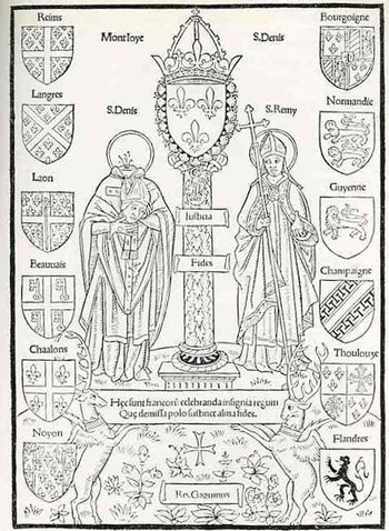
    Robert Gaugin (1433-1501) produced this fabulous illustration for his Compendium de origine et gestis Francorum, a 180-leaf history of France, printed in Paris in the second week of 1500.  (This is actually the fourth edition of this work which first appeared in the year 1495, which would officially make it incunabula.)

    St. Denis and St. Remy are pictured here standing on either side of a column supporting the fleurs-de-lys, and surrounded by the coats of arms of various French cities and provinces. 
    Blogtphead_off096_det

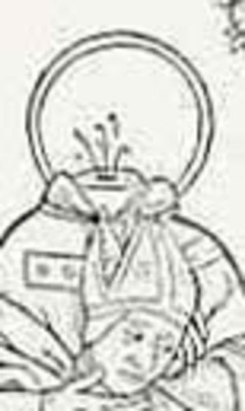
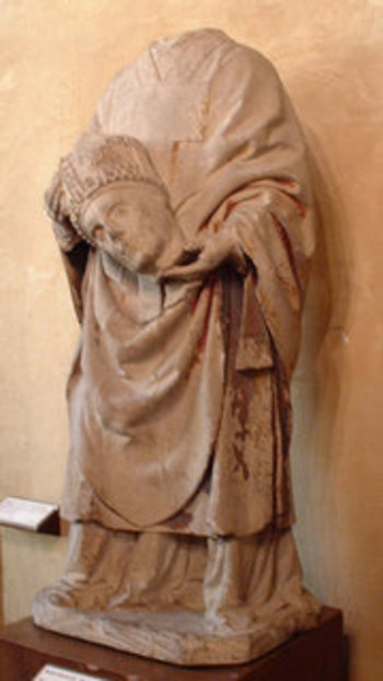
    So far as I can limitedly determine this is the first title page featuring a headless, or decapitated, human.  And that human is St. Denis of Paris, also called Dionysius, Dennis and Denys, the third century bishop of Paris who was martyred about the year 250.  It is said that after being beheaded by the Romans at the highest point in the city of Paris (now known as Montmarte, “mount of the martyr”), Denis picked up his head, held it in his hands, and walked two miles in this fashion, preaching all the way.

    St. Denis however was not the only beheaded person to carry his head, nor was he anywhere near being the only saint to do so. As a matter of fact there is an entire category of saints who carried their heads following beheading, called Cephalophores.  This special class of saints
    Denis_bertrand

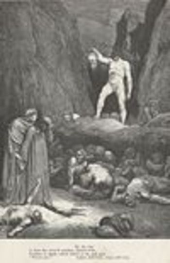
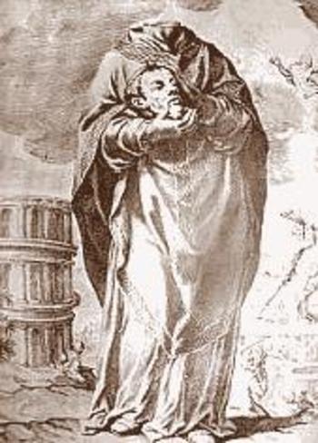
    include Paul of Tarsus, Saint Ginés de la Jara, Saint Gemolo , Aphrodisius of Alexandria, (pictured below)  Nicasius of Rheims,  Cuthbert of Lindisfarne and Oswald of Northumbria, while others of this category though not saints include Lucian of Beauvais, Nectan, , Osyth, Quiteria, Winefride and Wyllow. Cephalophores also make many appearances in literature, most notably in Dante’s Inferno (8th Circle, Bertrand, pictured left) St_denis_2
    ) and in Sir Gawain and the Green Night. St_denisaphrosdius

    But none I think appear on a title page of a book earlier than this 1500 example of St. Denis.

    As a very occasional note, St. Denis is pictured here with one halo–sometimes he has two. 

    ·Posted by :

    ·in:

    — —

  • Blank & Missing People—Pelerin, Schoen and Marey and Picturing Absent and Empty People for the Study of Perspective.

    JF Ptak Science Books  Post #85
    Blogmissing_people076

    In some of the elementary thinking on perspective in the history of art and science there is a certain amount of subtraction that must occur before addition and advancement can be made—these experiments have resulted in some very unusual-singular even—images, which when viewed apart from their proper context and considering the times in which the images were made make them seem revolutionarily modern. 
        Take for example the extraordinary work of Jean Pelerin (also called “Viator”) in his De artificiali perpectiva, a very rare woodcut-illustrated book printed n Nurenberg in 1509. In illustrating what he referred to as his “three point perspective” Pelerin removed much of the gothic-tradition bric-a-brac that is so heavily favored in these early books and replaced them with outlines from his rather astonishingly expressive notebooks, and replacing people, individual humans, with what may be the first “almost-entirely-absent” human forms. These roundish, ghost-like figures are just meant to hold the outlines of space, meant to function in the role of a simple comparative unit. This works quite well as an artistic technique—a solicitation tool which I think gives his reduced, “empty” humans an incredible, ethereal look unlike any other in the history of the first 60 or so years of printing.  It is difficult to imagine what the observer of these images back there in 1509 was thinking when they looked at these figures, and perhaps removed them from their textural context—it  would have been a unique visual experience for them
    .Blogmissing_peopl_2e077_2

    Just a little while latter Erhard Schoen, in his Unnderweissung der proportzion und stellung der posssen liegent und dtehent, printed in Nurenberg (as well!) in 1538, presented another unique way of representing the human form in model for the sack f studying perspective.  He used simplified geometric form to stand in for the curvy humans, replacing them with proportional stacks of boxes which would more easily explain to the younger reader how to represent the human body n space and in proportion to other things.  Again like the Pelerin, I think that these were monumentally combative images showing humans in a radical, previously unknown way. 

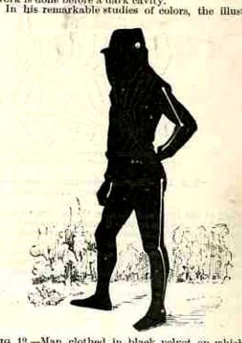
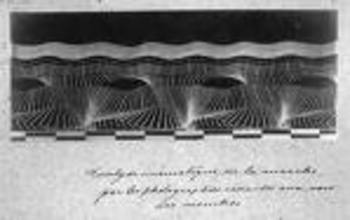
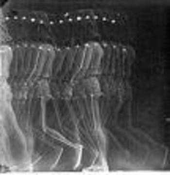
    Dashing into the 19th century we find another superb image of the empty man from Etienne Marey in his photographic and moving-photographic studies of motion.  This is actually a little odder, as the man in this image can be either completely empty or the convex, being completely filled up.

    Blogmissing_menmarey084
     

    Blogmssing_marey_2

    Marey would fit sensors at moving/jointed parts of the human body, affixed to a black-cloth-wearing experimental helper.  The point was to collect simply *movement* images and not necessarily-at this point at least—the parts of the body responsible for the movement.  At this time Marey was interested in the effects of motion, and used his empty man to do just that.
    Blogmissingmarey_one


  • Digital “Computers” 1450-1750: Memory and Calculating on the Fingers and Hands

    JF Ptak Science Books Post #81  (Expanded)

    Bloghands_memory072_2
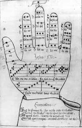
    These lovely images weren’t intended to show people living in the Renaissance and Baroque eras how to actually record data on their hands—they were intended rather as templates to show how they could use their fingers and hands for calculating and as memory devices.  Much like Frances Yates has shown us so beautifully in The Art of Memory and how info and data was stored in imagined and compartmental palaces in the mind (relying upon images), the hands were also used as a theatre of memory in addition to extended calculation. 

    These mnemonic devices were necessary—especially during the Renaissance—because of the general lack of and access to affordable vellums or paper and writing instruments.  Having notebooks filled with memoir or history of calculation was generally not something that was happening for even the not-wealthy but not struggling class.  These mental images were used widely in the areas of religion, palmistry, astrology mathematics, astronomy, astrology, alchemy, music, and other such fields. 
    Bloghands_big074_3

    The first image (from a German manuscript) of the hand-theatre was found and deciphered by Claire Richter Sherman (Folger Shakespeare Theatre) and is religious in nature, an intentional piece of memory for the devoted and for devotions.  The needs of religion were splayed out as the hand was opened and fingers flexed, and working from thumb to pinkie, from finger tip and joint—“do God’s will, examine  your conscience, repent, confess”, and so on, and above all be content with your lowly penitente stature.  If there were 28 of these admonitions or reminders at different points of the hand and you memorized them all, it would be a much simpler time to recall and keep them in order if you merely had to touch a part of your hand where that memory should be to invoke what it was you were supposed to do.  Therefore you could theoretically cast about with your creator with your hands in your pockets—if you had pockets. 

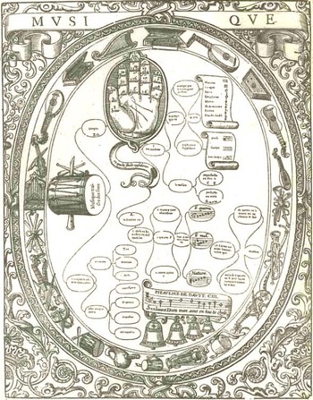
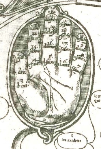
    The next two images (including the enlargement of the hand section) are from a work from 1587 entitled Musique and are attributed to John Cousin the Younger (1522-1597).
    The basic premise for this device—it seems to me—was to be able to order the different chords of 20 different instruments. 
    Bloghands070_2

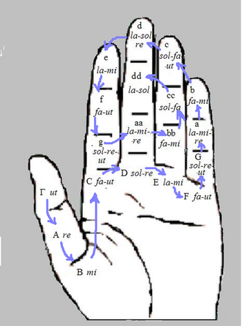
    Another musical hand mnemonic was the Guidonian hand, a survivor of Medieval times, and possibly named after Guido of Arezzo (a musical theorist), and was an aid to singers learning to sight sing.   

    The entry for the Guidonian hand in Wiki explains it use rather well:  “The idea of the Guidonian hand is that each portion of the hand represents a specific note within the hexachord system, which spans nearly three octaves from “Γ ut” (that is, “Gamma ut”) (the contraction of which is “gamut”, which can refer to the entire span) to “E la” (in other words, from the G at the bottom of the modern bass clef to the E at the top of the treble clef). In teaching, an instructor would indicate a series of notes by pointing to them on their hand, and the students would sing them. This is similar to the system of hand signals sometimes used in conjunction with solfege…”
    Bloghands_bodies071

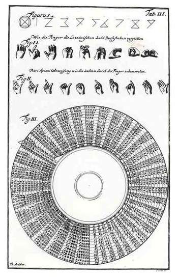
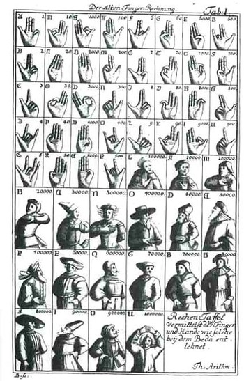
    The final two examples come from Jakob Leupold’s  (1674-1727) Theatrum Machinarum (1724)—this was a complex work involving nine sections and addressed the theoretical  aspirations of engineering (load, flexure, that sort) and its applications to its daily practitioners.  In one section of the book he sought to explain the connections (and correlations) of hand motion and symbolism to the origins of the number systems, carrying it out further still into body language, so that two people conversant in these symbols could talk and bargain between themselves in economic/body terms.  Barbara Maria Stafford, in her Artful Science, Enlightenment,

    Bloghand_guido

    Entertainment and the Eclipse of Visual Education (1994) points out the long history of this tradition, and that it reached far back into misty time:  Leupold knew that Appian, the Venerable Bede, and Aventinus had been fascinated by manuloquio, or natural language with the hands.  He thus linked counting to a global….medium of prearranged gestures…”

    Bloghandguido_2_2


    ·Posted by :

    ·in:

    — — —

  • Dismantling Reality–Euclid, Mondrian, Malevich, Lobachevsky and the Appearance and Disappearance of Form Through Geometry.

    JF Ptak Science Books Post #80

    Today’s post comes via my wife Patti’s phoney baloney sandwich for our four-year-old Tessie.  It was a tight fit of geometric pieces made to cover slim pieces of bread that would fit into her bento boxes.  The form was lovely!  And—on the heels of yesterday’s post—it reminded me of the remarkable qualities of geometry, and the role it has played in the creation of the known and visible parameters of our world(s). Geometry has also played a very visible role in removing those parameters, for as much as the art has forced regularity in our thought, it has played just as large a role in challenging that structure.  What Euclid has given, Lobachevsky has both taken away (and added to). (Nikolai Lobachevsky [1792-1867] and Janos Boylai [1802-1860] each independently developed non-Euclidean geometries:  that is, they replaced Euclid’s parallel postulate with the postulate that there is more than one parallel line through any given point, saying that the foundational fifth postulate of Euclid was not true.)
    Bloggeometry_byrne
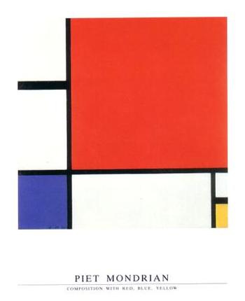
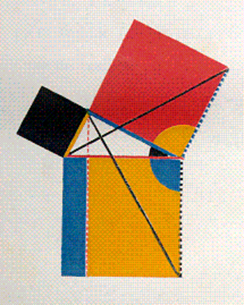
    Take for example an image and idea from yesterday’s post regarding the engineer and art-geometer Oliver Byrne (who replaced much of the text of Euclid’s first six books by using an odd index of color) and Piet Mondrian.   The approach (as noted by Augustus de Morgan among others) is gorgeous but hokum—the effect though is pretty and it does define the areas of the geometric solids that I’d like to use here.  The approach that Byrne tried to develop and simplify Euclid for more general readers was to employ a peculiar art form of geometry to help classify the structure of the world—ordering the universe, and vice versa.
    Bloggeometrymondrian
    Piet Mondrian, who was one of the earliest artists to practice the new, revolutionary form of non-representational art—that is, producing art with no recognizable subject matter, no humans, or landscape or animals or bugs or whatever—uses very similar geometrical solids to reclassify all of existence into sensations and color forms.  Mondrian is more correctly classified as a constructivist, or cubist, and he uses the same tools to re-identify nature as Euclid developed to help classify the structure of the world.  This is his “Composition with red, Yellow and Blue” which was painted in 1930, a full eighteen years after Kandinsky created the first painting in this field. But there were other early pioneers in the non-representation field who exhibited a more mathematical aesthetic in liberating the object than we see in the first works than the great Kandinsky.  Umberto Boccioni (1912), Frank Kupka (1913), Olga Rozanova (1913), Liubov Popova (1914), Felix del Marle (1914) come quickly to mind,
    Bloggeometryyubov_popova
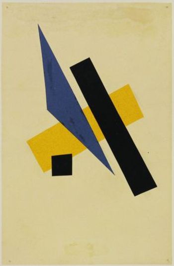
    though none leap to consciousness as quickly as Kasimir Malevich.  Malevich begins this work before 1910, and by 1913 he has produced such works as “samovar” in which the (samovar) object is dissected and moved to different places in the visual field on the back of geometrical objects.  But it is in 1915 that we are introduced to his extraordinary “Black and red Square”, where we find that he has removed all representation of objects—not only that, he has removed almost all of the forms, period.

    On the other hand there is certainly a very long history of artistic adventures which have no recognizable subject, though the artists in these cases I am relatively certain about were not trying to replace the known stuff of our world with the not-yet-known.  Geometrical artistic expression at its base has been seen in mazes, labyrinths and mosaics for thousands of years.  I guess you could even make a case for architecture fulfilling this role as well it the buildings were taken as art forms.  But I’m interested here mostly with the artist intentionally choosing to obscure the known subject.
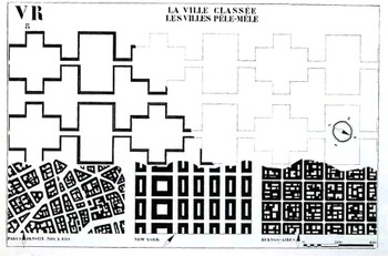
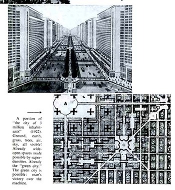
    This leads to the troublesome forms of the French architect Le Corbusier (Charles-Édouard Jeanneret-Gris, 1887 –1965).  Leafing through his The Radiant City (Elements of a Doctrine of Urbanism to be Used as the Basis of Our Machine-Age Civilization, 1933) is a confusing affair.  As much as the man wants to rectify and save the world (his words, salve me fons pietatis) with his geometrical cities, replacing the mess of disorderly human civilization, his results, while giving a crispy clean order, are formidably lifeless (to me, at least), the organic and messy bits of human life de-fractured and placed in 90-degree containers.  Le Corbu complains about the American successes, there in 1930 or so, saying that the U.S. is a monument of achievement but for achieving the wrong things.  A little later in 1932 and 1933 however he does take time to make positive comments about the interesting experiments going in Fascist/Mussolini Italy and Stalin’s Soviet Union…it was common I know for thinking people to have such harmonious thoughts about these regimes, but there were plenty of others who kew and wrote about what was
    Bloggeometrycorbu_city066
    really happening in those places, and Le Corbu was not one of them.)  The so-called positive elements of American advancements that Corbu took away with him back to France– Taylorist and Fordist (Henry was a vehement anti Semite and Nazi sympathizer)  strategies adopted from American models to reorganize society—I think come vividly alive in his geometrical replacement of human habitation—call me old fashioned, but I just don’t like it.  I also don’t like it because it smacks so much of his disgust of capitalism (which he talks about as consumerism) and of his own right-wing political beliefs.  Le Corbusier followed these thoughts into the camps of philosophies like  the right-wing syndicalism of the French politician Hubert Lagardelle.  These also eased him into a position with the traitorous Vichy government during the Nazi occupation of France during WWII—he did cut ties with it in 1942, though only after the architectural plans he had developed for various projects were rejected.
    Bloggeometrycorbu_litl_squ067  

    [Another leading 20th century architect, Philip Johnson, had his own problems with admiration of fascist ideas, though the amoral and whorish Johnson would’ve have seen these ideas as “problematic” only insofar as they would keep them from working.  He was a decade-long Nazi sympathizer, and among many other things actually followed the Nazis as they stormed their way through Poland—something Johnson described as a (positively) “stirring” experience. He was in a separate class from the kinda-stupid Charles Lindbergh and the empty-suited-but-still-dangerous Prince Harry as Fascist trumpeters.  He was more on the level of detestable fascist intellectuals like Martin Heidegger and Ezra Pound. He was awful.]

    It just so happens that two of the most towering names in 20th century architecture were embroidered into the fabric of Fascism, and I think that these ideas burn their way directly through the geometrical imagination of Le Corbusier. His brand of geometries lead us towards the human cog-and-wheel, tight-box, suffocating proclivities of his right-wing extremism, and is perhaps the worst sort of illustration for the use of that beautiful branch of mathematics

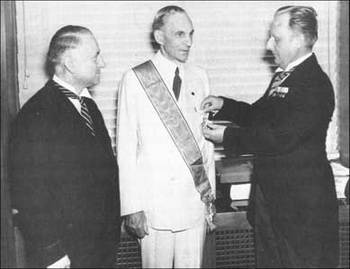
    Just for the sake of clarity I’ve included this photo of Henry Ford becoming the third recipient of the Nazi Grand Cross of the German Eagle,  presented by Karl Kapp, German consul-general of Cleveland (left), and Fritz Hailer, German consul of Detroit (right). The other two recipients were Benito Mussolini and Count Ciano.

      Fordnazimedal


    ·Posted by :

    ·in:

    — —

  • Science and Art; True Science or Science Fiction? #1: Tinguely, Oliver Byrne, Vredeman de Vries and the Theatrophone

    JF Ptak Science Books   Post #79

    Blogrealtinguely
    There are encyclopedias to be written on the not-obvious in the history of science, dictionaries of “what is it”, codexes of “is that real?”, handbooks to distinguish things that look like scientific apparatus but are actually works of art, and vice versa. This is my first installment looking at the occasionally squishy visual line that distinguishes images that are “true” scientific creations from those that are not. 

    Case #1.  FALSE 
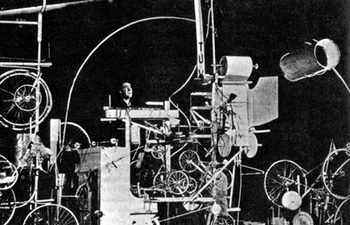
    Our first example comes from Jean Tinguely (1925 – 1991)  a Swiss painter and sculptor, best known for his Dadaist kinetic sculpture, officially known as metamechanics. This photo shows Tinguely in the midst of trying to make his self destructing sculpture, Homage to New York (1960), self destruct. His collection of wheels and cogs and connected motors and techno bric-a-brac, which in their way stood for the embarrassment of overproduction and  self-satisfaction with material goods, embarrassingly failed to self destruct during its unveiling at MOMA.

    Blogrealbyrne
    Case #2. TRUE.
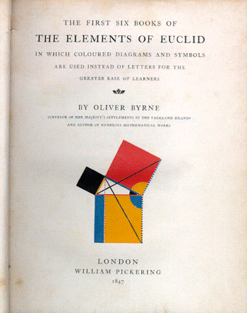
    Oliver Byrne’s semi-insane but gorgeous interpretive work of the first six books of Euclid  published by William Pickering in London, is problematic.  Byrne’s use of color in place of letters in defining and explaining the propositions just doesn’t work very fluidly–it is a great, perhaps the great, example of something that is visually pleasing, beautifully rendered, and sort of functionless.

    Blogrealbyrne_tp
    Blogrealtelegraphone_2

    Case #3. TRUE
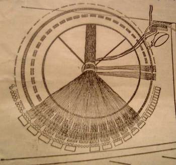
    This is the distributing board of the central London “theatrophone”, a telephone relay device that “broadcast” theatrical and symphonic productions to telephone subscribers.  The idea is base on installations of this device during the International exposition in Paris in 1881.  The article appears in Scientific American, Supplement No. 1002, March 16, 1895.  The second image is the switchboard in the central office of the Theatrophone Company.


    Blogrealvredmanbw_2

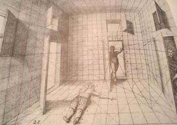
    Case #4, TRUE:  Hans Vredeman de Vries (1527 – c. 1607),a Dutch Renaissance architect and engineer, produced a superb book on perspective in 1604, from which this image was selected.  Of course we manipulated it a little in p-shop, dumping it into mosaic, cheating a little, but, well, there you have it. Vredeman’s production was luscious and smart, and was highly utilized and prized for hundreds of years as a
    useful tool in determining perspective.  It’s a mysterious image, bizarre, even–why, for example did the humble artist use a prone/dead/injured human there on t he floor when he could’ve selected something more benign? The odd figure entering the room through the secret door adds to the general threatening atmosphere of this interesting image.  Base line though–it is undeniably an excellent instructional on drawing with perspective.


    ·Posted by :

    ·in:

    — —

  • The Best Images of Horses, Ever: Hans Beham and Perspective, 1528

    JF Ptak Science Books LLC Post #105
    Blogmodel_bookhorses129

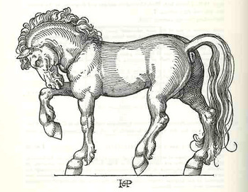
    Hans Sebald Beham wrote—produced, rather, the text and illustrated—Dises buchlein zeyget an und lernet ein mass oder proporcion der Ross, nutzlich iungen gesellen, Malern und goltschmiden, a tremendous, inspired model book for artists and observers, back there in 1528.  Amidst the heavy, blocky Gothic type of the book lie a series of just beautiful, proportional studies of horses.  It is probably the single greatest illustrated work on horses done in the history of printing to this time; and it has stood the test of time as a work of art, rather well.

    It is also, evidently, the work of an anti-Lutherian and certified “godless” painter, expelled by the city of Nurnberg (along with his brother and as it turns out the subject of yesterday’s Saturn post, George Pencz).  He, and his brother Barthel, and Pencz—with whom he shares birth and death dates of 1500 to 1550—were shaken by the city half way through his life in 1525 for having bad thoughts about religion and the proper way of not avoiding it. The decision by the city didn’t affect his art, as we can well see
    Blogmodel_bookhorses2130

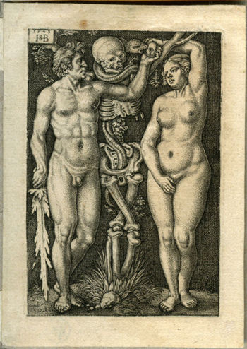
    Beham’s model book on the horse was followed by one on the human figure.  He was an extraordinary talent whose fine, deft touch can be recognized across the room, miniature or not.

    Behamadam_and_eve
     

    ·Posted by :

    ·in:

    —