A Daily History of Holes, Dots, Lines, Science, History, Math, Physics, Art, the Unintentional Absurd, Architecture, Maps, Data Visualization, Blank and Missing Things, and so on. |1.6 million words, 7500 images, 4.9 million hits| Press & appearances in The Times, Le Figaro, Mensa, The Economist, The Guardian, Discovery News, Slate, Le Monde, Sci American Blogs, Le Pont, and many other places… 5000+ total posts since 2008.

Category: Architecture and Building

  • Looking at Things Straight On, Part 3: Perspective Books in the 16th Century

    JF Ptak Science Books LLC  Post 496
    0 blog jan 24rodler'422

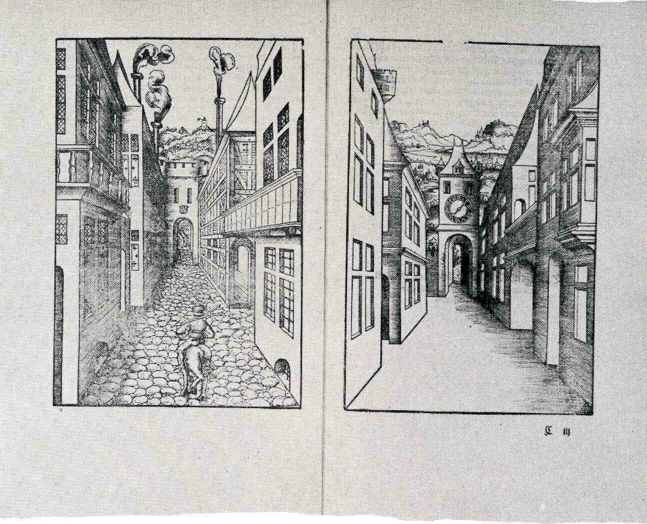
    Hieronymus Rodler (who died in 1539) wrote one of the greatest books of the Renaissance on the use and care of the relatively-newly-discovered practice of perspective. Perspectiva, Eyn Schon nuetzlich buchlin und underweisung der Kunst des Messens...(Useful Booklet and Instruction in the Art of Measurement), published in Frankfurt a.M. in 1546 (as a second edition following the 1531 first). I say “newly” because Rodler wrote his book to help explain, or at least somewhat simplify, the 1525 Underweysung der Messung (Instruction in Measurement)  by Albrecht Durer, a great work of some substantial complexity and difficulty.

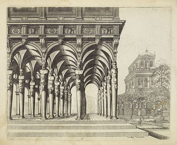
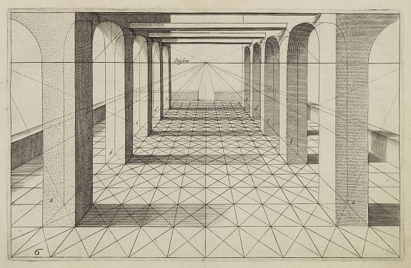
    The works of Wenzel Jamnitzer  (1564 and 1568), Heinrich Lautensack (1564) and Hans Lencker (1567), all fine examples of earlish work in perspective and al quite lovely–but it is  Hans, or Johannes Vredeman de Vries (ca.1527-1604, “The King of Architects” among the Dutch, at least), whose Perspective of 1604 rises to the greatest heights, a book filled with superb copperplate engravings of the master’s work, vanishing points into which all the lines of the engraving converge, sucked as it were into a perspective Black Hole.   That, and of course there are so many of them that look exactly at the center of a receding horizon.  (And this continues two earlier posts written along the same vein, here.)
    Perspective de vries

    In his dedication to the reader (“To the Studious Viewers of Optics”), Vredeman de Vries writes that 

    “My eyes and mind took pride
    In Sacred Optics. Thereunto allied
    was a fructifying labor,  forty years
    I plied this art devoutly, Here appears
    a doctrine worn by time. That art is famed
    For trustworthiness which trusty rules have framed…
    This art, which guides the eye and soothes the brain,
    with images, but never cheats the sight
    with lying views…”

    I have purposely not said anything about early artists (like  Uccello, Filippo Brunelleschi, Leone Alberti (Optics),  Piero della Francesca, Piero della Francesca, Federico Commandino, Jan van Eyck, Leonardo, and Serilo and Vignolla, Raphael, and so on) and the development of perspective in painting because, well, I can’t figure out how to do it in a paragraph.  But you can certainly consult fine books like Samuel Edgerton The Renaissance Rediscovery of Linear Persepctive (1975)  and Hubert Damisch The Origin of Perspective  (1994) for a bigger taste of teh issue. Me, I just wanted to look straight-on at some 16th century perspective  illustrations…
    Perspective de vries2


  • Finding Hidden Images in Antique Prints: 18th Century Forensic Social X-Rays

    JF Ptak Science Books   Post 484


    Even though I truly enjoy the intimate pathology of antique prints, finding “hidden” images within images within images, it seems as though I’ve only made 25 or so posts about them, and this in spite of thousands of such images to choose from.  Posts like “Hidden Children: Found Art and Social Vignettes Inside Art“,  “Revealing the Worlds Inside of Prints: Finding Hidden Human Geography in Old Prints” and “Finding Hidden Images in Antique Prints: 18th Century Forensic Social X-Rays” are good representatives of this genre.  

    0 blog jan 23 vickers412

    Images hold selective secrets for different people of divergent interests.  Sitting through a motion picture, for example, shows a series of still images flashed before us—in a single scene people bring to bear their own ways of experience and observation.  A forensic pathologist will see things shown within their specialty different from someone with a chemical explosives background who will see a bomb differently from an ER doc who would respond to an emergency room differently from a bookseller who might notice in the scene that the paperback edition of a tree Grows in Brooklyn being read by an American G.I. in 1944 didn’t exist yet, and so on.  A single image can hold a tremendous variety of depth and interpretation depending on the observers’ perspective. 

    0 blog jan 23looking hard surrey414

    Most of the time when I look at prints now in the antique map shop that I own (and now my only public venue now that the history of science bookshop has been alive solely online now for the last 6 years) I am looking at the extraneous “stuff” that is used as filler to the print’s purpose, and I find the uncommitted art just fascinating, sort of like “loose” unnecessary snapshots of common life, everyday life, of people walking by.

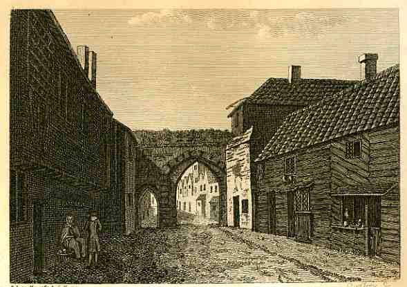
    These two images are from a series of etchings done by S. Hooper in 1785 of ancient and semi-ancient ruins in Surry and Sussex.  The first is of Bermondsey Abbey, Surry, a 12 th century English Benedictine monestary with precursors reaching back another 500 years.  I’m pretty sure that it is the central archway(s) that are the remnants of the structure in this print,

    0 blog jan 23looking hard surrey415


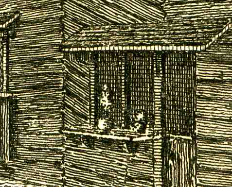
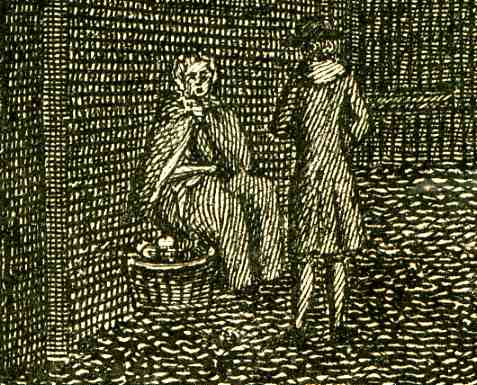
    with Renaissance-era occasional buildings sprouted up around it.  I find the old shopkeeper’s window (i.e. “store”) at the right to be very interesting, someone selling their services or wares from a location that I would bet was hundreds of years old even by 1785.  The shop would be ready for business by opening the shutters and flipping down the table/ledge.  I wonder too about the woodworking on the second floor of this curious structure, placed in an unconventional diagonal.  The shaded feature of the shawled woman selling her goods from a basket to what seems a well-dressed man is another curious addition. 

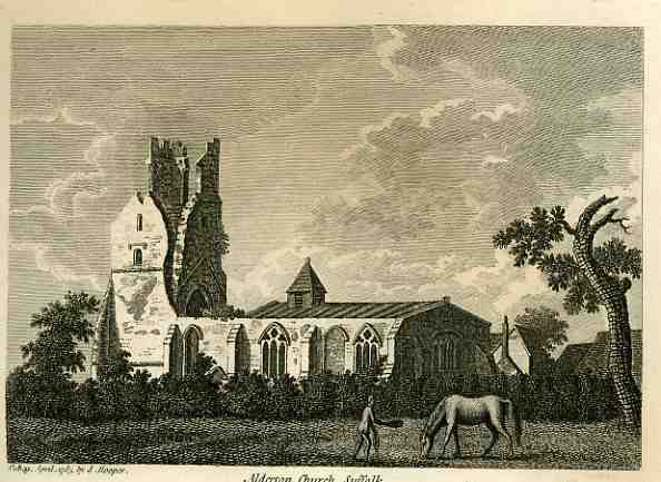
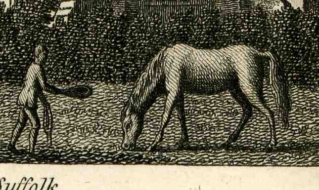
    The second image is of Alderton Church, Suffolk, and the feature of itnerest here this time not so  hidden at all, though it is incidental and it is sweetly odd.  the ruins of the church are

    0 blog jan 23looking hard surrey417

    adequately rendered, but the horse in the foreground is just beautifully done, far more so than required by its half-inch appearance in the full-size original.  Also, the man approaching the grazing horse does so slightly hunched, with a hat outstretched (offering a treat inside?), and doing so I’d say in a kind, respectful manner, trying as he was to put a halter on the horse.  It is just a lovely, quiet sub scene that is unnecessary to the architecture of the ruin but probably very necessary to the artist or etcher who wanted just a tiny flight of fancy now-and-again, and so placed something of artistic merit in a dead space of the print. 


    0 blog jan 23looking hard surrey416


  • Great and Unbuildable Department: Floating a Missing Manhattan (1975)

    JF Ptak Science Books LLC  Post 470

    “Heard melodies are sweet, but those unheard
    Are sweeter…” John Keats,
    “Ode on a Grecian Urn”

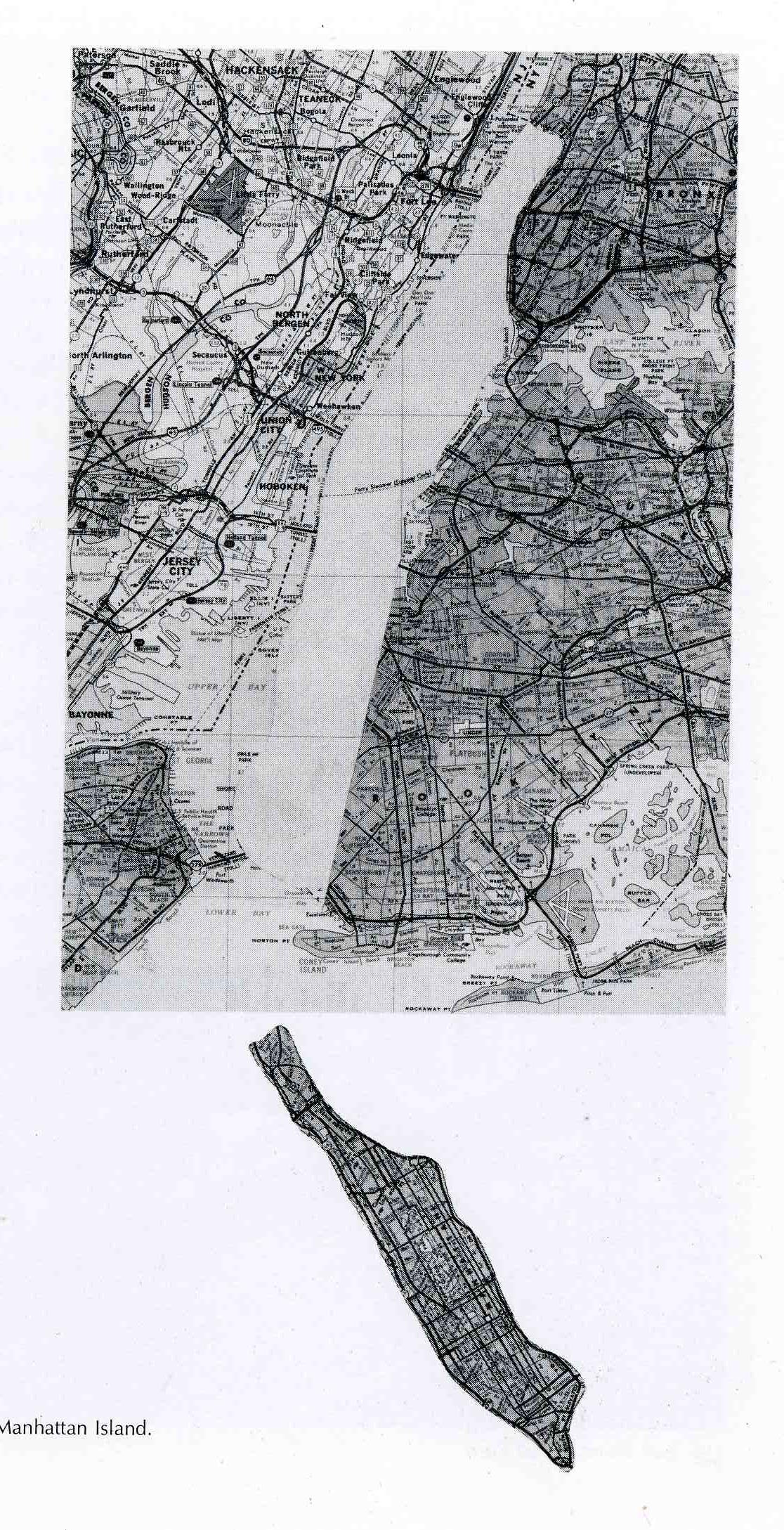
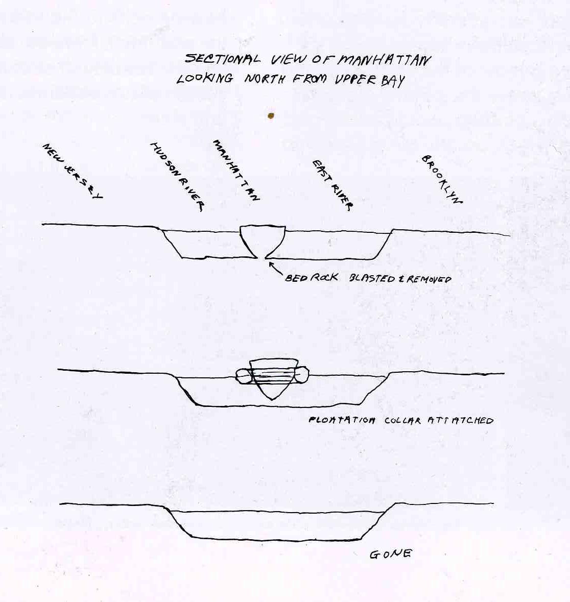
    0 blog jan 16 manhattan386 Agreeing with Mr. Keats or not, Robert Grosvenor had a delectable and memorable idea for a project in 1975:  testing the sea-worthiness of Manhattan island.  Grosvenor (b. 1937) was a well-known kinetic sculptor in Manhattan by the time of his detaching-Manhattan idea.  I found the summary of his project in Unbuilt America, by Alison Sky and Michelle Stone, of SITE, Inc. (seventh in a series called ON SITE), and published in 1976.  The book is a treasure trove of the unbuilt and the unbuildable, or the undoable, or the unnecessarily unattainable, though Grosvenor’s part in this book is clearly one of the very few who did not (really) take his/her project seriously.  I do though like the simplicity of the presentation of the project, right down to the “Step 2” of preparation, which was the umbilical snipping of the bedrock of Manhattan and the attachment of the “flotation collar”, which, I guess, would allow it to be moved around so long as flotation devices were attached. 

    I’m not sure, but I don’t think that Manhattan ever learned how to swim.  I’m also not so sure about where Manhattan would “go”,exactly; but what would it matter, since the people living in Manhattan were already where they wanted to be?

    0 blog jan 16 manhattan387


  • The Thin White Line: Concrete Ribbons as the Answer to the Air Raid Problems of London (1938)

    JF Ptak Science Books LLC   Post 469

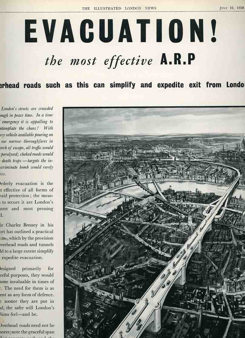
    0 blog jan 07 evacuate london365The Illustrated London News for 16 July 1938 was screaming at its readers–14 months away from the British involvement in WWII–that the MOST EFFECTIVE form of ARP (air-raid protection) was via the evacuation of London.  And of course what the “article” meant was the orderly evacuation of London, as decentralized evac during a crisis (i.e. bombing) would be an “appalling” and chaotic mess.  

    The answer was elevated highways. 

    The reader was told that “the cost of such roads will necessarily be high”, but the high ticket price wouldn’t be quite as bad as tearing down buildings and widening streets through central London.  The tearing/widening idea is so original and so shockingly bad I don’t know what to say, if there was actually anything to say at all.  But then it is second only to the idea of building elevated roadways for evacuation purposes–road that look from the picture like they were four lanes wide.  These roads would have “the additional merit that under them the traditional appearance of London can be maintained unimpaired”.  Stress that part about the appearance “underneath”.  Not only that, the heartbeat of London evacuation=, these elevated roads, were evidently immune from bombs themselves; or at the very least nothing is mentioned about these roads being targets in themselves.  One bomb, one hit, one severed artery. (Looking back through the Bad Ideas Department I see Buckminster Fuller’s tragically goofy idea for building a mile-high dome over midtown Manhattan that was “radiation proof”…he didn’t say anything about it being impervious to actually being the direct target of a nuclear weapon, though.)

    Generally when ideas are this terrificly bad there is usually a reason for it, a reason that transcends logic and honest coherent thought.  And that reason in this case was money. 

    At a time when Nazi Germany was bursting at the seams for more people to fight and for  nations to devour, when there was a true and real fear of London being a target of German bombs, this simple and weak and strategically indefensible solution was proposed by one large and interested party.

    The “article” is signed by the Cement and Concrete Association of Grosvenor Gardens, London.  And thus all is clear.


  • A Room with a View: Hornor’s Panorama of London (1821) and its Cache of Irony

    JF Ptak Science Books LLC  Post 450

    0 blog dec 30 room at the top328

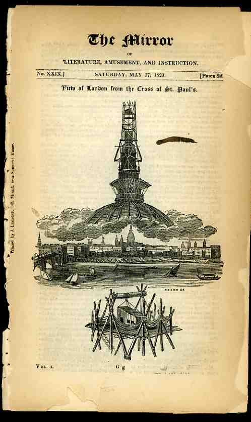
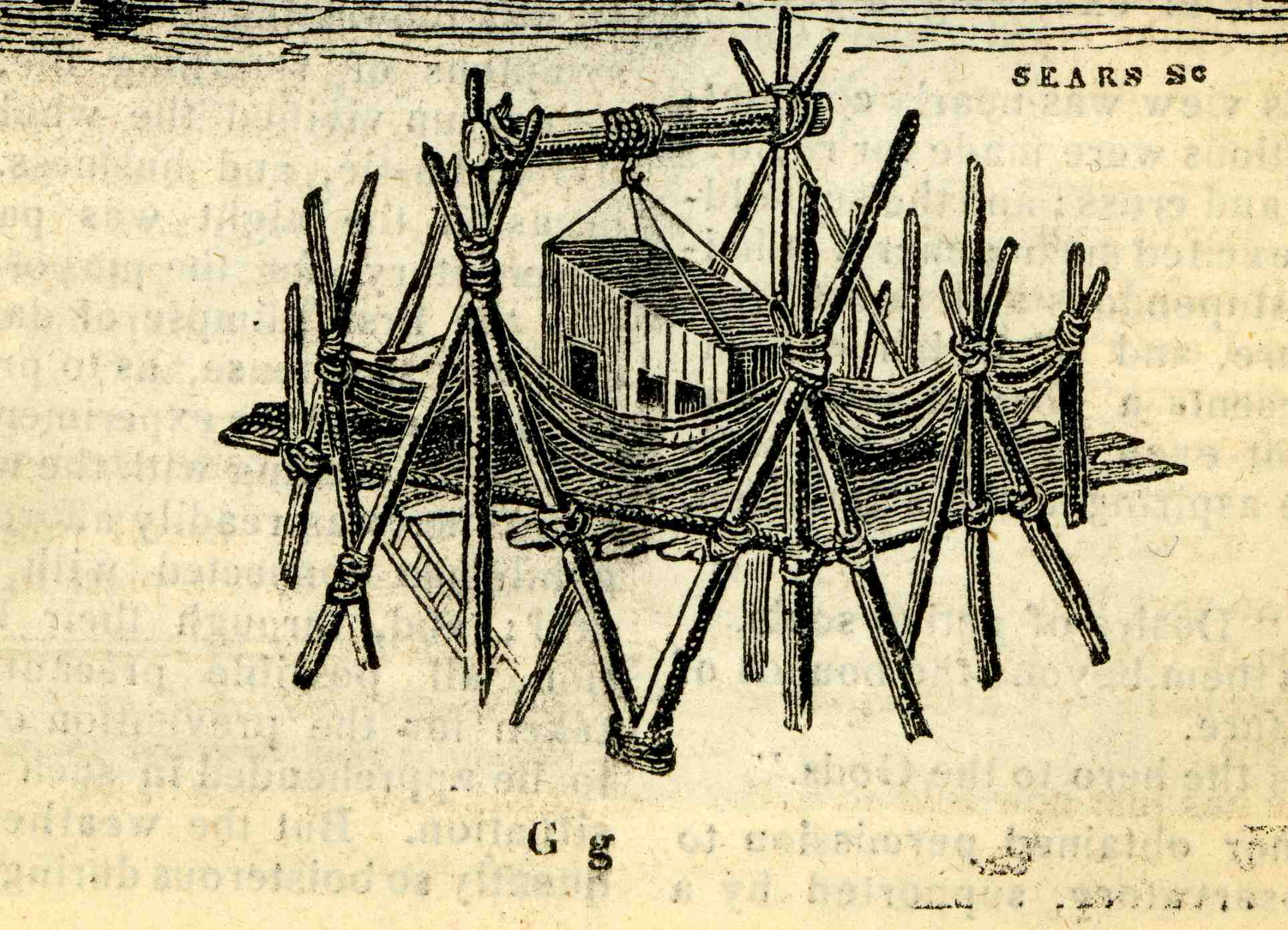
    Before satellite imagery, before airplanes, before balloons, and before photography, the only way of obtaining large-scale and factual panoramic views was to get to a good observation point and draw away.  Thomas Hornor (a surveyor and panoramist, 1785-1844) did just such a thing in 1821:  taking advantage of the cross being removed for cleaning from the top of St. Paul’s (London), he somehow convinced the powers-that-be to allow him to construct an observation post for himself in its place for  a long term, uninterrupted and altogether fabulous view of the city of London.  He set up shop up there, about 400 feet above the ground, and stayed, making minutely detailed drawings of the cityscape, working with a telescope and a great deal of reserve.  And some amount of courage–we can see from this detail of his story published in The Mirrour in 1823 that his shack was, well, not the safest-looking shack that has ever been built atop a cathedral. 

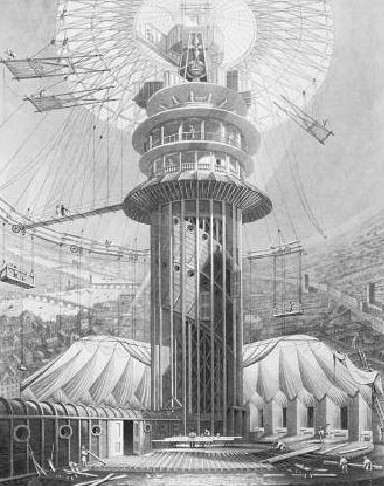
    The end result was an enormous, fantastically detailed acre-sized painting which was installed and displayed in Decimus Burton’s Colosseum. The installation was as much an artwork as the painting–it was affixed to the walls and people would view it from a multi-story observation deck in the middle of the building.  For those who didn’t want to climb the stairs to get to the viewing room,  an “ascending car” was fabricated, making the structure one of the earliest buildings to have an elevator.  There is some sort of irony in that:  people would pay to see a painting using London’s (perhaps)

    0 blog dec 30 room at the top329

    first elevator to get to the top of a small structure inside another
    structure to see a painting made from the top of a large structure of a
    scene that could be viewed for free by walking outside.  Nonetheless,
    the fantabulous painting was viewed by more than a million  people
    before moving on.

    I have a feeling that this may be an interesting category to develop (a “room with a View” that is), pursuing other rooms in other tall places. 
    For example the last little triangular window is the hole in the sky for something at the Chrysler Building in NYC.  I had heard that it was initially a bathroom that was built for the avuncular Mr. Chrysler, so that he could do his

    Hornor2

    business higher than anyone else in th world, which seems to have
    fitted his personality.  After all, he did his fair share of this
    behavior, having dumped on people of all shapes and sizes, not the
    least of whom included the architect for his spectacular
    building, William Van Alen.  He was stiffed by Chrysler because of
    mysterious and misbegotten ideas arising from old Walter’s temperamental
    and stingy belly–that dear readers takes a lot of ____, not paying the
    architect who designed the world’s tallest building and then to put his
    name on it.  

    I should mention that this little room in the Chrysler building pops up every now and then, perhaps most famously in Kurt Vonnegut’s Jailbird, where beautiful Kurt stuffs the head offices of the American Harp Company.

    Check out Stephen Oetterman’s The Panorama, a History of a Mass Medium (1997) and Bernard Comment’s The Panorama (1995).


  • Blank and Empty Space: Reference-Free Language(s), Babel

    JF Ptak Science Books LLC  Post 372

    Empty and Missing Things, Part 19. 

    Blog--14 nov--fantastic arch
    Returning
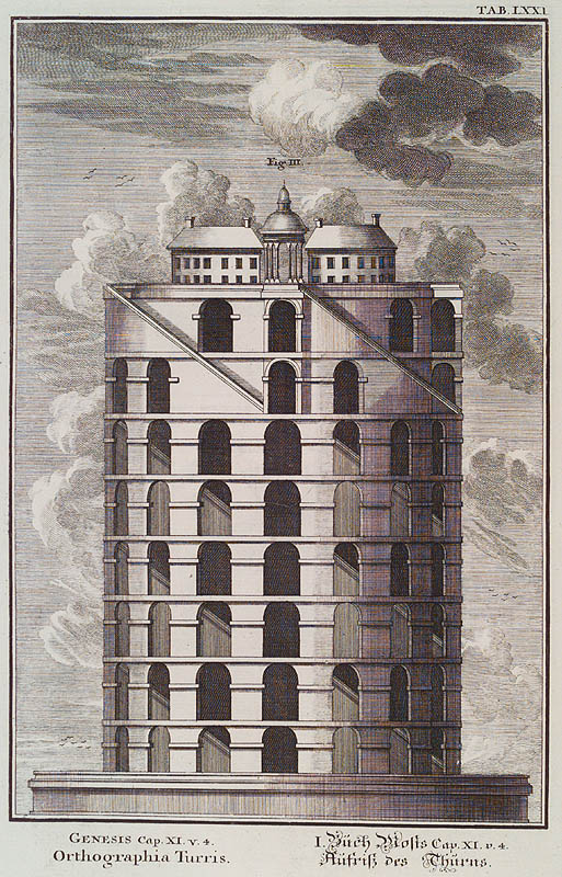
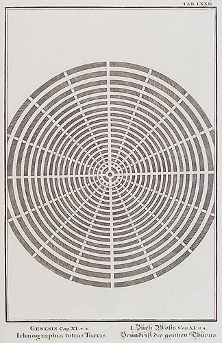
    to Jean-Jacques Scheuchzer’s* magical, inventive, fact-bending naive-surreal work on universal history based on the Old Testament, I’ve found these two glorious and odd images of the Tower of Babel.  The first (“Genesis Cap.XI.v.4. Orthographia Turris.Mediummetalis”) is terrific, shocking even in its abrupt construction and flat-out stumpiness, because it is one of a very small minority that shows the structure to be canonical, with a little church at top. The enormous stairway is just completely out of proportion to the purpose of the structure, the effort falling into some sort of odd advanced-child category.

    If Italo Calvin’s “Invisible Cities” or (better yet) Jorge Borges’ “The Circular Ruins” were to be illustrated, this image would fit right in.

    The other very unusual bit here, is that Scheuchzer also provides a plan for the city that was to be built around the tower–I’m pretty sure that I haven’t seen references to this before, and the Biblical references to it are no help whatsoever in determining its physical aspects.

    There are probably very few things that could be as blank or as empty as combative, competing, nonsensical and completely self-referential language or communication.  Well, except for Scheuchzer’s very empty town plan locating the tower in an urban setting–a listless place of surrounded circles of nothingness for a place in which everything is said and nothing is understood.  Ground Zero for blank


    Blog--nov 14--plan

    language.

    Notes:

    Two interesting books that I should mention that address the ideas
    of fantastic/imaginary architecture and decay are C. W. Thomsen, Visionary
    Architecture: From
    Babylon to Virtual Reality,   (Prestel, 1994) ; and  Paul Zucker, Fascination of Decay (Gregg  Press, 1968).


    *

    Kupfer-Bibel, in welcher die Physica sacra, oder geheiligte
    Natur-Wissenschafft derer in heil. Schrifft vorkommenden naturlichen
    sachen, deutlich erklart und bewahrt,
    printed in Augsburg and  Ulm
    by  C.U. Wagner, 1731-1735. Offered in four volumes, illustrated with
    758 plates, it is a magnificent work, if not altogether correct, or
    even near- correct, with an enormously confused pedigree, implying the
    wisdom and text of the Bible (and the old Testament at that) as the
    background for a physical history of the world.


  • The Towering Magnificence of the Porcupine, 1604

    JF Ptak Science Books LLC  Post 359                                            

    000-ebay--Nov 4--porcupine995

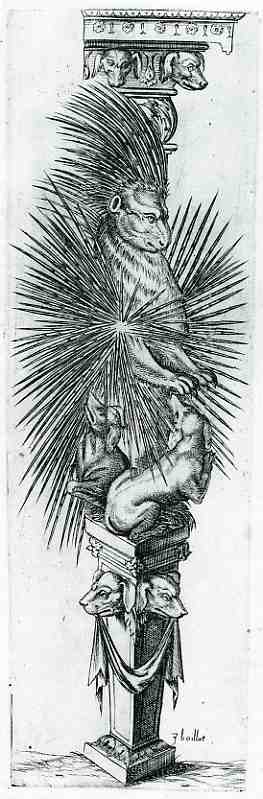
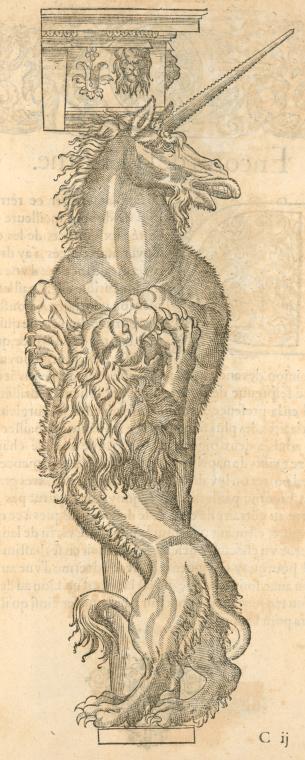
    This is perhaps the greatest monument ever erected to the porcupine–of course it may be the only monument ever erected to the porcupine, but it is undeniably monumental.  This unusual image was published in Strassburg in 1604  in Joseph Boillot’s (1546-1603) sumptuous New Termis Buch (first printed in 1592 as a Nouveaux pourtraits et figures de termes).  It is a bestiary of sorts, a very curious book, offering real and imaginary animals together in alabastered, marblized, memorialized, architectural form, with the  great hope of offering them to fellow engineers and builders for incorporation into the real world.  Or perhaps not, perhaps it was all just done in fun, an exercise, an experience, an artistic creation wrapped inside  the fundus of a great Baroque eyeball.  Unicorn


    The end result is the Boillot produced some extraordinary beasts, wrapping them in extraordinary garments, surrounded by other wonderful animals real and not, and elevated to extraordinary heights.  The powerful unicorn, draped with the vicious but subdued lion; the ass, regal, judicious, pensive, thoughtful, kept in place, or warm, by a dragon. Then of course there is the porcupine, absolutely magnificently appointed with spikes  kept by by dogs, supported at all levels by the creatures.


  • Bad Ideas Department: the “Terminal Box” and the Restructuring of Society, 1938

    JF Ptak Science Books LLC  Post 376

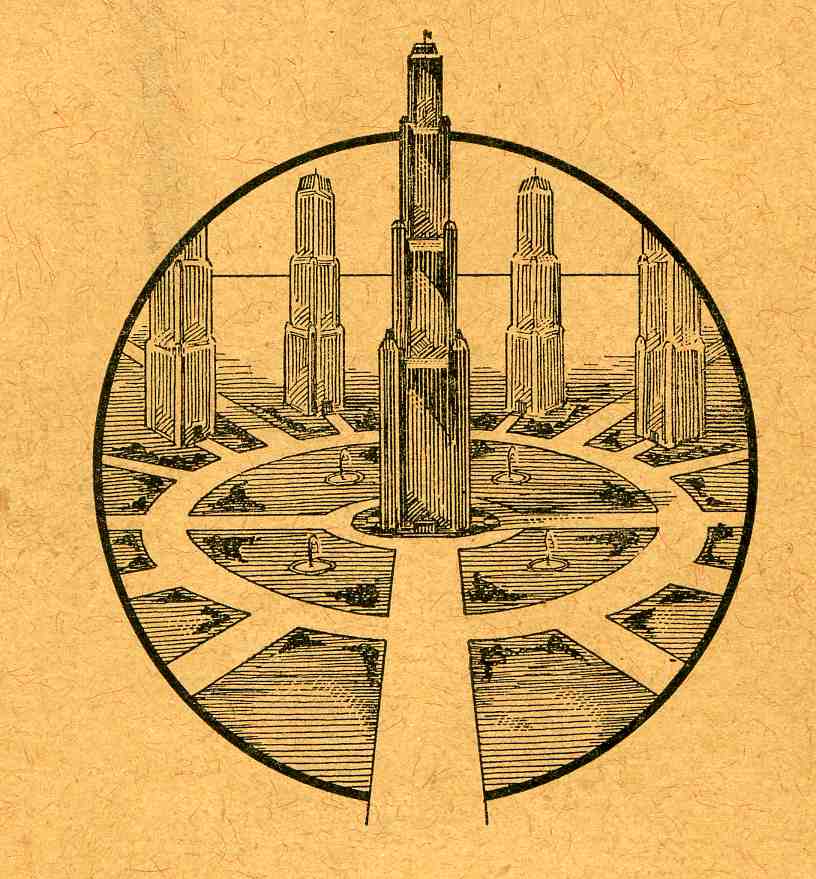
    0-blog---Nov 14 new city075
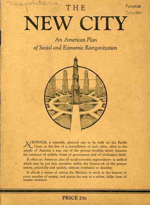
    The unnamed author of The New City, an American Plan of Social and Economic Reorganization (1938), makes a hard-edged plea for the formation of a new American society—and by “new” the author really means it, advocating a different economics, social structure and even the physical development of new cities and abandonment of the old physical and philosophical structures. 

    Sprinkled among the Swiftian notions of rightness, quixotic lancings of social ills and a general bombardment of the structure of society are some interesting and isolated points: 
    “America is the supreme user of the machine…ravishing the irreplaceable wealth of one of the earth’s richest continents, tearing down forests, looting the treasures of coal and draining the reservoirs of oil and natural gas, by methods scandalously wasteful.” 

    This leads the author to the Depression, “a decade of demonstration of the profit system’s inability to deliver to the people the needs of life, a painful heartbreaking demonstration”.  0-blog---Nov 14 new city076

    It is the profit-deliverers, not the machine s or people, who are to blame.  One way of addressing the distribution system, was, unfortunately, Russia—“a form if society set up to overcome this impasse of the capitalistic system of production and distribution”.  Of course the Russians, the Soviets, were just in the middle of their enforced starvation/gulag/brutalization period under Josef Stalin, the gigantic negative parts of which were still in general not known to the great unwashed. 

    The unnamed author dips lightly into Socialism, and then into Fascism and Nazism, though the only thing he/she really has to say about the later two is that “their answer [to economic woe] was in the seizure or control of the means of production by the state”, their own brutal means skipping off unnoticed into a pinkish glow, though the loss of personal freedom is “disdained”. 

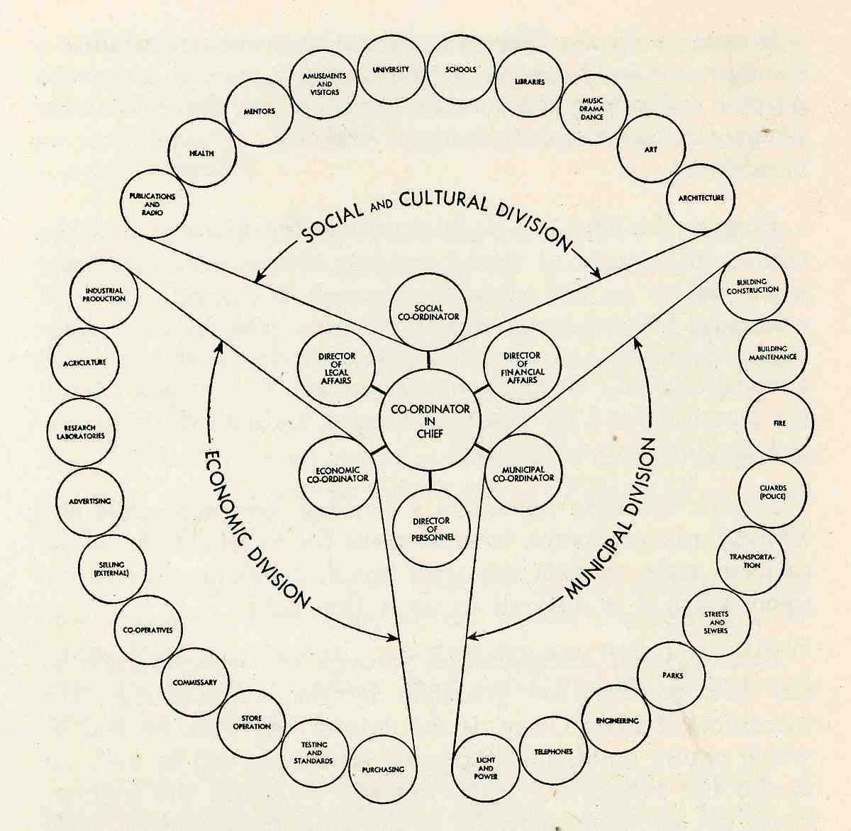
    The New City is actually a new world order, a new governmental form to take advantage of technological advancements leading to “nationalized urbanization” The first city in this new order is Neopolis, and this pamphlet was a call to those who would stand as its citizens.  (There’s actually a sort of application form, though all it really is a bill-of-sale for ordering more copies of the New City pamphlet.)

    Even though the pamphlet is easily obtained, membership, the possibility of being a Neopolitan, is something entirely different.  The difference is actually exceptional, perhaps the most extraordinary thing about this whole misguided idea.  “Membership is to be carefully controlled at all times” we read. . “It is not desired to build up a huge and unwieldy membership of poorly-assimilated elements….interesting educational instruction…with tests to determine the fitness of the member for loyal, cooperative activity, leading, necessarily, to the elimination of those who may be found undesirable”. 
    That’s some pretty muscular, steroidal stuff, particularly after such a glancing blow against the Soviets and Nazis. 
    0-blog---Nov 14 new city077

    Since this is just an “abridgment” of a soon-to-be-written 250-page explanation of the concept, the complex and concentric organization of society is left mainly to the drawing of its plan, the physical layout of the city based upon this ideal. 

    The Seattle-based author never did quite make it past page 29, never did name themselves, and never provided a concrete place where all of this heady stuff was being think out.  It is a sort of pretty design in a creepy/queasy way, there on the front cover, but that’s about as far as it goes.  If anyone actually did send any money to this quack thinker, it wound up in a nicely metaphorical place:  at “Terminal Box 3463”. 

    This may be the very best idea to come out of touching this pamphlet—a place where people can send correspondence regarding Bad and/or Dead or Dying Ideas: “Terminal Box ______”.  I guess that box number would be pretty high by now. 

    Stalin20
    (Uncle Joe, before he killed the children.)


  • There was a Rubber Lady in a Rubber Kitchen in a Rubber House….

    JF Ptak Science Books LLC Post 347
                                                                                                               
    000-ebay--Oct 30 rubber floor965

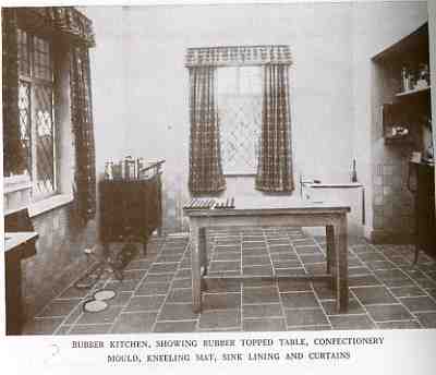
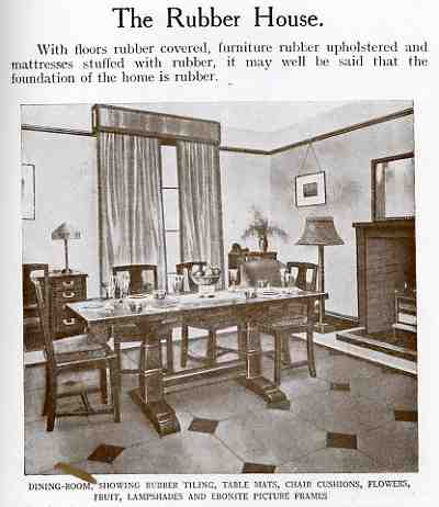
    After 15 or 20 centuries of development of rubber, including merciless horrors and peonage and slavery and brothel farms and whore cities in the depths of the Amazon, and it’s the spread of its development worldwide, who among the hundreds of thousands, millions, of people would’ve foreseen the development of their precious commodity into a rubber kitchen?  Perhaps it is sort of like imagining Johnny von Neumann or Chuck Babbage reacting to the use of their precious inventions into a platform for entertaining children with judged performances of stealing cars and killing aliens? 

    000-ebay--Oct 30 rubber floor966

    Those feelings, I guess, are unknowable, though the gentle people in
    those folks might’ve given it all a “of course”, world-weary nod of
    relinquishing approval.  Or not.

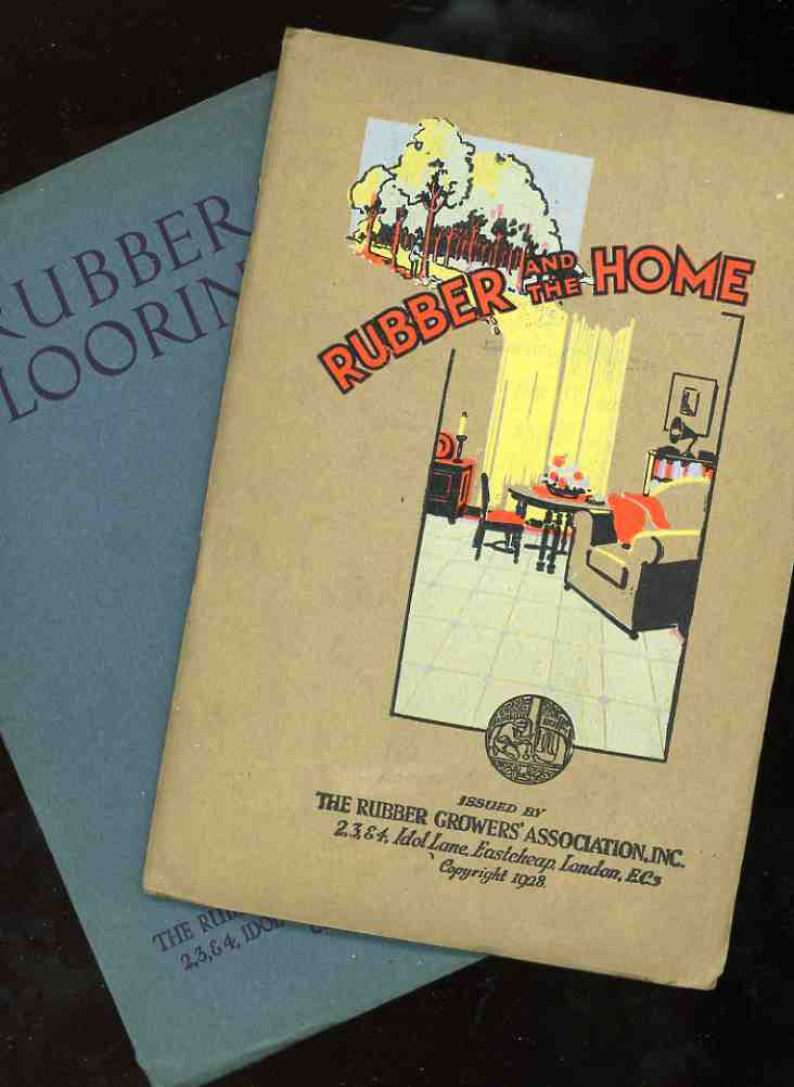
    But right before the mass of rubber was produced synthetically, and
    just as the naturally-produced rubber farms had spread far across the
    globe 9and diminishing the former leader Brazil’s share of total output
    to about 15%, the London-based Rubber Growers association produced
    these two (below) pamphlets extolling the endless uses of their
    product.  And I really mean ‘endless”, as they propose in these pages
    oh-my-rubbery-brothers the rubber house.  Not that the exterior of the
    house is made of rubber, but just about everything inside was.
                                                                                                               

    000-ebay--Oct 30 rubber kitchen968

    The rubber house had rubber floors, and rubber floors cushioned rubber
    tables and chairs, and the rubber chairs cushioned rubber seat pads,
    and the rubber seat pads cushioned (yes) rubberized derriere’s encased
    in rubber pants. And then things spin a little out of control, like in
    the kitchen, where the floor, table top, confectionary mould, kneeling
    mat, sink lining, hardware cushions and curtains (!) were made or
    rubber.  (This is only the big-item list, which doesn’t bother with the
    rubber hoses, anti-splash nozzles, wringer rollers, ice cube trays,
    sink cozies, rubber sponges (!), brushes, mitts, teapot stands, and the
    myriad of small, loseable kitchen aids—those are on another list. The
    kitchen apron, by the way, is just one of many rubber clothing items,
    “made so pretty and delicious that it is a delight to wear”.)  Rubber
    moves into the dining room in a big way, covering the floor, table top,
    seat covers (with cushions stuffed with rubber), lampshades, flowers,
    fruit “ebonite picture frames”, drawer pulls, fireplace implement rests
    (?), bulb bowls, egg cups and so on.  The nursery has the same sorts of
    items, with the addition of wall paneling, extra cushioning around the
    rubber crib, mattress and mattress stuffing, and, of course the toys.                                                                                              

    000-ebay--Oct 30 rubber dining room969

    And so the wish of the Rubber Growers’ rubber house is stated and soon
    passes into history, along with the stainless steel house, the elevator
    house, the wind-driven house, the house-on-wheels, and the rest.  I
    think I reached my limit pretty early on with this, but definitely
    passed the point of no return with the “chic variety” of rubber hats
    for ladies to match their “dainty rubber parasols”.

    000-ebay--Oct 30 rubber964


  • When Things ARE Better in Glorious Black & White: Color Detonation and the Invention of *More* Primary Colors, 1942

    JF Ptak Science Book Post 316

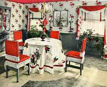
    Well: this is a variation of yesterday’s post on the two opposite edges of color in oddly-applied scientific/technical manners. In unwittingly responding to the question “when is color-use bad?”, the answers were found in these room decorations from 1942, all of which come from a pamphlet entitled Ideas for Old Rooms and New, extracted from the mind of  Hapel (?) Dell Brown.  It is a tidy book with ideas that are anything but tidy;and  as you scroll down you’ll see that the room solutions suggested by Hapel Del are anti-tidy; clutterous (no, not a word but could be).  Everything about these creations speaks to the annihilation of visual resting places; everything seems to be an affront to the concept of causal emptiness.  The weird thing is that there aren’t very many objects in these rooms at all (at least comparing these rooms from where I’m sitting)–the visual complaints seem all rocketing from the abuse of colors found in the fabric of the furniture and walls and floors and window treatments.  The eye gets no rest–and as a matter of fact, the cones of the eyeball are impaled on the rods as a result of the author/decorator  desperate attempts to invent three more primary colors. 

    00blogoct_14color848

    Believe it or not we don’t really get the full flavor of the color cacophony because the floors in these picture look sort of benign, fading away into themselves–which they are not, according to  the description in the text, because they are all high-gloss linoleum rolls or tiles (“efused [sic] with deep wondrous color”.  And that means not only are these floors adding sheen and color to the rest of the incredibly colorful–an effect fairly lost in these photos–they are also cold.

    One thing that I haven’t pointed out in this peon to syrupy/pastel-y/techno-gelatinous-chromodrama is that they were all done in response to a re-decoration of a perfectly nice-looking house, with all of the former “bland” colonial-style rooms presented in glorious black and white.  I’d rather live in Maison Noir than in this happy nightmare.