A Daily History of Holes, Dots, Lines, Science, History, Math, Physics, Art, the Unintentional Absurd, Architecture, Maps, Data Visualization, Blank and Missing Things, and so on. |1.6 million words, 7500 images, 4.9 million hits| Press & appearances in The Times, Le Figaro, Mensa, The Economist, The Guardian, Discovery News, Slate, Le Monde, Sci American Blogs, Le Pont, and many other places… 5000+ total posts since 2008.

Category: Architecture and Building

  • What Things Used to Look Like: Candy Stores (not “shops”), 1942.

    JF Ptak Science Books   Post 302
    1blogsept_23_candy_cvr649

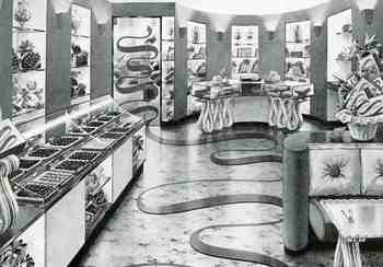
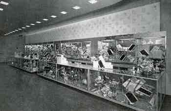
    Well now–this is a candy shop

    It is positively dripping with evil,  its luscious display  in a soft pre-chewed-like environment, as in a chocolate dream in someone else’s head.  (Chocolate dreams are good to have, just ask poor old dead Hans Sloane, the man whose chocolate-based fortune and bequest formed the basis of the British Museum.)  The ribbon design in the floor continuing up the wall just past the display is an invitation to getting totally lost in sugarly beauty, a swirling trail to a confectionary Ravena.

    All of these images come from the pamphlet published by the Associated Retail Confectioners of the United States:  Meet the Foods Candy is Made Of, made to accompany their annual meeting of 1946 at the Drake Hotel in Chicago.  (There must’ve been an awful lot of these folks to book the Drake.)  The cover does seem somewhat on the desperate side, trying to convince anyone who would have a look that candy–since it is made of all that good looking stuff–was indeed FOOD (“no wonder candy is so good to eat!”)
    1blogsept_23_candy_cvr647

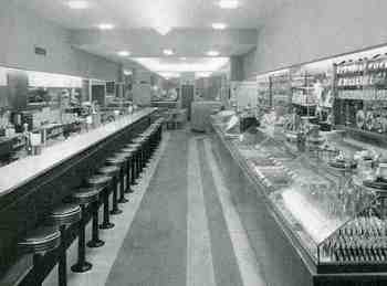
    The next image is the “Table Service” area of Wieda’s Incoporated, (a fine, large candy store in Patterson, New Jersey) , “located in the rear”, where I guess the serious stuff is done, when you needed a table to consume your goodies with a wholesome cup o’ Joe.

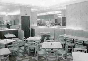
    The third image is again from Wieda’s–perhaps a little bit of payoff to Mr. Wieda for his (presidential) service to the association.  The black and white image does absolutely nothing to address it fabulously colored interior, with its lemon yellow ceiling, with the upper walls and curtains a burnt orange and the lower walls “a soft light green”, all surrounding a terrazzo floor of maroon and gray.  The woodwork was all walnut, and the mirrors were “tinted flesh color, which is more flattering to the customer than the usual untinted mirror”.  Oh my.
     1blogsept_23_candy_cvr648


    There was all sorts of information-sharing in the conference, evidently:  the best way to package and display candies, convincing mothers that candy was “food” after all and good for the kids, packaging candy so that it appealed to children, wrapping candy around other small gifts and trinkets, luring the customer into the candy store with more elaborate displays to pull you deeper inside, and so on.  There was allot of thinking going on here about sweets, which seems pretty inconsequential until you think about the fortunes made by Hans Sloane and the Wrigleys and Mars, especially with the later too, what with the gum company being purchased by the Mars family for billions of dollars–which is a lot of money for gum, which of course is hardly a candy.

    1blogsept_23_candy_cvr646

    In any event these stores are just gorgeous, and gorgeous in a way that their gorgeousness can never again be achieved–and I’m not sure why.  Maybe its because I’m not wearing one of those fabulous double-worsted suits that Bogey used to wear, not that he’d be found in one of these places.
    1blogsept_23_candy644

    ·Posted by :

    ·in:


  • History of the Future of the City: Tomorrow Department #4, Ebenezer Howard and the Garden City, 1898

    JF Ptak Science Books  Post 275
    Bloghoward_1

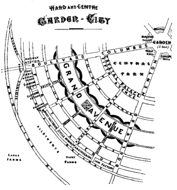
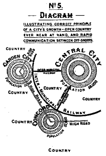
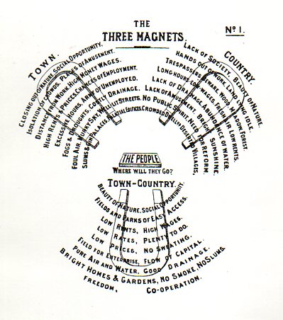
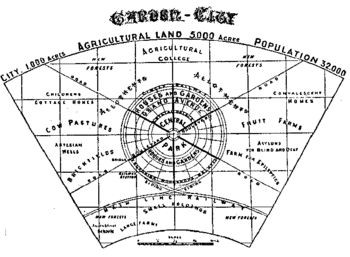
    Ebenezar Howard (1850-1928), London-born  failed Nebraskan farmer, Chicagoan stenographer, London Parliamentary reporter and non-obscure semi-visionary of town planning in The Future, drew some mighty pretty images of cities best reserved for random placement in the Encyclopedia of Difficult Imaginary Places.  Ideas about technically based Victorian wanderings on what to do with the laboring classes  must’ve been brewing in his head for some time before he self-published them in his Tomorrow, a Peaceful Path to Reform in 1898.  The ideas took shape in the for of Garden Cities—which, frankly, have a very industrial and technical look to them, which although brimming with forests and gardens and parks and green spaces galore still had a weird orthographic and predictable quality to them, making them look like green machines.   He hoped to start a revolution in city design, and his ideas proved popular enough to be forced into a new edition in 1902 in his Garden Cities of tomorrow, and then reprinted again in 1946 with a forward by none other than Lewis Mumford. Bloghoward_2

    I should say that I don’t “get” his design (which in all fairness, Howard provides a mea culpa for each of his drawings saying that the ideas really need to be implemented with an actual environmental footprint before they could be done) though I certainly do understand his idea. The garden city philosophy came to Howard after seeing the mess of Chicago following the great fire of 1871, and also by way of the writing of people like Edward Bellamy (Looking Backward) and John Ruskin, as well as utopian movements and things like the social “discovery” by Ed Booth and others of the miserable conditions of the million or so people in East London. The idea of people living in such an environmentally destitute area like East London must’ve seen appalling to him, and perhaps the thought of the industrialized and centralized urban landscape would’ve fallen into this same category as well. The best resource for curing such revolutionary societal ills for Howard was nature. , or rather wrapping nature around lesser urban centers and being far more attuned to the relationship between the earth and that the communities that we build, which is a fabulous idea, though I hardly think that Howard was

    Bloghoward_3

    the first to it. He was though the force behind the first planned garden city in England—Letchworth—so he certainly did have an impact on others who were thinking about the same sort of things. His own designs, though, seem distant and necessarily undoable to me.

    Architecture--ebenezer howard073


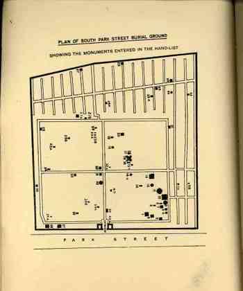
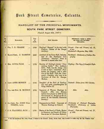
  • Imagined Neighborhoods of the Far-Away Dead: Park Street Cemetery, Calcutta

    JF Ptak Science Books LLC Post 257

    Blog1sept_13_calcutta547
    I wonder what this cemetery looks like now, this colonial funiery landscape, all these British occupiers buried in their imagined death community? (Lord Curzon, for one, found it to be “the most pathetic site in Calcutta”, which in 1900 was saying allot According to the piece below from the Telegraph, Calcutta, things haven’t gotten much better.)  Is there any melancholy left for a place like this, filled with the British working class in the heart of Calcutta?  Perhaps they could never have imagined their Further India slip away on its own, and that they’d be buried in a so-incredibly foreign land?

    Seems like this would be ripe terrain for post modernists, having a go at the real and imaginary architecture of dead colonials in a post-colonial world, using a language that only the initiated can understand. (Constructing self-referential vocabularies with slippery exterior-to-the-argument reference points isn’t exactly the best way to get to a general discussion…nor doers it seem to be additive when the vocabulary has a life of its own.)

    (I had a little go at the post-modernists and constructed a little language generator here.)

    Blog1sept_13_calcutta_map548
    From The Telegraph, Calcutta,  16 September, 2007:

    South Park Street Cemetery

    “First stop: a grim place. But a haunting, beautiful place.
    Maintained
    by the Christian Burial Board, the South Park Steet Cemetery was
    founded on August 25, 1767. Henry Louis Vivian Derozio, William Jones,
    founder of Asiatic Society, John Hyde, a judge famous for his papers,
    are buried here, as is Rose Aylmer, the woman who inspired the poem of
    the same name by Walter Savage Landor. The tombs are in various stages
    of decay. The sight of the mossy tombstones, mostly imposing, some
    addressed to persons never known to history, as the headstone that says
    “here repose the earthly remains of James Miller”, in various stages of
    decay, but exuding serenity along the network of lichen-covered paths,
    brings soothing thoughts. If this is the end, it is not so bad. The
    caretaker is not very cooperative, though, and the place also invites
    criminal elements after the dark.

    But then visitors are not allowed.”

    Blog1sept_13_calcutta_map549_2


  • Graffiti and Prison Technology ca. 1800

    JF Ptak Science Books   Post 222

    Bloggraffiti
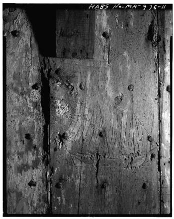
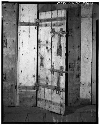
    Here’s a compelling vignette on two sides of the same door.  It comes in two images from the Historic American Building Survey and are of the  Old Jail (built in 1690 and located on State Route 6A & Old Jail Lane) of Barnstable, Massachusetts.  What is so shocking to me is the graffiti of an American schooner picking its way through a sea of tapered nails on the bad side of the door.  It is just heartbreaking (if you can remove from your mind whatever offense this fellow was in jail for) to think of someone scratching away at something this personal on what looks like massive, first-growth, very hard hardwood:  and certainly within smelling distance of the water. 

    Seeing the picture below gives a better idea of the primitive weight of the door and the impossibility of getting away from what seemed essentially to be a windowless room of tight two-inch thick hardwood.  If you’ve ever been in an old New England barn in June you would have found that the place could still be cold inside–and not a simple cold, either, but a bone-breaking cold.. This jail must’ve been pretty inhospitable in the winter, what with the wet windy northers and the frozen mist coming in from Barnstable Harbor.  It just plain wouldn’t have been good.

    The other–good–side of the door, and the better place to be, if you had to be in that building:

    Bloggraffiti_other_side

    ·Posted by :

    ·in:


  • The Marcel Duchamp of 18th Century France: Visionary Architect Jean-Jacques Lequeu

    JF Ptak Science Books LLC  Post 160
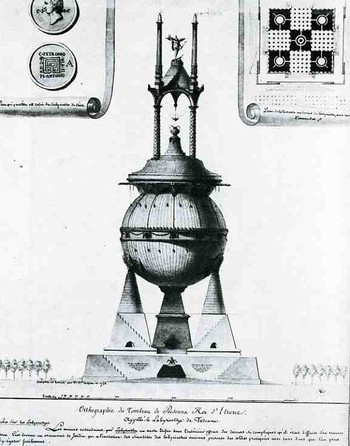
    Bloglequewu289 Jean-Jacques Lequeu (1757-1825), a French architect of fabulously distanced sight, produced this breathtaking image in 1792.  The Tomb of Lars Porsena, King of Etruria (the great Etruscan king, d. ca. 500 BCE ), is just one of hundreds of works by Lequeu, a re-discovered architectural genius who worked during the same era as other visionary architects such as Etienne Boullee (1728-1799), Claude-Nicolas Ledoux (1736-1806), Louis-Jean Desprez (1743-1803), Francois Barbier (1768-1826), Charles Bernard (1765-1818), Francois-Joseph Belanger (1747-1818), and others, though these guys are the most famous.  As a matter of fact, I think, almost all of these architects were re-discovered—Boullee, perhaps the most famous of the lot, was found again not in his buildings but in his visionary drawings that he deposited with the National Library.  But Lequeu—found again in the same way–it seems had to be rescued from an even greater obscurity than the others.  He tried to expose a unity that he saw in the world, some secret sort of unity, that he saw all around him, and which was unseen by everyone else in creation—at least until the 20th century.
    Lequeu started out in a staid and brilliant way, a successful architect in his own right, and student of Scoufflot, designing ancient-inspiration buildings for the super rich.  But along came the Revolution and away went his career—he wound up a surveyor and a cartographer until his retirement in 1815, after which he enters social and historical oblivion, until he finally dies in total obscurity ten years later (or so, the date is unclear).  His post-revolutionary vision was as phenomenal as his success in selling his ideas were dismal.  Well, this is really a cheap shot—his imagination was shockingly large, enormous, his designs fantastic and beautiful, and completely unexpected, and they seemed to grow larger/loftier and more interesting as time wore away at him.

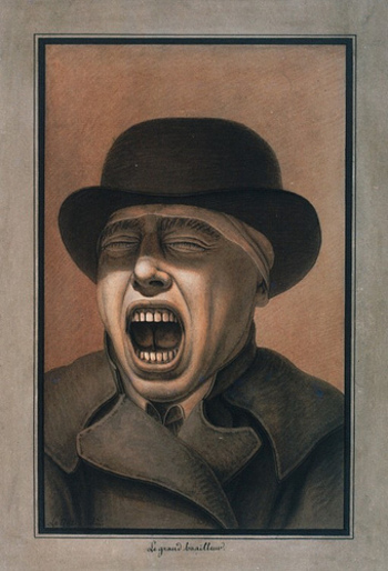
    I think that as Lequeu was cleaved away, cell by cell falling through the floorboards of his single rented room, he reached further into time and deeper into space than almost any architect of that hundred-year period.   I also think that he was very well aware of his genius being seen as pure eccentricity—his dozen or so self portraits are among the most bizarre that I’ve ever seen (before 1900). Lequeu_portrait

    The odd thing in all of this is that in this brilliance there is still a reluctance to leave the Baroque, and this at a time when just about everyone else—beginning around 1750—was abandoning it.  So much of the work of the other visionaries mentioned earlier freed themselves of the Baroque—not entirely true, not true at all, for the unique creations of Lequeu, who (as in the Tomb of Lars Porsena) included more than a few bits of the practice even in his most incredible works. 

    Somehow Lequeu saw the Lars Porsena tomb as a 650-foot tall (!!) structure, with impossible insight and filigree.  Extraordinary. (In the upper corners of the drawing of the tomb Lequeu included a design for a coin and also the plan of the structure.  The original tomb of Lars Porsena, according to Pliny the elder in his Natural History, XXXVI, 19, 91ff, was a 15 meter high rectangular base with 90 meter sides–completely destroyed in the wars in the first century. 
    Bloglequewu288_2

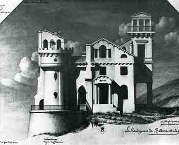
    Perhaps his most sensational creation (and one which was devoid of all Baroque influence, as it turns out) was his Meeting Place at Bellevue.  It is almost impossible to believe that it is am 18th century creation—it is as harmonious (armonia) as it is asymmetrical.  It looks deeply 20th century, and looked as far into the future as it was deeply unknown.


  • Beautiful Technical Illustration: Heck’s “Iconographic Encyclopedia”, 1851

    JF Ptak Science Books   Post 151

    J.G. Heck wrote and compiled a fascinating and complex work entitled The Iconographic Encyclopedia of Science, Literature and Art, and was published in America for the first time in 1851 following Spencer Baird’s translation from its original German.

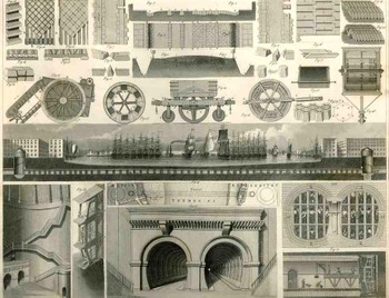
    Blogtunnel_full239

    The key to his work is the amount of data displayed on each of the 500 engraved plates illustrating this work and the way in which it is arranged.  The design and layout of the 30,000 items on these 500 plates was a work of genius, and for my money it is easily the best-presented complex means of the display of data and objects that was published in the 19th century.   

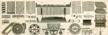
    Take for example this illustration in the technology section (a subdivision of the applied arts which is a sub division of the plastic arts) and, continuing in this complicated scheme, was Plate 1 from Section X Number A1 with a description found in the text on a dozen pages in Section 2 of Volume 2 on section pages 134-150 and overall page numbers 835-851 (!).  The plate contains 35 figures, very finely executed and rendered (many of the other of the 500 plates have 100 or more figures), and is in general related to the construction of roads and tunnels (and further, part of the “communications” section).

    This of course would be a perfect Hypertext candidate.

    Blogtunnel_top240

    The illustration itself contains an enormous amount of information.  The row along the top third or so is dedicated to street construction and paving stone, showing stones in plan and profile, as well as a cross section and ground plan of a “typical” street (including sidewalks).  It is interesting to note the detail of the cross section and the stonework that is placed beneath the horse and wagon section of the street.  There are some other beauties here as well–details of wooden paving blocks, the plan for a Laves of Hanover road, different ways of cutting stone blocks—but we won’t deal with those right now, except to point out that there are several renderings of street cleaners and road rollers (of Shettenmann and another of Schaefer) used to border the street section from the tunnel section. 

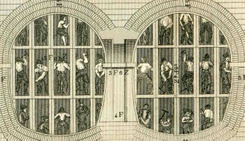
    Blogtunnel_middle241 The middle section of the engraving is of course a cross section of the Thames tunnel of the beautifully-named Isambard Kingdom Brunel (begun in 1825 and completed 1843, the tunnel 35 feet wide (11 m), 20 feet (6 m) high and 1,300 feet (396 m) long, running between Wapping and Rotherhithe at a depth of 75 feet (23 m)).  The representation here is only one inch high and ten inches long but is loaded with just fabulous detail, no the least of which are the (less than) 1mm tall workmen that can still be seen in the tunnel.
    Blogtunnelbig_detailig247
     
    The enlarged detail shows a section of the tunnel being built according to Brunel’s new specifications:  a larger, shielded tunnel being constructed around the interior construction of 12 individual tunnels (each about tall enough to allow a (short) man to stand erect. 

    In short, the engraving is a superb example of *correct* design of great artistic  ability, all accomplished while displayed heaps and gobs of interconnected, complex information. 


  • Three Great First F’s: Forks, Forts, Fission, (and one plain non-first F (Nobel))

    JF Ptak Science Books LLC  Post #139
    Blogfsfork210

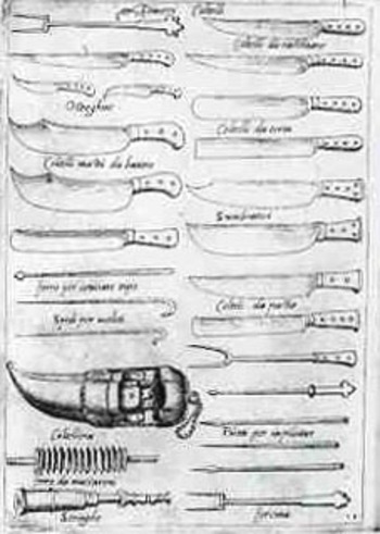
    Apropos of nothing whatsoever, I’d like to look at four “first” F’s.  the first is the first known published image of a fork , or forcina in Italian.  This was a prickish utensil (seen in the image at the bottom-right), hiding none of its stabbing qualities with a middle tine, and shows for us all its direct decent from Mother Knife.  It appears in the Opera dell’arte del cucinare by the great Renaissance chef  and cook to Pope Pius V Bartolomeo Scappi (c. 1500 – 13 April 1577, buried in the church of SS. Vincenzo ad Anastasio alla Regola, dedicated to cooks and bakers) was published in 1573. In the book he lists approximately 1000 recipes of the Renaissance cuisine (some of which, for Renaissance salads, appear at bottom) includes many images of kitchenware, the fork being perhaps the most famous.  (I used to know the first time that a fork appeared in a painting–of the Last Supper of course, but I’ve forgotten, though it does come right on the heals of Scappi.)

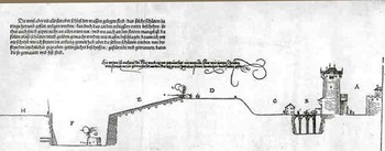
    The second unrelated but interesting first “F” is perhaps the first image of a modern, canon-proofed fort, by none other than Albrecht Durer.  This image appears in 1527 in his Etliche underricht zu bestestigung der Stat, Schloss und Flecken, and although his designs were impracticable (massive and massively expensive forts and fortified cities;
    Blogfsfort211_2

    pretty but very costly), there were certain elements of the work that were very useful—namely, the new face of some of te walls that he offered to the modern canons of the 1520’s.  These weapons were vast improvements over their earlier brethren, and Durer responded to the extra and more accurate firepower by lowering and thickening the walls and giving them greater slope—this would aid in deflecting many of the shots that were not directly spot-on, and also would improve the chances of the fort’s survival against those hits by having thicker walls. 

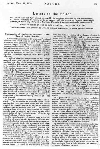
    The third F is slightly related to Durer’s fort walls—this is the first appearance of the word “fission”.  It appeared as so many of these sorts of 20th century announcements appeared with great sotto voce--this one, in a “Letter to the Editor” of the journal Nature (11 February 1939), by Lise Meitner and Otto Frisch.
    Blogfsfission212

    The communication, “Disintegration of Uranium by Neutrons:  a New Type of Nuclear Reaction”  wasn’t a letter to the editor in the conventional sense of course but was meant to be the quickest line of communication of an important result and thus appeared somewhat truncated though the great stuff of the announcement was made known and understood.     Niels Bohr’s “The Mechanism of Nuclear Fission” in the Physical Review (1 September 1939) may I think be the first use of “fission” in the title of a paper.) 

    There is a very big story here with Meitner and fission and Nazis and the Nobel.  This leads to our fourth F:  and that would be “F” as in “Failure” to the Nobel committee who in 1944 awarded the Nobel Prize to (German, non-Jewish) Otto Hahn for the discovery of nuclear fission while completely ignoring (purposefully, I would say) Meitner, who really, by all  rights, should’ve gotten the award, and probably by herself.  This is a more complex tale than I would care to deal with now, but I think that it is beyond doubt that the Nobel committee again (think Einstein and others) severely screwed this up in favor of maintaining their dislike for people with Meitner’s heritage.  (And yes, she was Jewish; Einstein suffered too at the hands of the committee, not receiving his award, unbelievably, until 1921, *16 years* following what was probably the best single year  that anyone ever had in the history of physics, ever, and then 14 years following his great year of 1907 and five years following 1916’s paper.  And so on.)   Yes, Meitner hung on in a not-good way in Germany for six bad years 1933-1938) until she finally get the hell out, but that really doesn’t tell the story very much.  The fission bit with Hahn and Strassmann is a little bedeviling, but it really was Meitner who recognized the whole thing as being the process of fission.  Period.  And shame again on the Nobel people for getting it wrong, again, on purpose. 

    ·Posted by :

    ·in:

    —

  • Fantastic and Unbuildable Architecture #6: the Pyramids of Gizeh in Detroit (Michigan), 1908

    JF Ptak Science Books  Post 137

    Because strait is the gate, and narrow
    is the way which leadeth vnto life,
    and few there be that finde it.

    –Matthew 7:14

    Blogprymmidelevtion216

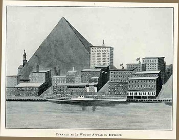
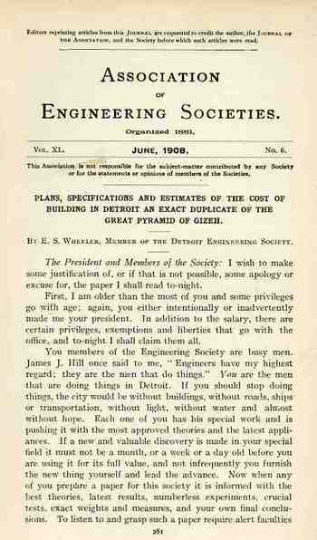
    And so it came, somehow, to be that E.S. Wheeler, president of the austere and august Association of Engineering Societies, presented a paper at its annual meeting in June 1908, on building an exact replica of the great pyramid of Gizeh.  I suspected that because of the intentionally fantastoid title that Mr. Wheeler intended the paper as a show, exhibition, to the younger engineers in the audience about how one might approach an unusual engineering problem, as an imaginative course of instruction.  That would be quite nice. 

    Except though that Wheeler presented the paper as though he was serious.  He delivered  it evidently with a high dryness, and people took him seriously.
    Blogprymmidpln215

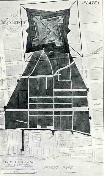
    The pyramid was to be built on the site of the village of Cadillac (of 1701), in central Detroit, occupying that site and then some, covering it with 13 square acres of stone.  Oh, yes, and it was also to be excavated, scooped first into a shockingly cavernous prism 759’ on each side and 120’ deep, or about 2.6 million cubic yards of stuff.

    The pyramid itself was to be built almost entirely of limestone, 760’ on each side, and 485’ high, set on the 13 acre base—where those 13 acres in the center of Detroit was left open to debate. Wheeler also intended to reproduce the interior of the pyramid as well (so far as it was known in 1908), and had a set of plans to accomplish that goal. 

    Wheeler figured that the material cost (exclusive of the base), would be $36,000,000 1908 dollars, which he considered a fair price.  The conclusion of his paper was a superb slash of logic and possibilities—he calculated that if each person in the United States contributed the equivalent of a day’s labor on the building of the pyramid, that the great structure could be built in a day and a half.  Wheeler closes with this superior gem, a sentence unlikely to be repeated in any subsequent technical journal”  “If the United States should stop all other work and devote itself entirely to building pyramids, as was probably the case in Egypt, it would, after it got fairly running, be able to turn out two every three days.
    Blogprymmidtp214    


  • The American Log Cabin–a Tiny Masterpiece of Antique Children’s Art

    JF Ptak Science Books  Post #127

    Bloglog_cabin_primitive188

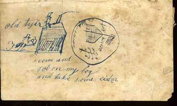
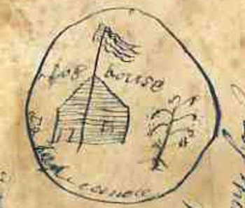
    Here is an example of a beautiful, achingly simple, drawing of two log cabins by a child, and done around 1830.  I absolutely adore antiquarian manuscript artwork of children.  The observations are pure and simple, and reminds me of what my children draw, except of course for the subject matter.  The work of children from 125 years or more ago is really quite difficult to find:  the writing and practice material of choice was in general absolutely ephemeral, taking place on a chalk board to save on paper and writing implements, as paper was far more expensive pre-1850 than it is today.  To further complicate things a family would have to actually save the art for four generations so that one could find it today, which is asking a lot from your family.  Most of the time the surviving artwork comes in two ways:  in the form of a notebook, which has survived through the years intact; and as incidental artwork jotted down on the free end papers in textbooks.  In any event, the art is hard to find. 

    The drawing has two elements:  the first shows a man approaching a house, an dis titled “Old Tyler”; to its right and on it side is the glorious image, “Log House”, complete with a flag on a flagpole and a little aphorism:
    “Come and
    Set on my log
    And take some cider”.

    Bloglog_cabin_primitive_det

    This is just simple a super bit of naïve childhood Americana.

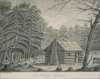
    Here is another image of frontier life in the US int he early 19th century, though this one, from George Collot’s Voyage dans l’Amerique Septentrionale, published in 1826, around the time, I reckon, that the child (above) was making this drawing, but is of course iconic and was distributed, unlike our young artist, whose drawing living only on for him and whoever the child might have shared it with.   I believe that the Collot image of the famous American log house is one of the earliest ever published. It is a gorgeous image and speaks to the spirit and humble pride of the folks who lived there.

    Collot log house


  • Visionary Architecture and a Falling Man Prank–E. Hebrard’s Tower of Progress, 1913.

    JF Ptak Science Books   Post 118 (expanded)

    Dsc00013

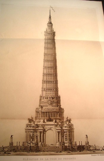
    This image has two things going for it, one obvious, the other not (and just about hidden, until you see it, then you can’t help not seeing it all of the time).  It comes from an unusual, somewhat pretty/bizarre visionary work privately printed in Paris in 1913.  The lead author, Hendrik Christian Andersen, along with Ernest M. Hebrard (and his brother, Jean Hebrard, who we saw in an earlier post), collaborated on a project (ungainly) called Creation of a World Centre of Communication1, a deeply complex, very detailed, and just plain weird offering for building a sprawling extraterritorial city dedicated to “oneness”.  The drawings and plans were lush and lovely, with a lot of thought in their execution but actually very little into how everything might actually be pulled together into some sort of working whole. 

    Dsc00012

    And so it goes.  I imagine that if the beautiful Etienne Boullee thought in terms of cities rather than in single structures, he might’ve produced just the same sort of gorgeous, unconnected thing.  After all, just because you draw a plan with a lot of buildings almost touching each other doesn’t necessarily mean you’ve drawn a visionary city. 

    This is one of 22 large images (in real life this print, a heliogravure, measures about 28 inches tall) showing different structures from an art center to a fountain of life.  This is the “Tower of Progress”—I don’t know what sort of progress as there’s really nothing to go by, except for the big 100’-tall clock, so at the very least it is a celebration of the progression of time, which needs no monument outside of the trillions and trillions of trillions (or centillions, or 10303?) of bones it has distributed around the planet over the millennia. But for Hebrard it formed the locus of the  “a fountain of overflowing knowledge to be fed by the whole world of human endeavour in art, science, religion, commerce, industry, and law; and in turn to diffuse throughout the whole of humanity as though it were one grand, divine body conceived by God, the vital requirements which would renew its strength, protect its rights, and enable it to attain greater heights through a concentration of world effort.” Whew.

    I figure that the tower was to be about 1,500 feet tall (scaling it by the 2mm tall figures scampering around in the image)—a giant tower perched on top of a rotunda placed on top of a table-like something, looking terrifically fake, but lustrous.

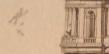
    The prize though in this portrayal of the “Tower of Progress” is a little smudge-like thing to the middle-left of the tower.  Under magnification, we see that it is a man, with a bowler and an umbrella, hurtling down, falling from somewhere way on high in the tower.  It is of course a very unexpected feature of this visionary architectural rendering, a hidden joke (perhaps?).  These sorts of additions—the work of a disgruntled/drunk/humorous engraver—pop up from time to time in the history of printing.  Perhaps the most famous intentional example of this graffiti is found in the earliest copies of the first edition of Twain’s Adventures of Tom Sawyer, where a male character is featured with

    a very large, very lumpy, very noticeable, erection; a proof reader spotted the embarrassment, and the plate was reworked to rid the character of the Natural Function.  I’d guess offhand that this was the case with the Hebrard heliogravure, even though there is a second figure in the tower pointing at the figure hurtling past, implying a little more thought in making this a more cohesive joke.   

    Notes:  An interesting review of this work appeared in Town Planning Review for 1914, here. 

    Falling_man_super_detail