A Daily History of Holes, Dots, Lines, Science, History, Math, Physics, Art, the Unintentional Absurd, Architecture, Maps, Data Visualization, Blank and Missing Things, and so on. |1.6 million words, 7500 images, 4.9 million hits| Press & appearances in The Times, Le Figaro, Mensa, The Economist, The Guardian, Discovery News, Slate, Le Monde, Sci American Blogs, Le Pont, and many other places… 5000+ total posts since 2008.

Author: JF Ptak

  • Faux Outsider Speculative History of Rattling Musical Jaw Bones, or Something

    JF Ptak Science Books  Quick Post
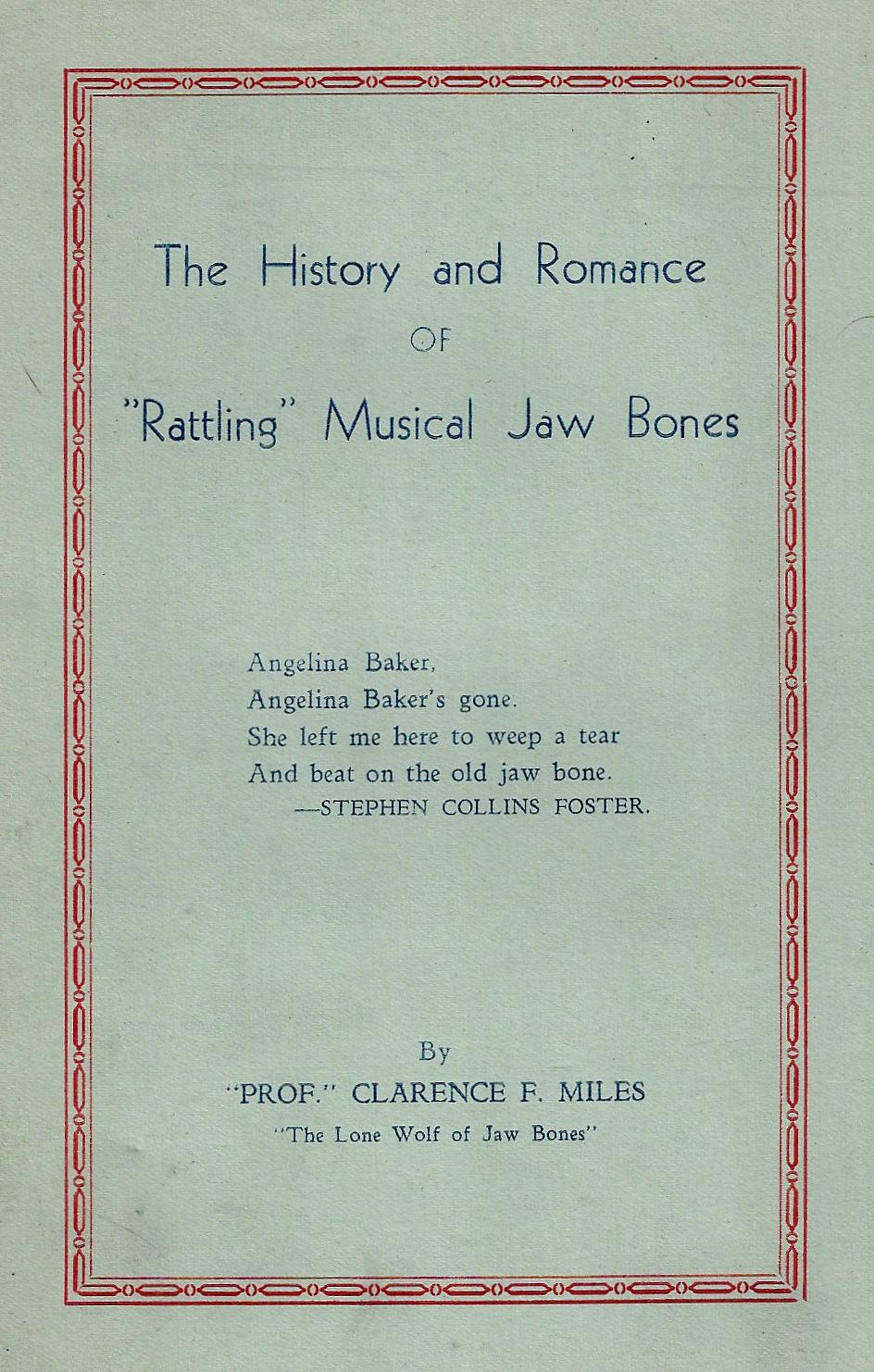
    Books cover rattling jaw bonesWell, here I am, uncertain about posting this odd piece about an odd subject, oddly written in odd style, with odd logic, all wrapped up in a big flat ball of buttery odd.

    At first I thought that this was a true Outsider adventure–that, or a work of a somewhat deep personal dialog that should have stayed deep, and private. In the end I’ve decided that it is a work of Speculative Outsider Fiction, though the subject may be real, but the presentation is purely performance. I think.  

    The work was written by “Prof” Clarence F. Miles, and pertains to horse jaw bones made into a tambourine-type instrument, and has some connection to Stephen Foster1.

    The History and Romance of “Rattling” Musical Jaw Bones,  (1936), “First and only edition, Bulletin No. 1, being the third part of a history of jaw bones” is boasted on one of the sub-title pages, even though it is stated immediately afterwards that “this is my first history of Jaw Bones”. This is an early display of this logic–there are for example the following section headings: “The Last Half of the Second and Last Section of Supplement No. 3” which of course followed the final section called “Second and Last Section of Supplement No. 3” both of which are preceded by  a chapter head  reading “Third Supplement to the First and Only Edition of Bulletin No 1 which is my book the history and romance of rattling jaw bones”! All of those sections fight each other for space in just over three pages. This pamphlet contains powerful displays of such battle construction made even more remarkable by the great brevity of the work, which is only 36 pages, about 10 of which are repetitious bits and chatter. 

    There are also numerous non-sequitur forays into unchartered waterless waters where the unexpected and the unconnected are frequently obtained and connected by brute force: 

    "The above evidence is conclusive proof that Mr. Charles Darwin wasted the five years of his life between the years 
    1831
    and 1836 that he spent as naturalist on the surveying ship H. M. S. Beagle on a voyage around the world
    and that the
    research work performed upon rattling jaw bones by the Stephen Collins Foster Institute of Rattling
    Musical Jaw Bones
    has knocked Mr. Darwin's famous or infamous theory into a cocked hat and the cocked hat
    can be found in the middle of
    next week. Deny it if you can."

    At the end of the work, and after much repetition of the title and the necessity for this history of jaw bones, the author
    states in the third to last paragraph that he hadn't even begun to write the history of jaw bones in his history of jawbones
    book. "From now on I start writing jaw bones at the exact point where jaw bone science ends and the jaw bone skill
    begins", which is a great line. He continues, "I will raise jaw bones to their rightful and exalted station and watch my
    style, speed and dust in accomplishing it".  

    There's more, but I think I've now exhausted my interest, though I do salute Mr. Miles for his great dexterity.

    Notes:
    1. "The quijada, charrasca, or jawbone (in English), is an idiophone percussion instrument made from the jawbone of a
    donkey, horse or mule cattle, producing a powerful buzzing sound. The jawbone is cleaned of tissue and dried to
    make the teeth loose and act as a rattle."--Wikipedia
    ·Posted by :

    ·in:


  • A History of Blank, Missing, and Empty Things, Part 42: the Dirt-Filled Tunnel (1895)

    JF Ptak Science Books   Quick Post

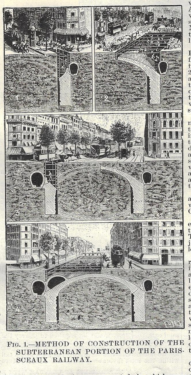
    Sometimes things are very obvious–so obvious that they hide in themselves, in plain sight. That was sort of what happened here, with these cutaways of subway tunnel construction in France in 1895. When I’m reading something to figure out what it is in order to place it in the Books for Sale section of this blog, trying to determine what it was beyond the thing that looked so obvious, it only takes one short sentence or fragment to wrap the whole thing up, and to validate the achingly obvious thing to be exactly what it seemed to be. Such is the case here, with the construction of the extension of the Paris-Sceaux railway (as reported in the Scientific American Supplement for May 11, 1895). Now it seems that in the four-section cutaway showing the progress of work that the workers first dig a deep trench and then construct a masonry “archbutment”, taking most of the sidewalk but not the street during the construction process. Once this is finished, part of the street is closed and the construction of the tunnel ceiling is built for the arch. That done, the work gets flipped to the other side of the street and repeated, though from this end the arch of the tunnel is joined, and the whole of it covered by earth and roadway, again.

    Sci Am SUpp 1895 tunnel detail

    [This small 2×4″ image is a detail from the front page of Scientific American Supplement, May 11, 1895.]

    Then the magic sentence appears:

    • “(F)inally a tunnel filled with earth was obtained”.

    How lovely! And of course, how obvious it is, in spite of looking at the procedure and thinking it somehow ‘backwards”.  Then:

    • “It was only necessary to clear this and establish a floor, and then the thing was finished.”

    There was still track and stations and electricity and ventilation and all of the rest to be installed, but once there was a place to put those things that was not simply dirt, it would be much easier.

    As they say here in the South, “It is what it is”. 


  • Heavy, Chunky, Obvious, Strained, Drawn with Limited Ability–But Strangely Compelling (?)

    JF Ptak Science Books  Quick Post

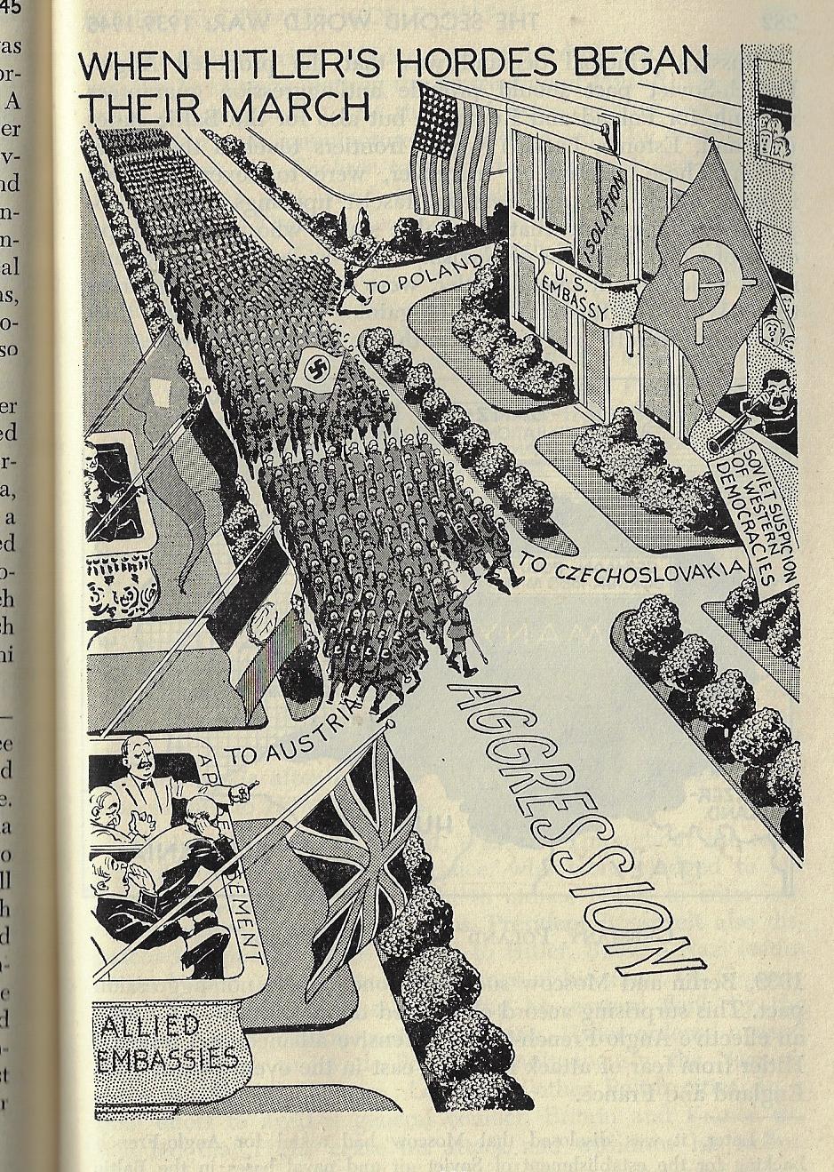
    Outsider Modern History _12_It would have been easy to judge this book by its cover–and the strange bit about that is that you would’ve been nearly correct.  Philip Dorf’s schoolbook history New Visualized Modern History was published by (not the) Oxford Book Company in NYC in 1947 has a certain look in its design that seems more like an odor. There’s some amount of talent in the illustrations that make it seem studied, except that there are many more elements that make it seem not so. The text (fairly extensive and compact in 388pp) looks to be well-written and accurate (or at least not the opposite) but it is interrupted by dozens of illustrations that are highly contrasted, very heavy,  blocky, immobile, strained, and somehow off-putting, but in the final result the drawings actually seem to work, delivering their message, if not in an inelegant steam-filled roller derby way. Perhaps they’re worthwhile after all, except that it is difficult to like something that you really don’t.


    Outsider Modern History _7_


  • The Aching Beauty of a Work on Telephone Pole Marking Systems (1938)

    Books markers coverJF Ptak Science Books  Quick Post

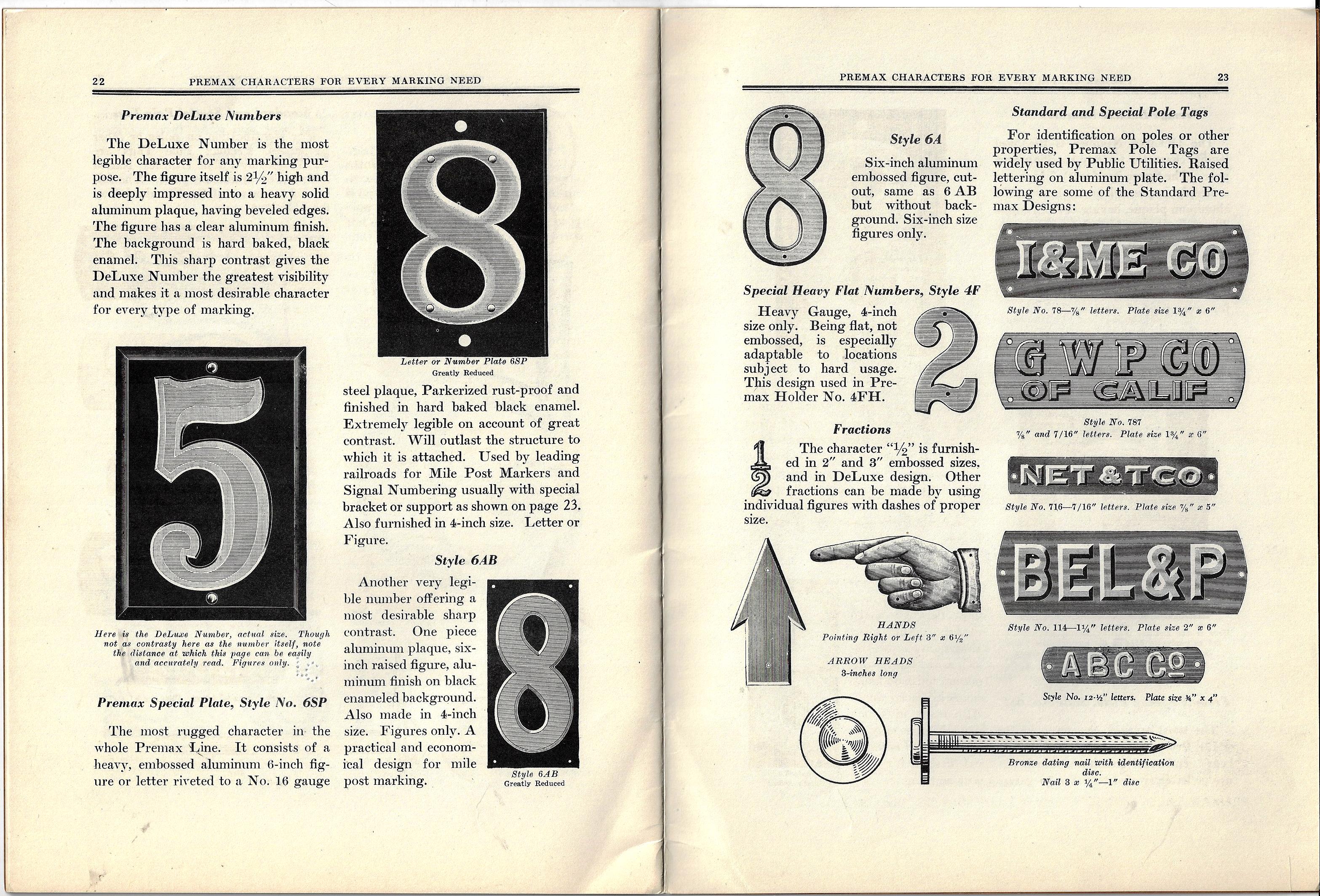
    Over the years I have reported on inspiring and near-perfect minor-major works on minor-minor topics, excellent considerations on the sublime mundane.  These have included efforts from 75+ years ago on the correct method of flagpole painting, zipper repair, maintenance of the reverse of billboards, and the like. Marvelous works exhausting exhausting topics, or seeming so.  How much can you write on the correct way of using a screw, or blasting a stump, or dealing with a puddle of unknown origin? Well, the answer is that quite a lot can be said about these things, especially if you look at the mechanics of the things, or the failure analysis (if there is any)…a lot.  Most of what these pamphlets talk about is the very basics of zipper repair or ladder repair or screen repair–and that is usually communicated over 20-30pp or so. And the remarkable thing is that the information is useful, even if you didn’t have a direct application for it. 

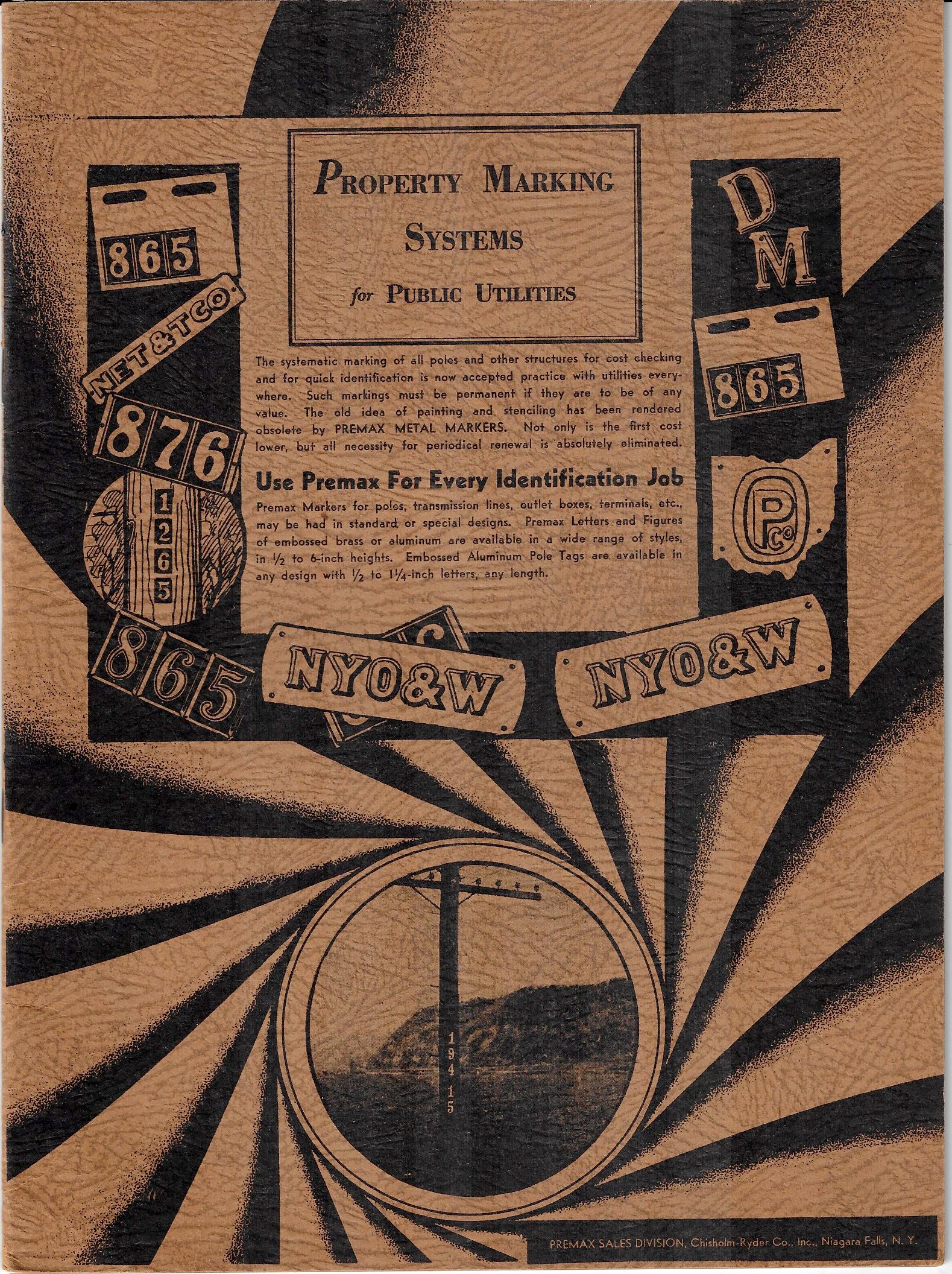
    Today’s installation is a somewhat Dadaist-looking pamphlet on telephone pole marking systems. Is there anyone who hasn’t noticed the found-art pummeled into telephone/utility poles and wondered what the numbers meant? This booklet, far from enchantingly-titled Property Marking Systems for Public Utilities, published by a manufacturer of such numbers and symbols back in 1938, answers these questions and tells the story of how you, too, can mark your poles in an efficient and modern manner.  

    I think the thing is achingly beautiful. 

    I think that if you engage these things as antique paper versions of the endlessly useful  DIY Youtube videos, they take on a higher glory.

    And of course this one to me has a lot of those found-Dada elements…

    Books markers


  • What Happened to Good Artists with Bad Vision Before Spectacles Were in General Use?

    JF Ptak Science Books   Post 2728

    Eyeglasses-detail[Johannes Reuchlin, Augenspiegel...1511]

    What happened to art in the period before Impressionism that was made by people who needed glasses and didn’t or couldn’t wear them?  The answer is obvious because, I think, nothing quite like that exists in galleries or public collections:  people who painted but had poor vision were probably/simply told that they couldn’t paint.  If a far-sighted person without corrective specs attempted to paint a sunset over a forest, and painted it exactly  as they saw it, and were doing this in 1787, there work undoubtedly would have been rejected as utterly failing in realism.  On the other hand, the result of their work may have been beautiful collections of forms and colors capturing the essence of the forest and the sunset, but they would have been 50 years shy of the JMW Turner time, and 70 years or whatever shy of the Impressionists.  

    A person with poor or disturbed vision who tried to paint during this time would have been roundly scooted out of the palace of correct painting, though they could have been inspirations to generations of Barnett Newmans and Jasper Johns and Clyfford Stills and Wassily Kandinskys.

    All this said, does something like Edvard Munch’s The Voice (1893) start to look a little “different” if you imagine a far-sighted artist at work without their glasses?

    Munch--the-voice-1893

    [Image source: https://www.britannica.com/topic/The-Voice-painting-by-Munch]

    Or a vision-impaired person producing Les Alpilles (1890) instead of a visionary Van Gogh?

    Van gogh les apilles

    [Image source: https://www.vangoghmuseum.nl/en/collection/s0417M1990]

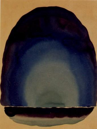
    Or a macular degenerating issue producing a painting like Georgia Okeefe’s Light Coming on the Plains III (1917)?

      Okeeffe_light_coming_up_on_the_plains_iii

    [Image source: www.alpheus.org/unfolding-the-art-of-georgia-okeeffe/]

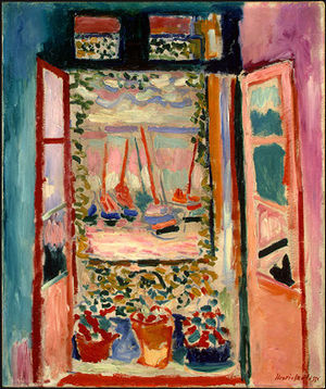
    Or a half-blind artist painting Matisse’s The Open Window, Collioure (1905), simply painting exactly what they saw?  

    Matisse

    [Image source: https://en.wikipedia.org/wiki/The_Open_Window_(Matisse)]

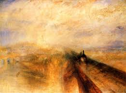
    I don’t think of revolutionary artworks in terms of their common ophthalmologic varieties–I just wanted to make a point about what happened to all of that artwork that was no doubt produced by people with impaired vision before the Impressionists and Fauves and non-representational artists came into being.  I wonder if those who received J.M.W. Turner (as with, say, Rain, Steam, Speed–the Great Western Railway, 1844) so badly so early on in his career and so early in the History of Disappearing Details wondered whether he had a visual issue, or not?  Turner rain steam speed

    [Image source: https://www.wga.hu/html_m/t/turner/2/205turne.html]

    And in a way, similar to the probably non-existent vision-challenged art of the past is the Robot art of the future–or at least the robot art of what was described by P.K. Hoenich in his article “Robot-Art, the Hopeful Monster” that appeared in two part in the journal Cybernetica in 1963 and 1964.  It was with high hopes that I started reading this article wanting the author to address robots-making-art in the future.  After all, my friend George Widener, who is a fabulously gifted artist,  directs some of his fantastically involved calculating/numerical artworks to the interests of his robot-collectors of the future–given this case, why (if the robots are collecting) wouldn’t they also produce art themselves?  And why, if given the legions and multitudes of robots of the future couldn’t they produce every recorded piece of art that has ever existed and then insinuate development and trends and institution and all of the other gifts of the singularity and produce all of the works of art that will ever be produced?

    Well, Hoenich turns out to be describing “robots” of  mostly a very different sort, whether he uses the term “monster” in his title or not.  He was broadly addressing a style of art that is produced by externally-controlled structures (mostly), and his particular brand was a mobile-like device with art bits whose movement was powered by the wind…and also used found spectra and sunlight.  It was not what I was hoping for, the vision of robots-at-the-easels/keyboard/whatever remaining unfulfilled. 

    Still it was an interesting read, mostly in laying Hoenich in a continuum of similar artists whose “robots” were the wind (as for example with a Calder) or Nicolas Schoeffer (with spectacular luminodynamics) or Mohly-Nagy (with a combo of light and movement) or Arp (with chance painting) and maybe even Pollock. I guess even Duchamp could be included in a category like this if you considered his work to be governed by selective, found chance, a sort of choice-chance, for his Readymades. 

    So in a way these artworks were made by “robots” insofar as they were produced by not-exactly the artist but with external assistance.

    “Squinting with Art” perhaps could have been the title of this post–squinting at your landscape to see it with semi-non-representational vision, and squinting at the titles of other works to make their possibility more appealing to what you ‘d like to see. 

    ·Posted by :

    ·in:

    —

  • Two Pythagorases, or Pythagorii

    JF Ptak Science Books  Quick Post

    Pythagoras

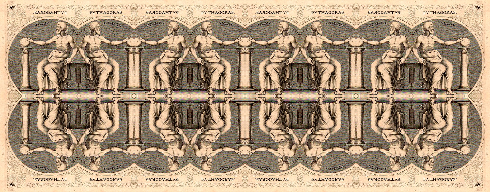
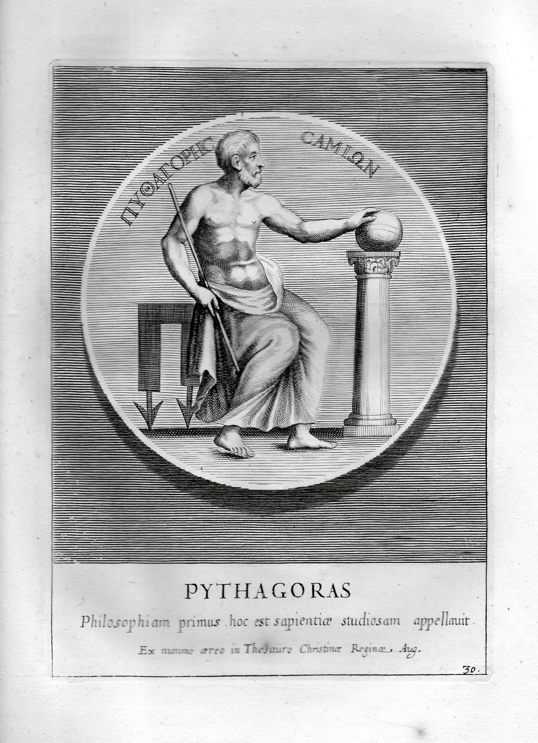
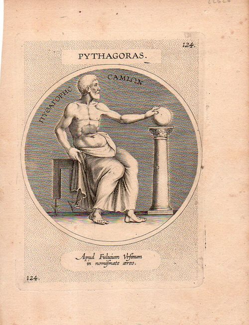
    I wanted to take a moment to share these two versions of the same image. This fine engraving of Pythagoras was printed in 1739  and appeared in Veterum Illustrium Philosophorum, Poetarum, Rhetorim et Oratorum Imagines…by Jo. Petri Bellorii, and published in Rome.  (The image measures 8.5×5″inches on a sheet 13×9″, and is on very heavy and thick paper.) It very closely follows the portraits of Pythagoras that appeared on coins and medallions from 1500+ years ago, so the attitude and the design is ancient. What is shows is a ripped Pythagoras gently touching a globe which is undoubtedly representing the Earth, as one of the many achievements of Pythagoras was to show that the Earth was a sphere. This is a problematic priority to establish, but certainly Pythagoras was among the earliest to establish this idea. (I still have not heard how Flat Earthers deal with the issue of different night skies for the northern and southern hemispheres, among other things.)

    The image differs somewhat from that below, and is sharper, with greater detail, which is a little odd, as it is newer than the other, though I guess it is possible that this was simply copied and a new plate was made for the engraving–generally after time and use the the engraved plate will show some wear and eventually the image will show dings and other bits.

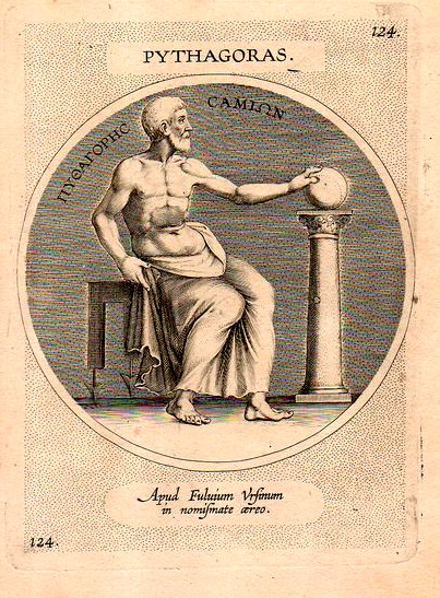
    Bike triplett188
    Here’she other version, which I think was executed by an engraver copying Theodor Galle, which would make it 16th century, though for the life of me the print doesn’t feel to me to be that age–it is old, for sure, and I would’ve guessed 17th or 18th century, but not 16th.  I’ve not found this image anywhere though I’ve found similar that point to Galle in the 16th c. (And oh yes, the image is 4″ round on a 7.5×5.5-inch sheet.)  Perhaps the original plate was reworked hundreds of years later to yield an inferior print–and for some reason the staff does not appear in the earlier version, though some artist reworked Pythagoras’ hand so that he could better hold the staff in the modern version. 

    Pythagoras

    ·Posted by :

    ·in:


  • A Rolling Note on Unnecessarily Rolling Things: Rolling Houses of the Future (1938)

    JF Ptak Science Books   Quick Post

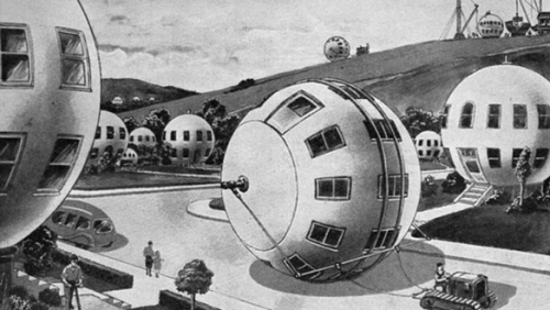
    There are many things that are rolling and rolled, though not so many of those are houses. “Rolling” as a word goes way back in English, to the 14th century at least, referring to a not-good sensation of the stomach, which no t surprisingly could be used very nicely in describing this Popular Mechanics idea from 1938 of the near-future. Much more useful in the history of rolling is log rolling, rolling your “r’s”, taking your tobacco to the rolling house, going to work at the mint in the rolling room, getting your seal legs for the rolling moment (and adjust ballast in the rolling chamber), hearing the rolling sound of waves, and such.


    Rolling_house_large

    It remains unclear to me why you’d need a house that could be rolled…after all, it couldn’t be rolled that far, and as we can see the tractor-of-the-future looks pretty much like a tractor-of-the-past, which also means that the house isn’t being rolled that far at 2 mph. Also for the sake of convenience the added track for rolling the rolling house is added to the center of the structure, which in this case is also where the first floor windows are, though in the other houses placing the tracks might be an issue because there the windows are not centered. And for some reason the houses look like they might be built on the hill in the background–that gives thought to the fancy that the houses needed to be rolled to get them down the hill and into place–of course they could just be built on site like most places, and therefore negate the rolling need.  There is one bit that does make sense–the crushing issue of the house rolling on top and over the driver of the tractor seems to be answered in the background, the artist allowing the driver to let the house roll down the hill ahead of him or her. Anyway, I’ll stop here with this wonderful image, and just roll along.

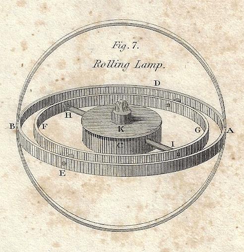
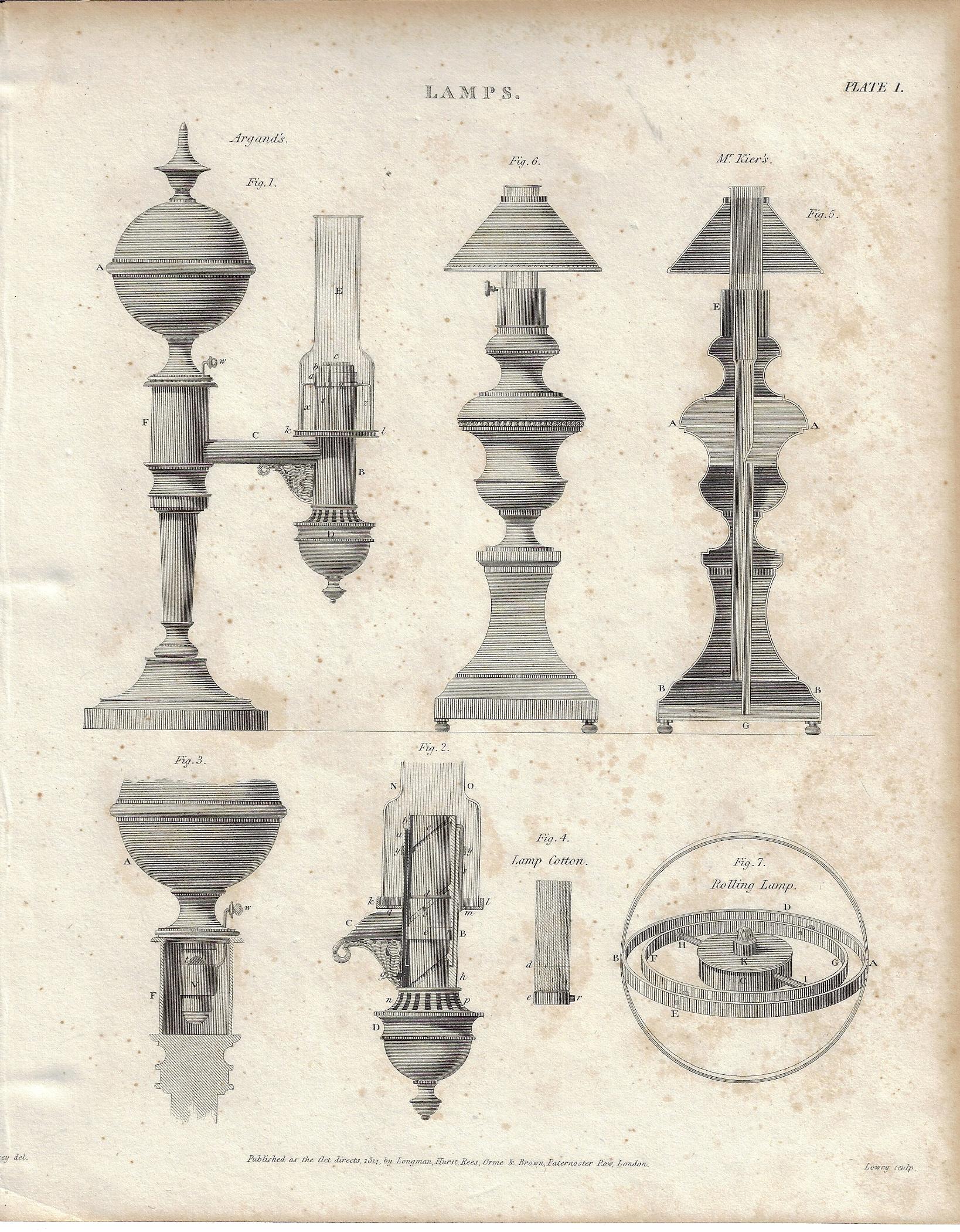
    Here’s a rolling thing that makes more sense, and is quite lovely as well, found in Rees Encyclopedia (1812):

    Rolling lamp 1809 detail

    This is a small detail from the general engraving on lamps:

    Rolling lamp 1809 large


  • Cross Section and Cockpit of a Hawker Hurricane, 1939 and 1942

    JF Ptak Science Books  Quick Post 

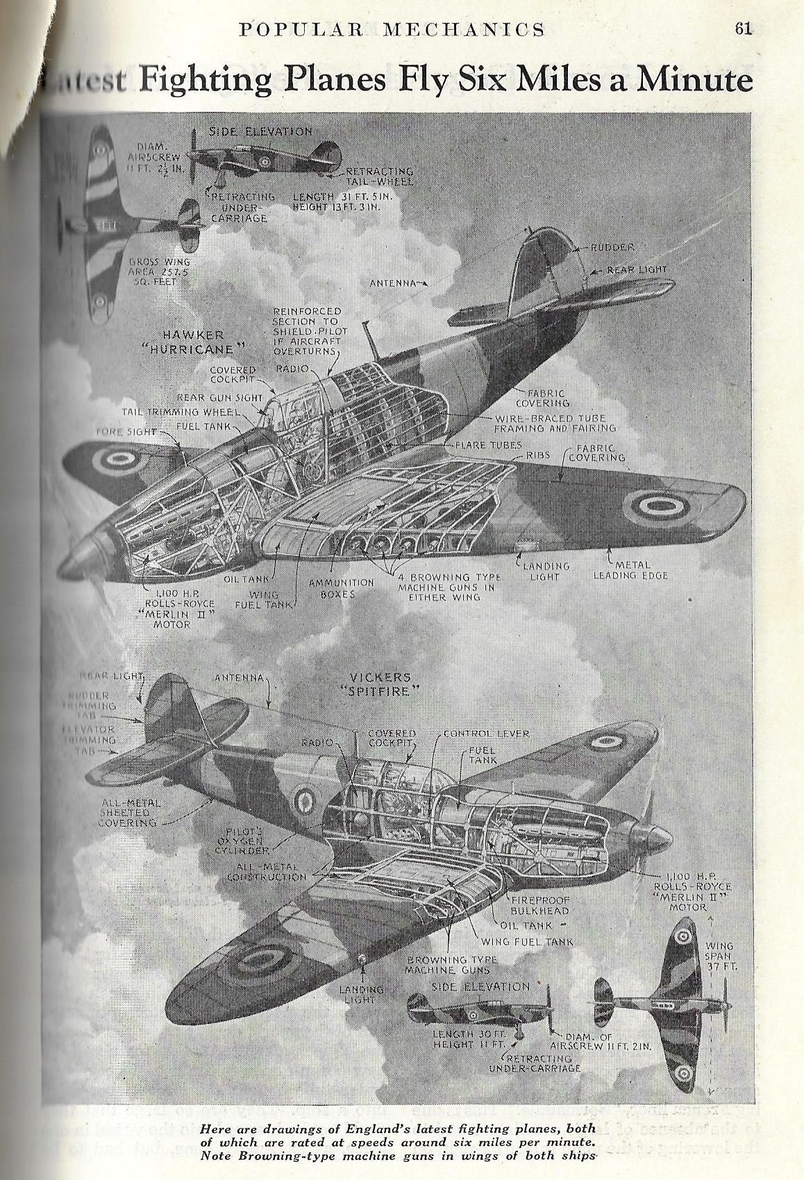
    I would say that there are perhaps 100 good, solid (mostly technical) cross sections on this blog, and to that number I’d like to add two more. the first features the Hawker Hurricane and the beautiful and winning Vickers Spitfire–two of the most important aircraft of the war and backbone of the RAF, and it appears as a short article right before the start of the European part of WWII in Popular Mechanics for January 1939.

    Cross section 1939 Spitfire Hurricane

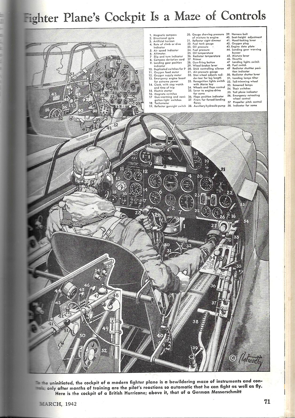
    This second image–barely a cross-section as things go but it does serve our purpose–comes via the cross-section-dependable Popular Mechanics for April 1942, and shows the cockpit controls for a British Hurricane as well as a smaller image for a German Messerschmidt. (Click and click again to greatly enlarge this image for the small print.)


    Cross section Pop Mech 1942 Hurricane aircraft


  • Remote Control Warfare, 1917

    JF Ptak Science Books   Quick Post

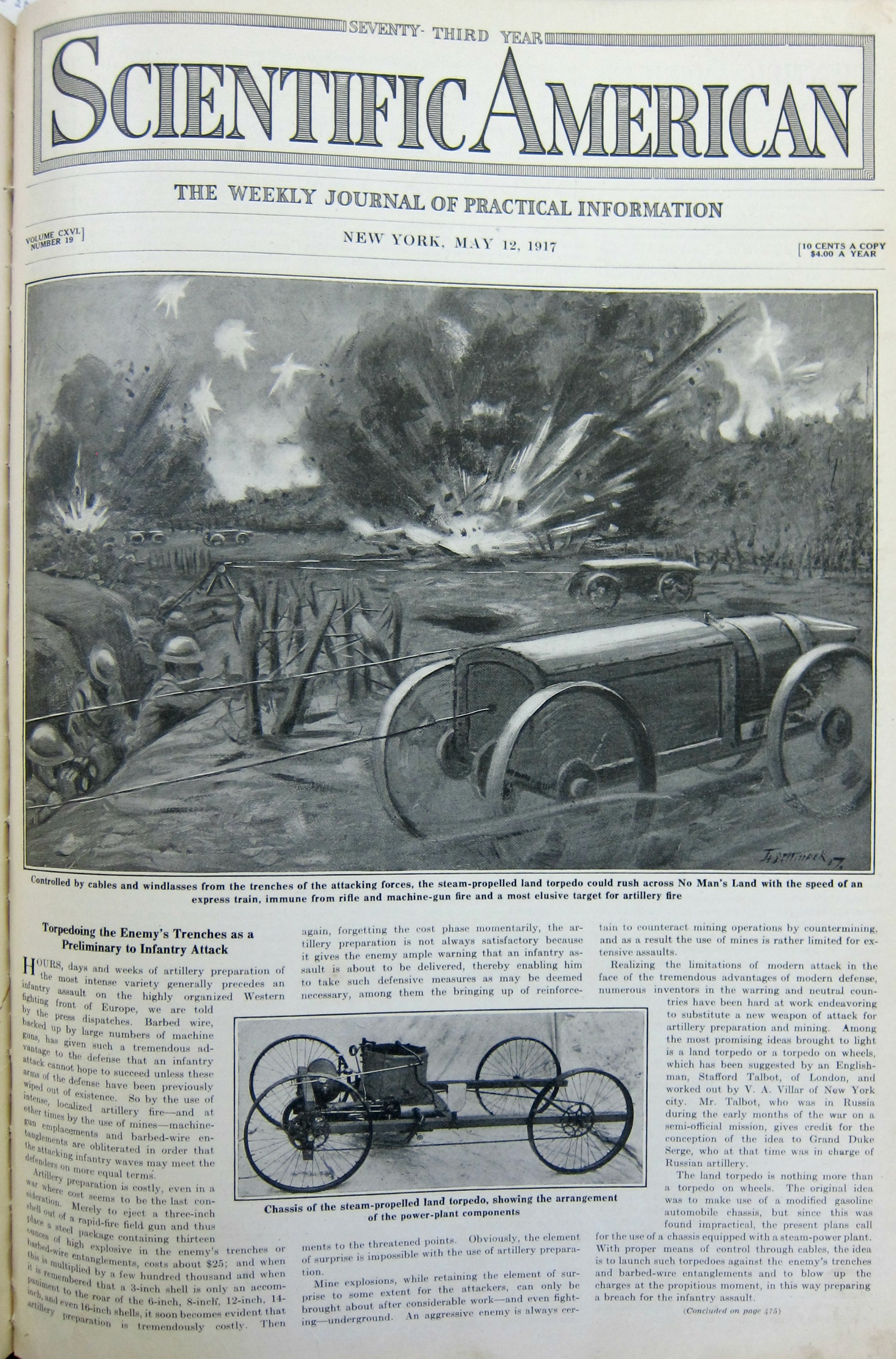
    “Torpedoing the Enemy’s Trenches as a Preliminary to Infantry Attack” is a short but powerful article on the possibility of drone strikes in 1917. Actually, it was more like a wire-guided war robot, steam-driven, trundling across No Man’s Land in a whirl of steel wheels and steam, guided from one trench to attack another, on the other side. The thing doesn’t look so functional, given the varied and terrifically uneven ground it had to traverse with a heavy (and explosive) load and its carriage and powertrain. In a way it reminds me of a Bangalore torpedo, except mobile–on the other hand, the Bangalore actually worked. 

    Ironically, the torpedo was being operated across land from one land-submerged army to another; the colorful cover of this issue pictures finding submarines by air patrol, and then eventually killing the sub with an air-launched torpedo. 

    WWI Project land torpedo


    ·Posted by :

    ·in:

    —

  • Iconic WWII Propaganda–Great Britain, 1940 (“Careless Talk Costs Lives”)

    JF Ptak Science Books    Post 2727

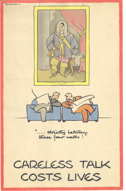
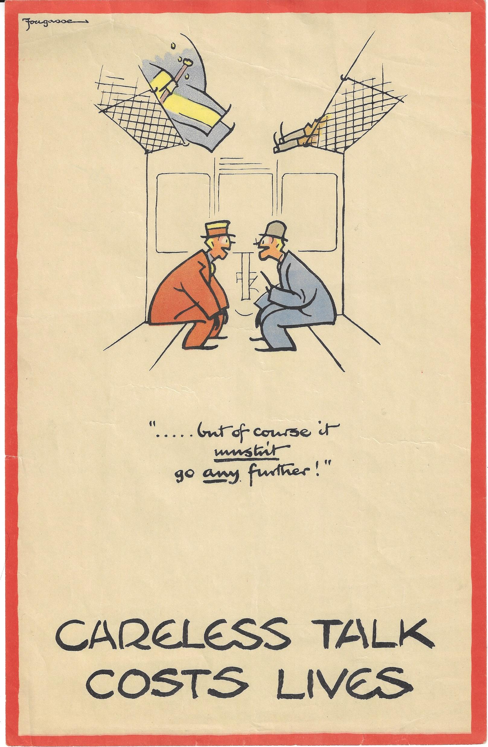
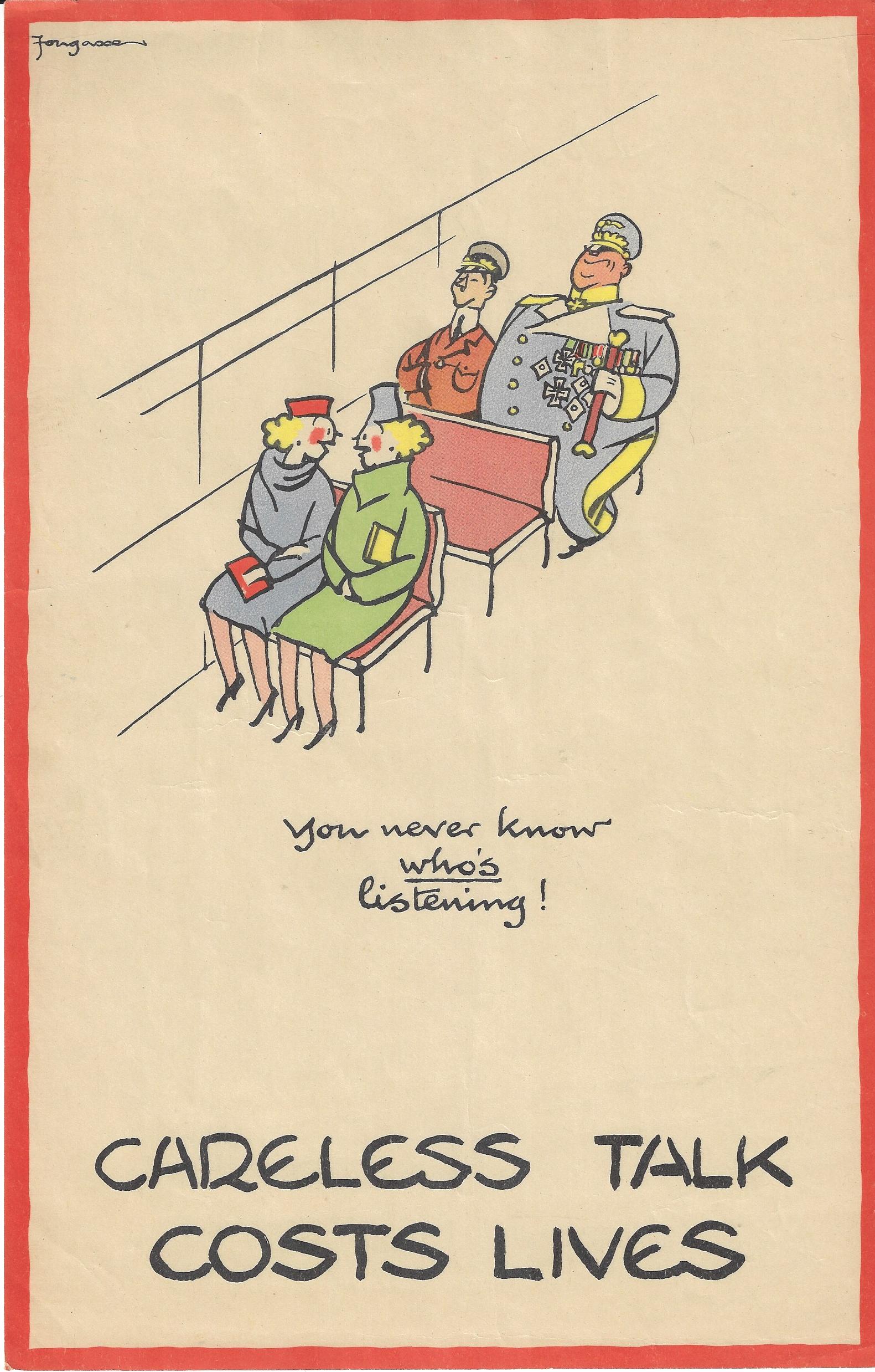
    I found these images years and years ago, and evidently had forgotten them–they surface yesterday from a long slumber, and immediately put me into mind of the very real hearst and minds campaign and of keeping secrets secret in the terrible and great struggle in the U.K. in 1940.  These are four of eight posters in the very popular “Careless Talk Costs Lives” wartime propaganda series issued by the Ministry of Information and printed in 19401. They are the very stylized work of the illustrator “Fougasse”, who was Cyril Kenneth Bird, (1887-1965), an illustrator for Punch (from 1937 to 1949) and other journals and magazines, and also a wounded vet of Gallipoli in the First War. 

    The series in general depicts people sharing a piece of possibly sensitive information that in the wrong hands and together with other pieces of info could reveal devastating secrets—and in each case there are figures lurking/loitering/disguised in the background waiting to collect the data, and generally a poorly disguised Hitler or Goering or both. Fougasse was able to make his message immediately memorable and understood because I think of his understated over-the-top visual humor. The images were funny, but the message was deadly serious. Also, you really didn’t even need to read the text to understand the message. (This is in the same vein as some of Thomas Nast’s finest work, conveying social content and a political message to the illiterate, making his devastating (and usually highly textual) cartoons understandable without needing to read them.) 

    (1) “Strictly Between Four Walls”.  In this poster (made a convenient size to be useful in virtually any small area and also abiding the wartime paper shortage) we see two men in big club chairs about to share some bit while the artwork-ensconced Hitler waits to hear the interesting parts. 

    Fougasse but of course it mustnt


    ·Posted by :

    ·in:

    —