A Daily History of Holes, Dots, Lines, Science, History, Math, Physics, Art, the Unintentional Absurd, Architecture, Maps, Data Visualization, Blank and Missing Things, and so on. |1.6 million words, 7500 images, 4.9 million hits| Press & appearances in The Times, Le Figaro, Mensa, The Economist, The Guardian, Discovery News, Slate, Le Monde, Sci American Blogs, Le Pont, and many other places… 5000+ total posts since 2008.

Author: JF Ptak

  • History of Boredom: St. Joseph’s Ennui in the Nativity?

    JF Ptak Science Books  Post 809   Blog Bookstore

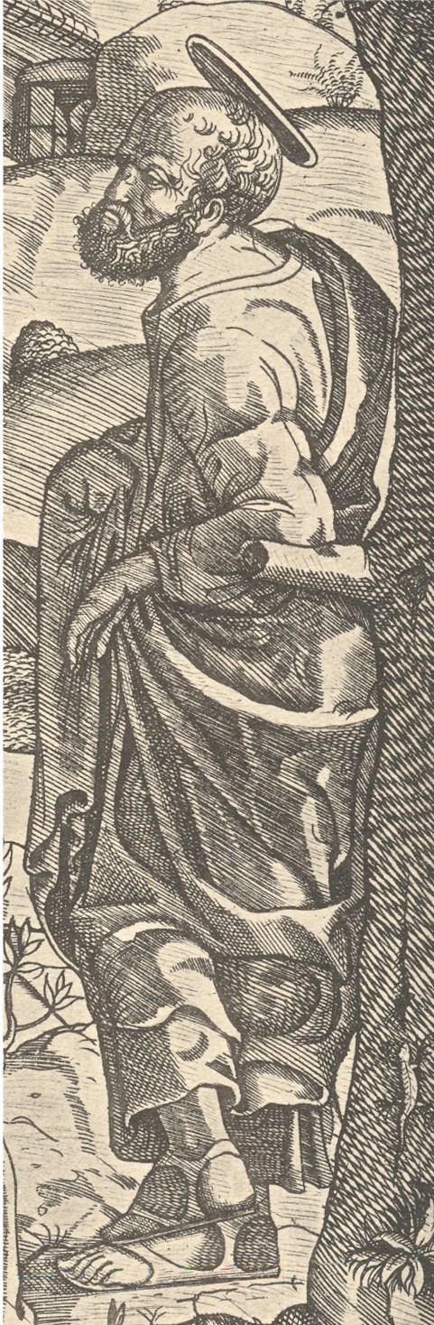
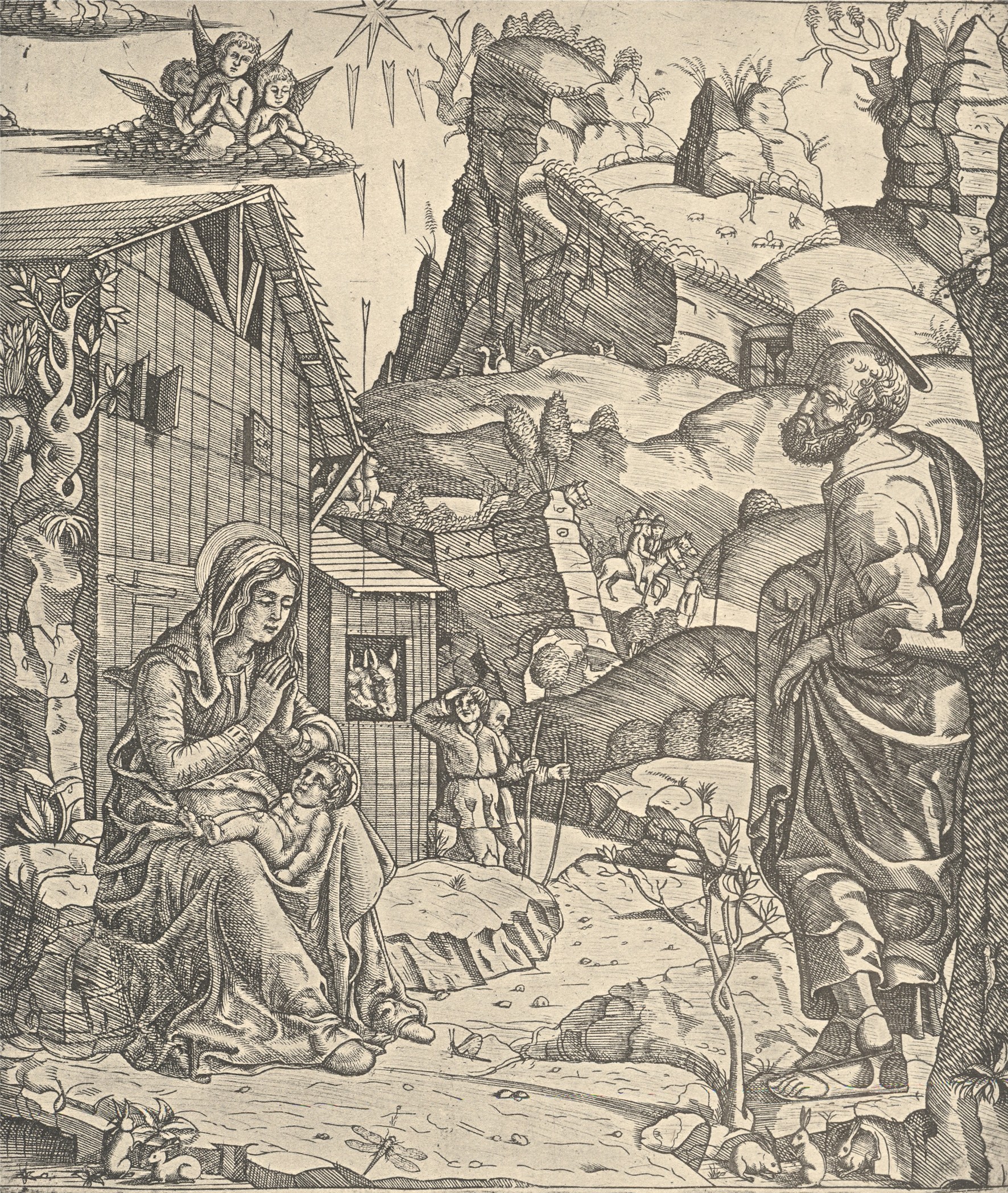
    This woodcut, the work of the semi-anonymous “Italian Monogrammist” and printed around 1510, shows the newly arrived Christ in the arms of his mother, taking the airs outside the stable. What is unusual to me here is the attitude of St. Joseph, who adopts a dictionary-ready pose of nonchalance:  he is leaning against a tree, his left arm propped up at the elbow on a tree limb, his feet crossed at the ankles, with a look of I-don’t-know-what on his face. 

    + blog 10.26 nativity

    He is definitely not of the standard Josephs that one sees in this scene.Perhaps he is communicating a certain type of tiredness, but I doubt it. The man is staring off into space, not looking at wife and baby, not looking at the many visitors coming through the tunnel in the mountain and excitedly rounding the nearby turn in the road, not looking at anything that we can see.  He’s not seeing the invisible stuff either:  not the praying angels and not the sun-ray daggers.He’s not tired, not excited about the baby and wife, not excited about the visitors, and in a pose of resident uncaring relaxation–boredom might be the easiest and best explanation, except, well, it doesn’t make for a good story. 

    + blog 10.26 nativity det


  • A Map of the Kingdom of Corsets, 1939

    JF Ptak Science Books  Quick Post
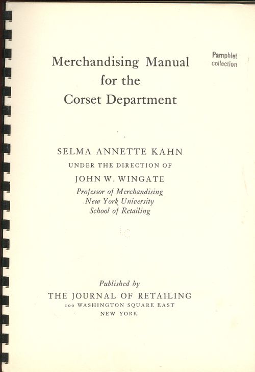
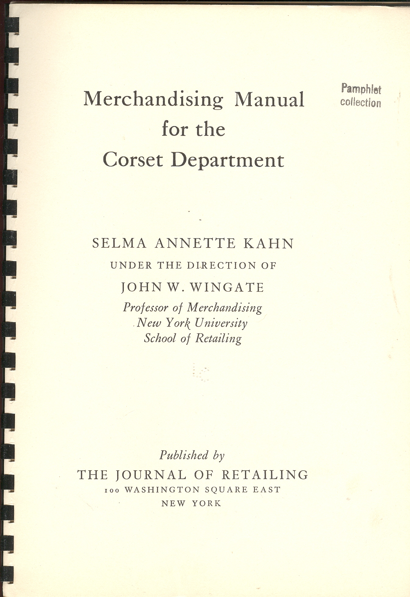
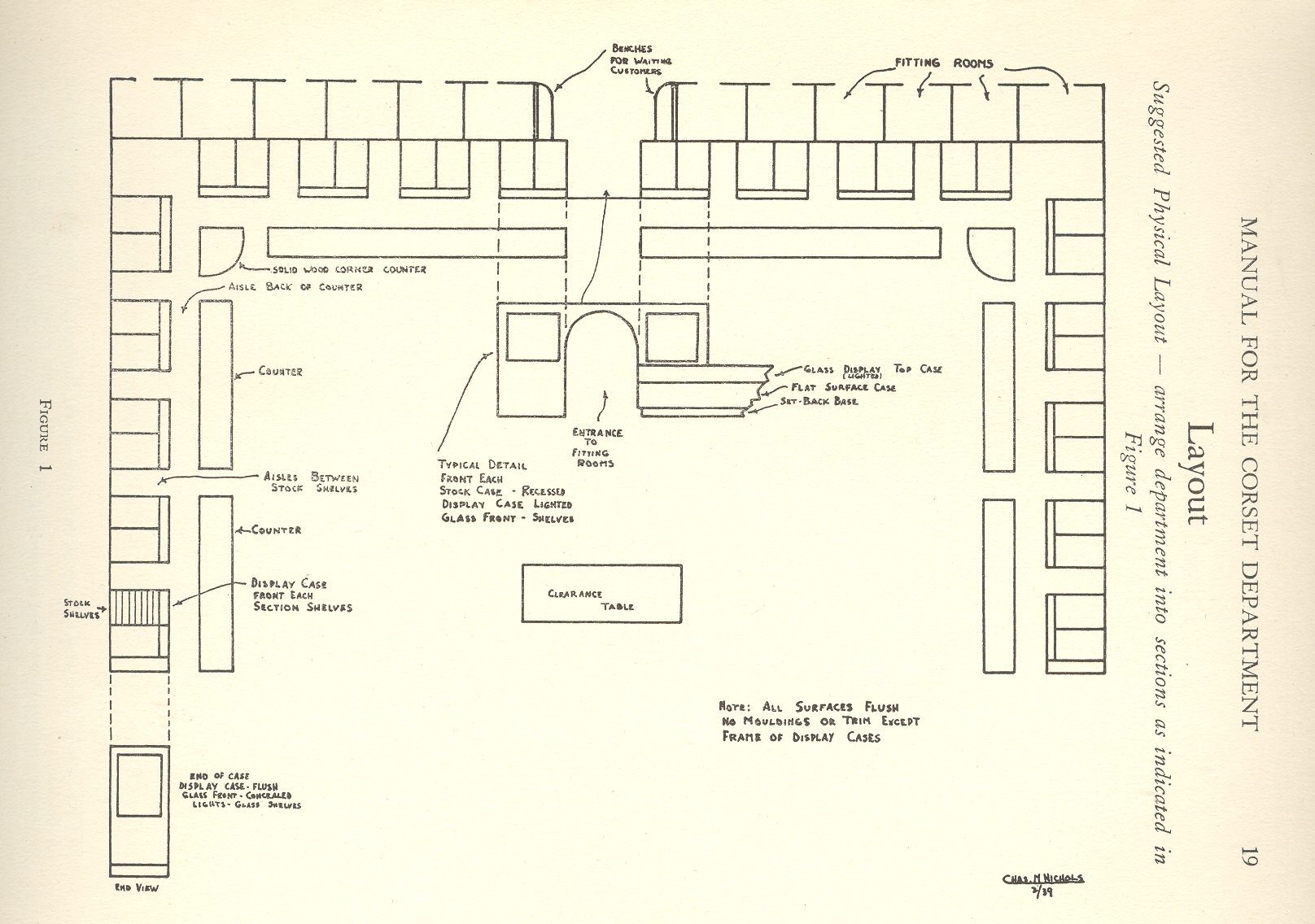
    + blog 10.26 corset tpThis finely produced, 75-page pamphlet lists all you need to know about marketing and maintaining a corset department in 1939–all except how to actually get back to 1939 to utilize this font of knowledge.  It was published with great seriousness for a serious business by the School of Retailing at New York University, a serious object for serious people.   Among the many things I’ve never thought of before thinking with this pamphlet were corset maps–and one of these happens to appear in this publication,  a map of an idealized corset department, which to me looks to be large, sanitized and medicinal, an oddly institutionalized presentation of an intimate something, something more of artistry and chance and possibility than an orthotic. 

    I should think that I would like to make a Kingdom Map for his image, some day.  It looks to me ready to accept the responsibilities of landforms or ideas or statistics or changes or comparisons in place of its plain nature of counters and countertops and display cases, empty boxes waiting for something a little more invigorating to depict.  Or maybe not, maybe the chance of display of transformations is enough to suit its peculiar, perhaps singular, needs.

    Or maybe on the Corset Map  instead of  substituting land and sea for corsets and boxes, one could substitute the noises of a quiet house at night, or the sound of heavy boots in a brittle-dry snow in the deep cold.  Or maybe a map of the discovery of children’s laughter, or inconvenient pauses in conversations through the history of human speaking…or a map of lost ways.

    Maybe the Corset Map could be used for a template for the things we will forget and the things we’ve forgotten, in which case the boxes need not be filled in, giving us a new version of the Bellman’s Map from Mr. Dodgson, a new subcategory of maps–the blank map.  Or it could be the outlines for a map of the places that you meant to say something, but didn’t.  Perhaps it could be used to outline where and how many times that people tell/told you that they’ll miss you if you step away, making hollow boxes of simple loneliness because we can’t be there all of the time.

    Or maybe the corset map is just a corset map.

    [This item is available for purchase, here.] The other surprise is how expensive these undergarments were.  For example, the Lily of France and Mme. Irene Corset Company (NYC) sold a girdle “for the heavy figure” (liberally sprinkling the word “heavy” throughout the description of the product like, well, sprinkles) for $132. The $132 corset is equal to about $2000 in today’s currency, or roughly a 15:1 increase. There were girdles and etc. in all price ranges, but the (1939) $30-$60 range seems to have been the most common; even still, the $30/low-medium quality item is about $430 in today’s dollars, and the cheapest of them all at 5 bucks goes in today’s economy at 75 dollars or so.  I’m not familiar with the value of undies today, but this sure sounds like a whole hell of a lot of money. 

    $132 for underwear in 1939 was a tremendous amount of money for the average person—even for the upper-middle class, it was a bunch, considering that you could buy a decent new car for $700.  It would also be equal to a half year’s worth of an average house rent ($28/month) and 1320 gallons of gasoline. 
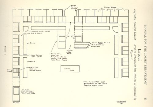
    + blog 10.26 corset map
     

    It sounds like it was very expensive to keep the up with the idea of an ideal figure, which of course was partially create by this same sort of company, creating both need and demand for its product. 

    1939 Price Comparisons:

    Wages per year, average:  $1,730.00
    Minimum wage: 30 cents/hour
    Milk, by the gallon: 35 cents
    Postage stamp, 1st class: 3 cents
    Dow Jones: 131
    Gas, average price of a gallon:  10 cents
    Bread, by the loaf:  8 cents
    Hamburger Meat, by the pound: 14 cents
    Automobile, new, average:  $700.00
    House, new, average: $3,800.00
    House rent, average: $28.00/month


  • The Odd Department: Cartoons & Tongue-Stuffed Calve’s Brains

    JF Ptak Science Books   Post 807  Blog Bookstore

    + blog 10.26 multiple


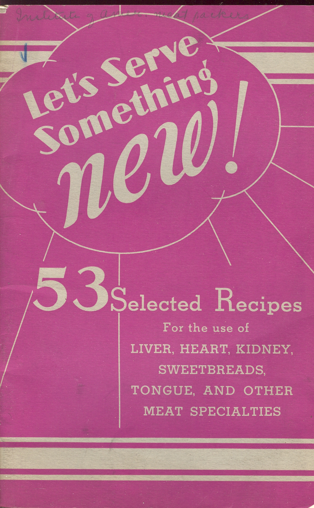
    In the excitable, pulsing pile that is my collection of Naively Bizarre Literature–some 5,000 items now pushing themselves around like a 750-pound bad idea–comes this lovely, “what the  ____!?” title:  Let’s Serve Something New. 53 Selected Recipes for the use of Liver, Heart, Kidney, Sweetbreads, Tongue and other Meat Specialties.

    + blog 10.26 liver cvr

    Now, once I got the tongue part out of my 18-year-long vegetarian brain, I wondered about what on earth the other part of the ripping title and what “specialties” there might be.

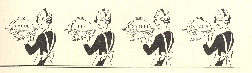
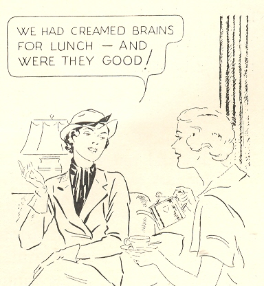
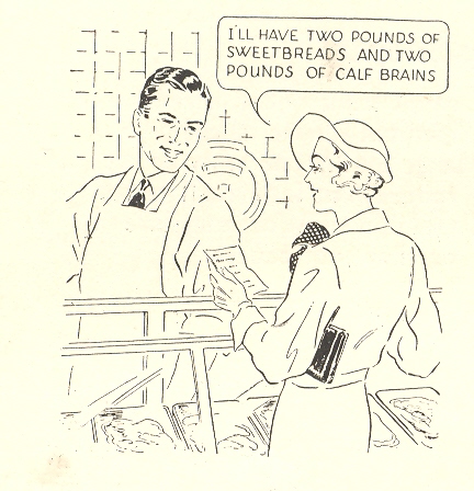
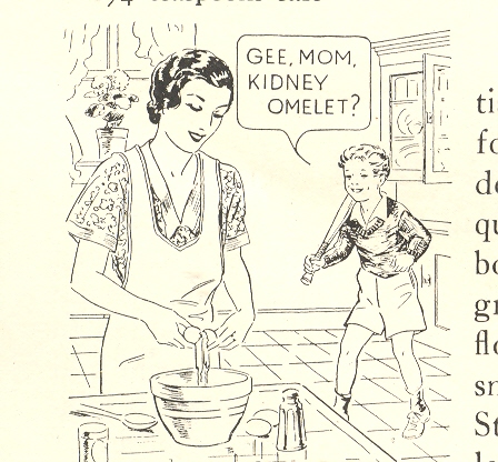
    But before I could get there I was stopped by these unique cartoon illustrations romping their way through the text with spectacular word balloons   There are SO many more words that could be injected into these balloons than the ones that were used, and so much more expected. But the zombie texts was inserted by the publisher, which was the American Institute of Meat Packers, whop no doubt were trying to force every last penny of profit out of whatever was left in the sluice sieves of the chopping room floor. 

    + blog 10.26 liver brains

    If these cartoons were extracted from this source, and their balloons left blank, and if people were asked to supply new text, the original words would be the very last in a very long list of possible fillers.  


    Removed from context, the illustrations are unexpected and hysterical; placed back into context, and well, they are a little wince-y. 

    + blog 10.26 i'll have calf brains

    The recipes that decorate this pamphlet are no less unbelievable, at least from where I’m sitting, and I’m sitting hard:  stuffed baked liver with vegetables in liver dressing, pork liver fermiere, liver with brown liver gravy, liver Pasadena (liver and butter and broiled bacon swimming in bacon fat), liver dumplings stuffed with liver, creamed sweetbreads, kidney omlettes, baked stuffed heart with rice border, heart chop suey, scrambled brains, sauteed brains, creamed calves brains, cold jellied tongue, tongue omlette, tripe roll, baked pig’s feet, and, not last, Tripe a la Mussolini (which is 1.5 pounds ogf tripe, bread crumbs, and tomato sauce).  (Spam stuffed with spam and spam jelly, braised in a light spam sauce, and covered in crackled spam.)

    + blog 10.26 gee mom


    After everything was said and done, the other surprise meats didn’t seem so surprising anymore, what with running up on the heals of delicacies like stuffed tongue and parboiled sumpin’s: tails, feet and oysters (a la Waldorf) seemed as harmless as a Sunday Slider. 

    Spam.


  • Portraits Within Portraits: Images of Exhaustion, Defeat and Old Youth

    JF Ptak Science Books LLC  Post 806  Blog Bookstore

    + blog 10.24

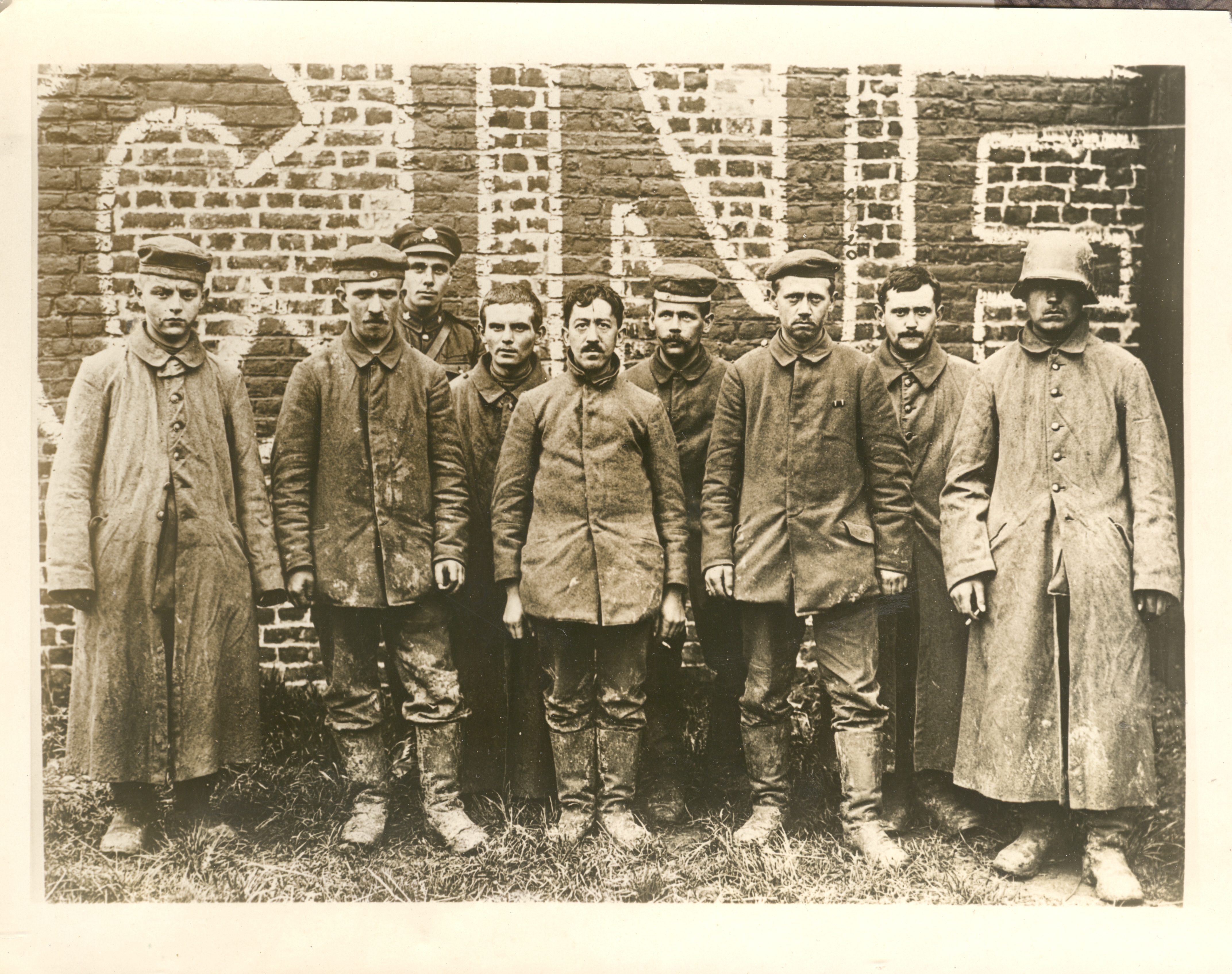
    Earlier today I made a post on some of the images in my collection of WWI News Service Photographs. (These were photos that were sold by an image agency to newspapers and journals which looked for stock photos of, well, whatever, and after paying a use fee would include the photo in the story they were reporting.)  This photo is one of three in a series that show German POWs being marched around a town in France and stopped here and there for a photo.  The picture was taken deep into 1918, within a month or two of the end of the war,.when the Germans were already defeated.  From the look of things, these soldiers were done: tired, mostly beaten, dirty. They at least had most of their buttons on their coats (which is actually a very big deal, keeping your overcoat closed in cold weather to keep warm and alive), their boots looked warn but intact, and they looked not terrible undernourished (though I doubt anyone in the group weighed more than 150 pounds).  

    + blog 10.24 boy left

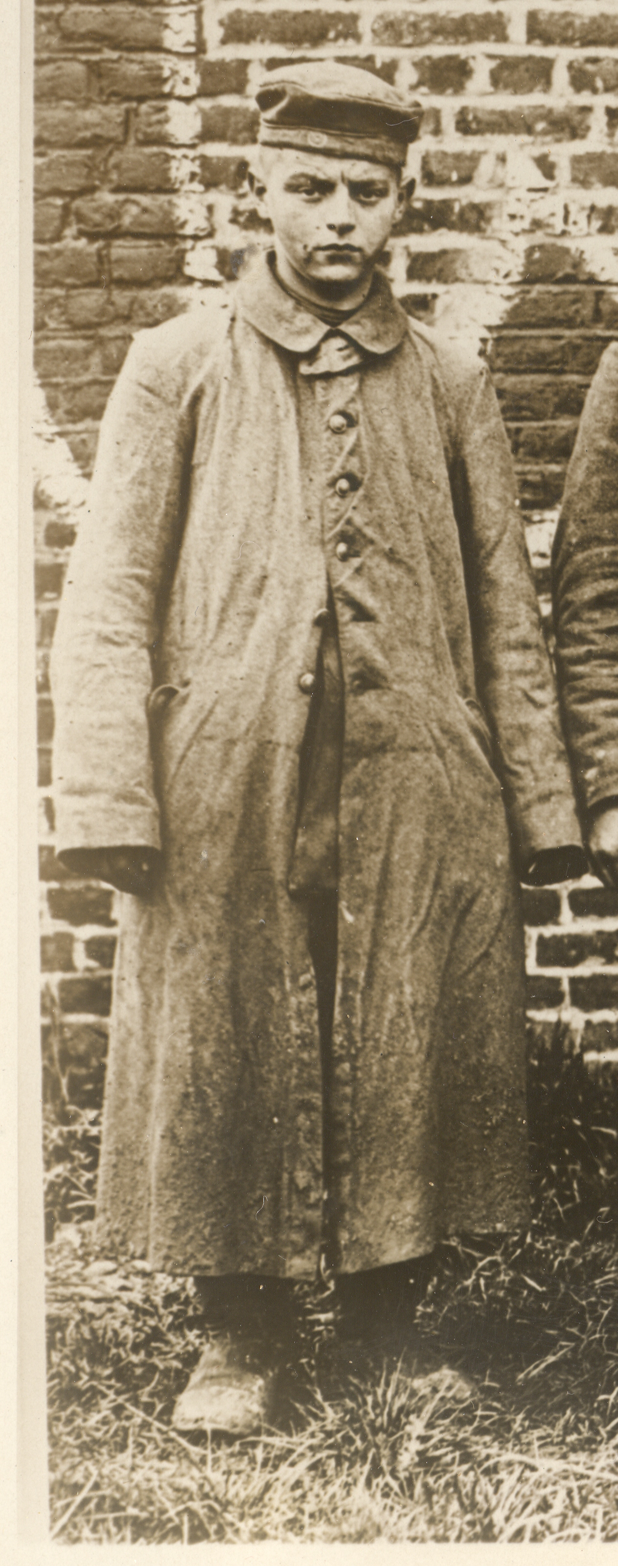
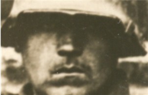
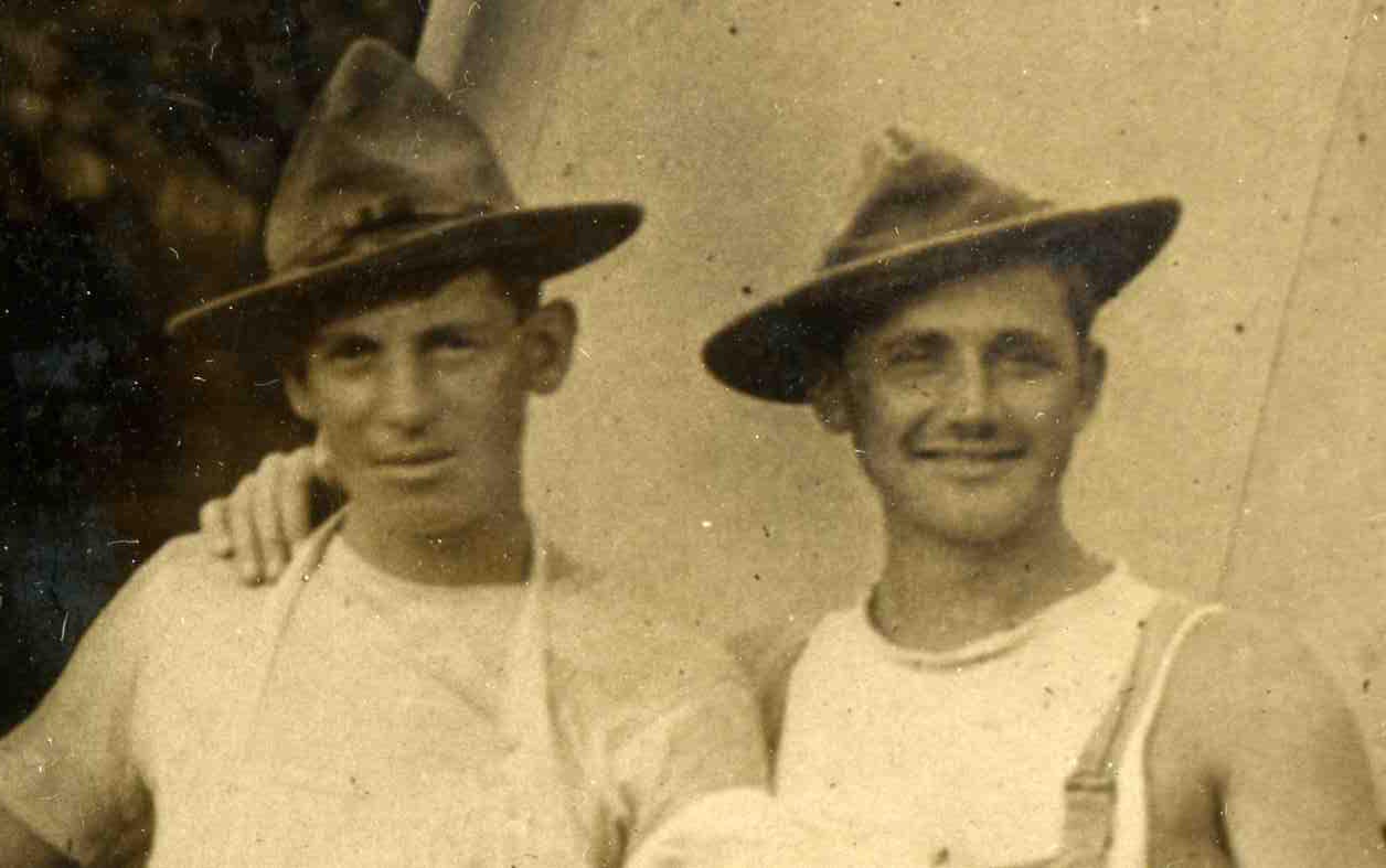
    The group is bookended by two remarkable figures:  the soldier on the left looks not 16 or so, but with a not-new ground in toughness.  He’s all smooth face and baby fat, though he has at least survived the grueling fighting.  The soldier on the right could be the prototype for any number of propaganda posters that popped up in Berlin in the early 1930’s advocating the sold-out but not defeated German soldier of the Great War whose fate must be avenged. 

    + blog 10.24 eyes

     Almost everyone was cupping a ciggy.

    Lastly, the guy third from the left seems to be a Canadian guard, not that this group was going to try to escape.


  • Portraits Within Portraits: Found Images in WWI Photographs

    JF Ptak Science Books LLC  Post 805  Blog Bookstore

    0 blog jan 12baker374

    In
    my collection of WWI News Photo Service Agency photographs I would say
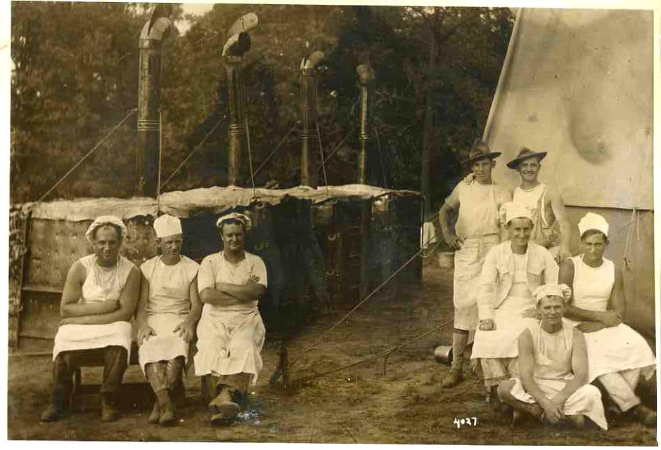
    that half or so of them show  scenes like this–semi-informal group
    portraits of military support groups.  500 portraits like this seem to
    be a lot, and I’m not sure why these images are so well represented.
    Except of course that there weren’t that many images (overall) of
    active-battle scenes. 

    These bakers, working at a front-line
    support station, from my read were probably taking a break, and the
    photographer took the opportunity to draw them together for the
    portrait.  I don’t know why they’re separated so, but they do look as
    though they have a real camaraderie–it is just a wonderful picture,
    full of friendship and loyalty, and I’m sure it has never been
    published before.  

    0 blog jan 12baker375


  • Unusual Views, Continued: Looking Straight Down, Found-Dadaist, 1919

    JF Ptak Science Books LLC  Post 804  Blog Bookstore

    The idea of representing a view straight down, of looking
    straight down from some height, is a relatively recent occurrence, this view
    being somewhat rare in the antiquarian world pre-balloon or pre-heavier-than-air
    flight.  The pre-human-flight reason for
    its scarcity is understandable, but even after the first Montgolfiers’1
    ascension in 1787, there’s another 120+ years of scarcity yet to come before
    these views would start to pop up in common (and uncommon) literature..  Now I’m not talking about cartography, which
    is basically a straight-down view of the world—what I’m referring to (and where
    I’ve posed a few time before in this blog, particularly here)
    is that same view but not as a map per se, but what you would see if you were dangling
    out of a plane or balloon.  The
    extraordinary map of Imola by Leonardo would certainly classify because of its
    you-are-there qualities:  essentially it
    would be like a bird’-eye or oblique view, but straight down.

    + blog looking down berlin

    I think that this view was avoided because (in
    pre-flight days) of the high imagination that it took to picture the view, and,
    secondly, because of how this view created its own special Flatland2 and
    crunched, flattened, everything down to what becomes somewhat (and sometimes
    entirely) unrecognizable.  This point was
    just hammered home to me while trolling through an interesting book by Matthew
    Biro, The Dada Cyborg3. Biro makes a
    great find of unintended/found Dada illustration in the Berliner Illustriete Zeitung4 in which a photographer makes images
    of passing pedestrians, turning them into quite something else due to the
    squashed depth of field and non-perspective. The photos make the point
    perfectly of why artists might have avoided this straight-down
    perspective.  The Found Dadaist result is
    interesting in itself. 

    [My apologies for so many hyphenated words in this
    post! Here’s some more in case the reader demands them: – – – – – – – – – – – –
    – – -.]

    Notes:

    1. The two brothers launched 4 June 1783, just
    before the end of our Revolutionary War, rising up in a 37,000 cubic foot
    balloon of alum-coated taffeta.

    2. Edwin Abbott’s fantastic and popular 1884 satire
    of English society, depicting the world of wants and desires in terms of a
    two-dimensional world structure (and desires for a three-dimensional
    existence).  Brilliant and simple; well, maybe
    not so simple.

    3. The Dada
    Cyborg, Views of the New Human in Wiemar Berlin
    ,
    University of Minnesota
    Press, 2009.

    4.  The
    issue for 29 December 1919.  This is the Berlin version of the
    weekly newspaper that I browse through, the Leipzig
    Illustriete Zeitung
    . 

    ·Posted by :

    ·in:

    — —

  • History of Boredom: “Nothing” in the Window

    JF Ptak
    Science Books  Post 802  

    + window statrers

    Looking at little things has its rewards, though what rewards those are may be a little oblique.  Today’s post is relegated to looking at the sidewalk on a stroll rather than the surroundings, and the sidewalk view is more like Baudelaire’s sidewalk botanist than Proust’s golden Parisian sidewalks. So it goes.

    + window statrersdet

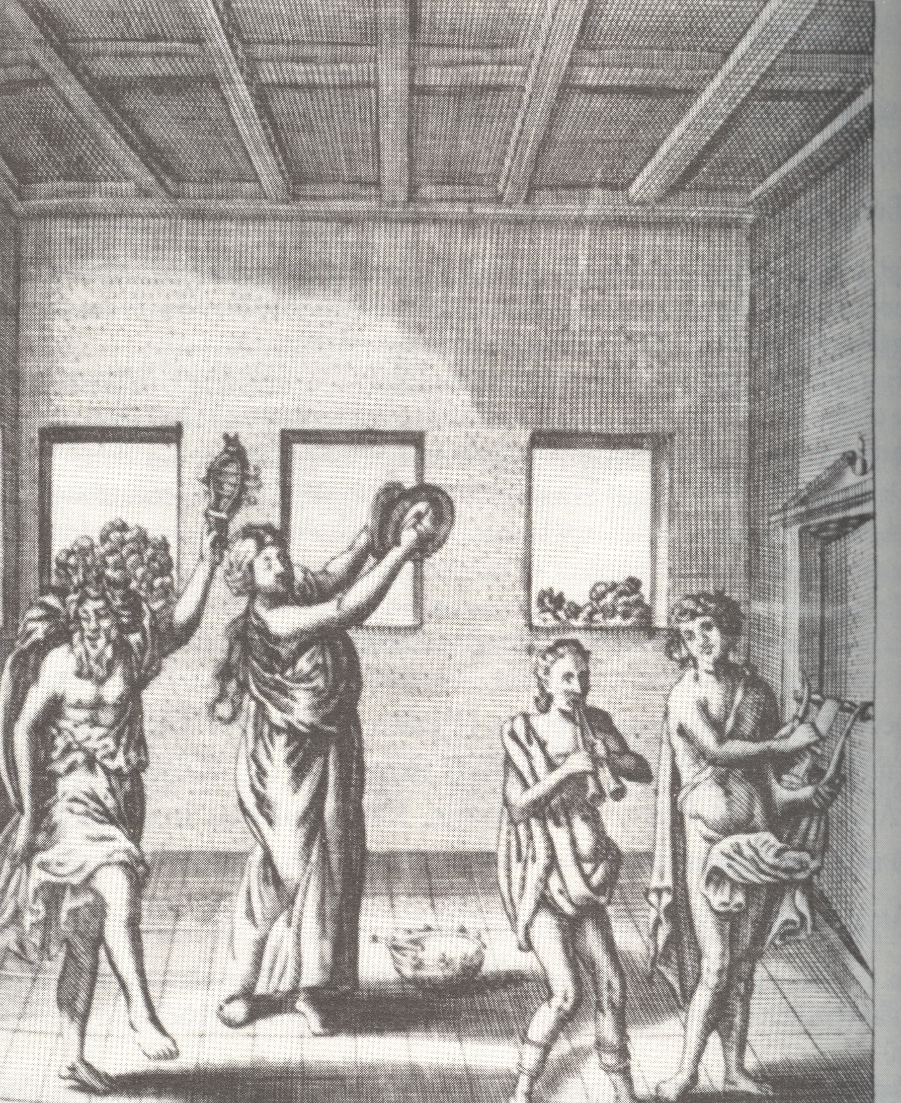
    Petrus Ciacconius Toledanus (Pedro Chacon,1525-1581) was a scholar who wrote on many things; this book, De Triclinio sive De modo co
    nvivandiapud priscos Romanos…(printed in 1664, 63 years after the author’s death) , takes a wide and classically scholarly look at bathing practices…and that includes bathing in water or in wine, and bathing once or six times a day, with dinner in the water or not, what to wear bathside, and all sorts of other bathing entertainments and necessaries.

    Arnolfini

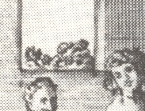
    But that’s not why I’m making this short stop here—it’s the odd bit in this illustration that has my attention.  I’m also not sure about the activity in the print—I’m fixed on the little bit of shrubbery that we can see in the background windows.  Having looked at thousands and thousands of images like this, I must say that seeing natural nothingness like this outside a window is very unusual.  In the unknown, unused and non-existent
    art appreciation genre of “Boring Things Seen Through Windows”, this print would be standard fare.

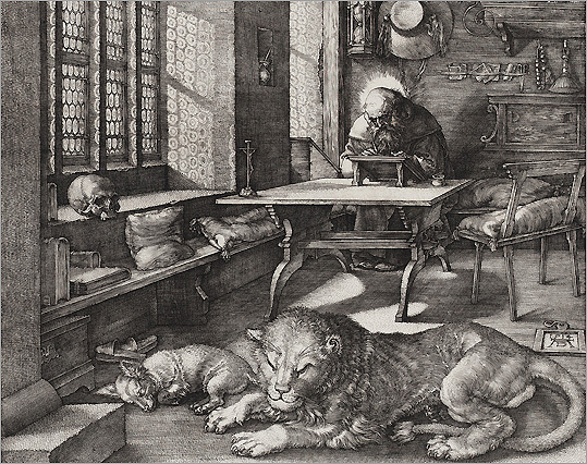
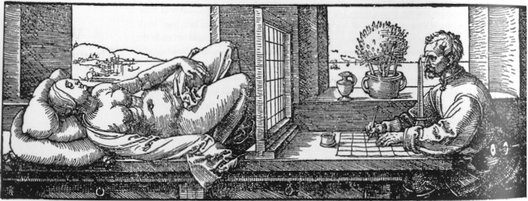
    But the real issue here for me is that the window is just a window in this print.  It doesn’t have any of the heavy significance associated with windows-in-art of the past, the window dripping with symbolic/spiritual significance (illumination, enlightenment, vision, godhead, divinity).  The window as a simple source of light or vehicle to relieve crowded interiors seems to be

    VanEyck_TheArnolfiniMarriage,detail

    overwhelmed by the religious/needy windows at least t
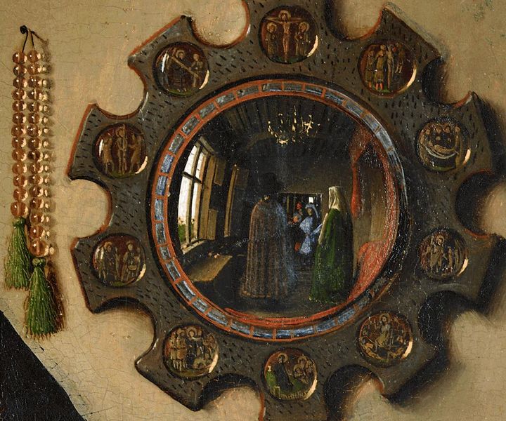
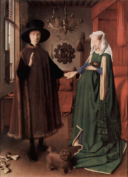
    hrough the first half of the 17th century.  (At least that’s my sense of it—I haven’t a single figure to back anything up.) The little windows that creep into the work of Van Eyck–especially in the famous “The Marriage of Giovanni Arnolfini and Giovanna  Cenami” of 1434—are interesting examples of the window as a simple source of light. (In the “Marriage” painting the window is much more visible in the iconic reverse double-painting seen in the mirror on the wall in the background.)

    St. Jerome

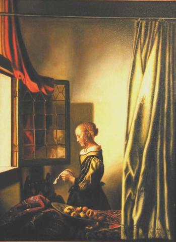
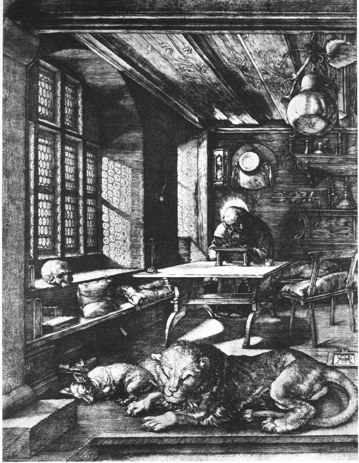
    Same too for the windows in some Vermeers, where you can virtually feel the breeze coming through them and into the  occasionally stuffy rooms.  And also for Durer:  while his great study of St. Jerome has a presiding possibility of Pure Holy Light coming into his room, it might also just be sunlight; on the other hand there is little doubt that the windows in his famous depi
    ction of an artist working a perspective study of a model through a dividing screen have nothing to do with the spiritual, and are just simple mundane windows.

    Durer


    By the 17th century there is a new genre of paintings having people looking out of windows (as with the case of Gerrit Dou, where we observe what seems like every one of his subjects looking out through a window),

    VermeerGirlAtOpenWindowLetter

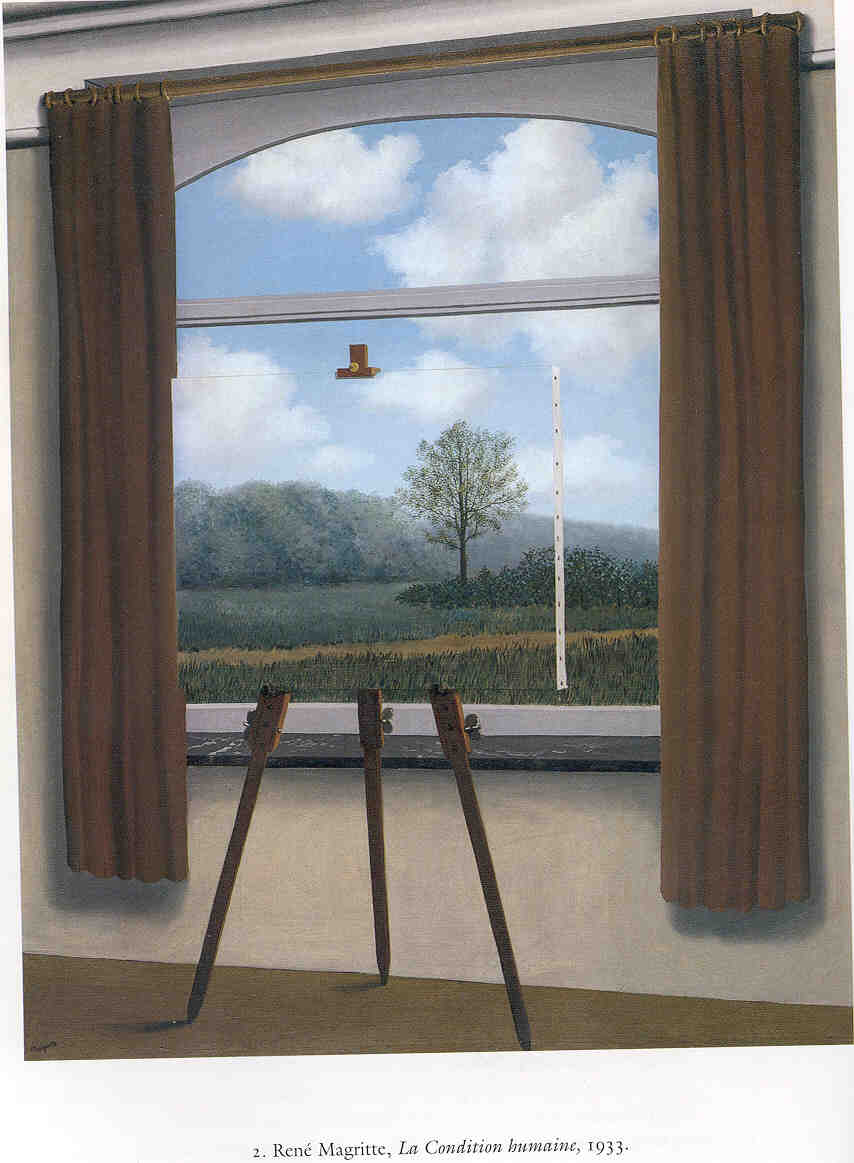
    which means I guess that the observer is the one who might shine in.  Enter the 20th century and the window takes on new meanings, as in bent/draped windows in Dali, or floating windows looking into the lonely world of Magritte, or the solitary nothing-but-a-window sculpture of Duchamp. 

    Magritte

    The unintended nothingness of the 16th century is what I think I like the best.

    Notes:

    For some pretty interesting books written on the window in art, see: Carlo Gottlieg, The Window in Art (University of Michigan, 1981, and which is a nice chronological treatment of the window, plus some psychological stuff) and Suzanne Delehenty, The Window in Twentieth-Century Art (1986), among others.  These will point the way.


  • History of Blank & Missing Things, #55: Empty Theory from Good Data

    JF Ptak Science Books LLC  Post 801  Blog Bookstore

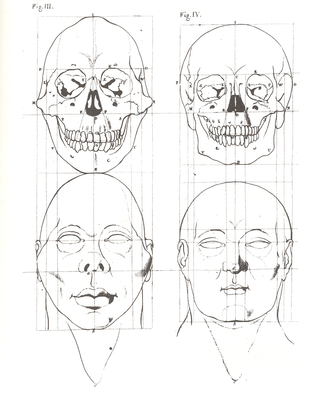
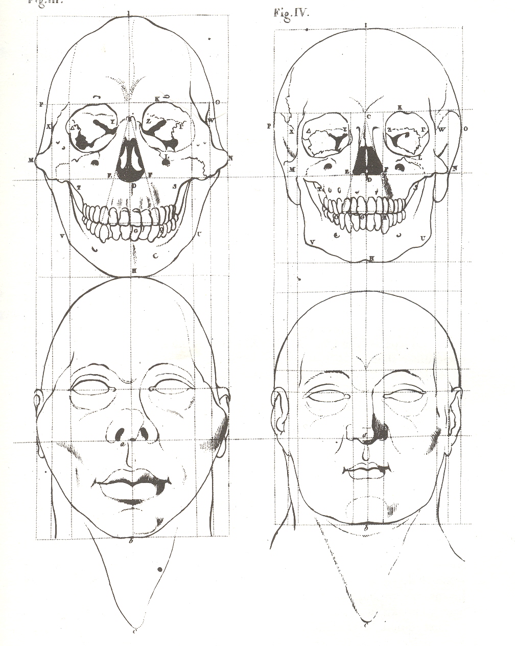
    It is difficult to imagine the impact that Pieter Camper’s intellectual leap had on his fellow anatomists back at the turn of the 19th century with this image1–with a mass of collected data, Camper was able to realistically suggest the facial qualities of a skull.  I’m not sure exactly when this effort was first made, but it seems to my memory that this is a very early effort.  But the mass of Camper’s work generally takes a bad turn turn when it came to representing his findings with theory. + skull

    I wrote about Camper earlier on this blog addressing his  “Bad Ideas of 1778”, in which it seemed as though he was doing anatomic transformations of animals into humans. Camper  (1722-1789) was a determined and excellent observer, which led to him understanding the skull like no other, but who was also lost among the numbers.  He was full of angles and degrees, articulating genetic possibilities by the measure of a face and the sentiments of its accumulated measurements.  He was also in his mind fully capable of judging a person by the physical measurement of their faces, which led to publications like his 1764 Oration on the Origin and Colour of the Blacks, in which he writes:

    “…some attribute peculiar to the quarter of the world; or the specifications of some singular ornament, peculiarity of dress, or of custom…. Thus, an Asiatic is distinguished from an European by colour and dress: the African and American, being somewhat similar in colour and dress, are known by the addition of a crocodile and elephant, a cargo of tobacco, incision of the skin, tatowing [tattooing], plumes of feathers, &c.“

    Which leaves us, well, nowhere.

    He collected some great data, but Camper was able to advance little beyond its diagrammatic representation:  theory was not his calling.

    Notes:
    1  The engraving comes from Camper’s posthumous  Dissertation sur les variétés naturelles qui caractérisent la physiognomie des hommes de divers climats et des différens ages suivi de réflexions sur la Beauté; particulièrement sur celle de la tête; avec une Manière nouvelle de dessiner toute sorte de têtes avec la plus grande exacitude.


    \


  • The Bumpy Earth and the Loss of Perfection, 1543

    JF Ptak Science Books LLC  Post 800 

    The idea of the Earth as a sphere is an ancient one, proved over and over
    again across the centuries, most famously proved by Aristarchus with a stick
    and a hole and a shadow. The idea of the Earth as perfect, as a perfect sphere,
    is an old belief wrapped in layers of hopeful scientific thought, God’s
    creation and the cradle of mankind necessarily being perfect (Summa aside).  This was a rigidly enforced perception and a
    religious assumption, just like the belief that the Earth was the center of this
    universe, and that a vacuum was a theological and therefore physical
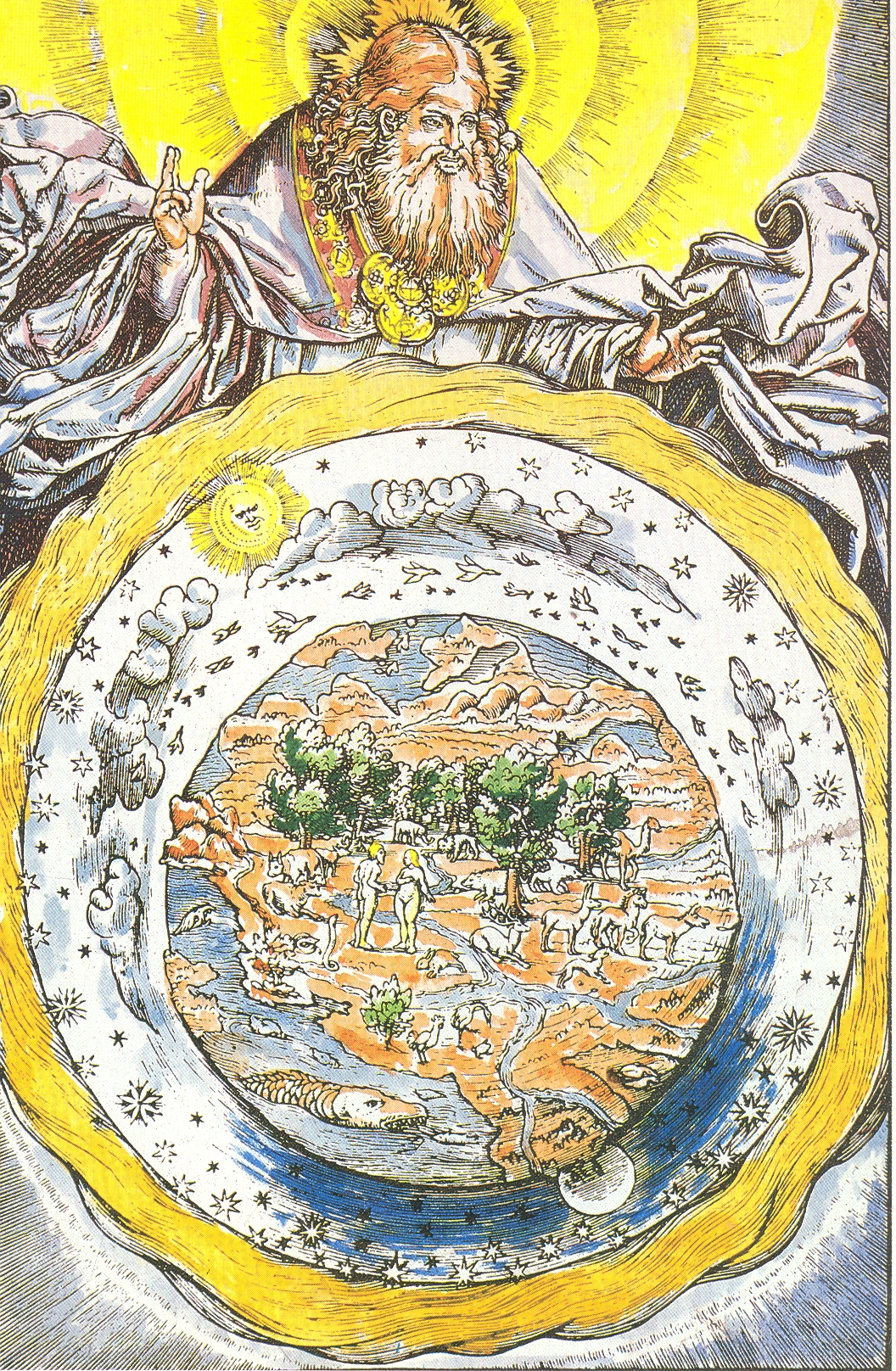
    impossibility.  (See my post On the Discovery of Nothing.)+ earth perfect

    The
    woodcut illustrated here—a depiction of a robbed and medaled God lording over
    his creation—is interesting in its depiction of what seems to be a not-perfect
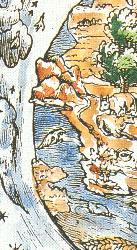
    sphere of the Earth. The planet is definitely not smooth around its perimeter,
    and the inclusion of three-dimensional mountain rendering accentuates this
    depiction, which to me seems all very novel. 
    The source for this image is given as a “Martin Luther Bible of 1543”,
    but that is wrong, unfortunately, which makes it less of a story. 
    If this woodcut was really done in 1543 it would’ve occurred in the same
    year as two monumental publications: 
    Nicolas Copernicus’
    De revolutionibus orbium coelestium and Andreas Vesalius’
    De humani corporis fabrica (On
    the Fabric of the Human Body)
    ,
    marking what is the birth of modern science.  (The print appeared in Luther’s translation of the Bible in 1534.)

    + earth perfect det

    But offhand I don’t see Luther’s “Bible” for this year, and in general 1543 is not a good year in general for Luther
    so far as I’m concerned.  He busily
    published
    Von den Juden
    und ihren Lügen
    (On the Jews and Their Lies ) and  Vom Schem Hamphoras und vom Geschlecht
    Christi
    (On the Holy Name and the Lineage of Christ), both of which
    were horrible anti-Semitic attacks, and worse. 
    For example, from the first work, he wrote that the Jews were a “base,
    whoring people, that is, no people of God, and their boast of lineage,
    circumcision, and law must be accounted as filth.”, and
    in the second wrote that it was not an immoral act for not killing Jews.  This really has nothing to do with the point
    of this post, but I just couldn’t let the reference to 1543 slide by without
    mentioning this very ugly tragedy of Luther’s  theology. 


  • A Question about Einstein and Missing (?) Modernism

    JF Ptak Science Books LLC  Post 799 

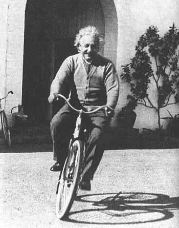
    Einstein-bicycle1 How much was Einstein affected by the many pieces of what was the greatest
    revolutionary period in history?  The
    period from, say the pre-Impressionists (1860 or so) to the period just after
    Cubism (again, say 1920), saw epochal changes across the sciences, medicine,
    the arts, literature….virtually everything. I cannot think of any period in
    intellectual history that approaches this 60-year period. Actually, the gargantuan
    changes can be shaved down to the period of Einstein’s living memory beginning with the stunning discovery of Roentgen’s
    x-rays in 1895 to the invention of non-representational painting in 19111.  Breathtaking, really. 

    In all of this, I wonder how Einstein saw the vast changes that were not in
    the fields of physics or mathematics? 
    Poincare, Boltzmann, Planck were analyzed and understood and appreciated
    and etc.  But what about Strindberg, and
    Schoenberg, and Seurat, and Leger, and Joyce, and Malevich, and Duchamp, and
    Kandinsky, and Klee?  Einstein certainly
    loved music and had a deep understanding of it, but it was with Mozart and Bach
    that he found beauty.  The music of the
    sphere, the primum mobile, the hand
    of the creator, were found in these two men.  Beethoven was too melodramatic; Wagner (in
    1939) was disgusting.  Others were just
    too simple, too light. 

    I don’t know what he felt about Schoenberg, or Joyce, or Klee.  Perhaps they were too messy, too
    unstructured, too removed from the fundamentals of nature that he felt Mozart
    found and displayed.  I just don’t know. As the architect of one of the most fundamental changes in the history of science, I wonder if (and why) he stood so seemingly unaffected by so many of these other enormous changes.

    Notes:

    1.  There are a number of books that address these revolutionary changes, but only one, I think, that looks at the great broad swath of revolutionary activity across many fields:  William Everdell’s The First Moderns (U Chic). A lovely book.

    ·Posted by :

    ·in:

    —