A Daily History of Holes, Dots, Lines, Science, History, Math, Physics, Art, the Unintentional Absurd, Architecture, Maps, Data Visualization, Blank and Missing Things, and so on. |1.6 million words, 7500 images, 4.9 million hits| Press & appearances in The Times, Le Figaro, Mensa, The Economist, The Guardian, Discovery News, Slate, Le Monde, Sci American Blogs, Le Pont, and many other places… 5000+ total posts since 2008.

Author: JF Ptak

  • Rectangles as Impossible Elements in Interior Design

    JF Ptak Science Books LLC  Post 798  Blog Bookstore+ squares title

    Sometimes, there are simply too many rectangles.

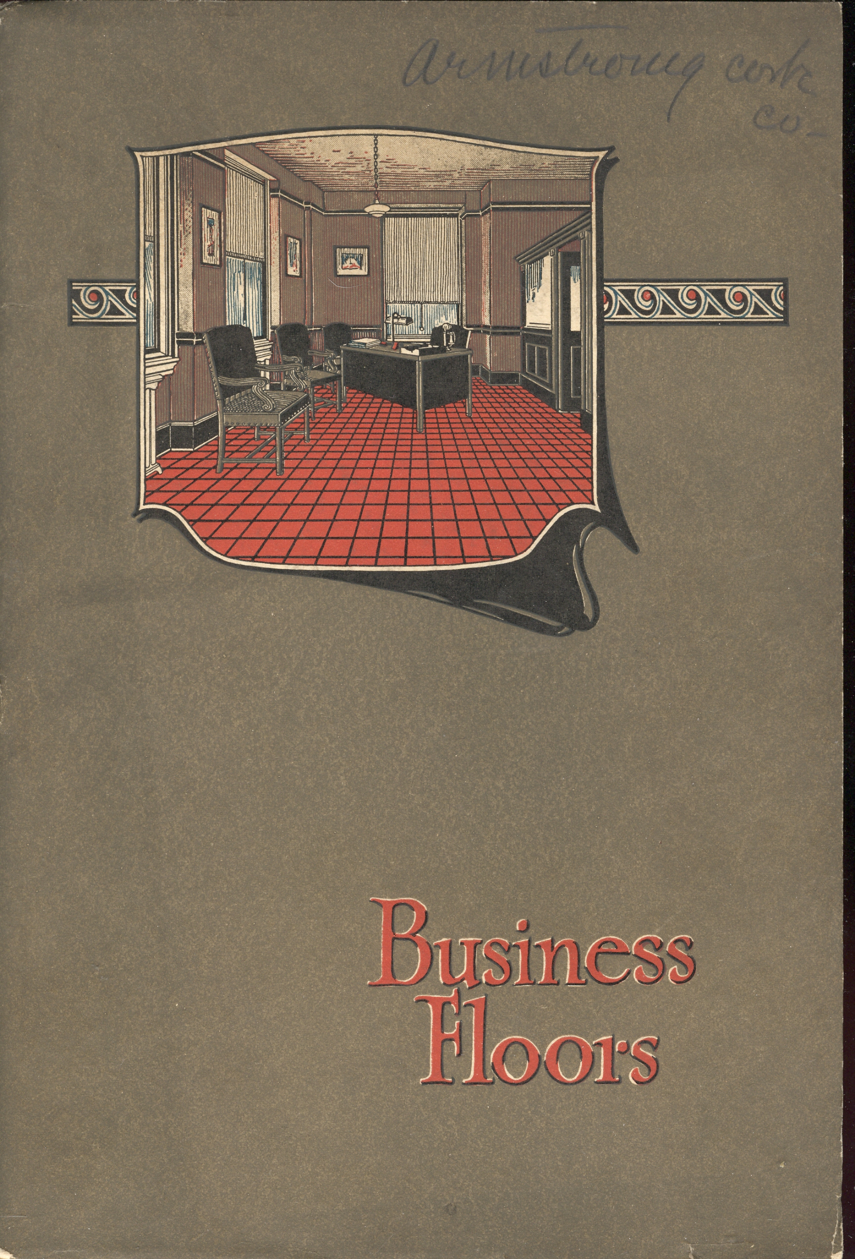
    But this sentiment is just a function of its time—for example, in this
    glorious manufacturer’s catalog by the Armstrong Cork Company (of Lancaster,
    PA), the incredibly-titled Business Floors, there simply aren’t enough rectangles
    to go around. 

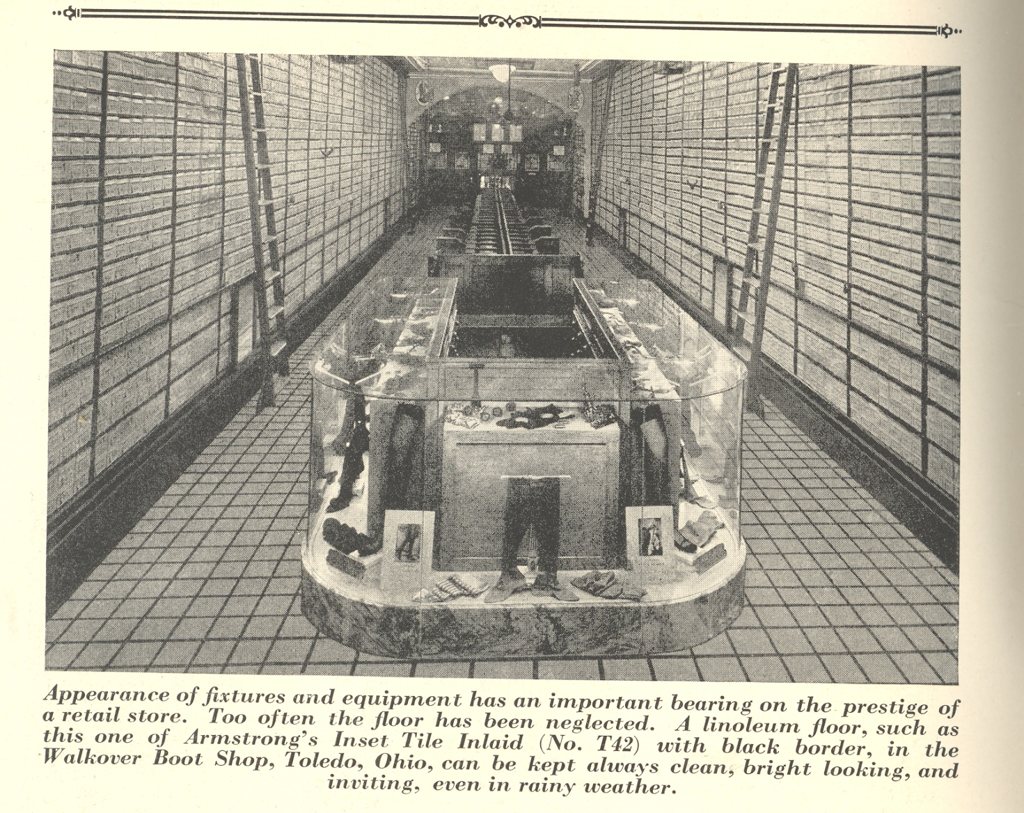
    For example:

    + squares  + squares 2 

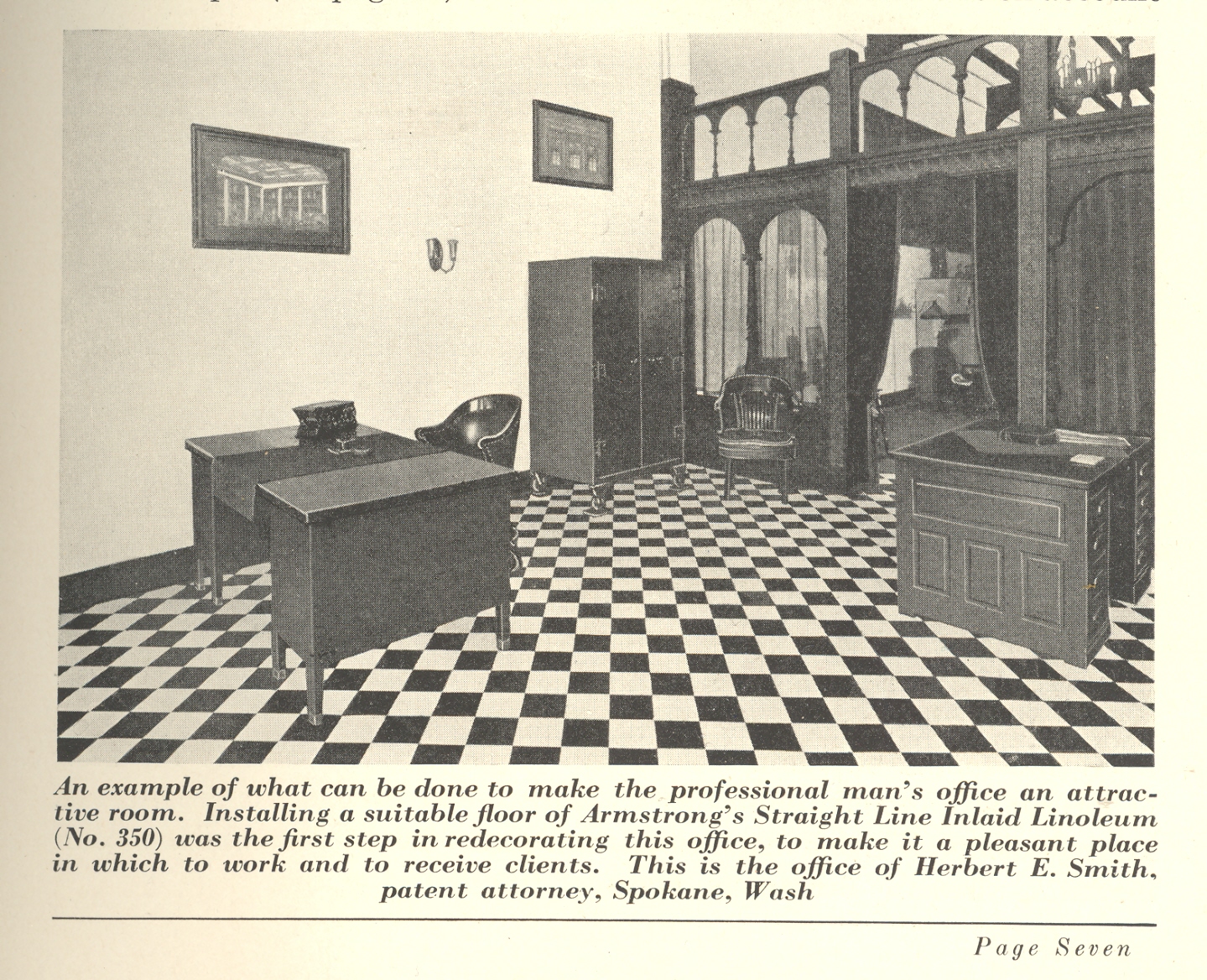
    And the perspective-bending distortions of this office, the point of view pulling the squares into rectangles before your eyes:

    + squares 3

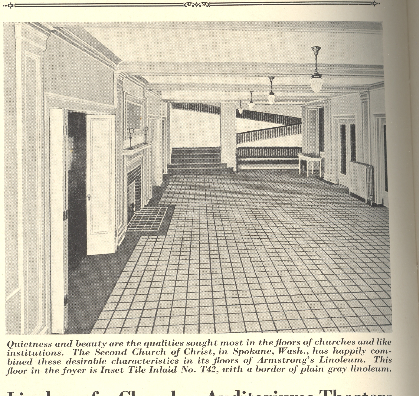
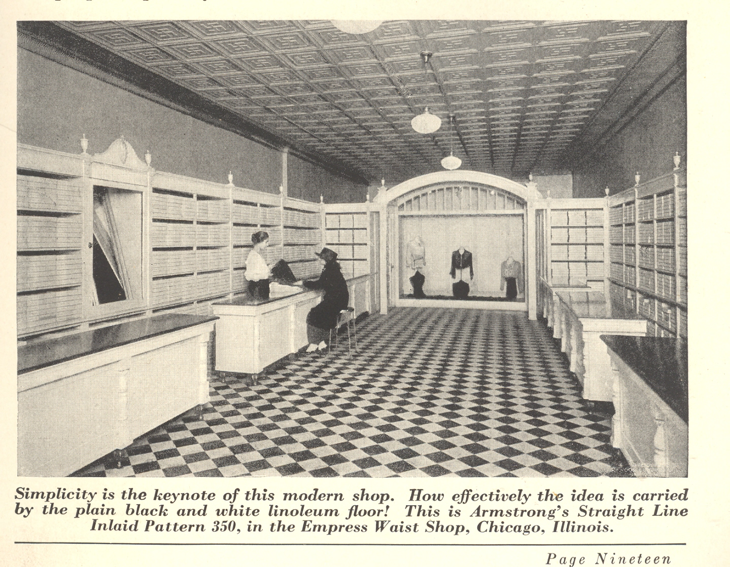
    And this mysterious masterpiece, which the cork company calls “simple”.  It is true that there is virtually nothing in this shop that draws the eye of the customer away from the clerk (the goods are stacked away perfectly in uniform boxes around the walls of the store), but the hundreds and hundreds of rectangles do nothing but confuse.  And aggravate.  A little Einstein on the Beach on the PA system and there would be no customers at all. 

    + squares 3 001


  • A Rare Map of the Soviet Gulags, 1936.

    JF Ptak Science Books LLC  Post 797  Blog Bookstore

    Adolf Ehrt (1902-1973) was a twice-born Nazi who in 1935 let
    his 3-year membership in the party lapse so that he could do better work for
    Hitler from the “outside”.  In short, and
    to skirt some very interesting detail (over which I really don’t have much
    expertise), Ehrt felt that there was too much influence from the Church and government
    sources to fuel his unrequited need for purity in the party. 

    Ehrt wrote this anti-Communist propaganda (Der Weltbolschewismus ein internationales
    Gemeinschaftswerk über die bolschewistische Wühlarbeit und die Umsturtzversuche
    der Komitern in allen Ländern
    ) from an imaginary perch in something called
    the Anti-Kominetern, but was really nothing more than an arm of the Nazi party.  Appearing in Leipzig
    in 1936, this book savaged communism, communists and the Soviet
    Union
    to no end.  I own it
    because it is an interesting document and speaks to its period, and also has
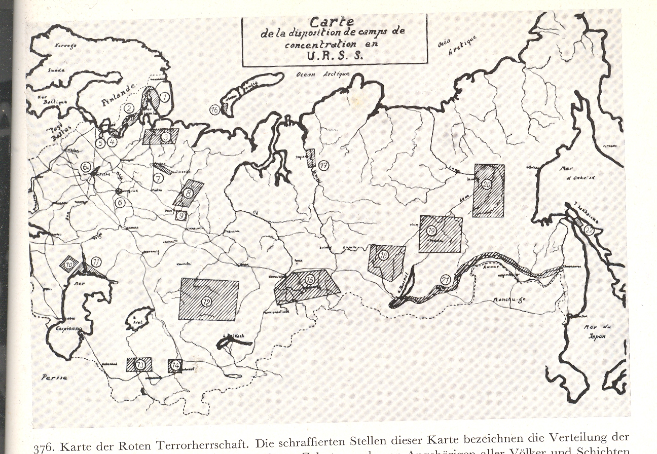
    hundreds of unusual photos, giving it a documentary appeal.  What I noticed just recently though was a map
    on part of page 481 in the weirdly skimpy section on the Soviet Union—a reproduction
    of a French map showing the distribution of concentration camps in the USSR.  I cannot remember seeing such a map in
    English during this time period. 

    + USSR concentration 002


    + USSR concentration 001 

    (Clickable/expandable image)

    + USSR concentration b

    Ehrt was a Nazi painting with broad historical/Nazi strokes
    across a Communist canvas, and did get a lot of stuff right in his attacks; but
    considering the source his book is useless except for its pictures.   The USSR was a wicked place to be at this time; the
    bestial Joseph Stalin busy killing hundreds of thousands, imprisoning more—but
    this was in general not the story reaching folks in the United States.
    That this French map (source not given) showed two dozen or so concentration
    camps (Gulags, work camps) is remarkable; and of course it is just the tip of
    the Gulag system iceberg.  It was at
    least a start. It was also just the beginning of a particularly nasty period
    for the Russian people, who staggered under the weight of an edict called Article
    581 that sent millions of people to their doom. 
    This map was also published just before the Great Terror2, a
    spectacularly bad war of internal doom that tore millions from their homes and
    hundreds of thousands  from the
    earth. 

    The map, rare as it is in appearance and sentiment,
    seriously underestimated the extent of the barbaric Soviet existence of the
    time. 

    1. “One can find more epithets in praise of this
    article than Turgenev once
    assembled to praise the Russian language,
    or Nekrasov to
    praise Mother Russia: great, powerful, abundant, highly ramified, multiform,
    wide sweeping 58, which summed up the world not so much through the exact terms
    of its sections as in their extended diacritical interpretation.  Who among us has not experienced its
    all-encompassing embrace? In all Truth, there is no step, thought, action, or
    lack of action under the heavens which could not be punished by the heavy hand
    of Article 58” Aleksandr Solzhenitsyn,
    The Gulag Archipelago    See “Article 58″  http://en.wikipedia.org/wiki/Article_58

    2. NKVD Order no. 00447, 1937, directed against
    “ex-kulaks”
    and other “anti-Soviet elements” (such as former officials of the Tsarist regime,
    former members of political parties other than the communist party, etc.)  See http://en.wikipedia.org/wiki/Great_Purge  Generally, any unfriendly could be uprooted and shot or sent off to Siberia. .  The operative made it easy for local justice
    units to identify trouble makers and shoot them.


  • Advanced Weirdness Department: Wincingly Dated Underwear Stares

    JF Ptak Science Books LLC   Post 796   Blog Bookstore

    + boy This Carter’s underwear ad from LIFE magazine (1950) makes a weird pronouncement—it
    is behavior and body language that was evidently  entirely appropriate for the time, that there
    was nothing amiss or untoward or askance or unusual in the position or the
    glances of the two models.  Now, today,
    the whole scene is at least unsettling, squirmy. 


  • Invisible Evolution of Meat, continued.

    JF Ptak Science Books LLC  Post 795  Blog Bookstore

    + meat pork chop team

    Related Posts:

    Meat “Packing” Industry, 1917:
    “The String Department” and “Curled Hair Machines” at the
    Meat Plant
      (here)

     Spam, Smeat, Spic, Prem, Mor & Arf: Food
    by Any Other Name  (here)

    Food, Food Packaging and Creating Desire: the
    du Pont Company, WWII. (here)

    I wrote yesterday (The Importance of Bridges in the Invisible Evolution of
    Meat) about the invisible evolution of meat from range to plate, but mostly about
    what happens in those big building with no windows.  The wide solitary middle of this food chain
    exists almost not at all in the popular mind, most folks choosing not to think
    of the gruesome process of “processing” animals into the plastic-protected deli
    selections.  + meat pork chop

    The middle killing & etc. part has been generally very well hidden from
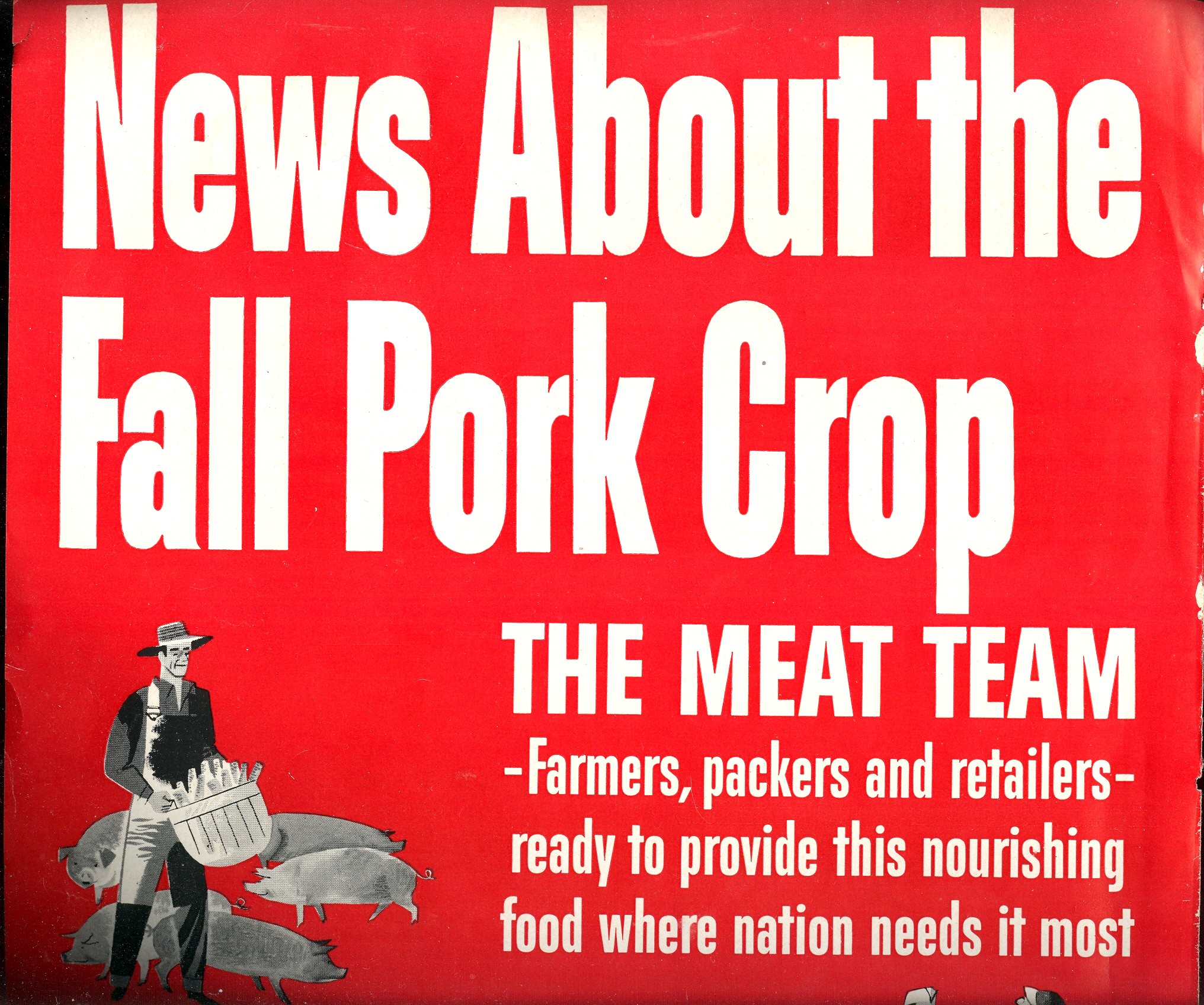
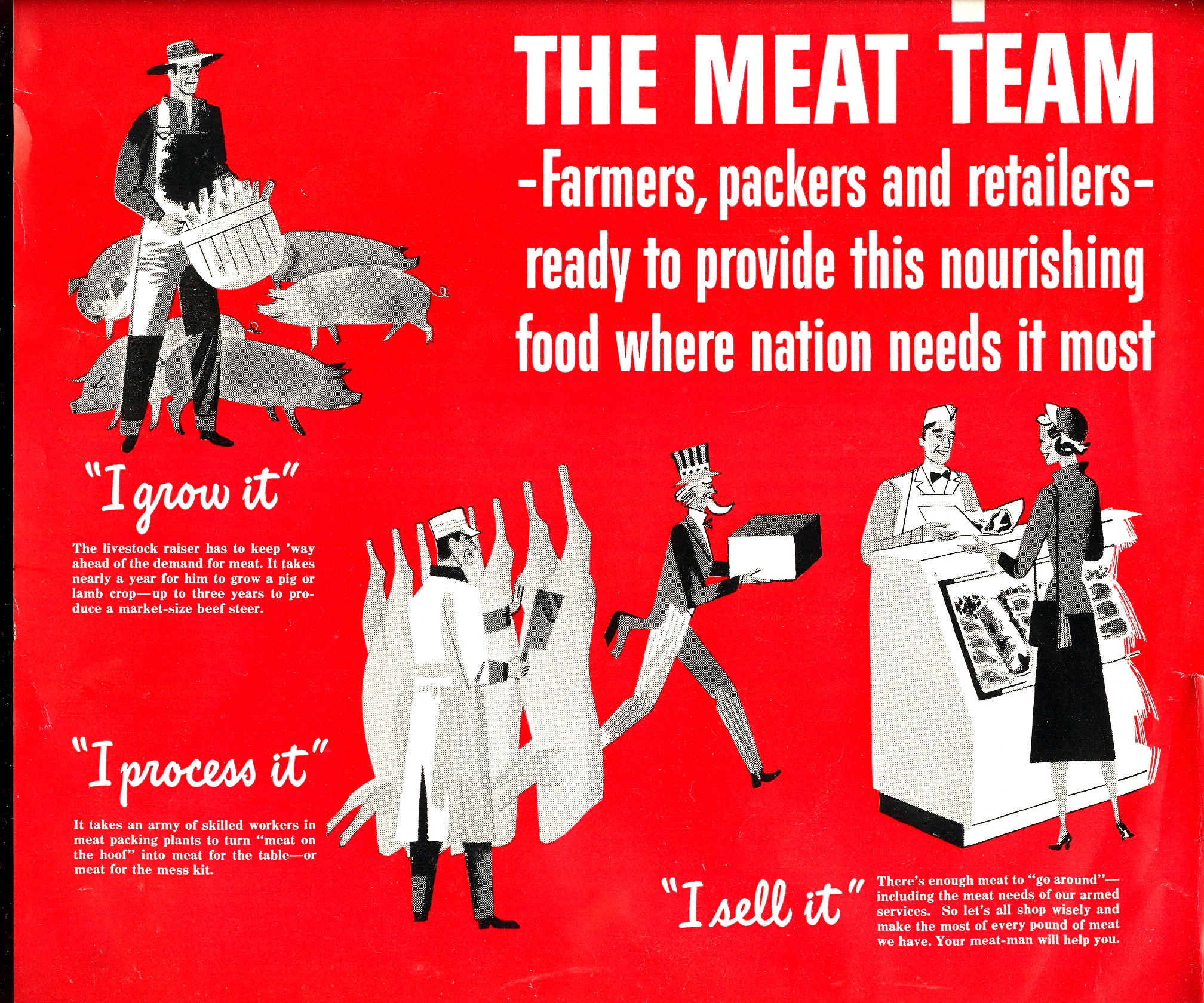
    public view, at least for the 20th century.  For example, this 1949 ad from LIFE magazine
    introduces the “Fall Pork Chop” with the evolution of meat summarized in those
    three small pictures.  The processing guy
    is starched and white and pure standing there before the non-detailed,
    smoothed-out carcasses.  He even has a
    little white cap.  The interesting part
    here is the Uncle Sam delivering the boxed final product.  Uncle Sam? 
    How did he get into the picture? 
    He certainly sanitizes the whole procedure, what with the imprimatur of
    the U.S.
    government and all, and even suggests a slightly patriotic aspect to the food
    chain. The odd thing here though is the blood-red background color, which was a
    common practice for selling dead flesh in LIFE for many years.

    + meat pork chop 001 The middle killing and scooping part of this is basically nothing that would
    ever be broadcast on television, and certainly it is nothing that parents would
    want their kids to see.  Don’t people
    turn in horror and disgust when those undercover videos of processing
    plant  practices make it to youtube?  So if these images are too fabulously
    gruesome for children (and adults) to watch, why take a benefit from them?  I’d say that if the process of producing your
    benefit is too horrible to watch  you
    shouldn’t  be able to enjoy the outcome.

    ·Posted by :

    ·in:


  • The Importance of Bridges in the Invisible Evolution of Meat

    JF Ptak Science Books LLC  Post 794  Blog Bookstore

    I wonder when it was that humans developed the extra senses that were able to “intuitively” determine (1) when
    something is missing, and (1.5) when something is just wrong?  I’m sure that these blood-bumpers were developed
    soon after the recognition that the face in the primordial goo staring back at
    its owner wasn’t something drowning. 

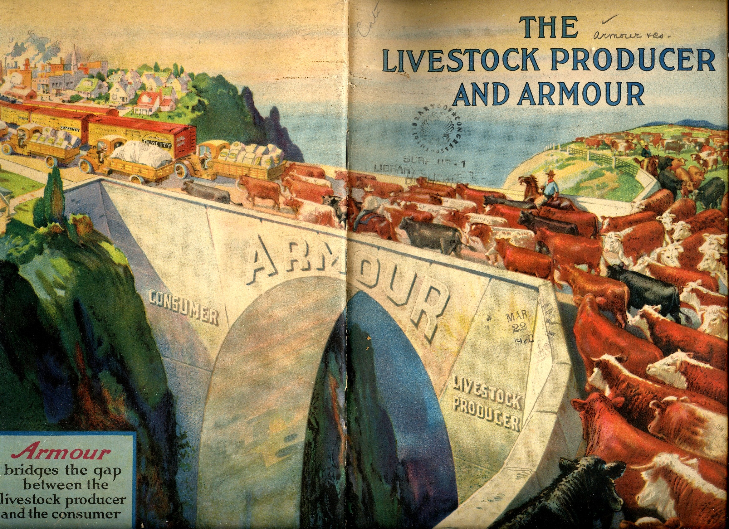
    + The Kodacolor Bridge of Evolving Meat

    This fast-forwards us through Wilberforces ultradense 6,000 years to the
    near-present: when looking at the explosively chromaticized picture of the progress
    of meat, brought to you by the invisible packing empire of Armour & Co. (of
    Chicago, of course), one gets the ancient immediacy of something being missing
    and just plain wrong.

    The cows being herded from their pastures are being led to the Armour bridge
    of Meat Evolution, where by some miracle the process of turning cows into
    packaged goods—like Leda and the swan—takes place over the “A” in Armour, three-quarters
    of the way over the bridge.  This process
    is wholesome in its invisibility, the walking product on the one side of the
    bridge getting ready for transubstantiation for the nested hu+ The Kodacolor Bridge of Evolving Meat 2manity on the
    other side.

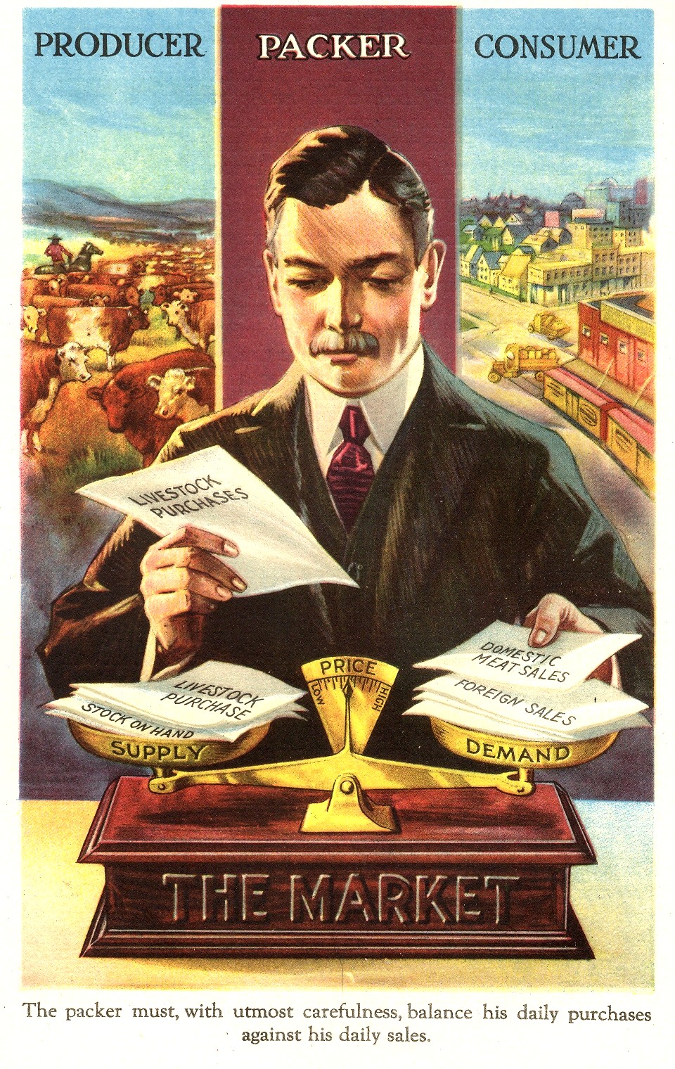
    The picture of the packer weighing the elements of the mysterious
    gold-plated market rams this invisibility home as well:  the “producer” and “consumer” columns behind
    him are prettily illustrated with referential scenes, while the “packer” column
    just gets a single slab of color.  A
    singularity of nothingness in regards to what goes on behind the packer’s head
    is all the consumer would want, then and now, ‘cause certainly nobody wanted to
    know what the hell was going on in the packer’s den to hasten the evolution of
    cows from muddy hooves to the dinner table–especially in 1926, when this
    pamphlet was printed.  The vast
    conspiracy of people not-wanting-to-know-what-happens-at-the-packing-house continues.

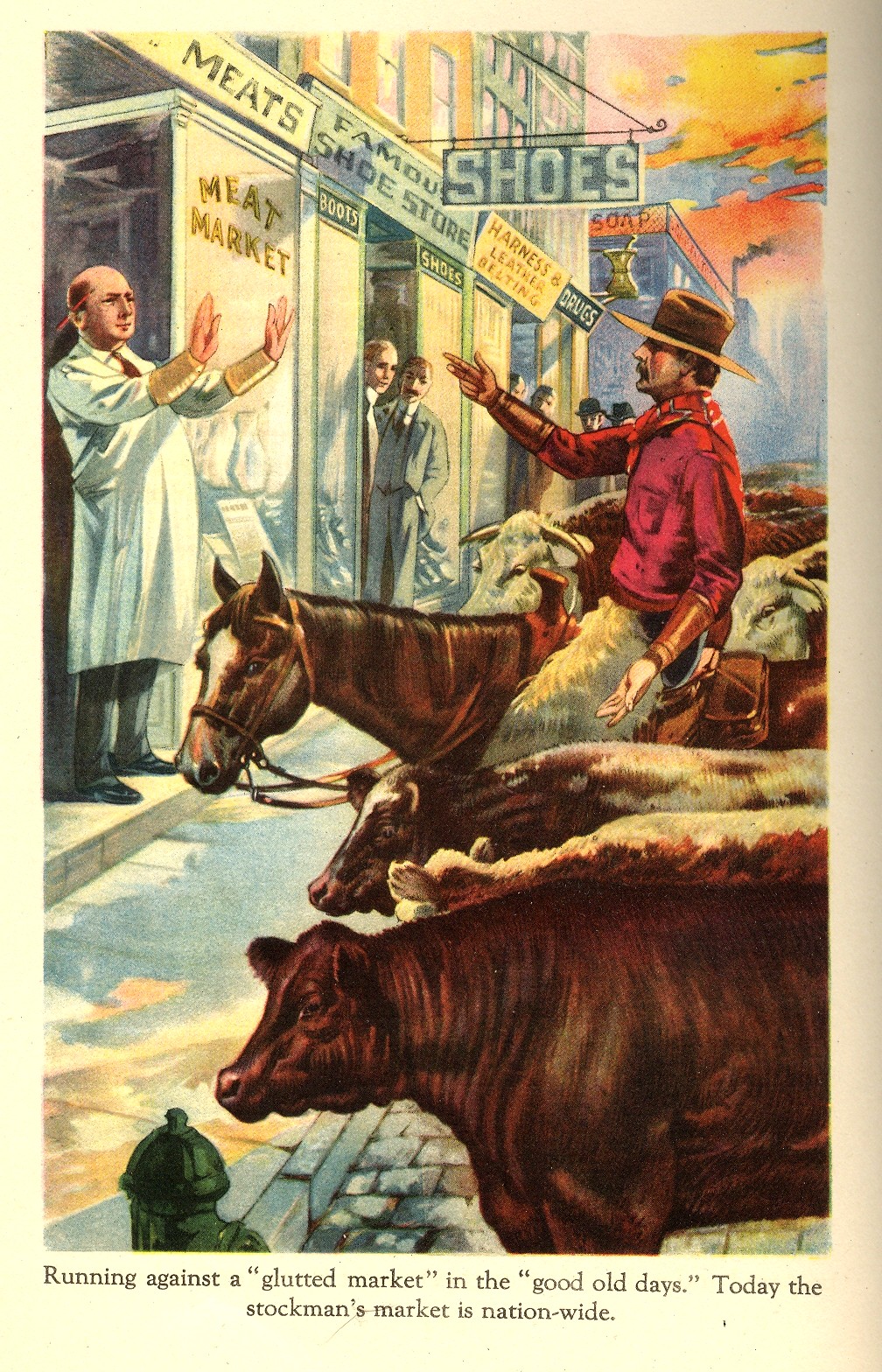
     + The Kodacolor Bridge of Evolving Meat 3 I can’t leave this short post without a nod to another extraordinary image
    from the Armour pamphlet:  the butcher
    waving off the drover and his herd because of a glutted market.  The “good old days” here doesn’t look very
    much like the 1870’s to me:  I can’t
    recall a single drover/cowboy image in my  very long experience that showed a cow
    sniffing a fire hydrant.  Plus everything
    else in the picture is pure 1920’s, except for the drover, who—although wearing
    skins in the city for some unknown reason—at least looks mostly like he should
    and isn’t packing an endlessly bouncing-on-your-thigh revolver.  Sorta. 

    The horse looks embarrassed and surprised at the same time. Is there an English word for that?  


  • Einstein as Subverting Flag-Burning Commie? What his FBI Files Look Like

    JF Ptak Science Books LLC  Post 793  Blog Bookstore

    Einstein--FBI detail 21950

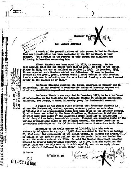
    While looking at the FBI files for Leo Szilard, a great physicist who had liberal-left ideas about peace and strategy and the use of the atomic bomb (in June 1945), I stumbled onto the files for one of the people sought by the Bureau to talk about Szilard:  Albert Einstein.  He and Szilard went back a long way, and Szilard’s advanced physics supra-intelligence and illuminated social outlook was instantly recognizable to Einstein, making it easy for Einstein to give him an excellent recommendation.  Which of course is something the FBI didn’t want to hear, as Szilard was mucking around in the national will to use the ultimate weapon, among other things.

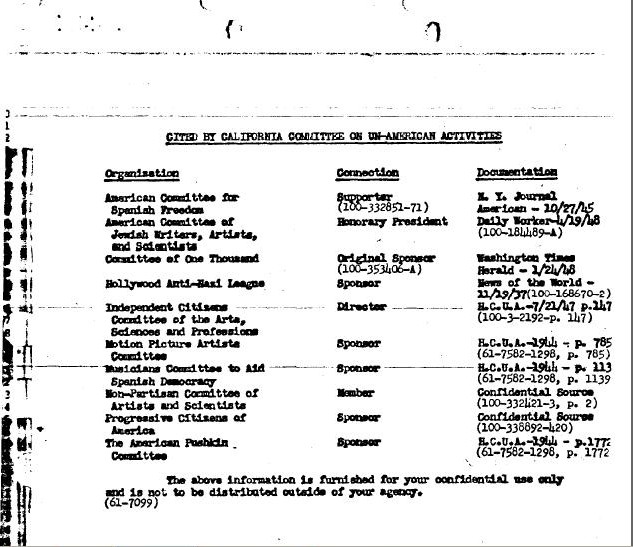
    I knew a little about the FBI’s interest in Einstein, but I had never actually looked at any of the declassified files, which as it turns out live at the FBI site, all 1600+ pages of them.  Hoover had some sort of special need to fill with looking after Einstein, whose nearly 20-year-long file is just not pretty. The Director was sniffing around the edges of Einstein’s social life, trying to make them into centers to do god knows what with them.  One of the files details the subversive organizations that Einstein was associated with–some of the hundreds and hundreds of groups that he lent his name to over the years. 

    Einstein--fbi--bad association

    Here’s some of those threatening organizations:

    Einstein--fbi--bad groups list 2 

    Not much to look at, really.  

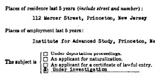
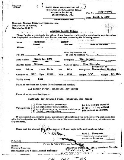
    But it is this gentle, subtle, horrible document below that causes real grief, the “under investigation” part at the end is just heartbreaking, a Lilliputian effort to control forces beyond their comprehension.  Such is the power of ignorance.

    Einstein--FBI 1950 

    Einstein--FBI detail v 1950


  • A Short Note on Forks and Art

    JF Ptak Science Books LLC   Post 791   Blog Bookstore

    I was on my way to something else when I stopped to look at
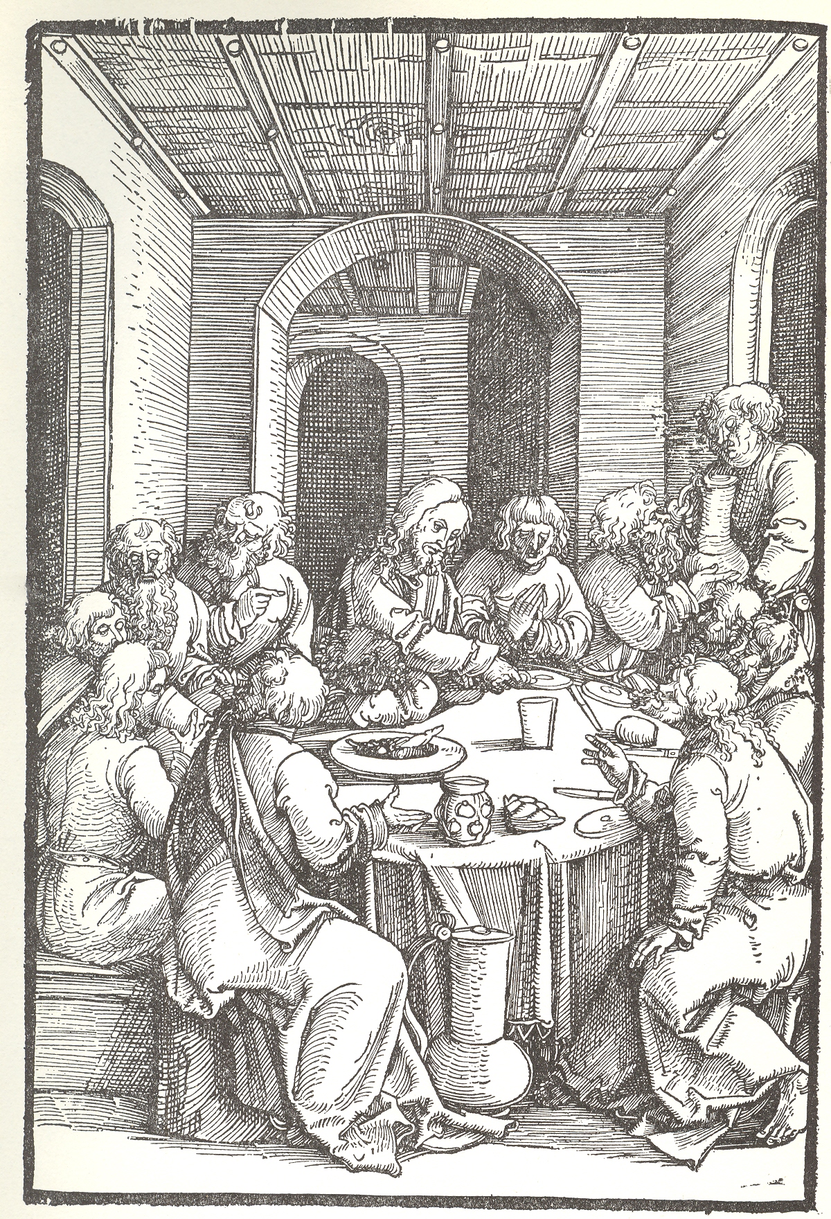
    this engraving by Ulrich Pinder, his last supper, the Speculum passionale, published in Nuremberg in 1507.  It has a nice perspective, an interesting ceiling,
    and a crowded table with very little on it in the way of food.  And no forks. 
    Knives—yes of course—and big containers of some sort of liquid, but no
    forks.  As it turns out, the fork really
    hadn’t made a strong appearance in northern Europe until the end of the
    century, brought back evidently from travelers in Europe.  The first appearance in a painting, in
    another Last Supper, I believe, occurs at least by 1599.

    + fork

    I know, there’s no spoons either, but they had been around
    for a long time, and just didn’t make an appearance on this table for reasons
    unknown.

    “I observed a custome in all those Italian Cities
    and Townes through which I passed that is not used in any other country that I
    saw in my travels, neither doe I think that any other nation of Christendome
    doth use it, but only Italy. The Italian, and also most strangers that are
    cormorant in Italy, does alwaies at their meales, use a little fork when they
    cut the meate . . . their forkes being for the most part made of iron or steel,
    and some of silver, but these are used only by gentlemen. The reason of this
    their curiosity is because the Italian cannot endure by any means to have his
    dish touched by fingers, seeing that all men’s fingers are not alike cleane.
    Hereupon I myself thought to imitate the Italian fashion by this forke cutting
    of meate, not only while I was in Italy,
    but also in Germany, and
    often-times in England
    since I came home.”
    Thomas Coryate, Coryat’s Crudities (1611)
    See:

    Forbes, R. J. “Food and Drink,” Charles Singer,
    et. al. eds. A History of Technology. Oxford:
    Oxford University Press, 1956. Vol. II: The
    Mediterranean Civilization and the Middle Ages, c. 700 B.C. to c. A.D. 1500
    :  page 126.

    Braudel, Fernand, Civilization and Capitalism 15th-18th
    Century
    , vol. 1: The Structures of Everyday Life: The Limits of the
    Possible
    , London:
    Collins, 1981:  page 209.

    ·Posted by :

    ·in:

    —

  • Fun in the 16th Century Bath: Minerals, Spirits, Frolic and Ennui

    JF Ptak Science Books LLC  Post 790  Blog Boosktore

    + bathing 001

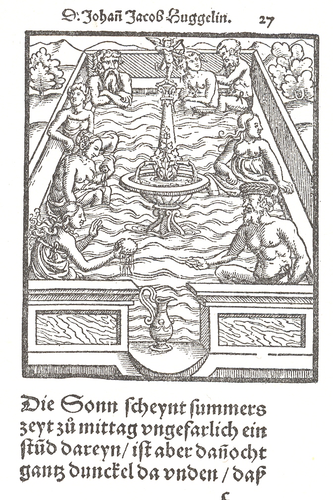
    There’s much real and important content in this woodcut, but I focused first
    on the few semi-entertaining and problematic figures positioned at the corners
    of this bath.  First things first: it
    appeared in Johann Jacob Huggelin’s Von
    heilsamen Baederndes Teuschenlands
    …, published in Mullhausen in 1559, which
    was a treatise on the mineral baths of Germany and their medicinal and
    therapeutic claims.  This woodcut occurs
    in the title page—and as a matter of fact, the exact image appears three years
    later in one of Paracelsus’ principal works, Baederbuchlin… published in Mullhausen, again, in 1562.  (This is one of Paracelsus’ most well-known
    efforts, and is seen as being one of the earliest works on hydrotherapy, but it
    is definitely predated by Huggelin.)  

    There is a gauzy modesty to the bathers, the men wearing a skimpy Euro-covering (with a nice bow), and the women a flouncy covering that is pulled down under the breasts.  The pair in the front look to be sharing a sponge, while another pair (towards the middle of the bath edges) are contemplating the landscape.  One of the pair in the rear right corner is getting  a nice scrubdown, while the most interesting-looking of the bath crew sits opposite, arms folded, looking sullen or filled with lost hope or just left out. 

    + bathing 2

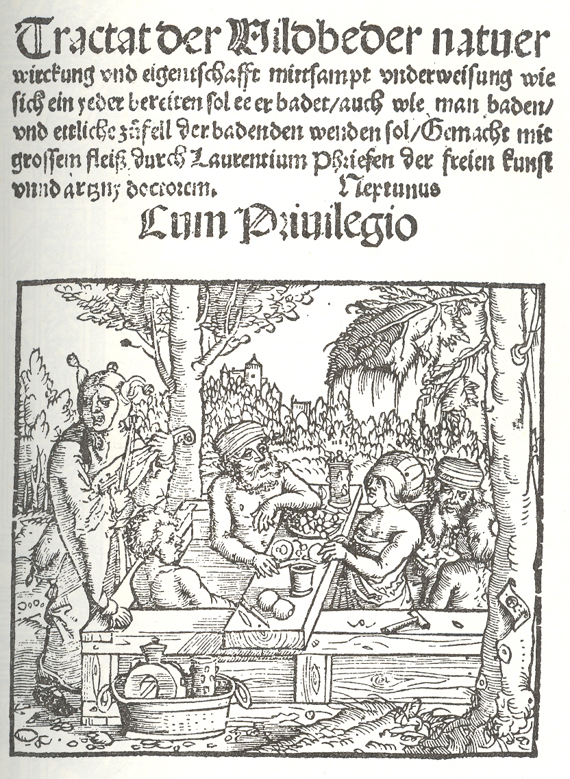
    More fun and more unbalanced is this image from Lorenez Fries, Tractat der Wildbeder, printed in
    Strassburg in 1519,  where those taking the
    baths for the medicinal spirits of the water to wash away their medicinal grit,
    and gout and grimes tried to help the water with food and alcohol.  There’s nothing wrong with that so far as I
    know, and evidently there’s nothing written about despoiling the massaging/washing
    powers of the bath in the Handy Handbook
    of Balneological Rules and Regs.
    As in the first image, the bathers are
    decently and modestly clad, only here they are enjoying fruits and meats, and have
    a jester/fool entertaining them with a viol. I imagine that if you were gouty or had the flu, an hour or two in a bath filled with music and food and spirits wouldn’t do too much damage.


  • Pig Iron vs. Eiffel Tower: Visualizing Difficult Numbers and Concepts

    JF Ptak Science Books   Quick Post  

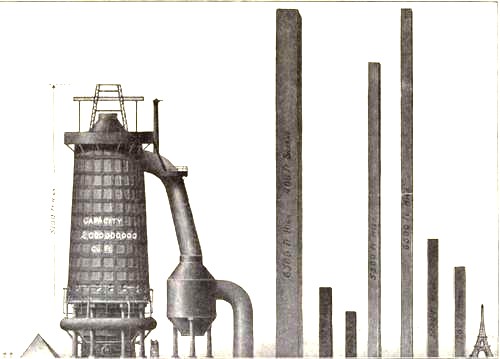
    Several years ago I wrote about some triumphantly unusual images (plus one on the 1891 10-ton Eiffel Tower bullet) of the Eiffel Tower–today I’d like to add another, a queer image which manages to loose the Eiffel Tower (and the Great Pyramid) in representations of pig iron production.

    Diagram steel eiffel 

    I love comparison like this (which appeared in the Illustrated London News for 1910), representing big, hard-to-associate  numbers of something against another quantity that can be instantly understood–the relationship between the two might be tenuous and complex, but at least it can give you some sort of handle on what would normally be an inaccessible, stand-alone number. Plus, any time that you can show what an ungraspable concept might “look like” and be explainable to a 10-year-old, well, you’ve got something. 


  • Straight Lines and Blank Space in Early Western Cartography

    JF Ptak Science Books LLC  Post 788   Blog Bookstore

    Blank and Empty Series #53

    It is sobering to look at the work of the early cartographers and see how much space in their maps they were willing to relinquish  to the blank unknown.  For example, Jacobus Ziegler, in his Quae intus continentur Syria,
    Palestina, Arabia, Aegyptus, Schondia,
    Holmiae, Regionem superiorem, singulae tabulae geographicae
    , published in 1532, was among the first to publish anything at all about Scandanavia and Greenland, wasted no effort in trying to add detail where there wasn’t any, a trait that was lost on many other cartographers and mapmakers in the centuries to follow.  His book was mostly about travel in Palestine, but at the end of the book he deals with the new and problematic geographic areas, featuring them in his eighth map, announcing the contents as follows:

    The western half of the map, featuring Sweden, Norway, Finland, Lapland and Greenland, is spectacular, and features an enormous, flat-detail, straight-edged Greenland as the bulky land mass in the west (“ulte Gron/rio/lan”, a terra incognita).  The extremely angular Greenland coastline stands in sharp contrast to the lovely wavy ocean, the mapmaker unafraid to stake his claim in what he didn’t know. 

    The eastern half of the map, Scandanavia, is more recognizable (if you focus on Denmark and Germany in the south and then work your way north):

    <

    Though the unencumbered line, far from the fractal nature of Mandelbrot’s coastline of Britain, appeared everywhere in the eight maps of Ziegler’s work, as we  can see in this intestinal-appearing Dead Sea (below).  The fact of the matter is that this was the state of the art in the first third of the 16th century, and there was in general not a great effort to embellish guesses and gloss over the areas where there was no information.  Of course there was still mythical placements of beings and locales and willing things into existence (like Prester John, sea monsters, El Dorado, no-headed men of South America, Patagonian giants, monsters, and so on), but I still find it remarkable to see how much rigor was given known geographic detail. 

    The Nile too received this unrelenting treatment of calm appraisal:

    I do admire this effort for not making things up, or covering areas for which there wasn’t good data with ephemeral and unnecessary features that would swallow up large swaths of white, empty space, as in this map of the lands eastern Syria:

    Though there were still no problems including sea serpents, even so close to the Syrian coast:

    On the whole though Ziegler’s stylized effort is quite beautiful and truthful,  and I enjoy the depiction of the sea giving way to the chunky, rectangulariness of even such decently known forms such as Cyprus.

    The bottom line here is that folks seeing this work for the first time in 1532 would have had a similar reaction to it as you had when you zoomed in on your house in Google Earth for the first time–it was an extraordinary display of information for the time.