A Daily History of Holes, Dots, Lines, Science, History, Math, Physics, Art, the Unintentional Absurd, Architecture, Maps, Data Visualization, Blank and Missing Things, and so on. |1.6 million words, 7500 images, 4.9 million hits| Press & appearances in The Times, Le Figaro, Mensa, The Economist, The Guardian, Discovery News, Slate, Le Monde, Sci American Blogs, Le Pont, and many other places… 5000+ total posts since 2008.

Author: JF Ptak

  • Bloomsday: Davy Byrnes, Gorgonzola Cheese, and So On.

    JF Ptak Science Books 

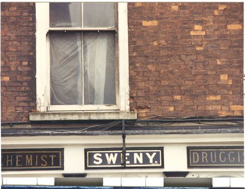
    I just came across these image that I made on a trip to Dublin some years ago.  Carrying the bags for my wife, Patti Digh, who was actually working there, I described my own work by going on a Ulysses tour. It was Sweny’s and Davy Byrnes (seems like two e’s are missing there, no?)  that I liked the most–particularly so for the chemists, because it looked as though nothing major had happened in there in  years, or at least that was the sense of the smallish creaking shop.  I wanted some lemon soap.

    See here for the rest: 

    [I am very happy to report that since this post was written in 2009 our daughter Emma Digh Ptak retrieved new lemon soaps for me from Sweny’s.]

      Sweny_1_

    ·Posted by :

    ·in:


  • The Dept. of Great Titles: “The Scientific Use of Common Things”

    JF Ptak Science Books    Quick Post

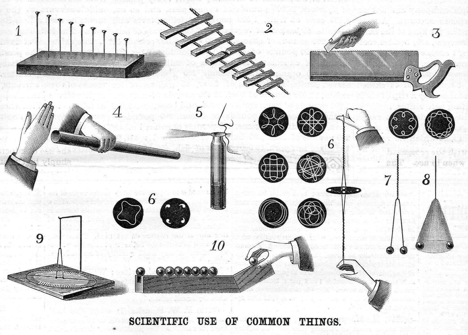
    This title, drawn from the identifier of an illustration from Scientific American (for September 13, 1890), I think would be a great way of teaching sci/tech principles, using stuff from your desk or hallway etc to illustrate the scientific method and to see how “science” can be found in  Real Life.   Of course this was from an era in which books like Ganot’s Physics would instruct not only on the principles of a pump but how to fix it as well–and also how to make the hardware like the nuts and bolts that you needed for the fix-up, and so on.  In general Scientific American was great for this sort of thing–these were the additional bits to the scientific news and drama of the week, the recipes on how to make the blackest ink and other such potentially useful recipes.  

    I’ve included this illustration because of the <sigh> requirements necessary to see what has been lost in scientific education at the elementary levels, and also due to its high/found artistic qualities.  It also looks like a puzzle, but isn’t. 

    Sci american use of common things086

    ·Posted by :

    ·in:


  • The Long and Short and Low and High of Rivers and Mountains, 1862

    JF Ptak Science Books   Quick Post

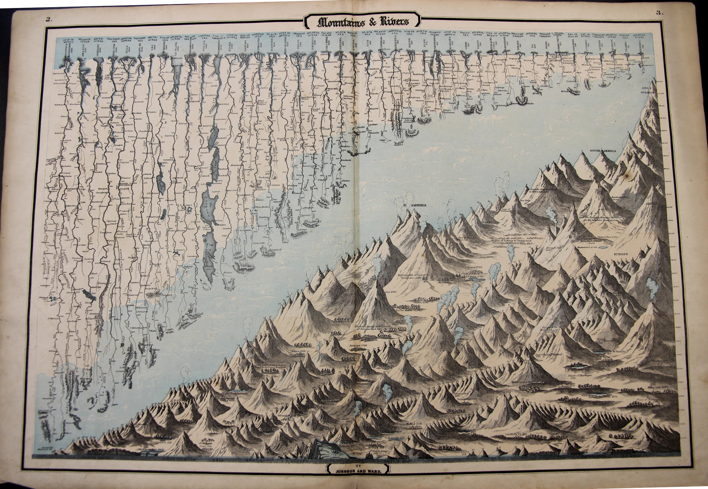
    This map may be simply named (“Mountains & Rivers”) but the information it displays is hardly so. As a matter of fact there are probably a thousand data points in this flowing, pleasingly-design comparative display of information–and the closer you look, the more there is. 

    Mountains and Rivers 1862

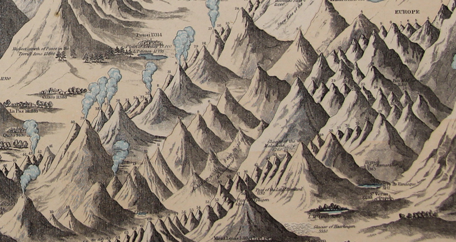
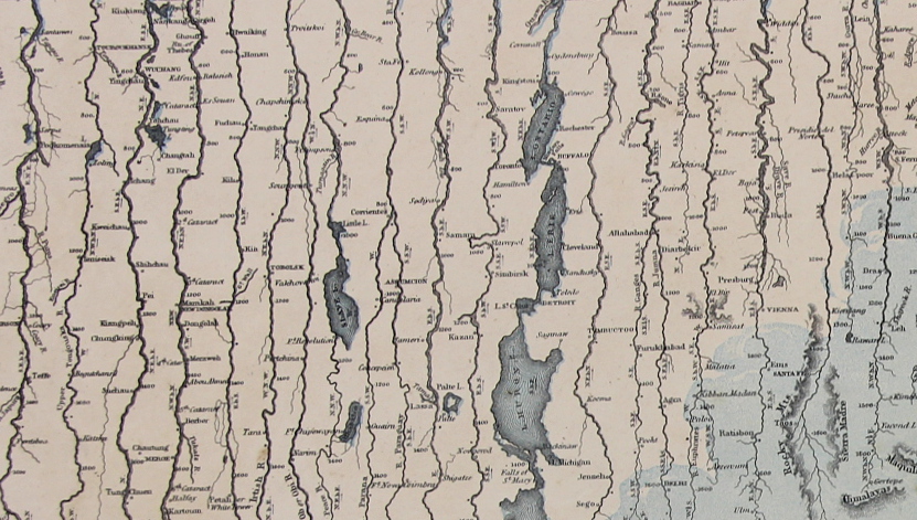
    In the mountains section there are hundreds of pieces of data locating the elevations at which cities and towns are found, and the altitudes of the extent of different types of trees, and of course the comparative heights of enumerated mountains set off by the continents.  Above the mountains floats the fantastic display of the lengths of rivers, listing 43 in all, showing cities at the various stages of each river’s progress. 

    It really is a glorious thing.

    Mountains and Rivers 1862 detail

    “Maps & Rivers” was printed and published by Johnson & Ward in 1862 and appeared in Johnson’s New Illustrated Family Atlas; there is at least one earlier version that appeared in 1856 with a different background and with ornate Celtic-inspired borders, though I prefer this version with the simple border and the full blue-sky-and-clouds background.  For my experience this is one of the richest of the genre published in the mid/late 19th century.

    • The original map is available for sale at the blog’s bookstore, here. 
    • Mountains and Rivers 1862 detail rivers

  • A Great Map of the “Other” London Underground: the Sewer System, 1990

    JF Ptak Science Books   Quick Post

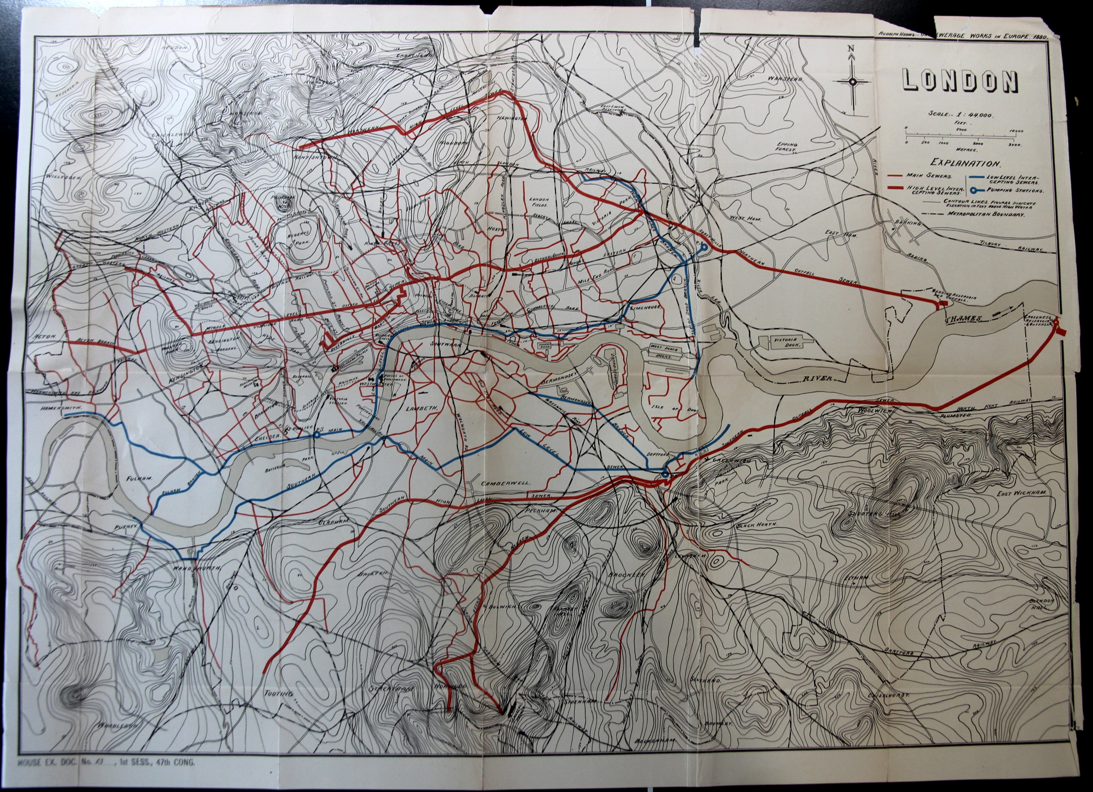
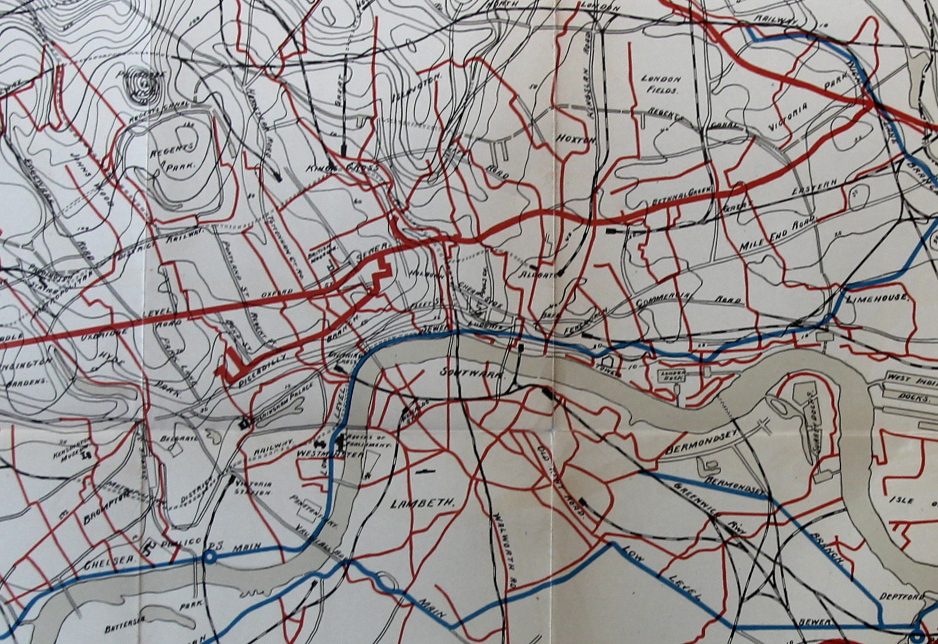
    In order ot have an Industrial Revolution, you need people, and the people (given the times) needed to live close to where they would work. Large number of people all living in close proximity to work means that they need to live close together; close together means that there needs to be essential services, like water. And of course with water you need a place for it all to “go”–and perhaps the “goingest” of water in the city would be for waste. So, if you can’t get rid of waste, then you have no Industrial Revolution. Or something along those lines.

    In any event that leads me into this fantastic map of the “other” London underground, the sewer system, the alternative outflowing lifeblood of the great city.

    London Map Sewer

    The map appears in the Report of the Results of an Examination Made in 1880 of Several Sewerage Works in Europe, by Rudolph Hering, in the Annual Report of the National Board of Health 1881 (Washington: Government Printing Office, 1882), pp. 99-223.

    • The original version of this map is offered for sale at the blog bookstore, here. 

    And a detail:

    London Map Sewer detail


  • Sumptuous and Large Depiction of the Old Testament “Creation”, 1886

    JF Ptak Science Books   Post 2478

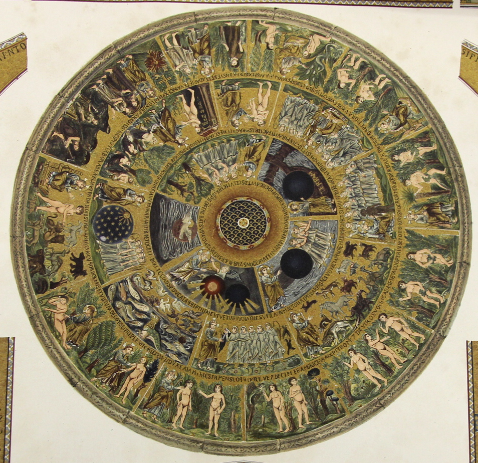
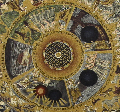
    I’m in the midst of making several posts relating to a group of large (27×21″) chromolithographs of the mosaics in San Marco (sumptuously published by Ferdinand Ongania in Venice in 1886.  The main part of this image is the story of creation, starting in the innermost circle of images, where we find the creation of light (and darkness),  and the rest, followed by the larger concentric circle showing the starry realms, the creation of the birds and fishes, then the land-based animals, and then (around “12 o’clock” on the second circle) comes the creation of life in Adam, where it all seems to go downhill.  In the outer ring we see the creation and presentation of Eve, the various temptations, the nakedness realizations and then the banishment–not all together a happy ending.  But the artwork is lovely, highlighted in gold. 

    Ongania 16 creation detail

    • The original image is available for sale via he blog’s bookstore, here.

    Detail of the inner circle of images:

    Ongania 16 creation detail 2_

    ·Posted by :

    ·in:


  • Massively Detailed “Hyper” Geometric Mosaics, San Marco, 1886

    JF Ptak Science Books   Post 2477

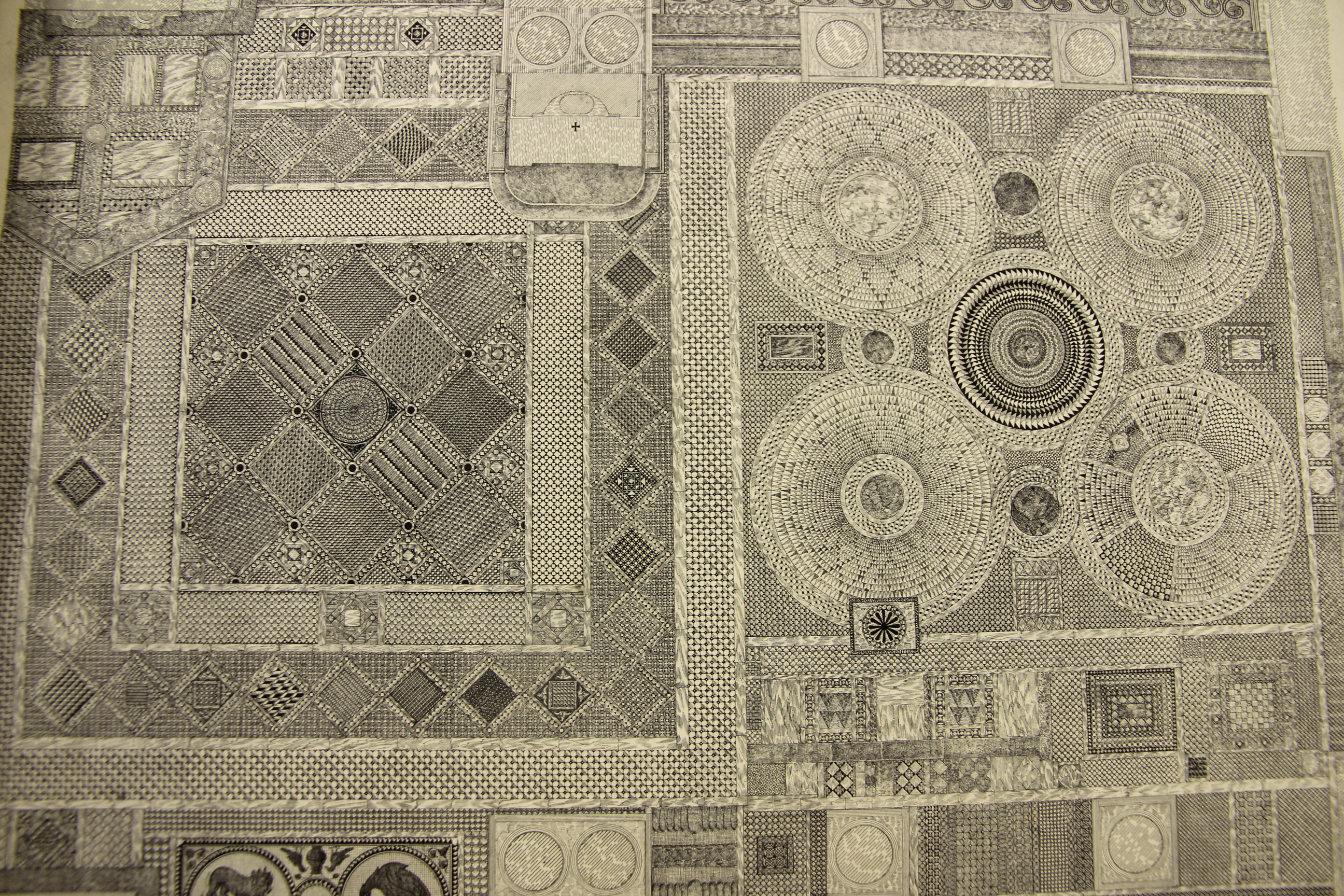
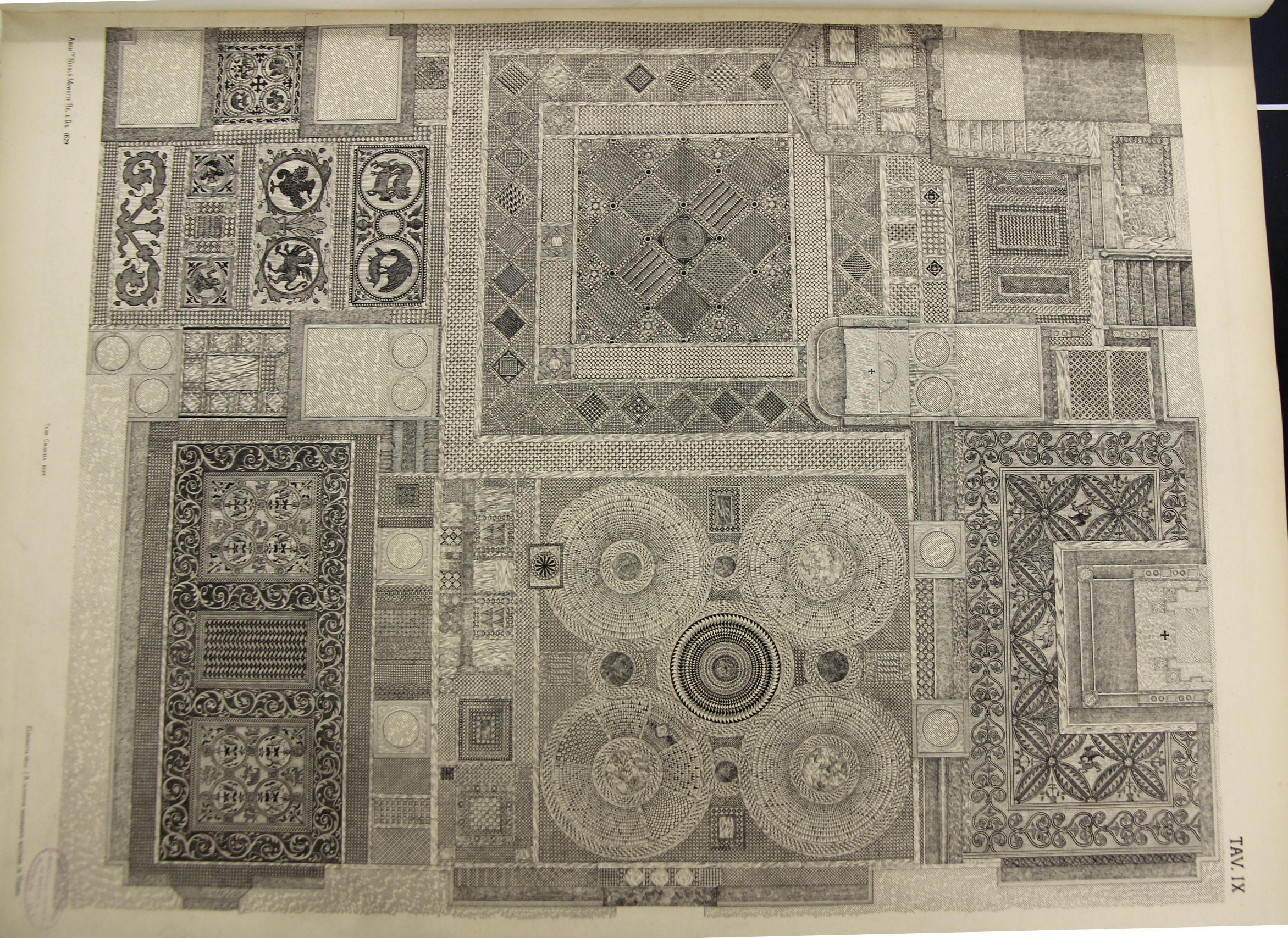
    The following four engravings appeared in the massive La Basilica di San Marino du Venezia, published by the prolific Ferdinand Ongania in 1886.  It is an exhaustive study of the iconic building, the publication being known chiefly I think for its very large and sumptuous chromolithographs of the building’s architecture, art, and endless detail. It forms two volumes of an overall monumental 12-volume epic, though these were complete in themselves.

    But then there are these engraving, in wonderful black-and-white, showing with fantastic detail and with a deft touch the mosaics of the basilica.  I believe that there were six overall but I sold two some time ago and hadn’t made a digital record of them.  Since I have these and another 22 images from that great work, and since I can’t seem to find them online, I thought to make at least rudimentary photographs of them and share.  (Making the pictures was a little problematic, as they are pretty large at 27×21″, so some of the lines are a little parabolic, though I think they’re good enough given limited time to spend on them–also each image is at least 2 meg, so they can stand some amount of enlarging.)

    • I’ll be selling all of them, with the mosaics being the first installment–so if you’d perhaps be interested in buying them, they can be found at the blog’s bookstore, here. 

    The engravings (again, they are large at 27×21″, 68x53cm, and are packed with detail).

    Each image is very expandable–click in to see the enormous detail:

    Ongania Mosaic 1


    Ongania Mosaic 2

    ·Posted by :

    ·in:


  • Visionary Architecture and City Planning of an Industrial/Scientific Community (1842)

    JF Ptak Science Books  Post 2477

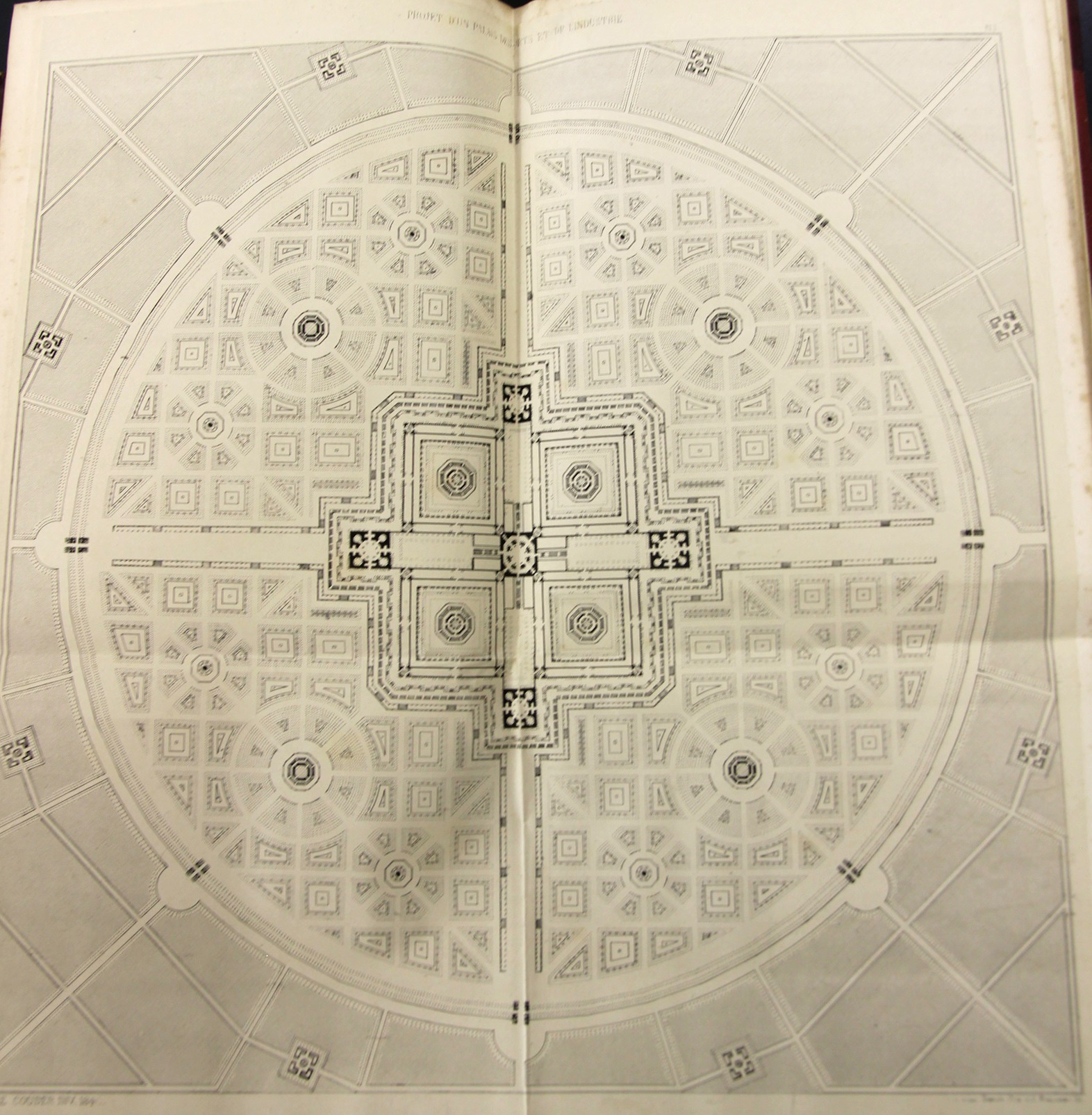
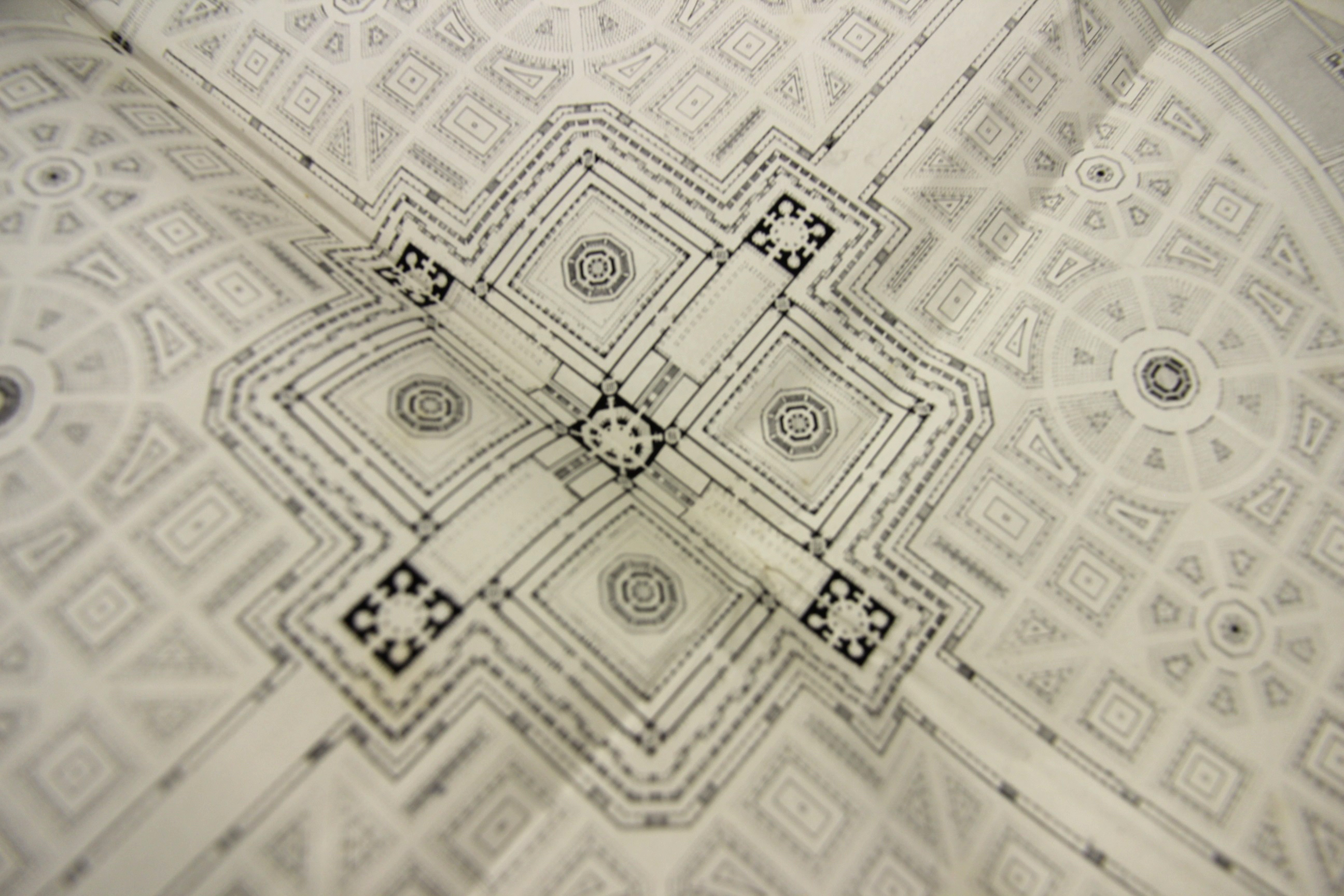
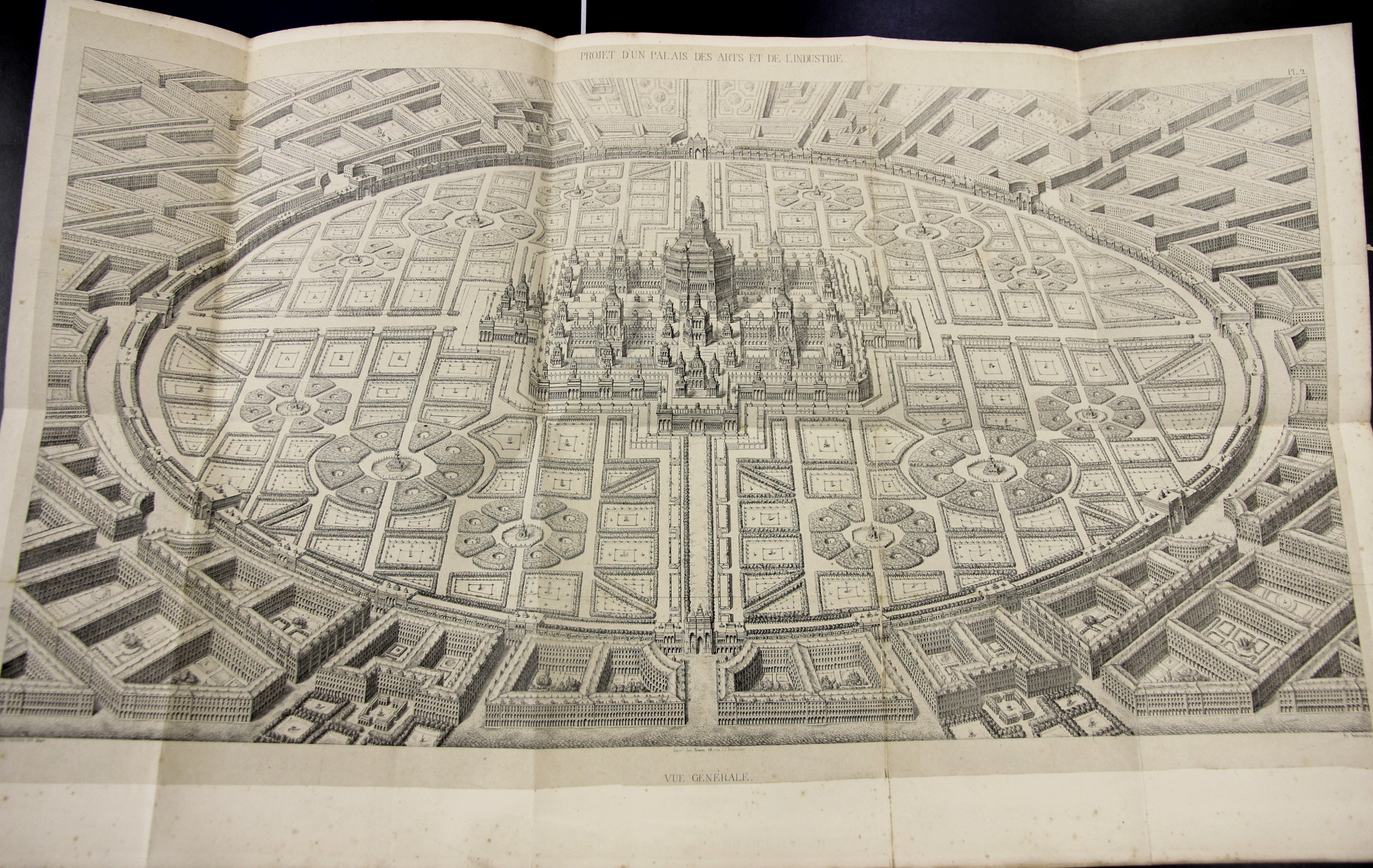
    (Jean Baptiste) Amedee Couder wrote L’Architecture et l’industrie comme moyen de perfection sociale, a fine work that was published in Paris (by Brockhaus et Avenarius) in 1842.  The work presents Couder’s rather stroing visionary plans for a perfect city of industrial and scientific harmony, laid out in suggestively-fractal harmony, with the suggestions of a Renaissance-laden snowflake design. Whatever it was, it was beautiful to look at, at least on paper, though I’m not so certain that I’d care to live in the canyonlands of stone and shadow on the other side of the garden wall of the perfect scientific-industrial conclave. 

    (Its actually a fairly scarce book, with only two copies found in the WorldCat directory, so I’ve reproduced the book’s larger folding plates)

    Couder 1

    Couder 2 detail

    • The original volume may be purchased via the blog’s bookstore, here.

    Couder 5

    Projet d’un palais des Arts et de l’industrie.  18×14 inches.


  • Fine 17th century Etching of a Scholar at Work

    JF Ptak Science Books   Post 2476

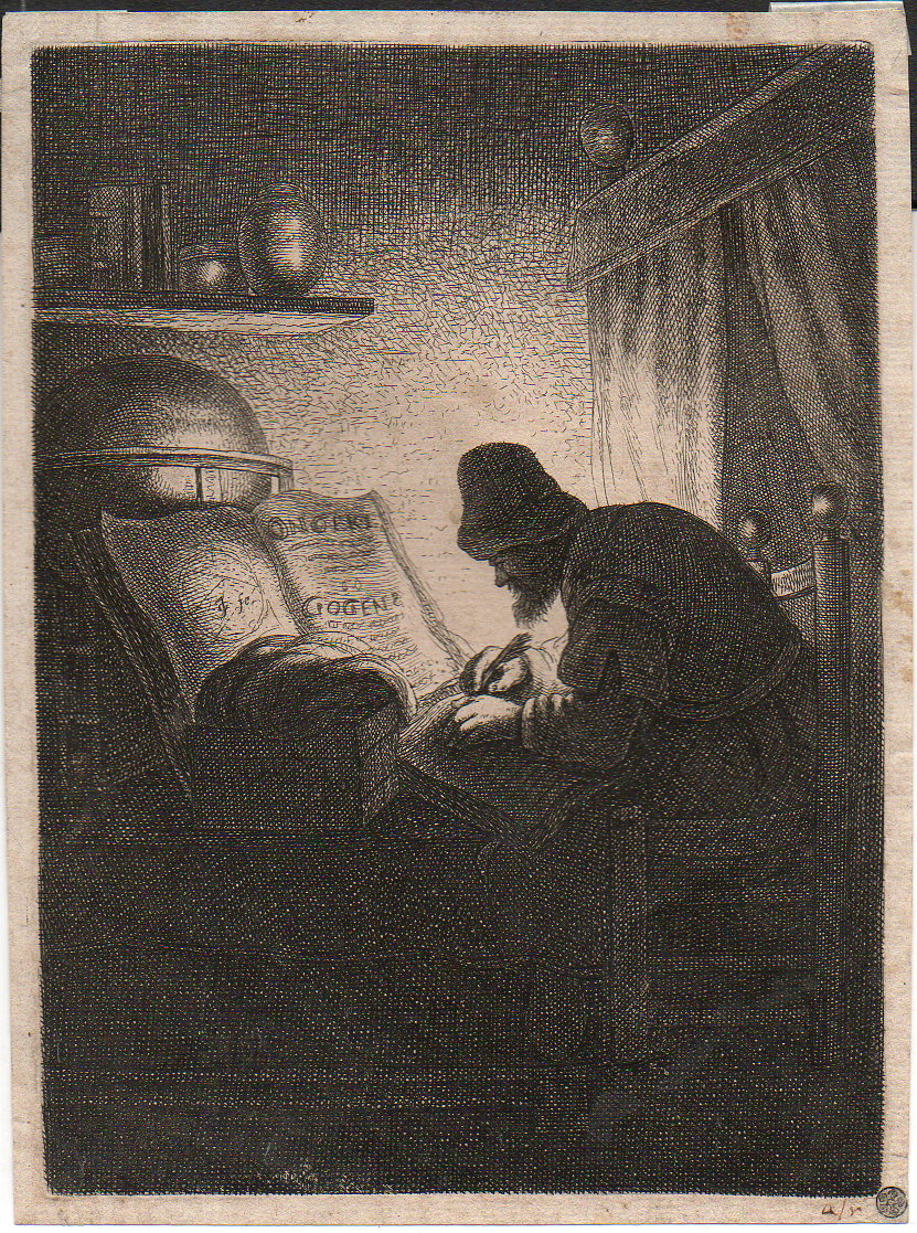
    Etching man in study110

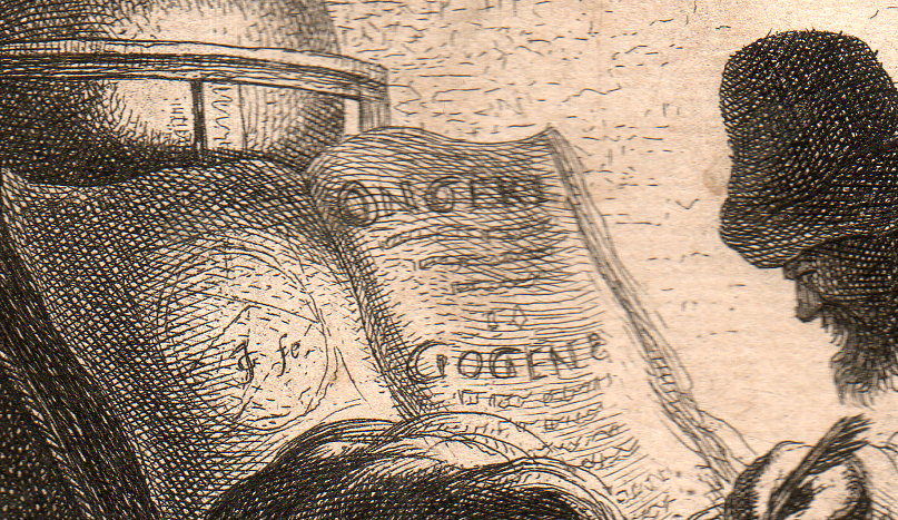
    I’ve long thought that this (ca. 17th century) etching of a scholar in his study was alchemical in nature–that just for the the appearance and sound of the two words printed int he large open book on the table. As it turns out, I cannot find those words, anywhere–at least with meanings that could be related to the book or the scene. 

    • The original print is available for purchase via the blog’s bookstore, here. 

    That said it is still an interesting and very personal scene–one man, still heavily clothed in the dark (and what seems to be late at night, though there is no evidence for that, that is just how it feels t me), working away at something with the benefit of only a single semi-weak light source

    The artist/etcher looks to be “JG”, or “IG” or “GT”, and other permutations and possibilities.  I have not been able to identify who the artist is, having scoured the Big Book of Initials and Monograms: Francois Brulliot’s Dictionnaire des Monogrammes, Marques Figurees, Lettres Initiales, Nom Abreges, etc., avec lesquels les Peintres, Dessinaeurs…. The book is a masterpiece of a type, sorting out the difficult and twisted means by which the originators of artworks identified themselves. It was published in Munich in 1832 in two volumes, and runs an easy 1200pp, though there is probably a half-inch of very thin paper that is unpaginated for various appendices.  (For some reason the letter “T” is represented in only one page in the monogram section. Odd.)

    The artist’s monogram followed by a “fe”, which is an abbreviation of “fecit”, or “faciebat”, which is also abbreivated as “f”, “fac”, and “fect”, which seems to be a kind of ambiguous term, referring to “JG” as being the maker, as either the artist or etcher/engraver, or both.  (This is less seldom scene than the more common indicators like “del” and “delin”, which abbreviates the Latin word for draw/drew, and so indicating the artist; “eng” and “engd” would stand for “engraved”, for the person who prepared and executed the plate made from the artist’s work.)

    Here’s the detail of the open book, as well as the initials of the artist (located on the left-hand page):

    Etching man in study111

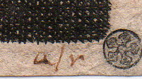
    And an early (and tiny, 2mm)  collector’s mark, stamped in the extreme right bottom corner:

    Etching man in study112I think that we’ll just have to appreciate this print at this point for what it makes us feel–though I am sorry not to have more detail on what it is/where it came from/who made it. 

    ·Posted by :

    ·in:

    —

  • Frank Lloyd Wright and the Benefits of a Bombed-Out London, 1940/1

    JF Ptak Science Books  (Expanding Post 1866 from 2012)
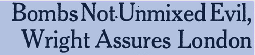
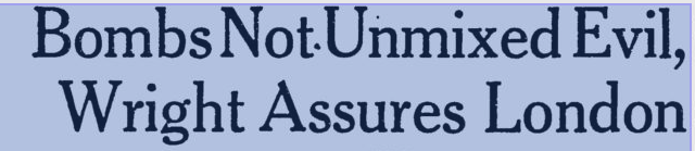
    Wright London bombing–article header from the Milwaukee Journal, 22 June 1941.

    • [I’ve written earlier on a related and very bad idea, Atomurbia, for atom-bomb-proofing American cities, here. The idea was to spread out the population and industry of the United States all over the country, so that there would be no centers of industry and no concentration of population, that every smallish city could be a target, thus making the many thousands of them un-bombable. This idea was the product of very influential people, and did not appear in a comic book.]

    Reading Nicholson Baker’s Human Smoke I found several unflattering and semi-unbelievable quotes from the unpretty Frank Lloyd Wright (see here).  Present at a MoMA exhibition he was sharing with D.W. Griffith (detailed in the publication Two Great Americans published by the museum in 1940), Wright chose the background of the Battle of Britain, in which German bombs were falling on cities in Great Britain cities killing thousands, to promote his city design idea of Broadacre.

    In development since 1932 (appearing in his book The Disappearing City) and kept on until his death in 1959, Wright’s idea for city /suburban development spread a “city” to its limits, nearly stripping it of its citiness and expanding it towards the horizon in a wide and low wave of a complete suburbia.  With this, Wright must have reasoned, Broadacre City must have seemed “bomb-proof” compared to the normal concept of the city, and decided to make the best of a horrible situation to promote his idea.

    And with this, he was quoted in November 1940 in the New York Times, saying:

    “I would not say that the bombing of Europe is not a blessing, because at least it will give the architects there a chance to start all over again”

    Wright is quoted in the Milwaukee Journal talking about the blessing-in-disguise of the terror bombing and the benefits it would give to the future and to city planning, saying that a few nights of bombing would have cleared the “slums and ugliness” that otherwise would have taken “centuries” (“”blasted out of the way in a few days”).

    I’ve never thought of Wright’s buildings as structures for people, even the lovely Fallingwater is iconically beautiful outside but not-so-people-friendly inside–it may be a minority opinion, but so it goes.  It is clear to me that for whatever record he was speaking to here in 1940 that he had no regard for the people who would have been in those destroyed areas; of course that was his executive orders, as all he was interested in was the idea of planning the city and responding to his own genius.

    He went on, this reported in Time Magazine for November 25, 1940, describing his bombing-as-a-benefit idea:

    “Broadacre is going to England as soon as there is a chance for it to be shown there. This will be immensely beneficial to England.” 

    To say that this was an idea best left to the imagination rather than in the pages of the Paper of Record goes without saying.

    And what of the architects whose buildings were lost during the Blitz?  Say, like Christopher Wren?

    “I don’t think that anyone will miss Wren’s work very much” (This, and the quote above, found in Baker, page 248.)

    And also this:

    ‘After all,’ says he, ‘what is St. Paul’s? An imitation of St. Peter’s in Rome. I don’t think anyone will miss Wren’s work much.” —Time Magazine, November 25, 1940

    I’ve had a problem with Wright for a long time, but had never bumped into this part of his thinking before.

    [Wright’s wrongs on the Bombing of Britain are also recorded in Peter Shedd Reed (ed), The Show to End All Shows: Frank Lloyd Wright and The Museum of Modern Art, 1940 (MoMA 2004, here), and here, in the Milwaukee Journal for 22 June 1941, and also in the News Chronicle of London in”How I would Rebuild London”]


  • The H-Bomb in L.A., 1961

    JF Ptak Science Books    Quick Post

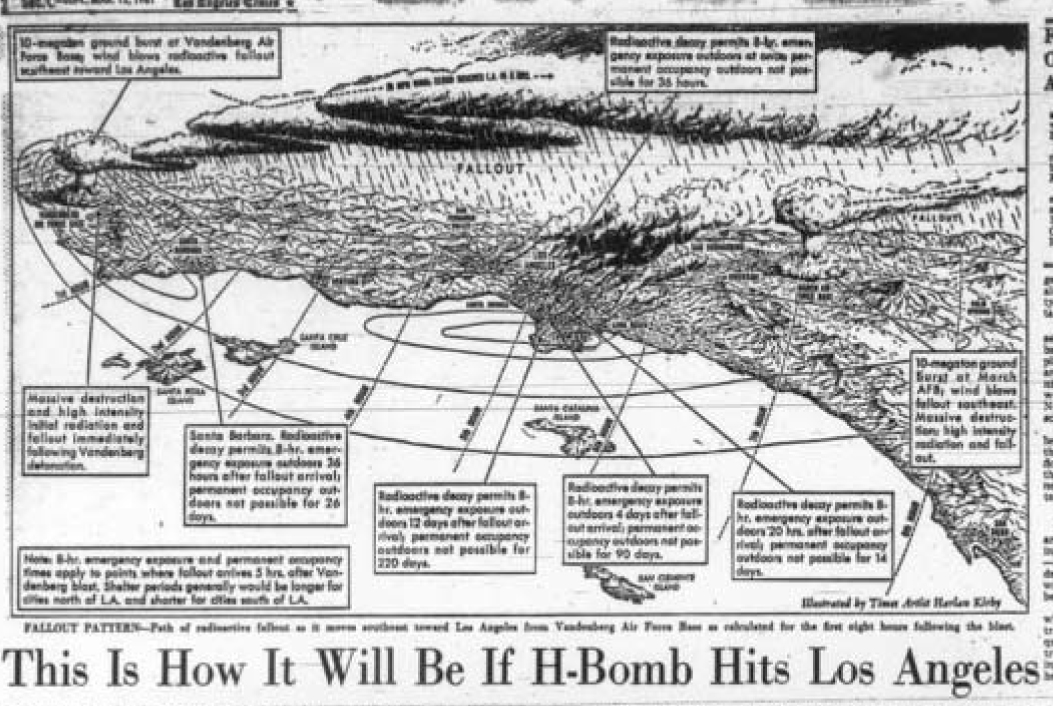
    The illustration below was for the story, “Red Alert. What if an H-Bomb Hit L.A?”which appeared in the Los Angeles Times 12 March 1961, and made no doubt for some very sobering contemporary wake-up-and-die reading.  If you were living anywhere in the country at the time and had never seen a representation of your city in ruins, and you encountered such a story and images before coffee, you might remember that missing cup for the rest of your life.  The dramatization and mapping was done by Harlan Kilby, and it portrayed the destruction of the city and millions of people in the event of detonation of a 10 megaton nuclear weapon–it gave the reader a vague notion of what city-eating looked like, the bomb ‘flattening” everything in a 3-mile radius of its central zone and killing everything in 28 square miles.

    (A little earlier, in 1960, there appeared a work by Harrison Brown and James Real called Community of Fear, which was a sci-fi kill-’em-up that used a kill zone with a 25-mile radius. For more on this film see Kenneth D. Rose One Nation Underground: The Fallout Shelter in American Culture, page 61.]

    LA Bomb bird's-eye copy[Image via the Library of Congress]

    Anyway, waking up to this in 1961 must have been an eye-opener. 

    ·Posted by :

    ·in: