A Daily History of Holes, Dots, Lines, Science, History, Math, Physics, Art, the Unintentional Absurd, Architecture, Maps, Data Visualization, Blank and Missing Things, and so on. |1.6 million words, 7500 images, 4.9 million hits| Press & appearances in The Times, Le Figaro, Mensa, The Economist, The Guardian, Discovery News, Slate, Le Monde, Sci American Blogs, Le Pont, and many other places… 5000+ total posts since 2008.

Author: JF Ptak

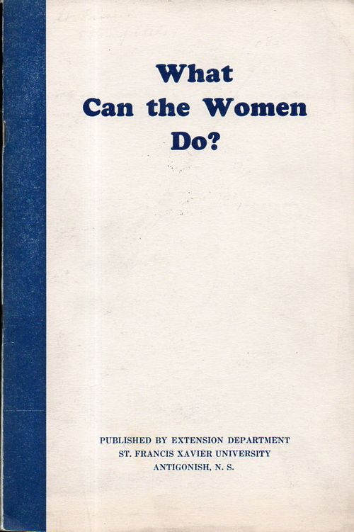
  • Unusual Book Titles Department: “What Can the Women Do?” (1940)

    JF Ptak Science Books  Quick Post

    What can th e women do159

    I think that this pamphlet could stand without comment, but, well, here it goes anyway:

    Here’s an extraordinary title from the Found-Absurd/Surreal Department:  What Can the Women Do?  was published by the Extension Department of St. Francis Xavier University in Antigonish, Nova Scotia in 1940.  It is a odd, uncomfortably-phrased work that seems completely antiquarian today–and yet the work is only 75 years old, well within the lifespans of 10% of U.S. citizens alive today.  That such a question would and should be asked within the space of the lifetime of millions of grandparents is remarkable, and brings the past bursting into the present. This question did not die here in 1940, but would continue for several decades more.

    The other point here is that this is only 20 years after women were granted the rights to vote in the U.S., and in some ways was an advancement in showing the number of different sorts of occupations open to women besides her job as housewife and mother.  


  • Not Razzle Dazzle, but a Sort of Camouflage Nonetheless: False Speed (1916)

    JF Ptak Science Books  Quick Post

    • A Note on “Hiding” in Plain Site: Razzle Dazzle Camouflage, 1917-1918   https://historyofideasblog.com/thesciencebookstore/2015/02/a-note-on-hiding-in-plain-site-razzle-dazzle-camouflage-1917-1918.html

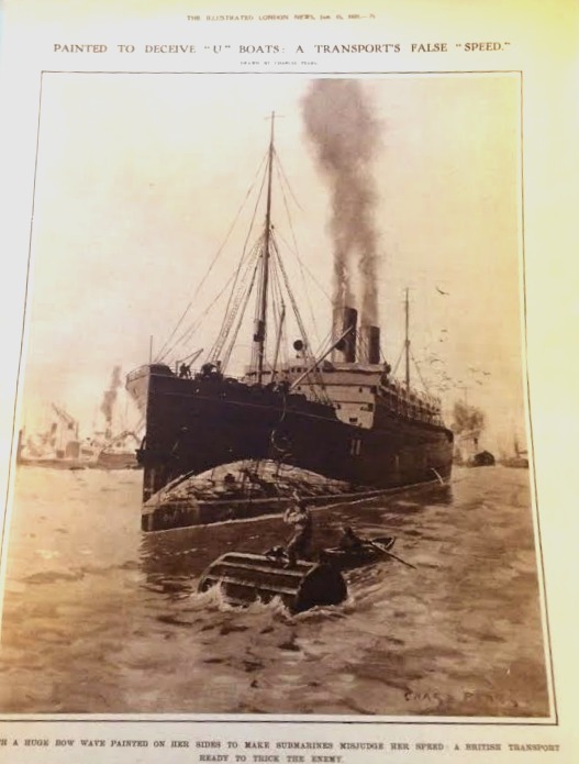
    This is just a short note on an unexpected piece of wartime development that I stumbled up leafing through the Illustrated London News for 1916.  It seems offhand that this sort of deception wouldn’t be very deceiving for very long–this painted bow wave  was intended to create the illusion of speed to a watching U-boat and thus throw off the calculations for the launch of a torpedo. I haven’t seen images like this very often at all–especially compared to other sorts of camouflage for ships–so I’m guessing that it was not a reliable way of fooling the hunting sub.  That said I have seen it more on U.S. ships leading up to WWII, but not very much…

    WWI ship camo a

    And the detail: 


  • History of Lines–the Use of Thick and Bold Lines in Information, 1862

    JF Ptak Science Books   Quick Post

    I have posted many times to this blog over the last eight years on interesting examples of the graphical display of information (mostly in the category of “Information, Quantitative Display of”) that included subjects like the comparative heights of mountains and lengths of rivers, ocean depths, divorce rates, fatalities from various diseases, literacy, the location of the population centers of the U.S., what 50,000 B-17s looked like if they were to fly at the same time, and so on.  Most of these are 19th century vintage, though there are a fair number now from before WWII, though the more recent varieties show unusual bits like the amount of food consumed by an average family over the course of a year, the history of hemlines in dresses, the changes in the vital measurements of the White Rock girl, and the like. 

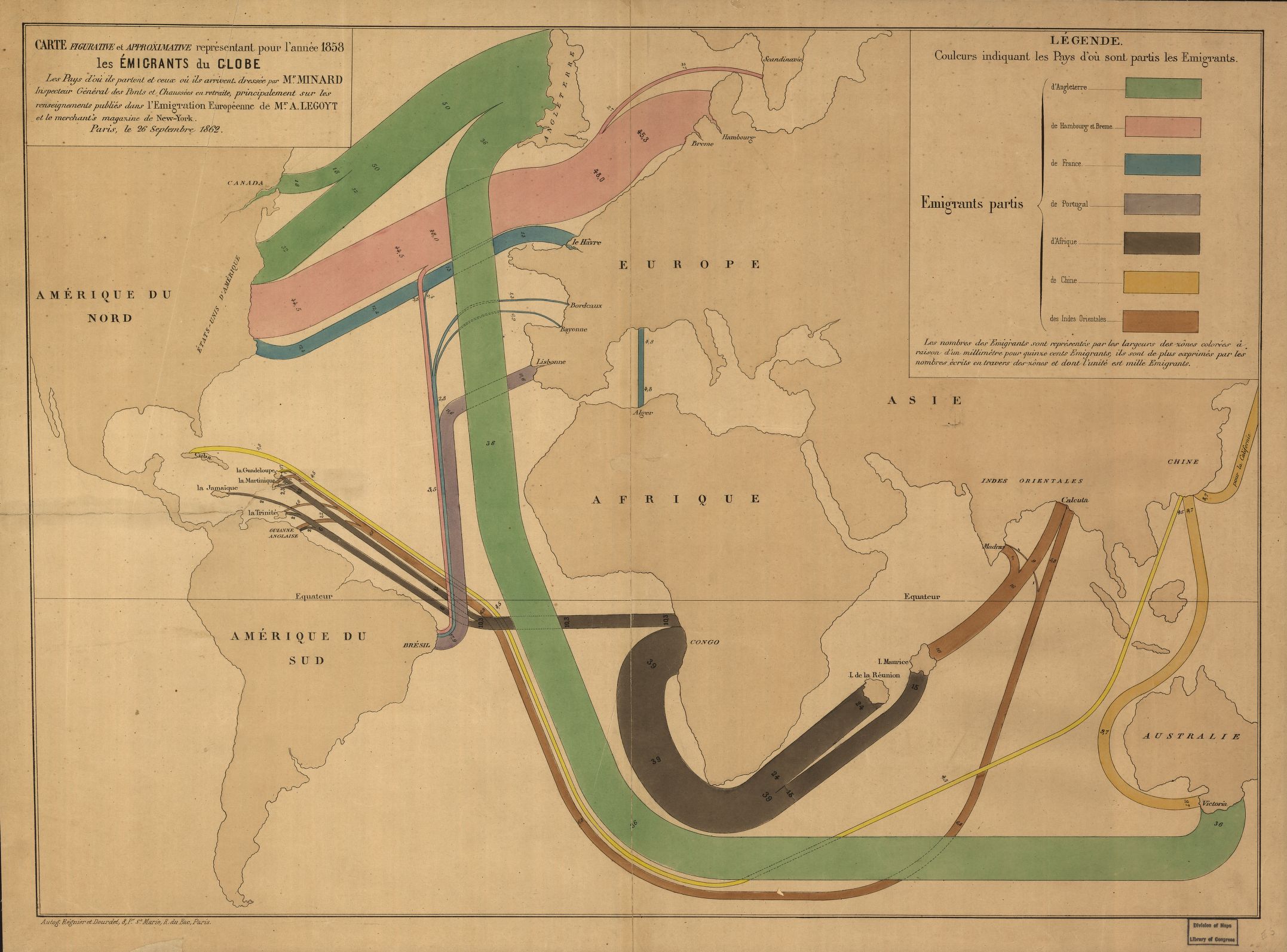
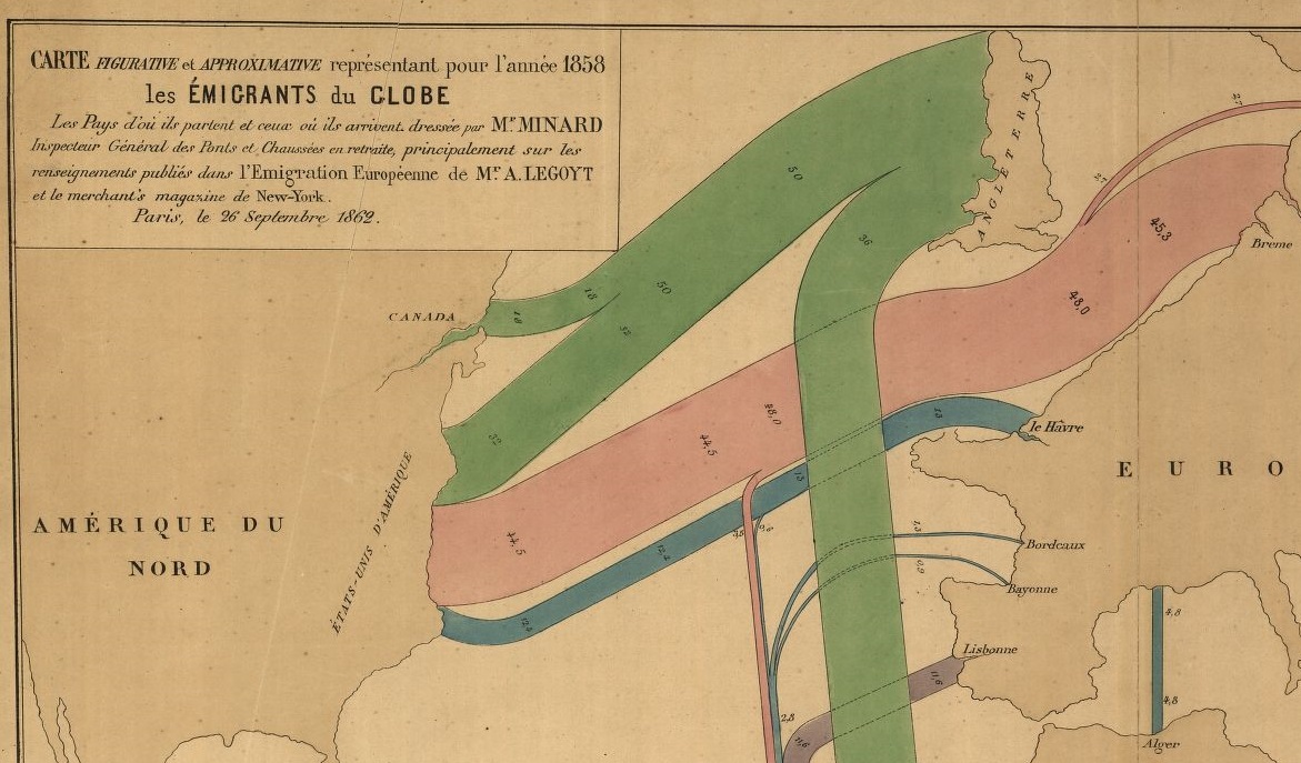
    The following map–depicting immigration origins and relative amounts and destinations–is somewhat unusual not only for the early date and manner in which the info is displayed, but also in the design–the data is not crowded out from the field of vision by anything but the broadest outlines of geography, almost all details are left off the map, which also uses two pale colors to set off the land and the sea, allowing the graphed colors to stand brilliantly apart. 

    Map immigration

    [Map source–the Library of Congress, http://tile.loc.gov/image-services/iiif/service:gmd:gmd3:g3201:g3201e:ct000242/full/pct:25/0/default.jpg]

    The map is the work of the early innovator and information-explorer Charles Minard, who is most known for his famously ubiquitous depiction of the death of Napoleon’s army in its advance upon and retreat from Moscow (see https://robots.thoughtbot.com/analyzing-minards-visualization-of-napoleons-1812-march).

    Map immigration b


  • Potentially Useless Info Dept.: Scientists Quoted in Definitions in the OED

    JF Ptak Science Books   Post 2574

    Prompted by an Oxford English Dictionary Word of the Day post by my friend Carolyn Ogburn in which a word’s origin quote citation was by H.L. Mencken I decided to look around for others by the BoB (“Bard of Balmer” and author of multi-editions of The American Language). The online version of the OED has a lot search possibilities, including the search for author/quotation (which can be expanded by a year range), and so it occurred to me to have a quick look at the quotations used for scientists. 
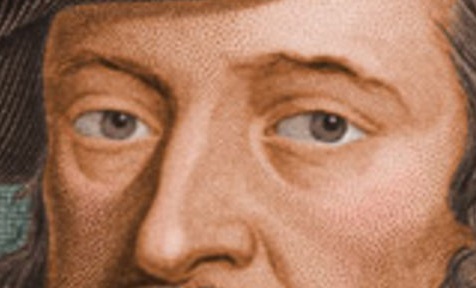
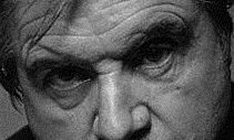
    Bacon francis right

    [The correct Francis Bacon, via wikipedia  images]

    My search was arbitrarily limited to one hour and outside of that was somewhat random though I did try to select folks who I thought might be more “quotable” or who could have contributed in significant ways to the English language in their work in general.  It turns out in the 30-odd names I selected the person who was quoted the most was…Francis Bacon (3,509 citations). Oddly though when I checked out Roger Bacon I found absolutely nothing. It seemed to me that a classical figure like Aristotle might have a lot but it turns out for probably obvious hindsight reasons that this is not the case, as the old man weighed in at 204.  Robert Boyle came in at 2670 which led me straight away to John Dalton, who came in at only 28, and then to Humphrey Davy (48), and finally to Joseph Priestly (with zero).  Then came the generally very very busy and innovative/creative genius Robert Hooke (512), and of course the next logical step from there was Isaac Newton, who would be annoyed to learn that he was beaten here by his dreaded colleague (308). William Whewell (who introduced the word “scientist” had 473 entries, while Charles Darwin registered 1,311 (while Charles Lyell came in at 1034 and Alfred Russell Wallace at zero).  The great founding partners of 19th century science came away with relatively not-many (Faraday at 349, Babbage at 155, and Clerk Maxwell at 183), all of whom were handily put away by John Tyndall (2025).  The 20th century folks are mostly shadows and mist: Bethe, Feynman, Oppenheimer, and Gell-Mann come in at 0; A.A. Michelson (straddling the century) had 2, Hubble 8, Dirac 21, Bohr 22, Hawking 24, Rutherford 26,  Penrose 30,  Gamow 37, E.O. Wilson 52, Carl Sagan 62. Musicologist Alfred Einstein had 107 entries while Albert Einstein–oddly, perhaps, though he was not a native English speaker–had 13.  

    Female scientists get very little reaction from the OED editors. Rachel Carson leads the way, but not by very much and with very little: 14. Marie Curie comes up with 3 (I. Curie has 1 and P. has 2), and then, when I check out the long list of possibilities, no one gets any: Meitner, Apgar, McClintock, Herschel, Grace Hopper, Hypatia, and so on. I even checked out Ada Lovelace who arguably does not fit here but given her popularity I thought might show up with something, but there wasn’t a mention. 

    What does this mean? I don’t know, and I’m not sure that there is any useful takeaway from this–except the obvious conclusions that you reach when you consider the absence of women in quotation citations. It is understandable that Leonardo appears in only 4 quotations (not having much of a printed output and living in another language), and I think I can understand why Francis Bacon leads the way in this sample, probably because he slipped across so many different disciplines–but everything else may be a soft blended nothing, though it is interesting, like too much whipped cream on a Sundae. 
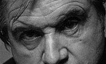
    Francis Bacon wrong

    [The incorrect Francis Bacon, via wikipedia images]

  • Hitting Charles Babbage with the Art Stick–Poemitization Derived from the OED

    JF Ptak Science Books  Quick Post

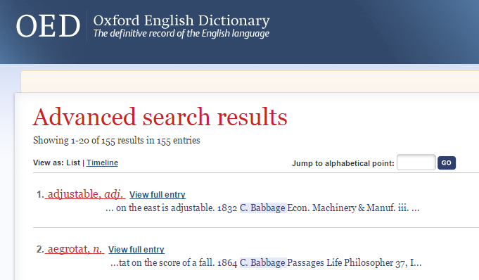
    • Make your own poem with the first few words of the first twenty entries of definition quotations of Charles Babbage used in the Oxford English Dictionary. Actually, any name will do…

    I just happened to choose Uncle Chuckles while I was taking a peek to see which scientist was used most often by the OED in definition quotation–and also because he may be the least likely of the famous scientists to be associated with poetry. (I’ve written a number of posts here on “found poetry”–enter this phrase in the Google search box at right for results.)

    So here it is, the bones of poetry–I think that there may be a “something” in this nothing, though our 12 -year-old instantly identified this as “meaningless–they’re just pieces of phrases”, which of course is correct. Except sometimes you find the art where the art ain’t; and sometimes, you don’t, simply because it if ain’t art it just ain’t no matter how hard you hit something with the art stick.

    OED Babbage

    • On the east is adjustable
    • on the score of a fall
    • (the next morning at seven)
    • applied sense or meaning
    • the heat of an Argand lamp
    • med’cine makes, and gives.
    • And set me on the proofe
    • nine pair of bed-screws.
    • each’d on the happy Plains
    • bobbin-netted to imitate brussels lace
    • bittes and a brace
    • Brilliant requires
    • work. buhl-work
    • bull’s-eyeing a sheet of blown glass
    • tispasmodic, and sudorific
    • calendaring is scorned and abhorred
    • wheels of eccentric form
    • aft, drawn round by Horses
    • water through an opening
    • and retired grumbling

    ·Posted by :

    ·in:


  • A Very Good Address–19 York Street, Westminster

    JF Ptak Science Books  Quick Post

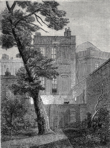
    I was doing a little reading on Mr. Milton’s version of “Chaos” in Paradise Lost, the great something-in-the-non-nothingness and source of creation, and bumped into this interesting factoid on one of his residences.  John Milton lived in a house in Westminster, in the 1650’s, a house that would later become #19 York Street. Later on this same address property would be occupied by Jeremy Bentham, James Mill, John Stuart Mill, and William Hazlitt.  And for some reason the property was demolished in 1877, taking away its memories and legacies. No disrespect to the 19 York Streets elsewhere (for example in Sulon Maine; Florence S.C., Gettysburg P.A., Watheroo, W.A., Oatlands N.S.W.) but I rather think that it would have been nice for this #19 to have survived. 

    The view of the house from the rear, plus cat:

    York Street Milton

    Image via Wikipedia Commons. 


    ·Posted by :

    ·in:


  • Japan Attacks L.A. (and the Rest of Us) in 1937

    JF Ptak Science Books  Post 2573

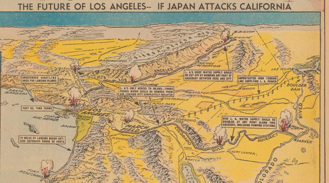
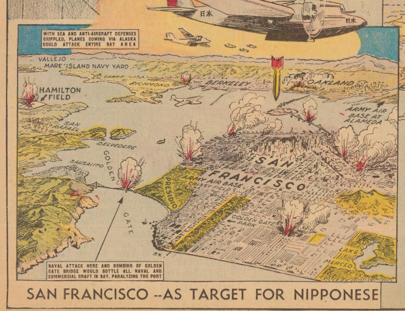
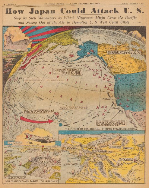
    Earlier in this blog I posted about an article that appeared in Life magazine on the various invasion/attack routes on the United States in 1941. (I believe this was the most visited of all 4000+ posts over eight years, with something on the order of 200k visits.) It came to mind while I was working my way through the P.J. Mode Persuasive Map Collection (digitized) at Cornell University and found this glorious appraisal of the possibilities of a Japanese attack on Los Angeles and the western U.S. It screamingly appeared in the Los Angeles Examiner on November 7, 1937  (p. V-8), and no doubt was meant to incite some sort of thinking in the paper’s reading population. (I don’t think it a coincidence that California is shown in yellow in the details when under attack and blue before being attacked.) Remember that the Japanese had already been mucking around in China for several years and the (Second) Sino-Japanese War was already full-on for a year by this point, so giving the possibility of Japanese imperial designs on the U.S. in 1938 is not necessarily so far out of reach.  (On the other hand many of the high command in Japan thought it a miserable and in some cases an insane idea to finally attack the U.S. in 1941, so there’s that–plus there’s the larger and more substantial issue of the incredible amount of ships and planes and support and energy that goes into manufacturing an invasion of this scope that would just be out-of-hand for Japan.) All that said, it is an interesting to see this play out in the pages of the Examiner.

    • Mapping the Invasion of America, 1942  https://historyofideasblog.com/thesciencebookstore/2009/12/mapping-the-invasion-of-america-1942.html
    • Invasion Routes to the U.S. 1940  https://historyofideasblog.com/thesciencebookstore/2011/06/invasion-of-the-us-1940.html
    • The Invasion of America, 19?? (1935) https://historyofideasblog.com/thesciencebookstore/2010/01/the-invasion-of-america-19-1935-scenario-for-invasions-via-canada-mexico-and-the-caribbean.html

    Maps Japan attacks LA detail a[Source: PJ Mode Persuasive Maps Collection, at Cornell: https://digital.library.cornell.edu/catalog/ss:3293952]

    And the vision for San Francisco:

    Maps Japan attacks San Fran
    [Source: PJ Mode Persuasive Maps Collection, at Cornell: https://digital.library.cornell.edu/catalog/ss:3293952]

    And the full page, showing the importance of the Aleutians to the general plan:

    Japan attack US[Source: PJ Mode Persuasive Maps Collection, at Cornell: https://digital.library.cornell.edu/catalog/ss:3293952]


  • Propaganda Maps Showing Threats to Hitler’s Germany, 1930’s

    JF Ptak Science Books   Post 2572

    Maps air raid 1936 detail

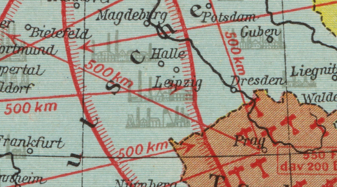
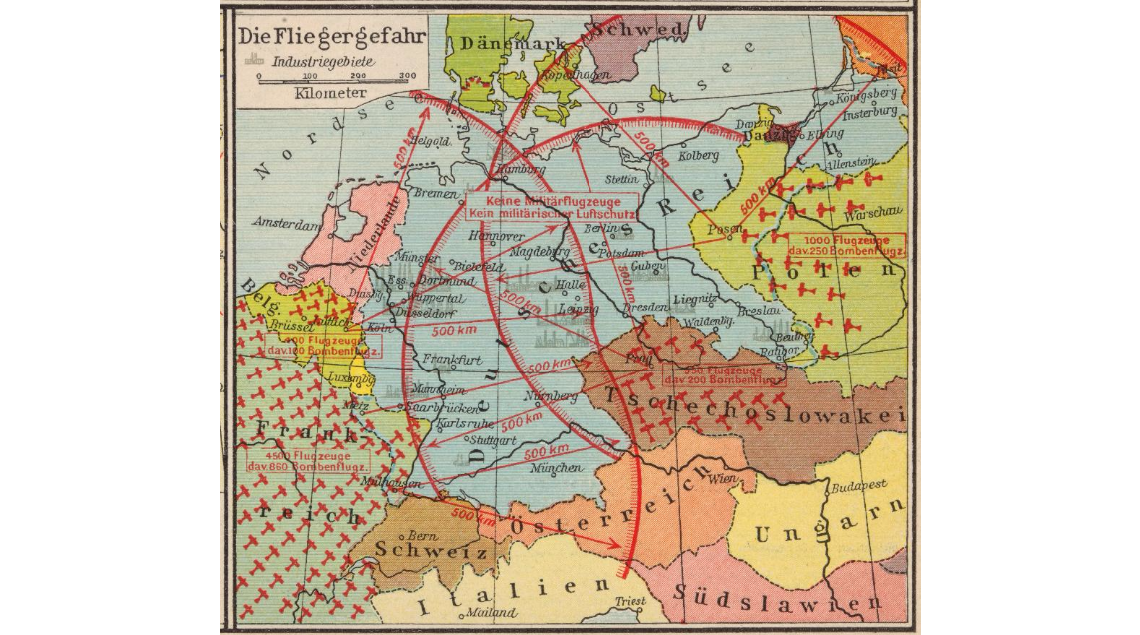
    I’ve found another example of map/propaganda display of the-threat-against-Germany in the between-the-wars period, this one published in  a very popular historical atlas by F.W. Putzger (Putzgers historischer Schul-atlas). The find comes in the fabulous “Persuasive Maps” collection of P.J. Mode (and housed and presented now at Cornell University, the source for the detail above and the originating image below) and supplements some earlier posts I’ve made to this blog on perceived and imaginary air and ground threats to Hitler’s Germany. These images no doubt gave pause to their viewers, driving home at least the need for building up “defensive” military responses to the threats posed to Germany.  In the top image the possible invaders of Germany are shown only in terms of airpower, depicting the range of the bombers and their country of origin, as well as the major cities that could be affected by such sorties.  No doubt the intent was to riddle Germany with as many red lines as possible, creating a morass of invasion and destruction possibilities, so much so that you have to look with a little discernment to see the city names under the limit lines.  It is a strong message, especially considering that in this case at least the audience was upper-level school children, and given that it appeared in an historical atlas the image was given that much more credibility and further entrenched a duck-and-cover mentality in its young viewers.  


    Maps air raid 1936

    [Image source: P.J. Mode Colelction at Cornell University, https://digital.library.cornell.edu/?page=18&q=persuasive&search_field=all_fields&utf8=%E2%9C%93&view=gallery]

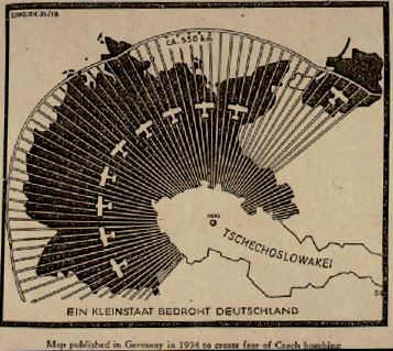
    As I said this map is a good supplement to other similar efforts that have appeared in this blog. For example, in continuing the heavy-lines-obliterating-Germany design is this earlier (1933) map showing the range of the air force of Czechoslovakia:

    [See https://historyofideasblog.com/thesciencebookstore/2010/10/nazi-propaganda-germany-surrounded-1933.html]

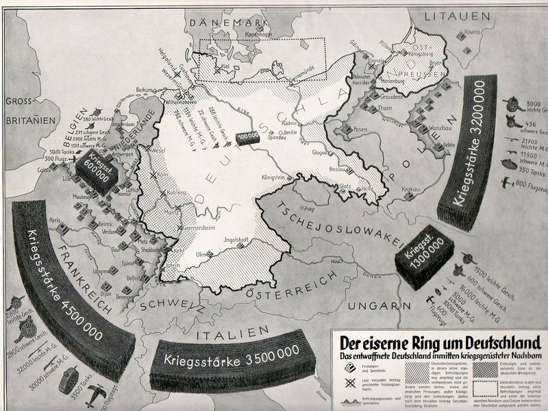
    And this fantastic effort (“The Iron Ring Around Germany”) showing the general possibilities of general attack against Germany:

    Nazi Prop surrounded538

    [See https://historyofideasblog.com/thesciencebookstore/2010/10/nazi-propaganda-germany-surrounded-1933.html]

    Nothing quite rallies people to your side as the unifying response to a perceived national threat


  • Maps of Torment: the U-Boat Menace, 1917/1918

    JF Ptak Science Books  

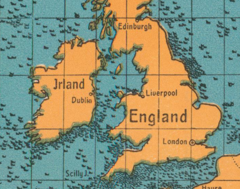
    This is a pretty stark reminder of just what was going on in the waters around Great Britain in 1917–it is a postcard propaganda map showing the gross tonnage of ships sunk by U-Boats for 1917:

    Maps U-boat WWI sinking

     [Image source: P.J. Mode’s wonderful collection of what he refers to as “Persuasive Maps”, now housed at Cornell University.]


  • An Unusual Chronological-Timeline-World Map (1887)

    JF Ptak Science Books   Quick Post

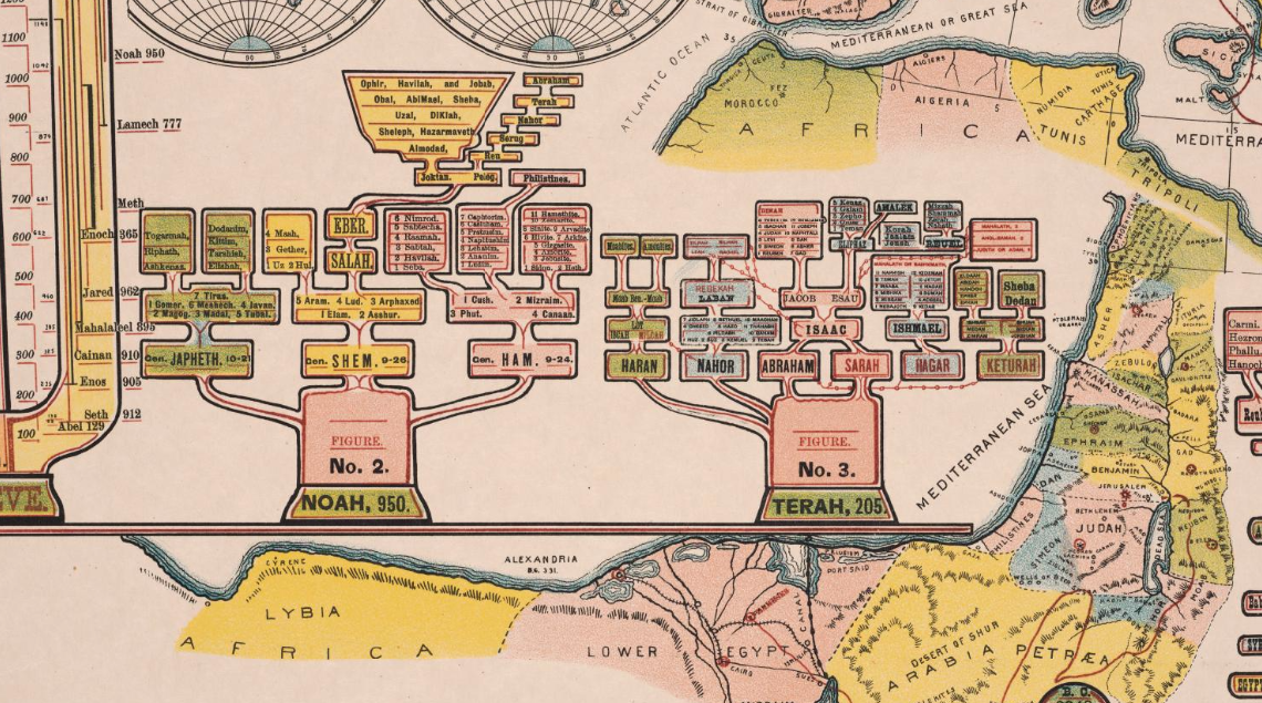
    The details of this chronological chart/map caught my eye–the genealogy trees look to me very out-of-place or -time, speaking in terms of design, and seem to have a definite mid-20th century feel to them:

    Maps dataviz chronology

    They are found in the left section of Jakob Skeen’ s 1887 Genealogical Chronological And Geographical Chart. Embracing Biblical And Profane History Of Ancient Times From Adam To Christ, which is part of my friend P.J. Mode’s wonderful collection of what he refers to as “Persuasive Maps”, now housed at Cornell University. I don’t often see chronologies of this detail with embedded maps, which is another odd bit about this display of information; overall, it is unusual to my experience: