A Daily History of Holes, Dots, Lines, Science, History, Math, Physics, Art, the Unintentional Absurd, Architecture, Maps, Data Visualization, Blank and Missing Things, and so on. |1.6 million words, 7500 images, 4.9 million hits| Press & appearances in The Times, Le Figaro, Mensa, The Economist, The Guardian, Discovery News, Slate, Le Monde, Sci American Blogs, Le Pont, and many other places… 5000+ total posts since 2008.

Author: JF Ptak

  • The Sum of All Dreams–(The Caloric Capacity of Every Dream That Has Ever Been Dreamt)

    JF Ptak Science Books  Quick Post   An entry in the series A History of Blank, Empty, and Missing Things

      Sleeping for perfection

    [From Rex Knight’s odd aether-waves work, Wake Up and Sleep!, 1938]

    The good estimate of the number of people who have lived on the Earth is about 100 billion. 

    I wonder about the resting results in their lives, of their sleeping adventures, of their dreams.

    If the average age of all people who have ever lived is, say, 30 years, that makes 3 trillion years of living, or about 1 quadrillion hours.  

    Let’s say that everybody got six hours of sleep for about 165 trillion hours; and let’s say that people dream, say, five times per not, that makes, again, about a quadrillion dreams.

    If we in general burn 50 calories a dream, that translates to about 50 quadrillion calories holding up the dreams of mankind. 

    I wonder where all those dreams have gone?  


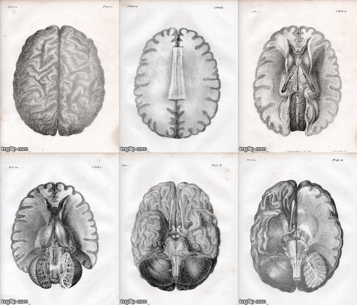
  • Paper Dissection of the Brain, 1844–Now with a GIF

    JF Ptak Science Books   Quick Post (Revisiting an earlier post with an added GIF)


    Brain521

     
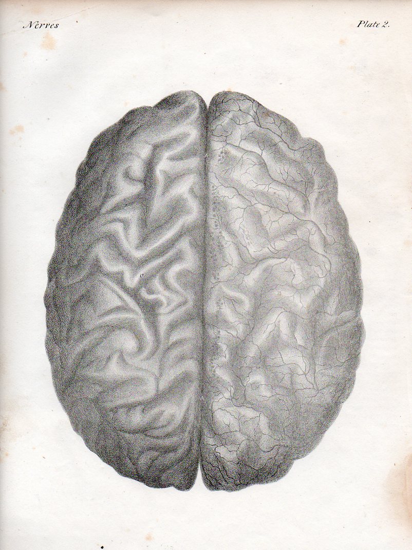
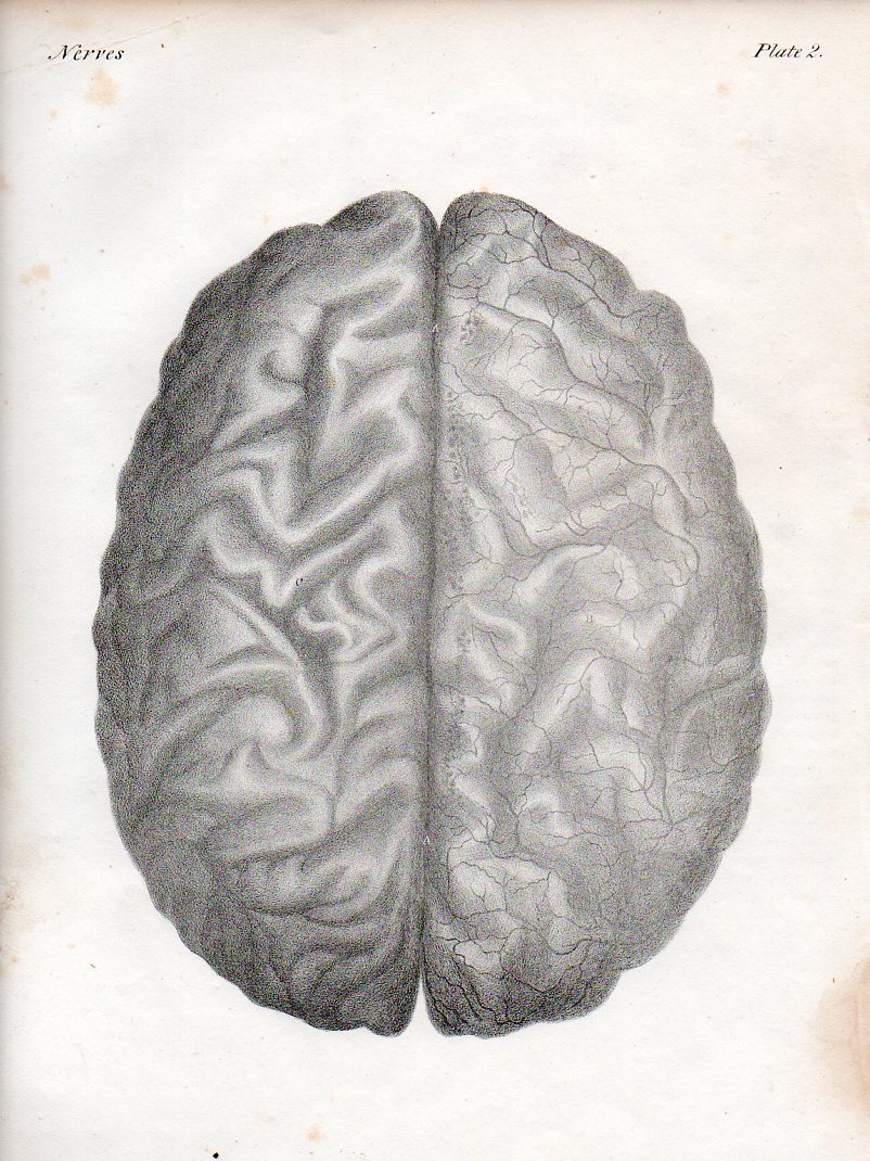
    These images are brought to us by the Irish-born Quain brothers:  Jones Quain (1796-1865),  an anatomist and professor of Anatomy and Physiology at the University of London; and Richard Quain (1800-1887), professor of anatomy in 1832 at the University of London, then surgeon at North London Hospital, and president of the Royal College of Surgeons. The illustrations are from a later (ca. 1850’s) and smaller printing of their beautiful 1844 work The Anatomy of the Arteries of the Human Body, with its Applications to Pathology and Operative Surgery, in Lithographic Drawings with Practical Commentaries.
     
     
    Brain521
     

    ·Posted by :

    ·in:


  • The Square in Tintin, Mondrian, & Malevich (1916-1930)

    JF Ptak Science Books  Post 2584

    Tintin square015

    There are no doubt squares in the general outline of the comic book panels of Tintin–what I had in mind was a very special square that occurs in Tintin’s adventures in the Soviet Union. This was the first adventure of Tintin, and appeared in a serialized form in 1929-1930.  We are introduced to the young and intrepid journalist/adventurer here in glorious black and white (this would be the only one of the Tintin adventures that was never rendered in color at one time or another), being sent off to the newish (since 1922) Soviet Union.  At the time it was Stalin’s USSR, and things were not–shall we say–going well for the people of the Soviet Union.  Tintin’s creator, Georges Remi (“Herge”) was working an anti-Marxist angle for his conservative publisher, and he had no difficulty in supplying story lines to fulfill that need–some of these were exaggerated overall, and some were exaggerated but proved correct over time.  The adventures there were difficult, occasionally brutal, and overall not brutal enough. 

    Herge depicted an unpleasant Soviet Union, working out from the “stinking slum” of Moscow out to the farms that were being destroyed in the countryside.  He insinuated threats of violence in voting, death by firing squads, the starving of the peasants, and much else.  The deal is that by the time the strip reached its conclusion in 1930 Stalin was already underway in his loudly quiet way in instituting the Great Famine/Holodomor in the Ukraine, and by the end of this created famine–a reverse nuclear weapon of food withdrawal–something on the order of 7 million people would be starved to death by 1934. Then of course came the Great Terror of 1936-8, and the rest of it.  Herge may have exaggerated some stuff in 1929/30, but few people could have imagined (even when it was happening) the scale of Stalin’s great evil.  

    That said, I wanted really to just talk about one square in the Tintin adventure.  This is where Herge goes black (Soprano’s style)–he leaves an entire panel black to depict violence. Entirely black.  I’m not a comic book/graphic novel guy, but I’ve seen my fair share of them (most <1970) and I have to say that seeing the black panel was extremely surprising.  In my experience, it just didn’t happen.

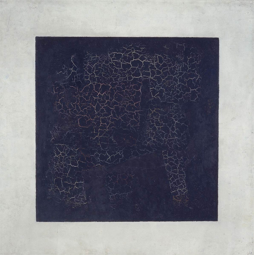
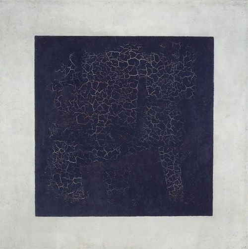
    And what that did was call to mind other squares–notably of course Kasimir Malevich’s (1878-1935) great construction, the Black Square (beginning in 1915):
    Black square

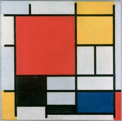
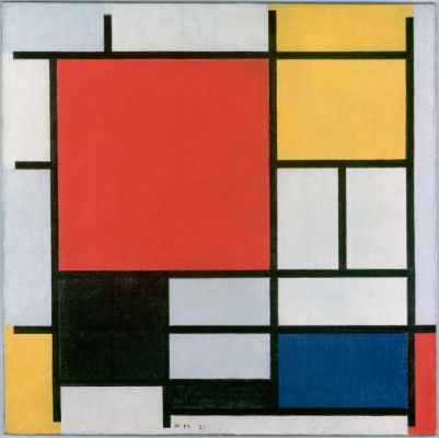
    Then of course there’s the Cubists…but what comes next to mind re the square (and the black one at that) are the later works by Piet Mondrian. Mondrian had gone through a tremendous period of change int he decades from 1905-1935, though it seems to me that even as early as 1909 squares began to appear in the skies (and other places) in his pre-Cubist representational paintings ( as in Sea Toward Sunset, 1909, and Church in Zeeland, 1909/1910), the geometry taking hold for good by 1916.  A good example is Composition with Large Red Plane, Yellow, Black, Grey and Blue, 1921:
    Mondrian black square

    [Image source: http://www.abstractcritical.com/article/malevich-and-mondrian/index.html  This illustrates an interesting article, “Malevich and Mondrian” by David Evison.]

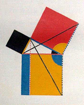
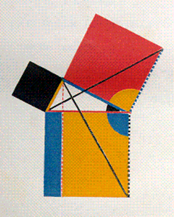
    And so we could wind our way through the history of black squares, but we’ll stop there. Oh, one more: the great squares of Oliver Byrne who in his gorgeous 1847 work replaced numbers with colors in presenting the first six books of Euclid:
    Byrne square

    [Source: https://historyofideasblog.com/thesciencebookstore/2008/05/jf-ptak-scien-1.html  I wrote a little about this in the first few months of this blog back in 2008 in “Dismantling Reality–Euclid, Mondrian, Malevich, Lobachevsky and the Appearance and Disappearance of Form Through Geometry”, which I admit is a big title for a thousand-word blog, but so it goes.]



  • On Taking Someone to Task for Not Acknowledging Having Used Someone Else’s Work (1875)

    JF Ptak Science Books  Quick Post

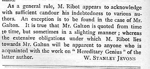
    The brilliant and versatile W. Stanley Jevons–logician, economist, computer pioneer–was a very busy man who packed a lot into his 46 years. Some of published output included numerous journal articles, and some of those contributions included book reviews, including this one, on Theo. Ribot’s Heredity, a Psychological Study of it Phenomena, Laws, Causes, and Consequences, which was published in 1875, with the review appearing in the April 29, 1875 issue of Nature. This one popped into view not so much for its broad consideration, but for the zinger at the end, prodding Ribot for not having included an acknowledgment to Sir Francis Galton, whose work he quotes from and relies upon in his book–it is a fairly soft rebuke but not without its spikes:

    Jevons ribot014

    ·Posted by :

    ·in:


  • The Canadian “College of Arms and Legs” for the Maimed Soldier (1917)

    JF Ptak Science Books  Quick Post

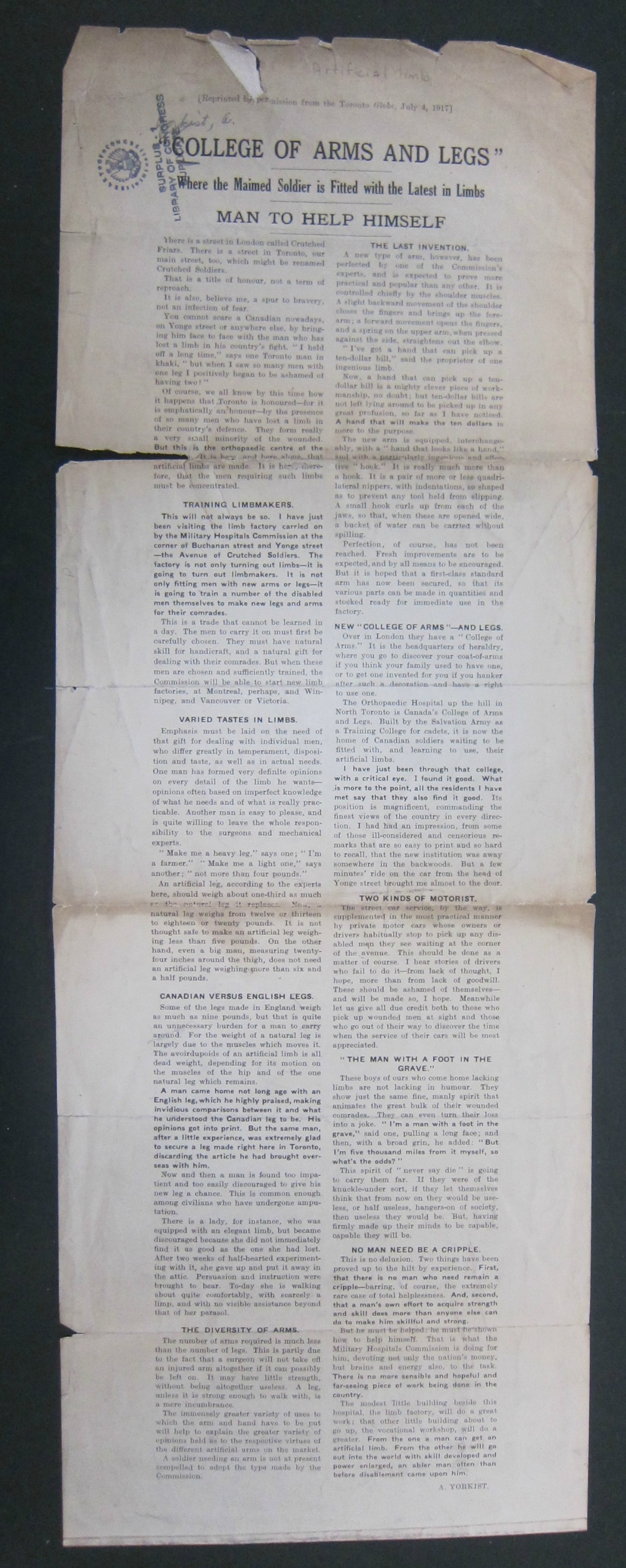
    I’m reprinting this rare broadside in the interest of the medical history of WWI.  It seems not to be anywhere (I can only find one copy in WorldCat, at the Countway Library at Harvard University) and I’m not finding any references to it, offhand.  It is interesting and appealing, a no-nonsense approach to provoking necessary attention to creating and securing artificial limbs for wounded Canadian solders.

    Canada of course joined the war effort against Germany on the same day as Great Britain, about two and a half years before the U.S. declared war. In all more than 61,000 Canadian soldiers were killed during the war, as well as 172,000 wounded–the U.S. in contrast lost 126,000 killed and 204,000 wounded.  Similar numbers, in a way, except that the U.S. had more than ten times the population, 92 million versus 7.2 mullion in Canada.  The 172k wounded coming home in Canada would’ve been like 2.3 million returning to the U.S. (a number larger than the 2.09 million returning wounded in all of the British Empire). All that said: 230,000 killed and wounded in a population of 7/2 million is considerable. 

    This broadside discusses the Military Hospital Commission and the Orthopedic Hospital, and how its address (Yonge Street) could be renamed “Crutched Soldiers”, and that “was a title of honor, not reproach” and a “spur to bravery”. There is a discussion of Canadian legs versus English legs, leg weights, and such. Of high interest for me, though was the discussion of “two kinds of motorist”–one who always stops and gives a ride to a wounded soldier in the vicinity of the hospital, and the other, who doesn’t. The writer of the broadside clearly has no use for the later.

    The report, in full (it is more legible expanded):

    College Arms and Legs c full


    ·Posted by :

    ·in:

    —

  • A Sinister-Looking-Yet-Positively-Intended Pamphlet Cover

    JF Ptak Science Books  Quick Post

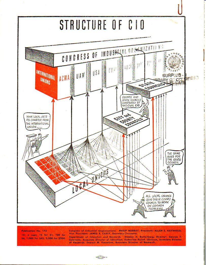
    This design has all the trappings of a modern right-wingish hatchet job screed publication denouncing and de-deifying the CIO (the other part of the AFL-CIO). As it turns out this gritty, demanding, and offsetting design is the cover for a pro-CIO publication, published by the organization itself.  The shattered sky raining coal tar and blood is falling on what sorta looks like a collection of imitation  Soviet-y working folks.  To me the art indicts the CIO for something, and that “something” is not good.  But inside it is all wine and roses and fighting the good fight for teh working class. It is just a very odd job, badly done.  

    Covers CIO009

    And the back cover:

    Covers CIO010


  • The Floating Cemetery of Piet Mondrian

    JF Ptak Science Books   Quick Post

    Mondrian graveyard

    [Source: illustration from Piet Mondrian, Life and Work, edited by Cees W. de Jong, Abrams, 2015.]

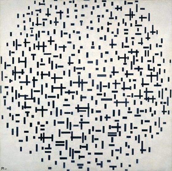
    I just wanted to open up this idea–I mean, I’m not an art historian, and the title doesn’t intend to insert this speculation in Mondrian’s mind as he painted this, but his Composition in Line  (1916, oil on canvas, 42×42″)  does to me look like a military graveyard.  After he got stuck in the Netherlands following the beginning of WWI he entered into a very creative and morphing phase of his creative artistic life.  His very recognizable primary color geometries of art start to appear in his notebooks in 1909, and geometric forms begin to appear in the skies and backgrounds of his representational landscapes and portraits (outside his Cubist mode) beginning at least in 1908, so to say that the war influenced very much in his creative spirit directly is probably wrong–but it doesn’t stop me from seeing The End of the Battle in these works.  

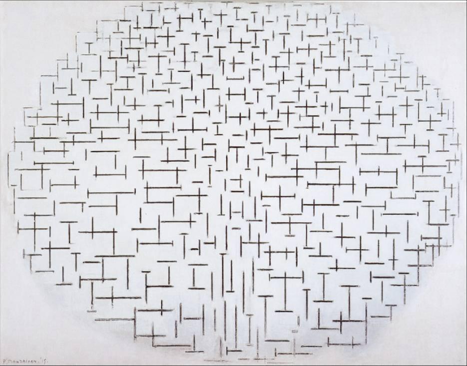
    Keeping to this theme, his Composition 10 in Black and White (1915, oil on canvas, 32×42″) looks a little like a trench map:

    Mondrian trenches

    [Source: illustration from Piet Mondrian, Life and Work, edited by Cees W. de Jong, Abrams, 2015.]

    Again, there’s no evidence to support these work as having anything to do with the war–they just suggest themselves to me, especially given the date.


  • In the Comics: NYC Destroyed in “Atomic War”, 1952/3

    JF Ptak Science Books  Post 2580

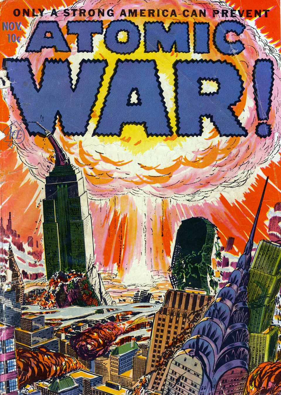
    I have been collecting images of destroyed Manhattan since this blog was started, and at this point there must be two dozen pre-1965 images. Mostly they are located in the Atomic/Nuclear Weapons series, as well as A History of Blank, Empty, and Missing Things, and lastly in the History of Holes series, all of which are browsable in the right-hand “categories” column.

    Today I’ll add two very strong Cold War images that leave no bit of interpretation to chance.  The first is a cover story for a four-issue short-lived comic called Atomic War, which was published in 1952 to 1953.  There is an enormous amount of red-baiting–no surprise given the period–and we find the Soviets initiating several varieties of preemptive strikes, including one in West Berlin in 1945 (the Soviets didn’t get the bomb until 1949). In any event it is a very strong push to patriotism and Red-hatred aimed of course at kids. No doubt an 11-year-old seeing this cover at Christmas time 1952 would remember it.  

    Atomic war nyc

    [Source: http://falloutshelternyc.blogspot.com/2011_02_01_archive.html. Another image source with some history:  Wiki  http://en.wikisource.org/wiki/Atomic_War!]

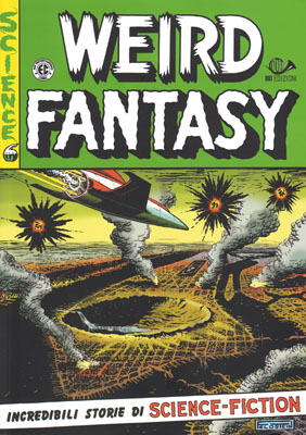
    The second piece is another example of indelible impression possibilities. a very disturbing cover showing the effects of a nuclear attack on Manhattan, which turns pretty much all of midtown into a hole–a hole that was starting to fill up with the Hudson River:

    Atomic weirdness NYC nuked[Cover by Al Feldstein, January 1952. Source: http://atomik67.altervista.org/COMICS-EDITORI/EDIZIONI_001/WEIRD_FANTASY-DOCUMENTI/Fantasy_Crono.htm]

    ·Posted by :

    ·in:


  • Unusual Book Titles Department: “What Can the Women Do?” (1940)

    JF Ptak Science Books  Quick Post

    What can th e women do159

    I think that this pamphlet could stand without comment, but, well, here it goes anyway:

    Here’s an extraordinary title from the Found-Absurd/Surreal Department:  What Can the Women Do?  was published by the Extension Department of St. Francis Xavier University in Antigonish, Nova Scotia in 1940.  It is a odd, uncomfortably-phrased work that seems completely antiquarian today–and yet the work is only 75 years old, well within the lifespans of 10% of U.S. citizens alive today.  That such a question would and should be asked within the space of the lifetime of millions of grandparents is remarkable, and brings the past bursting into the present. This question did not die here in 1940, but would continue for several decades more.

    The other point here is that this is only 20 years after women were granted the rights to vote in the U.S., and in some ways was an advancement in showing the number of different sorts of occupations open to women besides her job as housewife and mother.  


  • Not Razzle Dazzle, but a Sort of Camouflage Nonetheless: False Speed (1916)

    JF Ptak Science Books  Quick Post

    • A Note on “Hiding” in Plain Site: Razzle Dazzle Camouflage, 1917-1918   https://historyofideasblog.com/thesciencebookstore/2015/02/a-note-on-hiding-in-plain-site-razzle-dazzle-camouflage-1917-1918.html

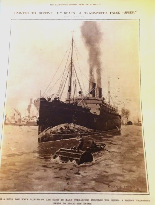
    This is just a short note on an unexpected piece of wartime development that I stumbled up leafing through the Illustrated London News for 1916.  It seems offhand that this sort of deception wouldn’t be very deceiving for very long–this painted bow wave  was intended to create the illusion of speed to a watching U-boat and thus throw off the calculations for the launch of a torpedo. I haven’t seen images like this very often at all–especially compared to other sorts of camouflage for ships–so I’m guessing that it was not a reliable way of fooling the hunting sub.  That said I have seen it more on U.S. ships leading up to WWII, but not very much…

    WWI ship camo a

    And the detail: