A Daily History of Holes, Dots, Lines, Science, History, Math, Physics, Art, the Unintentional Absurd, Architecture, Maps, Data Visualization, Blank and Missing Things, and so on. |1.6 million words, 7500 images, 4.9 million hits| Press & appearances in The Times, Le Figaro, Mensa, The Economist, The Guardian, Discovery News, Slate, Le Monde, Sci American Blogs, Le Pont, and many other places… 5000+ total posts since 2008.

Category: Statistics–Fossil, Found, Odd, Forgotten

  • One Inch=$370 Million: Unusual Displays of Quantitative Data and the Height of American Public Debt

    JF Ptak Science Books  Post 1721

    0 ebay 13 graphs268

    [Click image to enlarge]

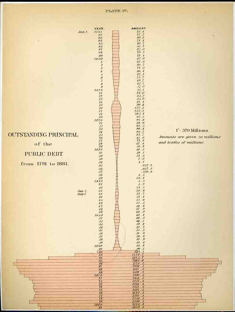
     It isn’t often that you see money represented by dry measure, but that’s what happened here in these two examples from the fantastic Walker Statistical Atlas ( Statistical Atlas of the United States based on the results of the tenth census 1880 with contributions from many eminent men of science and several departments of the government Comp. under the authority of Congress by Francis A. Walker, M. A., superintendent of the tenth census … and published in 1884).  What we see here is a history of American federal indebtedness from 1791 (when the public debt stood at 75.1 million dollars) to 1881 (about 2 billion).  Using the CPI (consumer price index) as a factor to translate that number in 2008 dollars (or so), the 2 bil grows to about $40 billion (a nickel then is about a dollar now). The interesting part of the legend–and what drew me to this graphic even before its somewhat unique shape–state “1”–370 millions”, that is one inch of pink horizontal bar stands for about $370,000,000, and the last bar on this graph is about 6 inches long, which, adjusted for inflation, would now be about 10 feet long. .That said, the really interesting part comes next–if we use this measure to graph a horizontal bar for the American debt as it stands in 2008, it would pink a pink bar that was about a HALF MILE long to express our 10(+) trillion dollars of debt.  OR, somehow, the old debt of 1881 would be about 1 story of a house, while the 2008 version would be up one side of the Empire State Building and down the other (and yes that includes the aerials).  I don’t know how to put this comparison in context, the differences are so staggering. 

    0 ebay 13 graphs269
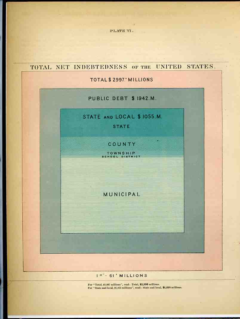
    After having popped a neuron or two trying to get my head around that one, we’ll further confuse the situation with the second chart, which shows the total net indebtedness of the U.S. in 1881 in terms of square inches; or, at the bottom of it all, a 7×7 inch square represented the entirety of the $3 billion owed out.  49 square inches. Working backwards this time, our $10 trillion (or $10,000,000,000,000.00 writ large) adjusted back to a CPI value in 1881 would have covered about 88 PAGES of the atlas or 9,000 square inches.  Again, the numbers are just almost too big to mean anything. 

    We, as a country, owe one hell of a lot of money.

    And yes there are many different ways of trying to figure out what one 1881 dollar “means” in terms of 2008 dollars, but the CPI is the most simple to use and least argumentative and at least gives a pretty good idea of scale.  It would be more useful to try and establish the degree of difficulty  of turning the corner on the debt in 1881 compared to doing that today, but this is just a late-night post at the end of the week, and I don’t have a good clue about how to try and measure that bit simply.


  • The Hidden Death Hammer: Display of Quantitative Data for the Battle of Jutland, 1915.

    JF Ptak Science Books LLC  Post 986

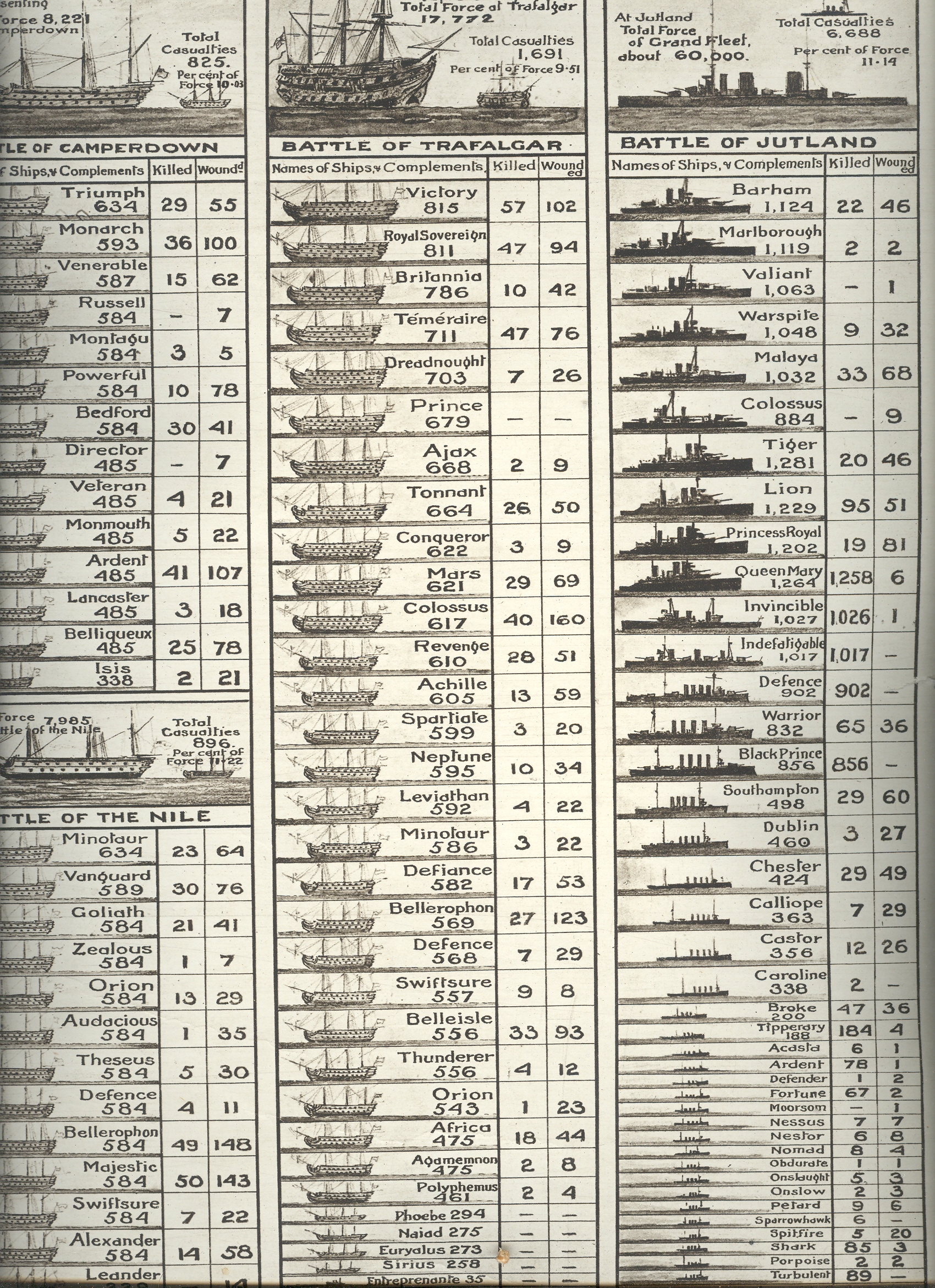
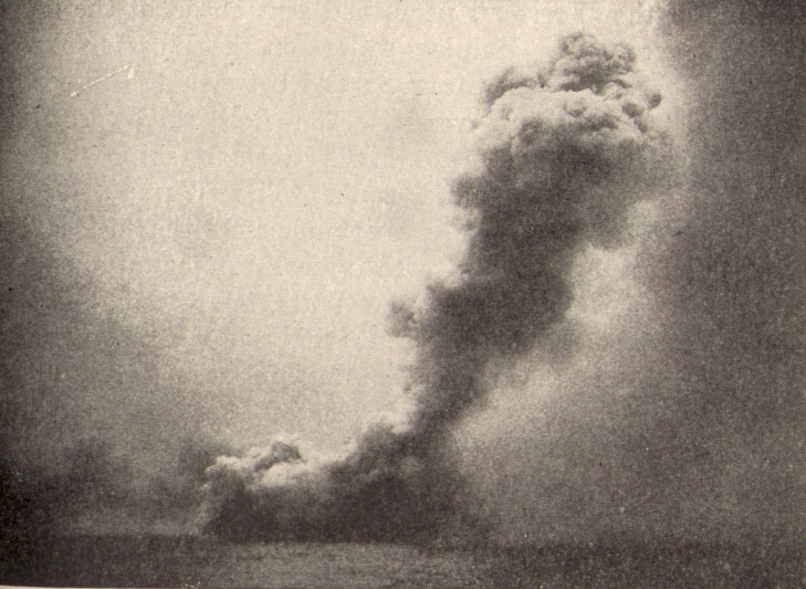
    A year and two weeks after the end of WWI, the Illustrated London News  published this compelling graphical display comparing
    the British naval losses at Jutland to three other great sea battles (Camperdown, the Nile and  Trafalgar). 
    The battle near Jutland (Denmark)
    was the largest naval engagement of WWI, involving the German Navy’s High Seas
    Fleet and the Royal Navy Grand Fleet, and took place May 31-June 1, 1915 (“The
    Day”).  It was an absolutely enormous
    engagement, with 250 vessels involved (151 for the Royal Navy, 99 for the
    German).1

    Mar 24 jutland

    The end result of the battle was mixed and still debated
    today; neither side could convincingly claim a conclusive victory from the
    affair.

    The Royal Navy losses at Jutland
    were staggering: 6,094 killed and 570 wounded, with German losses at 2,551
    killed and 507 wounded. 

    And while this graphical display places Jutland in a weak
    context with these other battles, and as pleasing as the thing is visually, the
    larger mark, the great lurking statistical and human beast lurking there in the
    mix of silhouettes and data, occurs about halfway down the far right column.

    Mar 24 jutland det

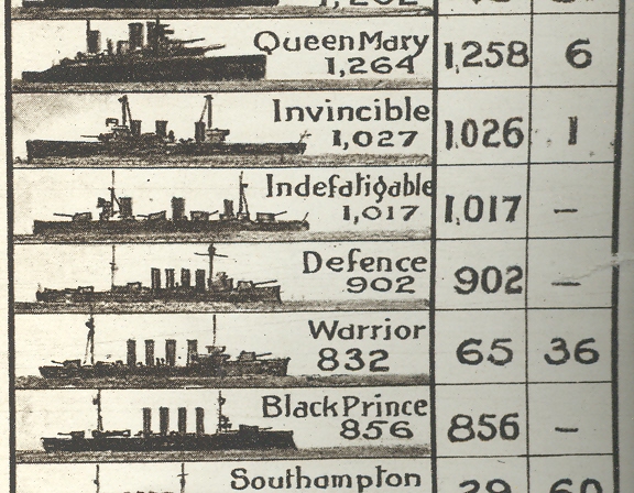
    Here we see the losses for five ships: the Queen Mary, the Invincible, the
    Indefatigable,
    the Defence, and
    the Black Prince.  Together, some 5066 men served aboard these
    vessels; at the end June 1, 1915, 5,059 of them would be dead.  Everyone aboard the Indefatigable, Defence
    and Black Prince would be killed; 1
    would survive on the Invincible, and
    6 would survive the killing of the Queen
    Mary
    . Astonishing, really.  And there
    are no other numbers like this on this chart.

    As certain and as clear as this representation seems, and as
    straightforward and seemingly elementary as it looks, I was shocked to see the
    numbers for those five Royal Navy ships, a “hidden” history within a broad
    comparative analysis. 

    Notes:

    1. England: 28 battleships,
    9 battlecruisers,
    8 armoured cruisers, 26 light cruisers,
    78 destroyers,
    1 minelayer,1
    seaplane carrier.
    Germany:
    16 battleships,
    5 battlecruisers,
    6 pre-dreadnoughts,
    11 light cruisers,
    61 torpedo
    boats.

    [The Queen Mary going down.]

    Mar 24 queen mary


  • A Mile-High Pile of Wood–Graphical Display of Quantitative Data.

    JF Ptak Science Books LLC  Post 913

    Continuing
    a long, developing thread on the graphical display of quantitative data–and
    especially that which uses man-made objects for comparison—is this interesting
    bit from a Romanian mining publication from 1933.

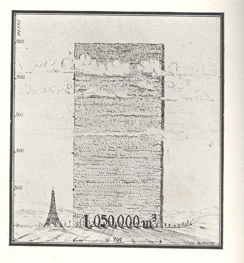
    The
    huge mound next to the Eiffel Tower shows the consumption of wood in Romania over a
    ten year period, a stack of wood 700  metres long and 1500 metres high.  Evidently this wall has only the most rudimentary depth of a metre, as the legend reads that the volume of the woodpile is 1,050,000 metres cubed, which is the same as its square area.  So somebody missed something, here, though the artist did supply some nice shadowing.

    Blog jan 17 wood

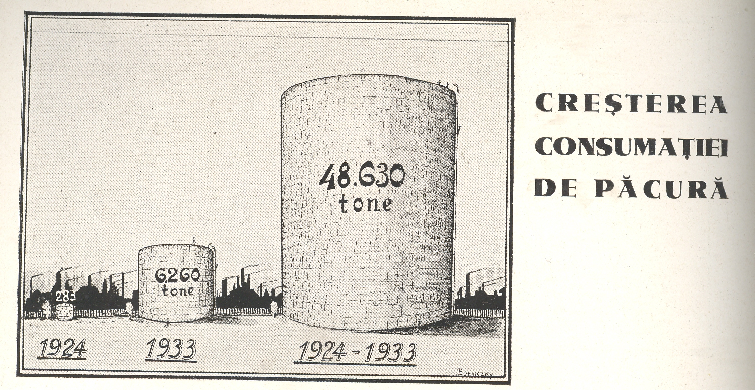
    Just
    above it appeared this comparison for the amount of oil consumed over the same
    ten year period

    Blog jan 17 oil

    I’m
    not sure why this comparison was being made. 
    This does come in the interwar period which saw a great expansion in
    Romanian territory and a vast modernization effort following the country’s devastating
    experience in WWI. Maybe it was illustrating modernization from wood-burning power/heating sources to oil-based. I really don’t know–I just liked the Eiffel Tower being dwarfed by a massively tall and impossibly skinny woodpile.


  • History of Dots (Circle Subcategory): Circles in Graphical Displays of Quantitative Data

    JF Ptak Science Books  Post 889

    I like bumping circles as modes of graphically conveying quantitative data—it is more unusual than most ways of portraying statistics and belongs mostly in the 19th century. 

    Blog dec 27 graphic circle

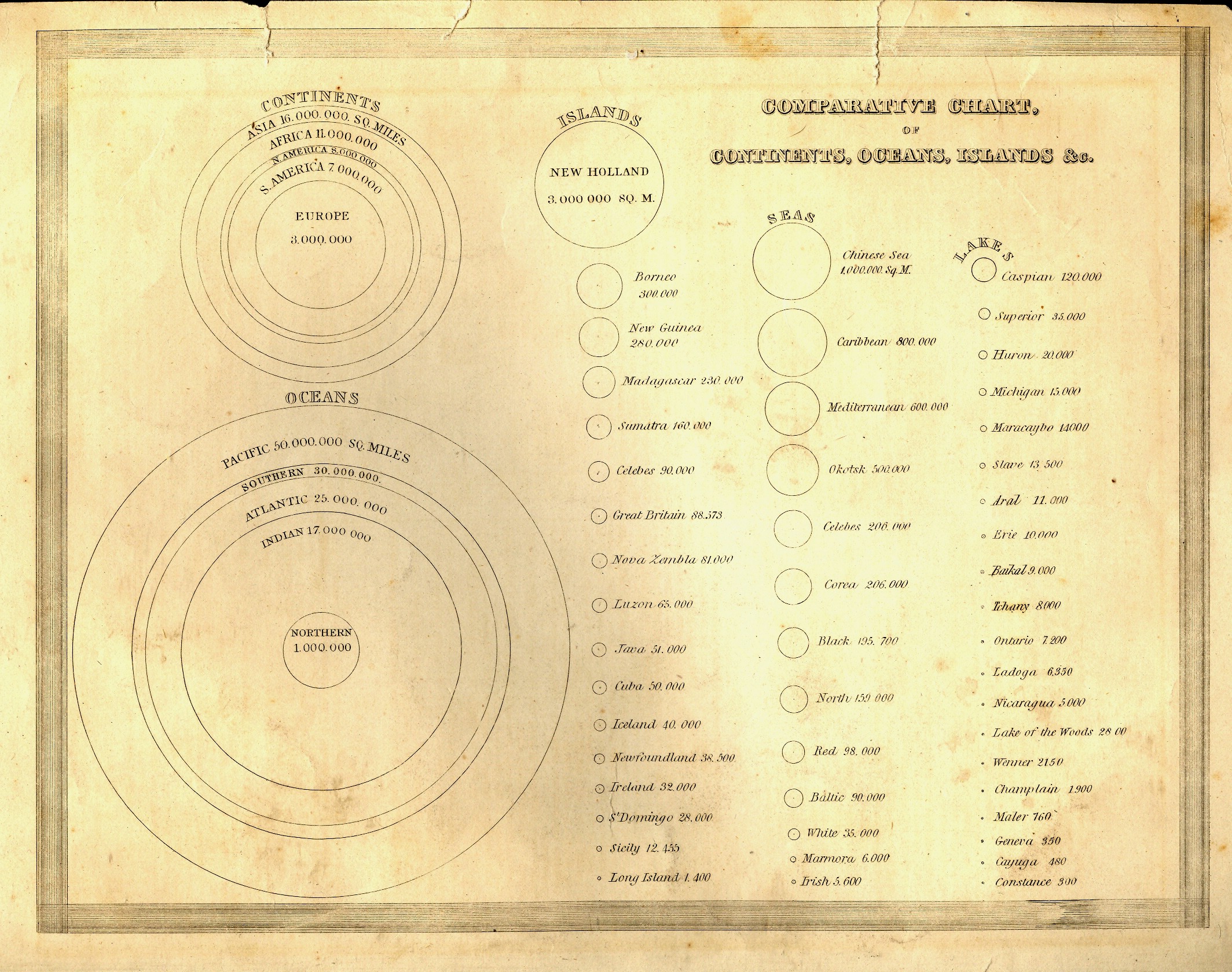
    The first example is relatively early, in the first class of this sort of information display, published in Thomas Bradford’s (1802-1887) superior Comprehensive Atlas Geographical, Historical and Commercial in Boston in 1835. Circles are the entire métier of this chart, showing the sizes of the continents and oceans, concentric circles nested inside each other, then branching out into three columns of progressively smaller circles showing the comparative sizes of islands, seas and lakes, all (interestingly) presented on
     the same scale.  It is a virtual one-stop, single-image display showing the graphical sizes of 59 geographical entities in relation to one another, making the understanding of their comparative sizes a simple, understandable, matter. 


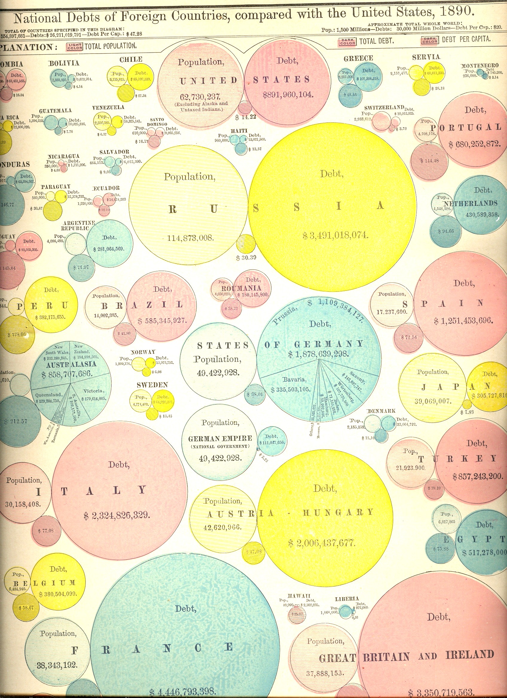
    Prettier but (initially) more difficult to use are the next two charts, the first showing the areas and populations of countries compared to that of the United States (in 1890), and the second showing the public debts of those same countries.  At first the display looks a little confusing. But once you settle in and get your eyes accustomed to the manner of presentation, the charts are actually very easy to use and very useful. 

    Moving over from circles to dots is this population map by Frère de Montizon Armand Joseph, Carte philosophique figurant la population de la France, published in 1830 (as the first of its kind).

    Blog dec 27 graphic bubble debt

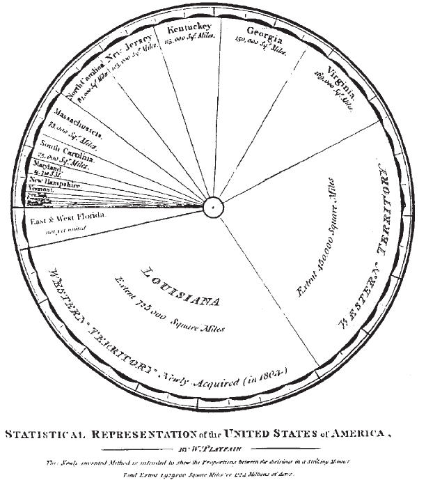
    The ubiquitous pie-chart only made its first appearance in 1801, the work of he gifted and possibly polymathic William Playfair.  He was an engineer (serving as apprentice to the inventor of the threshing machine, Andrew Meikle,  and personal assistant to James Watt) and economist, and occasional mathematician, who also invented  the line graph (1786),  bar chart (1801)and circlegraph(1801).  But for this and all of his other work, he died in poverty and not comfortable1.  


    NOTES

    1.Works by William Playfair include:

    • 1786. The Commercial and Political Atlas: Representing, by Means of Stained Copper-Plate Charts, the Progress of the Commerce, Revenues, Expenditure and Debts of England during the Whole of the Eighteenth Century.
    • 1801. Statistical Breviary; Shewing, on a Principle Entirely New, the Resources of Every State and Kingdom in Europe. London: Wallis.
    • 1805. A Statistical Account of the United States of America by D. F. Donnant. London: J. Whiting. William Playfair, Trans.
    • 1807. An Inquiry into the Permanent Causes of the Decline and Fall of Powerful and Wealthy Nations: Designed To Shew How The Prosperity Of The British Empire May Be Prolonged.


    Blog dec 27 playfair


  • Window Shopping with Berenice Abbott, 1935

    JF Ptak Science Books LLC  Post 883  Blog Bookstore

    I enjoy antiquarian window shopping, browsing photos or
    engravings that depict goods for sale– especially if the prices are posted. I
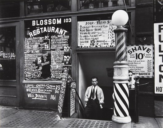
    came back to this deep-in-the-Depression-fantastic photo made in 1935 by Berenice
    Abbott (Springfield, Ohio, 1898-1991). Blossom
    Restaurant, NYC
    was part of Abbott’s effort funded by the WPA, this time as
    a part of her Changing New York Project, and captures the restaurant and
    neighboring barber shop at 103 Bowery. 
    The two businesses actually occupied the first floors and basement
    (respectively) of the Boston Hotel, a standard flop house in a tough and
    distressed part of the city that rented beds by the day, with 249 small
    door-less cubicles offering a decent place to spend the night for 30 cents1. 

    Abbott

    30 cents seems to be the going rate for a bunch of things
    going on in this  picture—30 cents for a
    night in the hotel, 30 cents for the better offers of Morris Gordon’s
    restaurant. 30 cents for a haircut and shave, 30 cents for a “women’s hair
    bob”2 and so on.  Which seems about
    right—a fancy haircut and a decent better-than-average dinner for two will
    probably cost about the same, today. 

    If you were really on a tight budget, 30 cents would buy you
    three vegetarian dinners, or 6 offerings of bread and soup, or three visits to
    the table of meatballs and bans, or pigs feet and kraut. 

    The price of a stick-to-your-ribs meal of sirloin and
    potatoes and a pot of coffee also cost about the same as a gallon and a half of
    gasoline (which cost about 20 cents). 
    The same amount of gas today would get you a serving at McDonalds, or
    something on that order, and perhaps even a happy take-away for the kids.
    Perhaps the two even out. 

    30 cents might get you a loaf of bread, and wouldn’t quite get
    you a dozen eggs.  Now this is
    remarkable, because if you adjust all of this according to modest CPI measures,
    the average cost of a dozen eggs in 1935 was 37 cents, or (according to the US
    Census website generating 1935 to 2009 prices adjusting to CPI) $5.84.  The bread would cost $4.74 in 2009 dollars,
    which means that the staples today—milk, bread, butter, eggs, were more
    expensive in 1935 than today.  Ditto
    gasoline, which cost 19 cents a gallon, or $3 today—actually this would be much
    more expensive in 1935 as the mileage the cars were getting then (and the
    octane) was much lower, so the cost of running an automobile was considerably
    higher.   The cost of the car itself,
    though, still favors the ‘thirties for modest transportation, which came in at
    about 600 dollars, or just over $9000 in 2009 dollars3. 

    The 3-cent first class postage stamp of 1935 was more
    expensive than first class postage in 2009: 
    47 cents versus 44.  When you look
    at the increases and bitty spikes of the cost of a first class stamp over time
    the whole thing looks pretty flat. 

    The average salary for a family of four in 1935 was about
    1500/year, which oddly enough is about the same for the poverty guideline level
    for 2009 established by the Department
    of Health and Human Services (about $23,000). 
    Minimum wage legislation didn’t begin until 1938, but if you take a look
    at one of my earlier posts here on the history of this idea 
    you’ll see that the recent history of legislating  a meaningful level of acceptance for a base
    living wage is mainly disgraceful, with relatively little accomplished (in
    adjusted economic terms) for half a century. 
    (The new minimum wage brings us to about a mid-way point as the highest
    minimum wages paid in the 71-year history of the program.)

    And so I thank Ms
    Abbott again for her beautiful social commentary, and a happy 75th birthday
    to this photograph. 

    Notes

    1.A fantastic website and resource for changing aspects of
    NYC can be found here, at Frank Levere’s Changing New York site. http://www.newyorkchanging.com/

    2. I wrote a little bit about the appearance of women-only
    hair salons in my post “The Staggering Beauty of Barber Shops” https://historyofideasblog.com/thesciencebookstore/2009/02/the-staggering-beauty-of-barber-shops-naive-surreal-department-22.html


    3. Other bits of what stuff
    cost in 1935:

    Flour (5 lbs)     25.3 cents

    Bread (lb)         8.3

    Round steak (lb)  36.0

    Bacon (lb)        41.3

    Butter (lb)       36.0

    Eggs (doz.) 37.6

    Milk (1/2 gal.)   23.4

    Oranges (doz.)    22.0

    Potatoes (10 lbs) 19.1

    Coffee (lb)       25.7

    Sugar (5 lbs)     28.2

    Car: $580

    Gasoline: 19 cents/gal

    House: $6,300

    Bread: 8 cents/loaf

    Milk: 47 cents/gal

    Postage Stamp: 3 cents


  • Anthropomorphic Display of Quantitative Data: Flight Safety, 1912

    JF Ptak Science Books LLC  Post 815

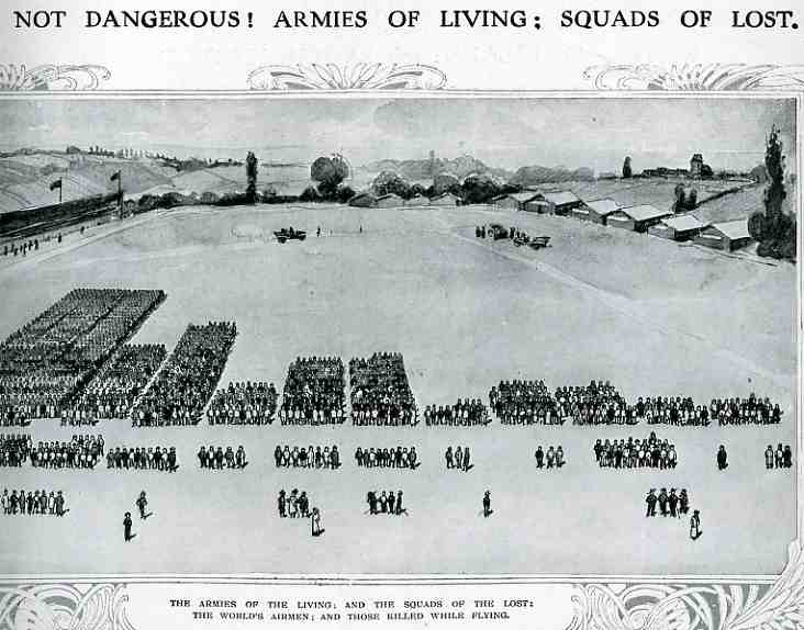
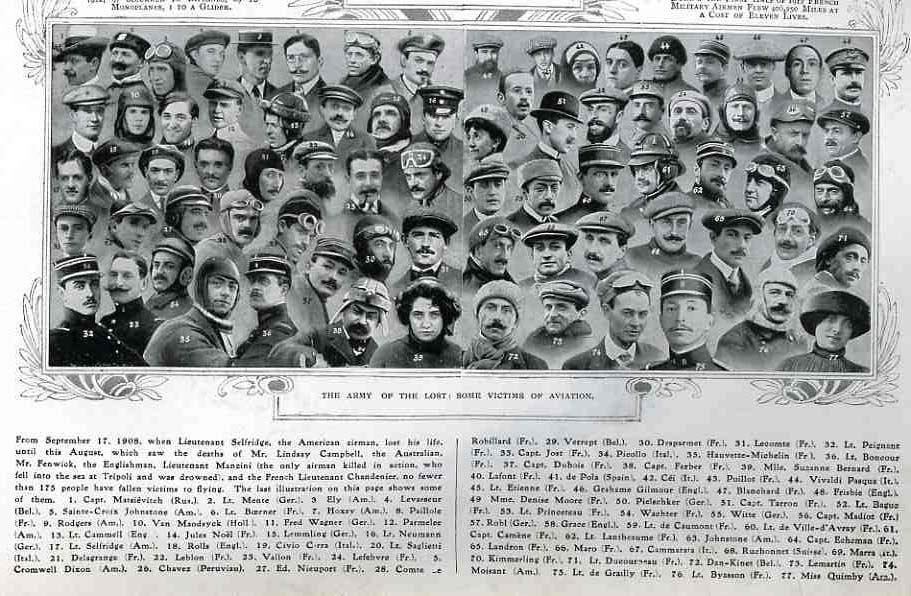
    Even though masses of people had been used in panoramic photography for some years (thousands of people, usually soldiers, gathered to form a living liberty bell, or portrait of George Washington, or some such thing) , I cannot recall the use of humans as a direct statistical aid as in this bio-bar graph, found in the pages of The Illustrated London News for 1912 (page 357).  000-ebay--Nov 7 air death005

    The article asks the question of whether air travel (and flight in general) was “safe”, and responded by graphing its “yes” response with this image. The larger groups in the top half of the image represent the number of flyers flying for that particular country; the small groups below show the number of aviators killed.  (There is no date of reference in particular but it seems to me that these are total deaths since flying began in Europe in earnest in 1905.) The photomontage below shows a selection of some of the most famous dead aviators. The number of deaths as a percentage of those flying seemed quite acceptable in the year of publication (1912) ; however if these figures were iterated forward to 2009 the death rate would be staggering, sending many thousands of aviators (and crew and passengers) to their deaths each year.  In the United States we save that safety failure for deaths in automobile accidents, which still kill about the same number of Americans each year as were U.S. soldiers lost for the entire war in Vietnam.  In spite of this the odds for survival looked pretty good in 1912. 

    000-ebay--Nov 7 air death portrait006


  • The Value of Money and Almost-Useful Information

    JF Ptak Science Books LLC  Post 814   Blog Bookstore

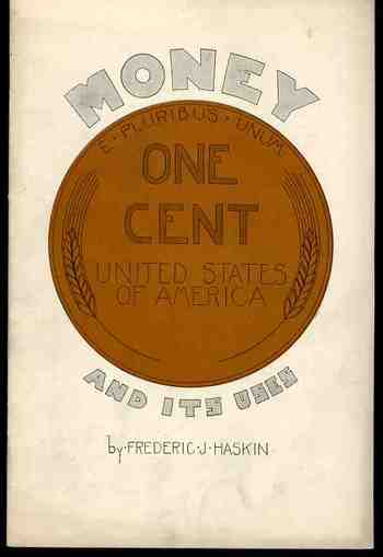
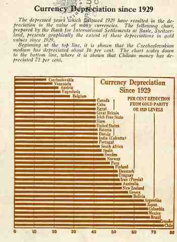
    I initially chose this pamphlet to be part of a larger series on terrific/unusual/bizarre cover designs–unfortunately its contents got in the way, a little.  The cover still borders safely on the unique, and so does most of its contents, except for the graphical analysis of the depreciation of worldwide currencies that appears on its back cover.  Here the information is actually pretty useful and unusual. It would’ve been more useful had the author included an end date for his comparisons–all we know is that he is looking at 1929 and the beginning of the Depression as a jump-off point, and we can assume that the end date is before the date of publication of the pamphlet (which actually isn’t stated).  Still, the graph is almost very useful.  It is for this reason that Money and its Uses Winds Up in the “Blank and Empty Department” for its diligent but ultimately useless graphical display of data.

    1blog_oc_t_9_money795

    1blog_oc_t_9_money796


  • The Overworked Working Poor of 1914: Women and Children and What They Didn’t Get Paid

    JF Ptak Science Books LLC    Post 760   Blog Bookstore

    ++00++ 9.19 10,000 cvr

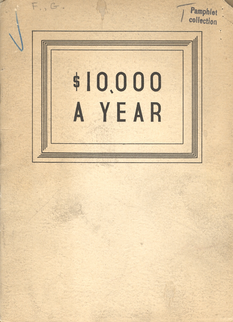
    An income of $10,000 dollars a year, in the Depression year
    of 1936, was a huge, fabulous fortune, controlling a major buying power for
    food and cars and housing.  (A fine brick
    home for the solid middle class family of five would’ve cost well less than the 10K
    per year—which means that this 1936 income would correlate somewhat to a 300,000/year income in 2009 dollars so far as buying power goes.) Unfortunately the author of
    this pamphlet directed it at doctors who could supplement or insure their
    income by selling their patients the pamphlet’s products:  “Anabolic Food Products”, a quacky vitamin
    supplement that evidently had really little use except to expand the
    income. 

    This reminded me of another pamphlet from a slightly earlier
    period on the over-worked working poor.  Report
    to the Louisiana State Commission to Study the Conditions
    of Working Women and Children…
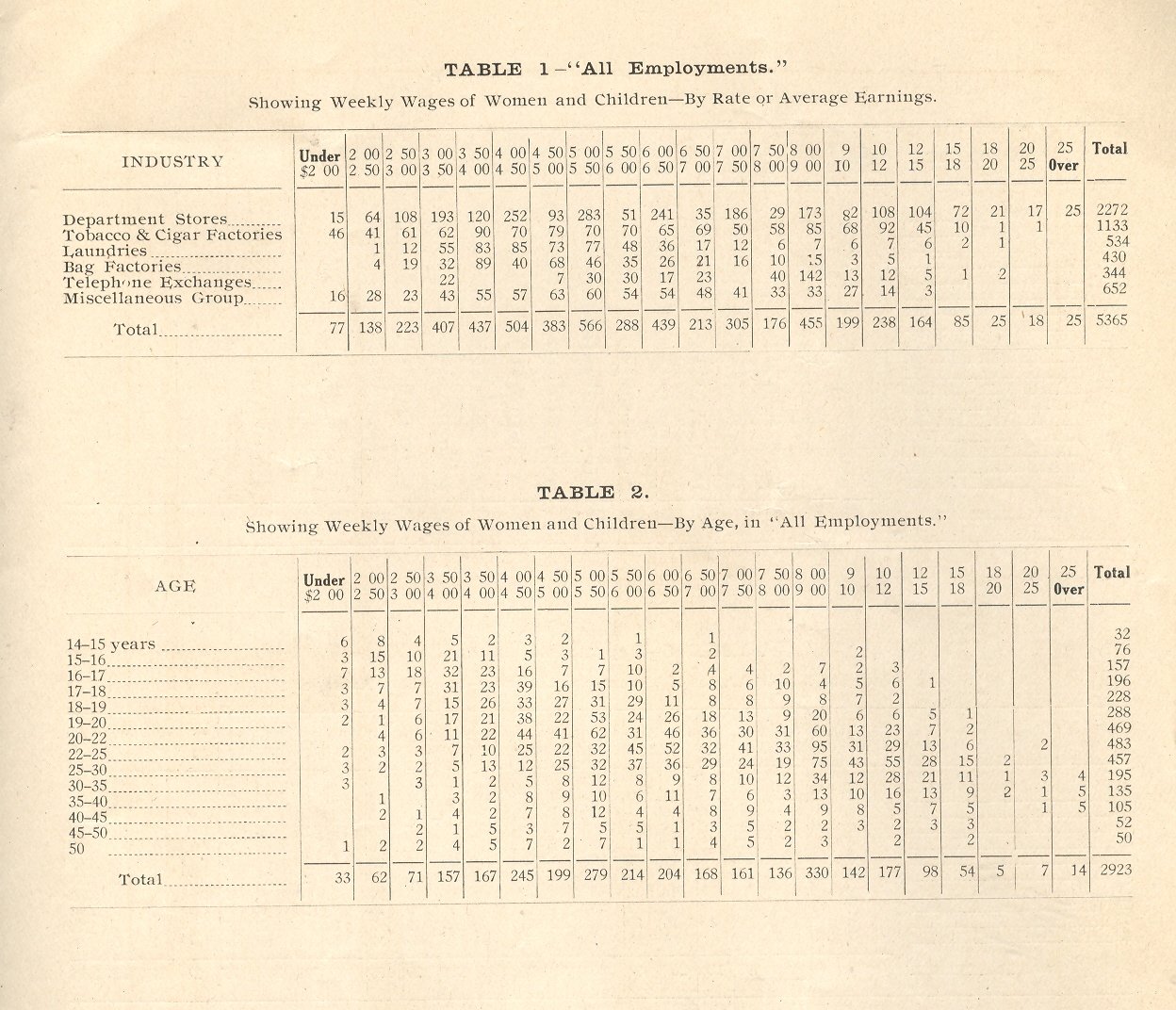
    (published in 1914), chronicled the averages incomes
    more so than the conditions of their work—and the statistical package was
    simply not a pretty story.  Reading through the
    numbers hammered home how far away and mountainous $10,000 a year meant. 

    ++00++ 9.19 10,000 cvr 1914

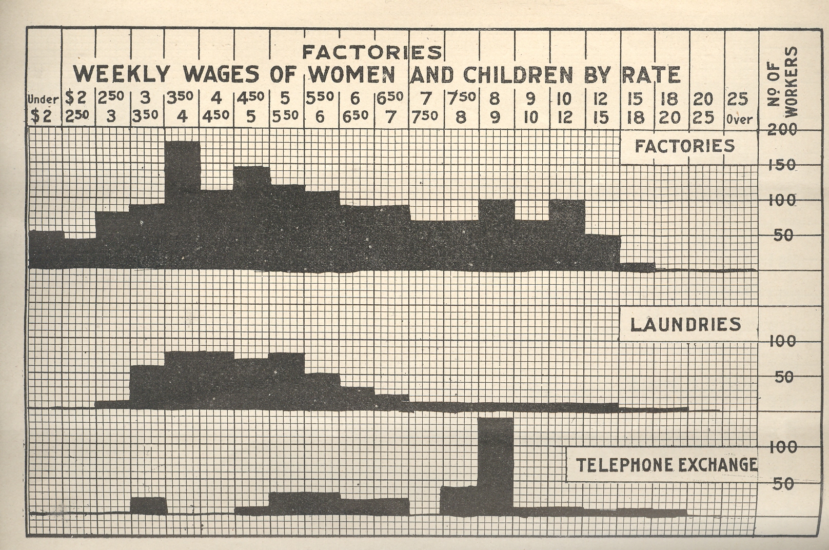
    That big bump in the bar graph for factory wages shows that
    the most frequent average weekly wage for women and children was about  $3.75, with about a quarter of all of those
    polled workers making less than that, and about half making 5.00 a week or so.
    Multiply those figures by 52 and they don’t come out to much—specifically, they
    don’t really approach the average income for a worker in the U.S. in 1914,
    which was about $650 a year.  It looks
    like only 10% or so of all of these workers met this standard of $12.50 per
    week.  And this was for factory workers—things
    get worse for most all other types of jobs—except for workers at a telephone
    exchange (and that wouldn’t last for very long).   

    ++00++ 9.19 10,000 cvr 1914 stats

    The conclusions the pamphlet reached are inescapable:  “we can arrive at but one conclusion, namely:
    that no matter what are the causes determining wages, the earnings of women in
    industry are exceedingly low in a great many cases, and scarcely enough for
    subsistence……the striking facts is that nearly three-fourths of all women in
    industry are between 18 to 35 years of age, meaning that they are spending the
    best years of their lives …at the lowest rate of wages…”

    In 2009 women are still paid less than men–about 77-cents on the dollar less.  Generally speaking the U.S. now imports most of its child labor produced goods–out of sight, out of mind.


  • Triumphantly Unusual Images of the Eiffel Tower

    JF Ptak Science Books LLC  Post 732  Blog Bookstore

    ===blog--aug 26==eiffel

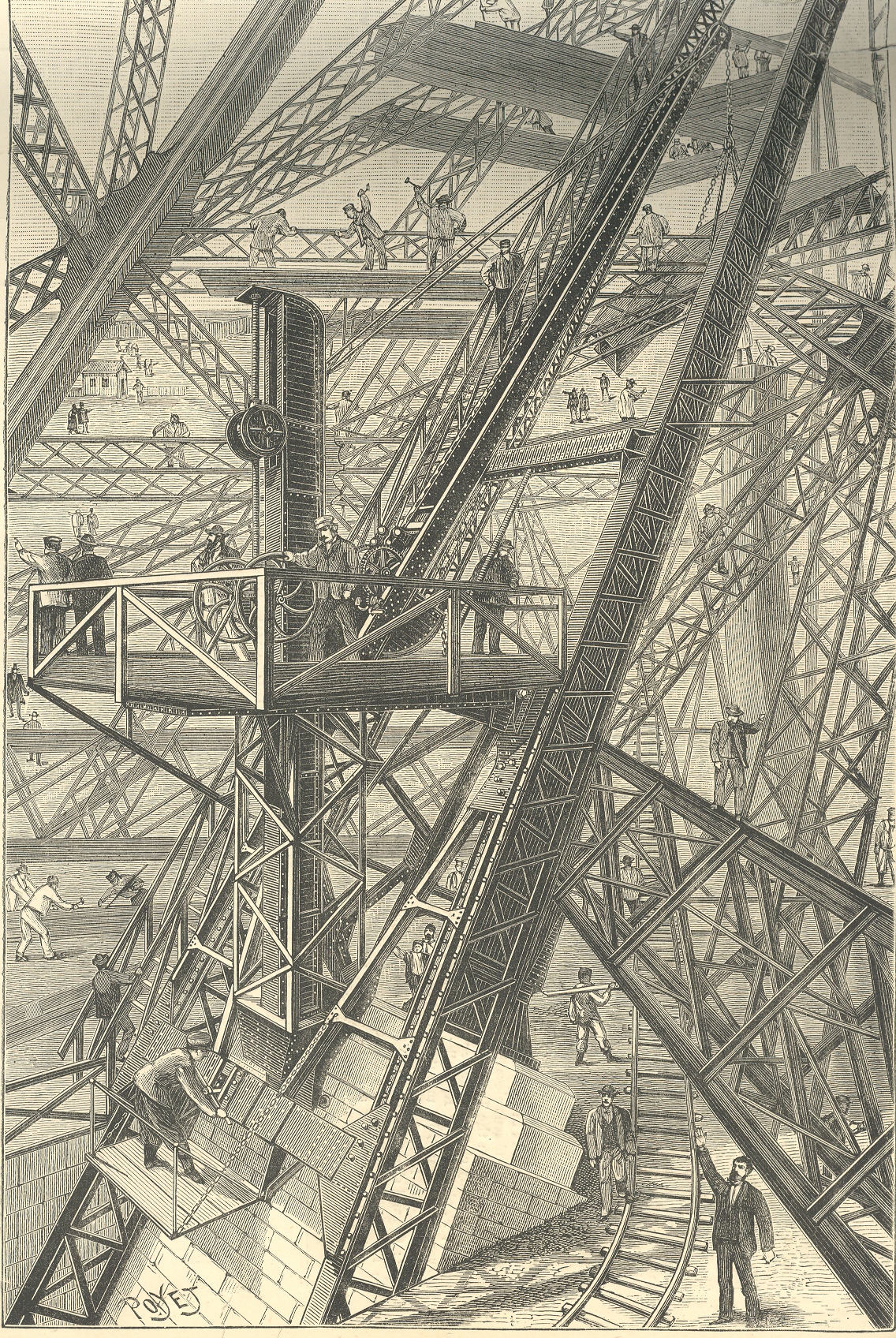
    This image of the building of the foundation of the Eiffel Tower, which appeared in the
    Scientific American in 1888, appears both orderly and chaotic, a dizzy miasma
    of activity and a confusion of right angles. 
    (My six-year-old Tess says that it looks “worky”.)  Part of the issue is the fine quality of the
    jumble, with 90-degree angles everywhere, which confuses the eye.  Another part is the perspective, which is odd
    in places, and which takes the whole of it and makes the print into a near
    Escher-like experience of impossibility. 
    IT is this spatial confusion which makes this print so uncomfortable to
    me. For instance it seems that the observer’s point of view may be in several
    different positions, depending

    Eiffel odd

    on where you resolve to fix our eye: if you choose
    the worker’s shed in the upper left corner as a reference point, the height of
    you viewpoint will be different than if you used, say the first pointing man in
    the foreground as reference.  Also that
    pointing man sands next to a little rail track that seems to hoist itself into
    the air before disappearing.  There’s
    much else, but these examples will do for present.

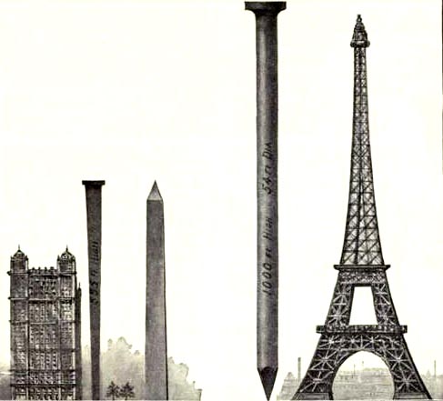
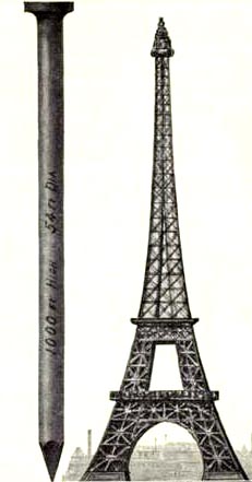
    These other images are the first nail & Eiffel Tower images I’ve ever seen.  The explanation is simple enough, though I think I’d much rather not know. 

    This image and data is from the generally useful data and
    interesting if not useless info Scientific
    American Reference Book. A Manual for the Office, Household and Shop
    ,
    by Albert A. Hopkins, and published in 1903. It gloriously depicts the annual American finish nail production in terms of Eiffel Towers:  there were evidently 10-million 100-pound kegs of these nails made in 1902; if they were made into one big nail, it would be this one–52′ in diameter and 1000 feet tall.  I guess another useful visual bit would be the representation of the number of new houses built/kegs of nails, which would make this image a little more meaningful; though, perhaps, we may not be going for meaning, here, necessarily.


    Eiffel odd det


  • Fossils of Almost No Value? Statistics, Prisons, and Meaninglessness

    JF Ptak Science Books    Post 622   Blog Bookstore
    Blog--May 23--convict The fossil record is generally one of the richest and most
    compelling histories of the development of life on earth, a far-reaching,
    cumulative record of extraordinary importance. 
    There are the other, occasional, fossils that stand only by themselves,
    and seem to have almost no use in the current time, living almost entirely
    within themselves. The following statics seem to fall into that category—they
    seem to be only a tombstone for an era, providing nothing except to tell the story
    of what happened, existing only for that purpose, with no compelling
    utilization for anything outside understand a small piece of life for the year
    the stats were gathered. 

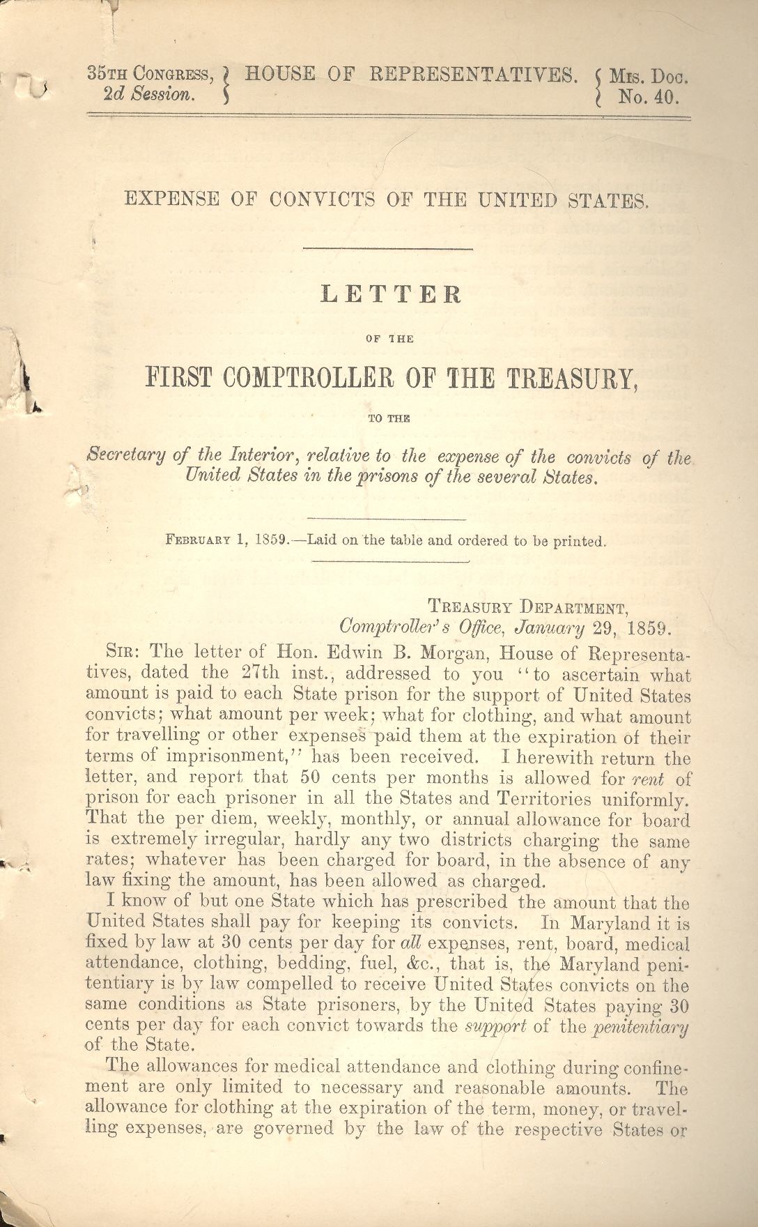
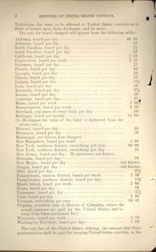
    The cause for this sentiment was found in a government
    publication called Expense of Convicts of the United States  (Letter from the
    Comptroller of the Treasury…)
    , 1 February 1859).  The following comes in the first paragraph:

    “I….report that 50 cents per months is allowed for rent of
    prison for each prisoner in all the States and Territories uniformly.”

    What this means is that the U.S. Treasury would pay 50 cents
    to the state for keeping a federal prisoner. 
    That is 50 cents per month, or about 1.7 cents per day. And that was
    also for rent of the cell, exclusive of all else, each state furnishing the
    government with the added cost, separately.

    Evidently the only state in the country that prescribed an
    exact amount for keeping a federal prisoner in a state institution was
    Maryland, “which received 30 cents per day for all expenses, rent, board, medical attendance, clothing, bedding,
    fuel, and etc” (italics in the original). 
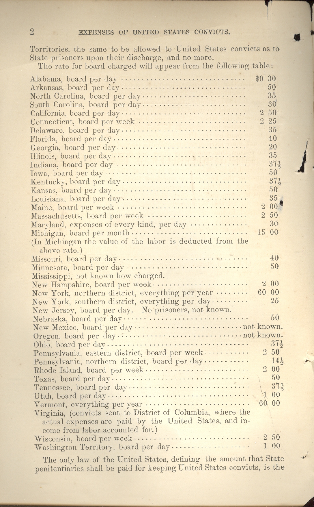
    The rest of the states and territories had diverging and different
    expenses, from the southern district of New York at 25 cents a day for board,
    and ranging up to about 50 cents per day in  Michigan. Vermont charged an extra 60 dollars a year, in addition to the 6 bucks that they would
    get for the rent of a Vermont
    cell, to keep a prisoner—all expenses included—for one year, or about 18 cents
    per day, total. 

    Unfortunately I don’t have the stats of how many federal
    prisoner there were in 1859, so I don’t know how much of a percentage of the
    budget was occupied by prison expenses. 
    But what I do know is that even with tossing around the CPI with
    multiplier effects and so on the figures translate in no way to keeping a
    person in prison today.   The cost of
    housing someone in prison per year is around $35,000 a year, or $100 or so a
    day.  Adjusting the 1860 dollar via CPI
    for 2009 makes that dollar worth about 25 dollars today, which would be a
    doubling and a doubling again of keeping someone in prison. 

    I’m not so sure that those figures tell us much about what
    we pay, today. 

    Next, I was having a breeze through The Prison System of the United States by S.J. Barrows
    (Commissioner of Prisons for the U.S.) which was published in Washington  in 1900.  One particularly interesting
    section was the publication’s solitary statistical table, “Appendix A”, which
    detailed the crimes of the 625 men incarcerated in the state of Michigan  in 1900.  Well over half of all those in prison were
    there for larceny and burglary, while about 12% were in the big house for
    violent crimes.  (Evidently 95% of this
    number were literate and 70% could “cipher” (that is, produce basic arithmetical
    skills)).  The total crime list (such as
    it was) includes the following:

    Capital crimes (murder in the first and second degree) and
    manslaughter, along with murderous assault comprised about 1% of the total
    prison population.  Other violent crimes
    included assault with intent to do great bodily harm, rape, attempted rape,
    rape and assault composed another 3%. Further assaults were classified under
    (a) with intent to do great harm;  and
    then as assault on a female under 14 years; and on a female under 16 years  There were also the sexual assaults:  taking indecent liberties with female; with
    male child;  unlawful and carnal
    knowledge of a young child;   inducing female to enter house of ill fame.  These last two categories included about 5%
    of the prisoners.  Set aside form these
    were the crimes of adultery, abduction, incest and sodomy, which included
    another 3%.  So it seems that the violent
    offenders in prison in  Michigan 
    in 1900 totaled out at 12% or so. 

    Burglary and larceny were the  largest categories, being subdivided into (a)
    burglary accompanied by actual assault; (b) larceny; (c) larceny from a
    dwelling;  (d) larceny from a shop in daytime; (e) attempting larceny from
    the person; (f) entering a church in daytime to steal; (g) breaking and
    entering a store in daytime;   (h) breaking and entering a store in
    nighttime;(I)  breaking and entering a
    dwelling in daytime; (j)  breaking and
    entering a dwelling;  (k) breaking and
    entering a railroad car.

    Then there were a few largely vacant offenses:  Resisting an officer; Uttering and publishing
    a forged note, breaking out of prison, perjury, arson, false pretense, and
    malicious destruction of personal property, all combing for less than 2% of the
    jailed population.
    Blog--May 23--convict 001

    The vast majority of prisoners in Michigan were imprisoned for non-violent
    crimes.  The federal fathers, in the
    meantime, recognized that people in prison shouldn’t be idle while paying their
    debts to society, and should fill their time with work that would occupy the
    prisoner and bring some income into the prison system:

    “The moment we apply to the convict a
    different system of economics because he is in prison we go astray. When we
    subject to analysis the plans proposed for abolishing the competition of
    convict labor we find them based on false principles or expecting results not
    to be realized. The wiser way for the peace of society and the interest of the
    State is to place prison industries on the same ground as free industries, and
    defend that.
    It is also said in opposition to the contract system that
    contractors do not pay as much for the labor of convicts as free laborers
    command.”

    In 2005 the federal offenses for which people are incarcerated include: Drug
    Offenses 59.6%; Robbery 9.8%;  Property
    Offenses 5.5%;  Extortion, Fraud, Bribery
    6.8% ; Violent Offenses 2.7% ; Firearms, Explosives, Arson 8.6% ; White Collar
    1.0%; Immigration 2.8%;  Courts or
    Corrections 0.8%;  National Security
    0.1%;  Continuing Criminal Enterprise
    0.8%;  Miscellaneous 1.5% .  54% of prisoner in state custody for the same
    time were incarcerated for violent crimes, with drug offenses coming in at 20%
    and property crimes at 19%.  The racial
    breakdown of prisoners in the U.S. is another tragedy: of the prison population
    in toto of 2.3 million in 2008 there
    were 4,777 black male inmates per 100,000 black males held in state and federal
    prisons and local jails, compared to 1,760 Hispanic male inmates per 100,000
    Hispanic males and 727 white male inmates per 100,000 white males—that means
    that the black incarceration rate was double and then double and then
    half-doubled again that of whites.  What
    this also means is that there were more blacks in jail cells than in college
    dorm rooms in 2008.

    I’m not sure that any amount of creative statistical mathemartistry could bring these figures to life for some sort of practical application in 2009, the present situation in the prisons being so immense and pervasive.  Numbers and assorted data from the past usually have the capacity to help us see where we are today; as I said earlier, I think that these fossils are simply that:  dead.