A Daily History of Holes, Dots, Lines, Science, History, Math, Physics, Art, the Unintentional Absurd, Architecture, Maps, Data Visualization, Blank and Missing Things, and so on. |1.6 million words, 7500 images, 4.9 million hits| Press & appearances in The Times, Le Figaro, Mensa, The Economist, The Guardian, Discovery News, Slate, Le Monde, Sci American Blogs, Le Pont, and many other places… 5000+ total posts since 2008.

Category: Statistics–Fossil, Found, Odd, Forgotten

  • The Anatomy of Comparison Department: HMS Ships Firing On London, 1909

    JF Ptak Science Books LLC  Post 596    Blog Bookstore

    HMS Ships Firing On  London,
    1909, Old vs. New  Comparing Shipboard
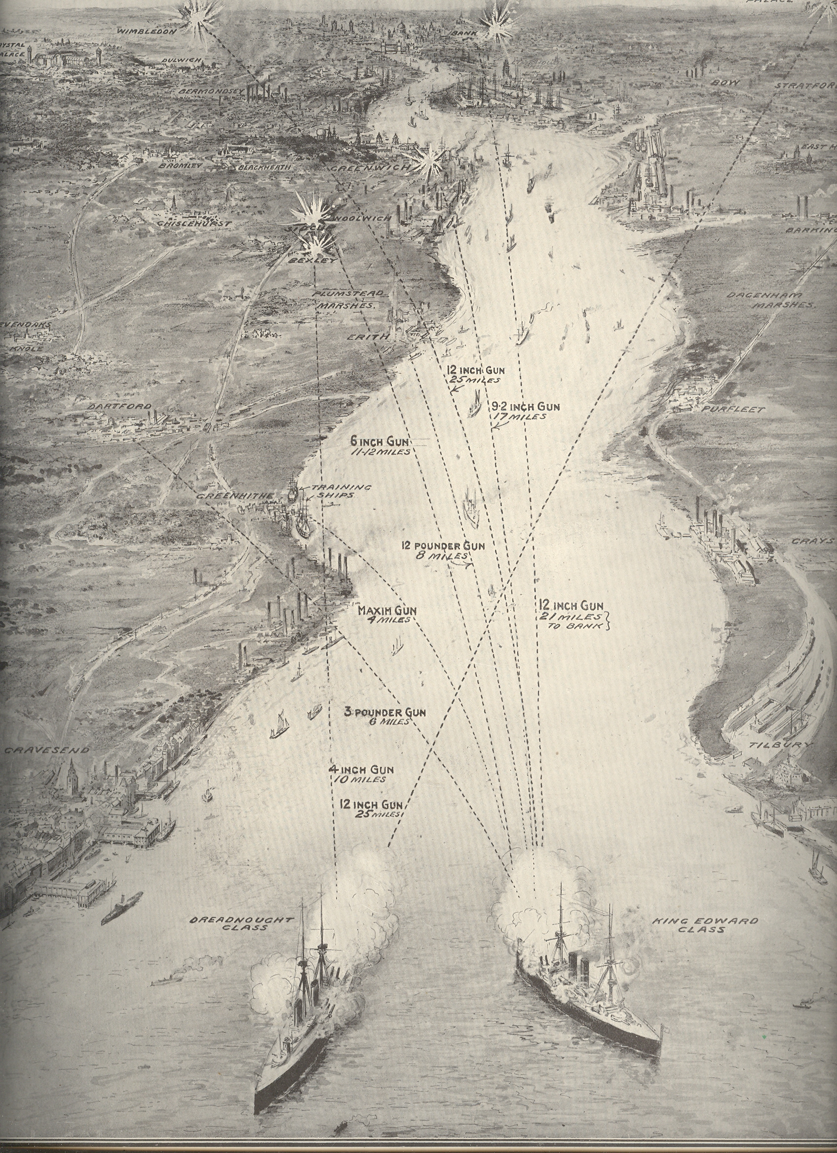
    Firepower:  a Compelling Comparative Graphic Display from the Illustrated London News for 24 July 1909

    Blog--april 26--london bombed Without looking at the sub-title and explanation of this of this print (“Firing
    from Thames Mouth to the Edge of Greater
    London”) its purpose might be a fair mystery, given the ships and the targets
    and all. The two large ships at bottom are a Dreadnaught Class battleship and a
    (smaller) King Edward Class ship, and, yes, they are firing towards London—but they
    are doing so to illustrate a point on modern weaponry and the vast, new
    superiorities of British advances in the death/protection arts.

    In June 1667 during the Second Anglo-Dutch War the British were set upon by
    an running attack by the Dutch Admiral Michiel de Ruyter, who had advanced as
    far up and into the coast as the mouth of the Thames.  The Dutch advance up the Thames was repulsed,
    though their secondary targets (so to speak) at Gravesend
    and the River Medway proved a scorching defeat for the British, and propelled
    the rocky war to a quick peace favorable to the Dutch. 

    This image shows what could’ve been the results of that engagement at
    Gravesend had the Dutch fleet been outfitted with the HMS’ new 12-inch guns—de Ruyter
    would’ve been able to reach the outskirts of London from that position, and
    could’ve b=done so from a distance of 25 miles or so. Of course the artist and
    editor aren’t really suggesting a “what if” scenario to the course of events of
    the Second Dutch War—they were merely creating a very compelling, highly
    illustrative comparison from old to new firepower, and to perhaps quite some fears
    about the strength of the Navy as the unstable and rickety international system
    limped its way into WWI, just five years in the future. 


  • An Outline Map of a Great Complexity: the ENIAC, 1948

    JF Ptak Science Books LLC  Post 575

    “The ENIAC exists independent of its history”–Brainerd and Sharpless

    Eniac


    The
    ENIAC (
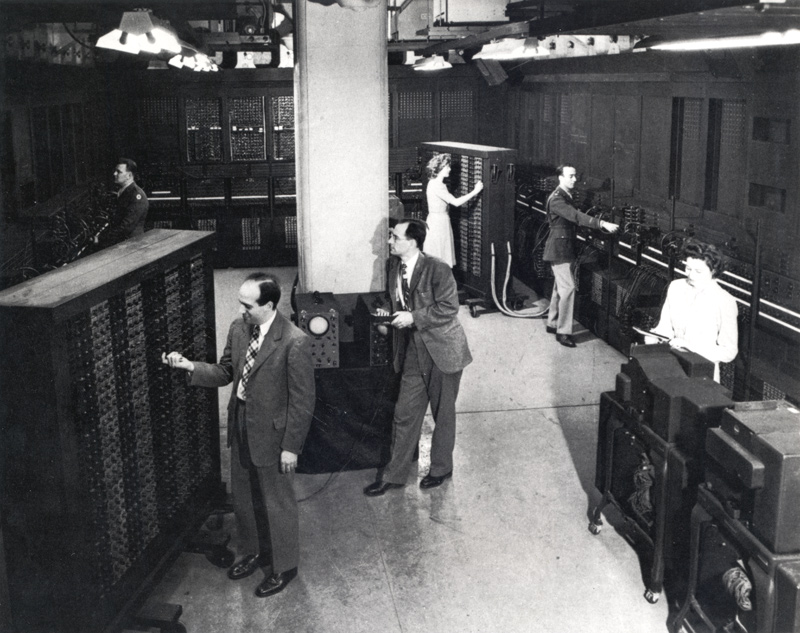
    Electronic Numerical Integrator And Computer, b. 1943-45) was, basically, the world’s first
    operational, high-speed digital computer, and the father of the computer
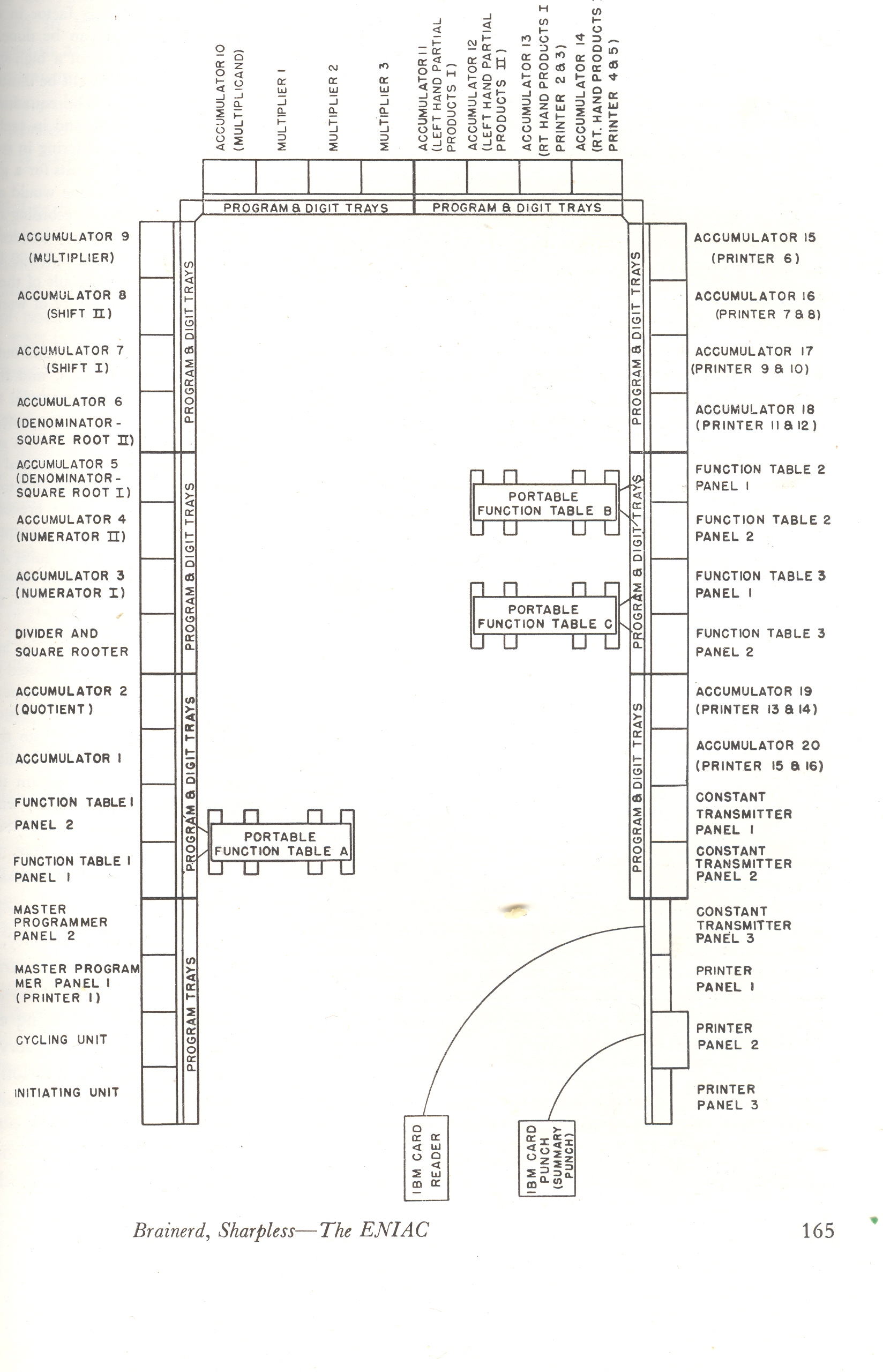
    industry.  What we see to the left  is the floor plan for the
    computer-with-no-monitor—I know to most people working today with a computer
    that the idea of a “floor plan” for anything that is not in a dark place at NSA
    is not easily conceivable.  The 30-ton,
    18,000 tube, 125 KHz ENIAC’s space was about 1800 square feet, where it was able to
    add about 5000 numbers/second, which was vastly faster than anything else in
    existence. It operated with
    70,000 resistors, 10,000 capacitors, 5
    million hand-soldered joints and 6,000 manual switches. It was a magnificent achievement.

    There are many sites dedicated to the history of the ENIAC—all
    I want to do here is surface this detailed floor plan of the computer, which seems
    not to be online.  The diagram comes from
    an article by J.K. Brainerd and T.K. Sharpless (Sharp brain!), “The ENIAC”,
    from the February 1948 issue of Electrical
    Engineering,
    which defines the machine and its components in full.  The abstract states: “The ENIAC is the only
    electronic large-scale general-purpose digital computing device now in
    operation.  Its speed of operation
    compares favorably with other electric and mechanical computers.  Developed under wartime pressures, it has
    been of value not only in producing results but in pointing the way toward
    improvements for future designs.” 
    Indeed.  The authors, both of whom
    worked on the construction of the machine from 1943 onwards, describe it in the
    following ten points:

    “1. Large-scale 2.General purpose 3. Digital 4. Electronic  5.  Uses
    10-digit numbers   6. Uses decimal system   7. High
    speed   8. Synchronous operation    9. Some parallel operations possible 10. Complete
    flexibility within limits of programming capacity” (page 170).

    The authors make the following (qualified) understatement: “electrical
    engineers in the United States
    have had a major interest in development of large-scale computing devices”
    mentioning the major players as MIT, Moore
    School (U PA), GE, Bell
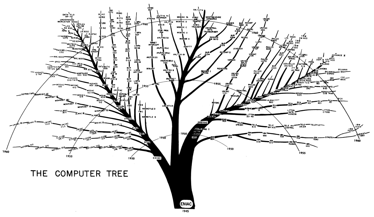
    Telephone, Harvard and the spelled-out “International Business Machine corporation”.  Within ten years of the end of WWII the second generation of computer was nearly functional, and (as can be seen in the wonderful computer tree below) there were dozens of new machines in operation. By 1960, the explosion was getting ready  with the advent of microminiaturization. 

    Eniac comp tree

    Eniac2

    The computers in operation from 1938 to 1948 include the
    following alphabetical hodgepodge: Z1 Z2 Z3 Z4, ABC, Bell Model II, S1, Mark I,
    Mark II, Elliot 152, ARC, Mark II, SSEM, and the more poetic Colossus and
    Demon. (Zuse Z1 1938;  Atanasoff ABC 1939;
     Zuse Z2 1939;  Bell Labs Complex Calculator aka Model I1940;  Zuse Z3 1941;  Zuse S1 1942; Bell Labs Model II; 1943
    Bletchley Colossus Mark I 1943; Zuse S2 1943; Bletchley Colossus Mark II 1944;
    Harvard Mark I 1944; Zuse Z4 1944; Bell Labs Model IV  1945;  Bell Labs Computer Model V  1947;  Elliott 152 1947; Elliott 153 1947;  Moore School ENIAC 1947;  Birkbeck ARC 1948; Harvard Mark II 1948;
    Manchester University SSEM 1948;  NSA DEMON
    1948.)


  • Lethal Teeth & Causes of Death in London; Milk Leg, Breakbone Fever and Eel Thing. The Death List for 1665

    JF Ptak Science Books LLC  Post 464
    Blog--bills of mortality
     Coming on the heels of the only post that I’ve made on teeth is this happy
    element, a brief mention of lethal teeth in London in 1665. The listing of the death and
    its introduction (if not the actual dead themselves) comes in the form of a
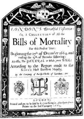
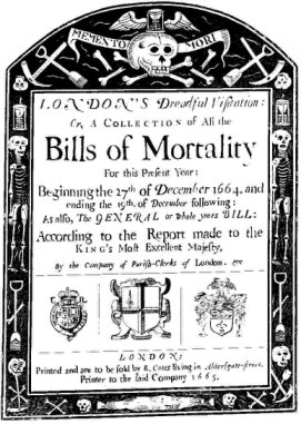
    publication called The London Bills of Mortality, which was begun (so it seems)
    in 1538.  As an instrument of society the
    Bills were more for legal ramifications than for compiling medical
    information.  The Bill was a necessary
    element for legal burial and the transfer of an estate, composed to make sure
    (or for extent possible at this time) that death had indeed occurred and that
    the legal course could be enacted to disassemble the accumulated physical life
    of the decedent.  The weekly reporting
    and compilations must’ve been wearying, and I imagine that this was not the
    most auspicious or desirable job to have, wringing in the newly dead.  Death’s accounting procedure grew more
    systematized as time wore on, getting a more formal approach as early as
    1603.  And it was not in every English parish
    that the cause of death was recorded, and the recorders were hardly a army of medical
    experts—causes of death were sometimes accurate, sometimes not, sometimes
    whimsical and sometimes all or none of the above.

    The list below attests to a somewhat poetical bent in the naming of lethal
    afflictions; of course most meant something immediate and understandle to the
    reader in 1665, though today many of the names seem quire airy and adventurous,
    hardly things to actual die of.  The list
    comes from the groundbreaking work of London haberdasher and man of
    semi-science, John Graunt, who in 1662 published Natural and Political
    Observations … on the Bills of Mortality
    (1662):  it was a tremendously important work and a
    foundation stone in statistical applications in health and epidemiology, as
    Graunt tried to organize and interpret the collected data. 

    Again, my attraction to this all stems from yesterday’s post on the question
    of the existence of teeth in the Renaissance—“teeth” is listed as a cause of
    death in 39 of these cases, the 6th leading cause of death among the
    39 causes listed.  I guess death might’ve
    been caused by a systemic infection caused by a rotten tooth ; or  perhaps the tabulator observed a dead body,
    saw a mouthful of bad teeth and nothing else obviously wrong with the body, and
    thus dubbed the cause of death as the most heinous looking thing that could be found.


    Abortive
    Aged
    Ague
    Apoplexy
    Asthma
    Bloody Flux
    Cancer
    Childbed
    Chrisoms
    [1]
    Colick
    Consumption
    Convulsion
    Dropsie
    Evil
    Fever
    French-Pox
    Gangrene
    Gout
    Griping in the Guts
    Headmouldshot
    [2]

    3
    52
    12
    1
    2
    1
    4
    4
    2
    2
    78
    112
    26
    1
    76
    2
    1
    1
    14
    2

    Jaundies
    Imposthume
    [3]
    Mortification
    Plurisie
    Rash
    Rheumatism
    Rickets
    Rising of the Lights
    [4]
    Rupture
    Small-Pox
    Stilborn
    Stone
    Stoppage in the Stomach
    Suddenly
    Teeth
    Thrush
    Tissick
    [5]
    Twisting of the Guts
    Ulcers

    1
    2
    7
    2
    1
    1
    1
    1
    1
    54
    9
    2
    2
    1
    39
    1
    5
    6
    1

    A few of the obscure terms explained:

    Ague: 
    deep fever
    Body Flux: sepsis? 
    Childbed: 
    a baby or mother who dies during childbirth
    Crisoms: 
    refers to a white baptisimal robe worn by an infant, meaning that this
    was a very young baby born    before baptism occurred.
    Dropsie: 
    lethal inflammation or edema
    French-pox: 
    syphilis (called “French” because of a decimating outbreak of teh
    disease in the French army.  That, or the
    prescribed treatment, which was the ingestion of mercury. 
    Headmouldshot: edema of the brain
    Imposthume: Abcesses or cysts
    Rising of the Lights:  inflammation of the lungs or general lung
    problesms
    Thrush—an infection of the mouth (especially
    in babies).
    Tissixk: 
    tuberculosis

    According to the website Magic-Nation “other causes of death included affrighted, bladder in the throat, breakbone
    fever, canine madness, commotion, eel thing, frogg, gathering, grocer’s itch,
    hectic fever, kink, milk leg, screws, stranguary, stuffing, rag picker’s
    disease, St. Anthony’s fire, tympany, worm fit, wolf, and being planet struck”.
    Most of these I have little  insight on,
    and even though they caused someone’s death, they still have a lilting, lyrical
    quality about them.  I particularly like
    and am curious about “eel thing”, “milk leg”, and “Stuffing”

  • Big Skies, Long Horizon: 42nd Street, 1861

    JF Ptak Science Books  LLC     Post 428

    0 ebay 12 42nd st256

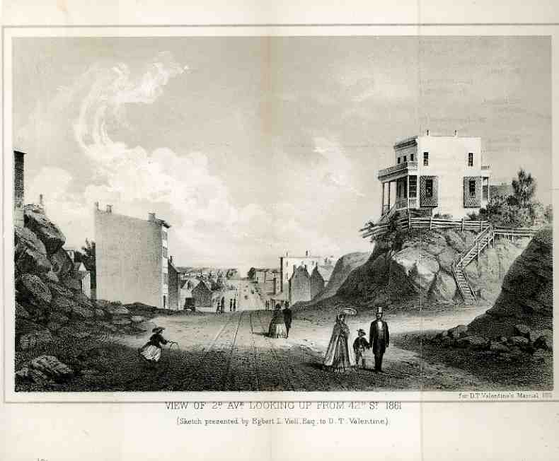
    This view of the northern reaches of Manhattan , published in Valentine’s
    Manual 
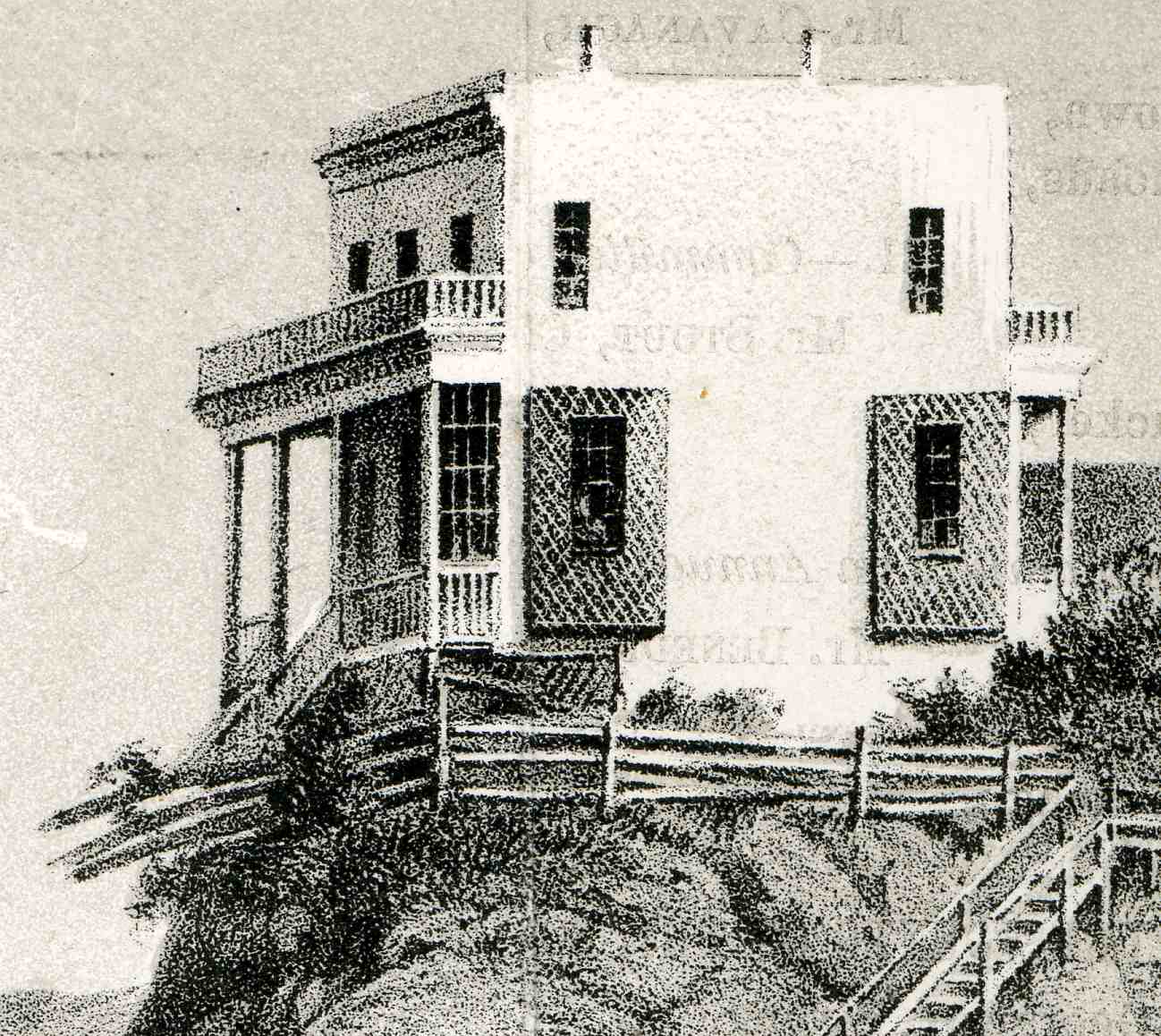
    in 1861, reveals a superior and clear view of the northern reaches of the island due north along 2nd Avenue at the 42nd Street intersection.  An historian of The City could probably identify that precipitously-perched house at the corner of 42nd and 2nd–I can’t.  My guess though is that from the looks of the ruining fence that 2nd avenue must’ve been widened and scraped away the house’s front yard.  The view up 2nd is largely unobstructed  and shows few people, though we do see a *girl* playing with a hoop and a strolling family (with, uncommonly, daddy holding the child’s hand…I guess that the mother’s hands were busy holding the parasol and shawl).  

    0 ebay 12 42nd st257

    The census for 1860 shows that the population of Manhattan at
    850,000.  Given that today’s population is about twice that, where were
    the rest of the 1860-people?  As we can clearly see, they weren’t
    uptown.  Manhattan was pretty densely populated as a whole, but the
    great majority of the population action was taking place below where we
    would today consider midtown. If we take the left and right hand of 2nd
    ave as the 19th and 22nd Wards (which were actually divided by 6th Ave,
    but 2nd will do for these purpose), then there would be about 80,000
    people living there, or about 9% or so of the entire population of the
    city. These two wards also accounted for about 30% of the entire area
    of the city below 86th street.  So even though this scene looks pretty
    pastoral, there were still a fair number of people living in those
    low-rise stretches.

    Another bit to consider is that the
    island’s population then was fairly static–the people in Manhattan
    were largely residents, whereas today the daytime population just about
    doubles, which makes it the country’s most-commuted-to daytime city.
    (Manhattan daily increase= 87% increase; Washington, D.C.  73.0%; 
    Boston  41.1%;  Seattle 28.4%; Denver 28.0%; Portland, OR  23.0%;  San
    Francisco  21.7%; Charlotte, NC  21.2%; Houston   20.6%; Nashville
    19.5%; Austin  19.4% )

    Second_Ave_NYC_from_85th_St

    All this said, I always have liked this image because it so odd, and naive, and lovely.  Unexpected,  I was thrilled to see the failing fence for this property, along with its curly stairs leading away from the sheer droop at what used to be the front steps of the house.  To me these are just gorgeous details.

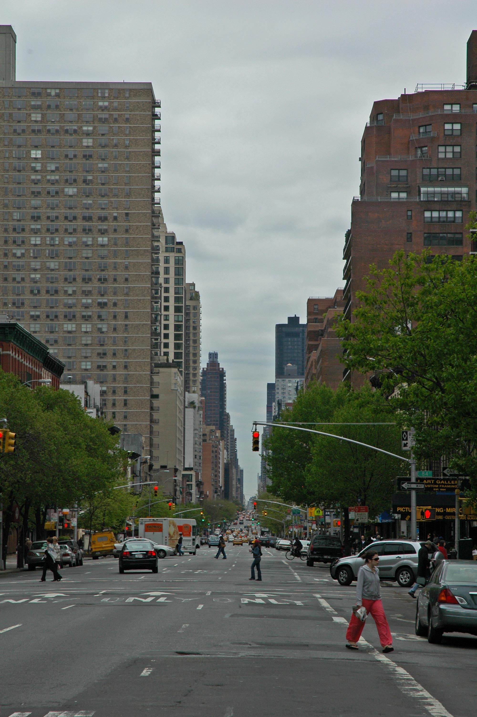
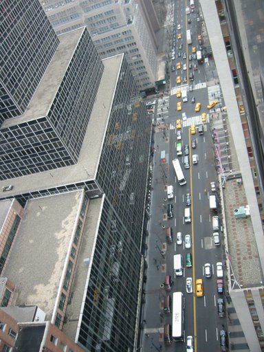
    Here’s a shot (right) of 2nd ave looking south from 85th street, which may very well be the vanishing point of the 1861 image.  Maybe.   The photo below shows 2nd and 42nd from the Helmsley. 

    Second ave 42nd st

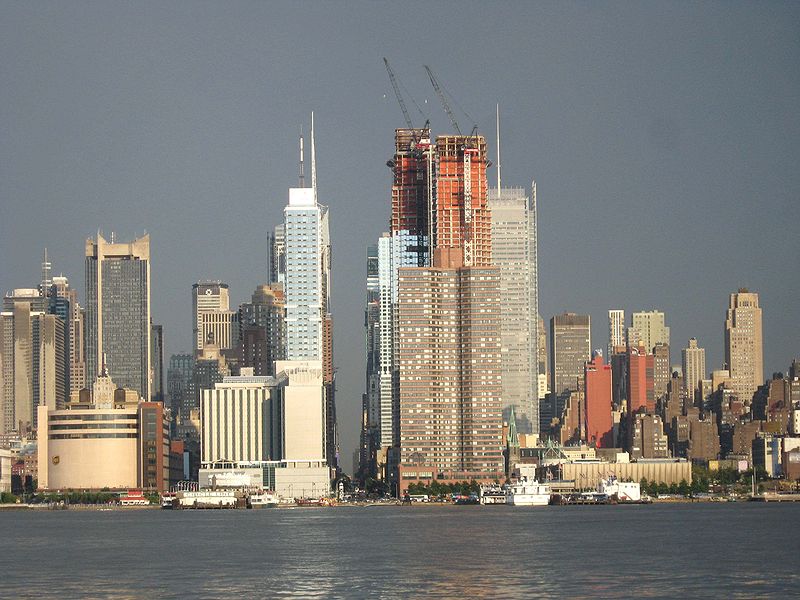
    Finally, below, we see a view of 42nd Street from the Hudson. 
    Sexond ave hudson


  • Unusual and Proto-Useless Statistics Dept: Travel Deaths, 1880 vs. 2006. An Orders of Magnitude(s) Story

    JF Ptak Science Books LLC  Post 415

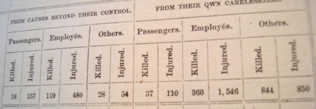
    Searching for something entirely unrelated to what I found (trying to answer how straight railway tracks were  in Texas in 1880*) but happy with the stumbling is this header for a long list of railway deaths on American railroads in the year 1880.  It appears in on page 280, part VIII, volume 13, part 4 of the U.S. House Miscellaneous Documents No. 42, part 4, volume 2132 of the publications of the U.S. House of Representatives.  Lots of numbers, yes?  Actually it is just vol 13 of the U.S. census report for 1880, the Statistical Report of the Railroads in the United States, by Armin E. Shuman (“Expert”).  It si a big books in a series of big books, running 862 pages and is mostly just (beautiful) numbers.  It is remarkable, really, that these folks had such extraordinary control over this amount of data–not only were they collecting it, but analyzing it as well, and doing it before the big breakthroughs that would come in the next census with the Hollerith machines. 

    Ballistics 348 The table is a summary of accidents reported by all railroads in the United States for the year 1880.  For *one* year, not the decade of the 1870’s.  The short story is that 2,541 people were killed in/on/by trains, with 5,674 injured.  Of the “killed” number, 61 were passengers who were killed “from causes beyond their control”, and 62 were killed “from their own carelessness”.  The numbers get much bigger because of the number of employees killed on  the job, more than 900 in the one year alone.  The total number of passengers carried for the year was 269,000,000.  I cannot find the number o total miles traveled.

    I made a quick check on the Bureau of transportation Statistics website just to see what kind of similarities there might be in these numbers. It turns out that the gross numbers were sort of similar–there were 658,000,.000 passengers carried domestically by American carriers in 2006.  There was a tremendous difference in deaths, though: 47 people were killed as a result of air travel that year, compared with the 2,541 by trains in 1880.  Two orders of magnitude, about, with each person traveling a great distance in the air (averaging about 1000 miles) than by rail (whose numbers I could not find quickly).  It is kind of interesting, though, that when you consider passengers as a lone stat in 1880 that the numbers get very close to 2006. 

    Working on the railroads in 1880 was tough and dangerous–more dangerous than I had known.  And I can pretty well  guess that there were no Thanksgiving turkeys being delivered to anyone’s family if Father happened to get cut in half by the South Manchester Railroad Company.  Certainly no turkey would come the year after.


  • Superior Display of Data: the Dead of the Titanic, April 1912

    JF Ptak Science Books LLC  Post  208

    Ballistics_042

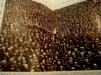
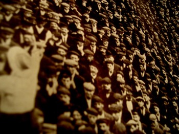
    The photographic editor of The  Illustrated London News came up with this superb illustration of what the 1513 dead aboard the Titanic would look like.  Oddly enough, the photo used for the visualization exercise is of Mr. Ben Tillett, a socialist reformer and speaker, and also the spokesman for the  National Transport Workers’ Federation and also of the Dock Wharf and General Workers’ Union., who at the time was playing an enormous role in the coal handling (and etc.) slowdown, representing the underpaid workers against the shipping companies. 

    The use of Tillett’s crowds to make a case for the shipping industry tells me that The News was oblivious to the attendant ironies. That Tillett was a tremendous thorn in the companies’ paw(s) is beyond question.  Almost immediately after the Titanic disaster he published a statement accusing the White Star Line of trying to save the first class passengers first at tremendous expense of the third class passengers.  “We offer our strongest protest against the wanton and callous disregard of human life and the vicious class antagonism shown int he practical forbidding of the saving of the lives of the third-class passengers.  The refusal to permit other than first-class passengers to be saved by the boats is a disgrace to our common civilization”.  Strong stuff with a huge dollop of truth to it–god only knows why The News would’ve used this picture and this quote as part of a way to concretize what the loss of 1500 lives looked like.  The News did counter the Tillett statement, saying “It need not be said that there is no truth in the allegations thus made…”

    Ballistics_043

    Except, well, they’ve not got the truth under control.  On the one hand
    it is true that the greater indicator of survivability on the Titanic
    was by sex and age variables; on the other, overall, hand Tillett’s
    implied figures are closer to the truth that The News found so repugnant.  Women and children did
    survive in much greater numbers across (voyage) class lines than
    anything else.  Only 3% of first class women perished, followed by 14%
    of second class and 54% of third class. 67% of first class men died,
    followed by 92% of second class and 84% of third; 78% of the male crew
    also disappeared.  So the men did generally go down with the ship, giving their
    places to women and children (and the other 33% of first class men).
    Well, not all of the children:  while no first or second class children
    were lost, 66% of third class kids drowned.  Overall, I’d have to side
    with Tillett rather than a company apologist:  67% of first class
    people survived, followed by 41% of second class and only 25% of third;
    least of all came the crew, with a survivability rate of 23%.

    Tillett would make many observations on the disaster, though one of the most revealing was his observation on the newspapers’ coverage of the heroism of only the first class passengers: ‘I feel glad that the motto “Women and children first” is the great
    call in the hour of danger at sea. Mr Astor’s heroic end was in keeping
    with the heroic end of the humble third class and the members of the
    crew”.  It was an excellent point, and true, and also very uncomfortable stuff to acknowledge in print. 


  • Census Art and the Display of Quantitative Data, 1860

    JF Ptak Science Books  LLC Post 176

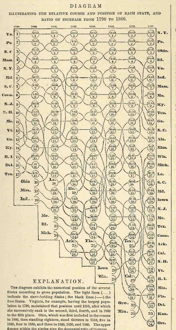
    Blogjuly_19census353_2                                                          This data set is from the Johnson’s Family Atlas for 1863 in the “Historical And Statistical View of the United States” section, printed on the back of the Tennessee and Kentucky map, and which was derived from the Eight Census of the United States  (1860).  It displays the changes in the states’ populations relative to each other, placing them in a populace order (highest to lowest), for a seventy year period, from 1790 to 1860, following the changes in the 17 states of 1790 to the 34 states in 1860.     So far as I can determine this is a very early graphical display revealing these sorts of comparisons of, well, anything.  It is  a little tenuous and twisted, but the ride it offers is determined and it is revealing–it just doesn’t enter the form in which the data could be more usefully (and quickly) displayed.  If you set your mind to it you can follow the languid changes in increases and decreases in a state’s population relative to the other states in the Union–for example, it is easy to follow the fortunes of New York and Virginia, as the changes each experiences over these seventy years is relatively marginal. Drastic changes are another story, and following the lines of their evolutions not easy:  the mercurial climbing chnanes in Ohio and Illinois are a bit hard to figure, though the longish but large changes (like that of South Carolina) prove a bit less tenacious to see.      
    There would be many more of these displays to come–particularly in the very large, double-page, fabulously colored lithograph that appeared in the atlas folio of the famous 11th census–but this was one of the very earliest attempts to display changes over time, and it worked out beautifully.


  • Statistical Fossils 2: Found Stats On International Mail Delivery Times, 1900.

    JF Ptak Science Books LLC  Post #121

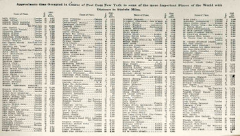
    Continuing to leaf through the George Cram Family Atlas of 1903 I came across another small fossilized statistical nugget that I know would be of value to some poor person out there:  this one is  a half-page of mail delivery times to about 200 places world-wide.  (I know that this would be helpful to some historian, as I just went through a similar process for some data that I actually needed,  finding a series of representational maps showing the frontiers of travel time for different modes of transport over different periods of time leaving from New York, and representing several decades’ differences—these were an enormous help to me, and I was unaware that such data had been compressed so elegantly; trying to piece this information together piecemeal would have been a very time consuming effort.) (This image is clickable for a magnified view.)
    Statistics_found_mail_times166_2

    So in keeping with some of the other data-posting tactics of this site (for example the atomic bomb chronology and the bibliographies of various scientists as found in these pages) as well as on my business site  I‘ll continue to make posts for some of the particularly scrumptious bits that I find during the day.

    And just for the record, the longest in-transit period for mail that I have seen thus far in this table is for New York to “Gabun” (Gabon), Africa, coming in at 47 days; Saigon came in a close second with 44 days, and Hong Kong, 43.  It still took 8 days to get a letter from NYC to London in 1899.  The record for an east bound crossing of the Atlantic in 1958 was still three days, twenty hours, set by the Queen Mary in 1938, so getting a letter delivered in London after only nine days (including the passage plus processing and foot delivery) was pretty fast there at the turn of the century.  Speed is a simple matter of relativity and perspective–and starting with a given known. 


  • Statistical Fossils 1: Found Stats Concerning the Rifles of the World, 1899

    JF Ptak Science Books LLC Post  Post #120

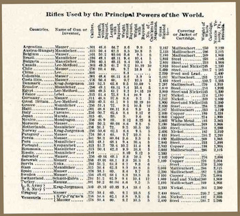
    Leafing through back-page minutiae of the George Cram Family Atlas of 1903 (a modest but full work on the level of something like the World Book Encyclopedia of the 1970’s) I stumbled upon a wonderful table entitled “Rifles Used by the Principal Powers of the World” (and by “world” it meant 43 countries). (You can CLICK on the image below for a more readable, magnified version.)   
    Statistics_found_rifles165

    The 3×4-inch table was packed with some unusual data, and even though I just jested with its 47-country “world” that is actually a fair representation of the gun-consuming nations of the time.  The table lists the name of the gun or inventor, followed by its calibre, length (with and without bayonet), weight (with and without the bayonet), number of cartridges in magazine,, the distance at which the gun is sighted, the “conveyor or jacket of cartridges”, and the muzzle velocity (in feet per seconds).  That’s really quite a lot of obscure data packed into such a small part of page 321 in this book.