A Daily History of Holes, Dots, Lines, Science, History, Math, Physics, Art, the Unintentional Absurd, Architecture, Maps, Data Visualization, Blank and Missing Things, and so on. |1.6 million words, 7500 images, 4.9 million hits| Press & appearances in The Times, Le Figaro, Mensa, The Economist, The Guardian, Discovery News, Slate, Le Monde, Sci American Blogs, Le Pont, and many other places… 5000+ total posts since 2008.

Category: Prints–looking HARD/deeply at

  • Extraneous Alphabets: Imperative Incidentals in Dante. And the Devil.

    JF Ptak Science Books  Post 2533

    There is a peculiar beauty to discovering a sleeping obviousness–something that is so present and apparent and minor that it can present for a while before you suddenly recognize it, and then the obviousness is all that you can see. “Hiding in plain site” is something that it might be called, though I don’t think we have a word for it in English.  
    Dante beatrice237

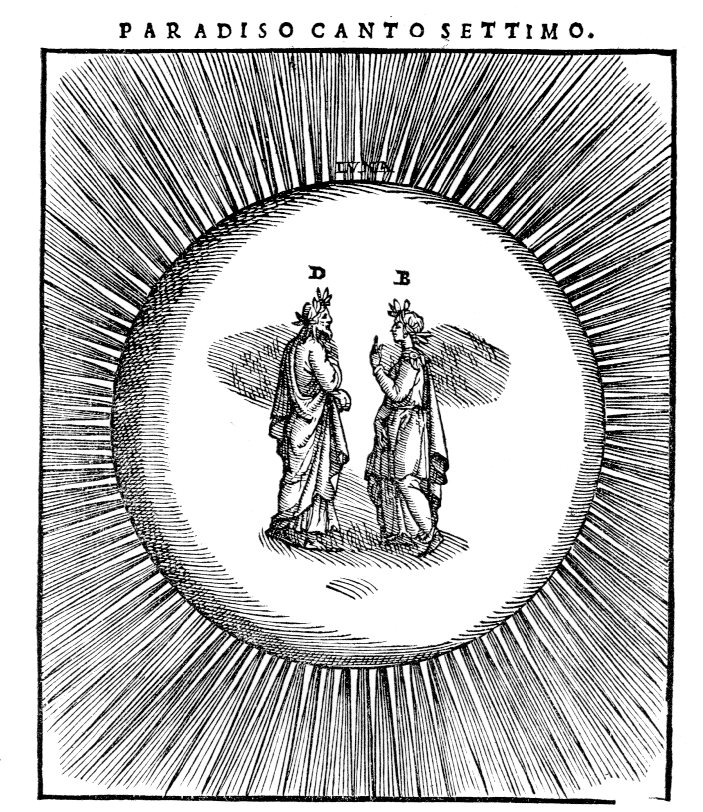
    Here’s an example of it, found in Dante. It may seem perverse to look at beautiful images like this/these illustrating one of the greatest stories that has ever been spun, but the tiny letters signifying the actors defined in the motion take on their ow unusual lives for me.  It seems very odd to identify objects that are so obvious and form the direction of the story and need no identification. (Some things need no introduction, like Dante and Beatrice, and Yogi Berra. (A friend told me a story of going to a function and being seated next to Berra for dinner, Yogi walking up to him and extending a hand saying “Hi, I’m Yogi”. No kidding?))  But I guess someone thought the notation was necessary, even if it both spoils and beautifies the simplicity of the design.  

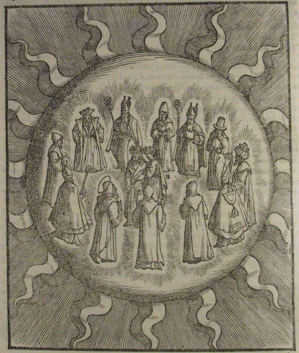
    The edition of Dante is by Alessandro Vellutello, (La Coemdia con la nova espostione de Alessandro Vellutello…published in Venice in 1544) who extended himself to include the (87) illustrations that I just mentioned, and included a text full of glosses. No doubt the signifiers in the illustrations are aids to the supplementary text–still, they seem to be fairly unnecessary. 

    • Here’s an entire gallery of the Vellutello illustrations at World of Dante, http://www.worldofdante.org/gallery_vellutello.html
    Dante sun big

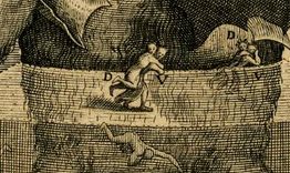
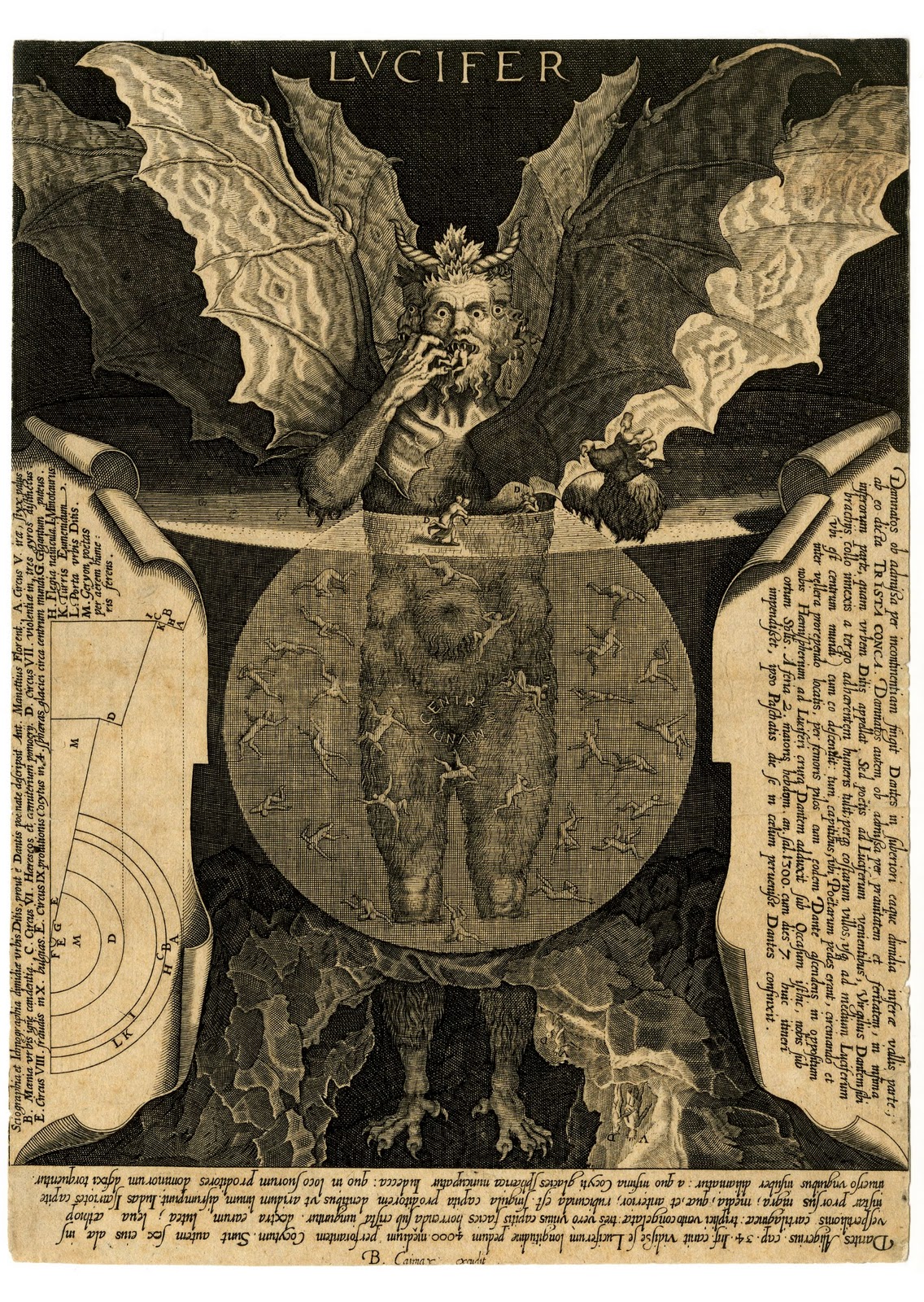
    That said, most of the time I appreciate the annotated image (speaking here of the non-technical/scientific ones)  mainly because without the help the iconography sometimes escapes me.  The Vellutello illustrations are much more “modern” than previous illustrations made for Dante, and seem to bridge the centuries of differentiated understanding so far as the interpretation of the images are concerned. On the other hand I appreciate the effort made for explanation in the engraving by Cornelis Galle of the Devil as it lived and breathed in Dante, the help coming in many forms. For example, without the annotations I would probably never have noticed the “D” and “V” figures (Virgil carrying Dante) so I  am thankful for the help:
    Lucifer

    Lucifer detail


  • The French Blue Devils at West Point, 1918

    JF Ptak Science Books   Quick Post

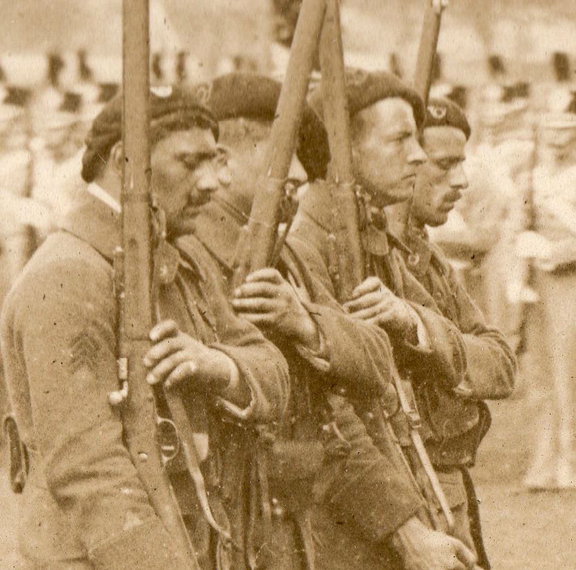
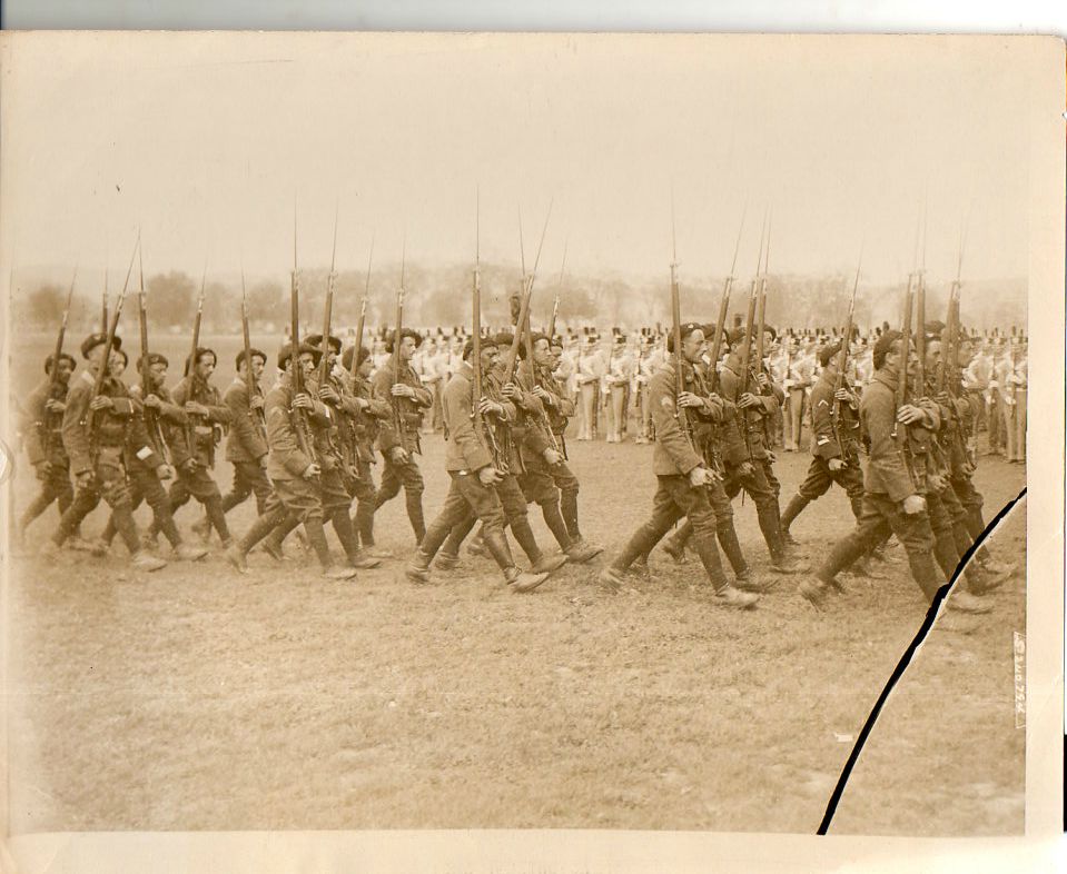
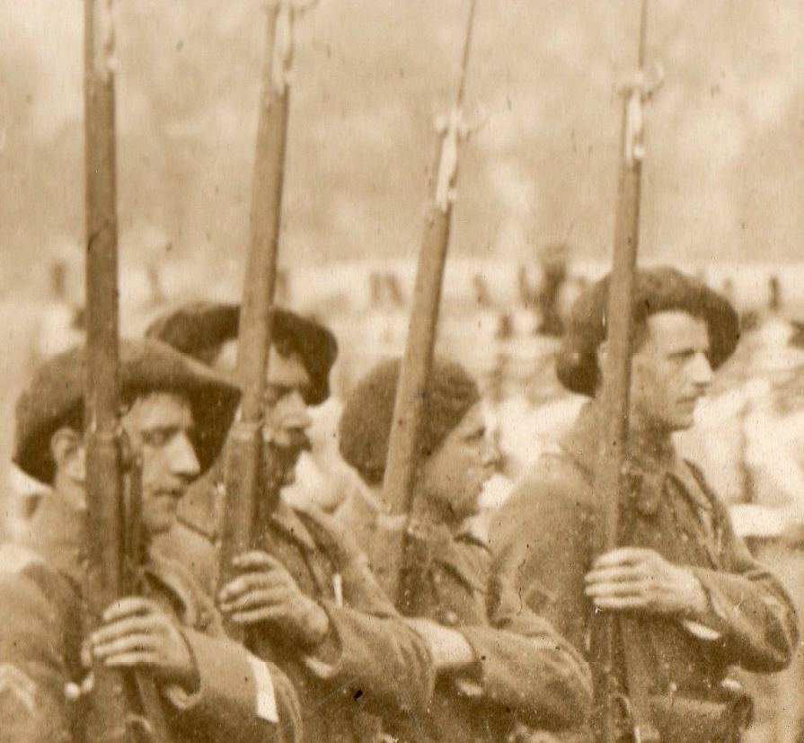
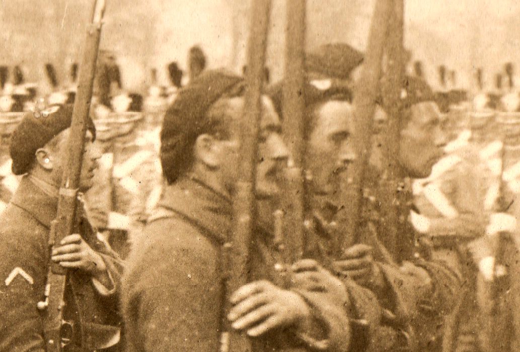
    I really enjoy looking at old photos with a magnifying glass, finding the pictures within the picture, until it is micro-images all the way down. It is odd “coming out” of them, sometimes, and then looking at the full image, and in some sense feeling utterly at a loss to try and find where you had just been in great detail.  

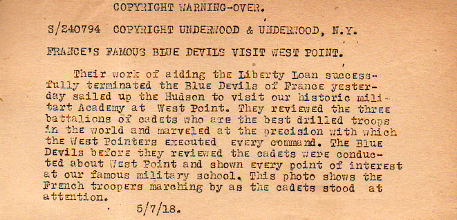
    Here’s an example with this great photo of the French Blue Devils on parade at the U.S. Military Academy at West Point.  These soldiers were and are elite mountain infantry, the Chassons Alpins, “Alpine Hunters”, and nicknamed “the Blue Devils”, and who saw their fair share of combat during WWI.  They made a tour of the U.S.at the beginning of the War in a fund raising drive, and evidently did so again, at least in this instance, showing up in New York in May 1918.  

    WWI--Photos--Blue Devils207

    WWI--Photos--Blue Devils206

    This is a news photo service photograph (see here for the story) and is accompanied by this text which was supposed to be used along with the image when purchased for publication in a newspaper or magazine.  

    • The original photo is available for sale at the blog bookstore, here.                  

    WWI--Photos--Blue Devils210

    WWI--Photos--Blue Devils208

    WWI--Photos--Blue Devils209


  • Pride in a 3mm House on the Dead Man’s Walk, 1855

    JF Ptak Science Books   Post 2483

    Jornada136

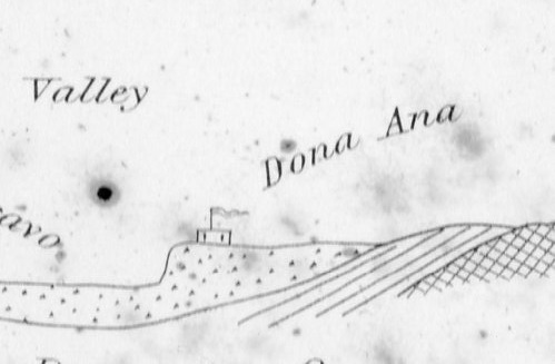
    Sometimes maps have an unusual ability they can Maps can record human achievement and anti-achievement and show human impact on the environment and vice versa, which is standard,  especially if you can see a little deeply into it.  Sometimes though there are the little bits–extras–that find their way onto the paper that opens a window to the emotional involvement of people and space, added by the artist or engraver or whoever it might be that last touches the plate before prints are made from it.  

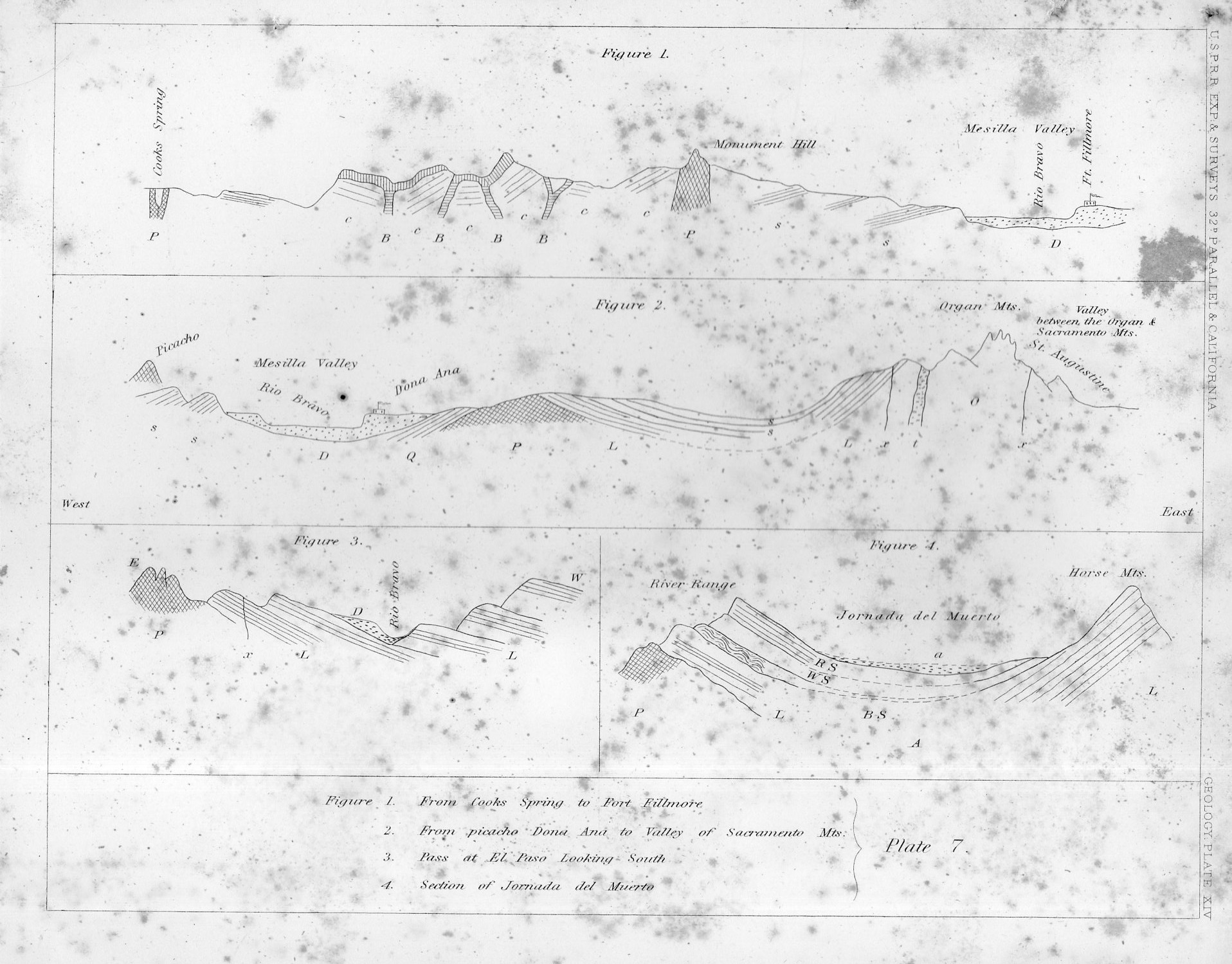
    This certainly seems to be the case in this cross-section of tough New Mexico earth.

    That little adobe building represents the Dona Ana Land Grant back in 1855, when those pioneers had a few decades of roots in the very hot ground there in New Mexico, across from the Rio Bravo, commanding the Mesilla Valley.  In the original print, published in the great U.S. Pacific Railroad Survey1 in 1855, the structure is only about 3mm long–very easy to miss until you start looking closely at the sheet, which itself is only 2×2.5 cigarettes high and wide.

    I thought the structure had a personality, and looked stolid, strong, and maybe even proud with its long fluttering banner, sitting there in the heights above the river, a strong place perched at the edge of the Jornada del Muerto (“The Dead Man’s Journey” or more prosaically and according to Mr. McMurtry, “The Dead Man’s Walk”)

    Jornada135
    Notes:

    1. The full title of the eight-volume publication, which was an exhaustive treatment of the U.S. west from the mud below to the birds above, Reports of Explorations and Surveys to Ascertain the Most Practicable and Economical Route for a Railroad from the Mississippi River to the Pacific Ocean Made Under the Direction of the Secretary of War, which was published by the U.S. government from 1853-6.


  • Concentration, ca. 1572.

    JF Ptak Science Books  Post 2482

    Ioni Maio130

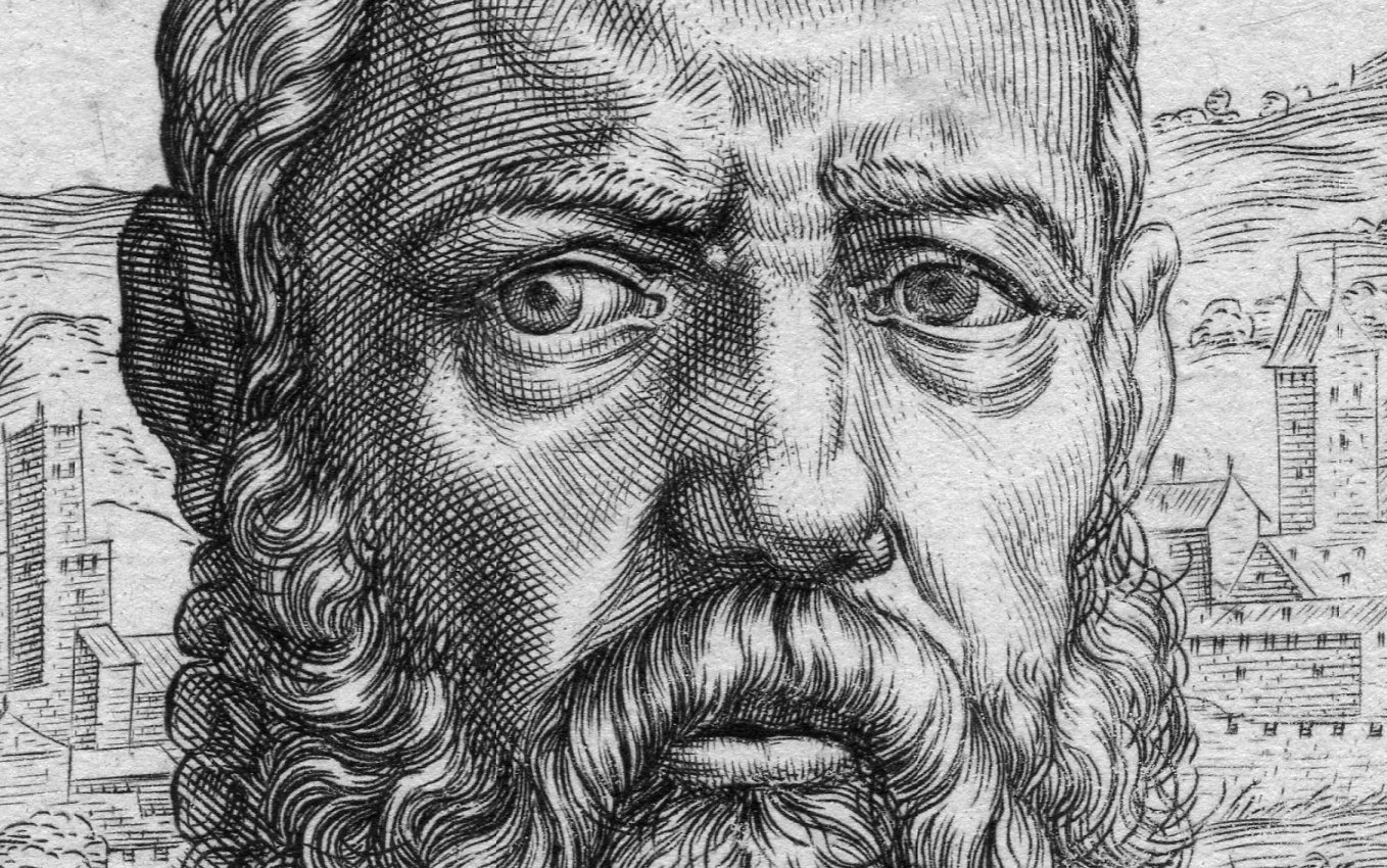
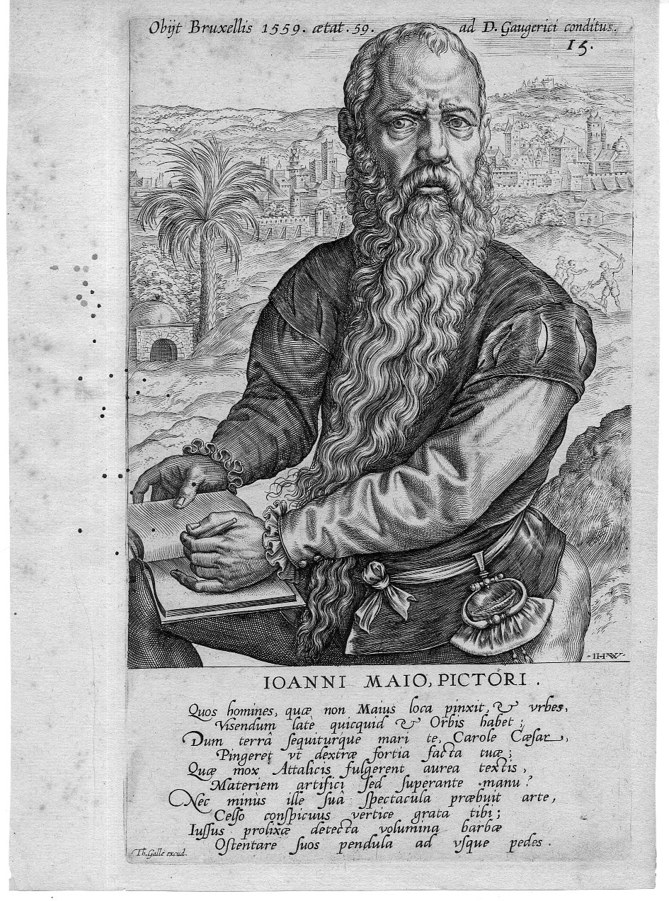
    This engraved portrait of the very striking Jan Cornelis Vermeijen (also “Vermeyer”, and here known as “Ioanni  Mao”) appears in Dominicus Lampsonius (Latinised form of Dominique Lampsone) Pictorum Aliquot Celebrium Germaniae Inferioris Effigies and published by Volcxen Diericx (1570-1600 fl).  (The first edition was published in 1572, and I believe that this image appeared somewhat later in the century as there are some differences in the text around the image.) Diericx was the  “widow of Hieronymus Cock , who took over his business ‘Aux Quatre Vents’ after his death in 1570. She and her new husband, Lambrecht Bottin are mentioned together by Plantijn at the head of a list of printmakers and print sellers in Antwerp, which was assembled between 1577 and 1580. Since the death of Hieronymus Cock in 1570 to her death in 1600 all the prints published by her have the sentence Aux Quatre Vents without the name of Cock”.–British Museum online. 

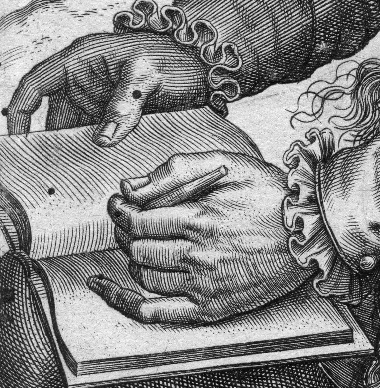
    I’ve long liked this portrait of Cornelis Vermeijen (ca. 1500-1559), I think mostly for his hands and for the ultra-concentrated bit of concentration that is going on in his eye/forehead conversation.  Even though I ‘ve owned this for a long time I’ve never known about the placement of the palm tree over Jan’s left shoulder or the murderous attack going on over his right. 

    The work was executed by Theodore Galle (signed in the plate at very bottom-left) after the engraving by Jan Wierix (1549-1620, who signed his name “I H W” in the bottom right of the portrait.  The other Dutch artists comprising the illustrations include The artists included in the book are (in this order): “Hubert van Eyck, Jan van Eyck, Hieronymus Bosch, Rogier van der Weyden, Dirk Bouts, Bernard van Orley, Jan Mabuse, Joachim Patinir, Quentin Matsys, Lucas van Leyden, Jan van Amstel, Joos van Cleve, Matthys Cock, Herri met de Bles, Pieter Coecke van Aelst, Jan van Scorel, Lambert Lombard, Pieter Bruegel the Elder, Willem Key, Lucas Gassel, Frans Floris, and Hieronymus Cock.” (Wiki)

    Ioni Maio129

    • The original is offered for sale at the blog’s bookstore, here. 

    Ioni Maio131

    Ioni Maio132


    The legend reads “Quos homines quae non majus loca pinacit et urbes Visendum late quicquid et Orbis habet Vum terra sequiturque mari te Carole Caesar Pingeret ut dextrae fortia facta tilt 6 Quae mox Attalicis fulgerent aurea teactis Materiem artifici sed superante manu Nec minus ille sua spectacula praebuit Celso conspicuus vertice grata tib…”


  • Details in Terrestrial/Celestial Globes, 1723

    JF Ptak Science Books   Quick Post

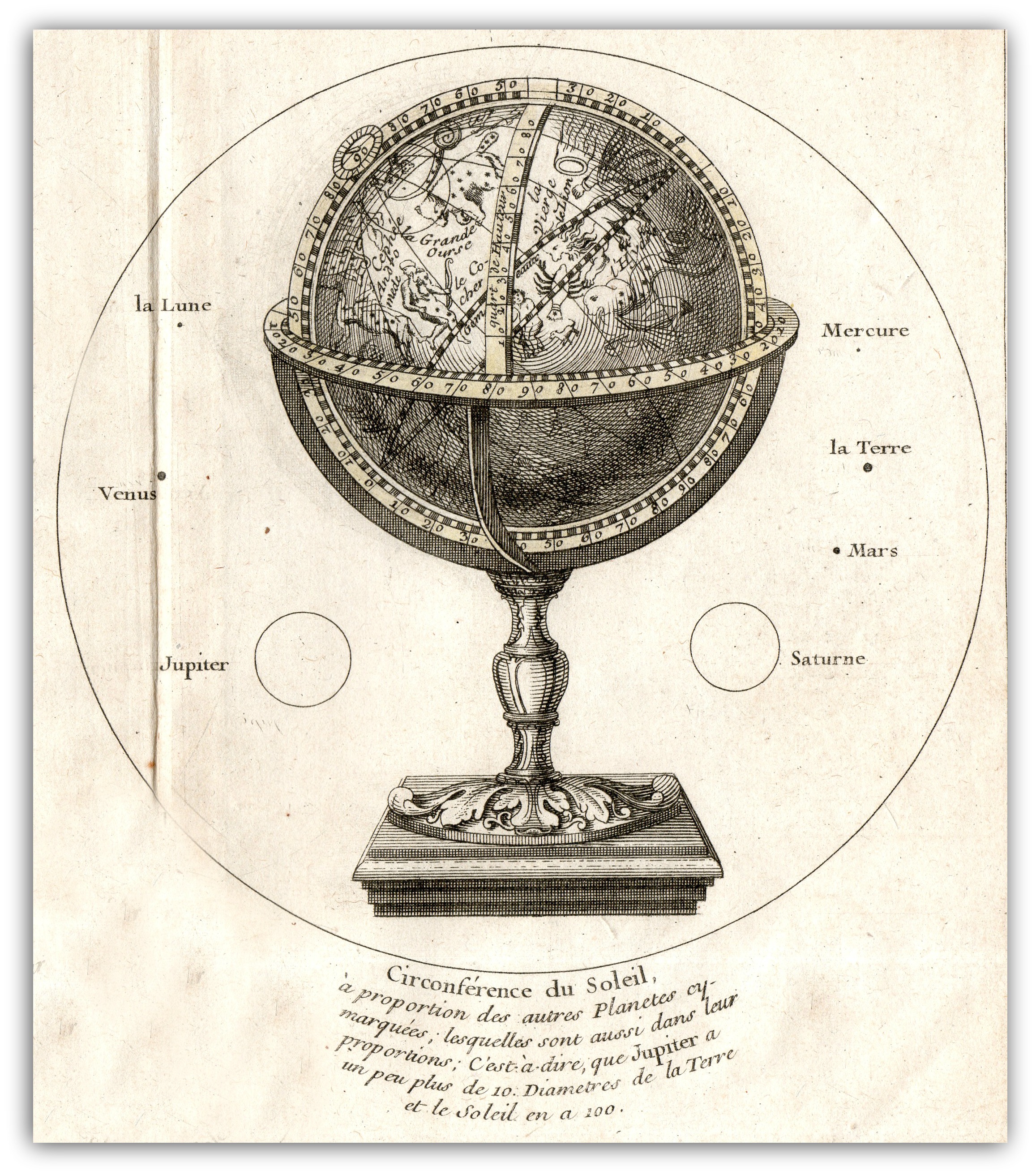
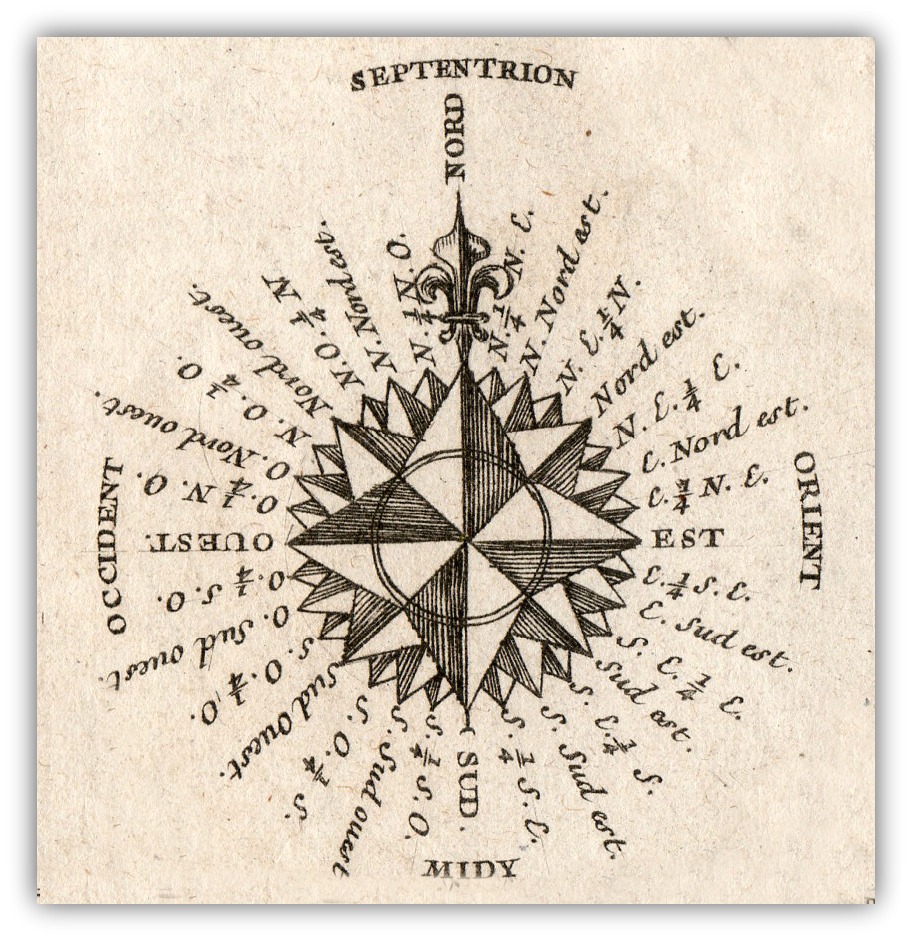
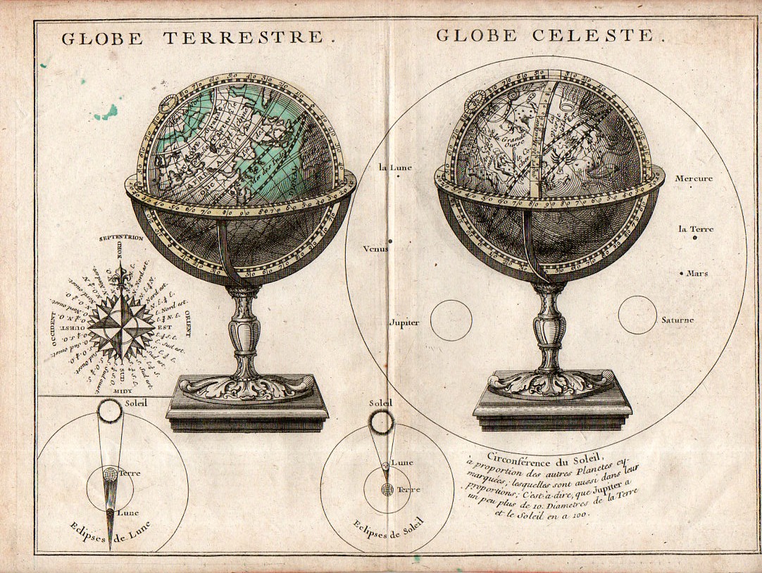
    The main object in this engraving–the presentation of two globes, one terrestrial and one celestial–is perhaps less interesting than secondary figures accompanying it.  The two small insets of solar and lunar eclipses are instructive and pretty, while the compass rose is full and surprisingly stubby, making that example fairly uncommon–and much more attractive when isolated and cleaned up a bit.  So too for the rudimentary but elegant comparison of the sizes of the planets compared to the Sun that surrounds the celestial globe–again, isolated and defined, the image is striking. 

    Map Globe Terrestre Globe Celeste detail

    • The original map is available here at the blog’s bookstore.

    Map Globe Terrestre Globe Celeste117This from the full image:

    Map Globe Terrestre Globe Celeste115


  • Isaac Newton, Alpha and Omega

    JF Ptak Science Books  Quick Post

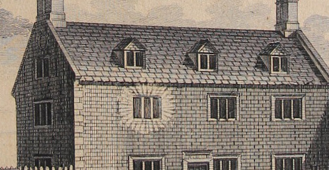
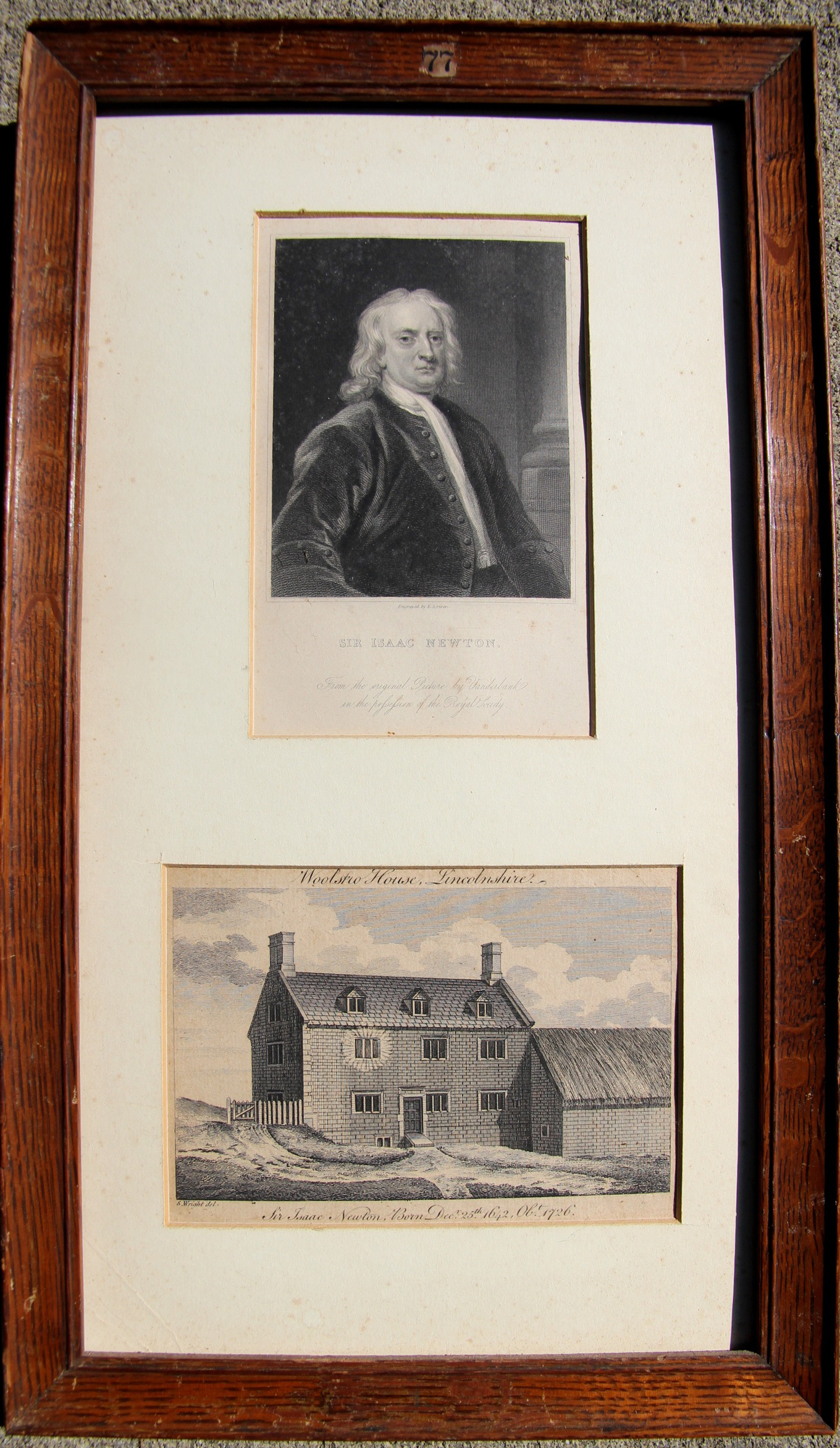
    For many years I’ve had this double-portrait (as it were) of Isaac Newton, an alpha and omega image: it depicts the window of the room in which Newton was born in Woolsthorpe (near Grantham), and then the last portrait made of him in life.  The portrait is very well known; the view of the window with the pure holy light, not so very much.

    Newton alpha omega detail


    Newton alpha omega


  • Chuck Close Convict Optics, 1936

    JF Ptak Science Books   Quick Post    An Episode in the History of Dots

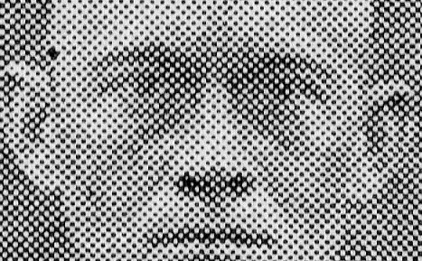
    There is no telling, sometimes, where an interesting/odd bit might occur. I guess you could make the case that they occur everywhere and that it is just our inability to see them that limits their appearance.  This may be the case with the following, a magnified part of a small part of a chart, where dots turn into squares:

    Convict farm909 detail

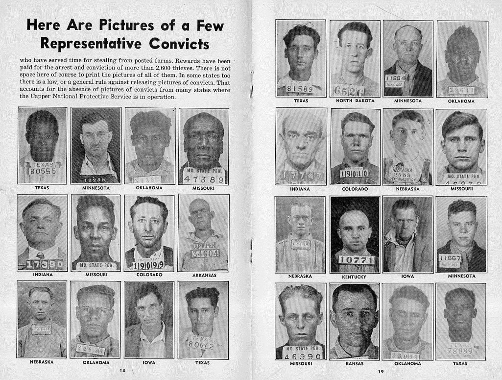
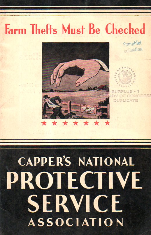
    The pamphlet topic is certainly a modest vanilla flavoring–prevention of farm theft (1936). However the cover is striking, so it is an easy thing to pick up.  There’s a bunch of anti-crime/catch-’em stuff and help on how to do that inside–there is also a two-page spread of mug shots of examples of people caught and convicted utilizing the services offered in the pamphlet. That’s where Mr. Close comes in.

    Convict farm samp-ler910

    One interesting thing about the enlargement is that you can make the image go from near-negative to positive by tightly squinting your eyes–which is something I think you cannot do with the pre-pixelated Mr. Close.  

    In any event, it was a very nice find, found in an unusual and serendipitous place. 

    And the cover:

    Convict farm cover911


  • Steampunk Air Travel, 1843

    JF Ptak Science Books   Quick Post

    “Let no man seek / Henceforth to be foretold what shall befall / Him or his children.Milton,” Paradise Lost XI, 770-72

    George Cruikshank–the gifted English cartoonist/satirist/caricaturist and social commentator–was readying his viewers to some hyperspeculative dreams on the possibilities of near-in-time powered flight.  Steampunk air travel is so commonplace in the near future that there are departure stations on building-tops   

    The etching in question, illustrating “Air-um Scare-um Travelling” appeared in the Comic Almanack (1843), and outlines a clear and hopeful image of future travel.  The ads show that there are frequent flights to far-away places, including Mont Blanc and Beijing.  

    It is interesting that the future is tempered somewhat by including an exploding airship at bottom left–so the future may be wondrous and exciting, though not without its dangers.  


  • The Tools of a Scientist, 1700

    JF Ptak Science Books    Quick Post

    Friedlein941

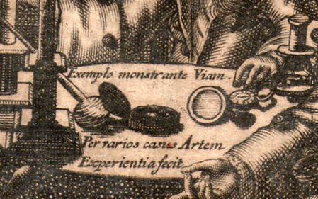
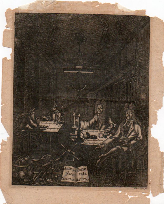
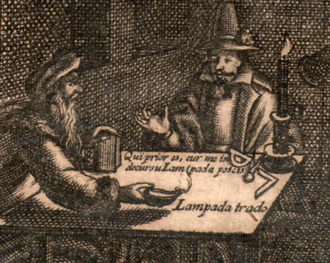
    This is an image of a  philosopher’s cabinet, an engraving (on copper?) by “I. Friedlein fec”, who was actually Johnann Friedlein, an emigree from North Germany to Denmark, and who worked ca. 1680-1705. It shows the tools of the trade for someone working in natural philosophy (the name “scientist” would not come into use for another 150+ years or so) and is an interesting insight into a small, polite gentleman’s club for experiment and investigation.

    Friedlein938

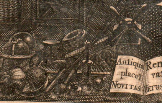
    The men surround a decent collection of scientific instruments–I can locate a compass, dividers, oil lamp, magnifying glass, compass, microscope  (at the right elbow of the figure on the right), terrestrial and celestial globes,  a (large) clock, barometer and various weights and scales.  And behind it all looms a fairly large refracting telescope (is it 6 six inches?) which also has mounted alongside of it a smaller sighting telescope. 

    Friedlein939


    Friedlein940

    Friedlein942

    Nyt dansk kunstnerlexikon: bd. Indenlandske kunstnere (fortsættelse …)by Philip Weilbach:


  • History of Ladders Series–an “Empty” Stubby Ladder of Hull

    JF Ptak Science Books  Quick Post

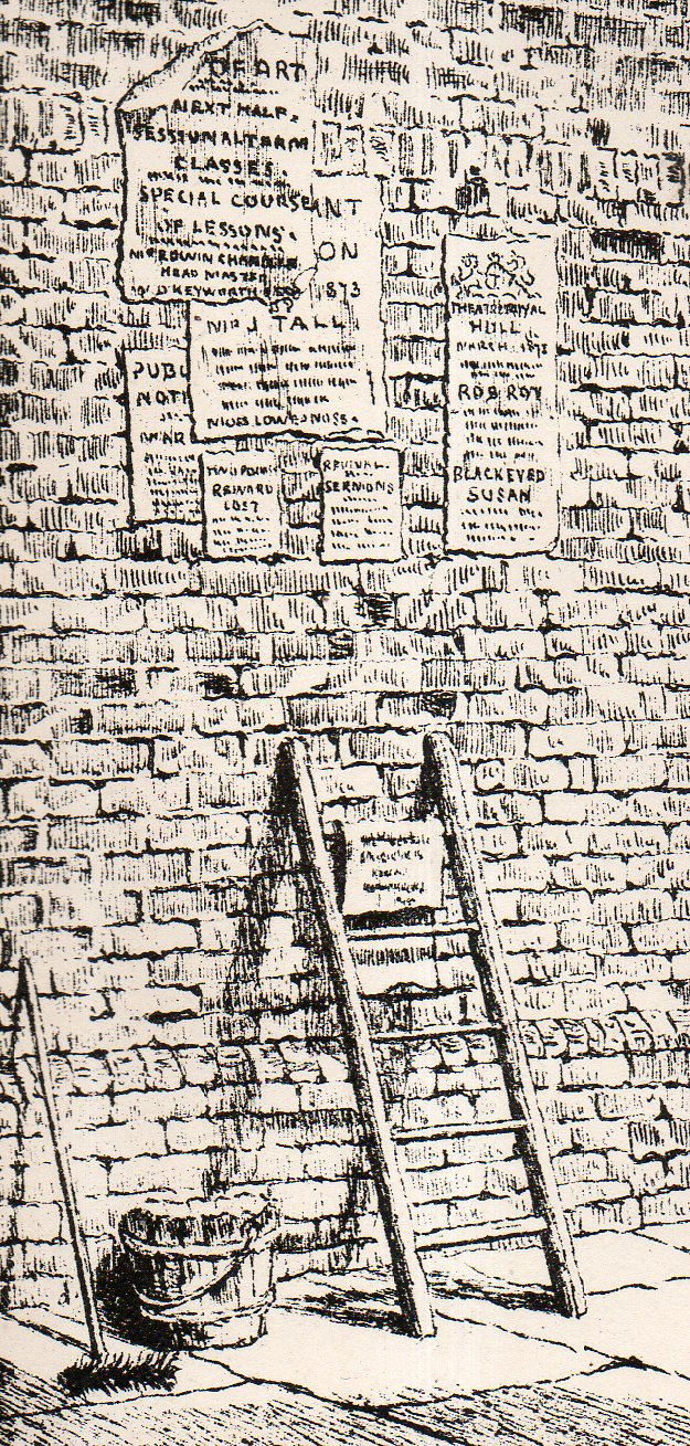
    Breezing through a volume of Building News for February 19, 1875, I came upon this interesting lithograph for a building in Hull, a city in East Riding of Yorkshire, England.  It depicts ancient brickwork on “an old house in Dagger Lane”, in one of the “nooks and corners of ancient Hull, an old city reaching back evidently to the 13th century. (An interesting assessment of this building appears here at Paul-Gison.com.) What attracted me in this image was not necessarily the ancient structure but the empty ladder–and I can say that after having looking at x-thousands of antique prints that (a) ladders are uncommon and (b) unused ladders are even more so.  Here we see t he ladder of a person posting bills on a wall, his bucket of paste and brush on the ground, the next poster on a ladder rung, and the laborer just not present.  It is an interesting snapshot of a bit of daily life not usually recorded from long ago…

    There are several other posts on this blog regarding ladders: 

    Beautiful Ladders of the Baroque (Here)

    One Upmanship–a Short Note on the History of Ladders  (Here)

    Renaissance Ladders in the Brooklyn Bridge, 1876 (Here)

    HULL069

    And the full image: