A Daily History of Holes, Dots, Lines, Science, History, Math, Physics, Art, the Unintentional Absurd, Architecture, Maps, Data Visualization, Blank and Missing Things, and so on. |1.6 million words, 7500 images, 4.9 million hits| Press & appearances in The Times, Le Figaro, Mensa, The Economist, The Guardian, Discovery News, Slate, Le Monde, Sci American Blogs, Le Pont, and many other places… 5000+ total posts since 2008.

Category: Perspective

  • Neutrons, Positrons, & Hell–the Epic of the Fall of Man Suggested in the Physics of 1932

    JF Ptak Science Books   Post 2613

    Two days ago (or yesterday?) it seemed as if everything that I touched or read or researched involved the year 1932–and two of the blog posts were on things from that year. Over in the science bookstore side of what I do here, I was also working on the discovery of the positron by C.D. Anderson (announced in the Physical Review, and which showed that yes indeed there were things smaller than the atom)’ Chadwick’s discovery of the neutron, and Cockcroft1 and Walton’s splitting the lithium atom–all in that big year of 1932. And this all somehow put me in the mind of dots and circles, and then concentric circles, and then to Hell.  

    This was not the physical Hell of what was to come in 1945 and it wasn’t the future beckoning call of Armageddon that came as one of the results of decades of nuclear research–instead it was a stronger but make-believe Hell of infinite belief, brought to us via the development of numerous religions and then more beautifully described by Milton and Dante…and, in the case here, Caedmon.  
    Caedmon272

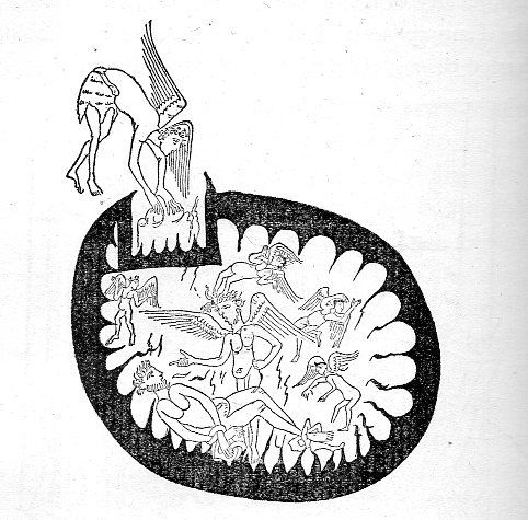
    All of this boils down to one picture that I had in mind when I was messing around with the 1932 stuff–the opening of the boundary of Hell into that of Chaos.  The image comes from a very early manuscript of Caedmon–who was a 7th century figure and the earliest English poet whose name is known. name is known–illustrating a part of the story of the fall of man. The image has stayed in the back of my mind for a long time, encountered in an interesting (and thickly spongey) book from 1896 by Stephen Gurteen (1840-1898) called The epic of the fall of man; a comparative study of Caedmon, Dante and Milton2. The striking picture is the third in the book (on page 108), though plenty of other images appear behind it through the course of the rest of the book, another 35 in all.  

    What we see is a circle within a circle, an atom of Hell, with Hell itself surrounded by Chaos, or the Abyss, and above this, there was Heaven, or the Empyrean; and in this case, an angel is reaching through the black surrounding region of Chaos and into Hell, where we see an example of the suffering of the mega-damned.  

    I know this isn’t quite a vision of an atomic model, but I associated it with our friends from 1932.  And yes there are other examples suggesting this structure springing from Dante and even Milton, but, really, it is just this one image that first comes to mind.  

    Notes:

    1. As it turns out in my experience John Cockcroft is a very rare photographic figure among physics Nobelists in that he is very frequently smiling in official photos. 
    2. Full text available here:  The epic of the fall of man; a comparative study of Caedmon, Dante and Milton, https://archive.org/details/epicoffallofmanc00gurtuoft   

    ·Posted by :

    ·in:

    —

  • Flat and Full Perspectives

    JF Ptak Science Books  Post 2602

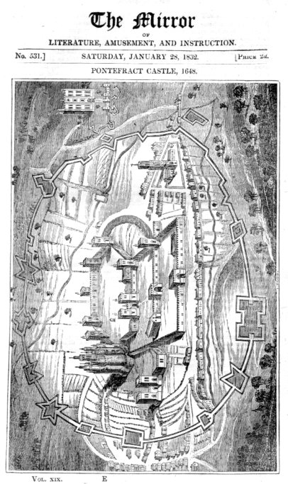
    There were two images that I came across tonight in the studio as I was chasing Pooches the Cat/Dog–they’re not quite on the opposite ends of themselves on the compass rose, but they are certainly in the neighborhood. I like it though that they came to me by chance, one after the other. One is very, very flat; the other is very “full”, and has a large sense of dimensionality.  The first is a 1832 woodcut of a 1648 rendering of Ponterfract Castle. Although perspective had been discovered (or rediscovered at 250 years earlier, the image has a Medieval taste to it, as we see both two- and three-dimensional representations together in the same image.  I think that most of that was done by design and the print was dual-purposed–first to show the plan of the castle and then secondly to show the fortifications and some buildings in elevation. The overall effect I think portrays more flatness than not.  

    Flat perspective089

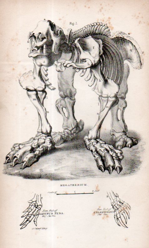
    The second perspective is something that I’ve always thought had a deep depth for a piece of paper. My copy is simply a loose engraving, bought years ago at Pageant Book Shop in Manhattan–a stray bit in a  “sciences” bin or some such, and I’ve had it ever since.  Again I’m not sure of its origin but my guess is that is is English from a popular science dictionary or geological text 1825-1850.  It just has a great perspective–plus it also looks as though we’ve just surprised it, a little.  It is a Megatherium (“giant/beast”) and was discovered first in 1788 by Manuel Torres and then assembled in the next year by Juan Bautista Bru, who evidently made the first illustrations of it.  An engraving of the magnificent mammal appeared in the second edition of Georges Cuvier’s Recherches sur les ossemens fossiles, (1812) which was a justifiably iconic image, though I like this little and odd-perspective one from above better.  

    Megathermin088


  • You Are There: Dive-Bombing Pilot, 1935

    JF Ptak Science Books 

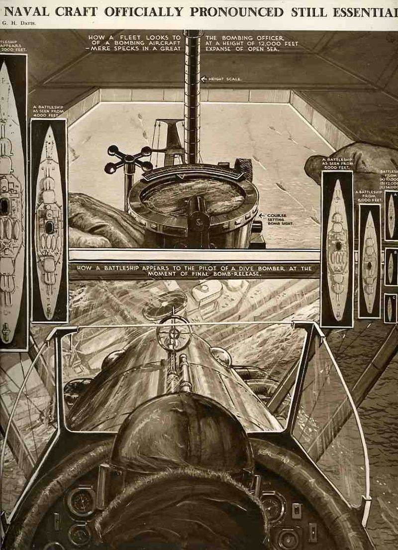
    In my experience popular images prior to WWII that put the reader inside of the picture– giving them the same view as the observing, principle member of the picture–are very uncommon.  Honestly, they just don’t happen very often, and I wish that I had paid more attention to them over the years before I realized they were as rare as they were. Such is the case with this extraordinary and action-packed picture in which the reader is hosted just behind and slightly above the head of the pilot of the aircraft dive-bombing the battleship.  It appears in The Illustrated London News for 7 November 1935, and it must have been captivating for the readers, being given the sense of closing in at great speed on the ship.  There are actually eight other smaller perspective images embedded in the image as well. The largest of these (at top) places the viewer directly inside the subject, giving them the feeling of how it looks like to the bombing officer of the aircraft as it approached the fleet. The other five images shows what the battleship looks like from different height from the inside of the aircraft.  Perhaps this doesn’t look like much to us today, but at the time, I can assure you, these images were exceptionally uncommon offerings of a personal perspective that few readers had ever experienced.

    00-blog-Oct 21--aircarft attack892


  • Two Dimensions to Three and Back Again (1588)–a Bit of an Optical Illusion

    JF Ptak Science Books  Quick Post

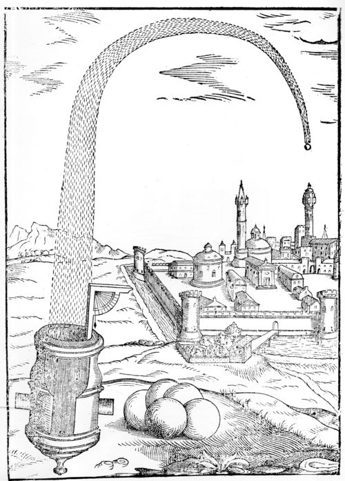
    Luis Collado de Lebrija, the Royal Engineer of the Army of Lombardy and Piedmont, wrote his superior artillery manual Practica Manuale di Artegliteria and published it in 1588–he was one of the five leading military engineers of the late 16th century. The image below is an interesting one from that book, showing a large cannon bombarding what possibly might be a Turkish city. In any event, the trajectory of the very large shell seems to me to be a little odd at first, looking as though it was shot high and straight up, coming down to the right; but looking at it again, the trajectory is back on track going forward 1000 meters than going up and down. And then, again, another look, and the perspective seems flat again, and back and forth it seems to go if you let it.   

    Collado cannon018


  • An Escher-Like Non-Escher Architectural Image

    JF Ptak Science Books  Quick Post

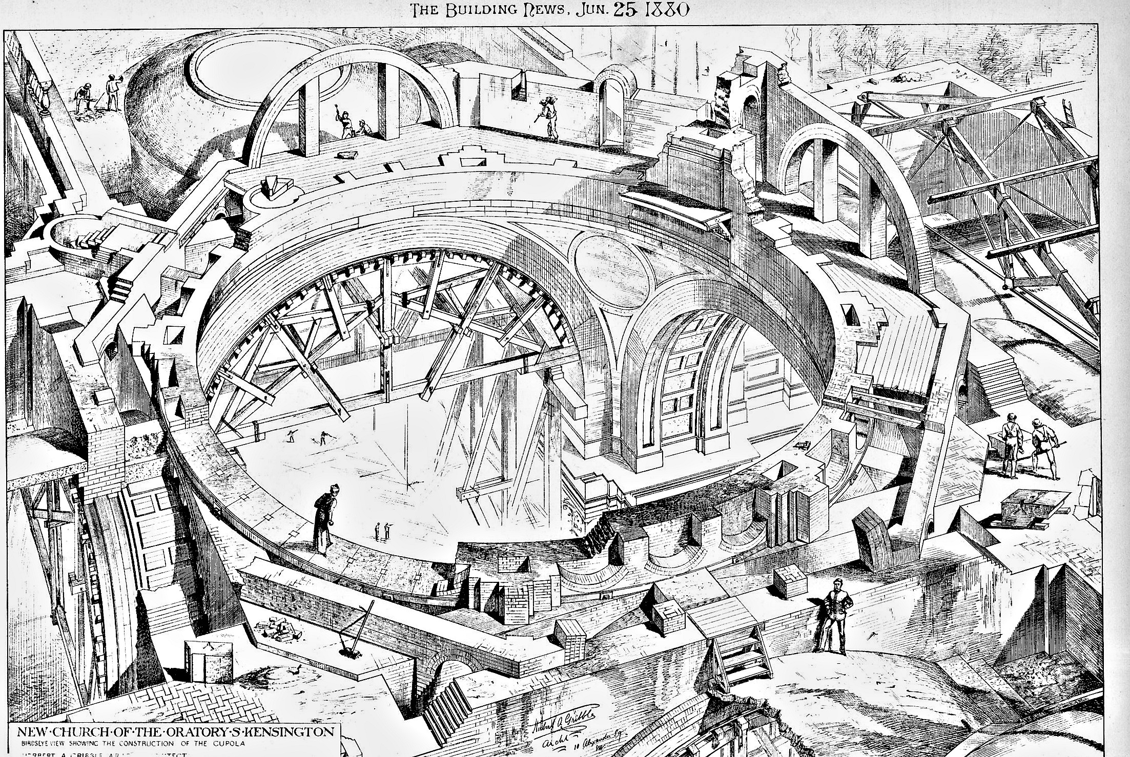
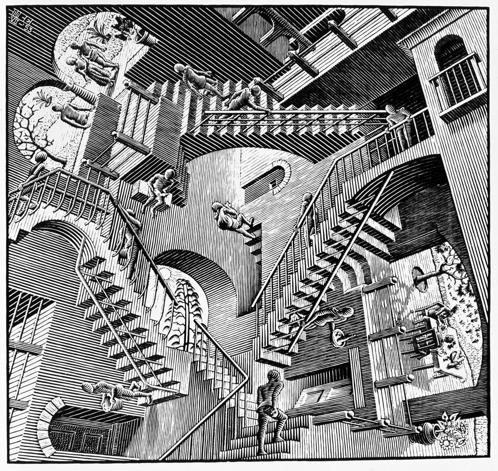
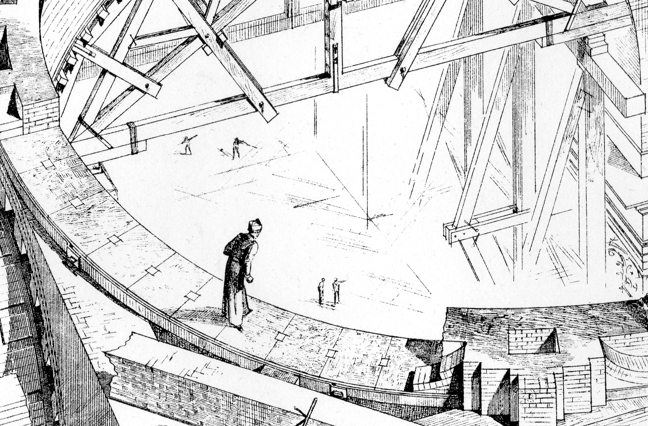
    This image really lifted itself from the page–it is from 1880 and has to me a very heavy scent of M.C. Escher to it.  This would be a very “found” aspect of pre-Escher (1898-1972), but it does have an indefinable quality to it that seems very 20th-century. What we are seeing here is a perspective of the construction of the “New Church of the Oratory of South Kensington” (known as the Brompton Oratory), but I think given the various stages of completion of the structure the whole of it takes on a spherical, three-dimensional quality, and has a somewhat impossible-looking aspect, as though from multiple viewpoints. I think we’re looking down through the naive, and though it is supposed to be representating a three-dimensional figure it seems profoundly not so. 


    Escher architecture463

    [Source: The Building News, June 25, 1880; Herbert Gribble, architect.]

    What it reminds me of directly is Eshcer’s  relativity, from 1952:

    Escher relativity

    I know that what I’ve said about the Building News image is reaching, and it wasn’t dealing with unusual geometries, or tessellations, or the oddish curved perspectives of Escher, but, well, it does somehow have that quality.  

    And an interesting detail:

    Escher architecture464


  • The Shadows of a Color “Photograph”, 1436

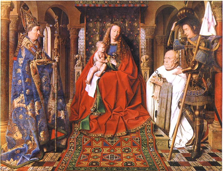
    Was it really Jan van Eyck and not J.C. Maxwell who produced the first color photograph?  Van Eyck’s after all is hanging up in Bruges in the Groeninge Museum, and Maxwell’s, well, Maxwell’s dissipated in about half an hour, leaving only an historical trace.  The problem of course is that Van Eyck’s oil (“Virgin of the Canon  van der Paele”) was done 403 years before the Daguerre invention (building of course on the work of others, notably Niepce, his former partner), so it really doesn’t count because it really doesn’t exist.  His work though *does* exist, but not as a photo—it was, is, a painting, finished in 1436, and it stands in my mind as looking so much like a perfect capturing of a moment that it seems a (luscious) snapshot. 

    Van Eyck virgin of the canon[Source: Victorian Web, http://www.victorianweb.org/painting/whh/replete/P40.html]

    In her book Color and Meaning, Practice and Theory in Renaissance Painting (1992), Marcia Hall makes the point (on page 69) that it is the lighting in this painting that makes it so extraordinary—and differentiates it entirely from the predictable light or “stage illumination of the Italians”.  Its an excellent point.  The light source in the painting is emanates as though it were a half-hour before sunset in Santa Fe; or here, in Hendersonville N.C., when there is a very low and nearly complete cloud ceiling and the sun manages just before sunset to peek through between the mountains and the cloud layers to blaze its extraordinary, horizontal-like brilliance making everything and anything that reflects that light into a work of private art. The figures in this painting by Van Eyck reflect a softer version of that light in such a manner—they are sharply illuminated, luminous, in all of their very human glory and frailty.  We have sharp relief, great detail, deep shadow—and much of that is missing in Italy at this time.

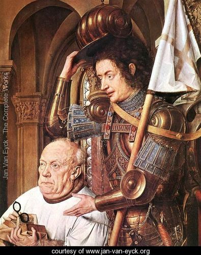
    The photo parts come in here:  the characters are caught in the middle of some very small, obscure action, and the smallness of their movements are captured perfectly

    Even though they are emotive of course the faces of the great Masaccio are relatively plain; Gozzoli, Fra Lippi, the magnificent Fra Angelico, Pisanello, Ghirlandaio, della Francesca, Veneziano, di Credi,. Perugino, and even the emotive and colorful Rafael, all working in about the same decades as van Eyck, simply do not give this anatomical expressiveness to the faces of their subjects.

    Van eyck virgin of the canon detail[Source: Jan Van Eyck . org, www.jan-van-eyck.org]

    So the extreme light and the detail in the faces gives the van Eyck this fantastical quality—on the other hand the perspective and the proportions of the characters in relation to the objects in the room and the room itself are off, secondary, not important—this too in sharp contrast to the great inventors, re-discovers, innovators of the scientific perspective.  (This homage belongs to a slightly earlier time, to Giotto and Uccello, but their work is just a bit to early for discussion with van Eyck.)  Marcia Hall goes on in her appraisal about the way in which van Eyck applied his color (“binding his pigments in a drying oil”) to give his subjects their incredible color depth, and this of course is a major element in understanding the picture (coming as it does from a stone-cold expert). 

    What I’m thinking now, the aspect that is giving this painting its “photographic” quality, its supra-realistic event, is this new use of light, new angle, with the immersion of anatomical detail and the “different”–Northern–perspective. 

    This is a very, overly, simple observation and simplification, but I think in general that it is true.

    ·Posted by :

    ·in:

    — —

  • There Was a Cubic Man and he Walked a Cubic Mile… (1917)

    JF Ptak Science Books  Quick Post

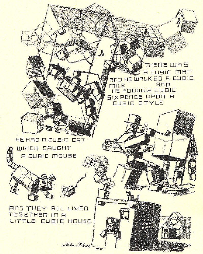
    • “A Slight Attack of Dimentia Brought on by Excessive Study of the Much Talked of Cubist Pictures in the International Exhibition in New York.”


    Cubist cartoon

    This is John Sloan’s illustration in The Masses summing up the legendary Armory Show of 1913.

    Between 17 February and 15 March 1913 there occurred in the huge building at Lex between 25th and 26th streets in NYC–the monumental International Exhibition of Modern Art at the armory of the Sixty-Ninth Regiment, the Fighting 69th (so called by Robert E. Lee), the “Fighting Irish”, the famous Armory Show, the Armory Show.  This was the first large public exhibition of modern art in America, and even though the 69th regiment had seen five wars (at least, so far as I can tell), the armory itself hadn’t really seen one, until 1913, when battle lines were drawn among the Cubists and within and without the confines of the modern” part of modern art, the sensitive honor of the nature of art laid bare.

    • Here’s a good source for other caricatures of the show:  http://armory.nyhistory.org/category/artworks/

    Interestingly, Sloan was one of the organizers of the show, as well as a contributor–his artistic orientation was far from the base that made the show so famous. Sloan (1871-1951) was on his own a wonderful artist, of a different school, and one of my favorites depicting city/street urban life of the 1920’s. 

    His cartoon for the radical The Masses is interesting and poignant, and although it pokes fun at the Cubists, it is respectful, and intriguing (in spite of the clever “dimentia”). There were a number of other artful interpretations of the vast modernity of the show that weren’t nearly so kind, not understanding or appreciating the Abstract and Cubist work.  

    ·Posted by :

    ·in:

    —

  • The Illogical in Pursuit of a Logical End–a Note on the Snark.

    JF Ptak Science Books   Post 2537

       "Just the place for a Snark!" the Bellman cried,
              As he landed his crew with care;
         Supporting each man on the top of the tide
              By a finger entwined in his hair."

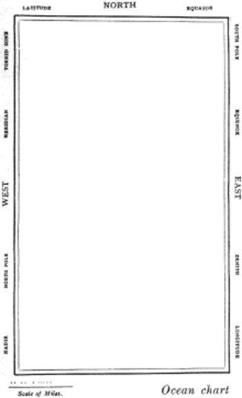
    So opens the semi- and fully-immortal The Hunting of the Snark. an Agony in Eight Fits, by the fully-and-not-partially-immortal Lewis Carroll, which (if it can said what the book is about) is about eight guys whose professions all begin with a letter “b” plus a beaver in search of a Snark.   In the second of eight Fits that comprise this lyrically nonsensical poem, we encounter a map of the route of possibilities taken by the group, this being in the charge of the Bellman. This is not only the finest map illustrating a Fit that exists, it is also (as I’ve stated earlier in this blog) one of the most beautiful maps ever published. It is a beautiful map of nothing, showing nothing, and marking the route of nothing.  Perfect for the Snark story.

    The Bellman himself they all praised to the skies-
    Such a carriage, such ease and such grace!
    Such solemnity too! One could see he was wise,
    The moment one look in his face!

    He had bought a large map representing the sea,
    Without the least vestige of land:
    And the crew were much pleased when the found it to be
    A map they could all understand.

    “What’s the good of Mercator’s North Poles and Equators,
    Tropics, Zones, and Meridian Lines?”
    So the Bellman would cry: and the crew would reply,
    “They are merely conventional signs!

    “Other maps are such shapes, with their islands and capes!
    But we’ve got our brave Captain to thank”
    (So the crew would protest) “that he’s bought us the best-
    A perfect and absolute blank!”

    Snarkmap

    Sometimes there is nothing so fine as something that beautifully illustrates the nothing that isn’t there, and this lovely map, unencumbered of all of the elements and details that define the mapness of something,  perfectly explains the origin of its need.

    The Snark evidently occurred to Carroll while he was out walking on one bright summer day, on a hillside–actually, it was one line of poetry, and it wound up being the closely line of the book.

      In the midst of the word he was trying to say,
              In the midst of his laughter and glee,
         He had softly and suddenly vanished away—-
              For the Snark was a Boojum, you see.
    
                       THE END

    So we had those eight guys and a beaver, setting out from points unknown and going to places not seen.  

    This was all started by that string of poetry that entered Carroll’s head on his walk.  He didn’t know what it meant, and didn’t know where it was going; he did however set out to figure it out for himself.  (“I know not what it meant, the; I know not what it means, now…”1) I find it such a lovely thing that Carroll would spend so much time trying to retrieve the intellectual evidence of where this line came from.  And what his investigation revealed was The Hunting of the Snark.  And at the end of the day, Carroll was no closer to knowing what a Snark was, in spite of all of the writing and commentary and criticism.  Throughout the rest of his life Carroll insisted that he didn’t know what the poem meant, though it could have meant something.  It was supposed to have been a work of nonsense and illogic, but I think it fits with the rest of his work on nonsense and the logic of it, so my best guess is that there was nothing quite so logically in his works as the reach of the illogical in pursuit of a logical end.  

    • Full text of the Snark, here, via Project Gutenberg. http://www.gutenberg.org/files/13/13-h/13-h.htm  Also a pdf with illustrations:  http://www.archive.org/stream/huntingofsnarkan00carruoft#page/n27/mode/2up

    Notes:

    1.  This line occurs in Morton Chase’s Lewis Carroll, a Biography, published by Macmillan in 1995, p 404.


  • Smoke and Word Balloons, 1531

    JF Ptak Science Books   Quick Post

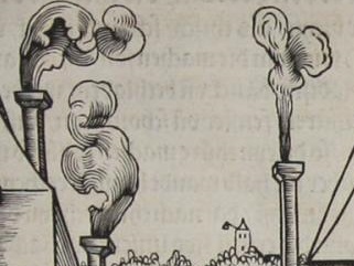
    Rodler detail smoke

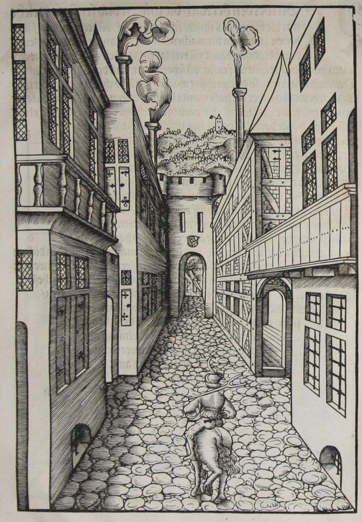
    This work—according to scholars most probably by Johann II of Bavaria1—was published in 1531, the effort of a true Renaissance Man, capable in languages, a scholar, draftsman, scultptor, artist. The book was important in the history of art for introducing the perspective studies of Durer on a grand scale. And in all of this greatest and beauty of this book, I have chosen as my focus for this moment an odd little bit of the book–smoke.  

    Rodler

    In this woodcut we see the central figure on a horse working his way down a tight street of crowded buildings in a walled city, a city gate just ahead.  The image was intended to illustrate principles of perspective, but I noticed the smoke and associated it/them with Renaissance (and later) word balloons–they’re not really that closely associated, but are suggestive of one another.  

    Balloon word[Source: https://historyofideasblog.com/thesciencebookstore/2009/02/word-balloons-continued.html]

    There is a certain amount of  poetical attraction to associate images in smoke and words, but I think that is going a little beyond the reasonable scope of analogy.  

    Notes:

    1. Johann II (1492 – 1557), and Count Palatine of Pfalz-Simmern from 1509-1557. And the book’s title:

    Eyn schön nützlich büchlin und underweisung der kunst des Messens, mit dem Zirkel, Richtscheidt oder Lineal. Zu nutz allen kunstliebhabern, fürnemlich den Malern, Bildhawern, Goldschmiden, Seidenstickern, Steynmetzen, Schreinern, auch allen andern, so sich der kunst des Messens (Perspectiva zu latein gnant) zugebrauchen lust haben.

    Published by H. Rodler, Simmern, 1531

    RODLER, Hieronymus ?] / JOHANN II OF PFALZ-SIMMERN


  • Beautiful and Practical Perspective, 1596

    JF Ptak Science Books  Post 2531

    Sirigatti forms _4.5_

    One of the most highly valued of disciplines to the Renaissance painter and architect and engineer was perspective, and at the end of the 16th century Lorenzo Sirigatti produced a superior example of the field.  La pratica di prospettiva del cavaliere Lorenzo Sirigatti was printed in Venice in 1596 and proved to be a valuable source of inspiration and possibility. 

    The full text is located at the Getty Museum (here) from which came the five images I’ve used in this post.  Part of the acclaim of the Sirigatti work was its fine elegance and non-nonsense line, and the general exclusion of a background brought a particular clarity to the designs. The images themselves follow a development from the introduction of the basic elements of perspective to an increasing complexity in their use, flowing from fundamentals to forms to architectural standards. They are lovely things, works of art in themselves even removed from their context.  

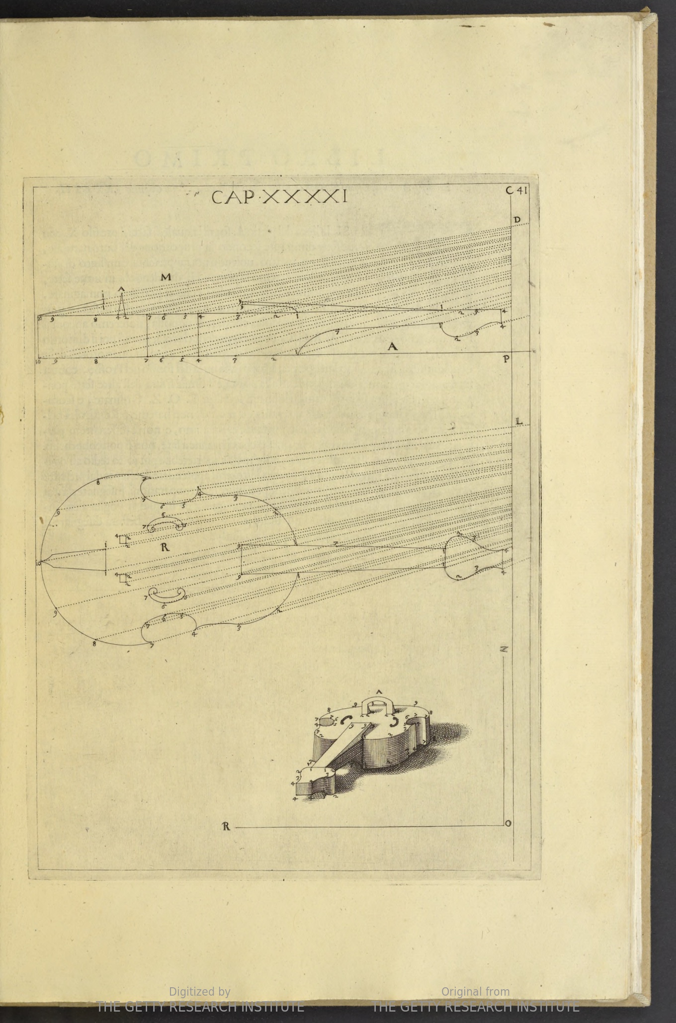
    One of the principal attractions to me was the quietness of the design, leaving everything outside of the subject to blankness–many other works of this type included scenes into which perspective studies appeared, but this was hardly the case with Sirigatti. For example, a perspective with violin:

    Sirigatti perspective violin

    Source: Getty Museum

    ·Posted by :

    ·in:

    — —