A Daily History of Holes, Dots, Lines, Science, History, Math, Physics, Art, the Unintentional Absurd, Architecture, Maps, Data Visualization, Blank and Missing Things, and so on. |1.6 million words, 7500 images, 4.9 million hits| Press & appearances in The Times, Le Figaro, Mensa, The Economist, The Guardian, Discovery News, Slate, Le Monde, Sci American Blogs, Le Pont, and many other places… 5000+ total posts since 2008.

Category: Perspective

  • Dismantling Reality–Euclid, Mondrian, Malevich, Lobachevsky and the Appearance and Disappearance of Form Through Geometry.

    JF Ptak Science Books Post #80

    Today’s post comes via my wife Patti’s phoney baloney sandwich for our four-year-old Tessie.  It was a tight fit of geometric pieces made to cover slim pieces of bread that would fit into her bento boxes.  The form was lovely!  And—on the heels of yesterday’s post—it reminded me of the remarkable qualities of geometry, and the role it has played in the creation of the known and visible parameters of our world(s). Geometry has also played a very visible role in removing those parameters, for as much as the art has forced regularity in our thought, it has played just as large a role in challenging that structure.  What Euclid has given, Lobachevsky has both taken away (and added to). (Nikolai Lobachevsky [1792-1867] and Janos Boylai [1802-1860] each independently developed non-Euclidean geometries:  that is, they replaced Euclid’s parallel postulate with the postulate that there is more than one parallel line through any given point, saying that the foundational fifth postulate of Euclid was not true.)
    Bloggeometry_byrne
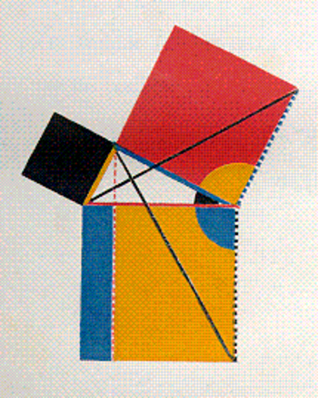
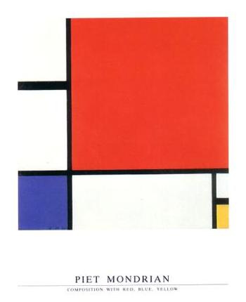
    Take for example an image and idea from yesterday’s post regarding the engineer and art-geometer Oliver Byrne (who replaced much of the text of Euclid’s first six books by using an odd index of color) and Piet Mondrian.   The approach (as noted by Augustus de Morgan among others) is gorgeous but hokum—the effect though is pretty and it does define the areas of the geometric solids that I’d like to use here.  The approach that Byrne tried to develop and simplify Euclid for more general readers was to employ a peculiar art form of geometry to help classify the structure of the world—ordering the universe, and vice versa.
    Bloggeometrymondrian
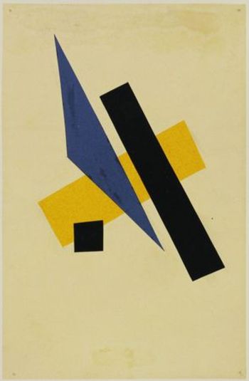
    Piet Mondrian, who was one of the earliest artists to practice the new, revolutionary form of non-representational art—that is, producing art with no recognizable subject matter, no humans, or landscape or animals or bugs or whatever—uses very similar geometrical solids to reclassify all of existence into sensations and color forms.  Mondrian is more correctly classified as a constructivist, or cubist, and he uses the same tools to re-identify nature as Euclid developed to help classify the structure of the world.  This is his “Composition with red, Yellow and Blue” which was painted in 1930, a full eighteen years after Kandinsky created the first painting in this field. But there were other early pioneers in the non-representation field who exhibited a more mathematical aesthetic in liberating the object than we see in the first works than the great Kandinsky.  Umberto Boccioni (1912), Frank Kupka (1913), Olga Rozanova (1913), Liubov Popova (1914), Felix del Marle (1914) come quickly to mind,
    Bloggeometryyubov_popova
    though none leap to consciousness as quickly as Kasimir Malevich.  Malevich begins this work before 1910, and by 1913 he has produced such works as “samovar” in which the (samovar) object is dissected and moved to different places in the visual field on the back of geometrical objects.  But it is in 1915 that we are introduced to his extraordinary “Black and red Square”, where we find that he has removed all representation of objects—not only that, he has removed almost all of the forms, period.

    On the other hand there is certainly a very long history of artistic adventures which have no recognizable subject, though the artists in these cases I am relatively certain about were not trying to replace the known stuff of our world with the not-yet-known.  Geometrical artistic expression at its base has been seen in mazes, labyrinths and mosaics for thousands of years.  I guess you could even make a case for architecture fulfilling this role as well it the buildings were taken as art forms.  But I’m interested here mostly with the artist intentionally choosing to obscure the known subject.

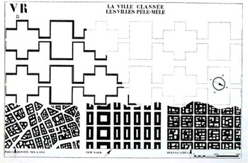
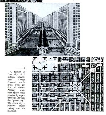
    This leads to the troublesome forms of the French architect Le Corbusier (Charles-Édouard Jeanneret-Gris, 1887 –1965).  Leafing through his The Radiant City (Elements of a Doctrine of Urbanism to be Used as the Basis of Our Machine-Age Civilization, 1933) is a confusing affair.  As much as the man wants to rectify and save the world (his words, salve me fons pietatis) with his geometrical cities, replacing the mess of disorderly human civilization, his results, while giving a crispy clean order, are formidably lifeless (to me, at least), the organic and messy bits of human life de-fractured and placed in 90-degree containers.  Le Corbu complains about the American successes, there in 1930 or so, saying that the U.S. is a monument of achievement but for achieving the wrong things.  A little later in 1932 and 1933 however he does take time to make positive comments about the interesting experiments going in Fascist/Mussolini Italy and Stalin’s Soviet Union…it was common I know for thinking people to have such harmonious thoughts about these regimes, but there were plenty of others who kew and wrote about what was
    Bloggeometrycorbu_city066
    really happening in those places, and Le Corbu was not one of them.)  The so-called positive elements of American advancements that Corbu took away with him back to France– Taylorist and Fordist (Henry was a vehement anti Semite and Nazi sympathizer)  strategies adopted from American models to reorganize society—I think come vividly alive in his geometrical replacement of human habitation—call me old fashioned, but I just don’t like it.  I also don’t like it because it smacks so much of his disgust of capitalism (which he talks about as consumerism) and of his own right-wing political beliefs.  Le Corbusier followed these thoughts into the camps of philosophies like  the right-wing syndicalism of the French politician Hubert Lagardelle.  These also eased him into a position with the traitorous Vichy government during the Nazi occupation of France during WWII—he did cut ties with it in 1942, though only after the architectural plans he had developed for various projects were rejected.
    Bloggeometrycorbu_litl_squ067  

    [Another leading 20th century architect, Philip Johnson, had his own problems with admiration of fascist ideas, though the amoral and whorish Johnson would’ve have seen these ideas as “problematic” only insofar as they would keep them from working.  He was a decade-long Nazi sympathizer, and among many other things actually followed the Nazis as they stormed their way through Poland—something Johnson described as a (positively) “stirring” experience. He was in a separate class from the kinda-stupid Charles Lindbergh and the empty-suited-but-still-dangerous Prince Harry as Fascist trumpeters.  He was more on the level of detestable fascist intellectuals like Martin Heidegger and Ezra Pound. He was awful.]

    It just so happens that two of the most towering names in 20th century architecture were embroidered into the fabric of Fascism, and I think that these ideas burn their way directly through the geometrical imagination of Le Corbusier. His brand of geometries lead us towards the human cog-and-wheel, tight-box, suffocating proclivities of his right-wing extremism, and is perhaps the worst sort of illustration for the use of that beautiful branch of mathematics

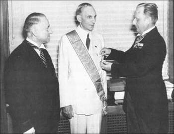
    Just for the sake of clarity I’ve included this photo of Henry Ford becoming the third recipient of the Nazi Grand Cross of the German Eagle,  presented by Karl Kapp, German consul-general of Cleveland (left), and Fritz Hailer, German consul of Detroit (right). The other two recipients were Benito Mussolini and Count Ciano.
      Fordnazimedal


    ·Posted by :

    ·in:

    — —

  • Science and Art; True Science or Science Fiction? #1: Tinguely, Oliver Byrne, Vredeman de Vries and the Theatrophone

    JF Ptak Science Books   Post #79

    Blogrealtinguely
    There are encyclopedias to be written on the not-obvious in the history of science, dictionaries of “what is it”, codexes of “is that real?”, handbooks to distinguish things that look like scientific apparatus but are actually works of art, and vice versa. This is my first installment looking at the occasionally squishy visual line that distinguishes images that are “true” scientific creations from those that are not. 

    Case #1.  FALSE 
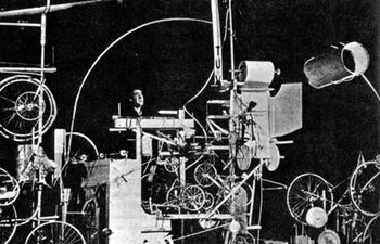
    Our first example comes from Jean Tinguely (1925 – 1991)  a Swiss painter and sculptor, best known for his Dadaist kinetic sculpture, officially known as metamechanics. This photo shows Tinguely in the midst of trying to make his self destructing sculpture, Homage to New York (1960), self destruct. His collection of wheels and cogs and connected motors and techno bric-a-brac, which in their way stood for the embarrassment of overproduction and  self-satisfaction with material goods, embarrassingly failed to self destruct during its unveiling at MOMA.

    Blogrealbyrne
    Case #2. TRUE.
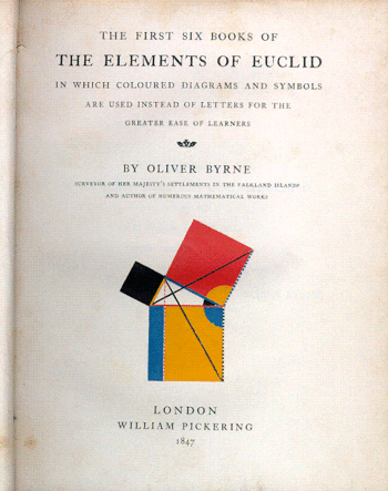
    Oliver Byrne’s semi-insane but gorgeous interpretive work of the first six books of Euclid  published by William Pickering in London, is problematic.  Byrne’s use of color in place of letters in defining and explaining the propositions just doesn’t work very fluidly–it is a great, perhaps the great, example of something that is visually pleasing, beautifully rendered, and sort of functionless.

    Blogrealbyrne_tp
    Blogrealtelegraphone_2

    Case #3. TRUE
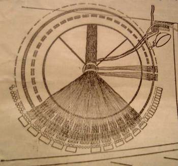
    This is the distributing board of the central London “theatrophone”, a telephone relay device that “broadcast” theatrical and symphonic productions to telephone subscribers.  The idea is base on installations of this device during the International exposition in Paris in 1881.  The article appears in Scientific American, Supplement No. 1002, March 16, 1895.  The second image is the switchboard in the central office of the Theatrophone Company.

       

    Blogrealvredmanbw_2

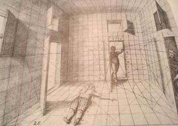
    Case #4, TRUE:  Hans Vredeman de Vries (1527 – c. 1607),a Dutch Renaissance architect and engineer, produced a superb book on perspective in 1604, from which this image was selected.  Of course we manipulated it a little in p-shop, dumping it into mosaic, cheating a little, but, well, there you have it. Vredeman’s production was luscious and smart, and was highly utilized and prized for hundreds of years as a
    useful tool in determining perspective.  It’s a mysterious image, bizarre, even–why, for example did the humble artist use a prone/dead/injured human there on t he floor when he could’ve selected something more benign? The odd figure entering the room through the secret door adds to the general threatening atmosphere of this interesting image.  Base line though–it is undeniably an excellent instructional on drawing with perspective.


    ·Posted by :

    ·in:

    — —

  • The Best Images of Horses, Ever: Hans Beham and Perspective, 1528

    JF Ptak Science Books LLC Post #105
    Blogmodel_bookhorses129

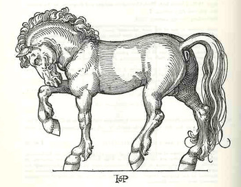
    Hans Sebald Beham wrote—produced, rather, the text and illustrated—Dises buchlein zeyget an und lernet ein mass oder proporcion der Ross, nutzlich iungen gesellen, Malern und goltschmiden, a tremendous, inspired model book for artists and observers, back there in 1528.  Amidst the heavy, blocky Gothic type of the book lie a series of just beautiful, proportional studies of horses.  It is probably the single greatest illustrated work on horses done in the history of printing to this time; and it has stood the test of time as a work of art, rather well.

    It is also, evidently, the work of an anti-Lutherian and certified “godless” painter, expelled by the city of Nurnberg (along with his brother and as it turns out the subject of yesterday’s Saturn post, George Pencz).  He, and his brother Barthel, and Pencz—with whom he shares birth and death dates of 1500 to 1550—were shaken by the city half way through his life in 1525 for having bad thoughts about religion and the proper way of not avoiding it. The decision by the city didn’t affect his art, as we can well see
    Blogmodel_bookhorses2130

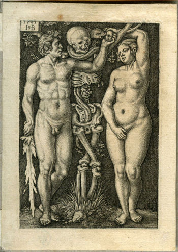
    Beham’s model book on the horse was followed by one on the human figure.  He was an extraordinary talent whose fine, deft touch can be recognized across the room, miniature or not.

    Behamadam_and_eve
     

    ·Posted by :

    ·in:

    —

  • Shaping Space and Controlling What We See—Determining What Color “Is”, Emily Vanderpoel and Pre-Kandinsky Art

    JF Ptak Science Books    Post #73

    Blogcolorvander_2poel_063
    The idea of how we put parameters to something like the visual field is a gargantuan topic—it is something that architects and geometers and physicists and mathematicians (in general) have dealt with forever.  Mapmakers have perhaps the most visualized aspect of this on paper, performing the semi-miracle of translating three dimensions into two; physicists have a more difficult time, taking the opposite approach, sort of , and translating two or three dimensional space into x-number of dimensions.  Anatomists had a difficult time of their subject until relatively recently in human history, what with the sublime religious curfews on messy knowledge and all coming into play, poking around into the heart and such as though it was an affront to the sanctity of the creator (M Servetus’ ideas on the circulation of the blood via the heart, making the heart a tool and not the brain or some odd conjunction of creative divine power, cost him his life, burning slowly alive at the stake…how mysterious the whole world of RNA Genotype-Phenotype Mapping and such would seem to him if he could have a peek into the future/present from wherever he is.)
    Blogcolorvanderpoel_062

    Color theory is old and pretty—as a matter of fact there is a very attractive gathering of color theory models (in black and white, though) displaying some two dozen or more color models from the last 400 years.  People like Della Porta (1593), our old friend and resident oddball polymath crank Kircher (1646), the smarter-than-you-could-believe Newton (1660), Waller (1686), Lambert (1772), the wide ranging and again polymathic Goethe (1792), Herschel (1817, who also ushered in our understanding of the other light-sensitive shape spacing medium of photography in 1840), the semi-forgotten Chevreul (1835), the beautiful Maxwell (1857), Wundt (1874, the early experimental psychologist who also looked for spirits/spiritmus and ghosts), von Bezold (1878), Rood (1879), Munsell (1918) Kandinsky (1914 and not decipherable by me) and Klee (1924), and so on towards the present, all tried to analyze the prospects of color.

    Not in this list is the very highly problematic Emily Vanderpoel, who in 1901 and 1903 produced (in two editions) a lovely but mysterious book called Color Problems for the Layman, in which she sought not so much to analyze the components of color itself, but rather to quantify the overall interpretative effect of color on the imagination.  I know this sounds begging and vague, but I really haven’t been able to make much headway in the work.

    Blogvanderpoel_1057
    I’m attracted to this effort because of its attempt at quantifying such abstract thoughts.

    By virtue of this effort, though, Vanderpoel had produced a strikingly illustrated book, with 118 color plates, all very intense, and beautiful, and in its way exceptional—unique perhaps.  Had the book been written thirty years or so hence we’d call it some sort of constructivist/constructionist artform.  But since the artwork in the book comes a decade before the first non-representational artwork in human history (or so), I don’t know exactly what to call it. 
    Blogvanderpoel_2058

    I really don’t know what it is, but I know that it is not entirely accidental, this pre-non-representational artform, because controlled geometrical color art is not accidental. 

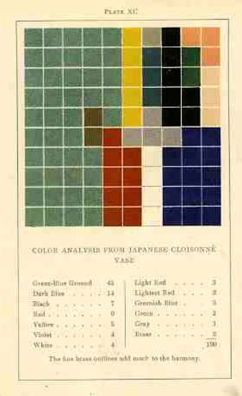
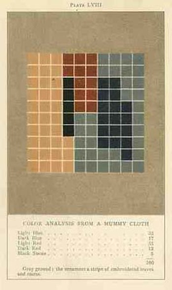
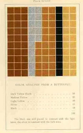
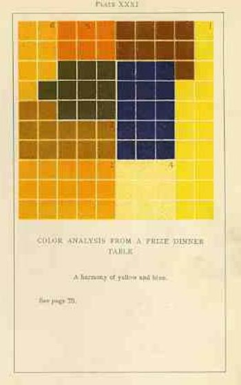
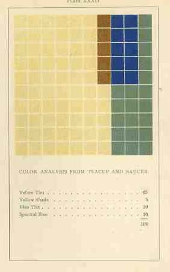
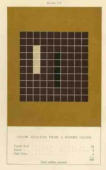
    In trying to quantify the color images of the objects in her study, Vanderpoel establishes a 10×10 square grid, dividing all of the color in that object into individual units numbering to 100.  Then, somehow, she identifies the major colors and places them according to a system that I cannot understand within the grid.

    Blogvanderpoel_3059

    The net effect is glorious.  I just don’t know how she got there—which isn’t normally a consideration in art, except that this work is an instructional on how to understand color in art and nature, and the explanation of the procedure is ethereal.  Vanderpoel was and remains a respected author on porcelains and other applied and plastic arts.  In this work she looked at her fair share of porcelain, limogues, clay pots, burial urns, glass shards, and the like; she also analyzed clouds, mummy cloths (and casings), dew on morning grass, brocade, the eye of a blue jay, feathers, and another hundred or so poetic arragenments of the stuff of teh world.  I still do not know what this book is trying to tell me, but I do know that it is remarkable.   

    Blogvanderpoel_4060  

    ·Posted by :

    ·in:

    — —

  • Making Things Disappear–Kandinsky (and Nature) and Penzias (and Alpher)

    Blogdisappear_hart
    It’s odd that at just the moment in time that time is
    freezing in moments, that things are becoming more visible and definable, that
    the world of art, in its way, became less so. Etienne Marey and Ed Muybridge displayed the acts of motion in slivers
    of itself, captured and presented for study, images that had never been seen
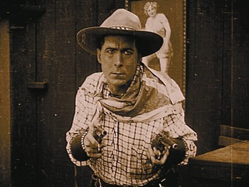
    before, while shortly after this William S. Hart transformed their intellectual
    heritage and wrestled it into train robbers and kissing thieves at 16 frames
    per second.  And just as the segmentation
    of motion had reached it highest modern heights, Marcel Duchamp, the great
    artist-like chess master and comedian, presented the world, in 1912, with his
    Nude Descending. This painting continued
    on the steady track laid down in the 1860’s by the Impressionists and Post-Impressionists, building on
    their sense images, their descending denial of “detail”, and made the human figure almost disappear.

    Blogdiappear_kandinsky
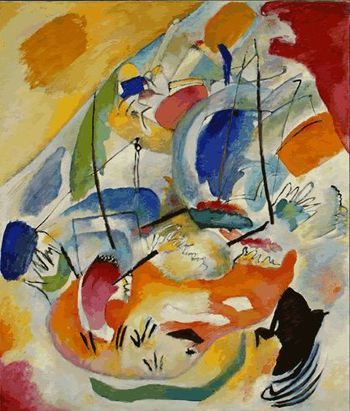
    It was Wassily Kandinsky in the next year who actually made
    everything disappear–everything that is but color and disparate forms.  In his painting
    Improvisations there were no human or natural forms–it was the first
    non-representational painting in history, with nothing at all being recognizable in his epochal work, showing people for the first time the “other” side of the mirror.   Making things disappear, en plein air, performing an emparquementage, if
    you will, is truly quite a work of art.

    Kandinsky tried to relate the philosophy of his
    approach in an inner-secretive, mysterious, occulty work called Concerning the
    Spiritual in Art
    (1912). It is a lovely
    book, with thick paper, very wide margins, beautifully printed, sumptuous even (in
    the original)–but it makes the innovation of his art ever more unreachable,
    more wispy–smoke without color, at least for me. The great Kasimir Malevich made a similar
    attempt with similar results–at least, again, to me–trying to explain how he
    eliminated natural forms and replaced them with rectangles, squares and
    circles. Later, Malevich would begin to
    replace color, working in white. He was
    sublime.

    Blogdisappear_herman
    Disappearance is not
    necessarily sublime. Ralph Alpher and
    Bob Herman got disappeared. With George
    Gamow they hypothesized the Big Bang and predicted where the remnant of the heat
    of the explosion (the so-called background radiation) would, could, be
    found. Alpher and Herman were basically
    correct in thei research (over the period of 1939-1949 figuring it would be
    about 5-degrees Kelvin), but were basically a little sleepy over their results,
    or at least until the numbers proved out to be good, when the background
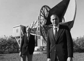
    radiation was “discovered” in 1964 by Penzias and Wilson with the Big Ear at
    Bell Labs in Holmdel, NJ. It all bore
    out, except, of course, their contribution—Penzias and Wilson got the Nobel for
    their work, and Alpher and Herman got, well, nothing. (For a long, lovely article about Alpher see fellow Asheville resident Joe D’Agnese’s article in Discover.)

    Blog_disappear_penzias_wilson_09060

    Penzias and Wilson did arrive at their
    findings independently of A+H, but that’s another story—that they were “Gone”,
    even when their contributions were made known in the thrill of the more modern
    discovery, was just not right. I met Alpher
    and Herman together in the late ‘80’s, coming into my store for a visit with
    books. Herman was pleasant and chuckly;
    Alpher, not. His pissed-offedness at the
    sleight of the background radiation work shone right through when discussing
    Penzias and Wilson. Herman was
    philosophical in discussing the great oversight:  “Yes, this is true, but
    we’ve been given plenty of honors since then”, he smiled, content. “Um. Yes. But not the Big One”, garumped Alpher.

    Einstein too slipped away a
    bit in what could have been a moment of monumental insight. Max Wertheimer, a colleague of Einstein’s who
    had a background in physics and was one of the founders of German gestalt
    psychology, had a chapter in a book of his called “Einstein: the Thinking that Went into General
    Relativity”. The chapter is coercively bland; basically nothing. Too bad, since
    Wertheimer was present at the creation, was friends with Einstein, had some
    sort of background and grasp for the material, and was a trained observer.  The great historian Arthur I. Miller in his
    book
    Insights
                      of Genius: Imagery and Creativity
                  in Science and Art
    (Copernicus, Springer-Verlag, 1996) thought the
    *promise* of the chapter heading to be phenomenal—he was deeply disappointed
    with the very little that was offered, which was basically a gestalt
    interpretation of E’s being at the time. (And psychology happened to be a “science” that Einstein would not admit
    into the scientific field—he had little use for the discipline.) The creativity, the intuition, the
    explanation, of some of the most creative thinking of the century, which was
    most probably on display for Wertheimer, was lost. Disappeared.

    Blog_d_isappear_man_ray


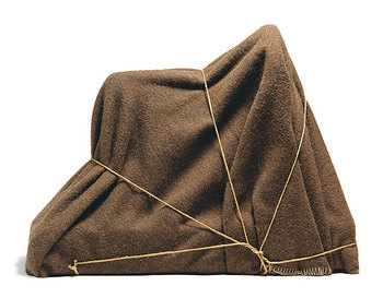
    Sometimes when things disappear they illuminate, as in the case of Kandinsky and Malevich and Duchamp and company.  Sometimes when they disappear we see the forms of the missing, making them further suggestive and capable of initiating inquiry. (A very bald example being The Enigma of Isidore Ducasse, a work by south-Philly-born-Emmanuel Radnitzky, otherwise known as Man Ray, the great Dadist, photographer and Rayographer, and 40 years before the work of Christo. He made Ducasse disappear and become mysterious by wrapping up a singer sewing machine, creating art and inquisition.) 

    And sometimes when things disappear, they just, well, disappear. 

    _________________________

    I can heartily recommend the following books by Arthur Miller, who has a very deep knowledge of numerous fields, and who brings them beautifully to bear in his books, as follows:

    Empire of the Stars: Friendship, Obsession and Betrayal in the Quest for Black Holes (Little Brown, UK edition; Houghton Mifflin, USA edition, 2005).
    Shortlisted for the Aventis Prize

    Einstein and Picasso: Space, Time and the Beauty that Causes Havoc (Perseus Books, 2001). Nominated for the Pulitzer Prize.

    Insights of Genius: Imagery and Creativity in Science and Art
    (Springer-Verlag, 1996 cloth; MIT Press, 2000 paperback).


    Albert Einstein’s Special Theory of Relativity: Emergence (1905) and Early Interpretation (1905-1911)
    (Addison Wesley, 1981: new edition SpringerVerlag, 1998)

    Imagery in Scientific Thought: Creating 20th-Century Physics (Birkhäuser, 1984; MIT Press, 1986; reprinted 2003, Dover Publications)

    Frontiers of Physics: 1900-1911
    (Birkhäuser, 1986)

    Early Quantum Electrodynamics: A Source Book (Cambridge University Press, 1994)

    Editor, Sixty-Two Years of Uncertainty: Historical, Philosophical and Physical Inquiries into the Foundations of Quantum Mechanics (Plenum Press, 1990)

    ·Posted by :

    ·in:


  • Original Reflections: unique experiences with mirrors: Van Eyck & Brunellesci

    JF Ptak Science Books  Quick Post

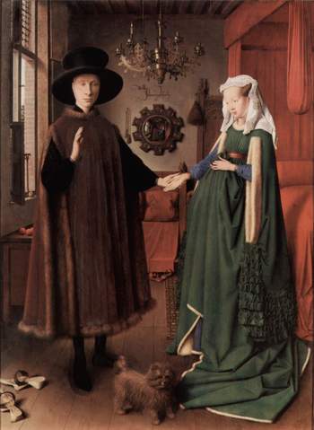
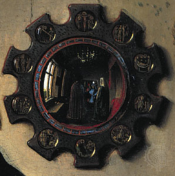
    I was thinking about writing a short post on van Eyck and settled on his painting of this newly married couple–The Arnolfini Marriage, painted in 1434, depicting the union of Giovanni Arnolfini and Giovanna Cenami, who married in Bruges in that year–and the very unusual image of the scene as reflected in the convex mirror directly behind the couple. It is a wonderful painting of course, lusciously and richly colored–the observer, though, is brought instantly to the mirror. And in that reflection is what is seen from behind the couple as well as what the couple is seeing–in a sense, a 180-degree view of the room (if we considered the painter’s perspective towards the couple as 90-degrees). It is one of the first times that a mirror is used in this fashion and is also offers a great instruction on the newly-rediscovered perspective. (The inscription above the mirror, which is surrounded by ten scenes from the life of Christ, reads “Jan van Eyck was present”–and probably was literal, as we see the painter himself reflected in a tiny portrait…along with another man, who may also have been involved with the wedding).

    Vna_eyck_mirror_big

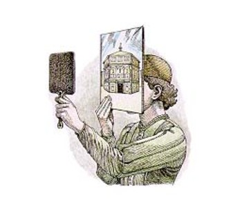
    As a matter of fact, it is just 30 years earlier that Filippo di  Ser Brunellesci (1377-1446) used mirrors as a tool in “creating” the first paintings in linear perspective in modern times–and he uses the mirrors in such a way as to compare what he was seeing in front of him, rather than using them to gain a sight-line for things that he couldn’t see. But they did in a way do just that. Brunellesci set his position inside the unfinished Santa Maria del Fiore (Florence), and used the apparatus (pictured here from the linked website) to record the facade of San Giovanni de Firenze (better known by its subsequent name, the Florentine Baptitstry, as all Florentine Catholics
     were Baptized there well into the 19th century) which was opposite his position across the Piazza del Duomo. He effort was a panel which was finished between 1407 and 1410, and which is now lost to time and space.

    Van_eyck_mirror_2

    It should be noted that the Baptistry, an 8-sided figure (with another, triangular, form added later; and 8-sided to represent the octava dies, the “eighth day,” the day of the risen Christ, which would be outside the scope of time and measurement) was decorated with colossal, fantastically beautiful doors, some of which were created by none other than Ghiberti, another (slightly later) master of linear perspective.

    Van_eyek_brun

    (The image above is taken from the very useful site which goes into good detail about the Brunellesci pin/peephole experiment.)


    ·Posted by :

    ·in:

    — —

  • Underground Horses, 1875

    JF Ptak Science Books   Post 22

    Unusual cross sections have always fascinated me–they are an X-ray of the techy-inards of the physical world , showing you a slice (literally) of the Unseen and Unapproachable. 

    Mine_height_2

    The first engraving here is of an (unidentified) Western-U.S. mine, printed 1869, and shows the comparative depth of an un-effacing mining operation in terms of height, nestling it in against Trinity Church (NYC).  The “21 stories” depth  of this mine would have been astonishing to the 1869 mind thinking of it in terms of height. Few office buildings in NYC for example exceeded 5 or 6 stories at that time. [It was in 1872 that the tall buildings’ fortune turned, as C.W. Baldwin (working for the Otis Company) invented the geared hydraulic elevator, meaning that buildings could now be taller than the strength and endurance of its occupants’ legs.  (Actually, to my mind it is the invention of the elevator safety brake that clinched the deal, making it safe to enter an elevator and expect to survive the experience.  There’s a lot of other stuff that comes into play, not the least of which is steel framing, lightening the buildings weight and displacing the weight from its’ normal receptacle of the foundation, but I digress.) ] So trying to imagine something that was 15 time the height of the spire of Trinity Church was doing some pretty large-scale imagining. 

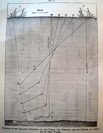
    A corollary the the height of the mine is, perhaps, a cross section of the depths of waters. Here we see an 1877 illustration from an article on new methods of determining the depths of ocean waters, giving a very clear indication of the enormous “height” of the ocean even in its most measurable (and not-so-deep) section.

    Depth_sounding 

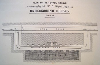
    I simply could not resist this 1875 engineer’s drawing (“Plan of Ten-Stall Stable….for W.D. Wight’s Paper on Underground Horses”)–and yes indeed these were horses kept underground, used for hauling the heavier wagons (on tracks) of whatever, brought out to these larger chambers by men doing the same work with lighter loads in smaller areas.  (For perhaps the best description ever of men at work in a coal mine, see the gorgeous George Orwell’s Down and Out in Paris and London)Underground_horses

    This is one of those images I think that will elicit a pretty light-hearted reaction until your brain catches up to the reality of what the print is really depicting.

    Coal_mine_black_3


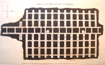
    This  image is actually much rarer than a mining cross section–it is a plan (looking from the top and down) of a mine showing the mode and direction of ventilating the whole bit, printed in 1818.  (As it turns out it is rarer still to see a plan depicting a mine’s numerous layers–I’ve honestly not seen another one of these done before 1900.)  What an incredible image this must have been to the early 18th-century eye, seeing such a novel, and rare, depiction of (important!) data.

    Mine_cross_mosaic

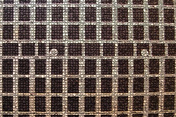
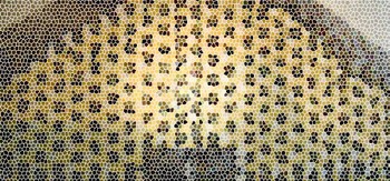
    In the Victorian panoply, the technological temple ma have had an entryway mosaic constructed from the idea of the mine cross section or plan–it is a structural, semi-architectural bit after all, made to withstand advanced weight and pressure.  Or how about a mine cross section template for a stained glass window?  I can imagine the Temple of Technology boasting a design schema of nothing but elements like these–those people trusted, perhaps even worshiped, the small and great mechanical machines and contrivances of their era.  All you have to do is look at the housings for even some of the simplest objects and you’ll find a metallic skin of awe and beauty, a symbol of admiration and respect for analog creativity.


    Mine_stained_glass


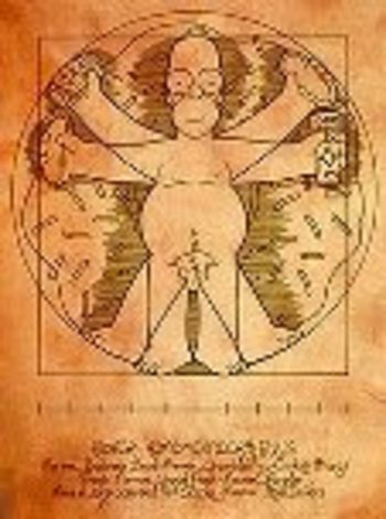
  • Homer Simpson on Perspective: the Rare Antique Image Looking Straight Down from a Height

    Blogstraight_homerJF Ptak Science Books LLC  Post 20

    I welcome the chance today to use our non-classical Homer instead of the beautiful Paolo Uccello to look at an issue of imaging a certain form of perspective drawing.  I’ve always been intrigued by antiquarian images that looked straight down, or up, at things–90 degree, perpendicular, real straight-on stuff, giving a feel for depth (or height) and perspective.  Funny thing is that in the wide world of scientific images, they really don’t show up very often.

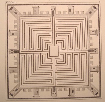
    A Mock-straight-down is found in this prettily-designed example (French, ca. 1860)–it seems to be view form a height of 250 feet or so down on the square of a low- (Western) renaissance town. That’s partly true, except that it is a mosaic from Pompeii (or Herculaneum), found imbedded in the floor of one of those mummified houses.  Dsc04640

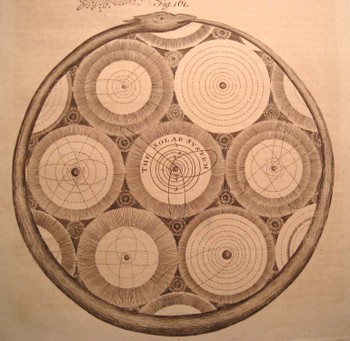
    Another pretender is this god’s-eye view (from Abraham Rees’ mammoth encyclopedia of 1800-1820) of the universe, centered upon our own helio-centric Solar System, which is centered, nested, amidst a whorl of other (contiguous and touching but not overlapping) solar systems, all of which is held in the Dsc04642
    infinite but knowable confines of an ourobus.   This
    again qualifies as a straight-down/up if and only if (iff) you squint real hard and imagine you’re seeing the scene through your CreatorView (TM!) glasses.  (The Creator needs glasses?)

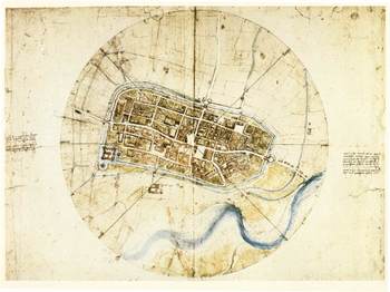
    The drawing by Leonardo of the town of Imola (currently resident with the Windsors) does come quite close to the concept–it has more artistic features than the common city plan , and is definitely at a perpendicular to its subject.Blogstraight_imola

    But it is this that is so terribly interesting to me–a small part of a
    little print from an unidentified encyclopedia from the turn of the
    19th c. It shows a picture of the earth looking straight down from a
    balloon, looking through an opening in the cloud cover, down to a small
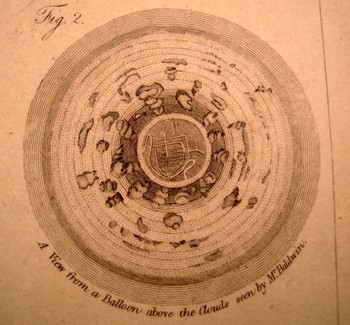
    town. There is an iconic work on the representation of the world as known to succeeding generations where the picture of the world is seen through a succession of gradually diminishing clouds (being opened like drapes over time), but I honestly cannot think of an early image of looking at clouds from above and straight down.  My sense is that this image would have caused as much Dsc04639_2
    interest and wonder as the first (Soviet) images of the other side of the Moon (back in 1959). 

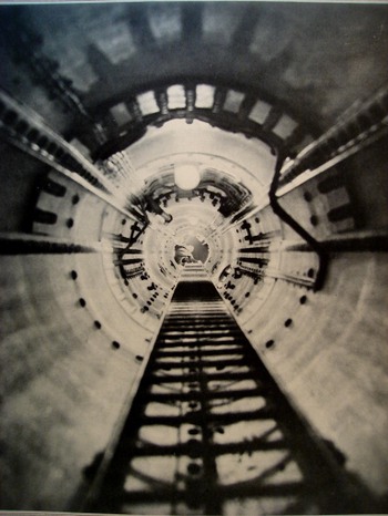
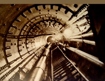
    Even when moving into the pre-satellite 20th century image, the straight-down picture is a rarity. In the last few years after having looked at dozens of thousands of popularly-published images (for another project), the straight-down/up were a scant tenth or perhaps hundredth of a percent of the total. There were a number of photographs made looking straight up (as in the two examples here, looking up the main mast into the crow’s nest of the Queen Mary, and the other with the same view, only in the Bremen. 

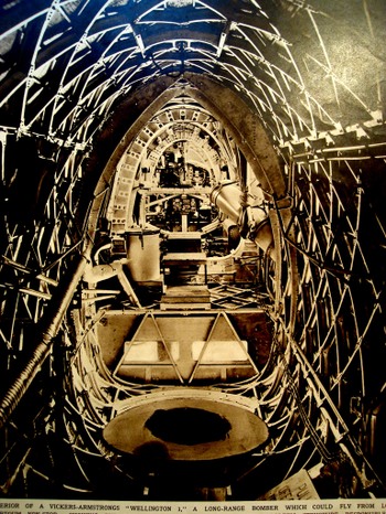
    Occasionally the view like this will show up (looking laterally through the Vickers-Armstrong “Wellington I” bomber aircraft (June 1939)

    I can’t leave this topic without mentioning two recent additions to this genre–the first is the Eames’ wonderful PowerDsc04643_2
    of Ten movie (go to youtube HERE, where in 40 steps we look at existence from quark to quasar. 

    The second is a little goofy but I like it nonetheless–the introduction to the Jodie Foster movie Contact (go to youtube HERE)  built on the bones of the Carl Sagan book. Here we swing out from the Earth and into space, following a broadcast-audio trail of humanity into the not-too-distant time/space (ignoring the signal degradation bit but so it goes), and then leaving that quickly behind, hurling itself backwards, to the outer reaches of the universe, until (and we don’t see this in the youtube clip) we wind up back in the iris of the heroine (and a bit too much like the Dave Bowman trip in “2001 a Space Odyssey”).  Dsc04644

    But we don’t see stuff like this very often, and I’m happy to go along for the ride. It really is just about seeing something new, after all.

    Perhaps the lack of this perspective is summed up by our old friend Homer J. Simpson. In one episode of the Simpsons (long ago and far away…or last week) Homer explains (to Lisa?) why cartoon characters’ faces are always oblique in profile. Homer turns and looks directly into the
    camera,” and his face gets all pancakey. It’s just not done “because it’s goofy” he says. And at least in Homer’s case, the proof is definitely in the puddin’.
    Dsc04645


  • The Wrong Stuff, Righted–the Attack on Darwin’s Descent, 1871

    JF Ptak Science Books LLC Post 17

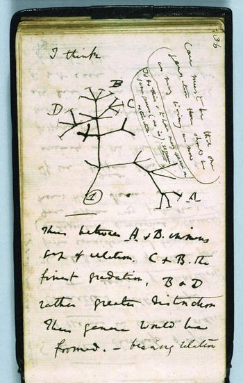
    I enjoy the good defense of the wrongfully accused–The Encyclopedia of Incorrect Reviews of Literature andDarwin_first_tree_2
    Science
    is an enormous and multi-generational work, filled to its festering brim with The Bad Stuff:   Everyone is represented here, glory rendered to trifle:  Hamlet was ripped by Voltaire (“vulgar and barbarous”) while Pepys raped Midsummer Night’s Dream (“insipid, ridiculous”); Moby Dick was “trash, bedlam literature”; Kipling couldn’t write in English (SF Examiner 1889); and Max Eastman weirdly and famously trashed Hemingway and his manhood in the New Republic while reviewing For Whom the Bell Tolls in 1940 (“lacks the serene confidence that he is a full-sized man”).   Perhaps one of the very prettiest of the bad/wrong review was made by The Bookman (the professional bookseller’s reviewing organ in the United States) in 1906, in reviewing Sinclair’s The Jungle:  “His reasoning is so false, his disregard of human nature so naïve, his statement of facts so biased, his conclusions so perverted, that the effect can be only to disgust many honest, sensible folk with the very terms he uses so glibly”.  Well put; better still if it were correct.  The list goes on and on and touches, well, just about everyone (including Dr. Seuss).  What I really enjoy is the response to the bad review, especially when the bad review was, simply, bad. 

    One good example, .a great example, really, is Thomas Stebbing’s response to an inciting, raw and hateful attack upon Darwin’s Descent of Man by The Times of London newspaper (April, 1871).  Incredibly, or predictably, The Times saw the work as an attack upon society: it accused Darwin of undermining authority and principles of morality, opening the way to “the most murderous revolutions”. A “man incurs a grave responsibility when, with the authority of a well-earned reputation, he advances at such a time the disintegrating speculations of this book.” Stebbing’s  review of the Review is drippingly but properly sarcastic, pointing out obvious errors in specific and the tone of the article in general in the defense of theAntievolutionleague_2
    book. Darwin’s “facile method of observing superficial resemblances” (says The Times) moves  Stebbing to issue the following: “they may fancy that truth is worth discovering , even when it seems to involve some contradictions to our pride and some loss of comfort to our finer feelings…”  It is a gorgeous line ending a proper, staid defense of what would seem prima facie to be something in need of no defense whatsoever—in 1871 or 2008. 

    Reverend Stebbing, a Darwinian, Naturalist and fellow of the Royal College of Surgeons, lived another 55 years after this article was published—one year longer than the issuance of the (negative, anti-Darwin) verdict in
    the Scopes/Monkey trial.  I wonder what he was thinking on that day in 1925…

    ·Posted by :

    ·in:

    — —