A Daily History of Holes, Dots, Lines, Science, History, Math, Physics, Art, the Unintentional Absurd, Architecture, Maps, Data Visualization, Blank and Missing Things, and so on. |1.6 million words, 7500 images, 4.9 million hits| Press & appearances in The Times, Le Figaro, Mensa, The Economist, The Guardian, Discovery News, Slate, Le Monde, Sci American Blogs, Le Pont, and many other places… 5000+ total posts since 2008.

Category: Perspective

  • Looking Up at Buildings at Strong Angles

    JF Ptak Science Books  Quick Post

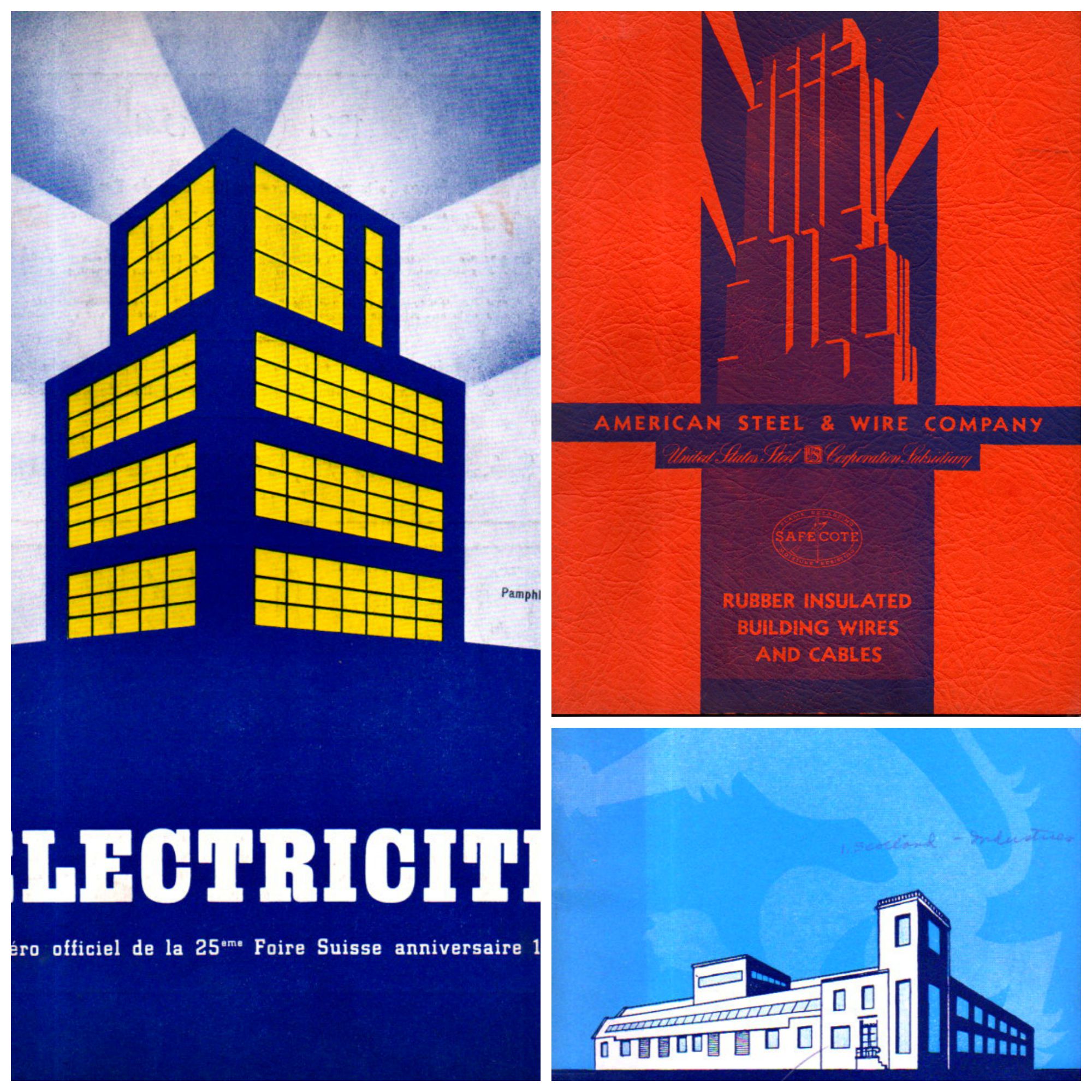
    I’m just taking a moment to share these three unusual pamphlets, with their very striking and unusual covers. The buildings suggest a different perspective, one from below-grade and looking up obliquely–something not-usual to me. There are small categories on this blog for views looking straight up, and views looking straight down–neither very common things–and this little gathering may be a new category of “uncommon perspective”.  

    Building light collage


  • When a Six-Cent Tax Was a Nickel Too Much (1938)

    JF Ptak Science Books    Post 2514

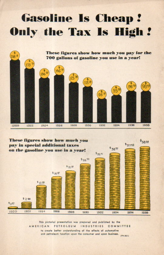
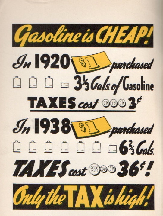
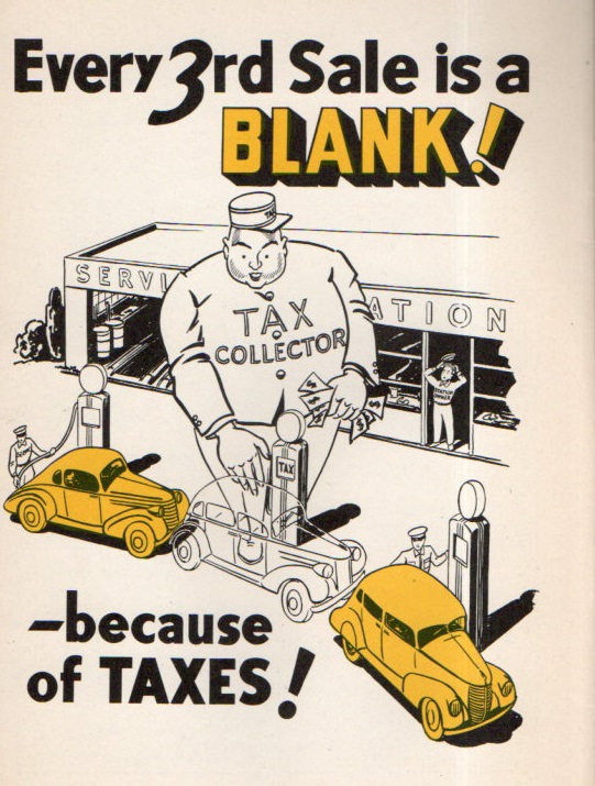
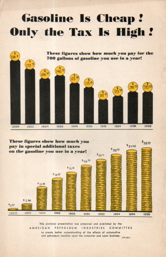
    Gas Tax062Although the artist/author created some great and 30’s-bubbly cartoons, I’m not sure about what he was so grouchy about–plus I don’t know about his number sources, either. The main graphic that gets to his point shows that in 1920 $1 bought 3.5 gallons of gas and paid  6 cents in taxes; in 1938 that dollar bought 6 gallons but the taxes were 36 cents.  So the screed was about getting even more gasoline for the buck even though it was buying nearly twice as much anyway.  Since the federal excise tax in gasoline actually went down from 1.5 cents to 1 cent a gallon at this time, the additional taxes would have come from the states, which I guess were not part of the equation in 1920. But the extra nickel or so per gallon looks to be about average for state taxes on gas in 1938 (as we see in Notes #1 below).

    [The image at left is the rear cover of the pamphlet under discussion–it really doesn’t have a title, just a series of statements.]


    This was sort of a long way to go in looking at a cartoon-illustrated sweaty tax screed from 1938, but as it turns out  there was a little surprise in the results.  The author/artist is uncredited but the pamphlet was produced and published by the American Petroleum Industries Committee, which no doubt was lobby for a decrease in state (and federal?) taxes to lower the price of gasoline and perhaps to increase consumption.  They made it abundantly clear that they did not like taxes.  And as it turns out they really don’t identify the source of the taxes, just gas taxes in general, though they made it seem as though it was a unified approach to lowering federal and state taxes together as a unit, and not as 48 individual governing bodies for state taxes. On the one hand the penny tax wasn’t really so bad; ont he other the state taxes could be 4-5-6 cents, which turns out to be a lot more than states charge today (CPI adjusted). 

    Gas Tax063So, given for example 5,000 miles/year at 15mpg1 average for 1938 is 333 gallons at 10 cents gallon making $33.33/year in gas expenses or 1.9% of a yearly average salary of $1,731. 

    In 2015, 5,000 miles/year at 20mpg=250 gals x $3.20 = $800/year in gas, and with the average salary (according to the Bureau of Labor Statistics) of $850/week or $43,700/year, the gas expense would be 1.8%  of the yearly income. I have seen other figures stating the individual average salary to be about $30,000–the discrepancy is considerable and I’m not sure of the origin. Using the lower figure the gas expenses jump to about 2.6%.  

    In any event I found it odd that working with a few found and not-quite arbitrary stats that the average percentage of the cost of gasoline via yearly salary would be so very similar.  Of course the cars have gotten much more expensive and also far more powerful and safer to operate, and car insurance has no doubt increased, as has maintenance, so the overall cost of keeping and using a car is quite a lot more today than in 1938–still the similarity of gas/yearly income was pretty cool to see.  

    Now the taxes that these guys were complaining about: that 1 cent in 1938 (according to the BLS inflation calculator) is equal to about 17 cents in 2015 dollars, which is just about what the federal excise tax is today in 2015. The 5 cent state tax in 1938 winds up being quite a bit more than state taxes today–for example North Carolina was charging 6 cents ($1.01) in 1938 compared to its 38 cents today.  

    And so where does this leave us? I really don’t know, except that when there are general complaints about things costing too much it is interesting to see how expensive things really are in a longitudinal perspective.  That, and always consider the source.  

      Gas Tax064

    Notes: 

    1.   First of all the 5k/yr average driving is arbitrary. Secondly I’ve found the stat several times now in quick searches that Ford Model A cars got about 20mpg in 1928.  Cars got heavier/more powerful by 1938 and for the sake of this exercise assume that the average mileage decreased with the increase in power and weight.  It is a little bit of a long shot but probably not to far from the mark. 


    IRS stats for federal excise taxes on gasoline, http://www.irs.gov/pub/irs-soi/00gastax.pdf


  • Paolo Ucello and the Forest of Pikes

    JF Ptak Science Books   Quick Post

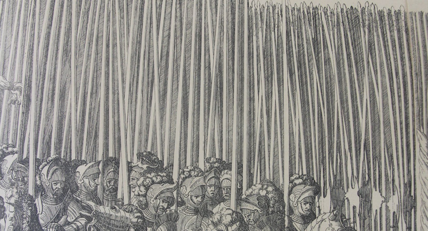
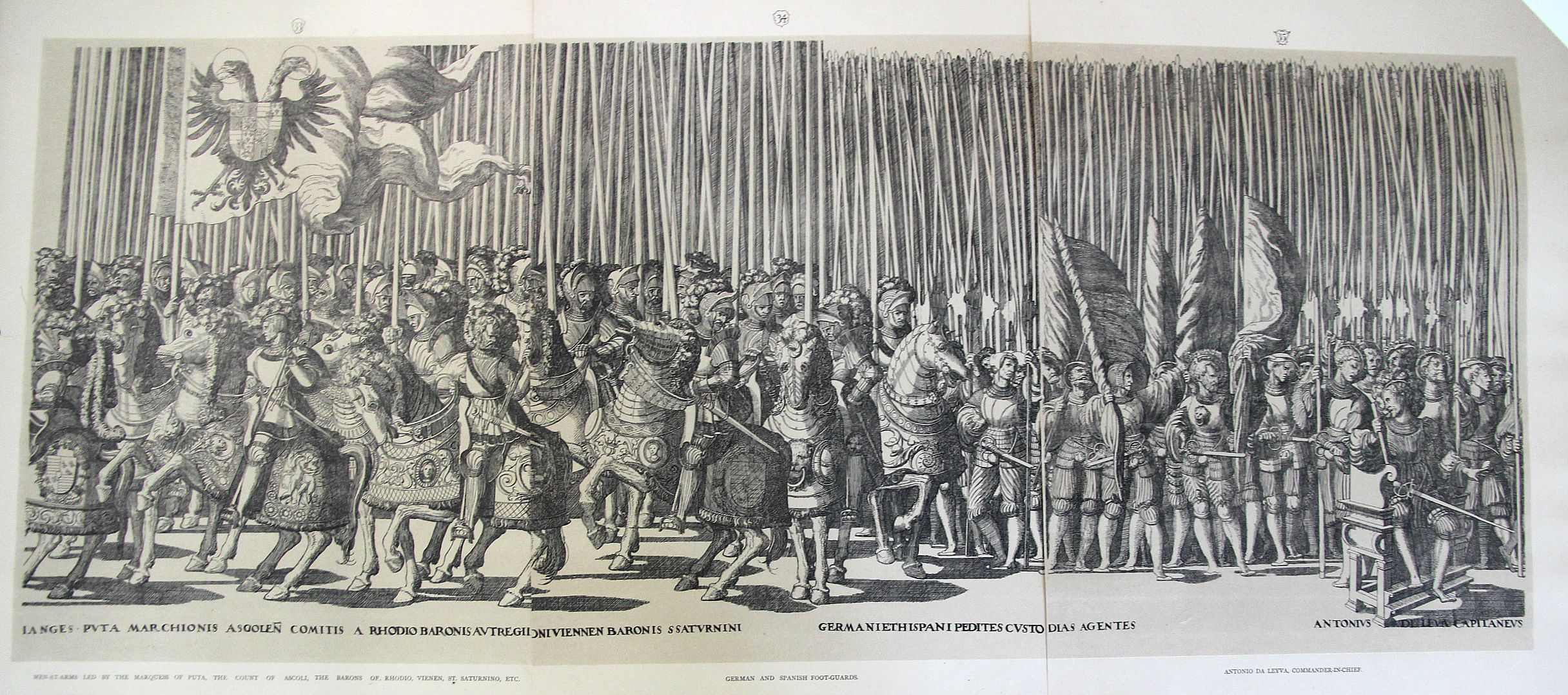
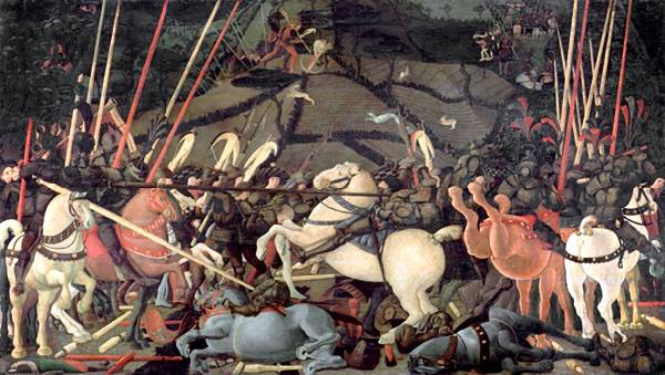
    Yes, yes, I know this isn’t the work of the beautiful Paolo Uccello, but it does remind me of his Battle of San Romano (ca. 1435, and 60 sq ft of brilliance) one of the great works by one of the leading early Renaissance artists.  It is the spears, which is about the first thing that I see in Uccello–that and of course the horse rumps, which are part of the issue in William Gaddis’ great American novel, The Recognitions, in which he discusses the famous “solids in Uccello”.  And he’s right–there is little or no detail in some big splashes of color, as in the horses. Big, solid, colors–what in the world was Uccello thinking about using those great blocks, nearly 600 years ago?

    Processional spears detail

    This is a detail from the larger three-section image (below) which is itself a small detail from the 20-section whole of one of the most famous festival books of the mid-Renaissance, this the work of Nicolaus Hogenberg (c.1500-1539). Gratae et laboribus aequae posteritati. Caesareas sanctique patris longo ordine turmas aspice. The original was published in 1540 and excessively rare (very valuable) in the first and second editions–my copies come from much later, int he late 19th century.  That said, it is at least a thrill to have them right there in front of you, in their great massiveness.  

    Processional large

    • [ The full original work can be seen at the British Library collection of Festival Books, the Coronation of Charles V http://special-1.bl.uk/treasures/festivalbooks/pageview.aspx?strFest=0086&strPage=049&print=1]

    And the Battle of San Romano that I’m dreaming of:

    Uccello romano

    [Source: the National Gallery,  http://www.nationalgallery.org.uk/articulate/projects/bf/bf_painting.html]

    ·Posted by :

    ·in:

    —

  • A Victorian YouTube and the Anti-Hermit Hermit

    JF Ptak Science Books  

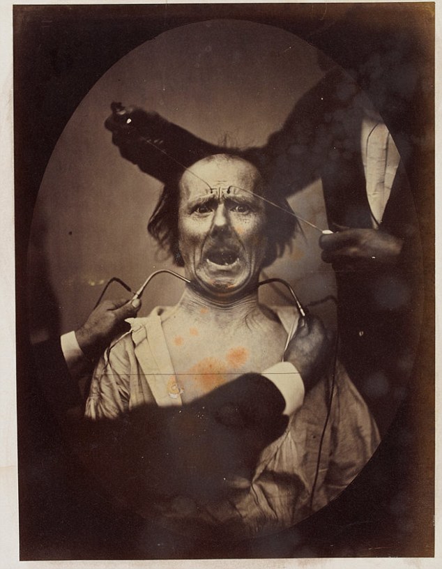
    The “eccentric” versus the “insane” in Victorian England may well have been identified by the amount of available disposable income–if you could afford your whimsy and misery, then you were “eccentric”; if not, then you  were “insane”, which also meant that you were culpable of being scooped up by The Authorities and interned if you turned out to be a larger/smellier/more obnoxious nuisance than a simple dot of the street.   That or you may have wound up as an electrically-prodded subject in an experiment by Charles Darwin (Expression of Emotions….).   In this way the past telescopes nicely into the present, less the electrical stimulation bit. 

    Darwin Expression[Image Source:  Daily Mail, here.]

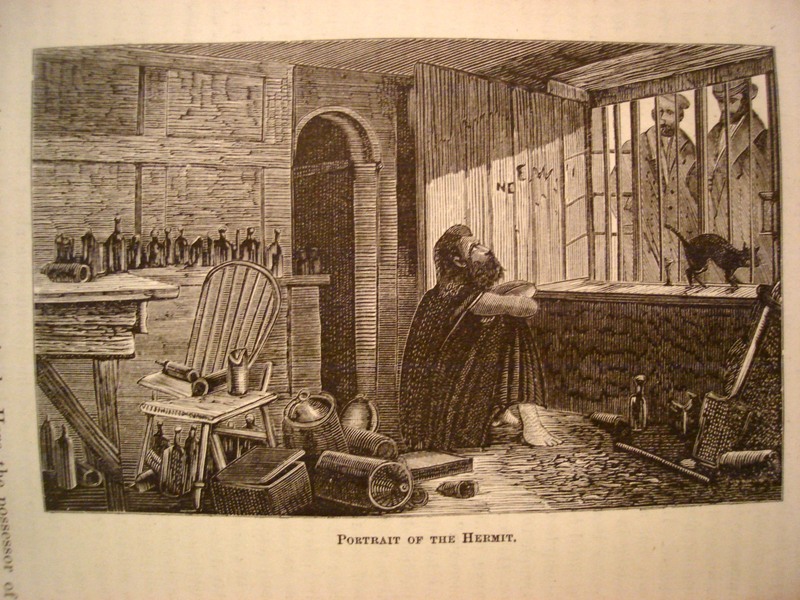
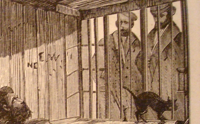
    The image shown below is that of Mr. James Lucas, “the Hermit of Red-Coat’s Green, (near Hitchens)”, living his life in a most uncommon hermit-like fashion, even for a hermit.  Seems to me that a hermit would be removed from society and be away from people; Mr. Lucas may be of a singular caste of that genre, living his life alone in the very midst of society–he lived in the kitchen of his townhouse, in a single room with a window to the street.  There he lived out his life in full and constant view of the passersby on the busy sidewalk.  Crowds would come by and stare, and Mr. Lucas would stare back–he would rarely, if ever, communicate, though he would (“he was not miserly”) give out “farthings and gin” to “swarms of tramps”, no to mention sweetmeats to children.   He’d watch people watching him.

    Hermit Insane

    He also didn’t write (except we are told “upon a check”), and made no physical effort to retain anything that he thought about; nor was the reason for his uncommon lifestyle made known.

    He was one son of “an opulent London merchant”, and in time proved to be an incorrigible and strong-willed non-conformist (with the funds to do so in some comfort).  He evidently went completely over the edge when his mother died, and after a year of keeping her body in the house removed to the kitchen, where he spent the rest of his days (living there from 1850 to 1874).

    Hermit Insane detail

     After he died and his room cleaned out for the sale of the family’s property, it was discovered that the floor was covered in two feet of ashes and soot from the kitchen fireplace.  Without the family money Mr. Lucas surely would’ve wound up on a cadaver table long before his seventieth year, suffering real social Dickensian travail rather than that which existed just in his mind.

    ·Posted by :

    ·in:

    — —

  • Einstein and Fermi Immigration Papers, National Archives

    JF Ptak Science Books   Quick Post

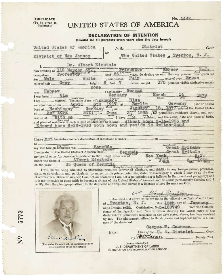
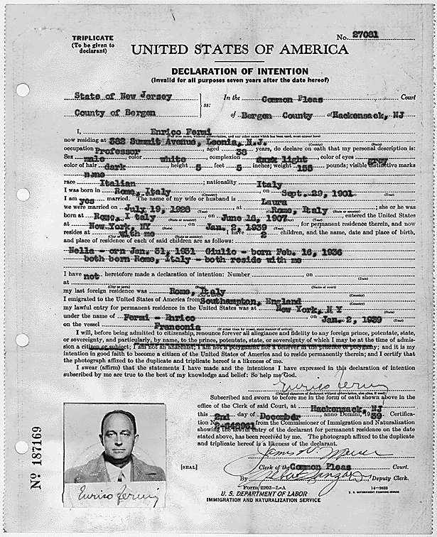
    Below are two immigration reports for Albert Einstein and Enrico Fermi–interesting how the Einstein is simply torn away from the loose leaf binder.  

    Immigration Einstein

    Albert Einstein, Declaration of Intention for Immigration

    Source: National Archives: http://research.archives.gov/description/596270

    Immigration--Fermi

    Enrico Fermi

    Source: National Archives: http://research.archives.gov/description/281852

    ·Posted by :

    ·in:

    —

  • On Making Things That Are There Not There: Camouflage, 1917

    JF Ptak Science Books   Post 2400

    Its a little difficult to think of Ellsworth Kelly, Jacques Villon, Grant Wood, Laslo Moholy-Nagy and Thomas Hart Benton as painters-for-war.  But its true, and true for many of hundreds of other artists in the 1915-1918 era. Its not as though they were in the trenches gunning down the enemy or lobbing hand grenades into the swirling gunsmoke. They were camofleurs, camouflage1 experts, artists employed as magicians, Wartime Magi, employed/drafted to make ships and such disappear. 

    Ever since it was (sort of) first noticed in 1915 that designs odd to the environment, stark geometric patterns and such, were capable of fooling the eye, people with  design capacity were pressed into service, rendering offensive and defensive instruments of war optically semi-impervious with variations of the then-five-year-old modern nonrepresentational art. That must’ve been a very odd position to wake up to every morning. 

    Of course the idea of camouflage in the animal world is probably 250 million years old–animals and insects have been blending into their environment for eons, and I’m sure too that early hominids did their fair share of walking behind brush.  But the idea of hiding great amalgamations of very heavy metal with paint is really quite modern.

    World War I photos--Camouflage291 [The original photograph is available for purchase at the blog’s bookstore, here.]

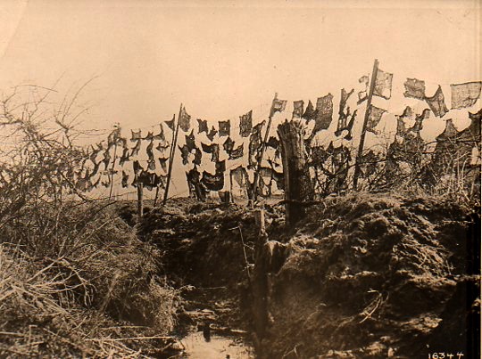
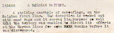
    In this photograph the camouflage is more a more futuristic conception of art than the abstract and cubist approaches that were taken during the war, this looking more like assemblages of found material more than anything else.  And, according to the text that accompanied the photograph (which comes from 1918, from the Underwood & Underwood news photo service agency), the camouflage–empty sandbags thrown on a barbed wire fence) successfully concealed a gunnery emplacement for months on end. 

    World War I photos--Camouflage det292 

    Notes

    1. A fine bibliography on camouflage appears here, at Leonardo Online.

    The definition of “camouflage” from the Oxford English Dictionary shows that it is a young word, in English:
    “(n) The disguising of any objects used in war, such as camps, guns, ships, by means of paint, smoke-screens, shrubbery, etc., in such a way as to conceal it from the enemy; also, the disguise used in this way; freq. attrib.


    1917    Daily Mail 25 May 4/4   The act of hiding anything from your enemy is termed ‘camouflage’.
    1917    Daily Mail 16 July 5/3   The King paid a visit to what is called a camouflage factory.
    1922    C. E. Montague Disenchantment viii. 108   A French aerodrome across which the French camouflage painters had simply painted a great white high-road.

    ·Posted by :

    ·in:

    — —

  • Marble Clouds and their Emotional Shadows: Cloud Geometries in Art

    JF Ptak Science Books   Post 1942 (Part I, reposting from 2012) 

    I silently laugh at my own cenotaph 
    	And out of the caverns of rain.  Percy B. Shelley, "The Cloud", 1820
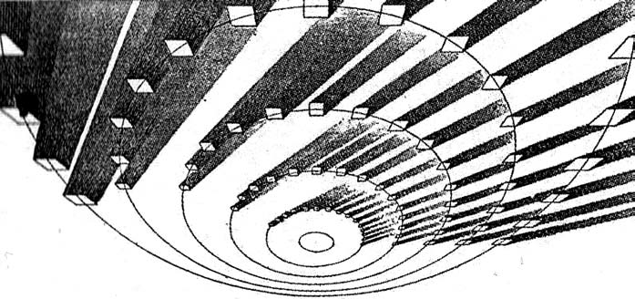
    [John Ruskin, Cloud Perspectival, 1860. Source for all Ruskin images:  “Cloud Studies: The Visible Invisible”, by Mary Jacobus, here.]

    John Ruskin (1819-1900) was still a very young man when he published the start of a series of works in art criticism,Modern Painters, in 18431.  To refer to it as a great work in critical theory is painting the work with a narrow brush, though–it had a very sweeping overall effect, and addressed all manner of issues integral to art, and was a developing vision of what art was looking at in the 19th century.  Ostensibly it began as a defense of the work of J.M.W. Turner and the way in which that man represented nature in his pre-Impressionist, pre-Expressionist work. Ruskin makes the case that the works that were so grating part of the art world i the 1830’s were highly consistent with centuries of representing nature in art–and not only that, but presenting evidence that turner did so like no other artist in history.  Ruskin would weave further volumes of Modern Painters through the body of his other work for the next 17 years, publishing the last installment in a fifth volume in 1860.

    Turner (1775-1851) was a great Romantic and a lot of that work tends towards a very full and very early expression of Impressionism and Expressionism, something that not everyone was ready for in the first quarter of the 19th century. This is particularly so in his paintings of clouds, and even more so in cloud/ocean interaction.  They are sweeping and breath-taking and very emotional works, in some ways like the late string quartets of Beethoven–powerful, provocative, internal dialogs of the deep power of nature. He must stand with John Constable as the Cloud Man of the 19th Century, or perhaps Constable stands with him.  They both in a way stand with Luke Howard, the scientist who was really the first classifier of clouds–an undertaking which in some impossible way escaped the recognition of the greatest classifiers it he history of science–and who did so in a paper in 1802, written at a time when Constable and Turner were both young artists.

    Turner and Constable both painted clouds like perhaps no others before them; and Ruskin, in his deep appreciation for the importance of the representation of nature int he art, also made a contribution to the understanding of clouds that was of an extraordinary nature. In the fifth volume of his Modern Painters Ruskin attempts a perspective study of clouds, and may have been about the first to do so. The illustrations of this effort I think are incredible, and remind me very much of installing a sort of rigidity to clouds, a cloud geometry, veritable studies of stones and blocks in the sky.  The imaging part of this exercise must have been an enormous thing back there in 1860, to think of clouds in a perspectival way, floating very large geometric objects in the sky. The astonishing results are seen (above) and following:
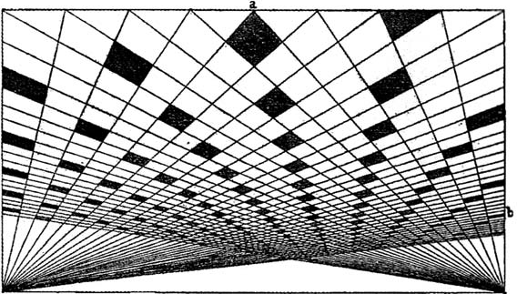
     And this:
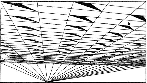
    [John Ruskin, Cloud Perspective: Curvilinear., Modern Painters, Vol. V, Plate LXV.]

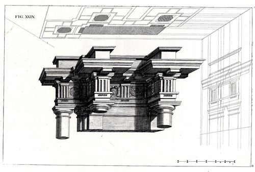
     In a way the first image reminds me of Andrea Pozzo’s work in his monumental   Rules and examples of perspective proper for painters and architects (1693):
     Pozo

    but really more in the way that Pozzo’s work seems to be elevated and floating in a heavy perspectivist space, bigger and blockier sky-borne marble than with ruskin.  But still, the disembodied floatiness of the Pozzo work is ethereal.

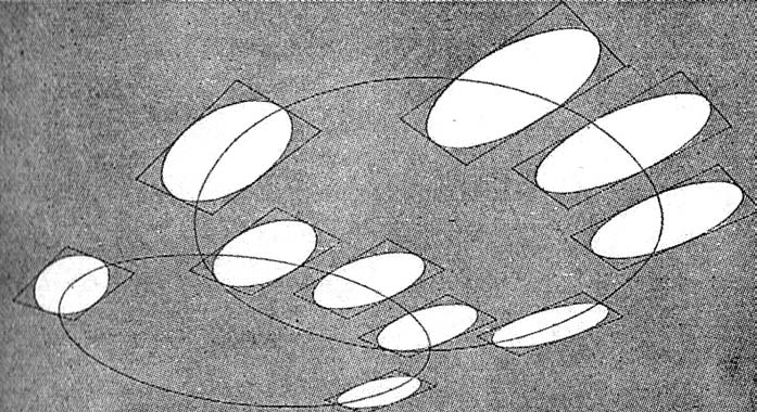
    Ruskin does round out his blocky and beautiful geometry, which definitely reminds me of work w=that would appear 90 years later:  Ruskin, again:
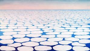
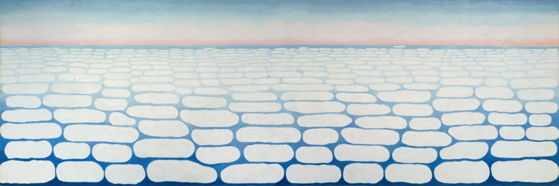
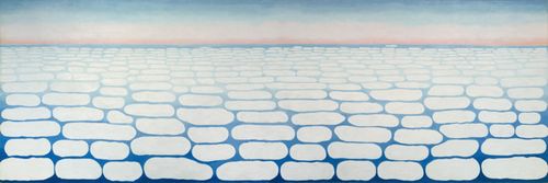
    And  Georgia O’Keefe’s Clouds III (1963), though her clouds tend towards a more rigid geometry in Clouds IV (1965, following):
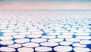
    Clouds O'KeefeO’Keefe, Clouds Above the Sky III, 1963
    Clouds okeefe sky above iv 1965

    O’Keefe, Clouds Above the Sky IV, 1965

    Ms. Georgia is definitely seeing her clouds with different eyes than Ruskin, and they are entirely different creatures–but still, the two come together in my head as relatives. The clouds, I mean.

    I started looking around for early hard-line cloud geometries and thus far I haven’t found very much, though there is a tremendous example by Henry Van de Velde’s (1863-1957) “Sun at Ocean (Rhythmic Synthesis”) which I found in  Werner Hoffman’s Turning Points in Twentieth century Art, 1890-1917 and which was executed in 1888/9, looks to me to be absolutely incredible for its time, a nearly non-representational, proto-abstract something, done three decades before these genres came into being.
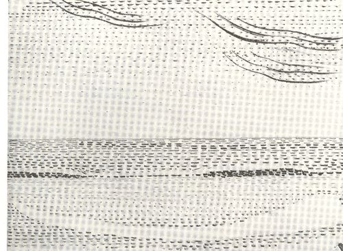
    Clouds van de velde
    I don’t know where the designer Van de Velde fits in the early history of non-representational art, but his effort in the second to last decade of the 19th century certainly seems to be very unusual for its time, and a good example of creative cloud representation. 

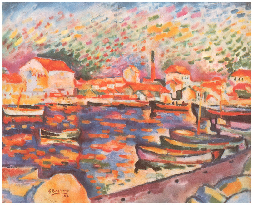
    Non-standard cloud imagery is much easier to finding the 20th century, like those of Georges Braque in his La Ciotat Harbor (1906):
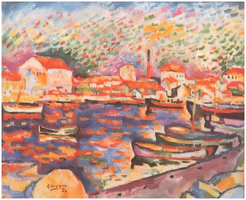
    Clouds braque
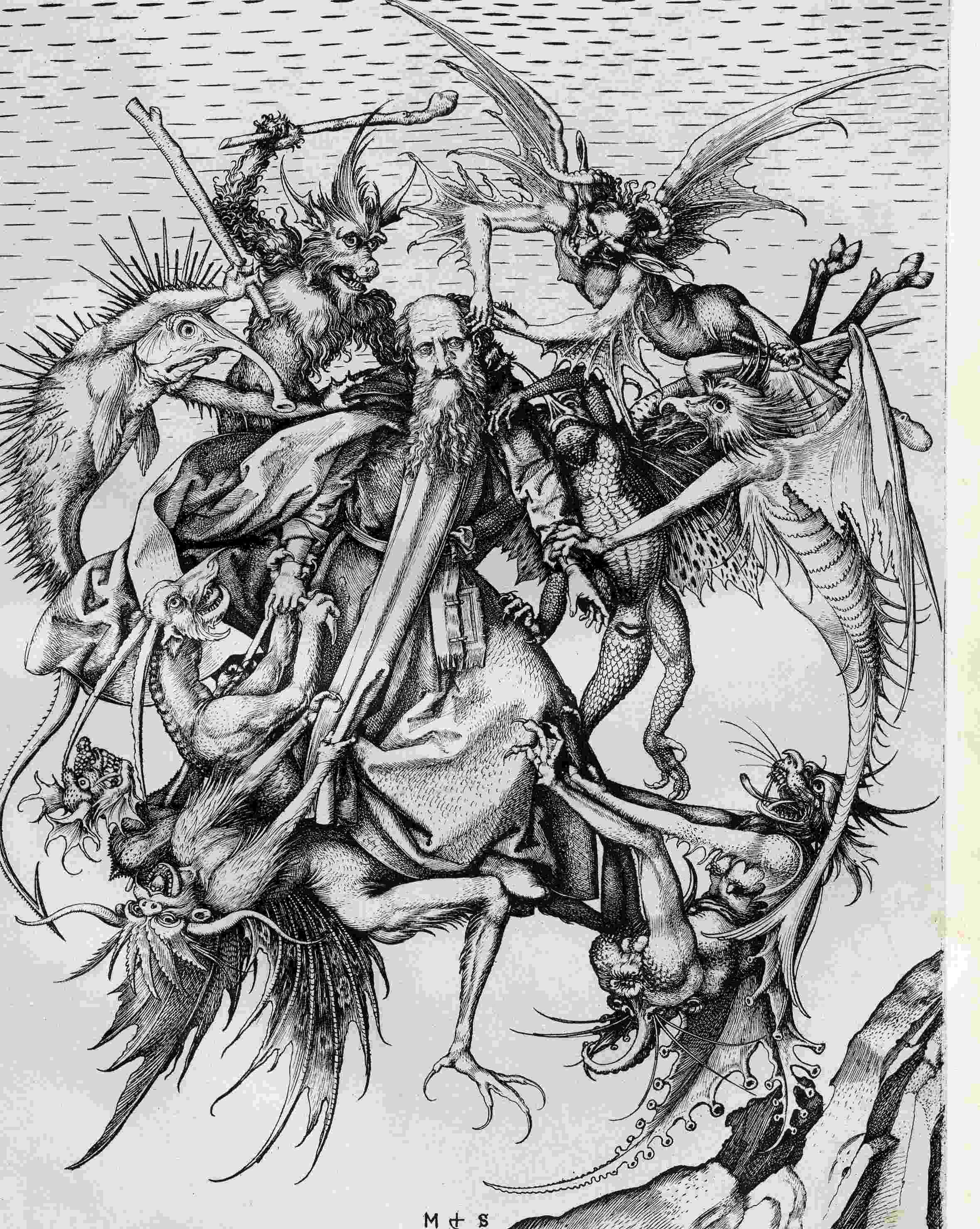
    Even this starts to have the look of something earlier, particularly if you turned the clouds-in-art clock way back, say, into the Renaissance. For example Martin Schoengauer‘s spectacular  The Temptation of St. Anthony, which was printed in 1470/5, has a beautiful, fluid circularity to it, full of an earthy roundness even as the saint is pursued by demons.  But the sky in the background is populated with nothing but dashes to suggest clouds, and which also starts to look something like the Fauvist and Expressionist works to come, 400/500 years later.
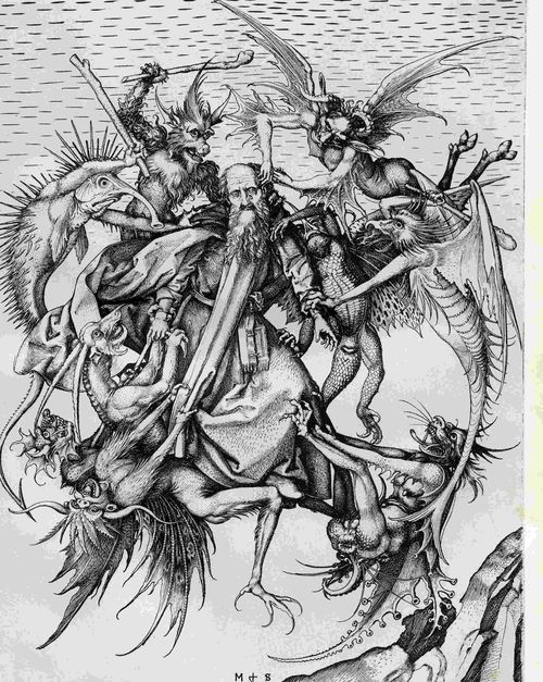
    Clouds schoengauer

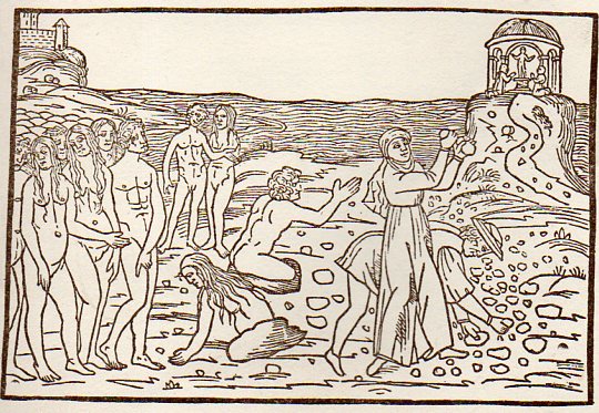
    (There are many examples of the sky being simply not represented at all, particularly in woodblock,

    like this image from Ovid (Accipe Studiose Lector P. Ouidij Metamorphosin...printed in Venice in 1509:
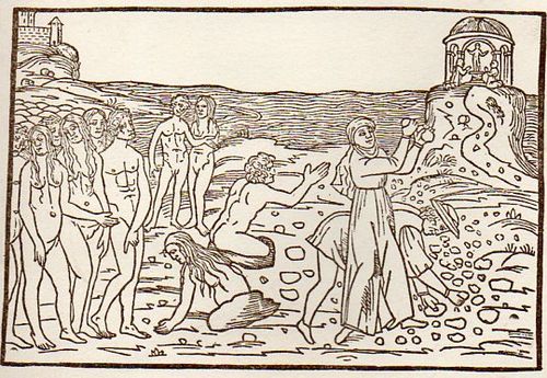
    Clouds no couds livy913

    “You could not see a cloud, because
    No cloud was in the sky:
    No birds were flying overhead —
    There were no birds to fly”.–Lewis Carroll, Through the Looking Glass.

    There are many non-sky images like this. 

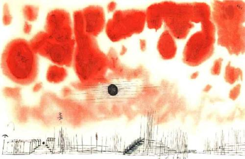
    Another interesting modern example is this Paul Klee (though it comes fairly late in that career, in 1940):
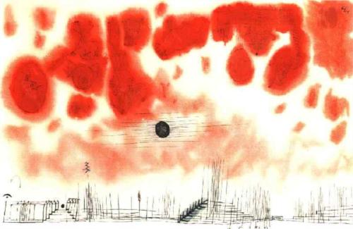
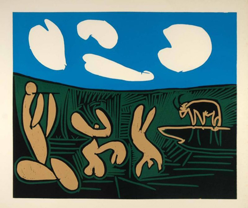
    Clouds Paul Klee 1940And an example from the ubiquitous Picasso, still later, in 1962:
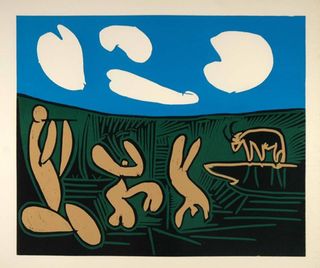
    Clouds Picasso

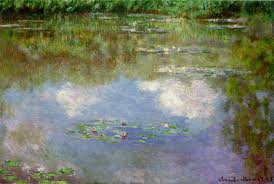
    But earlier images are harder to locate.  The obvious early-ish source (though still much later in the century) would be Van Gogh (say, with Starry Night) and Monet, though the fractalesque Van Gogh gets much closer to the re-interperative power of the Ruskin images than the reflected impressionist beauty of the Monet.
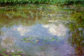
    Clouds Monet
    On a cursory look around the antiquarian painterly sky-world, it is becoming obvious that the cloud geometries of Ruskin are very uncommon. 

    Notes

    1.  For full text of Ruskin’s  Modern Painters , see  (1873)volume 5 for (1860) and  (1873)

  • Math Dreams and Mathmares

    JF Ptak Science Books  Post 692  (from 2009) Expanded

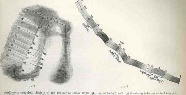
    This post was written five yers ago when I was excited to find an illustration of a dreamer and numbers with some mathematical content.  I thought that it was pretty unusual to find as an illsutrastion, even though I had read many stories of people being influenced byt their dreams, evem in the sciences, but that there were few images of the process.  In Post 692 I psoted a found image of such a thing that was just a simple advertisement in a German magazine.  There was also a series of images from Francis Galton on imaging arithmetical processes from Nature back in 1880, which may also be the first scientific article on synesthesia.  And there doesn’t seem to be a lot more than this, even in canonical illustration.  

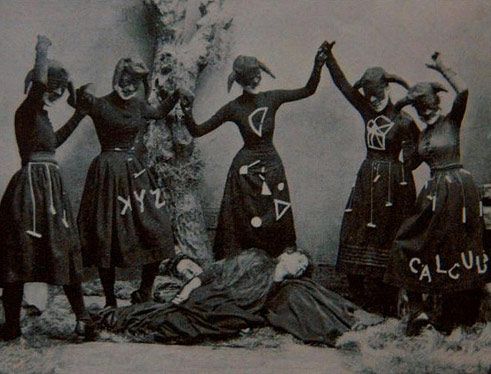
    So it came as a surprise today to find this photo to add to the small collection of math dreams and imagery of “doing” math (from ca. 1880):

    Math nightmare

    Thinking big thoughts in dreams is generally not a common thing, as anyone who has read their own semi-conscious half-awake memory notes of a dream-based inspiration could attest.  But it does happen: 
    ==Blog July 21=math dream

    Paul  McCartney1 dreamed the song Yesterday, Gandhi dreamed the source of non-violent resistance, Elias Howe  dreamed of the construction of the first sewing machine, and Mary Shelley the creation of her novel Frankenstein…  For good or for ill, William Blake was evidently deeply influenced by his own dreams; on the other hand, Rene Magritte was deeply influenced by dreams but didn’t use any of his own for his paintings, or so it was said. Otto Loewi turned an old problem into not one in a dream, finding a solution to the prickish problem of whether nerve impulses were chemical or electrical (and resulting in the Nobel for medicine in 1935); the fabulous discovery of the benzene ring came to August Kekule in a dream as well.  Artists have been representing people in dreams and dreamscapes for many centuries: Durer depicted a dream in a 1525 watercolor, for example, and thousands of artists have depicted famous biblical dreams (Joseph of Pharo) for long expanses of time.

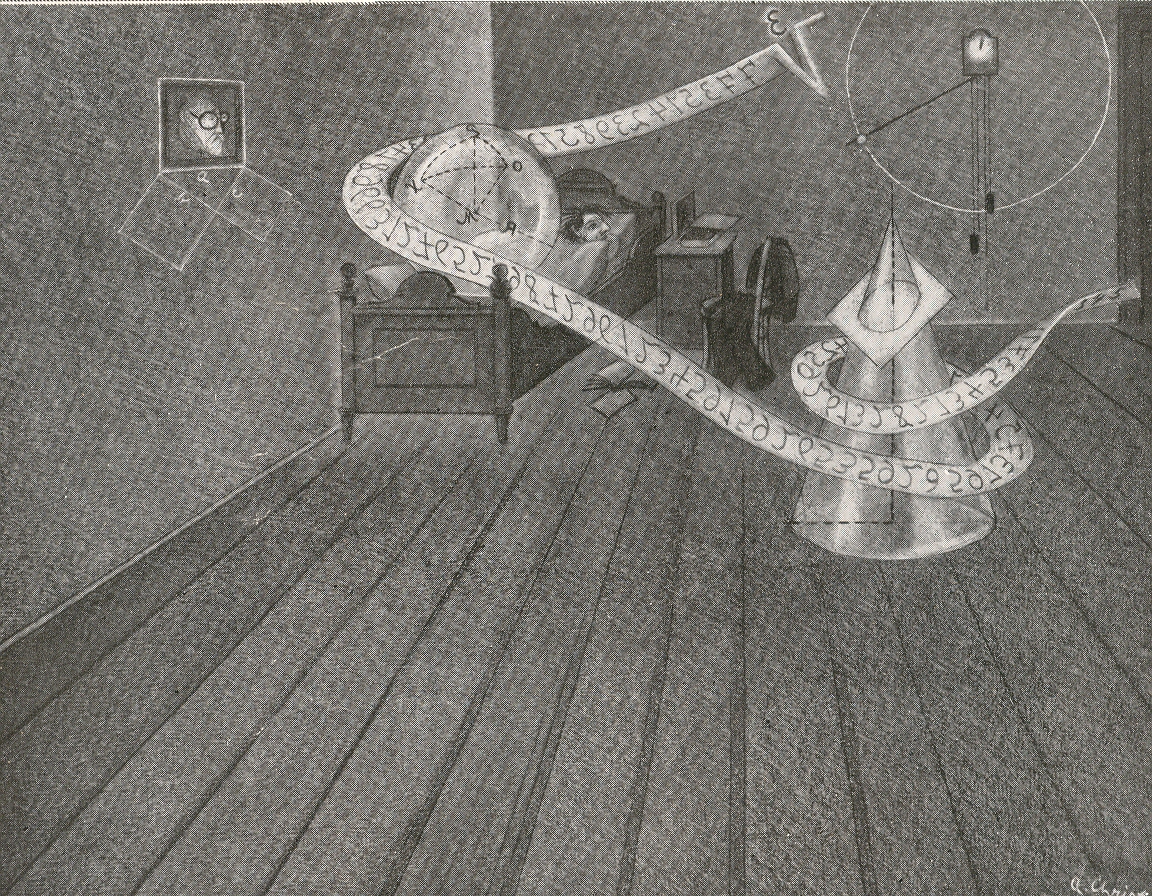
    What struck me, though, in this illustration found on the other side of the page of the Illustrirte Zeitung2 (for August 1932) that I used for yesterday’s post about damming Gibraltar and Shakespeare’s memories, was the depiction of someone dreaming mathematical thoughts…or at the very least, dreaming numbers.  People have undoubtedly dreamed much in mathematics, but I can not recall seeing illustrations of these dreams.

    I’m differentiating here from something like a Poincarean inspiration, or vision, or thunderstrike–I’m talking about drop-dead asleep sleep, dreaming sleep, REM and all that. Also I’m differentiating this from imaging mathematical thought, as in the work of Francis Galton in 1880 in which the subject of mentally seeing the process of mathematics is perhaps first addressed. I wrote a short piece on that here, way back in Post 9. )

    Photo

    The numerical sequence in this dream doesn’t look like anything to me:  the backwards radicand doesn’t strike anything common in my head.  The geometrical drawing under the portrait in the dreamer’s room though is the impossibly iconic Pythagorean theorem, and there is a nice picture of a conic section in the foreground; but the artist, who improbably signed the work “A. Christ”, doesn’t offer much of math in the dreamscape.  Still, it is a rare depiction of someone dreaming about math. 

    Notes
    1. “I woke up with a lovely tune in my head. I thought, ‘That’s great, I wonder what that is?’ There was an upright piano next to me, to the right of the bed by the window. I got out of bed, sat at the piano, found G, found F sharp minor 7th — and that leads you through then to B to E minor, and finally back to E. It all leads forward logically. I liked the melody a lot, but because I’d dreamed it, I couldn’t believe I’d written it. I thought, ‘No, I’ve never written anything like this before.’ But I had the tune, which was the most magic thing!” from Barry Miles (1997), Paul McCartney.
    2.  This is really a great sheet of paper, coming from issue 4492, pp 518-519.  Two pictures of dreams on one side, with three visionary images on the other (the Gibraltar dam, a sub-polar submarine, and a futuristic Indian railway/bridge.

    ·Posted by :

    ·in:

    —

  • When You Leave out the Detail, Where Does it Go?

    JF Ptak Science Books   Post 2140   Part of the series on the History of Blank, Empty, and Missing Things.


    Follow Me on Pinterest

    When modern art was becoming modern, and artists were reveiling more of nature and life by using less of its components and using more of suggestion and motion and color–leaving out the “detail”–where indeed did that detail, well, go?

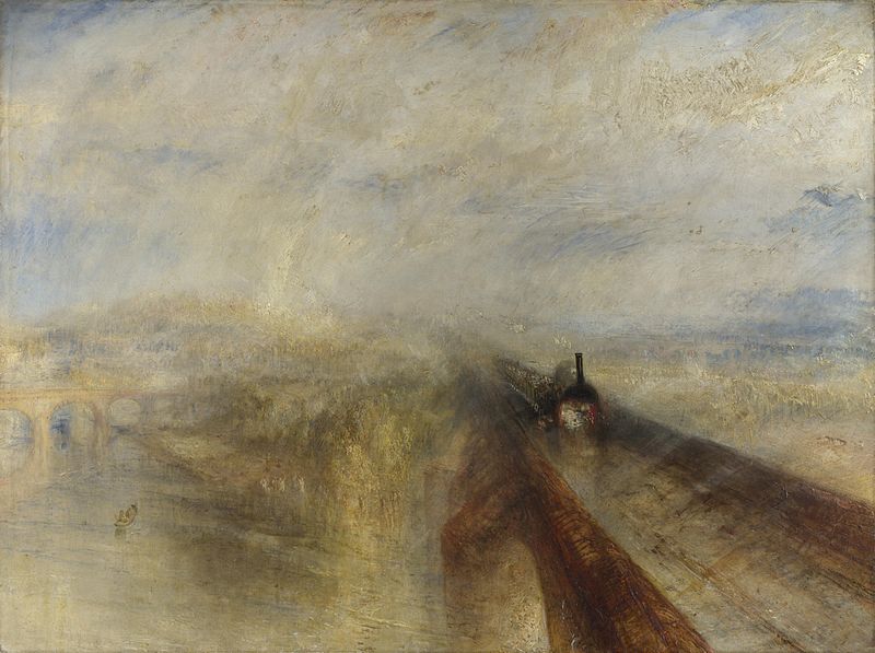
    Detail turnerIt is interesting to imagine a composite world to our’s, a place where that missing and removed detail goes.  For example, when JMW Turner painted a train passing over a river on a bridge, he was more suggestive of the scene than he was in reality-based descriptors.  [Rain, Steam and Speed – The Great Western Railway, 1844.]  The intricacies of realism and reproductional relativity is not there, the action and train and river implied, artistic impressions and whatever else was in the artist’s toolbox or mind’s eye. 

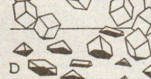
    Perhaps the seeping detail from one world to the next is more like the sphere entering the two-dimensional world of Flatland, or better yet the reverse of Charles Bragdon’s 1drawings of the footprints of 3-D objects passing through a 2-D plane…the detail of the Turner seeping through the canvas and into the opposing DetailWorld, falling like rain. Maybe it is a world of non-representational images and impressions awaiting the attention and arrival of detail to give it all a solid, easily distinguishable representation of the imagined world around the easel in that Other Place.

    Detail bragdon

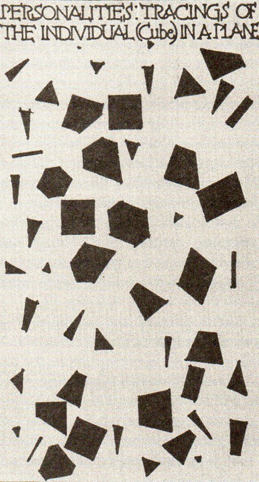
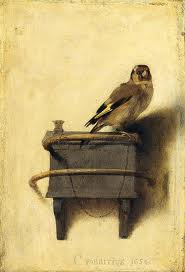
    Another beautiful image by Bragdon is from “Personalities: Tracings of the Individual (Cube) in a Plane” from  Man, the Square2 shows the “shadows” of the three-dimensional figures as they lived in their two-dimensional world.  It comes close to the impact of the cubes above, but really only depicts what two-dimensional creatures would see of the three-dimensional beings inhabiting their Bragdonesque world.  Blog--blagden 1 det349 All of this was put into my mind by seeing this image (The Goldfinch, 16540  by Carel Fabricius.  Clearly we can see a bird on a perch, chained to the upper rung, with another rung below, but as much as we can see  the detail  we don’t.  So much of this image is suggested and implied, hundreds of yers before Impressionism:  the face of the bird is barely there, the second rung dissolves into the wall, the shadows are muted and half-existent, and so on.  The details of the painting are as much missing as they are there.

    Detail fabricius

     And of course the world of detail would disappear more and more, until by 1911, it existed hardly at all, the representational world drifting off the canvas completely, for those who wanted that to be the case. 

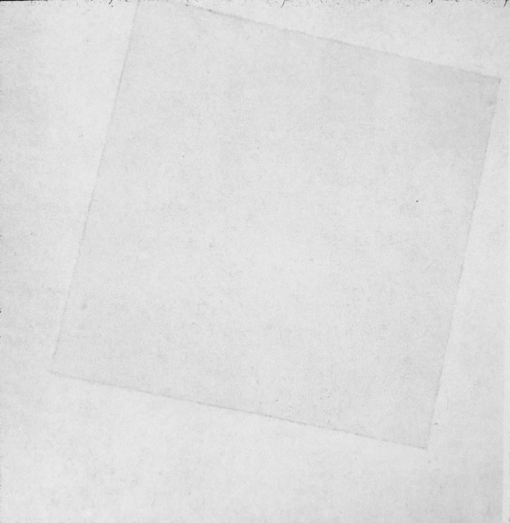
    Again, as much as say Kasimir Malevich made all of the detail go away in his Suprematist paintings like a white square on a white square (White on White, 1917/18, which I can say is not served well at all with images online or in books, as the artwork is really pretty textured and detailed),

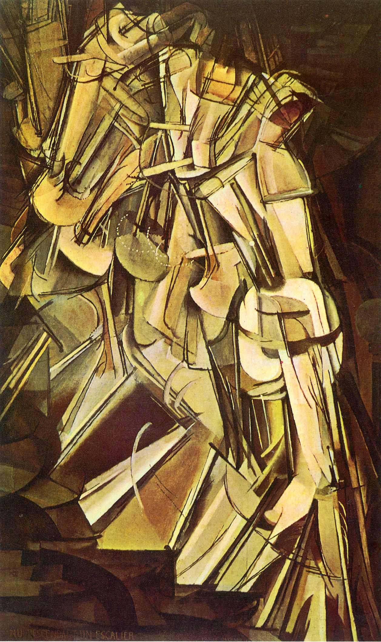
    Detail  white squareat about the same time ither artists like Marcel Duchamp were both taking away details of one sort while adding new details of another never-yet-done sort, as in his Nude Descending (1912), where we begin to see the representation of the fourth dimension in art:

    Detail duchamp

    Perhaps the rain of details into DetailWorld work in reverse for the unexpected details of stuff we can’t see in our world? 

    Well. We know that there is no DetailWorld, but I think it is certainly interesting enough to think of these revolutionary changes in art and trying to imagine the enormous amount of painterly stuff that the innovations/discoveries replaced, if they were to all go to one place.  In a way it is analogous to the changes in the mountain that I can see now from my living room window–mostly it is invisible when the patch of woods between our house and the mountain is all leafed out (seeing the forest for the trees), but with autumn and winter here at about the same time, it is easier to appreciate both the trees that I can see when I can’t, and the mountain that I can’t see sometimes when I can. 

    Notes:

    1.(Bragdon) A PRIMER OF HIGHER SPACE. (The Fourth Dimension). Rochester: Manas Press, 1913. 8vo, (12), 79pp, including 30 plates. 

    2. (Bragdon) MAN THE SQUARE. A Higher Space Parable. Rochester: Manas Press, 1912. 12mo, 34pp, 9 illustrations.  


  • An Interesting Three-Part Perspective, 1560

    JF Ptak Science Books  Quick Post 

    Follow Me on Pinterest


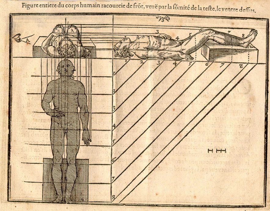
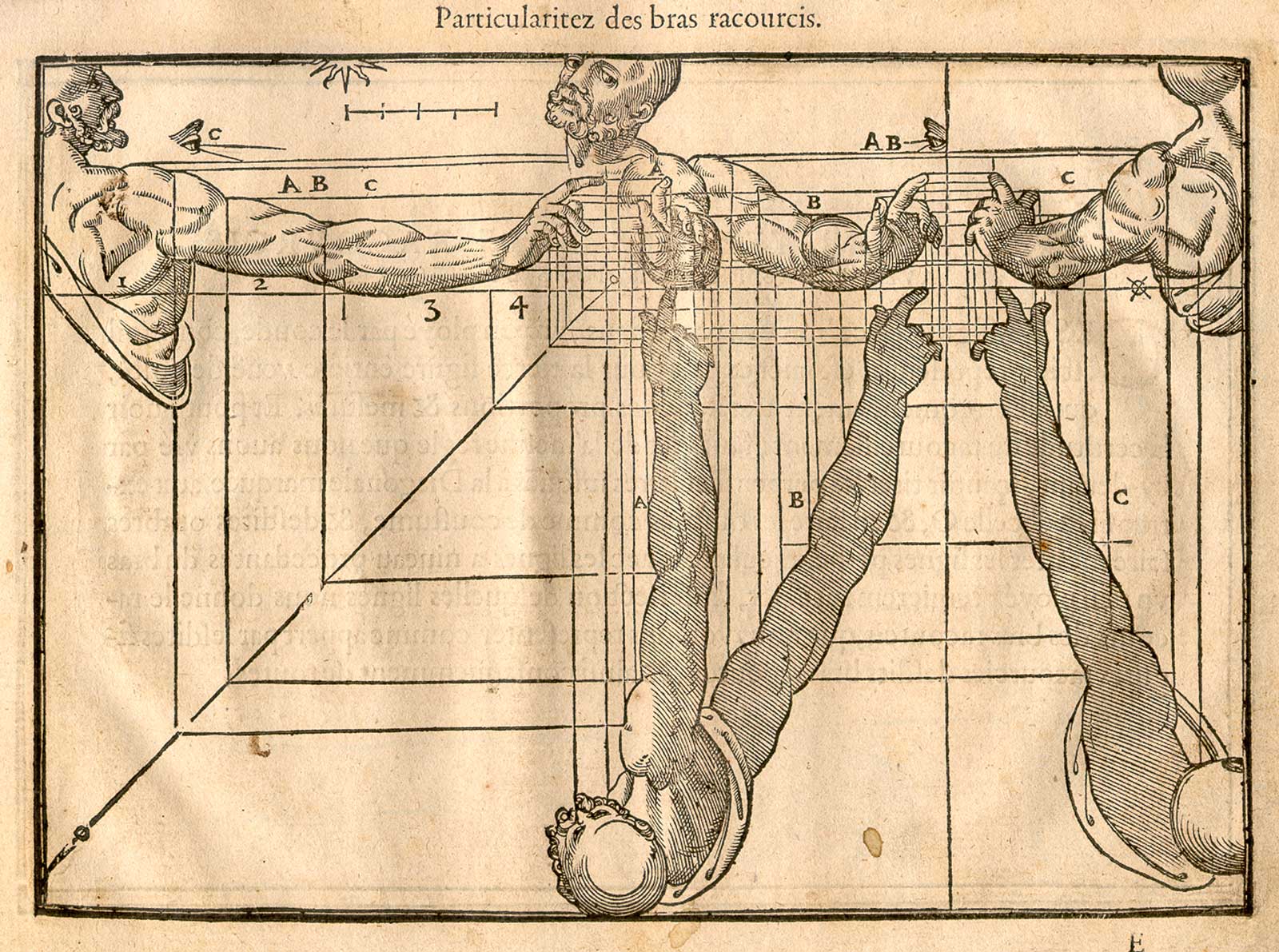
    I’m not sure if I’ve ever seen a 16th century human perspective drawing showing the body in plan and elevation and cross-section.  Jehan cousin the younger (1522-1595, in France), the son of Jean Cousin the Elder (1490-1560), a painter and sculptor, produced such an image in his Livre de Perspective, which was published in 1560. Well, the image definitely was published in 1560, though the artist may have been father and it may have been son–they worked closely together, and the Younger was taught at great length by the Elder, so much so that their work became indistinguishable. Nevertheless, the images I think are quite extraordinary, as we see below: 


    And so by Andreas Mantegna, a classic example:

    The following images come from the 1608 edition of the Cousin Perspective. a number of which are fairly unusual (all from the Library of Congress site, here):
    Cousin_p16

    ·Posted by :

    ·in:

    — —