A Daily History of Holes, Dots, Lines, Science, History, Math, Physics, Art, the Unintentional Absurd, Architecture, Maps, Data Visualization, Blank and Missing Things, and so on. |1.6 million words, 7500 images, 4.9 million hits| Press & appearances in The Times, Le Figaro, Mensa, The Economist, The Guardian, Discovery News, Slate, Le Monde, Sci American Blogs, Le Pont, and many other places… 5000+ total posts since 2008.

Author: JF Ptak

  • Original Reflections: unique experiences with mirrors: Van Eyck & Brunellesci

    JF Ptak Science Books  Quick Post

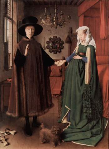
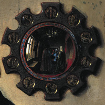
    I was thinking about writing a short post on van Eyck and settled on his painting of this newly married couple–The Arnolfini Marriage, painted in 1434, depicting the union of Giovanni Arnolfini and Giovanna Cenami, who married in Bruges in that year–and the very unusual image of the scene as reflected in the convex mirror directly behind the couple. It is a wonderful painting of course, lusciously and richly colored–the observer, though, is brought instantly to the mirror. And in that reflection is what is seen from behind the couple as well as what the couple is seeing–in a sense, a 180-degree view of the room (if we considered the painter’s perspective towards the couple as 90-degrees). It is one of the first times that a mirror is used in this fashion and is also offers a great instruction on the newly-rediscovered perspective. (The inscription above the mirror, which is surrounded by ten scenes from the life of Christ, reads “Jan van Eyck was present”–and probably was literal, as we see the painter himself reflected in a tiny portrait…along with another man, who may also have been involved with the wedding).

    Vna_eyck_mirror_big

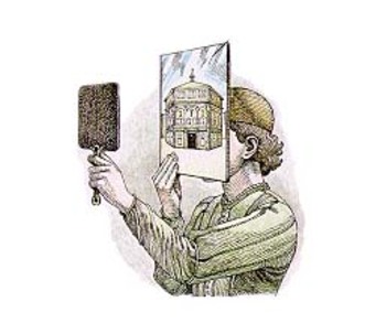
    As a matter of fact, it is just 30 years earlier that Filippo di  Ser Brunellesci (1377-1446) used mirrors as a tool in “creating” the first paintings in linear perspective in modern times–and he uses the mirrors in such a way as to compare what he was seeing in front of him, rather than using them to gain a sight-line for things that he couldn’t see. But they did in a way do just that. Brunellesci set his position inside the unfinished Santa Maria del Fiore (Florence), and used the apparatus (pictured here from the linked website) to record the facade of San Giovanni de Firenze (better known by its subsequent name, the Florentine Baptitstry, as all Florentine Catholics
     were Baptized there well into the 19th century) which was opposite his position across the Piazza del Duomo. He effort was a panel which was finished between 1407 and 1410, and which is now lost to time and space.

    Van_eyck_mirror_2

    It should be noted that the Baptistry, an 8-sided figure (with another, triangular, form added later; and 8-sided to represent the octava dies, the “eighth day,” the day of the risen Christ, which would be outside the scope of time and measurement) was decorated with colossal, fantastically beautiful doors, some of which were created by none other than Ghiberti, another (slightly later) master of linear perspective.

    Van_eyek_brun

    (The image above is taken from the very useful site which goes into good detail about the Brunellesci pin/peephole experiment.)


    ·Posted by :

    ·in:

    — —

  • The First Shadow of a Color “Photograph”—Jan van Eyck, 1436

    Van
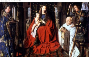
    Was it really Jan van Eyck and not J.C. Maxwell who produced the first color photograph?  Van Eyck’s after all is hanging up in Bruges in the Groeninge Museum, and Maxwell’s, well, Maxwell’s dissipated in about half an hour, leaving only an historical trace.  The problem of course is that Van Eyck’s oil (Virgin of the Canon  van der Paele) was done 403 years before the Daguerre invention (building of course on the work of others, notably Niepce), so it really doesn’t count because it really doesn’t exist.  His work though *does* exist, but not as a photo—it was, is, a painting, finished in 1436, and it stands in my mind as looking so much like a perfect capturing of a moment that it seems a (luscious) snapshot. 

    In her book Color and Meaning, Practice and Theory in Renaissance Painting (1992), Marcia Hall makes the point (on page 69) that it is the lighting in this painting that makes it so extraordinary—and differentiates it entirely from the predictable light or “stage illumination of the Italians”.  Its an excellent point.  The light source in the painting is emanates as though it were a half-hour before sunset in Santa Fe; or here, in Asheville, when there is a very low and nearly complete cloud ceiling and the sun just manages just before sunset to peek through between the mountains and the cloud layers to blaze its extraordinary, horizontal-like brilliance making everything and anything that reflects that light into a work of private art. The figures in this painting by Van Eyck reflect a softer version of that light in such a manner—they are sharply illuminated, luminous, in all of their very human glory and frailty.  We have sharp relief, great detail, deep shadow—and much of that is missing in Italy at this time.

    The photo parts come in here:  the characters are caught in the middle of some very small, obscure action, and the smallness of their movements are captured perfectly

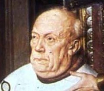
    Even though they are emotive of course the faces of the great Masaccio are relatively plain; Gozzoli, Fra Lippi, theVan2
    magnificent Fra Angelico, Pisanello, Ghirlandaio, della Francesca, Veneziano, di Credi,. Perugino, and even the emotive and colorful Rafael, all working in about the same decades as van Eyck, simply do not give this anatomical expressiveness to the faces of their subjects.

    So the extreme light and the detail in the faces gives the van Eyck this fantastical quality—on the other hand the perspective and the proportions of the characters in relation to the objects in the room and the room itself are off, secondary, not important—this too in sharp contrast to the great inventors, re0-discovers, innovators of the scientific perspective.  (This homage belongs to a slightly earlier time, to Giotto and Uccello, but their work is just a bit to early for discussion with van Eyck.)  Marcia Hall goes on in her appraisal about the way in which van Eyck applied his color (“binding his pigments in a drying oil”) to give his subjects their incredible color depth, and this of course is a major element in understanding the picture (coming as it does from a stone-cold expert). 

    What I’m thinking now, the aspect that is giving this painting its “photographic” quality, its supra-realistic event, is this new use o flight, new angle, with the immersion of anatomical detail and the “different”, Northern, perspective. 

    This is a very, overly, simple observation and simplification, but I think in general that it is true.

    ·Posted by :

    ·in:


  • Durer’s Beautiful Monsters. The Geometrical Man Takes Control, 1525.

    Dsc04744
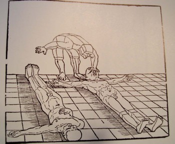
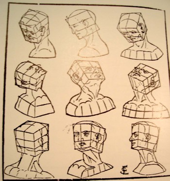
    Albrecht Durer’s (1471-1528) drawing of a geometrical man was an amazing–startling, even–object to the early 16th century consciousness. His …Symmetria partium…humanorum corporum (1537) was a masterpiece, and a key piece of visionary thinking.

    His Underwysung der Messung (“Treatise on Measuring”) written nearly 500 years ago (in 1525) set the stage for this next work–it is here that we find some of the most recognizable of
    Durer’s illustrations of the instruments that he employed to doRobot_flash_gordon his perspective work.  Durer–so far as I can tell–created an orthographically rotating human figures in three-dimensional trapezoids, creating incredibly human-like non-human forms.  To the modern eye they look  like supra- or proto- or post-human, perhaps; mechanized, calculated, structural. His use of stereometry, the science of measuring volume, was adapted to this study of human form and the relationship between that and movement. 

    They were in a sense a CAT scan.  And in this way the person in 1525, seeing this for the first time, could have been  experiencing something like the sensation of seeing an X-Ray for the first time in 1895 or a magnified flea in 1626, only the image wasn’t magnified nor was it an internal view–it did help in understanding perspective and motion. 
    Dsc04745
    This was a new way of thinking about the body, challenging the god-grace and ubiquitous church-inspired revelation of how it worked.  This was not a necessarily easy time in which to picture humans in such a scientific way.  (In 1553 the physician and theological scholar Michael Severtus would be burned at the stake for his views on the Trinity, Nicean Creed and other related things, though his undeniably revolutionary idea of cardiopulmonary circulation was in itself a direct challenge to church teachings).

    Durer’s innovation accommodated empirical observation and allowed for proportional change.  Its importance in relational drawing, anatomical and  technical, cannot be understated, which I think trumped it as a subversive agent to orthodoxy.

    Erhard Schoen  (1491-1542)  who was one of the most prolific woodcut illustrators in Europe during this period with more than 116 books to his credit, produced Unnderweissung der proportzion unnd stellung der possen, liegent und stehent…, Norenberg 1542 followed Durer showing that the human form was reducible to connected but discrete Euclidean solids, and thereby was a knowable entity. (It is interesting to footnote here that this work came after a period of a dozen or so years in which Schoen produced many heavily anti-Catholic cartoons, broadsides andAgricola illustrations.) 

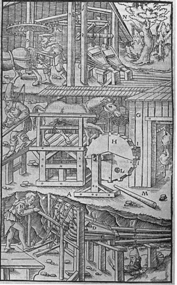
    Close on the heels of Durer was the work of Georg Bauer  (also known as Agricola, 1494-1555) whose De re metallica Liber XII (“12 Books on the Subject of Metals”) in 1556.  This work by Agricola (recognized as one of the founding fathers of a number of disciplines–mining geology and metallurgy, mineralogy, structural geology, and paleontology) was actually more concerned with mining and minerals than the title implies.  It was here, again, that the illustrations were crucial and revolutionary—his book was a chief resource in mining for hundreds of years, due chiefly for its clear and precise how-to illustrations. 

    ·Posted by :

    ·in:


  • Bombing Britain, 1940–a View of the Battle of Britain from Germany

    JF Ptak Science Books  (an earlier post edited and expanded)

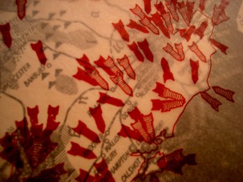
    Dsc04742_2
    It is essential to look at objects from alternative angles, especially in science, in order to determine the correctness, or fitness, of a finding, or opinion.  Even when consolidating data or evidence regarding the confirmation of an established bit,  you may very well find other strands of loose data that could help illuminate even a well established or iconic societal “given”.

    That the war was not going well for the Allies in September 1940 is an understatement—and the chief allies at this point excluded the United States, happily now recovering from the Depression, and still a full 14 months away from entering the war. 

    Dsc04739

    What is very weird to me is that after having looked at every issue of LIFE magazine at least three times  from the start to the end of World War II, that there are more advertisements using war images than there are images of the war itself.  This actually continues into the spring of 1942, when LIFE got really busy, the war got really messy, and people started really dying.  And frankly even the coverage of Pearl Harbor in no way lived up to what I thought the coverage of a photo-magazine like LIFE would be. This is not a scientific study.  It just strikes me as odd, or propagandizing, that there should be such relatively scant, or undervalued, coverage of the fighting when sanitized images of that same fighting were being used to sell socks and shaving cream and cigarettes and such.  I understand the power of hearts-and-minds campaigns, but this seemed so amateurish, boorish even, that it just didn’t approach the level of a psychological ploy to pacify an American public that had virtually no interest in attending the European Theatre. 


  • Liserl and Mileva–Einstein’s Disposable Women

    Einsteinhans_albert_detail_2

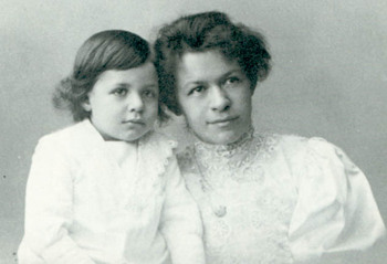
    Looks like a Chuck Close of Albert Einstein, yes?  Well, its not–its just a heavily pixilated enlargement of Einstein’s son, Hans Albert Einstein, who at age 3 or 4 looks pretty much like his father, very much so, actually. 

    Einsteinmileva_detail_smile_2
    The Mona Lisa smile is another missing–discarded–piece of Einstein’s life.  It belongs to his first wife, Mileva Maric.  She was by most accounts an accomplished mathematician, exceptionally intelligent, and a person of her own.  She nearly succeeded in the males’ world of mathematics, but didn’t .Few women did at that time in history–or at least few succeeded under their own name.  There’s a lively debate among some that Mileva was instrumental in the development of the special theory of relativity (among other things) developed by Albert in 1904/5 and published in the Annalen der Physik in the annus mirabilis of 1905.  Personally I doubt that she contributed significantly to the theoretical composition of the theory; I haven’t much of a doubt that she contributed materially to its development, being an intelligent and capable foil/sounding board/conversant with her husband.  As anyone who is a partner in a relationship of two intelligent people realizes, there is a lot of back and forth going on in the development and creation of ideas.  I don’t have any doubt that something like that went on here.Einsteinmileva_detail_eye

    But Albert was done with her by 1914 or so, living basically apart until their official divorce in 1919..  He had minimal relations with Hans Albert.  Eduard developed schizophrenia in his 20’s and that was about it so far as his father was concerned–he was cared for by Mileva until her death in 1948 and then died in an institution in 1965.) And he was particularly done with his daughter Liserl, a baby that he made with Mileva. a girl who simply disappears.  She was born in 1901, and born in “secret”–though it was not a secret to her, or her mother.  She’s gone by 1902.  Then her parents manage to marry in 1903.  The next year Albert tries again at fatherhood witrh Hans Albert, but I think his attention span for children has a relatively short event horizon.  Eduard is born in 1910, but the development of his mental disorder divorces him from hi sfather for good.  It is simply not a pretty story. 

    Einsteinmileva
    Einstein went on his personal life full of what I see as complications, abandonments, deceptions; living with all sorts of shadows, with a hollowness, there, somewhere. 

    I don’t really care to think about Albert’s personal story, and I don’t read his flea-combed biographies I’m perfectly happy to just deal with the intellectual history of his life and be satisfied with that.  But there are days like today, when I think about people celebrating his personal life–as in his birthday–that I sense the emptiness, and wonder about Hans Albert, and Mileva, and Eduard, and the Lost Girl, Liserl.  I think that rather than celebrating Einstein’s personal milestones that we take a moment to remember the countable but countless lives like Mileva who are simply discarded, and that their lives meant as much to them as Einstein’s life meant to him. 

    At least Mileva derves a gravestone.

    Michele Zackheim wrote an interesting book on Lieserl, Einstein’s Daughter, if you’re interested. 

    ·Posted by :

    ·in:


  • The Solids in Uccello

    JF Ptak Science Books

    Blogsan_romano
    My ueber-brilliant wife, Patti Digh, has for decades been fascinated by the monstrous-great William Gaddis, and in particular, by his novel The Recognitions.  It is a difficult book to feel at home in—it took me four tries to feel comfortable in this complex wristbender, but once in, the water was fine, and I finished it during a boring and largely vacant astronomy meeting in Pittsburgh years ago.  It is perhaps one of the best books written by an American in the 20th century, and among the many threads that wind their way through the 950 pages, one involves
    the gorgeous 15th century painter, Paolo Uccello.   Uccello, in short, was one of the first Renaissance painters to (re)discover and paint using perspective, and did so magnificently.  Gaddis refers cryptically, however, to the “solids in Uccello”. 
    Dsc04733
    Books on perspective are some of the most beautifully illustrated works ever printed. They are full of insight and detail—a detail, the seeing of which, is a mystery (and to Uccello, mystical) beauty, a submerged, geological magnificence that is also an extraordinarily powerful tool.

    I wrote two posts or so ago about the importance of Leonardo’s illustrations to Pacioli’s work on perspective, and how this was really about the first time that geometrical figures were illustrated , published, for the first time, in perspective.  And of course the images were drop-dead gorgeous. 

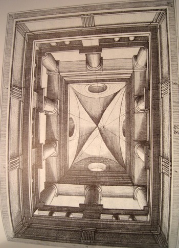
    Vredeman de Vries (Perspectiva) was a 17th century Dutchman who is perhaps one of my favorites—shown here is his projection for an open loggia in which an illusionary ceiling could be painted (in the manner of Andrea Pozzo’s The Transmisson of the Divine Spirit (1688-1694) , an extraordinary painting of tremendous depth on the curved vault of S. Ignazzio in Rome).   (Another example of de Vries at bottom is a simple perspective of diverse architectural forms.) 

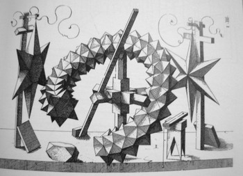
    Dsc04734 Wenzel Jamnitzer’s Perspectiva corporum regularium (1568) is a somewhat earlier work of great depth and beauty—this image is again just a “simple” arrangement of geometrical objects, but there’s really nothing very “simple” about it.  The forms are difficult and arranged in a difficult presentation, and rendering them in perspective was a great achievement, and I think a wonder for the mid-16thc mind to see. 

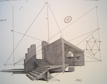
    Brook Taylor’s simple, clean lines and presentation of these architectural forms from his New Principles of Linear Perspective (2nd edition, London, 1719) is another perspective miracle of the 18th century.  To me the lines of perspective showing the view of the objections connected to the spare presentation of the objects themselves look completely modern to me rather than being a technical treatise from 289 years ago.Dsc04729 ,

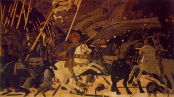
    Uccello understood all of this, and painted using these techniques with enormous power.  The “solids’ recognized by Gaddis (and not really discussed) are incredible to me.  Looking at his painting Battle of San Romano  (1457) we see Perspective in her place; when we look at, say, the rumps of the horses, we see almost no detail, just a mass of color, a solid, with spectacular plainness. What in the world was he thinking?  He could certainly have painted the horse and the other solids with texture and detail, but he didn’t, and to me it seems antithetical to the painting.  What in the name of all motherly things was he thinking?  And who else on earth was using such huge amounts of plain solids in their paintings?  I’m not aware that anyone else was, and I am relatively clueless as to why he did it, abandoning Blogsan_romano_rump as it were the potentials of the beauty of excruciating detail that we see in these other works. 

    I would love to know what Uccello was thinking when he decided to create that mass of color, that solid, when there was no one else doing exactly that.  But my major thanks go to Patti Digh for loving that, and to Mr. Gaddis for creating the question.


    ·Posted by :

    ·in:

    —

  • The First Photograph of a Smell

    JF Ptak Science Books LLC 

    It leaves me with such a cozy
    feeling to not find what I think is an obvious-but-odd phrase in Google.Dsc04716

     And that’s what happened with
    “the first photograph of a smell” (or “photograph of a smell”
    or odor, for that matter),  as shocking
    to the senses as it might be.

    There are long and interesting lists
    of firsts in photography: the first
    color photograph (Maxwell, 1867, but impermanent), the first photograph of a
    human face, the first photograph of the moon, the first photo of a planet, and
    so on, tirelessly, until we see how many derivations of “firsts”
    there are. (We can go from first photo
    of human to first photo of a human face to first photo of a human in motion to
    the first photo showing human hands to the old human recorded by photography
    tot eh first photo of a couple to the first photo of a human with a tool and on
    and on.) There is a shorter list of “first photographic non-photograph of
    a photograph”
    (?!) that I wrote about in an earlier (illustrated) post,
    but we won’t go there today.

    Here is a “first” though
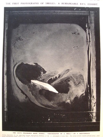
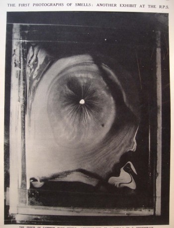
    that I think hasn’t been dealt with too terribly much: the first photograph of an odor.

    These beautiful images appeared in the 10 September 1938 issue of The
    Illustrated London News and were exhibited at the 83rd Annual International
    Exhibition of the Royal Photographic Society, and were made by H. Devaux (who
    evidently, according to the snippet of an obituary that I can see from Science
    magazine, was a plant physiologist and “pioneer of surface physics”Dsc04717

    who died in 1956). The note accompanying the photographs read: “The emission of an odor involves
    volatillisation of material. If an
    odiferous material is enclosed in a cell a few millimeters above a clean
    mercury surface, it is possible to collect on the surface of the mercury a
    monomolecular layer of the volatillising or odoriferous substance. If the mercury surface initially is covered
    with talc powder, the gradual formation of the monomolecules layer may be
    observed as the talc is gradually pushed away from the point immediately below
    the specimen of material.”

    The photos
    are that of the odors of a lily and of camphor. I don’t know which is which, and a good story could be made up for
    either photo belonging to either item. Needless to say, these images are as gorgeous as they are unexpected,
    especially considering that they were made in 1938.

    FOOTNOTE:

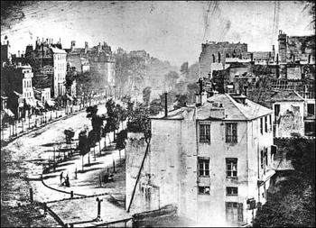
    I’d just like to add here the first photograph of a human being–well, actually, it is the first photograph that just happens to capture a human in the emulsion (discussed Blogoldest_human_photo_2
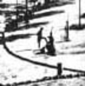
    very nicely on the Doug’s Darkworld  blogsite.  Since the  exposure time was so terribly long for this image to be made, the moving people and horses and carriages on the street, all of the city-life bits, were necessarily spectral, invisible, to the photograph.  Only the stationary items were captured, and the only people captured here were two figures in the foreground, doing something or other that made them still for at least five minutes–long enough for their anonymous but famous photonic impressions to be captured.   Mr. Doug and others seem to think this is a man getting his boots shined–I agree.
    Blogoldest_human_photo_detail

    ·Posted by :

    ·in:


  • Dr. Seuss and the 236 Words that Changed Reading Forever

    JF Ptak Science Books

    I think that it is difficult to overstate the importance and long-term significance of Dr. Seuss‘ (Theodor Seuss Geisel, 1904-1991, son and grandson of brewmasters) contribution to childhood.  I think that it is impossible to calculate the overall impact of his bringing young people to the joy of reading, and to the familiarization  with the bare mechanics of how to read.  Of course he told a great story, but his books were literally page-tuners—they were simply written with words useful to children, with few words per page, thereby allowing the child to see the pictures, read all of the words, and turn the page, giving them a sense of accomplishment along with enjoying  a fine story.   Perhaps it is the getting-the-kids-used –to-reading that was his most fantastic accomplishment—and something that few others have achieved, measuring by just pure numbers. 

    Blogcathatbook

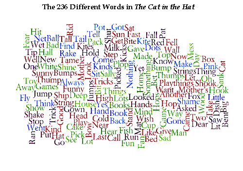
    And the way in which he did this was to artistically use an extremely limited budget of words—Dr. Seuss used precisely 236 different words to write The Cat in the Hat.

    It is certainly true that there have been many sparse, relatively wispy papers in the history of science form which enormous change has sprung..   Pound-for-pound though The Cat in the Hat holds its own. 

    I’ll give the entire list of words below—just have a peek, and try to imagine writing something interesting with just this palette. 

    Wordle--cat in the hat

    It isn’t fair at all to compare this masterpiece with others in different genres, but just to give you an idea of its relative simplicity I’ll quote some numbers taken from an incredible study conducted by Zachary Booth Simpson (“Vocabulary Analysis of Project Gutenberg”).  Simpson’s interpretation is more complex than the story I’ll tell here, but basically he looks at the numbers of words in a piece of literature (for example) and then convenes the number of different words, deducing the actual and then relative density of word usage, which is pretty interesting (and verifies that pit-of-the-stomach feeling about which authors use more words in smaller space). 

    Gibbon’s Decline and Fall seems to lead the way in the absolute number of different words used (43,113!!, which is astonishing), in the 1.5 million word text, while old Uncle Bill uses 4,842 words in the 32,000-word Hamlet—meaning that Measure for Measure (sorry) Mr. Gibbon out-Bills Bill, which I thought was very hard to do.  Other interesting bits are Hugh Lofting’s Doctor Doolittle, who tells the story with 2759 words; Moby Dick, told with a spectrum of 17,227 words; and Les Miserables is painted with 23,334 different words.  The only work that comes close to Seuss in Mr. Simpson’s very considerable list is the New McGuffey Reader, which is really, actually, a tough go, and uses 630 words.

    Unfortunately I do not know about the Dick and Jane readers But they’re no match whatsoever for the Good Doctor.

    So my hat is off and off and off to Theodor Geisel, aka Dr.Seuss—on the anniversary of his anniversary in Seussland, where it is Seussqunetennial every day.


  • The X-Ray of the Imagination 2: Phrenology, Chinese Hell Scrolls, and the Beauty of the Thought Balloon

    The X-Ray of the Imagination:  Internal Dialog, Demons, Humors, and Picturing the Stuff of Thought–On the outer shapes of the inner container

    In an earlier post I wrote about what I thought was the first graphic representation of  the process of forming andBlogxrayfludd
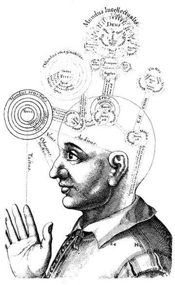
    imaging a complex thought (found in Francis Galton’s Visualizing Numeracy). It is interesting how people tried—over a long period of time—to get at exactly that, the inner process, via some sort of external means, which is almost entirely left in the not-so-exclusive world of the science-like.

    Perhaps the greatest early effort (and certainly the most beautiful yet) to ascribe physical locations and attributes to the mind was the work and drawings of Robert Fludd.  That would be Dr. Robert Fludd (1574-1637), occultist/philosopher, randy logician and hermticist astrologer pseudo-scientist; and maybe the best of his work is found in his fabulously titled work Utriusque Cosmi, Maioris scilicet et Minoris, metaphysica, physica, atque technica Historia (The metaphysical, physical, and technical history of the two worlds, namely the greater and the lesser…), published in Germany between 1617 and 1621.  Things get very deep and complex and confusing, even in the illustrations; so as far as being a key to human knowledge, Fludd probably relaxed the confusion boundaries more than he strengthened insight—but maybe that was supposed to be his job, what with supposedly being a Grandmaster of the Priory of Sion

    Another great effort in the attempt to physically determine what might be going on inside someone’s brain and mind were the physiognomists. Physiognomy (does it really matter how it is spelled?  I should think that if I was to try and determine how I should spell the word using the very methods its practioners employed that the spelling might change daily…) from the Greek, basically meaning “nature” and “interpret”, claimed an ability to judge the scope of a brain by the shape of its container—the skull.  If a skull was sunken or distended or high or pretty or what have you then this shape in some way related to the development of that area of the brain.  So a high forehead could mean great insight or knowledge or intellectual ability; a low, sloping forehead meant, well, not, and to steer clear of such people with yourBloglavater
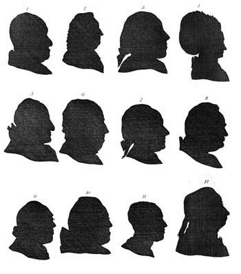
    hand firmly on your purse.  An early practioner was the very formidable Thomas Browne (1605-1682) (in the Religio Medici), but the powerhouse thinker (as it were) was Lavater (1741-1801), who caused and challenged all manner of mischief. The democratic nicety of this pseudo-science is that you didn’t really need to be associated with any extended scientific thought to engage in its application—a nice silhouette-maker would do, along with a series of interpretive and a decent personality was about all you needed.  A nice clear forehead would help.

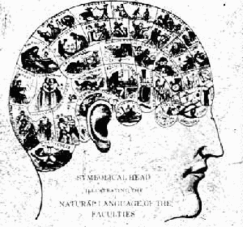
    Nipping at the heels of Johann Caspar Lavater and company was Franz Gall (1758-1828) and the Phrenologists (from the Greek again, “mind knowledge”), who made a slight step beyond simple head shape by “reading” the bumps and indentations of the skull.  Their educated fingers were in this way were supposed to have the capacity to feel the special elements of that part of the brain manifesting itself via cranial nodules or something.
    Blogphren
    Pathognomy was yet another step in the stairs to the flooded basement, where passions and emotions resident in the voice, or gesture, or facial expression, would somehow reveal the structure of the mind.  I found this one pretty curious because it concentrated on the motions of the physical ramifications of the brain, which somehow seemed very elegant in a ghost-like, narcotized way.

    But this is just the attempts to ascertain thought—actually picturing it, literally, was not all that common.  Dreams,Blogxraycruikshank
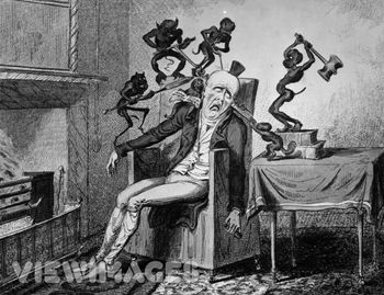
    fears, thoughts, pain, interpretative inner dialog—seems to have occupied artists far less than love or creed or ambition or devotion.  Being able to “see” someone’s pain, or nightmares, was really quite special.

    Thomas Cruikshank made this a sub-specialty for himself, depicting people suffering extreme anguish as a result of gout, or delirium tremens, or fear, and anthropomorphizing them, giving these concerns/fears/pains a human-like quality.  So instead of seeing  a badly inflamed gouty ankle and imaging its pain, we see anti-cherubs, demons, spikey creatures at work on the ankle, pricking it, setting it on fire.

    Bosch of course performed miracles in setting out the fear of the Lake of Fire in very explicit, basic, understandable ways.  In my opinion though the Chinese Hell Screens (as a genre) have Mr. Bosch beat by a long mile, as they were terminally specific in elucidating even what might seem to be trivial transgression for the casual viewer.  (For example, a person who wasted paper would, according to one scroll, spend eternity in a lake of flaming feces, bobbing to the surface occasionally to be stuck in the face by a flaming spear.  Now THAT’S Hell!)

    We have certainly seen people in the throes of nightmare in art, but the relative subtlety of the visions of HenryFuseli
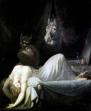
    Fueli (The Nightmare, 1782) and William Blake (“Jeruslaem”, 1820, for example) and of course Fransico de Goya’s “The Sleep of Reason Produces Monsters” (from Los Caprichos) really do wane in comparison to some of the highly explicit horrors of Cruikshank and James Gillray and Thomas Rowlandson.  Perhaps this is so because the later group seems to address the masses and making the nightmare more universal, visiting the ample-butted poor as it would the couch-bound Faintress of the Upper Classes. (I guess I should really remove Goya from the former class, as he really did intend to reach the working poor as much as anyone else.)

    I’ve wondered about the artist Arcimbaldo—the genius portrait painter whose artistic palette was fruits and vegetables—and whether his use of various types and shapes of foods were supposed to correspond to any internal dialogs in the person sitting for him but, well, I think not.  Nice thought, though.

    Most effective though in graphically revealing the inner workings of someone’s mind is, yes, the word balloon, which takes a second seat to its younger sibling, the glorious thought balloon.

    What a fantastic creation!

    The word balloon, or the idea for it, exists for quite some time in Mesoamerica, incised in sculptures from 1000 yearsBlogxrayyellow_kid
    ago.  (See Hull, Kerry Michael (2003). “Verbal Art and Performance in Ch’orti’ and Maya Hieroglyphic Writing”).    Something that we begin to recognize in a more modern form comes up in the 12 th century with word scrolls—elegant, flowing, appealing bits of fabric upon which the words of the person in the painting are written.

    Word balloons really come into their own in political art in the 18th century (and do have a very curious, artistic affect in their longish, elongated appearance with tiny 3-point type inside).  Sometimes the word balloons look like smoke with words in it—these might be my favorite, as they give the clear impression of the immediate and dissipating nature of most speech.

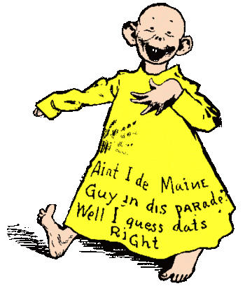
    The Yellow Kid, generally acknowledged as the first “cartoon character”, at first had his speech written directly on his flanged shirt.  It was around 1896 (I think!) that the words moved from his apparel and into a balloon over his head.

    The most beautiful innovation though came a little later (exactly when I’m not sure, I’m sorry to say) with the invention of the thought balloon.   What a magnificent idea!  Why hadn’t this concept been employed earlier, anyway?  How come it took until that unparalled period of time—1895-1915, when virtually everthing became “modern”, when just about everything (save politics, unless you include the creation of the concentration camp) experienced a paradigm shift—and not earlier?  Certainly it is common and debased, and runs amok with the very idea of art and its attempt to show the viewer the inner machinations/beauty of its subject; but wouldn’t it be interesting to have the thought balloon for Lisa Gheradini (the wife of Francesco del Giocondo, “Mona”)?

    Well, probably not.

    But the thought balloon–bubbly, cloud-like apparitions above its thinker’s head—certainly has it place, and isBlogthought_bubble
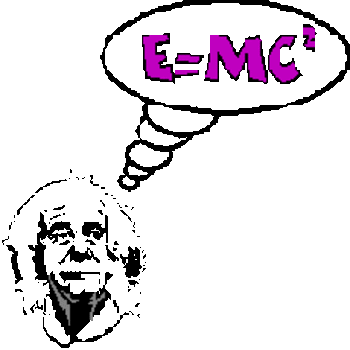
    absolutely a more elegant invention discerning thought than Lavater or even the lovely Mr. Fludd could ever dream.
    ·Posted by :

    ·in:


  • The Sovietesque Disappearance of Pacioli’s Rhombicuboctahedron

    JF Ptak Science Books LLC  Post 23

    What?

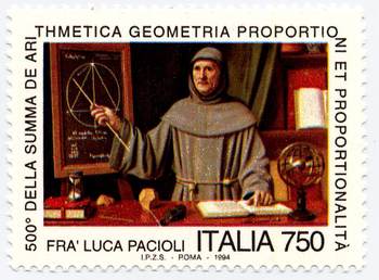
    I’m lodging a complaint, 16 years after the fact (though new to me), about the Italian commemorative stamp honoringBlogpacioli
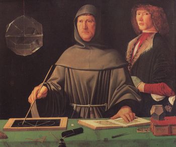
    the great Fra Luca Pacioli—a great mathematician, inventor of modern bookkeeping, and friend and dispersal-agent of/for Leonardo da Vinci—it also seems to be the first representation of a living mathematician.  The stamp is based upon and freely rearranges (to the point of obsidian abstraction) elements of the famous painting by (perhaps) Jacopo Barbari (and painted in 1495), which now hangs in the Museo di Capodimonte (Naples). 

    The painting has been reproduced in mathematics books and such many times over—with good reason, as it is a gorgeous work and is filled with lots of mathematical bits and pieces. 

    The stamp, however, is a curious and annoying work if you are at all familiar with the original.  The most glaring but not most important change is the Soviet-like loss of the figure to the right of Pacioli—althoughBlogpacioli_stamp
    not positively identified, some believe it is Guidobaldo, and others believe it to be the very pretty Albrecht Durer.  He’s gone, replaced by some sort of out-of-century bookcase.  I’m not saying that whoever this happened to be needed Stalinist disappearing  for political reasons, but it upsets the entire composition of the painting, and leads to other more foul errors. 

    The closed red book on the table is moved and an hour glass is placed on top of it, taking up the slate that was there in its place in the original, which is now hanging on the wall.  It is highly unlikely that Pacioli would provide a demonstration in this matter. 

    Also the mathematical notes here are slightly different from the (correct) references to Euclid’s Elements Book XIII, proposition 12 (If an equilateral triangle is inscribed in a circle, then the square on
    the side of the triangle is triple the square on the radius of the
    circle.)

    An armillary sphere makes a curious appearance, and a few of the mathematical tools on the table top make disappearances.  The sphere may be the artist’s attempt to make up for the loss of other symbols, as the sphere represents the Platonic music of the spheres, successive levels of forms being built one on the other and so representing the universe.  (Plato’s
    Republic, where, in the Myth of Er he wrote,
    “. . . Upon each of its circles
    stood a siren who was carried round with its movements, uttering the
    concords of a single scale.”
    [Republic p.  354])

    The important item that is kept on the stamp from the original (though moved) is the polyhedra form, the dodechahedron, one of the great Platonic solids, and a figure composed of 12 pentagons.  It is a highly symbolic link between ancient thought and the rise of the new mathematics and even newer art. 

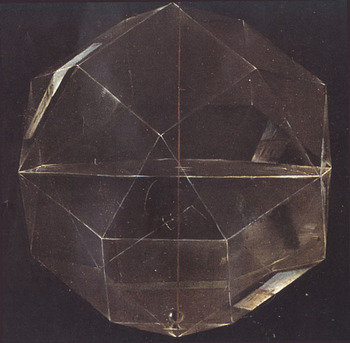
    The most important missing item, though, is the glass object hanging at the left of the painting—it is theBlogpacioli_rhomhb_close
    rhombicuboctahedron.  This object is one of the thirteen semi-regular (or Archimedean) solids, and has 26 faces made of 18 squares and 8 equilateral triangles, with 24 vertices and 48 edges.  It is constructed of glass and hangs by a string, and is half-filled with water.  It is spectacularly shown in the painting by Barbari—it is simply a glorious achievement of perspective and light and shadow.

    And, as it turns out, reflection.   In a superb 90-page article by Nick Mackinnon: (“The portrait of Fra Luca Pacioli”, The Mathematical Gazette, 77 (1993) pp. 130 – 219).  Mackinnon combs through the painting with microscopic precision, and in this case reveals that there is an exterior reflection (of s house) on one of the bottom panels of the figure. (Good work!  He even goes on to try and figure out what it is we are looking at in the reflection.) 
    It is annoying for this figure (or a shadow or hint of this figure) not to be on the stamp because of its beauty and symbolism.  It is none other than Pacioli’s friend, Leonardo, who illustrates his book Divina proportione—a masterpiece of thinking and illustrating, introducing the concept of the divine proportion (phi) and its importance in design and in nature in general. Perhaps of greatest significance though are the illustrations of some of the figures in the book, which I believe are the first time that people are able to see geometrical drawings in perspective, which is a very big deal. 

    Unfortunately this link is pretty much missing without the Rhombicuboctahedron—you don’t have to know how toBlogpacioli_da_vinci
    say it to appreciate it.  (Or as Bernard Malamud writes in the Natural, when discussing a spaghetti dinner “I don’t know how to spell it, but it sure eats good”.)

    All I’m saying is that the designer for the stamp shouldn’t been consulted, and the Italian government should just have used the original as the basis for the stamp.  After all, they didn’t remove the backgrounds of the Mona Lisa or the Last Super because they were too-conflicty with their subjects in those commemorative issue stamps, did they?

    Oh, I forgot–they did. 

    Here are a few good books to consult if you’re interested in polyhedra:

    H.S.M. Coxeter, Regular Polytopes.  Coxeter was perhaps the most impressive geometer of the 20th century.
    Peter R. Cromwell, Polyhedra.
    H. Martyn Cundy and A.P. Rollett, Mathematical Models
    Alan Holden, Shapes, Spaces and Symmetry. (Very pretty!)
    Peter Pearce, Structure in Nature is a Strategy for Design.
    Magnus Wenninger, Polyhedron Models.  (Paper construction!)

    ·Posted by :

    ·in:

    —