A Daily History of Holes, Dots, Lines, Science, History, Math, Physics, Art, the Unintentional Absurd, Architecture, Maps, Data Visualization, Blank and Missing Things, and so on. |1.6 million words, 7500 images, 4.9 million hits| Press & appearances in The Times, Le Figaro, Mensa, The Economist, The Guardian, Discovery News, Slate, Le Monde, Sci American Blogs, Le Pont, and many other places… 5000+ total posts since 2008.

Author: JF Ptak

  • When Having Hope in Hopefulness is Helpless: Nuclear Protection, 1960

    JF Ptak Science Books     Post 2517  

    I’ve written on this blog earlier on the creation of Atomurbia–the dissemination of U.S. industry and population centers more-or-less evenly, and remotely, throughout the country to decrease targeting liability, “employing distance as defense”. There were different flavors of this plan, from the gargantuan to less-so, but no matter how this is idea is presented, on virtually any level, it was. of course, a Big Plan. It was so very big that it was even hard to talk about–the thing seemed just too big, and impossible, for discussion beyond generalities.  
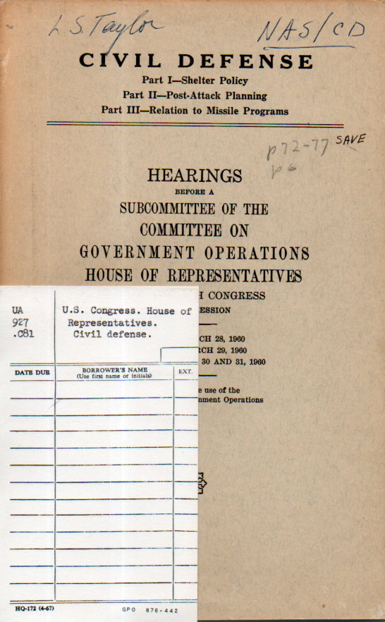
    Atomic  Taylor Atomurbia112I found some language in a Congressional hearing on civil defense for 1960 that addresses and undresses the issue of “dispersal”. In “Part II–Post Attack Planning” of these hearings1 there is a discussion of “dispersion”, and what it is and is supposed to do, but there is ultimately a monumental shrug about this Enormous Situation, and a recognition that “there is no active program of dispersion” (pg 102).  This in the face, evidently, of at least part of the dispersal plan being the Federal Government’s “responsibility of carrying out out the national policy of dispersal in locating new or major expansions of essential facilities in accordance with defense mobilization order I-19”.  

    I’ve wondered how such a plan would come into being–I mean the impossible move everyone everywhere plan–but did not know about this I-19 plan that actually made the dispersal of new national-interest industries a governmental responsibility.

    The hopelessness of implementation of such a nightmare is spelled out pretty well in this bit, on the same page 102: “The objective of industrial dispersal can only be achieved when industrial and economic factors contribute to this purpose”.   A statement like this is so large and bland and intractable that it really says nothing, except that if the effort and the money was there, then the dispersal plan could possibly be achieved.

    The report continues, “It indicates a desirable goal but there is no program here”. 

    Leo A. Hoegh (former governor of Iowa and speaking to the CD issues as the first director of the Office of Civilian and Defense Mobilization) makes the case that there is dispersal going on, but as a natural element of industries looking to “get out of the marketplace”, and brings up the growth of new industry in Iowa as an example, which was really pretty ingenuous, and he is held accountable to that thinking by Congressman Chet Hollifield (Ca.) who basically says, “Oh, come on….”

    Mr. Hoegh responds: “The thing is, we are interested in dispersal and we are urging it”.

    Mr. Holifield: “There has been no dispersal”, he said, there has just been growth. “None of your industrial centers…have decreased”. 

    Mr. Hoegh: “We are still desirous to have dispersal”. 

    According to the borrower’s card in the pocket at the rear of the book, it was never borrowed. That doesn’t mean that it wasn’t read–just that it wasn’t overnight reading.

    Notes:

    [For those keeping track of such things the “L.S. Taylor” on the front cover of this hearing was Lauriston S. Taylor,  (1902-2004), pioneer in radiation measurement, radiation protection, and health physics.)

    1. Hearings before a Subcommittee on the Committeee on Government Operations, House of Representatives, Civil Defense (Parts I-III); March 28-31, 1960, 573pp.  

  • 100 Years Into the Noir-y Future of 1947

    JF Ptak Science Books    Post 2518     Part of the History of the Future series

    • [This image is similar to one that I wrote about in September 2014 for the Mensa Bulletin,  here]

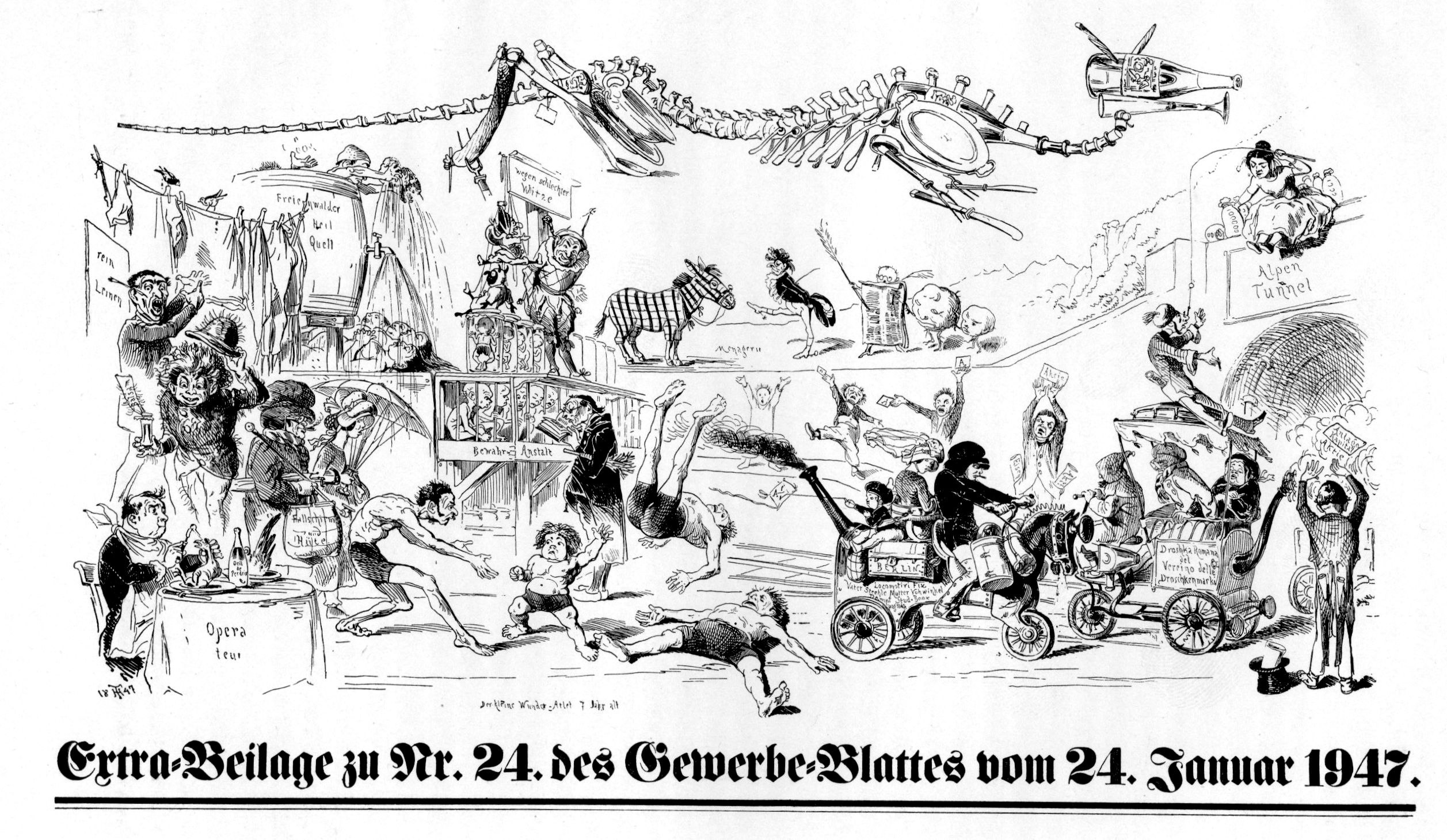
    Theodor Hosemann was a cartoonist, book illustrator, caricaturist and social commentator–but more interestingly, for today, he was edgy visioneer.  The lithograph, “Extrabeilage zu Nr. 24 des Gewerbeblatt vom 24. Januar 1947”, is Hosemann’s somewhat noir-y vision of the future from his perch in 1847.  His sense of the future “wirklickeit’/reality from where I sit here in 2015 is mostly bumpy and uncomfortable–it may have been funny in a fatalistic manner when the “brave” artist constructed the piece, perhaps like a forbidding fairy tale; if so then Hosemann was a jagged comic.  

    Hosemann future094

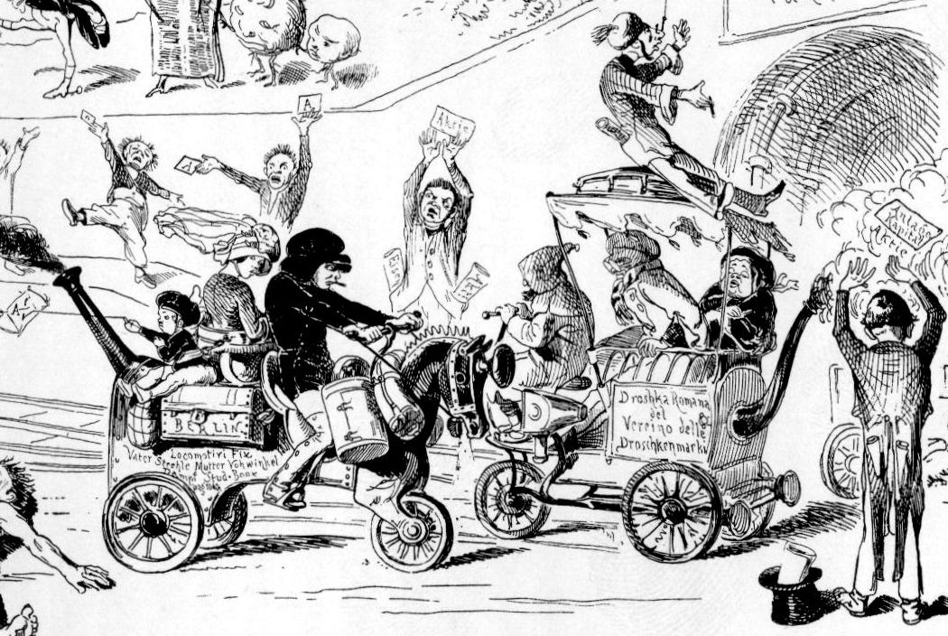
    It seems there are to me an equal number of found/lost elements in the image. The most obvious prognostications are the two steam vehicles/dampfwagen in the lower right, passing each other at the entrance of the engineering marvel that would have been a tunnel through the Alps.  The anthropomorphic horseless carriage in the shape of a horse, steaming to the entrance, is driven by a guy who  is (I guess) smoking a cigarette (as are several other people). Odd thing here is that the ciggie had just been introduced into France and named just a few years earlier, and here it is in the lips of a pater familias cruising with his family–his child flying a kite from the back seat–as they make their way to a trans-European ride.  The steam vehicle exiting the tunnel is driven by a hooded figure whose three passengers are in various stages of welcoming teh new sights: one has a heavy headdress and is adorned by large steampunk goggles, while the woman seated behind him is having a private moment of some sort of exasperation; meanwhile the guy traveling on the roof of the car has just been hooked through the nose by a woman at teh tunnel top, seemingly fishing for, well, something.  

    Hosemann future094 detail kids

    The most visible object is mysterious–the long skeleton at top is composed of bone, sausage, forks, spoons, morphing ducks, spoon vertebrae, plates, knives, corks, a champagne flute and a bottle. I’m unsure of the allegory.  

    In the upper left corner we see women taking the waters, immersed in a hydrotherapy of something-or-other from a “healing source”. A man beneath him lifts his hat to reveal a wild head of hair produced presumably from the bottle of “balsam” in his hand–hair tonic that has produced a giant mane plus hair sprouting out everywhere else. The man seated before him is beginning his meal on some sort of bird by pulling its eyeball out.  

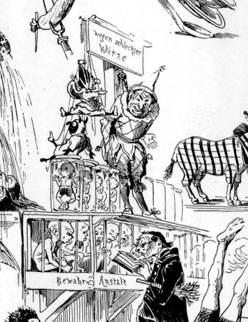
    The central figures are particularly engaging, and perhaps prophetic.  At the top of this little structure is a Punch/Judy-like character with marionettes (standing beneath a sign that extols us not to laugh at bad jokes). He is also lazily seated on jars of babies.  It may be that they are children being produced in artificial wombs, grown somehow, as beneath them we find more fully-formed children in cages being lectured by a classic schoolmaster with book-and-whip. Perhaps related to all of this in the foreground we find the “wonder child” who at seven years of age is very muscled and defeating grown men in a wrestling match,m one of whom he has thrown into the air with one arm.  Perhaps Hosemann was telling us of the possible future from 68 years ago where a race of super-people would be manufactured in artificial environments to embody super-human traits?  Certainly seems so.  

    Hosemann future094 detail cars

    So Hosemann did get a few things right in this vision, or at least he got the sense of future developments correct.  I still have a bit of a problem with what I think is the humor of it all, but then again I wouldn’t read the fairy tells of the Brothers Grimm to a little kid, either. It is difficult to translate those sensibilities forward 175 years, for me, anyway, the sense of ‘funny” and the insight that comes from that getting lost in the swirl of historic dust, like mostly all of the “amusing” parts of books (not the movie!) like Pinocchio, where the soft places to land in this child’s story have all fallen away leaving not much more than a  fledgling adventure in rounded brutalism.  


  • Unusual WWII Maps by a Significant Soviet Intelligence Agent

    JF Ptak Science Books   Post 2517

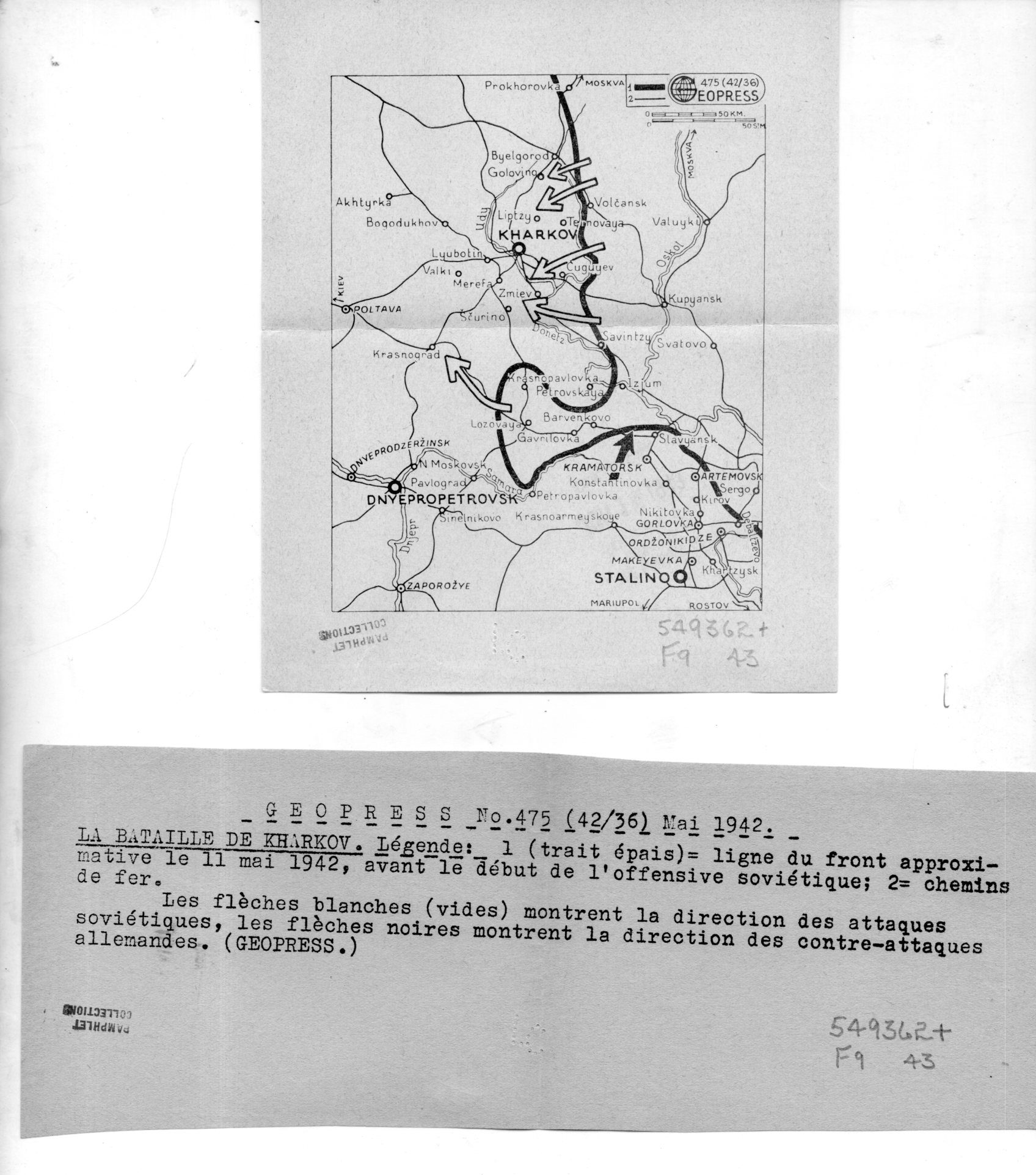
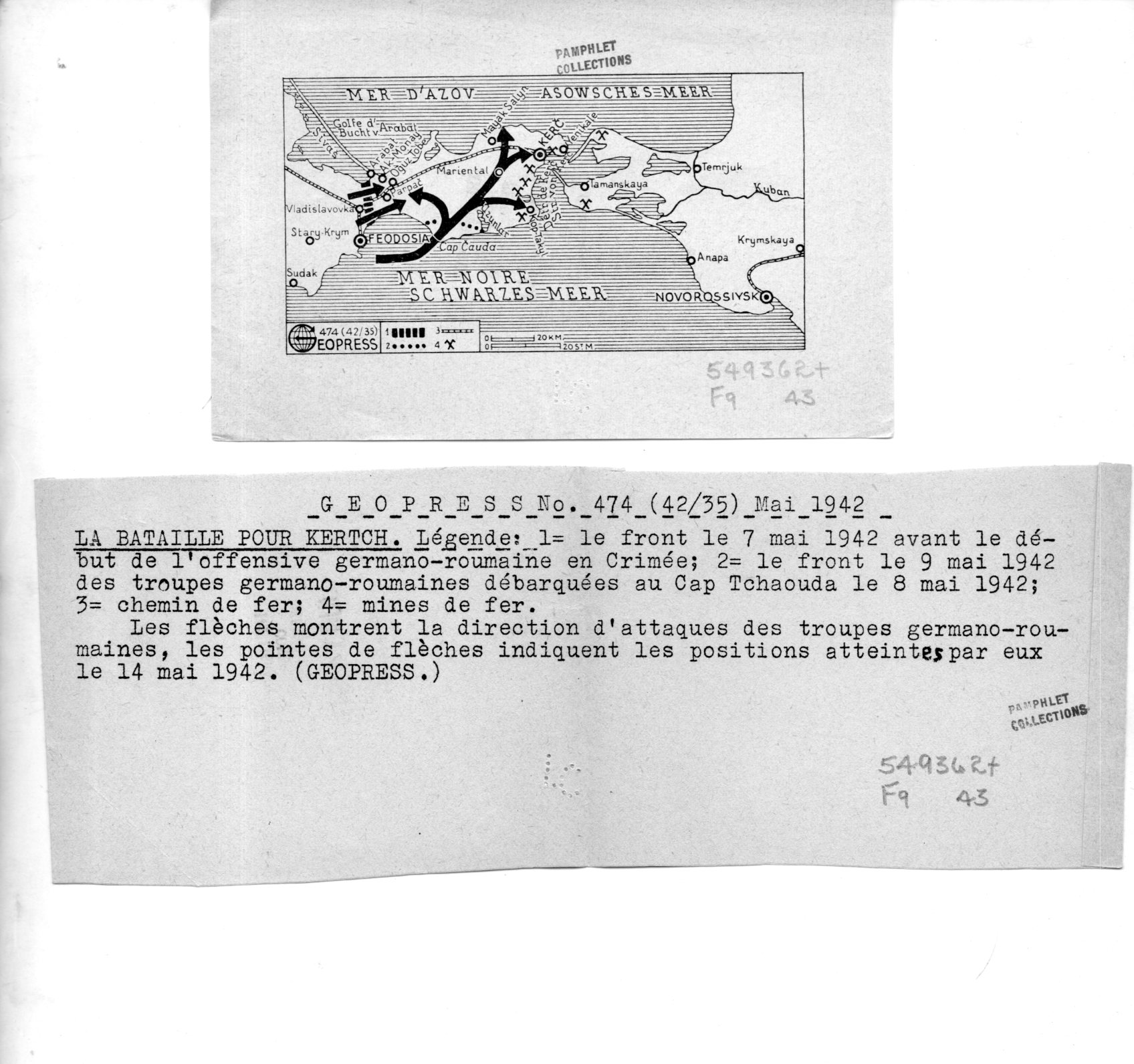
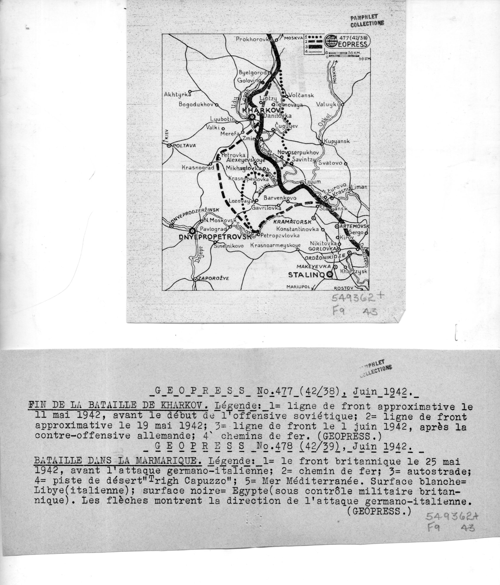
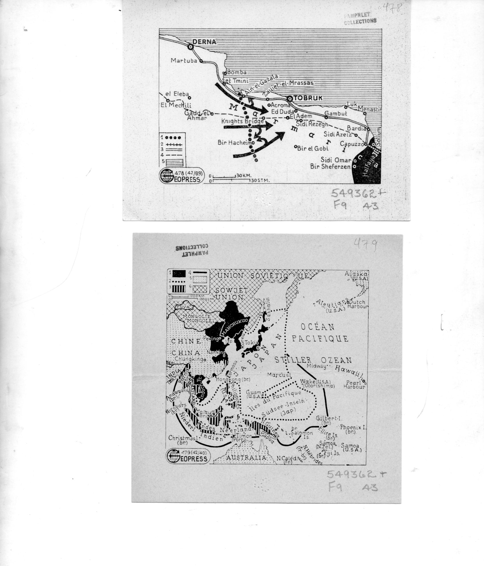
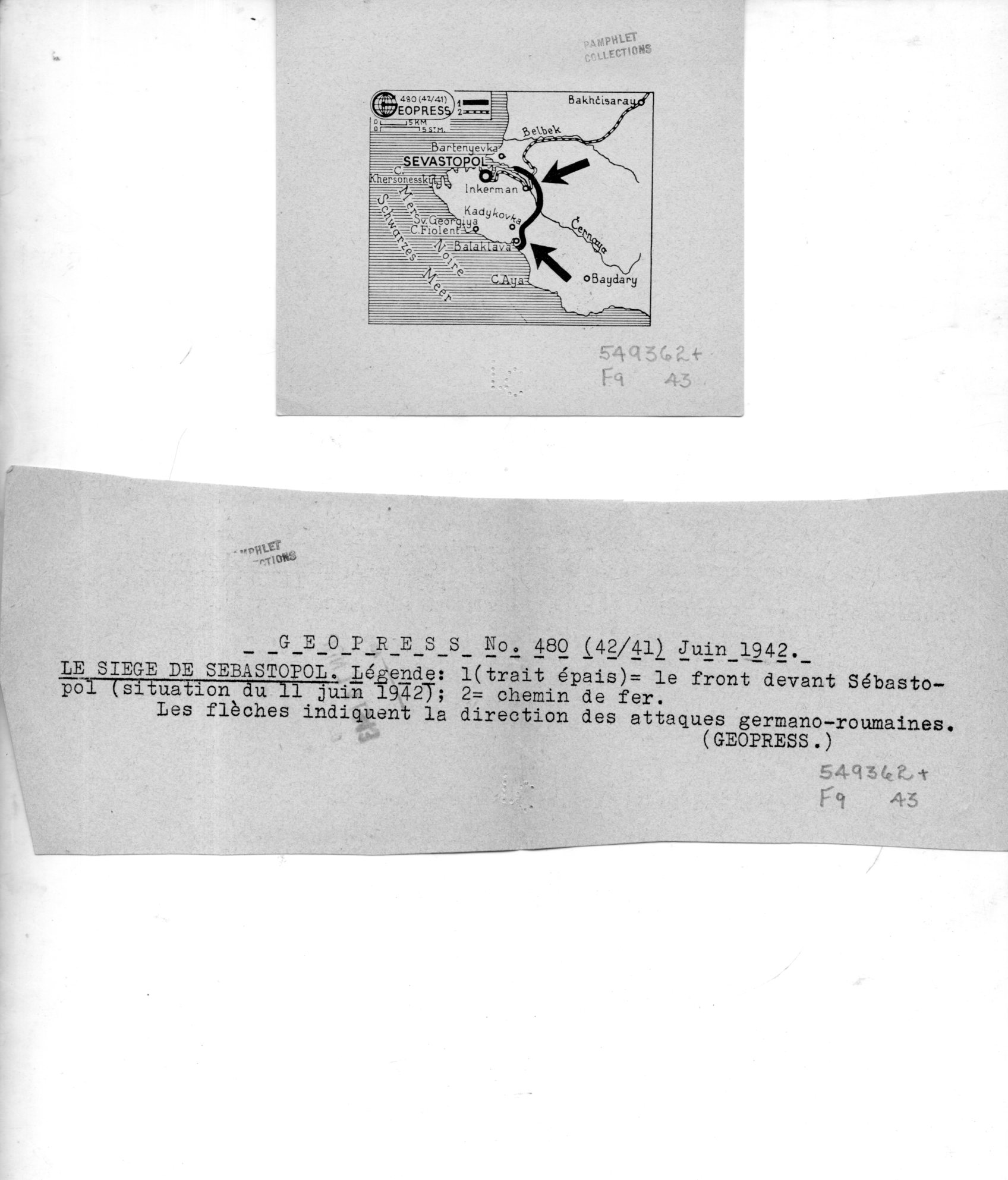
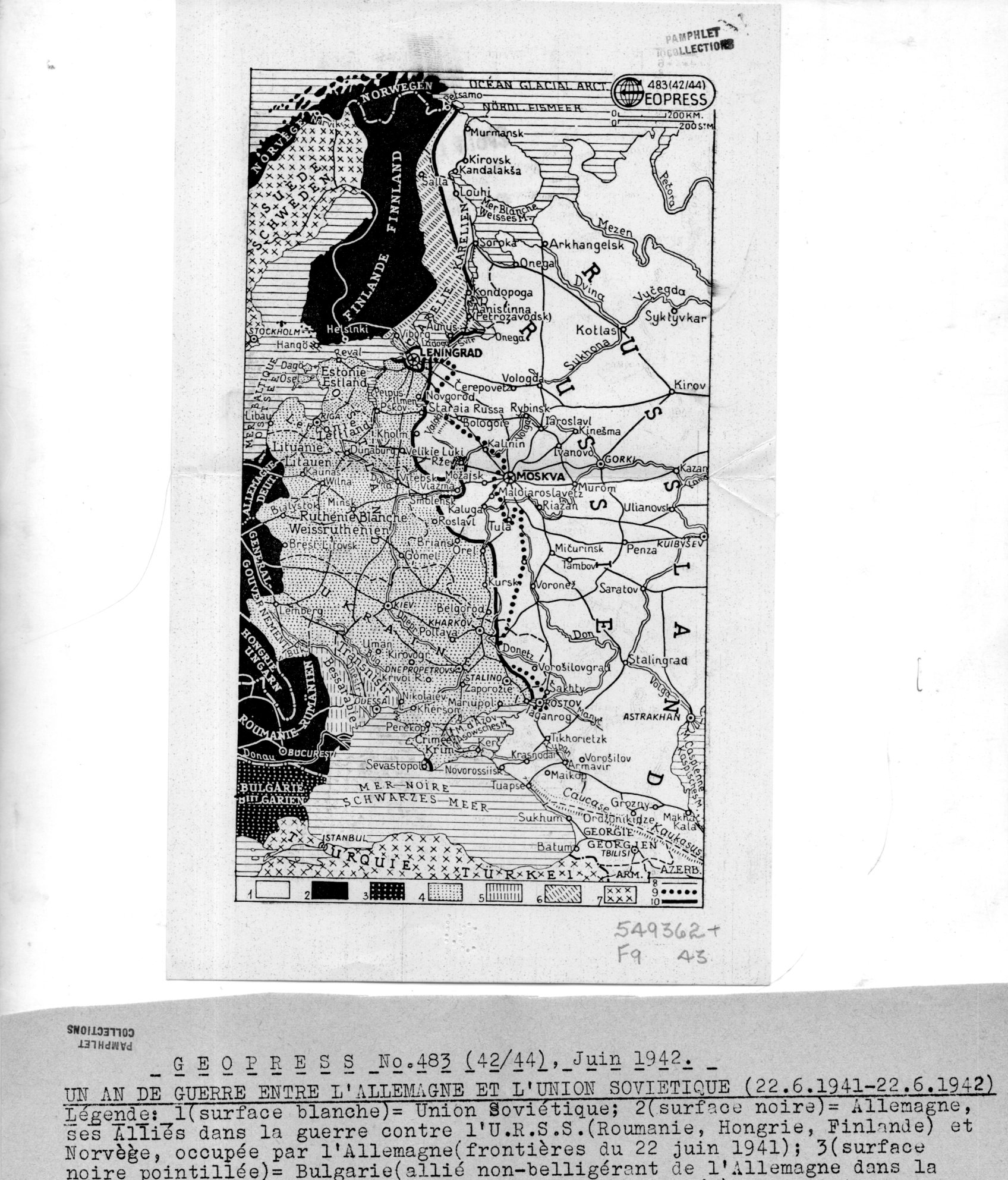
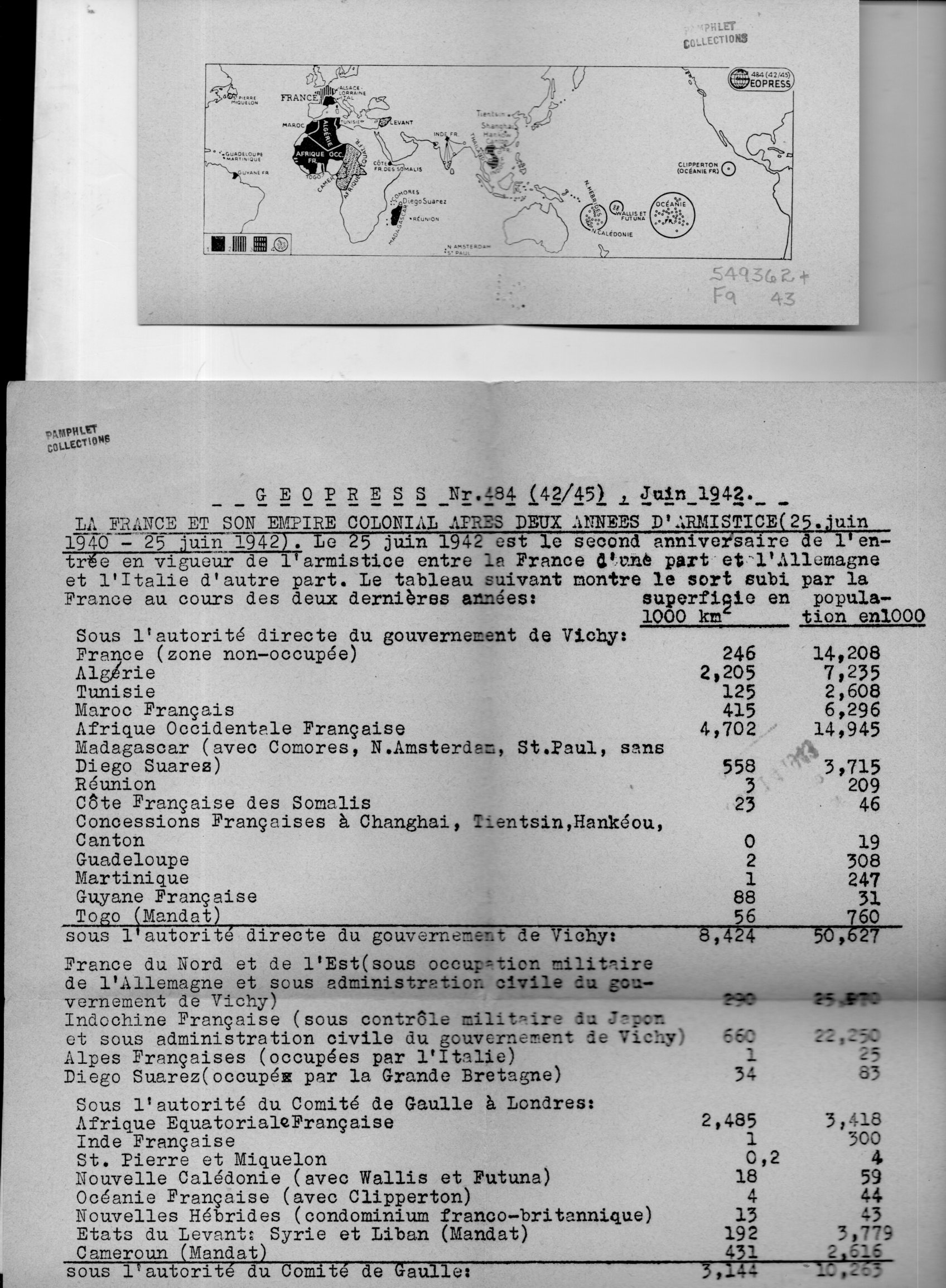
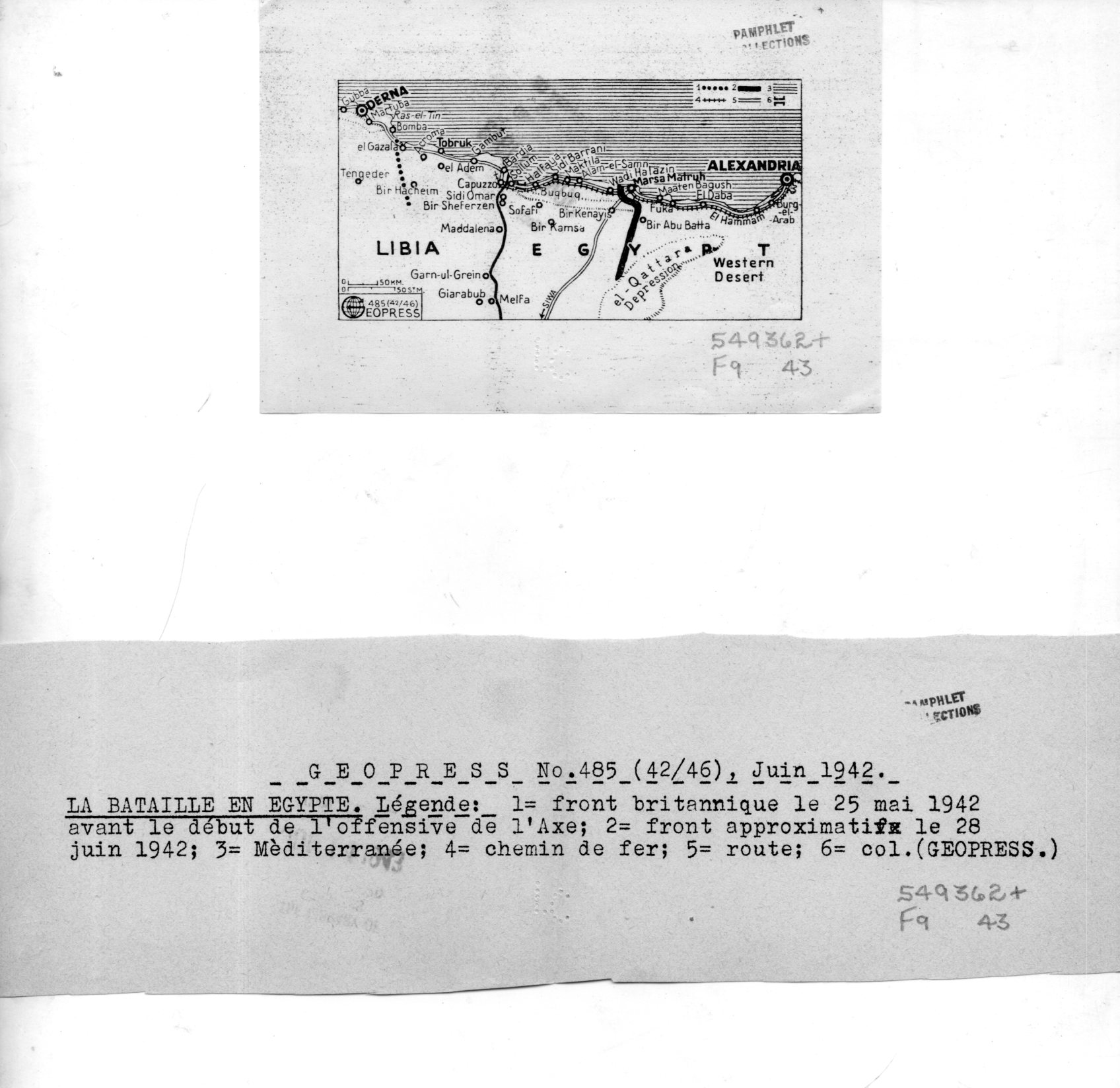
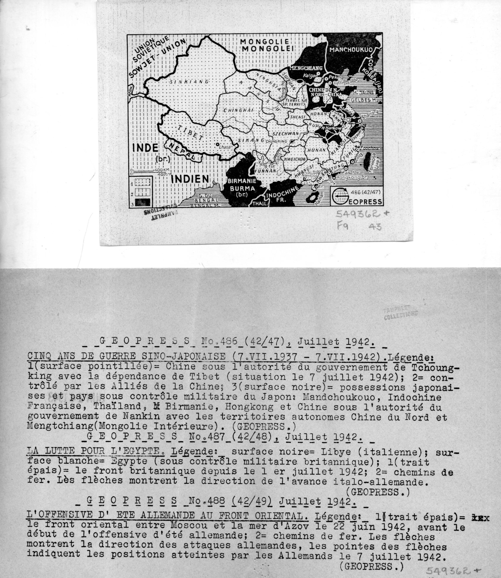
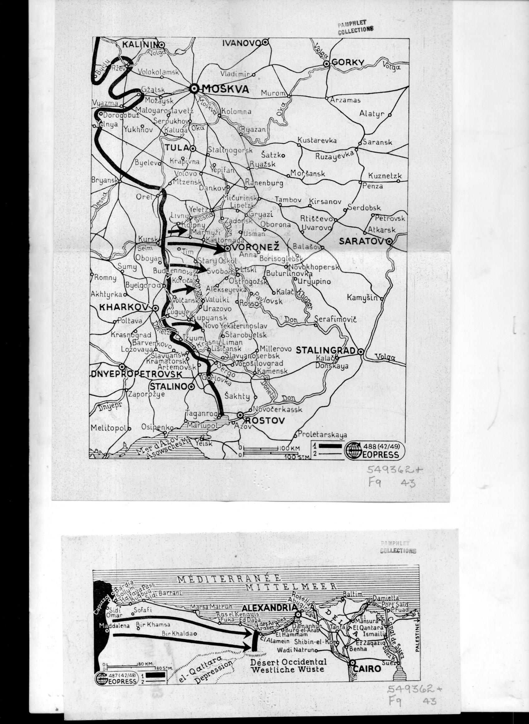
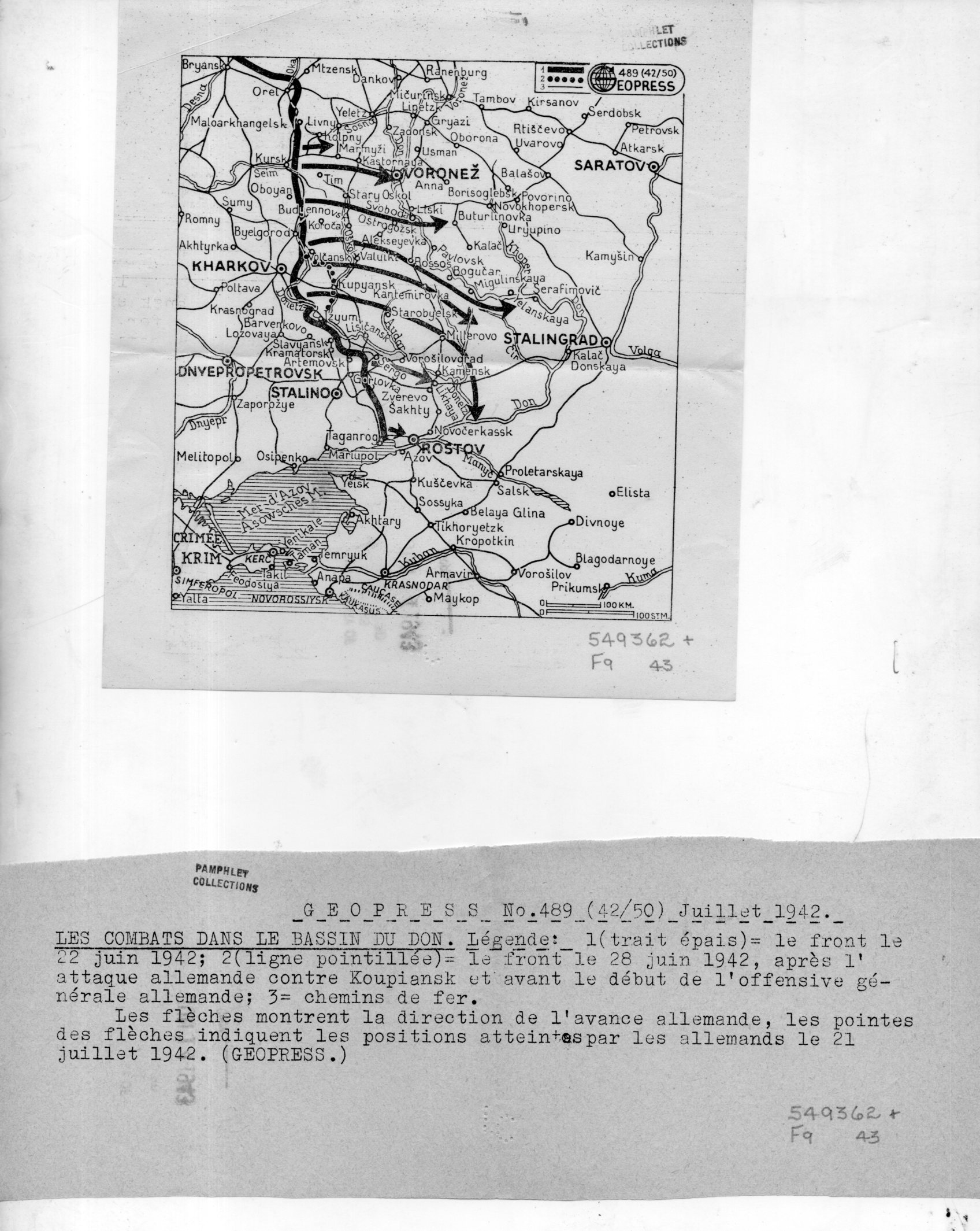
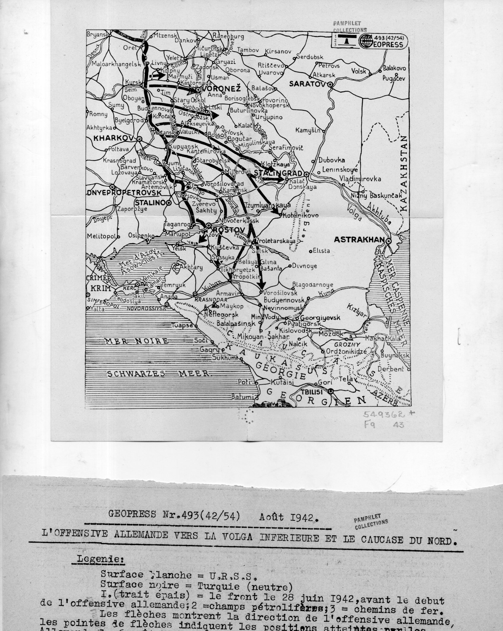
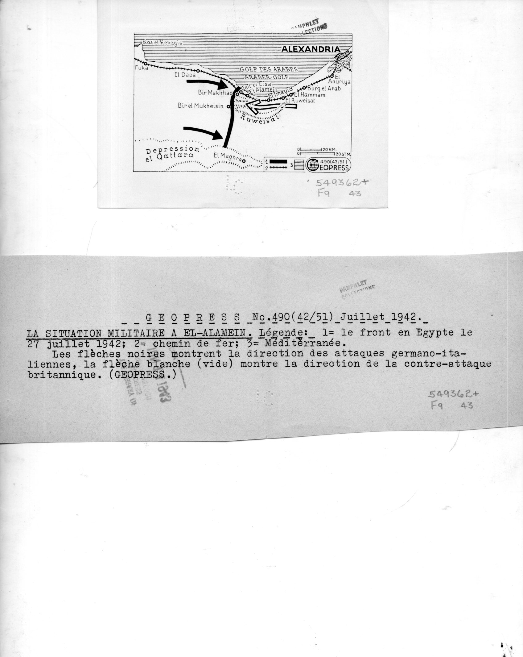
    I’ve found a number of interesting maps in the pamphlet collection here–these are highly unusual to my experience in that they were the work of a firm called “Geopress”, which was an active business and cover for a significant intelligence agent for the Soviet Union, operating in Switzerland, collecting data relating to German activities during WWII. There’s nothing I can add beyond the information that I quote extensively below from the CIA website on Rado–except that I cannot find images/examples of his Geopress work. So it seems the most efficient thing to do here is to simply quote the known sources and reproduce the images of the 18 maps and their accompanying texts.  

    Geopress _4_080

    As I said Rado operated Geopress as a news/cartographic service, and Rado was an accomplished cartographer, so the mans in and off themselves as maps are perhaps not a singular issue.  Their evident scarcity, however, does seem to be an issue. Also I do not understand why these maps are so small, some of which are just 1″x 3″; also the uneven;y cut/torn text sheets that are made to accompany the maps are also puzzling in their own way.  I do not understand the format–someone out there in Weblandia no doubt will.  

    All of the maps shown below are from 1942. They were received by the Library of Congress in June 1943 and stamped so on the backs of the maps.  (They lived for some time in the “Pamphlet Collection” at the LC before being purchased by me in 1998.)  

    The following quotes come from the CIA website, the Center for the Study of Intelligence, here:  https://www.cia.gov/library/center-for-the-study-of-intelligence/kent-csi/vol12i3/html/v12i3a05p_0001.htm]

     “Alexander (Sandor) Rado, Alexander Foote’s chief in the Swiss-based “Rote Drei” net that in 1941-43 supplied Moscow with detailed information on German order of battle… His activity in intelligence, mapping, and related fields has lasted nearly 50 years and may earn him a place in the pantheon of major intelligence figures of the times.”

    And this:

    “In 1936 or 1937, with Soviet funds and having a Swiss citizen as silent partner, Rado organized Geopress, a news agency specializing as Inpress had in maps and geographic background data. Geopress was more successful than Inpress because of better organization and the increased demand for news maps in the advancing shadows of World War II. As cover for an intelligence operation it proved ideal. Its normal activity—news collection and dissemination—provided justification for contacts with businessmen, officials, diplomats, journalists, and military leaders, some of whom became intelligence sources. It also justified a large volume of telephone and telegraph traffic, extensive postal business, and the maintenance of a courier system.”

    And so:

    “While building up his Geopress cover Rado also developed his sources, organized communications, and summarized for transmission the reports collected by his growing network. And he even found time to maintain through publications his image as an internationally known geographer.”

    And:

    “24 Feb. 1945.  During the German occupation of Hungary, (Rado) lived in Geneva where (he) published geographical maps for the Allied Governments until 1943; discovered by the GESTAPO and consequently his relatives in Hungary were murdered/ went with family to Paris in September 1944 and continued his work/summoned to Russia to report on his activities with the Free French Organization and left on 8 Jan. 1945 by special plane for Moscow/suspecting a trap, he got off the plane in Cairo where he remained/received no news from his wife in Paris and suspects that she might have been deported/he was formerly a Fellow of the Geographical Society in London, New York, Paris, Geneva, Rome and Washington, D.C.  OFFICE OF CENSORSHIP, Egypt, 11 April 1945.”

    [Again, the source for this and the above quotes:  https://www.cia.gov/library/center-for-the-study-of-intelligence/kent-csi/vol12i3/html/v12i3a05p_0001.htm]

    The maps:

    Geopress _3_079

    Geopress _6_082

    Geopress _7_083

    Geopress _8_084

    Geopress _10_086

    Geopress _11_087


    Geopress _12_088

    Geopress _13_089


    Geopress _14_090

    Geopress _15_091

    Geopress _16_092

    Geopress _17_093


  • DIY: 2-D Paper Math Models into 3-D Forms

    JF Ptak Science Books   Post 2516

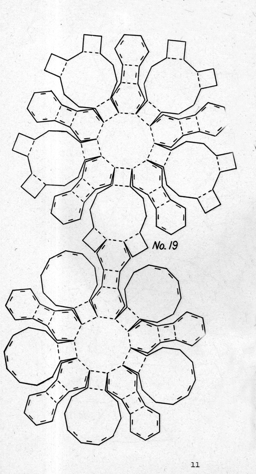
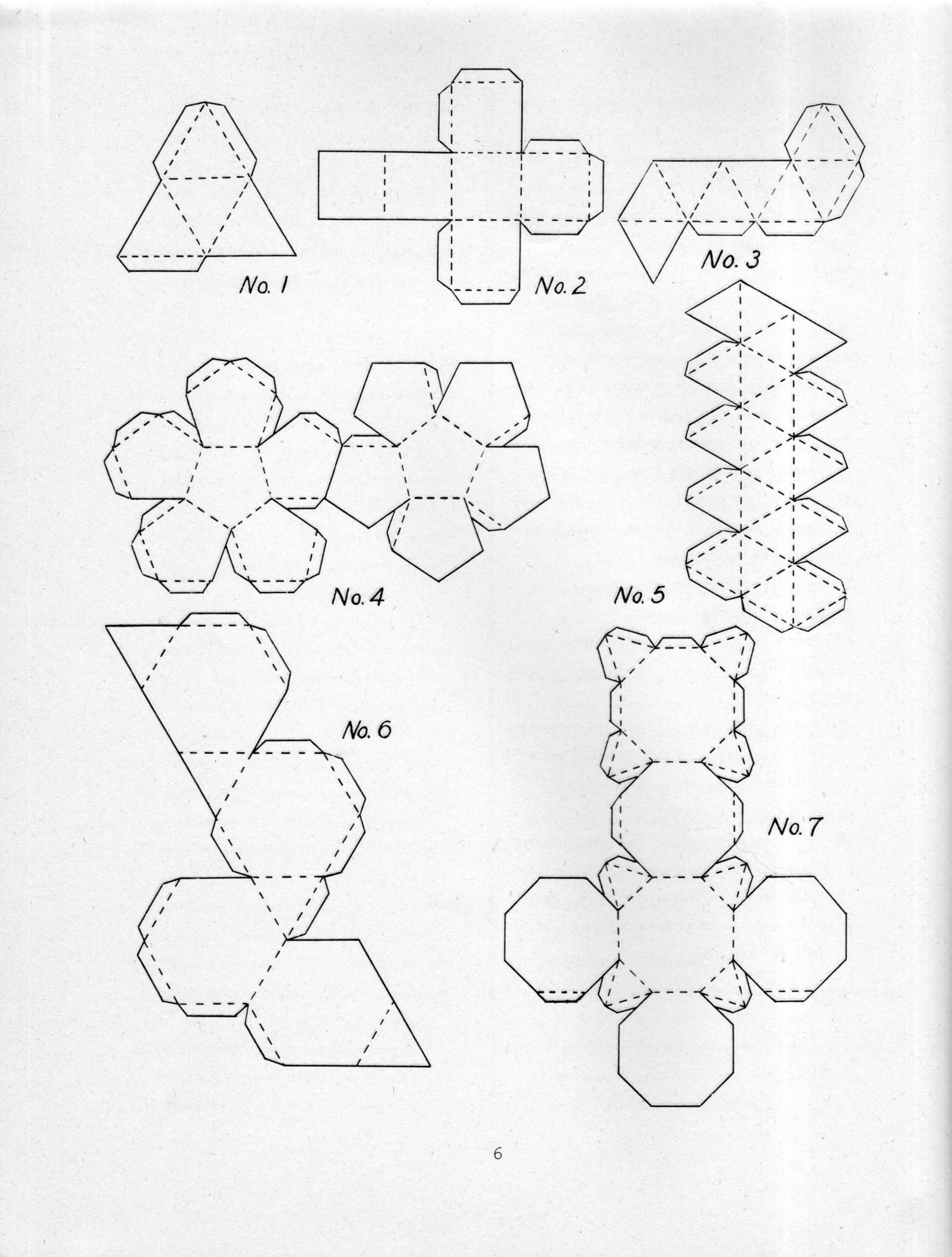
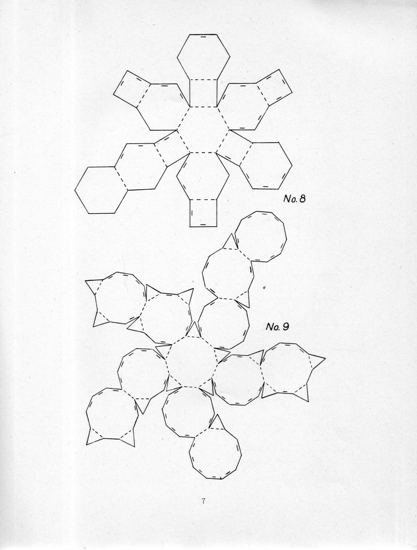
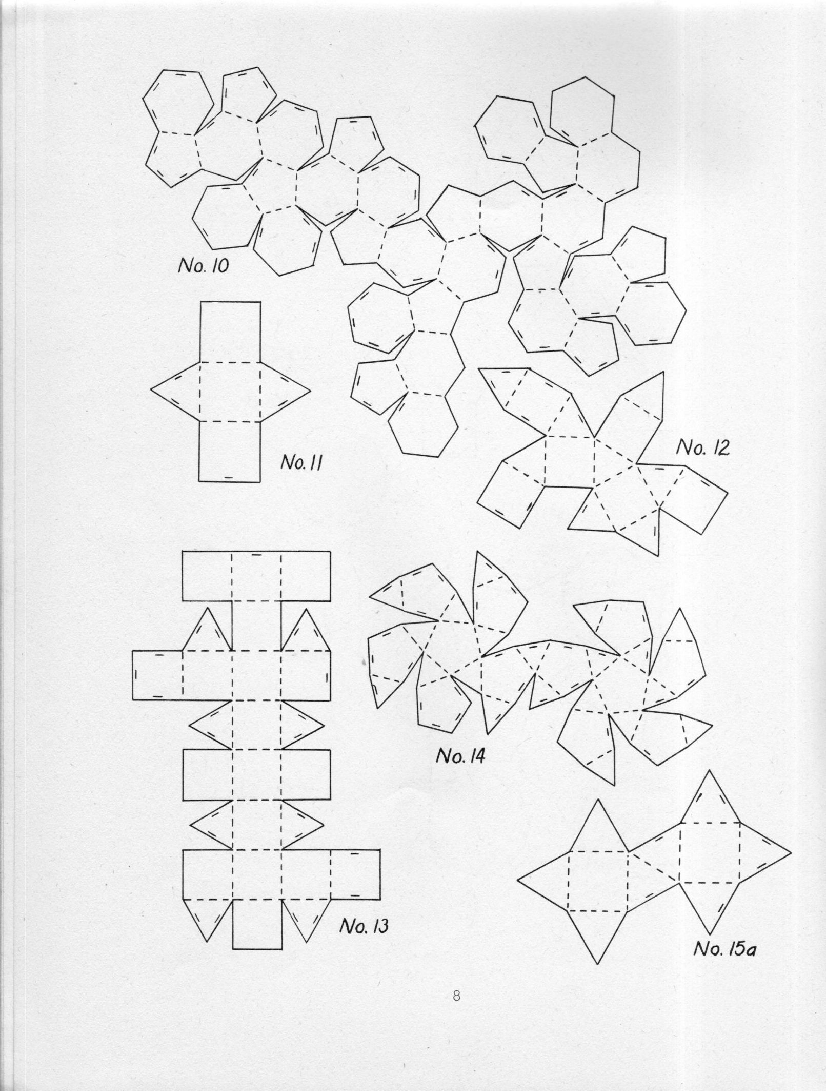
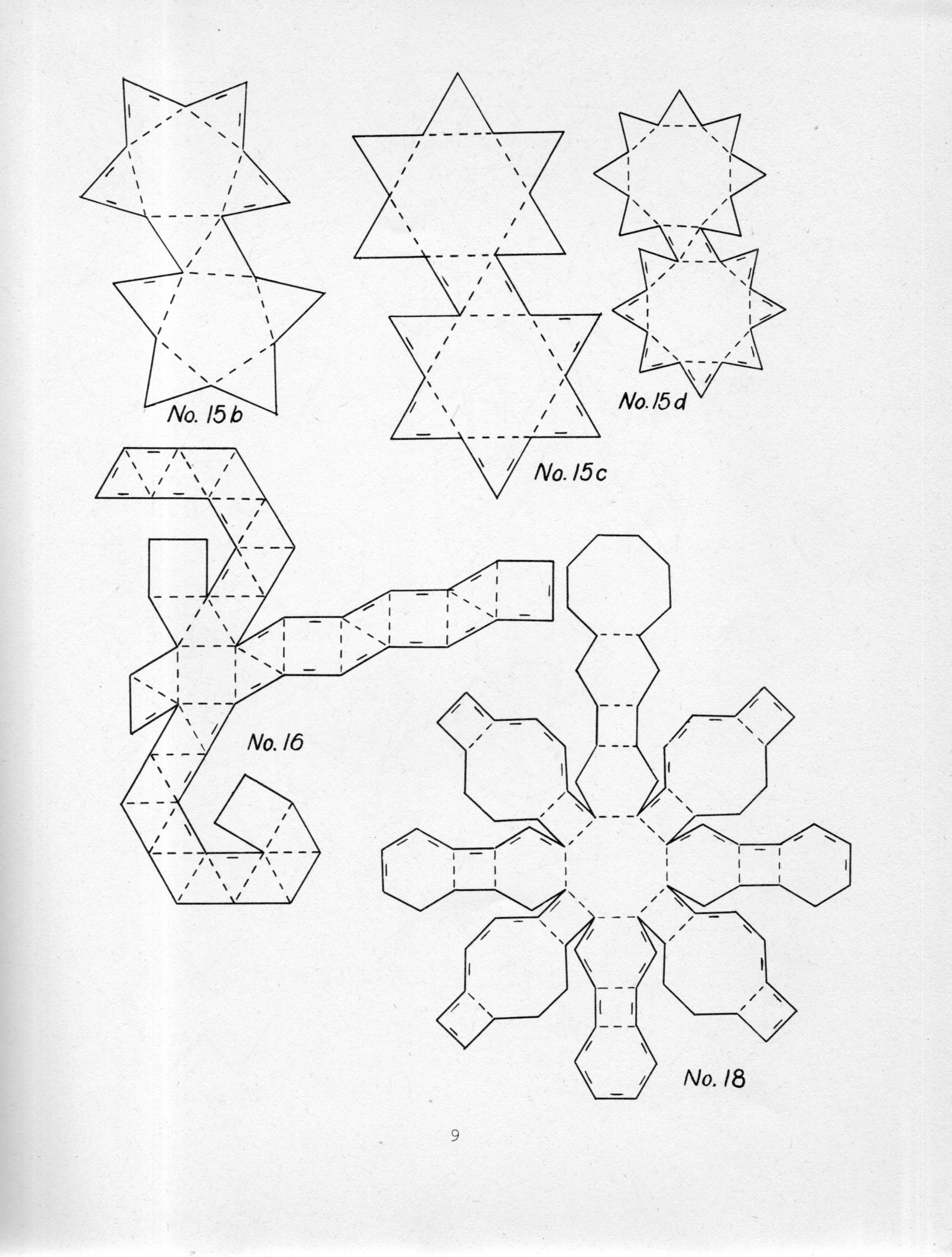
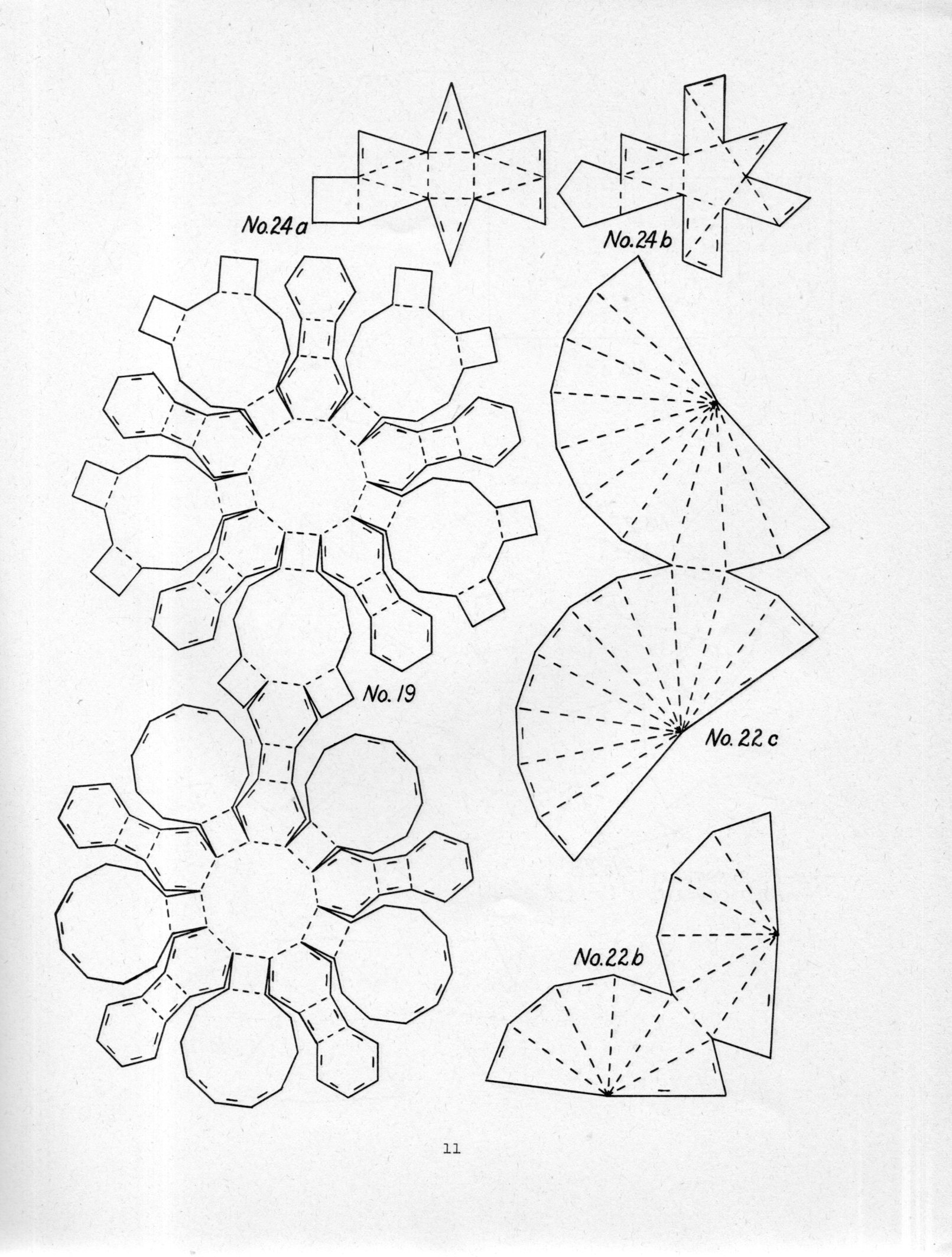
    I’ve missed this pamphlet for years–tall, slender, no spine title–until this morning, when it came to life.  It is the work of Miles C. Hartley, who deconstructed polyhedron for the purpose of reconstructing them in a classroom as “sensory experiments”. This was his method of keeping students interested in math, or at least keeping students interested in something that hopefully led to an interest in math. Hartley recognizes that many textbooks will include models for the five regular polyhedron, and stop there, the students “stalemated”. Hartley goes on to include 69 models, many of them fairly complicated, in the hope of creating a deeper interest in solid geometry and symmetry.  

    For example, this is a great rhombicuboctahedron, scooped out of the fourth image below, and which nicely fills a larger sheet of paper for cut-fold-paste:

    Polyhedron074

    If I could determine that the book was out of copyright and not just out of print I would just reprint the thing right here–but for now I’ve included the first 22 diagrams with scans tight enough to allow them to be printed, cropped, enlarged, and printed out again with each design on a 11×8 sheet of paper.  Enjoy!

    [Source: Hartley, Miles C., Patterns of Polyhedrons. This copy is the first edition of 1941, printed by Edwards Brothers lithography, 27x22cm, 29pp, and which seems to be fairly scarce. The reprints that are available in one form or another seem to all come from the “revised edition” of 1948 and 1951, which is the same size but with 48pp. I’ve not seen one of these and don’t know if the diagrams are just spaced differently or if there are more.]  

    Polyhedron069

    Polyhedron070

    Polyhedron071

    Polyhedron072

    Polyhedron073


  • Air Raid Instructions, Westminster, 1941–With Videos

    JF Ptak Science Books  Quick Post

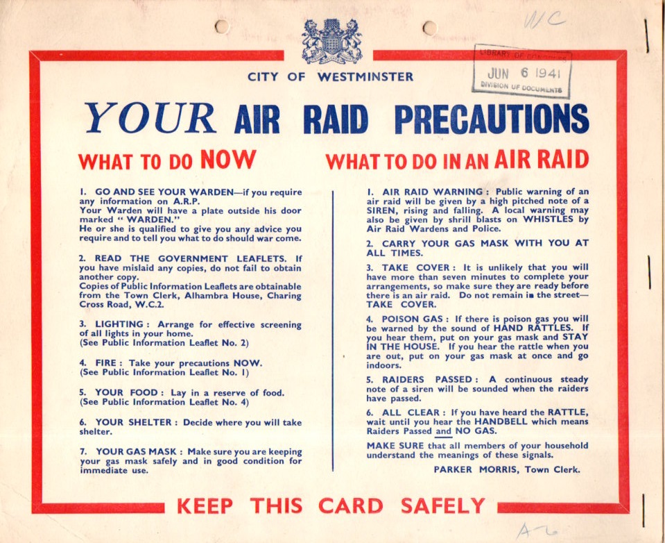
    I recovered this sample Air Raid Precaution poster from a box of WWII material, received by the Library of Congress on the very day that many historians declare to be the very end of the Blitz.  Of course the poster was printed earlier, collected in this case by the OSS and put in a folder and then sent off to the Library of Congress.  

    WWII Air Raid Precaution068

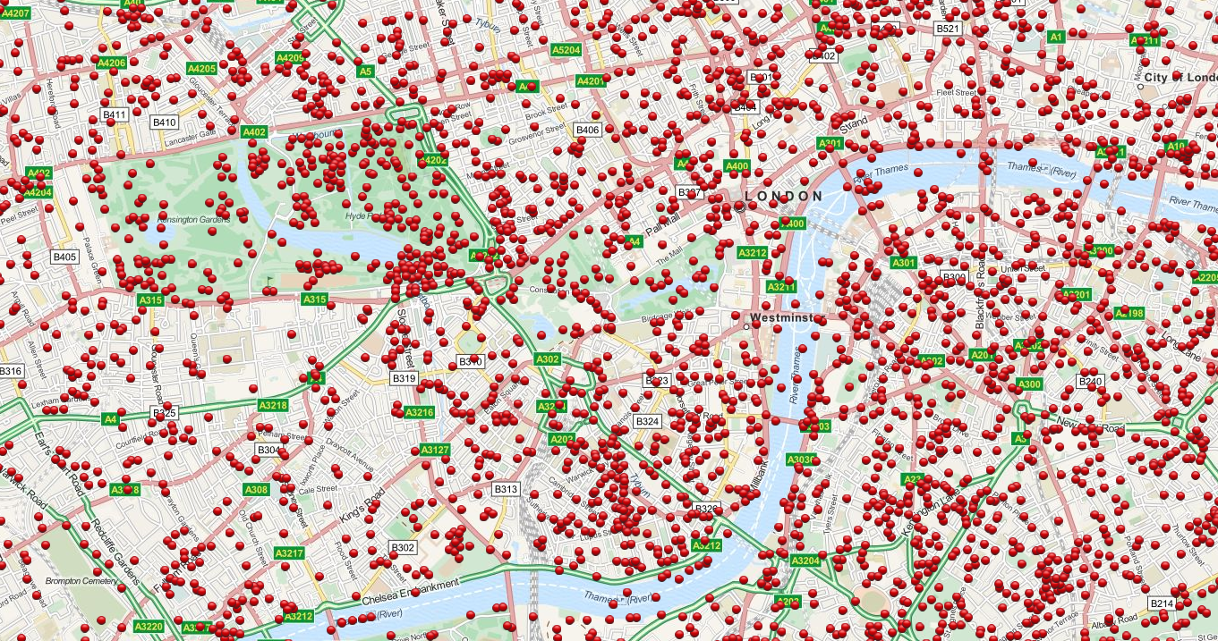
    It is a remarkably level-headed document, clear and concise, very stiff-upper-lip.  And these posters were very necessary, as we can see by the map following: 

    WWII Bomb Map London

    This incredible story (centered on Westminster) is a detail from an incredible (and interactive) map showing every bombed dropped by the Germans on London during the Blitz  7th October 1940 to 6th June 1941 [Source:  http://bombsight.org/?#14/51.5005/-0.1281]

    The following are instructional newsreels (all found on youtube) about what to do in an air raid (1940), while the second demonstrates the sounds of the air raid sirens discussed in the document above, and the third is a short history of the Blitz:


    Ource: https://www.youtube.com/watch?v=mHep5WA9qqU


  • JANCFU on Yellow: Nagasaki, August 9, 1945

    JF Ptak Science Books   Post 2515  [Part of the Atomic and Nuclear Weapons Series]

    Somewhere between transporting the Fat Man bomb to the loading lift and raising it up into the bomb bay of Major Charles Sweeny’s B-29 Superfortress Bockscar,  it acquired a stencil-painted acronym: JANCFU, right on its nose.  

    JANFU detail

    [Source:  http://military.wikia.com/wiki/Fat_Man]

    It was black on a bomb painted mostly yellow, a zinc-chromate yellow.  The yellow similar to the cover of Dr. Seuss’ One Fish, Two Fish…; the color yellow symbolizing courage/nobility in Japan, Wisdom in Islam, and a deity-color in Hinduism; the color so fond of many great writers like London and Doyle, and Harte and Stevenson that they employed in in titles of the books.  The favorite color of Van Gogh1, and perhaps not-so-favorite of Shakespeare (appearing in references to bile and melancholy and falling leaves), it is usually a positive color–except that it also can signify cowardice, ego, caution, and illness (malaria, jaundice).  It is also the color of the Star of David worn by Jewish people living under Nazi-occupied/controlled places/  

    JANFU

    Fat Man was yellow.  But it was yellow because like a fire truck it was the easiest and quickest thing for the eye to register, and what needed to be registered with Fat Man was its trajectory on its way down to detonate 1640 feet above Nagasaki.  

    JANCFU, painted or airbrushed on the nose of the bomb at the last moment, or so it seems, stood for “Joint Army Navy Civilian Fuck Up”.

    It was hardly that.  It was like another yellow–Yellowstone–but of a different sort of indescribable awesomeness, this more like an impending enormity, too large to be known.  

    Fat Man movie

    [Source: Business Insider, For the video, see here:  http://www.businessinsider.com/nagasaki-raw-video-2014-2   The article is worth the read, but if you just want the video, scroll to the end.]  

    Notes:

    1. The Van Gogh museum’s “Van Gogh Letters” is a must-visit if you are interested in his correspondence. http://vangoghletters.org/vg/  Actually the word “green” pops up about 15% more often than “yellow” as the most often mentioned color in the correspondence, though I think that the scholars say that his favorite color hands-down was yellow.  

    John Coster-Mullen’s  Atom Bombs: The Top Secret Inside Story of Little Boy and Fat Man must be the most complete description of the bombs ever published.  And it was accomplished by the relentless study of the “nuclear archaeologist” Mr. Coster-Mullen, a truck driver by trade who had no formal education in physics or metals or engineering.  He produced not only this remarkable work, but also created a life-size nearly perfect replica of Fat Man. I’m pulling up this reference because in there Coster-Mullen states that it was Project Alberta engineer Harlow Russ who painted the JANCFU on the bomb.  There was other stuff written on the bomb, but nothing quite so surprising, or shocking, than this.  Perhaps the small tattoo underneath the acronym is almost as shocking, but not really–the Fat Man bomb profile with the letters “FM” (“Fat Man”) in the interior of the design has its moment of shock/recognition, as though any identifier was needed for the thing.  (It is like the surgeon circling the correct kidney he needs to remove, drawing on their patient–just in case there was any confusion, this stencil assured everyone that this was indeed what it was.)  See this great article in The New Yorker about Coster-Mullen, here.  


    ·Posted by :

    ·in:


  • Looking Up at Buildings at Strong Angles

    JF Ptak Science Books  Quick Post

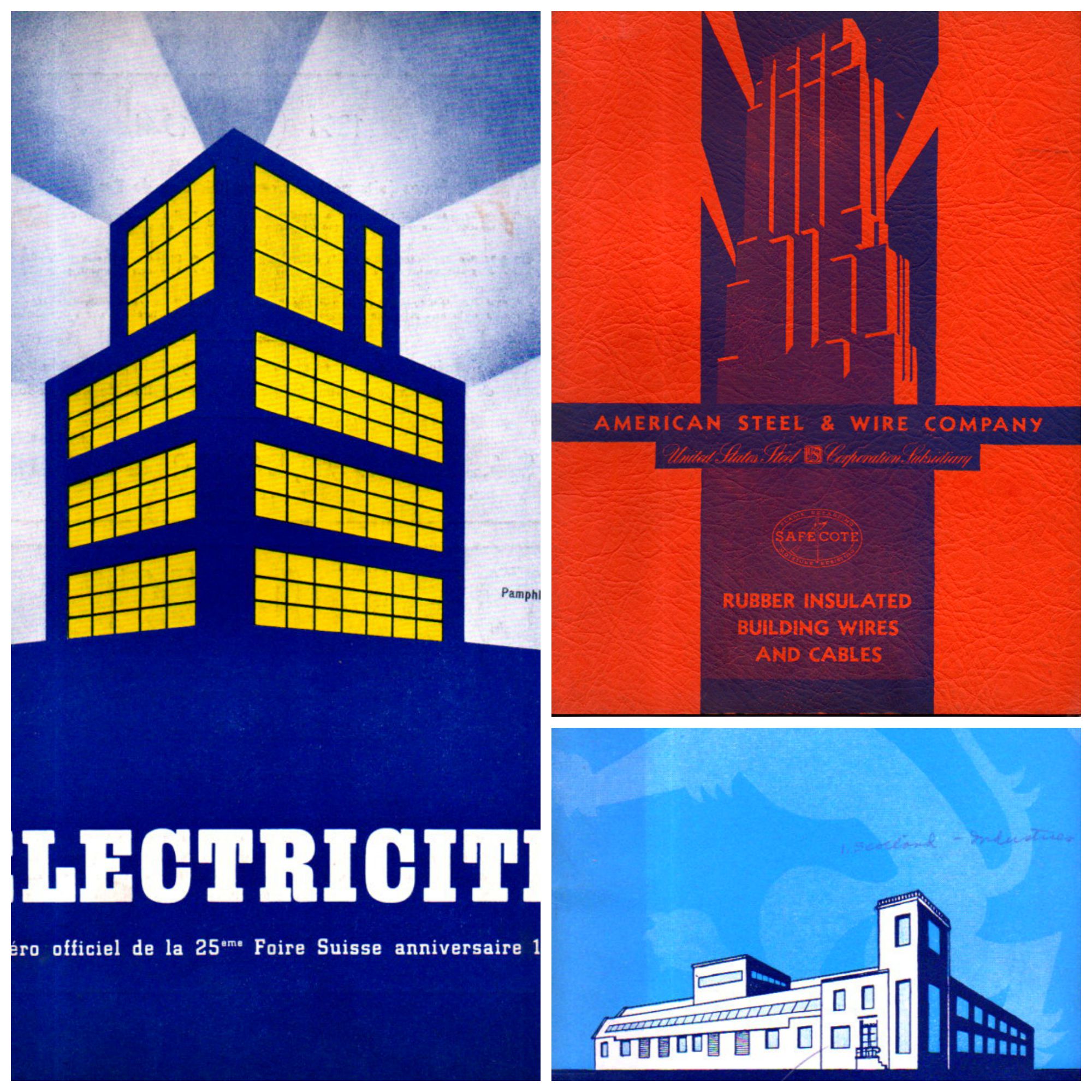
    I’m just taking a moment to share these three unusual pamphlets, with their very striking and unusual covers. The buildings suggest a different perspective, one from below-grade and looking up obliquely–something not-usual to me. There are small categories on this blog for views looking straight up, and views looking straight down–neither very common things–and this little gathering may be a new category of “uncommon perspective”.  

    Building light collage


  • When a Six-Cent Tax Was a Nickel Too Much (1938)

    JF Ptak Science Books    Post 2514

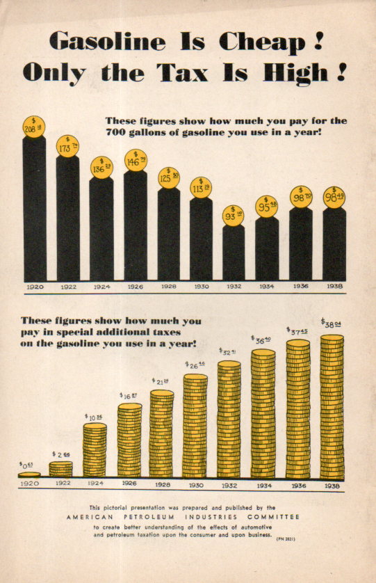
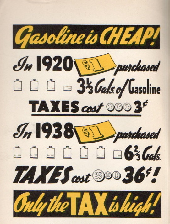
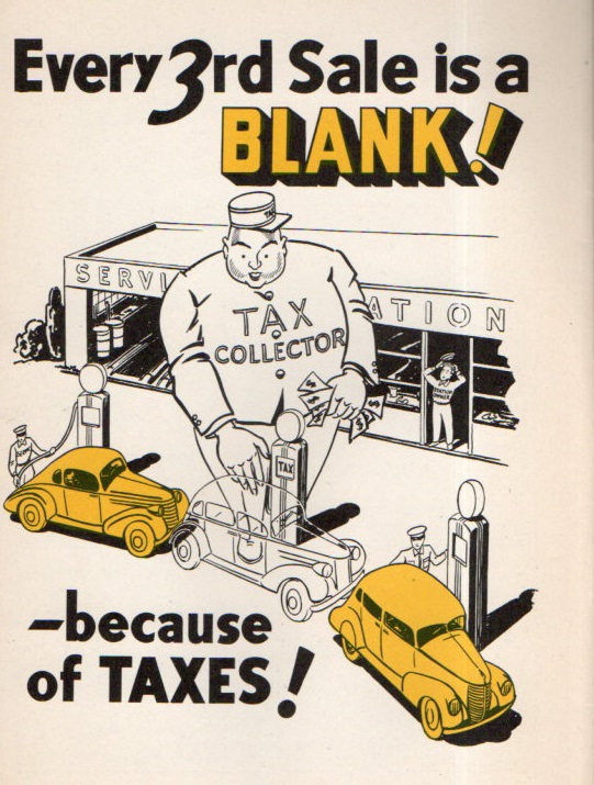
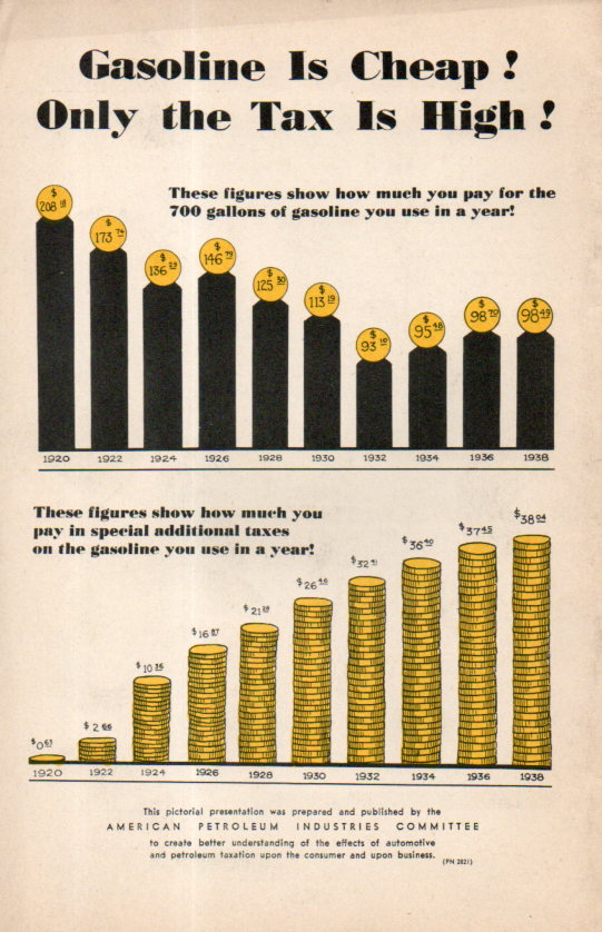
    Gas Tax062Although the artist/author created some great and 30’s-bubbly cartoons, I’m not sure about what he was so grouchy about–plus I don’t know about his number sources, either. The main graphic that gets to his point shows that in 1920 $1 bought 3.5 gallons of gas and paid  6 cents in taxes; in 1938 that dollar bought 6 gallons but the taxes were 36 cents.  So the screed was about getting even more gasoline for the buck even though it was buying nearly twice as much anyway.  Since the federal excise tax in gasoline actually went down from 1.5 cents to 1 cent a gallon at this time, the additional taxes would have come from the states, which I guess were not part of the equation in 1920. But the extra nickel or so per gallon looks to be about average for state taxes on gas in 1938 (as we see in Notes #1 below).

    [The image at left is the rear cover of the pamphlet under discussion–it really doesn’t have a title, just a series of statements.]


    This was sort of a long way to go in looking at a cartoon-illustrated sweaty tax screed from 1938, but as it turns out  there was a little surprise in the results.  The author/artist is uncredited but the pamphlet was produced and published by the American Petroleum Industries Committee, which no doubt was lobby for a decrease in state (and federal?) taxes to lower the price of gasoline and perhaps to increase consumption.  They made it abundantly clear that they did not like taxes.  And as it turns out they really don’t identify the source of the taxes, just gas taxes in general, though they made it seem as though it was a unified approach to lowering federal and state taxes together as a unit, and not as 48 individual governing bodies for state taxes. On the one hand the penny tax wasn’t really so bad; ont he other the state taxes could be 4-5-6 cents, which turns out to be a lot more than states charge today (CPI adjusted). 

    Gas Tax063So, given for example 5,000 miles/year at 15mpg1 average for 1938 is 333 gallons at 10 cents gallon making $33.33/year in gas expenses or 1.9% of a yearly average salary of $1,731. 

    In 2015, 5,000 miles/year at 20mpg=250 gals x $3.20 = $800/year in gas, and with the average salary (according to the Bureau of Labor Statistics) of $850/week or $43,700/year, the gas expense would be 1.8%  of the yearly income. I have seen other figures stating the individual average salary to be about $30,000–the discrepancy is considerable and I’m not sure of the origin. Using the lower figure the gas expenses jump to about 2.6%.  

    In any event I found it odd that working with a few found and not-quite arbitrary stats that the average percentage of the cost of gasoline via yearly salary would be so very similar.  Of course the cars have gotten much more expensive and also far more powerful and safer to operate, and car insurance has no doubt increased, as has maintenance, so the overall cost of keeping and using a car is quite a lot more today than in 1938–still the similarity of gas/yearly income was pretty cool to see.  

    Now the taxes that these guys were complaining about: that 1 cent in 1938 (according to the BLS inflation calculator) is equal to about 17 cents in 2015 dollars, which is just about what the federal excise tax is today in 2015. The 5 cent state tax in 1938 winds up being quite a bit more than state taxes today–for example North Carolina was charging 6 cents ($1.01) in 1938 compared to its 38 cents today.  

    And so where does this leave us? I really don’t know, except that when there are general complaints about things costing too much it is interesting to see how expensive things really are in a longitudinal perspective.  That, and always consider the source.  

      Gas Tax064

    Notes: 

    1.   First of all the 5k/yr average driving is arbitrary. Secondly I’ve found the stat several times now in quick searches that Ford Model A cars got about 20mpg in 1928.  Cars got heavier/more powerful by 1938 and for the sake of this exercise assume that the average mileage decreased with the increase in power and weight.  It is a little bit of a long shot but probably not to far from the mark. 


    IRS stats for federal excise taxes on gasoline, http://www.irs.gov/pub/irs-soi/00gastax.pdf


  • When Buckets were Buckets and Picks were (really) Picks

    JF Ptak Science Books   Quick Post

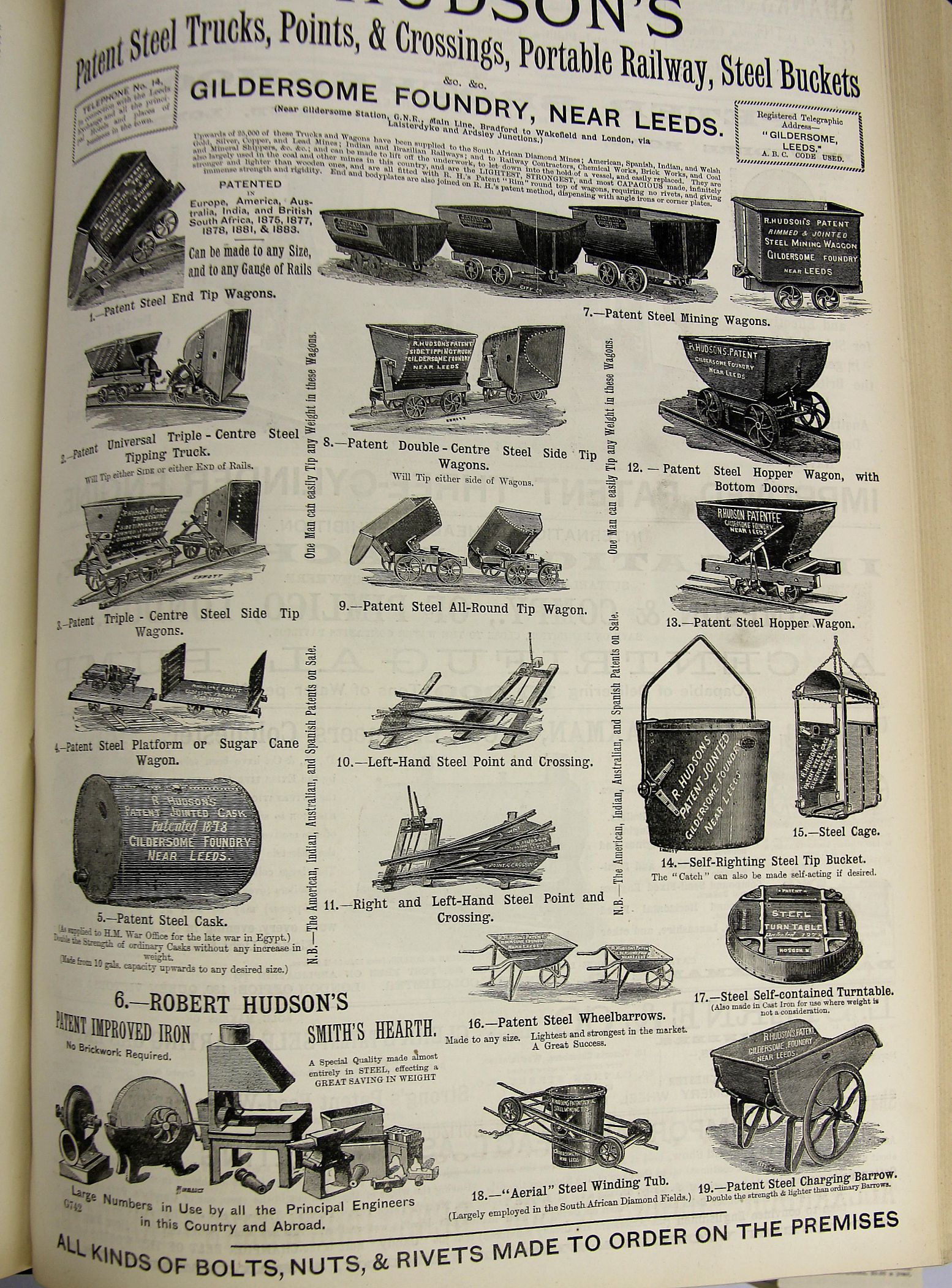
    Rose is a rose is a rose is a rose as Ms. Stein has said, though that doesn’t necessarily apply to buckets and picks.  Once upon a time there was a solid and universal need for many varieties of each one of these (exclusive of the not-elusive Ms. Hyacinth Bucket-pronounced-bouquet as the Major would say),and we get a taste for them in these pages of advertisements.  

    The first is for Hudson’s hardware (“steel trucks, points, crossings, portable railway, steel buckets”) and so on, presumably mostly for mining, and it appeared in The Engineer for July 4, 1884:

    Mining buckets

    The ad has a superb aroma of engineering heavy finery.  

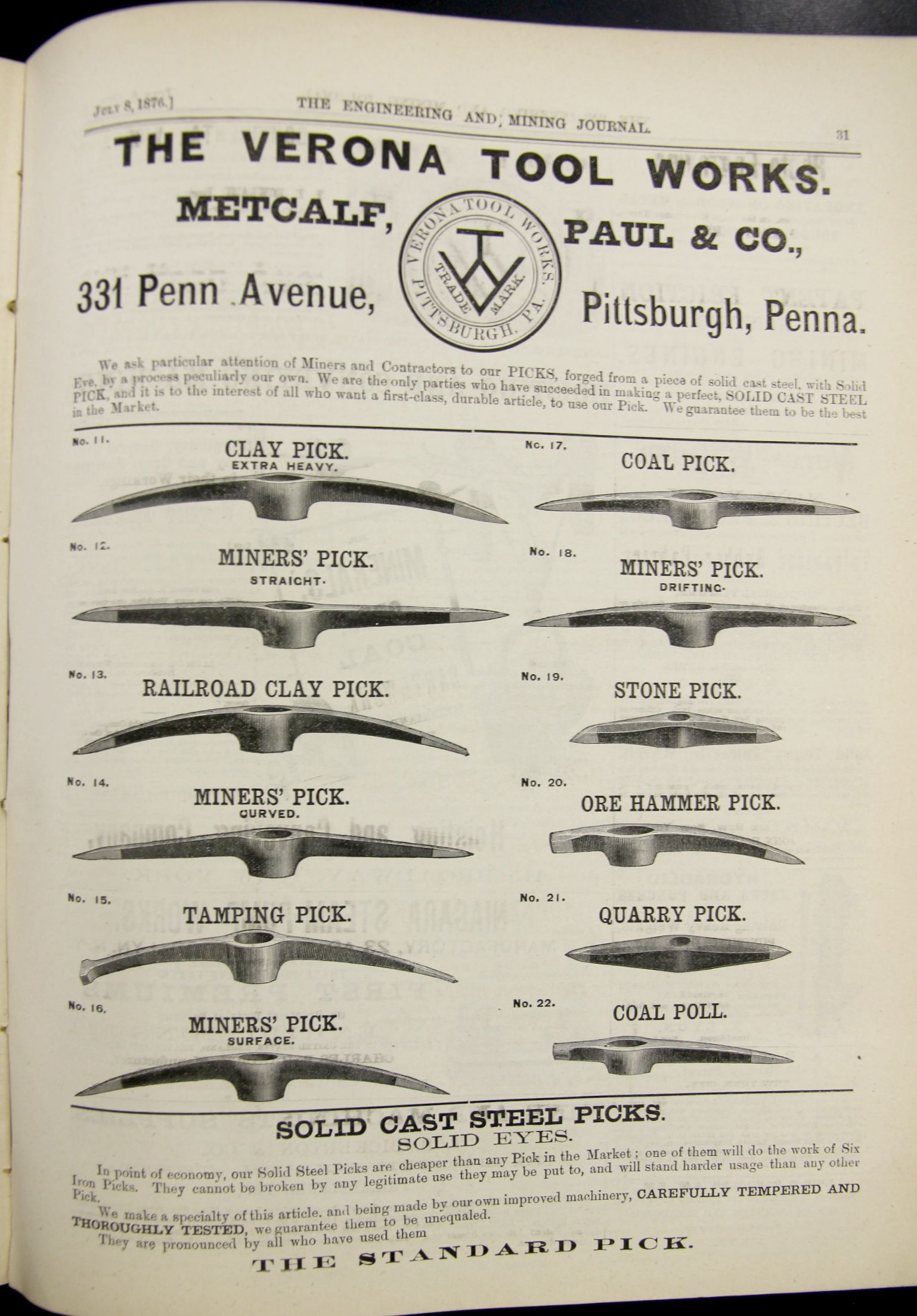
    The second is from the Engineering and Mining Journal, July 8, 1876, and the ad trumpets a “perfect, solid cast metal pick” for all sorts of segmented work.  Different jobs, different surfaces, different environments, different people–different picks for the job.  

    Mining picks


  • Outsider Politics & the Apotheosis of Religico-Governmental Control

    JF Ptak Science Books   Post 2513

    Compass057[Woodcut image by J.J. Grandville, [Jean-Ignace-Isodore Gerard (1803-1847)] from Bilder aus dem Leben der Thiere (“The Public and Private Life of Animals”) vol II, p. 224  =>For a good summary of Grandville’s fantastic work, which is completely unrelated to this post, see Opinionated Art, here.]

    People's Party058

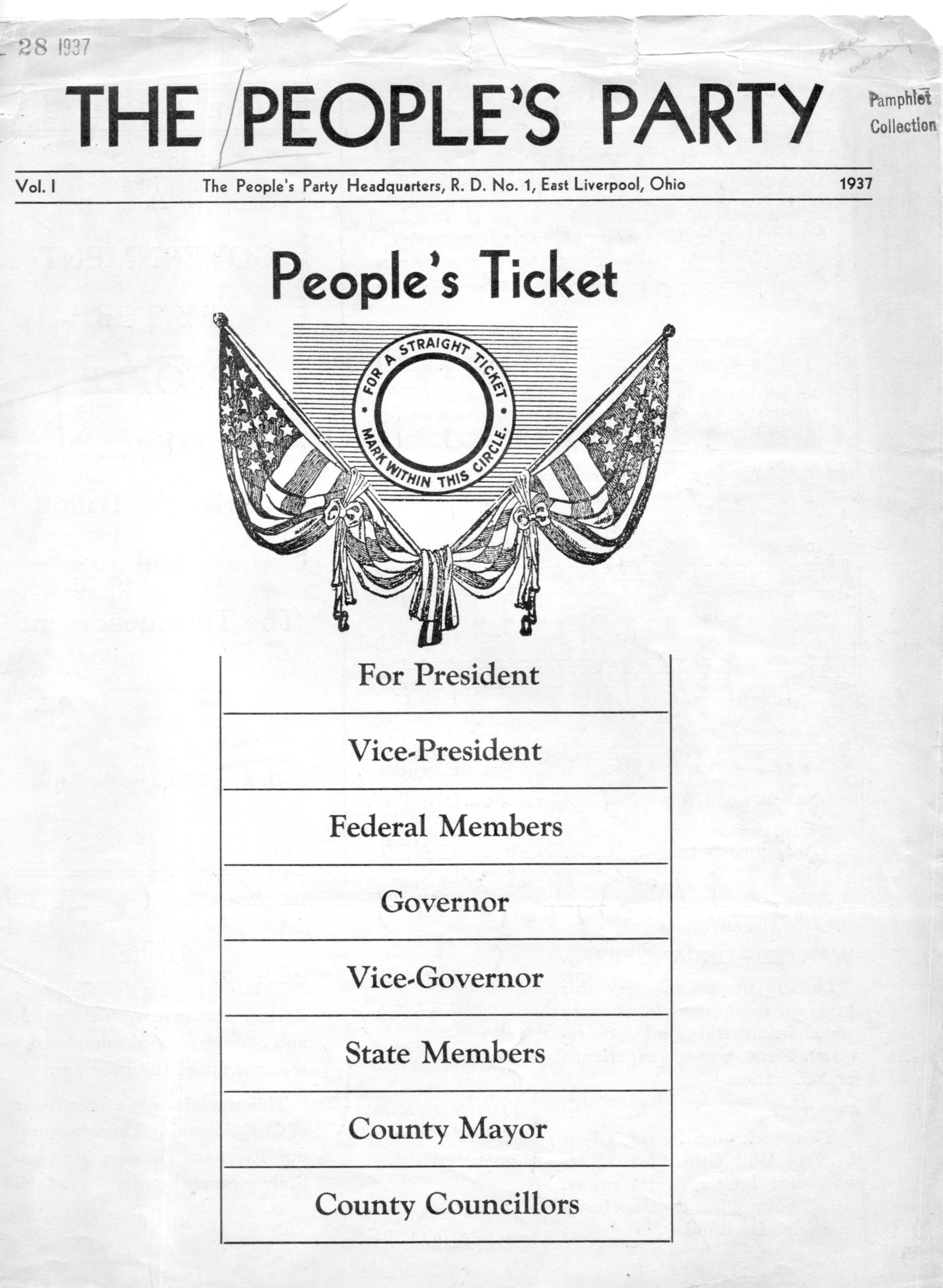
    This wisp of a pamphlet (printed in 1937), set out on a task to introduce the idea of a theocracy and government according to Christian revelation, winds up in a rather odd and unexpected place.  If you were to remove the religious aspect of the proposals and the “theomendments” of The People’s Party, you wind up with an extreme form of dictatorship in which “the Government” and “Government-Nation” is a sort of totally-dominating  Socialist-Scriptural-Brutalista melange.