A Daily History of Holes, Dots, Lines, Science, History, Math, Physics, Art, the Unintentional Absurd, Architecture, Maps, Data Visualization, Blank and Missing Things, and so on. |1.6 million words, 7500 images, 4.9 million hits| Press & appearances in The Times, Le Figaro, Mensa, The Economist, The Guardian, Discovery News, Slate, Le Monde, Sci American Blogs, Le Pont, and many other places… 5000+ total posts since 2008.

Author: JF Ptak

  • A Slab of Nothing Suggesting Something

    JF Ptak Science Books   Quick Post 

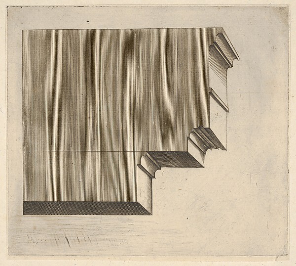
    There is hardly anything that is nothing, or a hardly-nothing that is nothing, because the more of a suggestion that in something exists nothing than we are forced to consider the nothingness which of course defeats the cause of identifying that something as a nothing.  The image below is a good example of the greater expanse of a supposed nothingness–it is a simple cross section of a doric entablature (“a horizontal, continuous lintel on a classical building supported by columns or a wall, comprising the architrave, frieze, and cornice”) or more simply put, the stuff between the pediment and the column.  In this case we see the anatomy of the entablature more so than anything else, most of the decoration and design pretty much left aside.  We are left with a map of lines, a picture of stability, firmness, and a cold comfort, somehow.  

    I just like the engraving.  

    Doric entabalur

    Master G.A. (Italian, active ca. 1535) Doric entablature 

    [Source:  Metropolitan Museum of Art, http://metmuseum.org/art/collection/search/415345?sortBy=Relevance&ft=doric+entablature&pg=1&rpp=20&pos=1]


  • Extraterrestrial Views of the Sun, 1870-1875

    JF Ptak Science Books  Post 2615

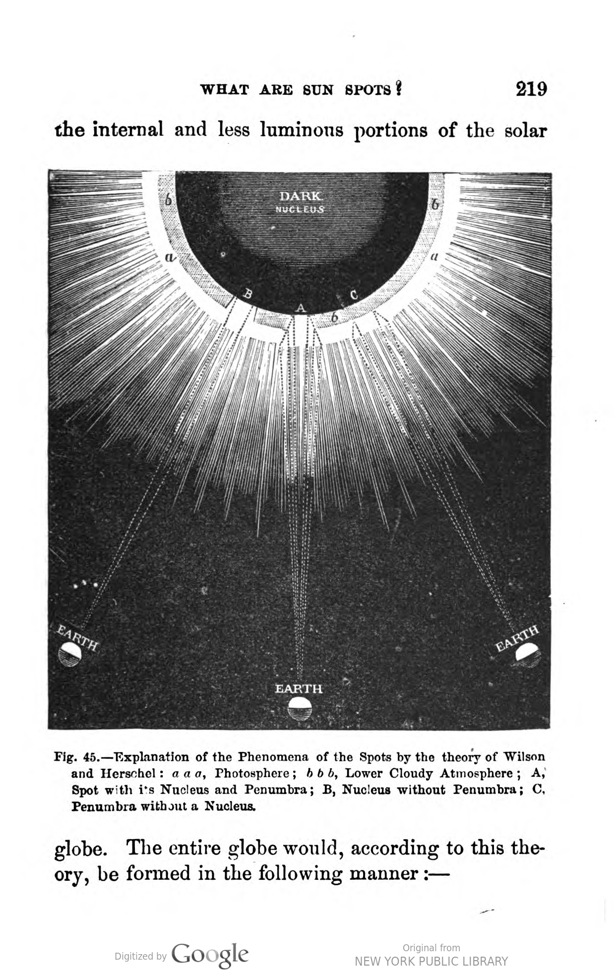
    This beautiful illustration displays the 1774 sunspot theory of Alexander Wilson (1714-1786) of the University of Glasgow, who hypothesized that they were “holes” in the surface of the sun.  The holes or cavities (A and B in this case) were an opening in the shining brilliance of the supposed surface of the sun, and revealing the true surface of the sun underneath the floating layer. This image is found in Amedee Guillemin’s The Sun (1870 and 1875), found in Google Books/Hathi Trust (https://babel.hathitrust.org/cgi/pt?id=nyp.33433057659199;page=root;seq=224;view=plaintext;size=100;orient=0)   

    • Wilson, Alexander (1774) “Observations on Solar Spots”, Philosophical Transactions of the Royal Society of London 64, part I.

    ‘Others,’ continues Cassini, ‘have imagined that the centre of the Sun is an opaque dark nucleus, entirely covered by luminous fluid matter; that in this opaque body there exist volcanoes similar to Vesuvius and Etna, which throw out, from time to time, masses of bituminous matter, which find their way to the surface of the Sun, where they produce the effect of spots, in the same manner that a new island was formed in the Archipelago near Santorin and another near the Azores; that this bituminous matter is altered or decomposed by that which covers the surface and which gradually consumes or dissolves it, forming those nebulosities and transformations which are remarked in the spots; the latter disappearing when this bituminous matter is completely consumed or destroyed; that they appear again, however, at the same points of the solar disc, when the volcanoes throw up another lot of bituminous matter.”
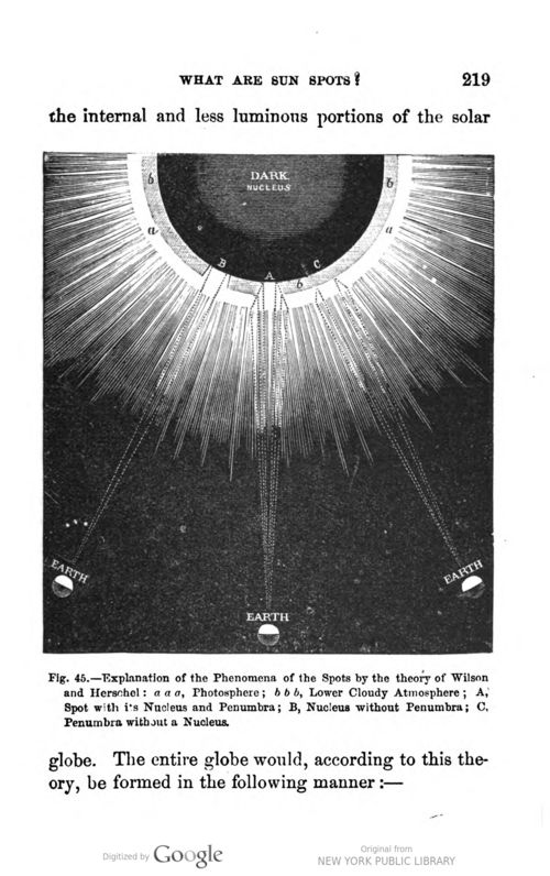
     

    SUn guillemin Wilson

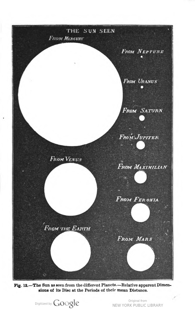
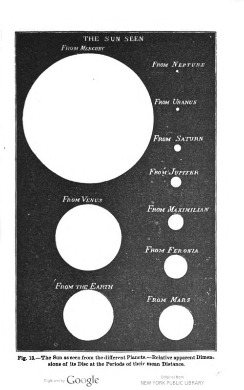
     And just for good measure (and from the same source) here is an unusual comparison of what the Sun looks like from the surface of eight planets as well as asteroid Feronia (which I imagine must be the asteroid 72 Feronia discovered by CHF Peters in 1861) and from “Maximillian”, which I have to admit escapes me.  The interesting part here is that “Maximillian” and Feronia and Sylvia and Flora are all named in images or data boxes but are not mentioned or identified in the text, which means that they were known well enough in 1870 to not need any explanation, and were simply a part of a popular astronomical conversation on minor planets and asteroids.  I’m not sure what the minor planet count was in 1875 or so but today the number is nearly 500,000 (numbered), of which about 20,000 have names.
    Sun Guillemin


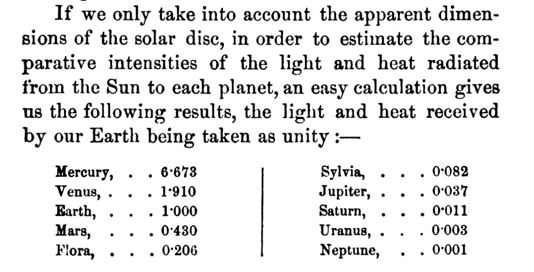
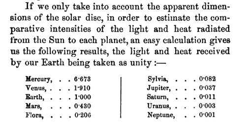
    And also the following, listing “Flora” and “Sylvia” in a planets list though they are 8 Flora and 87 Sylvia, asteroids in the main asteroid belt:
    Sun minor planets Guillemin

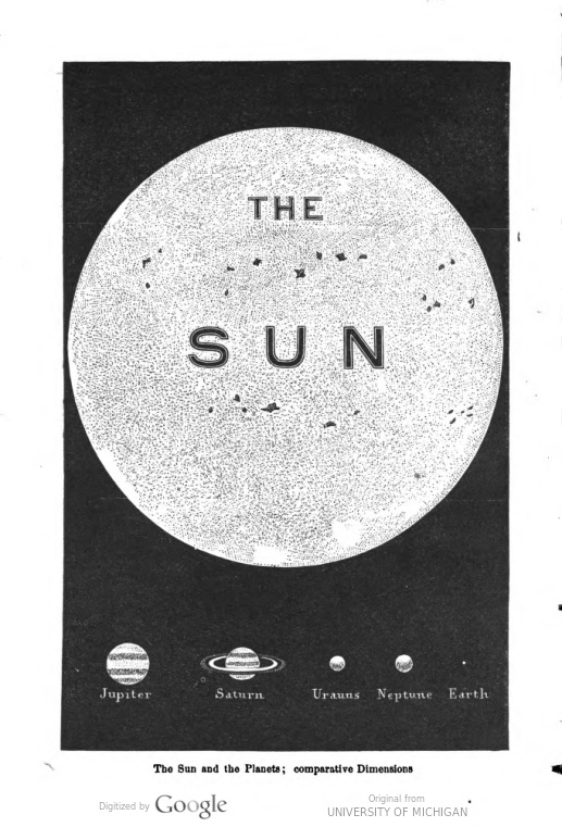
    And the frontispiece, which names the Sun very non-marginally, as though it needed such an identifier:
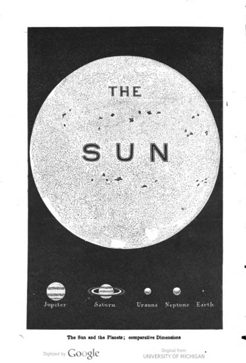
    Sun THE SUN Guillemin

    Source: Amedee Guillemin’s The Sun (1870 and 1875), found in Google Books/Hathi Trust (https://babel.hathitrust.org/cgi/pt?id=nyp.33433057659199;page=root;seq=224;view=plaintext;size=100;orient=0)   


    ·Posted by :

    ·in:

    —

  • Joie de Huh? Abstract Transcendental Outsider Found-Poetry on Pamphlet Covers

    JF Ptak Science Books  Quick Post

    The following pamphlet covers are just a few of the hundreds of Joie de Huh? examples of Pamphlets With Big and Cumbersome Titles Collection.  They have a sustained abstract poetic transcendental-Outsider feel to them, which certainly fill up a page with their confusing bigness.  I might be able to make a whole wall of these things, which I would suggest to be a bad wall for a bedroom.  

    The first has a definite feel of 1918 to its design, but was actually published in 1940, before the U.S. was actually at war.  There is an inescapable feel of an uncorrected take-home assignment for a logic course to it:

    WWII Kelso382


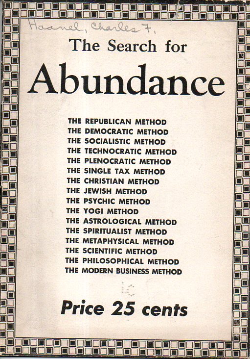
    Next, Charles F. Haanel’s  abbondanza-y  The Search for Abundance, which was published in St. Louis, Mo. in 1937, and seemingly so by the author. (It is a simple 31 pages long, and didn’t seem to get spread out very much–there are no copies located via WorldCat/OCLC, and my copy from the Library of Congress seems to be one of the copyright deposit copies. After considering the list of names on the front cover for their attainment of “abundance” the writer decides that none have been successful, and that the true method is via an AynRandian Natural Law something, which really doesn’t get explained.  The work may have been swallowed up by the abundances of the future that it tried to portray. 

    WWII  abundance377

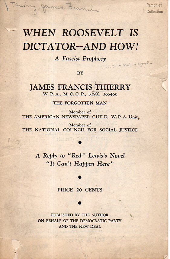
    And to go with your next sip of coffee/tea (Mr. D.) is this bouncing title, which is sort of the way the entire pamphlet reads.  There are many exclamation points inside along with a lot of very (to me) obscure references to not-obvious political figures, all of which is wrapped around a comedic sense of irony that makes it very difficult to figure out exactly what the complaint is, and on what side of the aisle the author comes down on. Nowadays that would be a masterful stroke by a politician, but the author here definitely had an agenda, though given everything I can’t really determine what it was.  


    WWII Thierry376

     (This one didn’t seem to survive, either–again my copy appears to be a copyright deposit copy, and WorldCat/OCLC lists only one lonely copy in the Yale library.) 


  • The High Majesty of Magisterially-High Kitchen Appliances (1935)

    JF Ptak Science Books  Quick Post

    Not only do the following illustrations appear in very uncommon muted pastels (for a high Depression-era publication1) it also seems as though the subtle colors underline and accentuate the screaming boasting nature of their images.  That’s the way it seemed to me when I flipped through the pamphlet and came upon Babel-like kitchen appliances. Perhaps it is the color, plus the design, and the odd perspective that give the stuff a regal/towering impression.  Or it is something else. 

    And so, the Zenith Unction of Refrigerator Beauty:

    Refrigerator400

    And the Withering Beauty of Pastel Height:

    ·Posted by :

    ·in:


  • Mathnocracy & the Mathless God of Mathematics

    JF Ptak Science Books

    Squidward: What’s that horrible smell?! [sees steam coming out of SpongeBob’s window] Is Patrick thinking again?

    Patrick: [sticking his head out of the window] I’m making art!

    Squidward: Patrick, it smells like something crawled into your brain and died!

    Patrick: That’s the creative process at work!

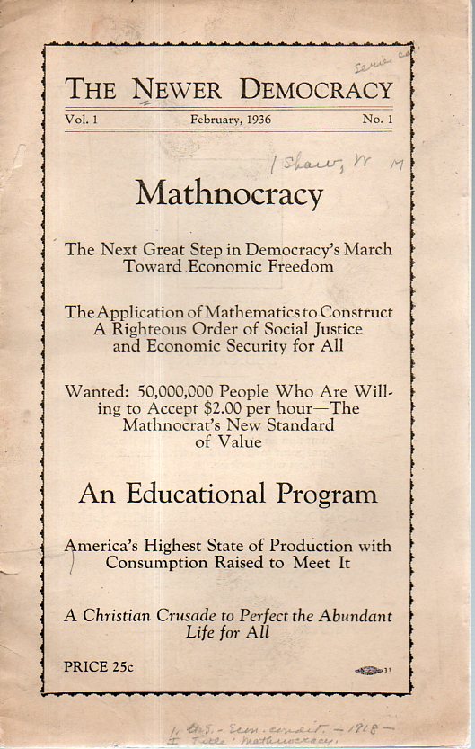
    This is one of those pamphlets with a title that goes on and on, and on, and pretty much tells you everything that there is about the work, and perhaps a little more. It is in the fine tradition of The Era of Enormous Book Titles that was so not-uncommon in the 17th c and Western Dime Novels from the turn of the century.  This “newer democracy” really didn’t have so much to do with “math” than it did with God being a mathematician, though not invoking much math, per se.   I’m not getting into the content very much because it really isn’t worthwhile—and unfortunately the pamphlet is not illustrated.  But it has a great title and cover, and is also a new entry in the “-ocracy” contingent, including the far more well-known “Technocracy” and the as-obscure “Humanocracy”, among others.  (Aha! I am reminded of an anti-FDR pamphlet called NewDealOcracy that was a fascist something or other…) 


    MAthnocracy363

    ·Posted by :

    ·in:


  • Airplanes of the Future (1942)

    JF Ptak Science Books   Quick Post

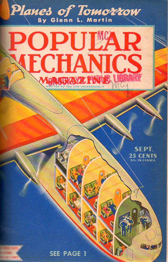
    This was a bit of a speculative peep into the future by someone who actually may have been able to see into it–Glenn Martin was on the scene immediately following the Wright Brothers, and would go on to create an aviation company that would become Martin Marietta, and then Lockheed Martin.  The article appeared in the September 1942 issue of Popular Mechanics.  The plane was a beast, though a pretty one–it was also very restrictive, carrying 100 passengers in spite of its size.  Packing people on wasn’t the priority at this point (especially at a conceived round-trip ticket of $400 to Europe, real money in those days)–luxury was. When you look at the Bureau of Labor Statistics inflation calculator for that $400, it turns into about $6,000, which is something you might pay for your first-class accommodation to Europe, except with this plane you get a shower or bath, a lounge car, a ping pong table, and a LOT of leg room.  

    Airplanes of future 1942360


  • Money, Medical Treatment, and the Size of the Working Classes

    JF Ptak Science Books  Quick Post

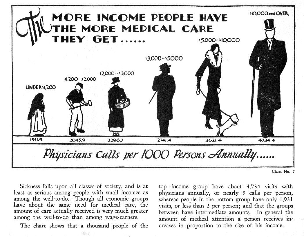
    Medical costs359

    A Picture-Book about the Costs of Medical Care was composed by the Julius Rosenwald Fund in 1932. One of the major data visualizations in the short pamphlet was the distribution of medical care according to income–and it comes as no surprise that during the Depression that the wealthiest people are enjoying more medical care than the other classes.  The stats are mostly not displayed in this pamphlet so there’s not much that I think I can say about them–except that it seems that the class distinctions/percentage in this  chart are similar to the William Thompson & Joseph Hickey (2005) class model.

    So from the Rosenwald Fund the numbers are described like so (with the addition of the bureau of Labor Statistic’s calculated figures for teh purchasing power of the 1932 dollar in 2016):

    • <$1,299, 15% of the population, ($20,957 in 2016 dollars)
    • $1,200-$2,000, 35% of the pop, ($34,938 in 2016 dollars)
    • $2,000-$3,000, 25% of the population ($52,392 in 2016 dollars)
    • $3,000-$5,000,  15% of the population, ($87,321 in 2016 dollars)
    • $5,000-$10,000, 7% of the population,  ($174,643 in 2016 dollars)
    • $10,000+, $2.9% population, (greater than $174,643 in 2016 dollars)

    The Thompson/Hickey model 

    • Upper 1% 
    • Upper middle class 15%
    • Lower Middle Class 32%
    • Working class 32%
    • Lower classes (including the working poor 20%

    The bottom two classes in the Rosenwald could constitute the poor and the working poor, making 50% which is what is most in-line with the Thompson/Hickey model. It is a little more difficult to work the numbers and try to distinguish the super rich, rich, upper middle class, and middle class in other models against the Rosenwald graphic. However when you look at two other models the poor and the working poor add up to about the same as above; the Dennis Gilbert model  (2002) finds 55% in this category and the Leonard Beeghley (2005) finds 57%. This is real smashmouth statistical surfing, I know, but it does seem as though there is a good correlation between the Rosenwald working class/working poor/poor numbers from 1932 and more recent models. 


  • How a Trade Union is Run–in Bright Red (1932)

    JF Ptak Science Books  Quick Post

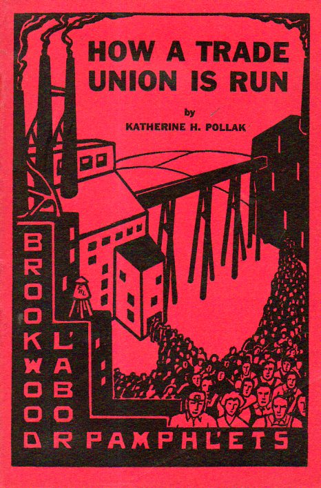
    Katherine Pollack (b 1905) wrote this informative pamphlet in 1932–it is red though Ms. Pollack wasn’t.  She did have a solid and liberal background–Ethical Culture School in NYC, economics at Vassar, grad work at Columbia, “tutoring, teaching and writing for the Bryn Mawr Summer School for Women Workers (1927-49), Brookwood Labor College (1929-32)…field work in Southern textile mill towns and West Virginia coal camps…”1, and then on to national offices for the CIO and then the AFL-CIO.  

    I hate to say it, but I was drawn to the pamphlet for the design.  It turns out that Ms. Pollack had the Right Stuff, and knew her business, and lived that life.  I’m glad to have made her acquaintance.

    The pamphlet was published by the Brookwood Labor College (1921-1937) evidently the first U.S. college devoted to the study of labor, and published in 1932.


    How a trade union is run348

    Notes:

    1. Katherine Pollack Elikson papers:  https://reuther.wayne.edu/files/LP000321.pdf


  • Odd Maps: Earth as a Workplace for Trucks (1939)

    JF Ptak Science Books   Quick Post

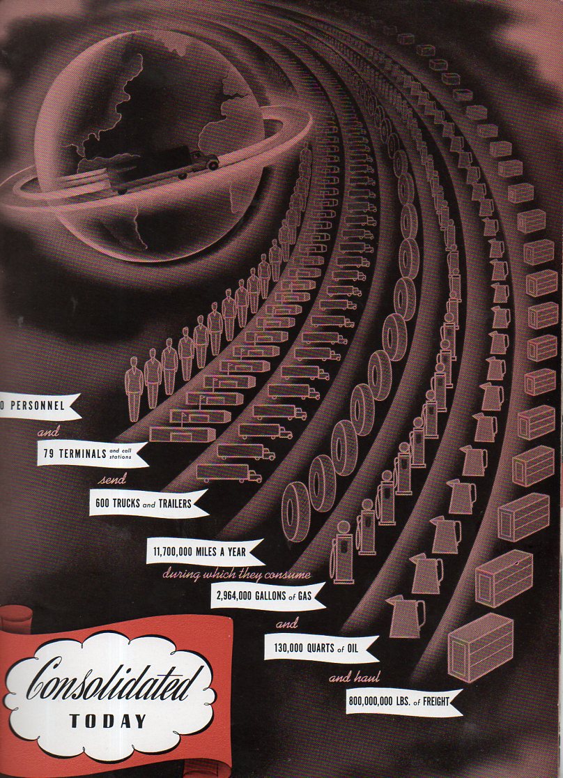
    You wouldn’t know about the highly-designed images in the work Highway Transportation by its title (“published in the interests of the shipping public”) by Consolidated Motor Lines Inc (1939). Nor would you assume how dry the interior was by the pamphlet’s cover. In any event the Earth  (with the poorly-drawn North America and the trunk-running ring around it)seems to be well under control by trucks, standing by in deference to the enormous quantities of oil consumed by trucks and other truck-related truck things, sweeping past it like the tail of a comet.  It is just an odd map, and that’s pretty much that. The sharp and streamlined plastic cover must’ve been shiny enough for everyone to think of it as an advanced work.   

    Map world truck346


    And the equally odd and slightly disturbing streamline-y cover:


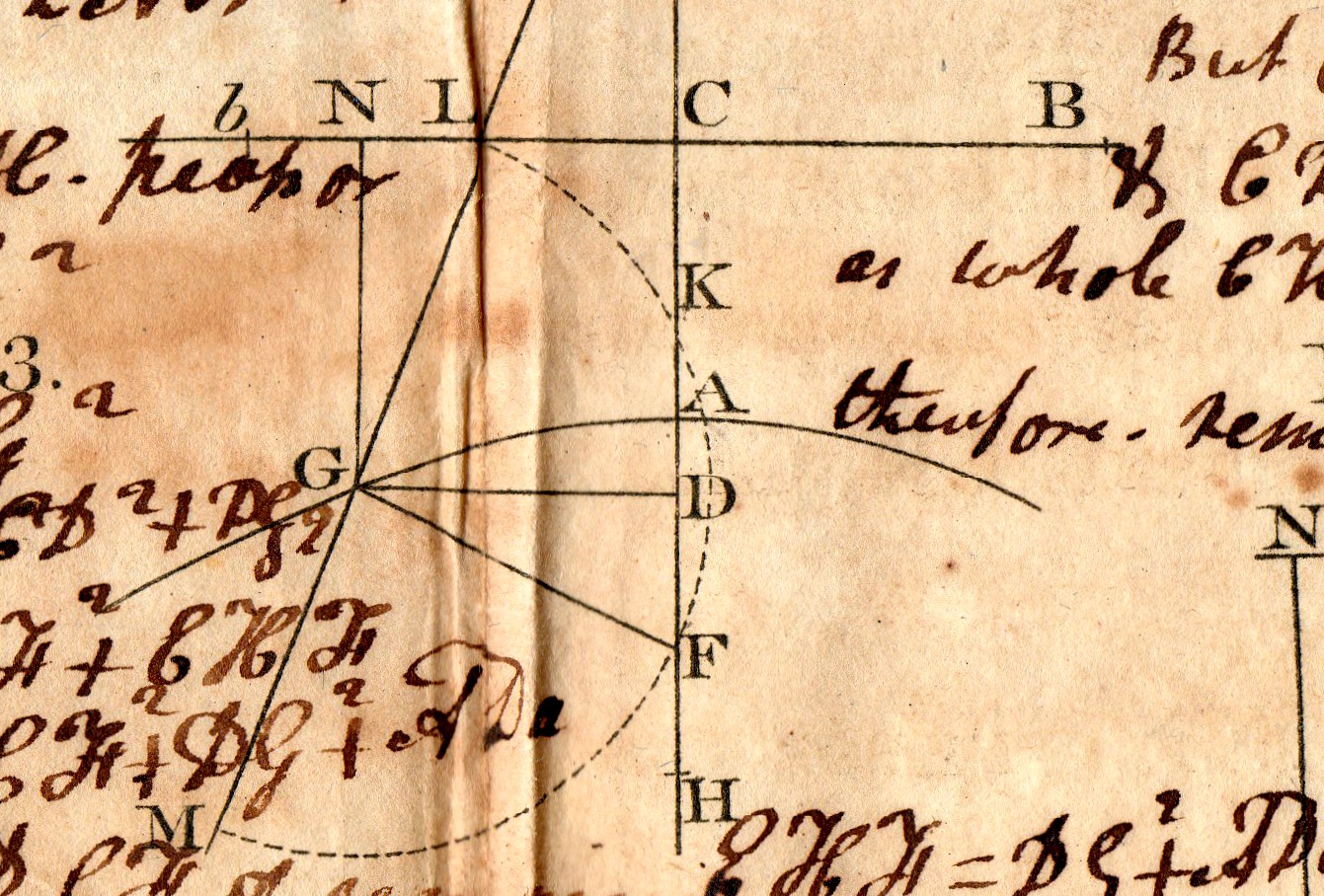
  • Found Art–Geometry, ca. 1775

    JF Ptak Science Books   Quick Post


    Math art345

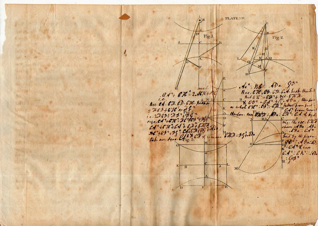
    Source: unknown (perhaps Thomas Simpson, Elements of Geometry…?)

    Math art342


    ·Posted by :

    ·in: