A Daily History of Holes, Dots, Lines, Science, History, Math, Physics, Art, the Unintentional Absurd, Architecture, Maps, Data Visualization, Blank and Missing Things, and so on. |1.6 million words, 7500 images, 4.9 million hits| Press & appearances in The Times, Le Figaro, Mensa, The Economist, The Guardian, Discovery News, Slate, Le Monde, Sci American Blogs, Le Pont, and many other places… 5000+ total posts since 2008.
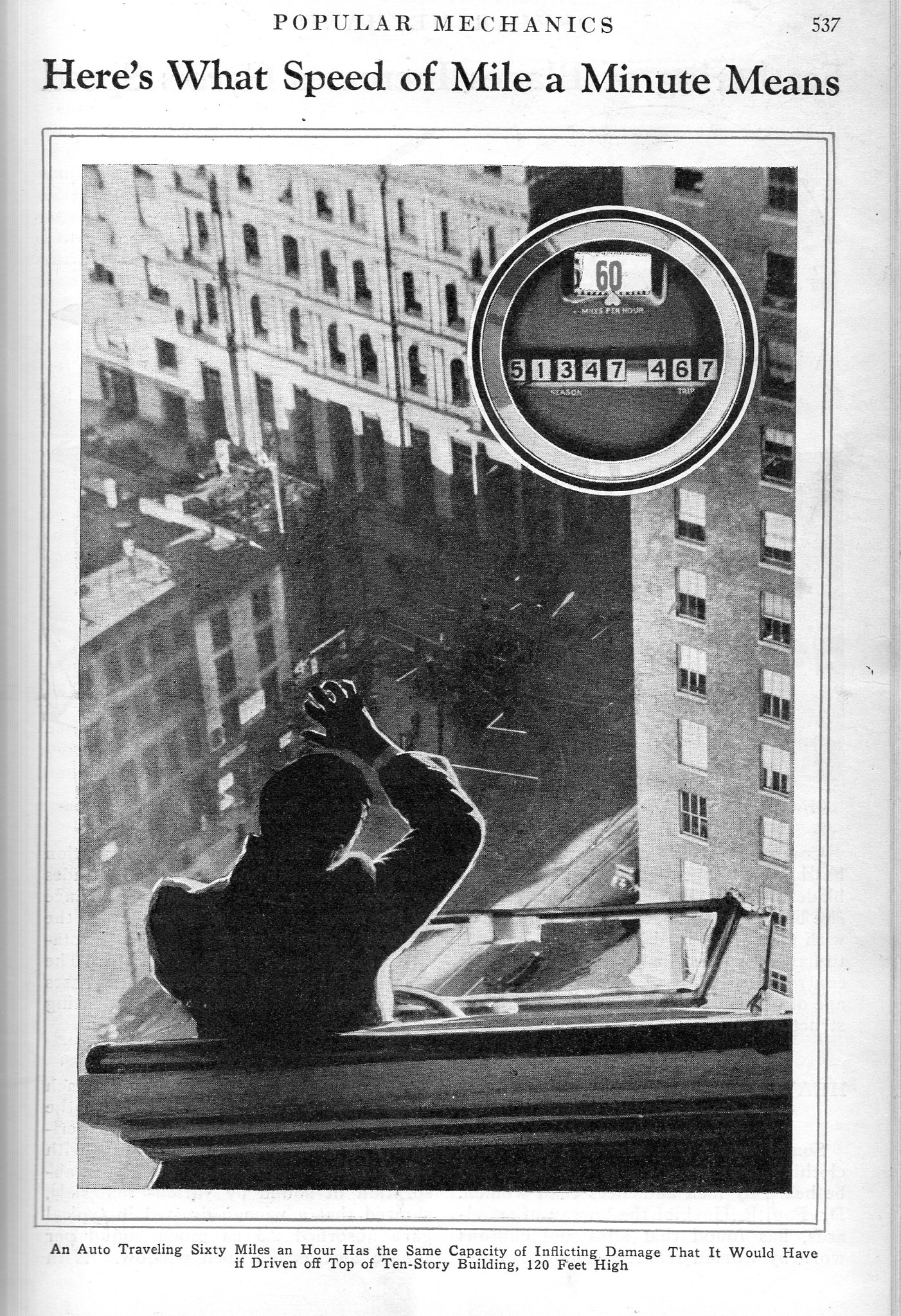
It might have made it more exciting for the readers to know that the fall would’ve taken about 2.73 seconds from 120′–I think the results are pretty much exactly the same whether the 60mph man was in a car or not so far as the effects of the sudden stop at the bottom goes. In any event, it was an effective way of relating the dangers of ultra-auto-speed in 1932.
JF Ptak Science Books (Archive Post 1303, expanded)
“There’s nothing so perfect as imperfection.”–Somebody.
“The great unconquerables in the geography of human thoughts and ideas are the bad ones.”–Nobody.
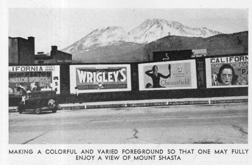
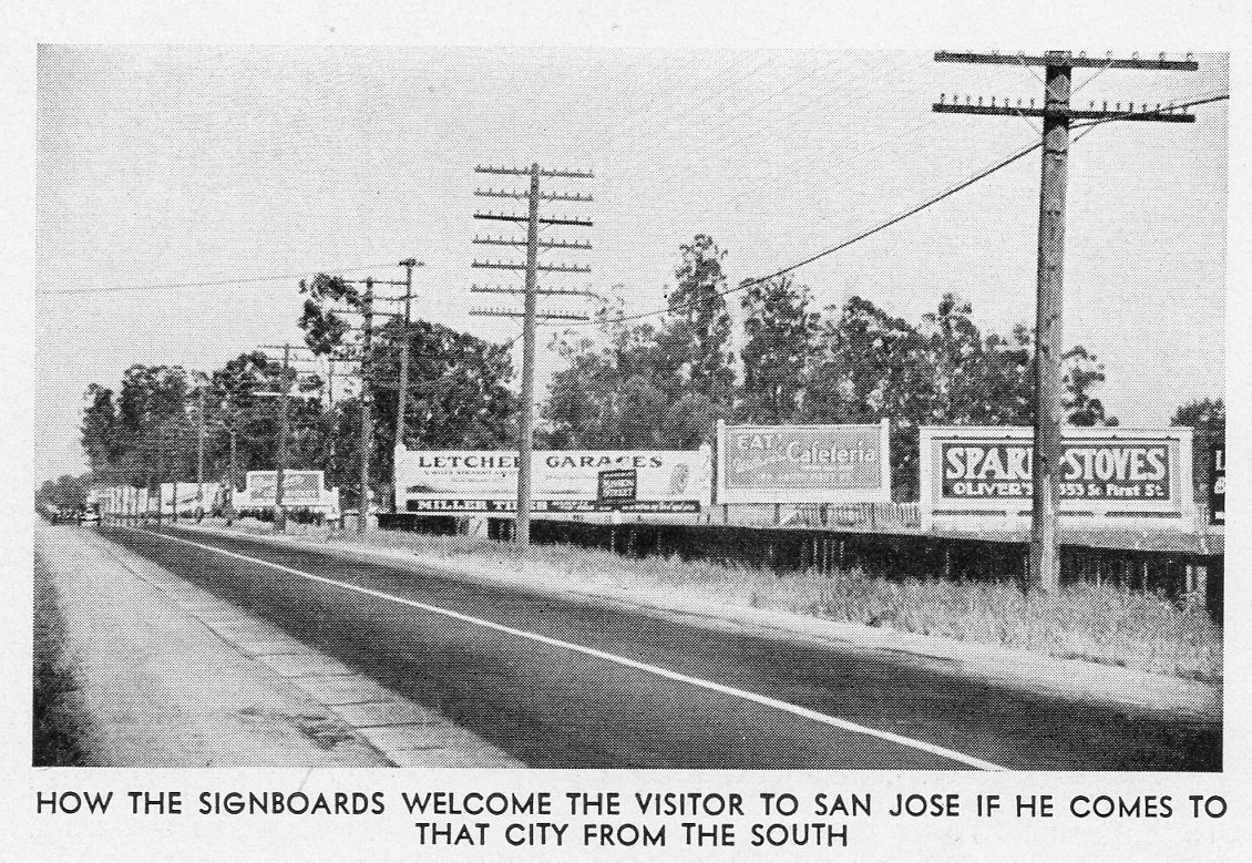
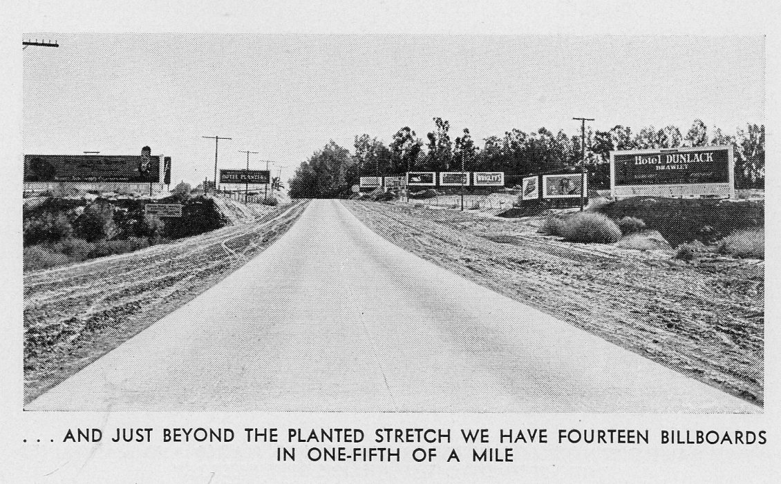
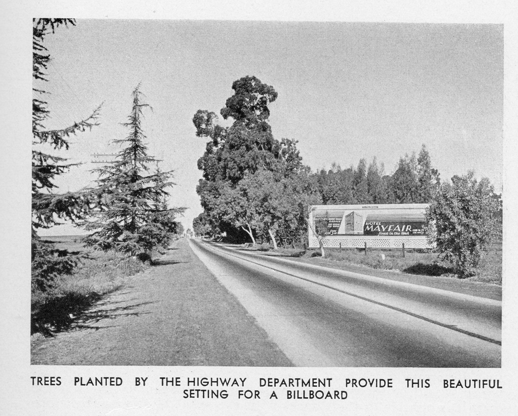
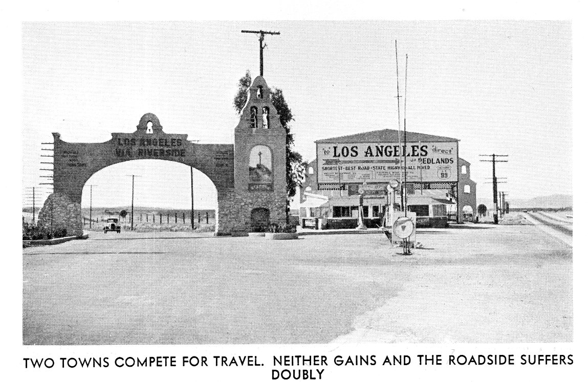
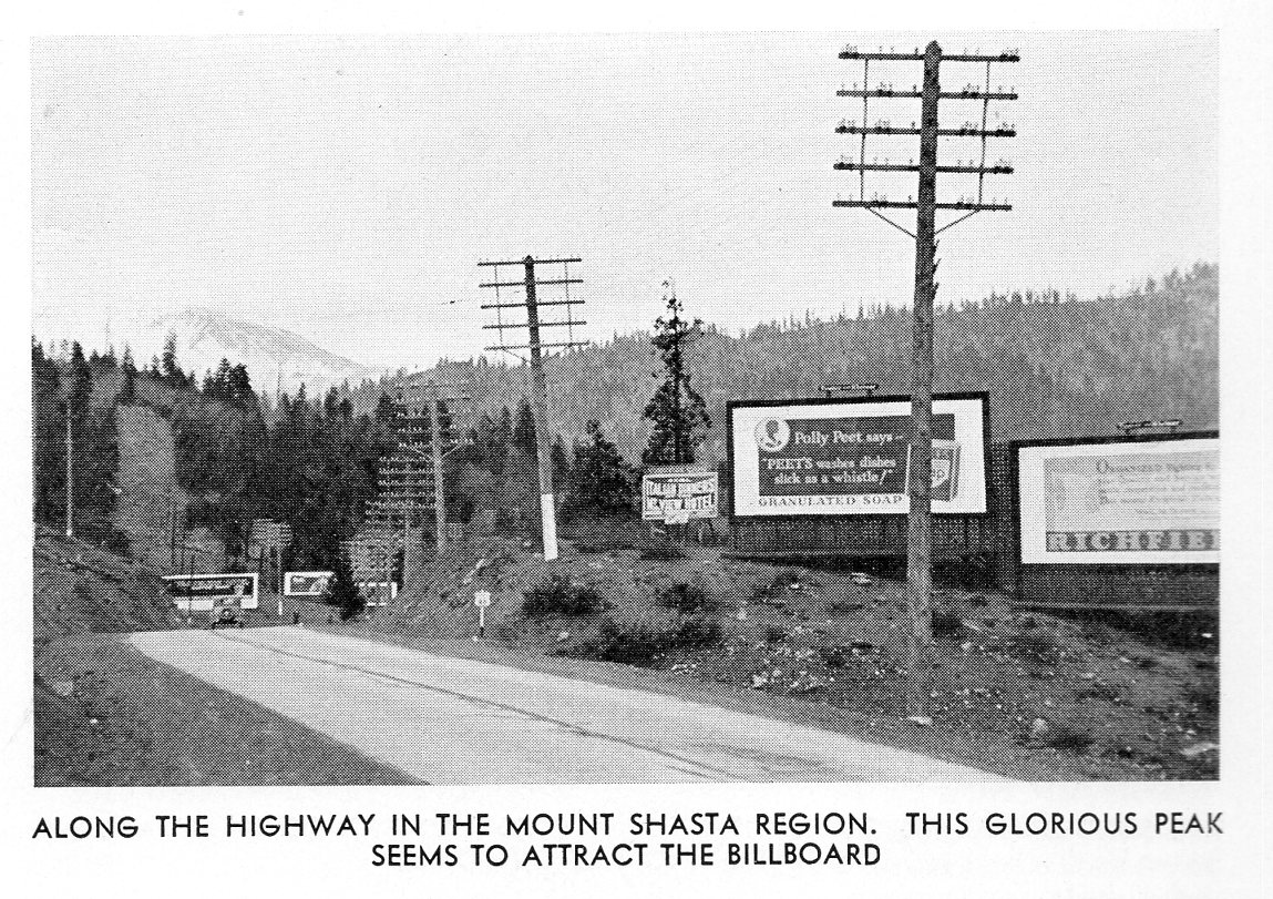
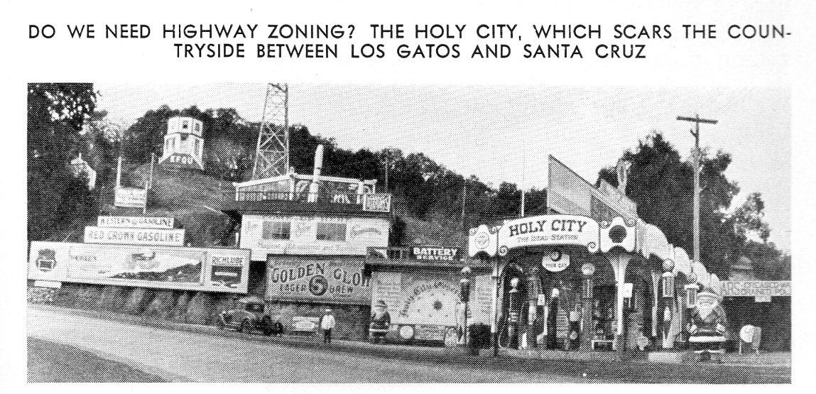
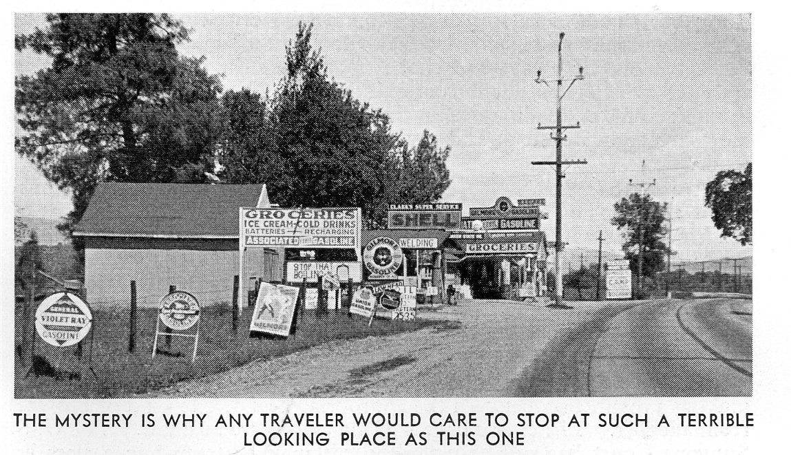
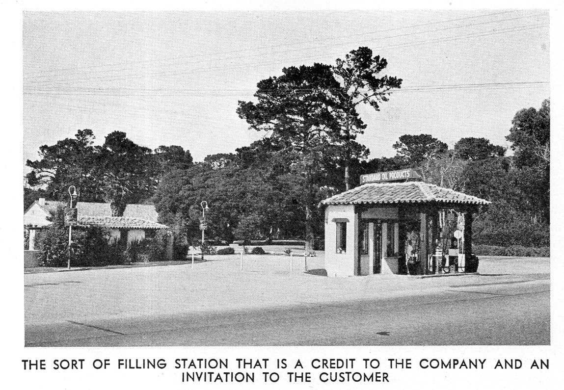
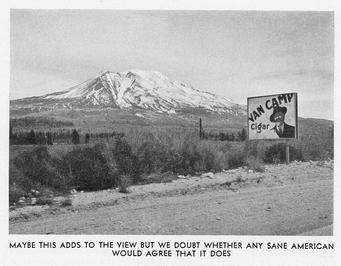
[The captions for the images in this pamphlet are mostly facetious–the author/s were conservationists of sorts, interested in the landscape and visual culture of their state. They tried to make their case in some instances with sarcasm.]
Bad ideas don’t so much go away as they get recycled. They can be replaced by good ideas or bad, but the ”original” bad ideas seem to linger on and on. They are perhaps the indomitable inheritance of society, real and imagined.
Bad human-produced landscapes are an outgrowth of bad ideas, calamities large and small that come and go, the old replaced by something new that is good or bad or indifferent. With the landscape, the original landscape itself–apart from the idea that brought it about–is generally lost forever once it has been replaced. There is no Bad Idea Spirit that brings it back whole again, unlike the generic Bad Idea, which can live on and on, unencumbered by history, like a Greek play or some deeper mythology.
Theoretically society is supposed to learn from recognized bad ideas, so as to not repeat them etc., which is one reason why we keep track of them, in the vain hope that someday someone somewhere in the history of our future will kill particular bad ideas off one by one.
In the meantime we can dwell on what we have, though with the removed bad idea landscape, it is more difficult. That’s why it is important every now and then to familiarize ourselves with them when the opportunity arises, which is just what happened with this innocuous-sounding pamphlet, The Roadsides of California, a Survey1 (1932) Its not like it’s Pandora’s box–we can open this one and just a few, limited baddies come out, and fall limply to the floor. But what we see is interesting, a slice of our memory of the horizon–a part of our “progress” that we’ve tried to excise–and what we can see now are the removed and forgotten things.
Notes
1. This is actually an interesting pamphlet, an early attempt at removing the quickly generated ugliness that was cluttering new roads for the explosion of automobile travelers. As quickly as cars were made in the new decade of the automobile, billboards and roadside attractions followed. This pamphlet identified this phenomenon as a problem.
“Computers do not as yet sell themselves.”–Lehman, 1959
Question: what had 1000 transistors, 5000 diodes, 2000 resistors and 1000 capacitors, a team of ten and took 18 months to build?
Answer: an inexpensive, $12,000 digital computer in 1959.
Mind you this is legions better than what was happening in the mid-1940’s, with teams of hundreds and costs in the many millions, and much better than in the early 1950’s, when these numbers were of an order of magnitude greater.
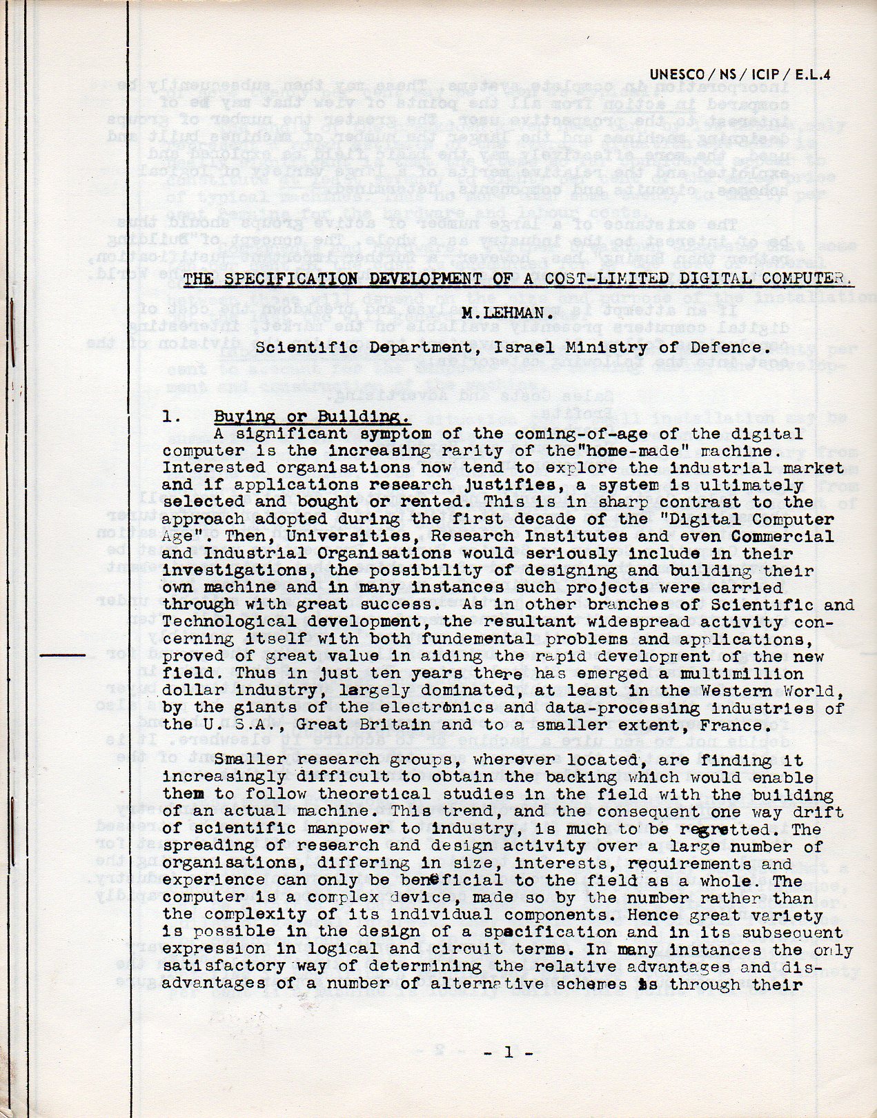
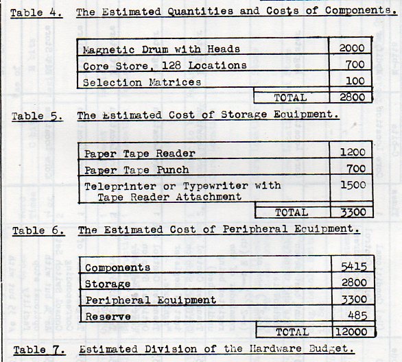
It seems to me that this short 1959 paper is at the upper end of a beginning concern–costing-out the price of a digital computer for second-tier interests. “The Specification Development of a Cost-Limited Digital Computer” (by M. Lehman of the Israeli Ministry of Defense) was written for those businesses and schools with a definite low-end budget, the upper range of which was set by Lehman at $12,000 for “peripherals, hardware and programming (or about $125,000 in 2016 dollars, sort of). This figure was also exclusive of maintenance outside of the cost (at 15-20% of the construction costs overall) of designing and building the machine.
This was some new thinking on providing lower-cost digital computers to a new market: “in just ten years there has emerged a multimillion dollar industry largely dominated….by the giants of the electronics and data-processing industries…”. Lehman was saying that there was a new opportunity for business to supply computers to “smaller research groups” who were “finding it increasingly difficult to obtain the backing which would enable them…to build an actual machine”. There were other ways of doing it, and Lehman laid out the basic understanding of that procedure.
Lehman’s leading quote for this post was accurate–computers needed to be “sold”, as in salesmen and businesses actively engaged in contacting clients who would (“might”) benefit from having computeriaed part of their business. The computer manufacturer’s “staff will often spend many months investigating customer’s problems, possibly reorganizing his techniques and generally preparing teh ground for the installation of a Digital System…”
(The figures in the right column are dollars.)
Lehman was doing some groundbreaking work here at the end of the ’50’s, still far ahead of the time–and probably a full generation–where computers didn’t necessarily have to be shown as being ‘needed” let alone “necessary”. The computer would be “selling itself” on the low-end of the market soon enough, but really not until the Reagan years when it was beyond question that the computer could be used by virtually any person or business–at affordable rates.
There’s just something very simple and calming in the arrangement of the colors in these photos–and of course something very different from what one comes to expect in interior design. This is so much so that I think it would be possible to take an entire two-day vacation in a house that is decorated in just this fashion. Your brain would be relieved of the expected and introduced to the soft exceptional with a color palette equivalent of an all-white-food carbo breakfast that one could slide under a bathroom door. I think you would take a seat with a good book, and then fall immediately to sleep–not from boredom, but from the unexpected luxury of color-unusualness and perhaps a little whiff of the grandparent’s house, the colors surrounding you having the optical qualities of the heat from a good fire. If we were seeing movies of folks gathered around the radio and listening to the end-of-the-war stories in 1945 in a set like the images below, we wouldn’t picture the black-and-whiteness to purge itself into this allotment of soft color.
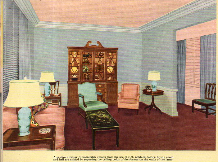
The images come from an innocent-sounding pamphlet published by Pittsburgh Paints: Pittsburgh Color Dynamics for Offices, Hotels and Restaurants and published in Pug in 1945. The cover gives it all away, and then once inside you are immediately invited to the design equivalent of a happy version of Nemo in Slumberland. For example, a living room, begging for someone to sit in and enjoy a cup of coffee while wondering when Joe DiMaggio would be back in pinstripes, and where the smokes were, and what happened to all of the missing artwork:
Of course if you spilled coffee on the rug (the color of Ronald Reagan’s shoes) no one would ever notice.
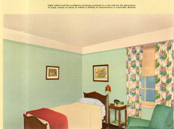
You could retire for the night after waking up from your color overdose/withdrawal here, a bedroom whdreams are dreamt and things are thunk, and sleep is the biggest thing made:
[The image cropping is at is appears in the original.]
This all just seems so terribly suave, so above distinction and yet below it. The “rediscovered” blue (“cascade blue”) that I forced into the title is found here, in one of the pages of color swatches:
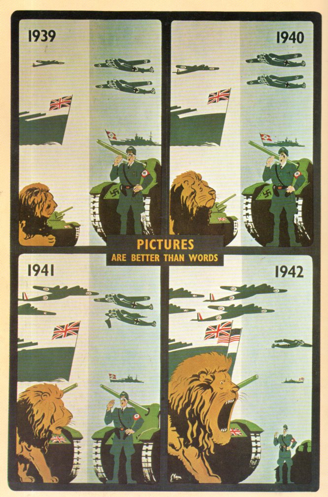
Here’s a wonderful British-stiff-upper-lip poster, a play on the Alec Guinness The Mouse that Roared, replacing the “mouse ” part, and winding up with The Lion That Roared.The poster comes from 1942 and for all intents and purposes is correct, except that the lion was roaring at least since 1940–the difference is that the lion got bigger and roar-ier. The British navy was always far and away more powerful than Germany’s, and although out-numbered in aircraft for the first year and a half or so of the war, Germany was pretty much hopelessly behind by late 1941 and certainly 1942. In any event the poster tells a good and fairly accurate story to the passersby in London in 1942.
[Source: Z. Zeman, Selling the War, Art and Propaganda in World War II (1978).]
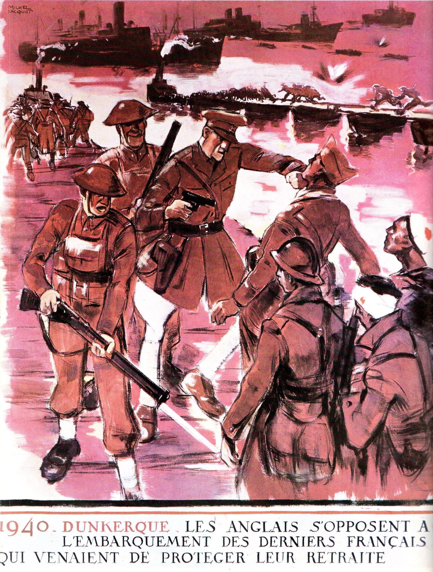
Michel Jacquot seems to have been a relatively busy graphic designer/artist and collaborator with the Nazis during WWII (and before). One very striking and damning poster that he created was this scene of Brits forcing French soldiers away from evacuation vessels at Dunkirk forcing them to satay behind and guard the rear and (2) get eaten alive by the approaching Nazis. All told, there were 338,226 soldiers evacuated from Dunkirk; the grim part of the miracle there was that 68,000 BEF were captured or killed and 40,000 French troops were captured–none of that happened because French troops were marauded by the Brits. Jacquot tried a hearts-and-minds with this one, though it is unknown what effect it had in creating a hatred-thread among the French.
[Source: illustration in Z. Zeman, Selling the war, Orbis Press, 1978.] “1940 Dunkerque. Les anglais s’opposent à l’embarquement des derniers français qui venaient de protéger leur retraite”, by Michel Jacquot.
Jacquot also cooked this one up, a grim anti-Communist poster in support of the extreme Nationalist/National Socialist Parti Populaire Francais (the PPF) in 1943. The leader of the PPF was a former outted Communist named Jacues Doriot (1898-1945) who was a National Socialist, a Nazi supporter, a collaborator, a traitor to his country who broadcast for the Nazis on Radio Paris, and a person who co-founded the Legion des Volontaires Francaise (LVF), which was a unit of French soldiers who fought with the Wehrmacht. There are some other posters, too, including some vile anti-Semitic ones, but you get a good-enough taste for where Jacquot was headed during the 1935-1945 period.
When I typed “compose” for this post it meant something slightly different, especially since I was going to sub-head it with a quote about John Cage:
“HPSCHD, a piece for 7 harpsichords playing randomly-processed music by Mozart and other composers, 51 tapes of computer-generated sounds, approximately 5,000 slides of abstract designs and space exploration, and several films1.”
Really? How could anything possibly go wrong here? Seriously though, I like John Cage and he gets a “pass” for all of the work that I don’t get or understand. He came up when I was working on the remnants of a box that contained further remnants of an early educational electric toy/computer called the “GENIAC”. This was a creation by the very versatile Edmund Berkeley and appeared first in 1955, about a decade or so after the appearance of the first “-IAC” computer, the ENIAC, a revolutionary machine begun in 1943 at the Moore School of Electrical Engineering at the University of Pennsylvania. The GENIAC (and later, the BRAINIAC) were DIYs for kids in the 1950’s and 1960’s, and in addition to the 100+ electrical circuits you could make there was also the possibility of making music, which puts it way out front in the history of DIY electronic sound.
But what I was going for here in the labels sheets for the GENIAC was to scrounge out some found-poetry–there really isn’t any, except perhaps for the silent John Cage type, or a repetitive/cascading Steve Reich/”Come Out”2 variety found here:
“George Calling Tom, George Calling Dick, Tom Calling George, Tom Calling Dick, Dick Calling George, Dick Calling Tom.”
Overall there may be some found-poetry, just in the variations of classifications of the labels that your were supposed to cut out. On page one we have labels for “the hall light”, “the porch light”, “the burglar alarm”, “the automatic oil furnace”.
Things get more interesting on the back of the first page, as we move from the mundane to the not-so:
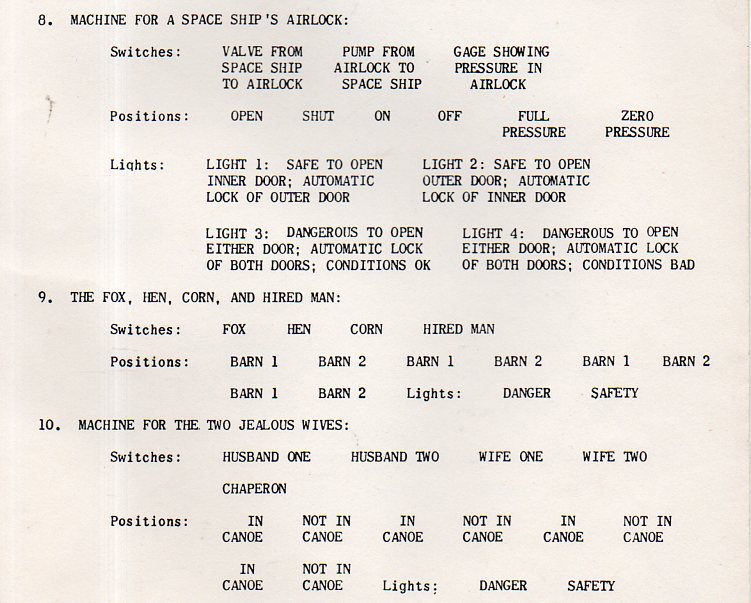
“Private signalling channels”, “machine for a space ship’s airlock”, “the fox, hen, corn, and the hired man, and then “machine for two jealous wives”.
That was certainly different from the obverse.
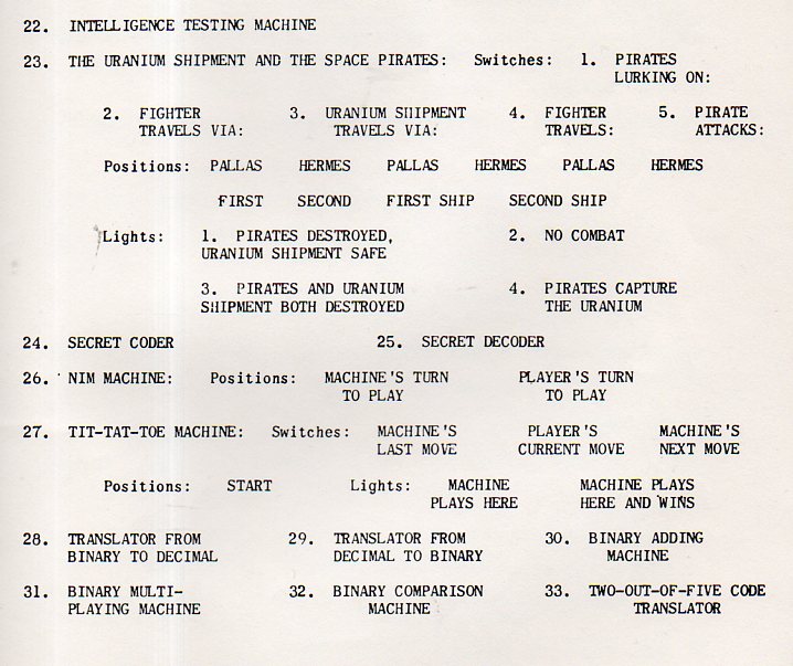
Things get more interesting still on page three:
At the end of the day, I think there is only scant poetry, and that is found in the structure of the label sheet–that said, I think the whole thing taken together is a Visual Thing itself, because the four page booklet (11×8.5″/page) is actually (anopithsographically (!)) printed on one sheet on paper and on one side only, so the effect is seeing this on a 11×34″ sheet of paper with all of these seemingly-disparate bits on it, which is pretty cool.
Notes:
1.”Computer-Based Algorithmic Composition”, Michael Edwards , Communications of the ACM, Vol. 54 No. 7, Pages 58-67 http://cacm.acm.org/magazines/2011/7/109891-algorithmic-composition/fulltext
2. If you don’t want to hear the whole thing (few will) but want to hear the effect, start at the beginning for 15 seconds, then advance a minute, then another, and so on.
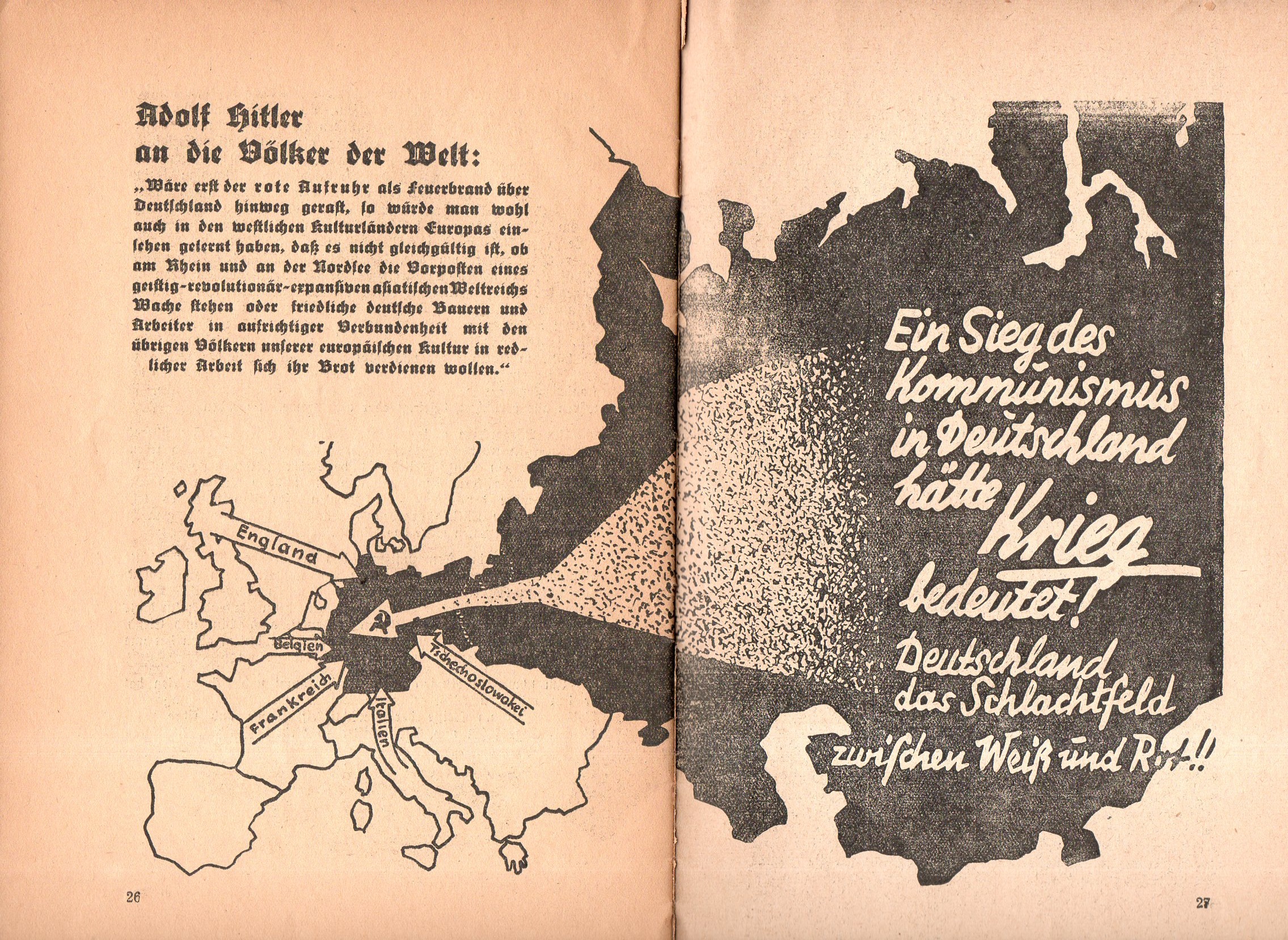
Not long after Hitler’s election in 1933 this curious pamphlet appeared: Ein Kampf um Deutschland (1933), short and thin, is a work filled with anti-Communist photos and images portraying them in as harsh a bad light as you could muster in 32 pages.One of the images is this map showing in no uncertain terms threats to Germany from the west, but most importantly a gigantic threat coming from the Communist east, the arrow striking right through the heart of Germany, with the hammer and sickle (the symbol only about 16 years old at the time) coming to rest just about on top of Berlin.
For all of this Hitler would sign a Non-Aggression Pact with the Soviet Union six years later (22 August 1939) with the plan of dividing some Eastern conquests with the Russians. Less than two years later came Operation Barbarossa, with Hitler launching a massive surprise invasion of the Soviet Union on 22 June 1941. Dozens of millions of lives later, it would all be over in four years.
And the opened cover for the pamphlet, or what is left of it:
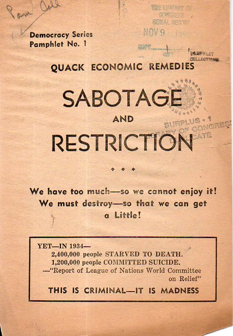
This is an interesting pamphlet (printed ca. 1933/4) that makes a lot of good points in what seems to be our current post-salient world, except that the author’s presentation makes it all look kooky, borderline, Outsider-y, and therefore dismissable. But the good points are there, and no doubt a lot of the numbers seem as though they can be true–it is just that the presentation is about as actionable as listening to some guy sitting in a shopping cart under the overpass and wearing cardboard box signs while delivering his message in bolts of screams–the medium really can be the message, or the mess. And this is just a mess, true or not, which was too bad.
(This is another one of those pamphlety works that seem as though they were very popular–and perhaps so, except that its popularity did not translate into any sort of existing longevity–there is only one copy of this work located in WorldCat/OCLC, and the only two online references to the pamphlet are for the listings for in the the library found by WorldCat. So, popularly, this work is no longer “around”. It is interesting to note that for the few dozen Google hits on “Quack Economic Remedies” there are several referring to presidential programs, with those including a wide range of politics, and include Obama, Nixon, and Wilson.)
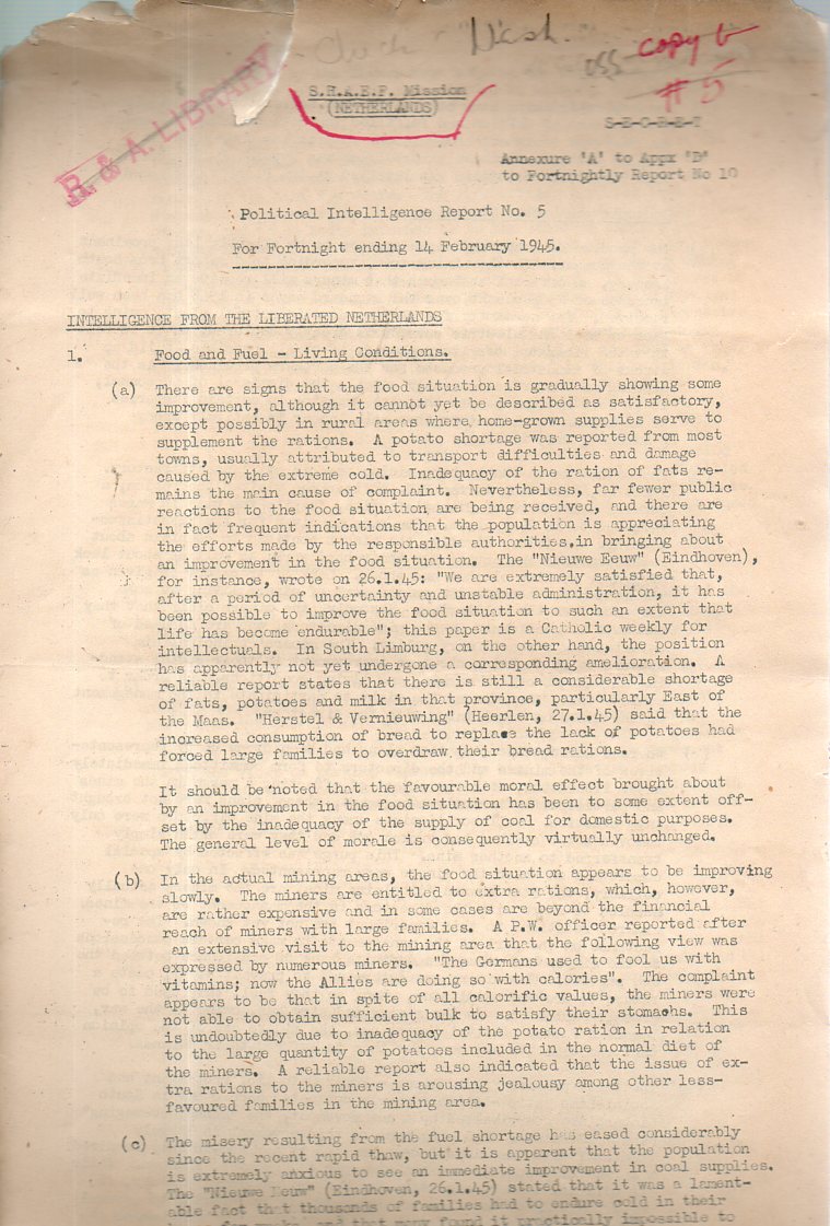
This is a detail of 10% or so of a document here, something that was printed regarding the socio-political temper of the liberated Netherlands in February 1945.
And so: “S.H.A.E.F. Mission (Netherlands) Political Intelligence Report No. 5. (For Fortnight ending 14 February 1945) Intelligence from the Liberated Netherlands” are the running headers. And of course there’s the “S-E-C-R-E-T” part of it, no doubt necessary then but hardly now. The paper includes a report on food and fuel and living conditions, labour and employment, attitude of the population to the Netherlands government, attitude of the population to Allied troops, and so on. What I found very interesting besides the report are the trails of where the document has been.
First, here’s the front page of the document in full:
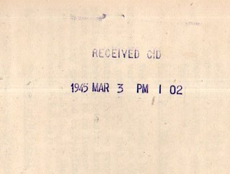
To interpret, SHAEF was “Supreme Headquarters Allied Expeditionary Forces”–the hand annotations and stamps do say where the document has been. First off, we’ll start with the stamp on the back, which may have been the first stamp overall:
The paper was received by the CID on 1945 Mar 3–now the CID could have been a number of things but when placed in context with the notes on the front, the CID becomes the “Central Information Division”, which was the O.S.S. (Office of Strategic Services, and the precursor to the C.I.A.) and the R & D (“Research and Analysis Branch”). Underneath the hand-written “O.S.S” is a most-erased name, a Lt. Col. ________. This is where the Found-Art comes in, because here I tried my trickery and foolery to pull out the name, but I failed, only being able to grab a couple of letters. The result though was interesting in itself, if not for who Lt. Col. ______ was. And so, there you have it, a little exercise that went off into the rabbit hole, producing something interesting but not useful. That happens a lot.