A Daily History of Holes, Dots, Lines, Science, History, Math, Physics, Art, the Unintentional Absurd, Architecture, Maps, Data Visualization, Blank and Missing Things, and so on. |1.6 million words, 7500 images, 4.9 million hits| Press & appearances in The Times, Le Figaro, Mensa, The Economist, The Guardian, Discovery News, Slate, Le Monde, Sci American Blogs, Le Pont, and many other places… 5000+ total posts since 2008.

Category: Industrial & Technological art

  • Ships in the Skyline Part III

    JF Ptak Science Books LLC   Post 291

    1ebay_sept_30cunard_skyline_detail6
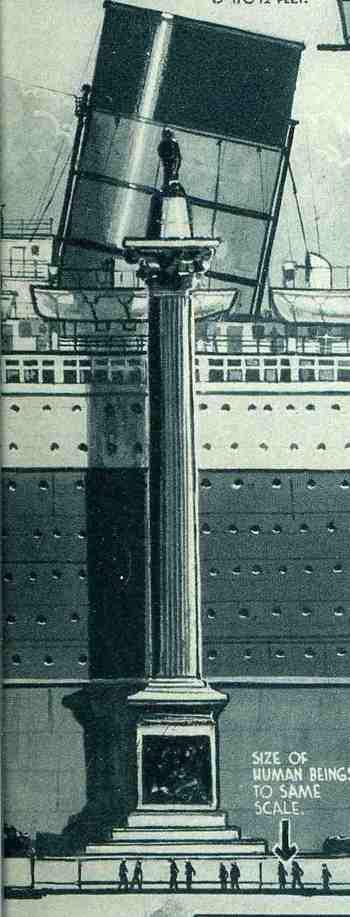
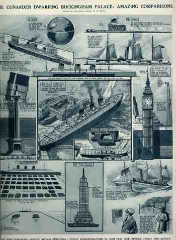
    In another unlikely-to-be-added-to category, Ships in the Skyline, I’ve found, surprisingly, a third installment. (I guess that there are many more as I’ve found these guys without actually looking for them, though perhaps that is the trick to finding things (that you don’t need).)  The comparisons that we see here for the ship The Cunarder, appeared in The Illustrated London News for 29 September 1934, and the skyline that it  is favored against is  London’s Big Ben.  Interestingly, the graphic goes on to compare the powertrain of the ship to 100 “Cock o’ the North type locomotives” to generate its 200,000 horsepower; also, the amount of steel frame found in the ship  (32,000 tons) is comparable to the steel framing of the brand-new Empire State Building (58,000 tons in the steel framework).  Of further interest is the relief of a human set against the Nelson Column in Trafalgar Square and the top of the ship’s fore funnel (reaching 170′).  This is just fantastic design and some good thinking about how to make the dimensions of the ship more understandable in everyday terms, and thus compares it in size and capacity to stuff that people see most every day, or at least know.
    1ebay_sept_30cunard_skyline_detai_3
       

    1ebay_sept_30cunard_skyline690


  • A 117×1 Mile Blanket of Planes: What 185,000 Planes Looks Like

    JF Ptak Science Books  Post 289

    1ebay_sept_30185000_planes695

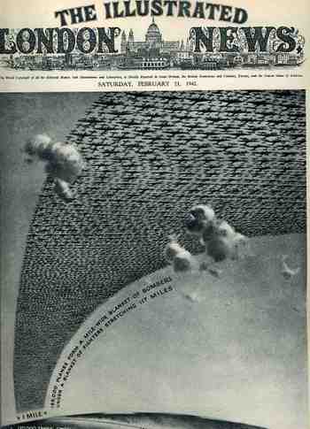
    This arresting cover image for The Illustrated London News of 21 February 1942 illustrates the (new) American production program for planes and tanks for 1942 and 1943 (It reminds me too of an earlier post I did with a similar cover for LIFE magazine here.) The caption reads: “185,000 planes form a mile-wide blanket of bombers under a blanket of fighters stretching 117 miles” which is actually a double blanket of planes–if they were thinned out to form one layer it would stretch one mile wide from Washington D.C. to New York City, which is quite an unimaginable ribbon.

    1ebay_sept_30185000_planes_detail69

    The reality of the situation was greater than this:  by 1945 over 300,000 planes were produced, 275,000 of them after Pearl Harbor.  And this from a combined aviation industry which before 1939 had produced fewer than 6,000 planes a year.  The war effort increased this by orders of magnitude, and by war’s end there were 81 production facilities with a combined area of 175 million feet, all bumped up within four years.   I’ve never read about it, but I have no doubt that one of the key ingredients to this sort of hyper-successful undertaking was organization–the oversight and control for this process must’ve been fast and decisive, with little room for mid-level anything.  I think that this is the only way the whole thing could’ve worked so well. 


  • The Beauty of Drill Bits in the Dark Days of 1918

    JF Ptak Science Books  Post 287

    1ebay_sept_30drill_bit697

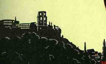
     This striking ad for Emil Steinrurck’s drill bit manufacturing company (Verlangen Sie Spiralbohrer-Katalog und Lagerlisten) appeared in the magazine Motor for July/.August 1918, just a few months away from the German defeat in WWI.  Steinruck’s Heidelberg business was making some massive, industrial  drill bits is all I can say, and they had a designer and artist who figured out exactly how to relate this to the motorheads reading this magazine–all care being taken and monies spent just as the guns of August turned into the corrupted plougshares of November.  What self-respecting machinist wouldn’t, or couldn’t, appreciate the beauty and depth of this thing even if a rusty old railway car was waiting just minutes in the future to spirit away the immediate future of Europe?  The small detail (of the factories and whatever weirdly empty buildings there were in the background) were miniature works in themselves.1ebay_sept_30drill_bit_detail698


    On the other hand, on the back of this full page ad appears another–a frilly, high-nouveau-y grillwork ad for the Horch automobile, forming the other representative book end to the manufacturing process.  Horch began producing 4.5 hp automobiles as early as 1901, and by 1918 had improve and upgraded to produce high-end luxury automobiles. I can’t determine what exact model of Horch this is in the ad, but I can tell that it is massive, with a tremendous wheelbase.  (Horch would merge/found Audi in 1932 and meet its fate in Allied bombing raids during the war.  It survived but in the hands of the Soviets who used the machinery to produce the Yugo-like Trabant (Trabbi”) sub-compact “car”. I guess that the artwork is sorta beautiful in its way. 
    1ebay_sept_30drill_bit_detail699

    1ebay_sept_30drill_bit_detail700


  • The Art of Writing in the Dark: a Fire-Lit Alphabet,1808

    JF Ptak Science Books LLC, Post 265

    Blog1sept_6_writing_in_dark515

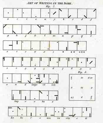
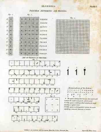
    This curious illustration appears in forty-five volume Cyclopedia of  Abraham Rees (published 1795-1820), displaying a system for communicating over distances at night.  When this part of the Cyclopedia was printed in 1808, the electrical telegraph was still 37 years away from coming into being–45 years from being somewhat well-used.  Before this time (visual) communications over long distances at night were limited to just these sorts of means–lighted semaphores, hand-held torches, that sort of thing.  Signaling at sea at night was somewhat different at this time and didn’t include anything remotely close to the alphabet.  So the rather complex system that we see at left is extremely uncommon–it seems also very cumbersome to put into effect.  Unfortunately I don’t have the text volume that would explain then entire system and implementation, so I’m going to guess that there was a large, powerful light source that was covered by a tight, black, covering tablet that would eliminate nearly all light leakage.  The symbols for each letter of the alphabet (and numerals) would be cut out from another tablet that would fit over the face of the light source, placed between the blank and the light.  To transmit a letter the user would then simply remove the blank covering tablet to reveal the light broadcast by the hole or slit in the tablet underneath.  The blank would then be placed back, a new tablet for a new letter placed underneath, and the process would begin again:  blank (dark); letter (light); blank (dark); letter (light), and so on to the end of the message.   I guess the distance at which these symbols could be seen would be dependent on light source, atmospheric conditions, ad so on.  The way that the letters are made into symbols seems to me very intelligent, so that you distinguish the differences from an appreciable distance.  I like it–its an elegant idea.  (Well, maybe it didn’t work in this manner, but it seems to make sense to me.)

    The image of the full sheet:

    Blog1sept_6_palpable514


  • The Magnificent Mundane: an Instructional WITH PROP on How to Use the Telephone, 1946

    JF Ptak Science Books LLC  Post 236

    Ballistics_049Yes, this elegant, well written (oversized) 1946 pamphlet, which explains
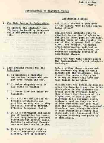
    in fabulous and excruciating detail how to use the telephone, does
    indeed come with a two-part heavy paper telephone receiver for the reader’s practice. It is packaged in an envelope in the back of the
    pamphlet with a large drawing explaining how to put the two pieces
    together.   The work is just so fulsome, wholesome, forthright,
    exacting and thorough that it just makes the casual reader stop in
    their tracks.  For example, it isn’t until page 13 that we get to pick
    up the receiver (and listen for the dial tone). I’ve reproduced some of
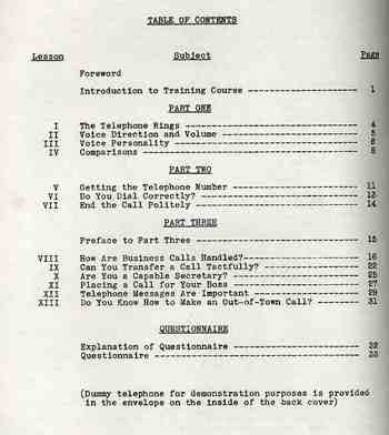
    the table of contents to give an idea of the extent of the telephone
    usage. 

    What brings this so close to being from out of the science fiction
    past is that the booklet is ten years older than me.  Atanasoff’s ABC, Bell Labs Mark II, Bletchley’s  Colossus, and Harvard’s Mark I machines existed, television was getting off
    the ground, and telephones were exploding their way into more American
    homes and businesses.  But somehow, here on the verge of the greatest electrical revolution in history, we’re still getting instructions on how to pick up the telephone.  But I’m really not complaining here, not at all–its just the nexus of the “how to listen for a dial tone” and the coming of the ENIAC one year after this pamphlet is published that is so startling.

    Even so, this instructional is more complete and (of course) better written
    than any of the pc manuals that came with any of the machines that I’ve
    purchase int the last 25 years. It is a thing of great and supra-obvious beauty.

    Again, this is another example of a small job done Very Correctly.

    (Click on image to expand.)

    Blogsept3_tele489
     

    Blogsept3_tele490


  • The Tree of Life and Coal’s Phylogeny–a decent Diagram but a Bad Idea

    JF Ptak Science Books LLC  Post 165
    Blogcoal_tree318

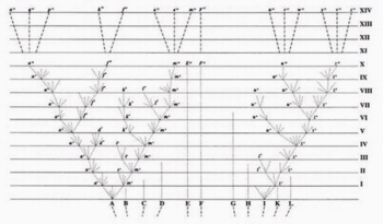
    Even though this is a simple classification scheme, and a
    very-well designed graphic at that, the use of the tree describing the genealogy
    of coal by-products just seems, well, wrong. The use of the tree in defining a visual phylogenic interrelatedness of
    living things appears pretty much for the first time in the first edition of the
    Origin of Species in 1859, and it is the only diagram that appears in the
    book. (And by this I mean the use of the tree-scheme for scientific purposes:  the tree of life of course has been used for many, many centuries, the philosophical design woven into the fabrics and incised into the stone of many cultures.  It sort of appears in print in classification usage at least by the wily and polymathic Athansius Kircher, who used it to display the elements in a Kabbalistic Tree of Life some 350 years ago.)
    The Verkaufsvereinigung fuer
    Teererzeugnisse (of Essen) used this idea in
    1922, publishing the ad for their company in the Illusrtriete Zeitung (Leipzig). The great tree spring from a bed of coal (“kohle”)
    exhibiting the “stammbaum der nebenerzeugnisse” (roughly the “pedigree of our
    product”), with the trunk being gas, branching out into tar, coke and cyan and
    so on.  Even though it’s the lifeblood of
    the continuing industrial revolution, and even though we’re hundreds of years into
    a deep need with the products, the use of the tree just seems antithetical to it
    all on all levels of recognition, especially now. 

    (The Darwin tree of life is below.)Darwintreeoflife


  • The Earliest, Instantenous, 3-D Modelling Device? A Primitive, Metallic “Polaroid” Portrait in 1836.

    JF Ptak Science Books LLC Post 165
    Blogphysiog320
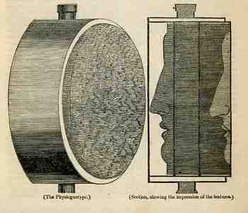
    In the “Spirit of Discovery” section of the British weekly magazine The Mirrour of Literature, Amusement, and Instruction for 22 October 1836 is a short notice on the “physiognotype”, “a machine for taking casts, lately invented by a gentleman in Paris”.  We’re accustomed to these devices now as they’ve been for sale in toy shops for decades—but in 1836 it was a real breakthrough for making instantaneous three-dimensional models of small things.  In 1836 there really wasn’t any simple way of producing a direct, proportional model like this in 3-D except for encasing it in plaster and then casting from that mold.  Two-dimensional modeling was easier, and there were numerous devices constructed for this purpose as people pursued the still-hot rage of physiognomic forecasting, with simpler means (like shadow portraits) being hundreds of years earlier.  (Photography remember is still three years away from being announced and another few years from being sort of accessible to middle-class folks.) 

    This device was simple and cool, and it worked.  It was basically a board with a mesh of tiny holes drilled into it through which were placed knitting needles (it looks as though it was 12” around or so and four inches deep), bound in wood, with the enclosure encased by a bladder of warm water (“to ensure that the needles moved with the greatest facility”)—this last bit was really a good idea.  You were left with a “brush of needles”, very densely packed, and very easily disturbed.  The author writes that the process took about two seconds, didn’t hurt at all, and caused “a sensation that cannot well be described”.  (Though he did state that if the instrument wasn’t warmed by the water the process would’ve felt like putting your face in the snow…does that mean it felt like putting your face in warm snow?) 

    I’ve tried, briefly, to see where this invention went, but it seems not to have advanced far beyond the reach of quack medical practioners and magicians.  It seems as though something like this could’ve been useful in the machine shop for modeling (replacement) parts without having to take the machine itself apart to do it.  I guess that it could’ve been used by haberdashers, cobblers, and all sorts of other craftspeople and small manufacturers, but it seems as though it actually wasn’t.  It looks like a dandy piece of thinking, to me. 


  • Simple Sublimity: Images of Disappeared Common Objects. Traffic Lights, 1936

    JF Ptak Science Books LLC  Post 154
    Blogtraffic262

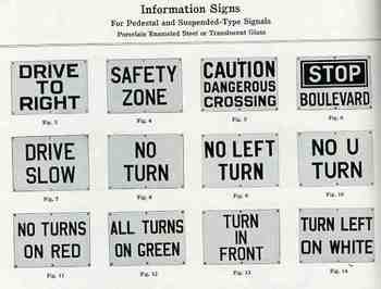
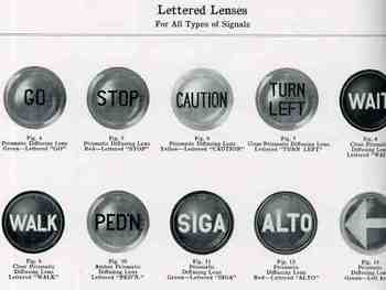
    These images are about as basic as it gets for the common, everyday, overlooked objects from the disappeared past.  They come from the Course-Linds manufacturer’s catalog for traffic lights and other control systems called, yes, Traffic Signals and Controls, published in Syracuse (NY) in 1936. It is a beautifully designed catalog—excellent illustrations laid out perfectly on their pages, with all of the data you’d ever need to order these things for your municipality. 
    Blogtraffic263

    What I find so fascinating about the images here is that they depict ubiquitous objects that today would today—given their ephemeral nature—be exceptionally difficult to find. 
    Given this catalog, today they are not.


    Blogtraffic260

    Blogtraffic259_2


  • Fantastic and Unbuildable Architecture #6: the Pyramids of Gizeh in Detroit (Michigan), 1908

    JF Ptak Science Books  Post 137

    Because strait is the gate, and narrow
    is the way which leadeth vnto life,
    and few there be that finde it.

    –Matthew 7:14

    Blogprymmidelevtion216

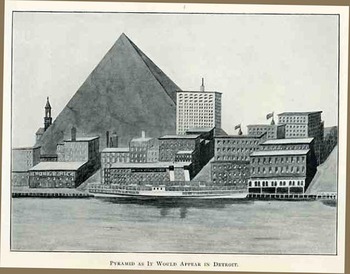
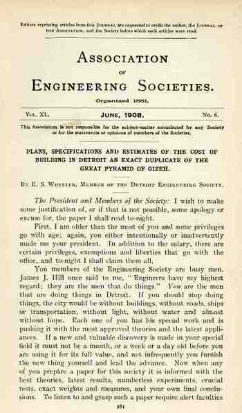
    And so it came, somehow, to be that E.S. Wheeler, president of the austere and august Association of Engineering Societies, presented a paper at its annual meeting in June 1908, on building an exact replica of the great pyramid of Gizeh.  I suspected that because of the intentionally fantastoid title that Mr. Wheeler intended the paper as a show, exhibition, to the younger engineers in the audience about how one might approach an unusual engineering problem, as an imaginative course of instruction.  That would be quite nice. 

    Except though that Wheeler presented the paper as though he was serious.  He delivered  it evidently with a high dryness, and people took him seriously.
    Blogprymmidpln215

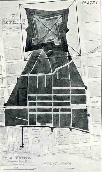
    The pyramid was to be built on the site of the village of Cadillac (of 1701), in central Detroit, occupying that site and then some, covering it with 13 square acres of stone.  Oh, yes, and it was also to be excavated, scooped first into a shockingly cavernous prism 759’ on each side and 120’ deep, or about 2.6 million cubic yards of stuff.

    The pyramid itself was to be built almost entirely of limestone, 760’ on each side, and 485’ high, set on the 13 acre base—where those 13 acres in the center of Detroit was left open to debate. Wheeler also intended to reproduce the interior of the pyramid as well (so far as it was known in 1908), and had a set of plans to accomplish that goal. 

    Wheeler figured that the material cost (exclusive of the base), would be $36,000,000 1908 dollars, which he considered a fair price.  The conclusion of his paper was a superb slash of logic and possibilities—he calculated that if each person in the United States contributed the equivalent of a day’s labor on the building of the pyramid, that the great structure could be built in a day and a half.  Wheeler closes with this superior gem, a sentence unlikely to be repeated in any subsequent technical journal”  “If the United States should stop all other work and devote itself entirely to building pyramids, as was probably the case in Egypt, it would, after it got fairly running, be able to turn out two every three days.
    Blogprymmidtp214    


  • The Art of Industry and Technology 1: Locomotive Roundhouse, ca. 1942

    JF Ptak Science Books LLC Post 132
    Roundhouset1


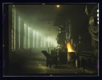
    I’ve admired this image for quite some time, finding it in the Library of Congress’ collection of the Historical Section of the Farm Security Administration (FSA) color photographs.  It is anonymous, unfortuantely, but since there were really only 23 or so staff photographers for this gigantic undertaking (including Esther Bubley, Marjory Collins, Mary Post Wolcott, Arthur Rothstein, Walker Evans, Russell Lee, Jack Delano, Gordon Parks, Charlotte Brooks, John Vachon, Carl Mydans, Dorothea Lange and Ben Shahn, 10 of which are truly monumental names in the history of 20th century American photography) I think that we could guess that it was done by the hands of a master.  It seems as though less than 2% of the 163,000 or so photographs made by this section during its eight-year run (1937-1945) were made in color, and I’m glad that this was one of them.