A Daily History of Holes, Dots, Lines, Science, History, Math, Physics, Art, the Unintentional Absurd, Architecture, Maps, Data Visualization, Blank and Missing Things, and so on. |1.6 million words, 7500 images, 4.9 million hits| Press & appearances in The Times, Le Figaro, Mensa, The Economist, The Guardian, Discovery News, Slate, Le Monde, Sci American Blogs, Le Pont, and many other places… 5000+ total posts since 2008.

Category: Industrial & Technological art

  • Triumphantly Unusual Images of the Eiffel Tower

    JF Ptak Science Books LLC  Post 732  Blog Bookstore

    ===blog--aug 26==eiffel

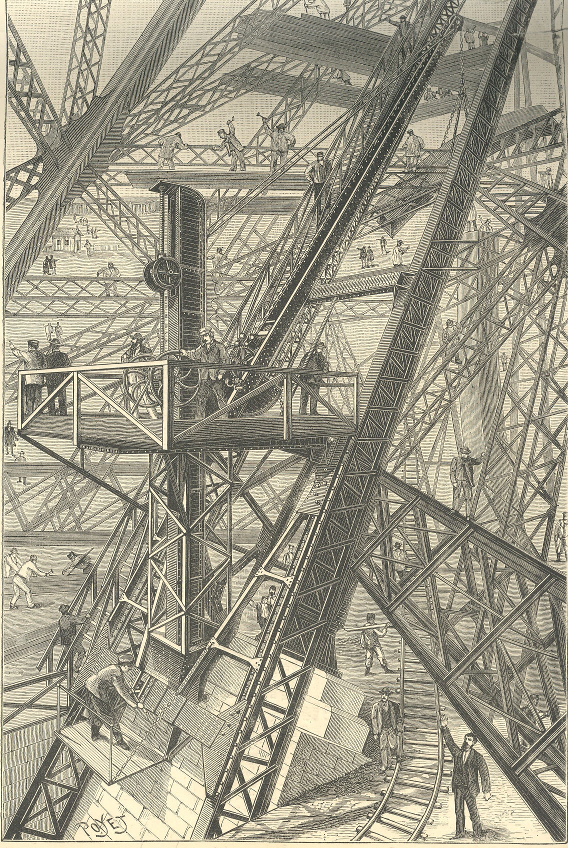
    This image of the building of the foundation of the Eiffel Tower, which appeared in the
    Scientific American in 1888, appears both orderly and chaotic, a dizzy miasma
    of activity and a confusion of right angles. 
    (My six-year-old Tess says that it looks “worky”.)  Part of the issue is the fine quality of the
    jumble, with 90-degree angles everywhere, which confuses the eye.  Another part is the perspective, which is odd
    in places, and which takes the whole of it and makes the print into a near
    Escher-like experience of impossibility. 
    IT is this spatial confusion which makes this print so uncomfortable to
    me. For instance it seems that the observer’s point of view may be in several
    different positions, depending

    Eiffel odd

    on where you resolve to fix our eye: if you choose
    the worker’s shed in the upper left corner as a reference point, the height of
    you viewpoint will be different than if you used, say the first pointing man in
    the foreground as reference.  Also that
    pointing man sands next to a little rail track that seems to hoist itself into
    the air before disappearing.  There’s
    much else, but these examples will do for present.

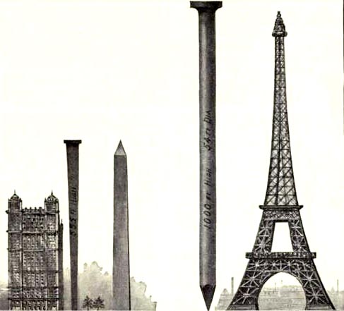
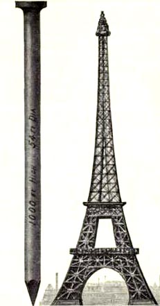
    These other images are the first nail & Eiffel Tower images I’ve ever seen.  The explanation is simple enough, though I think I’d much rather not know. 

    This image and data is from the generally useful data and
    interesting if not useless info Scientific
    American Reference Book. A Manual for the Office, Household and Shop
    ,
    by Albert A. Hopkins, and published in 1903. It gloriously depicts the annual American finish nail production in terms of Eiffel Towers:  there were evidently 10-million 100-pound kegs of these nails made in 1902; if they were made into one big nail, it would be this one–52′ in diameter and 1000 feet tall.  I guess another useful visual bit would be the representation of the number of new houses built/kegs of nails, which would make this image a little more meaningful; though, perhaps, we may not be going for meaning, here, necessarily.


    Eiffel odd det


  • Telegraph “Fax”, 1895. Transmitting Images by Wire & 120-Year-Old Emoticons

    JF Ptak Science Books  Post 701     Blog Bookstore

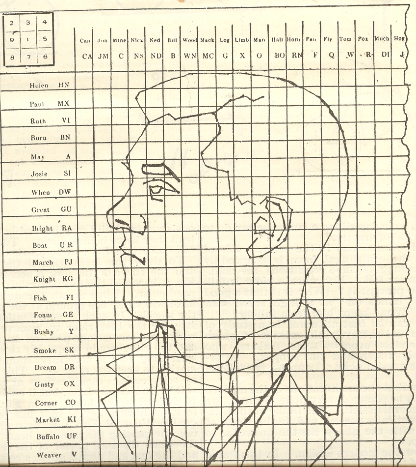
    ==Blog July 28=tele port 1This Scientific American article on the smart/odd/analog transmission of pictures via telegraph (14 September 1895) by W.H. Lowd, can make you say “ohhh, of course” out loud.  Mr. Lowd’s insight came fifty years after the Morse telegraph came into being, thirty years after it becomes the greatest means of communication, twenty after the first multiplex telegraph, and in the same year as Marconi’s first successful wireless transmission.   It was though an ingenious inspiration whose utility lasted for about 60 seconds—which is about how long it took to develop a smarter way of transmitting an image in its entirety.

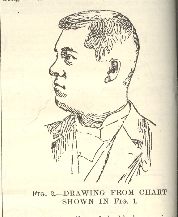
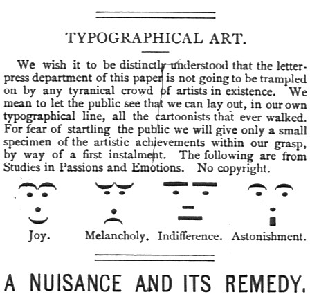
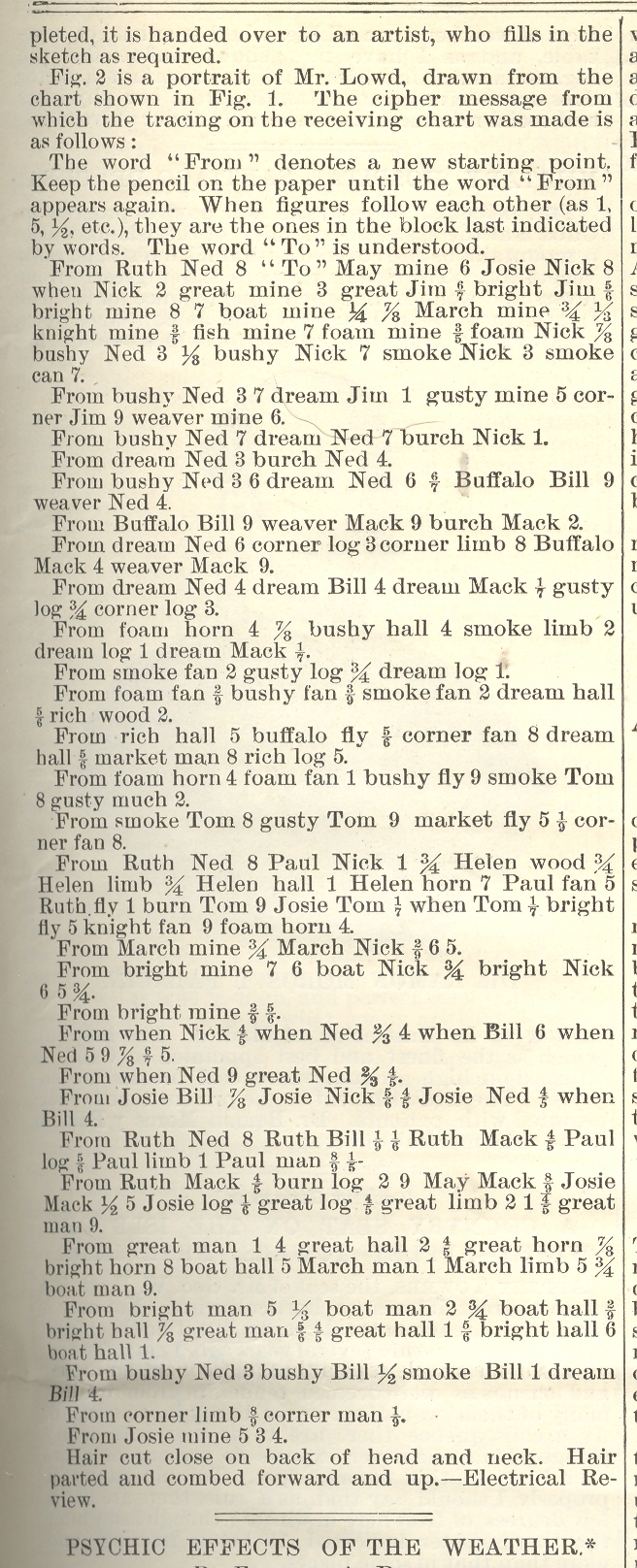
    Mr. Lowd recognized that he could transmit the outline of a picture by placing on opaque tracing of the picture on top of a telegraphic ciphering sheet and then transmitting the coordinates, which when received on the other end could be connected by short lines into the picture that was being transmitted from the sending end. ==Blog July 28=tele port 2 Images constructed of numbers and letters and such had been made for centuries before this; this however is a very early use of this idea that was employed to human-representational transmit the object electrically over distances by wire.  Emoticons—a more abstract version of this idea–such as we know them today are actually better than 150 years old.  They appear as early as 1857 in the telegraphers’ world, and somewhat earlier in the typesetter’s arsenal. (For example, a later attempt, taken from Puck Magazine No. 212, page 65, 30 March 1881, shows us something that we took to be “new” in the 1980’s as having roots that spread downwards into history by another 120 years.)

    ==blog==july 29=Puck

    But Mr. Loud’s idea was pretty, I must admit, even though it was far from being the answer to the question it addressed, with a more pleasing, technology-based solution appearing by 1899. 

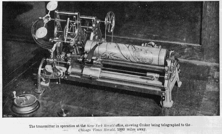
    (A successful apparatus for the true transmission of an image by wire is seen here, below, and was produced in 1899/1900.) ==blog==july 28==pics by wire

    The other bit that is interesting is that this transmission of an image necessitated an early Surrealist-like poem, dictated by the cipher/codes that were use by necessity to send the picture. 

    ==Blog July 28=tele port 3


  • A Long, Low, Massive Circle: Circular Building, 1938

    JF Ptak Science Books LLC  Post 639  Blog Bookstore

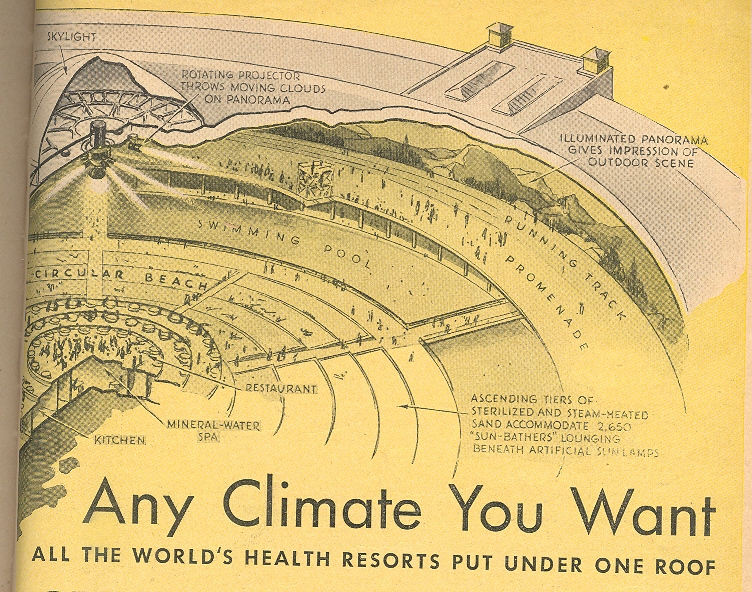
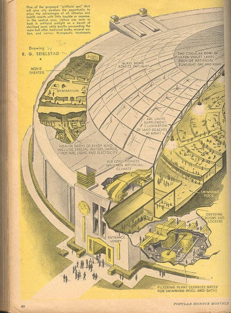
    This re-surfaced idea for a
    mega-spa was very wide, very long and very low. 
    Karl Stoldeck and J. Goldmerstein—architects and planners in Berlin—published
    a broad idea in 1928 called Thermenpalast (Thermal Palace, Spa Space, something
    like that), and although it seemed to satisfy almost everyone, the idea was
    consumed in the general economic malaise of the depression of 1929.  It looks as though the idea had a little life
    again in 1934, but there was a problem with fund raising.  The idea came back again, broader, bigger,
    and more defined, finding some idea-space in the Popular Science Monthly for
    March, 1938.

    Blog--jun 6 1

    The structure for health and
    exercise was massive—as a matter of fact, it would’ve been the most massive
    circular project in history.  The
    building had 6.5 acres under glass, which makes it 280k or so feet, giving the
    building a diameter of 1,800 feet and a circumference of something just over a
    mile.  IT looks as though the ceiling
    reached a maximum of 250’ or so; seeing that the dome would also be about 1200,
    that presents a little engineering problem. 
    But no matter:  it would never be
    built, anyway, even with Nazi dollars from home.

    The building was quite a feast
    of the body—there was a mountainside panorama around the exterior wall,
    illuminated from a  series of light sources
    from the ceiling.  In diminishing concentric
    circles: there was a mile-long running track, a promenade just inside that,
    followed by a spectacular pool which looks to be 4000’ long and 100’ wide!  Interior to the pool was a wide “beach”, a
    restaurant, park and lounging area.

    Blog--jun 6 2

    This was also a multi-floor
    building, with gyms and restaurants and a long series of health baths.  The entire spectacle would offer many
    different climates depending on the needs of the clientele. 

    The cost:  6 million, U.S. A few years earlier the Empire State 
    building was built for $24,718,000. The
    architectural firm Foster + Partners

    released designs for a the largest building (“Crystal Island”)  ever built: 
    2.5 million square meters (8.2 million feet, or 35 times bigger than
    this 1938 idea), with a tower 1476 feet tall, all sort of circular, and to be
    built in Moscow.

    Had the thing been built in Berlin and started in
    1938, it would’ve been about ready to bombed on the day of its completion. 

    Here’s an interesting read on water parks:  Water, leisure and culture: European historical perspectives, Susan C. Anderson, Bruce H. Tabb, 2002.


  • A Short Homage to the Alphanetical Past of Union-Made American Brooms

    JF Ptak Science Books LLC  Post 584
    Blog Bookstore

    I was breezing through what seems to be an innocuous forgotten document:  the 1941 Union Label Catalogue-Directory. It lists the union labels of trades who were part of the American Federation of Labor (AFL), a 32-page pamphlet advising its readers on how to hunt for union-made goods, and to get the union-earned dollar spent with other unions. Even though only 68 years old, the list of unions seems far more antiquarian, the unions and the jobs/workers they protected seemingly from another, earlier time: the Allied Printing Trades, Cigar Makers, Clerks Protective Association, Glove Workers, Hatters, Horse Shoers, Meat Cutters, Pocketbook Workers, Novelty Workers, Sheep Shearers, Stereotypers, Telegraphers, Wall Paper craftsman, and on and on.   

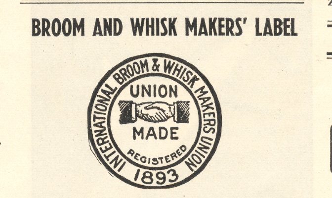
    But it was the broom and whisk makers union label that really struck me. There is something beautiful and sad in this design–the design is lovely as is the idea of the workers who were probably protected by the union; what is instantly saddening is the recognition of the incongruity that such a trade was widespread enough to need protection and organization, and how far gone such industries are. Really gone.  Blog--broom

    Looking through the names on the list of union shops of broom and whisk makers suggests elements for a poem on vanished brooms.  There is of course the Ace Broom Company, and the Acme, and, yes, the American Broom Company; followed by the Amor, Artzcraftz, Baria, Bard, Birminham, Best, Brown, Buckholtz, Burlington, Coleman, Continental, Eagle, Galesburg, Haferman and Hanset, Ideal, Imperial, Lighthouse, Mid-West, Montana, M & M, Mutual, National, Progress, Progressive, Rainbow, Reliable, Rich, Royal, Western, Terre Haute and Zenith.  The “R’s” have the field, hands down. 

    The pamphlet ably describes the design and its color, and where the label appeared on the product.  In the case of the brooms and whisks, it also assured the purchaser that the product was not made by “contract prison labor”.  (I have a prison-manufactured catalog from Angola Prison here that I’ll have to write about some day–published in 1937, it was glossy and thick, offering hundreds (?!) of items for the office and home, but mostly heartpine and heavy oak goods for white collar consumption.  The scale of the operation is pretty surprising to me.)

    I like the whole idea of the handshake, the square deal, the care in the construction of the broom.  I just looks right.  And as you well know a good broom is a thing of beauty–it will do its just correctly and last forever. 


  • A Battleship in Union Square: the “USS” Recruit, 1917, & the Invention of the Word “Landship”

    JF Ptak Science Books LLC  Post 559

               blog 23 recruiot shiop727
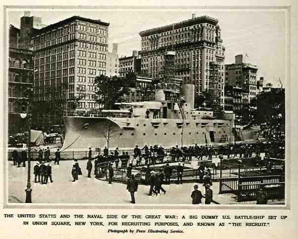
    Well, perhaps this isn’t the origin of the word “landship”,
    but it does make for a snappy title.  The
    fact of the matter is that the Mayor of NYC, John Purroy Mitchel,  had this model of a ship (designed by Donn
    Barber and Jules Guerin, and sort of based on the USS Maine) built to attract greater numbers to the city’s recruiting station,
    as it lagged behind the established quota of 2000 enlistments for the Navy with
    only 900 men.  The 200 x 40 foot landship
    did the job, gaining 25,000 recruits (until it was disassembled in 1920),
    though it didn’t work very much magic for the mayor, who lost his election
    later in the year.  Actually, the gung-ho
    Mitchel lost his entire life in 1918, after volunteering for the Army Air Corps and
    dying in a training accident. 

    ZZZZZZZ]


  • Ars Memoria–Giordano Bruno and the Art of Memory

    JF Ptak Science Books LLC  Post  509
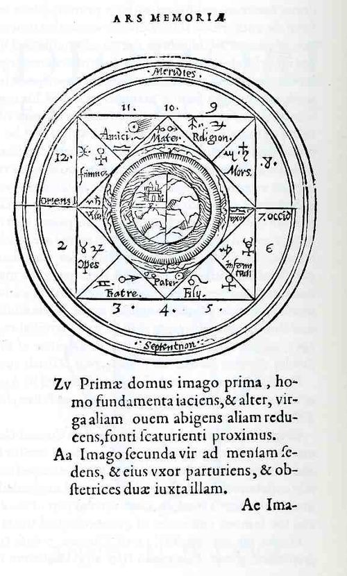
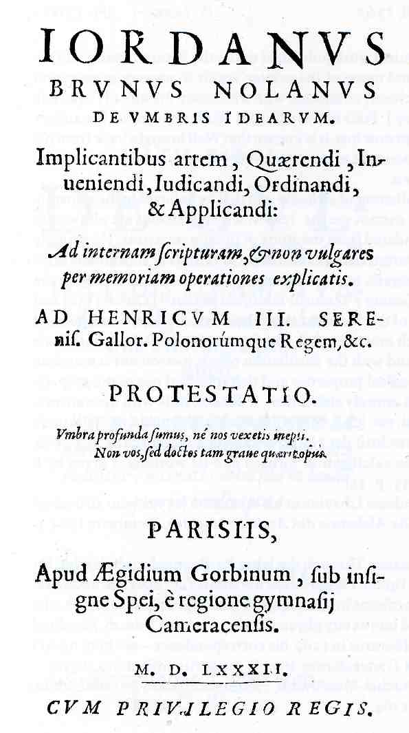
    0 blog feb 9 bruno memory545

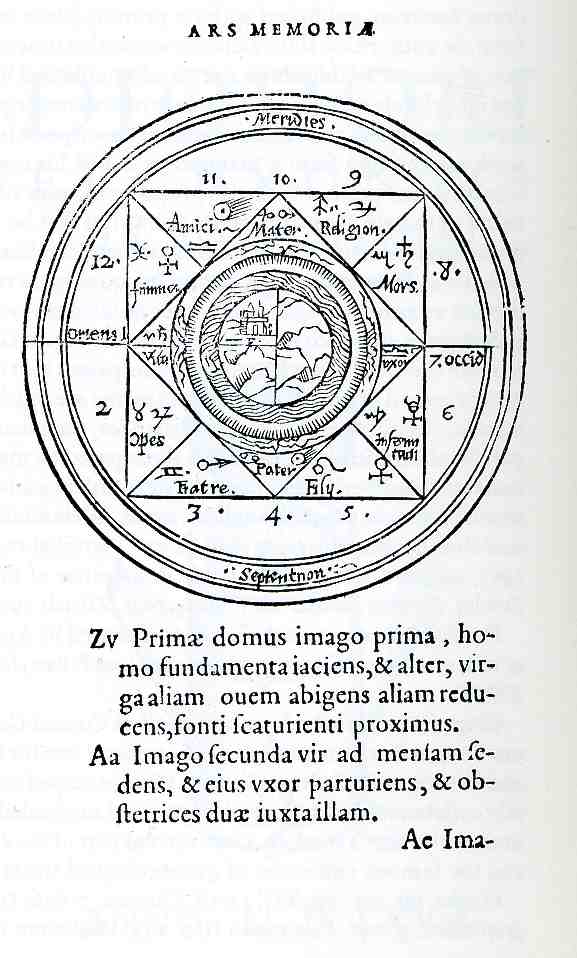
    The images presented here today are related to graphical memory, ars
    memorativa
    , the technique of aiding the storage (and retrieval!) of info in the
    human brain.  This was accomplished  by mnemonic devices that associated the
    location of the data with a striking or jarring or geometric image, all
    structured in such a way that the correlation of the continued image would
    relate to more and deeper remembered information, one bit leading to the next,
    expanding into other bits, and so on, in a kind of fractal way.  The visual tools held a space for the data;
    they were a constant structure into which information could be poured, allowing
    for chains of info to be formed and retrieved. 
    And so by the effort of visualizing the structure of where the memories
    where (supposed to be) the user would be able to recall them by simply
    remembering their placement, and since the structure built on itself, one
    memory would lead to the next, and so on, a cascade of rushing memories.

    Giordano Bruno (who I wrote a little about here some time ago) established
    his system in 1582 based upon the concentric circles of Raymond Lull, grouping the
    circles with symbols and letters and other designs,. Forming tighter cells of
    memory, much in line with the long practices of the later Hermeticists. 

    0 blog feb 9 bruno memory546

    Part of the goal, it seems to me, was to be able to not only recall this
    information, but to be able to get it out of the way, so to speak, to be able
    to put all of the factual stuff necessary to think in a safe place so that real
    thinking could be done.  Bruno was one of
    those who tried to go beyond the veil of the known by having a clear,
    orerdly mind.  Also, the process of
    getting there—to the point where you have a lot of info loaded into these
    memory spaces—involved lots of quiet time, or meditation, or deep thought, or
    something, which also led in that inexorable way to a finer modality of
    thinking.  (Jeff, Laura?) Perhaps it was
    a mode of composition that could only come after long, deep meditation and
    memory exercises.

    Certainly this approach to though/logic/rhetoric/composition is nothing
    new.  Ancient it is, really.  This sort of process reaches way back to the Egyptians,
    and to
    Cicero‘s
    De oratore
    (Bk II 350-360), and the
    Rhetorica
    ad Herennium
    , (ca. 90 BCE), and Quintilian‘s
    Institutio Oratoria (Bk XI), and (of
    course)
    Aristotle
     
    On The Soul
    and
    On Memory and
    Reminiscence
    ; to the delightful Matteo Ricci
     
    A Treatise On Mnemonics
    and to
    Simonides of Ceos, Saint Thomas Aquinas and Cosmos Rossellius
    Theasurus artificosae memoria (1579).;
    to Jacobus Publicius,
    Oritoriae artis epitome,  Peter of Ravenna, Phoenix, sive
    artificiosa memoria
    ,  and to Johannes
    Romberch,
    Congestorium artificiose memorie. 
    And
    these are examples that don’t get us even out of the 16th century. 
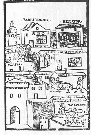
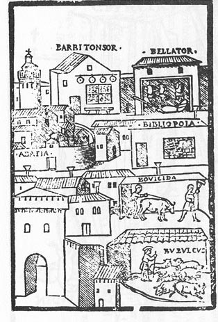
    0 blog romberch

    Some of the writers listed above used memory devices that were architectural in style, or showed levels of the heaven and earth as memory place-holders, or used the human body and body parts to elegantly display to the mind where the memory was hiding on the body.  I’ve included one example from Johannes Romberch–who used city and architectural images in addition to a wide assortment of astronomical, alphabetical and geographical devices–because it is an extremely early depiction of a bookstore (in the upper right, “bibliopola”).

    The practice of the art of memory was taken by some groups as a sort of religious experience–as a matter of fact even in the late 18th century the Quakers thought enough of the practice to want it banned, leading as it did to too much thought on matters that were far strewn from religious tolerances.  Some of the ars memoria practices, like those of Lull, were too far removed into the spheres of the esoteric and astrologic to do much good for the Straight & True believer.  The great historian of memory, Frances Yates in The Art of Memory, says the following about Lull:

    “Lullism had a vast diffusion which has only recently
    begun to be systematically studied. Owing to the core of Platonism, and
    of Scotist Neoplatonism, within it, it formed a current which, not
    acceptable to many in the ages dominated by scholasticism, found itself
    in a much more welcoming atmosphere at the Renaissance. A symptom of
    the popularity that it would gain in the full Renaissance is the
    interest accorded to it by Nicholas of Cusa. In the full Neoplatonic
    stream of the Renaissance, stemming from Ficino and Pico, Lullism took
    a place of honor. Renaissance Neoplatonists were able to recognize in
    it notions very congenial to them and reaching them from mediaeval
    sources which, unlike the humanists, they did not despise as barbarous.

    “There is even, at the heart of Lullism, a kind of interpretation of astral influences
    which would have aroused interest in the age of Ficino and Pico. When
    the Art is done on the level coelum, it becomes a manipulation of the
    twelve signs of the zodiac and the seven planets, in combination with B
    to K, to form a kind of benevolent astral science, which can be worked as astral medicine, and which, as Lull points out in the preface to his Tractatus de astronomia,
    is a very different matter from ordinary judicial astrology…. Lullism
    thus establishes itself at the Renaissance as belonging with the
    fashionable philosophy, and becomes assimilated to various aspects of
    the Hermetic-Cabalist tradition. ”  (p. 187-8)

    Be that as it may, I do have a soft place for Bruno, the defrocked Franciscan who met his end in flames*.  He may have actually been of great value to the birth of modern science, perhaps not–he did seem to have the idea of the infinite universe and the idea of the fluidity of time and space, along with some other stuff (see extended reading) that rubbed the Catholic fur in the wrong direction.  Needless to say, the Church’s foundation felt threatened by Bruno’s cosmological beliefs, and found that the best thing to do about dealing with superior and scientific thinking to their own was to burn the author. 

  • Looking Straight-On at Things in Antique Prints, Part 2

    JF Ptak Science Books LLC  Post 483 (continuing Post 20)

    0 blog jan 23 vickers411
    In one of my earliest posts on this blog I wrote: I’ve always been intrigued by antiquarian images
    that looked straight down, or up, at things–90 degree, perpendicular, real
    straight-on stuff, giving a feel for depth (or height) and perspective. 
    Funny thing is that in the wide world of scientific images, they really don’t
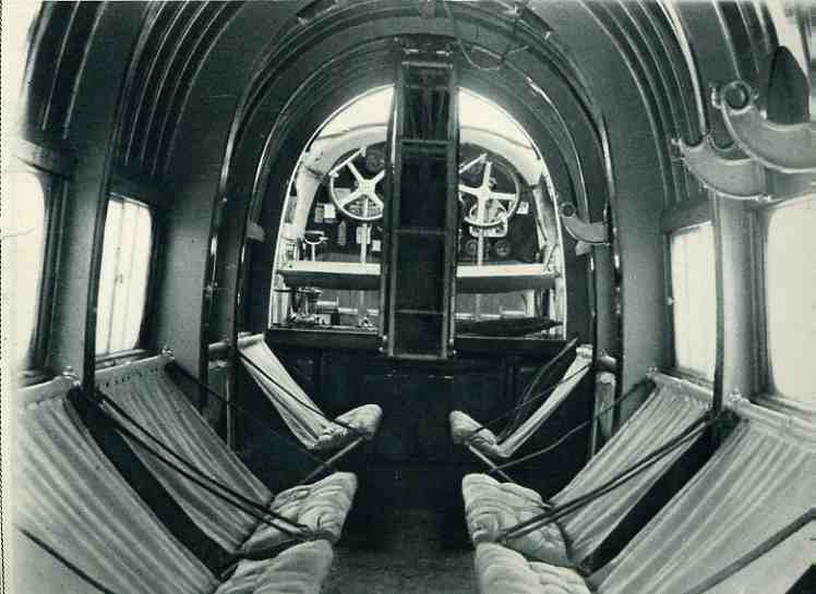
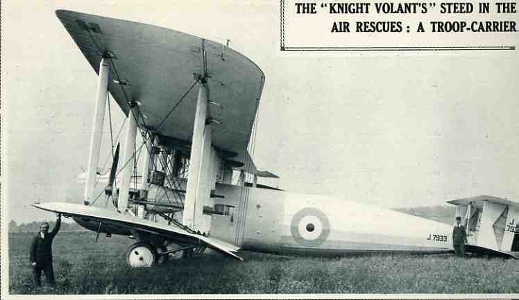
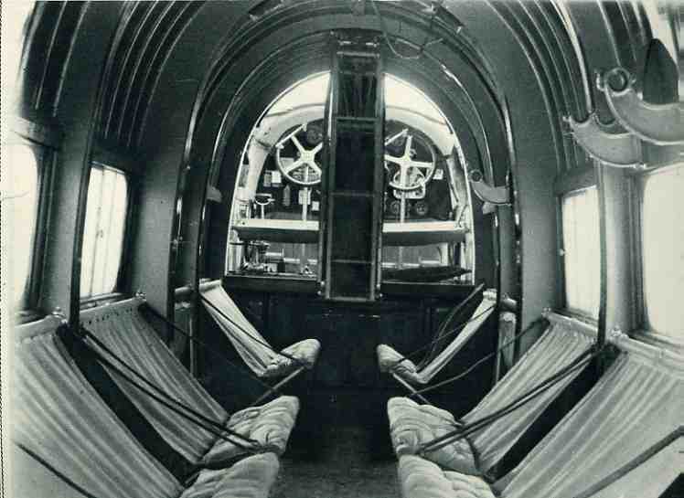
    show up very often.”  Still rue.  I really haven’t noticed that many straight-on images–perhaps the paucity of these things is as simple as them not being “as pretty” as other views.  I have found another, today, showing the interior of the “spacious RAF” Vickers “Victoria” troop carrier aircraft for (January 5) 1929.  It was indeed spacious for the time, and was one of the largest planes in the air. 

    The Vickers Victoria first flew in 1922—this 1929 monster
    was powered by two 570hp engines which allowed it to cruise at a modest 110 mph,
    taking it 11 minutes to climb to 4900 feet. 
    It had a crew of two and carried 22 troops—it looked as though it might
    do more than that, but this was quite a load given the time and the altitude at
    which the plane would function.  As you
    can see by the fellow standing in the foreground, it was a very tall plane—17 feet tall, with a 59’ long body on a massive  87’ wingspan (that made even more impressive
    by the wings’ 2,178 square foot surface). 


    0 blog jan 23 vickers410


    The view here is from the rear of the aircraft looking
    straight forward, and I notice that the pilots didn’t have any backrest for
    their seats.  The interior, even though
    fairly threadbare and essential, did have upholstered seats for the folding
    chairs. 


  • The Car as the Dominating “Life” Form in the U.S.: Finding Places to Rest the Populating Automobile, 1930

    JF Ptak Science Books LLC  Post 481

    0 blog jan 07 car future364

    If I was an alien (of the outer-space variety) looking at the United
    States, I’d find it difficult not to assume
    that the biological units scurrying around the place were not put there to
    service the automobile.  Cars get born,
    then put on display, then selected and driven to their new home.  They get washed, and fed, and sometimes have
    their own places to sleep at night in their very own structure with their
    caretakers housed nearby.  They get taken
    out for airs in the morning and evening, resting while the humans labor all day
    to make enough money for their care and maintenance and feeding.  In the evening, they get brought back home
    and allowed to rest further.  They
    respond directly to inputs only and give no unsolicited response:  sort of like cats.  Fantastically large allowances are made for
    cars, humans going so far as to remove life- and atmospheric-sustaining biological
    units such as trees and good dirt so that the car can be taken virtually
    anywhere in the country on a path made specifically for them.  These pathways, which are padded and smooth,
    have ancillary bits attached to them so that the humans may walk beside them—houses
    and such are all connected to these paths to more easily enable the people to
    have access and maintain the car.  And,
    at the end of the day, humans breathe in the very excrement and excretia
    produced by the cars.  Placed under a
    microscope, the whole thing might resemble a biological unit, the cars being
    its very blood, everything else present to contain and move it.


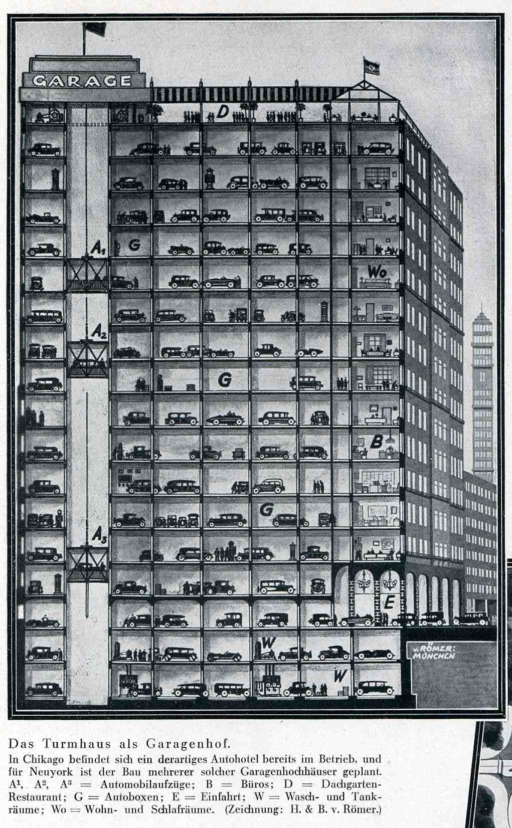
    0 blog jan 222 car bfuture398

    These images from the Illustriete Zeitung (Leipzig, issue
    4484, pp 239-240) for November 1930 speak to the exact issue of how to care for
    the now ever-present automobile. 
    Entitled “Wie Bringe Ich Meinen Kraftwagen Unter?”, the short article
    (by the engineer Botho von Romer of Munchen) addresses the need of what to do
    with cars at bedtime—where do we put them? 
    One answer was this spectacular carpark (“Garagenhof”) high rise—seventeen
    floors of parking (with two more underground), serviced by a variety of
    elevators, pointing out that varieties of this structure already existed in Chicago and New York

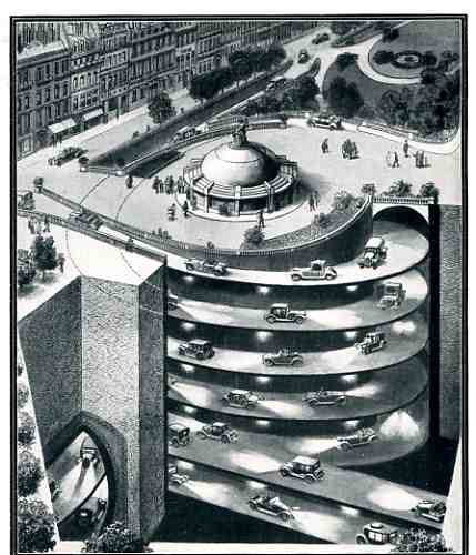
    There was also the possibility of vast masses of sunken
    garages, their entrance way screwed into the earth leading to tunnels and
    networked warehouses where the cars could be safely deposited and removed from
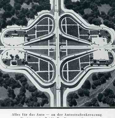
    city streets.  There were also these two
    versions of the simple above-ground garages and parking lots:  the apartment block gives over the entire
    interior area to individual parking and garages (doing away with any
    greenspace), while the massive semi-cloverleaf design is made for nothing else
    in mind than to park the cars in the four semi-centers.


    0 blog jan 222 car bfuture399

    By 1930 the production of the automobile had been revolutionized
    to such an extent that virtually anyone with a job and less than five kids
    could actually afford a car.  It is
    interesting to note that at the average price of say 30 cents a gallon for
    gasoline (in the U.S.A.)
    that folks 80 years ago were paying pretty more per gallon (adjusted via CPI)
    than we are paying now at $1.87/gallon (in my mountain city at the far end of
    the pipeline). 


  • The 18th Century Bible on Dutch Canal and Dam Construction: Tileman Horst Theatrum Machinarum, 1737

    JF Ptak Science Books LLC  Post 461

    0 blog jan 08 horst368

    Tileman van der Horst and Jan Schenk produced the Theatrum Machinarium
    Univesale
    *, one of the most celebrated works on the construction of all those
    elements so necessary to keeping life dry in Amsterdam 9the place of the book’s
    publication).  It was perhaps the most
    important work then produced on dikes, sluices, dams, weirs, canals and
    swing-bridges, the very elements of existence in Holland.  Jan Schenck was the engraver of this work,
    which may also be the most accurate and the most sumptuously illustrated book
    of its type in Holland in the 18th century—the technical aspects of the
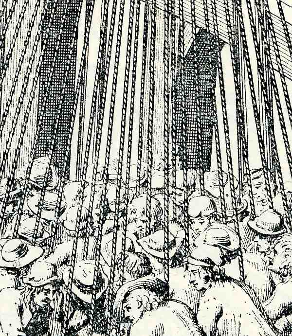
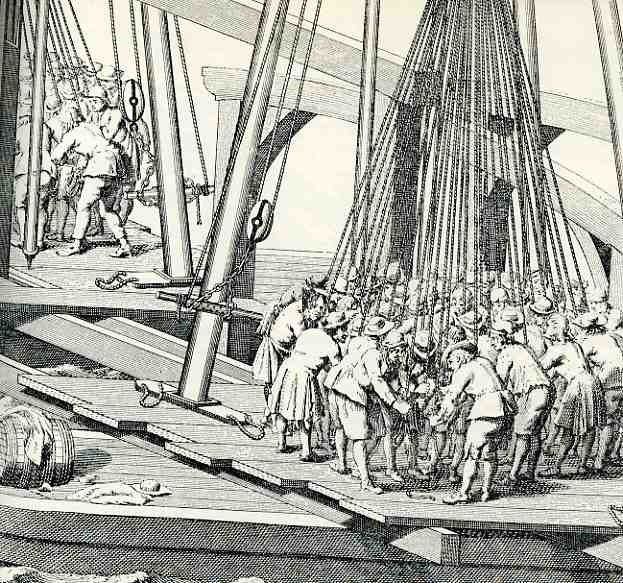
    rendering was just superb. In the image (which is a detail of a detail of a
    larger folding plate) I reproduced at left and below we see that Schenk and Horst weren’t kidding around in their treatise:  what we see here is the elevation for a plan
    showing the laying-in of pilings for a larger structure.  This is still tricky business today in Amsterdam, given the soil
    structures on which the city is built, some of these pilings go down hundreds
    of feet.  This group of about fifty men
    is certainly struggling with something big; but just how big it is I do not
    know.  (They do look rather well-dressed
    for being about to muck around in the foundation area of a structure.) And this
    draws my attention to the planks on which they all stand; the boards seem just
    enormous, looking to be two feet wide and several inches thick, and long.  I’d be very curious to know where this lumber
    was coming from, as I feel it certainly wasn’t local.

    0 blog jan 08 horst367
    *Theatrum Machinarum Universale.. of
    Keurige Verzameling van .. Waterwerken, Schutsluizen, waterkeringen, ophaal- en
    draaibruggen
    . Printed in Amsterdam., by Petrus Schenk en Zoon, 1757-74.  Illustrated with 50 engravings on 47 partly folding plates.


  • Ships in the Skyline, Part V: Cities INSIDE of Ships

    JF Ptak Science Books  Post 308       

    1blog_oc_t10_ship_in_skyline_deta_2

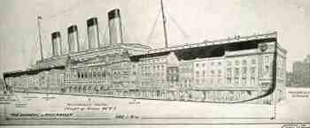
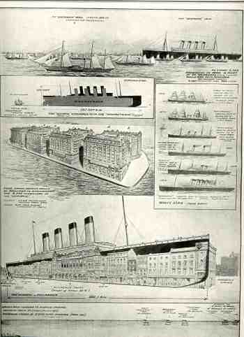
    In trailing some loose associative memories of ships being compared to skylines, and seeing he ships placed in the skylines, I was able to find four good samples.  This one is, in a way, the negative version of that, showing cities placed inside of the ships, the ship in this case being the White Star triple-screw Olympic–which at the time was the largest ship ever launched at 882′–and the image found in The Illustrated London News for 22 October 1910.  It was done in celebration of the launch of the ship from Belfast, which was also the heaviest transference of weight (27,000 tons) from land to water in history.   To illustrate the ship’s massiveness the picture editor placed a row of hotels and buildings bounded by the eastern end of Burlington House to the very edge of Piccadilly Circus, with the Piccadilly Hotel (height 77′ 6″) right there in the middle under the first three smoke stacks. 

    1blog_oc_t10_ship_in_skyline_deta_3

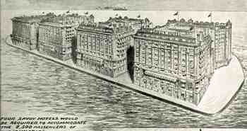
    The second image relates the passenger capacity of the Olympic to the Savoy Hotel, showing a floating platform with four of these massive hotels.  The Illustrated London News was making a real point about the Olympic and the Savoy, because at around this time smaller ships were referred to as “floating hotels”; the Olympic, on the other hand, was much more than that–it was four floating hotels, and big ones, at that, and the image captures that perfectly. 

    Truth be told, I really like the image of the floating hotels out of context and without a caption–it really makes the case for the idea of a Floating City in a Floating World. 

    1blog_oc_t10_ship_in_skyline803

    [CLick for a larger, clearer image]