A Daily History of Holes, Dots, Lines, Science, History, Math, Physics, Art, the Unintentional Absurd, Architecture, Maps, Data Visualization, Blank and Missing Things, and so on. |1.6 million words, 7500 images, 4.9 million hits| Press & appearances in The Times, Le Figaro, Mensa, The Economist, The Guardian, Discovery News, Slate, Le Monde, Sci American Blogs, Le Pont, and many other places… 5000+ total posts since 2008.

Author: JF Ptak

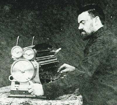
  • A Fine Calculating Machine by Bollee, 1889

    JF Ptak Science Books  Quick Post

    Bollee
    [Source: http://www.rechnerlexikon.de/artikel/Bild:Bollee-mit-Maschine-CNAM1990.jpg]

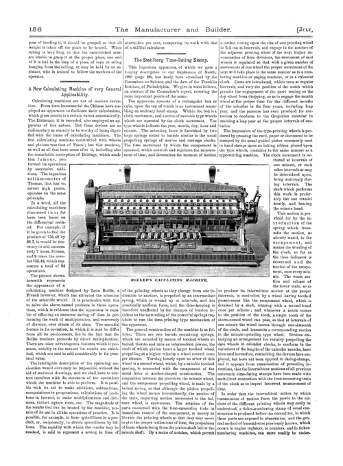
    This was a surprise, finding M. Bollee’s article (Sur une nouvelle machine a calculer) in this 1889 Comptes Rendus, pecking around in that big 10-pound volume looking for something else.  It was very easy to miss if you weren’t looking for it, just a few pages long in a 1000-page book.  But there it was, nestled comfortably in pp 737-739.  It these few pages Bollee describes his machine and with particular reference to his innovative approach to direct multipilication–a fine addition (ha!) to the long line of contributions by Babbage and Clement, Scheutz, Wiberg and Grant and Hamann. 

    Notes:

    Léon Bollée: “Sur une nouvelle machine a calculer”, in Comptes Rendus de l’Academie Sciences (Paris), volume 109, 1889, pp. 737-9.

    An image of the machine from The Manufacturer and Builder:

    Bollee

    See:  the Making of America, http://digital.library.cornell.edu/cgi/t/text/pageviewer-idx?c=manu;cc=manu;rgn=full%20text;idno=manu0022-7;didno=manu0022-7;view=image;seq=0162;node=manu0022-7%3A21


  • Heavy Stuff in Elegant White-on-Black Lines

    JF Ptak Science Books  Quick Post

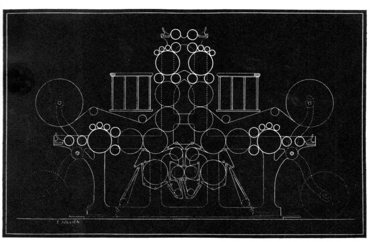
    Henry Jullien produced a beautiful work with schematics of printing machinery rendered in white-on-black, though I’m reasonably certain that the images were printed in black. The work was a catalog for the leading Belgian firm of printing presses and bookbinding apparatus.  The design is simple and very elegant and reminds me of some of the kinetic and non-represntational artwork that would come a few decades later.  (Heny Julien, Construction de Machines Typographiques, Lithographiques et Chromo-typographiques et Chromo-Lithographiques, 1881)

    Typography machine265

    ·Posted by :

    ·in:


  • The Agony and Beauty of Bad & Incredible Title Pages

    JF Ptak Science Books   Post 2022  Books with Unusual Title Pages series

    Follow Me on Pinterest


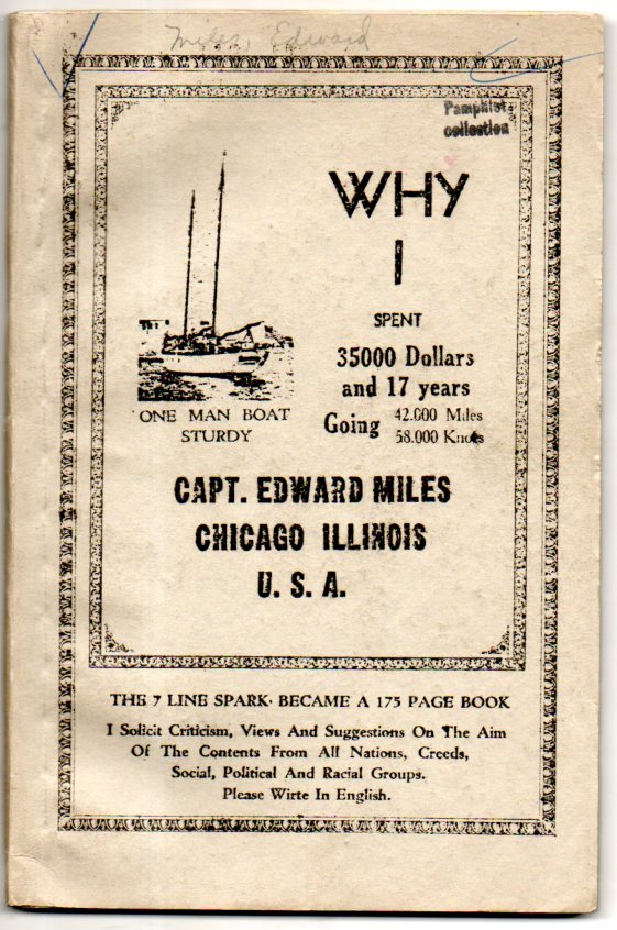
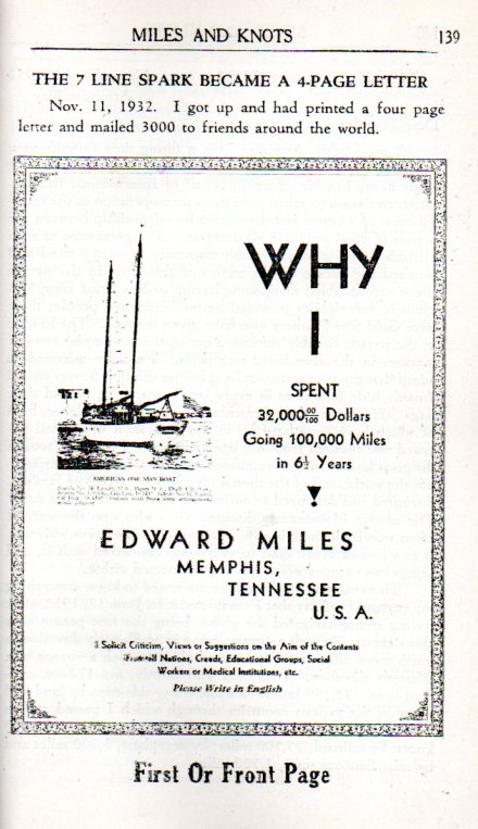
    Simply put, this is easily a first-percentile title and title-page design, the work of a man who set out to discover the world for/by himself and wound up taking a very long inner journey of Some Outsider-y Influence, and then felt the need to share it:
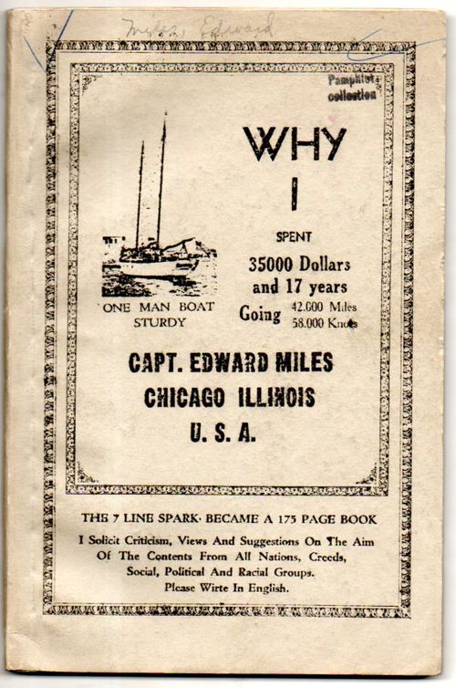
    Outsider Edward Miles257
    That is a lot of unnecessary information to share, particularly on the cover of your book.

    This is a very good example of the combination of two main threads of odd title pages that have been slowly accumulating in a series of posts on this blog (a good example of which can be seen in the post “Little Bizarredness:  Bland Hyper-oddness in Published Works”,  here) about books with “simply difficult” title pages: (a) those that are swift and contra-subtle, wispy cloudy bits that lack a cohesion and make them a little impenetrable, and (b) those that are bold and straightforward and mostly nonsensical. Here we have a composite, the elusive “(c)” category, which is a combination of a+b (where a+b=a+b, only)–both light and dense, simple and complex, all adding up to a little bit of bold almost-nothing.

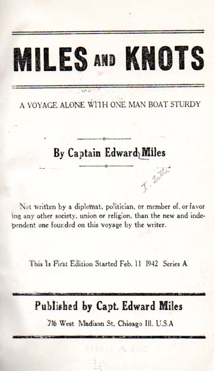
    When we open the pamphlet we see that Capt. Miles tries again with the title page of the book, changing the title on the cover but with high accomplishment is able to retain the overall largesse of mystery about what the book is about:
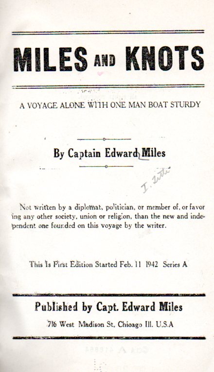
    Outsider Edward Miles258
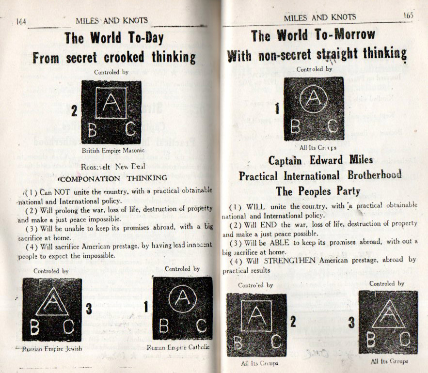
    Evidently Capt. Miles did make a grand expedition, and he was away for a long time, and he did build himself an absolutely beautiful boat–and brought back with him the idea of some sort of international straight- and not bent-thinking ferocious logical thinking political party. His was the Peoples Party (I’m not so sure why he chose this name when it was taken by several other groups already), the “patriot’s preportional [sic] part of the New International Party” (“a recorded reality”), that “with non-secret straight  thinking New Independent International Political Party the Third Party within All Nations will collectively end all empires” and so on.  He also referred to his political party by yet another name:  “Miles International Practical Brotherhood”. Its hard to take the “practical” part of this seriously, especially when Miles’ own political party gets referred to by so many different names.

    Cap’t. Miles excuses himself right at the beginning for his grammatical and spelling errors, which is a good thing because there are so very many of them, as he “had little of the artifica [sic] education (schooling)”.  He does recount his voyage but it is riddled with internal Socratic monologues that lead the reader to question many things, not the least of which is the simplest of questions:  “why?”

    In any event Cap’t Miles does drag teh reader through 175 pages of poorly written and badly spelled oddnessment.  His outre design capacity and presentation though makes this a fine example of outsider thinking. 

    Deep in the book Miles takes a deep breath and dips into the snipe-like “(d)” category, which is a very rare occurrence of reproducing the title page of a book deep within the text and not getting the title correct, which is a peculiarly beautiful agony:
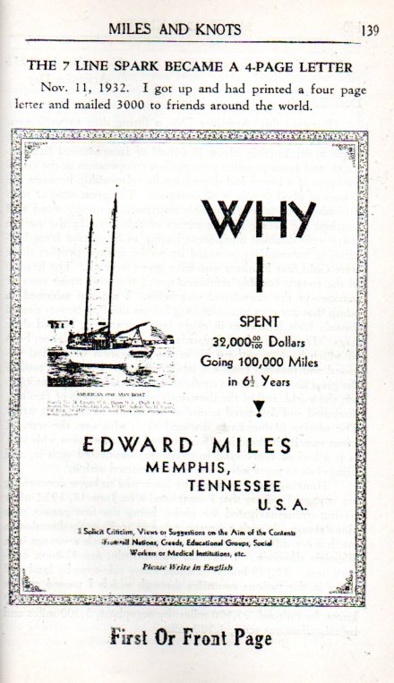
    Outsider Edward Miles259

    Evidently there is no distinction between the ‘first” page and the ‘front” page, both of which are different, anyway.

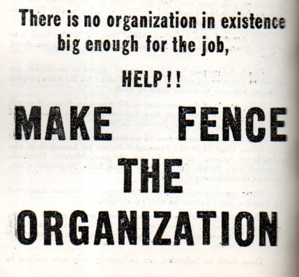
    There are also bits like this half-page announcement laced throughout the book, looking like salty sprinkles in a foamy Guinness:
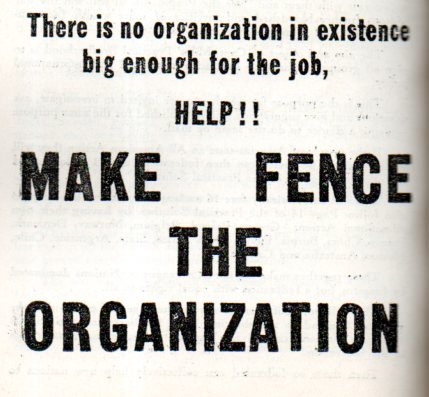
    Outsider Edward Miles261

    And just when you think that you’re through the book and its brilliant cloudiness you find this:
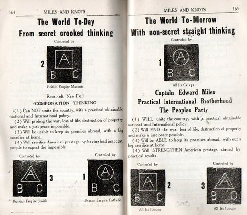
    Outsider Edward Miles260

    It is all really quite breathtaking, in a way. 

    The book–whatever its title–was written and published by Capt. Edward Miles and issued in 1942 as a first edition “Series A”–no doubt this was supposed to be the first of many such installments.  I’m trying not to imagine the disappointment that Miles must’ve felt when there was no need for more.  I guess he could’ve blamed it on the war…

    My copy is the copyright deposit copy, no doubt sent by Miles as part of the process to secure a copyright for his work in the United States.  I can find only one library in the world (via the OCLC)  with a copy of this book–the hometown Newbury, in Chicago–the record for which states that their copy was “number 105 of the first edition”. Perhaps Miles numbered the pamphlets as they went out, and perhaps the numbering was truthful. In any event, this is not the solo-lonely outcome of big and lonesome high-seas thinking, and at least one other copy exists 515 miles from here.

    I think this is one of those works that is best appreciated at a distance, and that a reading of it would only ruin things by the accumulation of painful and what looks like embarrassing detail. Looking at the large font aspect of the book is good enough to allow this work to be treated as a kind of artwork which would only be obscured by weed-prone narrative. 

    Bottom line:  the man did build a beautiful boat.

  • Ice Hooves and Blank People, 1555

    JF Ptak Science Books  Quick Post   Blank, Empty and Missing Things series

    Follow Me on Pinterest


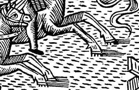
    Magnus--ice hooves and blank peopledetail blank
    This image may be unusual to the modern eye but not so for Nordic vision in the mid-16th century.  The appeal comes in the detail, which at least in a crafty title description seems a little odd, even though I have no doubt that it was all very sensible to the people of the time.

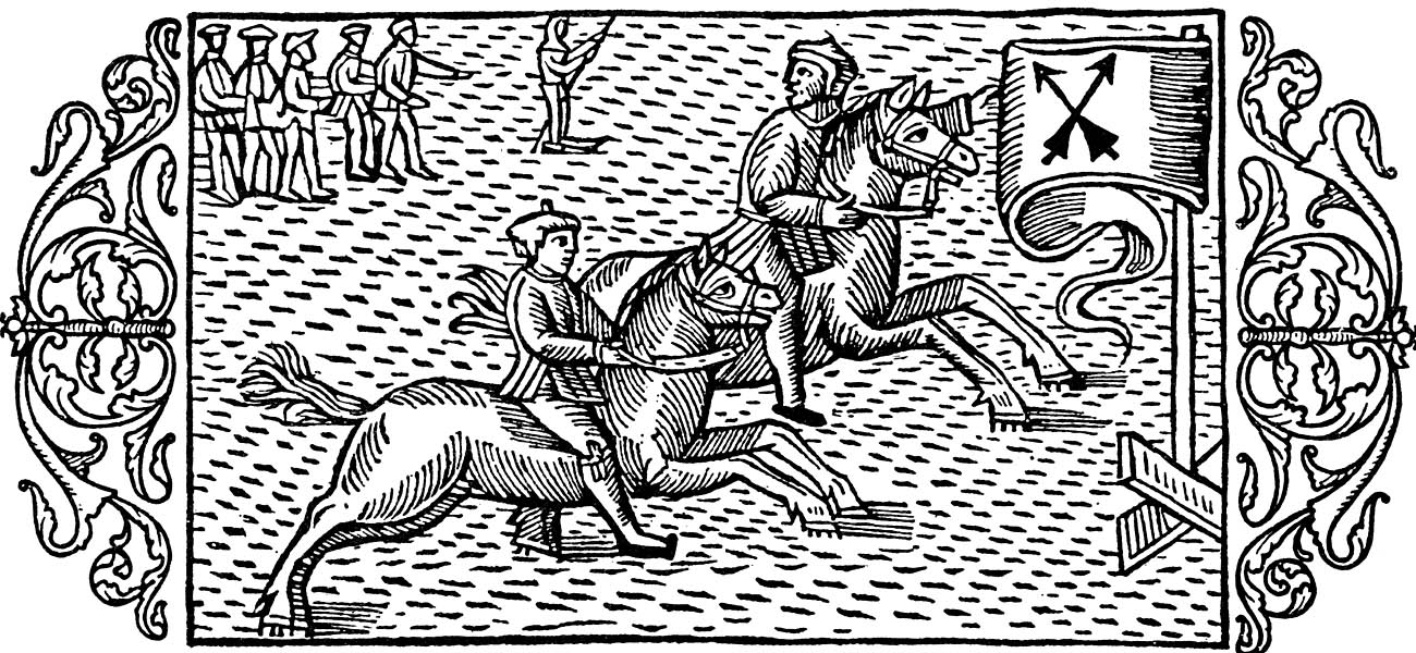
    The scene is from Olaus Magnus (Swedish historian and geographer, born. at Skeninge, Sweden, 1490; and died at Rome, 1558) who wrote the legendary and Renaissance-high-point Historia delle genti et della natura delle cose setentrionale1… in 1555.   Among many dozens of generally fabulous images we find this horse race on ice–naturally, in order for this to happen, the horses need to be specially outfitted with crampons, which is a good thing to do if you absolutely have to take your horse out on an iced-over river.  Still, it just seems entirely anithetical to riding a horse.

    Magnus--ice hooves and blank people detail hooves

    Magnus--ice hooves and blank people
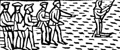
    The first image is one in a developing series on this blog concentrating on blank and empty things–in this case, the detail of faces in the small crowd in the background is the issue.  It is interesting to note that the group holds on to one another to form a line for stability while moving across the ice without any special footgear–the leader however is more prepared, and pushes along the ice with a staff while wearing bone skates. 

    Notes

    1.  The full and rather lengthy title of Historia de gentibus septentrionalibus… is translated as  “Olaus Magnus Gothus’, the Upsala Archbishops’, history of the nordic people’s different manners and camps, also about the wonderful differences in customs, holy practices, superstitions, bodily exercises, government and food keeping; further on war, buildings and wonderful aids; further on metals and different kinds of animals, that live in these neighbourhoods “.


  • Visionary Map: the Earth Without Water, 1694

    JF Ptak Science Books   Post 2020  Follow Me on Pinterest

    Part of the series on the History of Blank, Empty and Missing Things

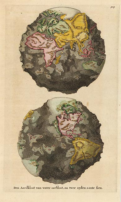
    I stumbled upon this fantastic leap into science affliction, an attempt to display the absolutely enormous idea of draining the Earth of all water revealing its ultimately rocky structure.  And this in the relatively young modern cartographic days of 1694. 

    Map world without water
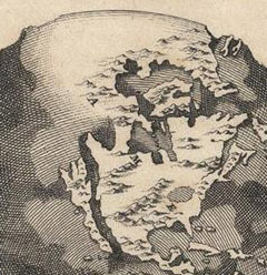
    This map (“Den Aardkloot van water ontbloot, na twee zijden aante sien”, published in Amsterdam in 1694 by Wilhelm and Jan Goeree in a Dutch edition of the expansive and imaginatively suggestive cosmo-theo-geographical work, Telluris Thoeoria Sacra) reveals the half-believed idea of California being an island was we can clearly see the enormous canyon separating it from the North American mainland. On the other hand, the “opposite” (in a way) belief takes place in the north, showing a large and towering land mass at the North Pole.

    Map world no water detail N Amer_edited-1

    All-in-all, given the state of geographical knowledge for the unseen stuff of the Earth, this was an excellent attempt to reveal the structure of the globe.  Sure, the depths of the oceans are a little off, the idea and the attempt to depict it was an extraordinarily interesting display for the time, especially with limited hard data.  This is even a more-remarkable series of observations considering the theoretical framework in which all of this was taking place. 

    Burnet (1635-1715) poured out his pounding heart into the pages of his sacred history, teaching people about the structure and history of the  Earth with generally little or unsuccessful regard to science–but no matter.  (Burnet did try to figure out where all of the water came for the flood, which is  a great question.  It is impossible for it to come from a natural rain of any sort, and Burnet probably came to the conclusion this the answer for the flood couldn’t come from the surface of the Earth.  So to keep things in compliance with his faith, Burnet established that the water necessary for the flood came not from the surface of the sphere, but below it, in the hollow Earth which was actually filled with water.) This was a work of structured faith and a belief  system, and wasn’t seen as much more than that except to the initiated. But a resulting map of the structure of a waterless Earth seems to me a more powerful piece of imaging than an Earth simply covered by water. 

    [Black and white image source  Barry Lawrence Ruderman Rare Maps, here.; color version from Oldmaps.com, here]


  • The Electronic Beds of Electronic Dreams, 1945

    JF Ptak Science Books  Post 2019   (expanding an earlier post)

    Electronic odoranalysis

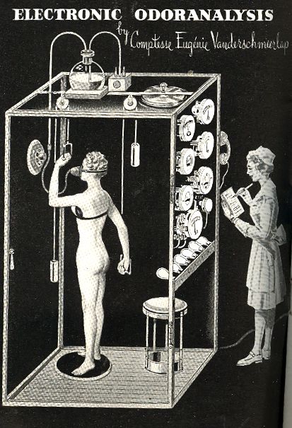
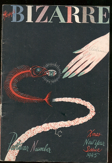
    I am very attracted to the innocence and softly bizarre category of my store’s Outsider Logic Collection, like this little pamphlet that was published in  New York in 1944.   The pamphlets in this category are odd but still understandable, and the “what the ____!” response to the subtle ones isn’t quite so high and the exclamation points not so many as in the cases of the Outsider Logic titles.  Bizarre is different from that, certainly not hiding behind any lesser or ambiguous title–it stretches the category a bit as it is intended to be a parody of the more-popular magazines and their advertising sponsors, but it is really quite a bit different from a simple humous and pun-laden trip into dead-end future visions.  It was copyright by the very far-reaching Hugo Gernsback, who in 1926 started the first magazine dedicated to the genre of science fiction (Amazing Stories) and for whom the World Science Fiction Society’s annual award for Science Fiction Achievement is named (the “Hugo”).  Gernsback evidently had a taste for cheeky parody, producing similar magazines to this called Quip, Forecast, Jolliers, Tame and Newspeep–it seems though that Bizarre may have ultimately morphed into Forecast.Blog--may 11--odd 002

    I guess that this was deeply weird for mass-production publication, and it was probably funny–now it is just weird, odd, and somewhat discomforting–a successful and intentional reach for being part of the Uninentional Outsider right from the start.

    Most of the magazine is dedicated to imaginary electronic delights–analog electronics (though it is still fairly early to be having such dreams and using the word “electronics”, as it was just barely two decades old at this point).  One of the oddest of these inventions of the near future was the Electronic Odoranalyzer, which was necessary for reasons I couldn’t discern. (I’d like to assume that odors are calculated and calibrated and a scent is chosen specifically for them, or it.)  

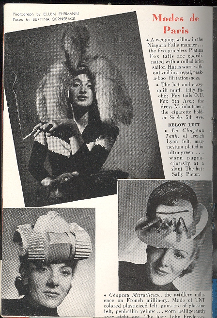
    The advertising was unusual as well:  there were hats you could potnetially purchase of weeping willow Platina fox tails; some hats had tanks (as with the Le Chapeau Tank hat, modeled for the magazine and “worn pugnaciously at a slant”), and other hats had simple canons (as with the French Mitrailsuese).  While wearing your tank hat you could also theoretically relax to your favorite tunes in style with a $125,000 radio–it was made for war profiteers who couldn’t find banks enough to hold their cash and was billed as too expensive to steal.Blog--may 11--odd 006

    Then there’s the EBC–the Electronic Bed Company–with their magnificent new product, an invention “by the great sage of Hackensack” so spectacular  as to make ordinary sleeping obsolete.  The bed was an air-conditioned, self-washing, self-adjusting, self covering, fiberglass-cushioned, telephone-capable, air pillowed, air conditioned masterpiece that looked like it was about ready for anything but sleep, which I guess would make it revolutionary.


  • Books-Times-Eight Found-Art, South Carolina, 1836

    JF Ptak Science Books   Quick Post

    Booksbooksbooksdetal_edited-1

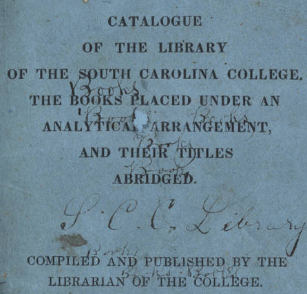
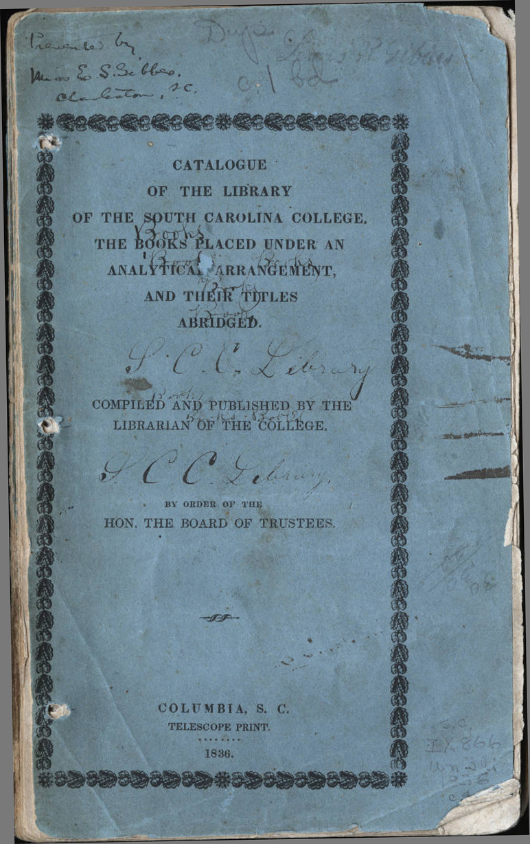
    This Found-Design on the cover of the Catalogue of the Library of the South Carolina College–a pamphlet printed in Colunbia in 1836–presents us with a scratchy biblio-lovliness, and a little bit of smokey mystery. Why did someone scrawl “Books” eight times on the cover of this work, I wonder.  (88  certainly was a number greater than all of the books in libraries or anywhere else in North America at the time, though I am sure that this calcualtion has nothing to do at all with the scirbble.)  I just don’t know–the annotations are just so inscrutable. Books books books books times two, writ on the cover of the skinny library catalog of the school founded in 1801 that would become the Universtiy of South Carolina. 

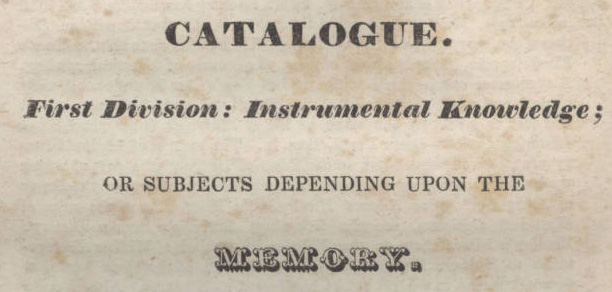
    Booksbooks books--memory

    The full image, via the new Digital Library of America, here.

    Booksbooksbooksdetal

    There are 108 pages of entries for books, making roughly 5,000 titles.  Books classified as “history” take pages 1-59, “philosophy” 61-96, and “poetry” 99-109. Given that this is supposed to be a history of science blog connected to my phys/maths bookshop, I looked for “math” and found it among other contenders in the second division, “philosophy”. It is categorized such along with the book entries for ethics, metaphysics, general theology, philology, criticism, rhetoric, orations, epistles, government, politics and medicine.  Math here is “Math, Pure and Mixed” and “Math Mixed, Tactics”, and occupies the largest section of the philosophy section–unless of course you add together al o fthe variations of “theology”, and then the maths come in second. 

    Just for the record, according to the American Almanac, the South Carolina College library holdings are right at the average of 57 American colleges libraries on which they reported.  They indicate 10,000 volumes for South Carolina, one of the 57 colleges totalling 580,000 volumes, or about a 10k average per library. (Just for the record, Harvard had about the biggest collection at 50k, followed by the Boston Athanaeum at 30k and Yale at 25.5; there was also Georgetown (12k), Library of Congress (24k), University of Georgia (7.5k), University of Kentucky (4.4k), Bowdoin (12k), LSU (10k), Dartmouth (14.5k), Princeton (7.5k), Cooper Union (14k), UNC (4.8k), Dickinson (8.5k), Brown (11k), and the University of Virginia (10k) to name a few.)

    [Source:  Public libraries in the United States of America; their history, condition, and management. Special report, Department of the Interior, Bureau of  Education. Part I, (1876), Chapter XXXVII. Library reports and statistics,   pp. 745-836, this section pages 760-772; with thanks to TLBKlaus for finding this reference.]

    The book categorizations make for an interesting read.

    ·Posted by :

    ·in:


  • “Hog Bond”, a Found-Poem in a 1960 FBI Deposition

    JF Ptak Science Books   Quick Post  

    The very first thing I saw on the new Digital Public Library of America website (here) was a randomly-selected timeline–I selected 1960 and then clicked on the first thing I saw. It was a deposition of a Mr. Johnny Bryant of Savannah, Georgia, on a case involving hogs in some way, and made on 23 May 1960. It is a single-page typed document made to the F.B.I., and it has a certain Surreal style to it wrapped around a problematic content.  The following is the document after running it through our Poem-O-tizer–it is the entire text with different spacing.  It makes its own case as, well, something. 

    Hog Bond

    I

    First, it was this man
    come down to see me

    about some hogs was
    running out,

    so he told me to come and
    go to the Court House with him to see Judge Harbison.

    So I got in my car and
    drove ahead and so he drove to the Court House

     
    Robert frank ParadeHoboken 1955

    II.

    When I got to the Court
    House Yard,

    I saw two policemen in the
    yard, so I ask him

    where is Mr. Harbison,

    so he said

    never mind that.

    You are going to jail.

    So I went to jail.

    I said OK.

    I will go to jail.

    So I went to jail. 

    Monday morning, Benjamin
    Warner got me out on a $200 bond.

    That Tuesday I came back
    to see the judge about getting

    a warrant

    for the hogs,

    so he said he couldn’t do it,

    so I told him if he
    couldn’t do it I wouldn’t own the hogs.

    ·Posted by :

    ·in:


  • Elevated IronPunk, 1868

    JF Ptak Science Books   Post 2018

    Follow Me on Pinterest


    Ironpunk walkway detailed detail

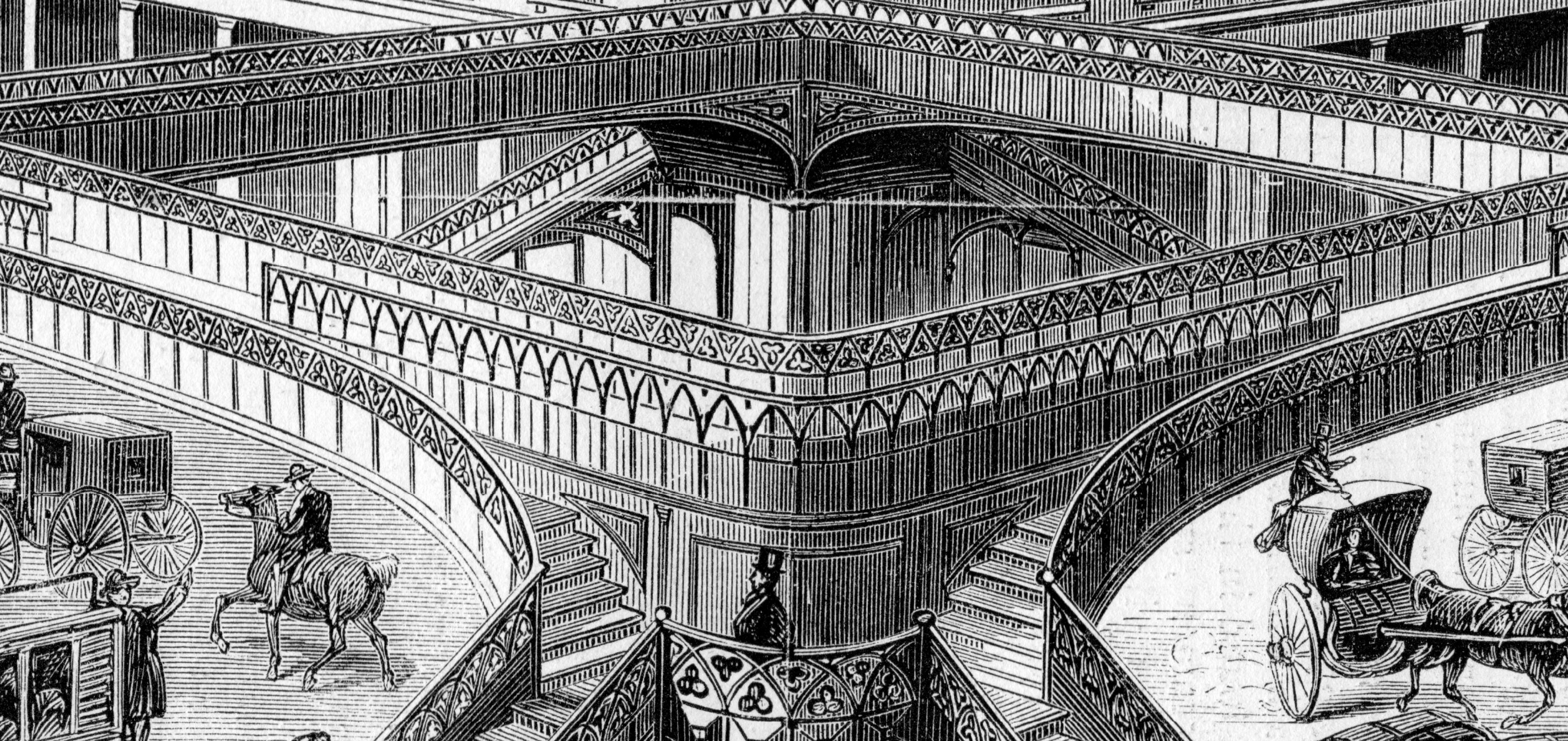
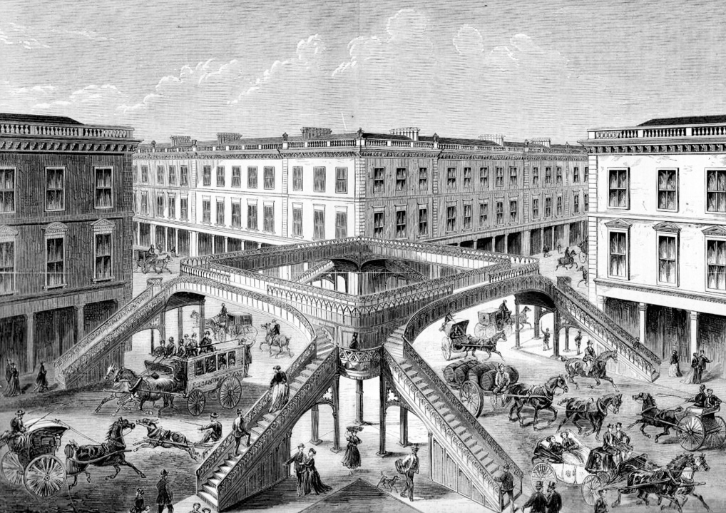
    Here we have an enormously IronPunk-laden solution to the pedestrian vs carriage traffic problem, playing out in a somewhat Escher-like way, drawn by the engineer Joseph Mitchell for a crossing “over Broadway, New York”.  It was published in Engineering, a magazine published in London, in 1868, intended as an example of what could be done to make London’s streets safer–evidently, they weren’t all that safe. 

    Ironpunk walkway244

    The article reports that there were 164 street deaths in London in 1867. These included 48 accidents with carriages; 59 children (6 months to 15 years); 12 women (including a 110 year old); and 44 daily workers (“in the pursuance of their calling, as carmen, bakers, coachmen, laborers”).  The article insists that the dead were of the “humble class” with some degree of intoxication involved.

    All (read “many”) things considered, London had a population of 3.3 million in 1871 (with NYC at 942,000 for he same period, not including the city of Brooklyn which held 340,000) and considering the state of traffic safety, 164 deaths (one every other day or so) was perhaps not too terribly high–except of course to the dead and their families.  In modern London with a population of 8 million there were 3,227 traffic fatalities in the city in 2009, and 116 pedestrian deaths. That’s more than half as many as 1871 with 150% more people.  Probably this is all apples and oranges…though in 1871 pollution from the traffic wasn’t really killing anyone–which is not true in 2013.

    Here’s an elevation of a structure that was actually built in NYC, an elevated quad-crossing”the first practical experiment in overhead street crossings”:

    It was 17’8″ high, 14′ wide, with access via 30 steps, and crossed one of the busiest intersections of Broadway.  It was intended to save people from their carriage-laden fate–but people hated it, and stayed away in droves, which I think was the lasting lesson for the Brits.  I guess people preferred to trust the traffic and dash across the street rather than make the 30-step climb up and then descend to the other side–too much effort.

    ·Posted by :

    ·in:


  • On the Early Magnificence of the Modern Mundane–Frost on Windows, 1555

    JF Ptak Science Books    Post 2017    Paper Microscope series

    Follow Me on Pinterest


    Magnus weather snow--detail
    To paraphrase an idea often stated by our younger daughter, Tess, on her understanding of science–“Everything goes Somewhere”–the things that we take for granted today all made a first appearance somewhere, sometime. 

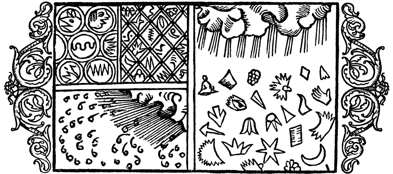
    This is the thought that struck me when I saw this illustration of frost on a pane of glass, on looking through a window that is covered with frost.  I really don’t know offhand when the very first record of an image of frost on a window occurs, but this one, found in the fantastic work on the history of Scandanavia (and etc.) in Olaus Magnus’ Histotria di gentibus septentrionale (“History of the Northern Peoples”), which was pubished in 1555, must be at least very early. 

    Magnus weather snow[Image source: http://www.avrosys.nu/prints/index.htm]

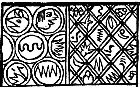
    The sections of the print on the right shows different forms of ice crystals–most, or all, are fairly unbelievable, but then again this decades before the microscope was invented.  That said, it does take a little bit of imagination to see an eye in a crystal, though not long afterwards scientific investigators like the great and unusual Athansius Kircher found the Virgin Mary in agate–and there’s a very long and deep history of anthropomorphization of natural history elements beyond this. The image on the bottom left is of falling snow, but the images on the left (top) are said to be frost on windows. 

    What a fantastic realization, to imagine that this may be among the earliest representations of the great and graphical and physical world of ice.  Everything gets seen the first time somewhere–maybe this is it for frost-on-a-window, maybe not. I’m not a frost expert.  I did try to find the first photograph of frost on a window, and then the first photograph of frost, but there were no hits in Google, and of course nothing in my books on the history of photography.  Then again, this is a pretty arcane matter, except that frost on the window can be fantastically beautiful and complex, and I wonder why it would not have made very early appearances in print and photography.  Perhaps it did, but I have a feeling that it didn’t.