A Daily History of Holes, Dots, Lines, Science, History, Math, Physics, Art, the Unintentional Absurd, Architecture, Maps, Data Visualization, Blank and Missing Things, and so on. |1.6 million words, 7500 images, 4.9 million hits| Press & appearances in The Times, Le Figaro, Mensa, The Economist, The Guardian, Discovery News, Slate, Le Monde, Sci American Blogs, Le Pont, and many other places… 5000+ total posts since 2008.

Category: Information, Quantitative Display of

  • Really Deep Depth: the Universe and SpongeBob SquarePants.

    JF Ptak Science Books   (Expanding an earlier post from 2013, but different enough to get its own Post # 2297)Follow Me on Pinterest 

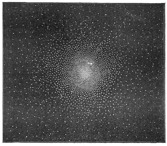
    Astronomy--47 Tuc189

    Thinking about the depth of space and visually explaining it are two different things–vast numbers and the deepest depths, all colliding with the imagination, which really has a hard time keeping up with it all.

    This beautiful engraving appeared in Amedee Guillemin’s  Le Ciel: notions d’astronomie a l’usage des gens du monde et de la jeunesse, which was published by Librairie de L. Hachette and Company, and printed in 1865 (the images from which are available here). Guillemin (1826-1893) was a social/culture writer who became a very respected science journalist/writer, becoming very popular with works in physics, technology, astronomy and general science, many lavishly illustrated. 

    There are many striking images in this book, The Sky/the Heavens…, but I’ve chosen this one because it has a certain deep depth to it, and relays a complexity and distinctness to something that is generally imaged as being less so, being a massive star cluster and all.  Unlike many of his other books, the great illustrations here are the small text images, some only 25% of the page, and in most cases rendered sparingly, and with a real feel of “difference” to them (at least so to me).

    The “Amas du Toucan”, known now more familiarly as 47 Toucanae or 47 Tuc (NGC 104), is a bright element in the southern sky, a huge cluster 120 light years wide and 16,700 light years from Earth, visible to the naked eye in the constellation Toucan (created by Petrus Plancius in 1598 or so).   And here it is, in a little 9×8 cm engraving with hundreds of white points as stars, made after an engraving of Sir William Herschel (1738-1822, a German-born English astronomer who–with his sister Caroline and brother John–spent decades observing and recording stars, double stars, clusters and nebulae).  

    Astronomy--47 tuc big detail

    47 Tuc was first catalogued as not-a-star by Abbe Nicolas Louis de Lacaille (1713-1762),  a French astronomer who found it too be too fuzzy to be a single star, and who produced a 10,000 (Southern) star catalog, Coelum Australe Stelliferum, which was published in 1762, and which also introduced 14 new constellations.  47 Tuc made another quick appearance in the great Catalogue des Nébuleuses et des Amas d’Étoiles (“Catalogue of Nebulae and Star Clusters”), a superb and meticulous work by Charles Messier, and published in 1771.

    But distances and depths such as we know them now were not-conceivable at this point for Guillemin–and really would be for another 60 years or so.  At this point, and for some time to come, the Milky Way was considered to be the entirety of the universe. The business of galaxies being outside of the Milky Way is a relatively recent development, determined so by Harlow Shapley in 1924, expanding the size of the universe ten-fold to 300,000 light years; this was blown up a quite a bit by Edwin Hubble in ’24 to 900,000 light years, and then five years later in one of his most famous papers Hubble blew the figure up a lot, expanding the universe to 280 million light years.  Walter Baade and others added to the figure in the 1950’s (4 billion light years or so), and during the 1960’s-1990’s the figure expanded to 25-30 billion light years, finding its way to 94 billion light years in 2006.  

    I would imagine that the concept of galaxies outside of our own, and that the universe was vastly larger than we thought, and that the potential for there being new/unforeseen discoveries was great, that in 1924/1929 it may have seemed somewhat like Galileo suddenly seeing an order of magnitude more stars than had ever been seen before by the naked eye…that the sky which had basically been unchanged in appearance to humans for thousands of years really wasn’t what people thought it was.  Perhaps it was like the Two Dimensional beings in Flatland  trying to comprehend the first appearance of a Three Dimensional entity.  Or of course the realization could have been like when Sandy Cheeks came to the shocking epiphany in an episode of the Immortal Sponge Bob Square Pants that the titanic battle she had been waging and ostensibly won with an Alaskan Bull Worm was just her fighting with the tip of the beast’s tongue–oh. Oh my.  Something along those orders.  Deep depth.  

    Sandy cheeks

    The Guillemin work is simply a lovely and elegant thing–one of many accomplishments in a beautiful and relatively simple book. 

  • Early Published RADAR Image of NYC, 1946.

    JF Ptak Science Books   Quick Post

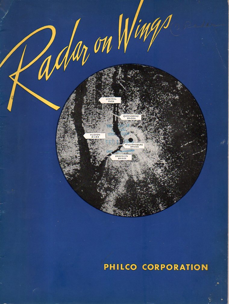
    Radar247

    The history of RADAR (RAdio Deection And Ranging, and something I’ve always written in caps) is absolutely not what I’m thinking about now–that is a long story with lots of twists and turns, complicated, complex–and it ranges depending upon location as for the most part RADAR (from the 1930’s anyway) was developed in secret, kept as a military secret.  And that’s because it was a very important development, with the victor of the Battle of the Beams being the possible victor, period.  

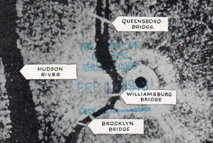
    The image is a detail from the pamphlet below (the covers printed in what looks like U.S.N. blue), made aboard a B-17 at 15,000 feet, and is one of the earliest popular treatments of the vital story of RADAR during WWII.

    Radar246

    The pamphlet was printed by PHILCO Corporation, (and dated January 4, 1946), and has an inserted leaflet stating that this “makes public for the first time the salient facts about the Corporation’s development and production of airborne radar equipment for the United States Army and Navy”.  

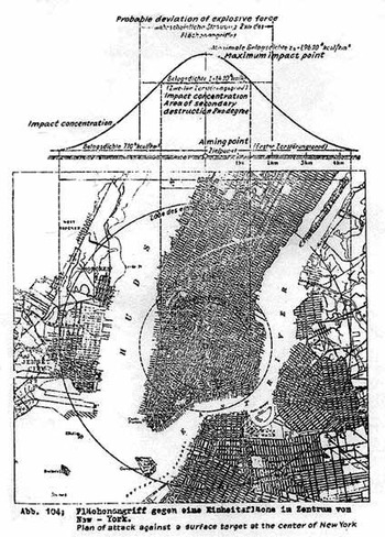
    The image also comes a little too-close-to-home, reminding me of the Eugen Sanger transcontinental bomber, and the image of NYC in the crosshair, 1943:

    Manhattan_bombed_4


    The image is from an earlier posts here, “Bombing Manhattan, 1943…”


  • The Molecular World in Not-Quite 3-D

    JF Ptak Science Books  Quick Post

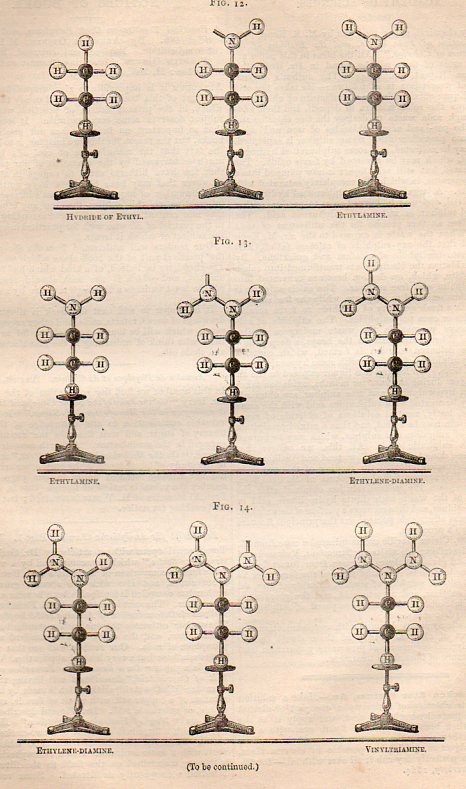
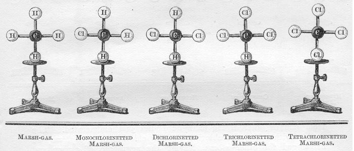
    Hofmann models046


    Hofmann models


    August Hofmann (a German organic chemist of high calibre, 1818-1892)  made this presentation1 to the Royal Institution in 1865, and it is one in which hand-made three-dimensional models of molecules2 are used for one of the first times for public demonstration.  (He actually made parts of it in different lectures, that is, but I have not yet been able to compare the two.)  The models aren’t quite three-dimensional, as Hofmann arranged them so that they would have at least 3-D molecules though their arrangement in space was veyry much liek they would appear on a piece of paper.  (This might be a bit off, and the molecules were all the same size, but the colors he employed to represent molecules are still being used: black/carbon, yellow/sulphur, white/hydrogen, blue/nitrogen, red/oxygen, green/chlorine.  

    Notes:

    1. HOFMANN, August Wilhelm. “On the Combining Power of Atoms”, in three parts, all in The Chemical News, October 5, 1865, pp 166-169; October 13, 1865, pp 175-179; and in October 20, 1865, pp 187-190.

    2.  The idea of molecules goes back 2000  years, to Empedocles, Leucippus, Democritus, and Epicurus. It should be noted I guess that the modern idea of the world (mostly?) owes itself to an 1873 article in Nature by James Clerk Maxwell.  He titled the paper, well, “Molecules”, and this is how he defined his terms: “An atom is a body which cannot be cut in two; a molecule is the smallest possible portion of a particular substance.”


  • When Catalog Cards Were Card Catalogs

    JF Ptak Science Books   Post 2287

    This is a short and stubby flare sent up 200 feet into the dark, a little missile celebrating the card catalog.  I remember being so heartbroken seeing the individual drawers of the Library of Congress card file up int he stacks, way back in the day when they’d still give you orange stacks passes if you could present an admirable-enough case for needing access all on your own–I imagine that the file drawers were stored away near the Qs which is what I usually wanted to see.  Anyway there they were, hundreds of them no doubt, hundreds and hundreds.  They were there because the cards had been photocopied, or something, and the entire rig on the reading room floor replaced, opened for more space.  I don’t recall the disposition of them for certain but I do believe they didn’t last very long, sent to the great card catalog in the sky where the manuscript entries on the backs of the cards, notes made by librarians and scholars over the years, are housed in a secret tower of lost information, because as we know it was only the fronts of those cards that were copied.  

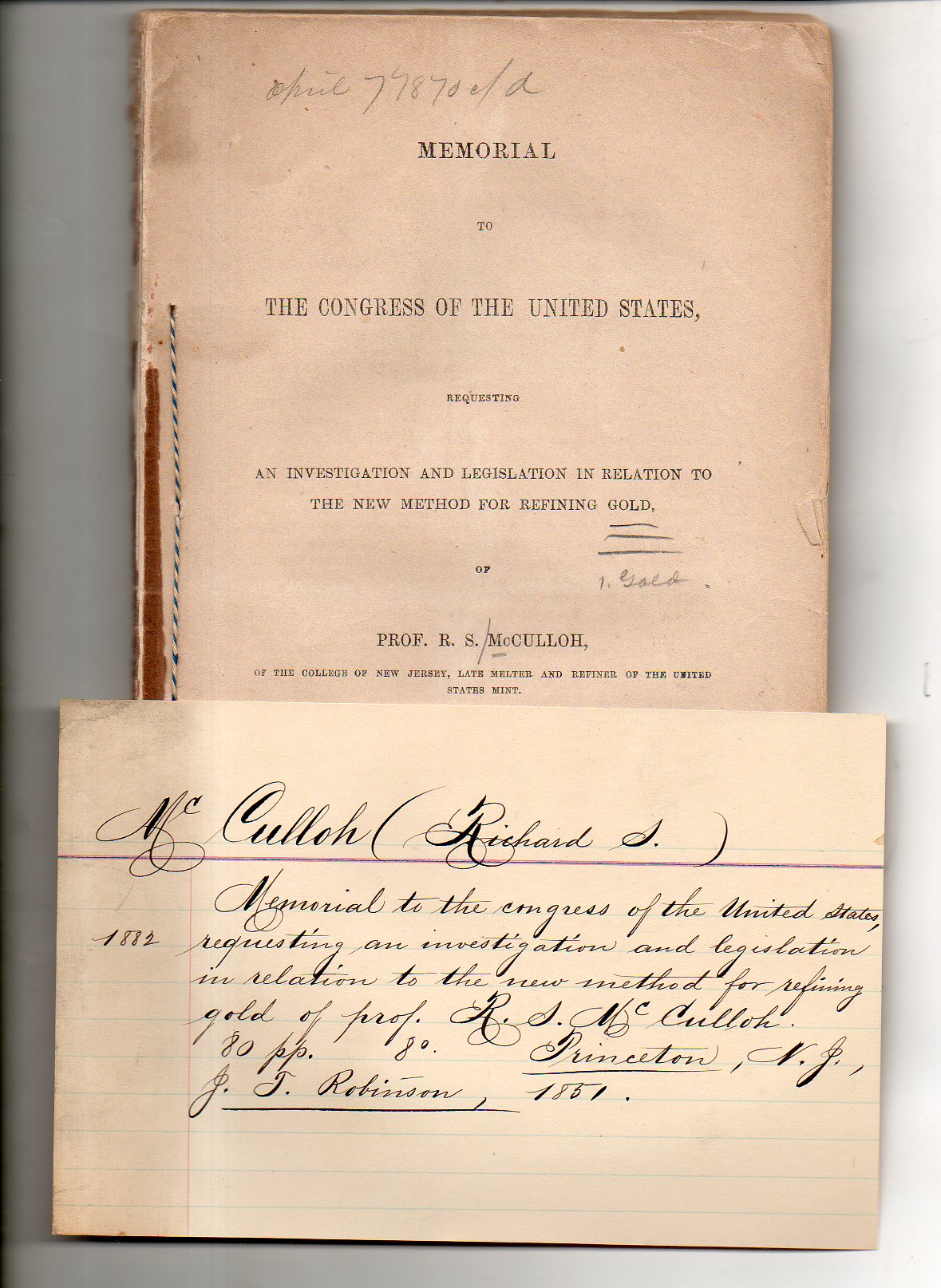
    Here is what the “flare” is about, a lonely hand-written catalog card for a surplus(ed)/duplicate pamphlet from the Library of Congress.  The work is by Richard S.  McCulloch, and called Memorial to the Congress of the United States Requesting an Investigation and Legislation in Relation to the New Method for Refining Gold (printed by John T. Robinson in Princeton, N.J., in 1851). 

    McCulloch221

    There is another slip of old paper in the pamphlet with a tiny annotation, “McCulloch/not in L.C.” It was, for 100+ years, but not any more.  

    I purchased this along with dozens of thousands of other pamphlets (in a collection called, yes, The Pamphlet Collection) years ago when the library determined that the material was not needed.  I was very happy to need them, and I’m still going through the process of finding other needy recruits for them.  

    But it is that card that makes me like a border person of some sort, of having used the old-time systems and then benefited greatly from the new and replacement systems.  For example doing searches in what is a very useful tool for me–the WorldCat database–for finding holdings of libraries for a particular title is now an instantaneous thing, whereas in the not-so-misty past (in terms of human years) this search would have involved going through several iterations of the multi-hundred-volume National Union Catalog.  The time I’ve saved looking up bibliographic references and using online reference tools probably has given me several lifetimes of look-up compared to the 1979 me.  

    Still and all, I think I’d like to see the card catalog.  

    Notes on the McCulloch book: 


  • What We Spent on Stuff, 1942

    JF Ptak Science Books     Post 2314

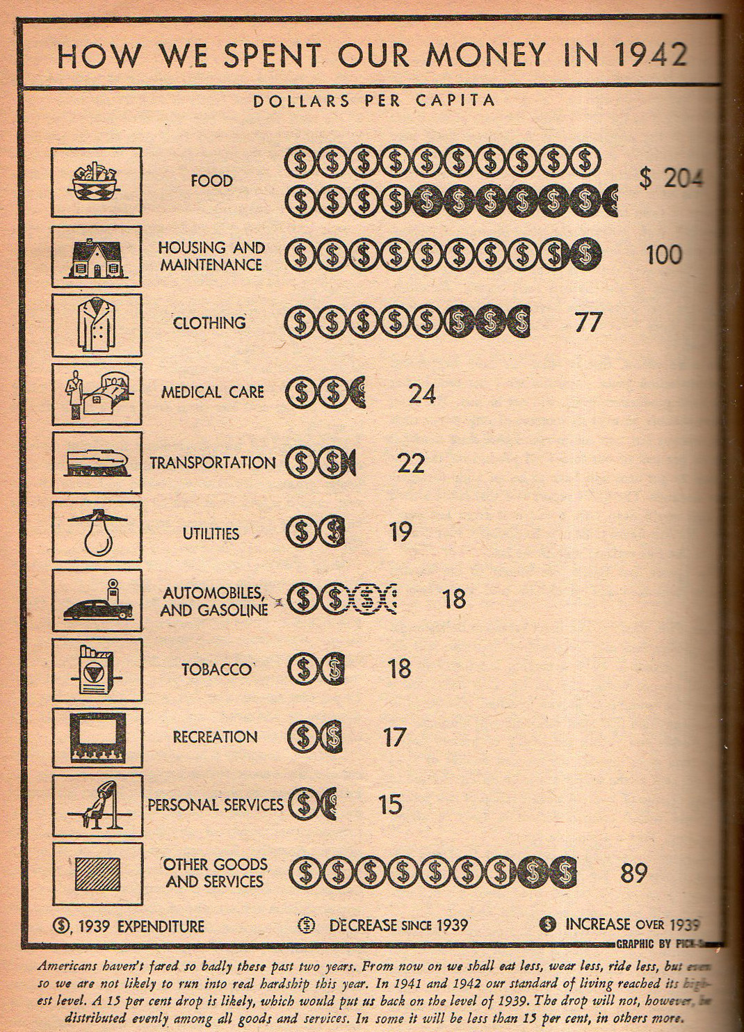
      NATION Graph how we poent our money315

    [Source: The Nation, May 1, 1943.]

    Average 1942 salary of $2,500 = $34,00; Average hourly salary of 30 cents/hour = $4.12; Average cost of house, $8,000 (which is also about three times the average yearly salary) = $109,000 ; Bread, 9 cents = $1.24; Milk, 62 cents = $8.52 First class stamp, 3 cents = 41 cents.  (Disappointingly I’ve seen some pretty wide discrepancies in these figures, not the least of which is housing, where I’ve seen upper-end estimates of $8,500 for a house…)

    Just for the record, according to the Bureau of Labor Statistics, the fair exchange for a one 1942 dollar would be about $13.75 2014 dollars. *These figures too are bumppy–I’ve chosen to use The figures above are disappointing because they’re figured per capita, which is a little difficult to work with, especially when trying to compare the data to family-computed figures with the numbers I have on hand.  In any event $204 is about 8% of the average income, which is less than the percentage a family will spend on food per year nowadays, which seems to be in the 20+% neighborhood.

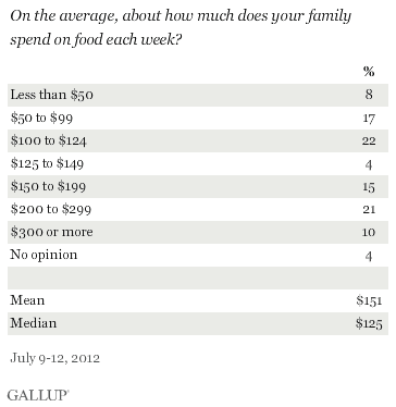
    On the other hand, Gallup reports widely different numbers for that time, namely $15/week or $60/month of $720 a year, per family, which is about 30% of an annual income, which seems more in keeping with expectations.  Adjusted for inflation, that figure is about $200/week in 2012, which is about 25% more than the average family spends today:

    Food expsnse percentages[Source: Gallup, here.]

    The shocking thing from this little adventure is seeing the 8% figure at $50/week, and 25% (!) at the <$100 level.  


  • Immigration Map 1903–a Great Display of Data

    JF Ptak Science Books  Post 2113

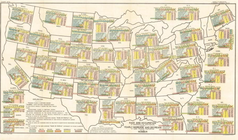
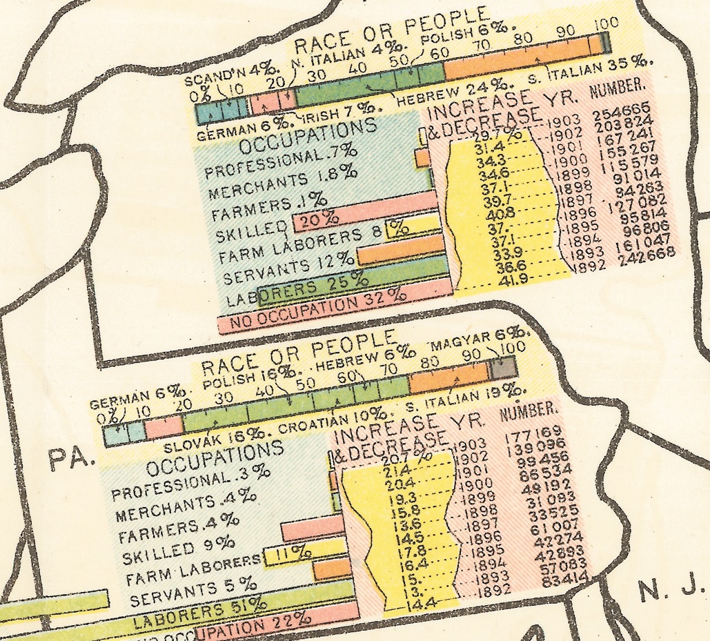
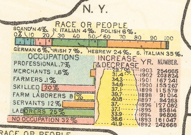
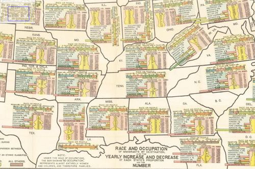
    This map is an interesting early attempt to embed complex statistical information into map form. It shows us the countries of origin of new immigrants to each state and the occupations of the adult male immigrants (with women and children being statistically both invisible and weighty, as they were classified simply as “no occupation”).  New York state saw a huge influx of immigrants–the leading numbers in the country–with more than 150,000 on average every year from 1892-1903,  Most of the South received little interest from immigrants, with Mississippi and North Carolina receiving in the double digits of immigrants, Virginia and Alabama getting in the mid three-figures, and Georgia and Tennessee settling in on average in the single digits.  Florida, on the other hand, is a very different case, receiving in the mid four-figures and also leading the country in the percentage of skilled immigrants (with 42%).  It is interesting to note that Alaska from 1894-1896 received no (legal) immigrants, then having 1 in 1897.  

    In any event it is a fascinating chart to have a browse with.

    Aliem map full

    [A full, zoomable version can be found at Michigan State University library, here.]

    “Race and Occupation of immigrants by destination. Also the yearly increase and decrease of each state’s proportion and the number.” Citation:  Race and Occupation of immigrants by destination. Also the yearly increase and decrease of each state’s proportion and the number. Made in 1903 to accompany the Annual Report of the Commission-General of Immigration for the Fiscal Year ended June 30, 1903 by Frank P. Sargent, Commissioner-General of Immigration and published in Washington in 1903 by the Government Printing Office.

    Immigration NY+PA good

    And New York, closer:

    Alien NY detail


    Alien map middle US


  • What 1.5 Billion Pounds Bought the Military in 1938: Finding a Gem Inside a Great Graphic

    JF Ptak Science Books    Post 916 (from 2010, expanded)

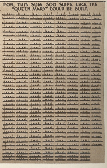
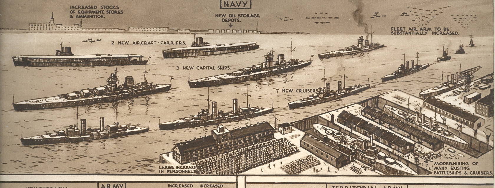
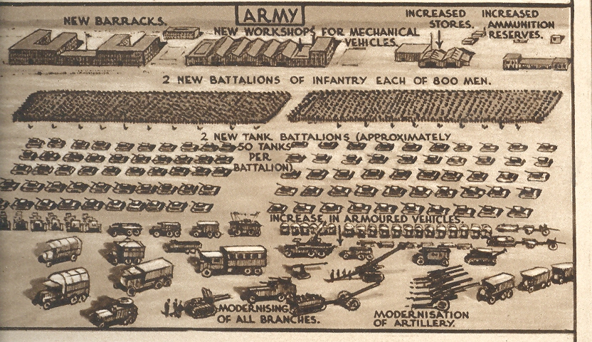
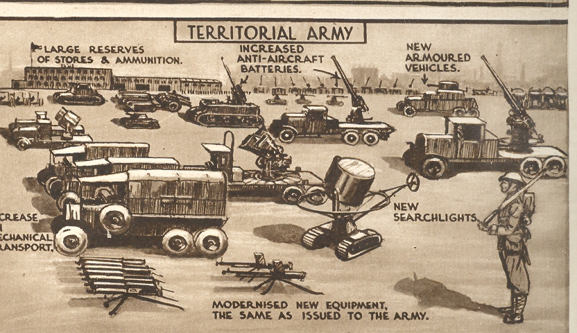
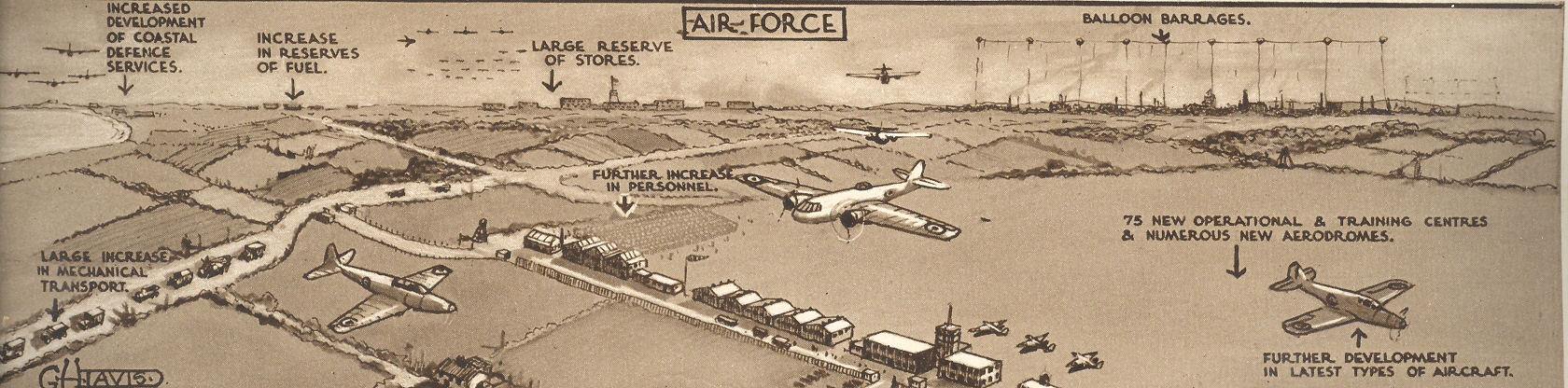
    The Illustrated London News for 27 February 1937 hosted a brilliantly designed graphic illustrating the ways in  which the British War department could/should spend 1.5 billion pounds (or about $100 billion in 2009 dollars, sort of) over a five-year period as the price of keeping the peace.  Of course they wouldn’t make it but a quarter of that distance as Austria fell to Czechoslovakia which fell to Poland and the end.  The full-page pictorial effort is to the right:

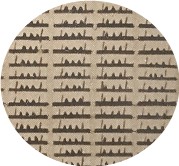
    Nestled in the corner of this page–at about 2×1 inches–is this lovely little graphic, showing that 1.5 bil could purchase 300 Queen Marys, which this delightful little design showed to great effect, and a hidden gem inside of a gem. First is a detail of this detail,

    Blog jan 22 Brit Mil bot right det 

    Followed by the full smidgen of the overall page of comparisons and analogies:

    Blog jan 22 Brit Mil bot right

    Then there’s the semi-standard presentation of what the Navy could purchase:

    Blog jan 22 Brit Mil top

    And then the Army:

    Blog jan 22 Brit Mil middle l

    And of course the Territorial Army:

    Blog jan 22 Brit Mil middle r 

    And the Air Force (which if you look closely includes a balloon barrage  facility at upper right):

    Blog jan 22 Brit Mil middle bot

    By far the most interesting to me is the hidden gemoid of Queen Marys, all produced by the fabulous G.H. Davies, who did many hundreds of such images and sectional cutaways and plans and technical drawings for the ILN over a 25-year period.  M.r Davies may well be my favorite technical artist of this period.


  • The Tools of a Scientist, 1700

    JF Ptak Science Books    Quick Post

    Friedlein941

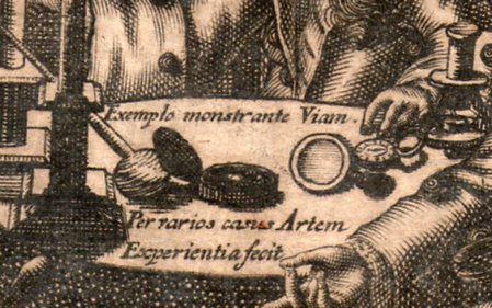
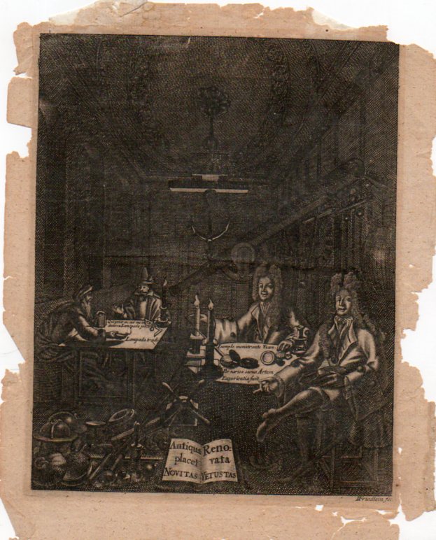
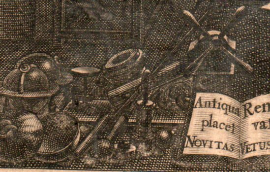
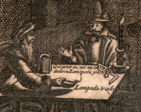
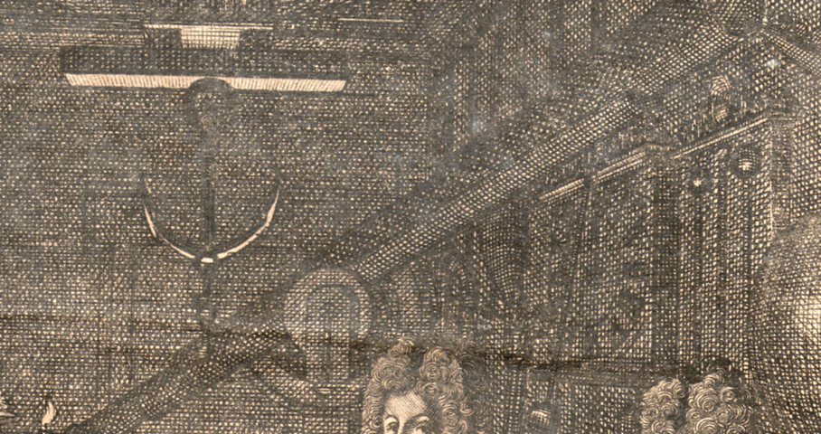
    This is an image of a  philosopher’s cabinet, an engraving (on copper?) by “I. Friedlein fec”, who was actually Johnann Friedlein, an emigree from North Germany to Denmark, and who worked ca. 1680-1705. It shows the tools of the trade for someone working in natural philosophy (the name “scientist” would not come into use for another 150+ years or so) and is an interesting insight into a small, polite gentleman’s club for experiment and investigation.

    Friedlein938

    The men surround a decent collection of scientific instruments–I can locate a compass, dividers, oil lamp, magnifying glass, compass, microscope  (at the right elbow of the figure on the right), terrestrial and celestial globes,  a (large) clock, barometer and various weights and scales.  And behind it all looms a fairly large refracting telescope (is it 6 six inches?) which also has mounted alongside of it a smaller sighting telescope. 

    Friedlein939


    Friedlein940

    Friedlein942

    Nyt dansk kunstnerlexikon: bd. Indenlandske kunstnere (fortsættelse …)by Philip Weilbach:


  • Graphical Display of Data–Profiles of British Destroyers, 1949

    JF Ptak Science Books  Quick Post     

    Display of Quantitative Information series.

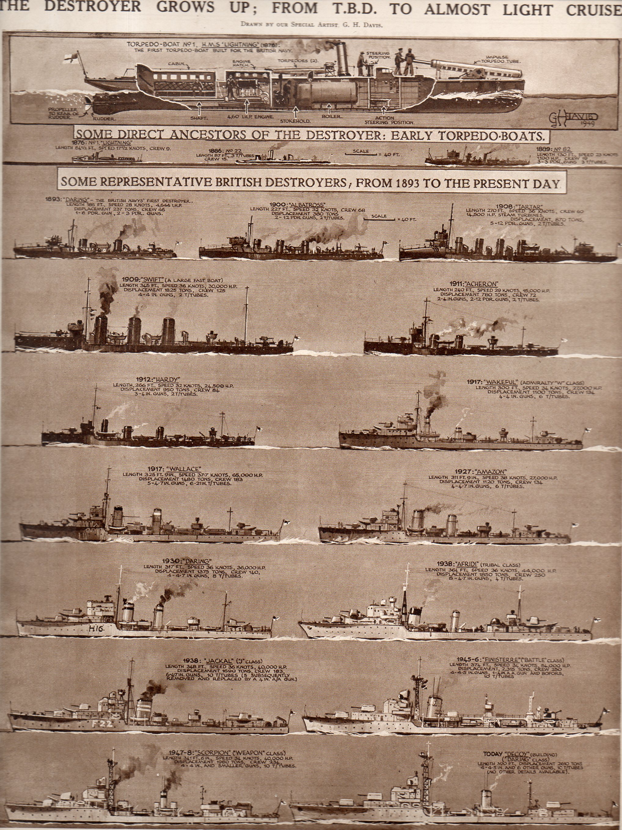
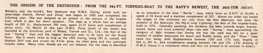
    I found this interesting and lovely display of empirical data, and I like it quite a bit, even though it really isn’t a good example of a graphical display of information.  The chart was intended to show the differences in the profiles of British destroyers, and not much more.  The image appeared in The Illustrated London News, April 23, 1949.  

    Hic--the Destroyer191

    And the text:

    Hic--the Destroyer text192

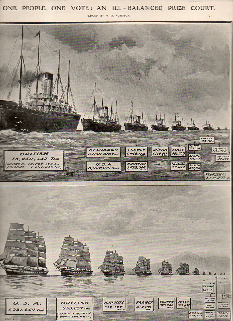
    Then there’s this (below) a good graphical representation of the size of fleet strengths, steam and sail, appearing in The Illustrated London News  for January 28, 1911, just a few years before the start of WWI:

    Graphic fleet size193


  • Superb Cover Design–WWII Underground Warfare, 1943

    JF Ptak Science Books   Post 2280

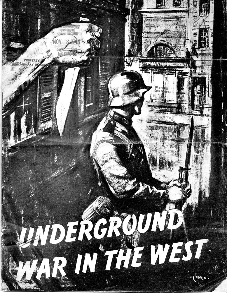
    “There are no news-cameras clicking where the underground war wages. It is a war of iron nerves against an iron machine, of indomitable men and women defying the Nazi monster, of sudden swift strokes out of the dark, of blows that fall where least expected, hampering, slowing, wrecking the Nazi war machine…” 

    WWII  Underground War196

    Underground War in the West has one of he most dyunamic covers I’ve seen in quite some time–not to say that there are absolute “best” designs, but it is certainly a top-tier design, a fine effort, grabbing the attention of even a casual browser, and suggesting action, even without a read. 

    This pamphlet really seemed like a tiger in a cage—looking through some of the collection here relating to WWII literature on activities in occupied countries, the startling cover graphic of Underground War in the West (printed at some time in 1943, and not before or after) really rattled its cage.  Its contents were non-too tame, either—while being reasonably polite (as was the fashion) it still invoked some very difficult ideas and images.  

    This was a terrific, mass appeal pamphlet on the underground actions of occupied Europe illustrated with pencil and charcoal drawings by Cuneo, with each page depicting a  resistance activity—including the underground press, medical aid, sabotage, and general murderous nuisance-making and in general pamphlet praises and celebrates the heroism in occupied countries such as Czechoslovakia (with a drawing showing the assassination of Heydrich), Holland (showing the Dutch caring for a wounded RAF pilot), Belgium, France, Greece. Norway, Poland, Yugoslavia and Luxembourg.

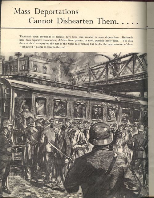
    Blog jan 7 undergrd deport

    There are full-page drawings relating to the strength of occupied people in the face of “Mass Deportation (cannot dishearten them, thousands and thousands of families have been torn asunder in mass deportations…”) and “Firing Squads…thin the patriot ranks yet ever more step into their places” . The section on “Facts from the Occupied Countries” list activities in 9 occupied countries;  under “Poland”, we read that “Germany has drawn a veil of silence around Poland…it is estimated that 2,500,000 Poles have died in concentration camps or by execution up to December 31, 1942. There are 54 concentration camps in Poland…and the average life span in the camps is nine months…”  Nowhere in the pamphlet however is there any singular mention of deportation or murder of the Jewish people—there were hundreds of articles printed in American newspapers up  until this time on the beginning of the (yet named) Holocaust, though acknowledgment of a fact doesn’t necessarily make it widely known in spite of its incredible and massive significance.  This pamphlet, while extraordinary in mentioning the millions of deaths in the concentration camps and “deportations”, was rather ordinary in its coverage of who it was that was being murdered in the camps.  

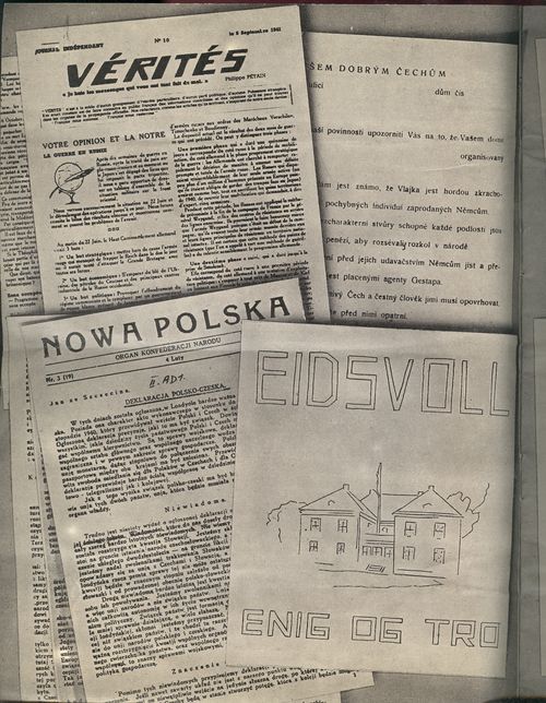
    There is also a two-page spread exhibiting examples of underground newspapers:

     
    Blog jan 7 undergrd newspars 001

    Only six copies are located in libraries around the world, and those are pretty high-calibre institutions:  Hoover Institute on War, Holocaust Library, Harvard University Law Library, London Metropolitan, National Library of Scotland, Oxford University.