A Daily History of Holes, Dots, Lines, Science, History, Math, Physics, Art, the Unintentional Absurd, Architecture, Maps, Data Visualization, Blank and Missing Things, and so on. |1.6 million words, 7500 images, 4.9 million hits| Press & appearances in The Times, Le Figaro, Mensa, The Economist, The Guardian, Discovery News, Slate, Le Monde, Sci American Blogs, Le Pont, and many other places… 5000+ total posts since 2008.

Category: Information, Quantitative Display of

  • First Printed & Illustrated Medical Book (1500)

    JF Ptak Science Books   Post 2277
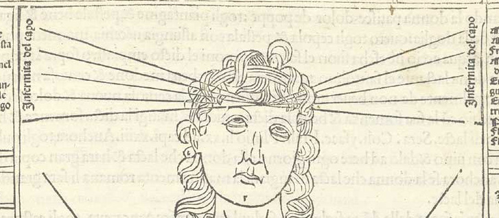
    Ketham_p37 det
    “For my part I deem those blessed to whom, by favour of the gods, it has been granted either to do what is worth writing of, or to write what is worth reading; above measure blessed those on whom both gifts have been conferred”–Pliny the Elder

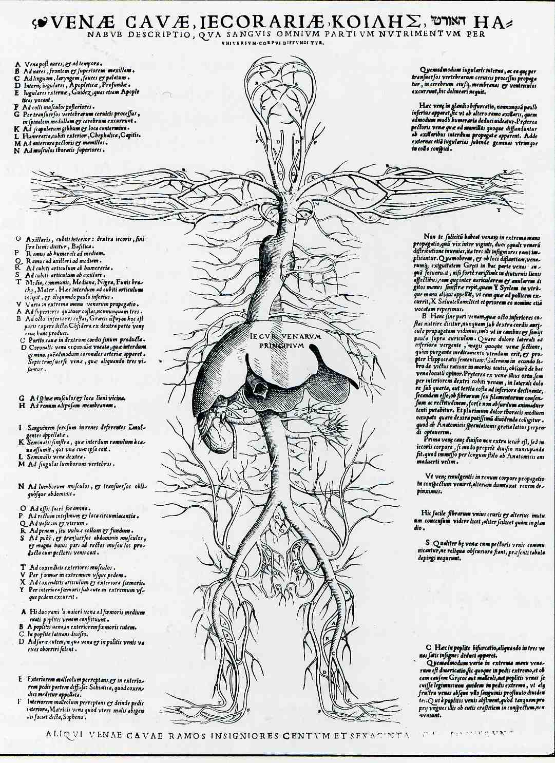
    Johannes de Kehtam’s Fasciculus Medicine (printed in Venice in 1500) was the first anatomy to be printed with illustrations. Ketham was described as a German doctor living in Italy and may well have been Johann von Kerchheim, a German practicing surgery and medicine in Venice during he 1470′), and who wrote a series of tracts on various aspects of medicine which were then collected into this single bound volume.  The illustrations are spectacular and to me have a very modern sensibility in their mid-Renaissance woodcut legacy–the look very clear and concise, are well proportioned, nicely labeled, and give plenty of free rein to open and blank spaces on the woodblock.  The only time these images really “fail” is when they appear in color–a process that would’ve been undertaken privately, by the purchaser of the book, who would have contracted with an artisan to color the book. The images in almost all of the cases of coloring that I have seen just do not match the elegance and brilliance of the original with no color. 

    [Source for all images: NATIONAL LIBRARY OF MEDICINE, here.]
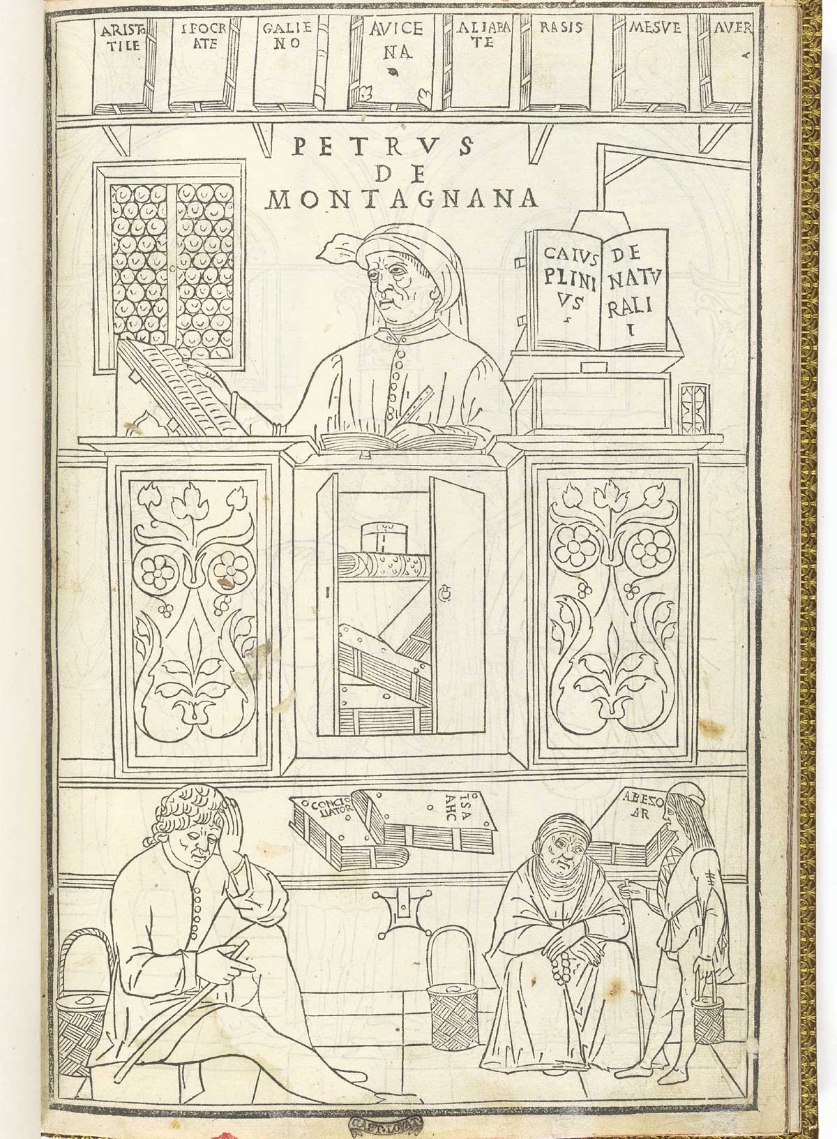
    Ketham_p01

    Its interesting to make a quick note on the books on display on the bookshelf behind the seated figure of Petrus de Montagnan (who is consulting classic texts in medicine as his three patients awaits his attention): the books  include Aristotle, Hippocrates (“ippocrate”), Galieno (Galen), Avicenna (980-1037), Rasis (Ibn Sina, Rasis, Razi, Al-Razi, c.865-925), Mesue, Yuhanna bin Masawayh (c.777-857), and Averroes (1126-98), Abu el-Walid ibn Ruchd, Abu el-Walid ibn Ruchd. On the shelf to the right we see a copy of Naturalis Historia by Cais de Plnii (Gaius Plinius Seocndus, also known as  Pliny the Elder, who lived from 23-79 A.C.E and who held forth on all knowledge from everywhere during the first century).

    It is the anatomical illustration where the un-named artist is most brilliant–the lines are sharp and crisp, the spacing elegant, and the imagery very clear.  It is just lovely work:

  • High Realism in Anatomical Art, 1690 & 1872

    JF Ptak Science Books      Post 2276

     Anatomy--braun--

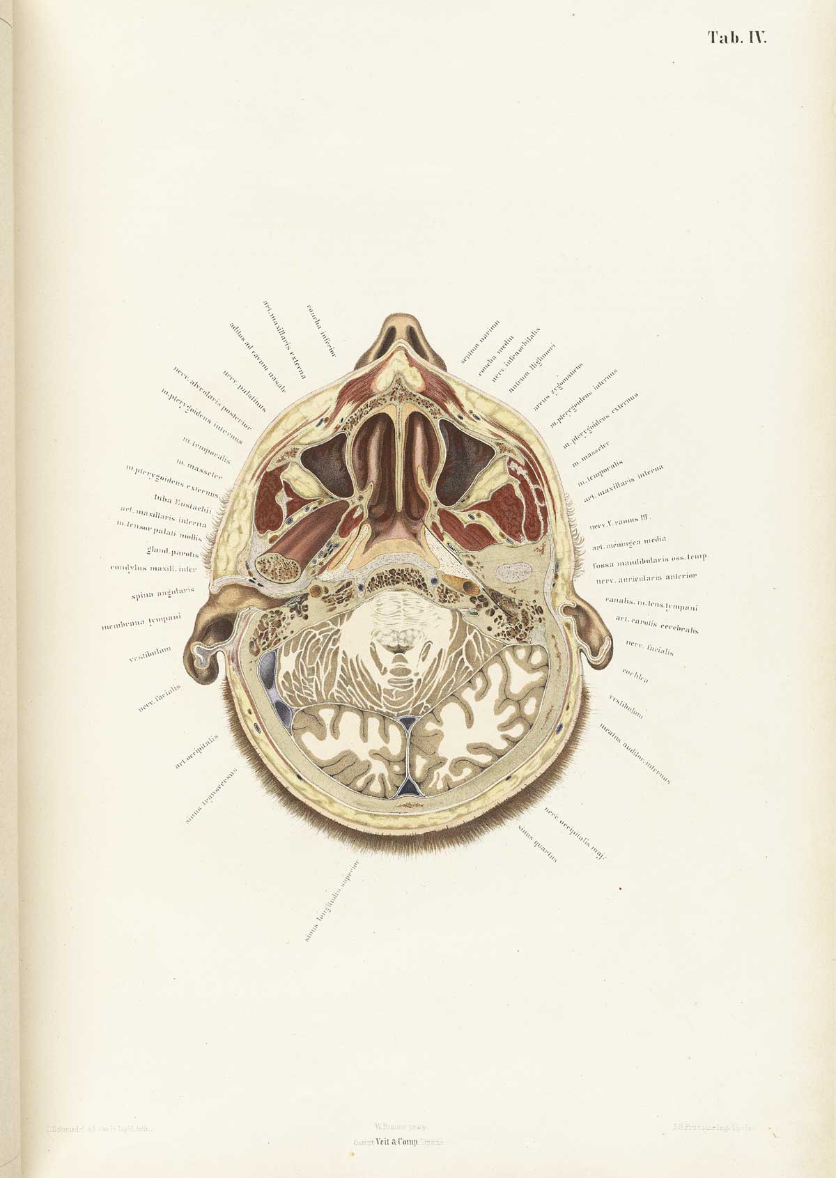
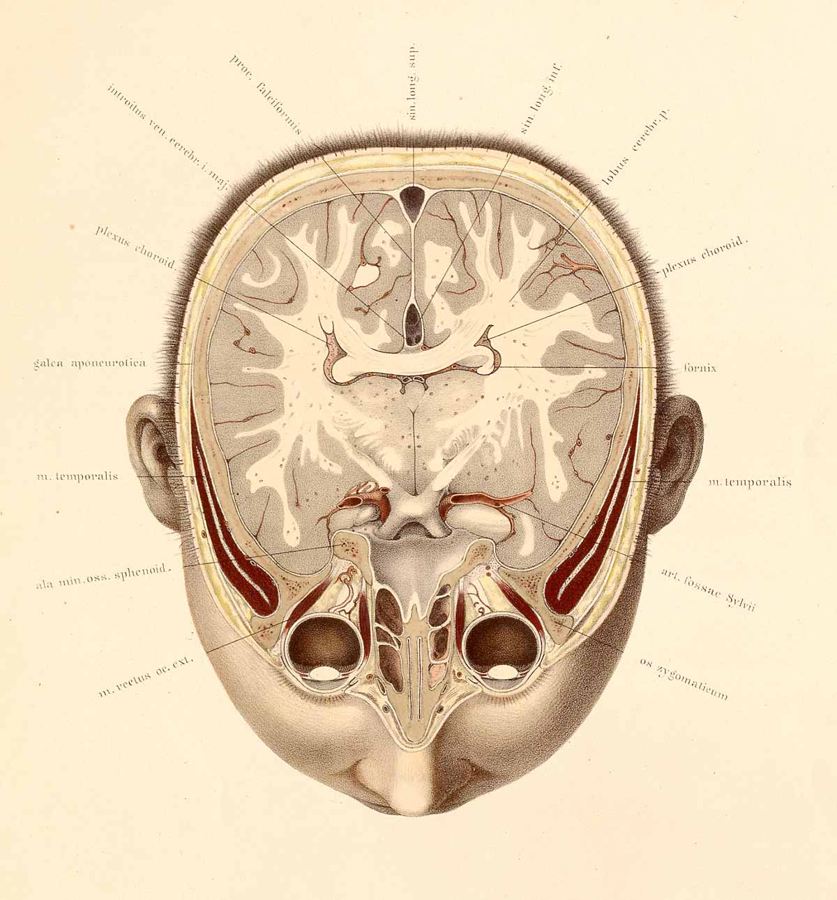
    The collaborative work of anatomist Wilhelm Braune (1831-1892) and artist C. Schmiedel (fl. mid-1800s) produced a singular work,  Topographisch-anatomischer atlas nach durchschnitten an gefrorenen cadavern…(published in Leipzig in 1872), which was an oustanding example of high-realism in the art of anatomy. This book is pretty much right-to-business, with no extraneous bits as had appeared in anatomies fo rcenturies. And even though these practices had pretty much expired by the first quarter of the 19th century, Braune/Schmiedel was ever more so detailed and simple–their design was fabulous, and their detail light and exceptional. 

    Anatomy braune04[Source: National Library of Medicine.]

    They also made use of sliced frozen sections of cadavers, which seems to give their work that crystalline touch.  The first image looks at the brain from top-to-bottom, while the second reverses the view, which is in itself somewhat unusual, even in 1872. 

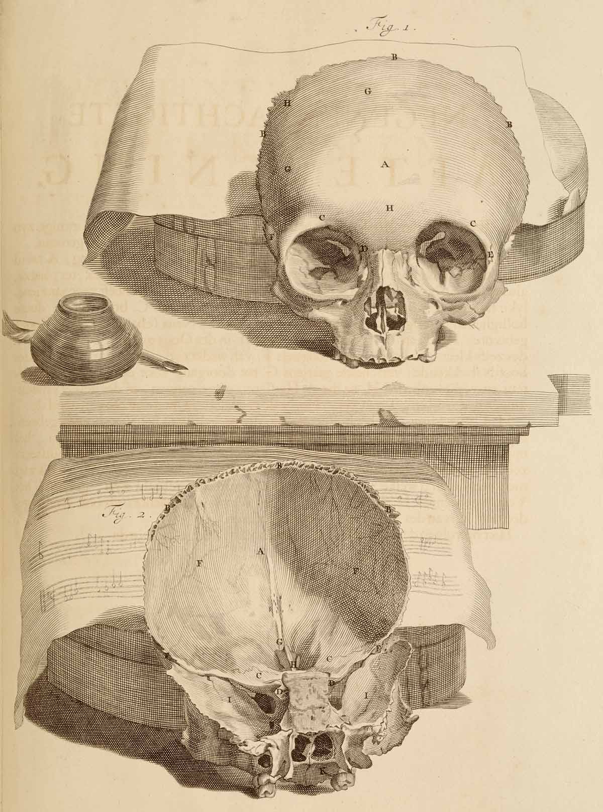
    Looking into a very finely-produced skull from an earlier period in the work of the anatomist Govard Bidloo (1649-1713) and the artist Gérard de Lairesse (1640-1711) in their Ontleding des menschelyken lichaams, (which was printed in Amsterdam in 1690) we find a bit of a different story.

    Anatomy skull[Source: National Library of Medicine.]

    One interesting aspect of Bidloo is that he can be extraordinarily detailed and still lend a rather baroque still life to engage his subject–like the skull with musical score, above.  There’s no reason for the added bit of scenery, its just a luxurious background for the anatomy. And then there are examples like this incredible facial/neck dissection below, which is very hard-core realistic, just as what you might find on any dissecting table, which most assuredly did not come equipped with pen/ink/music score.  Bidloo here is ultra-real, more so than the greater majority of anatomist/illustrators. [Ontleding des menschelyken lichaams...printed in Amsterdam, 1690, as a copperplate engraving with etching. Source: National Library of Medicine.]


  • Exceeding Excess–on Lots of Detail in Maps (1891)

    JF Ptak Science Books    Post 2275

    One of my favorite atlases of all-time is Adolf Stieler’s Hand-Atlas (Hand-Atlas über alle Theile der Erde und über das Weltgebäude, published in Gotha, Germany, by Justus Perthes) and edited by August Petermann.  I love this series (there were eight editions and a number of intervening printings to 1891) because the maps seemed so impossibly detailed for their scale.  They have so much detail and such great relief that in some very odd way they almost do not look like maps.  The sheets have massive amounts of info, particularly so with areas in which you do not expect it.

    This post came to be because I bumped into an old Stieler-friend–the six-sheet map of the United States.  I have four different flavors of the map, but the one I like the most is from 1891.  The sheets are all produced to be pieced together contiguously, so that they form a map 28″x52″–and there is so much detail the work looks a little like carto-graffiti, except of course that it isn’t, and that all of the extremely small and fine engraving piles one next to the other make for a very accurate and full map of the country.  

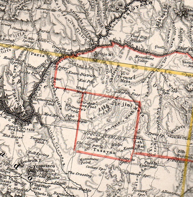
    Take, for example, the Four Corners region, mainly for north-east Arizona:

    Stieler189
    This is about 50% larger than the original, about a 2″x3″ section of one 15″x18″ section of the six-section map, and it is just packed with detail.

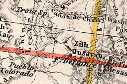
    And here, a smaller detail, of about a one square inch section of map, concentrating on the Canyon de Chelly.  Now I know this area a little, and about the history of its cartography (somewhat), and I can safely say that this is just tremendously detailed given the scope of the map.  The remarkable thing about the Stieler atlas is that all of the maps are like this.  Extraordinary–not particularly beautiful in the traditional over-the-fireplace sense f beautiful, but fantastic as, well, maps (of particular and perhaps peculiar scientific loveliness).   

    Stielerdet190


  • M(art)hematics (Math Art), 1806

    JF Ptak Science Books   Quick Post

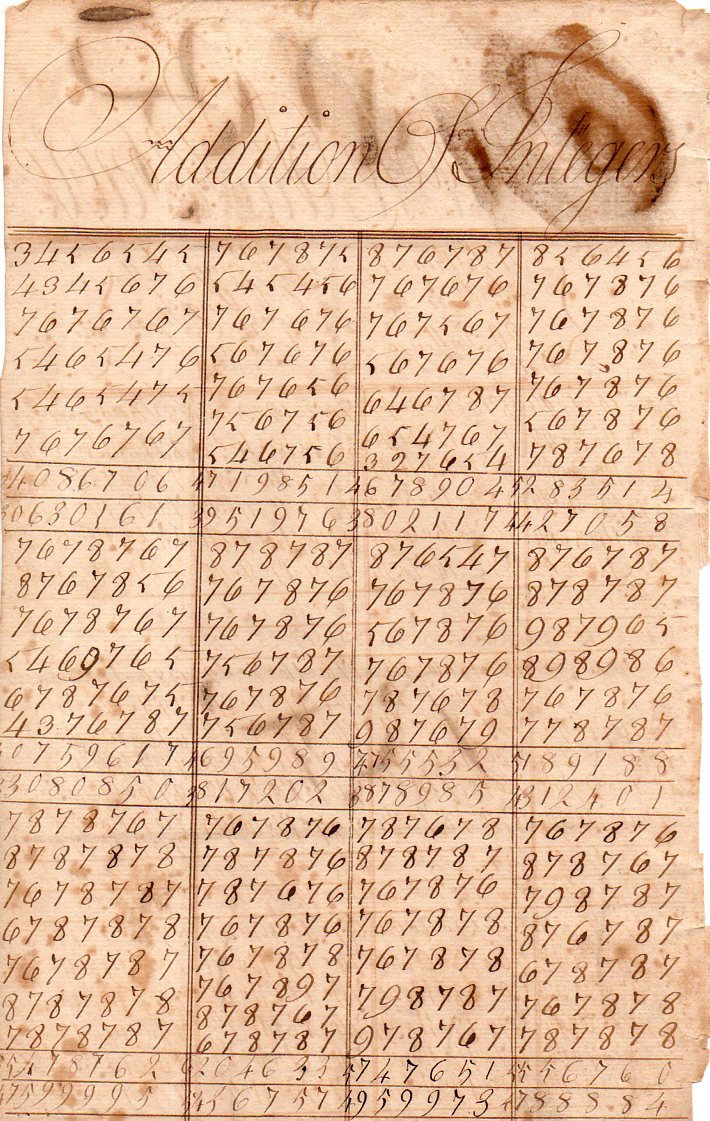
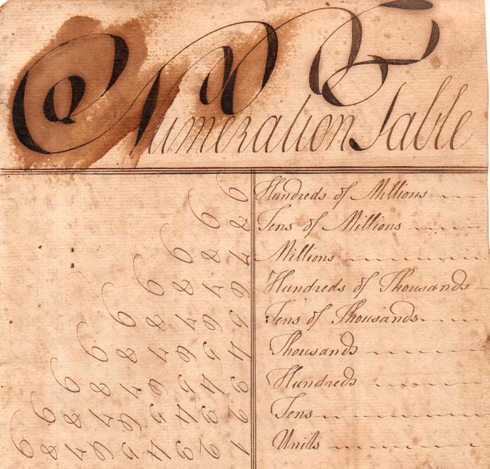
    Sometimes the rote and the routine as practice by young hands two hundred years ago can yield some surprising and beautiful results.  And so we find the beauty in these columns of arithmetic problems, practiced by a young girl in Philadelphia in 1806.  The work is determined and taken all together is just a lovely thing.  (And yes there’s a mistake here and there but it doesn’t matter, not really.)

    See also:  Mathematical Art, the End of Simple Multiplication (1814), here.

    Marthematics183

    And again in this “numeration table” where we see the 

    Marthematics184


  • An Unusual Set of Astronomical Images

    JF Ptak Science Books  Quick Post

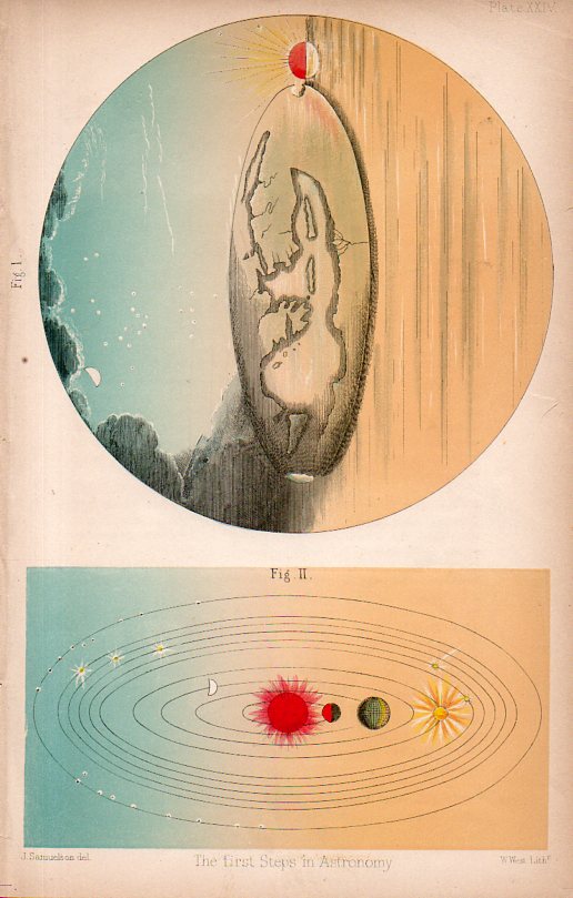
    Well, these look unusual to me, mainly because I do not understand the representation of the Sun in either image.  The first image (printed I guess around 1860) is the easier of the two, showing the Oikoumene, the inhabited world, of the Earth as known to Herodotus, the orbis herodoti, of the 5th century bce.  All of the land to the right (south) is Libya, Arabia, Persia, and India, all undifferentiated, though we can see the Nile delta. The two main land masses poking into the sea are Thrace and Phrygia, with

    Astronomy odd178

    no sign of very much to the west of that, no sign of Italy, nothing for the Celtic regions or Iberia, with some hint of polar regions.  Why the Sun is so, I am not sure.  

    The red Sun makes another appearance in the outline of the solar system, in the next image.  It is red, and brilliantly so, and firey; in the place of the Earth in the third sphere is the Moon, and beyond that another yellow firey star, which I take to be, perhaps, our own planet.  I can’t read this one, the yellow star and all…though it is very pretty.  


  • Affairs of the Heart: Blood & Clouds, 1664

    JF Ptak Science Books  Post 2270

    0 blog feb 6 circle541

    [Image sources: National Library of Medicine.]

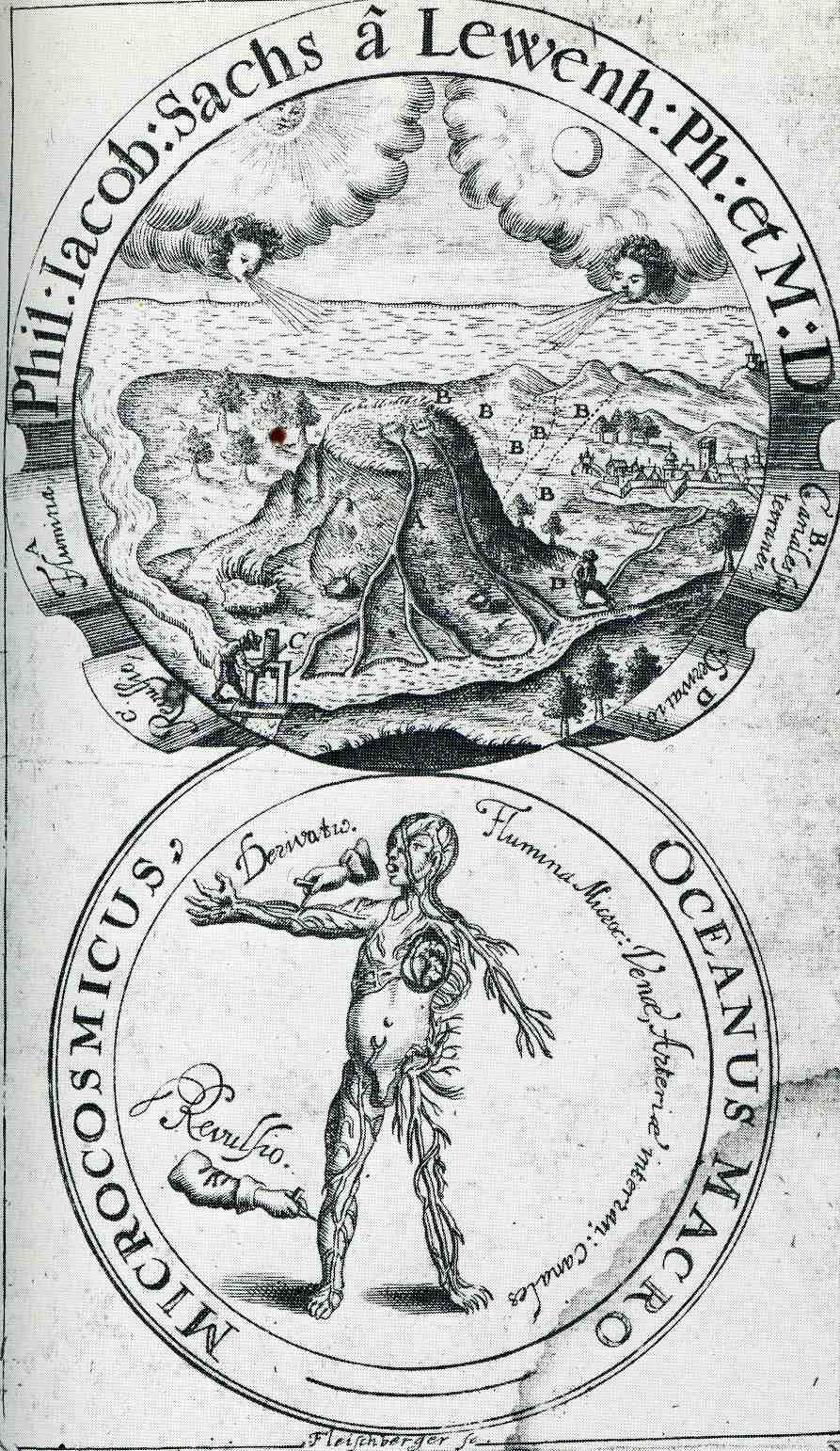
    In 1664 Philipp Jakob Sachs (Sache de Lewenbheimb) wrote an influential book on the circulation of the blood.  It was the advanced work of a learned man, a naturalist and physician who was also the editor of the Ephemerides Academiae naturae curiosorum, which was the first journal in the field of natural history and medicine and one of the founders of the Academia Naturae Curiosorum (Leopoldina).  His work came 40 years after the great work by William Harvey, who published Exercitatio Anatomica de Motu Cordis et Sanguinis in Animalibus in 1628, a work in which he essentially brought the idea of circulation of the blood into the modern age, building on earlier ideas of Michael Servetus, whose 1561 work on circulation (and his religious ideas) brought him to be executed by flames. 

    For centuries the pulse was a vaguely understood thing reaching back into the murky medical past as far back as Galen.  The association of course was with the heart, and the association of the heart was as the great controlling center of all function and control of the human body—a theory that reached far forward into the 16th century.

    Servetus (physician, cartographer, theologian, writer and general all-adept Humanist of a high order) was in trouble with the church for many reasons, not the least of which was trying to dislodge the theory of the heart as sacred and the seat of wisdom.  But he did establish that the heart was an organ, which didn’t sit well with very many people, least of all the Calvinist court in Vienna which found him guilty on many anti-Humanist grounds, including his anti-Trinitarian Christology, which made him a reviled figure to Catholics and Protestants.  He was tried and found to be dangerously heretical, and sent to the flames.

    Harvey withstood blistering attacks on his correct statements on the circulation of the blood (costing him nearly all the patients in his practice), though he at least lived to see a brighter day:  Servetus, on the other hand, didn’t, and was burned at the stake for his heresies, one of which his attack on the spiritual heart.

    In any event, the frontispiece to Sachs’ work is an interesting allegorical composition showing a connection between the place of the very prominently featured heart in the circulation of the blood, and the water cycle, and the cosmos of creation (the breath of life coming from the winds of the Sun and the Moon).   

    0 blog feb 6 circle542


    Notes:  (Sachse de Lewenheimb, Philipp Jakob Sachs, 1627-1672 , Oceanus macro-microcosmicus, seu Dissertatio epistolica analogo motu aquarum ex et ad Oceanum, sanguinis ex et ad cor… 1664, with full text via Google books here).


  • What 1.5 Billion Pounds Bought the Military in 1938: Finding a Gem Inside a Great Graphic

    JF Ptak Science Books    Post 916 (from 2010, expanded)

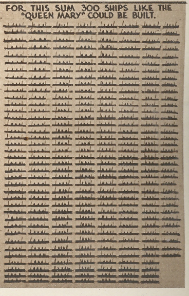
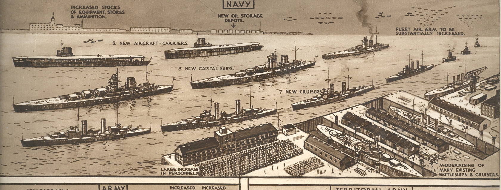
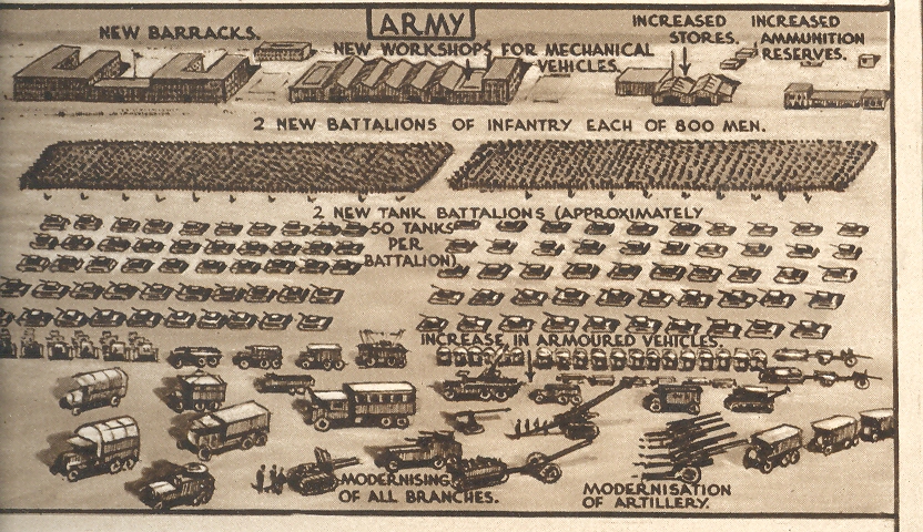
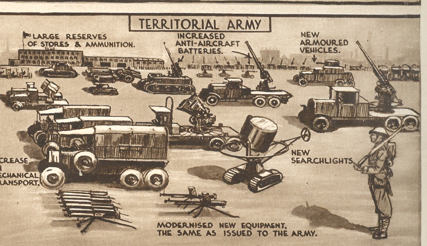
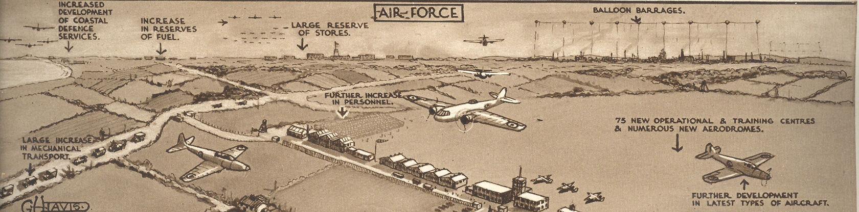
    The Illustrated London News for 27 February 1937 hosted a brilliantly designed graphic illustrating the ways in  which the British War department could/should spend 1.5 billion pounds (or about $100 billion in 2009 dollars, sort of) over a five-year period as the price of keeping the peace.  Of course they wouldn’t make it but a quarter of that distance as Austria fell to Czechoslovakia which fell to Poland and the end.  The full-page pictorial effort is to the right:

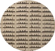
    Nestled in the corner of this page–at about 2×1 inches–is this lovely little graphic, showing that 1.5 bil could purchase 300 Queen Marys, which this delightful little design showed to great effect, and a hidden gem inside of a gem. First is a detail of this detail,

    Blog jan 22 Brit Mil bot right det 

    Followed by the full smidgen of the overall page of comparisons and analogies:

    Blog jan 22 Brit Mil bot right

    Then there’s the semi-standard presentation of what the Navy could purchase:

    Blog jan 22 Brit Mil top

    And then the Army:

    Blog jan 22 Brit Mil middle l

    And of course the Territorial Army:

    Blog jan 22 Brit Mil middle r 

    And the Air Force (which if you look closely includes a balloon barrage  facility at upper right):

    Blog jan 22 Brit Mil middle bot

    By far the most interesting to me is the hidden gemoid of Queen Marys, all produced by the fabulous G.H. Davies, who did many hundreds of such images and sectional cutaways and plans and technical drawings for the ILN over a 25-year period.  M.r Davies may well be my favorite technical artist of this period.


  • CartographArtia of the Flight of Homing Pigeons

    JF Ptak Science Books  Quick Post 

      Homing pigeon151

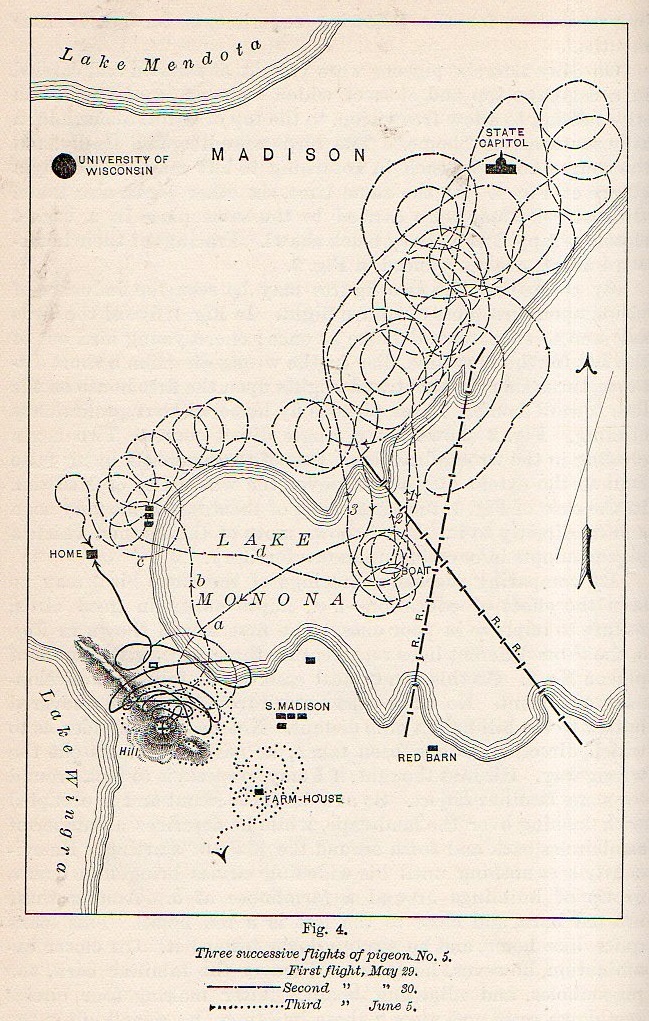
    Non-representational art was still nearly twenty years in the future when this lovely cartographic artwork was published in 1894.  And what we are seeing here in the collection of circles and spirals is a representation of three trials of a homing pigeon finding its way home in the Lake Monona region of Madison, Wisconsin.  C.F. Hodge Ph.D. (of Clark University, psychology) wrote “The Method of Homing Pigeons” for Popular Science Monthly (volume 24, 1894), showing at least in this found instance that behavioralists (yet named at this point) enjoyed working with pigeons well before C.B. Ferster recommended them over rats to B.F. Skinner (mainly because, as Ferster said, he didn’t like rats).

    Actually Hodge was more of a neuro/pathology person, but for now I’m just interested in the artwork generated by his experiments.  


  • Big Tonnage Visualization–on Quantifying Images of Bigness

    JF Ptak Science Books  Post 2251   Artistic Display of Information series

    Infographic railways

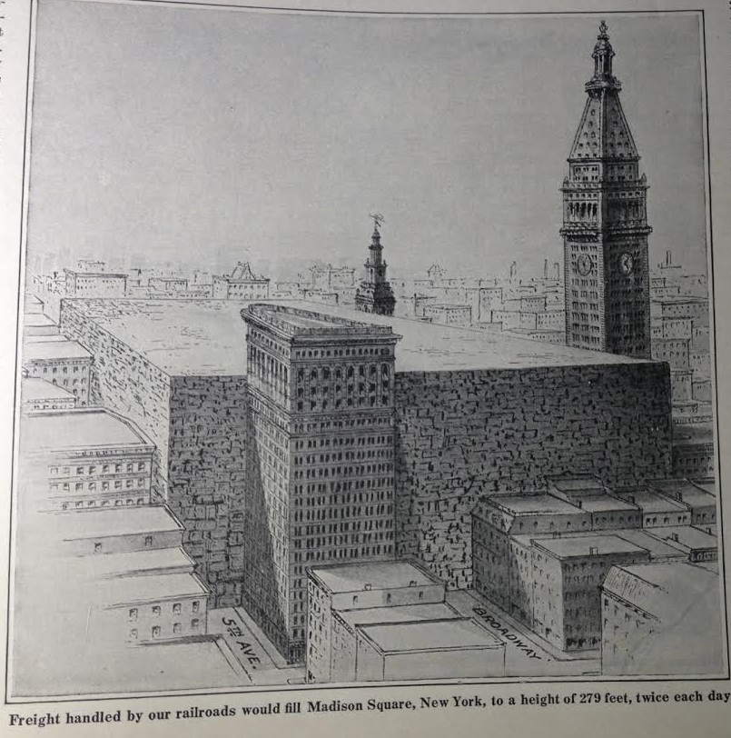
    There are many posts on this blog relating to pre-WWII visualizations of bigness and smallness, of what it would like exactly to see 54,000 B-17s in flight, or how much a German prisoner eats per year in British compounds in 1917, and so on. I found the following qualitative display of quantitative data regarding American railroads and the astonishing amount of material they transported per year, resting comfortably in the pages of a Scientific American for 1918.  The editor placed the display right on the first page of the issue, stating that “every one of us knows that the railway system of the United States has the quality of bigness, but not every one understands just how immense it actually is”, and he was correct.  The top image relates to the 2 billion tons of freight hauled by the railways every year–that would mean that you could fill up Madison Square Garden (one of the earliest versions of the building now occupying that spot) twice every day with stuff for one whole year. That would be a cube 870′ long and 540′ wide and 280′ deep.  (The editor doesn’t reckon it but that would also make for a tower 870’x540’x90,000′ (or 18 miles) high.)

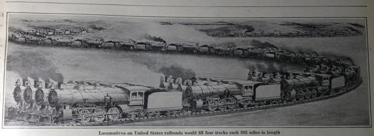
    The editor also points out that if you took all of the locomotives (and coal cars) in the U.S. and lined them up they’d be a 4-track-wide string of them 385 miles long–that’s a lot of locomotives. 

    [Source, Scientific American, January 12, 1918, volume 118, page 49. ]

    Infographic railways2


  • Salvage! (1943)

    JF Ptak Science Books

    00-blog-Oct 25 salvage922

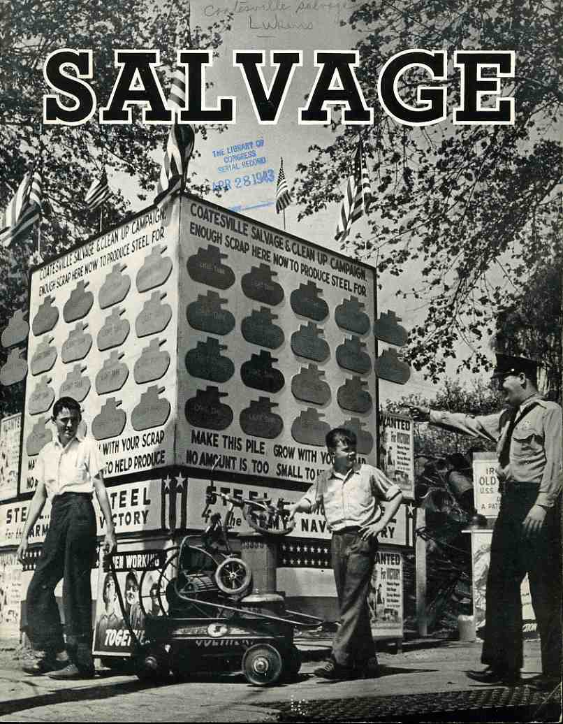
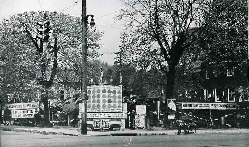
    Now for an example of something fantastic: Salvage (1943) is just brilliant!  It is a superb  design, getting its inelegant point elegantly across to the reader, making the collecting of junk  a bona fide war effort, triumphant, superior; it delivers the message gorgeously.  Who wouldn’t want to rush out and look for some metal scrap and bits and grow a neighborhood junk yard so that the community could build a tank?  Certainly these two boys–under the watchful guidance of a smiling cop in a black tie–couldn’t resist, and from the looks of the progress billboard behind them, nor could anybody else in the neighborhood, as the community collected enough metal junk for 14 tanks.  (Or at least pieces and chunks for fourteen tanks.)

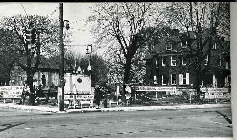
    The community was Coatesville, Pennsylvania, and they certainly did their collecting-best.  The two photos below show (top) the scrap yard after two days of collecting, and (bottom) the end of the campaign two months latter.

    “One pound of fat contained enough glycerin to make a pound of black powder, enough for six 75-mm shells. Twenty three hundred old nylon stockings contained enough nylon to make one parachute.
    Thirty thousand razor blades contained enough steel to make fifty 30-caliber machine guns.”   (Lingeman, Richard R. Don t You Know There Is a War On? The American Home Front, 1941-1945. New York: G.P. Putnam’s Sons 1970, 254-55).  When you have an entire town doing this, you can build tanks; when you have millions of people throwing together to collect this “junk”, then you get part of a war effort.  It is also part of a giant propaganda hearts/minds machine, especially for the U.S., which was (and I use this word with some hesitation) cushioned from the effects of the war by two oceans–it reminded people who hadn’t contributed a life to the war that there was actually something tangible going on, and that they could do something to help.  It kept peoples’ minds in the game.  Rubber was another big concern, as was silk (the controlling exporter of both coming largely from overseas, and in the case of silk, the exporter was Japan.)  Of course there was the introduction of synthetics for both silk and rubber, but the point in fact was that there was indeed a shortage, and the donated and salvaged stuff was necessary. 

    Here’s a beginning picture for the burgeoning community scrapyard:                                                                                                                                             00-blog-Oct 25 salvage before923

    Some interesting works relating to salvage drives:

    Barringer, Edwin C. The Story of Scrap. Washington D.C:Institute of Scrap Iron & Steel Inc., revised edition, 1954.

    Cohen, Stan. V for Victory: America’s Home Front During World War II. Missoula Montana: Pictorial Histories Publishing Co., Inc., 1991.

    And afterwards:

    00-blog-Oct 25 salvage after924

    Hoopes, Roy. Americans Remember the Home Front: An Oral Narrative. New York: Hawthorn Books, 1977.

    Lingeman, Richard R. Don t You Know There Is a War On? The American Home Front, 1941-1945. New York: G.P. Putnam’s Sons, 1970.

    O’Neill, William L. A Democracy at War: America’s Fight at Home and Abroad in World War II. New York: The Free Press, 1993.

    And here’s one I’d like to see (the cover of):

    Wolf, Howard. The Story of Scrap Rubber. Akron, Ohio: A.
    Schulman, Inc., 1943.