A Daily History of Holes, Dots, Lines, Science, History, Math, Physics, Art, the Unintentional Absurd, Architecture, Maps, Data Visualization, Blank and Missing Things, and so on. |1.6 million words, 7500 images, 4.9 million hits| Press & appearances in The Times, Le Figaro, Mensa, The Economist, The Guardian, Discovery News, Slate, Le Monde, Sci American Blogs, Le Pont, and many other places… 5000+ total posts since 2008.

Category: History of Lines

  • Straightening Out Michelangelo (Part of the “History of Lines” series)

    JF Ptak Science Books  Quick Post

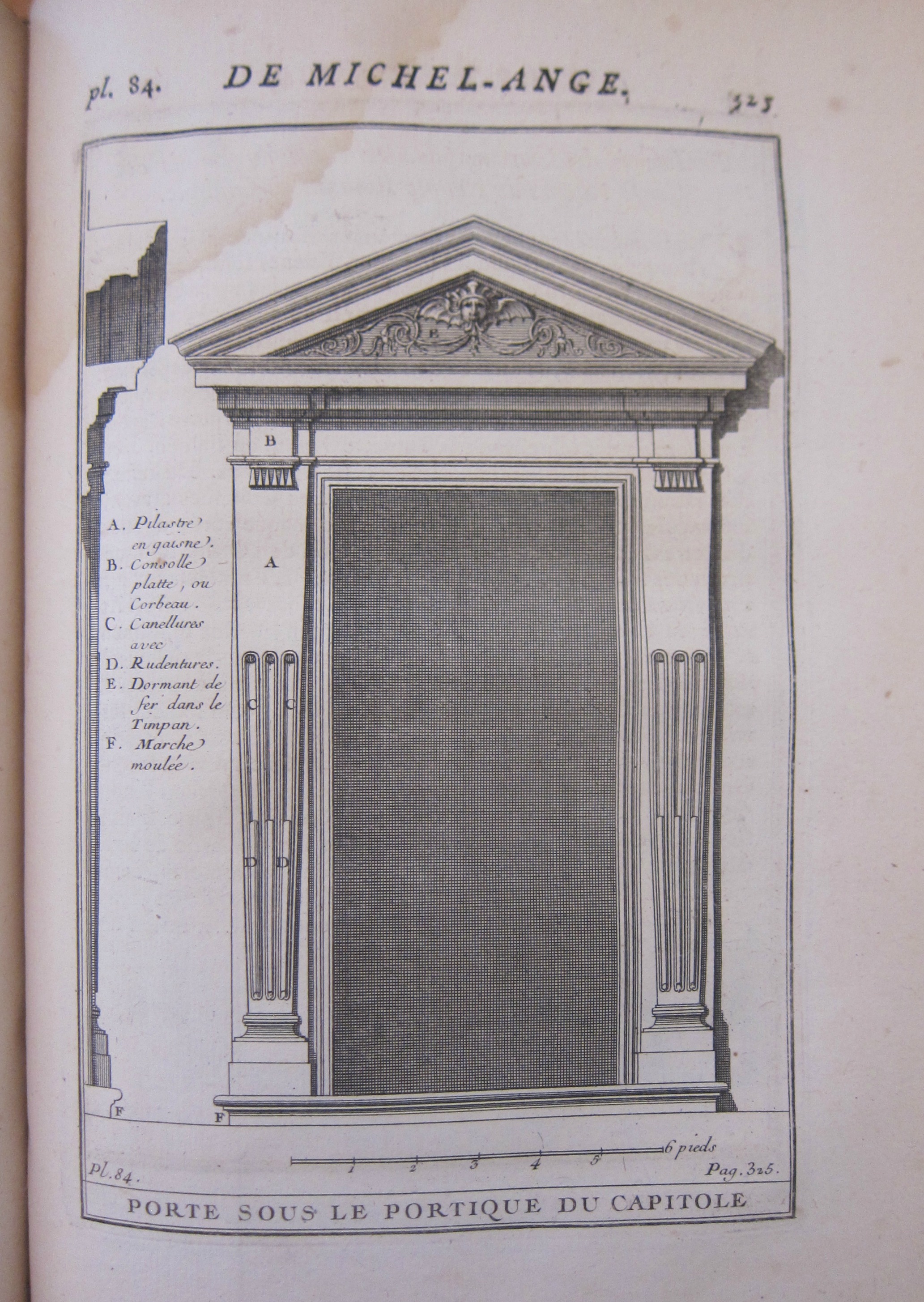
    I suspect that the subject of “straightening out” of any work of Michelangelo is, well, infrequently done, mainly because of all the things that could and should be written about that man this would be the least of them all.  That said, the “straightening” bit struck me when I was looking at the detail in an engraving of a doorway that Michelangelo design on Capitoline Hill, and the extraordinary detail in the shadowing just called out to me.  The design is beautiful, but all I could think of was how many squares were in that shadow. And then of course one had to wonder how long a line all of those shadow line would be if they were all placed end-to-end. The answer to that is about 300′.  

    There you have it. 

    The engraving is from C.A. d’Aviler, Cours d’Architecture qui Comprend les Ordres de Vignole…new edition, printed in Paris in 1756, p 325, plate 84, “Porte sous le portique du Capitole”. 

    The detail of the shadow:

    Michelangelo lines _3_ detail

    And the full image:

    Michelangelo lines _1_ full


  • Outsider Real Politik from 1942 (“Straight Boundary Lines. Stop–Wars.”)

    JF Ptak Science Books   Post 2695   History of Lines series
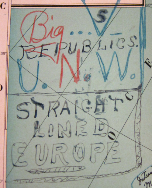
    Maps Outsider 1945 world map titleThis Outsider-y pamphlet on the reorganization of the world after the end of WWII was a very unexpected find.  Some of the thinking in the text could make your eyebrows touch your cheeks from their dubious logic and idea base, but it is the map to illustrate the distribution of political existence for most of the countries of our planet that is the most remarkable component of this exegesis. 

    First things first: I cannot find the author’s name, though it is doubtful that I would have posted it here, given the amusement park wonderfulness of this foreign policy.  The bumpy title of this far-reaching work , United Nations of the World Washington, D.C. U.S.A. January 1, 1942, Started the New World Era Called the Dawn of the Golden Age Which is the Beginning of the End of all World Destructive Forces, should give a bit of a hint to what might follow…at least this is the case for many of the 1000-odd Naive Surreal/Outsider Logic pamphlets in my “collection”.  The work (11×8.5″, 14 printed leaves, 8 maps) was printed on April 25, 1942 (so noted on the last page, along with the manuscript annotation, “Plato”), and made its way here via the Library of Congress. The pamphlet began its journey though at the White House–in the right corner of the pamphlet cover you can see the rubber stamped “Respectfully Referred to the Department of State” followed by [some name], “Secretary to the President”. As it turns out that name was Marvin H. McIntyre, who indeed was the secretary to the president. McIntyre has been with Roosevelt since the later’s VP campaign in 1920, and then joined FDR at the White House in 1933, when he remained as one of the three secretaries to FDR until he died in 1943. In any event, the author must’ve sent his idea of re-arranging the world directly to Roosevelt; McIntyre though it better for Roosevelt to not be distracted by this work and no doubt sent it off for the DOS people to deal with. The very faded rubber stamp at bottom seems to indicate that it was received at State in May 1942, which means it made a rocket exit from the WH. Then either something or nothing happened until it was sent to the Library of Congress in 1947.
    Maps Outsider 1945 Lines stop wars
     

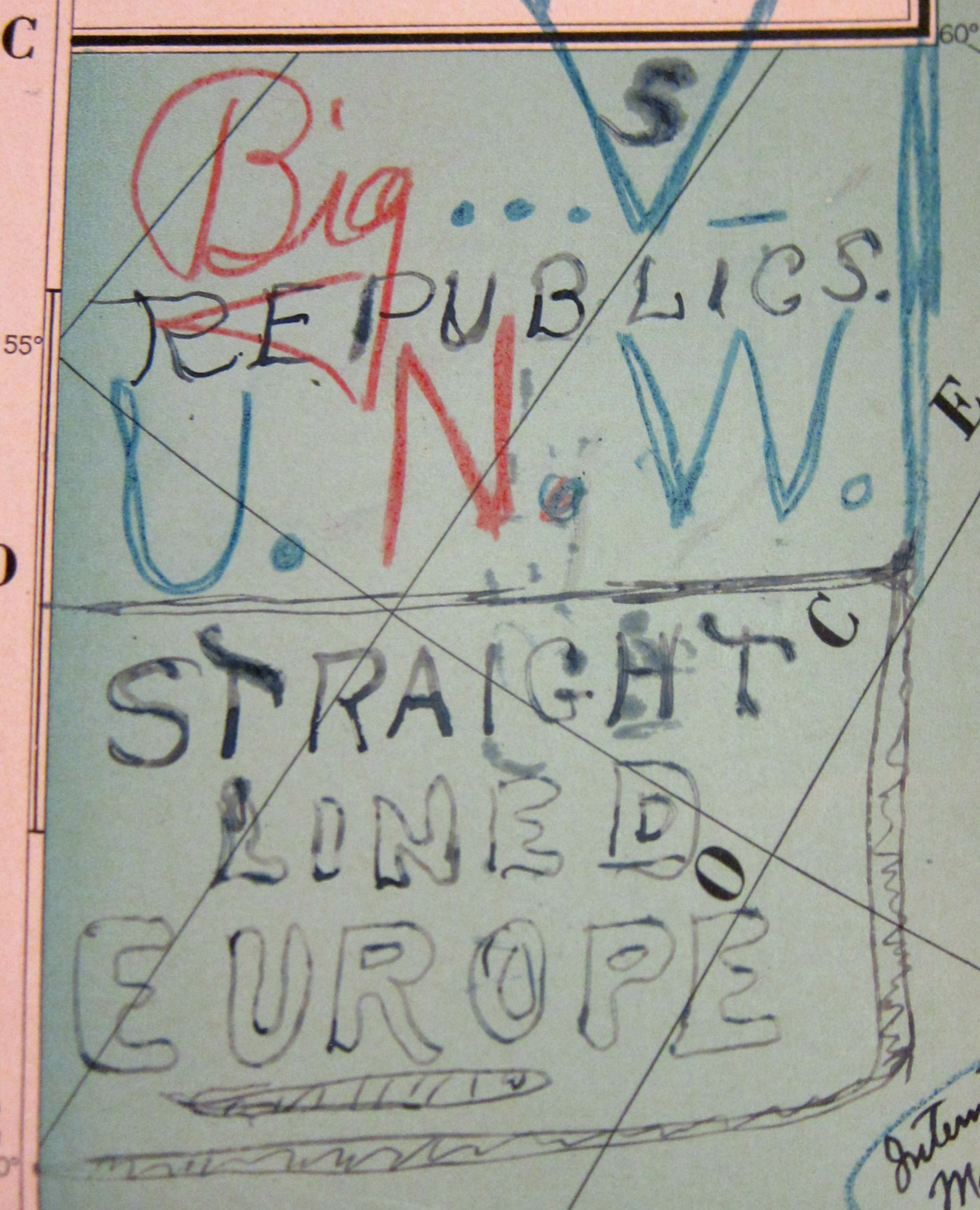
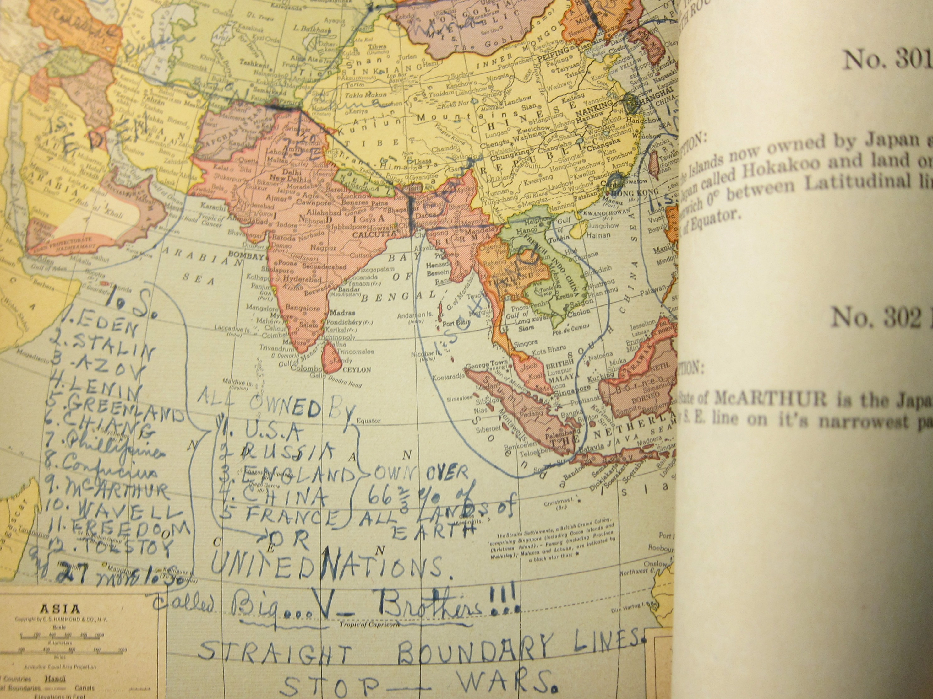
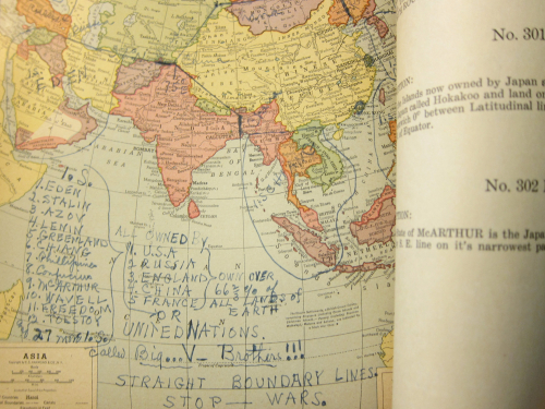
    The main deal here is that the United Nations of the World seems to be composed of five countries–the U.S., Great Britain, France, China, and France–with the headquarters in Washington D.C. (including a small part of Virginia “and some of Delaware”) because “a more appropriate place on Earth Planet cannot be found for UNITED NATIONS OF THE WORLD”.  How the distribution of national identities, the disappearance of most national governments, property, wealth, armies, navies, and so on, is accomplished, I do not know, as there isn’t a clue in the work.  I do know that the author complained of too many curved lines for boundaries and insisted on straight lines. That didn’t stop him from going curvey, though, as we can see in the development in North America, where for some reason San Francisco is now an “IS” or “International State” called “the Golden Era”.  

    Some of the other changes introducing the new International States include:

    • “Light” (Canada);
    • “Petain” (West Africa);
    • “Eden” (the Middle East);
    • “McArthur” [sic] (northern Japan);
    • “Confucius” (southern Japan); 
    • “Liberty” (the USSR)
    • “Liberty” (Belgium and Holland and other bits and pieces);
    • “Edison” (northern Germany);
    • “Franklin” (southern Germany);
    • “Lincoln (norther Italy);
    • “Plato” (southern Italy);
    • “Stalin” (Bulgaria);
    • “Lenin” (the Baltics);
    • “Wavell” (Papua New Guinea);
    • “Wellington” (New Zeland);
    • “Churchill” (central-ish Africa)
    • Turkey would become part of Russia (“in 1950 A.D.”).

    There are a number of others, all findable in the expandable images below.

    In the end, the U.S., “Russia”, “England”, China, and France (for reasons unknown) would “own over 66 2/3 of all lands of Earth”. 

     There is no indication how all of this would work, including 2/3 of the world being “owned” by the five countries. Of all the problematic bits in this work perhaps the problematiciest is the voting arrangement in the Supreme World Court, which would create an equal voting block between the U.S./U.K. and China/USSR, the deciding factor being (yes, you guessed it) France. 

     

    ·Posted by :

    ·in:


  • A Fine Diagram Controlling Time: Rail Schedules, 1874.

    JF Ptak Science Books  Quick Post

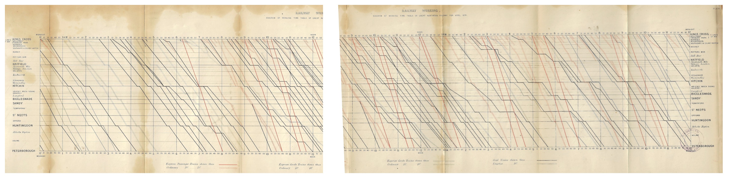
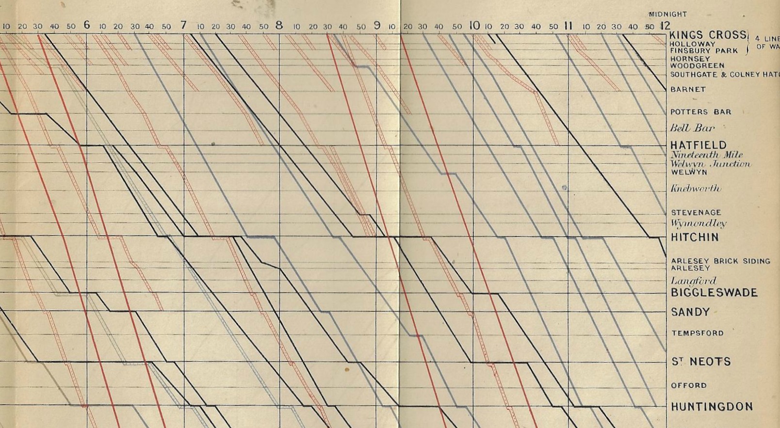
    Railway Working, Diagram of Working Time Table of Great Northern Railway from April 1874, drawn by R. Price Williams and printed by lithography by Thomas Keith, 400 King street, Covent Garden. There is a 24-hour table at top and bottom (each hour divided into 10-minute units), and a division of express and ordinary passenger and freight trains in the legend at bottom.  This lovely image of time and lines measures 7×30″, and is an illustrative chart in Minutes of Proceedings of the Institution of Civil Engineers...volume XXXVIII, Session 1873-4, part II, edited by James Forrest, and printed in London by the Institution in 1874.  Such was the way a country was run. 

    Maps subway _1_ and _2_ together

    And a detail:

    Maps subway 1874 detail

    I found an explanation of this diagram in Engineering, September 24, 1875, page 249:

    “This represents a portion namely between the hours 9 am and 2 pm of a diagrammatic time table for April 1874 of that part of the Great Northern Railway lies between King’s Cross and Peterborough the between the vertical lines indicate time, those between horizontal lines the distance between the stations while diagonal lines show the passage of the trains and by different colours the nature the trains. At 9 o clock will be seen a train leaves King’s Cross and arrives Peterborough at 10.40. The diagonal representing train is not quite continuous there is a small part drawn upon the Hitchin station line this shows the 9 o clock train reaches Hitchin at 9.45 and that it there for about three minutes. At 9.5 an train leaves King’s Cross but goes no further than Green while at 9.8 another train leaves Cross and proceeds as far as Hatfield. At 9 10 a coal leaves King’s Cross and reaches Peterborough at 1.20.  10 o clock an express train leaves King’s Cross Peterborough at 11.30 and at 10.10 another express King’s Cross reaching Peterborough at 11.45.

    And larger, for effect, but vertical:


  • The Great Totalisator, 1926

    JF Ptak Science Books  Quick Post in The History of Lines series

    Computer  totaliser detail

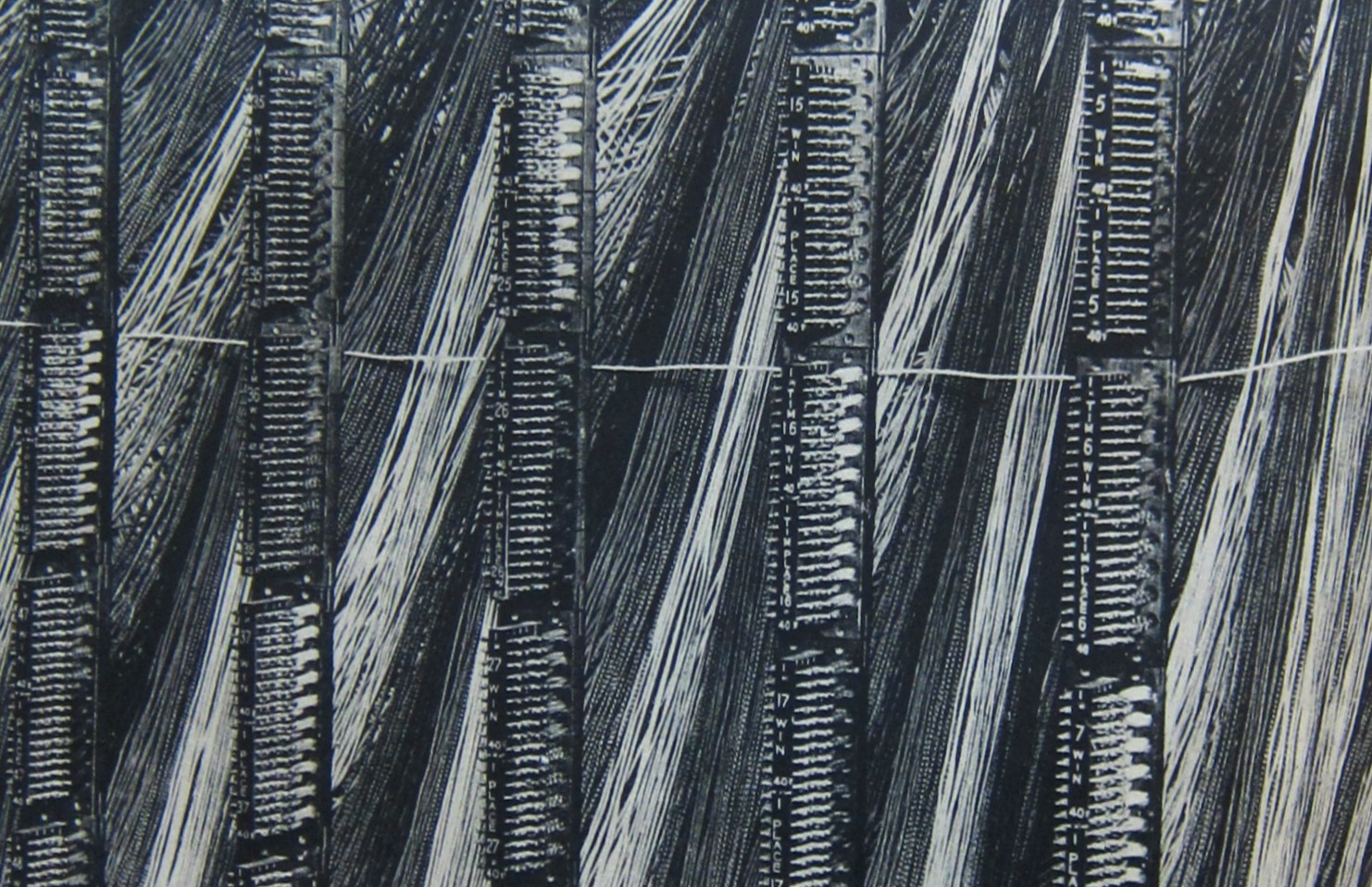
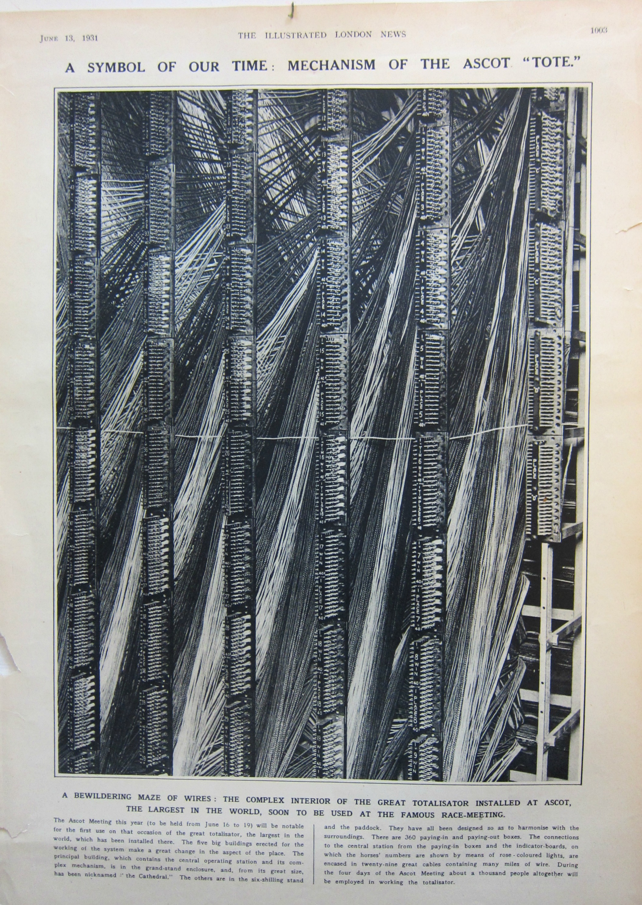
    And so I came to this fabulous word in a running title in the pages of the November 13, 1926 issue of the Illustrated London News–what a fabulous thing, in- or out-of-context!

    Totalisator.

    It appears as a noun in the Oxford English Dictionary as “totalizator”, and goes back to a first use in 1879 in reference to the Pari(s)-Mutuel system of betting–but here, in this article, the “totalisator” is an electric betting mechanism.

    Computer totaliser

    It could also be the nickname of a certain Golem-like U.S. politician implausibly running for the presidency who can make no mistake and is a fanatic for himself no matter the consequence or the validity, or it could be the name of a 1960’s Japanese cartoon monster (either heroic or evil), or it could be an adversary of the 1966 Batman, or it could be a 1930’s Robot (pronounced “Robit”), or I guess a suite of a lot of other things.  It was certainly a behemoth when installed at Ascot in 1925/6, occupying 5 structures and run by a team of 1,000–a fantastic thing of the future, here today, and gone soon afterwards.  

    “Totalisator” seems much more definitive and authoritative with a period at the end of the word, as above, in arial black. 

    ·Posted by :

    ·in:


  • The Square in Tintin, Mondrian, & Malevich (1916-1930)

    JF Ptak Science Books  Post 2584

    Tintin square015

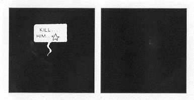
    There are no doubt squares in the general outline of the comic book panels of Tintin–what I had in mind was a very special square that occurs in Tintin’s adventures in the Soviet Union. This was the first adventure of Tintin, and appeared in a serialized form in 1929-1930.  We are introduced to the young and intrepid journalist/adventurer here in glorious black and white (this would be the only one of the Tintin adventures that was never rendered in color at one time or another), being sent off to the newish (since 1922) Soviet Union.  At the time it was Stalin’s USSR, and things were not–shall we say–going well for the people of the Soviet Union.  Tintin’s creator, Georges Remi (“Herge”) was working an anti-Marxist angle for his conservative publisher, and he had no difficulty in supplying story lines to fulfill that need–some of these were exaggerated overall, and some were exaggerated but proved correct over time.  The adventures there were difficult, occasionally brutal, and overall not brutal enough. 

    Herge depicted an unpleasant Soviet Union, working out from the “stinking slum” of Moscow out to the farms that were being destroyed in the countryside.  He insinuated threats of violence in voting, death by firing squads, the starving of the peasants, and much else.  The deal is that by the time the strip reached its conclusion in 1930 Stalin was already underway in his loudly quiet way in instituting the Great Famine/Holodomor in the Ukraine, and by the end of this created famine–a reverse nuclear weapon of food withdrawal–something on the order of 7 million people would be starved to death by 1934. Then of course came the Great Terror of 1936-8, and the rest of it.  Herge may have exaggerated some stuff in 1929/30, but few people could have imagined (even when it was happening) the scale of Stalin’s great evil.  

    That said, I wanted really to just talk about one square in the Tintin adventure.  This is where Herge goes black (Soprano’s style)–he leaves an entire panel black to depict violence. Entirely black.  I’m not a comic book/graphic novel guy, but I’ve seen my fair share of them (most <1970) and I have to say that seeing the black panel was extremely surprising.  In my experience, it just didn’t happen.

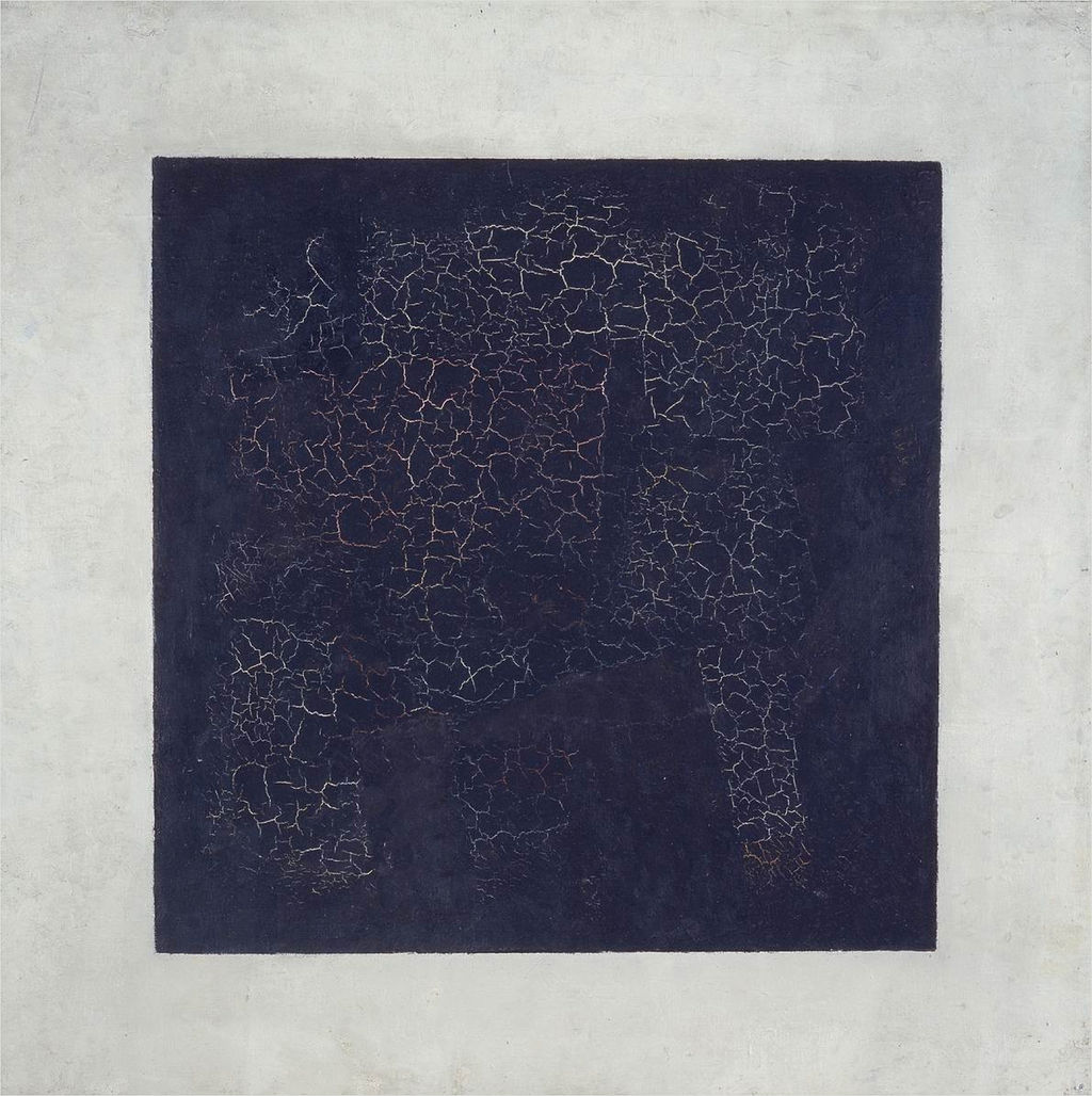
    And what that did was call to mind other squares–notably of course Kasimir Malevich’s (1878-1935) great construction, the Black Square (beginning in 1915):

    Black square

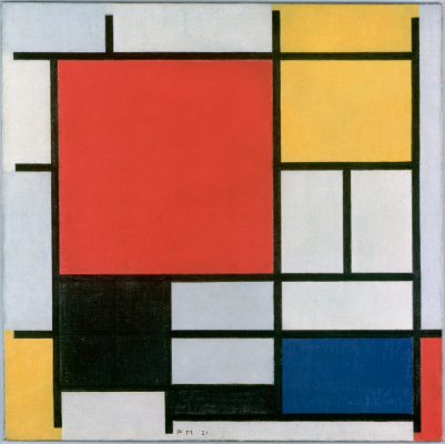
    Then of course there’s the Cubists…but what comes next to mind re the square (and the black one at that) are the later works by Piet Mondrian. Mondrian had gone through a tremendous period of change int he decades from 1905-1935, though it seems to me that even as early as 1909 squares began to appear in the skies (and other places) in his pre-Cubist representational paintings ( as in Sea Toward Sunset, 1909, and Church in Zeeland, 1909/1910), the geometry taking hold for good by 1916.  A good example is Composition with Large Red Plane, Yellow, Black, Grey and Blue, 1921:

    Mondrian black square

    [Image source: http://www.abstractcritical.com/article/malevich-and-mondrian/index.html  This illustrates an interesting article, “Malevich and Mondrian” by David Evison.]

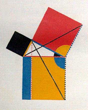
    And so we could wind our way through the history of black squares, but we’ll stop there. Oh, one more: the great squares of Oliver Byrne who in his gorgeous 1847 work replaced numbers with colors in presenting the first six books of Euclid:

    Byrne square

    [Source: https://historyofideasblog.com/thesciencebookstore/2008/05/jf-ptak-scien-1.html  I wrote a little about this in the first few months of this blog back in 2008 in “Dismantling Reality–Euclid, Mondrian, Malevich, Lobachevsky and the Appearance and Disappearance of Form Through Geometry”, which I admit is a big title for a thousand-word blog, but so it goes.]


  • History of Lines–the Use of Thick and Bold Lines in Information, 1862

    JF Ptak Science Books   Quick Post

    I have posted many times to this blog over the last eight years on interesting examples of the graphical display of information (mostly in the category of “Information, Quantitative Display of”) that included subjects like the comparative heights of mountains and lengths of rivers, ocean depths, divorce rates, fatalities from various diseases, literacy, the location of the population centers of the U.S., what 50,000 B-17s looked like if they were to fly at the same time, and so on.  Most of these are 19th century vintage, though there are a fair number now from before WWII, though the more recent varieties show unusual bits like the amount of food consumed by an average family over the course of a year, the history of hemlines in dresses, the changes in the vital measurements of the White Rock girl, and the like. 

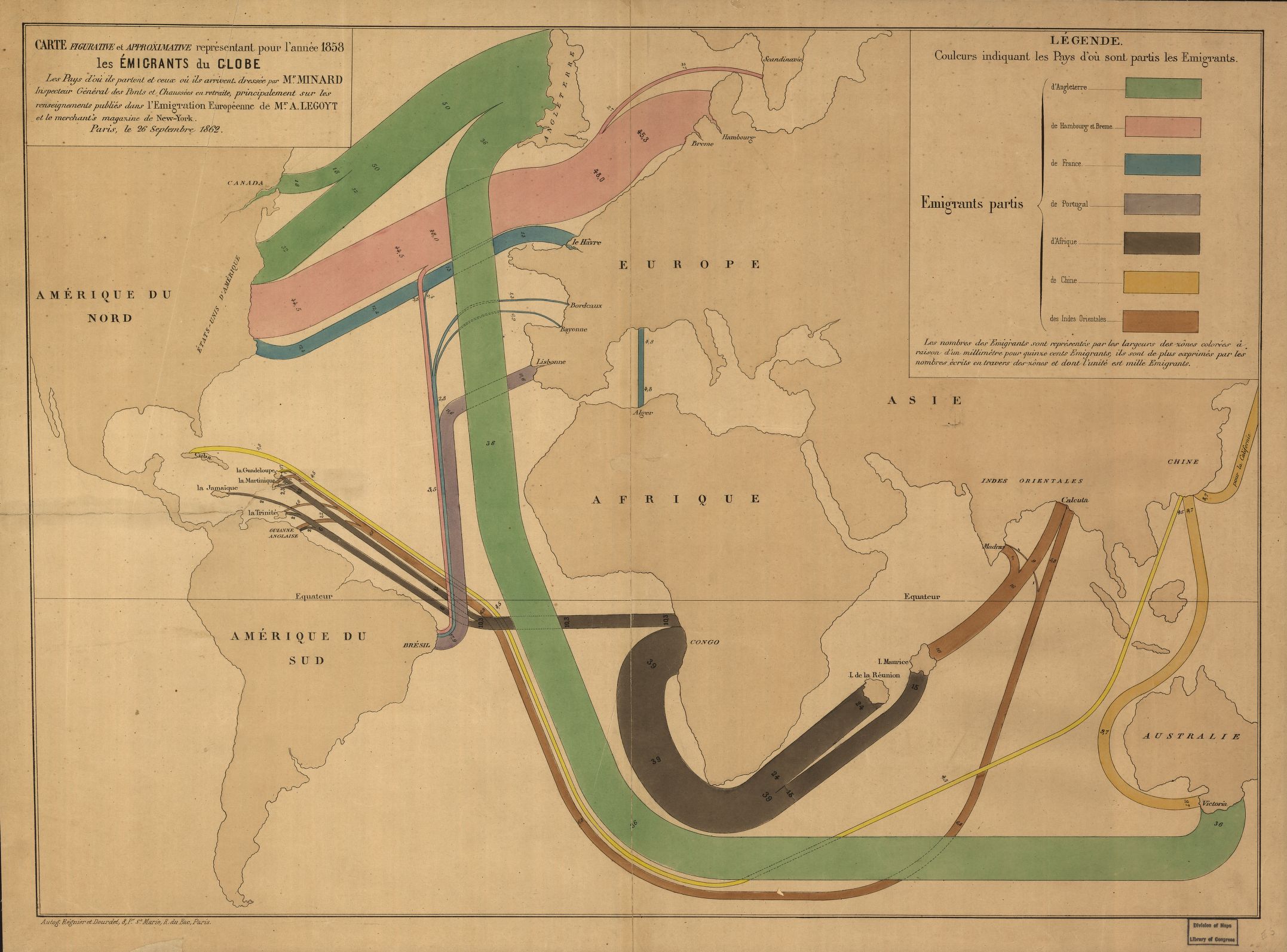
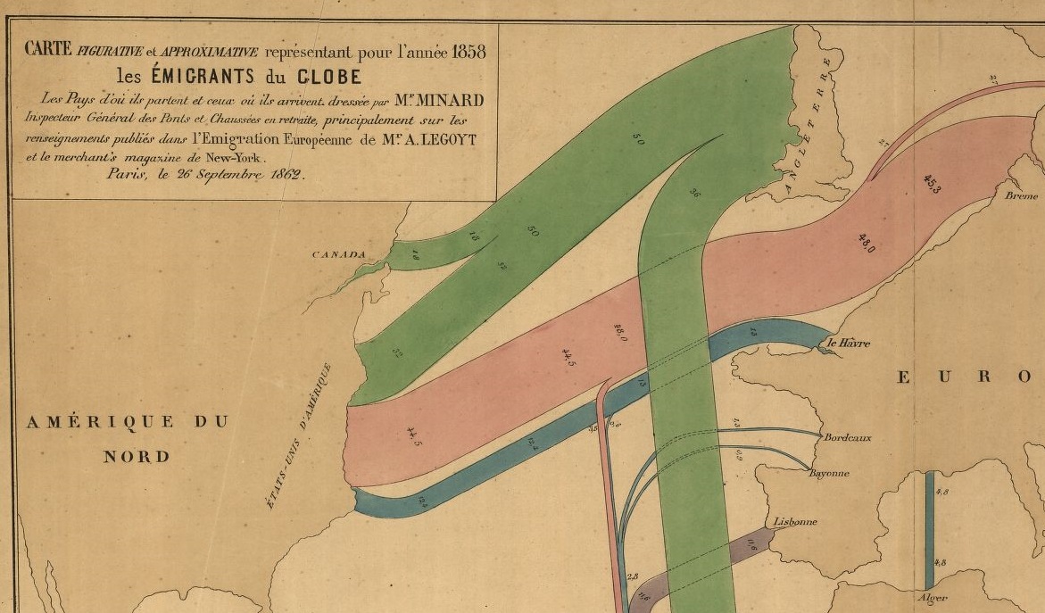
    The following map–depicting immigration origins and relative amounts and destinations–is somewhat unusual not only for the early date and manner in which the info is displayed, but also in the design–the data is not crowded out from the field of vision by anything but the broadest outlines of geography, almost all details are left off the map, which also uses two pale colors to set off the land and the sea, allowing the graphed colors to stand brilliantly apart. 

    Map immigration

    [Map source–the Library of Congress, http://tile.loc.gov/image-services/iiif/service:gmd:gmd3:g3201:g3201e:ct000242/full/pct:25/0/default.jpg]

    The map is the work of the early innovator and information-explorer Charles Minard, who is most known for his famously ubiquitous depiction of the death of Napoleon’s army in its advance upon and retreat from Moscow (see https://robots.thoughtbot.com/analyzing-minards-visualization-of-napoleons-1812-march).

    Map immigration b


  • Squares in Design, 1923

    JF Ptak Science Books  Quick Post    History of Lines series

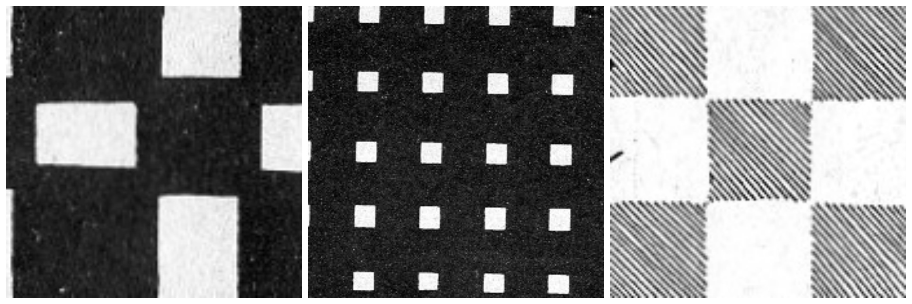
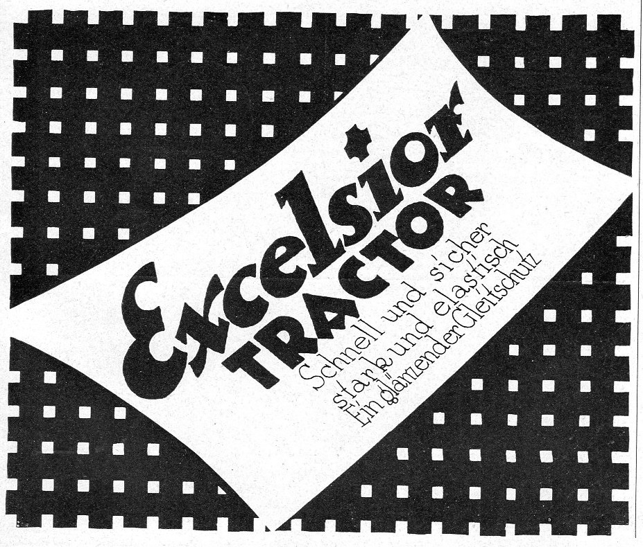
    It was an amusing to find these designs using square elements in the design of advertisements–interesting and odd, mainly because I hadn’t seen much like this, before.  And here were three examples ina single issue of Illustrirte Zeitung for June 1923.  It seemed as though the idea might be endemic–as it turned out, there were no other examples for the use of squares like these for any other advertisers for the rest of the year.  In any event, the square details are an attractive thing. 


    Square montage


    Square excelsior419

    ·Posted by :

    ·in:


  • History of Lines: Lines in Public Baths

    JF Ptak Science Books Quick Post    The History of Lines series

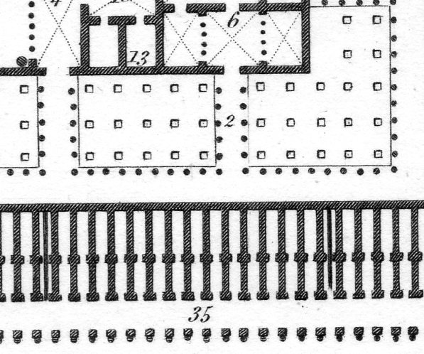
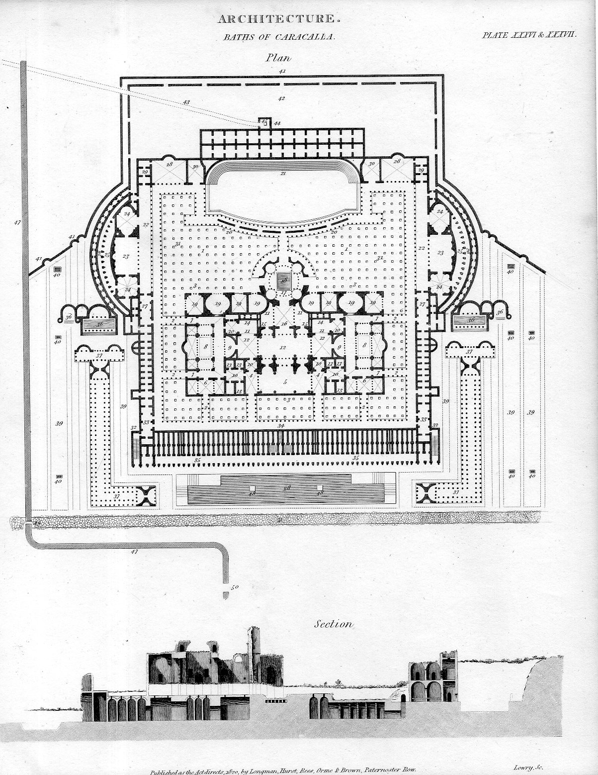
    The public baths of Caracalla served Romans for about 400 years–the complex was complex, and massive.  I’ve long liked this architectural plan of the place–it is necessarily neat and orderly, and fits a lot of data and detail on a 11×8″ sheet of paper while at the same time still having a lot of white breathable space on the page.  Here’s a sample of the detail, which in real life is less than one square inch: 

    Architecture caracalla383

    And the full engraved sheet (printed in 1820 for Rees’ Dictionary):

    Architecture caracalla382


    The following quote is from the great work by Rodolfo Lanciani, Ancient Rome in the Light of Recent Discoveries, Boston/New York, Houghton, Miflin & Company, 1898, pp 91-2, on the Caracalla baths (http://penelope.uchicago.edu/Thayer/E/Gazetteer/Places/Europe/Italy/Lazio/Roma/Rome/_Texts/Lanciani/LANARD/4*.html):

    “Next to forums I must speak of the baths as places of public resort. At the end of the third century after Christ, Rome numbered 11 large public thermae, and 926 smaller ones conducted under private enterprise. The baths of Caracalla alone could accommodate, at one time, 1,600 people; the baths of Diocletian, 3,600. Taking 1,500 as the average accommodation of each of the public thermae, and 50 as that of each of the private baths, we learn that in ancient Rome, at any minute, 62,800 citizens could restore their strength in baths of every nature and description; and this, without bringing into the calculation the Tiber, the Anio, the Lake of Agrippa, and the bathing accommodations with which every Roman house was abundantly furnished…”


  • The Anatomy of Creation: the Brilliance of James Ussher

    JF Ptak Science Books   Post 2563

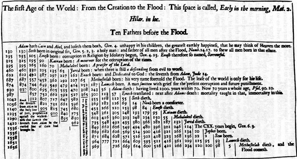
    Ussher

    [Source: undetermined, via Twitter]

    [“Ten Fathers Before the Flood”–what a great title for a book!]

    Dublin-born James Ussher (1581-1656) was born into a well-placed family and achieved high theological orders, being the Irish Archbishop of Armagh and the Primate of All Ireland, and of course a polyglot and scholar above all. What he is remembered most for today–at least outside of Ireland–is his chronology of the world which placed the creation of all things at a very specific time, on the evening of 22 October 4004 b.c.e. (I guess the b.c.e. should be redundant, but it isn’t.) 

    I should point out that I’m writing about this today because Thony Christie (of the excellent Renaissance Mathematicus blog https://thonyc.wordpress.com/) shared a  tweet of Ussher’s table of chronology from Australian Peter Harrison and it brought back memories of dealing with Ussher from years ago.  It is easy now to take a few potshots at the man and his work, daring to think that Ussher could figure this out using Biblical chronology and establishing the date of the creation of all things to an afternoon 6019 years ago.  

    The thing about Ussher is that he was a very smart guy–very.  His work puts me in the mind of Robert Burton and his Anatomy of Melancholy, which is a great and probably unreadable book, filled with a staggering amount of everything. Ussher as it turns out uses the Bible of course but uses a vast amount of secular references as well, reaching out to all sorts of important and obscure sources, some of which have disappeared over the last 470 years.  As a piece of scholarship (he wrote on general history from Gensis to the destruction of the temple at Jerusalem) and the product of the mid-17th century, Ussher’s work (completed evidently in just four years, though how long the overall research took is anyone’s guess) is a tremendous accomplishment. All it takes is a little dip into it (forgetting the modern knowledge of geology etc.) to realize that this is a fantastic work.  

    •  Full text of the Annals of the World appears here: https://archive.org/stream/AnnalsOfTheWorld/Annals_djvu.txt

    In his introduction/epistle Ussher remarks that many of the great historians considered marking the event of creation to be an impossible task, some saying that only divine intervention would lead to the ultimate cause. He cites the preface of Censorinus in his (fantastically titled) Explication of Times Intervals: “If the origin of the world had been known to man, I would have started there.” (Consor. in c. 20.)  And also Ptolemy in his Astronomical Supputations on the impossibility of this knowledge, “To find the details of the history of the whole world or such an immense period of times, I think it is beyond us that desire to learn and know the truth.” (Ptolem. 1. 3.)

    Ussher calmly explains how he did came upon doing it for himself without much fuss: “Anyone can do this who is well versed in the knowledge of sacred and profane history, of astronomical calculations and of the old Hebrew calendar. If he should apply himself to these difficult studies, it is not impossible for him to determine not only the number of years but even the days from the creation of the world. Using backward calculations, Basil the great, told us we may determine the first day of the world.”

    Ussher signs off from the epistle to start his work so: “Other things the prudent reader will figure out for himself. I wish you the enjoyment of these endeavours and bid you farewell.”  Even if you don’t get past this intro you’ll still get a decent understanding of how deep Ussher went, and why he should be remembered for the content of his work in context of his time rather than just that beginning-of-creation date.  

    Notes:

    1. And we wont discuss here the whole end-of-creation thing, which should have come to pass about 11 years ago, if not earlier (if using the calculation of others), as found in 2 Peter 3:8King James Version (KJV) “8 But, beloved, be not ignorant of this one thing, that one day is with the Lord as a thousand years, and a thousand years as one day.” So six days of creation=6,000 years, 4004bce+6k=2004 ace.  

    2. Other early estimates of Creation include:

    • Bede 3852 bce
    • Scaliger 3949 bce
    • Kepler 3992 bce
    • Newton ca. 4000 bce

  • History of Lines: Circles, Cartesian Vortices, Tree Rings, or ?

    JF Ptak Science Books  Quick Post

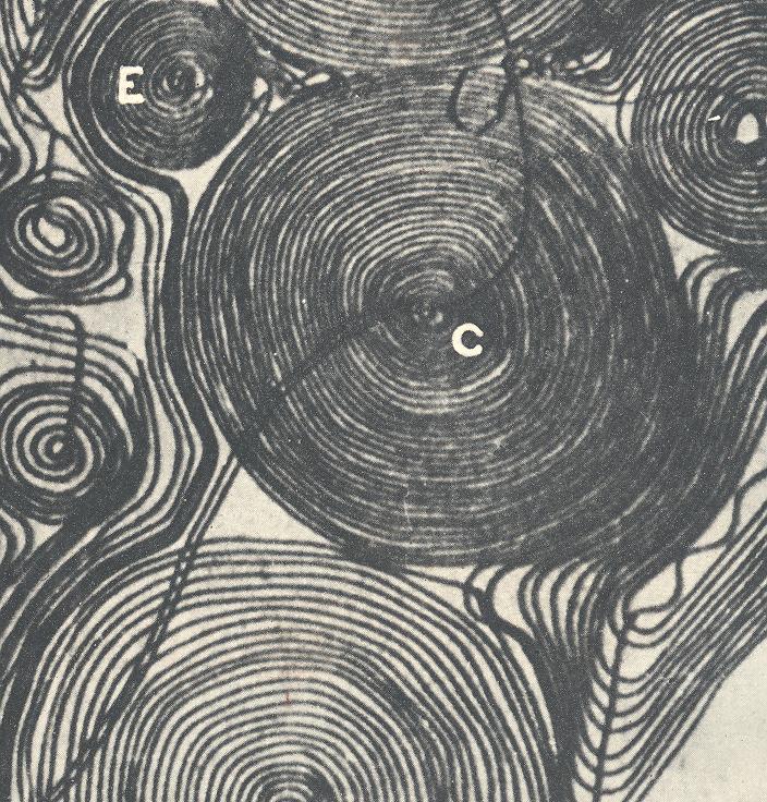
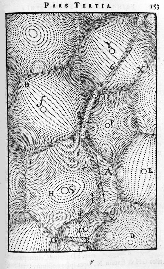
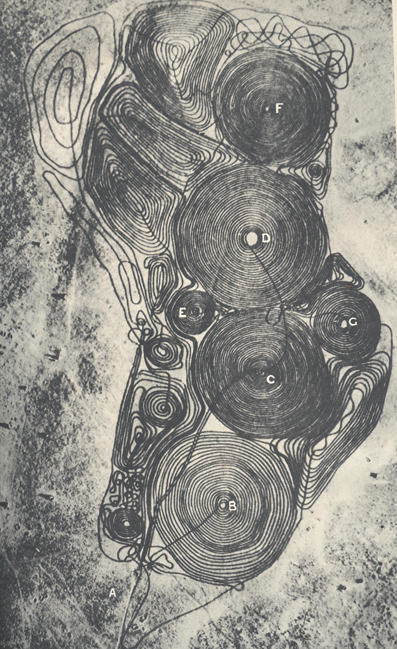
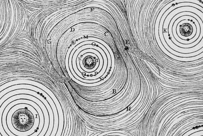
    At first (and second) glance this image comes very close to looking like a display of Rene Descartes’ illustrated cosmology (featuring his vortices (“tourbillons”)).  The images are indeed similar–first, the mystery image, followed by one of the Cartesian tourbillons (from Principes de la Philosophie from 1644):

    1--may 14 circles det

    [Primary image, detail.]

    And the image from Descartes:

    DEscartes tourbillons

    1--may 14 circles

     [Primary image, receding.]

    Is the primary image another incidence of the Cartesian cosmology as we see in the original and in other places, like in Nicholas Bion (in 1710)?

    Bion tourbillons detail

    Surprise!

    The primary image in question is actually a plowed-over landing strip, the place done in by German sappers sometime in 1944, to render the airfield useless once the Germans pulled back.  In any event the image struck me as being similar in design to Descartes, though for the Germans it represented more a catastrophic collapse more than anything else.