A Daily History of Holes, Dots, Lines, Science, History, Math, Physics, Art, the Unintentional Absurd, Architecture, Maps, Data Visualization, Blank and Missing Things, and so on. |1.6 million words, 7500 images, 4.9 million hits| Press & appearances in The Times, Le Figaro, Mensa, The Economist, The Guardian, Discovery News, Slate, Le Monde, Sci American Blogs, Le Pont, and many other places… 5000+ total posts since 2008.

Category: Anticipation, History of

  • Smoke and Word Balloons, 1531

    JF Ptak Science Books   Quick Post

    Rodler detail smoke

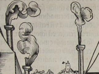
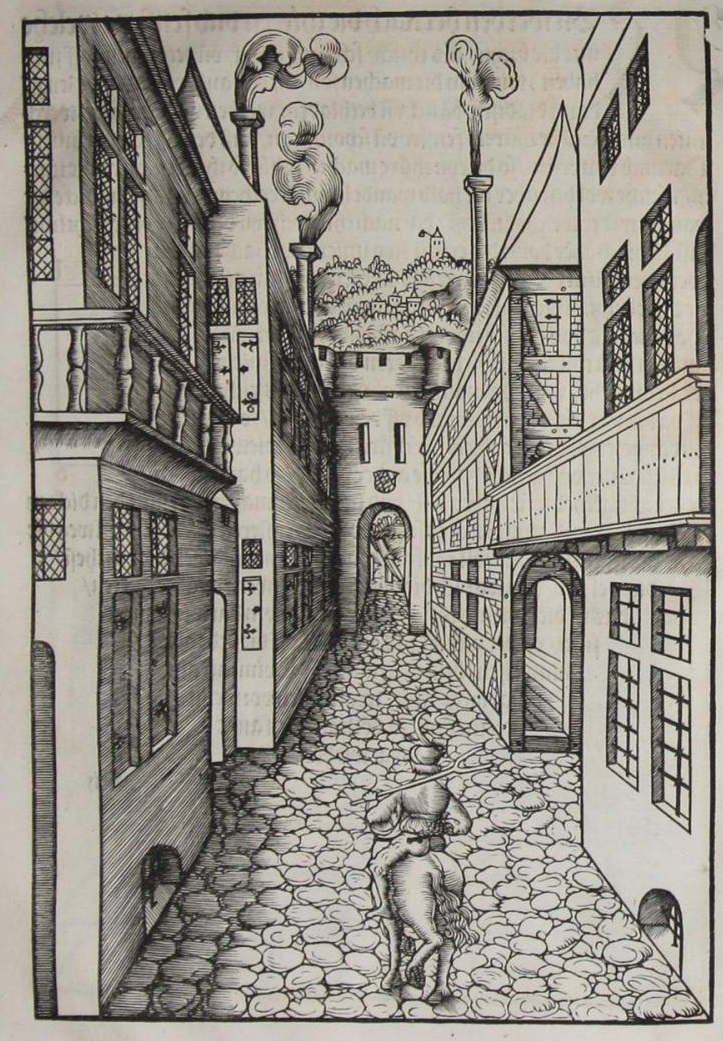
    This work—according to scholars most probably by Johann II of Bavaria1—was published in 1531, the effort of a true Renaissance Man, capable in languages, a scholar, draftsman, scultptor, artist. The book was important in the history of art for introducing the perspective studies of Durer on a grand scale. And in all of this greatest and beauty of this book, I have chosen as my focus for this moment an odd little bit of the book–smoke.  

    Rodler

    In this woodcut we see the central figure on a horse working his way down a tight street of crowded buildings in a walled city, a city gate just ahead.  The image was intended to illustrate principles of perspective, but I noticed the smoke and associated it/them with Renaissance (and later) word balloons–they’re not really that closely associated, but are suggestive of one another.  

    Balloon word[Source: https://historyofideasblog.com/thesciencebookstore/2009/02/word-balloons-continued.html]

    There is a certain amount of  poetical attraction to associate images in smoke and words, but I think that is going a little beyond the reasonable scope of analogy.  

    Notes:

    1. Johann II (1492 – 1557), and Count Palatine of Pfalz-Simmern from 1509-1557. And the book’s title:

    Eyn schön nützlich büchlin und underweisung der kunst des Messens, mit dem Zirkel, Richtscheidt oder Lineal. Zu nutz allen kunstliebhabern, fürnemlich den Malern, Bildhawern, Goldschmiden, Seidenstickern, Steynmetzen, Schreinern, auch allen andern, so sich der kunst des Messens (Perspectiva zu latein gnant) zugebrauchen lust haben.

    Published by H. Rodler, Simmern, 1531

    RODLER, Hieronymus ?] / JOHANN II OF PFALZ-SIMMERN


  • Extraneous Alphabets: Imperative Incidentals in Dante. And the Devil.

    JF Ptak Science Books  Post 2533

    There is a peculiar beauty to discovering a sleeping obviousness–something that is so present and apparent and minor that it can present for a while before you suddenly recognize it, and then the obviousness is all that you can see. “Hiding in plain site” is something that it might be called, though I don’t think we have a word for it in English.  
    Dante beatrice237

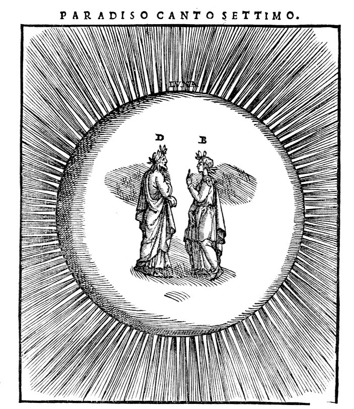
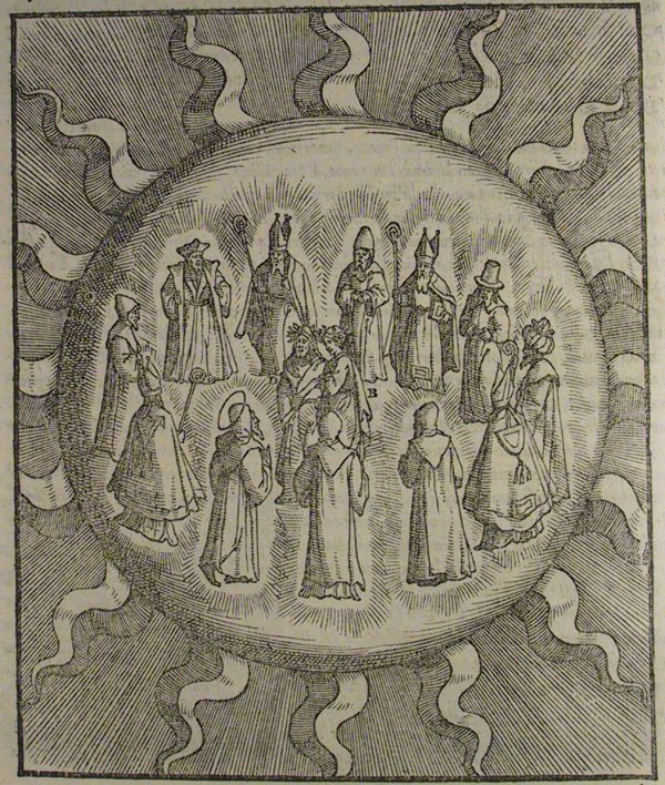
    Here’s an example of it, found in Dante. It may seem perverse to look at beautiful images like this/these illustrating one of the greatest stories that has ever been spun, but the tiny letters signifying the actors defined in the motion take on their ow unusual lives for me.  It seems very odd to identify objects that are so obvious and form the direction of the story and need no identification. (Some things need no introduction, like Dante and Beatrice, and Yogi Berra. (A friend told me a story of going to a function and being seated next to Berra for dinner, Yogi walking up to him and extending a hand saying “Hi, I’m Yogi”. No kidding?))  But I guess someone thought the notation was necessary, even if it both spoils and beautifies the simplicity of the design.  

    The edition of Dante is by Alessandro Vellutello, (La Coemdia con la nova espostione de Alessandro Vellutello…published in Venice in 1544) who extended himself to include the (87) illustrations that I just mentioned, and included a text full of glosses. No doubt the signifiers in the illustrations are aids to the supplementary text–still, they seem to be fairly unnecessary. 

    • Here’s an entire gallery of the Vellutello illustrations at World of Dante, http://www.worldofdante.org/gallery_vellutello.html

    Dante sun big

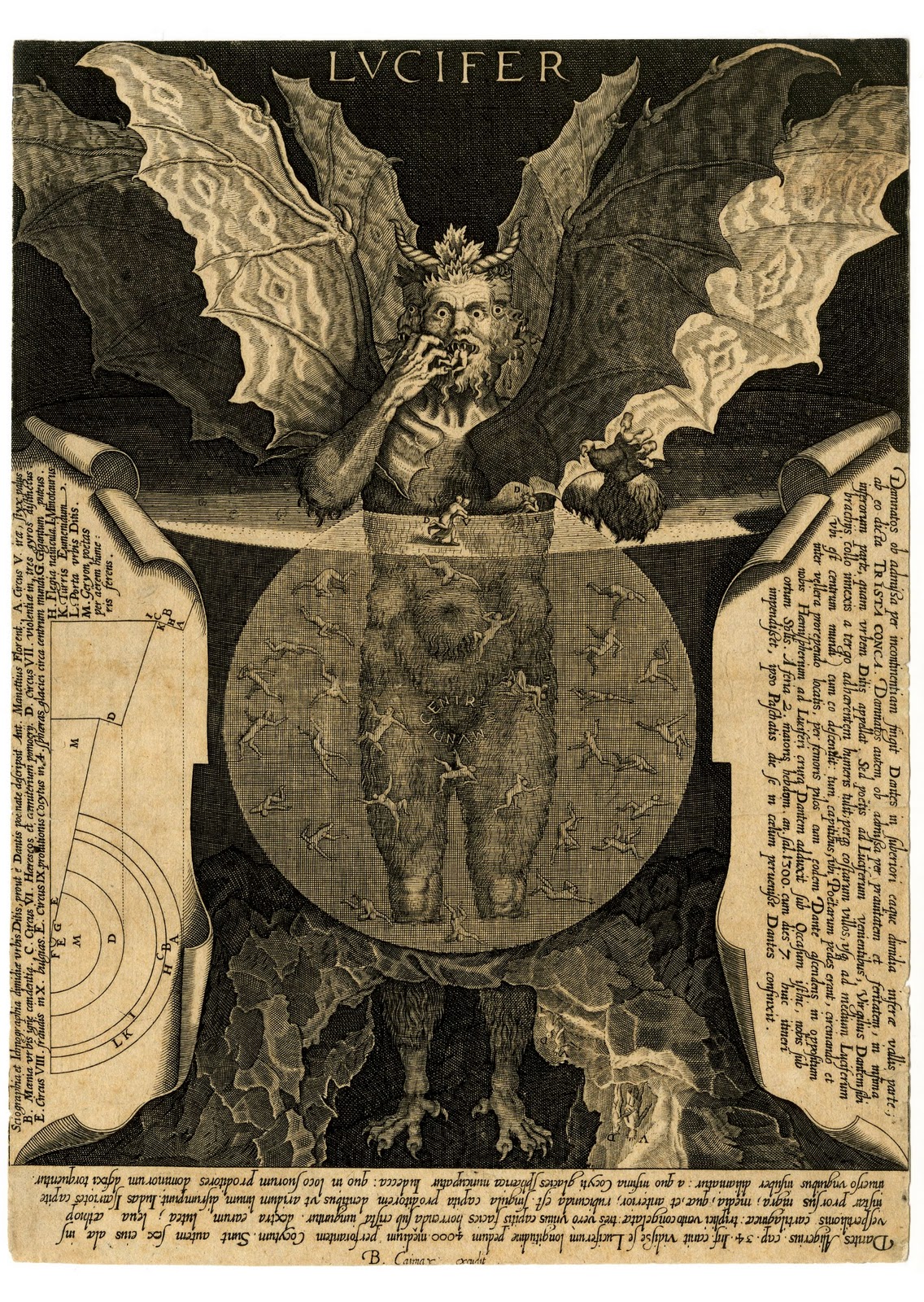
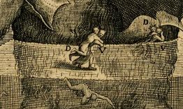
    That said, most of the time I appreciate the annotated image (speaking here of the non-technical/scientific ones)  mainly because without the help the iconography sometimes escapes me.  The Vellutello illustrations are much more “modern” than previous illustrations made for Dante, and seem to bridge the centuries of differentiated understanding so far as the interpretation of the images are concerned. On the other hand I appreciate the effort made for explanation in the engraving by Cornelis Galle of the Devil as it lived and breathed in Dante, the help coming in many forms. For example, without the annotations I would probably never have noticed the “D” and “V” figures (Virgil carrying Dante) so I  am thankful for the help:

    Lucifer

    Lucifer detail


  • A Chain but Not a Chain (?) in the Last Judgment (1512)

    JF Ptak Science Books  

    Chain236

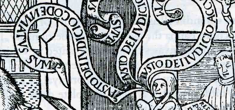
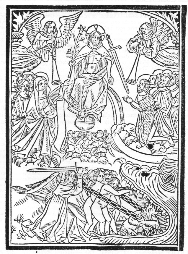
    This interesting image, “The Last Judgment”, appeared as a woodcut in a book by Ricius (Rici, Rizzi, Rizius), Paul(us) (Paulus Israelita), Freiherr von Sprinzenstein (1530 Reichs- u. erbländischer Freiherr, 1480-1541), Eruditiones christianae religigionis plurimum utiles & cuilibet christiano ad modum necessarie, which was printed in Paris in 1512. The author was a German Jew who converted to Christianity and wrote and studied a form of Christianized kabbalaism, a philosopher, translator, and a physician who was the doctor to Emperor Maximillian I.  What attracted me in all of that in this image had nothing to do with any of this–what I’m seeing here, wrapped around the condemned entering Hell in the mouth of the beast, is a chain.  The unhappy group standing in the jaw of the beast, cowering against a very annoyed Archangel Michael, are being collected with the “chain” and pulled downward by a hell-beast.  

    It is an odd object, and I’m not convinced that it is a chain, though it does look like one.  The issue with chain is that outside of being worn for defense and adornment (for centuries) steel chain didn’t appear in the west in extended use unto the 19th century.  There is a sketch of chain in a Leonardo sketch, but a popular use of a chain really doesn’t exist for another two centuries.

    Again, this item does have a torus-like shape and does look like a chain of some sort, but that doesn’t necessarily make it one.  Also I’m not familiar with its symbology if it isn’t a chain, so I’m a bit out of my element. I’m glad though to share this should someone out there know what it is, or isn’t. It is certain though that it is odd. 

    UPDATE:

    A friend on facebook provided an interesting Bible quote on chains/Last Judgment:“For if God spared not the angels that sinned, but cast them down to hell, and delivered them into chains of darkness….” 2 Peter 2:4.

    Also there are:

    And the angels who did not keep their positions of authority but abandoned their proper dwelling–these he has kept in darkness, bound with everlasting chains for judgment on the great Day.–Jude 1:6

    And I saw an angel coming down out of heaven, having the key to the Abyss and holding in his hand a great chain.–Revelation 20:1


  • A Catalog of Ephemeral Memories: Daily and Forgotten Necessaries, 1941

    JF Ptak Science Books   Post 2526

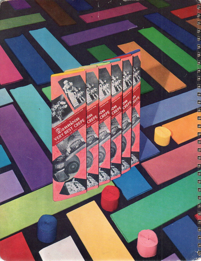
    Catalogs Dennison _1_ 165

    This title sounds highly romanticized, I know, but it is in some sense pretty close to the truth.  This distributor/manufacturer catalog offered the daily bits and pieces of the business end of personal and, well, business life. The sections of this heavily illustrated catalog includes  the stuff of day-in and day-out life management: “for sale” and price tags, jewelry tags, colored marking tags, clasp envelopes, key tags, coin mailing cards, white and colored labels, address and mailing labels, notarial and lawyers seals, sealing tape, binding accessories, paper fasteners, sealing wax sets, desk set bookcases, gummed seals, holiday merchandise, sealing wax, tissue paper, crepe paper (with actual colorful samples), confetti, wedding cake boxes, overhead decorative displays, and such.

    Catalogs Dennison _2_ 166

    It is interesting to see pictures of these things that are (mostly) still with us now but different–they can elicit memories much like the smell of a kindergarten classroom . They were familiar and common objects once upon a time, essential and mostly invisible–but now, 70-odd years later, the near-memories might be close to the surface, waiting for a visual push to recognition. 


    ·Posted by :

    ·in:


  • Extraterrestrial Skies and Landscapes Depicting the Earth, 1877

    JF Ptak Science Books  Post 2520

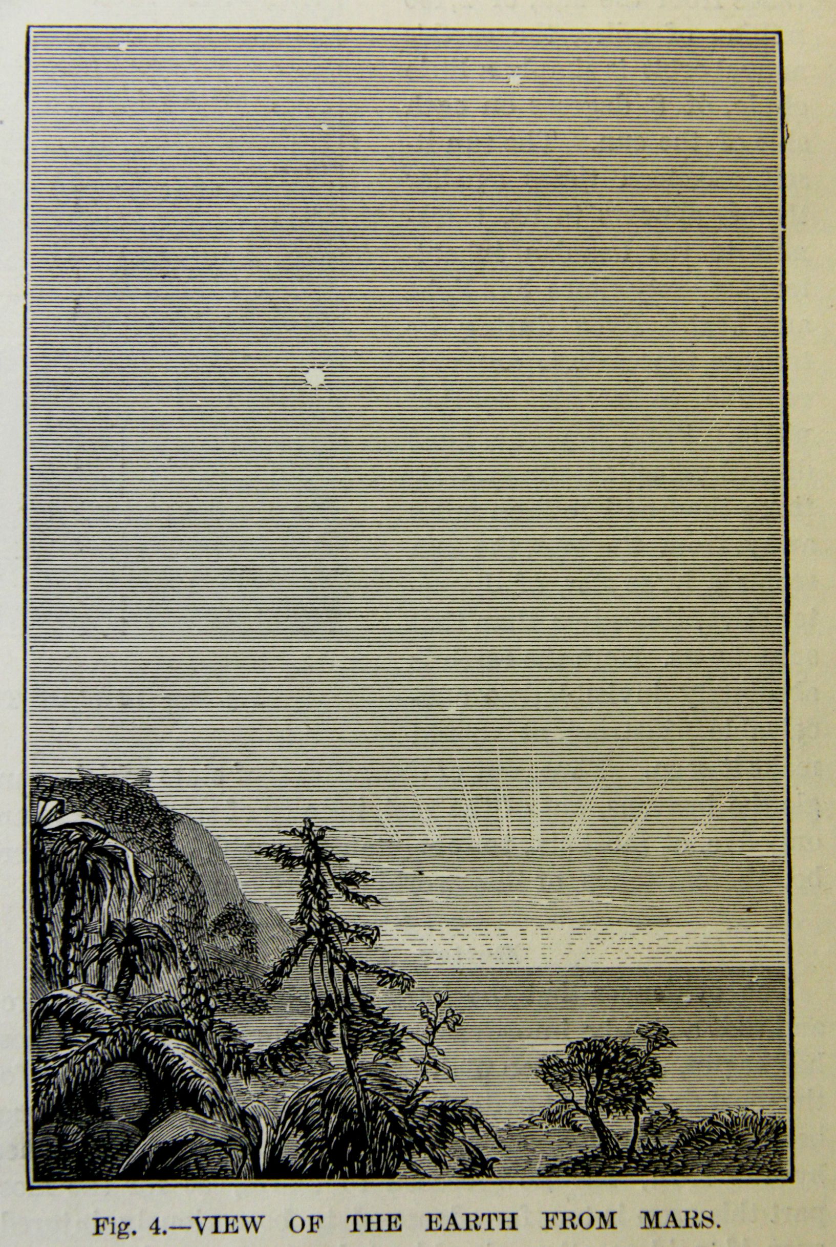
    Earth from other Planets MArs

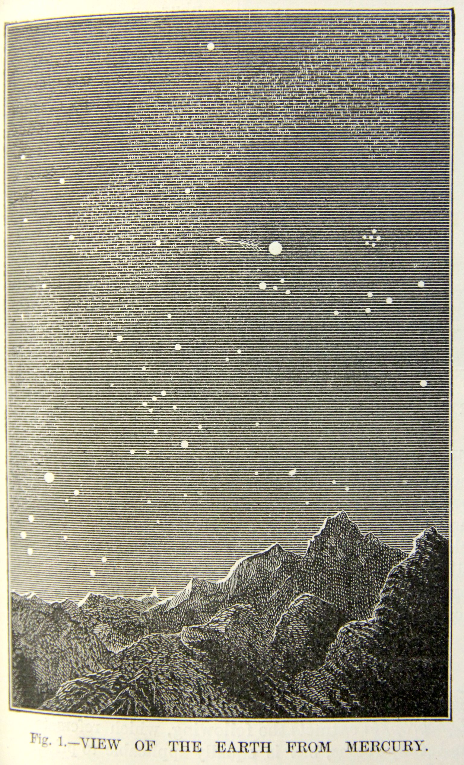
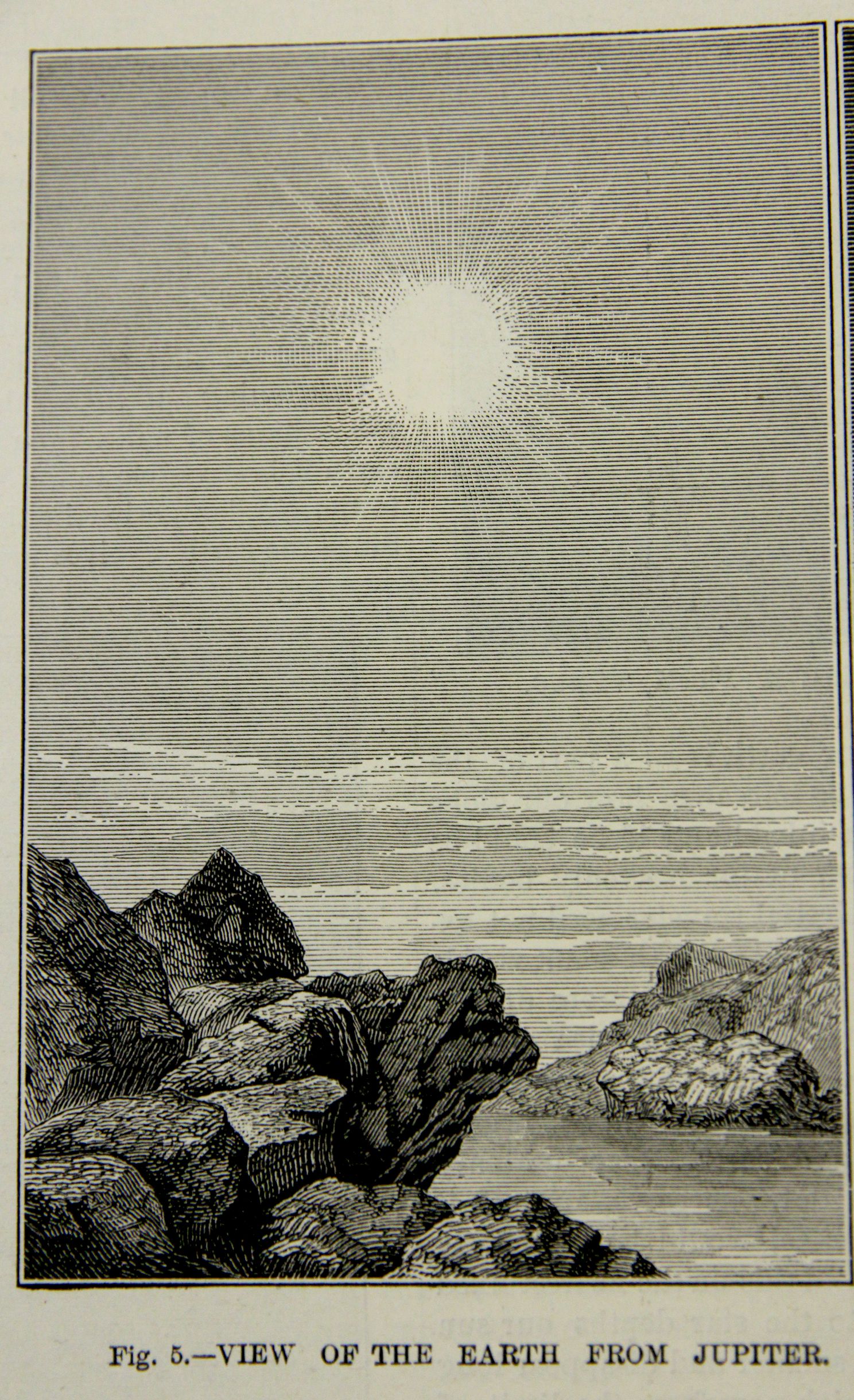
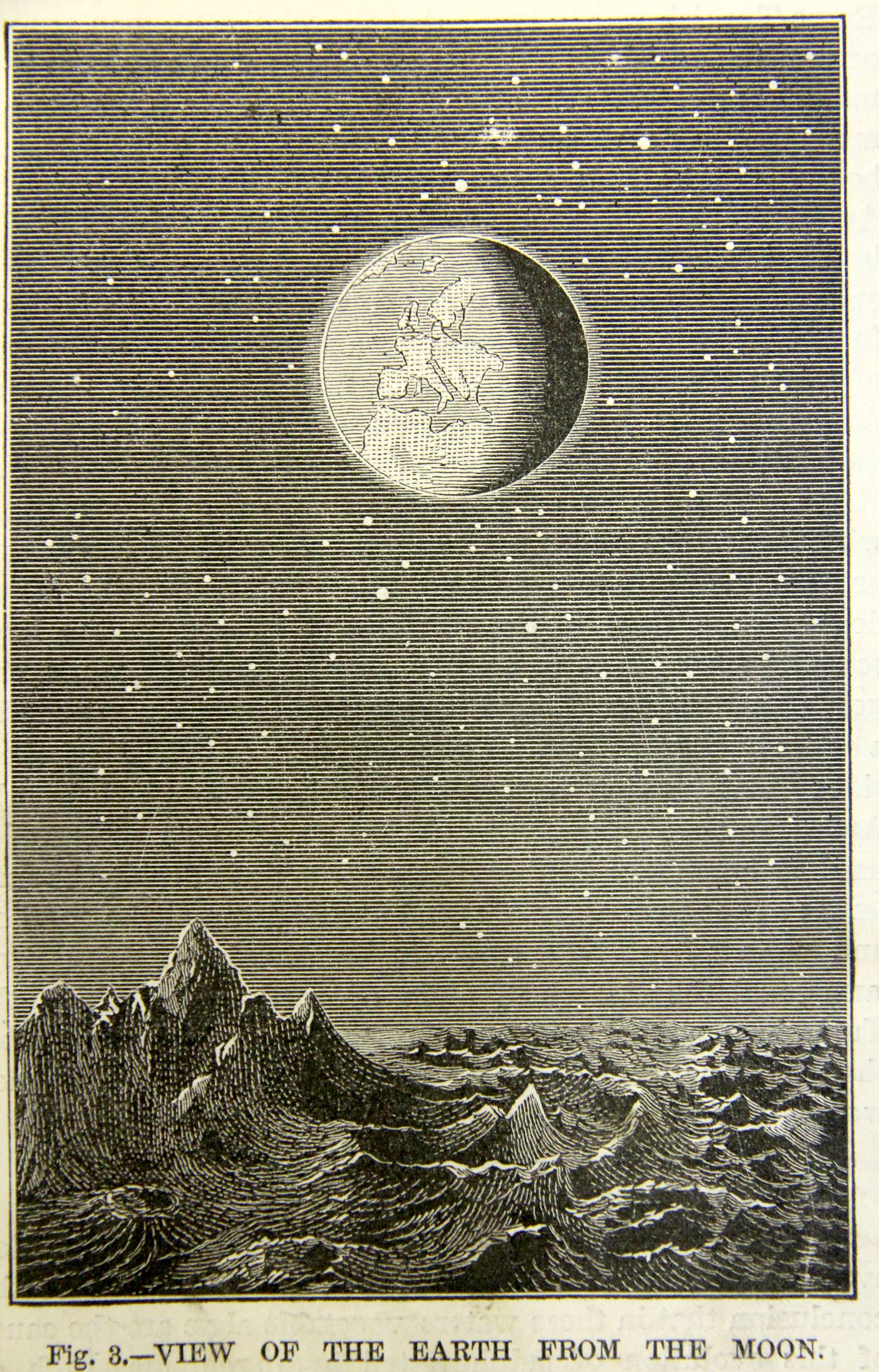
    I was struck by these images of the Earth as seen from other planets (and the Moon) in our solar system, mainly because I had associated at least one of them to Camille Flammarion (1842-1925), who I thought originated the view.  But that is not the case, evidently, as this Scientific American article appears November 23, 1877, and the Flammarion book in which it appears (Astronomie Populaire) was not published until 1880.  This is interesting in general because views of the Earth from other exact locations in the solar system are not common at this point in the late 19th century, and as can be seen in the illustrations there were some enormous (?) leaps of faith, though I am not sure how long a jump it would take to show a vegetative Mars in 1877.  

    Certainly the depiction of the Earth from an unspecified distance and location was very highly practiced in the history of astronomy, stretching back many centuries, but there is very little found for depicting an extraterrestrial prior to 1900–seeing the Earth in the sky with boots-on-the-extraterrestrial-ground is very uncommon. 

    This is really just a somewhat-related smidgen of a larger discussion on the history of the plurality of worlds and life elsewhere in the universe, an idea that is ancient, reaching back to the Greeks, and comes into play here with the Earth-like environment of Mars pictured above.  These views are sympathetic to an idea of another set of observational eyes looking up at the Earth as Earthlings might do in looking at Mars, a very individualistic view of the night sky, making it personal by setting the event very close to the ground of the planet/Moon rather than a view that was set nearby in space.  This is also conducive to the imagination of 1877 for visualizing not only the existence of life elsewhere, but also of interplanetary travel.  

    The somewhat-odd thing here is that it seems as though the Scientific American article was published independent of the famous reports of Giovanni Schiaparelli1 (“direttore del R. Osservatorio astronomico di Brera in Milano” ) which appeared in 1877/8 following his historic observations of Mars at the 1877 opposition  and in which he used the word “canali” which would later be mis-interpreted/-used as “canals” (when it was intended as “channels”).   Schiaparelli adopted new terminology for his great adventures on the surface of Mars including “ocean”(“the names I adopted will in no way harm the cold and rigorous observations of facts”2) though he did not intend for them to be used literally.  (He had in fact used the word “canali” as early as 1859, a yer after Angelo Secchi had employed the term.) Also the great William Whewell had hypothesized the existence of oceans and mountains and the possibility of life on Mars earlier than that, in 1854; and Anthony Proctor contributed greatly to the life issue with his work and map (featuring continents and oceans) in 1867, so I think that the presentation of the Earth-friendly vision of the Martian surface in the Scientific American could well have been accomplished independently of the Schiaparelli observations of 1877.  The idea of organized and technological life took off shortly after this in a sort of Martian-life-mania3, quickly reaching great new heights in H.G. Wells’ War of the Worlds in 1897, when Martians needed to have their own very destructive look-see of their own extraterrestrial sky.  It wasn’t unti the 20th century, really, when it became more a more common/popular thing to see the Earth imagined from a viewpoint on another world.  

    All this said, I do not know when the first illustration like this–a view of the Earth in an extraterrestrial sky with surrounding landscape–appears in print.  

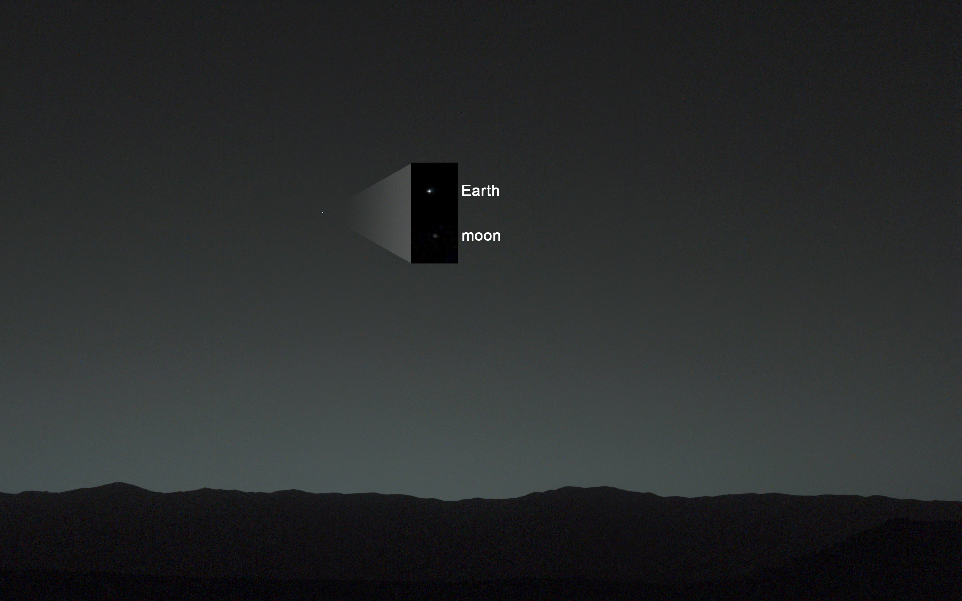
     A modern view, from NASA, Curiosity‍‍ , “first view of the Earth and the Moon from the surface of Mars(January 31, 2014)”:Earth from other planets  modern MArs

    [Source: http://photojournal.jpl.nasa.gov/figures/PIA17936_fig2.jpg]

    Earth from other planets Mercury

    And a very hospitable Jupiter:

    Earth from other planets Jupiter

    Earth from other planets Moon


    Notes:

    1.  G. V. Schiaparelli’, Atti della Reale Accademia dei Lincei: Memorie della Classe di sdenze fisiche, matematiche e naturali 3:2 (1877-1878): 3-13  The famous map by Nathaniel Green was published soon afterwards, Nathaniel E. Green, ‘Observations of Mars, at Madeira, in August and September 1877’, Memoirs of the Royal Astronomical Society 44 (1879): 123-40.

    2. Dictionary of Scientific Biography, volume 12, pg 161).

    3.  Not my term and a good one–found in K. Maria D. Lane, “Mapping the Mars Canals Mania….”, in Imago Mundi, Vol. 58, No. 2 (2006), pp. 198-211.


  • A Very Early Use of the Nazi Swastika in the U.S., 1924.

    JF Ptak Science Books   Post 2519

    Swastika135This Outsider-y political pamphlet attracted my attention for the swastika and the date (1924) more so than anything else, including an absolutely luxurious use of quotation marks, capitalizations, and bolds that the text would reveal. Ernst Goener’s work looked like trouble in that mysterious way that some writers will use an now-unknown word or phrase upon which everything is balanced–in this case, “the Prize”. That, and who “our People” might have been1. 

    The swastika is of course an ancient symbol mostly happy in its antiquity–its existence as a symbol didn’t really become polluted and disgraced until the 20th century when it seemed to have made an impact on nationalist groups in Germany following some relatively popular (and innocnet?) exposure by  archaeologist Heinrich Schliemann. And of course the existence of the symbol in modern usage is basically terminated by the NSDAP/Nazi Party and Adolf Hitler.  

    With this pamphlet I was thinking that use of the swastika may have been an innocent/antiquarian thing, except that I stumbled over  the “Jew” in bold a number of time in the pamphlet’s short little life (as in “the all-powerful Jew of Versailles” and so on–you get the picture). Goerner as it turns out was a vivid pro-German figure here in the U.S. during WWI, and was a Nazi sympathizer from the earliest days of that political movement at least through 1941, where I lose track of him. To finalize the connection I read that Hitler had designed the Nazi standard as far back as 19202, and that the use of the swastika in the Nazi flag began soon afterwards, well before 1924–so there was plenty of room for this pamphlet to employ the use of the Nazi swastika for its symbolic commentary on the cover.  

    In the end Goerner winds up being a German propagandist through WWI, and was an American  supporter of the Nazis from the very earliest state of the party all the way into WWII.  He was indeed using the Nazi swastika as his calling card, in the U.S., in 1924.  Goerner was not an “Outsider” at all–he was a greased-rocket German/Nazi sympathizer and pamphleteer, with a lust for the NSDAP and a hate for Jewish people. 

    ·Posted by :

    ·in:


  • Lincoln on Baseball and Home Runs, 1860

    JF Ptak Science Books  Quick Post

    “Four score and keeping score”1

    Lincoln Base ball

    A few years ago I had a fantasy conversation occur between Babe Ruth and Ho Chi Minh–they were several times in the same city at the same time (or so it seems), though I am not sure they shared a common language. I’m also not sure that Ruth and Ho would have much in common to talk about, but if they were cheek-and-jowl at a diner perhaps there would be an exchange–=in any event my creative powers failed me, mainly because outside of the idea of the two meeting and speaking, I’m pretty sure that there is no “there” there. 

    I would like to think that Abraham Lincoln could enjoy watching a good game of baseball while he was president, having a little opportunity to get away from the war and politics–but that seems pretty doubtful; It seems that as a kid he played some form of baseball (“townball”) which feels far more likely to be a real story–beyond that his connection to the game looks pretty weak.

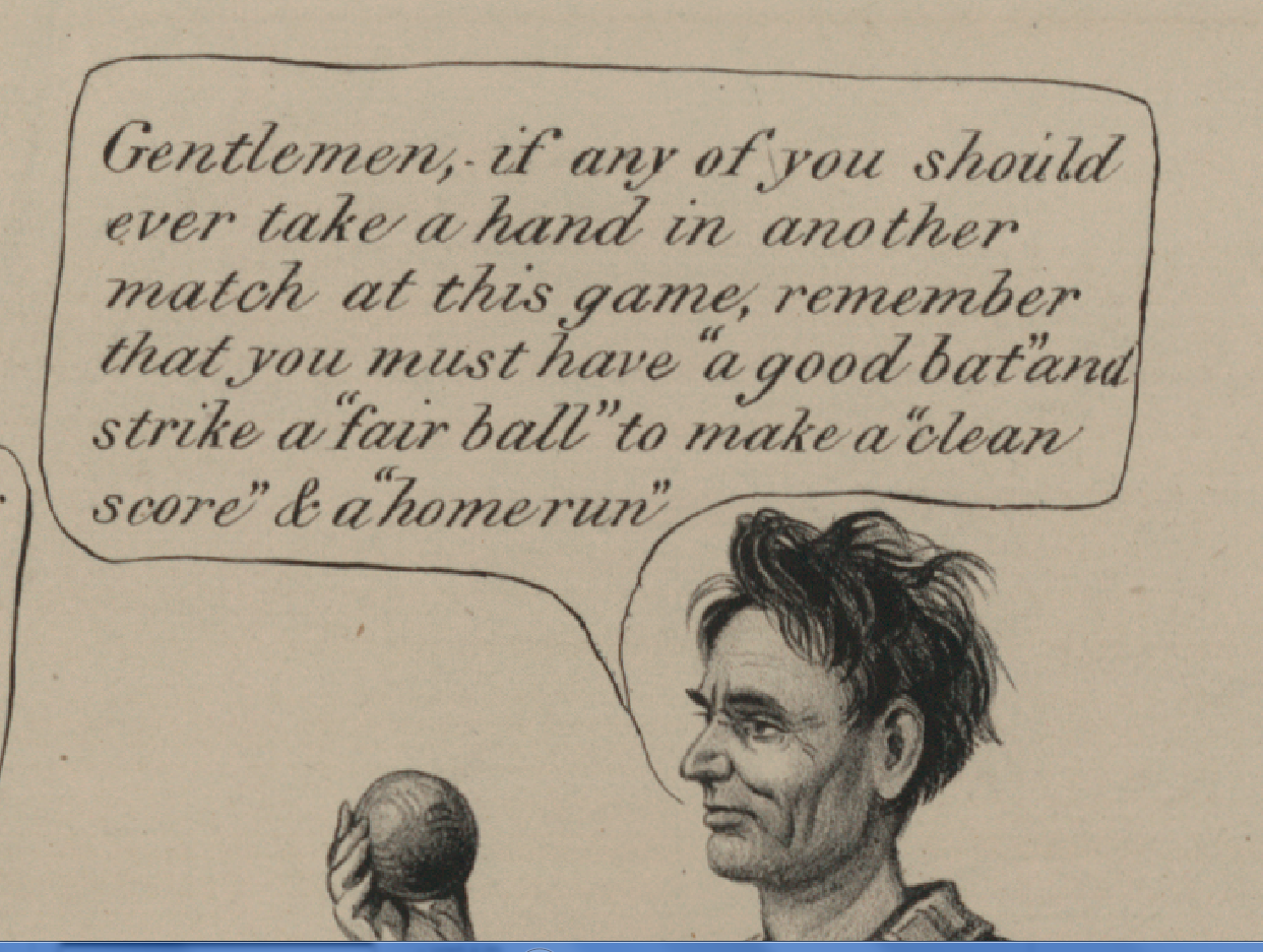
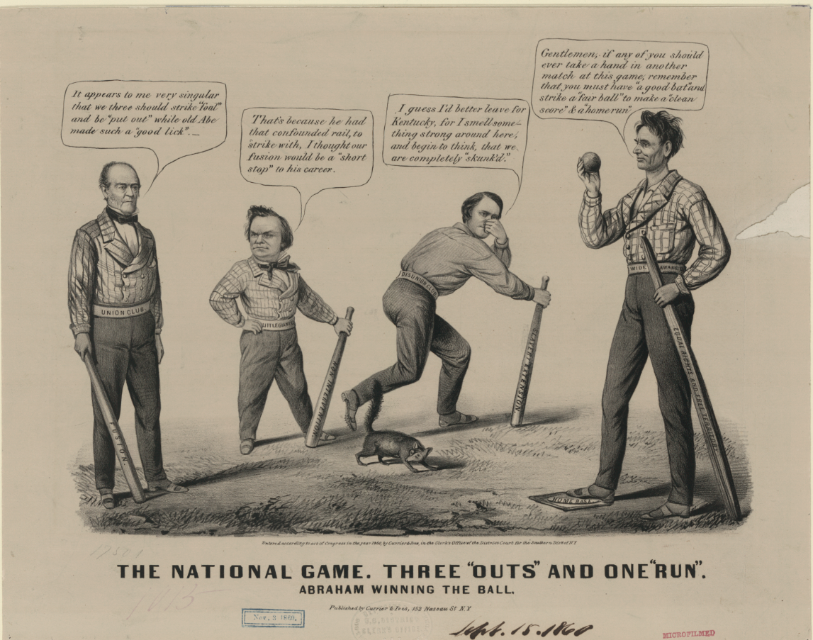
    There is however this small campaign broadsheet which in 1860, received by the Library of Congress a month before the election, that a political cartoon was published by Currier and Ives with a strong baseball analogy.  I don’t know if Lincoln was ever recorded using the term “home run” but the artist happily put it in a word cloud for him in the detail above, taken from the image below:

    Lincoln base ball b_[Source: the Library of Congress, http://www.loc.gov/pictures/item/2003674584/]

    The longish and good summary of the image is from the LC:

    • Summary: A pro-Lincoln satire, deposited for copyright weeks before the 1860 presidential election. The contest is portrayed as a baseball game in which Lincoln has defeated (left to right) John Bell, Stephen A. Douglas, and John C. Breckinridge. Lincoln (right) stands with his foot on “Home Base,” advising the others, “Gentlemen, if any of you should ever take a hand in another match at this game, remember that you must have a good bat’ and strike a fair ball’ to make a clean score’ & a home run.’” His “good bat” is actually a wooden rail labeled “Equal Rights and Free Territory.” Lincoln wears a belt inscribed “Wide Awake Club.” (See no. 1860-14 on the Wide-Awakes.) A skunk stands near the other candidates, signifying that they have been “skunk’d.” Breckinridge (center), a Southern Democrat, holds his nose, saying, “I guess I’d better leave for Kentucky, for I smell something strong around here, and begin to think, that we are completely skunk’d.’” His bat is labeled “Slavery Extension” and his belt “Disunion Club.” At far left John Bell of the Constitutional Union party observes, “It appears to me very singular that we three should strike foul’ and be put out’ while old Abe made such a good lick.’ Bell’s belt says “Union Club,” and his bat “Fusion.” Regular Democratic nominee Douglas replies, “That’s because he had that confounded rail, to strike with, I thought our fusion would be a short stop’ to his career.” He grasps a bat labeled “Non Intervention.”

    Notes:


    1. “Lincoln was game for baseball”, February 11, 2003, by Richard Rothschild, the Chicago Tribune. http://articles.chicagotribune.com/2003-02-11/sports/0302110160_1_16th-president-historian-jules-tygiel-abner-doubleday


    ·Posted by :

    ·in:


  • Air Raid Instructions, Westminster, 1941–With Videos

    JF Ptak Science Books  Quick Post

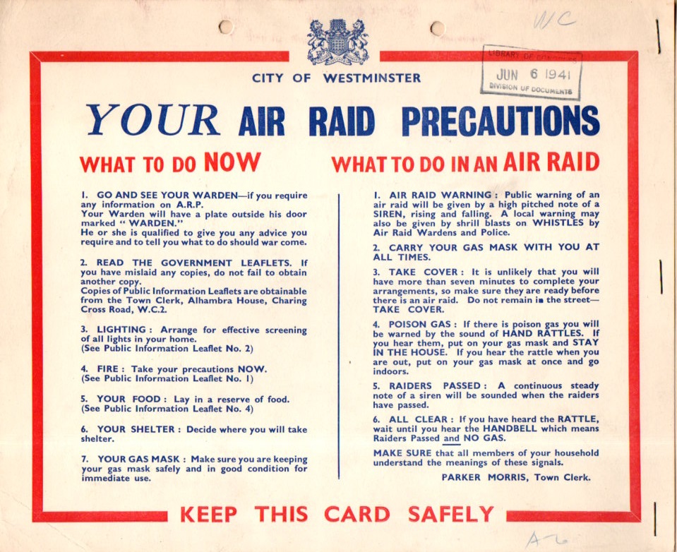
    I recovered this sample Air Raid Precaution poster from a box of WWII material, received by the Library of Congress on the very day that many historians declare to be the very end of the Blitz.  Of course the poster was printed earlier, collected in this case by the OSS and put in a folder and then sent off to the Library of Congress.  

    WWII Air Raid Precaution068

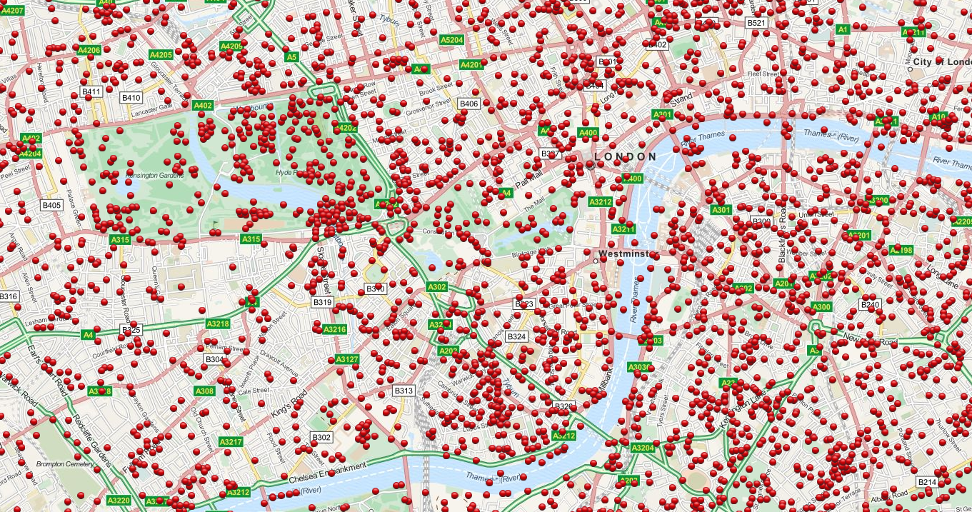
    It is a remarkably level-headed document, clear and concise, very stiff-upper-lip.  And these posters were very necessary, as we can see by the map following: 

    WWII Bomb Map London

    This incredible story (centered on Westminster) is a detail from an incredible (and interactive) map showing every bombed dropped by the Germans on London during the Blitz  7th October 1940 to 6th June 1941 [Source:  http://bombsight.org/?#14/51.5005/-0.1281]

    The following are instructional newsreels (all found on youtube) about what to do in an air raid (1940), while the second demonstrates the sounds of the air raid sirens discussed in the document above, and the third is a short history of the Blitz:


    Ource: https://www.youtube.com/watch?v=mHep5WA9qqU


  • A Map of Judgment: Nuremberg, 1945/6

    JF Ptak Science Books     Post 2510

    Nuremberg049detail


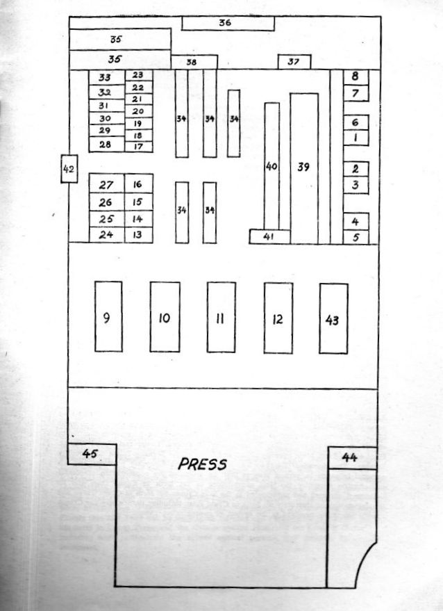
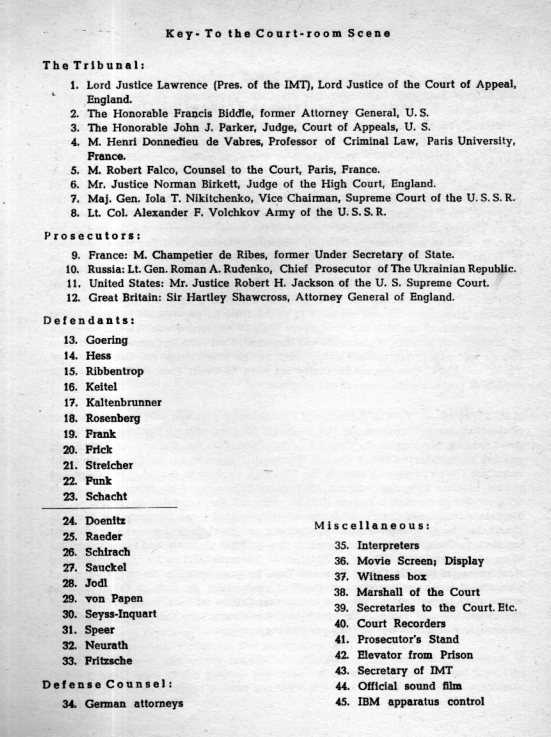
    Nuremberg048In all of the reading that I have done about WWII, I haven’t done that much on the war crimes trials and tribunals afterwards, save for Goering, Schacht, and several of the companies/industries like I.G.Fraben–still, I think I’ve never seen a diagram of the seating arrangement at Nuremberg.  But here one is, in this small pamphlet introducing the International Military Tribunal printed by military order in 1946.  

    We have all seen images from the newsreels shown in documentaries, which seems to give the physical auditorium a rather large feel–with this diagram, and seeing how closely the accused Nazis sat next to each other, the proceedings looked as though they took place in a rather not-large space.  


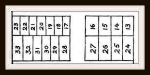
    More to the point though is the detail which I’ve segregated above.  These are seat assignments along benches for  the Nazis being adjudicated for war crimes.  The diagrams make the seating arrangements look segmented, by they are not. (The key to the seating arrangements is reproduced below.)

    There are 21 names associated with those space, 21 of the most infamous names in the Nazi regime; 11 would receive the death penalty; 3 would receive life, 4 would receive various sentences of 10-20 years, and 3 would be found not guilty. 

    Nuremberg049

    For the record, and in order as they appear on  the list below:  Goering, death; Hess, life; Ribbentrop, death; Keitel, death; Keltenbrunner, death; Rosenberg, death; Hess, death; Frick, death; Streicher, death; Funk, life; Schacht, noty guilty; Doeniotz, 10 years; Raider, life; von Schirach, 20 years; Saukel, death; Jodl, death; von Papen, not guilty; Seyss, death; Speer, 20 years; Neurath, 15 years; Fritsche, not guilty. 

    Nuremberg050

    Here’s a photo of the seated group from above, Goering (#13) is seated at bottom left center, head in hand.  He would soon be dead by his own hand.  

    Nuremberg photo

    [Source:  https://www.jewishvirtuallibrary.org/jsource/Holocaust/nurtrialtoc.html]

    I’ve not had anything to say about the Nuremberg Trials ebcause I think that everyone coming here already knows enough about them to appreciate this “map”.  


  • A Leonardoesque Pre-Surrealist Anatomy Book for Artists, 1884

    JF Ptak Science Books (Expanding Post 667 from June 2009)
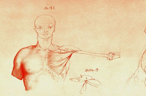
    Blog==June 29--rimmer pecs det

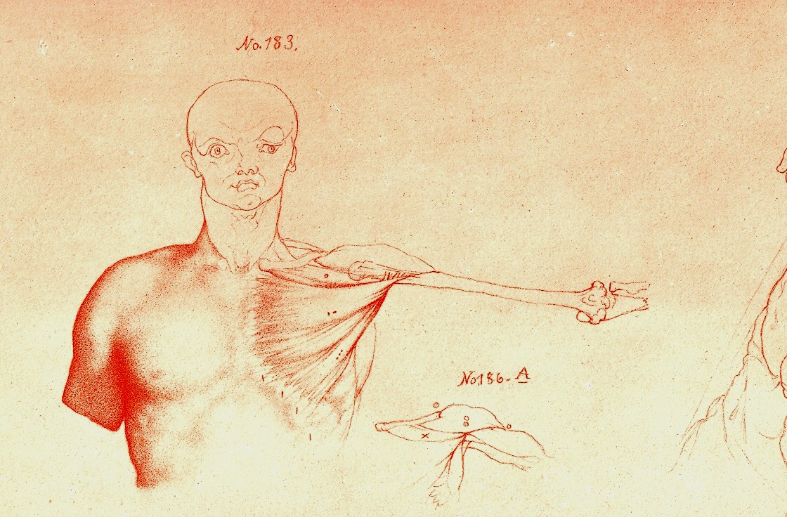
     Looking at old prints sometimes reveals more than just their own history, simple or not:  there are, from time to time, subtle bits of otherness that creeps into the image, if you allow yourself the time to see it. 

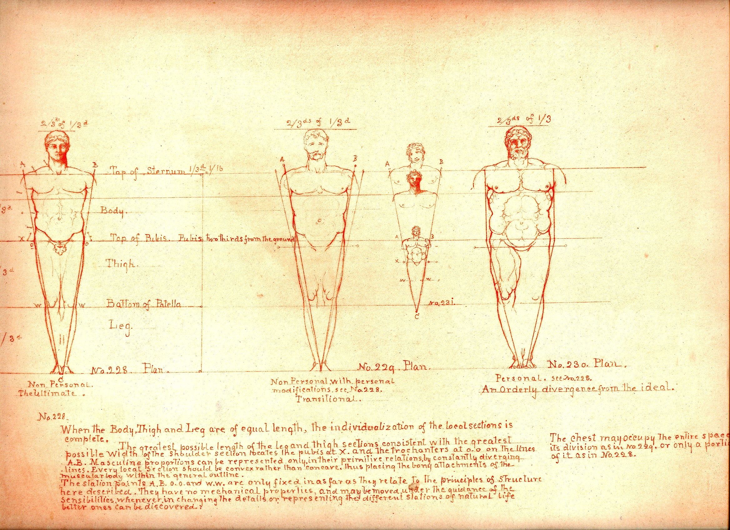
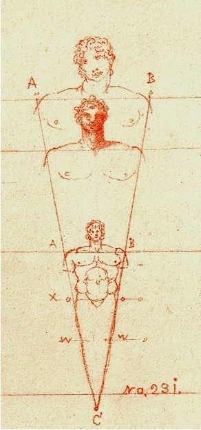
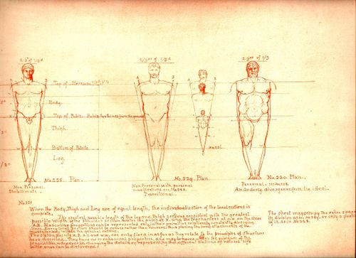
    And sometimes looking at images of the past reveal a little of the future, or the possibility of the future, as we can see here in these examples in the book by the art-anatomist William Rimmer (1816-1879).  His work is superior, and spot-on, and has Leonardo-flourishes all throughout his work–he reaches deeply into the past to the great anatomical standards, and also employs newly established work too (as with Charles Darwin1). There is also–to me anyway–a certain quality of his work that predates modern art movements, like the Surrealists, and Dadaists, that melt into his work, giving it a very post-modern sympathy.  The drawings sometimes have a great “unexpected” sense to them, which I think is not often found in anatomical artwork, given the nature of the exercise and all, giving Rimmer a sense of surprise and somewhat-removed fantasy.

    (In another example of this idea of pre-dating a modern movement, I wrote a little about the odd art/color textbooks of the pre-Kandinskian Emily Vanderpoel , about whose color theory I still understand not at all, though the images that she produced as illustrations to these bizarre theories are stunning, pre-modernist, and unintentional creations.)

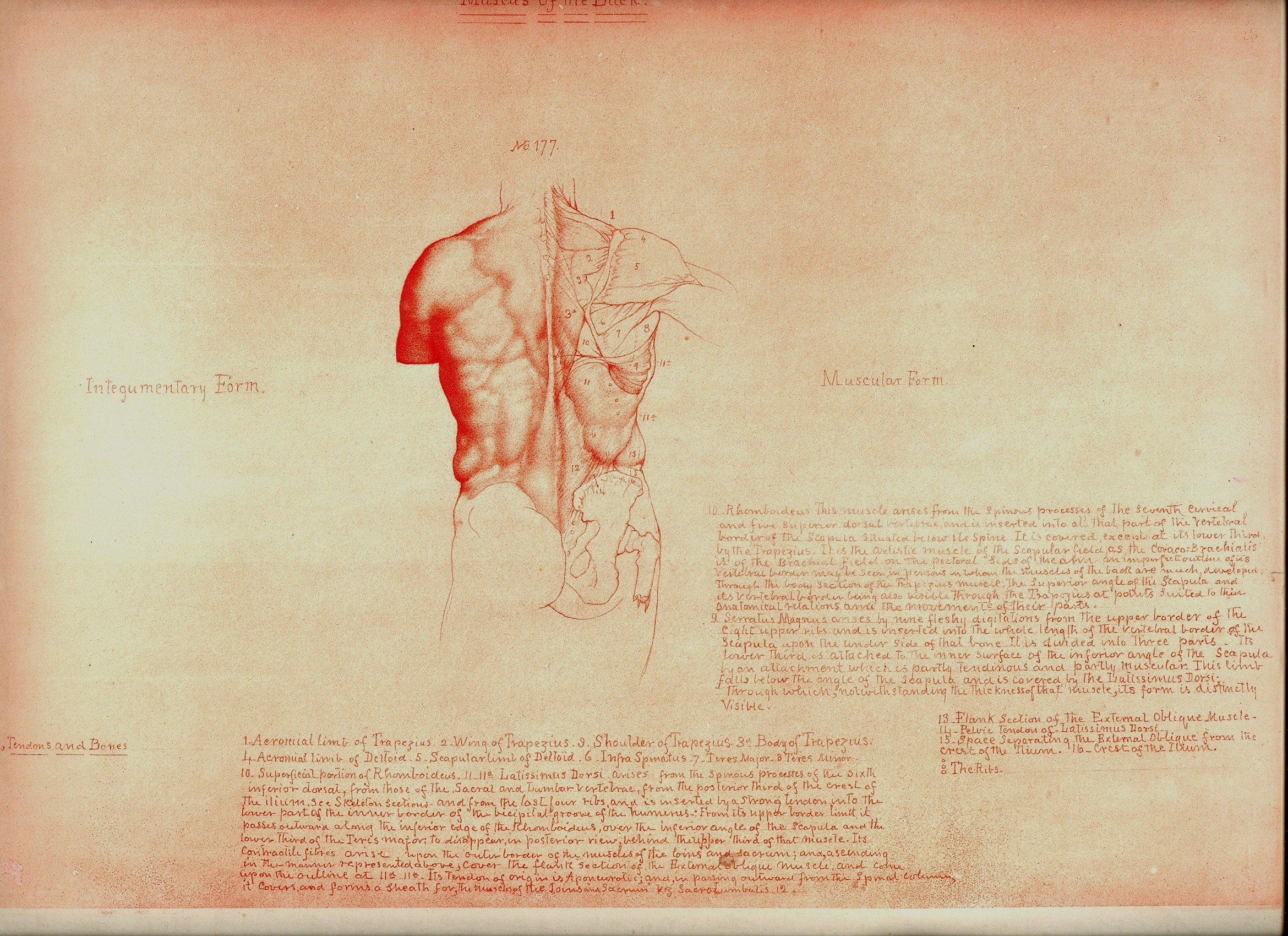
    The images being discussed here are found in Rimmer’s  Art Anatomy (1877 is the first edition and very rare for its process and for being destroyed in a printing house fire, and subsequent printings, this one being the subsequent 1884 printing).  He was a very accomplished artist, and was also a physician and a fine anatomist, with a long career of having varied careers in the arts.  He was very concerned and interested in what happens to the skin, forced into action by all of the stuff underneath it.  He pursued the movement of muscle, and bone, and the interplay of the two, and produced a wonderful exponent of artistic anatomy. 
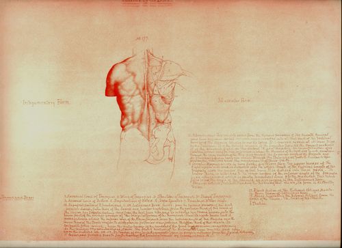
    Blog==June 29--rimmer back

    Even the design of the book and the placement of drawings and text on the page–page after page–is both antique and pre-modernist, the images surrounded by the author’s notes and explanations, sometimes the very spacing and placement on the page is an evocative mystery.  

    Perhaps some of this “mystery” may be easily solved given the way in which the book came into being.  According to Amy Beth Werbel in her Thomas Eakins: Art, Medicine, and Sexuality in Nineteenth-century Philadelphia (Yale University Press, page 61, here) Rimmer constructed most of the work while on vacation, using no models, and seemingly working without reference. That would be an extraordinary accomplishment, and might explain some of the “surprising” parts that I just spoke of, but it really doesn’t necessarily address that dreamy quality of looking not-so-quietly into the future of art. (There are other odd and, well, bizarre, bits that Rimmer writes about that seem unrelated to this anatomy task, but I’ll just have to chalk that up to “personality” at the present time.)

    (I’ll expand this quite a bit as I’ve got 50 or so of these lithographs that I’ll be selling.)
    Blog==June 29--rimmer little man


    Notes:

    1. Elliott Davis writes a very interesting article on Darwin and Rimmer and about the influence of the former on our artist.  For example, Davis writes that Rimmer’s work “represents the most comprehensive anatomy book issued in the United States at the time and provides new insight into the influence of Darwin’s evolutionary theory on artistic practice.“ See:  ”Life Drawing from Ape to Human: Charles Darwin’s Theories of Evolution and William Rimmer’s Art Anatomy” by Elliott Bostwick Davis, on the Nineteenth Century Art Worldwide blog http://www.19thc-artworldwide.org, here. Also from Davis’ article is this good footnote on two further sources of information for Rimmer:  “Marzio, 1976, p. 1. For information on Rimmer, see Truman H. Bartlett, The Art Life of William Rimmer: Sculptor, Painter, Physician. Boston and New York: Houghton Mifflin, 1890. [And] Jeffrey Weidman, Neil Harris, and Philip Cash, William Rimmer. A Yankee Michelangelo, Exh. Cat. Brockton, Brockton Art Museum/Fuller Memorial (Hanover and London: University Press of New England, 1985).