A Daily History of Holes, Dots, Lines, Science, History, Math, Physics, Art, the Unintentional Absurd, Architecture, Maps, Data Visualization, Blank and Missing Things, and so on. |1.6 million words, 7500 images, 4.9 million hits| Press & appearances in The Times, Le Figaro, Mensa, The Economist, The Guardian, Discovery News, Slate, Le Monde, Sci American Blogs, Le Pont, and many other places… 5000+ total posts since 2008.

Category: Anticipation, History of

  • Seeing Mathematics as it “Happens”

    JF Ptak Science Books  (an earlier post from 2008 expanded and corrected  somewhat) 

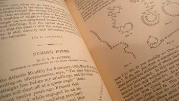
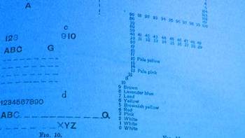
    I wanted to return and add a bit to an earlier notice concerning a series of drawings that I found utterly fascinating—what seems to be among the earliest illustrations of the active formation representing visualized human thought.  (I know that this titling is ungainly, but it seems to be the least inelegant solutions to stating the idea of what the images represent.)  In 1873 Miss H. R. Hudson wrote an article1 on her visualization of numbers–and later and more famously Sir Francis Galton approached this same issue first in an article in Nature2 that included a number of fascinating presentations of the “suspended” numbers.  Working further through this thesis he greatly expanded it, resulting  in a 26-page chapter called “Number-Forms” in his book Inquiries into Human Faculties and its Development 3(1883, with a second edition appearing in 1909).  Galton includes another 71 images of visualizing arithmetic, plus others on general images of mental images of numbers and letters—there is also a small but beautiful section on associations between colors and numbers and letters.  (These are all depicted in the first four images on this page.)
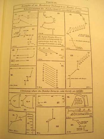
    Bloggalton1

    G.T.W. Patrick (a professor of philosophy at the state university of Iowa) published one of the earliest papers in response to Galton’s work.  In “Number-forms”4, published in the Popular Science Monthly in 1893, Patrick addresses and expands Galton’s work somewhat, including another eighteen wonderful illustrations of similar images.

    But the path back to Galton is not quite a straight one.  Galton was initially concerned with imaging of numbers and numbers forms while people were performing mental calculations.  Patrick on the other hand asked his subjects if they had associative images in their mind of numbers—formally, he asked them if the number series of 1-9 presented itself in a visual, representative way in their minds.  In the second and third parts of his three-part inquiry, he asked the same question about letters and the alphabet, and then, thirdly, if they perceived any sense of color from letters and numbers, and what then what those exact relationships were.
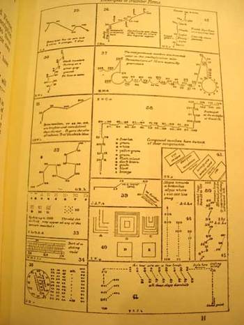
    Bloggalton2_4

    It is interesting that in the studies of Galton and Patrick that over time in each of the subjects tested that (in Galton’s words) the images were “absolutely unchangeable except for a gradual development of complexity”.  Since I (like Galton, which is probably the only time I will ever be able to associate myself with this man
    in terms of familiar traits) have no such images in my head when I think about mathematics or numbers or letter or words in general, it is remarkable to me on the human scale that people who have these associations would have the same ones time after time.  A movable feast, as it were.  Of course it would make sense that this reference system would be constant—but for someone that doesn’t ‘see” these images at all, the fact that they are so flowing and lucid and unchanging is simply difficult for me to imagine. (In a few weeks I’ll return to this issue, looking at how some prodigiously gifted people “see” with their special attributes.)
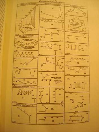
    Bloggalton3_2

    Images below are from the Patrick paper:
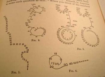
    Bloggalton5

    Bloggalton6


    Bloggalton4blue

    Notes:

    1. “The nine digits will ascend in a straight line before my mind’s eye, and the larger numbers will slant off at a queer angle”, Atlantic Monthly for February, 1873.
    2. Nature, January 15, 1880. Follow the first link to a full reprint of the paper and a short article on it that appeared in this blog. 
    3.  Full text of Galton’s work appears at Gutenberg: http://www.gutenberg.org/files/11562/11562-h/11562-h.htm#1noshow
    4.  Popular Science Monthly,  February 1893 (pp 504-515). Full text of the article by Patrick  here: https://en.wikisource.org/wiki/Popular_Science_Monthly/Volume_42/February_1893/Number_Forms  I should also note that Patrick wrote a very early paper on the psychology of football in 1903, full article here: https://archive.org/stream/jstor-1412309/1412309_djvu.txt

  • The Square in Tintin, Mondrian, & Malevich (1916-1930)

    JF Ptak Science Books  Post 2584

    Tintin square015

    There are no doubt squares in the general outline of the comic book panels of Tintin–what I had in mind was a very special square that occurs in Tintin’s adventures in the Soviet Union. This was the first adventure of Tintin, and appeared in a serialized form in 1929-1930.  We are introduced to the young and intrepid journalist/adventurer here in glorious black and white (this would be the only one of the Tintin adventures that was never rendered in color at one time or another), being sent off to the newish (since 1922) Soviet Union.  At the time it was Stalin’s USSR, and things were not–shall we say–going well for the people of the Soviet Union.  Tintin’s creator, Georges Remi (“Herge”) was working an anti-Marxist angle for his conservative publisher, and he had no difficulty in supplying story lines to fulfill that need–some of these were exaggerated overall, and some were exaggerated but proved correct over time.  The adventures there were difficult, occasionally brutal, and overall not brutal enough. 

    Herge depicted an unpleasant Soviet Union, working out from the “stinking slum” of Moscow out to the farms that were being destroyed in the countryside.  He insinuated threats of violence in voting, death by firing squads, the starving of the peasants, and much else.  The deal is that by the time the strip reached its conclusion in 1930 Stalin was already underway in his loudly quiet way in instituting the Great Famine/Holodomor in the Ukraine, and by the end of this created famine–a reverse nuclear weapon of food withdrawal–something on the order of 7 million people would be starved to death by 1934. Then of course came the Great Terror of 1936-8, and the rest of it.  Herge may have exaggerated some stuff in 1929/30, but few people could have imagined (even when it was happening) the scale of Stalin’s great evil.  

    That said, I wanted really to just talk about one square in the Tintin adventure.  This is where Herge goes black (Soprano’s style)–he leaves an entire panel black to depict violence. Entirely black.  I’m not a comic book/graphic novel guy, but I’ve seen my fair share of them (most <1970) and I have to say that seeing the black panel was extremely surprising.  In my experience, it just didn’t happen.

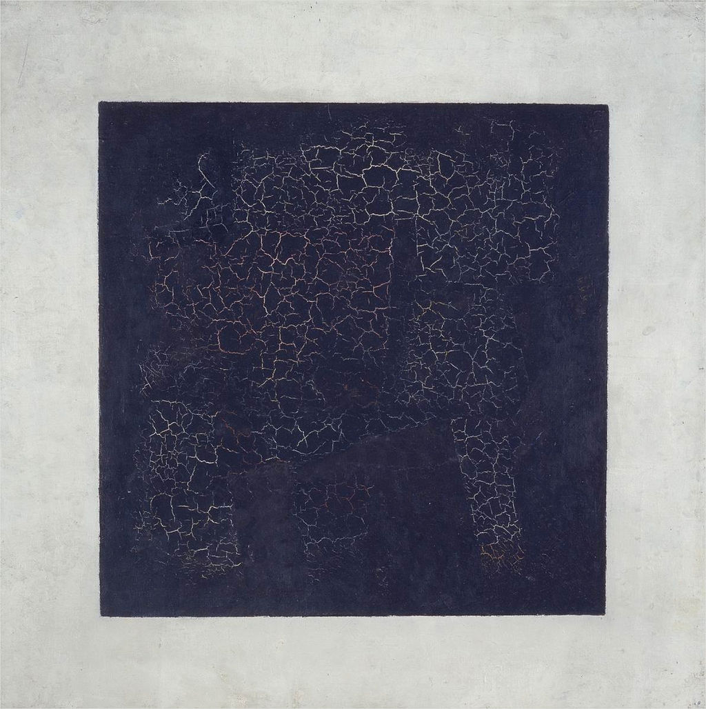
    And what that did was call to mind other squares–notably of course Kasimir Malevich’s (1878-1935) great construction, the Black Square (beginning in 1915):

    Black square

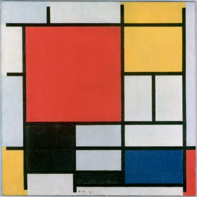
    Then of course there’s the Cubists…but what comes next to mind re the square (and the black one at that) are the later works by Piet Mondrian. Mondrian had gone through a tremendous period of change int he decades from 1905-1935, though it seems to me that even as early as 1909 squares began to appear in the skies (and other places) in his pre-Cubist representational paintings ( as in Sea Toward Sunset, 1909, and Church in Zeeland, 1909/1910), the geometry taking hold for good by 1916.  A good example is Composition with Large Red Plane, Yellow, Black, Grey and Blue, 1921:

    Mondrian black square

    [Image source: http://www.abstractcritical.com/article/malevich-and-mondrian/index.html  This illustrates an interesting article, “Malevich and Mondrian” by David Evison.]

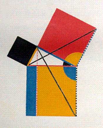
    And so we could wind our way through the history of black squares, but we’ll stop there. Oh, one more: the great squares of Oliver Byrne who in his gorgeous 1847 work replaced numbers with colors in presenting the first six books of Euclid:

    Byrne square

    [Source: https://historyofideasblog.com/thesciencebookstore/2008/05/jf-ptak-scien-1.html  I wrote a little about this in the first few months of this blog back in 2008 in “Dismantling Reality–Euclid, Mondrian, Malevich, Lobachevsky and the Appearance and Disappearance of Form Through Geometry”, which I admit is a big title for a thousand-word blog, but so it goes.]


  • A Sinister-Looking-Yet-Positively-Intended Pamphlet Cover

    JF Ptak Science Books  Quick Post

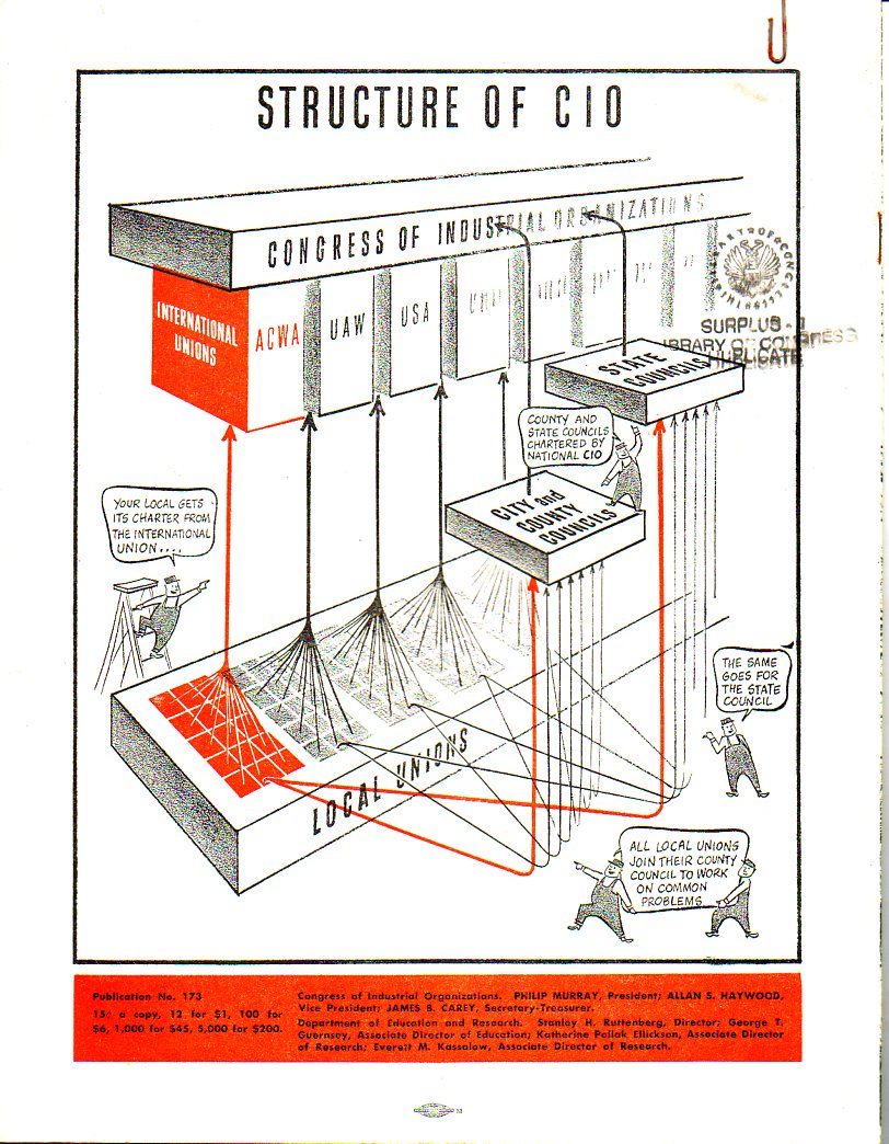
    This design has all the trappings of a modern right-wingish hatchet job screed publication denouncing and de-deifying the CIO (the other part of the AFL-CIO). As it turns out this gritty, demanding, and offsetting design is the cover for a pro-CIO publication, published by the organization itself.  The shattered sky raining coal tar and blood is falling on what sorta looks like a collection of imitation  Soviet-y working folks.  To me the art indicts the CIO for something, and that “something” is not good.  But inside it is all wine and roses and fighting the good fight for teh working class. It is just a very odd job, badly done.  

    Covers CIO009

    And the back cover:

    Covers CIO010


  • What the Sound of the End of War Looked Like, 11/11/1918

    JF Ptak Science Books  Quick Post

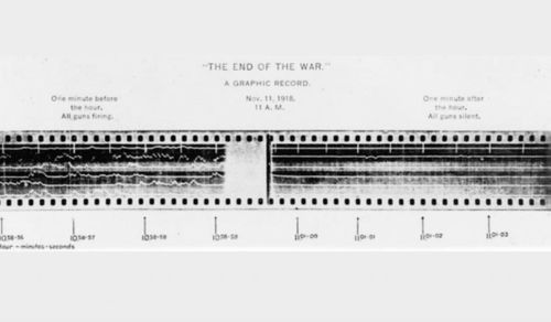
    What the end of the war sounded like was, well, nothing–it was the absence of something, and no doubt for all of those involved it was the absence of the Everything that was manufactured to take away their lives.  This photograph of the display of recorded sound at the battlefield  shows the moment the war ended, at 11 o’clock on the 11th day of the 11th month, 1918.  

     November 11th  what peace sounded like

    [Source: http://www.newsweek.com/2014/11/14/amazing-photo-shows-moment-guns-fell-silent-282453.html]

    Attack, by Siegfried Sassoon (1917)

    At dawn the ridge emerges massed and dun 
    In the wild purple of the glow’ring sun, 
    Smouldering through spouts of drifting smoke that shroud 
    The menacing scarred slope; and, one by one, 
    Tanks creep and topple forward to the wire. 
    The barrage roars and lifts. Then, clumsily bowed 
    With bombs and guns and shovels and battle-gear, 
    Men jostle and climb to, meet the bristling fire. 
    Lines of grey, muttering faces, masked with fear, 
    They leave their trenches, going over the top, 
    While time ticks blank and busy on their wrists, 
    And hope, with furtive eyes and grappling fists, 
    Flounders in mud. O Jesus, make it stop!


  • A Concentration Camp Burned by the Nazis (1938)

    JF Ptak Science Books  Quick Post

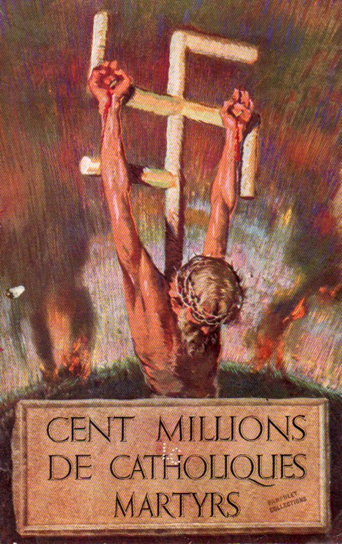
    Poster--100 million catholics dead449

    Needless to say, the cover design for Cent Millions de Catholiques Martyrs (published 1943) is very striking, and very unusual.  I’ve noticed the swastika/crucifix motif before, but not this bloody, and not with Jesus on it. (This is a relatively rare publication: only six copies are located in WorldCat, and all quite good libraries, too, including the LC, Newberry, NYPL, Harvard, Stanford/Hoover, and WVU.)

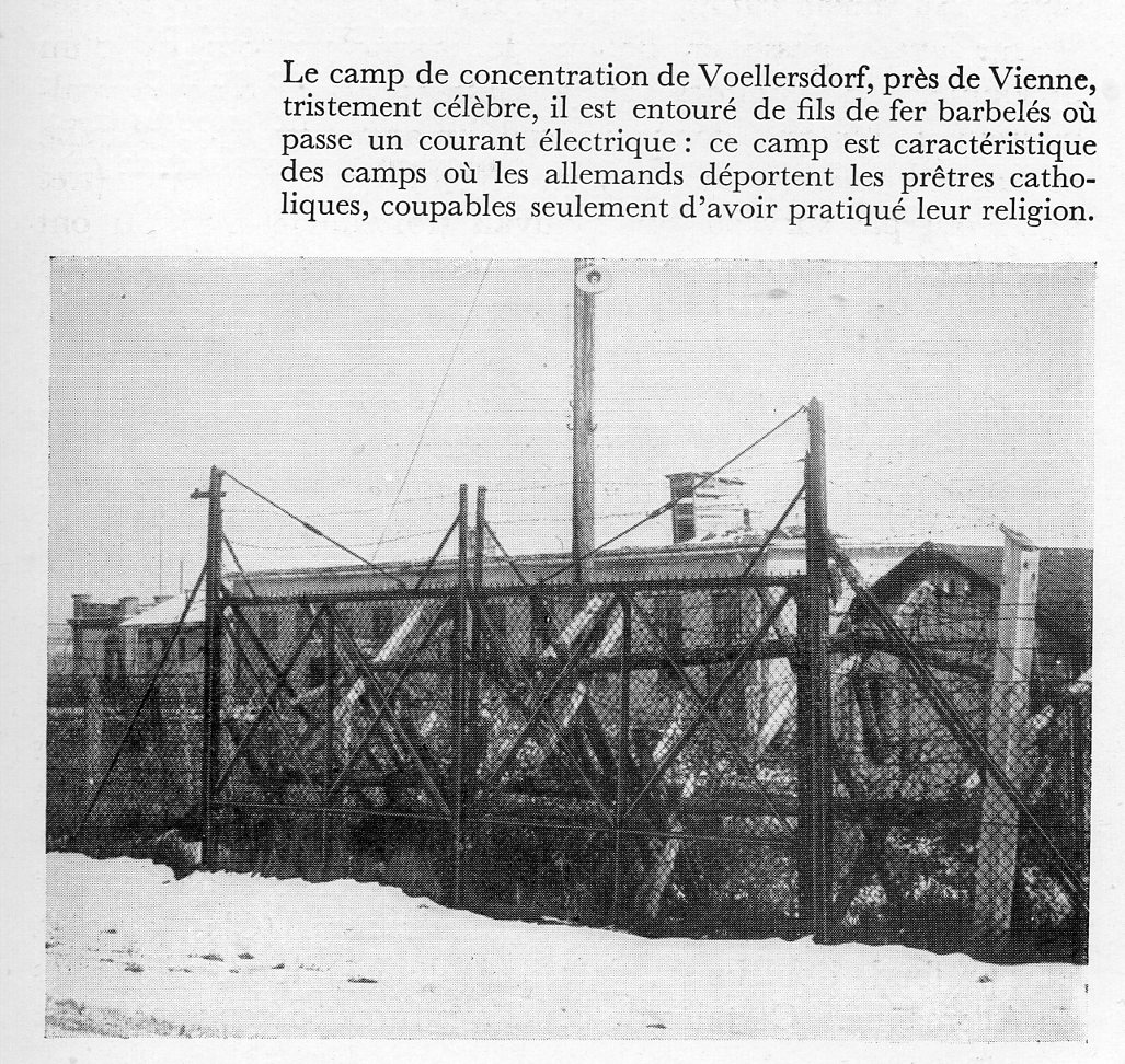
    The other thing of interest is a discussion of concentration camps–in particular, the Voellersdorf (Wollersdorf) concentration camp in Austria, which was used for political prisoners, including fascists. As a matter of fact, the camp was liberated after the Anschluss, and the Nazis took great pleasure in burning the camp to the ground…to high propagandistic value.1 

    The camp evidently was burned after all of the useful stuff was removed. It has been reported that furniture stamped “Voellersdorf” were found in Dachau.

    Also sent to Dachau was the commandant of the “detention” camp Voellersdorf, Emanuel Stillfried. He was sent to Dachau on April 4, 1938 (and given the “matriculation” number 13808) and interned as a political prisoner (under “protective custody”) partially for his role in imprisoning “illegal” Austrian Nazis.  He was released from Dachau on September 13, 1943.2  

    It is not a terribly common thing to encounter a concentration camp photo in a pamphlet like this during the war, so I’ll share it here–

    Voellersdorf (near Vienna), described as the principal concentration camp in Austria:

    Concentration camp austria005

    Here’s a very interesting British film on the Nazi burning of the Austrian concentration camp:

    Notes:

    1.  See  Society of Terror: Inside the Dachau and Buchenwald Concentration Camps, Paul Neurath, Nico Stehr, Christian Fleck; Routledge, 2005, page 21.
    2.  See  http://www.polizei.gv.at/sbg/publikationen/geschichte/gendarmerie.aspx

    ·Posted by :

    ·in:


  • The History of the Future of Massiveness (1907)

    JF Ptak Science Books   Post 2580

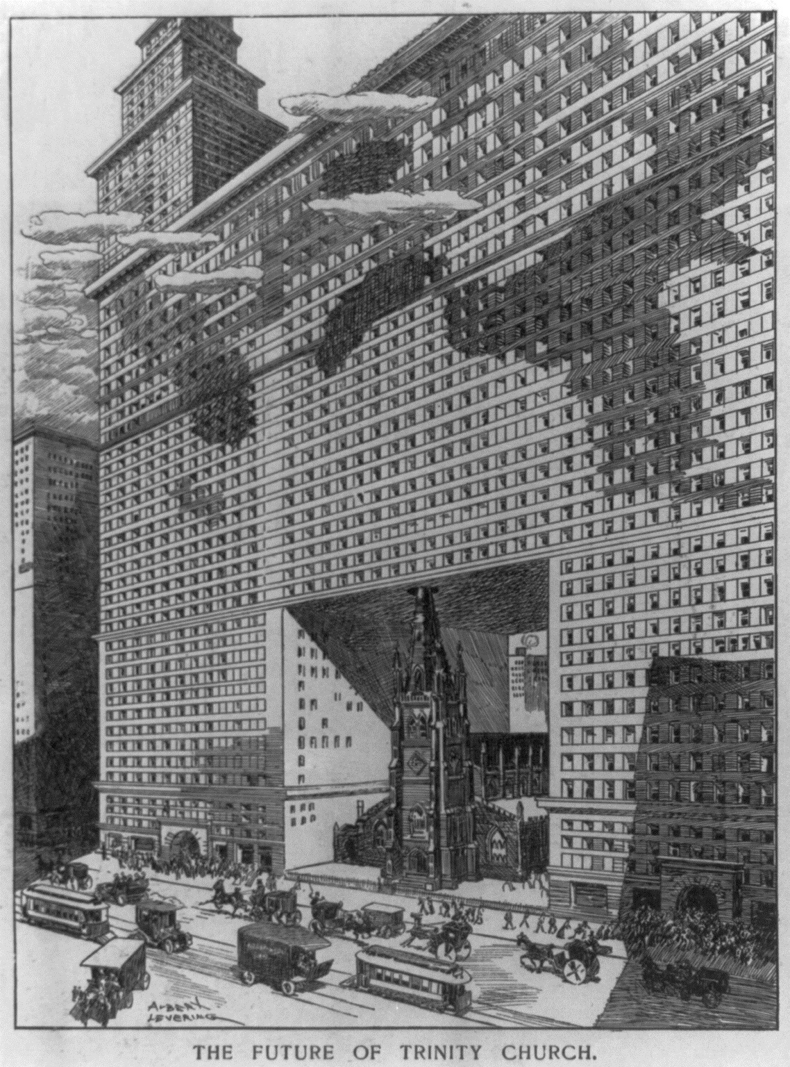
    For many years the steeple of Trinity Church was the tallest object in Manhattan, but by 1907 when the city was entrenched or engulfed in a skyscraper building adventure the future of massiveness and of height knew no bounds, especially when the limits of those boundaries were attainable.  And so this enormous structure grew around the church, with room-enough-for-steeple, built among the clouds.  It turns out that the 284′ spire was the tallest thing in Manhattan until 1890, when the World Building was completed (17 years before the publication of this engraving) raising the new highest heights ceiling to 348′.  If you iterated the scale of Trinity (below) to the rest of the imaginary building, the new structure would be about 750′ tall–the Metropolitan Life Insurance Company Tower would come close to that in another two years (and be the tallest building in the world until 1913), so the building shown below would have been probably the world’s largest in 1907, and easily the most massive.  


    Future of trinity church

    [Source: Puck magazine, March 6, 1907, wood engraving by Albert Levering]

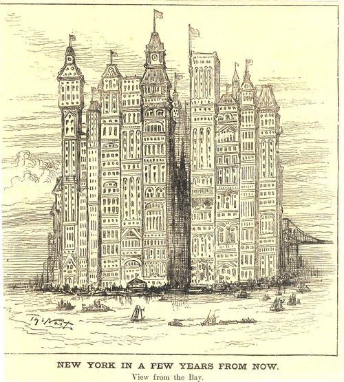
    This reminds me somewhat of an earlier vision of an engulfed Trinity–Thomas Nast’s future Manhattan skyline of 1881 for Harpers Weekly, where the church is visible still but crowded out almost entirely by enormous structures which were still/only decades away:

    Trinity Manhattan skyline


    [Source: an earlier post on this blog https://historyofideasblog.com/thesciencebookstore/2009/12/the-history-of-the-future-of-skyscrapers-thomas-nast-1881.html]


  • The Pre-History of Imaginary Robots: Electric Deer, 1892

    JF Ptak Science Books    Post 2566

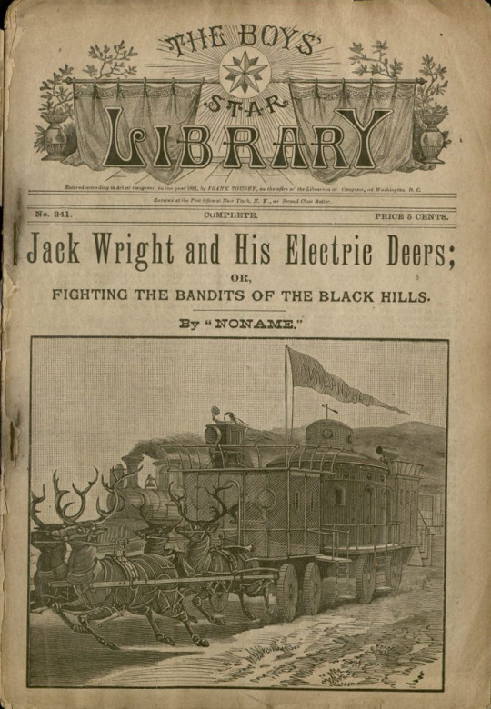
    Rebecca Onion at Slate Vault surfaced this very interesting image of electric breath on her twitter account (@Slate Vault), showing early robotic creatures alive and well and living in the minds of thousands of young kids, placed their partially by stories like this found in the pulpy pages of Frank Tousey’s Pluck and Luck in 1892. The image  (from the special collections library at the University of South Florida (here)) shows yet another work of genius/ingenuity by the endlessly adventurous “Jack Wright” a boy inventor, who seemingly went everywhere, did everything, and had the stuff to make it all happen.

    I’ve posted1 many times on this blog about 19th century imaginary robotics, and had not seen this Wright story and his fabulous “electric deers”. 

    Robot deer detail

    This Jack Wright adventure was written by “Noname”, who turns out to be by Luis Senarens (1863-1939)2, a very prolific and early sci-fi writer, a Brooklyn boy, who had been referred to as an American version of Jules Verne.  Senarens wrote beginning in the 1880’s and was no doubt much taken by the new applications of electricity, and Senarens applied it quite liberally. In a quick browse, he introduced electricity inventively, sprinkling it liberally over powered machinery and introducing his own electric ocean liners, submarines, sledge boats, canoes, air-schooners, locomotives, balloon ships, torpedo rams, horses, and no doubt much else. I’m glad to have caught up to Mr. Senarens’ robots.

    Robot deer

     Notes:

    1. Just search “robot” in the google search box at upper right.
    2. See the Edward T. LeBlanc Memorial Dime Novel Collection for very much expanded info on this and other series:  https://dimenovels.org/Series/734/Show

  • A Note on Franklin Roosevelt and the Holocaust, 1942

    JF Ptak Science Books   Post 2564

    FDR Jews secret

    For all of the greatness of the man, Franklin Roosevelt for whatever reason came up decidedly short on the issue of accepting German Jewish immigrants seeking to escape Nazi Germany (in the 1930’s) and then later, during the war, having a terrible record in the response to the concentration camps (1940-1942) and (somewhat later) on the identification of the extermination centers.(1943-1945).  It is certainly a large stain on this legacy, a despondency that is confused, confusing, and highly open to debate. 

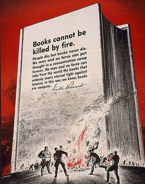
    This came to mind when I reviewed an older post on this blog on books/propaganda issued by the government printing office–in particular, the “Books are Weapons” series, which is a collection of strong images used in connection with Roosevelt’s statement about books/weapons:

    Books are weaponsWhat struck me today for the first time is FDR’s use of “concentration camp”, which is surprising to me–at least the “me” at my level of understanding FDR and the Holocaust–because when this poster was issued by the Government Printing Office in 1942 Roosevelt had spent very little public time on the issue.  And in the course of the next 24 months or so, Roosevelt had more evidence of the gigantic crimes being perpetrated by Germany but still had very little publicly to say on the matter.  1942 though seems to be early for this sort of statement–and to find it in a mass-produced vehicle like this poster was a jolt. 

    The text on the monolithic book that stand free and tall and immobile in spite of the Nazis in the foreground and their small pyre of burning books:

    • “Books cannot be killed by fire. People die, but books never die. No man and no force can put thought in a concentration camp forever. No man and no force can take from the world the books that embody man’s eternal fight against tyranny. In this war, we know, books are weapons.” –Franklin D. Roosevelt. 1942 (the date referenced from the Library of Congress page on this poster http://www.loc.gov/pictures/item/96502725/   Another post on this blog shows two other variations on this poster:  https://historyofideasblog.com/thesciencebookstore/2014/09/books-are-weapons-in-the-war-of-ideas.html)

    This is a very long story, but for right now it seems a relatively certainty that the situation of the Jews in Germany and the rest of Europe was fairly well known and established within the Roosevelt White House, and even so too to some extent in the popular press. By 1943 there was probably no doubt whatsoever with what was going on–in an example of Roosevelt’s association with the contemporary knowledge of the Holocaust the FDR Presidential Library offers the following O.S.S. document on the destruction of the German Jews:


  • A Non-Imaginary Post about Imaginary Books in Real Books

    JF Ptak Science Books  Post 2685

    Eco Library

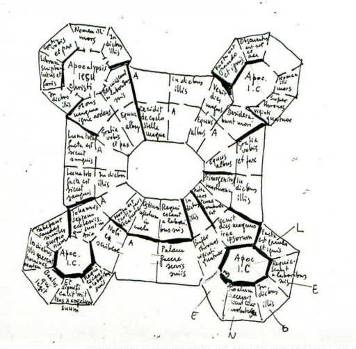
    [Umberto Eco’s sketch for the imaginary library in his The Name of the Rose, from Digital Architectural Papers, here]

    “To write vast books is a laborious nonsense, much better is to offer a summary as if those books actually existed.”  — Jorge Luis Borges

    I imagined to be reading about the imaginary illustrations of a non-existent book when I wondered about the extent of (intentionally) imaginary books in the history of real books.  It was a quick realization of how deep and how old this genre is–and as a matter of fact one excellent single-stop website that displays this depth is the Librarian of Babel by Emi Hastings  (Catalogues of Imaginary Libraries https://librarianofbabel.wordpress.com/2014/04/25/bibliographies-of-imaginary-libraries/).

    At the outset I thought to write some sort of overview or a little history of the imaginary book, starting of course with Rabelais and then Borges, but there is just so much more than can be accommodated by a simple evening’s work that I decided to simply make a few lists of representative creations by a selection of some favorite biblio-creativists. So, help yourself to some interesting and humorous suggestions by Charles Dickens, John Donne, Francois Rabelais, Marcus de Fable, Douglas Adams, Jorges Luis Borges, Umberto Eco, Vladimir Nabokov, Haited Pleat,  and J.K. Rowling.

    Works invented by Charles Dickens [findable in numerous forms with this list found at http://flavorwire.com/329815/charles-dickens-library-of-fake-books]:

    Five Minutes in China. 3 vols.
    Forty Winks at the Pyramids. 2 vols.
    Abernethy on the Constitution. 2 vols.
    Mr. Green’s Overland Mail. 2 vols.
    Captain Cook’s Life of Savage. 2 vols.
    A Carpenter’s Bench of Bishops. 2 vols.
    Toot’s Universal Letter-Writer. 2 vols.
    Orson’s Art of Etiquette.
    Downeaster’s Complete Calculator.
    History of the Middling Ages. 6 vols.
    Jonah’s Account of the Whale.
    Captain Parry’s Virtues of Cold Tar.
    Kant’s Ancient Humbugs. 10 vols.
    Bowwowdom. A Poem.
    The Quarrelly Review. 4 vols.
    The Gunpowder Magazine. 4 vols.
    Steele. By the Author of “Ion.”

    Works invented by John Donne, Catalogus librorum aulicorum incomparabilium et non vendibilium, or The Courtier’s Library of Rare Books Not for Sale, was written between 16-7-1611, and published in 1650: [http://libraryofinvisible.blogspot.com/2014/03/anonymous.html]

    Edward Hoby’s Afternoon Belchings
    On Distinguishing the Sex and Hermaphroditism of Atoms
    On the art of decyphering and finding some treason in any intercepted letter
    Concerning the method of emptying the dung from Noah’s Ark
    Martin Luther, On Shortening the Lord’s Prayer
    The Princely Ocean, or The Pyramid, or The Colossus, or The Abyss of Wits: where by means of 60,000 letters to the Nobles of all nations … are related everything that is able to be related concerning toothpicks and hangnails
    On the Navigability of the Waters above the heavens, and whether Ships in the Firmament will land there or on our shores on the Day of Judgment, by John Dee
    What not? or a confutation of all errors in Theology as well as in the other sciences, and the mechanical arts, by all men, dead, living, and to be born, put together one night after supper

    The Art of Cutting the Teeth.
    Matthew’s Nursery Songs.
    Paxton’s Bloomers.
    5 vols.
    On the Use of Mercury by the Ancient Poets.
    Drowsy’s Recollections of Nothing.
    3 vols.
    Heavyside’s Conversations with Nobody.
    3 vols.
    Commonplace Book of the Oldest Inhabitant.
    2 vols.
    Growler’s Gruffiology, with Appendix.
    4 vols.
    The Books of Moses and Sons.
    2 vols.
    Burke (of Edinburgh) on the Sublime and Beautiful.
    2 vols.
    Teazer’s Commentaries.
    King Henry the Eighth’s Evidences of Christianity.
    5 vols.
    Miss Biffin on Deportment.
    Morrison’s Pills Progress.
    2 vols.
    Lady Godiva on the Horse.
    Munchausen’s Modern Miracles.
    4 vols.
    Richardson’s Show of Dramatic Literature.
    12 vols.
    Hansard’s Guide to Refreshing Sleep

    Works invented by Francois Rabelais, a selection from  Catalogue of the Choice Books Found by Pantagruel in the Abbey of Saint Victor: Devised by François Rabelais: Translated and Annotated by Walter Klinefelter, a Student of Catalogues (printed in Pantagruel, c. 1532; translated and printed separately, 1952):

    The Spur of Cheese

    The Codpiece of the Law
    The Testes of Theology
    On the Art of Discreetly Farting in Company
    Three Books on How to Chew Bacon
    Martingale Breeches with Back-flaps for Turd-droppers


  • Welcome to Near-20th Century Design, 1623

    JF Ptak Science Books  Quick Post

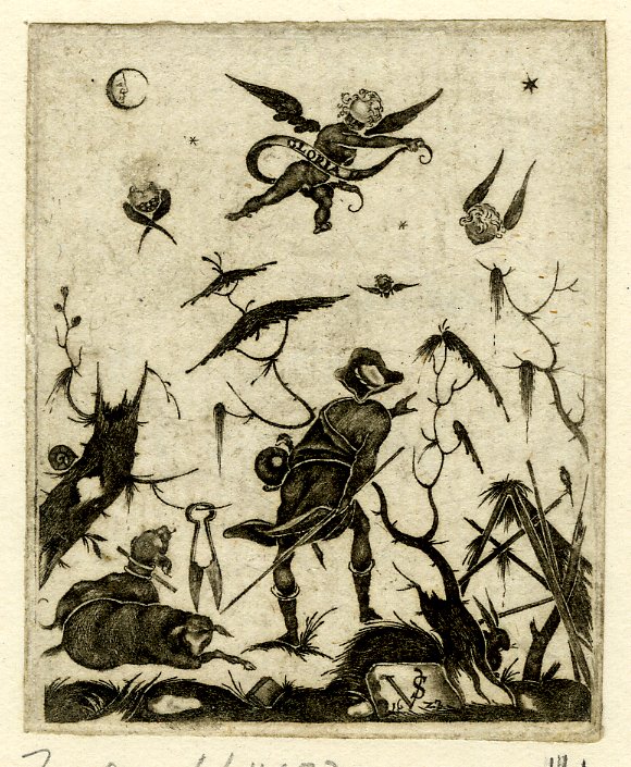
    I wanted to just take a moment to stop to appreciate and share this designing peep into the future. The image is located on the superior Bibliodyssey blog’s “Blackwork Prints” post (located here http://bibliodyssey.blogspot.com.au/2010/03/blackwork-prints.html along with many more examples) and was created by the German engraver Valentin Sezenius in (improbably) 1623.  It looks to me as though this piece of ornamental design was completed in a high style of the 1880-1910 period–very light, ethereal, flowing, spare.  It is surprising to me, anyway, that this work is as old as it is–and yet, it is.  

    Sezenius man with shears

    ·Posted by :

    ·in: