A Daily History of Holes, Dots, Lines, Science, History, Math, Physics, Art, the Unintentional Absurd, Architecture, Maps, Data Visualization, Blank and Missing Things, and so on. |1.6 million words, 7500 images, 4.9 million hits| Press & appearances in The Times, Le Figaro, Mensa, The Economist, The Guardian, Discovery News, Slate, Le Monde, Sci American Blogs, Le Pont, and many other places… 5000+ total posts since 2008.

Category: Architecture and Building

  • Brutalist Anthropomorphic War of the Worlds Hoisting House, 1927

    JF Ptak Science Books  Quick Post

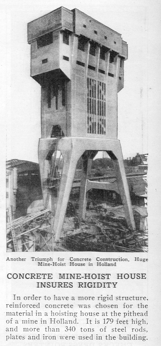
    All you really need on this structure to complete its Brutalist International Style is a little swastika on the top.  Seriously, though, the 170′-tall building is located at the pithead of a mine somewhere in Holland. It is found in the June 1927 issue of  Popular Mechanics and celebrates its concrete construction, and was an achievement for the time. Still, it has a very distinct flavor of Wells’ (earlier) aliens in his War of the Worlds. 

    …and if this structure does spell anything at all, it is “rigidity”.

    Brutalist654

    ·Posted by :

    ·in:


  • Unbuilt New York City, 1935–Almost-Closing the NYC Harbor


    JF Ptak Science Books 

    Liberty Landing _1_602

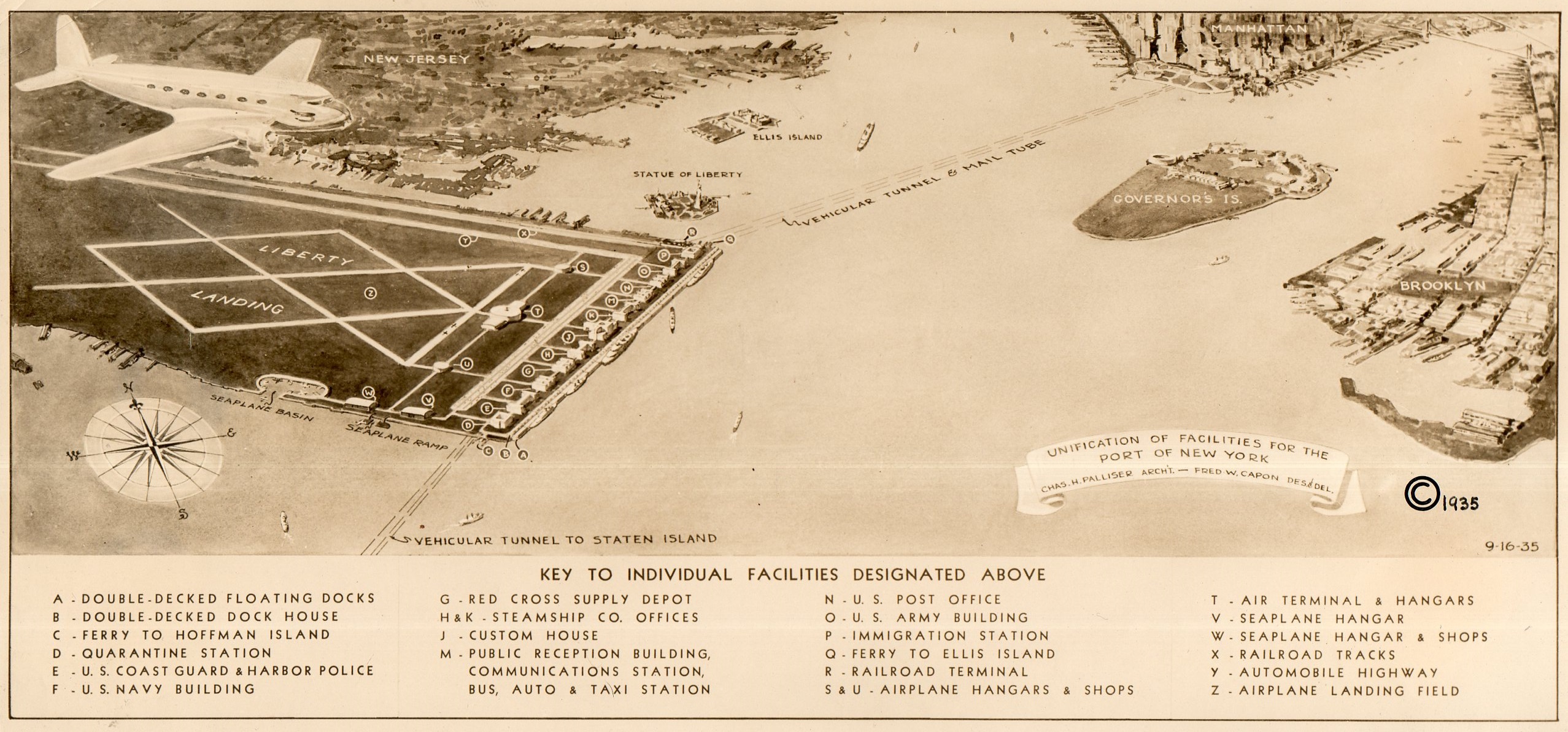
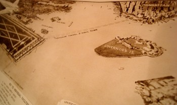
    I recently uncovered an interesting, unpublished and probably not-acceptable engineering report to extend the ports capacity in the Hudson River at New York City–the ports of the  area being famously over-busy for a long period of time, especially right before World War II.  Charles Palliser and Frederick W. Capon presented a proposal in 1935 for a unification of the port and airport facilities to take care of the overcrowding and overworked problem.


    Liberty Landing _2_603

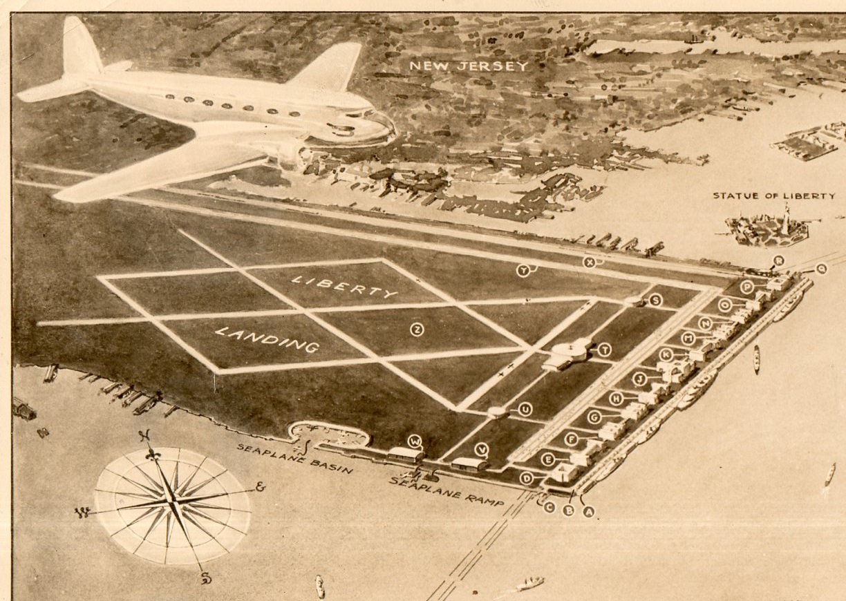
    What they came up with was Liberty Landing, a mile-long and half-mile-wide facility that nearly bumped into the Statue of Liberty (and hence its name).  The plan called for backfilling the “flats” that were just south of Jersey City, as “the natural formation of these were very favorable”, which meant that the airport-port combo would extend all the way into the harbor to the edge of the channel, which would put it further out than the Statue of Liberty, which would also be just hundreds of feet away from the end of the north runway.

    Also attached to the backfill and new land would be a one-mile-long floating dock.  Oh my!

    The floating island would also have vehicular tunnels that connected it to Staten Island and the Battery.  There were facilities for seaplanes, airplanes, railroads, dirrigbles, and trucks, plus a military installation, a custom’s house and the US Mail Service, so that all commerce would converge at this one point, which sounds interesting (for about 20 seconds). 

    Dsc04773

    This is a good candidate for the “Better Left Undone” award for 1935.

    As I look at the photograph of the aerial view of the plan it strikes me that if the designers increased the surface area by only 125% or so they could’ve connected the new facility with Governor’s Island AND Brooklyn, building a land bridge from Jersey City to Coney Island—a superbly bad idea to cap an already strongly bad idea. 

    The report is called, simply, Liberty Landing, and published by the architect in Jackson Heights, NYC, 16 Septmeber 1935.  This is also the U.S. Copyright Deposit copy (accepted 10 October 1935), which is where the history of this project ends.

    ·Posted by :

    ·in:


  • The Dome of Creation, San Marco, Venice

    JF Ptak Science Books   Post 2625

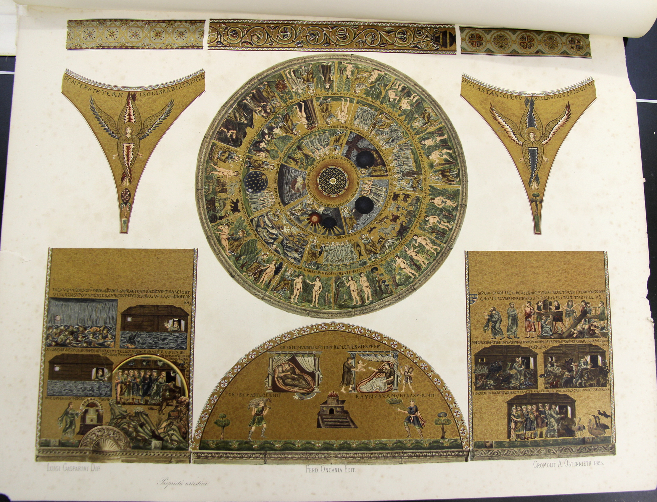
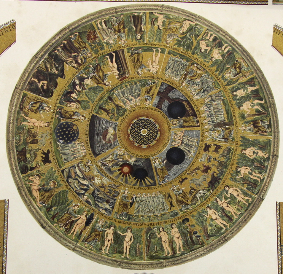
    I’m in the midst of making several posts relating to a group of large (27×21″) chromolithographs of the mosaics in San Marco (sumptuously published by Ferdinand Ongania in Venice in 1886.  The main part of this image is the story of creation, starting in the innermost circle of images, where we find the creation of light (and darkness),  and the rest, followed by the larger concentric circle showing the starry realms, the creation of the birds and fishes, then the land-based animals, and then (around “12 o’clock” on the second circle) comes the creation of life in Adam, where it all seems to go downhill.  In the outer ring we see the creation and presentation of Eve, the various temptations, the nakedness realizations and then the banishment–not all together a happy ending.  But the artwork is lovely, highlighted in gold. 

    Ongania 16 creation

    • [Creation Myth] Chromolithographic image from  Basilica di San Marino du Venezia, published by the prolific Ferdinand Ongania in 1886, 27×21″, 68x53cm. Very good condition. Ongania’s work is an exhaustive study of the iconic building, the publication being known chiefly I think for its very large and sumptuous chromolithographs of the building’s architecture, art, and endless detail. It forms two volumes of an overall monumental 12-volume epic, though these were complete in themselves.


    Ongania 16 creation detail


  • A Slab of Nothing Suggesting Something

    JF Ptak Science Books   Quick Post 

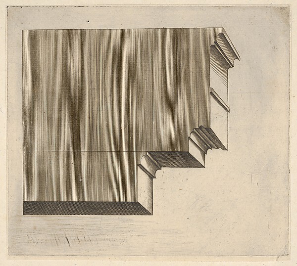
    There is hardly anything that is nothing, or a hardly-nothing that is nothing, because the more of a suggestion that in something exists nothing than we are forced to consider the nothingness which of course defeats the cause of identifying that something as a nothing.  The image below is a good example of the greater expanse of a supposed nothingness–it is a simple cross section of a doric entablature (“a horizontal, continuous lintel on a classical building supported by columns or a wall, comprising the architrave, frieze, and cornice”) or more simply put, the stuff between the pediment and the column.  In this case we see the anatomy of the entablature more so than anything else, most of the decoration and design pretty much left aside.  We are left with a map of lines, a picture of stability, firmness, and a cold comfort, somehow.  

    I just like the engraving.  

    Doric entabalur

    Master G.A. (Italian, active ca. 1535) Doric entablature 

    [Source:  Metropolitan Museum of Art, http://metmuseum.org/art/collection/search/415345?sortBy=Relevance&ft=doric+entablature&pg=1&rpp=20&pos=1]


  • Gigantic and Unbuildable Architecture: Buckminster Fuller’s Midtown Manhattan Dome, 1968

    JF Ptak Science Books LLC  Post #115 (from 2008, extended a little)

    Big_arch_city_fuller139
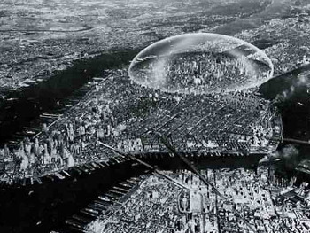
    Buckminster Fuller had a lot of good ideas but I’m not so sure that this is one of them.  I don’t have much doubt that versions of domed cities will exist in the not-dim future, though I do have doubts that they would be constructed to preserve the bones of antiquated ideas.  It seems logical to me that the retrofit of untold millions of cubic feet of city life just couldn’t make sense, even if the square footage was in Manhattan.

    Domed cities pop up here and there in speculative/science fiction in the 1960’s (though there is a far-deep reference to one from the 1860’s, though that one is under water), and there are many that are sprinkled like seasoning here and there in more modern formats, as with Stephen King’s Under the Dome made into a slappingly-silly tv show of the same name and The Simpson’s movie that Borrows Very Heavily from King.  There are others to be sure, though I am more interested in miniature domed underground cities or Lego-made Dyson sphere within a Domed Galaxy. 

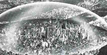
    Fuller’s idea (working with Shoji Sadao) is multiple orders of magnitude removed from the original idea of the arcade (like the passage Choiseul, located in the second arrondissement of Paris), envisioning the construction of a dome to encapsulate NYC from the East River to the Hudson along 42nd St, and from 64th to 22nd St:  that is two miles in diameter and, plus at least a half-mile high (or about 2.5 Empire State Buildings pile one on top of the other at zenith sector).  I’m not so sure how this would be built, or how things would be heated or (especially) cooled, or what the construction material was for the skin of the dome, or how people get in and out, or how you deal with heating and cooling, or how any noxious chemicals are expelled—but Mr. Fuller thought that the savings alone from snow removal from NYC streets would pay for the dome in ten years.  (That would maybe work out–the snow-removal analogy–if someone had asked Mr. Fuller exactly how much snow he was talking about…)  
    Big_archfuller_detail141

    Mr. Fuller also thought that the dome would protect the city (or this part f the city) from radiation fallout.  That could be true, assuming that of all the hundreds of nuclear warheads that the Soviets would’ve launched against NYC alone none of them would’ve found their target, except perhaps for the Ridgways or Staten Island, where the shock wave or winds produced by ensuing firestorms would not have disturbed the dome.  Of course if a warhead actually came close—or actually hit—the dome, the protection from radiation would be moot. 

    Source:  Buckminster Fuller in Think magazine, vol 34, Jan/Feb 1968.  AND of course the lovely work by Alison and Sky Michele Stone, Unbuilt America, McGraw Hill, 1976, pg. 99.


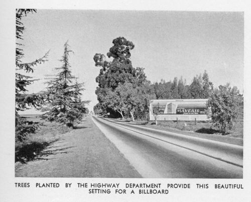
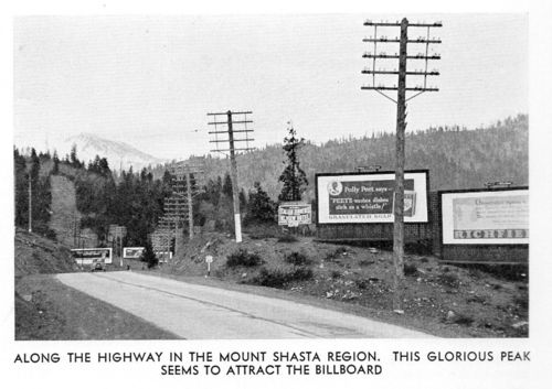
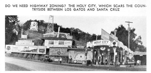
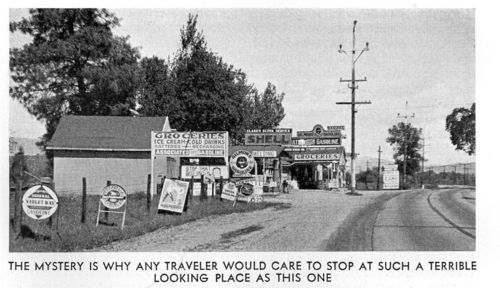
  • Lost Highways–Bad California Road Landscapes of Yesteryear

    JF Ptak Science Books   (Archive Post 1303, expanded)

    “There’s nothing so perfect as imperfection.”–Somebody.

    “The great unconquerables in the geography of human thoughts and ideas are the bad ones.”–Nobody.
    California roadside d261

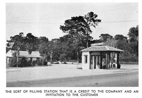
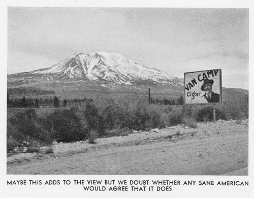
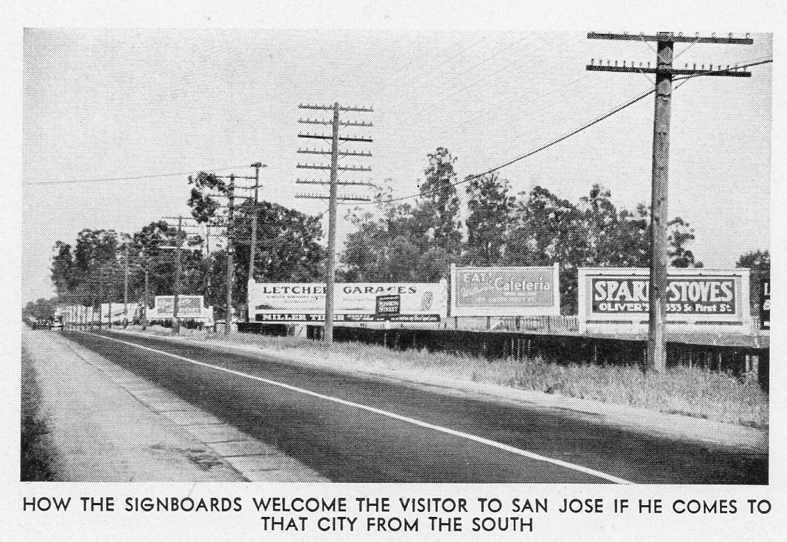
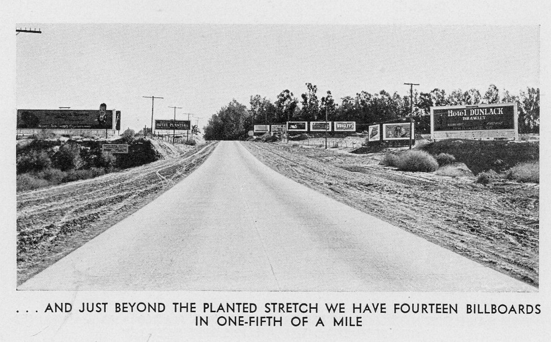
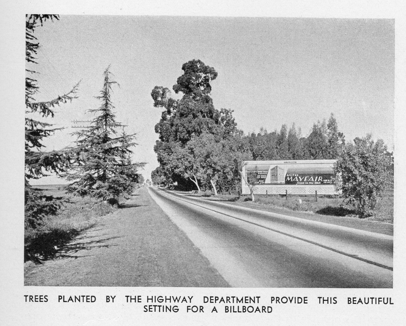
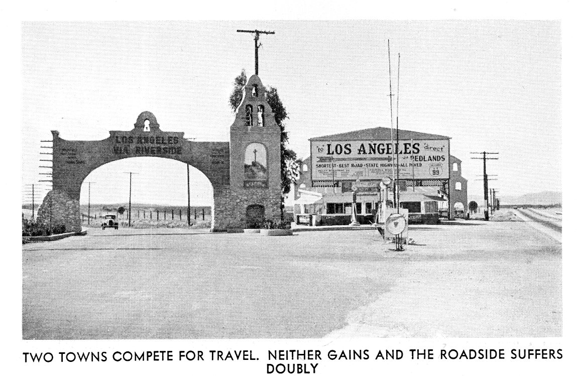
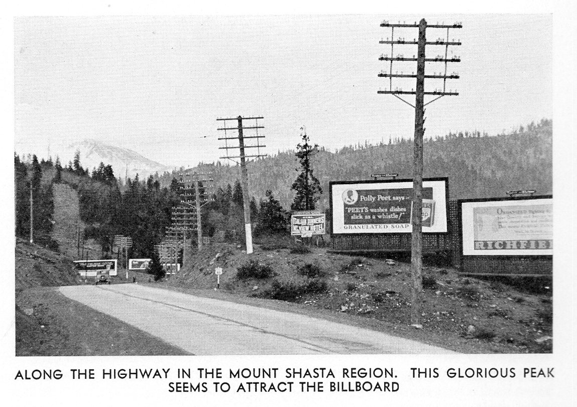
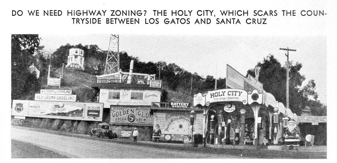
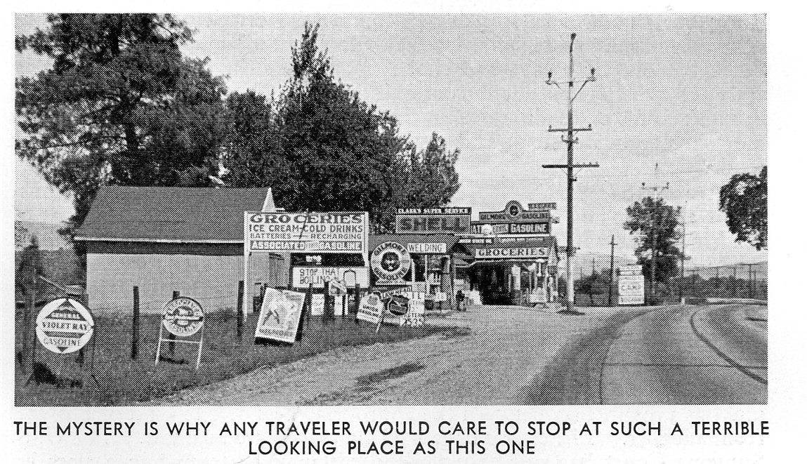
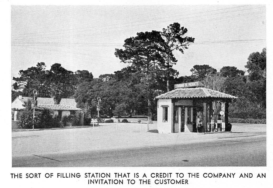
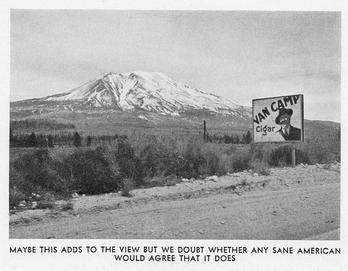
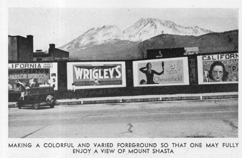
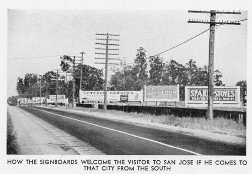
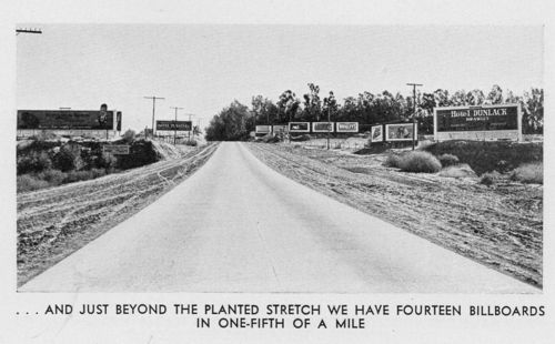
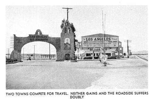
    [The captions for the images in this pamphlet are mostly facetious–the author/s were conservationists of sorts, interested in the landscape and visual culture of their state. They tried to make their case in some instances with sarcasm.]

    Bad ideas don’t so much go away as they get recycled. They can be replaced by good ideas or bad, but the ”original” bad ideas seem to linger on and on.  They are perhaps the indomitable inheritance of society, real and imagined.   

    Bad human-produced landscapes are an outgrowth of bad ideas, calamities large and small that come and go, the old replaced by something new that is good or bad or indifferent. With the landscape, the original landscape itself–apart from the idea that brought it about–is generally lost forever once it has been replaced.  There is no Bad Idea Spirit that brings it back whole again, unlike the generic Bad Idea, which can live on and on, unencumbered by history, like a Greek play or some deeper mythology.
    California roadside b259

    Theoretically society is supposed to learn from recognized bad ideas, so as to not repeat them etc., which is one reason why we keep track of them, in the vain hope that someday someone somewhere in the history of our future will kill particular bad ideas off one by one. 
    California roadside c260


    California roadside a258

    In the meantime we can dwell on what we have, though with the removed bad idea landscape, it is more difficult.  That’s why it is important every now and then to familiarize ourselves with them when the opportunity arises, which is just what happened with this innocuous-sounding pamphlet, The Roadsides of California, a Survey1 (1932)  Its not like it’s Pandora’s box–we can open this one and just a few, limited baddies come out, and fall limply to the floor.  But what we see is interesting, a slice of our memory of the horizon–a part of our “progress” that we’ve tried to excise–and what we can see now are the removed and forgotten things. 
    California roadside F263


    California roadside G264


    California roadside H265


    California roadside I266


    California roadside I267


    California roadside E262


    Notes

    1. This is actually an interesting pamphlet, an early attempt at removing the quickly generated ugliness that was cluttering new roads for the explosion of automobile travelers.  As quickly as cars were made in the new decade of the automobile, billboards and roadside attractions followed.  This pamphlet identified this phenomenon as a problem.

  • Sleeping in Suave-opolis: Vacationing in a Rediscovered Blue (1945)

    JF Ptak Science Books   Post 2612

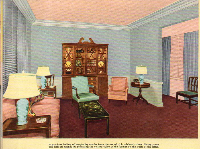
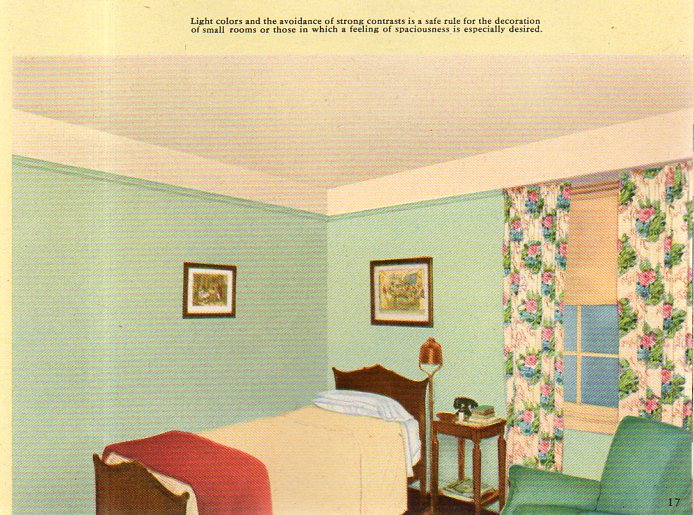
    There’s just something very simple and calming in the arrangement of the colors in these photos–and of course something very different from what one comes to expect in interior design. This is so much so that I think it would be possible to take an entire two-day vacation in a house that is decorated in just this fashion. Your brain would be relieved of the expected and introduced to the soft exceptional with a color palette equivalent of an all-white-food carbo breakfast that one could slide under a bathroom door. I think you would take a seat with a good book, and then fall immediately to sleep–not from boredom, but from the unexpected luxury of color-unusualness and perhaps a little whiff of the grandparent’s house, the colors surrounding you having the optical qualities of the heat from a good fire. If we were seeing movies of folks gathered around the radio and listening to the end-of-the-war stories in 1945 in a set like the images below, we wouldn’t picture the black-and-whiteness to purge itself into this allotment of soft color. 

    The images come from an innocent-sounding pamphlet published by Pittsburgh Paints: Pittsburgh Color Dynamics for Offices, Hotels and Restaurants and published in Pug in 1945.  The cover gives it all away, and then once inside you are immediately invited to the design equivalent of a happy version of Nemo in Slumberland. For example, a living room, begging for someone to sit in and enjoy a cup of coffee while wondering when Joe DiMaggio would be back in pinstripes, and where the smokes were, and what happened to all of the missing artwork: 

    Color indeed a252

    Of course if you spilled coffee on the rug (the color of Ronald Reagan’s shoes) no one would ever notice.

    You could retire for the night after waking up from your color overdose/withdrawal here, a bedroom whdreams are dreamt and things are thunk, and sleep is the biggest thing made: 

    Color indeed b253[The image cropping is at is appears in the original.]

     This all just seems so terribly suave, so above distinction and yet below it.  The “rediscovered” blue (“cascade blue”) that I forced into the title is found here, in one of the pages of color swatches:


  • Squidward, Stainless Steel, and the Future (1937)

    JF Ptak Science Books   Quick Post

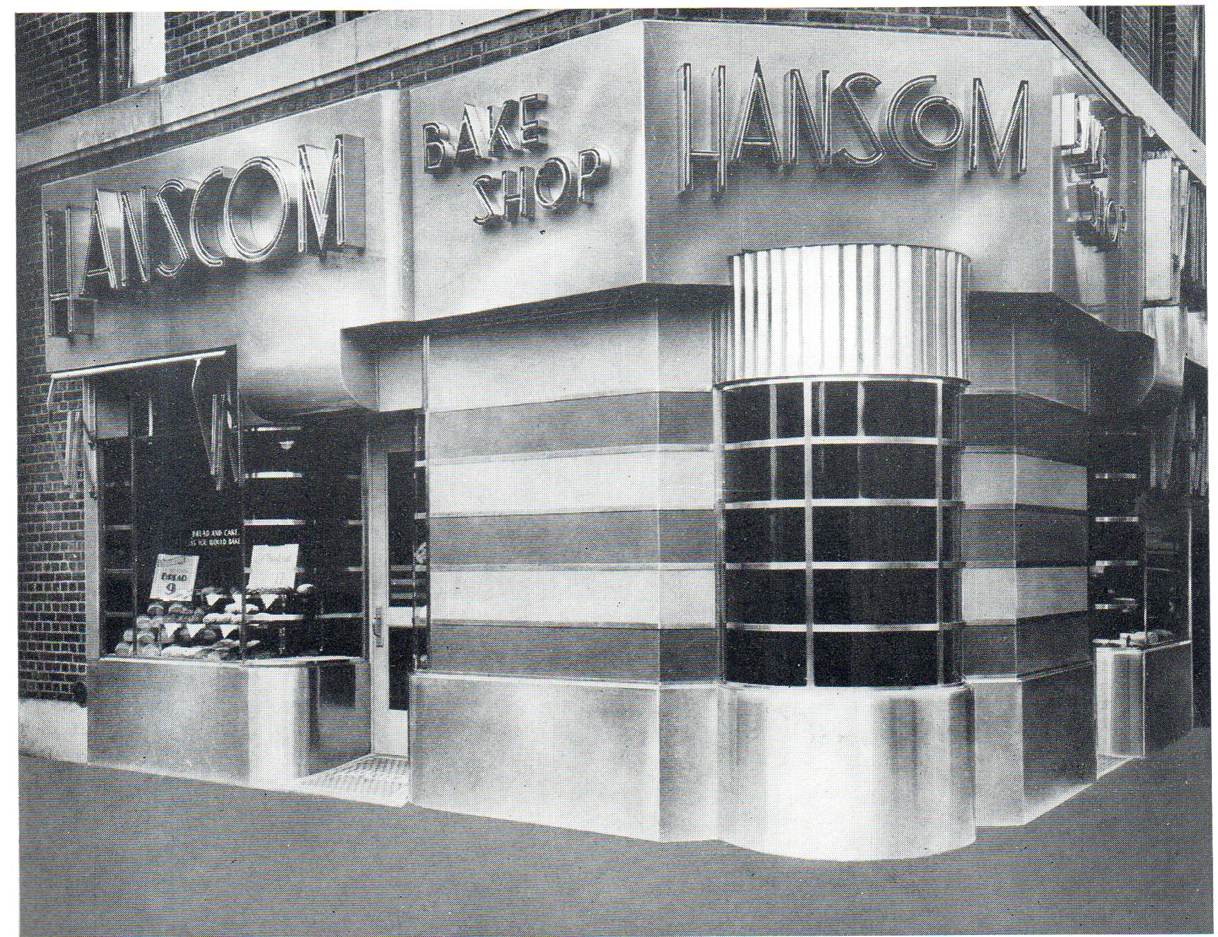
    Squidward Tentacles once had a dream of the future–I mean, a dream with the future in it–in which everything in the sea was chrome plated, except of course for the water.   His vision (which he liked at first for its shineyness and then hated soon afterwards for it shineyness) of the future may have involved a vision of the past as well as someone else’s vision of the future.  Anyway it is my mentality that pulls up Spongebob when looking through this fine 1937 pamphlet1 on architectural/design uses of stainless steel, where there was so much shining and shimering matteness constructed using steel and chromium, which comes a little close to Squidward’s chrome seabed.  But not really. In any event, these are lovely creations, best served up in glorious black & white.  

    Archiectural aluminum a393

    ·Posted by :

    ·in:


  • Before-and-After on the Mean Streets of NYC (1893-6)

    JF Ptak Science Books   Quick Post

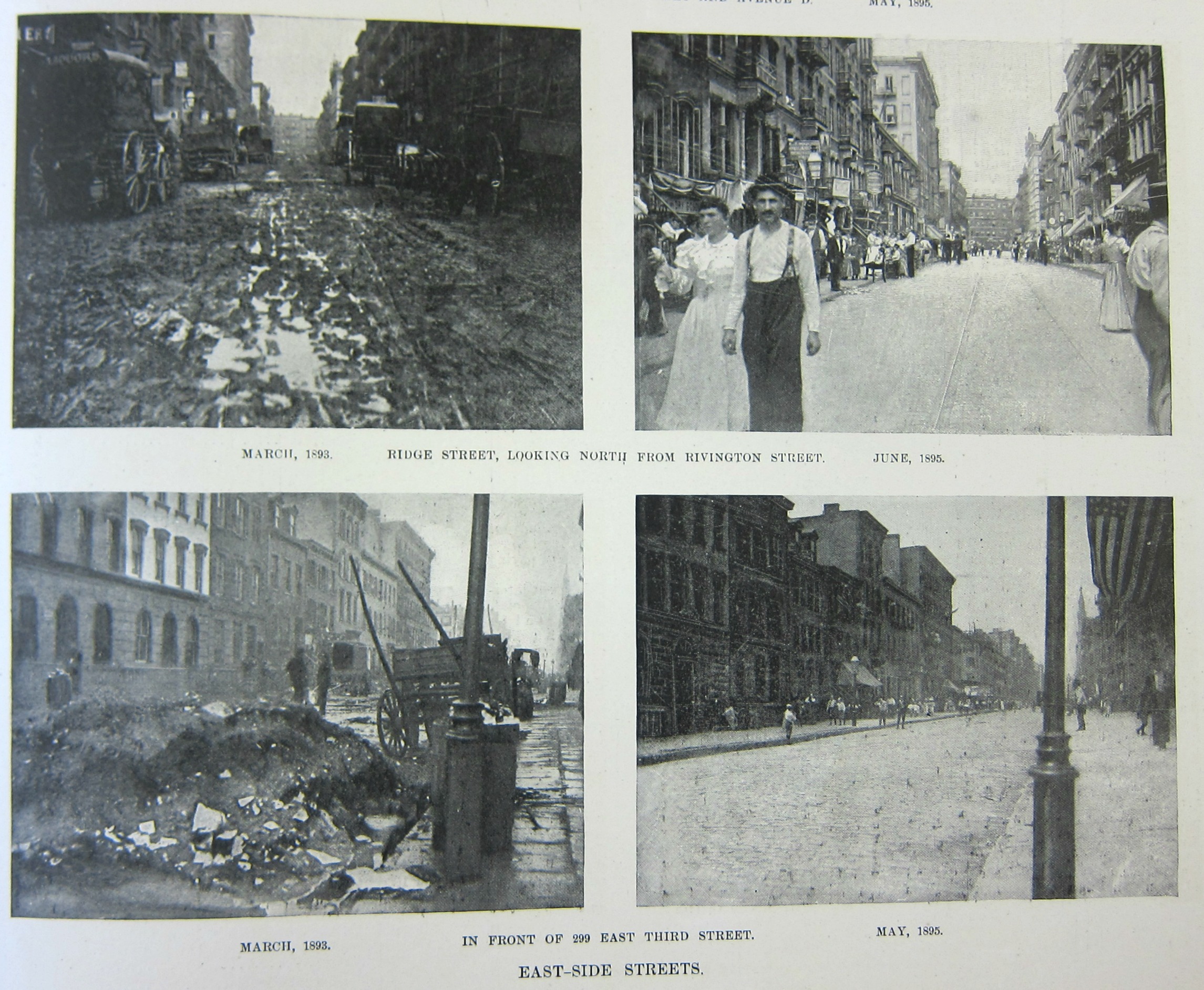
    NYC Street before and after 1 of 4


    This is one of four images from the May 25, 1895 issue of Harper’s Weekly, and they show eight different views of before-and-after photos of filthy city street cleaned up and maintained by the Civil War vet Colonel George E. Waring. Waring (1833-1898) was also an engineer and a sewer pioneer, and was responsible for instituting a real department of sanitation in New York City. To that end he hired some 2000 men and put them in white uniforms to perform their functions–the uniforms gave the workforce a dignity and also made the population at large aware that there was a serious and dedicated effort to clean the city–it was a brilliant success.

    This story is told in the six pages (located below) from the great social observational/photo-documentarian Jacob Riis’  The Battle with the Slum (1902) describing Col. Waring’s efforts to clean the streets of Lower Manhattan. Riis is vicious with his treatment of the Tammany political machine for not undertaking any real effort to reduce the amount of street waste/filth, and heaped much praise on Waring, who he declared as the first to open the slums up to the light. That is just about right, and probably understates the case somewhat, as he was responsible through these efforts in saving the lives of thousands of people and improving the living condition for most of the city, in general.

    Evidently the photos from Harper’s are sometimes credited to Riis, though evidently it seems that the experts say he only used these images made by someone else for his 1902 book. No matter–Riis did much else.  


  • Flat and Full Perspectives

    JF Ptak Science Books  Post 2602

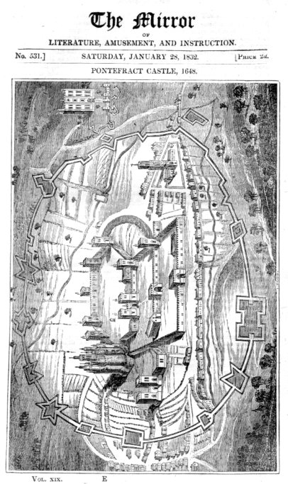
    There were two images that I came across tonight in the studio as I was chasing Pooches the Cat/Dog–they’re not quite on the opposite ends of themselves on the compass rose, but they are certainly in the neighborhood. I like it though that they came to me by chance, one after the other. One is very, very flat; the other is very “full”, and has a large sense of dimensionality.  The first is a 1832 woodcut of a 1648 rendering of Ponterfract Castle. Although perspective had been discovered (or rediscovered at 250 years earlier, the image has a Medieval taste to it, as we see both two- and three-dimensional representations together in the same image.  I think that most of that was done by design and the print was dual-purposed–first to show the plan of the castle and then secondly to show the fortifications and some buildings in elevation. The overall effect I think portrays more flatness than not.  

    Flat perspective089

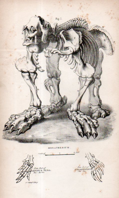
    The second perspective is something that I’ve always thought had a deep depth for a piece of paper. My copy is simply a loose engraving, bought years ago at Pageant Book Shop in Manhattan–a stray bit in a  “sciences” bin or some such, and I’ve had it ever since.  Again I’m not sure of its origin but my guess is that is is English from a popular science dictionary or geological text 1825-1850.  It just has a great perspective–plus it also looks as though we’ve just surprised it, a little.  It is a Megatherium (“giant/beast”) and was discovered first in 1788 by Manuel Torres and then assembled in the next year by Juan Bautista Bru, who evidently made the first illustrations of it.  An engraving of the magnificent mammal appeared in the second edition of Georges Cuvier’s Recherches sur les ossemens fossiles, (1812) which was a justifiably iconic image, though I like this little and odd-perspective one from above better.  

    Megathermin088