A Daily History of Holes, Dots, Lines, Science, History, Math, Physics, Art, the Unintentional Absurd, Architecture, Maps, Data Visualization, Blank and Missing Things, and so on. |1.6 million words, 7500 images, 4.9 million hits| Press & appearances in The Times, Le Figaro, Mensa, The Economist, The Guardian, Discovery News, Slate, Le Monde, Sci American Blogs, Le Pont, and many other places… 5000+ total posts since 2008.

Category: Architecture and Building

  • The Sudden, Unexpected, Ineffable Beauty of Pile Driving (1950)

    JF Ptak Science Books   Quick Post

    I was making my way through the IBM  Proceedings of the Industrial Computation Seminar for September, 1950, after having reported on the article by pioneer Wallace Eckert1 on the role of punched cards in scientific computation, when I read down the contents list and found a paper titled  “Pile-Driving Impact”.  The contents page listed the author (Edward A. Smith) but not their association, and so when I turned to the article I expected a vision-of-the-future-world-of-computer sorta paper. 

    Wrong! 

    The paper was far more interesting than that, and Mr. Smith–from the Raymond Concrete Pile Company–was writing about piles, pile driving, and the impact of the application of computing in the course of doing pile driving…and teh people who loved them. Well, not that last part, but everything preceding it. Of course it makes sense to be writing about this, though I had never before considered the role of computation on pile-driving before this–and I must report that Smith’s paper was sort of beautiful, in its way.  I was very happy to have read it.  

    Here’s a part of the Smith piece to enjoy, followed by a link for the rest of the paper.

    • Pile-Driving Impact, by EDWARD A. SMITH (Kaymond Concrete Pile Company ) “[Calculations] performed in the IBM Technical Computing Bureau, provided a complete numerical analysis of the behavior of a pile when struck by a pile-driving hammer. The results indicated what stresses occurred within the pile and capblock, as well as the penetration of the pile into the earth. This is an example of the replacement of costly experimentation by economical calculations…”
    • “Previously, using only key-driven calculators, it has been possible to study only partially a few isolated cases of the behavior of a pile under an impact. This was due to the high cost in time and money associated with each case studied. By employing the high speed and accuracy of IBM electronic calculating machines to perform this repeated formula evaluation, it is possible to study the behavior of numerous pile types. The cost of each case studied thereby will be substantially reduced.”
    • Source, and for the rest of the paper, see Internet Archive: https://archive.org/stream/bitsavers_ibmproceedmputationSeminarSep50_8283585/IBM_Industrial_Computation_Seminar_Sep50_djvu.txt

    Notes: 
    1. Eckert was professor of astronomy at Columbia from 1926 to 1970 (!), as well as the Director of

    the US Naval Observatory Nautical Almanac Office, and founder and Director of the Watson
    Scientific Computing Laboratory at Columbia University).

    "As Director of Watson Lab and IBM's Director of Pure Science, he oversaw construction of the SSEC
    (arguably the first true computer) and NORC (less arguably the first supercomputer), the most
    powerful computers of their day, as well as of the IBM 610 – the world's first "personal
    computer" – and he installed the first computers at Columbia open to research and instruction,
    meanwhile initiating what might very well be the first computer science curriculum, in 1946,
    including his own course, Astronomy 111-112: Machine Methods in Scientific Computing, along
    with other courses that same year taught by Watson Lab scientists Grosch and Thomas."
    --http://www.columbia.edu/cu/computinghistory/eckert.html
  • Symmetry in Chaos–a Collision of Geometric Designs at San Marco

    JF Ptak Science Books   Post 2717

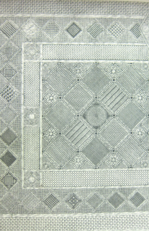
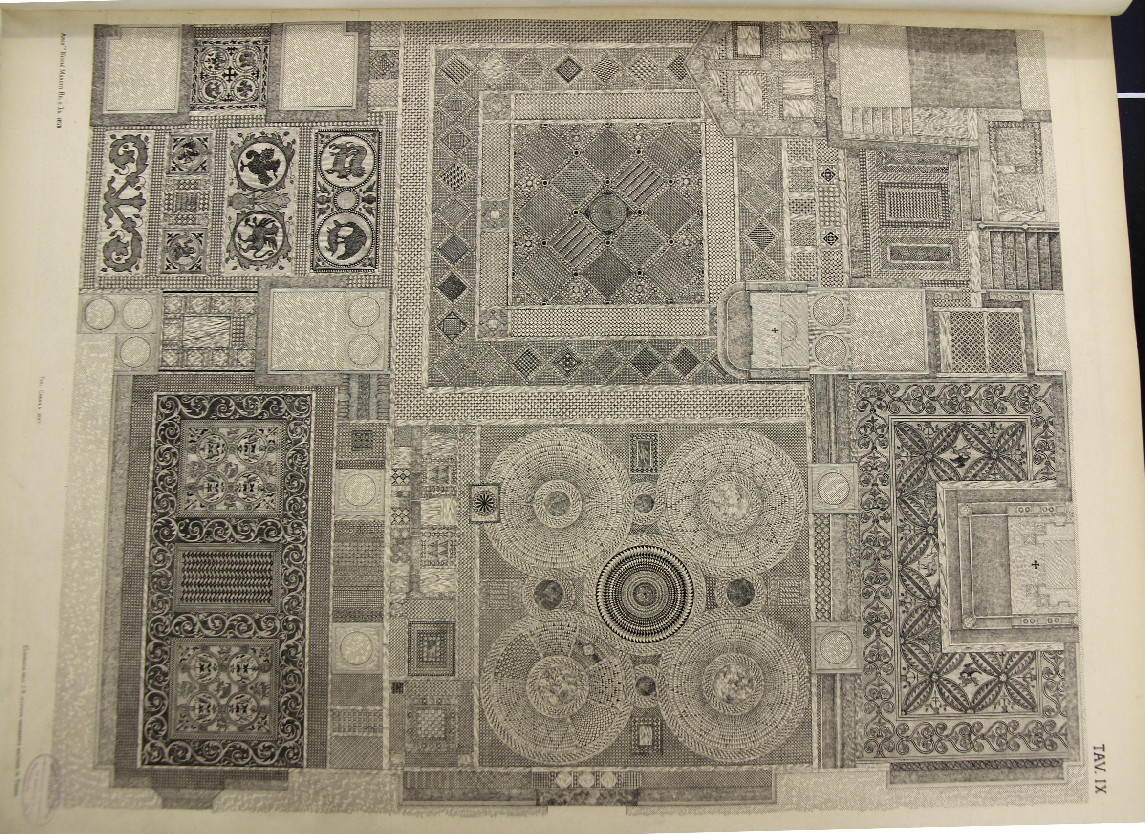
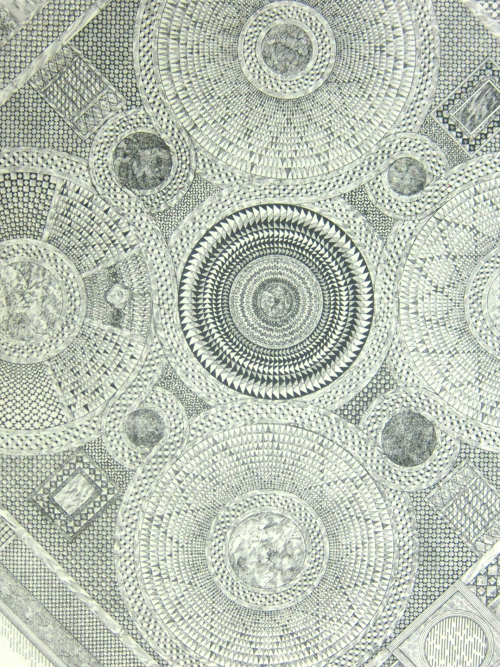
    The following four engravings appeared in the massive La Basilica di San Marino du Venezia, published by the prolific Ferdinand Ongania in 1886.  It is an exhaustive study of the iconic building, the publication being known chiefly I think for its very large and sumptuous chromolithographs of the building’s architecture, art, and endless detail. It forms two volumes of an overall monumental 12-volume epic, though these were complete in themselves.

    San Marco mosaic detail _4_


    [Detail from the second engraving, below.]

    But then there are these engraving, in wonderful black-and-white, showing with fantastic detail and with a deft touch the mosaics of the basilica.  I believe that there were six overall but I sold two some time ago and hadn’t made a digital record of them.  Since I have these and another 22 images from that great work, and since I can’t seem to find them online, I thought to make at least rudimentary photographs of them and share.  (Making the pictures was a little problematic, as they are pretty large at 27×21″, so some of the lines are a little parabolic, though I think they’re good enough given limited time to spend on them–also each image is at least 2 meg, so they can stand some amount of enlarging.)

    San Marco mosaic detail _3_

    [Detail from the second engraving, below.]

    The engravings (again, they are large at 27×21″, 68x53cm, and are packed with detail) are printed on a  very thick paper that will now crack if you try the double-fold test, so although the paper is stable you do not want to bend it, though you wouldn’t want to do that, anyway.  Each sheet has a protective paper guard attached to it on the left side, covering the entire image–the reason why you may see a shadow along one long side is just from the rolled-back protective sheet not getting completely out of the way.  Also all of the margins are not necessarily included in the photos–there were certain limitations in making the photographs, and some margins just didn’t make ti entirely into the picture. All this said, I think you can a pretty good idea of the massive order in the seeming chaos. 

    These are large and gorgeous pieces of art, and have a certain value of beauty outside their architectural context. (The images are also very clickable.)

    • AND you may actually purchase these from my bookshop, here: https://historyofideasblog.com/books/2015/06/hyp.html


    Ongania Mosaic 2

    ·Posted by :

    ·in:


  • The Beauty of Public Restrooms (1908)

    JF Ptak Science Books  Quick Post    

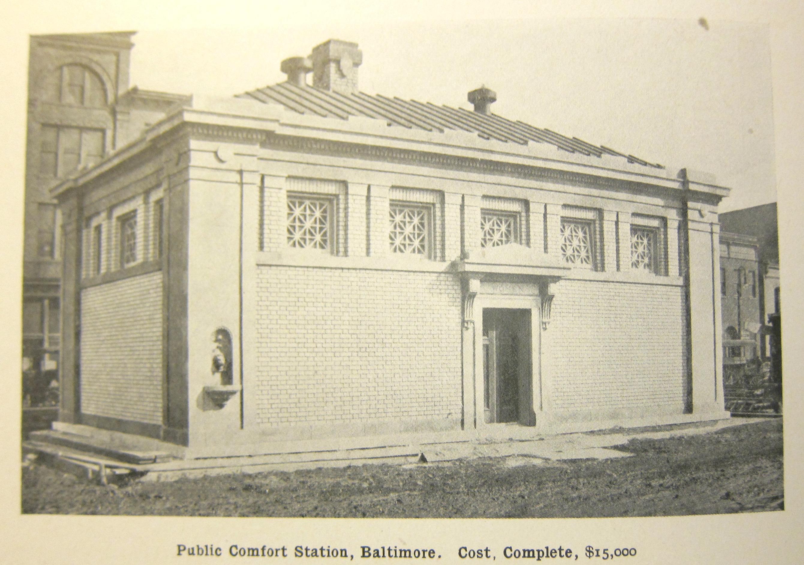
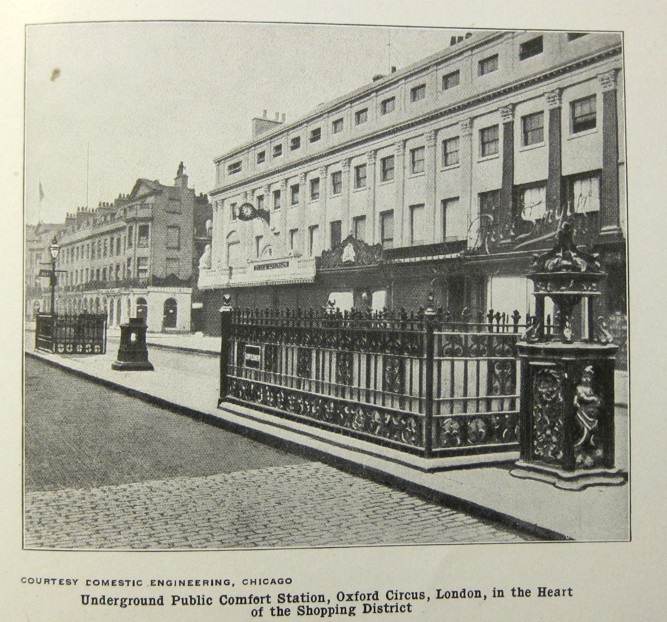
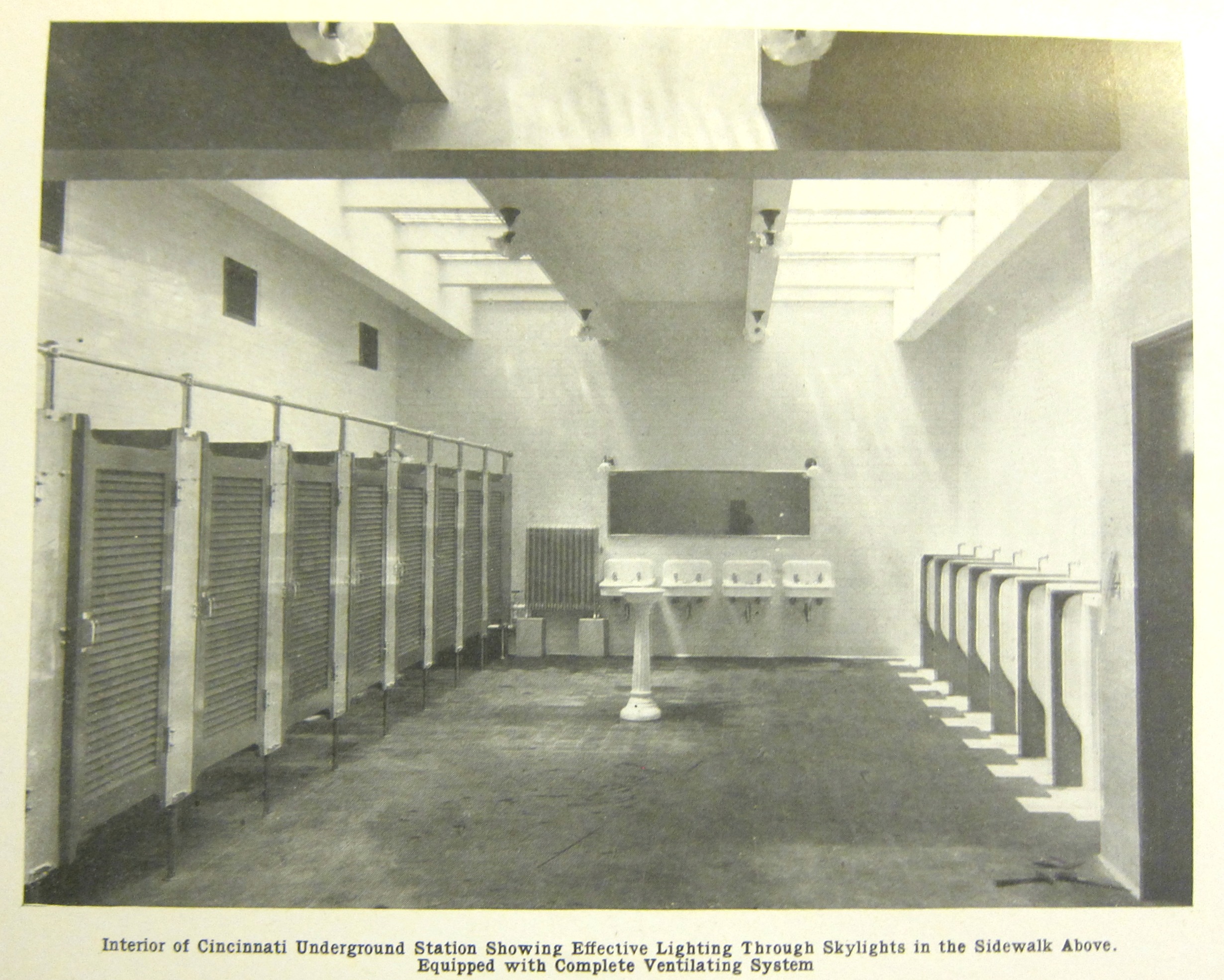
    The pamphlet’s title was both pre-forgettable and irresistible: “Public Comfort Stations for Saint Louis”. It was published in 1908 in plain vanilla wrappers by the Civic League of St. Louis, though the title has little cadence and does not lend itself to poetry (not many good words rhyme with “ouis”) and is way too rich in blocky syllables for haiku. The pleasant surprise in this little package were the unexpected photographs and plans of Worldwide Restrooms, which for reasons that require no explanation I decided to reproduce below. 

    Comfort stations _2_


    Comfort stations _3_


    Comfort station _5_

    ·Posted by :

    ·in:


  • The Rolling Houses and Glass Homes of Futurlandia


    JF Ptak Science Books   [Part of a series on the History of the Future]

    The rolling house of the future (offered in the September, 1934 issue of Everyday Science and Mechanics) promised at least one thing–the ability to be towed by a tractor.  (And seeing that the thing is being pulled along by chains, let’s make sure that there’s no downhill towing, yes?)

    Rolling_house_large

    [Image source originally located via  Retronaut though now I cannot find the correct links for them. Sorry!]

    The spherical houses seemed to come with their own railroad tracks for easier motion–a continuously self-laying track, which would make the new American suburbs a Suburbia Mobilia.  Cheap cars, cheap houses, and a Great Depression might have made for a picture of the future that was very self-sustaining.  On the other hand, the one thing that would not have been in the gunsights of the American manufacturing center is the size of the houses, which seem to me to be on the order of 500 square feet or so, which does not make for a lot of room to store all of the consumables that were waiting just around the next decade or so, waiting for the first real generation with a large amount of disposable income to loosen on all manner of never-to-be-purchased-before-by-the-working-classes consumers.  In this respect I am sure that these small buckets for human life would seem unacceptable, leaving little room for purchases. 

    ++00++ 9.25 ochiltree, texas

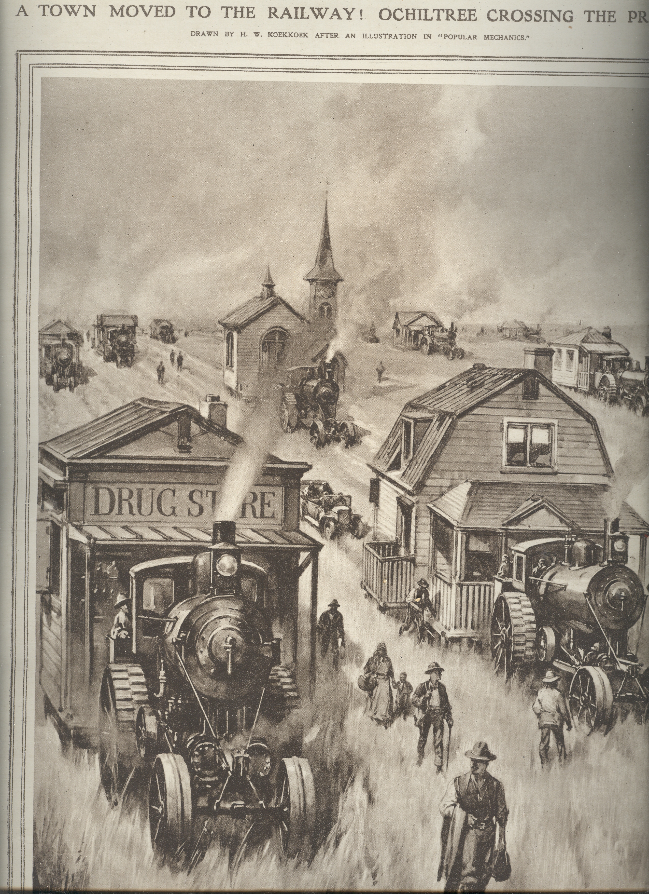
    It does remind me of wholesale town-moving, but from the past–real-life stuff, things that happened.  Like here, for example, in  Ochiltree, Texas, 20 October 1920.  This was a rare occurrence–to move a town–though it is hardly unique, particularly if moving the town closer to a railroad line that had decided to pass it by meant the difference between life and death of the town, then, well I guess you moved the town if you could.  Cemeteries included, sometimes; and sometimes not.

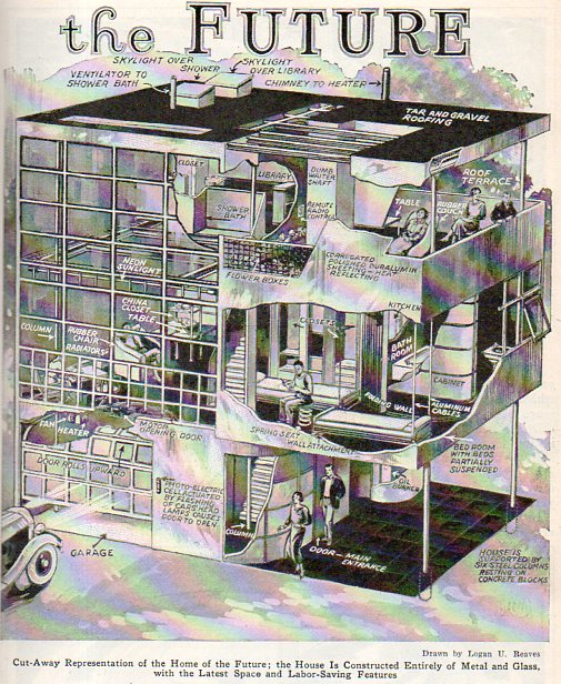
    A memory of another image of a futuristic future house of the future pulled my recent memory to a volume of Popular Mechanics for 1931, the August issue, featuring a “Home of the Future” speculation–this one was also small, but far less mobile, being constructed of metal and glass; and from what I can see, the common home’s exterior walls were mostly glass.

    Future house514

    It looks like a small place–I’m not sure that the car would actually fit in the glass garage.  And it doesn’t look all that comfortable, either, especially in regard to having no walls for bookcases.  (A wall of shelving for a collection of Kindles?)  There *is* a “skylight over the”library”, but it looks like the library isn’t more than a half case of books.  But perhaps in the future we are all entering a world where something is whatever we call it.  Oh, yes, I think that part of the future has already arrived in 2012, and I doubt seriously that the folks writing this article for a popular audience had anything more than a droll popularity in mind in their authorship.  In any event, this future house wasn’t mobile, was small, and looked pretty uncomfortable. And I also bet that the roof gave them problems up there in Futurlandia. 


  • Oddly Adjectival Color Plumpness, continued (1938)

    JF Ptak Science Books   Quick Post    Part of the Series on Color, Its Uses and Abuses

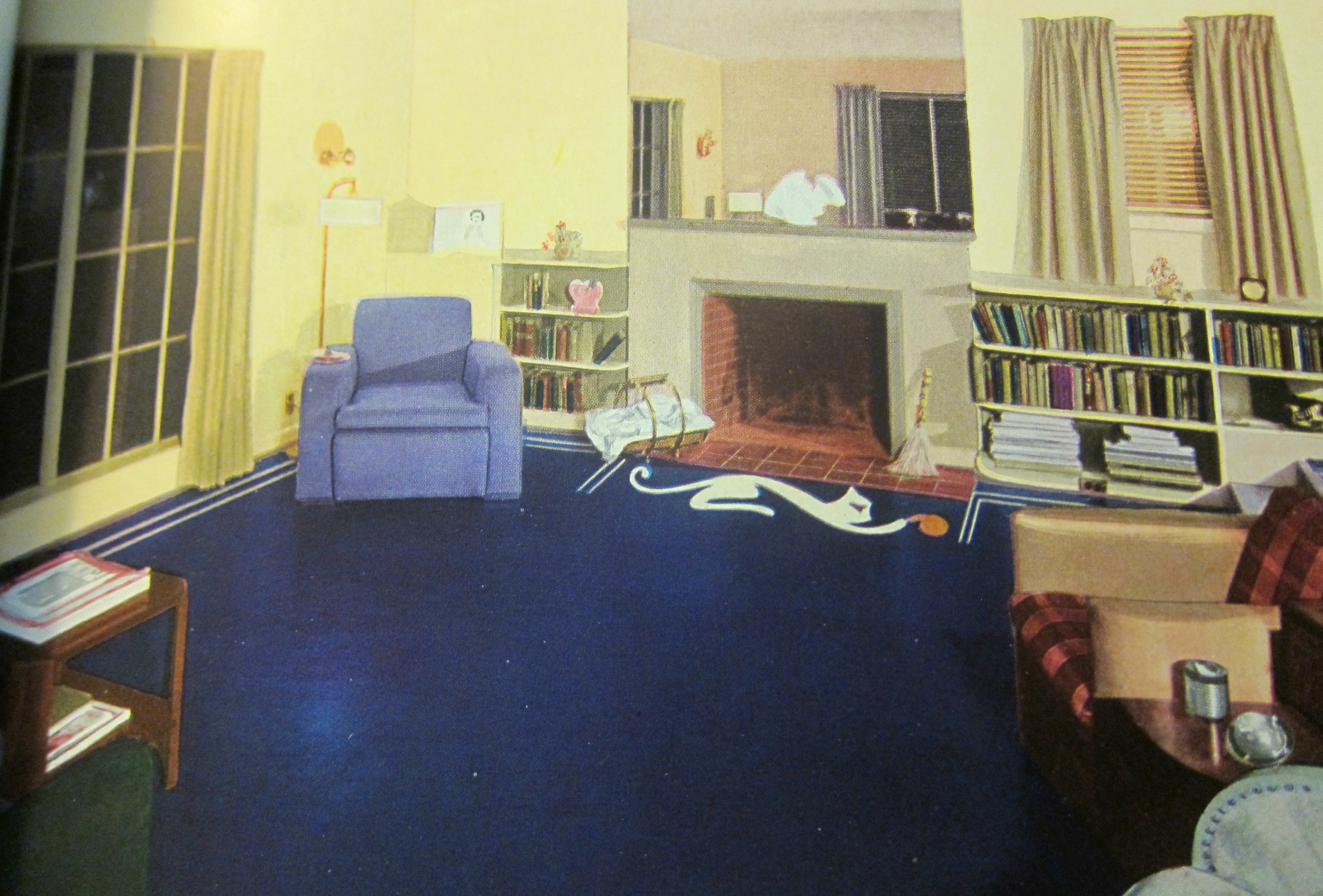
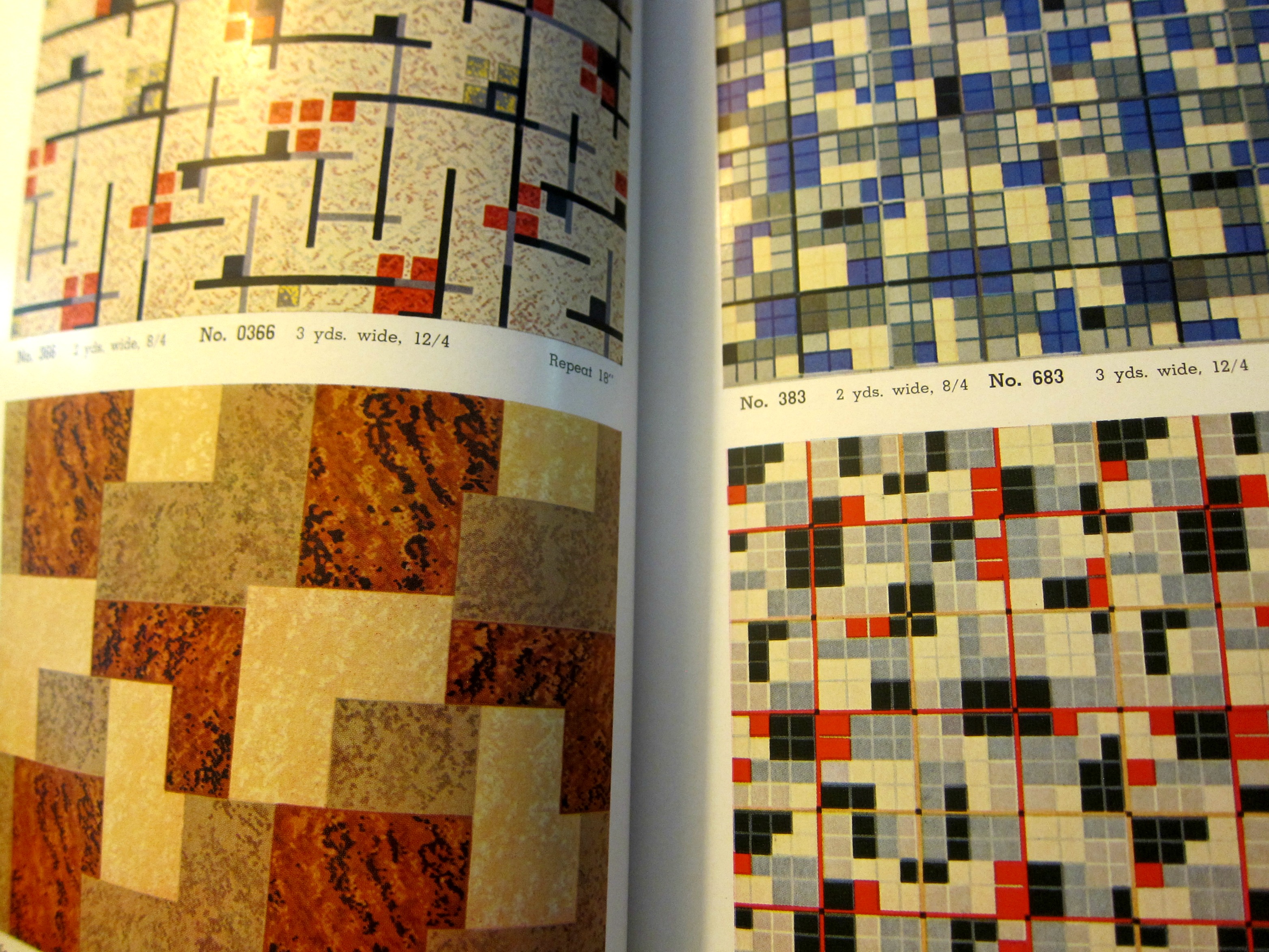
    I’ve written a number of times on what seems to be “extreme” color in the 1930’s  (as in “Oddly Adjectival Opposites: Color Plumpness and Color-in-Black-and-White, 1941” https://historyofideasblog.com/books/2011/02/odd.html) and come to it again today via the weirdly sublime color contrasts of rugs and floor coverings offered in the Bird Rug Catalog for 1938. I’ve thought about and seen so many of these images in luscious grays and stark blacks that it is difficult to think of these same images in gigantic color. It is just hard to picture Mr. Bogart’s eyes and his accusing/weary glance being framed by that blue chair and all of the colors bombarding it. There should I guess be a diacritical of some sort to attach to the vocabulary of colors to express “surprise”, as I could surely employ it in describing that blue linoleum floor:

    Bird catalog _7_

    Deep closeup of flooring:

    Bird catalog _10 detail_


    Flooring details

    Bird catalog _9_


  • Grand Central Terminal, NYC,1939

    JF Ptak Science Books  Quick Post

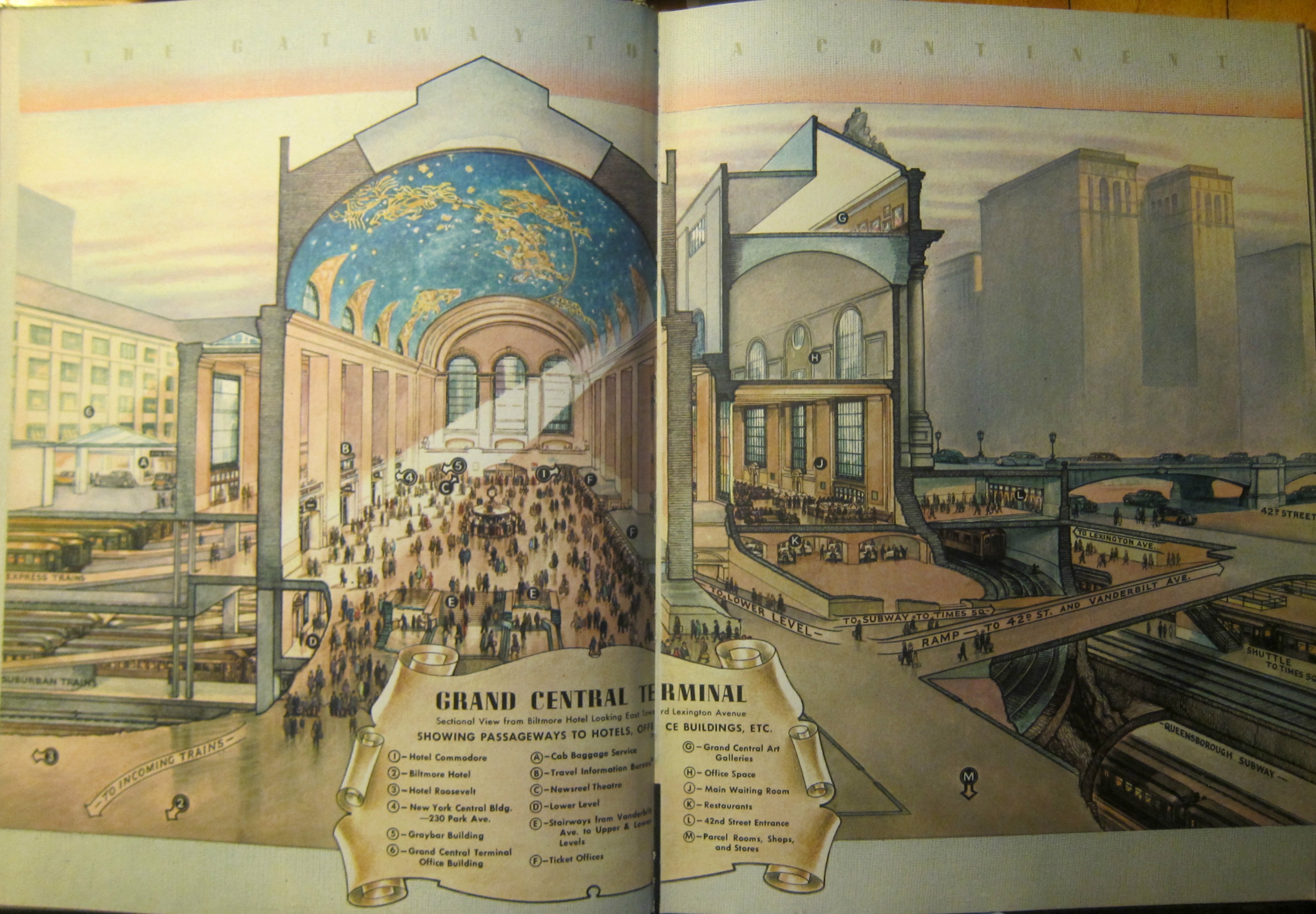
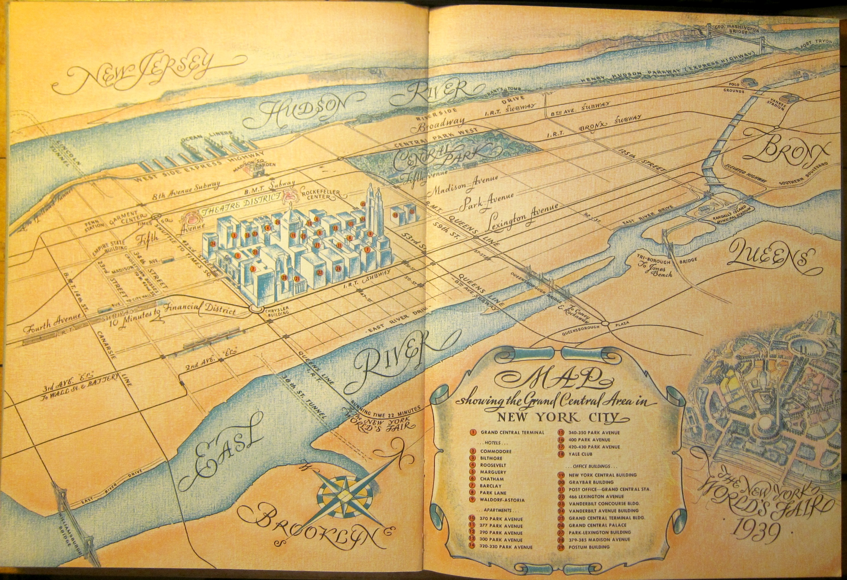
    This is a very Grand-Central_terminal-centric image of NYC–and rightfully so, being one of the great buildings of Manhattan. These images come from a promotional The Gateway to a Continent, published in 1939, which is a fairly luxurious publication which I think was intended for the appreciation of possible luxury accommodations for visitors to the 1939 New York World’s Fair. The result is an overview of the venues on Lexington/Park/Madison from 42nd-51st streets. There’s a great two-page map that shows this section in detail and which leaves out virtually everything else save the text mentions of some like “the Chrysler Building”, “the Empire State”, and “Penn Station” without images of them.

    NYC Grand Central Cutaway _1_


    NYC Grand Central Map of Manhattan _1_


  • Homes for Workers, 1943

    JF Ptak Science Books  Quick Post

    Homes for Workers _3_


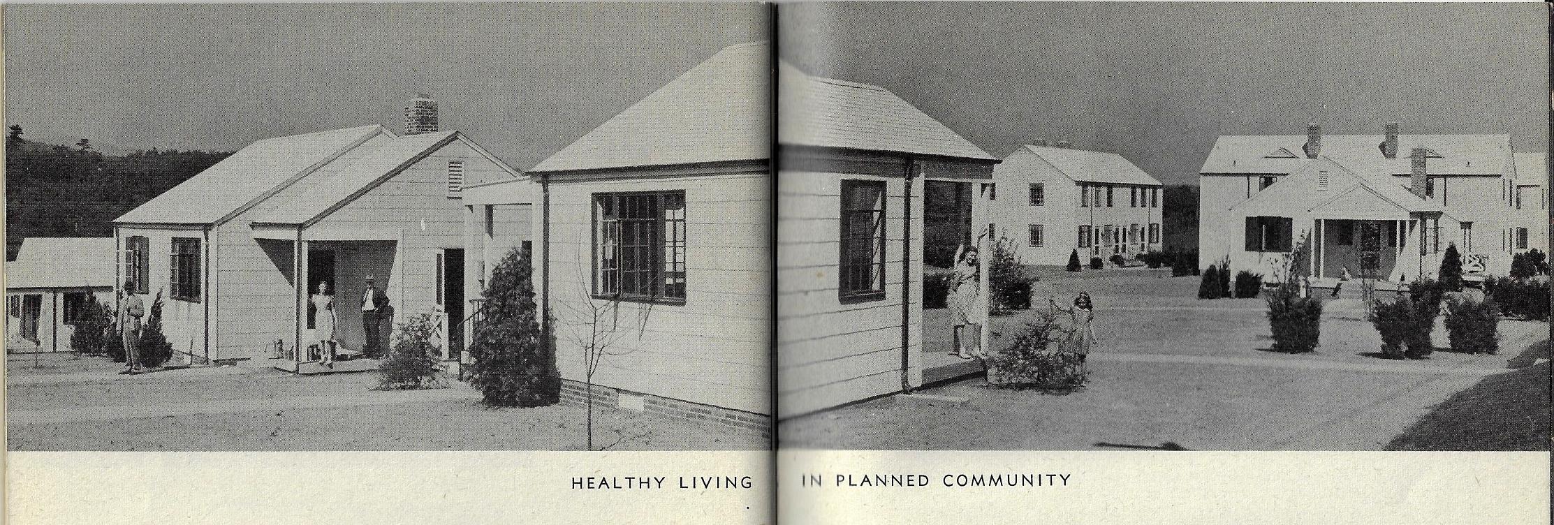
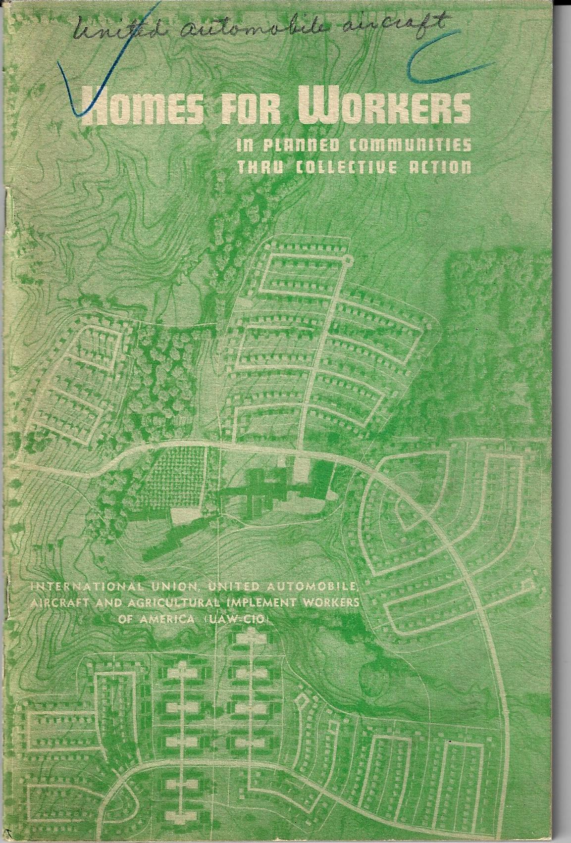
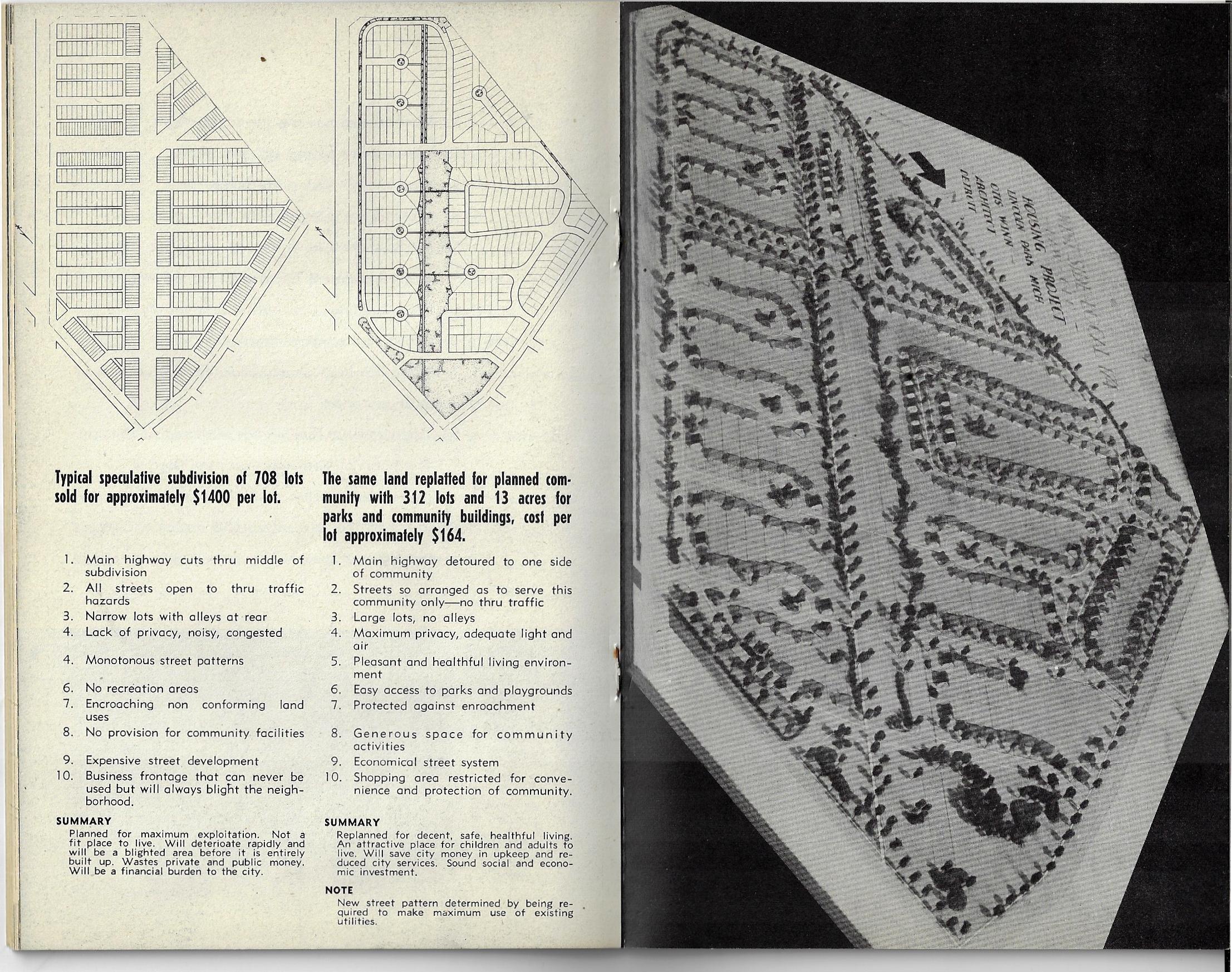
    Homes for Workers _1_This doesn’t ring quite true, nowadays, but this pamphlet, Homes for Workers in Planned Communities Thru Collective Action, published in 1943, was a work published by the massive unions UAW-CIO (United Auto Works and the Congress of Industrial Organization) in a very highly socially supportive way. The work outlines a way to organize more-or-less ideal communities for workers via collective action and pooled money, with large groups purchasing major lots of land and then contracting for construction.  No doubt there was also some thinking going on about the returning soldiers and the expansion of the general industrial base of the U.S. in a more international role. No doubt this sort of thinking would be thought of as Socialist in just a few years, once the Soviet Union had been recognized as a competitor and then an aggressive enemy.  In any event, this is an interesting pamphlet, with a certain allegiance to the general comfort of the working class. 


    Homes for Workers _2__0002

    Homes for Workers _3_

    ·Posted by :

    ·in:


  • The Barrels of Brooklyn, 1873

    JF Ptak Science Books   Quick Post 

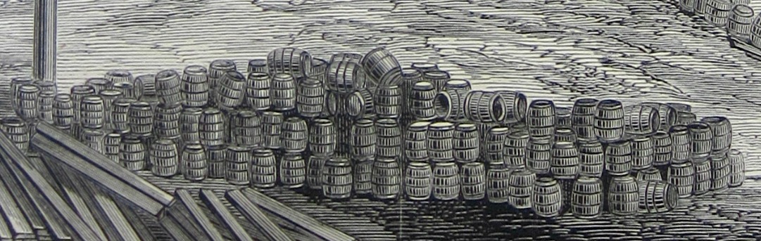
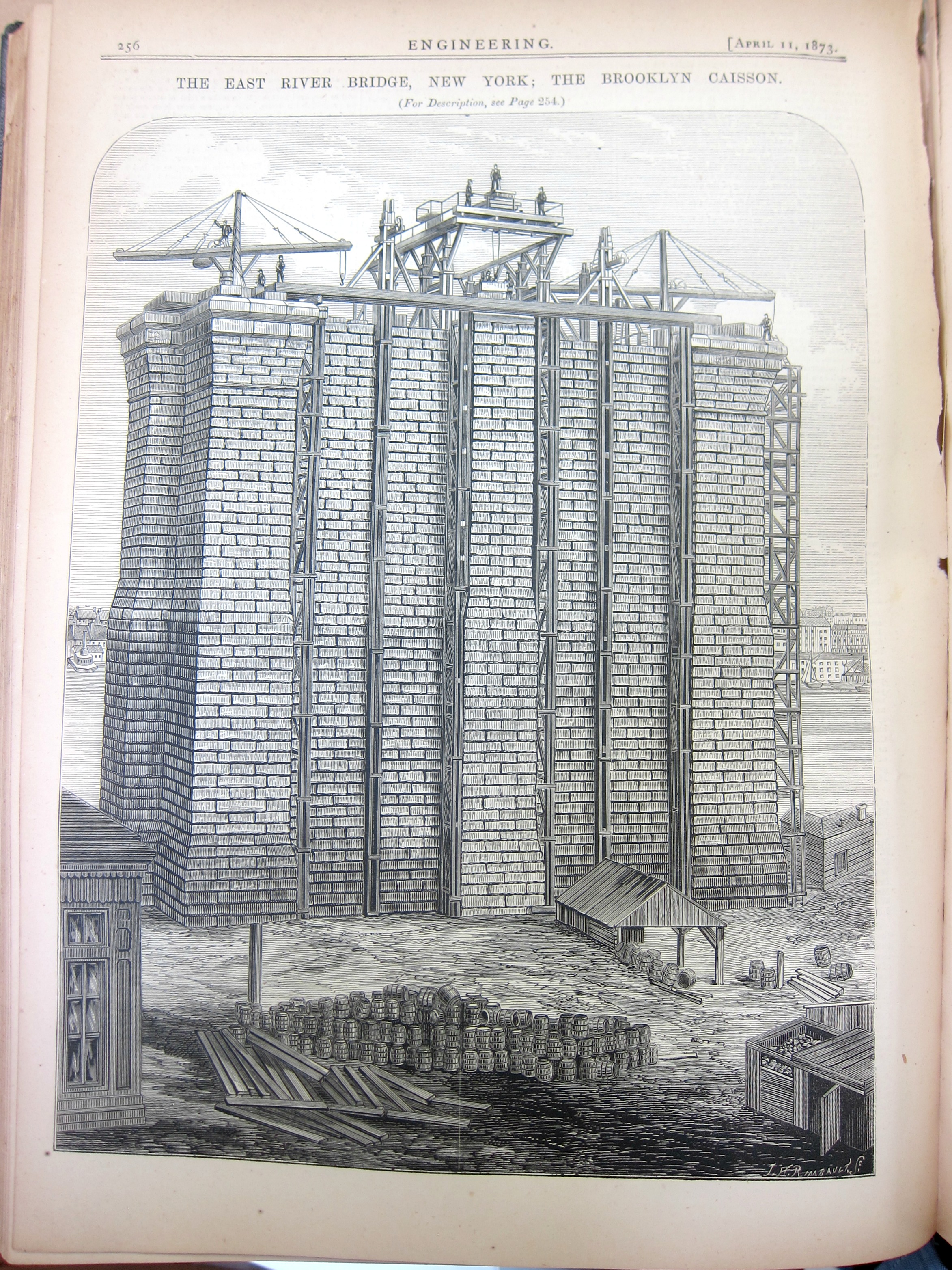
    This dramatic image of the foundations of the New York and Brooklyn Bridge (and then the East River Bridge, and then in 1915 the Brooklyn Bridge) appears in the journal Engineering for April 11, 1873. It is a massive structure, and like a tree there is as much going on for it underground as there is above; and in all of that, one of the most interesting elements is the pile of barrels in the foreground, a detail of which is below: 

    Engineering 1873 Brooklyn barrels

    Frankly I’m a little surprised at their state, disheveled and open and spilling here and there.  Why not keep them in order of some sort? 

    And the full image, featuring the granite that was moved by schooner down along the coast all the way from Vinalhaven Island, Maine: 


    Engineering 1873 Brooklyn Bridge


  • A History of Black & White in Color (continued)

    Putting Black-and-White Back into Color: 1930’s Schoolrooms

    ref:  JF Ptak Science Books    Post 1840, expanded.

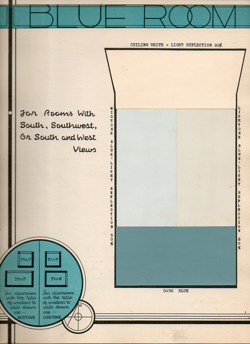
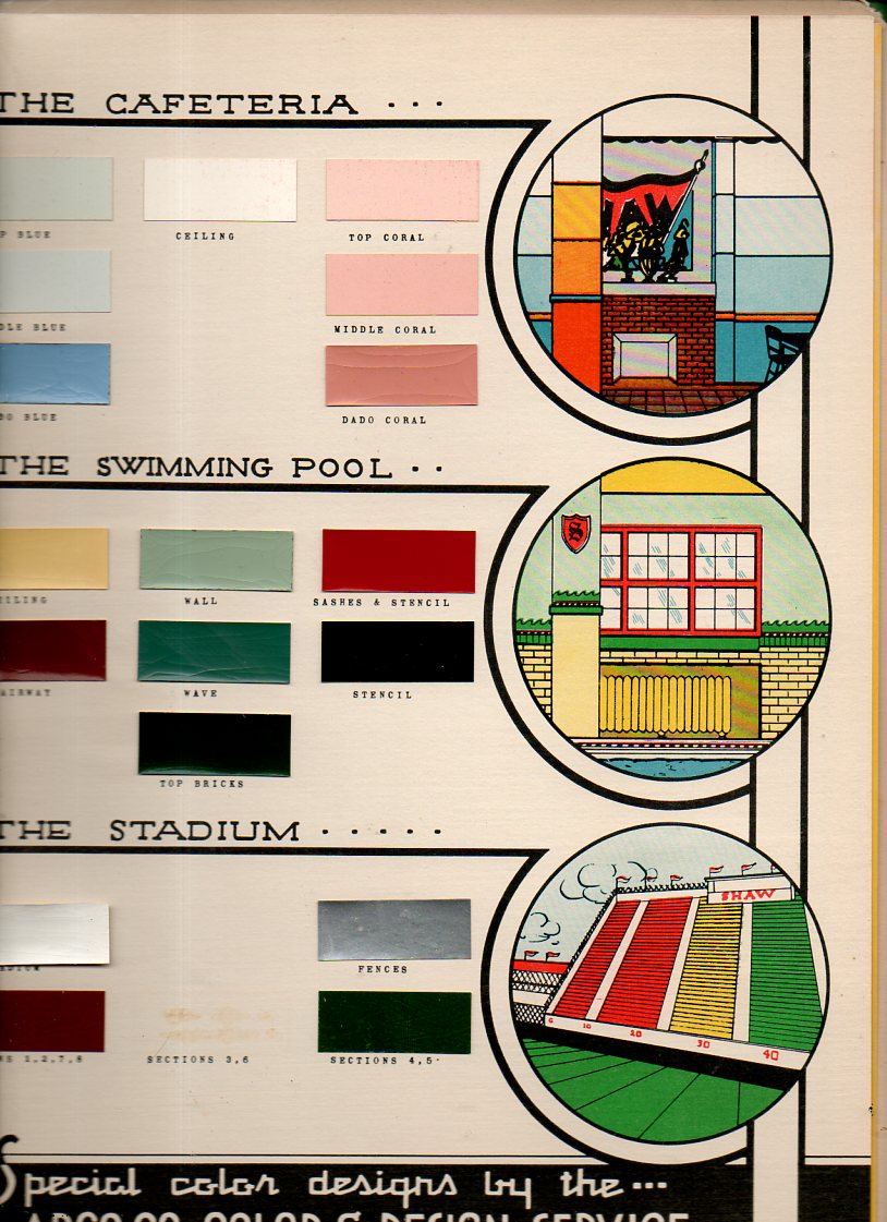
    Its easy to assume a modern prejudice regarding the interior decoration of 1910-1940 school rooms, allowing a certain conceit and picturing them in shades of gray, the images formed being “colored” by the images of those things that we have seen, almost all of which have turned up in black-and-white photographs or movies. But of course we know that this can’t be true, and that Humphrey Bogart didn’t always wear a gray worsted in his movies, and didn’t move that gray suit through gray rooms. Its just that the image-formation is influenced by what we’ve seen, and since what we’ve seen of these rooms is mostly without color, then our images are difficult to assemble outside black-and-white.  This applies to just about everything from that era, which explains why it is such a glorious shock to see motion pictures or photographs of (say) New York City street scenes from 1944. (And why is it such a jolt to the visual system to learn that police cars in Chicago during the 1933 World’s Fair were orange?)

    This thinking came to the surface again this morning when I uncovered the Paint Specifications for the Model School, prepared for the East Cleveland Board of Education under supervision of the Foremost Authorities, and published by ARCO in 19391.  It reminds us that the only thing that lived in black-and-white in those days are in our memories.  (I’ve written about unexpected color in Lost German Color of 1927,  The Very Describale Macro Color of 1937, The Color Green in the History of Squares, and of course the non-immortal 200,000,000 Pounds of Buttocks-or-Putting the Black-and-White back into Color, and others.

    Color school587

    Color school592


  • The Poisonous Miasma of the U.S. Capitol as Found Poetry (Fred. Law Olmstead, 1882.)

    OlmsteadJF Ptak Science Books  Quick Post

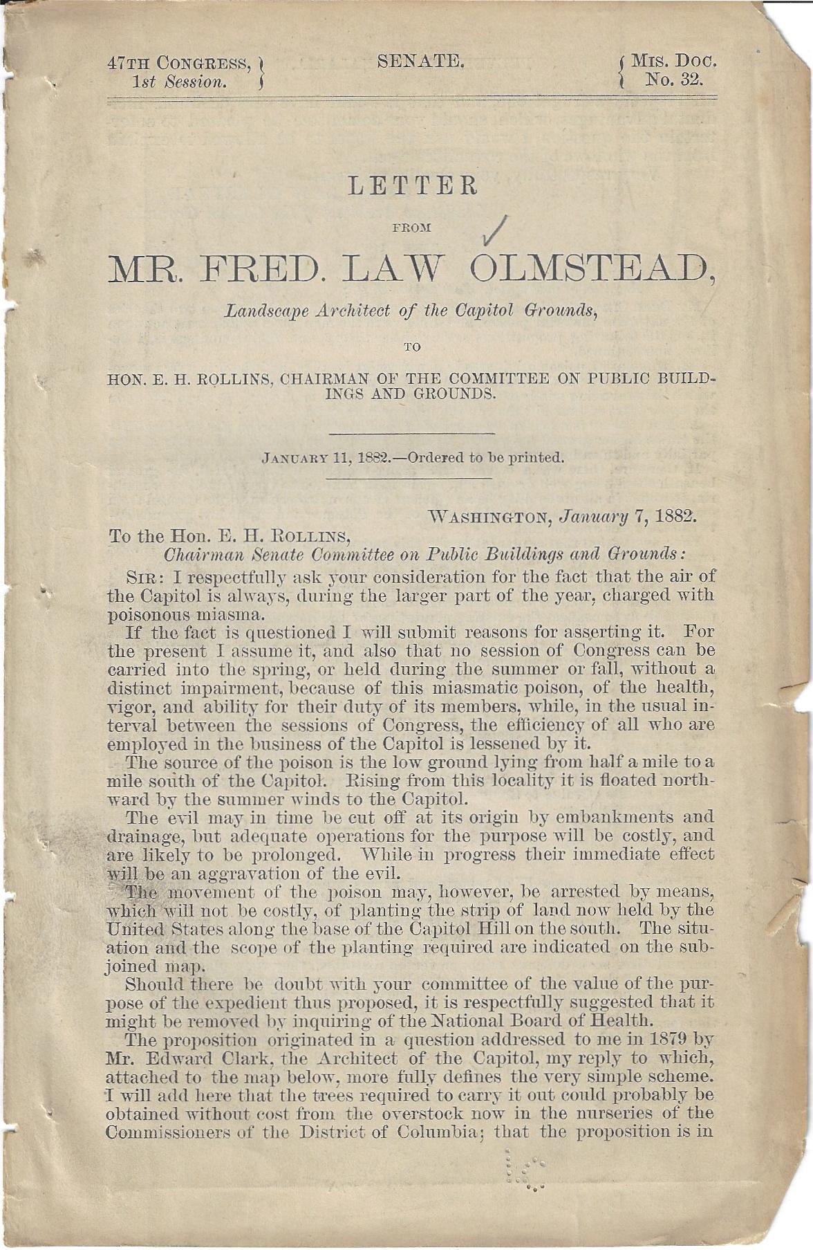
    Yes, that is pretty much a direct quote (full quote to follow) by the great landscape architect and engineer of the Capitol grounds, though it is in reference to the miasma going into the Capitol and not that coming out of it.  Olmstead reports that there’s some wicked “evil” stuff in the low-lying areas just east of the building, and recommends that for the sake and pity of all that is holy that the problem be addressed, and quickly. His immediate solution is to transplant and grow a wide row of bushes and trees in between the Capitol building and the evil stuff.  The text of the lead of the appeal follows, rendered intact, but lofted into a poetic structure that probably doesn’t work–it would work out better though if you can listen to it in your head being recited by Billy Collins:

    I respectfully ask your consideration for the fact

    that the air of the Capitol is always during the larger part of the year

    charged with poisonous miasma.

    If the fact is questioned I will submit reasons

    for asserting it.


    For the present I assume it and also that no session of Congress can be carried into the spring or held during the summer or fall without a distinct impairment because of this miasmatic poison of the health vigor and ability for their duty of its members while in the usual interval between the sessions of Congress

    the efficiency of all who are employed in the business of the Capitol is lessened by it.

    The source of the poison is the low ground lying from half a mile to a mile south of the Capitol. Rising from this locality it is floated north ward by the summer winds to the Capitol.

    The evil may in time be cut off at its origin by embankments and drainage but adequate operations for the purpose will be costly and are likely to be prolonged. While in progress their immediate effect will be an aggravation of the evil.


    And so on. The “regular” text version is below. 

      • “Chairman Senate Committee on Public Buildings and Grounds: Sir: I respectfully ask your consideration for the fact that the air of the Capitol is always during the larger part of the year charged with poisonous miasma.”

      • “If the fact is questioned I will submit reasons for asserting it. For the present I assume it and also that no session of Congress can be carried into the spring or held during the summer or fall without a distinct impairment because of this miasmatic poison of the health vigor and ability for their duty of its members while in the usual interval between the sessions of Congress the efficiency of all who are employed in the business of the Capitol is lessened by it. The source of the poison is the low ground lying from half a mile to a mile south of the Capitol. Rising from this locality it is floated north ward by the summer winds to the Capitol. The evil may in time be cut off at its origin by embankments and drainage but adequate operations for the purpose will be costly and are likely to be prolonged. While in progress their immediate effect will be an aggravation of the evil. The movement of the poison may however be arrested by means which will not be costly of planting the strip of land now held by the United States along the base of the Capitol Hill on the south…”

    Source: Letter from Fred. Law Olmstead, Landscape Architect of the Capital Grounds, to Hon. E.H. Rollins, Chairman of the Committee on Public Buildings, Washington, D.C., Senate Miscellaneous Document No. 32, 47th Congress, 1st session, January 11, 1882.  9×6″, 2pp, simple folding diagramatic map.