A Daily History of Holes, Dots, Lines, Science, History, Math, Physics, Art, the Unintentional Absurd, Architecture, Maps, Data Visualization, Blank and Missing Things, and so on. |1.6 million words, 7500 images, 4.9 million hits| Press & appearances in The Times, Le Figaro, Mensa, The Economist, The Guardian, Discovery News, Slate, Le Monde, Sci American Blogs, Le Pont, and many other places… 5000+ total posts since 2008.

Category: Architecture and Building

  • Stacked-Tech: Things on Top of Other Things (1926).

    JF Ptak Science Books  Quick Post

    In just three or four decades into the skyscraper era and heavier-than-air powered flight there was a certain sense of planning to join those two technological (series of) achievements. This sense of enlightenment though didn’t seem very enlightened, or practical. The idea of locating airports on the tops of tall buildings, or on structures covering rivers (like the Hudson or Thames), or on long and wide structures built over expanses of shorter inner-city buildings, seem to have had a life from the late ‘teens into the 1940s.  They were struggling ideas that struggled. 

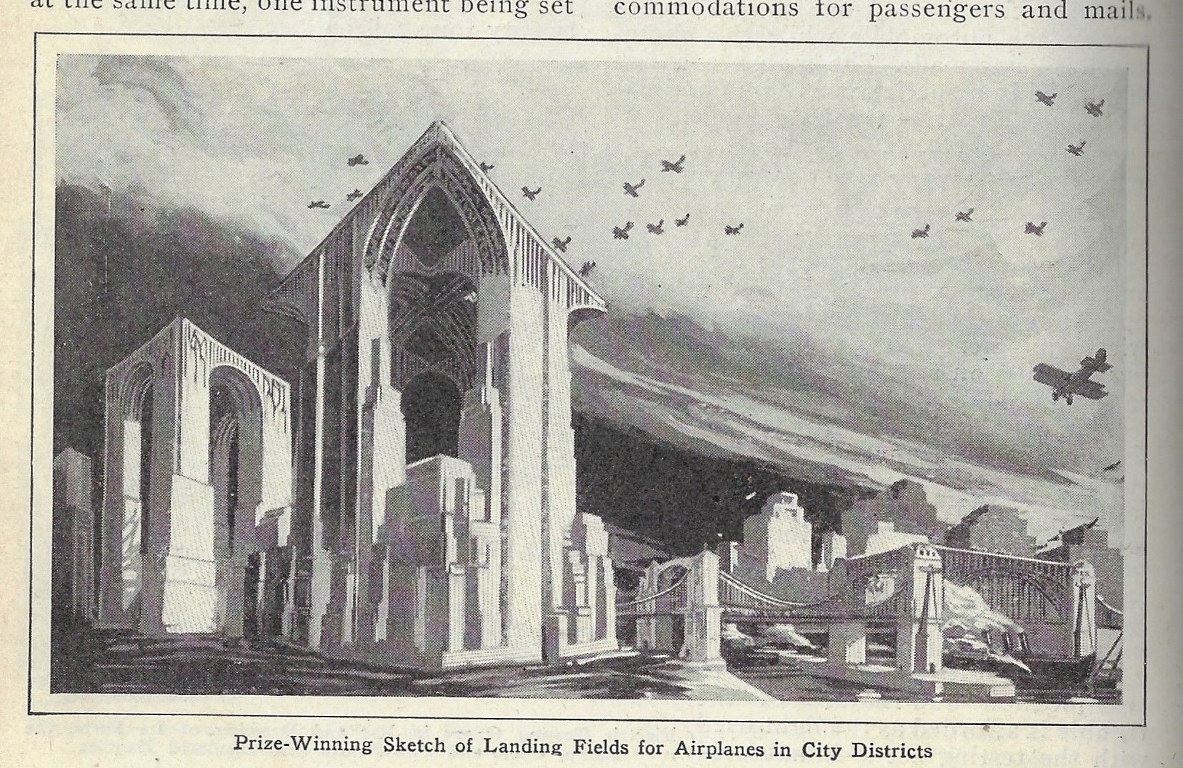
    I found two more examples of this stuff-on-top-of-other-stuff tech thinking today. The first shows a structure 950′ tall made to accommodate a strained amount of air traffic in the heart of a large metropolitan center. (There are numerous examples of this idea sprinkled throughout this blog–just pop the word “airport” into the Google search box at upper right and you should find 10 or so posts on the topic, all with great illustrations.) By the way, this was one busy dream of an airport, what with 20 planes coming and going. 

    Pop Mech 1926 tennis court resevoir

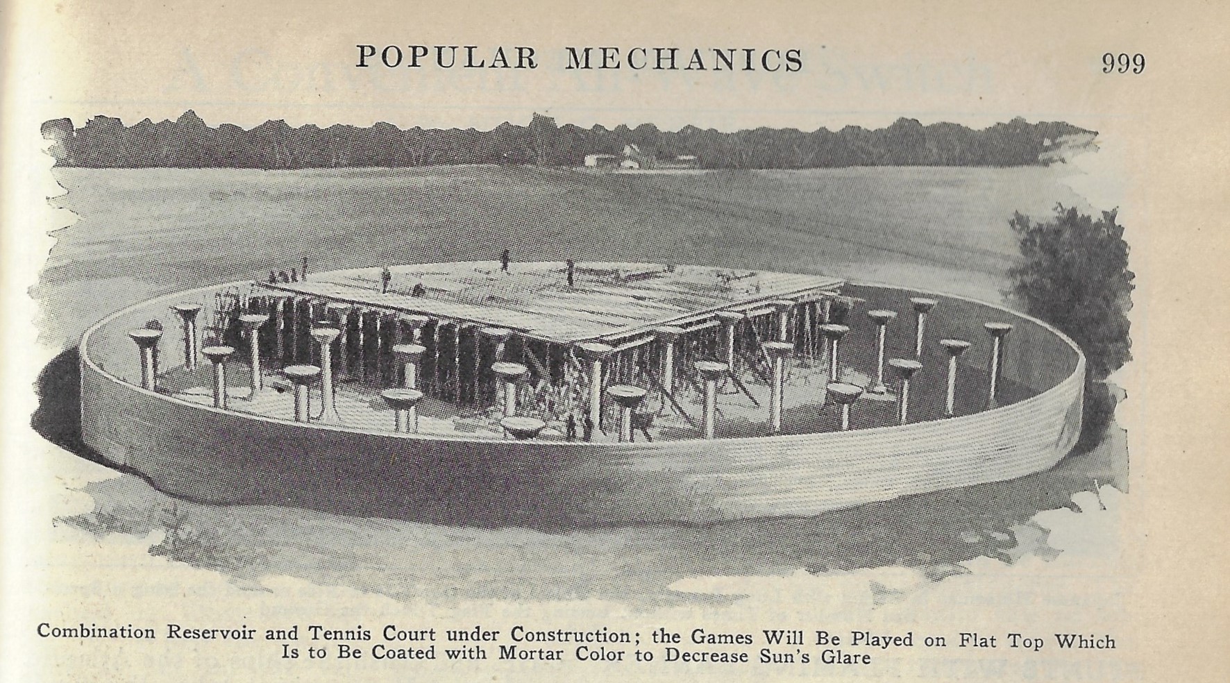
    The second image is unusual but less-techy: a tennis court built on top of a reservoir:

    Pop Mech 1926 tennis court resevoir

    I ‘m not sure how hurting people were for spaces for a tennis court in 1926, but the competition for the open land for such a thing couldn’t’ve been that severe. 


  • “I’ve Got a Bridge to Sell You!” First (?) Notice of the Sale of the Brooklyn Bridge? (1867)

    JF Ptak Science Books  Quick Post 

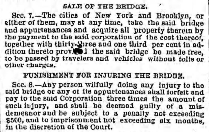
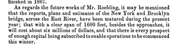
    The butt of an old tag-line for a gullible person convinced of something that could be easily disproved was something along the lines of “…and if you believe THAT I have a bridge to sell you”, that bridge being of course the Brooklyn Bridge. Well, the snippet below from an article in The Brooklyn Eagle (January 25, 1867, page 2) in which the agreements were made to start construction of the bridge (commencing in 1869) also included a section about the sale of the bridge from the corporation building it to NYC or Brooklyn or both. Now this is not what the comedy tag referred to of course as this was real, but it is a little amusing to see such a thing in black-and-white.

    Also its amusing to see below it a notice on “punishment for injuring the bridge”.

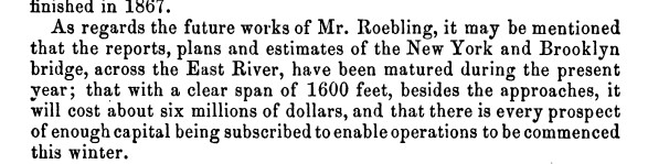
    Lastly in this short post I include an interesting view of the future, found at the end of an appreciation of John Roebling in a volume of the Journal of the Franklin Institute for 1867.  It is a statement on the plans for building the Brooklyn Bridge–at teh time it was still the “New York and Brooklyn Bridge”, and then the “East River Bridge”, though “Brooklyn Bridge” was also used, the official designation of that final name coming in 1915. 


    Brooklyn Bridge sale of

    [Source: Brooklyn Eagle archive at the Brooklyn Public Library, now gloriously online.]

    JFI 1867 Roebling _detail_


    [Source: Journal of the Franklin Institute, volume 84, pg 410.]


  • A Fine Engineering Effort: Constructing the Foundation for a New Building Under the Still-in-Use Building to be Replaced (1922)

    JF Ptak Science Books   Quick Post

    Here’s a very interesting engineering and building feat: placing the foundations for a new building to replace an older one while the older one was still (1) standing and (2) in use. The recipient of this effort was the McVickers Building in Chicago, a theater that opened in 1857 and came to it slow end in 1922. It looks like the last bit of currency was squeezed out of this old building, performances being given right to the very end while foundations for the new building were being constructed 24 hours a day. Int he world of cross sections this is a good one, and also pretty unusual. Also in the top left corner we see a photo of a caisson under construction–a shot I don’t see very often in my searches of old stuff.  

    Pop Mech 1922 Cross section theatre caissons

    Source: Popular Mechanics, February, 1922. 


  • Car Travel for No Good Reason Whatsoever and “Motorist Road Homes” To Accommodate That (1922)

    JF Ptak Science Books  Quick Post

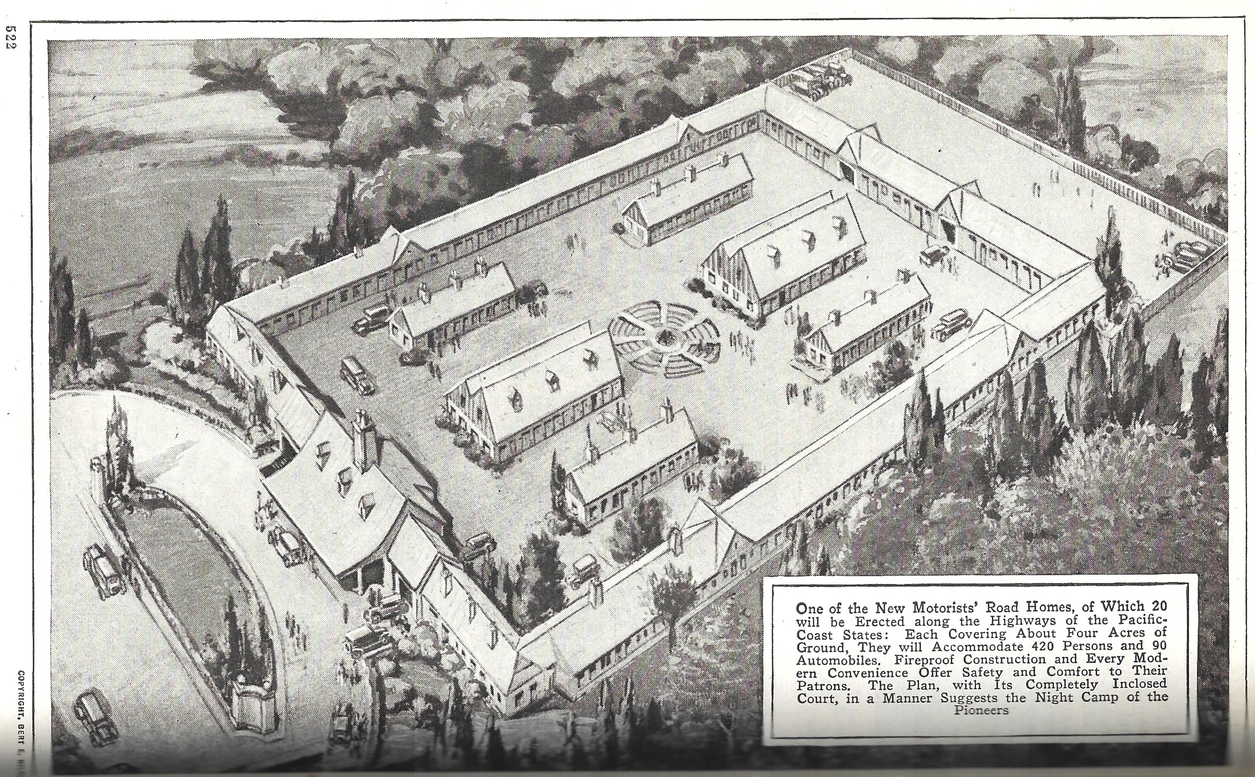
    This diagram reminds me of an enormous and mega-completed versions of the imaginary Joey the Juices’ “Stop ‘n Go Inn ‘n Out” motel down on the nice part of Rt. 1.  This exploded version of the motoring motel was meant for West Coast for travelers “aimlessly covering thousands of miles”, a giant influx of people riding the wave of massive new car ownership. This ranch was to welcome 420 people with room for 80 cars–which means, I guess, that people were traveling together–really together–five to a car, which implies that there were a good number of people contributing in an organized way to “aimless” activity. Perhaps people were just doing a lot of serendipitous driving as an organized crew. In any event I’m pretty sure that I’ve not seen plans for a motor lodge of this size, and thought to share it, finding it in the pages of Popular Mechanics for October 1922. 

    Given the birth of a much wider middle class, and the capacity for some disposable income, and access to cheap/affordable transportation and the roads to ride these new cars on, a large part of the working population of the U.S. did have the luxury at this point of travelling for the sheer hell of it. 

    Pop Mech 1922 car ranch


  • Ships & Skyscrapers: Ships in the Skyline and a 2000′-Tall Building (1908)

    JF Ptak Science Books  Quick Post

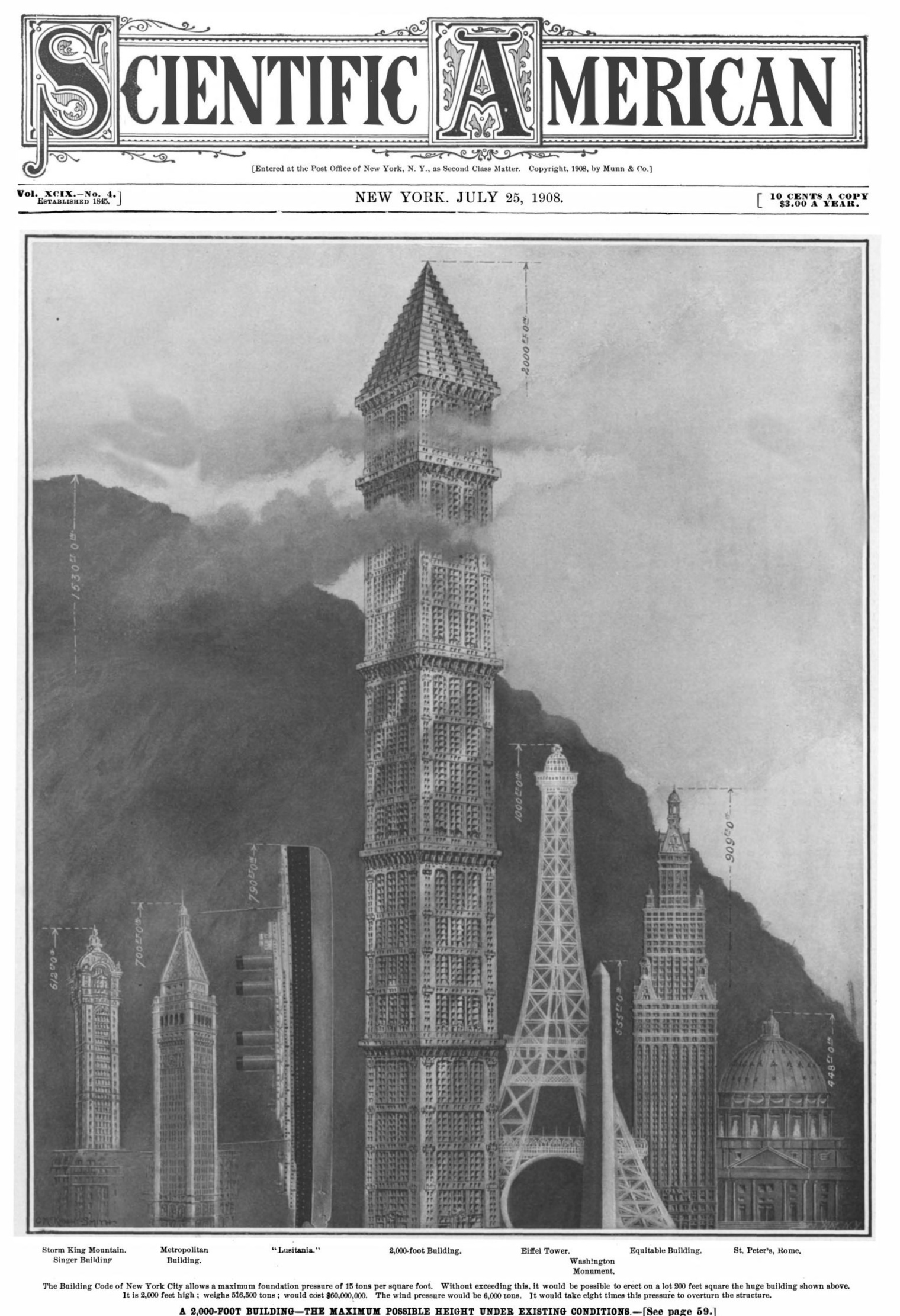
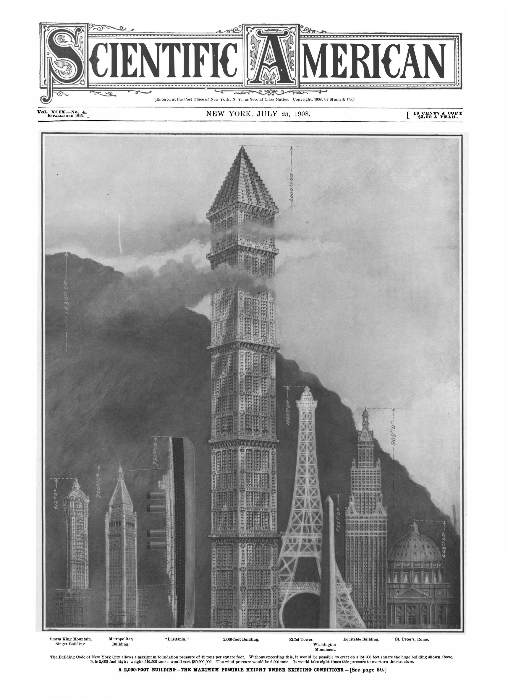
    I’ve lost track of the count of the sub-series on “Ships in the Skyline” in which new buildings etc. are measured against commonly-known objects, including large ocean liners. The enormous ship as measuring stick is interesting, and the appearance of the ship amidst buildings is very attractive in a Dadaist sort of way, as an artistic non sequitur. That said, here’s another example, this from the Scientific American for 25 July 1908,  showing what was estimated to be the maximum height (based on foundation and framing) of the still relatively-new architectural ideal of the skyscraper. 

    I guess I should identify what “new” means–here I’m talking about the third decade of the building, the first of which (for all intents and purposes) could be identified as William Jenney’s Home Insurance Building in Chicago in 1885, which was 10 stories and 138′ high. (There are couple of other earlier and qualified contenders for “first skyscraper”, but for here the Jenney building will work fine.)  There was a boomlet of skyscrapers in Chicago beginning in the 1890’s, and the beginning of the Golden Age/Building Boom around 1900, so by 1908 the building style was well established, though “skyscraper” as a word applied to buildings was only 20 years old. (According to the Oxford English Dictionary, the first use of the word for a building was preceded by its usage for a tall horse (1788), a tall bonnet (1800), a ship’s sail (1801), an exaggerated story (1840), and a  high-hit ball (1842), before it came to rest on a building in 1884 and 1889.)  The secular buildings were not taller than the non-secular ones (like the Rouen and Cologne cathedrals) until the early nineteen-oughts. 

    Anyway, here’s the image with a Beaux-Arts superbuilding: 

    Sci Am 1908 Ships in SKyline  2000 foot bldg


  • Vanderpoel’s Futuristic Designs and a Color Tile Catalog

    JF Ptak Science Books  Quick Post 

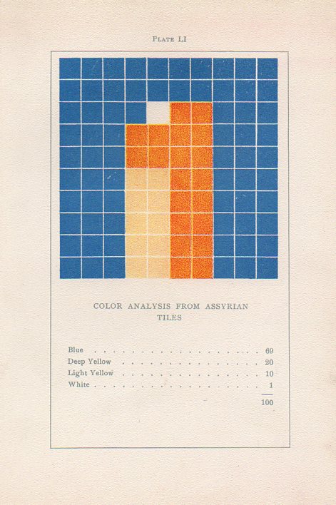
    Vanderpoel assyrian tilesWhile looking through a London stationer’s website for Blackwing pencils I found on their site a catalog for a floor tile maker that strongly reminded me of a gorgeous turn-of -the-century art book.

    I’ve written several times1 on this blog about the non-pre-discovery and non-pre-discovery-recognition of nonrepresentational art by the fabulous art theoretician Emily Vanderpoel. She wrote a a lovely and mysterious book in 1901 (a second edition appearing two years later)  called Color Problems for the Layman, in which she sought not so much to analyze the components of color itself, but rather to quantify the overall interpretative effect of color on the imagination–I think.  I know this sounds begging and vague, but I really haven’t been able to make much headway in the work, though it seems to display the occurrence and frequency of general colors in 100-block distributions. Vanderpoel seems to take the overall sense of the colors of, say, a Greek vase or mummy cloth or a teacup and saucer, and display the overall effect in her grid. As I said the procedure escapes me but the net result is beautiful. 

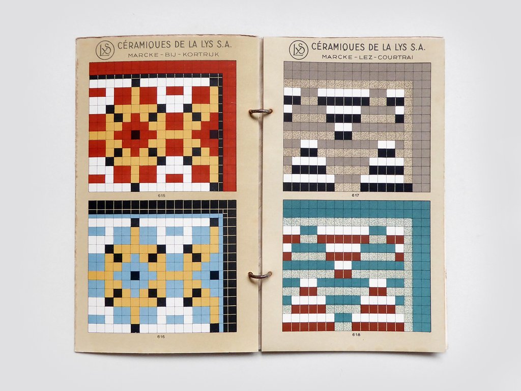
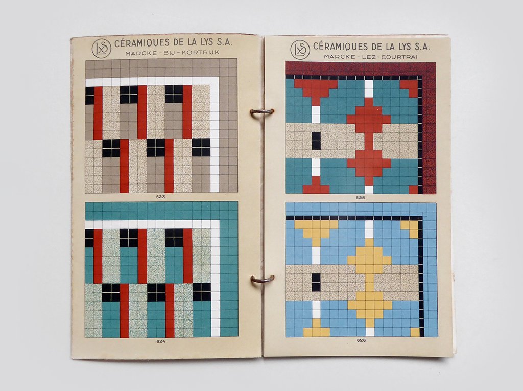
    The 1940’s tile maker’s illustrations of samples of their work are also quite strong, and as you can see bear some similarities with the Vanderpoel:

    Tile catalog Belgian _1_

    Tile catalog Belgian _2_
    [Tile image source: from the store perfectly-named Present and Correct https://www.presentandcorrect.com/collections/ephemera/products/tile-catalogue-1940s]

    Offhand I guess you could say that any of cubist/block/tile/mosaic designs could remind you of Vanderpoel–but not so, and in ways I can’t fully explain. It is something about the distribution and very involved nature of these tiles that pull it towards Vanderpoel…and perhaps it is the color selection. I’m not sure.  I have perhaps a dozen tile manufacturer catalogs from about this period (1930’s/1940’s) and none have struck me as strongly as this one does in its “relation” to Vanderpoel. In any event, there seems to be a “there” there. 

    Notes:

    1. Here are some links to the posts on Vanderpoel:

    • https://historyofideasblog.com/thesciencebookstore/2010/12/what-color-is-an-unintentional-modernist-masterpiece-of-book-illustration.html
    • https://historyofideasblog.com/thesciencebookstore/2008/04/shaping-space-a.html
    • https://historyofideasblog.com/thesciencebookstore/2015/02/mummyii.html

  • Cross Sections of Parisian Work Life, 1852-1883

    JF Ptak Science Books  Post 2753

    One of my favorite escapes on this blog is writing about cross section and cutaway images, scenes that show multiple levels, inside and out, peeling away a bit of facade to show the working stuff underneath. Buildings are particularly interesting, especially when it shows what people are doing inside of them, and to that end I’m sharing three good examples, two from 1883 and a third somewhat earlier, from 1852. 

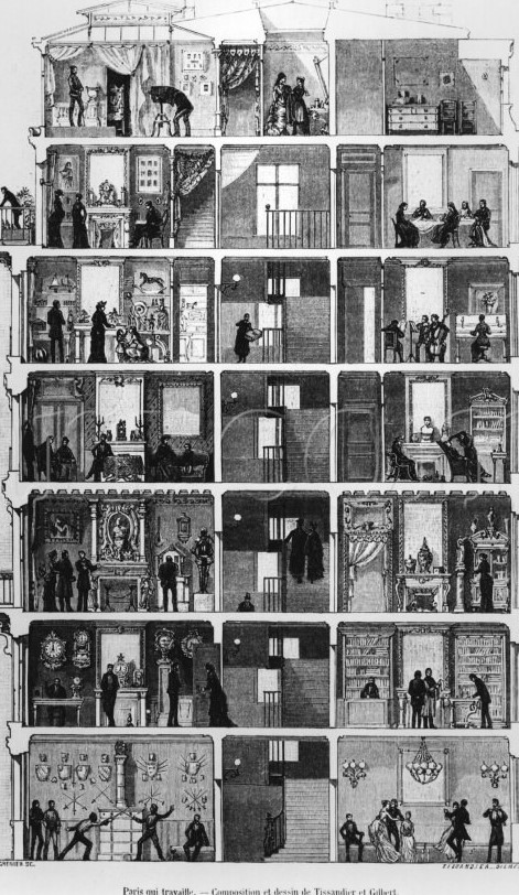
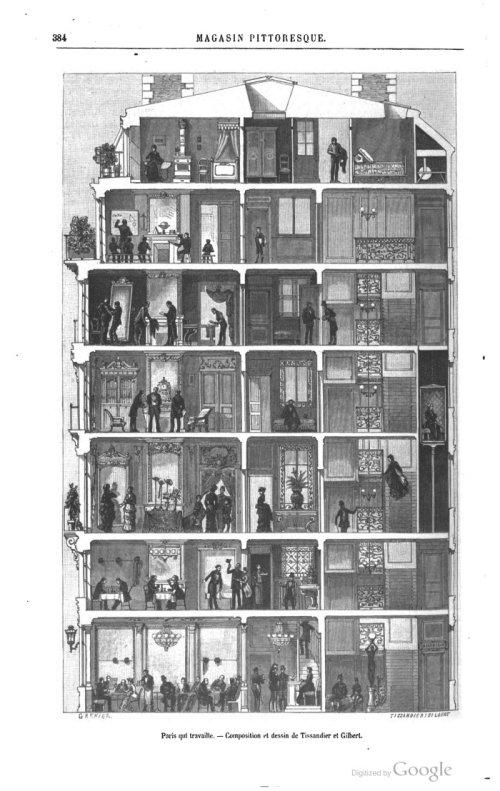
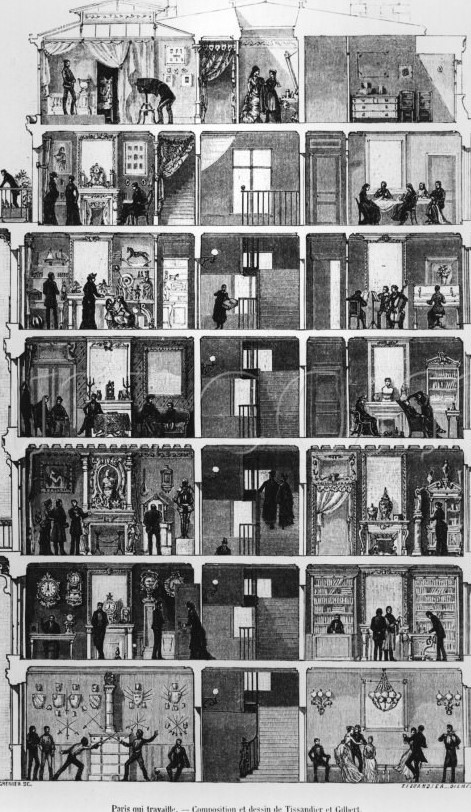
    The first two images are from Le Magasin Pittoresque, volume 51, printed in Paris in 1883 (located on pp 383-6), where we are instructed that  it is not the beautiful and classical Paris that we are to piece-apart but rather the Paris that works–that’s the true Paris, “le vrai Paris”, not the “real” Paris that plays, “Paris qui s’amuse”. It is working Paris, the article states, that is the Paris worth studying.

    The cutaway structure is said to represent one of those of Rue Auber or Avenue de l’Opera, or some such, a standard building of its time, housing businesses and trades.  On the first floor is the cafe complete with flaneur (or “saunterer”), and traders and “industrialists”; there is a restaurant above that, and then an “elegant milliner” on the next. Then comes “un grave personnage” which is perhaps an attorney, and above that a fashionable tailor. Next come the children in a geometry class, and then at the top floor, rooms for a worker and a servant (as the description allows). 
    Cross section paris house 1883 le_magasin_pittoresque_page_2


    The next structure we are told could’ve been on St. Denis.  On the ground floor we find a fencing and dance master, two related peas in a related pod, coupled with another good pairing above, where we see a watchmaker and a bookseller. (“L’art et l’industrie font bon voisinage, comme pour montrer l’influence que l’un a sur l’autre”.) Next occupying a whole floor is a dealer in art and trinkets (“bibelots”); above this, an unhappy scene on the left featuring a dentist. On the next floor we find happier surrounds, showing a toy maker and a music instructor; further on, we see a group of women working a quilt or some such; at top, there is a photographer, and to the right two small rooms for the working folk.   
    Cross section parisian building 1883

    [Image source: Blog Histoire Geo  https://pierrickauger.wordpress.com/2018/01/27/diverses-vues-en-coupe-dun-immeuble-parisien/ Full text available at Hathi Trust https://catalog.hathitrust.org/Record/012224156] 

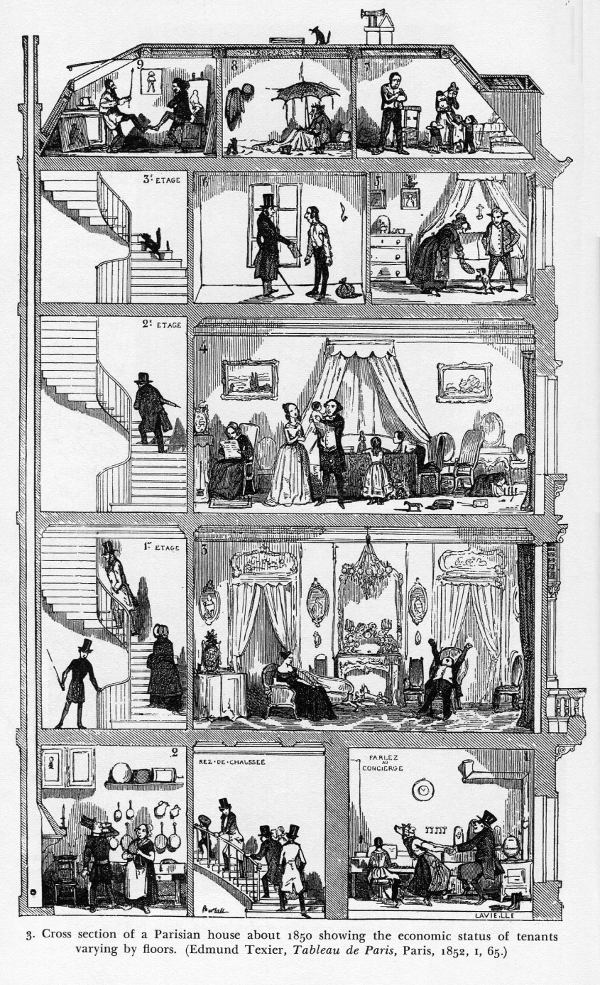
    The third example is another fine slice of Parisian city life, from Edourad Texier’s  Tabelau de Paris, printed in 1852. This may be a little more whimsical than the other two, if for no other reason than the whole assortment is topped off by what may be a laughing cat.  
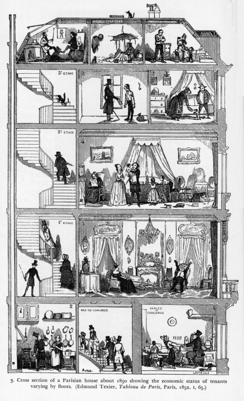
     

    Cross section Texier tableau de paris 1852

    I couldn’t find full text for this one so I’m just free-wheeling, but it doesn’t take much to interpret the scenes. On the ground floor on either side of the entrance we have, I think, a couple of gents who may be taking too much liberty with the cook and concierge. The first floor is evidently first class–we see some well dressed and evidently bored people–or at least they look so compared to the folks downstairs. Above them is a well-to-do family, someone making enough to afford good clothing and toys and artwork and a mother-in-law. The smaller and cramped rooms start above here, with a scene of a down-and-outer being presented a bill no doubt for collections presented to a man with nothing in his room save a bag of his possession; across the hall a humble couple entertain their dog. In the attic/garret we find two artists amusing/inspiring one another, while at the far end a family seems to be in desperate times. In between these two is someone on the floor underneath an umbrella, no doubt a philosopher. And again, on top of it all and perhaps in editorial, a laughing cat.

    Cross section Texier tableau de paris 1852

    [Image source: Blog Histoire Geo  https://pierrickauger.wordpress.com/2018/01/27/diverses-vues-en-coupe-dun-immeuble-parisien/  Full text availabe at Hathi Trust https://catalog.hathitrust.org/Record/012224156] 


  • Defining the Work: Two Examples of Describing Standard Terms (1710)

    JF Ptak Science Books  Quick Post

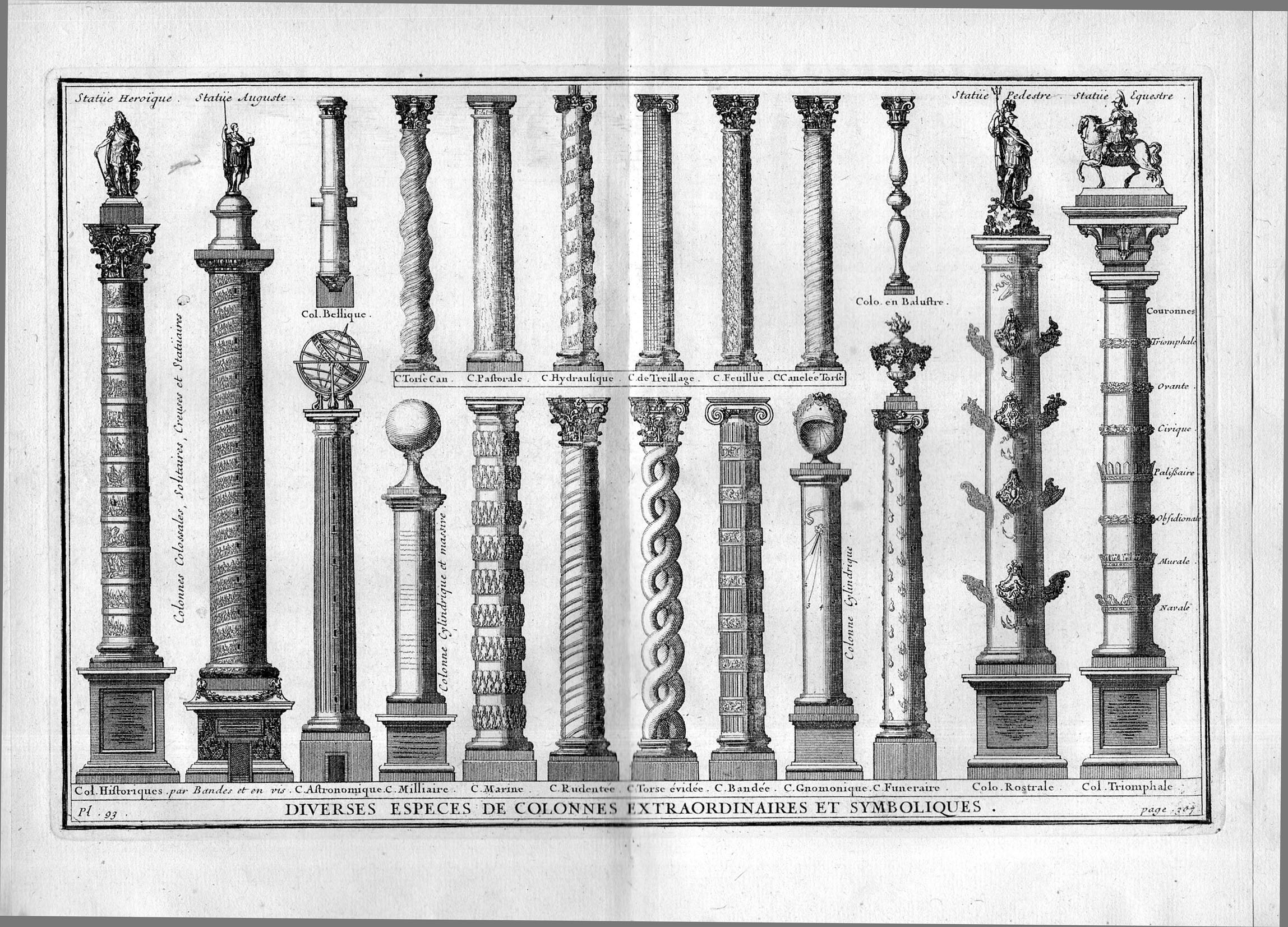
    Over the years I’ve seen many architectural prints, and I’ve come to determine that I most enjoy the comparative views.  It is uncommon to see a single-sheet engraving dedicated to different forms of columns, as we see here in plate 93 (page 307)  of volume one of A.C. Daviler’s Cours d’Architecture qui comprend les Ordres de Vignole…published in Paris in 1710. Daviler (1653-1701),was an architect and a student of  Jean-Francois Blondel (1683-1756) who worked very extensively on the architectural theory of Giacomo Barozzi or Jacopo Barozzi da Vignola (1507-1573). Here he identifies and classifies 20 different types of columns, just to make sure that everyone was on the same page, so to speak:

    Architecture--vignole--columns429

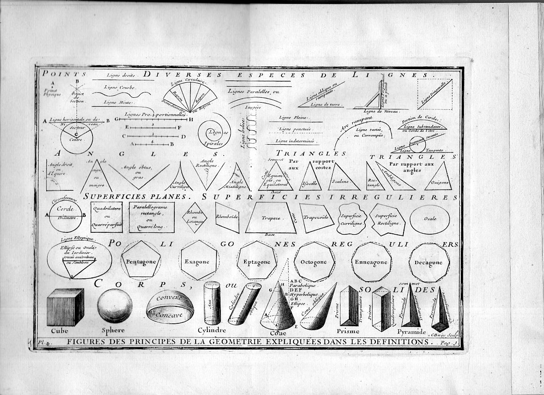
    Actually, the very first engraving in the work is dedicated to a definition of terms, establishing the basis for the forms that would be discussed over the following thousand pages.  It is an excellent way to start a book, making sure that everyone has a common identification for what standard words would mean. It is a standard and very good idea but not often illustrated: 

    Architecture--vignole-shapes430

    ·Posted by :

    ·in:


  • A Bridge for Carrying a Ferry Over Water (1869)

    JF Ptak Science Books  Post 2755   

    I don’t mean to appropriate the past from my seat here in the future, raising my eyebrows over what definitely seems to be an Ig Nobel engineering effort, but, well, there are times when you distill a bad idea over a low flame that the bad idea distilled is still a bad idea. 

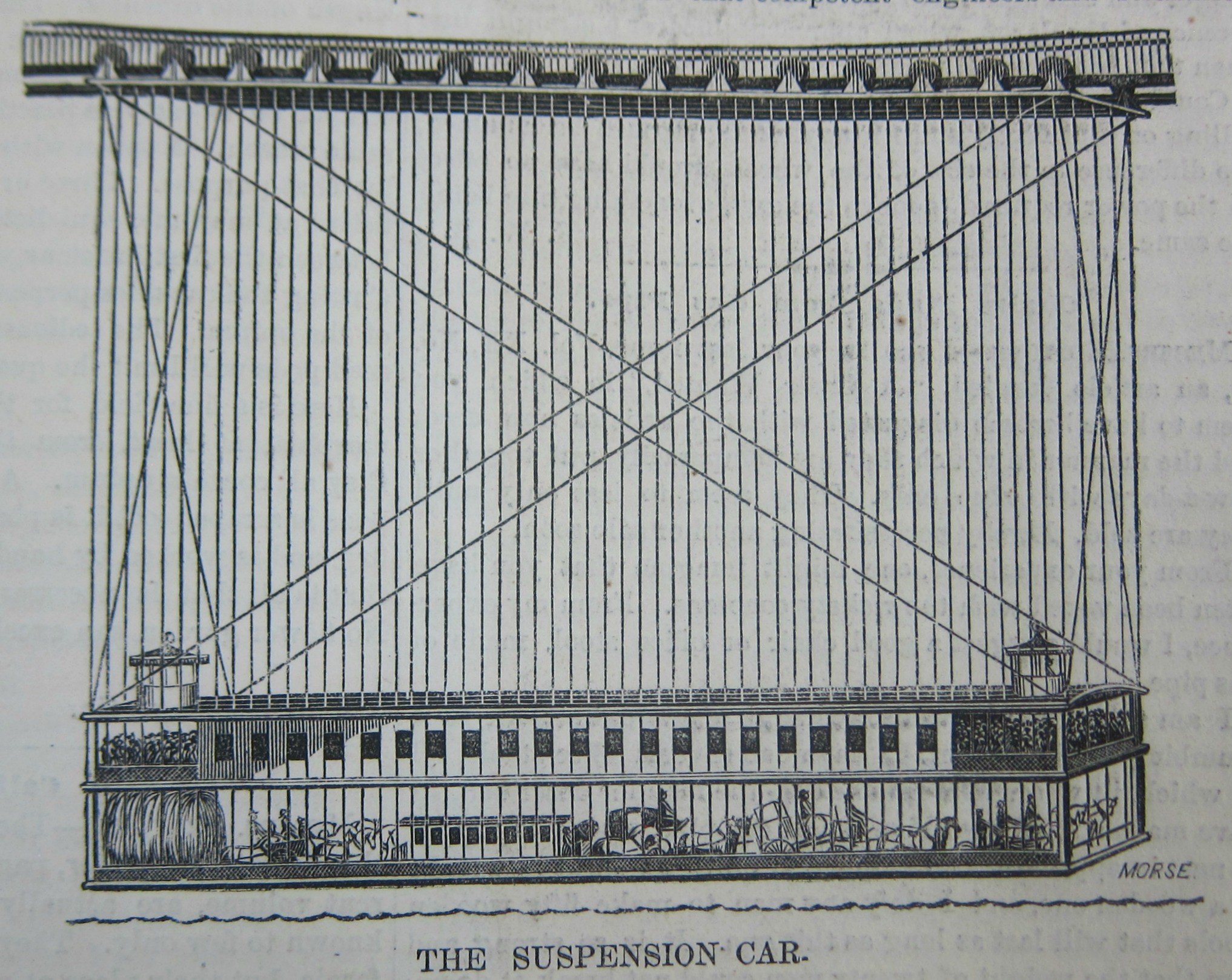
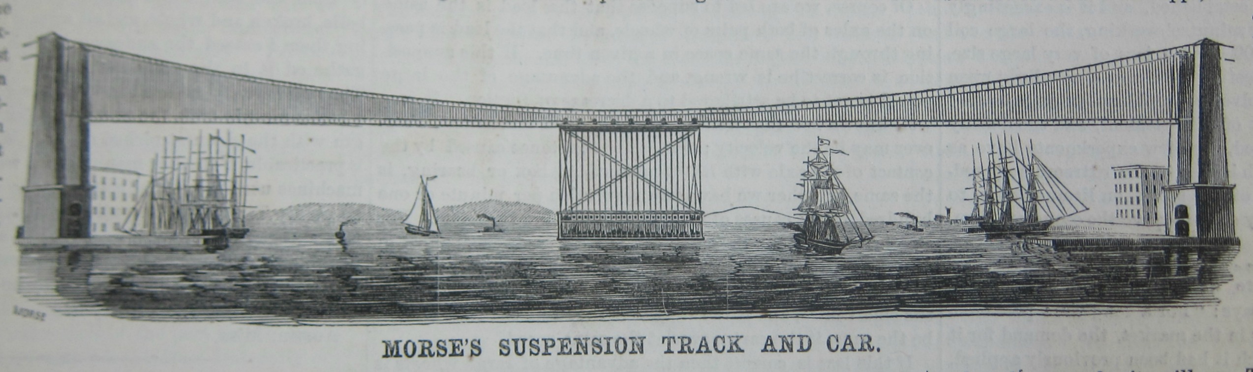
    I’ve tried to imagine the circumstance in which this bridge would make sense, particularly in light of the fact that it was a proposal by J.W. Morse to counter the Roebling plan to erect the East River (later “Brooklyn”) Bridge in about the same location. This is how this bridge plays itself out in my mind: a suspension bridge of some substantial size is constructed to carry a ferry from Manhattan to Brooklyn, even though it seems that a ferry would be able to get from one place to the other with not terrible fuss, except in the old style of using a boat it would be moving on/in the river rather than over it. The ferry wouldn’t need a bridge to cross the river if it didn’t wholly depend on one from completing its task, which ferries almost never do, being watercraft and all.

    Sci Am 1869 suspension ferry

    The details of the plan are a little shocking: that “car” hanging from the bridge cables measured 160’x40′ (6400 square feet) and two storeys high, and was meant to carry 5,000 people at one time (75,000 over a 12-hour period) along with another 500 horses and carts on the lower level. It was to make the trip in a minute or two, and would be moved from one point to the other at a few feet above the river.

    This might make sense if the river was choppy, or ice-bound, at which point it would be nice to use HyrdoplanePunk to get across the river. A bridge-as-bridge would accomplish this task without turning itself basically upside down and inside-out. 

    As I said it is not so good to judge application of technology by a modern standard; though in this case it seems as though if you were to look just slightly into the future from 1869 that you’d realize a continuous flow across the river would be highly preferable to a car shuttling a limited number back and forth. In addition to numerous other issues, I’m not sure how the engineer was dealing with the traffic and congestion caused by the fits and starts of 1,000 or 2,500 (let alone 5,000) people plus freight leaving the car/boat all at once, joining a crowd of people and horses and so on waiting to board, dozens of times a day.

    Sci Am 1869 suspension ferry profile

    At the end of it all, this bridge is also just not very attractive, and not made for the ages—it seems temporary, a short range solution to a long range issue, something soon to be dismantled, used elsewhere, and then scrapped.

    I should point out that there is a variety of bridge dedicated to this sort of transportation—it is evidently of French origin, and referred to as a pont a transbordeur, and seems to have some utility here and there, though that “here” and “there” did not include “Manhattan” and “Brooklyn”.

    • From the article:  “While plans have now been divulged to connect the island of Manhattan in New York with Brooklyn by means of a giant suspension bridge over the East River, Mr. J. W. Morse has devised a bridge which permits of a much lighter construction than a normal suspension bridge and is, consequently, much cheaper to build. Mr Morse’s project provides for transportation across the river in a giant platform, suspended by means of cables from a trolley running upon a gantry across the river. Measuring 40 X 160 feet, the platform has two stories: the top floor is for pedestrians while the bottom deck is intended for horses and carriages. While a normal suspension bridge requires extensive abutments and ramps to enable the road traffic to reach the bridge-deck level of almost 120 feet, Mr. Morse’s transporter bridge obviates the need for such provisions. The fact that the traveller [sic] hangs only 3 feet above the water-and hence is almost at street-level-makes it easy for heavily loaded wagons to cross the river, and will also be appreciated by the workman returning home on foot after a hard day’s toil in the factory or warehouse.” —Scientific American,  24 May, 1869

  • An Alphabet of City Planning: “G” is for “Garbage” (1936)

    JF Ptak Science Books  Quick Post

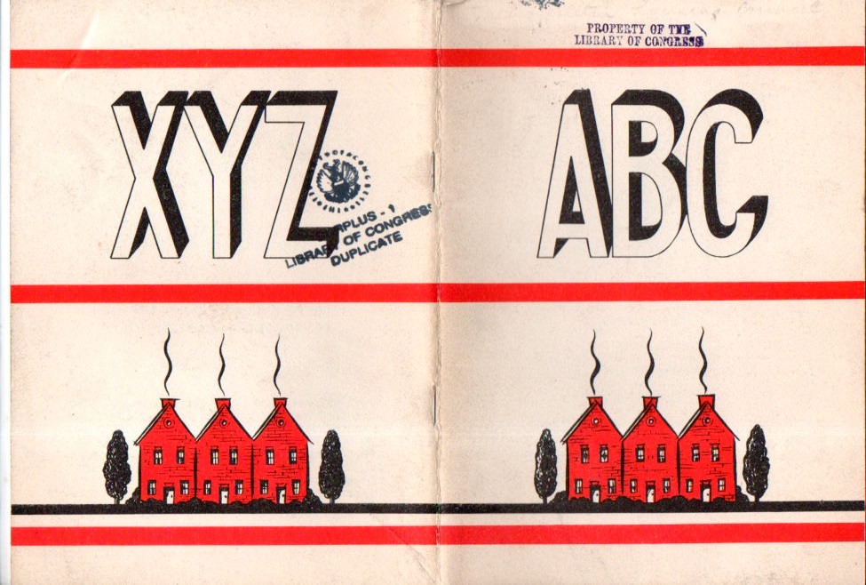
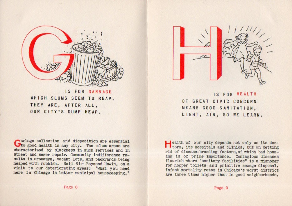
    I am pretty certain that this is the only semi-antiquarian alphabet of city planning that I have seen1. And of course I am compelled by the “Garbage” entry, as one should be.

    “May [this book] help you to look for and to see in this city of ours more than you have ever seen before. May it assist you in making this  a better place in which to live, to the end that Chicagoans will not fear the memories of home they give their children.”–preface.

    Notes:

    1. ABC. “Words and design by Arthur Bohnen, assistance of Elizabeth Blair, illustrations by Ethel Schacherer.”  7×5″, 26pp. “This publication is distributed to its members by the National Association of Housing Officials.” 1936–WorldCat   Only four copies located in WorldCat OCLC: Chicago PL, NYPL, Canadian Centre for Architecture, Columbia University.  


    ABC of housing192

    G is for GARBAGE

    which slums seem to reap.

    They are, after all, 

    our city’s dump heap.  

    ABC of housing193


    Here are a few of my favorite entries: