A Daily History of Holes, Dots, Lines, Science, History, Math, Physics, Art, the Unintentional Absurd, Architecture, Maps, Data Visualization, Blank and Missing Things, and so on. |1.6 million words, 7500 images, 4.9 million hits| Press & appearances in The Times, Le Figaro, Mensa, The Economist, The Guardian, Discovery News, Slate, Le Monde, Sci American Blogs, Le Pont, and many other places… 5000+ total posts since 2008.

Author: JF Ptak

  • Tinian, the Manhattan Project, and Manhattan (1944/5)

    JF Ptak Science Books   Quick Post 

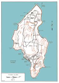
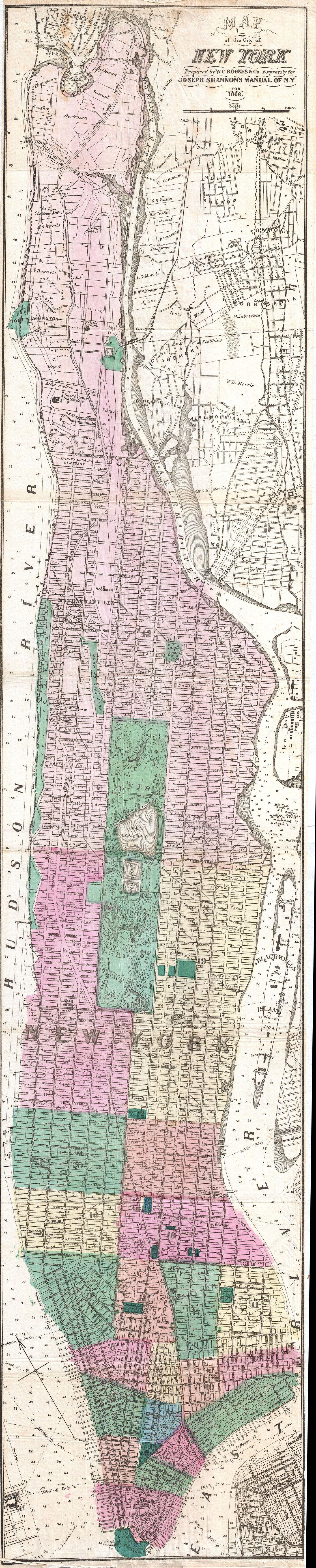
    As we all know Tinian Island was of a vast strategic importance to Allied War effort against Japan.  It sits just a few miles away from Saipan, and is situated close enough to Japan (1500 miles) to make the place an integral part of the advance on Japan as an airstrip.  The battle fought to control the island–in August 1944–resulted in it being taken by U.S. forces, the Japanese losing all but 300 or so of a garrisoned force there of 8500. Tinian became home to (among others) the 509th Composite Group, which was the home base for the bombing of Hiroshima and Nagasaki. It was the penultimate step of the fulfillment of the Manhattan Project–the last being the dropping of the bombs–and it struck me only very recently that after all of this time, it seems to me that Tinian bears a resemblance to Manhattan Island, which  makes for a peculiar irony. 

    Now that I have for the first time looked at a map of Tinian with street names, I see that this irony was deeply incised into the very earth of the place by Seabees, because when the plan of the city was laid out in the fall of 1944, the place received a gridwork of streets similar to Manhattan–and as a matter of fact, a number of the streets were named with Manhattan in mind: Broadway, Riverside Drive, Canal Street, 42nd Street, Wall Street, Canal were there and named, and even for the north end of the island, the major road leading out was named Saw Mill River Parkway, which is what I would drive leaving the city for Great Barrington, Ma. I don’t know why I am so very late to this party, but I am.  If you’ve not noticed this before, join the club, and enjoy.  (See here for a clearer map of the Tinian street names: http://www.pacificwrecks.com/provinces/marianas/maps/tinian.html#axzz4HjqvMu1w )

    Tinian Tnian manhattan


  • Found Book Art: Franklin at Sea, 1787

    JF Ptak Science Books  Quick Post

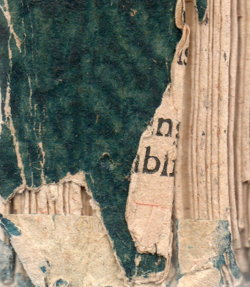
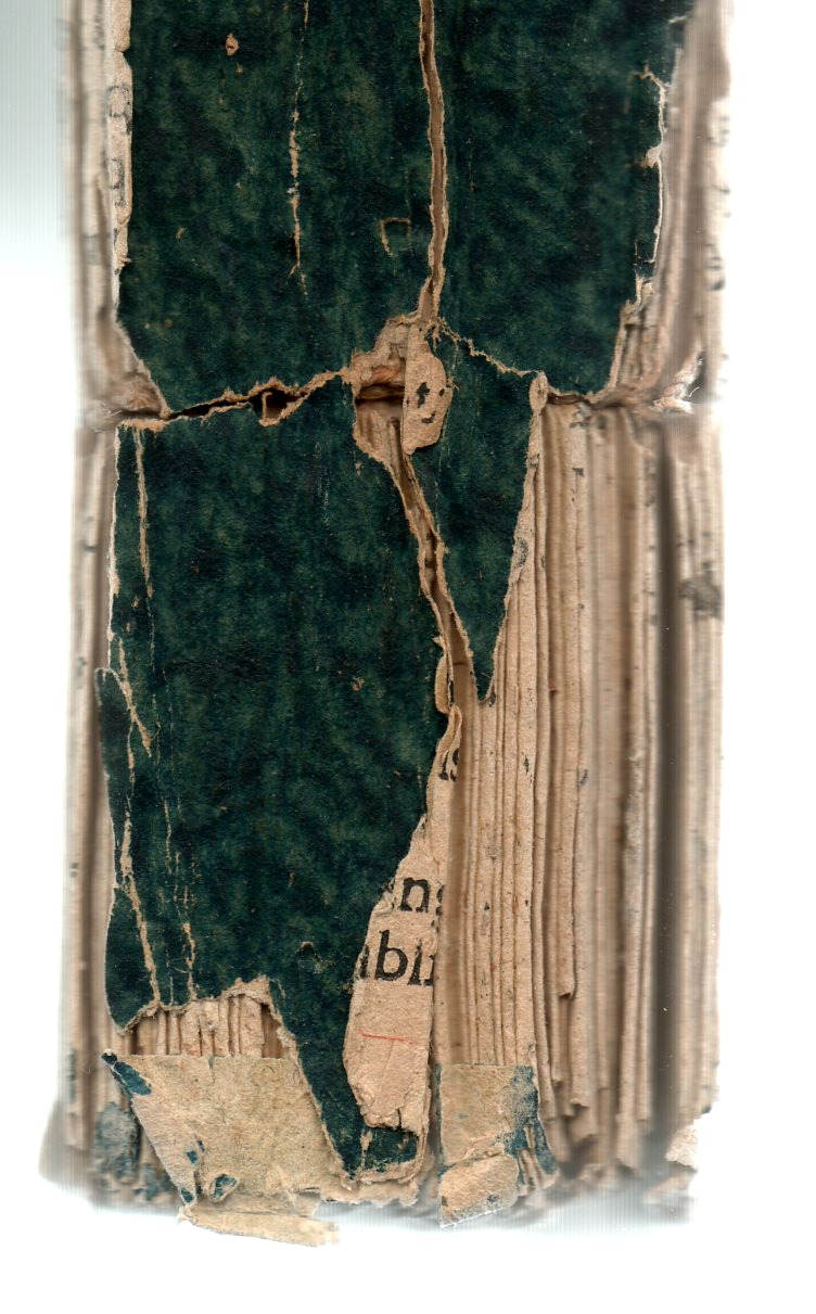
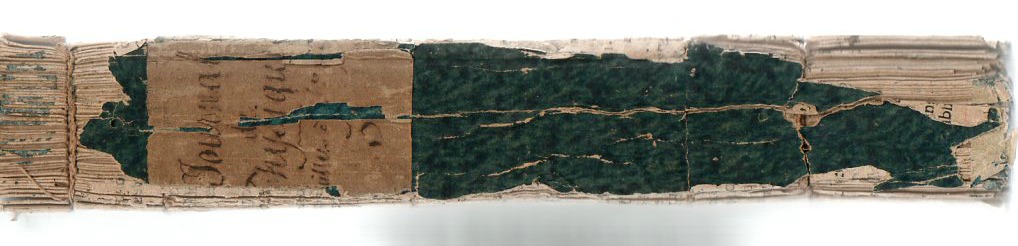
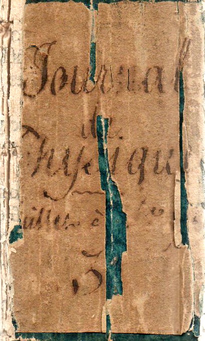
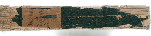
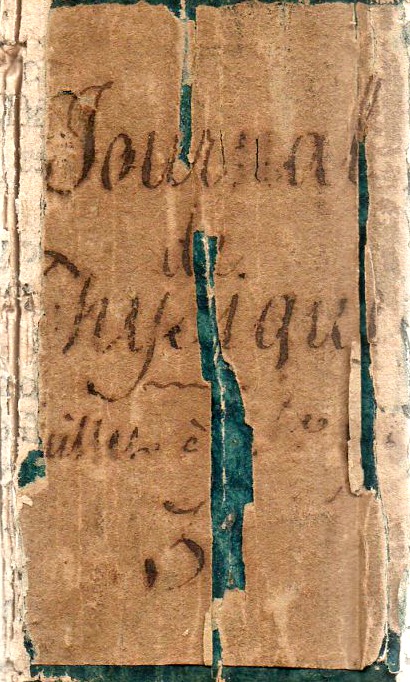
    One of my favorite bits to compose for this blog is the Found Book Art series–which is odd because there isn’t even a category for it. Maybe there are a dozen of these in the 4500 posts here, so there aren’t many, though there could be,..I guess I could do one a day, but that might take the special flavor away for me. In any event, I like them; I’d probably like them even more if I hauled out one of the microscopes and did some close work on them.  For today, though, I’m just looking at this pretty spine of the journal Observations sur la Physique sur l’Histoire Naturelle et sur les Arts of 1787 which contains a seminal contribution1 by Ben Franklin on the Gulf Stream.  

    Franlin bookart634


    Franlin bookart633

    These are details of:

    Notes:

    1. Suite de la Lettre de M. Benjamin Franklin, a M. David le Roy, Membre de pluisseurs Academies, Contenant Differenres Observations sur la Marine, a three-part series printed in Observations sur la Physique sur l’Histoire Naturelle et sur les Arts, avec des Planches en Taille-Douce.…dedicated to M. Le Comte d’Artois, and edited by l’Abbe Rozier, J.A. Mongez, and M. de la Metherie, in the issue for July-December 1787, volume 31, and Printed in Paris at the Bureau of the Journal de Phyique, 1787.


  • Benjamin Franklin, in Love with the Sea, 1786/7

    JF Ptak Science Books   Post 2632
    Franlin b631

    Franklin, Benjamin. Suite de la Lettre de M. Benjamin Franklin, a M. David le Roy, Membre de pluisseurs Academies, Contenant Differenres Observations sur la Marine, a three-part series printed in Observations sur la Physique sur l’Histoire Naturelle et sur les Arts, avec des Planches en Taille-Douce.…dedicated to M. Le Comte d’Artois, and edited by l’Abbe Rozier, J.A. Mongez, and M. de la Metherie, in the issue for July-December 1787, volume 31, and Printed in Paris at the Bureau of the Journal de Phyique, 1787. (he title of the Franklin, translated: (A) Letter(s) from Dr. Benjamin Franklin, to Mr. Alphonsus le Roy, member of several academies, at Paris. Containing sundry Maritime Observations.) The papers appeared in  September  pp 224-231; October, pp 254-264;December pp 456-468.
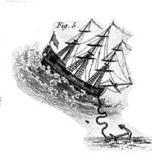
    Franklin

    By the time Benjamin Franklin published these three pieces—letters he had written at sea— he already had a lot of experience with the voyage, having made numerous trips oversea since 1754. At this point he was the American envoy to France, and had been (very successfully!) busy at securing arms and agreements from France, and put his time during the crossing to some concentrated use.

    These three letters by Franklin to le Roy are remarkable for their insight and invention, describing new types of ship sails and anchors, propulsion systems, hull and planking designs—and of course the first description in a scientific publication of the Gulf Stream. And in all of this Franklin as shipboard, biding his time at sea, thinking and experimenting, coming up with ideas that were of high interest though not necessarily workable, and some just frankly beyond his big grasp.
    Franlin c632

    I was really shocked when I started piecing my way through this volume, and finding the Franklin. Honestly, I didn’t know the significance of the Franklin starting into it, the thing only dawning on me as I got half-way through the second letter, and with a squint recognizing that what he was talking about in the waters off of the coast of “Floride” was in fact the Gulf Stream. “Oh” is what I said to myself. This is that paper. At least it wasn’t a terribly obvious overmiss—this version of the famous description of the Gulf Stream didn’t come with a map, and the illustrations were little bits showing flouncy sails (of dubious application, sorry) and sea brakes. Even when I realized that this was the Gulf Stream Paper, its significance still wasn’t significant, as the great report occupies just a small portion of one of three letters. So it goes.

    The first publication of these letters appeared in the Transactions of the American Philosophical Society of Philadelphia (the society founded by Franlin in 1743) about a year earlier, and which contained the famous map (15×8” or so,  A Chart of the Gulf Stream with Remarks Upon the Navigation from Newfoundland to New-York In order to avoid the Gulf Stream . . . and nor included here) which he completed with the help of his first cousin Thomas Folger. Actually the two had printed an earlier version, in 1769/70, though the map received basically no circulation and was famously disappeared for 200 years before being unearthed.

    There were earlier references to the Gulf Stream—as with the ignored Walter Haxton chart of 1735—though nothing nearly so complete and accurate as the Franklin map.

    This is the first French version of the letters, and so the first French translation of the description of the Gulf Stream; it was also the first appearance of the article in Europe.

    It has been said that the work by Franklin was ignored and associated with inferiority by the Brits because of the adolescent nature of the American Republic and the inexperience of its navy, especially in regard to the Royal Navy. The Gulf Stream simply couldn’t be a discovery of a “river in the ocean” as described by a bunch of fisherman in a colony far from the birthright of a proper navy and scientific inheritance. But of course the Brits were wrong.

    Here’s a bit from the letters on the Gulf Stream, appearing in my journal on page 460-1, translated:

    “This stream is probably generated by the great accumulation of water on the eastern coast of America between the tropics, by the trade winds which constantly blow there. It is known that a large piece of water ten miles broad and generally only three feet deep, has by a strong wind had its waters driven to one side and sustained so as to become six feet deep, while the windward side was laid dry. This may give some idea of the quantity heaped up on the American coast, and the reason of its running down in a strong current through the islands into the Bay of Mexico, and from thence issuing through the gulph [gulf] of Florida, and proceeding along the coast to the banks of Newfoundland, where it turns off towards and runs down through the western islands. “

    Well, sheesh. There was a lot of thinking going on in this letters—not bad for a guy with other things going on in his head regarding the founding of a new nation.


  • “There is No Necessity to Kill the Babies”–Fight the Famine Council, 1919/1920

    JF Ptak Science Books  Quick Post

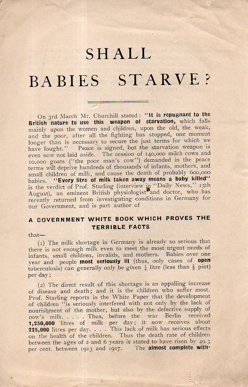
    This is one of the pamphlets published by the Fight the Famine Council, published in London in 1919/1920/ Fight the Famine was founded in January 1919 to fight for the lifting of the embargo still in place for Germany and its Allies by alerting government figures and agencies about the conditions brought on by the continuing years-long embargo.  Leading the Shall Babies Starve pamphlet is (as you can see below) a strong quote by Winston Churchill (who at the time was Secretary of State for War, 1919-1921), who insisted that using food as a weapon was “repugnant to the British nature”. Of course this one of the results of the embargo, which no doubt lead to the deaths of hundreds of thousands of bystanders, including women and children.  Shall Babies Starves outlines the effects of the continued embargo on on infants and children, including short sections on “what a milk famine will mean”, tuberculosis, and “there is no necessity to kill the babies”.  This was a four-page leaflet, reprinted in full:

    British handouts Babies Starve _1_630

    ·Posted by :

    ·in:


  • A Superior Musical Review Hidden inside a Superior and Obscure Journal, 1923

    JF Ptak  Science Books  Post 2630

    Manuscripts (MSS), edited by Paul Rosenfeld in New  York, 1922-23, was a Small Magazine, a wonderful Dadaist publication with contributions from the leading artisitc/intellectual community including Georgia O’Keefe, Alfred Stieglitz, Paul Strand, John Marin, Charles Demuth, and many others. What I’m writing about right now is issue #5–appearing in March 1923–of the six (total) issues that were printed of this short-lived and very highly spirited magazine–the issue shockingly emerged from a box in the studio last night. The striking cover was designed by Georgia O’Keefe, and underneath the cover for issue #5 “one of the most remarkable issues” (according to the Dada Once and For All catalog by Ex Libris in 1983), was the work of the critic and Stieglitz-supporter Herbert Seligmann. 

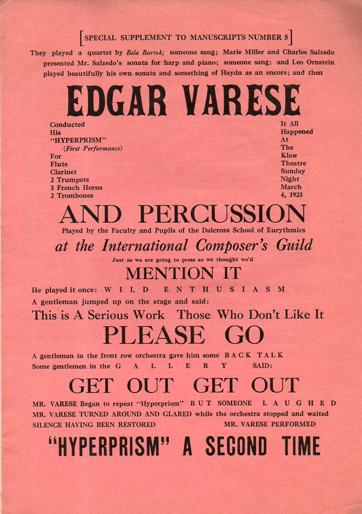
    All this aside, what really struck me was the broadside “review” tucked into the twelve-page publication–a very segmented, highly typefaced and fonted (sorry!), very creative look at the composer Edgard Varese’s Hyperprism, a very adventurous work for wind, brass, and percussion instruments was completed in 1922 and revised in 1923, and then obviously reviewed by Seligmann in this issue of MSS in 1923.  Varese (1887-1965) was a very-modern modernist whose reference to his music as “sound-mass” (among many other things of course) that was in a way similar to the process of crystallization/chemical crystallography gives an insight into the name of the piece to be performed. The review admonished “This is a Serious Work, Those Who Don’t Like It PLEASE GO” among other such tidy phraselets.  I reproduce this fantastic little gem below:

    Varese615

    Also if you’d like to listen to it:


    By the way Music and Modern Art by James Leggio  reproduces (on page 141) the Varese review as a full-page illustration. 

    See also Herbert  Seligmann, Alfred Stieglitz Talking: Notes on Some of his Conversation, 1925- 1931, New Haven: Yale University Library 1966, for more on MSS. 

    For more on MSS:


    • All six issues reproduced at Monoskop, here: https://monoskop.org/MSS
    • Full text of the MSS Number 5 https://monoskop.org/images/3/3d/MSS_5_Mar_1923.pdf

    And this from issue #5 on the previous issue of the magazine:  “MSS. Number One contained writings by Sherwood Anderson, Kenneth Burke, Waldo Frank, Paul Rosenfeld, Herbert J. Seligmann, William Carlos Williams. MSS. Number 2 contained writings by John Marin, Alfred Stieglitz, Paul Strand, Charles Duncan. MSS. Number 3 was entitled “What Is True Art?” by J. B. Kerfoot and W. Rhea Moreau. MSS. Number 4 was entitled “Can A Photograph Have The Significance Of Art?” by Sherwood Anderson, Thomas H. Benton, Ernest Bloch, Oscar Bluemner, Stephan Bourgeois, Gilbert Cannan, Charles Chaplin, Thomas J. Craven, Elizabeth Davidson, Charles Demuth, Marius De Zayas, Arthur G. Dove, Marcel Duchamp, Alfeo Faggi, Waldo Frank, Hutchins Hapgood, J. B. Kerfoot, Gaston Lachaise, Walter Lippmann, John Marin, Kenneth Hayes Miller, George F. Of, Georgia O’Keeffe, Leo Ornstein, Joseph Pennell, Carl Sandburg, Evelyn Scott, Charles Sheeler, Leo Stein, S. Macdonald Wright, Carl Zigrosser, Bibliography. The price of MSS. Number 5 is 15 cents. Subscription to 10 numbers one dollar. The entire cost of this MSS. Number 5 is the printing bill of $130.00 for the present edition of 1,000 copies, presented by Clarence S. Nathan, Inc., and paid by the Tin Whistle Fund. Each author is solely responsible for what appears over his signature. Complaints should be sent to individual authors. Subscriptions will be received by Herbert J. Seligmann, 129 East 10th Street, New York City. Donations of money will be received with thanks by the same. For the cover design: apologies to “Dada” (American), Marcel Duchamp, Man Ray, and acknowledgment to “Anonymous.” Copyright, 1923, by Herbert J. Seligmann.”–from page 2 of MSS Number 5. 


  • Anti-FDR Cartoon Book, 1944

    JF Ptak Science Books   Quick Post

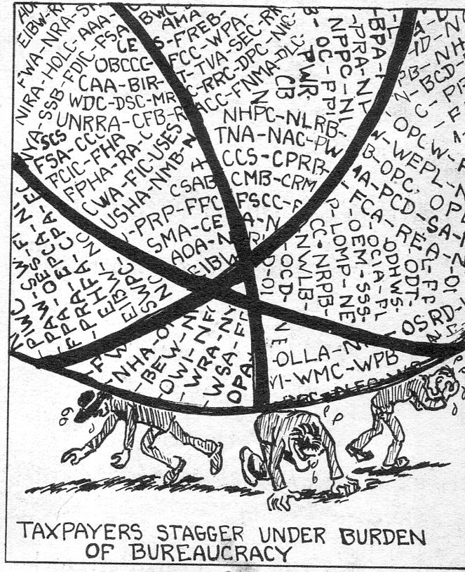
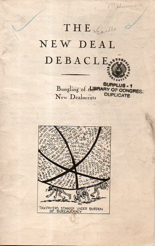
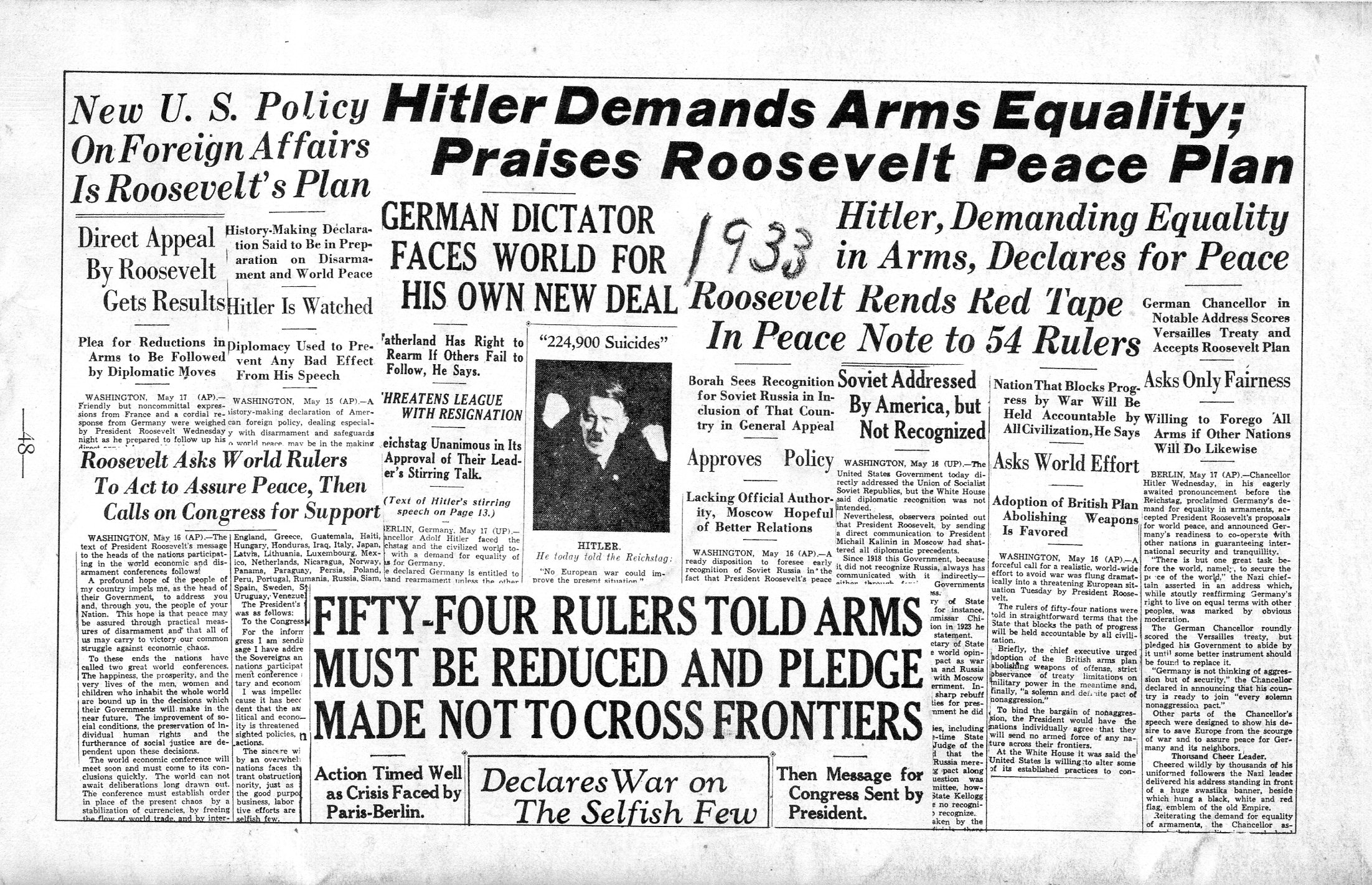
    It takes all kinds, as this pamphlet clearly if not not cleverly shows. There was some opposition to FDR as he went for his fourth term as president in 1944–by the summer of that year the outcome of WWII had swung positively towards the Allies, the Depression was broken, and for fighting in a world war the U.S. was in pretty good shape. There was of course opposition to his re-election, though in hindsight it is hard to see the why of the question, even including the unprecedented fourth term following the unprecedented third term. But the man was doing his job: he had basically saved the country and now was winning the war.  Even though FDR trounced Thomas Dewey in that election, it wasn’t as though a sizable percentage of U.S. citizens hadn’t had enough of him: FDR received 53% of the popular vote, won 36 of 48 states, and slammed the electoral college 432-99.  Still, there were only 3 million votes separating Roosevelt from Dewey in the popular vote (25 mil-22 mil), which seems odd, as it feels particularly uncomfortable thinking of Thomas Dewey heading the U.S. war effort for the closing two years or so of the war. Lincoln crushed the lead-footed Gen’l McClellan in the electoral college in 1864, and wound up beating him handily in the popular vote–but given the stature of Lincoln at that point, one might have expected him to pull more than a 10-point difference over the field commander who felt he never had enough troops, but he didn’t. Anyway, this pamphlet–written by Melissia Castle with cartoons by Pearl Porterfield–took long and myopic aim at the New Deal, trying to crush the enthusiasm for FDR.  I can’t find anything on Ms. Castle, and can only find a possible little bit for Ms. Porterfield (as a studio hairdresser and colorist to Marilyn Monroe and Jean Harlow, though I am not sure if this is the correct Pearl Porterfield)–the book itself also seems to be pretty much nowhere, so it looks as though it probably was published to little effect.   

    New deal debacle613

    New deal debacle612

    And the confusing back cover: 

    New deal debacle614

    ·Posted by :

    ·in:


  • Beautiful Oil Rigging Supplies, 1899

    JF Ptak Science Books   Quick Post

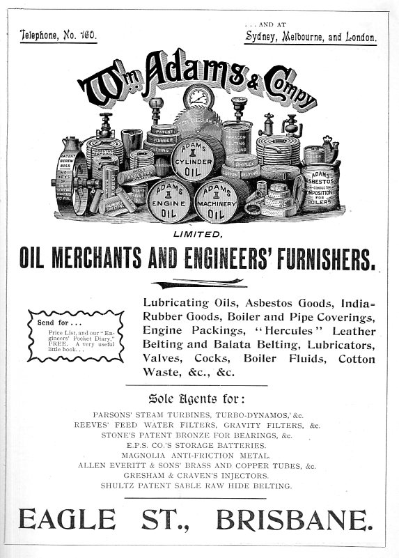
    I couldn’t resist this display found in a short work on the gold fields in Queensland, Australia. William Adams & Company furnished the necessaries for running oil rigs and various mining instruments. The gear is just nicely displayed and presented:

    Simoil merchant611

    Source: The Goldfields of Queensland. Charters Towers Goldfield, by William Lees. Queensland, Outridge Printing Company, 1899. 24.5x18cm, (xii), 34pp. Numerous small inset throughout, including larger images of works, as well as birds-eye views of Charters Towers, Queensland, and four other full-page photo images, plus a full-page plan of the works. (The title page calls for “With Plan” and I’m pretty sure that the full-page plan is it; I can find no evidence of a folding plan or any such thing in the table of contents. The publication is also filled with many advertisements. 


    Simoil merchant610

    ·Posted by :

    ·in:


  • Unbuilt New York City, 1935–Almost-Closing the NYC Harbor


    JF Ptak Science Books 

    Liberty Landing _1_602

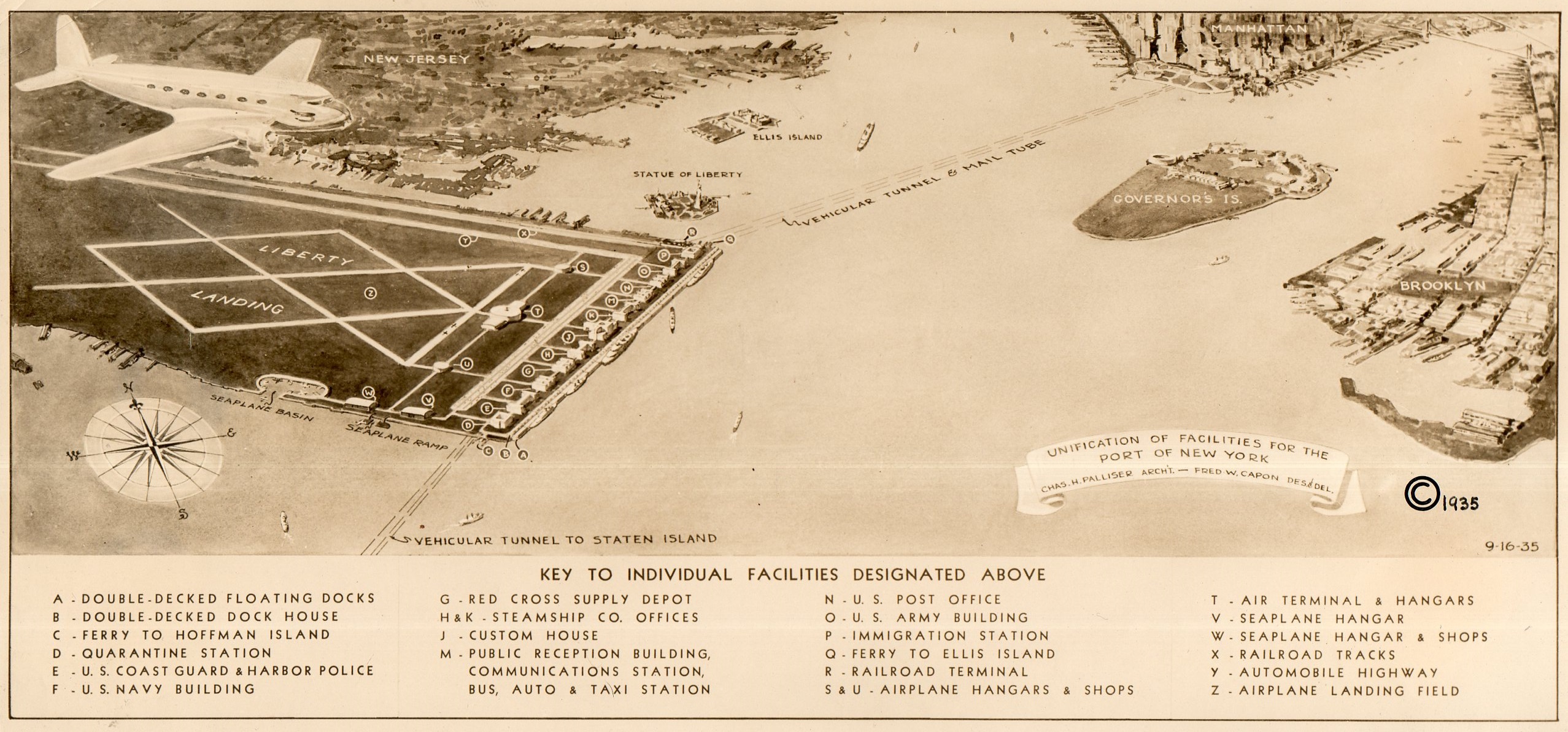
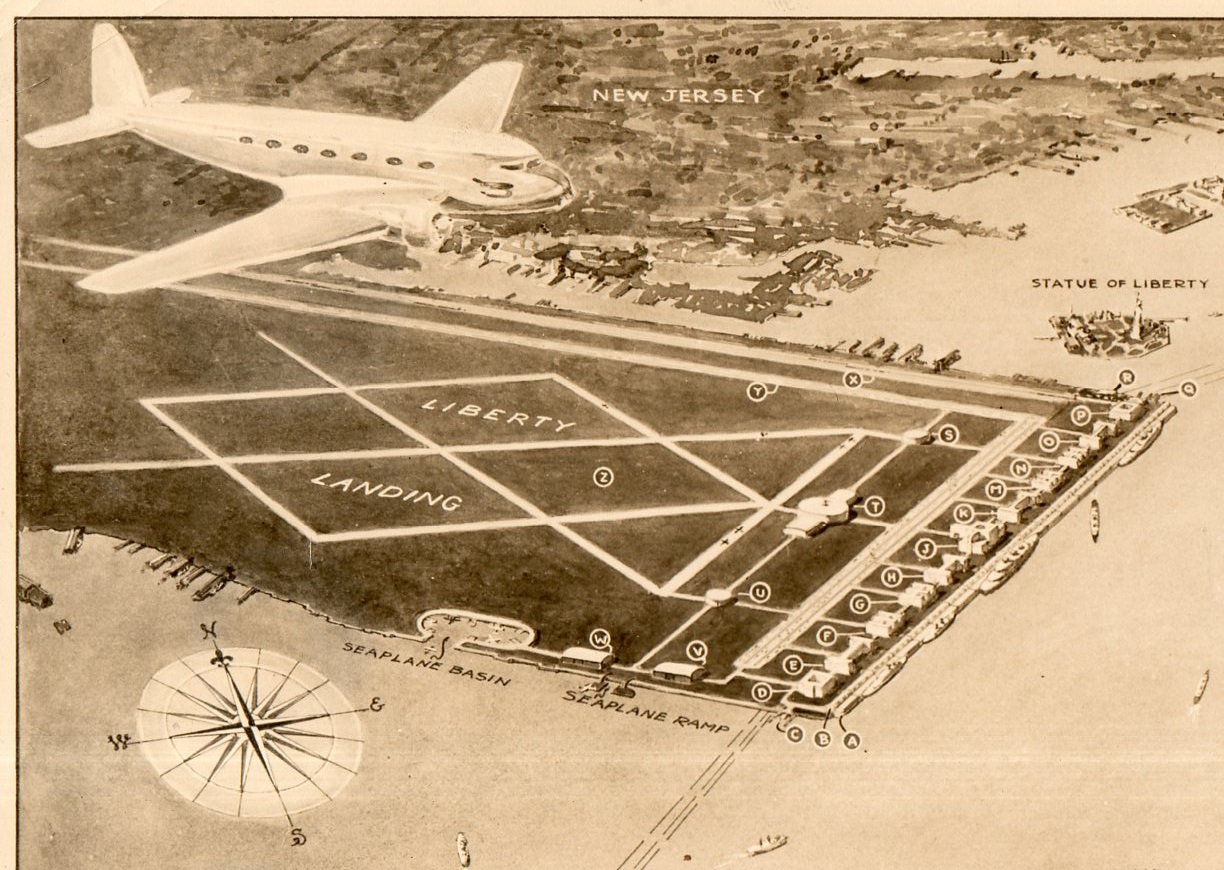
    I recently uncovered an interesting, unpublished and probably not-acceptable engineering report to extend the ports capacity in the Hudson River at New York City–the ports of the  area being famously over-busy for a long period of time, especially right before World War II.  Charles Palliser and Frederick W. Capon presented a proposal in 1935 for a unification of the port and airport facilities to take care of the overcrowding and overworked problem.


    Liberty Landing _2_603

    What they came up with was Liberty Landing, a mile-long and half-mile-wide facility that nearly bumped into the Statue of Liberty (and hence its name).  The plan called for backfilling the “flats” that were just south of Jersey City, as “the natural formation of these were very favorable”, which meant that the airport-port combo would extend all the way into the harbor to the edge of the channel, which would put it further out than the Statue of Liberty, which would also be just hundreds of feet away from the end of the north runway.

    Also attached to the backfill and new land would be a one-mile-long floating dock.  Oh my!

    The floating island would also have vehicular tunnels that connected it to Staten Island and the Battery.  There were facilities for seaplanes, airplanes, railroads, dirrigbles, and trucks, plus a military installation, a custom’s house and the US Mail Service, so that all commerce would converge at this one point, which sounds interesting (for about 20 seconds). 

    Dsc04773

    This is a good candidate for the “Better Left Undone” award for 1935.

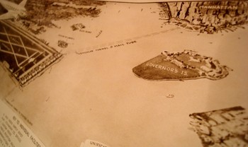
    As I look at the photograph of the aerial view of the plan it strikes me that if the designers increased the surface area by only 125% or so they could’ve connected the new facility with Governor’s Island AND Brooklyn, building a land bridge from Jersey City to Coney Island—a superbly bad idea to cap an already strongly bad idea. 

    The report is called, simply, Liberty Landing, and published by the architect in Jackson Heights, NYC, 16 Septmeber 1935.  This is also the U.S. Copyright Deposit copy (accepted 10 October 1935), which is where the history of this project ends.

    ·Posted by :

    ·in:


  • A Map of Television to Come, with a Price Tag (1946)

    JF Ptak Science Books  Quick Post

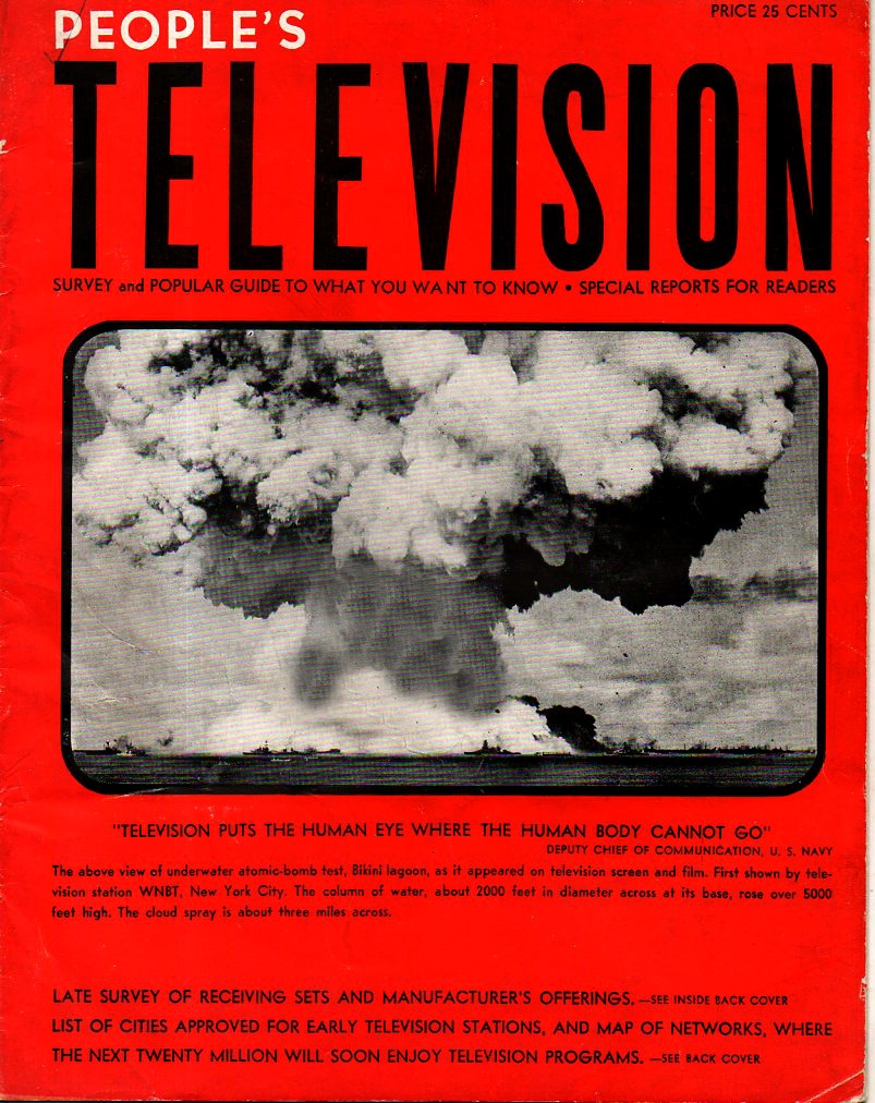
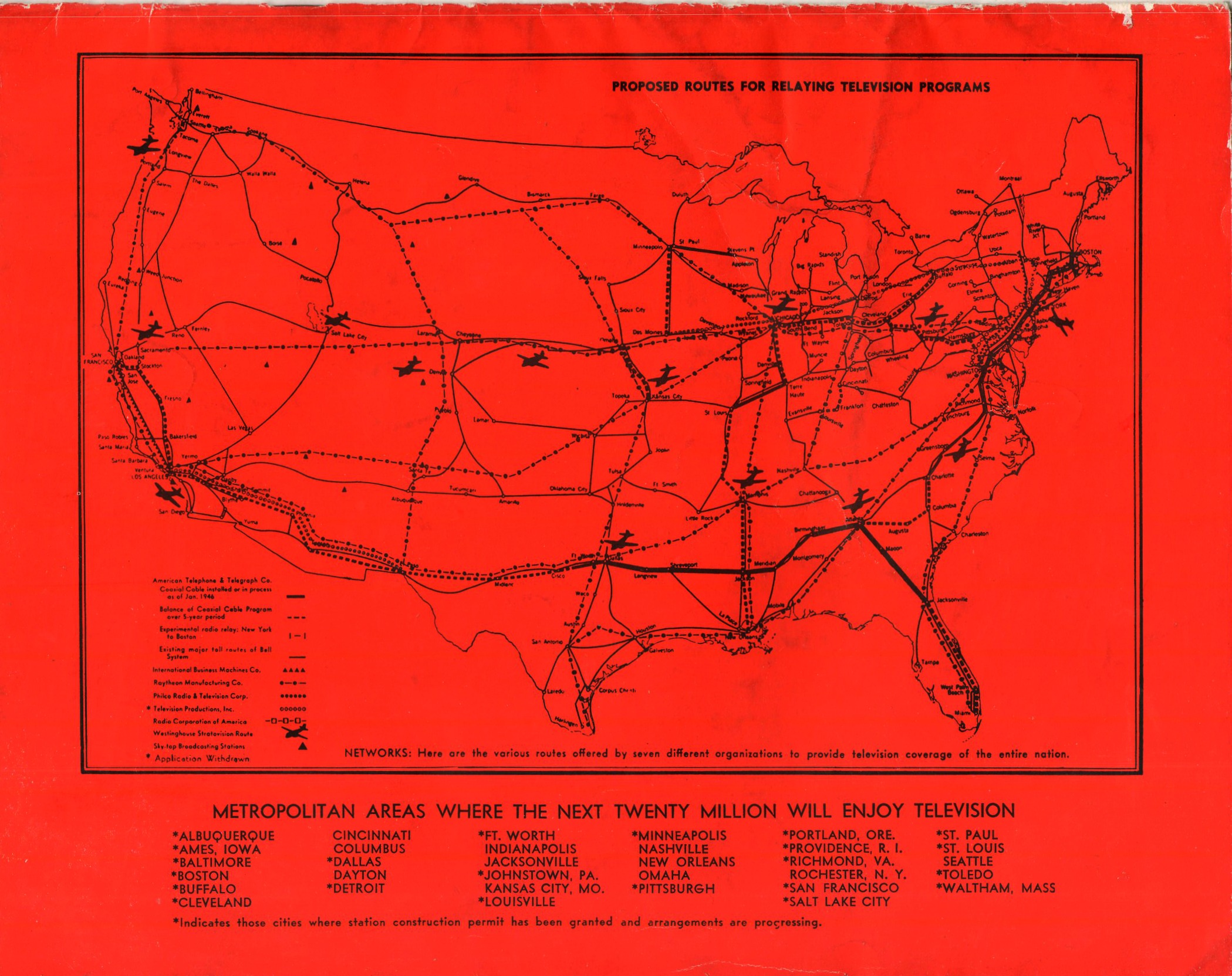
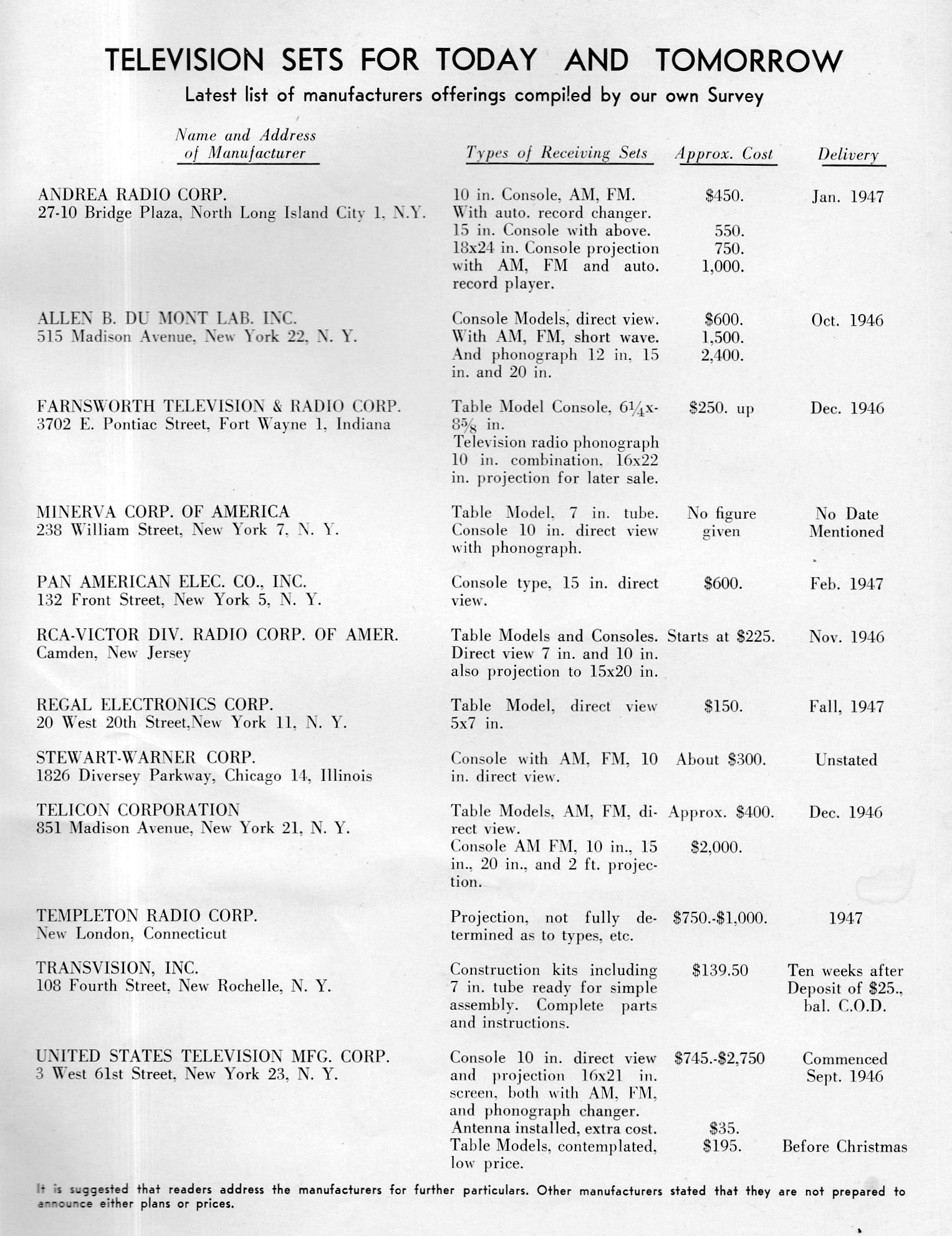
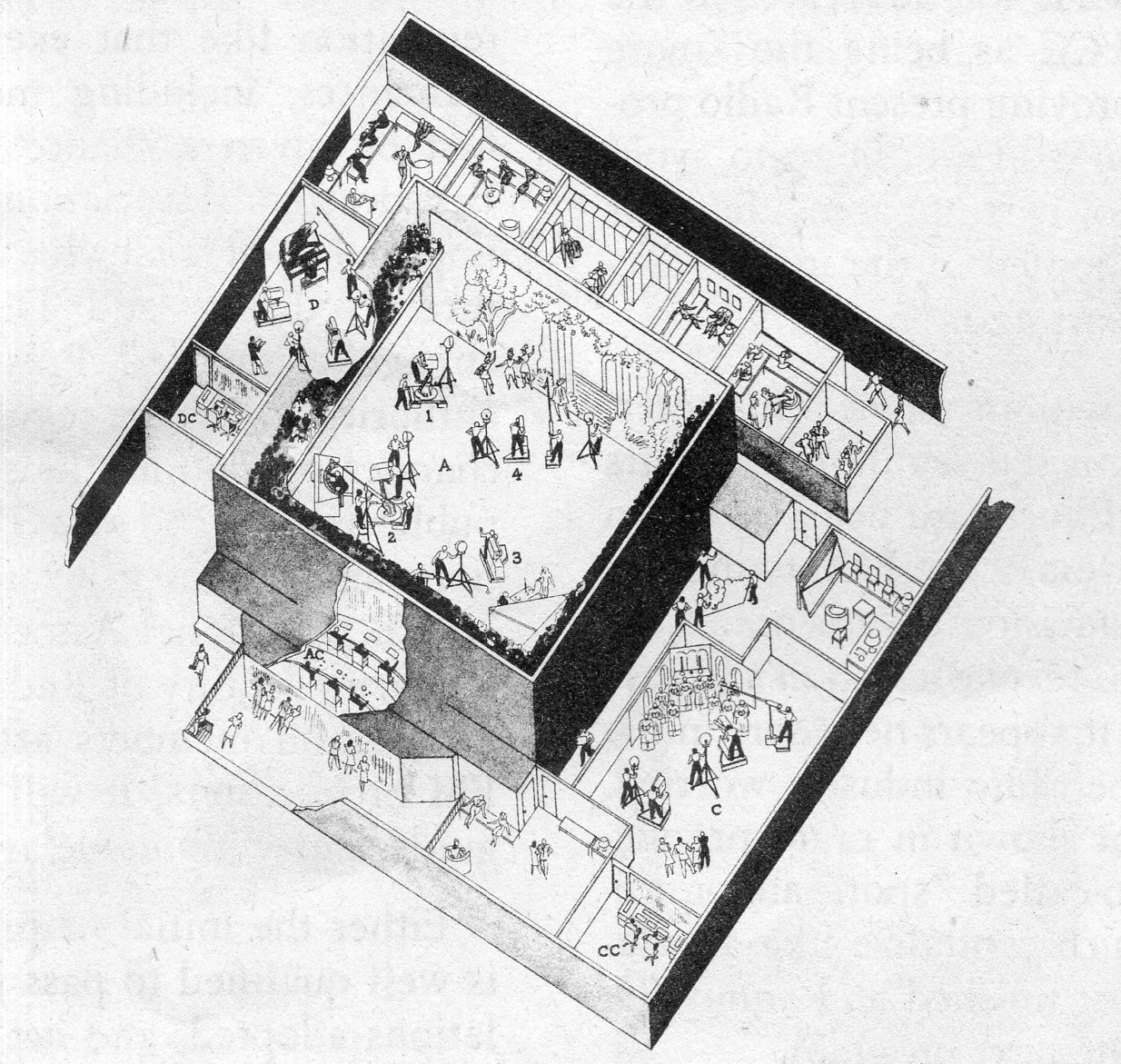
    On the anniversary of the Nagasaki bombing (today being August 9) I found this old friend down in the studio:  People’s Television, Survey and Popular Guide to What You Want to Know…” (possibly) by Walter J. Greene, which was published about a year after the bomb was dropped, received by the Library of Congress in December 1946. In a full twenty-four pages the author laid out the future of the young (“virile youth returned from war”) television and how signals could be transferred across the country for transcontinental broadcast, setting up the reader for the appreciation of the coming boom in the new medium. It includes a small section on how television programs are made (I’ve included a scan of a small diagram of the Du Mont-John Wannamaker Television Studios located at the Wannamaker store in NYC), a chapter on how the public will determine the content of television programming (“The Public is the Final Judge, Television can “Grow Up” More Quickly than Radio”), a bit on the future of television reception, color television (“A Cause for Some Speculation”), all followed by a reader quiz and a list of televisions and their prices.

    Of course the major draw for me in this pamphlet is its cover–one of many efforts using imagery of nuclear explosions to sell an idea or a product. The image is a famous one, being the second airburst test shot at Bikini, Marshall Islands, on July 1, 1946. The image has been cropped a bit, the full versions showing a beach and palm trees in the foreground.  Although it seems as though this was a mass-produced item, it just doesn’t seem to show up anywhere, nothing substantive in the intertubewebs, and the trusty WorldCat/OCLC finding hardly anything–surprising. 

    Peoples television _1_591

    And a map of the coming transmission scheme:

    Peoples television _map_592

    And a list of televisions available–remember that $1 in 1946 is about the equivalent of $12 today, so, $1000 for an upper end model would have been about $12k today, which is considerable:

    Peoples television _tv prices_595

    And of course the television studio of 1946:

    Peoples television _studio_593


    ·Posted by :

    ·in:


  • Blade Runner Retinal ID, 1936

    JF Ptak Science Books   Quick Post

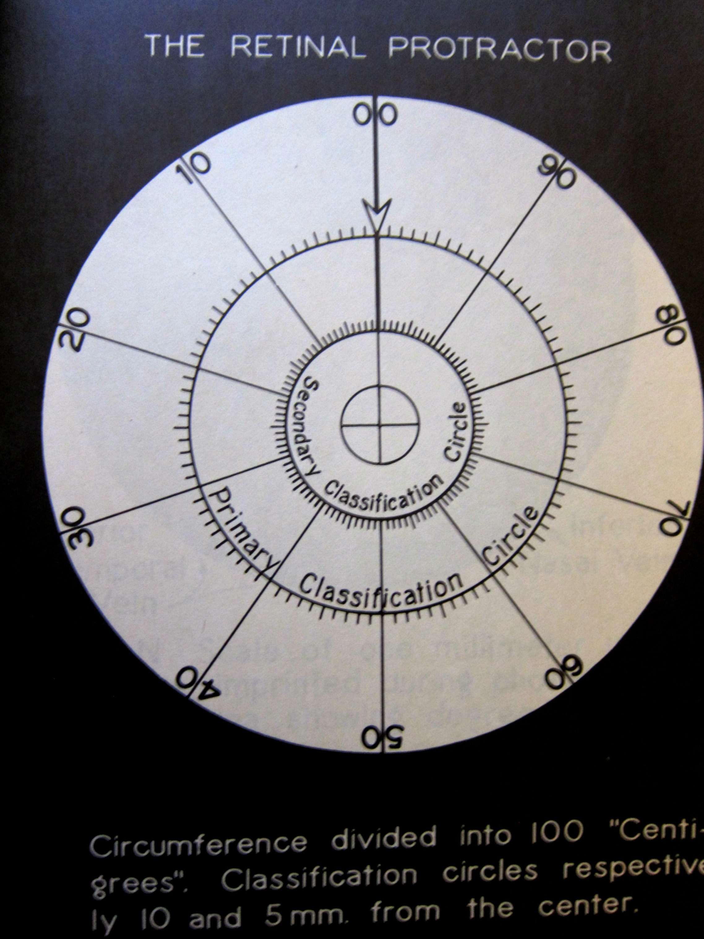
    Retinal identification is here, and it is in the future; it was in the past’s version of the future in the P.K. Dick Do Androids Dream of Electric Sheep? in 1968 which was turned into the film Blade Runner in 1982. But long before any of this was Carleton Simon and Isidore Goldstein, who figured out that everyone has a unique display of veins in their retina. Of course this is not exactly as obvious as fingerprints, but evidently it was a whole new thing in 1936–highly interesting. ANd what struck me was the “retinal protractor” which was like a grid placed on the photograph of the retina onto which the veins would be plotted, from there it went to another step to assign numerical values. 

    Retina id protractor

    Source:  Carleton Simon. The retinal method of identification; a new system of classifying retinal patterns. Presented at the annual convention of the International Association of Chiefs of Police at Kansas City,Mo.,September 21st to 24th, 1936.  11×8.5″ cover/title, followed by 4 leaves of photographs showing the sections of the retina, examples of the veinous patterns, and a retina protractor explaining the sections of the retina in a common language for placement.  
     
    Dr. Simon–“Criminologist of the International Association of Chiefs of Police, New York Association of Chiefs of Police…” is the Simon of Simon & (Dr. Isidore) Goldstein, whose groundbreaking paper1 introducing the uniqueness of the patterns of retinal blood vessels and their use in identification, was published on September 15, just a week before this address.  This publication may have been a handout for the address–it consists of one page of cover text and a separate four leaves of retinal pattern photographs with a cover sheet.  
     
    Notes:
    1. “One of the most accurate techniques for human identification is based on the uniqueness of the retina blood vessels pattern. The unique structure of the blood vessels in the retina pattern was first introduced in 1936 by Simon and Goldestein” . Simon C,,  Goldstein, I., “Retinal Method of Identification”, New York State J Med. 1936 Sep; 15– noted in “Retinal Identification System using Fourier-Mellin Transform and Fuzzy Clustering” Hadi Jafariani and Hamid Tabatabaee, Indian Journal of Science and Technology, Vol 7(9), 1289–1296, September 2014.

    ·Posted by :

    ·in: