A Daily History of Holes, Dots, Lines, Science, History, Math, Physics, Art, the Unintentional Absurd, Architecture, Maps, Data Visualization, Blank and Missing Things, and so on. |1.6 million words, 7500 images, 4.9 million hits| Press & appearances in The Times, Le Figaro, Mensa, The Economist, The Guardian, Discovery News, Slate, Le Monde, Sci American Blogs, Le Pont, and many other places… 5000+ total posts since 2008.

Author: JF Ptak

  • The Beauty of Public Restrooms (1908)

    JF Ptak Science Books  Quick Post    

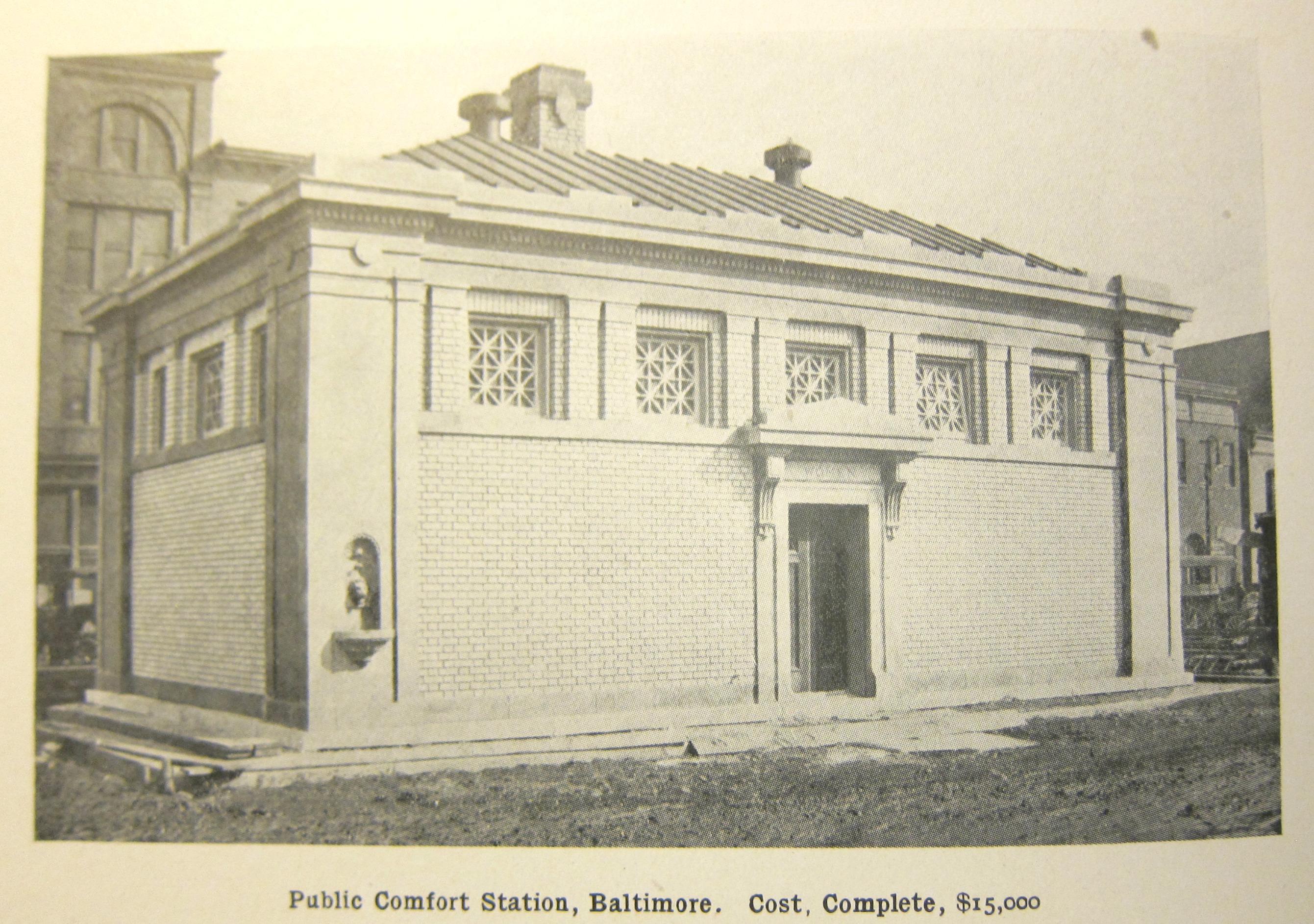
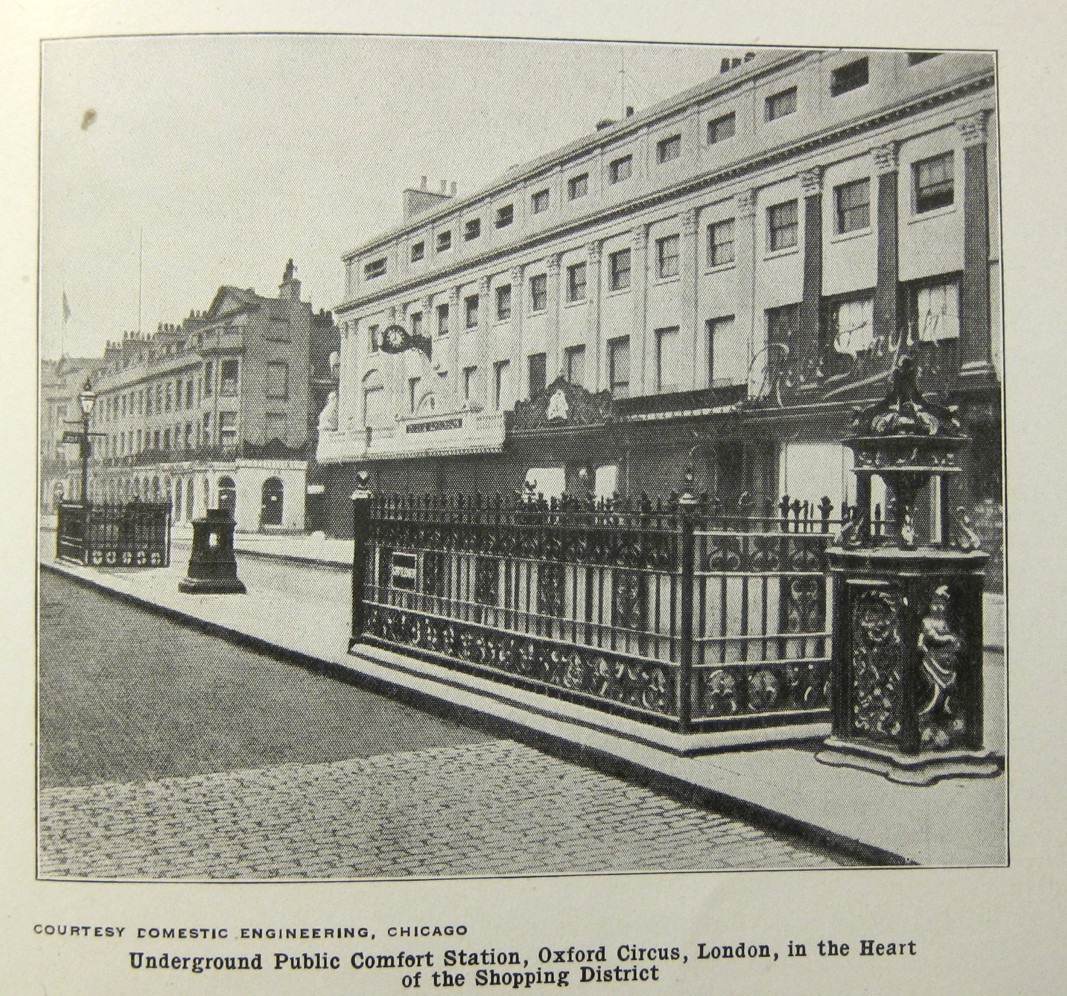
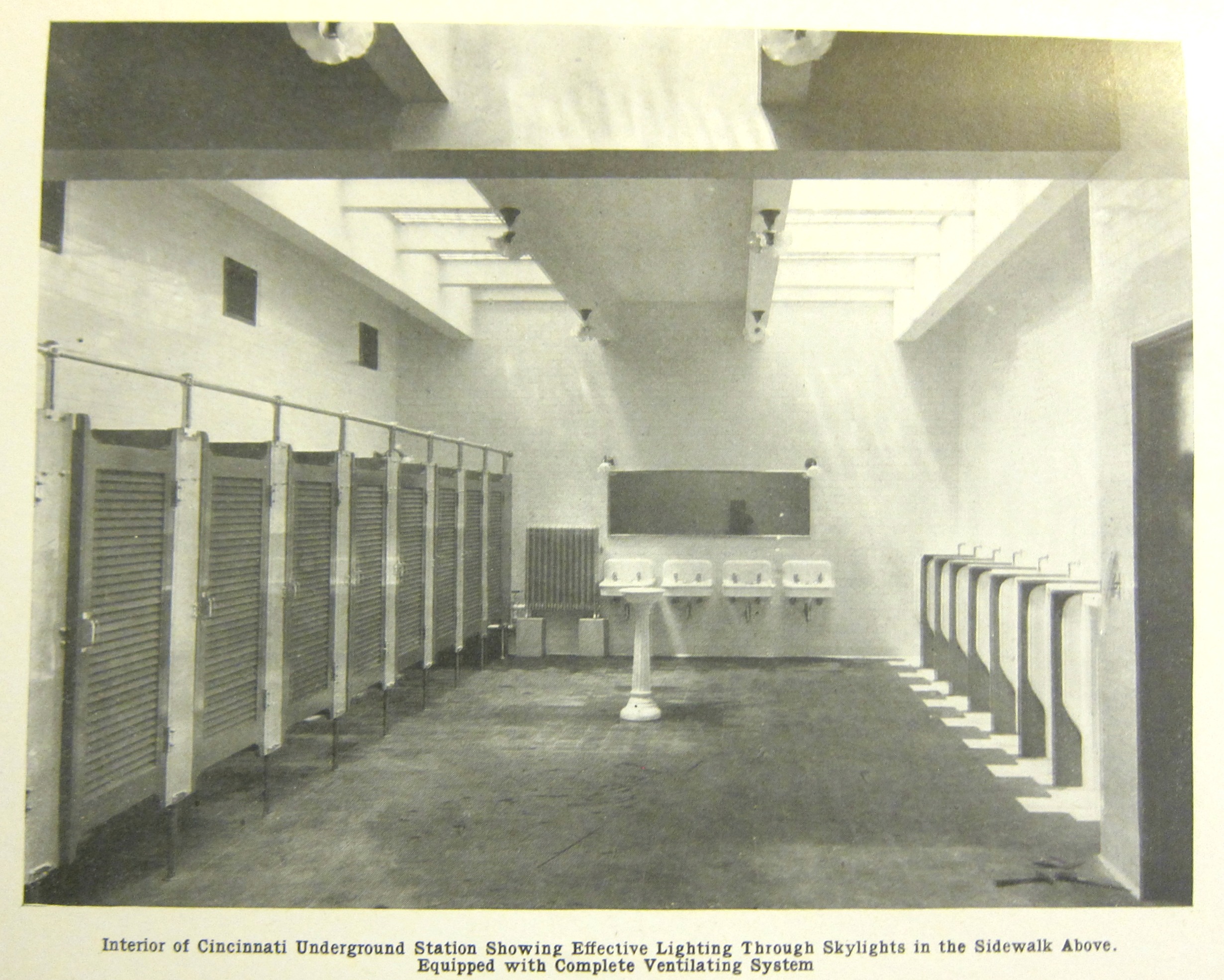
    The pamphlet’s title was both pre-forgettable and irresistible: “Public Comfort Stations for Saint Louis”. It was published in 1908 in plain vanilla wrappers by the Civic League of St. Louis, though the title has little cadence and does not lend itself to poetry (not many good words rhyme with “ouis”) and is way too rich in blocky syllables for haiku. The pleasant surprise in this little package were the unexpected photographs and plans of Worldwide Restrooms, which for reasons that require no explanation I decided to reproduce below. 

    Comfort stations _2_


    Comfort stations _3_


    Comfort station _5_

    ·Posted by :

    ·in:


  • Another Episode in Our Bulbous Future (1931)

    JF Ptak Science Books   Quick Post    

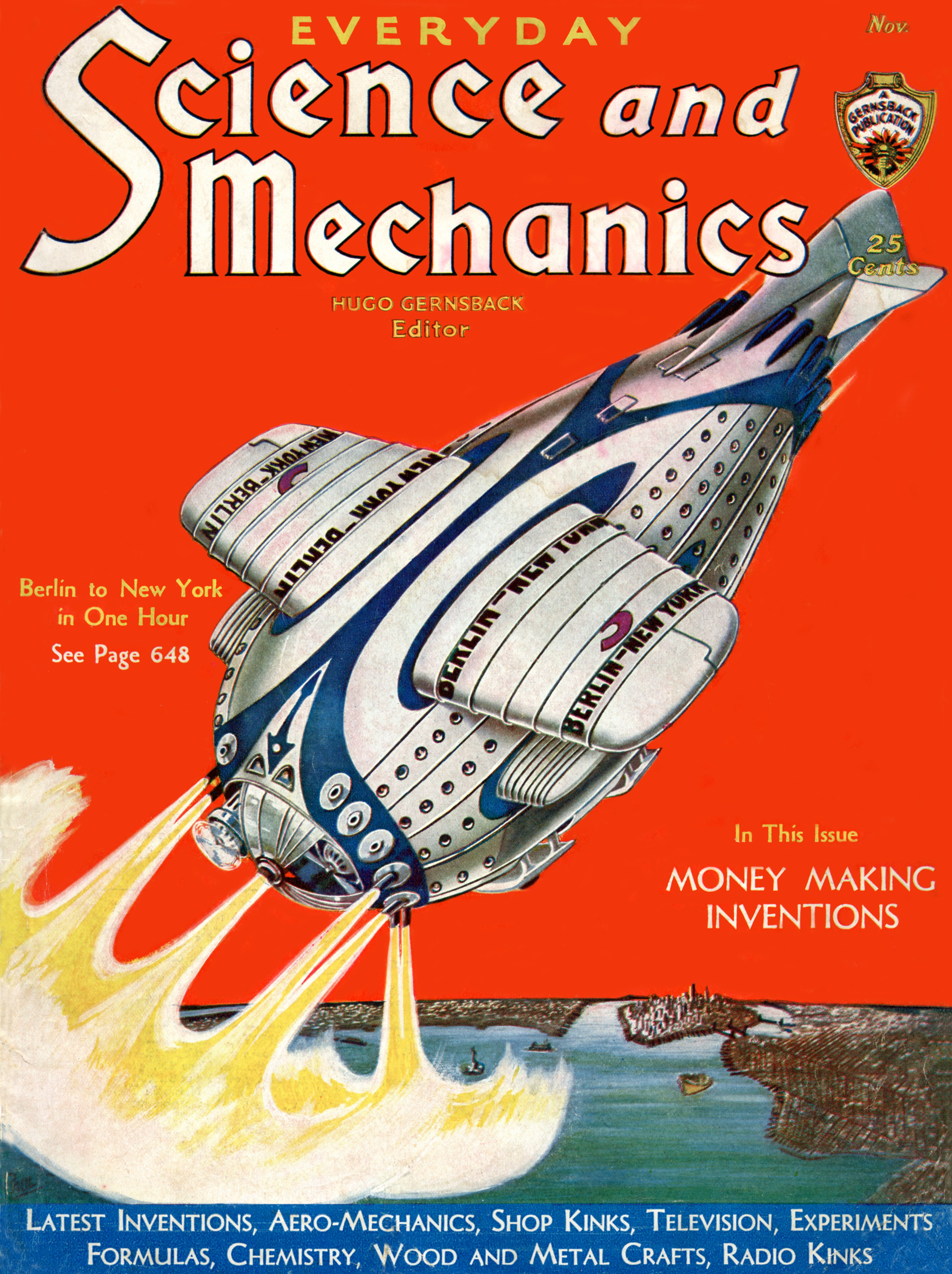
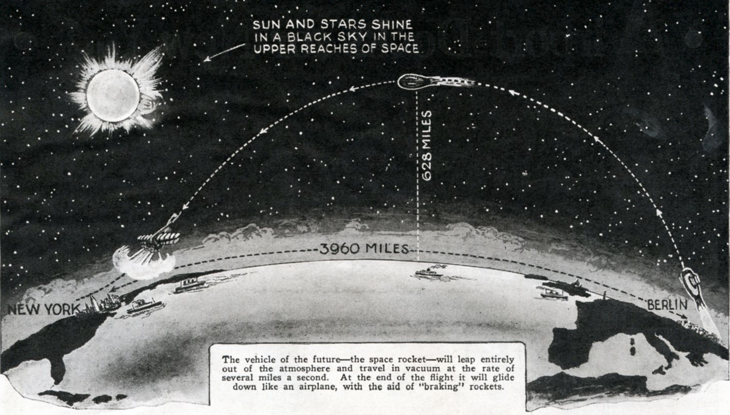
    I’ve written several posts here on the great science fiction/speculative science illustrator Frank R. Paul, and I am returning to him now with this glorious image of spaceflight commercial services. It appears in Everyday Science and Mechanics, published in November 1931 (volume 2/12), and the great Bulbosity is featured splashily on the cover. The airship was supposed to get its passengers 628 miles into space to complete a one-hour arc from Berlin to New York City, and the image shows us the end of a flight,  the craft slowing above the bay, just south of Manhattan and Brooklyn and north of Staten Island:


    Everyday Science_and_Mechanics_Nov_1931_cover bulbous

    Image source: Wiki Commons, https://commons.wikimedia.org/wiki/File:Science_and_Mechanics_Nov_1931_cover.jpg

    Text: https://commons.wikimedia.org/wiki/File:Science_and_Mechanics_Nov_1931_pg648.jpg

    And the cross section of the journey:

    Everyday Science_and_Mechanics_Nov_1931_text

    Hugo Gernsback–the author, editor, creator, publisher, and major force in the history of science fiction–wrote the article, and although many problems associated with space flight had already been at least semi-solved, there was still a big hurdle to go: fuel.  Yes, and the engines that the fuel would power.  There are no specs for the ship, but offhand –judging the portholes to accompany a seat–I’d guess that the ship was at least 200′ long and 80′, and was getting into orbit under its own power. And by the looks of things, there wasn’t much space for the engines that would do that. It seems that Mr. Gernsback was confident that the problem would be solved by 1946.  I know that the facts and figures don’t have much to do with the actual vision, because those are the things that could get in the way of visionary thinking, sometimes. Seems that here there would be no real encumbrances like that here to get in the way of this lovely idea.   


  • The Rolling Houses and Glass Homes of Futurlandia


    JF Ptak Science Books   [Part of a series on the History of the Future]

    The rolling house of the future (offered in the September, 1934 issue of Everyday Science and Mechanics) promised at least one thing–the ability to be towed by a tractor.  (And seeing that the thing is being pulled along by chains, let’s make sure that there’s no downhill towing, yes?)

    Rolling_house_large

    [Image source originally located via  Retronaut though now I cannot find the correct links for them. Sorry!]

    The spherical houses seemed to come with their own railroad tracks for easier motion–a continuously self-laying track, which would make the new American suburbs a Suburbia Mobilia.  Cheap cars, cheap houses, and a Great Depression might have made for a picture of the future that was very self-sustaining.  On the other hand, the one thing that would not have been in the gunsights of the American manufacturing center is the size of the houses, which seem to me to be on the order of 500 square feet or so, which does not make for a lot of room to store all of the consumables that were waiting just around the next decade or so, waiting for the first real generation with a large amount of disposable income to loosen on all manner of never-to-be-purchased-before-by-the-working-classes consumers.  In this respect I am sure that these small buckets for human life would seem unacceptable, leaving little room for purchases. 

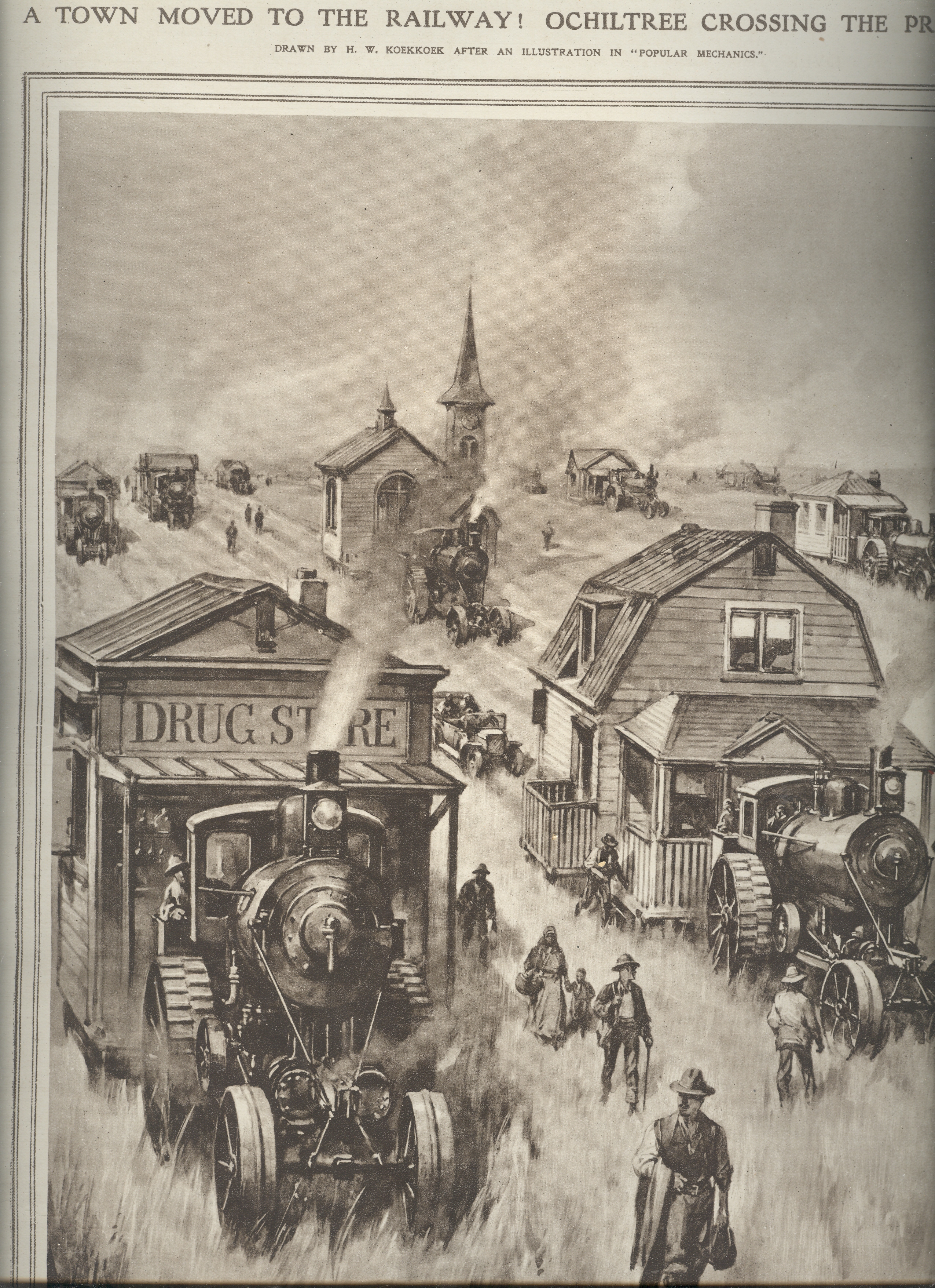
    ++00++ 9.25 ochiltree, texas

    It does remind me of wholesale town-moving, but from the past–real-life stuff, things that happened.  Like here, for example, in  Ochiltree, Texas, 20 October 1920.  This was a rare occurrence–to move a town–though it is hardly unique, particularly if moving the town closer to a railroad line that had decided to pass it by meant the difference between life and death of the town, then, well I guess you moved the town if you could.  Cemeteries included, sometimes; and sometimes not.

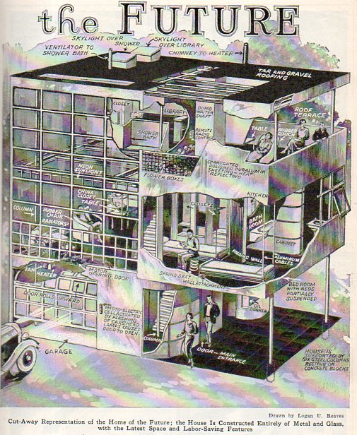
    A memory of another image of a futuristic future house of the future pulled my recent memory to a volume of Popular Mechanics for 1931, the August issue, featuring a “Home of the Future” speculation–this one was also small, but far less mobile, being constructed of metal and glass; and from what I can see, the common home’s exterior walls were mostly glass.

    Future house514

    It looks like a small place–I’m not sure that the car would actually fit in the glass garage.  And it doesn’t look all that comfortable, either, especially in regard to having no walls for bookcases.  (A wall of shelving for a collection of Kindles?)  There *is* a “skylight over the”library”, but it looks like the library isn’t more than a half case of books.  But perhaps in the future we are all entering a world where something is whatever we call it.  Oh, yes, I think that part of the future has already arrived in 2012, and I doubt seriously that the folks writing this article for a popular audience had anything more than a droll popularity in mind in their authorship.  In any event, this future house wasn’t mobile, was small, and looked pretty uncomfortable. And I also bet that the roof gave them problems up there in Futurlandia. 


  • Strange Things in the Sky Department

    JF Ptak Science Books    Strange Things in the Sky Department  

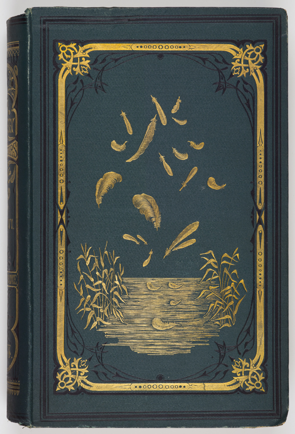
    In the 30 or so posts I’ve made in this department I have yet to deal with anything having to deal with birds. This is understandable since they’re the ones who have been up in the air for 200+ million years (or at least late Jurassic), while humans have been in the air for only about .0001% of that time in our controlled falling.  

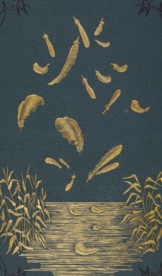
    Feathers detail

    [Source: Allan Hume, Stray Feathers, a Journal of Ornithology for India.…1879, American Museum of Natural History, here.]

    But it still struck me as odd, these feathers in the air, and very uncommon to my decades+ experience of Looking At Pictures. They are simply a gilt-stamped decoration in a book cover, a piece of arresting design, for an ornithological journal (see below)–still, it is an unusual image, in-context or not. 

    I imagine that if you were resting on this little body of water from the journal cover and one of those feathers happened to fall on you that it would be quite the experience.  But there was a time when receiving a feather meant something far worse than an unusual natural history experience. That was the other thing about this unusual book cover decoration–it reminded me of a piece I read a few years ago (found again!) by Francis Beckett of The Guardian who tells a very difficult story about his grandfather receiving a white feather from a complete stranger on the street during WWI.  The brief story here is that his grandfather tried to enlist in 1914 but was not accepted because of poor eyesight and also being the father of three girls; but, while out and about in 1916 he was handed a white feather from a woman on the street, a complete stranger–that feather at the time being a symbol for cowardice.  Evidently the grandfather went the next day to enlist, and after millions of deaths the eyesight/children issue two years earlier was no longer an issue–he was accepted,  and fought for two years before being killed in 1918.  Beckett’s grandmother held the white feather woman responsible for her husband’s death.  

    The feather has meant many things to many cultures for thousands of years, and nearly all of it was good:  ascension, lightness of being, virtue, glory, flight, and so on, mostly having to do with cosmic connectivity.  On the other hand using the white feather for taking flight from duty and cowardice was a devastating thing.  

    And the full image:

    Feathers

    [Source: Allan Hume, Stray Feathers, a Journal of Ornithology for India.…1879, American Museum of Natural History, here.]

    ·Posted by :

    ·in:


  • The K.K.K., the Catholic Church, and (Badly) Organized Labor (1923)

    JF Ptak Science Books   Quick Post

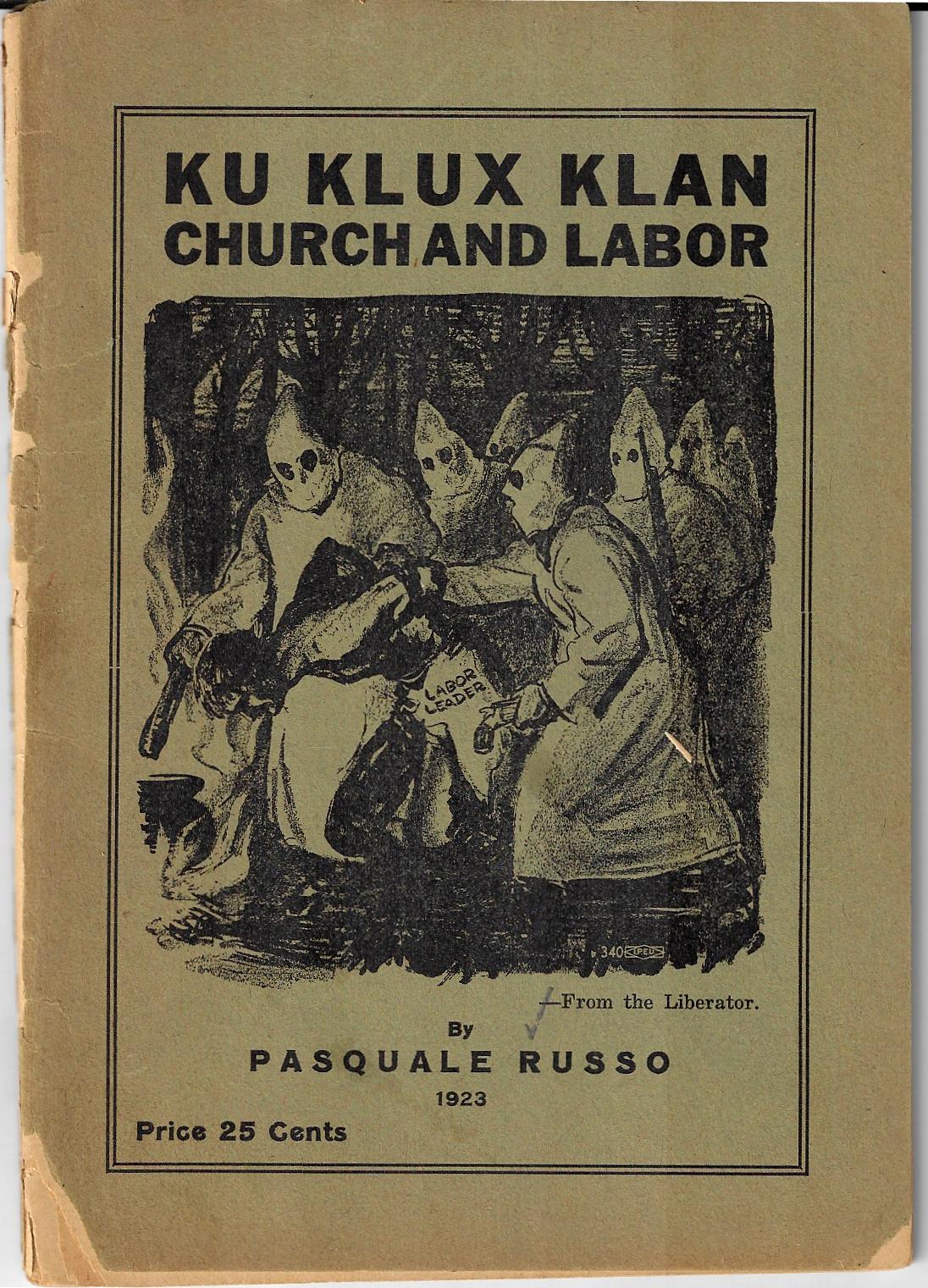
    KKK Church and Labor 1923The author of this curious work1, Pasquale Russo (who also wrote “Negro Slavery or Crime of the Clergy” and “Tony the Immigrant” among others) makes a case against the K.K.K., and also manages a conjoined condemnation against the “Church”–and that being, so far as I can tell, the Catholic Church–all the while building a very strong pro-labor (Socialist?) overview for the improvement of the condition of the working classes. This seems a little unusual to me as the K.K.K. was also anti-Catholic, making similar arguments against that religion as Mr. Russo. Mr. Russo’s reasoning behind the attack here seems to be that the Church was in its way complicit with the actions of the K.K.K. by being against labor, as was the Klan, and so with this thinking the Church was pro-K.K.K. and anti-working class by restricting the freedom of the laborer, and against “the solidarity of the white and colored”.  There is very strong support in the pamphlet for the Negro worker (the “N” in “Negro” being capitalized at a time when even that small dignity was rejected by many in the publishing industry), railing against the  segregationist policies of the “United Federation of Scabs” (the American Federation of Labor, A.F.L.) and Samuel Gompers and for being the “lickspittles” of the ownership class. The pamphlet was published at an interesting time–1923–for the main aspects of the work: there was significant anti-Catholic leanings high and low throughout the country; the K.K.K. was about halfway through its second very short-lived revival before its collapse later on in the decade; the African American as a race and as a worker class was still very abused; and the infatuation with Socialism and the newly-formed Soviet Union was young and growing. So the pieces of history were there, though they are in a jumble. 

    The pamphlet is a highly problematic but forensically-interesting work, and speaks to its times in a number of ways–that said, I am not sure where this fits in with anything, and how much of Mr. Russo’s self-published philosophy was shared and how much of it was simply an externalized internal insight. 

    Overall my little graze through this pamphlet left me a little tired and depressed–it did give me some sort of understanding of something, but I don’t know what. 

    Notes:

    1.  Pasquale Russo, Ku Klux Klan, Church and Labor, 1923; published by Mr. Russo in Chicago (833 Sedgwick Street). 7×5″, 59pp.   Provenance: Library of Congress, with their surplus/duplicate rubber stamp on the rear cover.  WorldCat/OCLC locates 16 copies.

    When I looked up 833 Sedwick on Google it seems as though it is just an empty lot wit a fence made of found bits of corrugated metal and chain link. 

    ·Posted by :

    ·in:


  • A Beautiful Solar Eclipse Print (1858)

    JF Ptak Science Books   Quick Post

    Eclipse913


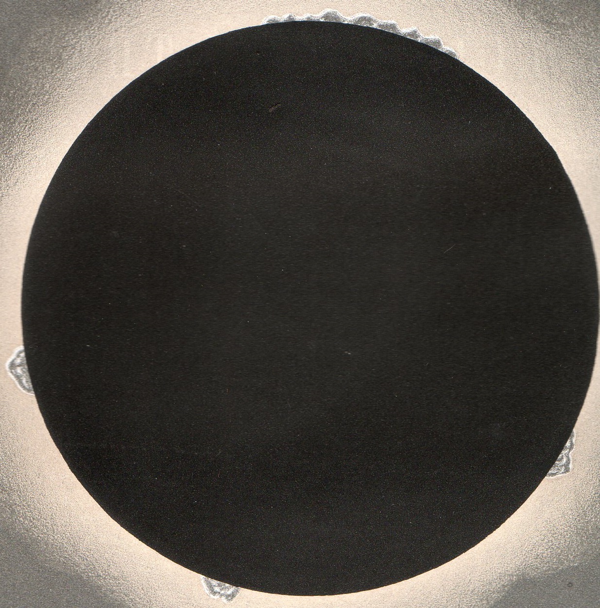
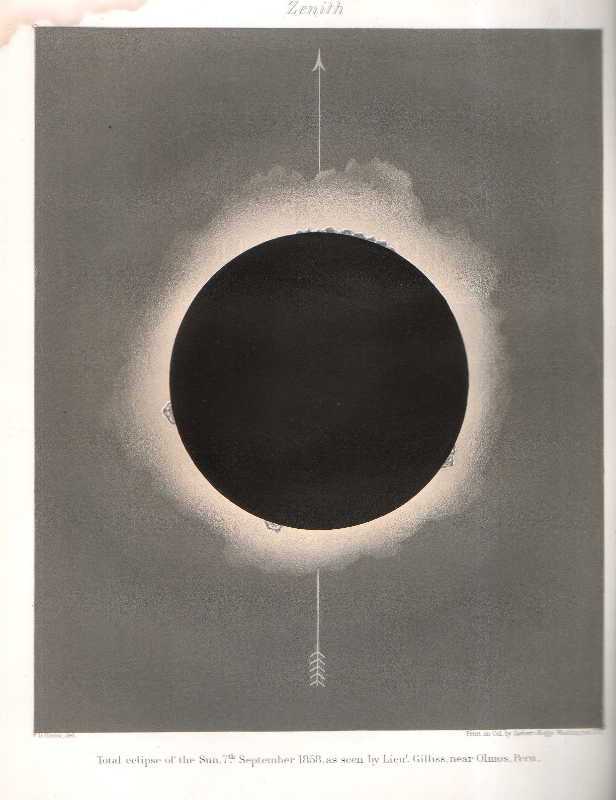
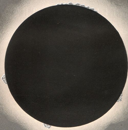
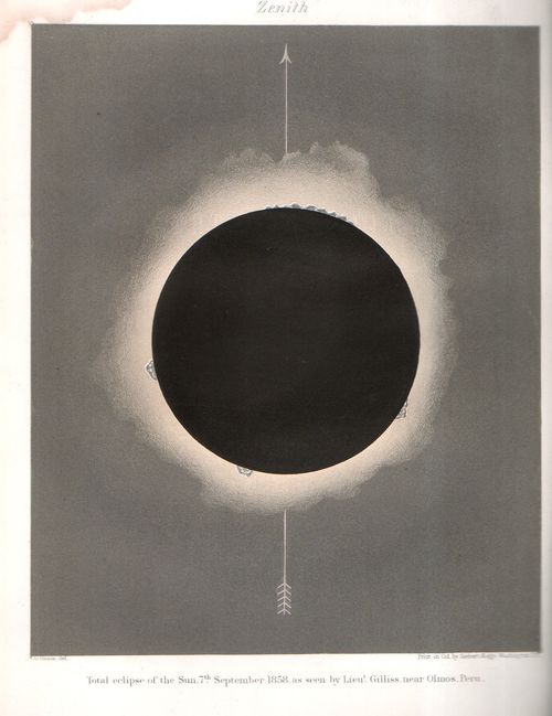
    F.G. Hesse captured this dramatic image of total eclipse at Olmos, Peru for Lt. James Melville Gilliss’ report of the event that he chased down for the U.S. Naval Observatory and the Smithsonian in 1858. Gilliss (1811-few months too short of the end of the Civil War in 1865) was a Georgetown boy who is buried in the beautiful Oak Hill Cemetery, and best known probably for being in charge of the Naval Observatory (previously the “National Observatory”), which was teh first national observatory established in the U.S.  He took over that position from Matthew Fontaine Maury1 (as in “Maury Day” celebrations in Virginia and being the father of American Oceanography and a prominent figure in the Confederacy) and was a position he held until his untimely death at age 53. The report in which the eclipse image appears is An Account of the Eclipse of the Sun, published in the Smithsonian Contributions to Knowledge series in 1859.

    In the report it sounds as though Gilliss was not prepared for the effects that the eclipse had on his non-experimentalist persona, and how awestruck he was to see it once in totality:

    “The screen of the glass [from the telescope] was hurriedly removed, and in the brief instant of doing so I found, to my surprise, that all the phenomena were distinctly visible to the unassisted eye.”

    “A corona light flashed out at the instant of totality. It extended farthest from the sun, in lines drawn from the centre through the solar clouds, but was nowhere traceable more than 15′ or 16′ beyond the lunar disk. There were no radial streamers, or bundles of rays, but only a uniformly diminishing, and slightly orange-tinted light, whose brightness and extent were apparently influenced by the mist-film, as the color of the clouds also may have been. Beyond the corona light, the color of the sky was of a grayish-black.”

    And then: 

    “It was a far more imposing sight without than with the telescope, and long has been my experience in the investigation of celestial phenomena, and calm and unimpassioned, at such times, as my temperament has become, the sublime majesty of the scene thrilled me with excitement and humble reverence.”

    During and after the eclipse Gilliss reported on the behavior of the town:

    “For some minutes previous, all work in the valley below us had ceased, and even the strains of martial music, which the Governor of Olmos employed to cheer laborers digging for water, two or three miles from town, were no longer audible. Superstition is still dominant here, and we hear the solemn toll of the church bell, whose sounds were intended to drive evil spirits from its vicinity.”

    “Neither at Olmos nor Piura, did any enceinte woman leave her room during the eclipse, whilst some from curiosity, but more through fear, were in the streets, yet not daring to look upon the sun, lest malady befall them. The somber green light gave them the appearance of corpses, and they apprehended that a plague might be visited upon them. Afterwards, the muleteers told us that their animals stopped eating, and huddled together in evident alarm.”

    Notes.

    1. Maury left the Observatory to become  a high-ranking official and overseas representative with the Confederacy at the outbreak of the war. The writeup for Gilliss in Wikipedia includes the coy and Victorian statement about Maury joining the Confederacy to fight for separation from the United States, with Gilliss promoted to the Maury position “when Maury responded to serve his state, kin and friends…” with no mention of the Civil War. 
    Eclipse912

    ·Posted by :

    ·in:


  • Moving the Atlantic Inland

    JF Ptak Science Books   Quick Post

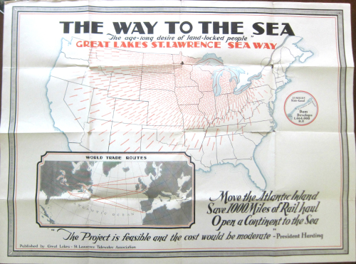
    Here’s an arresting image: the arrows of transportation interests directing themselves inward, inland, to the Great Lakes, ca. 1923.  The map is a bit of advertisement–a “convincer”–to send more economic traffic through the Great Lakes and of course the Great Lakes–St. Lawrence Seaway. Somehow it was making more sense to the writers of the copy for this idea to send freight from Virginia and Pennsylvania and New York away from the coast and up to the lakes, even though that would triple or quadruple the shipping times for those goods. Some of this makes sense, some doesn’t. Anyway, the resulting map is quite a piece of work–but I do think they should’ve let the Atlantic coast stay where it is.  

    Maps Move Atlantic Inwards


  • The Fate of the Future & the Ironies of Artistic “Futurism”

     JF Ptak Science Books

    “The oldest of us is thirty: so we have at least a decade for finishing our work. When we are forty, other younger and stronger men will probably throw us in the wastebasket like useless manuscripts—we want it to happen! They will come against us, our successors, will come from far away, from every quarter, dancing to the winged cadence of their first songs, flexing the hooked claws of predators, sniffing doglike at the academy doors the strong odor of our decaying minds, which will have already been promised to the literary catacombs.”–from the “Futurist Manifesto”, by F.T. Marinetti, 1909

    They came for Mr. Marinetti (1876-1944) a little earlier than that, and continued to come, though whoever it was that came couldn’t quite reach the founder of Futurism, who seemed to be one invisible step ahead of oblivion.  Or perhaps it was behind?  I’m not sure.

    But futurism as a movement was more in the past than in the future, barely lasting long enough to have anything but a past.

    Mussolini

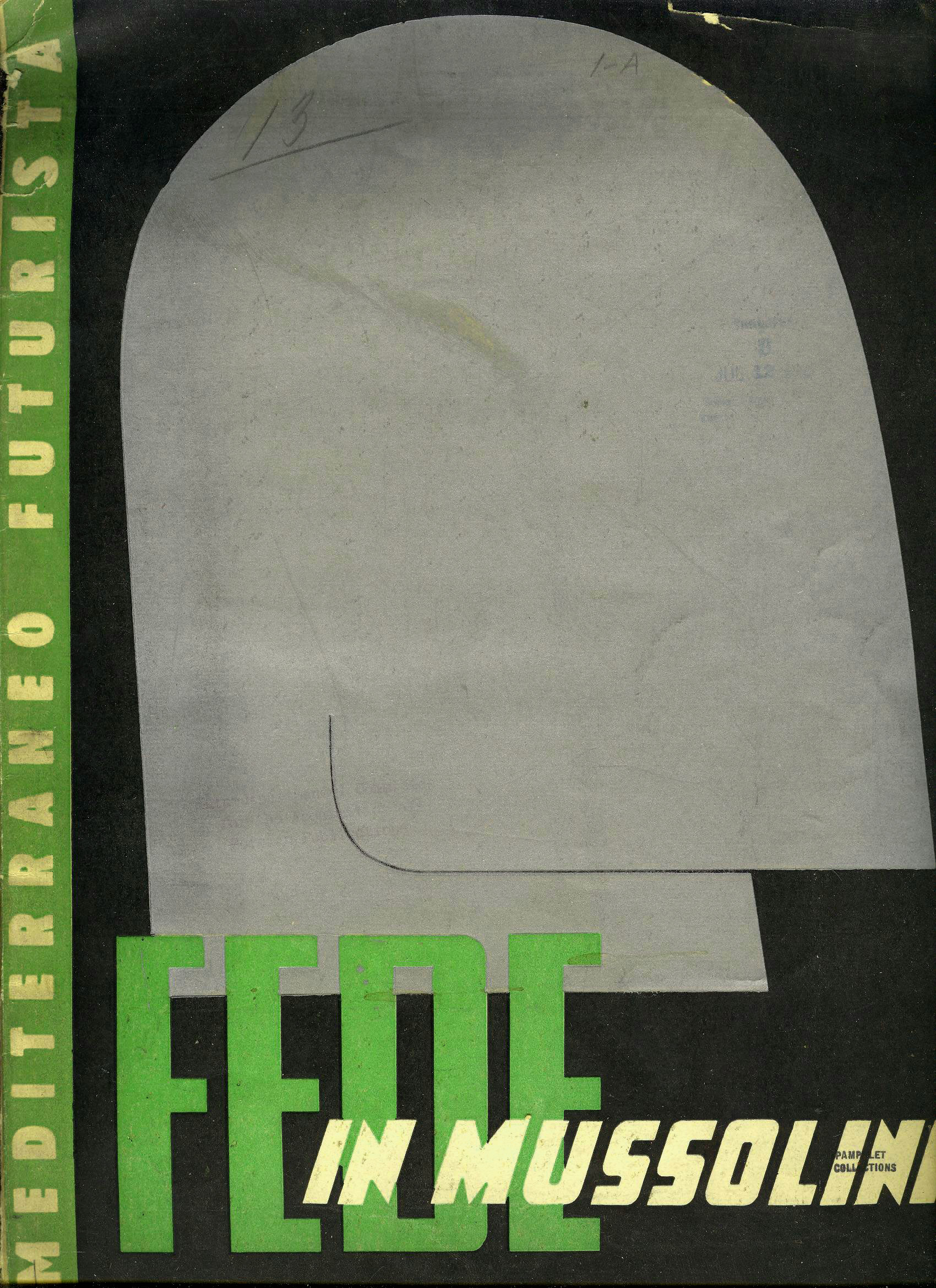
    • This is the cover of a magazine edited by Marinetti and others, a hagiographic-porn hommage to the leader of the Italian fascist government, Benito Mussolini, featuring a very striking portrait of the leader on the cover. (I’ve seen a note elsewhere stating that the image on the cover is by (Mari Biazzi (1880-1965)) though I could not find any other references for that. Also I’m not sure about the journal, as it comprises the names of two Futurism journals, Mediterraneo Futurista and Fede in Mussolini (“Faith in Mussolini”).Apologies for this incompleteness. Mostly I just wanted to share the image given its particularly brutal Brutalist aspects.)

    Not that the movement wasn’t important–it was, obviously–its importance branched out into other areas and movements, morphing into necessary branches, leaving behind a shell of the original tended by the originator.  (It can be argued that this movement helped create the environment for Dadaism and Cubism [or at least Cubist-futurism as in the Russian sense of that art].)  Marinetti had some unsavory and some just downright weird political and social ideas, having a long and vested interest in fascism.1  And not only the earliest part of Italian fascism –founded in 1919 with an interest in expanding the democratic process–but the later, Mussolini-controlled Italian fascism as well.  Marinetti sought the protection of Il Duce,2 and even so during the war, when he sought to protect his movement’s art from being designated as “degenerate ” and therefore unacceptable and existence-deniable by Adolf Hitler.

    And so the unlikely prolonged existence of futurism–a movement transformed far beyond itself in a matter of years, held together by pieces of fluff and dust, supported in its old age on the hopes of a noxious political system which was itself doomed to rapid failure.

    “At last they’ll find us—one winter’s night—in open country, beneath a sad roof drummed by a monotonous rain. They’ll see us crouched beside our trembling aeroplanes in the act of warming our hands at the poor little blaze that our books of today will give out when they take fire from the flight of our images.”  –F.T. Marinetti, from his “Futurist Manifesto”, 1909

    Notes

    1. Marinetti’s goal was to establish futurism as the official art movement of the government–something he specifically wrote against in earlier incarnations of himself.  He would come to loggerheads with much of his earlier social opinions, abandoning his beliefs in his never-ending quest to promote his movement.  I must say though that Marinetti did publicly speak against anti-Semitism.

    2. Marinetti sought to have the Nazi traveling exhibition of degenerate art–which included works by futurists–banned from Italy.  So even though the Nazi fascists established futurism as degenerate, Marinetti was able to enlist the aid of Mussolini to shield Italians from what the Nazis thought of the art.  But the futurist manifesto seemed comfortable with the while idea right from the start, as we can see in proposition #9 of its self-proclamation: “We will glorify war – the world’s only hygiene – militarism, the destructive gesture of freedom-bringers, beautiful ideas worth dying for and scorn of woman…”


  • On Not-Missing the Not-Unhidden Darwin and his “Masterpiece” Map (1845)

    JF Ptak Science Books   Post 2680

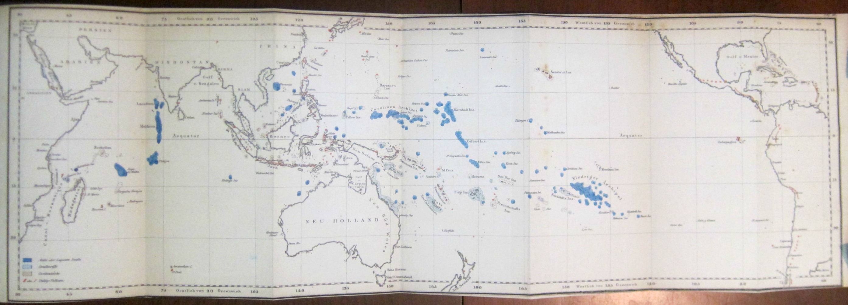
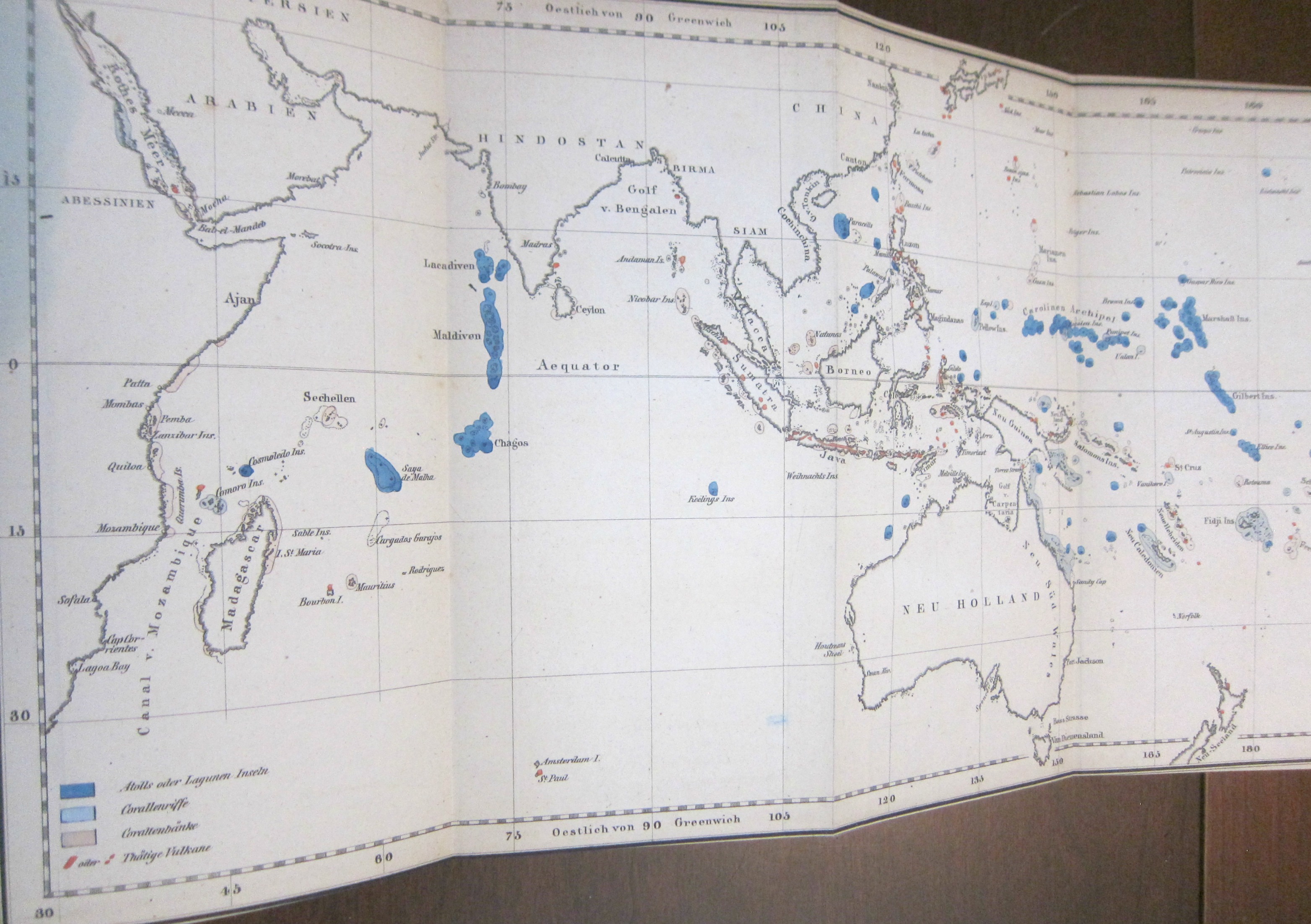
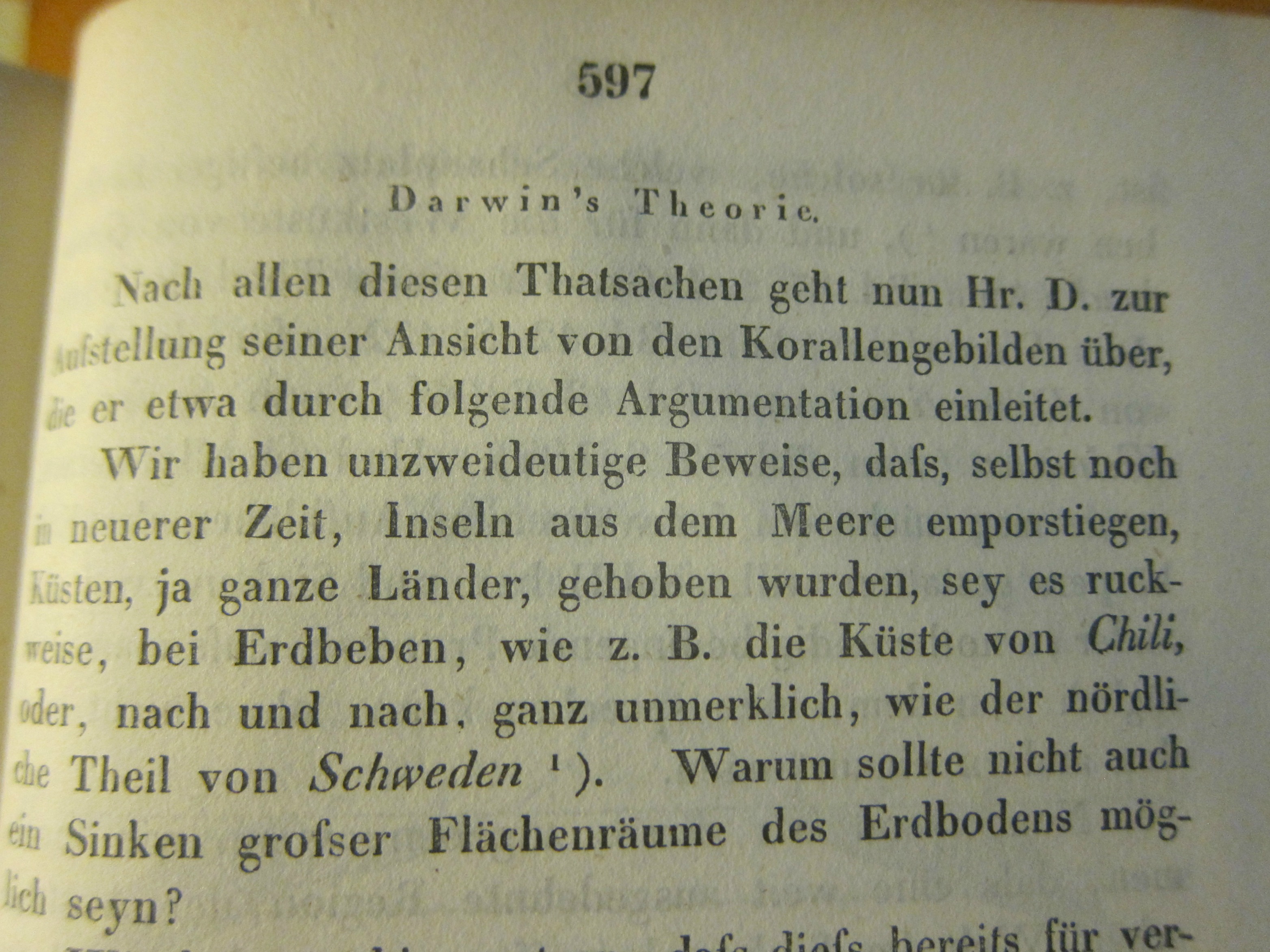
    I was surprised to find this long and early (1845) contribution1 on Darwin and his ambitious work on coral reefs in the generally physical-sciences-heavy Annalen der Physik2. The surprise was ever more so because of the illustration for the article–a German version of the coral islands/reefs map that appears as the frontispiece to Darwin’s The Structure and Distribution of Coral Reefs3…  that appeared three years earlier in 1842.  (Darwin’s Journal of Researches...,  today more commonly known as the Voyage of the Beagle, which was the third volume of Narrative of the Surveying Voyage of His Majesty’s Ships Adventure and Beagle…… was published in 1839, and his first publication of any kind appeared ten years earlier in 1829; the first German translation of the Narrative appeared in 1845 as  Naturwissenschaftliche Reise. As John van Wyhe–the founder and curator of the fantastic resource Darwin Online–points out the German translations were significant because “It was in German…that Darwin influenced the founder of genetics Gregor Mendel, and the pioneering evolutionists August Weismann and Ernst Haeckel”4.)

    When I was thumbing through the volume I noticed the folding map tucked away at the back of the book, nestled with a number of other folding engravings–and I very nearly missed it (that being easy to do in this case).

    Darwin annalen _4_

    • [For a full description of the map consult Darwin Online, Structure and Distribution of Coral Reefs, chapter VI, pp 119-126 http://darwin-online.org.uk/content/frameset?viewtype=side&itemID=F271&pageseq=8]

    Having worked with the Annalen for many years (principally the Annalen from 1799 to the early 1930’s which numbered in the low hundreds of volumes) it was my overall impression that the appearance of contributions in the natural sciences were not at all common in the early years and had become less so by the time of the Darwin-related article. In any event, there it was–I felt a little groggy for not recognizing the map straight away–I slowly pieced it together from the clues, and then pinned the thing down in the test (the Annalen is not generally very user-friendly in placing images with text, though if I had bothered to look for the usually missing image index it would have made life easier). And then, there it was–right where it should be.

    Darwin annalen _2_

    So tonight I’m just sharing a few images of the map from this happy little adventure of not-missing the not-attributed-in-the-table-of-contents Darwin.  I guess I should’ve recognized the map right at the outset, but didn’t. Ah, well. 

    Here’s an appreciation of the map from the University of Maryland’s Integration and Application Network, “Ten Classic Maps” (http://ian.umces.edu/blog/2013/12/27/ten-classic-scientific-maps/): 

    “Coral reefs: The map of coral reefs throughout the Pacific Ocean created by Charles Darwin in 1842 as part of his first science book, The Structure and Distribution of Coral Reefs is a masterpiece. Although Darwin’s subsequent books about natural selection eclipsed his insights into coral reefs, this coral reef map is part of the theory that Darwin had about the formation of coral reefs. Darwin correctly hypothesized that coral reefs were formed by the limestone accumulation by corals and that extinct volcanos were buried beneath modern coral atolls. It was over one hundred years before drilling associated with the nuclear testing on Bikini atoll that Darwin’s theory was confirmed. Darwin did a couple of important things with this map: he color coded the reefs that were subsiding (blue) and uplifting (red) and he produced a large foldout to cover the entire tropical Pacific Ocean in a single contiguous map. In this manner, viewing the map instantly reveals the “magnificent and harmonious picture” of the broad patterns that Darwin observed. I am convinced that this is the first important piece of evidence supporting plate tectonics and the Pacific ‘Ring of Fire‘, and that if Darwin had a bit more information available at the time, that he would have actually come up with the theory of plate tectonics.”


    Darwin annalen


    Notes

    1. (Darwin, Charles.) “Ueber Verbreitung, Beschaffenheit und Entstehung der Korllen-Inseln” [nach Darwin], in Annalen der Physik und Chemie, 1845, series II volume 64, pp 563-614 (about 15,000 words).  (“The distribution, character, and origin of the coral islands.”, “after Darwin”.)

    2.  The Annalen would become one of the most important scientific journals in physics beginning in the 1830’s. 

    3. The Structure and Distribution of Coral Reefs. Being the First Part of the Geology of the Voyage of the Beagle, under the Command of Capt. Fitzroy, R.N. during the Years 1832 to 1836. The work included three folding maps in total (two of which were hand colored). 

    4. John van Wyhe, “Darwin in Translation”,https://www.amphilsoc.org/library/valentinedarwin/vanwyhe


  • The Shock of (Color) Recognition (1939)

    JF Ptak Science Books   Quick Post

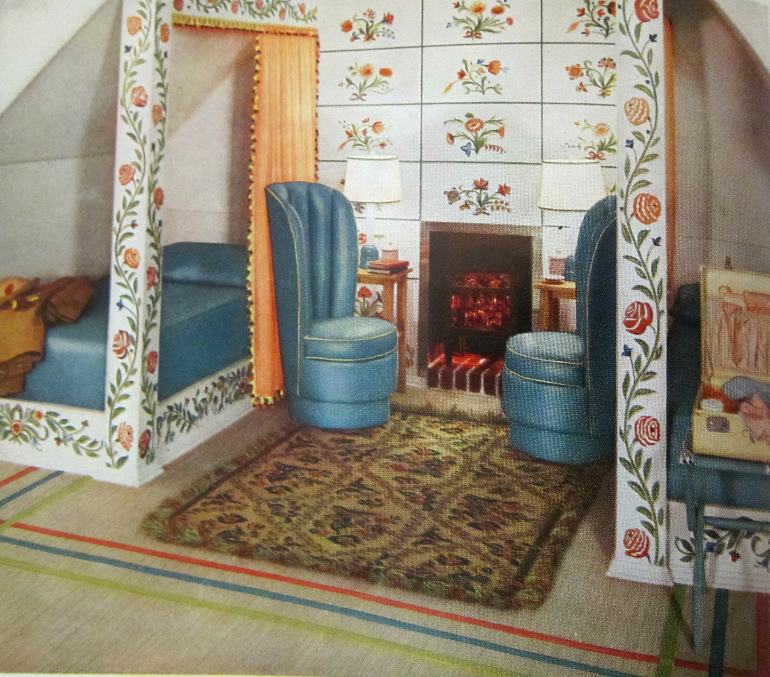
    Continuing a post from earlier today on the idea of applying a diacritical to an adjective expressing surprise (!) in the recognition of a color I share the following series of images appearing in the 1939 edition of Armstrong Cork Company’s Beauty Hints for the Home Decorator. Now, somewhere in there should be an exclamation point or two, liberally applied sentence enhancers. And that’s what I looked for, my little box of exclamation points (absent the non-existent diacriticals) when I saw photos of these spectacular rooms of distinction in the Armstrong catalog.  As I’ve written earlier, the colors (!) were quite a surprise, like seeing painted Roman statuary. For example, there is this magnificent (?) bedroom, with two twin beds, tall skinny chairs next to a tall skinny fireplace, and then those colors:

    Armstrong _3_


    ·Posted by :

    ·in: