A Daily History of Holes, Dots, Lines, Science, History, Math, Physics, Art, the Unintentional Absurd, Architecture, Maps, Data Visualization, Blank and Missing Things, and so on. |1.6 million words, 7500 images, 4.9 million hits| Press & appearances in The Times, Le Figaro, Mensa, The Economist, The Guardian, Discovery News, Slate, Le Monde, Sci American Blogs, Le Pont, and many other places… 5000+ total posts since 2008.

Author: JF Ptak

  • A Child’s Manuscript Map of the U.S.A., ca. 1875-1880

    JF Ptak Science Books  Post 2274

    It is difficult to find children’s art from the 19th century–original work, printed work, published work.  Very difficult–perhaps even more so for the published work than the manuscript.  It is easy to understand why: first, the children would need access to paper and pencil or pen and ink–items that had some cost, that were not inexpensive, not available to the vast majority of children. Their work was ephemeral, produced on slate, or in horn books, or in charcoal on a wall, or in dust.  Then, if the children did manage to record their creativity, then it would have to survive a generation of possessionship within their own lifetimes–to survive from the first part of the 19th century, the paperwork would have to survive five generations or more, 150+ years of house cleanings.  Tough odds.

    That is why it is also a little special when I come across larger manuscript works that have survived against these odds. 
    Maps US ms

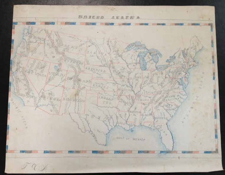
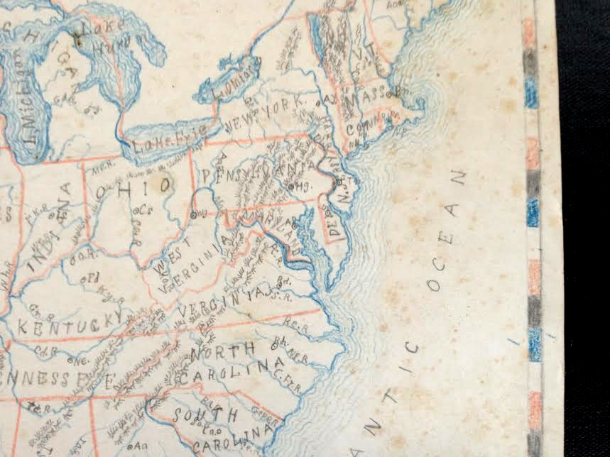
    This map of the United States isn’t so simple as it seems–although there are no major cities located in any states, many rivers are, as well as mountain ranges.  The coastlines get a very nice treatment with recessive blue lines, giving the map a certain dimensionality, and the lettering of the states is also distinctive, with the terminals of the letters in the state names ending with dots or lines.  
    Map US ms det

    I’d guess that the map was done around Centennial time, 1876 to the mid-1880’s, the biggest clues being the inclusive of Wyoming (which sets a date after 1868) and the large Dakota Territory, which would become North and South Dakota in 1889.  

    As maps by kids go, this one is fairly large at 12×15″–it is about the largest single sheet artwork that I have in a 150-odd pieces of antiquarian children’s art collection…also I wonder about how the kid in 1880-whatever got her/himself such a large piece of paper to work with, as it seems to me to be not a simple task.  

  • A Beastly and Beautiful Number Cruncher, 1889

    JF Ptak Science Books   Quick Post

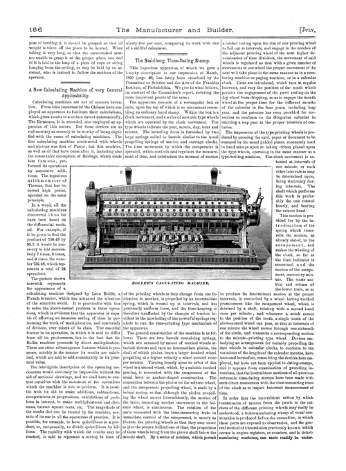
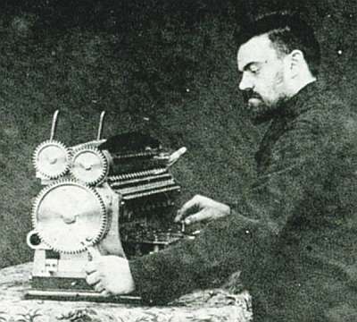
    It was a surprise, finding M. Bollee’s article (“Sur une nouvelle machine a calculer”) in this 1889 Comptes Rendus, peeking around in that big 10-pound volume looking for something else.  It was very easy to miss if you weren’t looking for it, just a few pages long in a 1000-page book.  But there it was, nestled comfortably in pp 737-739.  It these few pages Bollee describes his machine and with particular reference to his innovative approach to direct multipilication–a fine addition (ha!) to the long line of contributions by Babbage and Clement, Scheutz, Wiberg and Grant and Hamann. 

    Bollee

     The article in the Comptes Rendus is not illustrated, though I did find an image of the machine in The Manufacturer and Builder:

    Bollee


  • A Lot of Computer Data on One Sheet of Paper (1956)

    JF Ptak Science Books   

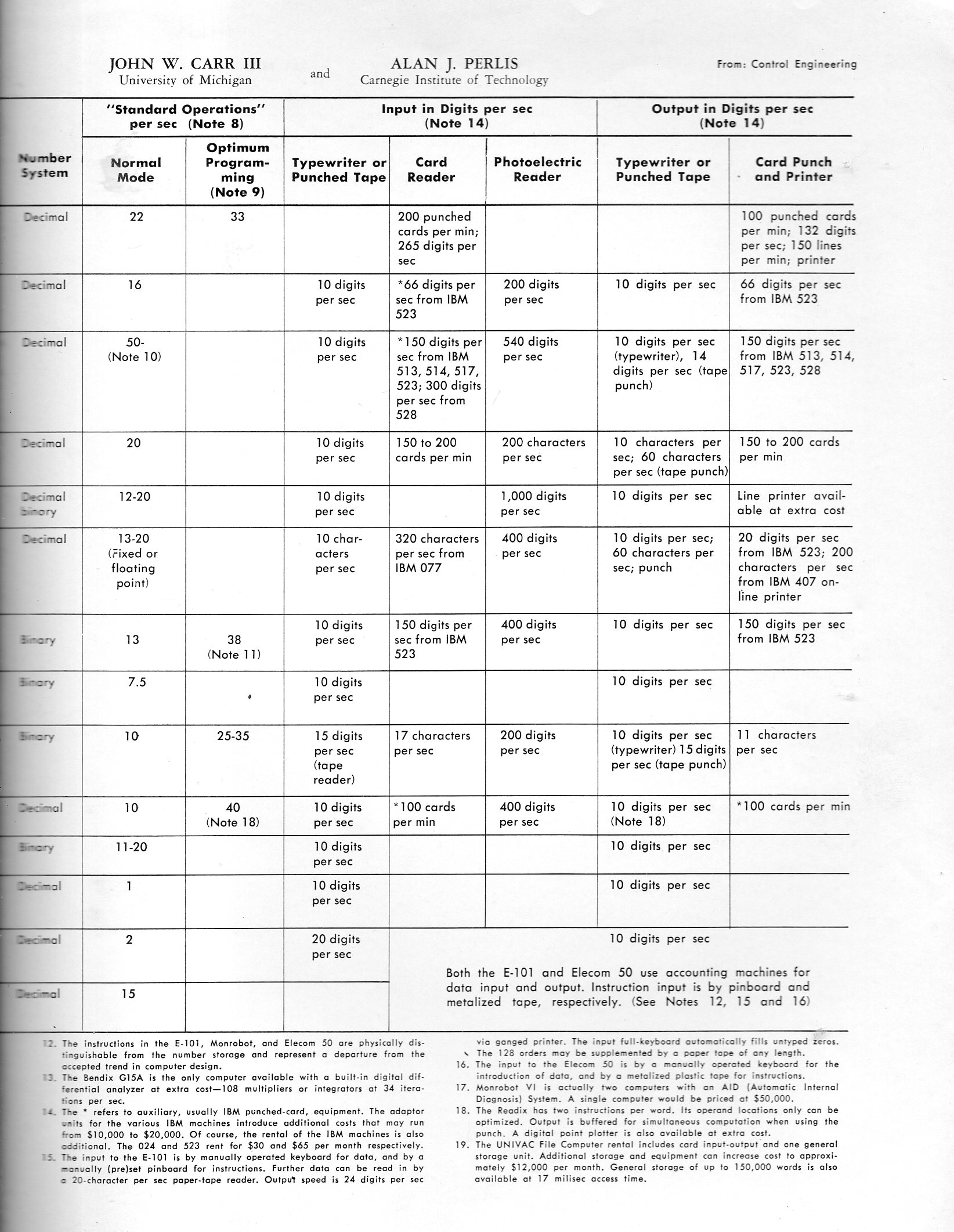
    A.J. Perlis’ and John Carrs’  “Characteristics of the Small-Scale Computers” looked innocent enough, 12″ tall and one folded piece of paper, and published in 1956, but there was a lot more to the simple publication than you’d expect from something so modest. The authors–John W. Carr III and Alan J. Perlis–were heavy hitters, and so I really wasn’t very surprised to see what they had done “inside”, though I was impressed and happy to see the data. Displayed on the 12×16″ sheet of paper are 15 data points on 14 computers, many of them classic/famous:  the 650 IBM, UNIVAC, Elecom, Alawac.  (Remember that when you’re looking at purchase price and monthly rental amounts that the 1956 dollar is equal to about $8.70 in 2015 dollars, so that $3275/month for the 650 would be about $30k.  The $136k for the Datatron is about a million today.)   

    Perlis795


    ·Posted by :

    ·in:


  • Futurama, 1939

    Futurama 9

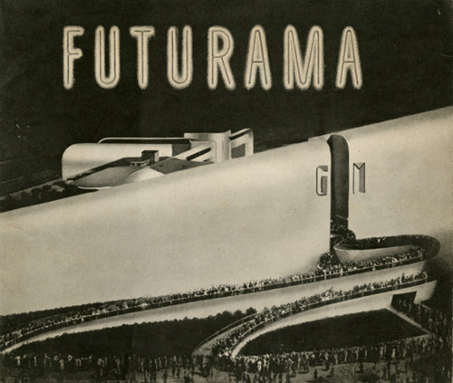
    [Image source: FUTURAMA.  Published by General Motors, 1940.  24pp. Original wrappers. Provenance: the Pamphlet Collection, Library of Congress. ]

    The 1939 World’s Fair in NYC famously exhibited a spherical attraction that exhibited a semi-robotic display of what the future would be like–a future that was only 21 years away, in 1960.  There would be an enormous amount of weight on the shoulders of 1960, given what the World’s Fair had to say about it in 1939.  Few things were very right, and many of course were necessarily wrong–but that must be the case when looking into the short-ended future with a monstrous amount of anticipation.  That–and since this was a feel-good celebration–nobody was talking about the world war that had already started. 

    One thing is for sure–the pavilion’s creator, General Motors, did foresee that highways and automobiles will be in high demand up there in the tomorrowland of 1960.  The display was designed by the fantastic Norman bel Geddes, who actually expanded on his superhighway theme in the next year with his book Magic Motorways (which can be read here).  Anyway people were very excited by the whole affair–waiting in line for a few hours, winding their way through the pavilion to take their seats in a circular gallery overlooking a vast and complex assemblage of miniature societal models, the seating arena rotated to give the viewers views of the entire display.  More than 26 million people saw the display over a six month period. 

    26 million is a big number.  Futurama drew as many people in six months as the three New York City baseball teams (the Yankees, Giants and Dodgers) brought in for almost the entire decade.  It is also equal to all of the deaths suffered by the Soviet Union during WWII. 

    I guess this was as good a vision as any–or at least it didn’t seem to involve very much planning outside the new automatic automobile nervous system that would leech into the life-blood of the country.  Other planned visions of the future do not look quite so good.  For example, Le Corbuser’s demolition of central Paris to make way for his Soviet apartment block reconstruction in his Voisin Plan (1925):

    Again, this is not a wholesale look into the future, just the resurfacing of one of the world’s greatest cities.

    A man with a little bigger vision, Frank Lloyd Wright, saw a heavier future in his Broadacre CIty:

    I’m not sure how these domed cities worked.  B. Fuller had an idea like this for central Manhattan that I wrote about earlier in this blog, but his idea escaped me too. 


  • Note on an Unusual Version of a Classic Russian Aerospace Text

    JF Ptak Science Books   Post 2527

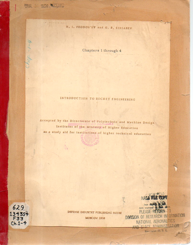
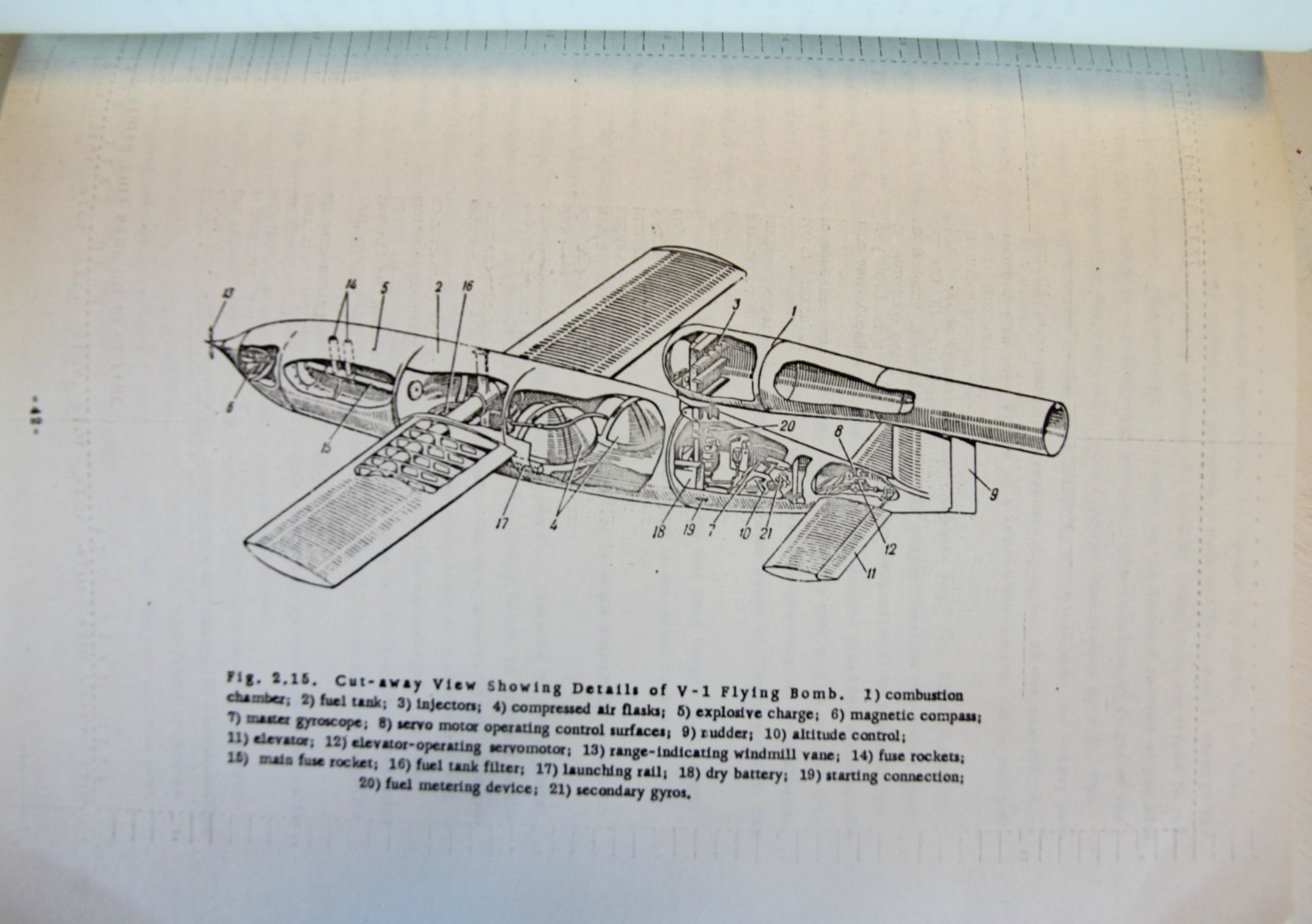
    V.I. Feodosiev (with his two initials looking ironically similar to the V1 that he wrote about) and G.B. Simiarev wrote a classic textbook1 in rocket technology which was published in Moscow in 1958.  Even though it was translated and published in English the following year by Academic Press, the version here seems to have been translated in the same year as its Russian edition. I’ve had some translations-on-demand in the store that were fast-tracked for the particular agency that needed the work, translations that sometimes didn’t appear in English for years afterwards.  In this case the Feodosiev was translated (anonymously) for an undisclosed agency, though this copy wound up in the library of  the NASA Division of Research Information2. It could well be that the work was produced for NASA but frankly there are many other candidates for the point of origin of interest.  This copy is definitely different from the Academic Press translation, so at least two different translations were made of the text.  

    Feodosev Rocket171

    I really don’t have that much to offer here on this edition, except to note its differences from the Academic Press version, though this may be of some use to someone working in this area.  

    • The original is available via the blog’s bookstore, here.

    Here’s an abstract/summary of the work (which has a slightly different title)  by the Academic Press 1959 version of this publication: 

    “Introduction to Rocket Technology focuses on the dynamics, technologies, aerodynamics, ballistics, theory of servomechanisms, principles of navigation instruments, and electronics involved in rocket technology.”

    “The publication first takes a look at the basic relationships in the theory of reactive motion; types of jet propelled aircraft and their basic construction; and types of reaction motors and their construction. Discussions focus on air breathing motors, anti-aircraft rockets, long range bombardment rockets, surface to surface, short range bombardment missiles, thrust of a rocket motor, and operating efficiency of a rocket motor. The text then examines rocket motor fuels and processes in the combustion chamber of a rocket motor.”

    Feodosiev _4_

    [V-1, from page 42]


  • Superior Advertising Art, 1911

    JF Ptak Science Books  Quick Post

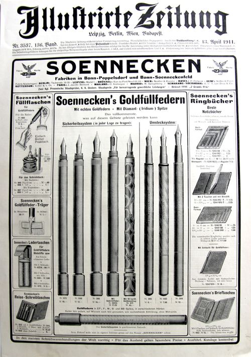
    I really don’t have much to say about this image except that it is a very nicely designed thing, an advertisement for fountain pens produced by Germany’s leading pen manufacturer (Soennecken, established 1875), This full-page/front-page illustration appeared in Illustrirte Zeitung for 13 April 1911.  

    Pens


  • The Somerset Coal Strike, 1922/3

    JF Ptak Science Books   Quick Post     History of Lines series: Strike Lines

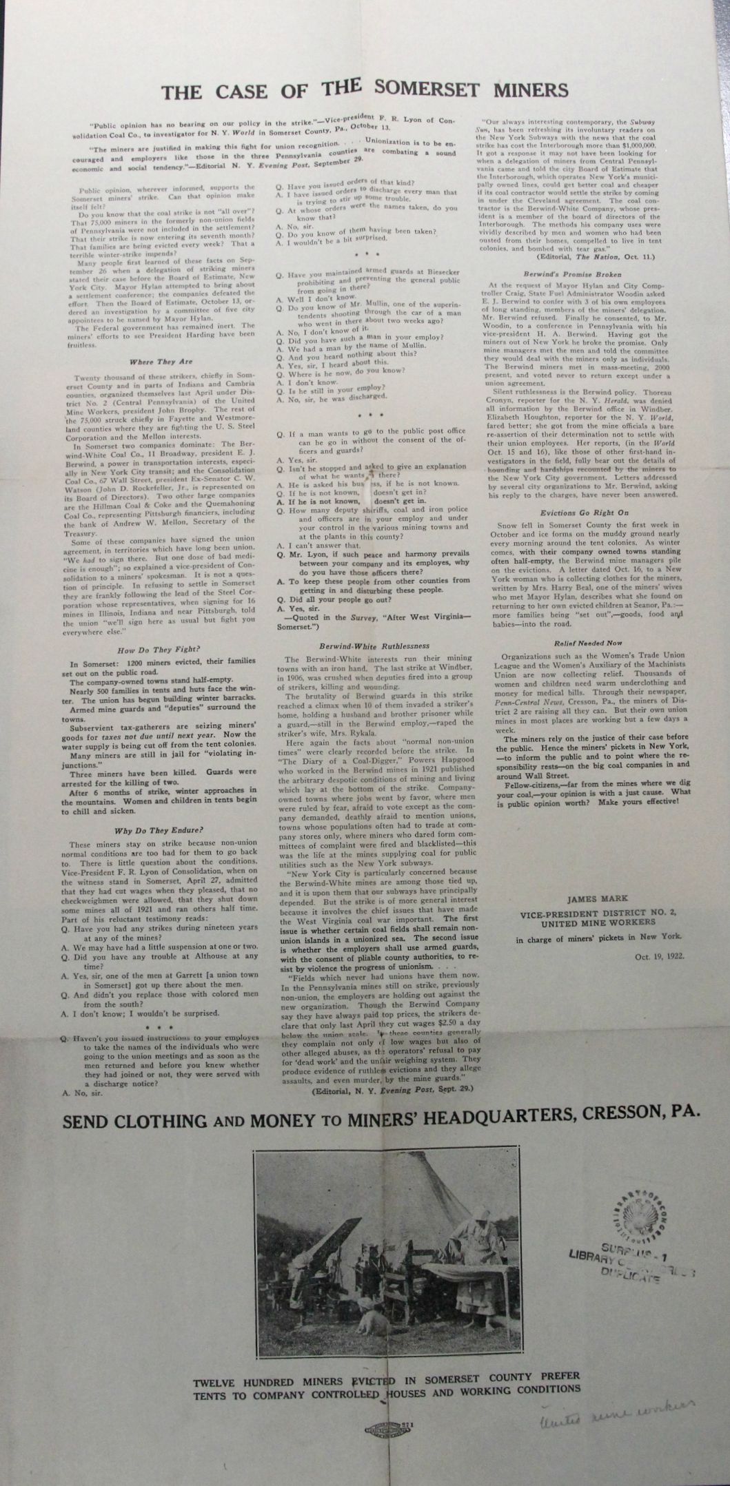
    This is a rare broadside (about 24″ tall) seeking household items and money for the relief of the striking workers of the hard/tough/brutal Somerset Mine strike of 1922-3.  The miners struck for union representation from the United Mine Workers against the Berwind-White Company, which ran a very tight ship, evidently. The miners for Somerset lived in a classical company-town existence, with their pay being mostly entirely absorbed by the company via rent for company-owned houses, stores, food, water, and so on, all aspects of life controlled by the employer who/which retrieved the salary of its underpaid workers by controlling all aspects of the workers’ lives. So the miners struck for representation from the union for more money and management resisted, especially since it would cost them profit during a year that saw coal production falling by a third.  So the strike began and lasted from 1922 to 1923, during which Berwind-White employed scabs and security and thugs to intimidate and control their workers, evicting 1200, sending hundreds of families into a Pennsylvania tent life for the winter, stopping the flow of water, and general thuggery.  The strike ended unsuccessfully in 1923, though the union came in by 1933. 

    Reading this summation and plea is a heartbreaker, and will no doubt make a person appreciate the idea of unions, especially in the U.S.A. of the 1920’s/1930’s.  


    Coal strike somerset

    ·Posted by :

    ·in:

    —

  • A Map of Fordlandia: the “Drama of Transportation”, 1932

    JF Ptak Science Books    Quick Post

    FORD_2_155

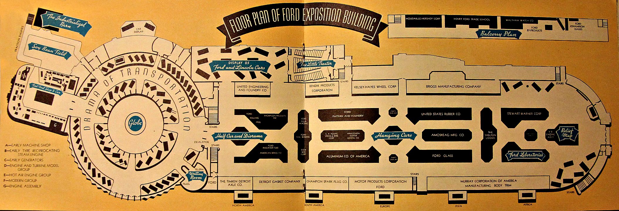
    The “fair” in this pamphlet, Ford at the Fair, was the Chicago World’s Fair of 1932, and it was a souvenir for the visitor to the Ford Motor Company pavilion.  Well, the building–pretty in profile, but odd/weird in plan–held other exhibitors whose business was related in support of Ford (Alcoa, Anaconda Copper, Bendix, etc.), and displayed in a singular turnaround the Cars as Consumable Products. (Remember that world’s fairs such as this were still mostly displays of technology and industry and business, so you were more likely to see a Meat Pavilion or Heinz Products then than to see curious rides and historical whatnots in present incarnations.) 

    This unusual Bavarian trophy/hunt display of a couple of Fords in the middle of the floor plan–which says simply “hanging cars” on the map looked impressive and a little alien-esque:

    FORD154


    And the map of the pavilion, which once you get over the possible Renaissance-like plan, and you pull back a little bit, it takes on a bit of a profile of a tank-like dragster:

    Ford _3_

    In any event, this was a glorification process wrapped around a celebration of old-timey industrial celebration, presented in gleaming metallic greens and blues, and rubber, and gasoline, and oil, and hope. 

    Here’s an interesting video showing the Ford pavilion at the fair, found at youtube.com:  


  • Displays of Info You Probably Don’t Need: Advertising Methods (1892)

    JF Ptak Science Books,  Quick Post

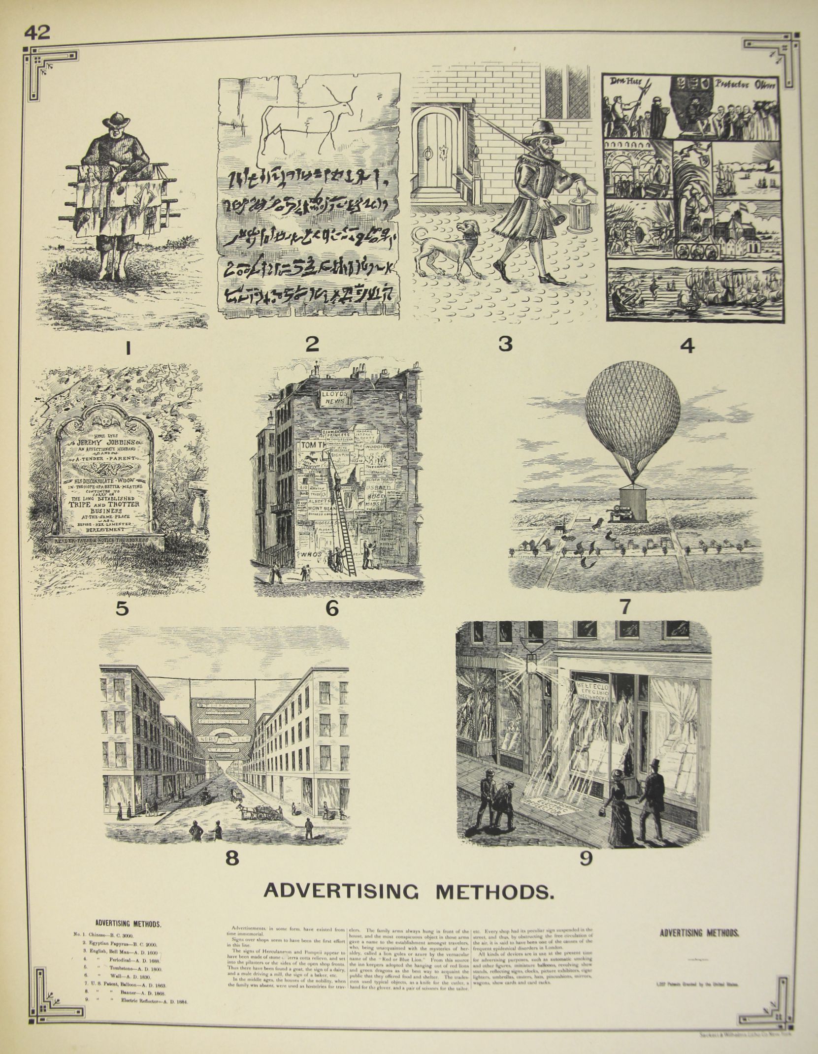
    Benjamin Butterworth, the Commission of Patents, produced in 1892 a superb work on the history of state of technical achievement in the U.S., The Growth of Industrial Art. The “art” part of the title actually referred to the creation-as-art of industry/technology more so than the design aspect of it, though the two are pretty closely related.  There were 200 plates of illustrations for inventions for windmills, mails, screws, cork, bicycles, harvesters, threshers, glass makers,, ice harvesters, cigar manufacturing, sweeping, telephones, telegraphy, and so on, in more than 150 categories.   Among these images some of my favorites are for advertising apparatus and means.  For example, in the historical timeline below we find in #7 an automated flying leaflet distributor, and according to the text it was (unlikely) patented in 1862:

    Advertising MEthods

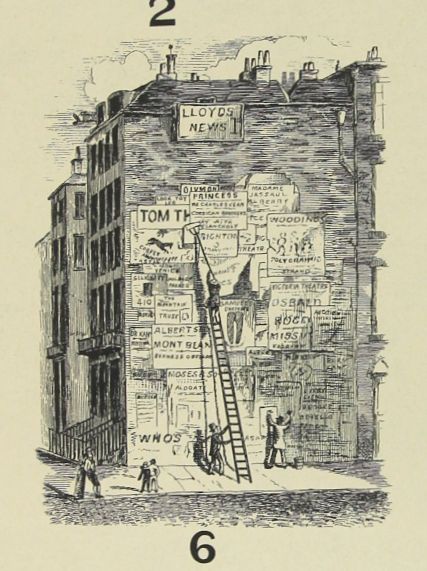
    #6 is cringeworthy, showing the very common practice of covering optimally-placed buildings with billboards–I’ve seen numerous early-ish images (19th c) showing large swaths of buildings on busy streets nearly entirely covered by ads.  

    Advertising Methods detail

    From Internet Archive, the full text with illustrations can be found here:  https://archive.org/stream/growthindustria00Unit#page/n9/mode/2up

    Text from the illustrations:


  • The Straight Series: Looking Straight Through a Vickers Gun Sight, 1916

    JF Ptak Science Books   Quick Post

    WWI Project MAchine gun sighting detail


    WWI Project Machine gun sighting


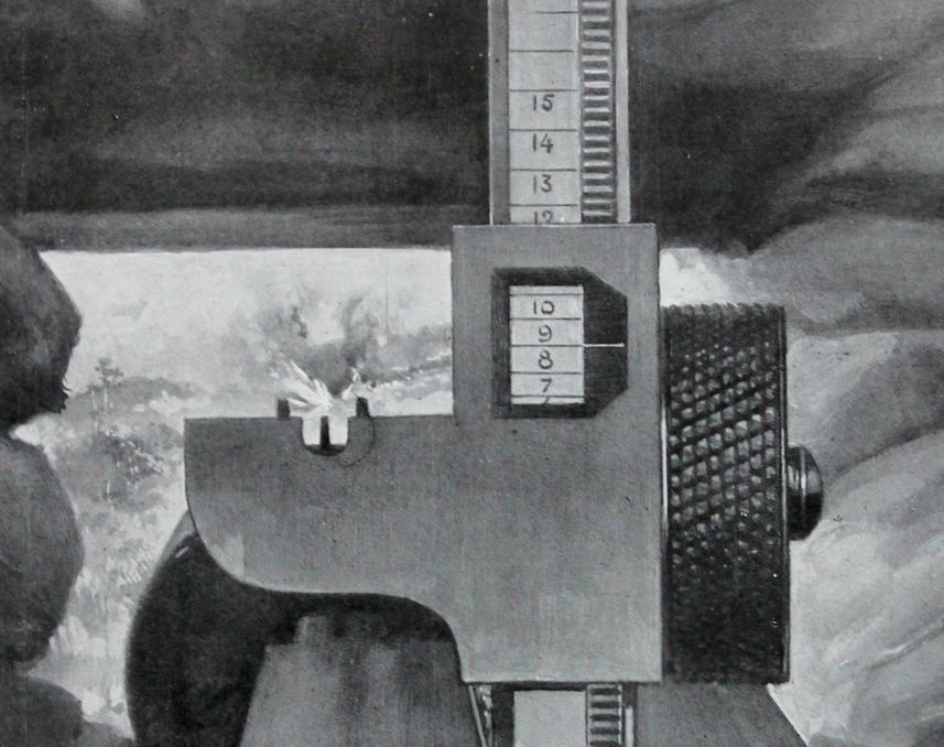
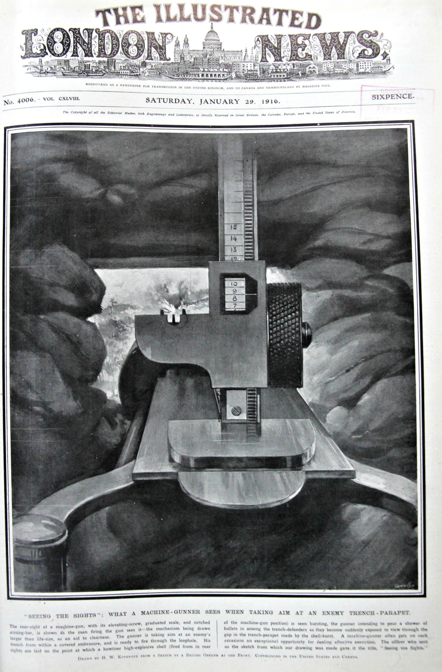
     There are a number of posts on this blog that have no real category, though they are joined by one simple principle–they look “straight” onto something, like straight up,  straight down, and straight through.  It isn’t necessarily obvious, but these points of view are really pretty scarce in the history of antique prints. (Since there is no category you can search “straight” int he Google search box at left for other poss.)  In this case, above, we have the gunner’s eye view of the working of a machine gun, a great image published by The Illustrated London News in 1916.  

    The machine gun type isn’t stated but I figured that it must be a water-cooled Vickers .303–from this vantage point your face wouldn’t be more than a foot from the sight; the curved bits at front are hand grips, and the “trigger” (an oval button that you press in to activate the gun) would be between those two curved elements and just below–I think that you could’ve seen the trigger if it was drawn in, though for whatever reason it is not there. In any event those hand grips are less than 9 inches apart, so you can tell now that the view of the machine gun is from very close proximity. 

    Here’s an unexpected find: a video of shooting a Vickers (without sighting mechanism) at nearly this exact perspective,  found on youtube:

    ·Posted by :

    ·in:

    —