A Daily History of Holes, Dots, Lines, Science, History, Math, Physics, Art, the Unintentional Absurd, Architecture, Maps, Data Visualization, Blank and Missing Things, and so on. |1.6 million words, 7500 images, 4.9 million hits| Press & appearances in The Times, Le Figaro, Mensa, The Economist, The Guardian, Discovery News, Slate, Le Monde, Sci American Blogs, Le Pont, and many other places… 5000+ total posts since 2008.

Category: History of Dots

  • Chuck Close Convict Optics, 1936

    JF Ptak Science Books   Quick Post    An Episode in the History of Dots

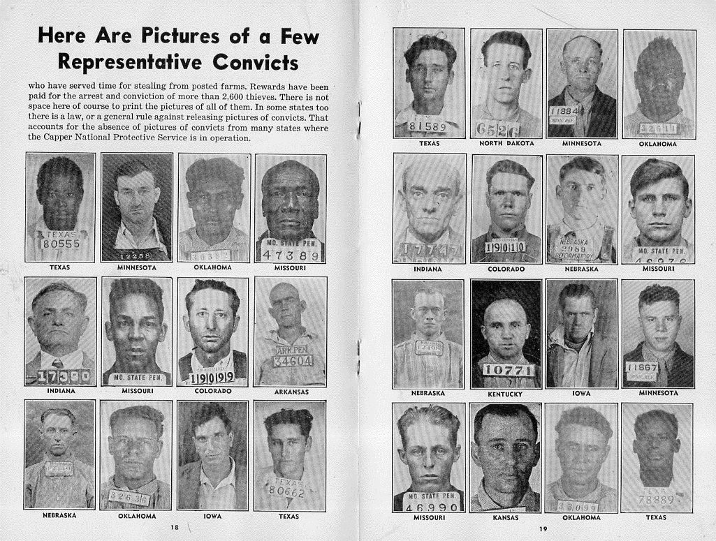
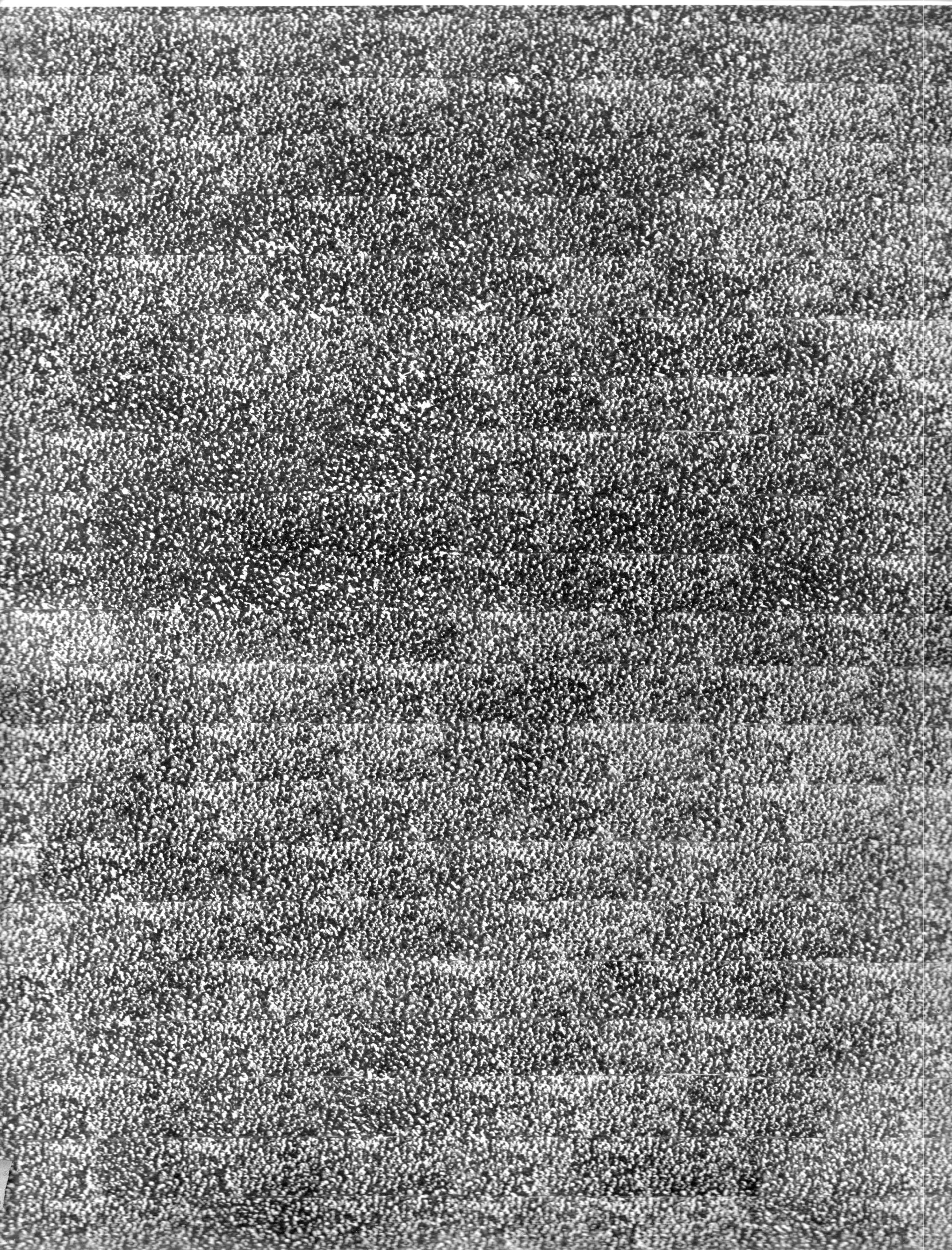
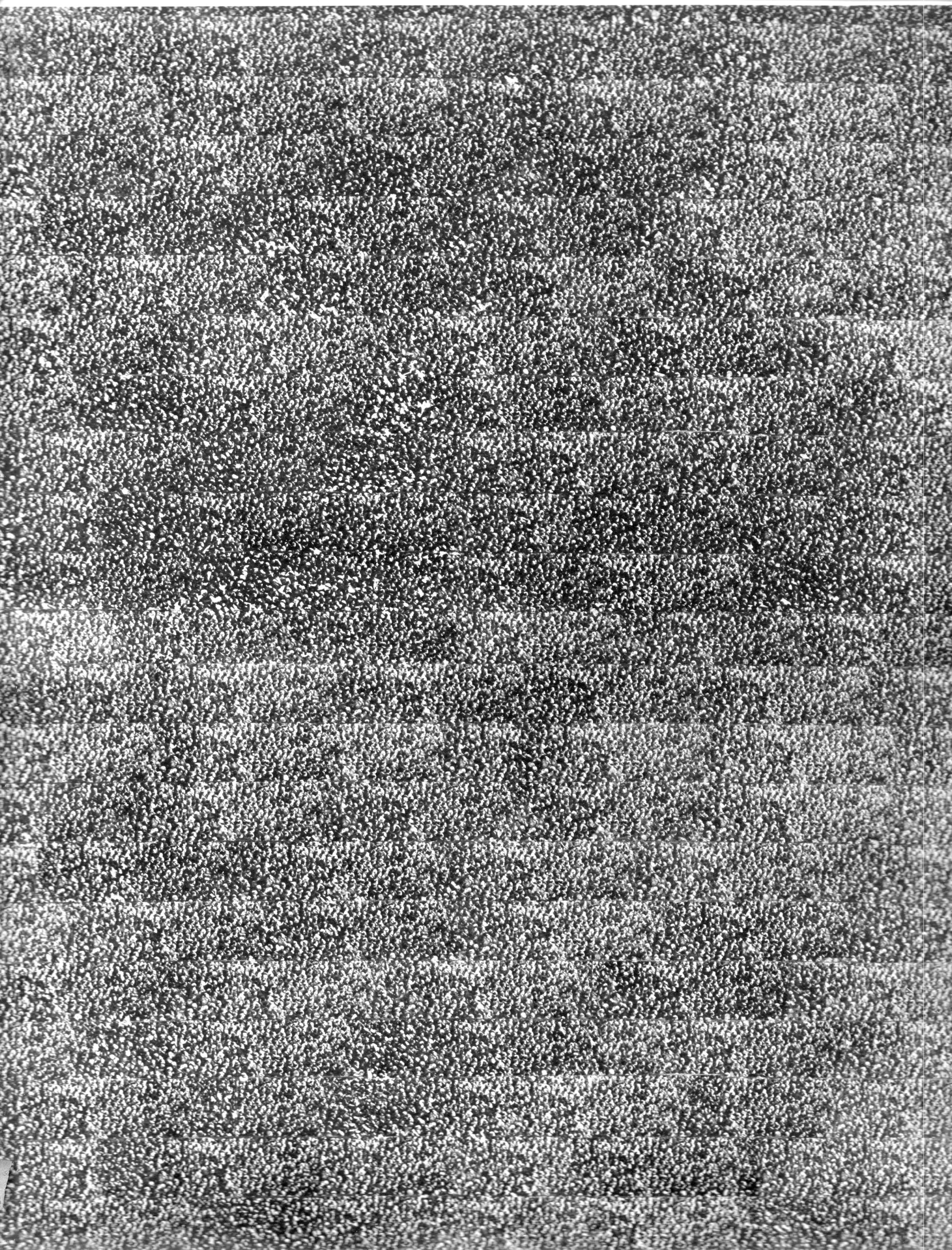
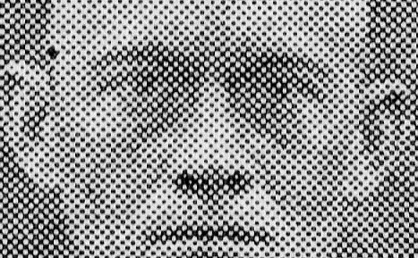
    There is no telling, sometimes, where an interesting/odd bit might occur. I guess you could make the case that they occur everywhere and that it is just our inability to see them that limits their appearance.  This may be the case with the following, a magnified part of a small part of a chart, where dots turn into squares:

    Convict farm909 detail

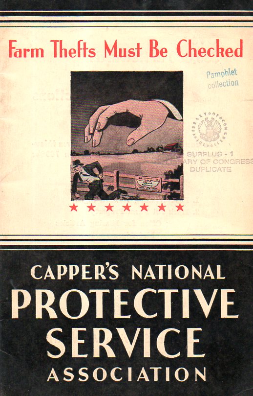
    The pamphlet topic is certainly a modest vanilla flavoring–prevention of farm theft (1936). However the cover is striking, so it is an easy thing to pick up.  There’s a bunch of anti-crime/catch-’em stuff and help on how to do that inside–there is also a two-page spread of mug shots of examples of people caught and convicted utilizing the services offered in the pamphlet. That’s where Mr. Close comes in.

    Convict farm samp-ler910

    One interesting thing about the enlargement is that you can make the image go from near-negative to positive by tightly squinting your eyes–which is something I think you cannot do with the pre-pixelated Mr. Close.  

    In any event, it was a very nice find, found in an unusual and serendipitous place. 

    And the cover:

    Convict farm cover911


  • Dots of Death, 1937

    JF Ptak Science Books  Quick Post    

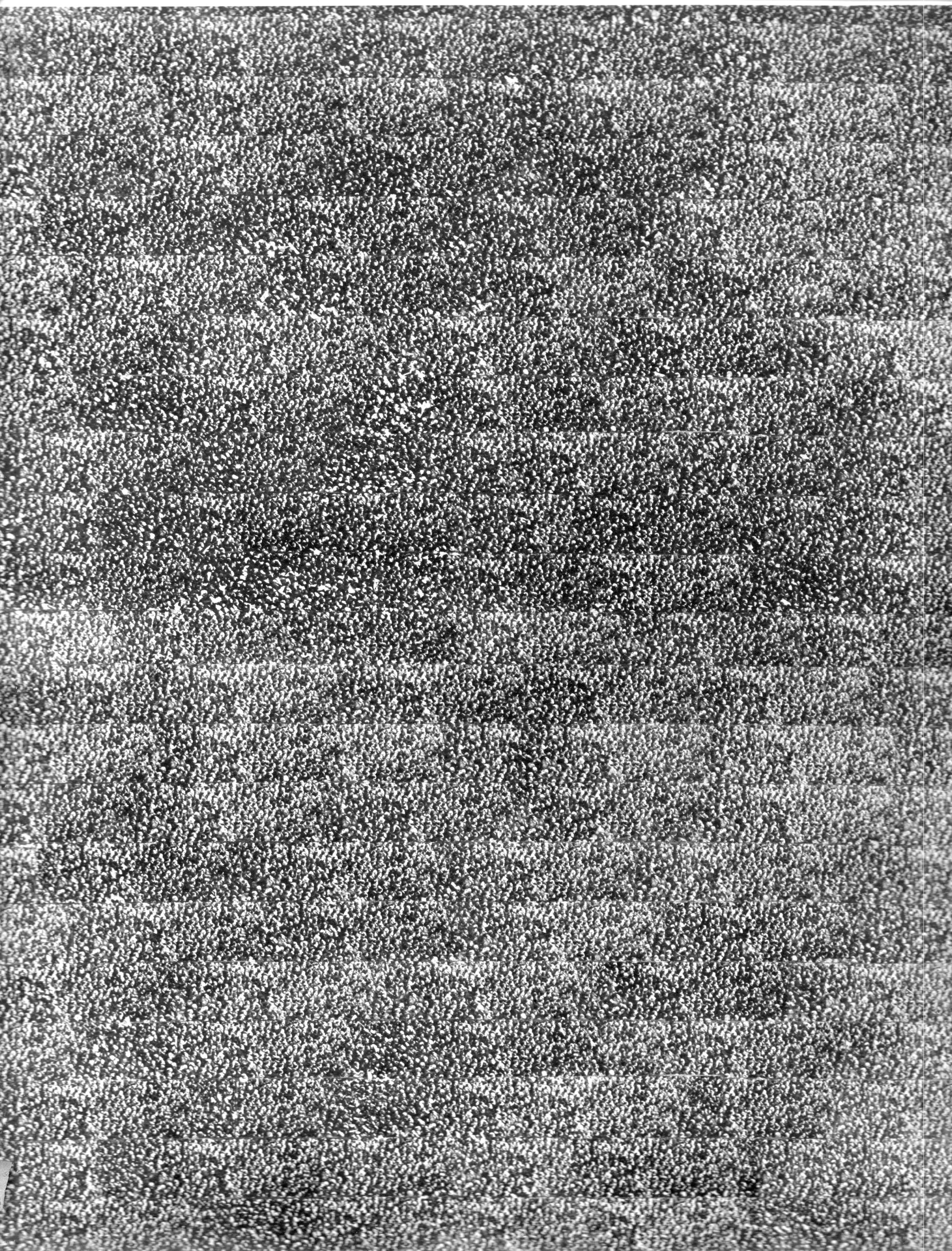
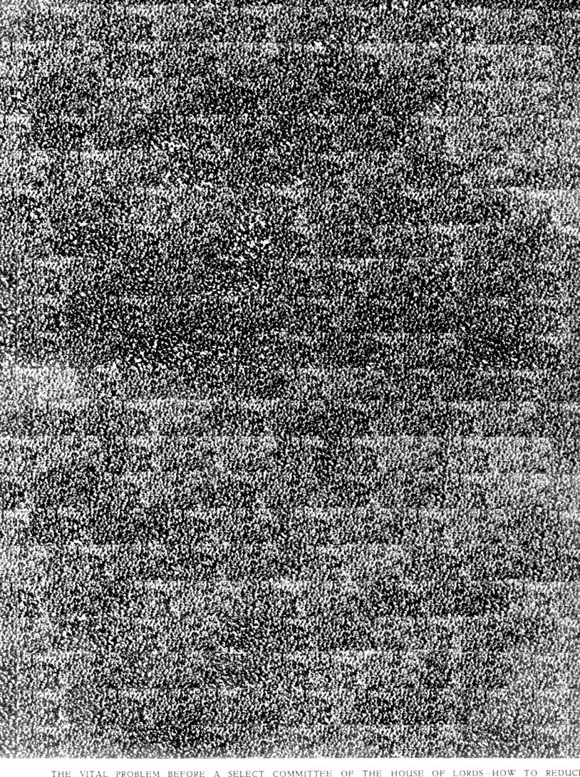
    This intriguing and striking collection of dots is actually an articulated portrait of death. Road death.  The composite picture appeared in the Illustrated London News on December 18, 1937, and when the reader opened the magazine to the big two-page spread–11×18″ big–they were probably shocked. The picture represents 67,000 people killed on British roads in auto accidents over ten years.  “Nothing less than appalling” is what the heading reads. 

    Just down the road, at the end of WWII eight years later, you would need 1,200 of these double sheets to represent the dead of that conflict. 

    Auto deaths865

    Auto deaths865


     Here’s a detail of one of the images:

    Auto deaths865


  • History of Dots: Dots of Death, 1937

    JF Ptak Science Books,  Quick Post                                                                         Part of the History of Dots series

    Data visualization traffic  death658

    This is one half of a very impressive, “what the holy heck” sort of photograph–even more so that it portrays the number of people killed in road accidents in England from 1928-1937.  67,100 people were killed–the number of injured was evidently 30 (!) times higher.  This is particularly impressive given that in all of the U.K. 2175 people were killed in 2012 compared to 36,000 for the U.S., which means 3.5/100,000 in the UK and 11.6/100,000 in the U.S. So things have gotten much better now than they were then, with a third of the fatalities for a much larger population. In any even the photo montage was a very compelling image, and was printed in the Illustrated London News, December 18, 1937, page 1110.  

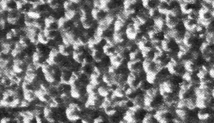
    An extreme detail figuring about 2% of the image: 

    Data visualization traffic  death660

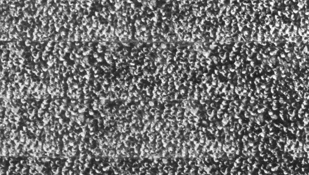
    Another detail, about 1/20th of the image:

    Data visualization traffic  death659

    ·Posted by :

    ·in:

    —

  • The Dots Between the Sun and the Stars (1652)

    JF Ptak Science Books  Quick Post

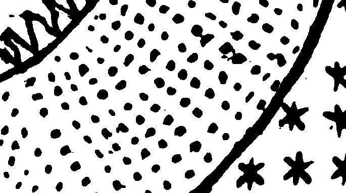
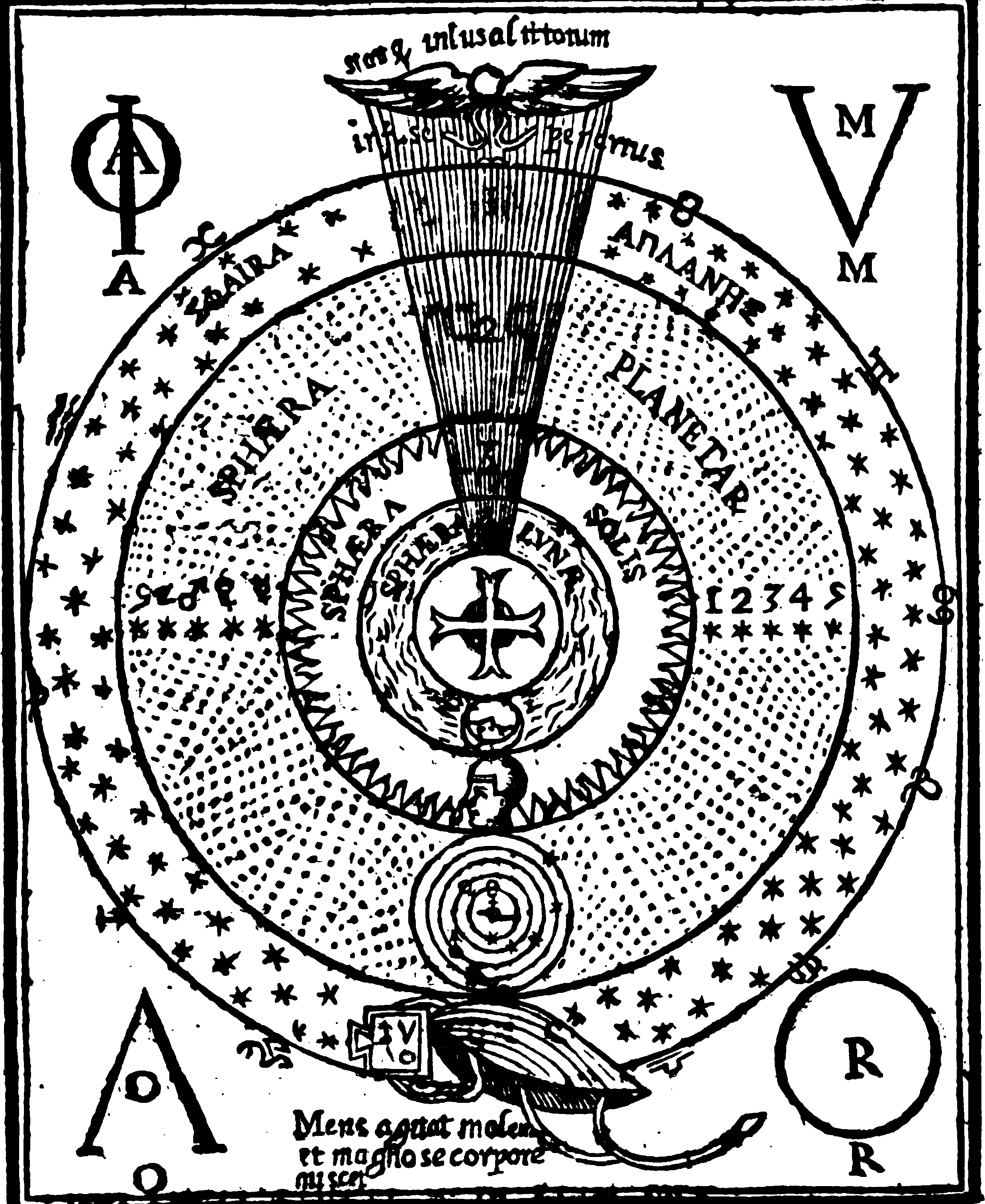
    This is just a quick addition to a continuing series on antiquarian cosmological images (the two major posts, Visual Chronology of Cosmology, Part I and Part II) containing 80 images, mostly before the 19th century) and a long series on the History of Dots.  The engraving below comes from the great intellectual explorer, Fr. Athansius Kircher, in his ultra-fabulous three-volume Oedipus Aegyptiacus (1652-4). And in here–as is the case with some other cosmological images–in between the sphere of the Sun and the sphere of the stars was the realm of the planets, and that is where Fr. Kircher’s artist employed the use of dots, to differentiate the planetary real estate from everything else.  

    Kircher_oedipus_aegyptiacus_1_cosmos det


    And the image in full view (both images reproduced from the Hachette reprint): 

    Kircher_oedipus_aegyptiacus_1_cosmos

    ·Posted by :

    ·in:

    —

  • Broadcasting Close-ups of pre-Chuck Close, 1923

    JF Ptak Science Books  Quick Post  Part of the History of Dots series

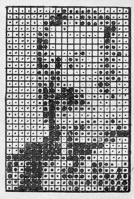
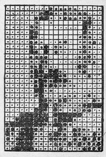
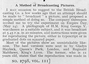
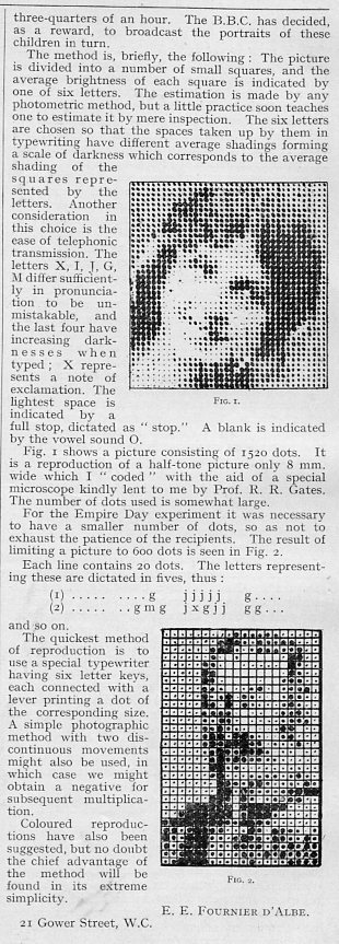
    Well, that’s a tricky title, and not quite right, but bits and pieces of it are.  Chuck Close up-close looks much different than this–more likely this image looks more like an early half-tone.  (You can really say that it looks like Seurat [dead at 32!] because it is in black & white and he was all about color.) What the story is is that this tells part of the story of broadcasting pictures by wireless–and the picture below, the picture that will develop after a little bit of removal and a lot of imagination, is that of King George V, the product of disseminating 1,500 dots in a 15-minute broadcast.  The full not-easily explained explanation is below, starting in the third paragraph.  

    Broadcasting pictures085[Source, Nature, June 16, 1923, page 811.]

    Which is a big enlargement of the following, which moving back from it begins to come together like backing away from a close-up of a Chuck Close:

    Broadcasting pictures085

    The original is only about an inch tall–when seen in context, the picture becomes clearer:

    Broadcasting pictures083

    Broadcasting pictures084


    ·Posted by :

    ·in:


  • About a Vocabulary for the Punctuation Period

    JF Ptak Science Books   Post 2204      History of Dots series

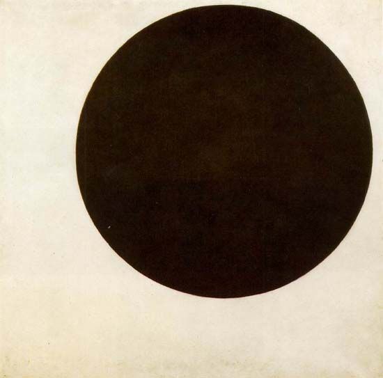
      Black_circle

    It is very odd how in the History of Stuff that clouds really were 
    never studied or named until the early 19th century–
    not even the great classifiers reaching back to Aristotle did so.  
    Clouds are enormous and changing moving statuary, 
    and bring pain and joy and everything and nothing, 
    and still they escaped notice. 
    Even the invisible Winds have been named 
    and codified going back millennia.
     
    It makes me think of things that we have control over now, 
    modifiers of expression, that have been basically the same
    for decades of centuries or longer, and escape notice for improvement.
     
    I was thinking of the markers/signifiers on the keypad I’m using right now. 
     The “.”/period, for example. Outside of  “…” which signifies (mostly) 
    a trailing away or reticence of some sort, 
    the period has stayed the same for 500 years.  
    But not all sentences end in the same manner–
    some come beautifully to a halt, 
    some struggle for existence and then die at the end,
     others are seemingly both eternal and lifeless, 
    some find themselves at a screaming halt, and so on.  
    There must be different sorts of “.”‘s, no?
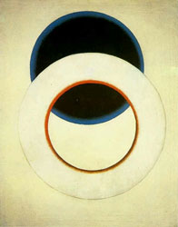
      Dot--Rodchenko White Circle, 1918
    [Alexsandr Rodchenko, White Circle, 1918. Source: Radicalart.info, here]
     
    There have been additions like we see in that last sentence “?”, 
    where a sentence is ended in a question or questioning. 
    And of course there’s the “!” and then combinations 
    of those two “?!”, “!?”, “??”, “!!”, and so on.
     
    But the period seems to stay about the same. 
    Perhaps a color or three could be added, like a red period 
    when the sentence comes to a hot and firey end.  
    Or a period within a white circle to indicate variency or aloofness from its conclusion.  
    Perhaps a change in size, or several concentric rings, 
    could indicate coming to an end in exasperation, 
    or mensuration, or perspiration, or whatever other number of -ations there might be.
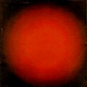
    DOTs--kljunRedLight-SpherComp23S[Ivan Kljun, Red Light, 1923. Source: Radicalart.info, here]
     
    The problem is then a person could use a keyboard for just the period–
    same too could be said for the comma and the delivery of pause and effect.
     
    And then again, if the sentence was written well enough, 
    a person wouldn’t need all of that extra cabbage at the end–
    plus, well-written or not, the reader could supply their own ending.
     
    So I guess we’ll just leave the period alone.
     
    The “dot” however is another story.
    It probably didn’t make a triumphant appearance until the printer’s tray, 
    and then stayed that way
    for hundreds of years, half a millennium, until, suddenly, it was much more.
    It became the point of pointilism, getting an enormous independent life in the hands of 
    Seurat and Pissaro in the 1880’s, and Signac and Van Gogh in the ’90’s, and Metzinger and Delauny in the ‘oughts, 
    and were filled with color and division and reflection and endless possibilities, 
    all dependent on where you stood and the proximity to the artwork.  
     
    And then in 1915 the dot became a point became a circle became an icon, 
    artwork again but without almost every other visual aspect of all the other painters who 
    ever painted before, 
    a beautiful simple place on a canvas by Kasimir Malevich.
    That’s the image up at the top of the page, the Mona Lisa of Suprematism.
     
    It came just a few years at about the end of the greatest revolutionary period of change 
    that has ever occurred to/with humans, from about 1885-1915, when almost everything became ‘modern”.  Centuries/millennia of artwork became completely different with the pre-Impressionsts, and then again with Kandinsky who removed all representation of identifiable forms and replaced them with shapes and colors, and then with Malevich who removed almost all of those and wound up with his monumentally simple forms, a deceptively simple thing leading to great complexity.  
     
    Pixels are an entirely ‘nother thing.
    ·Posted by :

    ·in:


  • History of Lines and Holes as Alphabetical Light

    J Ptak Science Books  Post 2160

    Part of the History of Holes  & History of Lines series

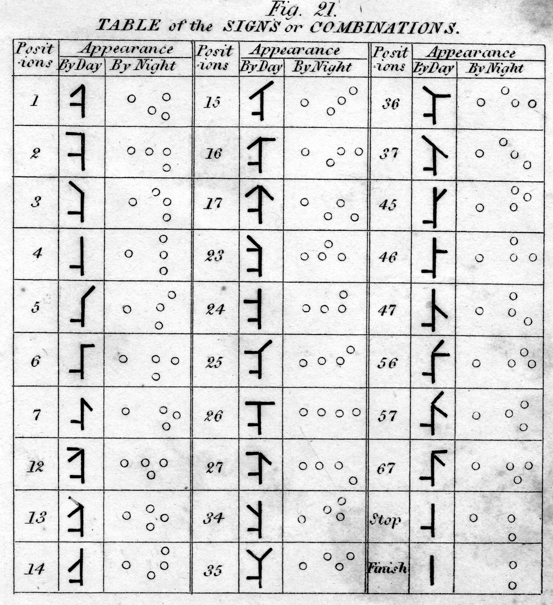
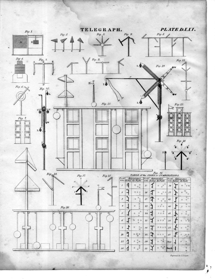
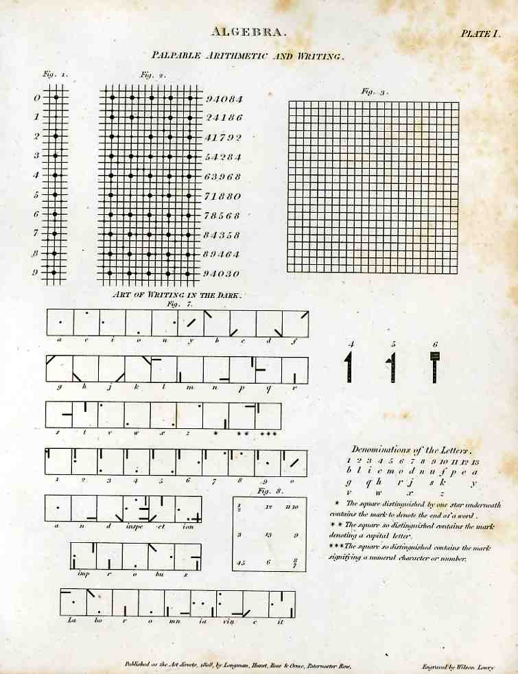
    Telegraph040This curious illustration appears in forty-five volume Cyclopedia of  Abraham Rees (published 1795-1820), displaying a system for communicating over distances at night.  When this part of the Cyclopedia was printed in 1808, the electrical telegraph was still 37 years away from coming into being–45 years from being somewhat well-used.  Before this time (visual) communications over long distances at night were limited to just these sorts of means–lighted semaphores, hand-held torches, that sort of thing.
    Telegraph039The system outlined in the (first) illustration above shows how a semaphore was articulated to produce telegraphic signals at night, fashioned with arms that had changeable holes in the arms, allowing light through to specify letters. As cumbersome and time-consuming as this might seem, it was about the only way to communicate remotely across distances (and at night)–so to transmit messages over miles there would be a series of installation s such as these on hilltops, transferring the message from one ot the other, until the destination was research. This idea did not look so antiquated until the electric telegraph took over, making it seem as though this fire-and-wood technology was 500 years old.  It was that, and older still–but it is the product of revolutionary development that the great discovery can sometimes bring upon instant antiquarianism on whatever it was that was being replaced. 

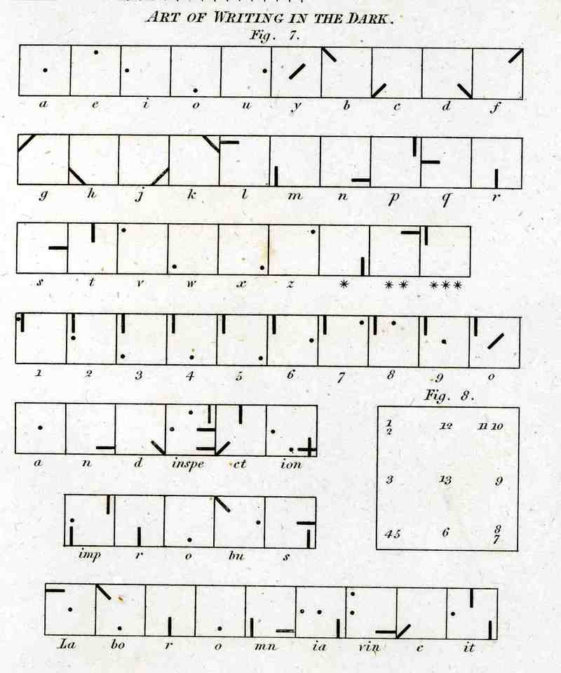
    Telegraph writing in dark

    Signaling at sea at night was somewhat different at this time and didn’t include anything remotely close to the alphabet.  So the rather complex system that we see here (above) is extremely uncommon–it seems also very unwieldy to put into effect.  Unfortunately I don’t have the text volume that would explain then entire system and implementation, so I’m going to guess that there was a large, powerful light source that was covered by a tight, black, covering tablet that would eliminate nearly all light leakage.  The symbols for each letter of the alphabet (and numerals) would be cut out from another tablet that would fit over the face of the light source, placed between the blank and the light.  To transmit a letter the user would then simply remove the blank covering tablet to reveal the light broadcast by the hole or slit in the tablet underneath.  The blank would then be placed back, a new tablet for a new letter placed underneath, and the process would begin again:  blank (dark); letter (light); blank (dark); letter (light), and so on to the end of the message.   I guess the distance at which these symbols could be seen would be dependent on light source, atmospheric conditions, ad so on.  The way that the letters are made into symbols seems to me very intelligent, so that you distinguish the differences from an appreciable distance.  I like it–its an elegant idea.  (Well, maybe it didn’t work in this manner, but it seems to make sense to me.)

    The image of the full sheet:

    Telegraphy writing in dark

    ·Posted by :

    ·in:

    —

  • History of Dots: Scrofula, Dalton’s Chemistry, Durer, and a Vienesse Classroom

    JF Ptak Science Books  
    Follow Me on Pinterest


    0 abay feb 25 dots scrofula627In a continuing series on the History of Dots I’d like to add the following, disconnected though they are, so I don’t lose them in the coming mix.  It is also one of my few chances to actually need to use the word “scrofula”–a lonely, ugly word, a word as unpretty as “Susquehanna” is pretty, a word that should be as timid, but isn’t, a word that really exercises all parts of your mouth when you say it out loud.  (Try it–there’s like five or six movements involved in getting that past your lips.)

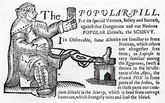
     To be truthful about it, it isn’t so much about scrofula as it is about the “curing ” of the disease with special little pills:  the Popular Pill!  This woodcut appears in a short sales treatise, published in London in 1675 or so, by Humphrey Nendick, (the delightfully titled)  A Compendium of the Operations Vertues and Use of Dr. Nendicks Applauded Pill, against all Chronick Diseases,m curing by the cleansing of the blood, That most successful medicine, which is so deservedly called, the Popular Pill.  For its Spcial vertues, safety and success, against the Dangerous and our Nations Popular Disease, the Scurvy.  I’m not so sure about what

    0 abay feb 25 dots durer628

    Dr. Nendick was up to with the pill, but I do know that is was obtainable from grocers, bakers, cutlers, gunsmiths and barbers all over England at three shillings for forty tiny dots of possible joy.  Its imaginary Galenical powers were supposed to bear against the tedium and insolence of all manners of scurvies and popular complaints–much like its contemporary dot/pill rivals like Pilulae Anti-Scurbuticae (sold at the Carv’d Posts in Stonecutter Street between Shoe Lane and Fleet Ditch (!)). 

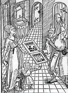
    Albrecht Durer doesn’t seem to have many dots at all in his works, though I did stumble upon this image from Sebastan Brant’s Navis Stultifera (Basle, 1497)–a fool interrupting a mother and daughter who were “discussing” their game of backgammon.

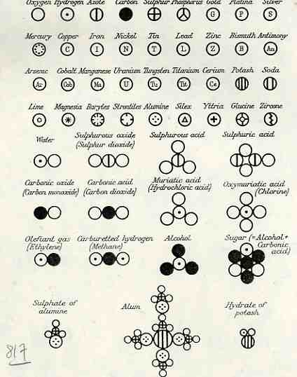
    On the other hand the history of the construction of the periodic table is necessarily filled with dots, as we see with the monarchical creation of John Dalton (1766-1844), in his New System of Chemical Philosophy (part II), and which was printed in 1810–these symbols were sued to visually represent the atomic structure of compounds, and were of vast importance and predictive powers, marking the true modernizing of chemistry.  It was in Part I of this work that Dalton first applied atomic theory to chemistry.


    0 abay feb 25 dots chem625

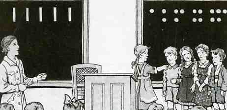
    0 abay feb 25 dots kids626

    This last element for this installment on dots simplifies things enormously, sort of, even though these dots represent the very building blocks of almost everything else.  They represent counting.  And they are beautifully present in this image from Franz Brauner’s Rechenbuch fuer osterreichische Volksschulen (published in 1953).  Funny that this “Rechenbuch” turns up again here in 1953–its been the major part of titles of books describing the laws of arithmetic for 450 years. 

    ·Posted by :

    ·in:


  • Molecular Chemistry of Dots of 1947

    JF Ptak Science Books   [Another in the History of Dots series.]
    Follow Me on Pinterest 

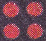
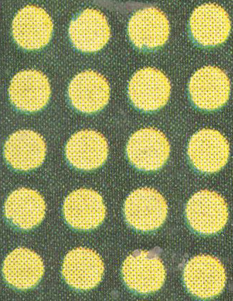
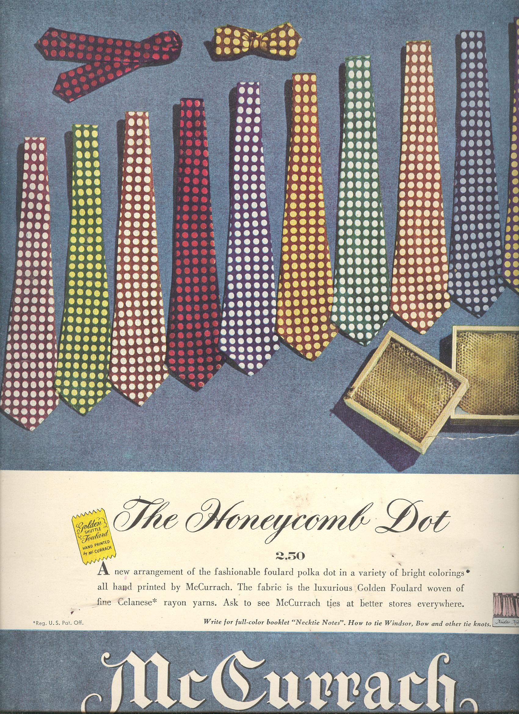
    The molecular chemistry of dots of 1947 is a beautiful thing, worthy of a powers-of-ten episode, though I can only do a gigantically scaled down version of it (a powers-of-two maybe) given pixelation and its dot-defeating and necessary tendency to relieve roundness and introduce squares everywhere. 

    1--may 13 tie dots det 1 

    1--may 13 tie dots det 2

    1--may 13 tie dots det 3

    1--may 13 tie dots det

    1--may 13 tie dots

    ·Posted by :

    ·in:


  • The Cosmology of Renaissance Dots

    JFPtak Science Books   Quick Post  History of Dots series 
    Follow Me on Pinterest 

    It has been quite a while since my last contribution to this series, and I’m sorry that this addition is such a quick one–it is, however, unexpected and lovely.

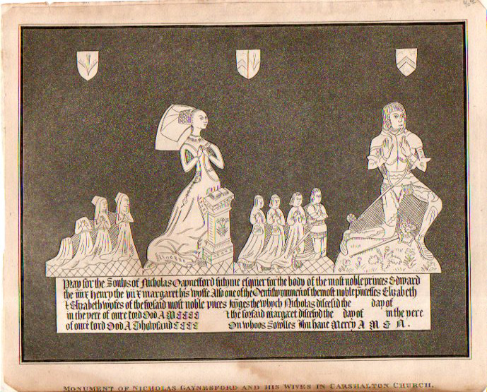
    Renaissance dots747
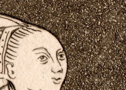
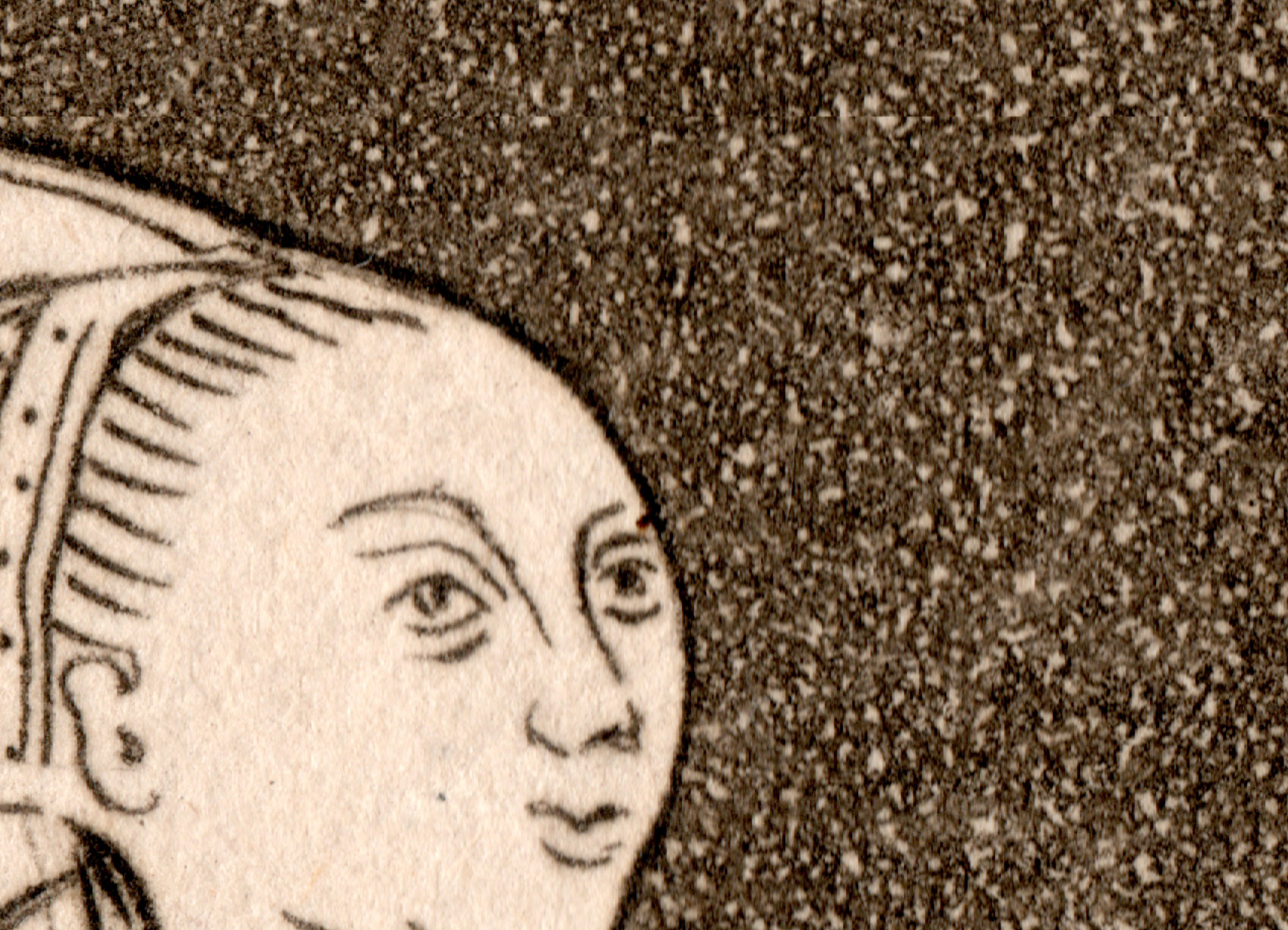
    The engraving, “Monument of Nicholas Gaynesford and his Wives in Carshalton1 Church” was published in Lyson’s The Environs of London, 1796 (though this may be reprinted just a bit later), and depicts the very large monument to Gaynesford (1471-1548). What is particularly remarkable for me is the incredible stipple work that forms the background. On first glance the background treatment seems to be solid, but there is something else there that gives it a depth and causes the collection of stark white figures to seemingly float on the page.  This is the cause:

    Renaissance dots748

    This detail is about 20 square millimeters from the original and is just absolutely filled with small dots.  A closer look reveals even more:

    Renaissance dots748

    There’s a few hundred thousand of these marks in the image, which measures only about 35 square inches. 

    ·Posted by :

    ·in: